


Abstract
Natural disaster emergency cartography requires high semantic accuracy in color design and efficient visual communication. However, existing studies still lack systematic palette analysis and knowledge organization methods based on real-world emergency maps. To address this gap, this study proposes a framework for palette analysis and knowledge organization that uses publicly available Emergency Response Coordination Centre (ERCC)’s emergency maps as the primary data source. The framework extracts disaster types and thematic mapping indicators. It performs palette identification, matching, and statistical analysis using color information from legend regions in the RGB, HSV, and CIELab color spaces, together with the ColorBrewer palette system. Based on the statistical matching results, we constructed a structured knowledge graph that links disaster types, thematic mapping indicators, and palettes, enabling organized retrieval of palette knowledge. Results show that color extraction from legend regions effectively reduces interference from non-thematic elements and improves the accuracy of palette identification. In addition, palette usage in ERCC emergency maps exhibits clear statistical associations and shared and differentiated patterns, indicating stable yet non-unique associations among disaster themes, thematic mapping indicators, and color palettes. The proposed knowledge graph provides a structured framework for organizing palette knowledge and analyzing semantic relationships in ERCC emergency cartography.
1. Introduction
Natural disaster events typically exhibit sudden onset, high complexity, and strong time sensitivity [1]. Following hazards such as floods, earthquakes, and typhoons, relevant agencies often need to rapidly conduct damage assessments, allocate resources, and disseminate information [2,3]. In this context, there is an urgent need for rapid, accurate thematic mapping to communicate critical information [4]. As essential media for representing spatial information, maps provide an intuitive means of visualizing the spatial distribution, interrelationships, and evolution of disaster-related phenomena, and thus serve as core tools in emergency management and decision support for natural disasters [5,6].
In natural-disaster thematic map design, color palettes are a key factor influencing map readability, visual hierarchy, and the efficiency of information transmission [7,8]. Appropriate color design can reduce cognitive load, highlight critical disaster information, and improve interpretation efficiency, whereas inappropriate palettes may increase comprehension difficulty and even lead to misinterpretation [9]. Because different thematic mapping indicators carry distinct semantic meanings and visual encoding logic, color design must be consistent with thematic semantics, data characteristics, and principles of visual cognition. For example, flood-related maps often emphasize precipitation and inundation processes, while heatwave and fire-related maps tend to highlight temperature anomalies and risk levels. Over time, different disaster types and thematic mapping indicators have developed relatively stable color-usage conventions in cartographic practice.
A substantial body of cartographic research has established mature theoretical frameworks and design guidelines for the use of color [8,10,11,12]. Existing studies generally agree that map colors should align with data measurement levels, thematic semantics, and perceptual principles [13]. Meanwhile, standardized color palettes such as ColorBrewer [14], along with built-in symbology templates provided by GIS platforms, serve as common references references for thematic map design. However, these rules and tools primarily rest on general cartographic principles and conventional mapping scenarios and lack systematic analysis grounded in real-world natural-disaster map cases. In particular, there is limited work focusing on the structured relationships among disaster types, thematic mapping indicators, and color palettes. Although existing studies provide solid theoretical and technical foundations for map color design [11], the selection of thematic map color palettes still relies heavily on cartographers’ experience [14,15]. Under rapidly evolving disaster conditions and high-frequency mapping demands, manual trial-and-error design processes are often inefficient, subjective, and difficult to generalize.
To address these limitations, we reviewed recent studies on knowledge-driven geovisualization and cartographic knowledge representation through ontologies, Semantic Web technologies, and geospatial knowledge graphs [16,17]. We found that these approaches provide structured representations of geographic concepts, visualization rules, and domain knowledge, enabling more explicit and interpretable visualization processes [18]. However, existing studies mainly focus on general knowledge organization, ontology construction, or visualization rule representation, while domain-specific empirical cartographic knowledge derived from real-world mapping practices remains underexplored.
In recent years, as generative artificial intelligence has advanced, cartography has gradually shifted toward more intelligent approaches [18,19,20]. Recent studies have achieved notable progress in map style generation, color transfer, and automated map understanding. For example, previous research has proposed color and texture interpolation methods for seamless integration of vector maps and remote sensing imagery [21], applied generative adversarial networks to map style transfer [22], and developed image-to-vector color transfer methods for multi-theme maps [23]. Meanwhile, MapReader has explored the automated extraction and understanding of cartographic elements from map images [24]. At the same time, MapGPT [25] and CartoAgent [26] have demonstrated the potential of LLMs for intelligent mapping and map-style generation. However, current approaches primarily rely on pixel-level or style-level transformations and generally lack explicit modeling of domain-specific semantic relationships in natural disaster mapping. In disaster mapping contexts, color design must not only ensure visual consistency but also reflect the physical processes and risk semantics associated with disaster types and thematic mapping indicators. As a result, current map style generation and color transfer approaches struggle to establish stable relationships among disaster semantics, thematic mapping indicators, and color palettes, and they cannot systematically capture and transfer long-term color usage patterns in real disaster maps, limiting their interpretability and task adaptability in natural disaster cartography.
Beyond these initial applications in intelligent mapping, large language models (LLMs) have demonstrated strong capabilities in language understanding and knowledge reasoning [27], offering new opportunities for map color design and recommendation [28]. For example, MapColorAI and related studies have explored the use of LLMs to generate color palettes for choropleth maps that are consistent with thematic semantics [29]. Similarly, a few-shot LLM-based system, NL2Color, has been proposed to refine chart color palettes using users’ natural-language expressions, achieving quality comparable to expert-designed palettes [30]. However, most general-purpose LLMs rely on large-scale general corpora and lack structured domain knowledge specific to natural disaster cartography [31], particularly the explicit relationships among disaster types, thematic mapping indicators, and color palettes derived from real cartographic practices. Consequently, their outputs often fail to consistently reflect established cartographic conventions, with limited domain consistency and task-specific reliability [32].
Overall, existing research on natural disaster emergency mapping still has several limitations. First, there is a lack of systematic analysis of color palettes in real-world disaster maps, making it difficult to identify consistent color usage patterns across different disaster types. In addition, existing studies have paid limited attention to organizing empirical color usage patterns from real-world disaster maps into structured, interpretable representations. Although geovisualization and cartographic knowledge representation have explored knowledge-driven approaches, domain-specific modeling of the relationships among disaster types, thematic mapping indicators, and color palettes remains insufficient.
To address these gaps, this study proposes a framework for palette analysis and knowledge organization in natural-disaster cartographic applications. Using publicly available natural disaster thematic maps as the primary data source, the framework automatically extracts disaster types, thematic mapping indicators, and legend color features to enable palette identification, matching, and statistical analysis. We further construct a natural-disaster map-palette knowledge graph to capture latent relationships among disaster themes, thematic mapping indicators, and color palettes in real-world cartographic cases. Specifically, this study makes three contributions:
- (1)
- Construct a natural disaster thematic map dataset and perform automatic color extraction and palette standardization to establish a foundational dataset for palette analysis.
- (2)
- Analyze color usage patterns across disaster types, thematic mapping indicators, and palettes to reveal preference, sharing, and differentiation characteristics.
- (3)
- Develop an empirical palette knowledge graph based on statistical matching results to organize observed relationships among disaster types, thematic mapping indicators, and palettes from real-world disaster maps.
2. Materials and Methods
2.1. Workflow
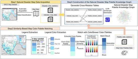
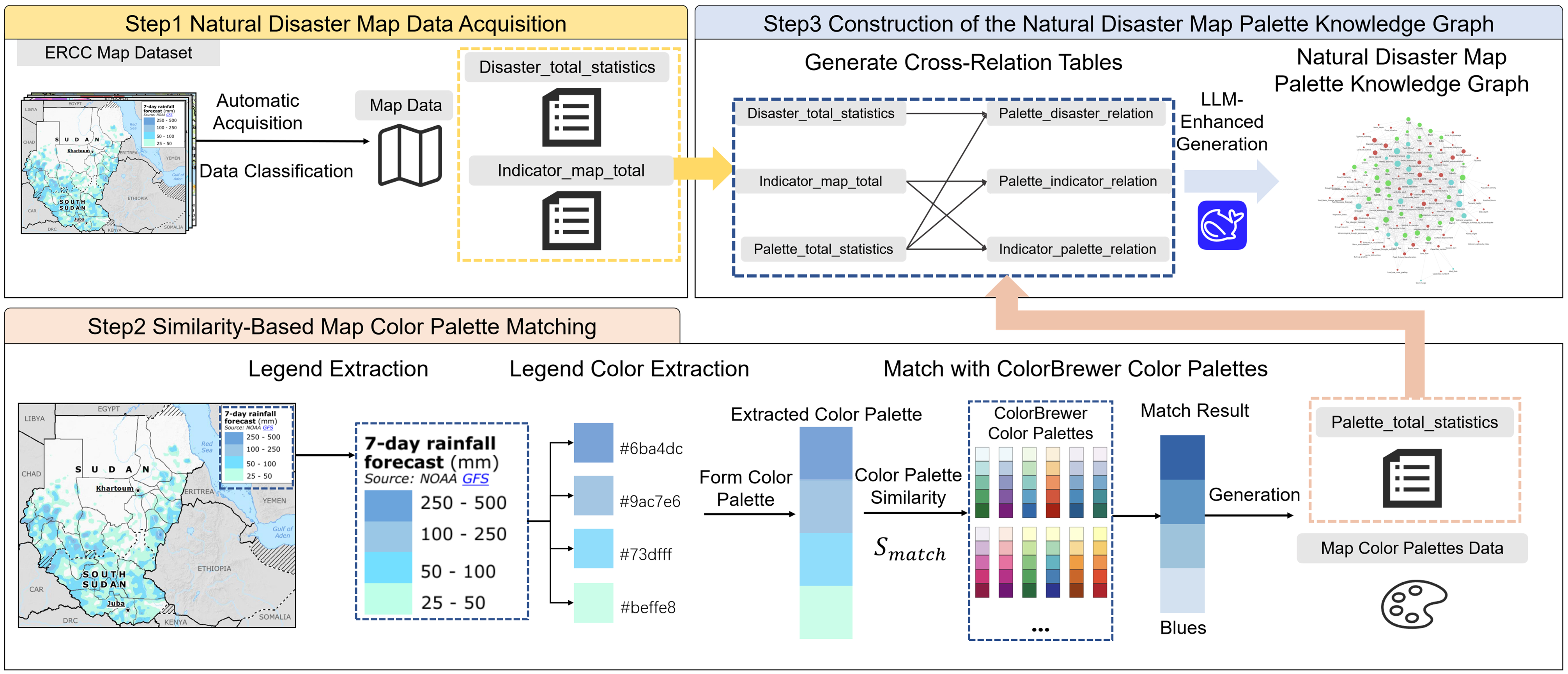
Figure 1 illustrates the overall workflow of this study, comprising three main stages: automatic acquisition of natural-disaster map data, similarity-based map-palette matching, and construction of a natural-disaster map-palette knowledge graph.
Figure 1.
Overview of the proposed workflow for natural disaster map palette analysis and knowledge graph construction. (the map [33] shown in Steps 1 and 2 and its legend shown in Step 2 were adapted from ERCC, under the Creative Commons Attribution 4.0 International (CC BY 4.0) license.)
During data acquisition, we automatically collect disaster-related thematic maps from publicly available sources, along with associated metadata, such as disaster types, thematic mapping indicators, and map descriptions. The collected maps are then systematically organized by disaster type and thematic mapping indicators to construct a dataset of thematic maps of natural disasters. Subsequently, we generate disaster-level and indicator-level statistics to provide a foundation for subsequent palette analysis and relational modeling.
In the similarity-based palette-matching stage, we first extract legend regions from thematic maps and apply color recognition algorithms to identify dominant colors within the legends. We organize the extracted colors into palette features that represent a key component of map style. Next, we represent each palette using fused features from the RGB, HSV, and CIELab color spaces and calculate palette similarity. The resulting similarity measures enable us to match extracted palettes to standard ColorBrewer palettes and construct a unified palette set for natural disaster maps. Meanwhile, we conduct statistical analyses to characterize relationships among disaster types, thematic mapping indicators, and palettes, generating multilevel palette statistics to support subsequent knowledge construction.
In the knowledge graph construction stage, we analyze the relationships among disaster types, thematic mapping indicators, and color palettes. Based on the statistical results, we construct three types of summary tables (disaster statistics, indicator statistics, and global palette statistics) and three types of relational tables (disaster–indicator, indicator–palette, and palette–disaster relations). On this basis, we construct the palette knowledge graph from these relational tables, enabling a structured semantic representation of relationships among disaster types, thematic mapping indicators, and map palettes.
2.2. Data and Preprocessing
We collected maps from the ERCC ECHO Daily Maps portal (https://erccportal.jrc.ec.europa.eu/ECHO-Products/Maps, accessed on 8 May 2026) in reverse chronological order, covering January 2021 to June 2025. The ERCC database provides standardized emergency maps with comprehensive disaster classifications, making it a reliable source for ERCC emergency-map-style analysis. We retained ECHO Daily Map products with downloadable files, visible color-encoded legends, and complete metadata, while excluding reference maps, administrative boundary maps, satellite imagery without thematic color encoding, and duplicate records. The resulting dataset comprises 16 disaster types, 69 thematic mapping indicators, and 1825 color maps. We assigned disaster types using ERCC event metadata and manually annotated thematic mapping indicators from legend regions. We then normalized the indicators through LLM-assisted entity resolution with manual verification. The thematic mapping indicators describe the thematic variables represented in each map rather than the disaster categories themselves. Therefore, different disaster types may share the same thematic mapping indicators, while a single disaster category may include thematic variables describing hazard processes, environmental context, exposure, and response capacity. Since we collected the dataset from a single institutional source, the identified palette patterns mainly reflect ERCC emergency mapping practices and should be interpreted within this specific cartographic context.
Table 1 summarizes the dataset by disaster type. Tropical Cyclone, Flood, and Severe Weather account for the largest numbers of maps, whereas categories such as Violent Wind and Meteorological Warning contain relatively few samples, indicating substantial imbalance across disaster types and thematic mapping indicators.
Table 1.
Statistical summary of the natural disaster map dataset by disaster type and thematic mapping indicators.
For palette analysis, we preprocessed the extracted legends. From the 1884 legend images we collected from the maps, we excluded 59 grayscale legends that lacked the hue information required for ColorBrewer-based semantic analysis, resulting in 1825 color legends.
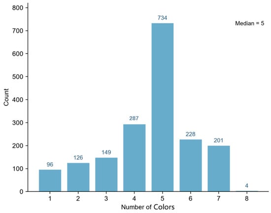
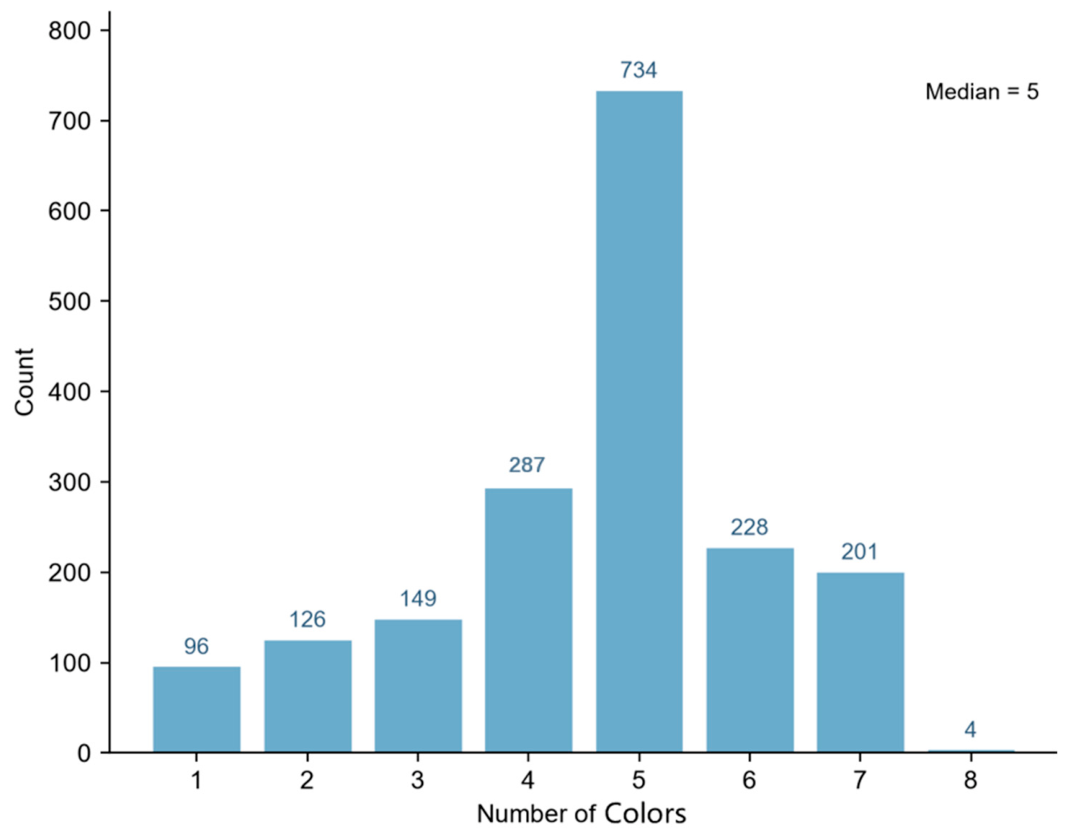
Subsequently, we removed legends with fewer than three color classes (ColorBrewer supports only 3–12 classes), excluding 96 one-class and 126 two-class legends and retaining 1603 valid legends. Among these, four-class (287, 17.90%) and five-class (734, 45.79%) legends dominated, together representing 63.76% of the total. We conducted all subsequent analyses on these 1603 legends; Figure 2 shows their color-class distribution before and after preprocessing.
Figure 2.
Distribution of legend color classes of all samples (n = 1825).
2.3. Color Extraction
This study employs the Haishoku library (version 1.1.8) [34], an open-source tool for extracting dominant colors and their proportions from images using Python 3.10.16. We used the tool to extract colors from natural disaster map images and then integrated them into a map palette.
Haishoku can extract dominant colors and their corresponding proportions from image pixels and output the results as RGB values or in hexadecimal format. We used map legends from natural disaster maps as inputs to extract their color compositions and construct corresponding map palettes.
Specifically, we first used the Haishoku library to extract the original color palette from each map image, obtaining both RGB values and the proportional contributions of each color. We then applied a color filtering strategy to reduce potential non-thematic interference in the extracted palettes, including background components (e.g., near-white regions) and annotation-related components (e.g., near-black elements). We designed the filtering process to preserve meaningful thematic colors, including grayscale-based map representations. Subsequently, we normalized the remaining colors by their proportions to form the final valid color set, which serves as the palette representation of natural disaster maps.
In addition, some map legends contain a small number of visually salient emphasis colors. We automatically identified candidate emphasis colors and manually verified them before palette matching. We retained the confirmed emphasis colors as independent color information and excluded them from the base palette matching. To facilitate semantic analysis, we further grouped the confirmed emphasis colors into representative categories using principal component analysis (PCA) and hierarchical clustering.
2.4. Palette Similarity Matching
Before palette matching, we cleaned and extracted the legend colors. We used Haishoku to extract dominant colors from legend images. We empirically determined the RGB thresholds by analyzing the pixel distributions of a randomly sampled 10% of the legend images. Near-white colors (RGB values of all channels ≥230) and near-black colors (RGB values of all channels ≤30) were removed as background and annotation components, respectively. We filtered out other achromatic colors using RGB channel differences to reduce non-thematic interference while preserving thematic maps in grayscale. We normalized the remaining colors according to their original proportions for subsequent palette analysis.
To quantitatively measure palette similarity among natural disaster thematic maps, we propose a palette similarity metric based on multi-color-space feature fusion. The method jointly represents colors in the RGB, HSV, and CIELab color spaces because these three spaces provide complementary information that any single space cannot capture.
For the i-th color in a palette, we construct a nine-dimensional feature vector:
where , , and denote the red, green, and blue components in the RGB color space; , , and represent hue, saturation, and value in the HSV color space; and , , and correspond to the three components of the CIELab color space. We normalize the RGB and Lab components to ensure comparable feature scales.
The three color spaces are selected because no single color space can simultaneously represent the numerical composition, perceptual attributes, and perceptual similarity of colors. RGB preserves the original color values extracted from map legends. HSV explicitly represents hue, saturation, and value, which correspond to the primary design dimensions commonly considered in cartographic palette design. CIELab is perceptually uniform, allowing color differences to better approximate human visual perception. Therefore, combining RGB, HSV, and CIELab provides complementary information for palette representation and enables the proposed descriptor to capture both the physical characteristics and perceptual semantics of map palettes. Because different palettes contain different numbers of colors, we compute the mean and standard deviation of each feature dimension across all colors in a palette and concatenate them into an 18-dimensional palette descriptor:
where and denote the mean and standard deviation of the j-th feature dimension, respectively. This descriptor captures both the central tendency and dispersion of colors within a palette while remaining independent of palette size.
We measure the similarity between two palettes using cosine similarity:
where and denote the palette descriptors of palettes A and B.
To assign a standardized ColorBrewer label to each extracted map palette, we calculate the cosine similarity between the map palette descriptor and every ColorBrewer palette descriptor . For each candidate palette, we select the variant with the closest number of color classes for comparison. We then identify the best-matching ColorBrewer palette as
where denotes the set of ColorBrewer palettes.
We define the corresponding similarity score as
A larger value indicates stronger agreement between the extracted map palette and the matched ColorBrewer palette. We apply this matching procedure independently to every thematic map in the dataset, generating a standardized ColorBrewer palette label and a corresponding similarity score for each map.
To evaluate the effectiveness of the proposed 18-dimensional color descriptor (18-dim Cosine), we further compare it with four representative palette-matching methods: Ordered, CIEDE2000 [35], Hungarian [36], and EMD [37]. Ordered serves as a simple baseline that compares colors in their original order without reordering or optimization. These methods employ different color representations and matching strategies, as summarized in Table 2. We evaluated their performance through statistical association analysis and palette recommendation experiments.
Table 2.
Comparison of color representations and matching strategies for different palette matching methods.
2.5. ColorBrewer-Based Color Palette Standardization
Existing automatic map color-extraction methods still have limitations in practical applications. They are often sensitive to image quality, compression artifacts, and background noise, which may lead to incomplete color identification, color value distortion, or redundant color interference. These issues reduce their robustness to downstream map-style analysis and modeling tasks. To improve the consistency and reliability of palette representation, this study introduces ColorBrewer as a standardized reference system. It develops a similarity-based matching approach to align natural-disaster map palettes with standardized color palettes, thereby providing a unified color baseline for map rendering.
ColorBrewer is a systematic palette design framework for thematic mapping that provides perceptually optimized and color-theory-validated palettes for different data types, including sequential, categorical, and diverging classes [38]. The palette design considers color discriminability, perceptual uniformity, colorblind safety, and cross-media consistency. ColorBrewer typically provides palettes in structured formats (e.g., JSON) and supports multiple class sizes (typically 3–12 classes), providing a stable, reusable foundation for standardized cartographic representation.
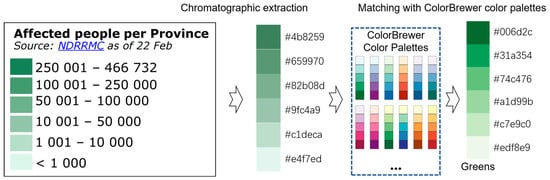
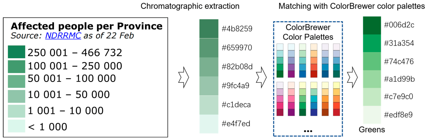
As a result, we can associate each map with a normalized ColorBrewer-compatible palette (Figure 3). The standardized palette representation not only mitigates limitations in raw color extraction but also provides a consistent and reliable color basis for subsequent palette analysis and related computational processing. ColorBrewer targets discrete, perceptually tuned choropleth color schemes. Therefore, the standardization pipeline covers this class of palettes but does not extend to continuous scientific colormaps (e.g., Viridis, Cividis) or custom institutional palettes.
Figure 3.
Workflow of palette standardization based on ColorBrewer. (the map legend [39] shown in the figure was adapted from ERCC, under the Creative Commons Attribution 4.0 International (CC BY 4.0) license.)
To ensure a fair comparison among palette-matching methods, matching is performed only between palettes with the same number of color classes. This design avoids the influence introduced by matching palettes with different numbers of colors and provides a consistent basis for method comparison.
2.6. Statistical Association Analysis
To statistically validate the relationships between thematic mapping indicators and standardized color palettes, we conducted association analyses using the palette-matching results. First, we constructed contingency tables between thematic mapping indicators and ColorBrewer palettes using the proposed 18-dim Cosine method and four comparison methods (Ordered, CIEDE2000, Hungarian, and EMD). We then calculated Cramer’s V to assess the overall strength of association and evaluate the consistency of associations across different matching methods.
Next, we calculated the odds ratio (OR), 95% confidence interval (95% CI), and Fisher’s exact test for the indicator–palette associations identified by the 18-dim Cosine method to evaluate their association strength and statistical significance.
Finally, we performed stratified analyses by disaster category as a supplementary validation of the overall association results.
3. Results
3.1. Distribution of Map Themes
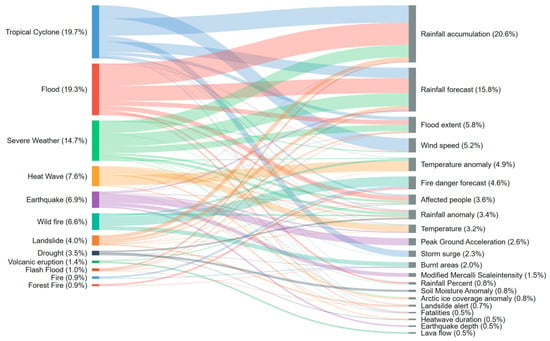
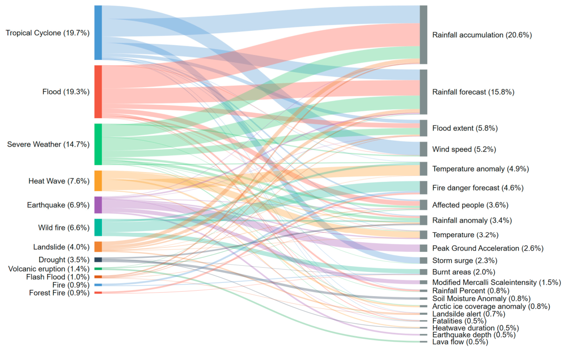
To analyze thematic patterns in natural disaster maps, this study examined relationships in the distribution of disaster types and thematic mapping indicators. Since some indicators occur infrequently, Figure 4 presents only high-frequency thematic indicators with more than 20 occurrences for clarity of visualization.
Figure 4.
Sankey diagram of relationships between disaster types and thematic mapping indicators.
The disaster type distribution shows a clear concentration pattern. Tropical Cyclone (19.7%), Flood (19.3%), and Severe Weather (14.7%) account for the largest proportions of the dataset. These disaster categories frequently involve environmental variables such as precipitation and wind-related indicators, which appear across multiple disaster types.
In contrast, Heat Wave (7.6%), Earthquake (6.9%), and Wildfire (6.6%) exhibit more specific indicator structures. Heat-related hazards are primarily associated with temperature variables; earthquake maps emphasize seismic indicators; and wildfire maps commonly include fire risk and affected-area information.
At the indicator level, the distribution also shows a concentration pattern. A small number of frequently used indicators, including precipitation-related variables, wind speed, affected people, and temperature anomaly, appear across multiple disaster categories and form shared thematic representations. Meanwhile, other indicators are mainly associated with specific disaster processes, reflecting category-specific characteristics.
The Sankey diagram further illustrates the relationship structure between disaster types and thematic indicators. Some indicators have broad cross-disaster applicability for representing general environmental conditions or impacts, whereas others are closely related to specific disaster processes. These results reveal both shared and disaster-specific thematic layers in natural disaster map representations, providing a basis for subsequent palette analysis and map-style knowledge modeling.
3.2. Distribution of Color Palettes
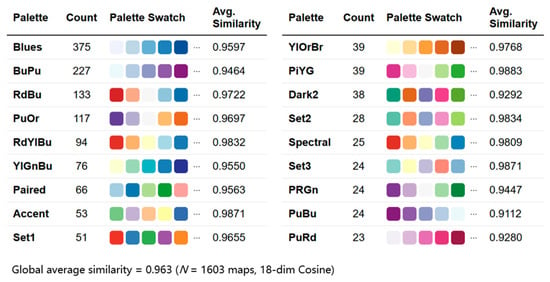
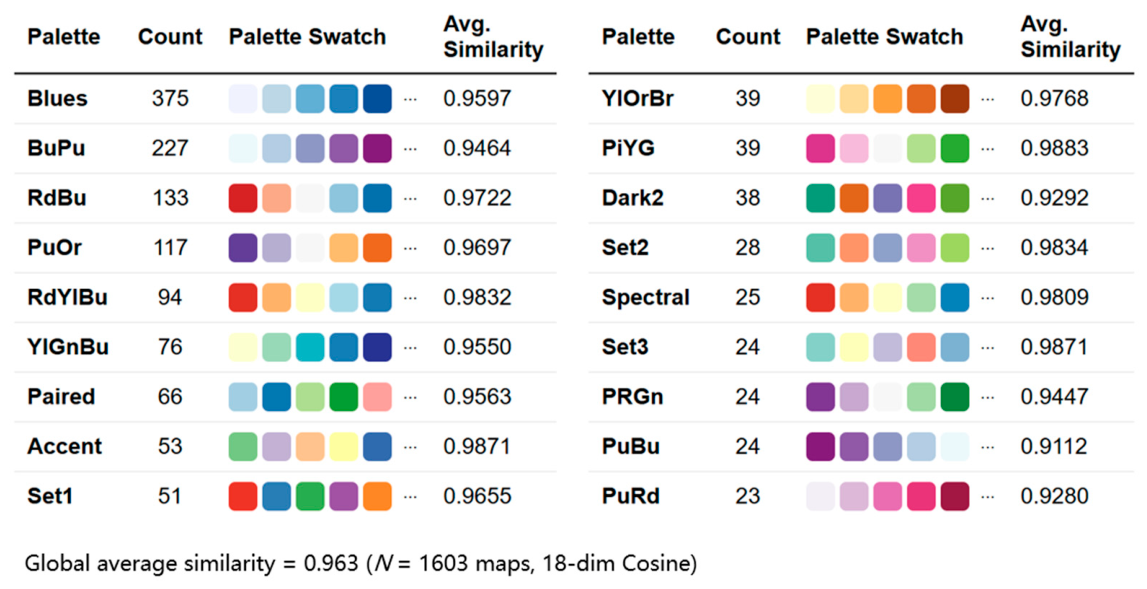
To analyze palette usage in natural disaster thematic maps, we statistically summarized the frequency of ColorBrewer palettes, as shown in Figure 5. Overall, the palette distribution exhibits a strong concentration pattern, with sequential and diverging palettes representing the dominant components of the system.
Figure 5.
Frequency distribution and average matching similarity of ColorBrewer palettes in natural disaster thematic maps.
Blues (375) is the most frequently used palette, followed by BuPu (227), RdBu (133), and PuOr (117), indicating a highly skewed distribution where a limited number of palettes account for most applications. The palette-matching results show a high average similarity of 0.963 across 1603 maps, suggesting that ColorBrewer schemes effectively represent the characteristics of the extracted palettes.
Sequential and diverging palettes constitute the core of the natural disaster map color system. Sequential palettes are mainly associated with continuous quantitative variables, while diverging palettes are commonly used to represent variation around a central reference. Together, they form the primary palette structures used in disaster-themed mapping.
The overall palette distribution follows a long-tail pattern, in which a small number of frequently used palettes dominate practical applications. In contrast, lower-frequency palettes offer additional flexibility for specific thematic contexts. These results establish the empirical basis for subsequent analysis of palette–indicator relationships and knowledge graph construction.
3.3. Theme-Based Palette Usage Patterns
3.3.1. Analysis of Palette Usage Patterns for Thematic Mapping Indicators
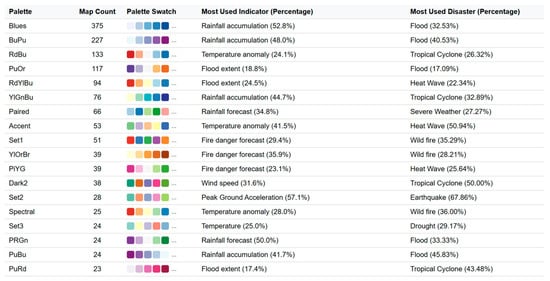
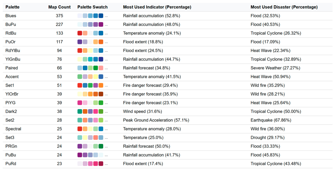
To investigate the relationship between color palettes and thematic representation in natural disaster maps, this study analyzes the thematic indicators and disaster types associated with frequently used ColorBrewer palettes (map count > 20), as shown in Figure 6. The results reveal distinct palette–indicator–disaster associations.
Figure 6.
Thematic mapping indicators and disaster types associated with the most frequently used ColorBrewer palettes.
Blue sequential palettes show dominant usage patterns. Blues (375), BuPu (227), and YlGnBu (76) are mainly associated with Rainfall accumulation and frequently appear in Flood and Tropical Cyclone maps, indicating a preference for blue tones in hydrological-related representations.
Diverging palettes are mainly associated with anomaly and variation-related indicators. RdBu (133) is strongly linked with Temperature anomaly, while RdYlBu (94) and PuOr (117 maps) are frequently associated with Flood extent and related variables.
Warm, high-contrast palettes are prevalent in wildfire-related applications. Set1 (51) and YlOrBr (39) are mainly associated with Fire danger forecasts, while Spectral (25) also appears in wildfire-related maps.
Some discrete palettes show strong associations with specific thematic tasks. For example, Set2 (28) appears alongside Peak Ground Acceleration and Earthquake maps.
Overall, the descriptive analysis reveals recurring palette–indicator associations across different disaster contexts. Blue sequential palettes are most frequently associated with hydrological and precipitation-related indicators, whereas diverging palettes are commonly associated with anomaly-related variables. Warm, high-contrast palettes appear more frequently in wildfire-related scenarios. These observed usage patterns provide the basis for the statistical validation presented in Section 3.3.2 and for constructing the palette knowledge graph.
3.3.2. Statistical Validation of Palette–Indicator Associations
The preceding analysis reveals stable relationships between thematic mapping indicators and ColorBrewer palettes. However, descriptive statistics alone cannot determine whether these relationships are statistically significant. Therefore, we perform statistical association analyses to validate the observed palette–indicator associations.
First, we assess the overall strength of the association using the proposed 18-dim Cosine method and four comparison methods. As shown in Table 3, all five methods produce statistically significant results (p < 0.001), with Cramer’s V ranging from 0.339 to 0.381. The similar association strengths across the five methods indicate that the observed palette–indicator relationships are consistent and do not depend on the specific palette-matching method.
Table 3.
Overall strength of association for the five palette-matching methods.
It is worth noting that Hungarian matching and EMD produce identical results in this study. Palette matching is performed only between palettes with the same number of color classes. In this setting, both methods determine the optimal one-to-one correspondence by minimizing the overall matching cost between colors, yielding identical palette-matching results.
Next, we calculate the odds ratio (OR), 95% confidence interval (95% CI), and Fisher’s exact test for the palette–indicator associations identified by the 18-dim Cosine method. Table 4 summarizes the statistical results for selected palette–indicator associations. Rainfall forecast–Blues (OR = 6.1), Rainfall accumulation–Blues (OR = 4.3), Affected people–PuOr (OR = 8.9), and Wind speed–RdYlBu (OR = 4.4) all show statistically significant associations.
Table 4.
Statistical results for selected palette–indicator associations.
Finally, we perform stratified analyses by disaster category to further validate these associations. As shown in Table 5, Rainfall forecast–Blues, Rainfall accumulation–Blues, and Wind speed–RdYlBu remain statistically significant within the corresponding disaster categories, supporting the overall association results. The Affected people–PuOr association is not included in the stratified analysis because the sample size within each disaster category is insufficient.
Table 5.
Stratified analysis results.
3.3.3. Robustness Analysis of ColorBrewer Standardization
Since the palette–indicator analysis relies on ColorBrewer standardization, we further evaluated the reliability of ColorBrewer-based palette representation. Given that different ColorBrewer palettes may share perceptual characteristics and that some customized palettes may not map exactly to a single standard palette, we analyzed the distribution of cluster-level matching scores. For each legend, we calculated the average matching score between the extracted palette and the palettes within each ColorBrewer cluster. We assigned the legend to the cluster with the highest average score. The number of clusters was determined using PCA with 95% of the variance preserved. Table 6 shows the distribution of cluster-level ColorBrewer matching scores. Higher values indicate closer matches for similarity-based metrics, whereas lower values indicate closer matches for distance-based metrics (e.g., CIEDE2000). P5 represents the 5th percentile of the cluster-level matching score distribution.
Table 6.
Distribution of cluster-level ColorBrewer matching scores.
Most extracted palettes consistently map to ColorBrewer clusters. Lower-matching cases mainly correspond to customized gradients, institutional color schemes, or palettes with limited correspondence to standard ColorBrewer designs. These cases were retained rather than removed for subsequent analysis.
For each similarity metric, the ranking procedure independently ordered the matching scores for the 1603 legend palettes and designated the lowest 5% of cases as low-quality matches for inspection. To evaluate their influence on palette usage patterns, we removed the lowest 10% and 50% of cases by matching quality and recalculated palette rankings. Table 7 shows the Spearman rank correlations between filtered and original rankings.
Table 7.
Robustness of palette ranking after removing low-quality matching cases.
After removing the lowest 10% and 50% matching-quality cases, the Spearman rank correlations remained within 0.949–0.993 and 0.716–0.916, respectively, indicating that the dominant palette rankings remained consistent after excluding low-quality matching cases. Therefore, low-quality ColorBrewer assignments did not primarily drive the identified palette–indicator associations.
To further examine whether ColorBrewer standardization obscures the diversity of original palettes, we compared ColorBrewer-based clustering with unsupervised clustering of raw extracted palettes using the Adjusted Rand Index (ARI), as shown in Table 8.
Table 8.
Correspondence between ColorBrewer-based and raw palette clustering.
The ARI values ranged from 0.180 to 0.517, indicating partial correspondence between ColorBrewer-based clusters and raw palette clusters. These results suggest that ColorBrewer standardization provides a semantically interpretable representation of palette organization while retaining differences observed in the original palette space.
3.4. Natural Disaster Map Palette Knowledge Graph
3.4.1. Natural Disaster Map Palette Knowledge Graph Construction
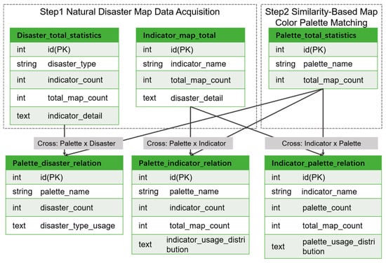
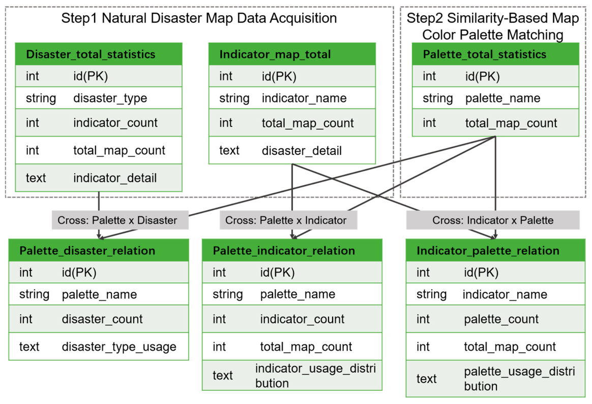
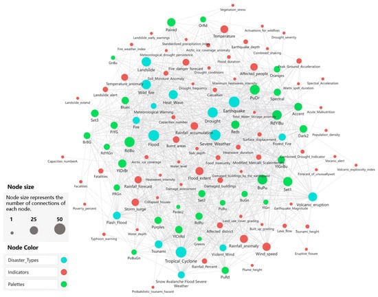
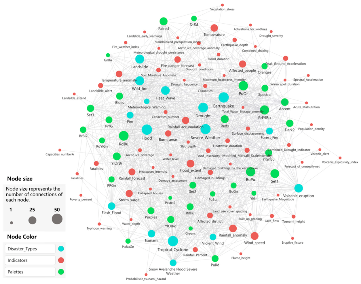
To reveal the relationships among disaster types, thematic mapping indicators, and map palettes in ERCC emergency maps, this study constructed six relational tables based on the preceding statistical results (Figure 7). These statistical relationships were further organized into a palette knowledge graph through a structured pipeline, as shown in Figure 8. The knowledge graph follows a hierarchical schema consisting of Disaster Category, Disaster Type, Thematic Mapping Indicator, and ColorBrewer Palette nodes. Edges represent the BELONGS_TO, HAS_INDICATOR, USES_PALETTE, USED_BY_DISASTER, and USED_BY_INDICATOR relationships, with statistical associations weighted by occurrence frequencies or palette-matching ratios. A programmatic procedure generated the graph nodes and edges from the statistical tables, with DeepSeek-v4 used to normalize legend labels, followed by manual verification. Obsidian served as an interactive frontend for browsing the graph structure. Overall, the knowledge graph provides a structured organization of relationships among disaster types, thematic mapping indicators, and palettes for ERCC emergency map palette analysis.
Figure 7.
Relational table structure for organizing knowledge of natural disaster map palettes.
Figure 8.
Natural disaster map palette knowledge graph constructed from disaster types, thematic mapping indicators, and color palettes.
The knowledge graph consists of six relational tables, including disaster statistics (disaster_total_stats), indicator statistics (indicator_map_total), palette statistics (palette_total_stats), palette–disaster relations (palette_disaster_relation), indicator–palette relations (indicator_palette_relation), and palette–indicator relations (palette_indicator_relation). The statistical tables describe the overall distributions of disaster types, thematic mapping indicators, and palettes. In contrast, the relation tables characterize their associations and palette-usage preferences, thereby revealing palette-expression patterns across different disaster themes. These relational tables serve as the data source for graph construction, while the knowledge graph explicitly organizes statistical relationships into a structured semantic network.
From a structural perspective, the knowledge graph forms a relational network of “Disaster Type–Thematic Mapping Indicator–Palette”. Shared indicators and commonly used palettes connect high-frequency disaster types, whereas different disaster themes further generate domain-specific local subgraphs through distinctive indicators and palettes. This structure reflects both common palette usage patterns and differentiated visual expression characteristics among disaster themes.
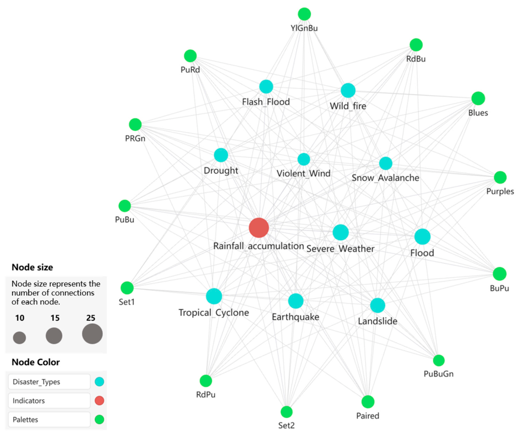
To illustrate the semantic association characteristics of the knowledge graph, we constructed a local semantic subgraph using the thematic mapping indicator “Rainfall accumulation” as an example (Figure 9). The results show that this indicator associates with multiple disaster types, including tropical cyclones, floods, flash floods, and droughts, and forms stable connections with blue-green palettes such as Blues, YlGnBu, PuBu, and BuPu, reflecting the common preference for cool-toned sequential palettes in precipitation-related thematic maps. Meanwhile, associations with several qualitative palettes also indicate the diversity of color expression across different cartographic scenarios.
Figure 9.
Local semantic subgraph of the “Rainfall accumulation” thematic mapping indicator in the natural disaster map palette knowledge graph.
Overall, the proposed natural disaster map palette knowledge graph provides a structured semantic representation of relationships among disaster types, thematic mapping indicators, and map palettes. Rather than performing automatic knowledge inference, the graph explicitly organizes empirical relationships observed in real-world disaster maps, serving as a foundation for natural-disaster map palette analysis and knowledge organization.
3.4.2. Knowledge Graph-Based Palette Recommendation Evaluation
To evaluate the practical utility of the constructed knowledge graph, we conducted a hold-out palette recommendation experiment. The process randomly divided the dataset into 80% training data and 20% testing data, constructed the knowledge graph from the training set, and then used the stored palette–indicator relationships to recommend palettes for thematic mapping indicators in the testing set.
We evaluated the recommendations using Palette Accuracy and Cluster Accuracy. Palette Accuracy requires an exact match between the recommended and ground-truth ColorBrewer palette. However, several ColorBrewer palettes share highly similar perceptual characteristics and semantic usage (e.g., Blues and BuPu). Therefore, Cluster Accuracy further evaluates whether the recommended palette belongs to the same palette cluster as the ground-truth palette, providing a more robust measure of semantic consistency.
As shown in Table 9, Hungarian and EMD achieved the highest Palette Accuracy (41.0%). In contrast, the proposed 18-dim Cosine achieved the highest Cluster Accuracy (66.1%), outperforming CIEDE2000 (58.7%), Hungarian (62.2%), EMD (62.2%), and Ordered (40.1%). These results indicate that the proposed method better preserves semantic relationships among perceptually similar palettes, leading to more consistent palette recommendations within the ERCC dataset. Together with the statistical association analysis presented in Section 3.3.2, these results demonstrate that the proposed 18-dimensional color descriptor effectively characterizes palette–indicator relationships and better preserves perceptual relationships among similar palettes, further validating its effectiveness.
Table 9.
Recommendation performance of different palette-matching methods.
To examine whether the learned palette relationships are specific to ERCC cartographic conventions, we further evaluated the framework on an independent ReliefWeb dataset containing 95 disaster maps from multiple organizations. These maps played no role in constructing the knowledge graph or determining palette relationships. Instead, ERCC maps informed the learning of palette–indicator relationships, which we then applied to ReliefWeb maps. Since exact palette choices may vary across institutions, we evaluated cluster-level recommendations rather than exact palette matching. We generated palette clusters using the same strategy as in the ERCC evaluation, with the number of clusters determined by PCA-based variance preservation (95% cumulative variance). As shown in Table 10, the proposed 18-dimensional descriptor achieved 53.7% Top-2 Cluster Coverage, while Hungarian and EMD achieved 52.6%. These results suggest that higher-level palette relationships show partial consistency across different emergency mapping datasets despite institution-specific color conventions, rather than indicating universal palette preferences.
Table 10.
Cross-source cluster recommendation results using ERCC-learned relationships on ReliefWeb.
4. Discussion
4.1. Comparison Between Whole-Map and Legend-Based Color Extraction
When extracting colors directly from entire natural disaster maps, non-thematic cartographic elements often affect the results, leading to incorrect color identification or the omission of thematic colors. Elements such as background fills, text annotations, administrative boundaries, hydrographic lines, and auxiliary symbols frequently occupy substantial portions of the map. This issue particularly affects thematic maps using point symbolization or flow-line representations, where the thematic symbols cover relatively small, spatially sparse areas. As a result, the extracted color palettes may not accurately reflect the intended thematic representation. To address this issue, this study further extracts legend regions from natural disaster maps and performs color identification using legend images as input.
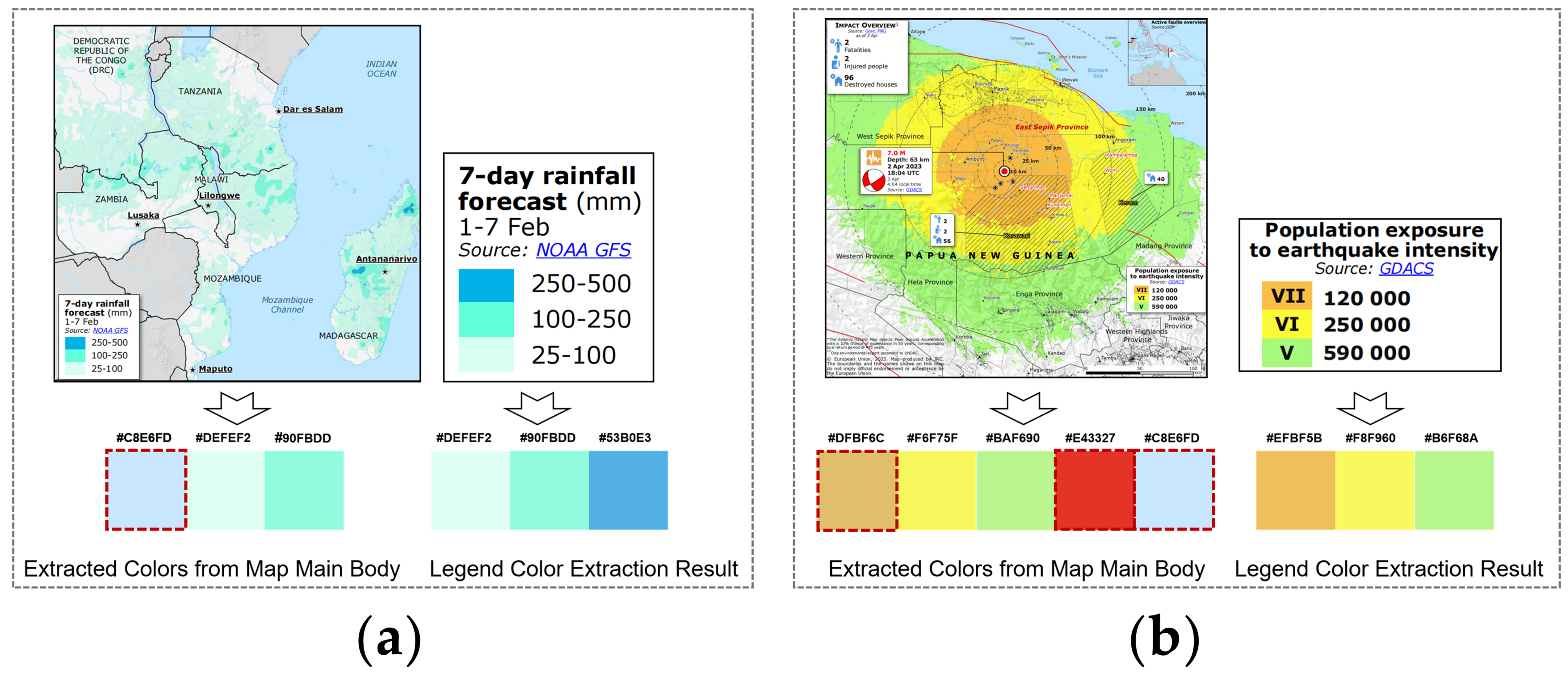
Figure 10 compares the color extraction results obtained from whole-map images and legend images. In the example shown in Figure 10a, the map background is a large body of water. When we perform color extraction directly on the full map, the algorithm incorrectly identifies the blue water area as a dominant thematic color. In contrast, the algorithm omits some actual disaster-related colors. In particular, the highest-risk class occupies only a limited spatial extent, leading whole-map extraction to ignore it despite representing the most critical information in emergency mapping contexts. In contrast, legend-based extraction accurately identifies the three core colors used in the “7-day rainfall forecast” map.
Figure 10.
Comparison of color-extraction results between whole-map and legend-based images. (a) Comparison of palette extraction results for a rainfall forecast map containing large background water-body regions. (b) Comparison of palette extraction results for an earthquake exposure map combining point symbols and choropleth representations. (the map [40] and legend shown in (a) and the map [41] and legend shown in (b) were adapted from ERCC, under the Creative Commons Attribution 4.0 International (CC BY 4.0) license.)
In the example shown in Figure 10b, the map combines multiple representation methods, including point symbols and choropleth layers. Direct extraction from the full map incorrectly incorporates the red epicenter symbols and blue water features into the thematic palette. In addition, interference from linear symbols yields extraction results inconsistent with the actual cartographic representation. By comparison, legend-based color extraction effectively avoids these disturbances and more accurately captures the true palette associated with the “Population exposure to earthquake intensity” indicator.
Overall, the results demonstrate that direct color extraction from complete map images is highly sensitive to non-thematic elements and complex map structures, particularly in maps with multiple thematic layers or sparse thematic symbols. In contrast, legend-based color extraction more accurately preserves the actual thematic palette characteristics of natural disaster maps. Therefore, this study adopts legend-region-based color extraction as the primary approach to improve the accuracy and robustness of thematic palette identification.
4.2. Color Palette Sharing and Differentiation in Natural Disaster Maps
Color palette selection in natural disaster thematic maps shows both shared usage patterns across indicators and variations within individual indicators. We define these two patterns as cross-indicator palette reuse (i.e., multiple indicators share the same palette) and indicator-level palette variability (i.e., a single indicator receives multiple palettes).
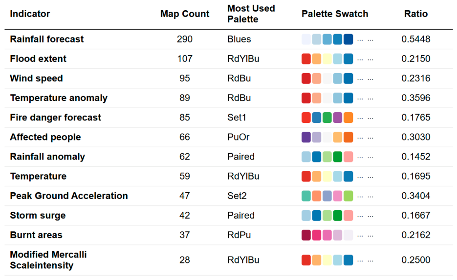
To quantify these patterns, this study analyzes thematic mapping indicators with more than 20 maps and summarizes the dominant palettes and their proportions, as shown in Figure 11. The results reveal that palette usage is based on both dominance and choices across different thematic contexts.
Figure 11.
Palette sharing and variability across thematic mapping indicators.
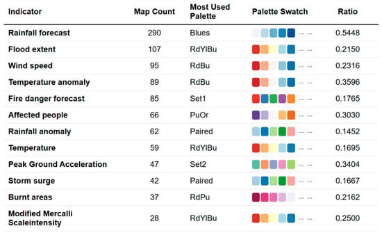
For cross-indicator palette reuse, several palettes consistently span across related thematic indicators. The Blues is dominant for Rainfall forecast (54.48%), indicating a strong preference for blue sequential palettes in precipitation-related representations. Similarly, RdBu is repeatedly used for indicators related to environmental variation, including Temperature anomaly (35.96%) and Wind speed (23.16%), suggesting that diverging palettes are commonly adopted for variables involving contrast and deviation.
Indicator-level palette variability is also evident. Although some indicators have a dominant palette choice, alternative selections remain present. For example, RdYlBu mainly represents Flood extent (21.50%), but its relatively small proportion suggests that multiple palettes serve the same thematic task. Similarly, Affected people show a preference for PuOr (30.30%), while other palette choices also exist. These patterns indicate that palette selection is influenced not only by thematic semantics but also by mapping context and cartographic design preferences.
Overall, the use of color palettes in natural disaster maps exhibits two coexisting patterns: cross-indicator palette reuse and indicator-level palette variability. This structure reflects the non-uniqueness of color encoding in disaster cartography and provides a foundational basis for constructing a semantically informed knowledge system for the color palette.
The palette sharing and differentiation patterns reported above derive from observed statistical associations. Although the proposed knowledge graph organizes disaster types, thematic mapping indicators, and palettes into a structured semantic network, it does not explicitly model hierarchical semantic relationships. The underlying disaster cartography domain, however, has an inherent multilevel structure, from broad hazard categories to specific disaster types, physical processes, and thematic indicators. HyperR3SNet [42] demonstrates that hyperbolic representation learning can effectively capture latent inter-class relationships in hierarchical remote sensing semantics, while Multi-relational Poincaré Graph Embeddings [43] show that hyperbolic embeddings are well-suited for representing hierarchical structures in multi-relational knowledge graphs. Incorporating such hierarchical representations into the current statistical knowledge graph to support cross-level semantic reasoning and palette recommendation represents a promising direction for future work.
4.3. Use of Emphasis Colors in Natural Disaster Maps
Color in natural disaster thematic maps serves not only to represent thematic information but also to highlight high-risk areas and critical warning information. Cartographers often introduce visually salient emphasis colors in addition to the base palette to improve visual attention and information readability. Therefore, emphasis colors serve a semantic role different from that of the base palette. While the base palette represents the overall thematic structure, emphasis colors highlight extreme values, warning levels, and critical hazard information.
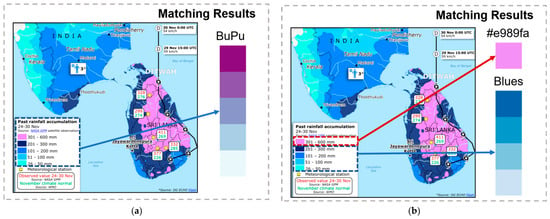
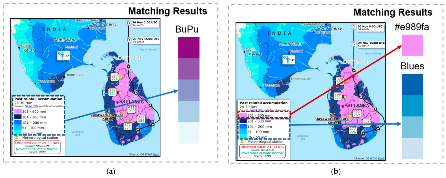
However, directly incorporating emphasis colors into palette matching may bias the representation of the underlying base palette. As shown in Figure 12, the pink color in a precipitation map is used only to emphasize extreme rainfall. Palette matching relies on the complete legend; the best match shifts toward BuPu. After separating the emphasis color from the dominant palette, the best match becomes Blues, which better represents the overall thematic color structure. This result indicates that emphasis colors should be treated as an independent semantic layer rather than as part of the base palette.
Figure 12.
Two-layer representation of base palettes and emphasis colors during palette matching. (a) Palette matching using the complete legend; (b) palette matching after separating emphasis colors from the dominant palette. (the map [44] shown in (a,b) was adapted from ERCC, under the Creative Commons Attribution 4.0 International (CC BY 4.0) license.)
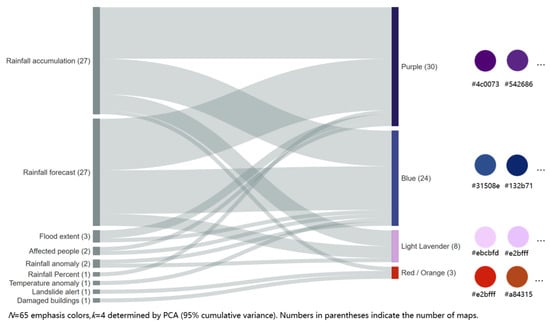
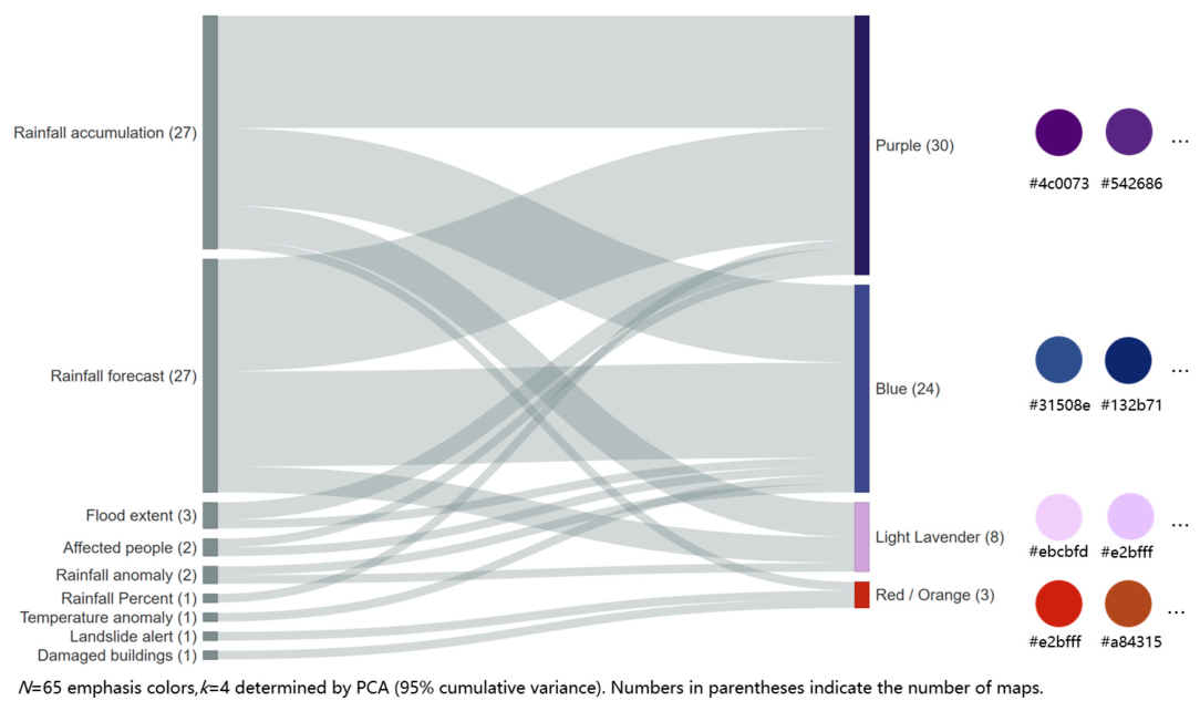
To further investigate their semantic role, we conducted an additional analysis of the confirmed emphasis colors. The confirmed emphasis colors were grouped into representative categories using PCA and hierarchical clustering. Figure 13 shows the relationships between thematic mapping indicators and the resulting emphasis-color categories. The data yielded four major emphasis-color groups: Purple, Blue, Light Lavender, and Red-Orange. Purple and Blue are mainly associated with rainfall-related indicators such as Rainfall accumulation and Rainfall forecast. In contrast, Red-Orange appears more frequently for high-risk indicators such as Landslide alert and Damaged buildings. These results suggest that emphasis colors also exhibit stable semantic preferences and provide complementary semantic information beyond the dominant ColorBrewer palette.
Figure 13.
Relationships between thematic mapping indicators and emphasis-color categories.
Overall, the base palette represents the dominant thematic color structure, whereas emphasis colors encode localized high-risk information. Together, they form a two-layer color representation that better reflects the visual design logic of natural-disaster thematic maps and enriches the semantic information available for subsequent knowledge-graph construction.
5. Conclusions
This study proposes a framework for palette analysis and knowledge organization for ERCC emergency mapping. Using publicly available ERCC emergency maps, we analyze disaster types, thematic mapping indicators, and color information from map legends to enable palette identification, matching, and statistical analysis. A palette knowledge graph further organizes the relationships among disaster types, thematic mapping indicators, and ColorBrewer palettes.
Methodologically, the proposed framework extracts colors from map legends rather than full maps, reducing interference from non-thematic elements such as backgrounds, annotations, and auxiliary symbols. To address the frequent use of local emphasis colors in ERCC emergency maps, we further propose a dominant-layer palette-matching strategy to enhance the robustness of palette matching.
The results reveal recurring patterns in palette usage across disaster themes. Blue sequential palettes are most frequently associated with precipitation- and hydrological-related indicators, whereas diverging palettes commonly represent anomaly-related variables. Warm, high-contrast palettes frequently appear in wildfire and high-risk scenarios. At the same time, Palette usage exhibits both shared and differentiated characteristics, with thematic semantics jointly influencing palette selection, data characteristics, visual cognition, and cartographic conventions rather than fixed one-to-one semantic rules.
The constructed knowledge graph provides a structured representation of relationships among disaster types, thematic mapping indicators, and palettes, supporting organized and efficient retrieval of palette knowledge.
Despite these contributions, several limitations remain. First, because the dataset is derived from a single institutional source, the identified palette patterns primarily reflect ERCC emergency mapping practices and require further validation with multi-source datasets. Second, although the proposed descriptor integrates RGB, HSV, and CIELab color spaces, this study relies on the ColorBrewer palette system and focuses primarily on choropleth maps and color variables; human visual perception experiments and emergency cognitive psychology are not explicitly incorporated. Third, legend-based color extraction may introduce uncertainties due to variations in legend layouts, graphical designs, and map presentation styles. Finally, the current knowledge graph mainly organizes observed relationships among disaster types, thematic mapping indicators, and palettes, rather than supporting dynamic semantic reasoning or automatic knowledge inference. In addition, the LLM component is used only for thematic indicator entity normalization and knowledge graph construction, without domain-specific fine-tuning, automatic palette generation, or a closed-loop framework that links semantic reasoning to palette optimization and map rendering evaluation.
Future work will incorporate multi-source datasets to validate the generalizability of palette patterns, improve automated legend understanding to reduce extraction uncertainties, introduce additional visual variables and perceptual evaluation, and develop adaptive knowledge graph mechanisms with domain-specific LLM fine-tuning to support semantic reasoning, automatic palette recommendation, and closed-loop optimization between palette adjustment and map rendering evaluation.
Author Contributions
Conceptualization, An Zhang and Weiyao Guo; methodology, Weiyao Guo; software, Weiyao Guo and Yi Cao; validation, An Zhang and Weiyao Guo; formal analysis, Weiyao Guo; investigation, Weiyao Guo and Yi Cao; data curation, Weiyao Guo; writing—original draft preparation, Weiyao Guo; writing—review and editing, An Zhang and Weiyao Guo; visualization, Weiyao Guo; supervision, An Zhang; project administration, An Zhang; funding acquisition, An Zhang. All authors have read and agreed to the published version of the manuscript.
Funding
This research was funded by the Chinese Academy of Sciences Strategic Priority Research Program (grant number XDB0740100).
Data Availability Statement
The disaster event map data used for model development and statistical analysis in this study were obtained from the Emergency Response Coordination Centre (ERCC) Portal, operated by the European Commission’s Joint Research Centre (JRC), available at https://erccportal.jrc.ec.europa.eu/ (accessed on 4 June 2026). All ERCC content is published under the Creative Commons Attribution 4.0 International (CC BY 4.0) license. Additional disaster map data used for external validation were obtained from the ReliefWeb platform (https://reliefweb.int/; accessed on 4 June 2026). The processed materials generated in this study, including map metadata, extracted legend information, color palette features, ColorBrewer matching results, statistical analysis results, and knowledge graph records, are available from the corresponding author upon reasonable request. The source code supporting data preprocessing, color extraction, palette analysis, and knowledge graph construction is also available from the corresponding author upon reasonable request.
Conflicts of Interest
The authors declare no conflicts of interest.
References
- Akter, S.; Wamba, S.F. Big Data and Disaster Management: A Systematic Review and Agenda for Future Research. Ann. Oper. Res. 2019, 283, 939–959. [Google Scholar] [CrossRef] [Scilit]
- Voigt, S.; Kemper, T.; Riedlinger, T.; Kiefl, R.; Scholte, K.; Mehl, H. Satellite Image Analysis for Disaster and Crisis-Management Support. IEEE Trans. Geosci. Remote Sens. 2007, 45, 1520–1528. [Google Scholar] [CrossRef] [Scilit]
- Voigt, S.; Giulio-Tonolo, F.; Lyons, J.; Kučera, J.; Jones, B.; Schneiderhan, T.; Platzeck, G.; Kaku, K.; Hazarika, M.K.; Czaran, L.; et al. Global Trends in Satellite-Based Emergency Mapping. Science 2016, 353, 247–252. [Google Scholar] [CrossRef] [Scilit] [PubMed]
- Ajmar, A.; Boccardo, P.; Disabato, F.; Giulio Tonolo, F. Rapid Mapping: Geomatics Role and Research Opportunities. Rend. Fis. Acc. Lincei 2015, 26, 63–73. [Google Scholar] [CrossRef] [Scilit]
- Tomaszewski, B.; Judex, M.; Szarzynski, J.; Radestock, C.; Wirkus, L. Geographic Information Systems for Disaster Response: A Review. J. Homel. Secur. Emerg. Manag. 2015, 12, 571–602. [Google Scholar] [CrossRef] [Scilit]
- Shafapourtehrany, M.; Batur, M.; Shabani, F.; Pradhan, B.; Kalantar, B.; Özener, H. A Comprehensive Review of Geospatial Technology Applications in Earthquake Preparedness, Emergency Management, and Damage Assessment. Remote Sens. 2023, 15, 1939. [Google Scholar] [CrossRef] [Scilit]
- Brewer, C.A. Color Use Guidelines for Mapping and Visualization. In Modern Cartography Series; Elsevier: Amsterdam, The Netherlands, 1994; Volume 2, pp. 123–147. [Google Scholar]
- Shive, J.; Francis, G. Choosing Colors for Map Display Icons Using Models of Visual Search. Hum. Factors 2013, 55, 373–396. [Google Scholar] [CrossRef] [Scilit] [PubMed]
- Juergens, C. Trustworthy COVID-19 Mapping: Geospatial Data Literacy Aspects of Choropleth Maps. KN J. Cartogr. Geogr. Inf. 2020, 70, 155–161. [Google Scholar] [CrossRef] [Scilit] [PubMed]
- Bertin, J. Graphische Semiologie: Diagramme, Netze, Karten; de Gruyter: Berlin, Germany, 1974. [Google Scholar]
- MacEachren, A.M. How Maps Work: Representation, Visualization, and Design; Guilford Press: New York, NY, USA, 1995. [Google Scholar]
- Zhou, L.; Hansen, C.D. A Survey of Colormaps in Visualization. IEEE Trans. Vis. Comput. Graph. 2016, 22, 2051–2069. [Google Scholar] [CrossRef] [Scilit] [PubMed]
- Armstrong, M.P.; Xiao, N.; Bennett, D.A. Using Genetic Algorithms to Create Multicriteria Class Intervals for Choropleth Maps. Ann. Assoc. Am. Geogr. 2003, 93, 595–623. [Google Scholar] [CrossRef] [Scilit]
- Brewer, C.A.; Hatchard, G.W.; Harrower, M.A. ColorBrewer in Print: A Catalog of Color Schemes for Maps. Cartogr. Geogr. Inf. Sci. 2003, 30, 5–32. [Google Scholar] [CrossRef] [Scilit]
- Brewer, C.A. A Transition in Improving Maps: The ColorBrewer Example. Cartogr. Geogr. Inf. Sci. 2003, 30, 159–162. [Google Scholar] [CrossRef] [Scilit]
- Huang, W.; Harrie, L. Towards Knowledge-Based Geovisualisation Using Semantic Web Technologies: A Knowledge Representation Approach Coupling Ontologies and Rules. Int. J. Digit. Earth. 2020, 13, 976–997. [Google Scholar] [CrossRef] [Scilit]
- Ma, X. Knowledge Graph Construction and Application in Geosciences: A Review. Comput. Geosci. 2022, 161, 105082. [Google Scholar] [CrossRef] [Scilit]
- Li, Z.; Xu, Z.; Shen, L.; Li, J.; Lan, T.; Wang, J.; Zhao, T.; Ai, T.; Ti, P.; Liu, W.; et al. Autonomous Situatedness Map Representation: A Theoretical Discussion on Intelligent Cartography in the Era of Large Models. Acta Geod. Cartogr. Sin. 2024, 53, 2043–2052. [Google Scholar] [CrossRef]
- Su, F.; Yan, F.; Wu, W.; Fu, D.; Cao, Y.; Lyne, V.; Meadows, M.; Yao, L.; Wang, J.; Huang, Y.; et al. Advancing Intelligent Geography: Current Status, Innovations, and Future Prospects. Geogr. Sustain. 2025, 6, 100375. [Google Scholar] [CrossRef] [Scilit]
- Kang, Y.; Gao, S.; Roth, R.E. Artificial Intelligence Studies in Cartography: A Review and Synthesis of Methods, Applications, and Ethics. Cartogr. Geogr. Inf. Sci. 2024, 51, 599–630. [Google Scholar] [CrossRef] [Scilit]
- Hoarau, C.; Christophe, S. Cartographic Continuum Rendering Based on Color and Texture Interpolation to Enhance Photo-Realism Perception. ISPRS J. Photogramm. Remote Sens. 2017, 127, 27–38. [Google Scholar] [CrossRef] [Scilit]
- Christophe, S.; Mermet, S.; Laurent, M.; Touya, G. Neural Map Style Transfer Exploration with GANs. Int. J. Cartogr. 2022, 8, 18–36. [Google Scholar] [CrossRef] [Scilit]
- Wu, M.; Sun, Y.; Li, Y. Adaptive Transfer of Color from Images to Maps and Visualizations. Cartogr. Geogr. Inf. Sci. 2022, 49, 289–312. [Google Scholar] [CrossRef] [Scilit]
- Zhang, Y.; Zhang, W.; Zeng, Z.; Jiang, K.; Li, J.; Min, W.; Luo, W.; Guan, Q.; Lin, J.; Yu, W. MapReader: A Framework for Learning a Visual Language Model for Map Analysis. Int. J. Geogr. Inf. Sci. 2025, 39, 1973–2008. [Google Scholar] [CrossRef] [Scilit]
- Zhang, Y.; He, Z.; Li, J.; Lin, J.; Guan, Q.; Yu, W. MapGPT: An Autonomous Framework for Mapping by Integrating Large Language Model and Cartographic Tools. Cartogr. Geogr. Inf. Sci. 2024, 51, 717–743. [Google Scholar] [CrossRef] [Scilit]
- Wang, C.; Kang, Y.; Gong, Z.; Zhao, P.; Feng, Y.; Zhang, W.; Li, G. CartoAgent: A Multimodal Large Language Model-Powered Multi-Agent Cartographic Framework for Map Style Transfer and Evaluation. Int. J. Geogr. Inf. Sci. 2025, 39, 1904–1937. [Google Scholar] [CrossRef] [Scilit]
- Vázquez, P.-P. Are LLMs Ready for Visualization? In Proceedings of the 2024 IEEE 17th Pacific Visualization Conference (PacificVis), Tokyo, Japan, 23–26 April 2024; pp. 343–352. [Google Scholar]
- Zhao, W.X.; Zhou, K.; Li, J.; Tang, T.; Dong, Z.; Hou, Y.; Zhang, B.; Min, Y.; Zhang, J.; Liu, P.; et al. A Survey of Large Language Models. Front. Comput. Sci. 2026, 20, 2012627. [Google Scholar] [CrossRef] [Scilit]
- Yang, N.; Wang, Y.; Wu, F.; Wei, Z. MapColorAI: Designing Contextually Relevant Choropleth Map Color Schemes Using a Large Language Model. Cartogr. Geogr. Inf. Sci. 2025, 53, 479–497. [Google Scholar] [CrossRef] [Scilit]
- Shi, C.; Cui, W.; Liu, C.; Zheng, C.; Zhang, H.; Luo, Q.; Ma, X. NL2Color: Refining Color Palettes for Charts with Natural Language. IEEE Trans. Vis. Comput. Graph. 2023, 30, 814–824. [Google Scholar] [CrossRef] [Scilit] [PubMed]
- Tao, R.; Xu, J. Mapping with ChatGPT. ISPRS Int. J. Geo-Inf. 2023, 12, 284. [Google Scholar] [CrossRef] [Scilit]
- Huang, L.; Yu, W.; Ma, W.; Zhong, W.; Feng, Z.; Wang, H.; Chen, Q.; Peng, W.; Feng, X.; Qin, B.; et al. A Survey on Hallucination in Large Language Models: Principles, Taxonomy, Challenges, and Open Questions. ACM Trans. Inf. Syst. 2025, 43, 1–55. [Google Scholar] [CrossRef] [Scilit]
- Emergency Response Coordination Centre (ERCC)—DG ECHO Daily Map. Available online: https://erccportal.jrc.ec.europa.eu/API/ERCC/Maps/DownloadPublicMap?contentItemID=4197&fileN=MainFile&forceDownload=False&ext=.pdf (accessed on 8 May 2026).
- Haishoku: Python Library for Extracting Dominant Colors from Images. Available online: https://github.com/GinLance/haishoku (accessed on 4 June 2026).
- ISO/CIE 11664-6:2022; Colorimetry—Part 6: CIEDE2000 colour-difference formula. International Organization for Standardization: Geneva, Switzerland, 2022.
- Kuhn, H.W. The Hungarian Method for the Assignment Problem. Nav. Res. Logist. Q. 1955, 2, 83–97. [Google Scholar] [CrossRef] [Scilit]
- Rubner, Y.; Tomasi, C.; Guibas, L.J. The Earth Mover’s Distance as a Metric for Image Retrieval. Int. J. Comput. Vis. 2000, 40, 99–121. [Google Scholar] [CrossRef] [Scilit]
- Harrower, M.; Brewer, C.A. ColorBrewer.Org: An Online Tool for Selecting Colour Schemes for Maps. In The Map Reader; Dodge, M., Kitchin, R., Perkins, C., Eds.; John Wiley & Sons: Chichester, UK, 2011; pp. 261–268. [Google Scholar]
- Emergency Response Coordination Centre (ERCC)—DG ECHO Daily Map. Available online: https://erccportal.jrc.ec.europa.eu/API/ERCC/Maps/DownloadPublicMap?contentItemID=4804&fileN=MainFile&forceDownload=False&ext=.pdf (accessed on 8 May 2026).
- Emergency Response Coordination Centre (ERCC)—DG ECHO Daily Map. Available online: https://erccportal.jrc.ec.europa.eu/API/ERCC/Maps/DownloadPublicMap?contentItemID=4776&fileN=MainFile&forceDownload=False&ext=.pdf (accessed on 8 May 2026).
- Emergency Response Coordination Centre (ERCC)—DG ECHO Daily Map. Available online: https://erccportal.jrc.ec.europa.eu/API/ERCC/Maps/DownloadPublicMap?contentItemID=4457&fileN=MainFile&forceDownload=False&ext=.pdf (accessed on 8 May 2026).
- Fu, J.; Wang, C.; Liu, M.; Li, X.; Liu, Y.; Shi, W.; Wang, R. HyperR3SNet: Leveraging Hyperbolic Space and Vision Foundation Models for Remote Sensing Semantic Segmentation. IEEE Trans. Geosci. Remote Sens. 2026, 64, 5620016. [Google Scholar] [CrossRef] [Scilit]
- Balazevic, I.; Allen, C.; Hospedales, T. Multi-Relational Poincaré Graph Embeddings. In Advances in Neural Information Processing Systems; Curran Associates, Inc.: Red Hook, NY, USA, 2019; Volume 32. [Google Scholar]
- Emergency Response Coordination Centre (ERCC)—DG ECHO Daily Map. Available online: https://erccportal.jrc.ec.europa.eu/API/ERCC/Maps/DownloadPublicMap?contentItemID=5521&fileN=MainFile&forceDownload=False&ext=.pdf (accessed on 8 May 2026).

Disclaimer/Publisher’s Note: The statements, opinions and data contained in all publications are solely those of the individual author(s) and contributor(s) and not of MDPI and/or the editor(s). MDPI and/or the editor(s) disclaim responsibility for any injury to people or property resulting from any ideas, methods, instructions or products referred to in the content. |
© 2026 by the authors. Published by MDPI on behalf of the International Society for Photogrammetry and Remote Sensing. Licensee MDPI, Basel, Switzerland. This article is an open access article distributed under the terms and conditions of the Creative Commons Attribution (CC BY) license.