


Abstract
Visual analysis provides a powerful approach for exploring multidimensional spatiotemporal data, yet it faces significant challenges in simultaneously representing temporal and spatial attributes. A key limitation is the difficulty of visually encoding temporal sequences within geospatial graphics, which often leads to the separate treatment of spatial and temporal visualization methods. To address this issue, we propose an integrated approach that embeds map views into parallel coordinates plots, uses parallel axes to represent temporal sequences, and encodes multidimensional attributes through color channels. This design enables holistic visual analysis of multidimensional spatiotemporal datasets within a single visualization. We evaluated our method through user studies involving datasets from two distinct domains. Results demonstrate that the proposed approach exhibits strong generality and effectively mitigates the limitations associated with separated visualizations of spatial and temporal attributes.
1. Introduction
Advances in Earth observation techniques, the Internet of Things, sensor networks, wearable technology, and continuous social media monitoring systems have significantly enhanced our capacity to collect highly complex spatiotemporal data. These technologies have generated extensive, detailed, and diverse records of both human activities and natural phenomena. They provide a solid and reliable data foundation for discovering and analyzing social processes and trends across both natural and human systems.
Data that incorporate temporal, geospatial, and general attributes are termed spatiotemporal data [1]. Such data possess a complex structure and carry substantial information, particularly reflected in their multidimensional attributes and relational diversity, for example, population, climate, economic activity, and transportation data. In the current era of growing globalization and digital transformation, the scientific and social phenomena that need to be interpreted are becoming increasingly complex. Analyzing and understanding multidimensional spatiotemporal data present significant challenges, as they require the integration of multiple dimensions, including economic, environmental, biological, ecological, social, etc. [2,3], as well as the exploration of interrelationships and spatiotemporal dependencies among these factors.
Visual analysis methods are particularly well-suited to extracting patterns from multidimensional spatiotemporal data for the following reasons:
- Multidimensional spatiotemporal data are characterized by their spatiotemporal attribute distributions, diverse feature representations, and complex relational structures. Conventional analytical methods are often ineffective in exploring the underlying spatiotemporal patterns and correlations and are even less suited to supporting interactive exploration or browsing. Visual analysis provides critical support for understanding, analyzing, and decision-making based on such data by enabling rapid and intuitive exploration. It assists analysts in identifying meaningful patterns and actionable knowledge within complex datasets, making it one of the most effective tools for spatiotemporal data mining. As a result, visual analysis has garnered widespread scholarly attention globally.
- Visual analysis methods facilitate data comprehension even for users without prior expertise in visual analytics or domain-specific knowledge. These methods reduce dependence on pre-existing spatial knowledge or geographic information analysis experience, making spatiotemporal insights more accessible. Consequently, visual analytics offers a universal approach suitable for multidimensional spatiotemporal data across a wide range of disciplines.
- Visual analysis leverages graphical representations and interactive human–computer techniques to facilitate the interpretation and processing of multidimensional spatiotemporal data. By integrating methodologies from data mining, machine learning, modeling, artificial intelligence, and visualization, it enables analysts to thoroughly, efficiently, and intuitively explore hidden objects, processes, events, and features, such as multidimensionality, spatiotemporal dynamics, and complex correlations. This integrated approach supports researchers in extracting meaningful information and gaining insights, thereby supporting decision-making and enhancing cognitive processes [4].
Inspired by the MPCP [5] and ST-Vis [6] methods, we propose spatiotemporal visualization in parallel coordinates plots (STPCP), a visual analytics approach for multidimensional spatiotemporal data that integrates the mathematical rigor of parallel coordinates plots with the cartographic strength of maps. Parallel coordinates plots offer a well-established foundation for visualizing diverse data types, including numerical, sequential, and categorical attributes, while maps remain the most effective medium for representing spatial information. STPCP enables simultaneous representation of temporal and spatial attributes within a unified visual framework: time series are encoded using parallel axes, spatial distributions are rendered using embedded maps, and the two views are seamlessly connected via polylines. These polylines are color-encoded to convey multidimensional attributes, ensuring visual continuity and avoiding context switching or disruptive comparisons. The design adheres to the principles of interactive information visualization and is complemented by intuitive interaction techniques, supporting the holistic exploration and user-friendly analysis of complex spatiotemporal datasets.
This paper begins by presenting the background and motivation underlying the STPCP design. Section 2 reviews relevant literature and identifies limitations of existing methods. The design principles and main features of STPCP are introduced in Section 3. Section 4 provides case studies, comparative analyses, and open-field trials that demonstrate the value of STPCP in visual analysis of multidimensional spatiotemporal datasets. Evaluation results are detailed in Section 5, while Section 6 discusses the limitations of the method. The paper concludes with a summary of findings and contributions in Section 7.
2. Related Works
Multidimensional spatiotemporal data, characterized by abundant spatial and temporal references and fine-grained attributes, offer great potential for extracting insights applicable to diverse real-world problems. To leverage this potential, a variety of visualization techniques have been developed. For example, Gruendl et al. enhanced parallel coordinates plots (PCPs) to represent timestamps, revealing relationships between time and multidimensional attributes [7]. It is common to visualize such data using multiple coordinated views—such as maps combined with PCPs, scatter plots, or timelines—to simultaneously represent geospatial, temporal, and general attribute information. However, multiview systems can introduce inconsistencies when the same attribute is encoded differently across views or when distinct attributes share similar visual encoding, often challenging the user’s ability to maintain visual–analytical coherence [8].
A central challenge in spatiotemporal visualization is the holistic integration of spatial and temporal dimensions. Common techniques include animated maps or small multiples to represent successive time steps. For instance, Liu et al. used multihued filled maps to visualize spatiotemporal distributions [9], while Encálada-Malca et al. dynamically explored PM10 concentrations in Lima using time-slider-enhanced graphs [10]. Similarly, Syetiawan et al. and O’Driscoll et al. used sequential maps to track, respectively, COVID-19 spread in Jakarta [11] and demographic changes in Ireland over 30 years [12]. Nevertheless, animation-based or discrete-time methods often impede direct comparison across temporal stages, as users must mentally retain spatial patterns from prior frames. Furthermore, visual clutter and overplotting frequently arise when representing dense or overlapping phenomena, complicating the interpretation of multidimensional relationships.
To reveal latent spatiotemporal patterns, recent work has progressed from static 2D maps to interactive 3D representations—such as spatiotemporal cubes and hybrid visual environments. Zhang et al. presented an interactive 4D visualization framework based on virtual spheres for animating hydrometeorological datasets [13]. Blaas et al. integrated PCP with 3D maps to analyze storm event datasets [14], and Tominski et al. visualized traffic trajectories using hybrid 2D/3D spatializations [15]. Du et al. introduced interactive tools operating in a 3D space (two spatial dimensions plus time) to support visual clustering in large-scale spatiotemporal data [16]. While these advances enable richer interaction, they often remain domain-specific, tailored to applications such as crime analysis, epidemic tracking, or environmental monitoring, and lack generalizability across diverse data contexts.
The review above highlights persistent challenges in spatiotemporal visual analytics: multiview systems frequently induce visual confusion and cognitive load through context switching; animation-driven techniques struggle to support temporal comparison over long series; and many methods are tailored to specific domains, limiting their broader applicability. To address these limitations cohesively, we introduce the spatiotemporal parallel coordinates plot (STPCP) framework. Its core design is a direct response to the identified gaps:
Reducing Visual Confusion and Context Switching: Unlike multiview layouts that require cognitive integration across separate displays, STPCP provides a unified, integrated visualization. Color-coded polylines seamlessly connect geographic maps with parallel coordinates plots, creating a continuous visual flow that minimizes the mental effort of cross-view linking and mitigates the visual confusion typical of loosely coordinated systems.
Enhancing Temporal Comparison: STPCP avoids reliance on animation for temporal analysis. Instead, time is encoded as a dedicated axis within the PCP, enabling users to perceive and compare trends, patterns, and anomalies across the entire temporal span in a static, simultaneous manner. This effectively addresses the “out of sight, out of mind” problem inherent in animated representations.
Promoting Generalizability: The framework is built on generic components—maps for spatial context and PCPs for multivariate attributes. This makes STPCP adaptable across numerous domains, such as meteorology, mobility analysis, and social media studies, where tracking multivariate attributes of spatial entities over time is essential, thereby transcending the narrow focus of domain-specific solutions.
3. Spatiotemporal Visual Analysis in Parallel Coordinates Plots
3.1. Multichannel Visual Analytics
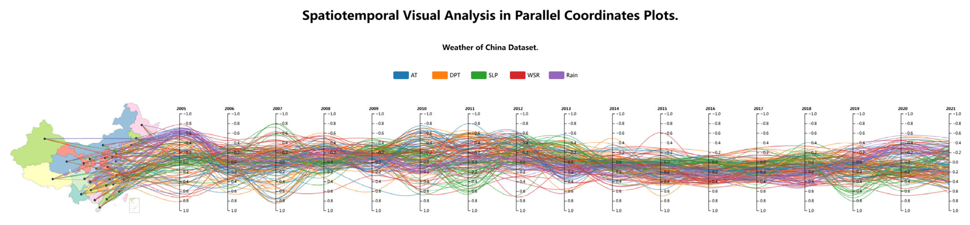
The STPCP method integrates cartographic and temporal visualizations within a unified framework: maps encode spatial information, while parallel coordinate axes represent temporal sequences. These components are connected by polylines that correspond to multidimensional attributes and are visually distinguished by color encoding. This design achieves synchronous visualization of temporal, spatial, and multidimensional data within a single, coherent view, avoiding visual fragmentation and enabling truly integrated spatiotemporal analysis. Using continuous polylines allows analysts to trace attribute evolution seamlessly across space and time. Beginning with the semantic meaning of a multidimensional attribute, the uninterrupted polyline guides the analyst’s traversal through spatial and temporal dimensions without disruptive context switches. This flow effectively conveys the dynamic variation in attributes over time and space, linking all information elements into a continuous narrative of spatiotemporal change, as shown in Figure 1.
Figure 1.
Architectural overview of the STPCP method.
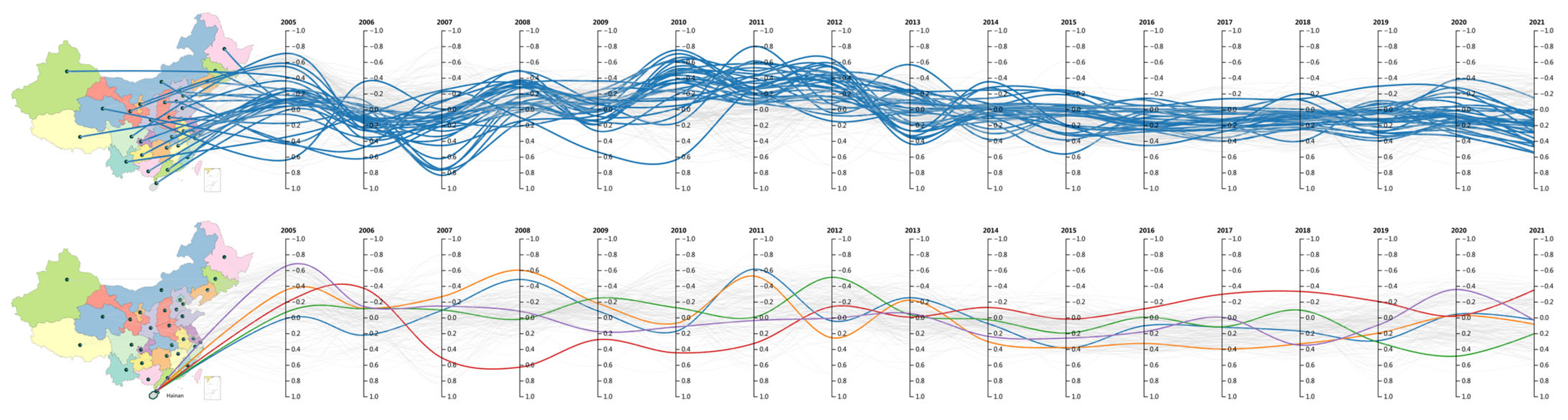
The STPCP method incorporates essential highlighting interactions to support effective visual analysis of multidimensional attributes. An attribute-based highlighting mechanism is implemented for polylines; when the user hovers over a specific polyline, all attributes associated with that line are emphasized, while other polylines are dimmed by adjusting their transparency. This reduces visual clutter and helps reveal meaningful spatiotemporal trends. Another highlighting technique is also applied to the map view. When hovering over a geographic area, the region is highlighted with a bold outline. Simultaneously, all polylines linked to that location are accentuated, while those connected to other areas are subdued. This dual interactive emphasis—on both attributes and spatial regions—ensures coherent context awareness during exploration, as illustrated in Figure 2.
Figure 2.
Bidirectional Linking between Attribute Classification and Geographic Space in STPCP.
3.2. Supporting Detailed Visual Analysis
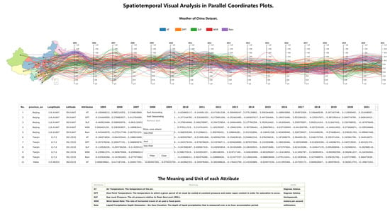
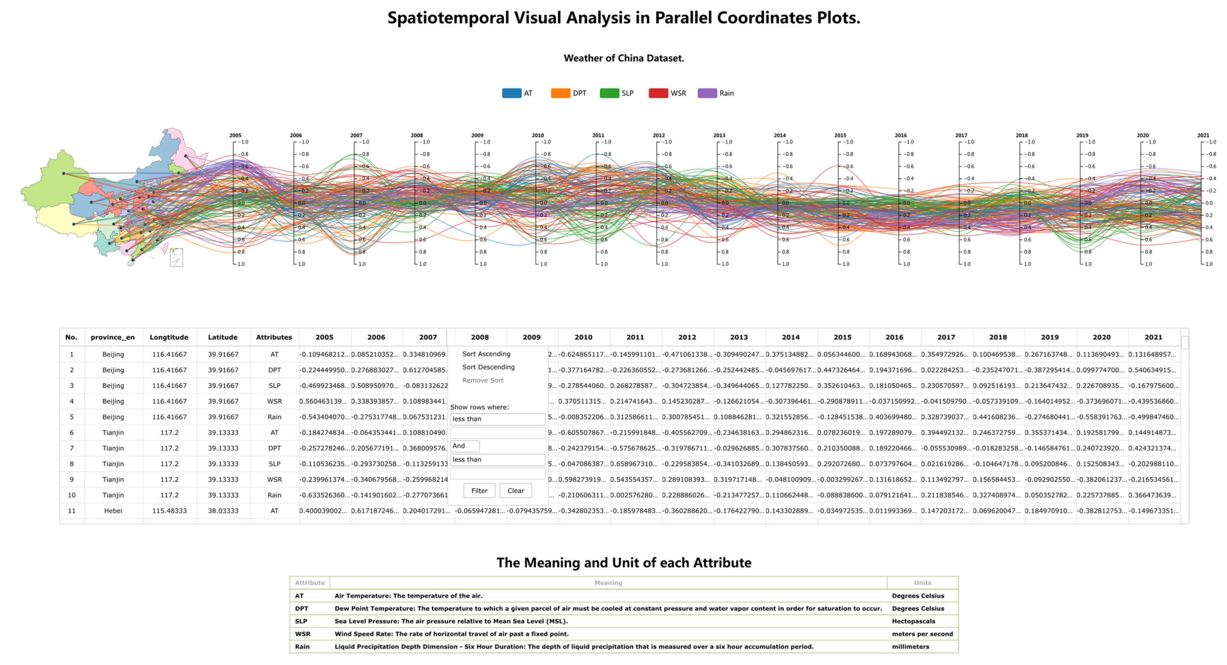
The STPCP method supplements visualization with a data table to display detailed records of multidimensional spatiotemporal data, presenting sorted, normalized raw data in tabular form. The table incorporates an interactive highlighting feature linked to the main STPCP view: when the user hovers over a row, the corresponding polyline is emphasized using a bold stroke, enabling analysts to inspect full data details within context. The STPCP analysis workflow leverages the jQWidgets [17] (version 14.0.0, provided by jQWidgets, Sofia, Bulgaria) Grid component for data tabulation, utilizing its built-in filtering and sorting capabilities to facilitate interactive exploration. Since attribute names in the STPCP view are displayed in abbreviated form, an explanatory legend is added at the bottom of the table to describe the meaning and units of each attribute, as shown in Figure 3.
Figure 3.
A supplementary analytical component of the STPCP method.
3.3. Polyline Color Encoding Semantics
The core visual metaphor of STPCP is the color-encoded polylines, which connect geographic locations on the map with their multiple timelines in the PCP. It is essential to clarify the semantics of both the polyline’s path and its color.
The Polyline Path: The trajectory of a colored polyline across the map and parallel coordinate timelines axes visually encodes the complete set of numerical values of a spatiotemporal entity.
The Polyline Color: The color of the polyline is a static visual channel. It is assigned based on one of the multidimensional attributes, such as temperature, air pressure, gross regional domestic product, rainfall, etc. This color remains consistent for the same entity across all views and throughout the interaction. Its primary purpose is to provide a persistent visual label, enabling users to achieve the following:
- Track and identify the same group of entities, for example, the resident population at year-end of each province in China, as they visually connect the map and the PCP timeline;
- Perceive patterns and outliers belonging to specific attributes within the dense polylines plot.
For example, in our case study, all polylines representing air temperature are encoded in blue, those representing dew point temperature are encoded in orange, and so on. This allows analysts to immediately see, for example, whether the outline of the blue line is abnormal compared with those of other colored lines.
This design is distinct from using colors to dynamically represent the value of a multidimensional attributes, which would be a different visual encoding strategy.
4. Evaluation
4.1. Case Studies
4.1.1. Visual Analysis of Basic Conditions of China Dataset with STPCP
A country’s basic conditions are crucial for understanding its productivity, living standards, and overall development. These indicators help capture the economic, social, educational, medical, and other foundational aspects. For nation’s researchers and policymakers, trends over time and developmental patterns are essential in assessing national production levels, urban evolution, and changes in comprehensive national strength.
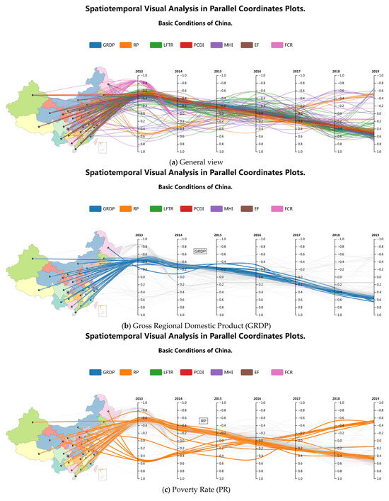
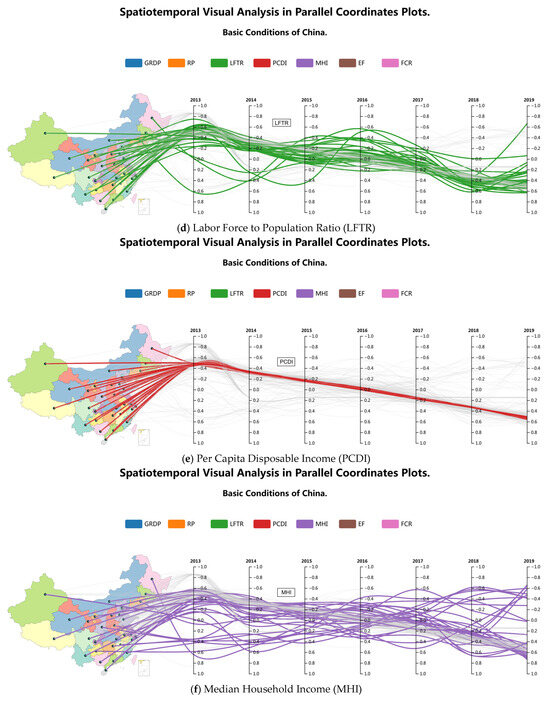
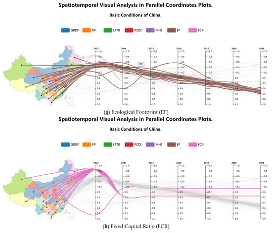
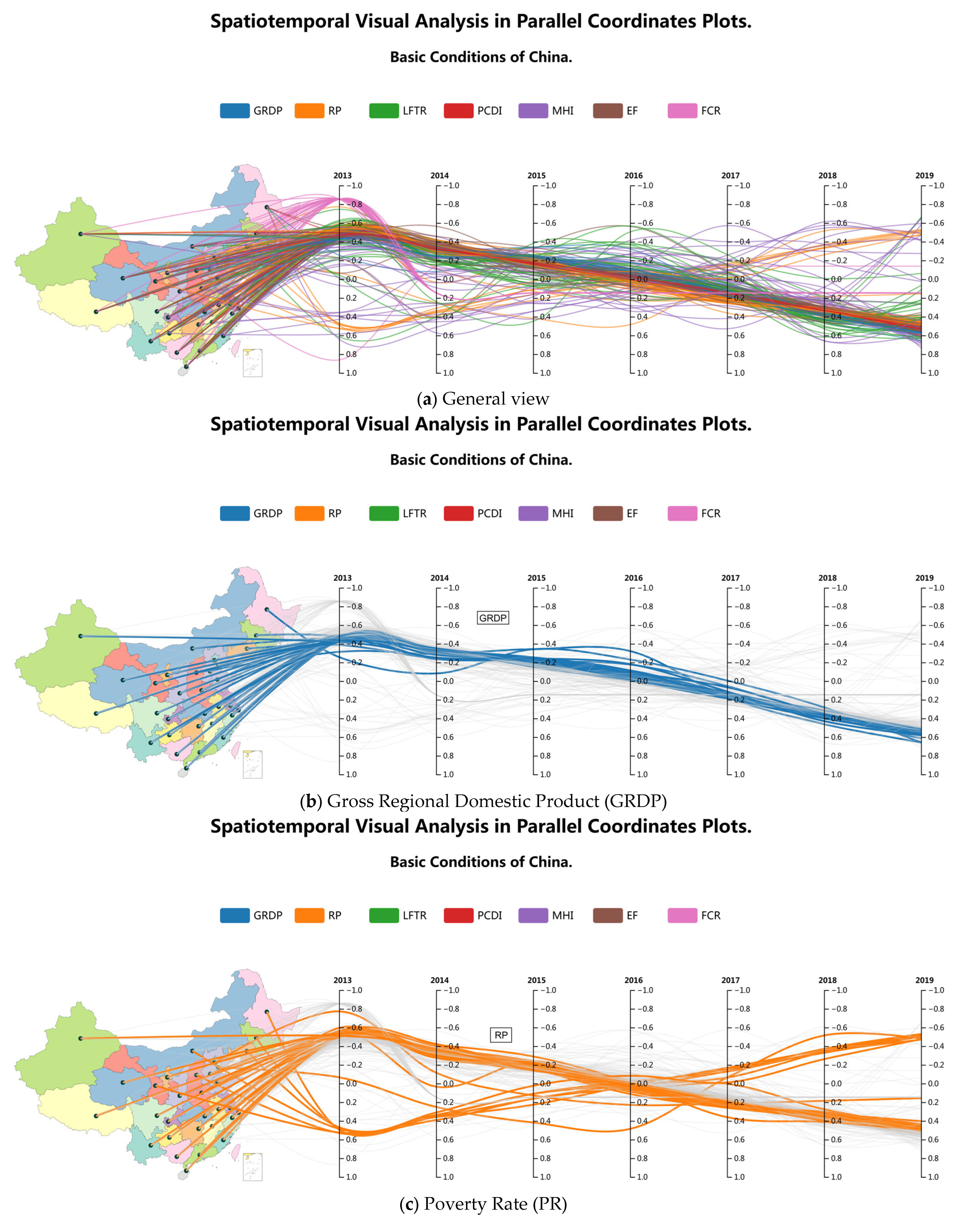
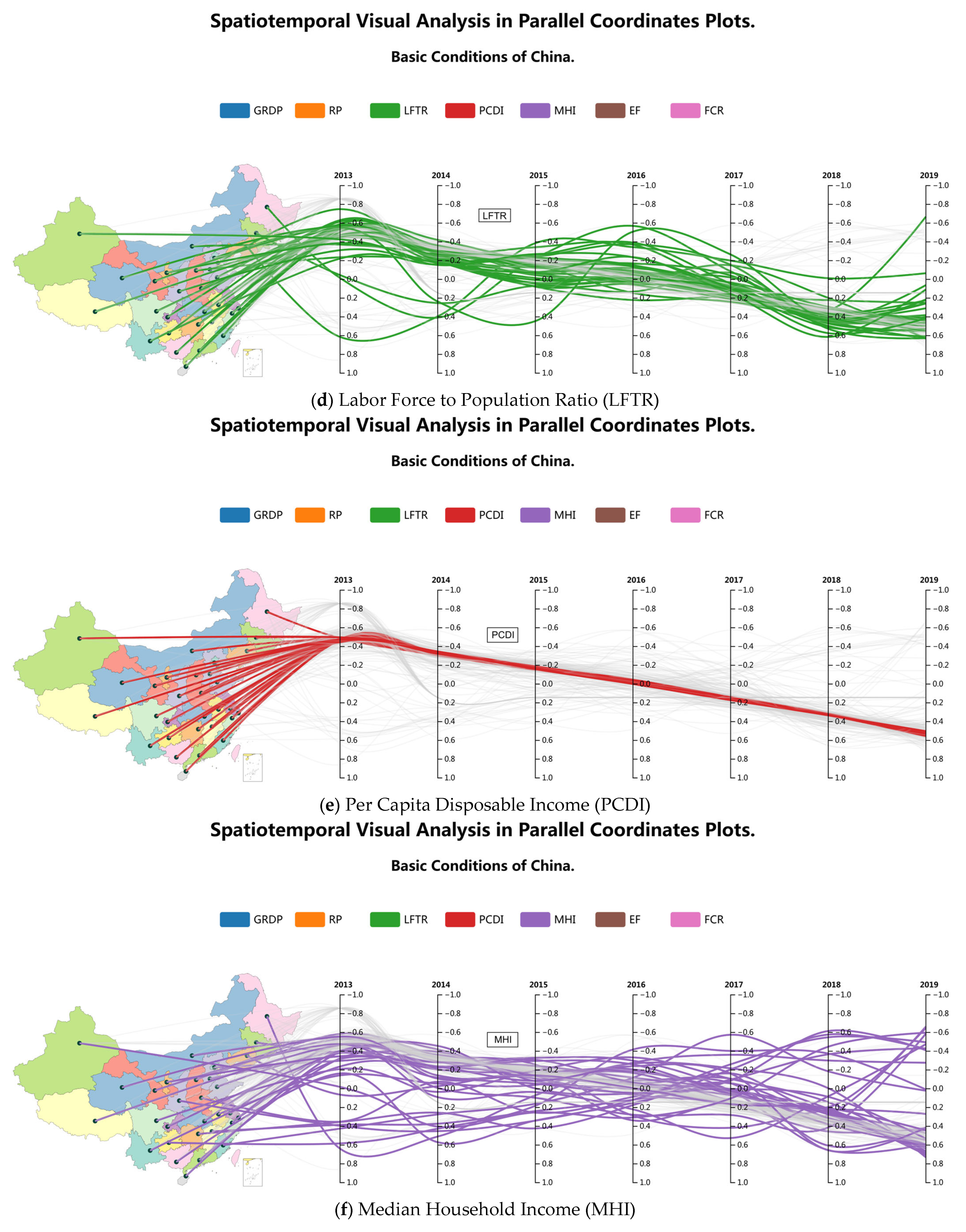
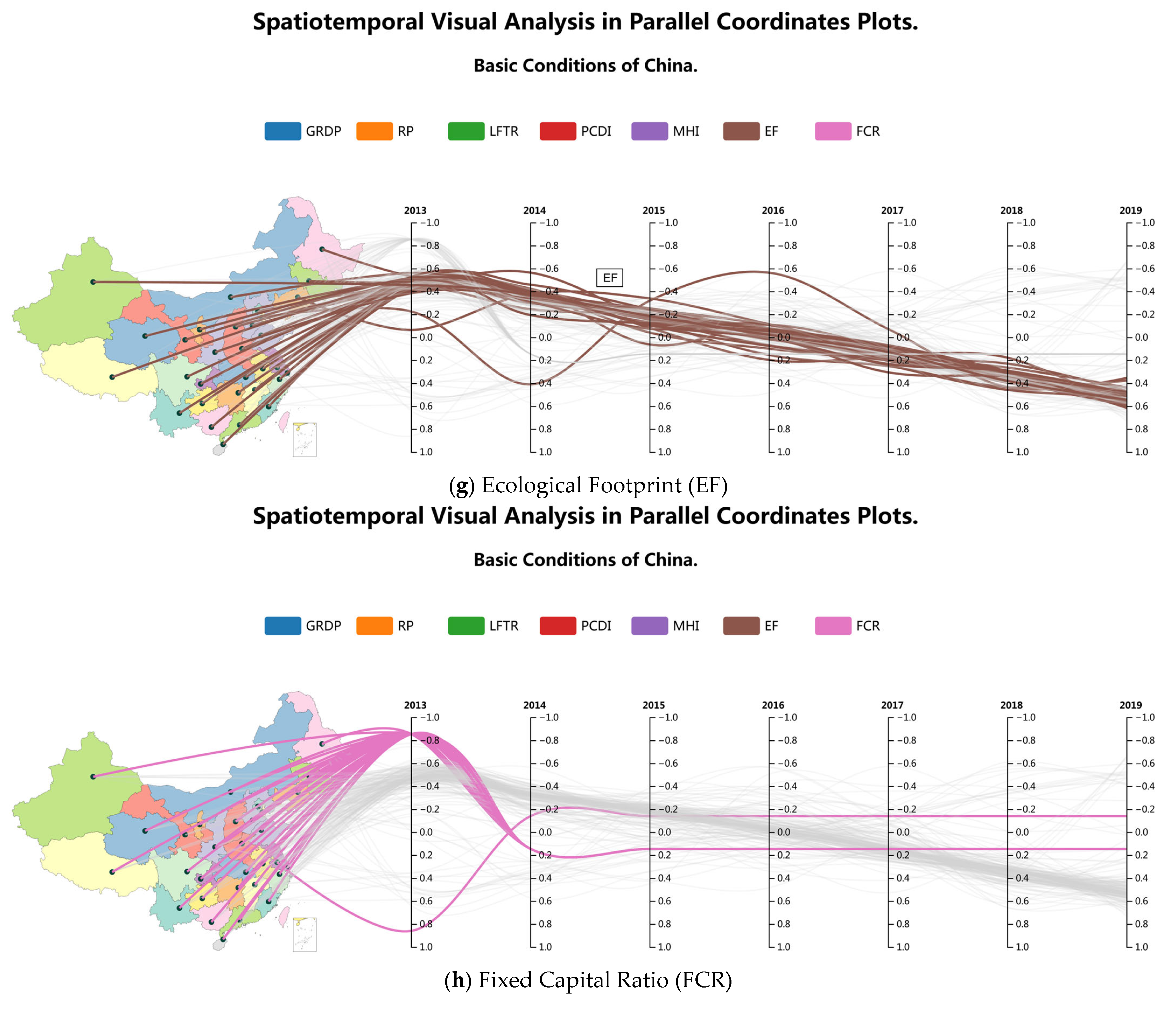
Figure 4a demonstrates the application of the STPCP method to visualize a multidimensional spatiotemporal dataset reflecting China’s basic conditions. We first employed attribute-based highlighting to examine the temporal evolution and spatial distribution of geospatial features and seven multidimensional general attributes.
Figure 4.
Case study: Multidimensional spatiotemporal analysis using STPCP. Individual panels demonstrate the interactive highlighting of distinct attributes within the integrated view.
As shown in Figure 4b,e,g, the gross regional product, per capita disposable income, and education expenditure increased year by year across most provinces. Figure 4c reveals that although the population grew annually in most provinces, it declined consistently in the three northeastern provinces (Liaoning, Jilin, Heilongjiang) and in Inner Mongolia, Shaanxi, and Gansu. Figure 4d indicates that local fiscal revenue generally rose across provinces, though one province experienced a sharp drop in 2019. Because of inherent visual clutter in the parallel coordinates plots, where overlapping polylines cause occlusion, the specific province corresponding to the declining trend could not be directly identified from the plot alone. To address this ambiguity, we used the interactive data table for precise tracing. By sorting the attribute column and triggering hover-based highlighting, we identified the descending polyline as belonging to Jilin Province. Similarly, as illustrated in Figure 4h, with table-supported interaction, we detected that forest cover decreased only in Jiangsu Province, while it increased in all other regions. Figure 4f reflects dynamic changes in medical and healthcare conditions across provinces over time. Additionally, by highlighting individual attributes, the parallel axes allow clear tracking of their spatial distribution in each year.
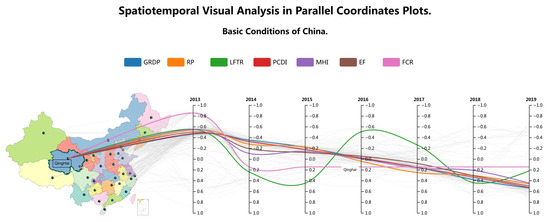
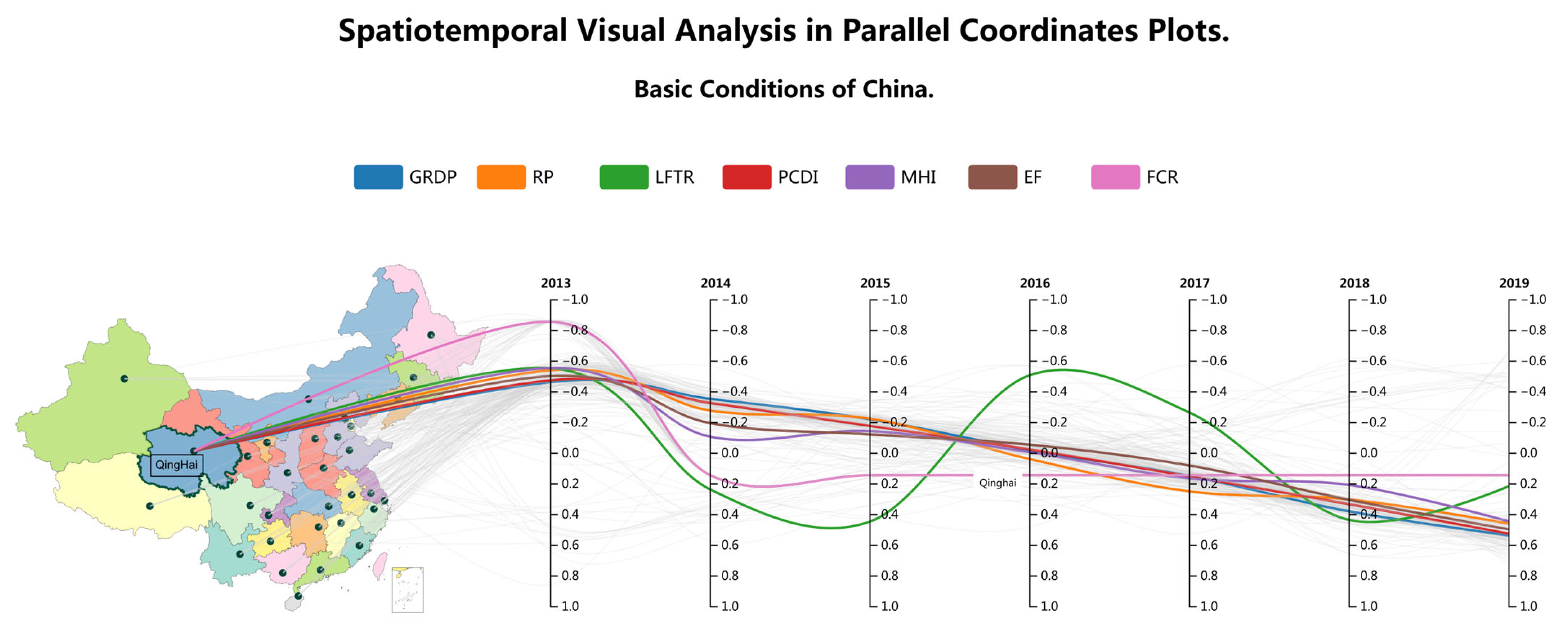
Subsequently, we applied the geospatial highlighting interaction to analyze attribute evolution in Qinghai Province, as depicted in Figure 5. The visualization revealed a sharp decline in local fiscal revenue during 2016. Notably, no significant correlation was observed among the various attributes during this period.
Figure 5.
Geographical and socioeconomic profile of Qinghai Province.
In summary, STPCP effectively communicates long-term trends in multidimensional attributes, identifying patterns of growth, decline, or stagnation. The parallel axes enable seamless observation of temporal progression across multiple time nodes without disruptive view transitions, making them ideal for multivariate time-series visualization. This innovative design integrates temporal and spatial attributes within a unified view using polyline-connected maps, leveraging cartographic strengths while conveying granular temporal details. The method provides an interpretable, holistic perspective on multidimensional spatiotemporal data. Live demonstrations of the STPCP framework are available online. The interactive demonstration visualizing China’s basic conditions using STPCP is available at http://124.71.229.165/stpcp/page1.html. Another interactive demonstration visualizing the Weather of China dataset using STPCP is available at http://124.71.229.165/stpcp/page2.html.
To support verification and further exploration, Supplementary Materials have been provided. These include a video demonstration of the STPCP framework in operation and high-definition renderings of its key visualizations (Figure 1, Figure 2, Figure 3, Figure 4 and Figure 5). All resources are hosted publicly on the Zenodo repository (DOI: 10.5281/zenodo. 17993833).
4.1.2. Comparison with Other Approaches
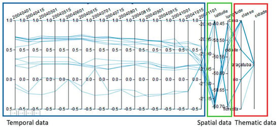
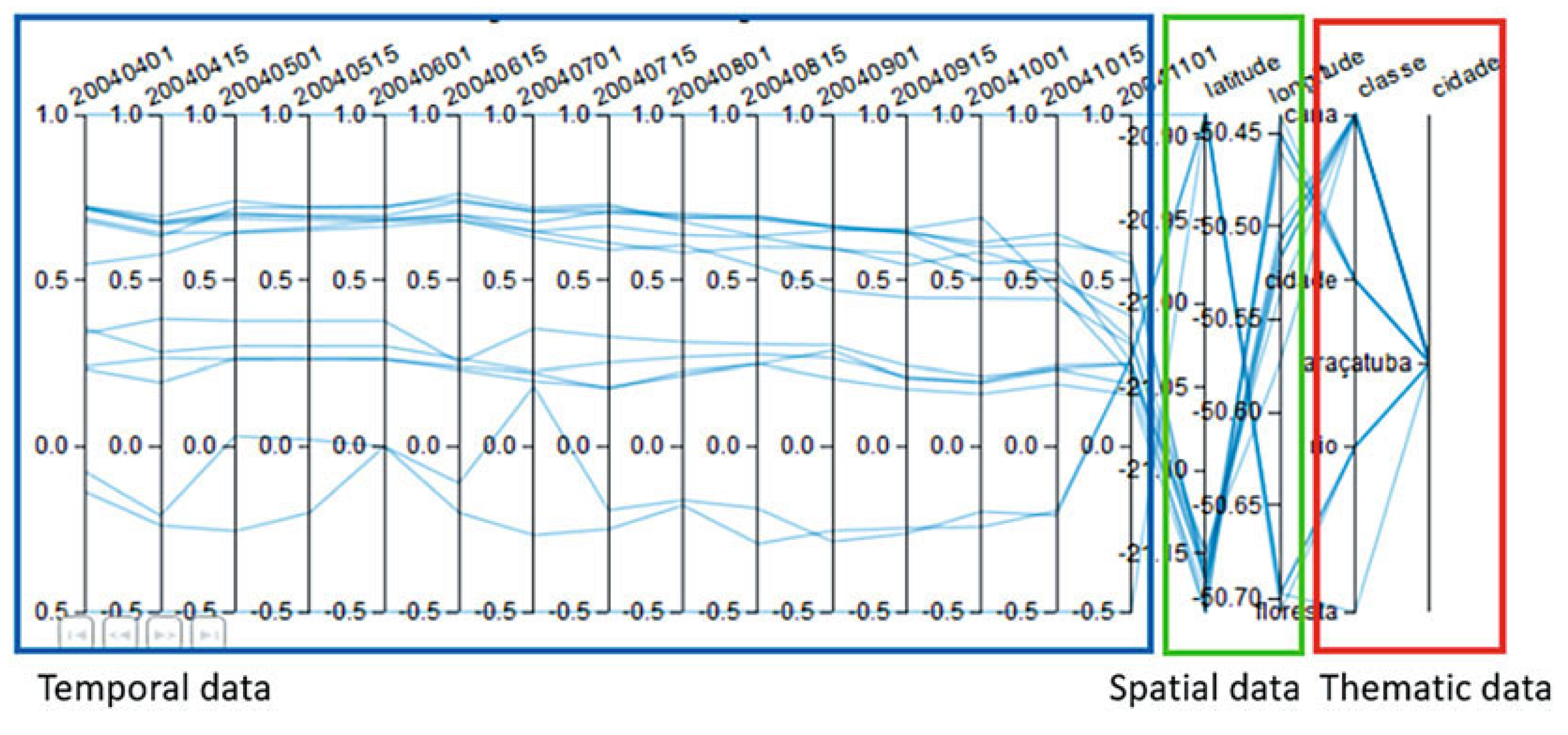
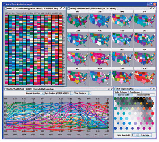
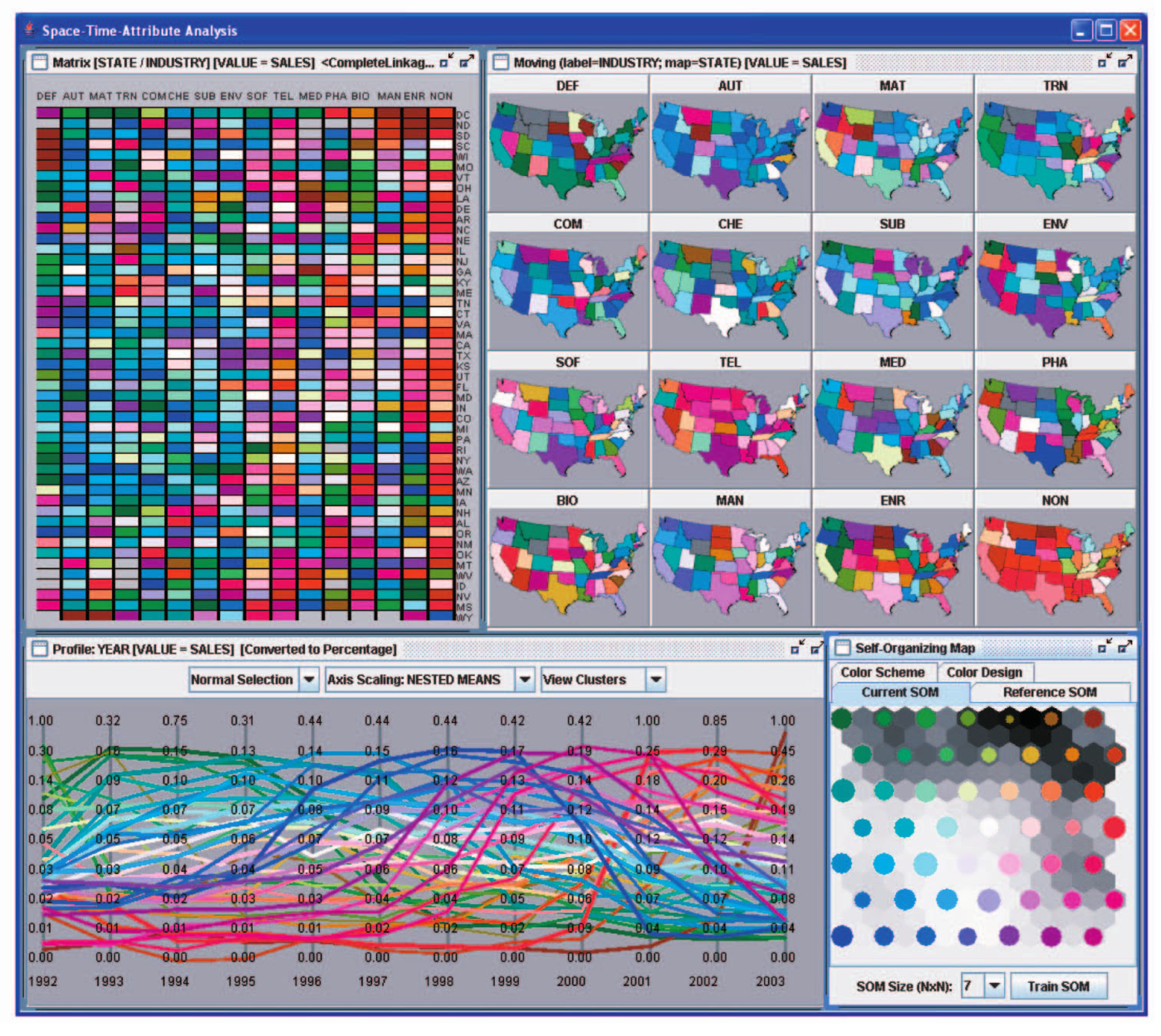
To further evaluate the performance of the STPCP method, we conducted a comparative analysis against two established spatiotemporal visualization techniques: the ST-Vis method [6], as shown in Figure 6, and the VIS-STAMP method [18], as shown in Figure 7. Thus, the comparison validates the distinct advantages of our proposed design in terms of efficacy, intuitiveness, and generality.
Figure 6.
The visualization method of ST-Vis [6].
Figure 7.
The visualization method of VIS-STAMP [18].
A primary limitation of the ST-Vis method lies in its use of parallel coordinates to encode longitude and latitude values. Such a representation of geospatial attributes is unintuitive. Even when a map is incorporated, the approach still induces visual discontinuities due to screen jumping, thereby impairing analytical effectiveness. Furthermore, ST-Vis supports visualization of a single attribute only and does not accommodate multi-attribute scenarios.
The VIS-STAMP method also employs maps to convey geographic information and parallel coordinates to display temporal sequences, and it considers multiple attributes. However, users are still required to frequently switch between different views to comprehend the relationships between spatial and temporal variables.
In contrast, STPCP uses polylines to seamlessly traverse both map and temporal axes, with color channels encoding multiple attributes. Color mapping effectively reveals connections among different variables [19]. With STPCP, users can analyze multidimensional spatiotemporal data more efficiently and intuitively, overcoming the drawbacks of view switching and resolving the visual separation between spatial and temporal attributes.
4.2. Field Trial Studies
4.2.1. Study Area
To assess the robustness and generalizability of the approach, this section describes the field trials conducted using two datasets derived from different domains.
The first dataset comprises China’s Basic National Conditions data, obtained from the website of the National Bureau of Statistics of China: https://www.stats.gov.cn (accessed on 5 March 2024). It contains two geospatial attributes (longitude and latitude) and seven multidimensional indicators: Gross Regional Domestic Product, Year-end Resident Population, Local Fiscal Tax Revenue, Number of Medical and Health Institutions, Per Capita Disposable Income, Educational Fund, and Forest Coverage Rate. The dataset covers 31 provincial-level regions in China spanning the years 2013 to 2019.
The second dataset comprises meteorological records collected from over 400 weather observation stations across China. It includes the following attributes: wind speed, air temperature, sea level pressure, dew point temperature, and precipitation depth, covering the period from 2014 to 2021. The dataset was sourced from the website https://quotsoft.net/air/ (accessed on 15 July 2025). Following data acquisition, a preprocessing pipeline was implemented to convert the raw data into a format suitable for visualization. A customized data-cleaning program was developed using the Python (version 3.10.2, Python Software Foundation, Wilmington, DE, USA) programming language. The data were organized by year, and feature scaling was applied to normalize numerical values to the interval [−1, 1] to eliminate the influence of differing measurement units. This normalization preserves the original data distribution while enabling integrated comparative analysis. The mean normalization formula applied is as follows:
The processed data were stored in CSV format for subsequent analysis and visualization.
4.2.2. Study Design
To evaluate the performance of STPCP in visualizing multidimensional spatiotemporal data, we conducted open-field trials with 83 participants recruited from a university population, comprising 47 males and 36 females. The participants included 33 undergraduates, 15 master’s students, 7 doctoral students, 21 faculty members, and 7 administrative staff, ranging in age from 18 to 51 years, with diverse academic and professional backgrounds. All participants were screened to ensure familiarity with the dataset domains and core visualization concepts, such as parallel coordinates plots and map-based visualization, and to ensure they had no prior exposure to STPCP, ST-Vis, or VIS-STAMP methods and had normal color vision.
To eliminate the effects of learning and fatigue on performance results, the presentation order of three visualization techniques was controlled using a fully balanced Latin square design [20,21]. All participants were randomly assigned to one of six possible orders. This design ensured that any impact caused by the sequence of operations was evenly distributed across all techniques, thereby ensuring fairness and internal validity of the comparison.
The STPCP application was deployed on a campus server and accessed via a web browser. Before beginning the tasks, participants received an introduction to spatiotemporal analysis and attribute correlation visualization to familiarize them with the analysis process and task objectives.
4.2.3. Study Content
In the controlled field trial studies, participants needed to compare the three abovementioned visual analysis approaches using the two real-world datasets. The experimental tasks required identifying data trends, spatiotemporal patterns, and inter-attribute correlations.
The evaluation content comprised two analysis tasks:
- a non-interactive task requiring participants to identify data trends, spatiotemporal development patterns, attribute correlations, and anomalies based on static visualizations alone;
- an interactive task allowing unrestricted use of all supported tools to analyze the same aspects.
Following each task, we recorded the participant’s task completion time and error rate. All tasks were self-paced to minimize time pressure and better simulate real-world exploratory analysis conditions.
4.2.4. Quantitative Evaluation
Subsequently, participants were asked to complete the NASA-TLX [22,23,24] questionnaire, rating their perceived workload across its six subscales (0–10): Mental Demand, Physical Demand, Temporal Demand, Performance, Effort, and Frustration Level. This provided a measure of the subjective cognitive load associated with each system. We employed the unweighted version of the NASA-TLX, with the overall workload score calculated as the mean of the ratings across all six dimensions.
4.2.5. Questionnaire
Following the field trial, participants were invited to complete a questionnaire evaluating the overall performance of STPCP. The survey included the following open-ended questions:
- What design features of STPCP contribute most to improving the visual analysis of multidimensional spatiotemporal data?
- What difficulties or issues did you encounter while using STPCP?
- What additional functions or interactive analysis methods would you suggest for future versions of STPCP?
5. Results
5.1. Results of the Field Trial Studies
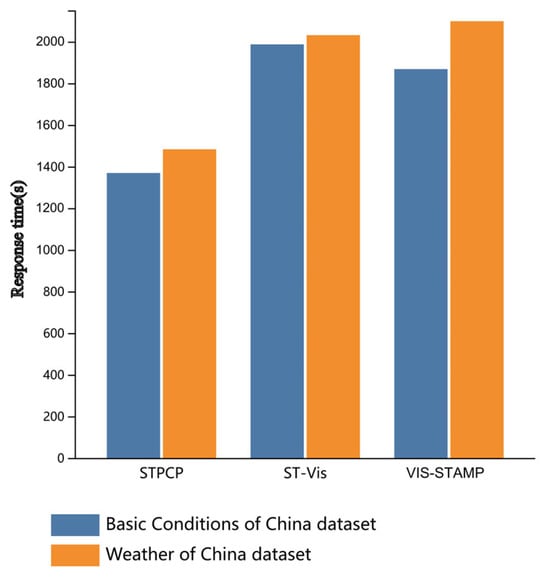
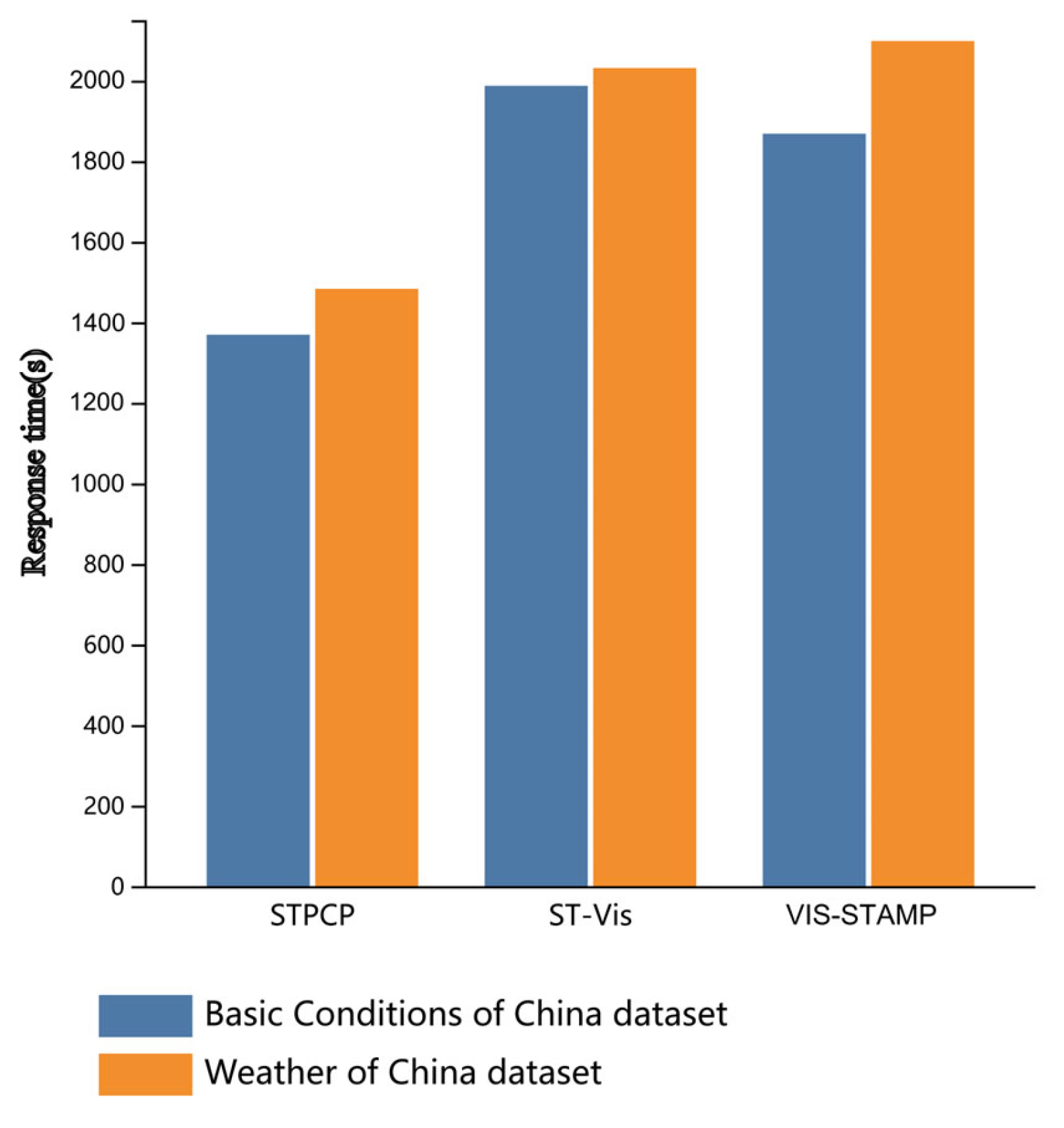
The response time results of field trial studies presented in Figure 8. The results indicate that the time required for STPCP was significantly shorter than that for both the ST-Vis and VIS-STAMP methods.
Figure 8.
Comparative response times of the evaluated methods in the field trial studies.
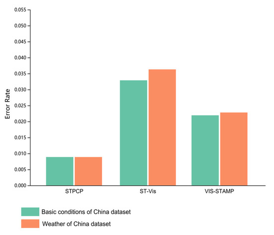
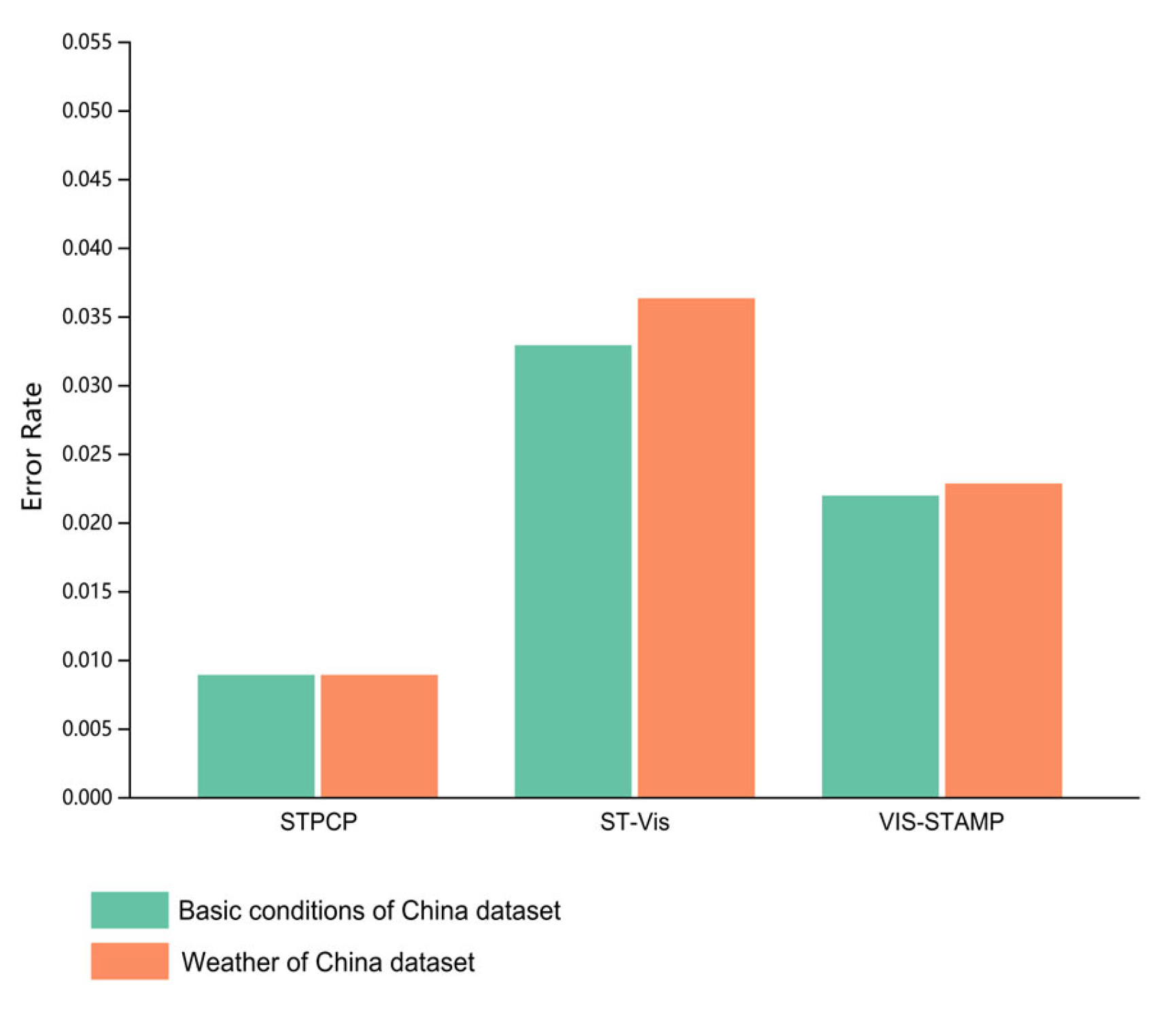
The error rate results of the field trials are presented in Figure 9. A significantly lower error rate was observed for the STPCP method compared with both the ST-Vis and VIS-STAMP methods. The highest error rate was associated with the ST-Vis method, suggesting that its approach of representing geographic location through abstract data may be less intuitive for the required tasks.
Figure 9.
Comparative analysis of error rates from the field trial studies.
A one-way ANOVA was conducted to compare the task completion times across the three visual analysis methods for each of the two multidimensional spatiotemporal datasets. The analysis was performed using SPSSPRO (version 1.0.11, provided by QingSi (Shanghai) Information Technology Co., Ltd., Shanghai, China, https://www.spsspro.com/), and the results are summarized in Table 1 and Table 2. ANOVA is a standard statistical method for assessing the effect of categorical factors on continuous outcomes [25,26,27,28,29].
Table 1.
Results of one-way ANOVA for response time of basic condition of China dataset.
Table 2.
Results of one-way ANOVA for response time of weather of China dataset.
As summarized in Table 1 and Table 2, the results indicate statistically significant differences in task completion time across the evaluated methods. The findings reveal considerable variations in performance, supporting the conclusion that the time required for visual analysis is largely determined by the choice of technique.
5.2. Results of Quantitative Evaluation
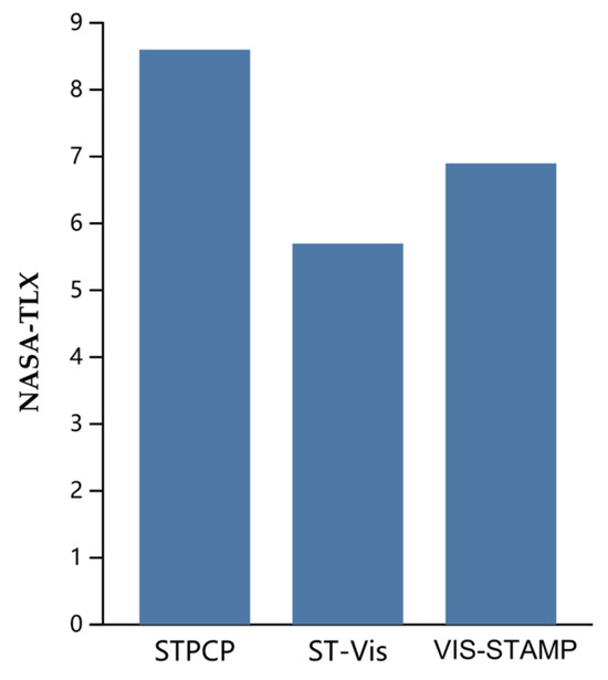
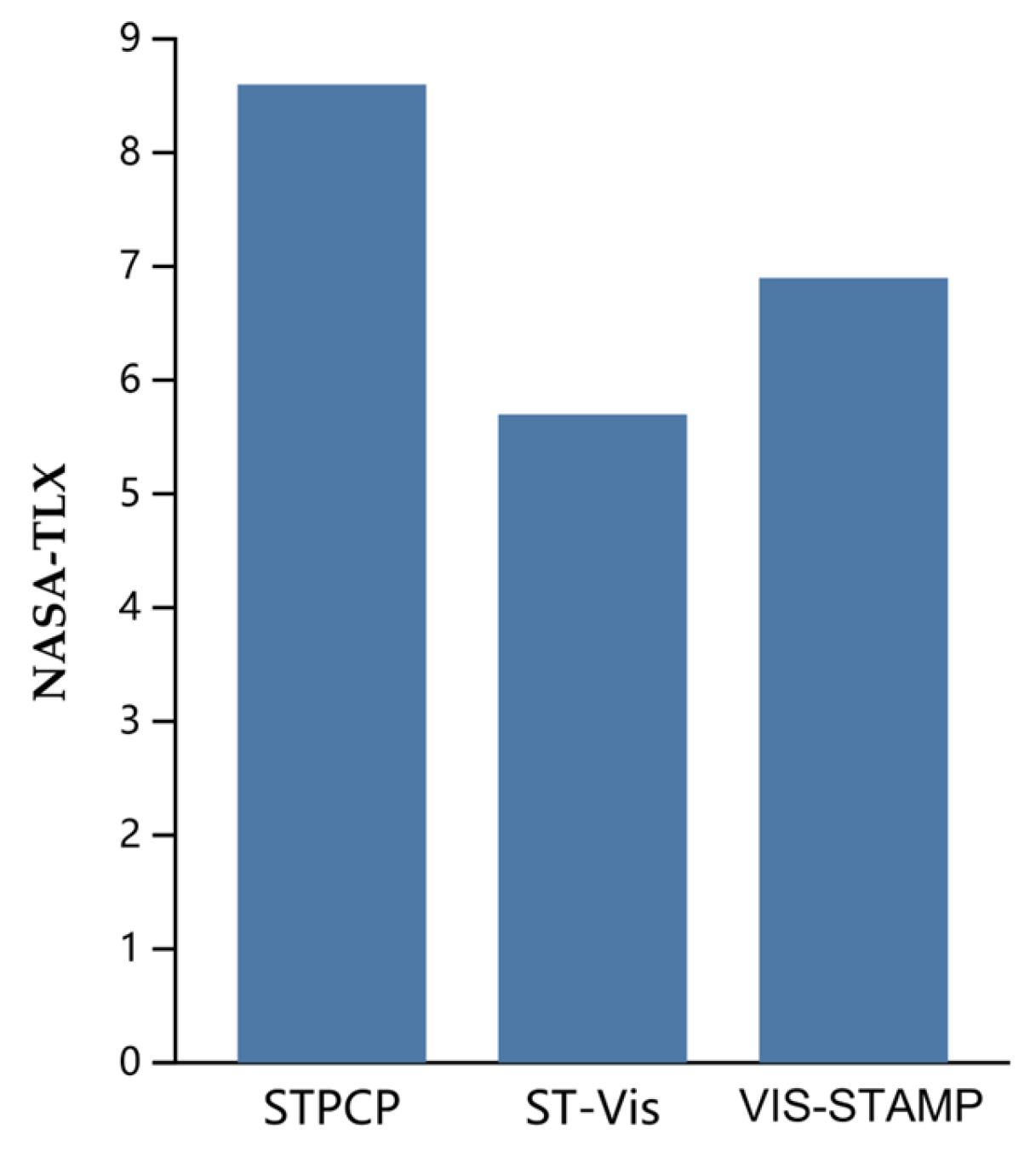
As presented in Figure 10, using STPCP was associated with a significantly lower NASA-TLX score than the other two methods. This suggests that its integrated view design effectively reduces the cognitive burden and operational confusion involved associated with integrating spatiotemporal and attribute information.
Figure 10.
Results of NASA-TLX.
We conducted a one-way ANOVA on the NASA-TLX analysis of the three methods, and the results are shown in Table 3.
Table 3.
Results of one-way ANOVA for NASA-TLX questionnaire of three methods.
Statistical analysis yielded a p-value of less than 0.001, indicating that the choice of visualization technique exerts a significant influence on the evaluation score, as detailed in Table 3.
5.3. Results of Questionnaire
Based on participant feedback, the STPCP method demonstrates notable strengths:
- it establishes an intuitive and efficient workflow by eliminating the need for view switching or manual context reintegration;
- its integrated design, which uses polylines to link parallel coordinates with geographic maps visually, provides a coherent environment for spatiotemporal analysis;
- the approach is highly generalizable and compatible with most tabular multidimensional spatiotemporal datasets;
- the system is responsive, easy to operate, and offers fast loading times;
- its interactive features meaningfully enhance the visual analytics process.
Therefore, the STPCP framework offers three principal advantages. First, it exhibits strong cross-domain applicability, effectively visualizing any tabular multidimensional spatiotemporal dataset (including coordinates, temporal nodes, and generic attributes) and adapting to varied user needs and scenarios. Second, it achieves a seamless integration of spatial and temporal attributes within a unified view, overcoming the traditional visual separation of these dimensions. Third, the system provides an intuitive, low-latency operational experience, supporting coordinated visualization and interaction of spatial, temporal, and multivariate data on a standard 2D display with modest computational and storage overhead, thereby enabling responsive, real-time analytical support.
5.4. Between-Group Analysis
To investigate whether user backgrounds have a systematic impact on task performance and subjective preferences, we conducted a between-group comparative analysis. One-way ANOVA was conducted on the core indicators (task completion time, accuracy, NASA-TLX subjective load). The results showed no statistically significant difference between participant groups with different backgrounds. This analysis indicates that the main conclusions of this study regarding the relative advantages of STPCP are universal among user groups of different professional levels.
5.5. Improvement of STPCP
In conclusion, the STPCP method addresses three key limitations common in current approaches for visualizing multidimensional spatiotemporal data:
- Holistic Representation through View Integration: STPCP integrates parallel coordinates with a geographic map within a unified visual environment, enabling simultaneous representation of temporal, spatial, and multivariate attributes. This design supports more intuitive, efficient, and continuous analytical reasoning.
- Effective Depiction of Temporal Dynamics: Many techniques rely on animation or small multiples to convey time, which can impede direct comparison and obscure continuous trends. STPCP directly encodes time as an axis within the parallel coordinates plot, providing a static yet continuous representation of temporal evolution alongside spatial and attribute dimensions.
- Generalizability across Domains: Existing spatiotemporal visualizations are often domain-specific. By building on the general-purpose parallel coordinates metaphor, STPCP maintains broad applicability and can be readily applied to any tabular multidimensional spatiotemporal dataset, enhancing its utility across different fields.
6. Discussion
6.1. Drawbacks of STPCP
Despite its strengths, the STPCP method has several limitations that merit discussion.
- Impaired Interactive Highlighting in Dense Regions: In areas of high data density, overlapping polylines near the map can compromise the reliability of the hover-highlighting interaction, making it difficult for users to select individual records accurately.
- Obscured Inter-Attribute Correlations: Although the distribution of individual attributes is clear, discerning correlations between attributes remains challenging. Visual clutter from line crossings can hide these multivariate relationships, limiting the method’s efficacy for direct correlation analysis.
- Scalability Limits with High-Dimensional Data: As the number of visualized attributes increases, the parallel coordinates plot can become visually cluttered, potentially leading to overplotting and reduced interpretability.
A notable suggested improvement from participants is the addition of interactive highlighting via the attribute legend. A “highlight-on-legend-hover” feature, that emphasizes all polylines in a selected category when the user hovers over the corresponding legend item could effectively address selection difficulties in occluded areas and improve attribute-specific tracking.
6.2. A Roadmap Toward Interpretable and Guided Visual Analytics
Future development of the STPCP framework will focus on enhancing analytical depth through model-driven explanation and proactive guidance, addressing the need for more interpretable, exploratory visual analytics.
- Visual Parameter Sensitivity Analysis: An interactive sensitivity dashboard will be developed to visually link key analytical parameters, such as clustering thresholds, to patterns in the main STPCP view. Using techniques like small multiples, this will help users assess the robustness of findings to parameter variations [30,31].
- Integration with Explainable AI (XAI): STPCP will be coupled with interpretable models, such as guided decision trees [32]. Selecting a data cluster will trigger the system to fit a model and present key discriminating features, providing a quantitative explanation for observed patterns. Conversely, rules derived from models can be projected back onto the STPCP and map views, automatically highlighting corresponding entities and establishing a bidirectional link between visual exploration and model-based explanation.
- Proactive Visual Guidance: Lightweight statistical analytics will be embedded to provide proactive suggestions. The system will automatically identify and visually highlight potential anomalies or significant data correlation shifts, offering “visual cues” to guide further user-driven investigation.
6.3. Addressing Visual Clutter and Correlation Perception
Visual clutter from polyline overplotting in the parallel coordinates view remains a primary challenge, as it can obscure attribute correlations and impede interaction [33], particularly because of the limitations of parallel coordinate plots for precise correlation analysis. Although the current STPCP implementation uses linked multiview filtering to reduce on-screen elements, more advanced clutter-reduction techniques can be integrated in future work. Promising directions include the following:
- Axis Reordering and Optimization: Automatically or interactively reordering axes to minimize line crossings can significantly improve pattern discernibility and reveal attribute correlations [34].
- Edge Bundling: Applying bundling algorithms to group polylines with similar trajectories reduces visual entanglement and clarifies dominant trends in high-dimensional data [35].
- Visual Abstraction: For large datasets, techniques such as cluster-based density rendering or alpha blending can maintain a clear overview while mitigating overplotting [36].
- Progressive Disclosure: The system can first present an overview, allowing users to drill down for details in regions of interest, balancing context with specificity.
Implementing and evaluating the above techniques—especially axis reordering and edge bundling—constitutes a clear roadmap for enhancing STPCP’s scalability for complex spatiotemporal data.
In addition, enhancing correlation analysis within STPCP may be advanced through two key directions:
- Integration of Quantitative Correlation Metrics: We will implement real-time calculation and contextual display of correlation coefficients. This will update dynamically as users select axes or brush data subsets, enabling the exploration of how correlations vary across spatiotemporal contexts and bridging visual pattern perception with statistical validation.
- Implementation of Advanced Clutter-Reduction Techniques: We will integrate density-based visualizations, such as 2D kernel density maps between adjacent axes [37]. This approach will reveal regions of high data concentration and effectively highlight linear or nonlinear correlations in large datasets, directly mitigating overplotting that obscures these relationships.
Embedding these features will evolve STPCP from a primarily exploratory tool into a visually guided quantitative analysis platform, allowing users to observe and statistically validate multivariate relationships within a single interactive environment.
6.4. Machine Learning and Optimization for Complex Spatiotemporal Data Analysis
The challenge of extracting insights from complex, high-dimensional spatiotemporal data is shared across many fields. A prevalent methodological response is the integration of machine learning with optimization algorithms. For example, in retail supply chain forecasting, the Mayfly Algorithm has been combined with a Bidirectional Gated Recurrent Unit network to model nonlinear temporal dependencies effectively [38].
This paradigm is pertinent to the STPCP framework. Although STPCP emphasizes interactive visual exploration over automated prediction, it addresses the same foundational need: managing complexity and revealing patterns in high-dimensional spatiotemporal data. The success of “optimization + deep learning” models underscores the importance of the feature and pattern discovery tasks that STPCP aims to support visually.
Looking forward, such optimization techniques could be adapted within STPCP itself, for instance, to automatically optimize visualization parameters, such as axis ordering and clustering thresholds, and thereby enhance pattern discovery. This alignment positions STPCP as a complementary component within the broader ecosystem of tools for analyzing complex data.
7. Conclusions
This study has presented a comprehensive evaluation of the STPCP framework through illustrative case studies, controlled comparative analysis, and open-field trials. The results confirm that STPCP enhances the efficiency, usability, and analytical versatility of visual exploration for multidimensional spatiotemporal data.
Looking forward, we intend to evolve STPCP along two primary avenues:
- Supporting the ingestion and visualization of real-time data streams.
- Extending its representational capacity to accommodate additional data types, such as movement trajectories and 3D geospatial information. These developments are anticipated to broaden the framework’s applicability to an even broader spectrum of scientific and industrial domains.
Supplementary Materials
The supporting information can be downloaded at: https://zenodo.org/records/17993833. As a supplementary resource, a screen-capture video demonstrating all interactive features of STPCP, along with high-resolution versions of Figure 1, Figure 2, Figure 3, Figure 4 and Figure 5, have been permanently archived on Zenodo. The materials are citable via the following DOI: 10.5281/zenodo.17993833.
Author Contributions
Conceptualization, J.L. and S.F.; methodology, J.L. and L.Y.; software, J.L., N.L. and L.Y.; validation, J.L. and L.Y.; formal analysis, J.L.; investigation, N.L.; resources, S.F.; data curation, L.Y. and N.L.; writing—original draft preparation, J.L.; writing—review & editing, L.Y. and S.F.; visualization, J.L.; supervision, S.F. and N.L.; project administration, S.F. All authors have read and agreed to the published version of the manuscript.
Funding
This research received no external funding.
Data Availability Statement
China’s Basic National Conditions data downloaded from the website: https://www.stats.gov.cn(accessed on 5 March 2024). Weather of China data downloaded from the website: https://quotsoft.net/air/ (accessed on 15 July 2025).
Conflicts of Interest
The authors declare that they have no known competing financial interests or personal relationships that could have appeared to influence the work reported in this paper.
References
- Tan, P.-N.; Steinbach, M.; Kumar, V. Introduction to Data Mining; Pearson Education India: Chennai, India, 2016. [Google Scholar]
- Goodman, A.A. Principles of high-dimensional data visualization in astronomy. Astron. Nachrichten 2012, 333, 505–514. [Google Scholar] [CrossRef] [Scilit]
- Nam, J.E.; Mueller, K. TripadvisorN–D: A tourism-inspired high-dimensional space exploration framework with overview and detail. IEEE Trans. Vis. Comput. Graph. 2012, 19, 291–305. [Google Scholar] [CrossRef] [Scilit] [PubMed]
- Andrienko, G.; Andrienko, N.; Demsar, U.; Dransch, D.; Dykes, J.; Fabrikant, S.I.; Jern, M.; Kraak, M.-J.; Schumann, H.; Tominski, C. Space, time and visual analytics. Int. J. Geogr. Inf. Sci. 2010, 24, 1577–1600. [Google Scholar] [CrossRef] [Scilit]
- Liu, J.; Wan, G.; Jia, Y.; Liu, W.; Xie, Z.; Su, Z.; Li, C.; Peng, S. Map-in-Parallel-Coordinates Plot (MPCP): Field Trial Studies of High-Dimensional Geographical Data Analysis. Electronics 2023, 12, 2062. [Google Scholar] [CrossRef] [Scilit]
- Vieira, A.P.S.B.; João, R.S.; Romani, L.A.; Ribeiro, M.X. The ST-Vis Tool for SpatioTemporal Visualization. In Information Technology—New Generations; Springer: Cham, Switzerland, 2018; pp. 577–587. [Google Scholar]
- Gruendl, H.; Riehmann, P.; Pausch, Y.; Froehlich, B. Time-Series Plots Integrated in Parallel-Coordinates Displays. Comput. Graph. Forum 2016, 35, 321–330. [Google Scholar] [CrossRef] [Scilit]
- Qu, Z.; Hullman, J. Keeping multiple views consistent: Constraints, validations, and exceptions in visualization authoring. IEEE Trans. Vis. Comput. Graph. 2017, 24, 468–477. [Google Scholar] [CrossRef] [Scilit]
- Liu, H.; Fang, C.; Miao, Y.; Ma, H.; Zhang, Q.; Zhou, Q. Spatio-temporal evolution of population and urbanization in the countries along the Belt and Road 1950–2050. J. Geogr. Sci. 2018, 28, 919–936. [Google Scholar] [CrossRef] [Scilit]
- Encalada-Malca, A.A.; Cochachi-Bustamante, J.D.; Rodrigues, P.C.; Salas, R.; López-Gonzales, J.L. A spatio-temporal visualization approach of PM10 concentration data in metropolitan lima. Atmosphere 2021, 12, 609. [Google Scholar] [CrossRef] [Scilit]
- Syetiawan, A.; Harimurti, M.; Prihanto, Y. A spatiotemporal analysis of COVID-19 transmission in Jakarta, Indonesia for pandemic decision support. Geospat. Health 2022, 17, 20220053730. [Google Scholar] [CrossRef] [Scilit]
- O’Driscoll, J.; Meredith, D.; Crowley, F.; Doran, J.; O’Shaughnessy, M.; Zimmermann, J. The spatiotemporal dimension of population change in Ireland: Visualisation of growth and shrinkage in Irish Electoral Divisions (1986–2016). J. Maps 2022, 18, 551–557. [Google Scholar] [CrossRef] [Scilit]
- Zhang, X.; Zhang, M.; Jiang, L.; Yue, P. An interactive 4D spatio-temporal visualization system for hydrometeorological data in natural disasters. Int. J. Digit. Earth 2020, 13, 1258–1278. [Google Scholar] [CrossRef] [Scilit]
- Blaas, J.; Botha, C.; Post, F. Extensions of parallel coordinates for interactive exploration of large multi-timepoint data sets. IEEE Trans. Vis. Comput. Graph. 2008, 14, 1436–1451. [Google Scholar] [CrossRef] [Scilit] [PubMed]
- Tominski, C.; Schumann, H.; Andrienko, G.; Andrienko, N. Stacking-based visualization of trajectory attribute data. IEEE Trans. Vis. Comput. Graph. 2012, 18, 2565–2574. [Google Scholar] [CrossRef] [Scilit] [PubMed]
- Du, F.; Zhu, A.-X.; Qi, F. Interactive visual cluster detection in large geospatial datasets based on dynamic density volume visualization. Geocarto Int. 2016, 31, 597–611. [Google Scholar] [CrossRef] [Scilit]
- Pande, A.K. jqWidgets Framework. In jQuery 2 Recipes; Springer: London, UK, 2014; pp. 473–542. [Google Scholar]
- Guo, D.; Chen, J.; MacEachren, A.M.; Liao, K. A visualization system for space-time and multivariate patterns (vis-stamp). IEEE Trans. Vis. Comput. Graph. 2006, 12, 1461–1474. [Google Scholar] [CrossRef] [Scilit]
- Bok, J.; Kim, B.; Seo, J. Augmenting parallel coordinates plots with color-coded stacked histograms. IEEE Trans. Vis. Comput. Graph. 2020, 28, 2563–2576. [Google Scholar] [CrossRef] [Scilit]
- Edwards, A.L. Balanced latin-square designs in psychological research. Am. J. Psychol. 1951, 64, 598–603. [Google Scholar] [CrossRef] [Scilit]
- Livingston, G., Jr.; Rayner, J. Rank tests for the Latin square design. Commun. Stat.-Theory Methods 2025, 54, 3200–3213. [Google Scholar] [CrossRef] [Scilit]
- Hart, S.G.; Staveland, L.E. Development of NASA-TLX (Task Load Index): Results of empirical and theoretical research. In Advances in Psychology; Elsevier: Amsterdam, The Netherlands, 1988; Volume 52, pp. 139–183. [Google Scholar]
- Hart, S.G. NASA-task load index (NASA-TLX); 20 years later. In Proceedings of the Human Factors and Ergonomics Society Annual Meeting, Chicago, IL, USA, 13–17 October 2025; Sage Publications: Los Angeles, CA, USA, 2006; pp. 904–908. [Google Scholar]
- Wu, Y.; Zhang, Y.; Zheng, B. Workload assessment of operators: Correlation between NASA-TLX and pupillary responses. Appl. Sci. 2024, 14, 11975. [Google Scholar] [CrossRef] [Scilit]
- Orooji, Y.; Ghasali, E.; Emami, N.; Noorisafa, F.; Razmjou, A. ANOVA design for the optimization of TiO2 coating on polyether sulfone membranes. Molecules 2019, 24, 2924. [Google Scholar] [CrossRef] [Scilit]
- Atia, N.; Benzaoui, A.; Jacques, S.; Hamiane, M.; Kourd, K.E.; Bouakaz, A.; Ouahabi, A. Particle swarm optimization and two-way fixed-effects analysis of variance for efficient brain tumor segmentation. Cancers 2022, 14, 4399. [Google Scholar] [CrossRef] [Scilit]
- Lee, H.M.; Hua, Y.; Xie, J.; Lee, H.P. Parametric Optimization of Local Resonant Sonic Crystals Window on Noise Attenuation by Using Taguchi Method and ANOVA Analysis. Crystals 2022, 12, 160. [Google Scholar] [CrossRef] [Scilit]
- Blanca, M.J.; Arnau, J.; García-Castro, F.J.; Alarcón, R.; Bono, R. Non-normal Data in Repeated Measures ANOVA: Impact on Type I Error and Power. Psicothema 2023, 35, 21–29. [Google Scholar] [CrossRef] [Scilit] [PubMed]
- Naganaidu, D.; Khalid, Z.M. ANOVA Assisted Variable Selection in High-dimensional Multicategory Response Data. Statistics 2023, 11, 92–100. [Google Scholar] [CrossRef] [Scilit]
- Evers, M.; Leistikow, S.; Rave, H.; Linsen, L. Interactive visual analysis of spatial sensitivities. IEEE Trans. Vis. Comput. Graph. 2024, 31, 5101–5115. [Google Scholar] [CrossRef] [Scilit]
- Klaffenboeck, M.; Gleicher, M.; Sorger, J.; Wimmer, M.; Moeller, T. RSVP for VPSA: A Meta Design Study on Rapid Suggestive Visualization Prototyping for Visual Parameter Space Analysis. IEEE Trans. Vis. Comput. Graph. 2024, 31, 5562–5579. [Google Scholar] [CrossRef] [Scilit]
- Mohedano-Munoz, M.A.; Raya, L.; Sanchez, A. Guided Decision Tree: A Tool to Interactively Create Decision Trees Through Visualization of Subsequent LDA Diagrams. Appl. Sci. 2024, 14, 10497. [Google Scholar] [CrossRef] [Scilit]
- Rave, H.; Molchanov, V.; Linsen, L. De-cluttering scatterplots with integral images. IEEE Trans. Vis. Comput. Graph. 2024, 31, 2114–2126. [Google Scholar] [CrossRef] [Scilit]
- Peng, W.; Ward, M.O.; Rundensteiner, E.A. Clutter reduction in multi-dimensional data visualization using dimension reordering. In Proceedings of the IEEE Symposium on Information Visualization, Austin, TX, USA, 10–12 October 2004; pp. 89–96. [Google Scholar]
- Zhou, H.; Xu, P.; Yuan, X.; Qu, H. Edge bundling in information visualization. Tsinghua Sci. Technol. 2013, 18, 145–156. [Google Scholar] [CrossRef]
- Moustafa, R.E. Parallel coordinate and parallel coordinate density plots. Wiley Interdiscip. Rev. Comput. Stat. 2011, 3, 134–148. [Google Scholar] [CrossRef] [Scilit]
- Liu, J.; Wan, G.; Wang, S.; Deng, P.; Su, Z.; Li, C.; Mu, Y.; Yin, Y. Visually Enhanced Parallel Coordinates Plot with Two-Dimensional Kernel Density Scatter Plots. IEEE Access 2023, 11, 116833–116845. [Google Scholar] [CrossRef] [Scilit]
- Sajja, G.S.; Meesala, M.K.; Addula, S.R.; Ravipati, P. Optimizing Retail Supply Chain Sales Forecasting with a Mayfly Algorithm-Enhanced Bidirectional Gated Recurrent Unit. SN Comput. Sci. 2025, 6, 737. [Google Scholar] [CrossRef] [Scilit]

Disclaimer/Publisher’s Note: The statements, opinions and data contained in all publications are solely those of the individual author(s) and contributor(s) and not of MDPI and/or the editor(s). MDPI and/or the editor(s) disclaim responsibility for any injury to people or property resulting from any ideas, methods, instructions or products referred to in the content. |
© 2026 by the authors. Licensee MDPI, Basel, Switzerland. This article is an open access article distributed under the terms and conditions of the Creative Commons Attribution (CC BY) license.