


Abstract
Indoor environments are experienced through multiple senses, and visual and acoustic elements jointly contribute to occupant responses. This exploratory study examined the associations of artwork colour tone and background music with subjective responses in an indoor audiovisual environment. Twenty participants completed five experimental conditions in a fixed order, comprising a reference condition and four combinations of cool- or warm-toned artwork with and without music. Affective and perceived cognitive states, artwork appraisal, and audiovisual compatibility were assessed. Significant differences in cheerfulness, anxiety, and vitality were observed across the five conditions after FDR correction. In the 2 × 2 analysis of the four artwork conditions, background music was associated with higher vitality ratings (pFDR = 0.042), while warm-toned artwork was associated with higher artwork liking (pFDR = 0.025). No significant colour tone × music interactions were detected. Because the conditions were presented in a fixed order, music-related differences could not be separated from potential order effects. These preliminary findings suggest that artwork colour tone may be considered when selecting artworks for aesthetic appeal, while background music may be considered when seeking to support occupants’ perceived vitality. Further studies with counterbalanced experimental designs are needed to validate these associations.
1. Introduction
Occupants experience an indoor environment as a whole rather than as a set of independent physical parameters. Odour, thermal conditions, window views and indoor vegetation all contribute to how a space is judged, and the multisensory character of occupant experience has become an explicit theme in building research [1,2,3,4,5,6]. Recent reviews of AI-assisted building performance assessment have also highlighted potential applications in indoor environmental quality and occupant comfort analysis, while emphasising the importance of reliable evaluation and validation [7]. Within this system, visual and acoustic elements are continuously present and comparatively easy to modify through design. A painting may make a room appear warmer, calmer or more energetic, while music simultaneously changes the emotional frame in which the same painting is perceived. Colour and sound are therefore rarely encountered in isolation: occupants experience them as a single audiovisual atmosphere, and how the two combine is directly relevant to indoor spaces that are intended to support positive emotional experience and aesthetic engagement [8,9].
Colour is one of the most immediate visual characteristics of an indoor environment. Cross-cultural evidence has linked perceived lighting and colour conditions with occupants’ mood [8]. Recent research on integrated daylighting and building design has highlighted the importance of adaptive shading control and multi-objective optimisation for balancing daylight availability, illuminance uniformity, glare control, view visibility, energy consumption, and thermal comfort [10,11,12]. Experimental comparisons of interior colour schemes indicate that warm colours tend to be perceived as more exciting, stimulating and arousing, whereas cool colours are more frequently associated with restfulness, calmness and spaciousness [13,14,15]. The psychological meaning of colour cannot be reduced to a simple warm–cool opposition, however, because emotional responses also depend on saturation, brightness and their interaction with hue [16,17]. The ecological valence theory further proposes that colour preference develops partly from an individual’s accumulated affective associations with colour-related objects and experiences [18]. Colour tone can therefore influence both emotional responses and aesthetic appraisal, although the direction and magnitude of the effect are likely to vary across people and contexts [16,18].
Background music introduces a similarly complex influence. Rather than consistently improving an experience, music can produce beneficial, detrimental or negligible effects depending on its characteristics, the listener and the situation [19,20,21]. A meta-analysis found a modest reduction in self-reported anxiety during music listening, but the corresponding effects on physiological indicators were less consistent [22]. Research on background music and cognitive tasks has likewise produced mixed findings, with outcomes depending on task difficulty, musical characteristics and individual differences [23]. Subjective feelings of alertness or concentration should therefore not be interpreted as improvements in objective cognitive performance. In an indoor environment, music may primarily shape emotional atmosphere, but its effect is likely to depend on what is being viewed [24,25].
This interaction raises a more interesting question: does music make visual art more appealing because it matches the artwork, or can matching and liking occur independently? Rančić and Marković found that congruent music–painting combinations received higher matching ratings, but congruence did not increase the pleasantness of the paintings [24,26,27]. Similarly, a recent study using professionally curated contemporary art and music reported that artist-intended pairings were perceived as more corresponding than random pairings, although this advantage did not extend to the other aesthetic ratings [25,28,29]. Audiovisual compatibility and aesthetic preference are therefore related but distinguishable responses: music may fit an artwork without increasing liking, and a visually preferred artwork need not be judged as better matched with its musical background.
Despite these advances, colour, music and visual art have commonly been examined in separate research traditions. Interior colour studies have concentrated on spatial perception and mood, background music studies have examined emotional or task-related outcomes [30], and music–painting studies have focused on congruence in gallery or online settings. It therefore remains unclear how warm- and cool-toned artwork, with and without background music, jointly influence subjective emotional state, perceived mental alertness and attention, artwork appraisal, and audiovisual compatibility within a common indoor setting. For design, the relevant question is also a practical one: whether a change in the visual or the acoustic component of a space has an identifiable and separable effect, or whether the two must be treated as a single combined intervention.
To address this gap, the present study employed five conditions: a reference condition, cool- and warm-toned artwork without music, and cool- and warm-toned artwork with background music. Participants evaluated their current affective state, perceived mental alertness and attention, artwork liking, viewing intention, artistic appeal, overall attractiveness, and music–artwork compatibility. Given the exploratory nature of the study, three research questions were considered: (1) how do subjective emotional and perceived cognitive states vary across the five experimental conditions; (2) are artwork colour tone and background music associated with differences in subjective responses and artwork appraisal, and is there evidence of an interaction between these two factors; and (3) does perceived audiovisual compatibility differ between cool- and warm-toned artwork under background music conditions? The four artwork conditions formed a 2 × 2 design with colour tone and background music as within-participant factors, while the reference condition provided a common baseline. As the experimental conditions were presented in a fixed order, the observed differences cannot be attributed solely to colour tone or background music. By examining emotional responses, aesthetic appraisal, and the perceived compatibility between music and artwork, this study provides preliminary evidence on how occupants respond to visual and auditory features in indoor environments.
2. Materials and Methods
2.1. Participants and Experimental Design
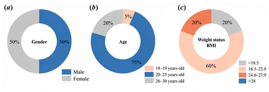
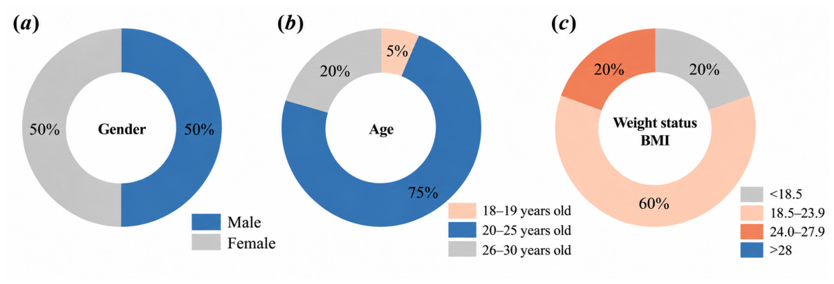
Twenty university students completed the experiment and were included in the analysis. The participants comprised 10 males (50%) and 10 females (50%), with a mean age of 23.35 ± 2.30 years (range: 18–28 years). Most participants were graduate students, while the remainder were undergraduate students. Regarding BMI, 20% of participants were classified as underweight (BMI < 18.5 kg/m2), 60% had a BMI of 18.5–<24.0 kg/m2, and 20% had a BMI of 24.0–<28.0 kg/m2. The distributions of gender, age, and BMI are presented in Figure 1.
Figure 1.
Demographic and anthropometric characteristics of the participants: (a) gender distribution; (b) age distribution; and (c) body mass index (BMI) categories.
Given the exploratory nature of the study, the sample size was determined based on experimental feasibility rather than an a priori statistical power analysis. Before participation, participants were asked to self-report any known colour-vision deficiencies (e.g., colour blindness), visual impairments that could interfere with artwork viewing, or hearing difficulties that could affect the perception of background music. None of the participants reported such conditions. All participants participated voluntarily, received an explanation of the study purpose and procedures, and provided written informed consent. Demographic information was collected once at the beginning of the session using Part 1 of the questionnaire (Table 1).
Table 1.
Experimental conditions and questionnaire administration.
All methods were carried out in accordance with the relevant guidelines and regulations. The study was reviewed and approved by the Research Ethics Committee of the Applied Technology College of Soochow University (Zhouzhuang College of Culture and Tourism, Suzhou, China) under approval number 2026-04-131. All participants provided written informed consent before the experiment began and were informed of their right to withdraw at any time.
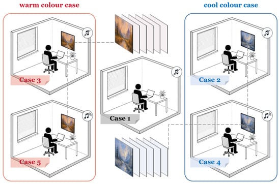
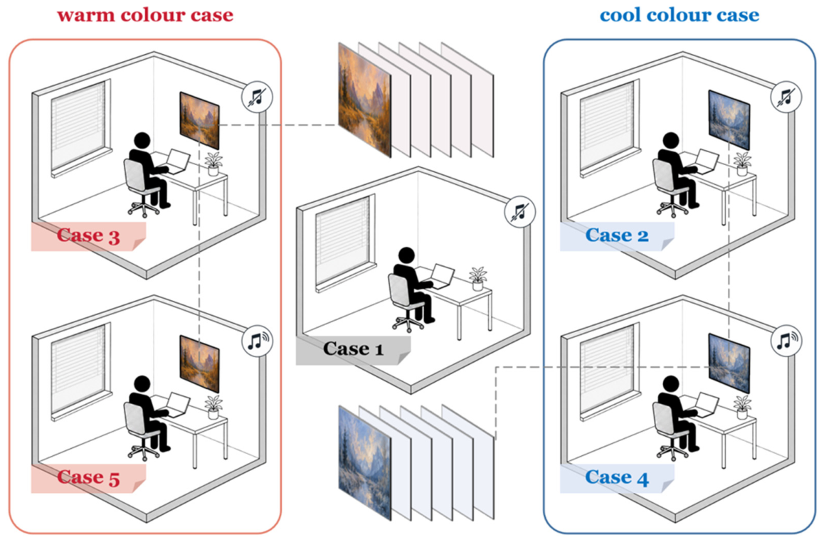
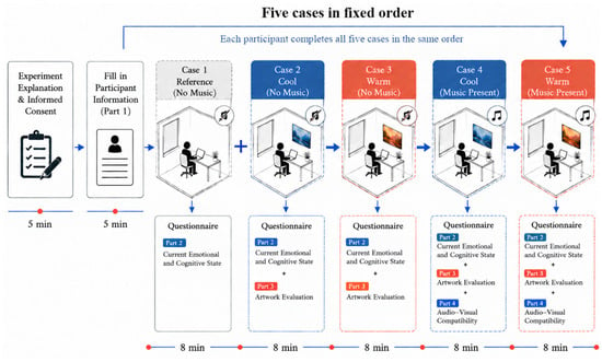
The experiment consisted of five conditions presented within a single session. As illustrated in Figure 2, Case 1 was the reference condition, in which neither artwork nor background music was presented. Cases 2–5 combined two artwork colour tones (cool and warm) with two background music conditions (absent and present). Case 2 presented cool-toned artwork without music, Case 3 presented warm-toned artwork without music, Case 4 presented cool-toned artwork with background music, and Case 5 presented warm-toned artwork with background music. Every participant experienced all five cases in the same order, so Cases 2–5 constituted a 2 × 2 within-participant design with colour tone and background music as the two factors.
Figure 2.
Visual scenes and audio conditions for the five experimental cases.
Because every participant completed all five cases, Case 1 provided a common reference condition for the analysis of emotional and cognitive state, whereas Cases 2–5 provided the four combinations of artwork colour tone and background music. Part 2 assessed current emotional and cognitive state and was completed after each case, Part 3 assessed artwork appraisal and was completed only after the four artwork conditions, and Part 4 assessed audiovisual compatibility and was completed only after the two conditions in which background music was present. Case 1 was therefore used only as a reference and was not included in the 2 × 2 analysis of artwork colour tone and background music.
2.2. Experimental Environment and Stimuli
The experiment was conducted in a studio at the Applied Technology College of Soochow University (Zhouzhuang College of Culture and Tourism, Suzhou, China). During the sessions, the air temperature was maintained at approximately 25 °C and the horizontal illuminance in the viewing position was 300–500 lx. Images were displayed on a 55-inch 4K (3840 × 2160 pixels) screen positioned at eye level in front of the participant, at a viewing distance of 1.8–2.2 m. Participants sat in an adjustable chair and were asked to maintain a stable viewing position and to avoid unnecessary movement during each condition.
In each artwork condition, a sequence of 16 paintings was presented, with each image displayed for approximately 30 s, resulting in a total duration of approximately 8 min per condition. The same set of 16 cool-toned artworks was presented in the same order in Cases 2 and 4, while the same set of 16 warm-toned artworks was presented in the same order in Cases 3 and 5. Thus, both the artwork sets and their presentation sequences were held constant when comparing the music-absent and music-present conditions within each colour-tone category. Warm- and cool-toned works were classified according to their overall colour appearance. A pixel-based colour analysis was conducted on two artworks used in the experiment to characterise their digital colour properties. The warm-toned artwork exhibited a representative hue of 25.7°, a mean HSV saturation of 0.437, and a mean HSV value of 0.614, whereas the corresponding values for the cool-toned artwork were 216.7°, 0.241, and 0.610, respectively. These values characterise the digital images rather than the measured luminance or chromaticity of the display. The HSV analysis was limited to two example artworks and therefore did not provide a quantitative characterisation of the complete warm- and cool-toned artwork sets. As the complete original image files were no longer available, a retrospective colour analysis of all artworks could not be performed.
In the two music-present conditions, piano music was obtained from the opening segment of a relaxation music video hosted on Bilibili, a Chinese online video-sharing platform (video ID: BV19mC3BwE8H; https://www.bilibili.com/video/BV19mC3BwE8H, accessed on 30 October 2026). The audio was played through loudspeakers placed on both sides of the screen at a sound pressure level of 55–60 dB(A) measured at the listening position. The same audio recording and playback level were used in both music-present conditions. No background audio was played in the reference condition or the two artwork-only conditions. The experiment was conducted in a relatively quiet indoor environment, and no obvious external noise disturbances were observed during the experimental sessions. However, the ambient background noise level was not quantitatively measured.
2.3. Experimental Procedure and Statistical Analysis
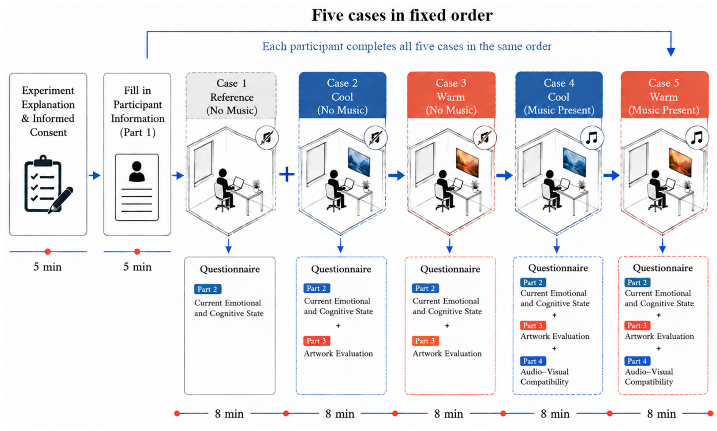
The experimental procedure is illustrated in Figure 3. Before the experiment, participants received a detailed explanation of the study purpose, experimental tasks, questionnaire requirements, and their right to withdraw at any time. After providing informed consent, they completed Part 1 of the questionnaire, which collected basic participant information.
Figure 3.
Experimental procedure. Each participant completed the five conditions in the same order, beginning with the reference condition (Case 1) and continuing with Cases 2–5.
Each participant then completed the five cases in sequence. The session began with the reference condition, after which the four artwork conditions were presented in the order Case 2, Case 3, Case 4 and Case 5. Cases 2 and 4 presented cool-toned artwork without and with background music, respectively, whereas Cases 3 and 5 presented warm-toned artwork without and with music. The order of presentation was identical for every participant and was not counterbalanced.
During each case, a series of images was displayed automatically on the screen. Each image was presented for approximately 30 s, and each case lasted approximately 8 min. Participants were instructed to view the images naturally while remaining seated and avoiding unnecessary conversation or movement. In the music-present conditions, the selected background music was played simultaneously with the image sequence. No background music was presented in Case 1 or in the two artwork-only conditions.
Immediately after each case, participants completed Part 2 of the questionnaire to report their current emotional and cognitive state. Part 3 was completed after each of the four artwork conditions, whereas Part 4 was completed only after Cases 4 and 5, in which background music was present. The session ended after all applicable questionnaire items had been completed. Only subjective questionnaire responses were analysed in the present study; no physiological, electroencephalographic or electrocardiographic measures were included.
Descriptive statistics were calculated for all questionnaire items and are reported as the mean and standard deviation. Response distributions were inspected for floor or ceiling effects and for substantial variation between participants. The four artwork-appraisal items address conceptually distinct aspects of aesthetic response and were therefore analysed separately rather than combined into a composite score.
Because every participant experienced all five cases, all comparisons between conditions were made within participants. For the six state measures, the five conditions were compared using the Friedman test, which is appropriate for repeated ordinal ratings, and Kendall’s W is reported as the corresponding effect size.
In the 2 × 2 portion of the design, artwork colour tone and background music were both manipulated within participants. For each participant, the colour tone contrast was calculated as [(Case 3 + Case 5) − (Case 2 + Case 4)]/2, and the music contrast as [(Case 4 + Case 5) − (Case 2 + Case 3)]/2. The interaction contrast was calculated as (Case 5 − Case 3) − (Case 4 − Case 2), representing the difference in music-related changes between the warm- and cool-toned artwork conditions. Each contrast was evaluated with a paired-samples t-test and is reported as F(1,19) together with partial η2; for a two-level within-participant contrast, F equals t2 and partial η2 equals t2/(t2 + 19). These contrasts were applied to the six state measures as well as to the artwork-appraisal outcomes so that the reference comparison and the factorial decomposition of the four artwork conditions served complementary purposes. Given the ordinal nature of the seven-point ratings and the small sample size, Wilcoxon signed-rank tests were also conducted as sensitivity analyses to assess the robustness of the paired t-test results. The Benjamini–Hochberg procedure was applied to the same predefined families of comparisons.
The same planned paired contrasts were applied to the six state measures and to the artwork-appraisal outcomes across Cases 2–5. Because audiovisual compatibility was assessed only in Cases 4 and 5, the two music-present conditions were compared with a Wilcoxon signed-rank test, and the rank-biserial correlation is reported as an effect size.
The false discovery rate was controlled using the Benjamini–Hochberg procedure when multiple outcomes were tested simultaneously. Three families of tests were corrected separately: the six Friedman tests of overall condition effects, the 18 contrasts of the six state measures (six measures × three effects), and the 12 contrasts of the four artwork-appraisal dimensions. Both unadjusted and FDR-adjusted p-values are reported. Statistical significance was defined as p < 0.05.
2.4. Questionnaire Measures
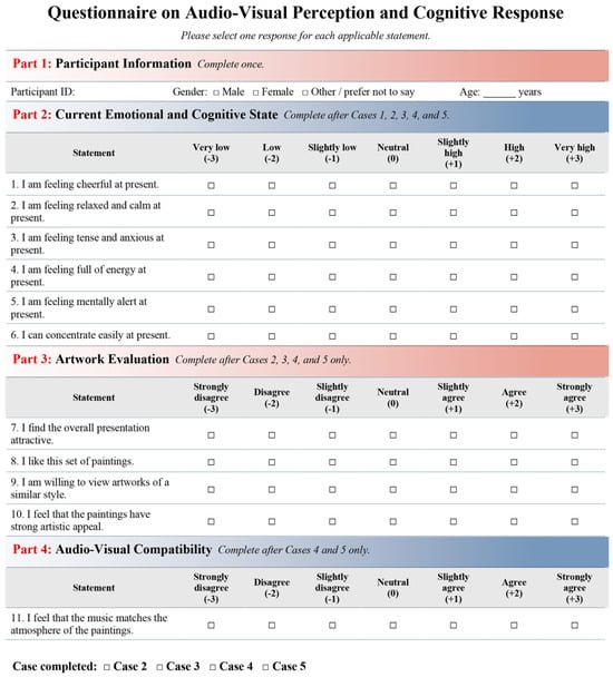
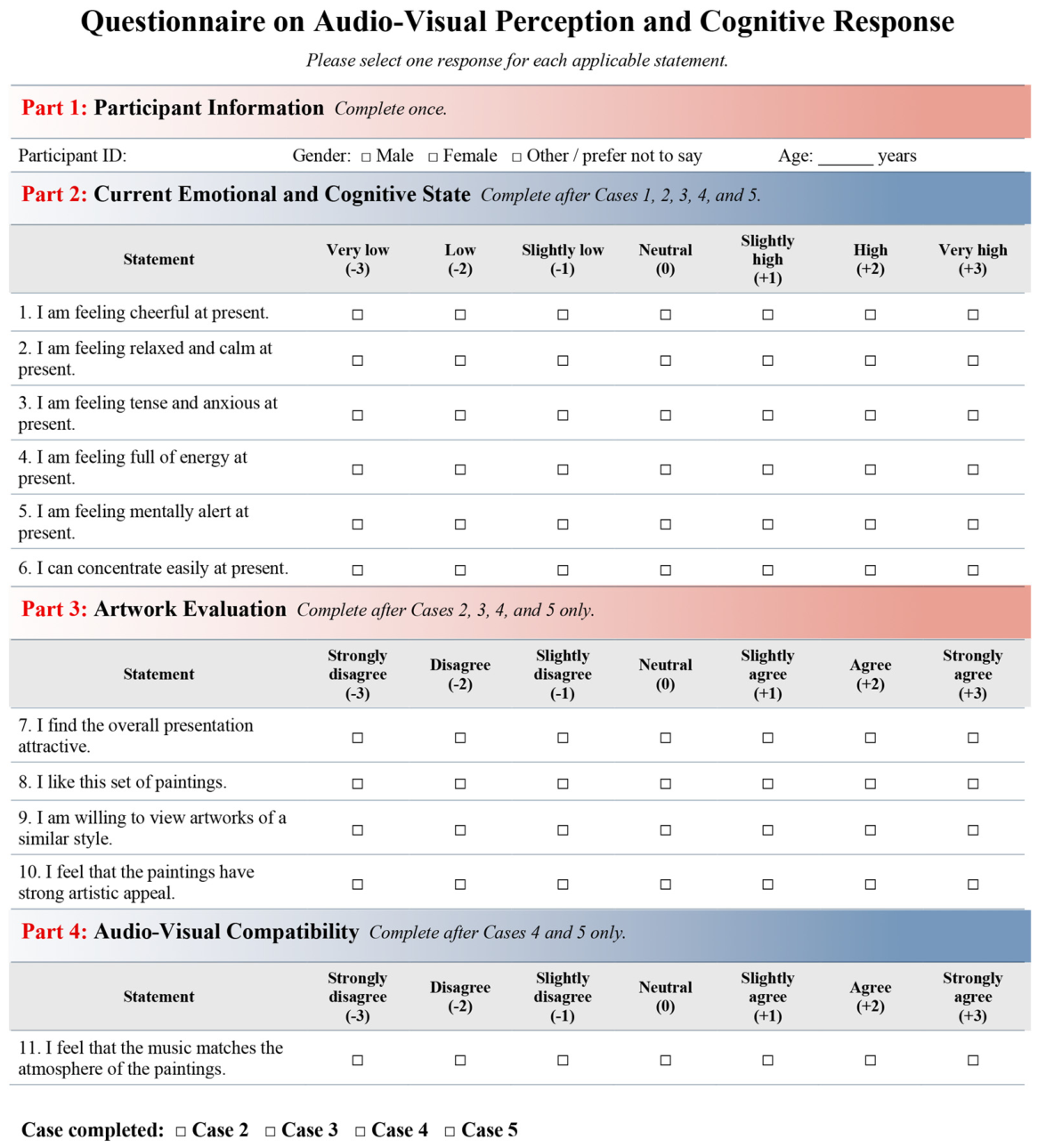
The questionnaire used in the experiment is shown in Figure 4 and consisted of four parts. Part 1 collected participant information and was completed once before the experiment. Part 2 assessed participants’ current emotional and cognitive state and was completed after each of the five cases. It contained six items measuring cheerfulness, relaxation and calmness, tension and anxiety, vitality, mental alertness, and perceived attention. Participants rated each item on a seven-point scale ranging from −3 to +3, with higher scores representing a stronger level of the corresponding state. For the anxiety item, more negative scores indicated lower perceived tension and anxiety and therefore a more favourable emotional response.
Figure 4.
Questionnaire used to assess subjective responses in indoor audiovisual environments.
Part 3 assessed participants’ appraisal of the artwork and was completed after each of the four artwork conditions. It included four items concerning overall attractiveness, artwork liking, willingness to continue viewing similar artworks, and perceived artistic appeal. Part 4 assessed audiovisual compatibility and was completed only after Cases 4 and 5; this item evaluated the perceived degree of correspondence between the atmosphere of the background music and that of the displayed artwork.
The artwork-appraisal and audiovisual compatibility items were rated on the same seven-point scale from −3 to +3, where −3 represented strong disagreement, 0 a neutral response, and +3 strong agreement. The questionnaire therefore distinguished emotional and cognitive state, artwork appraisal, and perceived audiovisual compatibility as separate dimensions of subjective response.
3. Results
Responses from 20 participants were included in the analysis. All items were rated on a seven-point scale ranging from −3 to +3. For the emotional and perceived cognitive state measures, higher scores indicated a greater reported intensity of the corresponding state. For the anxiety item, negative scores indicated lower reported tension and anxiety and therefore represented a more favourable emotional state.
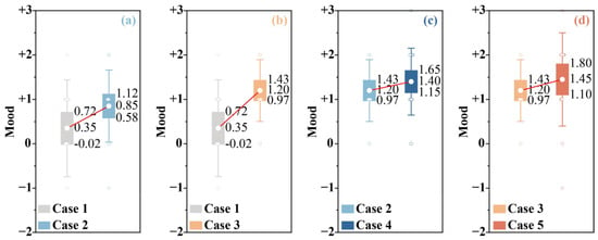
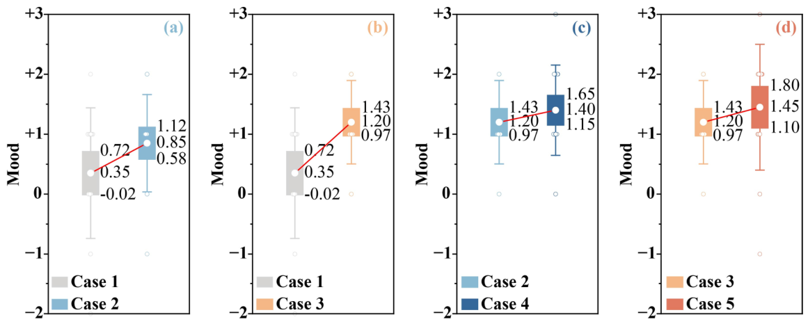
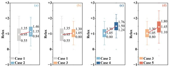
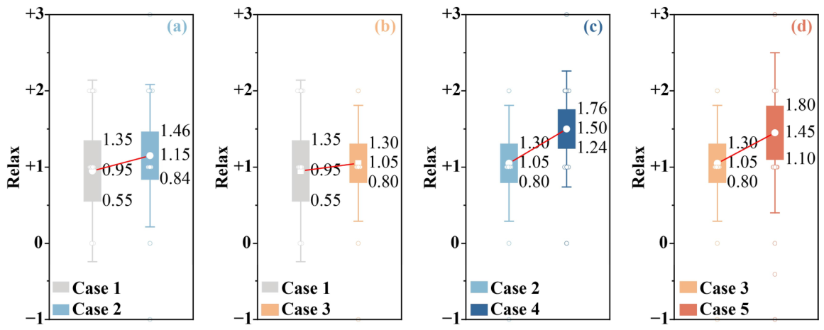
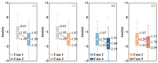
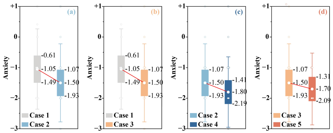
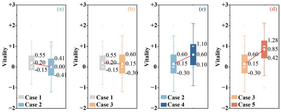
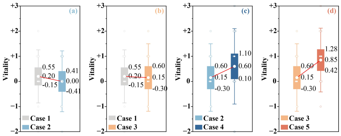
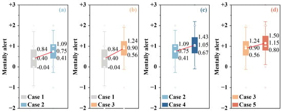
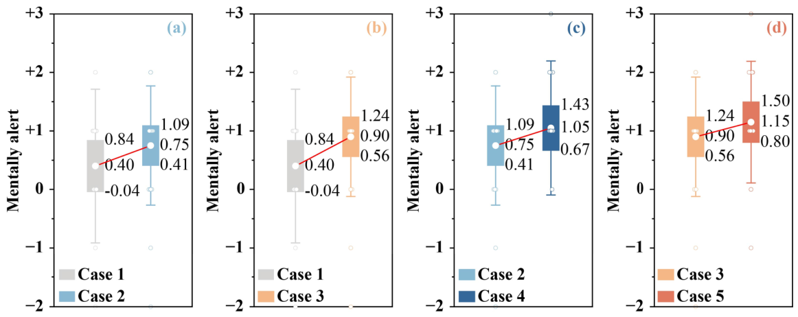
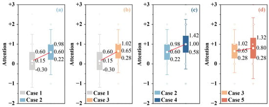
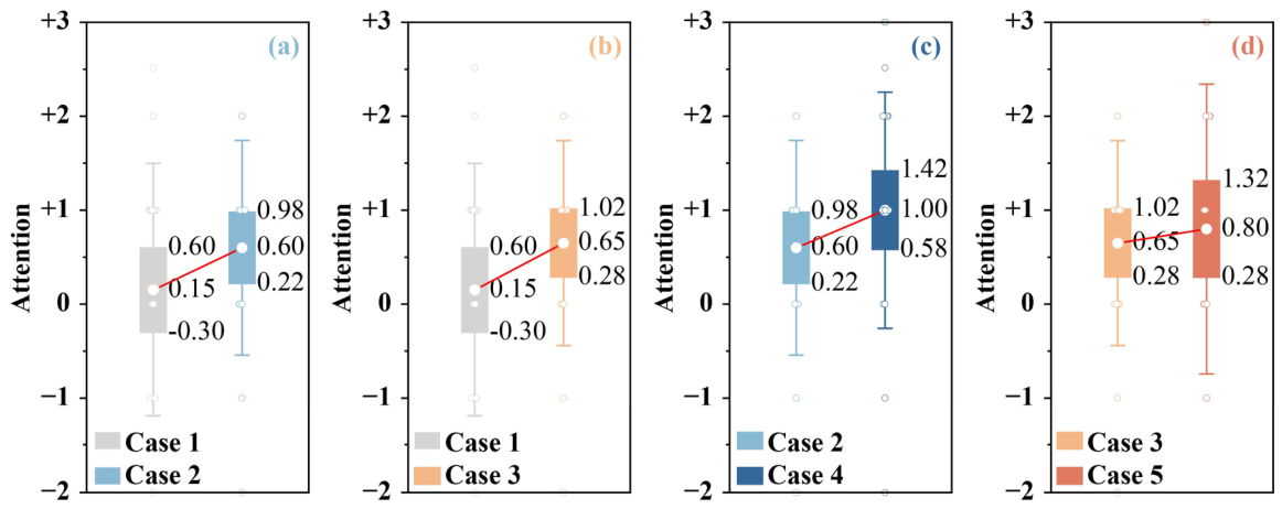
Figure 5, Figure 6, Figure 7, Figure 8, Figure 9 and Figure 10 present the distributions of affective and cognitive-state ratings using the same four comparisons: (a) Case 1 versus Case 2, (b) Case 1 versus Case 3, (c) Case 2 versus Case 4, and (d) Case 3 versus Case 5. These comparisons illustrate the differences between the reference condition and the two artwork-only conditions as well as the changes associated with adding background music under the cool- and warm-tone conditions. Individual observations show the distribution of participant ratings, whereas the mean markers and connecting lines indicate the direction of change between conditions.
Figure 5.
Self-reported cheerfulness across the five experimental conditions. (a) Reference condition compared with cool-toned artwork without music (Case 1 vs. Case 2); (b) reference condition compared with warm-toned artwork without music (Case 1 vs. Case 3); (c) cool-toned artwork with and without background music (Case 2 vs. Case 4); and (d) warm-toned artwork with and without background music (Case 3 vs. Case 5). Boxes show mean ± SD/3, and whiskers indicate mean ± SD. Labels denote the upper bound, mean, and lower bound; circles represent individual ratings; and lines connect condition means.
Figure 6.
Self-reported relaxation and calmness across the five experimental conditions. (a) Reference condition compared with cool-toned artwork without music (Case 1 vs. Case 2); (b) reference condition compared with warm-toned artwork without music (Case 1 vs. Case 3); (c) cool-toned artwork with and without background music (Case 2 vs. Case 4); and (d) warm-toned artwork with and without background music (Case 3 vs. Case 5). Boxes show mean ± SD/3, and whiskers indicate mean ± SD. Labels denote the upper bound, mean, and lower bound; circles represent individual ratings; and lines connect condition means.
Figure 7.
Self-reported tension and anxiety across the five experimental conditions. (a) Reference condition compared with cool-toned artwork without music (Case 1 vs. Case 2); (b) reference condition compared with warm-toned artwork without music (Case 1 vs. Case 3); (c) cool-toned artwork with and without background music (Case 2 vs. Case 4); and (d) warm-toned artwork with and without background music (Case 3 vs. Case 5). Boxes show mean ± SD/3, and whiskers indicate mean ± SD. Labels denote the upper bound, mean, and lower bound; circles represent individual ratings; and lines connect condition means.
Figure 8.
Self-reported vitality across the five experimental conditions. (a) Reference condition compared with cool-toned artwork without music (Case 1 vs. Case 2); (b) reference condition compared with warm-toned artwork without music (Case 1 vs. Case 3); (c) cool-toned artwork with and without background music (Case 2 vs. Case 4); and (d) warm-toned artwork with and without background music (Case 3 vs. Case 5). Boxes show mean ± SD/3, and whiskers indicate mean ± SD. Labels denote the upper bound, mean, and lower bound; circles represent individual ratings; and lines connect condition means.
Figure 9.
Self-reported mental alertness across the five experimental conditions. (a) Reference condition compared with cool-toned artwork without music (Case 1 vs. Case 2); (b) reference condition compared with warm-toned artwork without music (Case 1 vs. Case 3); (c) cool-toned artwork with and without background music (Case 2 vs. Case 4); and (d) warm-toned artwork with and without background music (Case 3 vs. Case 5). Boxes show mean ± SD/3, and whiskers indicate mean ± SD. Labels denote the upper bound, mean, and lower bound; circles represent individual ratings; and lines connect condition means.
Figure 10.
Self-reported attention across the five experimental conditions. (a) Reference condition compared with cool-toned artwork without music (Case 1 vs. Case 2); (b) reference condition compared with warm-toned artwork without music (Case 1 vs. Case 3); (c) cool-toned artwork with and without background music (Case 2 vs. Case 4); and (d) warm-toned artwork with and without background music (Case 3 vs. Case 5). Boxes show mean ± SD/3, and whiskers indicate mean ± SD. Labels denote the upper bound, mean, and lower bound; circles represent individual ratings; and lines connect condition means.
3.1. Emotional Responses Across Experimental Conditions
Cheerfulness increased progressively across the conditions (Figure 5). The mean score rose from 0.35 ± 1.09 in the reference condition (Case 1) to 0.85 ± 0.81 in the cool-tone condition without music (Case 2) and 1.20 ± 0.70 in the warm-tone condition without music (Case 3) and reached 1.40 ± 0.75 in Case 4 and 1.45 ± 1.05 in Case 5 when background music was present. The proportion of participants reporting positive cheerfulness increased from 60% in Case 1 to 85–90% in the artwork and music conditions, and no negative rating occurred in Cases 3 or 4. Case 5 had the highest mean but the largest dispersion, indicating greater individual variation when warm-toned artwork was combined with music. The overall difference across the five conditions was significant, χ2(4) = 23.40, p < 0.001, pFDR < 0.001, and Kendall’s W = 0.293, making cheerfulness the most condition-sensitive of the affective measures.
Relaxation was positive in all five conditions (Figure 6), with means of 0.95 ± 1.19 in Case 1, 1.15 ± 0.93 in Case 2 and 1.05 ± 0.76 in Case 3, increasing to 1.50 ± 0.76 in Case 4 and 1.45 ± 1.05 in Case 5 when music was present; 80–90% of participants reported positive relaxation in every condition. Because the distributions overlapped substantially, the overall difference across the five conditions was not significant, χ2(4) = 7.12, p = 0.130, pFDR = 0.195, and Kendall’s W = 0.089, and the higher ratings in the music-present conditions therefore represent a favourable descriptive pattern rather than a reliable condition effect.
Anxiety ratings were negative in all five conditions (Figure 7), indicating that participants generally reported low levels of tension and anxiety. The mean score decreased from −1.05 ± 1.32 in Case 1 to −1.50 ± 1.28 in both Cases 2 and 3 and reached its most favourable value in Case 4 (−1.80 ± 1.15), followed by Case 5 (−1.70 ± 1.17); the proportion of negative ratings rose from 65% in the reference condition to 90–95% in the music-present conditions. Individual values nevertheless extended across several scale categories. The overall difference across the five conditions was significant, χ2(4) = 11.67, p = 0.020, pFDR = 0.040, and Kendall’s W = 0.146, with the most favourable values occurring in the music-present conditions.
Vitality was lowest in the reference and artwork-only conditions (0.20 ± 1.06 in Case 1, 0.00 ± 1.21 in Case 2 and 0.15 ± 1.35 in Case 3) and higher when background music was present (0.60 ± 1.50 in Case 4 and 0.85 ± 1.27 in Case 5; Figure 8). Only 35% of participants reported positive vitality in Case 1, compared with 65% in Case 4 and 75% in Case 5, so the main descriptive change was a movement from neutral towards positive vitality. The ratings in the music conditions nevertheless covered a broad range of the response scale, and Case 4 showed the largest dispersion of the five conditions. The overall difference across the conditions was significant, χ2(4) = 12.63, p = 0.013, pFDR = 0.040, and Kendall’s W = 0.158.
Taken together, the five conditions were associated with significant differences in cheerfulness, anxiety and vitality after correction for multiple comparisons, whereas relaxation showed a favourable but statistically unreliable pattern.
3.2. Perceived Mental Alertness and Attention
Perceived mental alertness increased numerically across the conditions (Figure 9), from 0.40 ± 1.31 in Case 1 to 0.75 ± 1.02 in Case 2 and 0.90 ± 1.02 in Case 3 and to 1.05 ± 1.15 in Case 4 and 1.15 ± 1.04 in Case 5. The proportion of positive ratings rose from 60% in Case 1 to 90% in Case 4 and 75% in Case 5, so Case 4 produced the more consistently positive pattern, while Case 5 had the higher mean. The distributions nevertheless overlapped substantially, and the overall difference across the five conditions was not significant, χ2(4) = 2.90, p = 0.575, pFDR = 0.575, and Kendall’s W = 0.036.
Self-reported attention also increased numerically across the conditions (Figure 10), from 0.15 ± 1.35 in Case 1 to 0.60 ± 1.14 in Case 2 and 0.65 ± 1.09 in Case 3, and was highest in Case 4 (1.00 ± 1.26) and lower again in Case 5 (0.80 ± 1.54). Positive ratings accounted for 55% of responses in Cases 1 and 2, 65% in Case 3 and 75% in Case 4, whereas the ratings in Case 5 ranged from strongly negative to strongly positive and showed considerable individual variation. The overall difference was not significant, χ2(4) = 4.98, p = 0.289, pFDR = 0.347, and Kendall’s W = 0.062. Neither alertness nor attention therefore showed a statistically reliable condition effect, and the numerical increases should be described as changes in subjective state rather than as evidence of improved objective cognitive performance.
Table 2 summarises the mean scores, standard deviations, omnibus test results and effect sizes for all five conditions. After FDR correction, the overall condition effects remained significant for cheerfulness (χ2(4) = 23.40, pFDR < 0.001, W = 0.293), anxiety (χ2(4) = 11.67, pFDR = 0.040, W = 0.146) and vitality (χ2(4) = 12.63, pFDR = 0.040, W = 0.158), whereas the effects for relaxation, mental alertness and attention did not (W = 0.036–0.089). Overall, the experimental conditions were therefore more consistently associated with affective responses than with perceived mental alertness or attention.
Table 2.
Effects of experimental conditions on affective state, mental alertness and attention.
3.3. Effects of Artwork Colour Tone and Background Music on Subjective State
Because the four artwork conditions formed a 2 × 2 design, the condition differences reported above were decomposed into colour tone, background music and interaction contrasts. Across the six state measures, none of the colour tone contrasts and none of the colour tone × music interactions approached significance (all F(1,19) ≤ 2.11, all pFDR ≥ 0.537), indicating that warm- and cool-toned artwork did not produce reliably different subjective states when the presence of music was held constant. The effects were concentrated on the background music contrast.
Vitality showed the clearest music effect, increasing from 0.00 ± 1.21 in the cool-tone condition without music and 0.15 ± 1.35 in the warm-tone condition without music to 0.60 ± 1.50 and 0.85 ± 1.27 when music was present (F(1,19) = 12.30, p = 0.002, pFDR = 0.042, partial η2 = 0.393). Cheerfulness showed a similar but smaller increase, from 0.85 ± 0.81 and 1.20 ± 0.70 to 1.40 ± 0.75 and 1.45 ± 1.05 (F(1,19) = 8.94, p = 0.008, pFDR = 0.068, partial η2 = 0.320). This effect did not remain significant after correction across the 18 state contrasts and is therefore reported as a suggestive rather than a confirmed effect. Relaxation was also higher in the music-present conditions (F(1,19) = 5.38, p = 0.032, pFDR = 0.190, partial η2 = 0.221), whereas perceived mental alertness (F(1,19) = 2.56, p = 0.126) and attention (F(1,19) = 1.58, p = 0.225) did not differ reliably.
Although mean anxiety ratings were lower in the artwork conditions than in the reference condition, the significant Friedman test indicated only an overall difference across the five conditions. Neither the music contrast (F(1,19) = 1.61, p = 0.220) nor the colour tone contrast (F(1,19) = 0.06, p = 0.804) was significant within the four artwork conditions. Without multiplicity-adjusted comparisons against the reference condition, the specific source of the overall difference remains uncertain. Taken together, the planned contrasts indicated that background music was associated with differences in subjective state, particularly vitality, whereas artwork colour tone showed no significant contrasts for the six subjective state measures. As a sensitivity analysis, Wilcoxon signed-rank tests were applied to the 18 state contrasts. The music-related contrast in vitality remained significant before multiple-comparison correction (p = 0.003), but its FDR-adjusted p-value was slightly above the significance threshold (pFDR = 0.053). This suggests that the statistical significance of this finding was sensitive to the choice of analytical method.
3.4. Artwork Appraisal and Audiovisual Compatibility
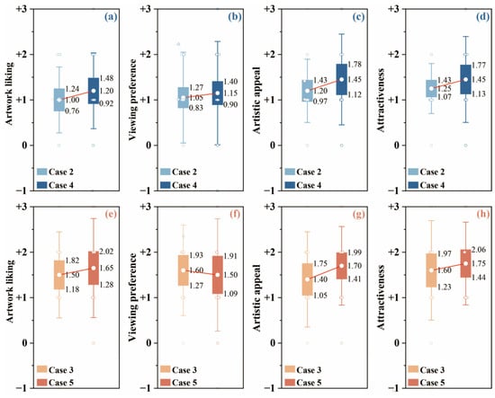
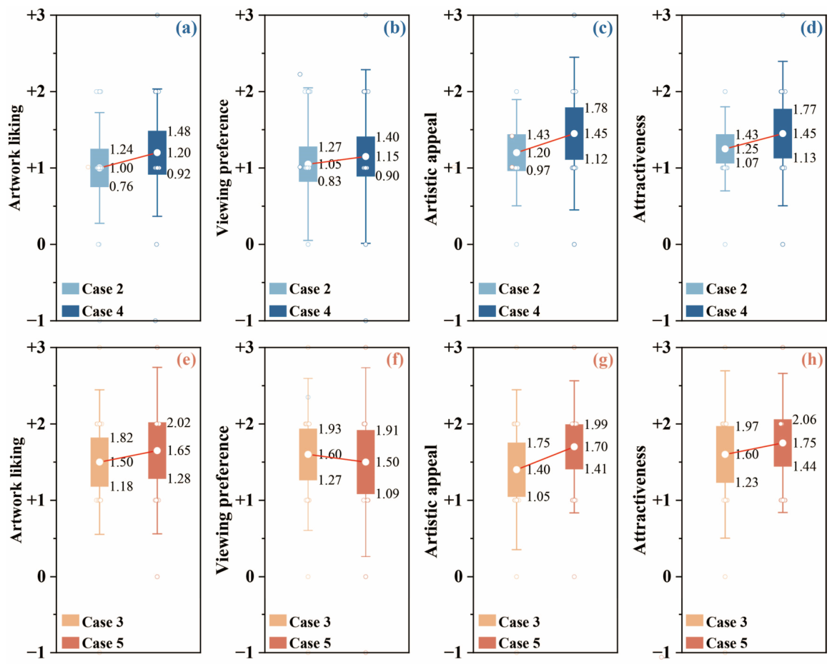
Warm-toned artwork received higher appraisal ratings than cool-toned artwork across all four appraisal dimensions (Figure 11). Artwork liking was positive in all four conditions, with mean scores of 1.00 ± 0.73 in Case 2, 1.50 ± 0.95 in Case 3, 1.20 ± 0.83 in Case 4 and 1.65 ± 1.09 in Case 5, so the warm–cool difference was 0.50 points without music and 0.45 points with music; 85–95% of participants gave positive liking ratings in every condition. Case 5 had the highest mean but also the greatest dispersion. The colour tone contrast was significant, F(1,19) = 12.73, p = 0.002, and partial η2 = 0.401, and remained significant after FDR correction, pFDR = 0.025. The increase associated with music was small, and neither the music contrast, F(1,19) = 0.74, p = 0.399, nor the interaction, F(1,19) = 0.02, p = 0.899 was significant. The Wilcoxon signed-rank sensitivity analysis also indicated a colour tone difference in artwork liking before multiple-comparison correction (p = 0.004). However, this difference did not remain statistically significant after FDR correction (pFDR = 0.053), indicating some sensitivity to the choice of statistical method.
Figure 11.
Artwork appraisal under visual-only and audiovisual conditions. (a–d) Cool-toned artwork without and with background music (Case 2 vs. Case 4) for artwork liking, viewing intention, artistic appeal and overall attractiveness, respectively; and (e–h) warm-toned artwork without and with background music (Case 3 vs. Case 5) for the same four appraisal dimensions.
Viewing intention was highest for warm-toned artwork without music. Mean scores were 1.05 ± 1.00 in Case 2, 1.60 ± 0.99 in Case 3, 1.15 ± 1.14 in Case 4 and 1.50 ± 1.24 in Case 5, so warm-toned artwork exceeded cool-toned artwork by 0.55 points without music and by 0.35 points with music. Positive viewing-intention ratings accounted for 80% of responses in Case 2, 90% in Case 3 and 75% in both Cases 4 and 5. Music was associated with a small 0.10-point increase under the cool-tone condition but a 0.10-point decrease under the warm-tone condition, so background music did not produce a consistent directional change in willingness to view similar artworks. The colour tone contrast approached but did not reach significance, F(1,19) = 3.59, p = 0.074, partial η2 = 0.159; the music contrast was absent, F(1,19) = 0.00, p = 1.000, and the interaction was not significant, F(1,19) = 0.46, p = 0.507. These results indicate a descriptive preference for viewing warm-toned artworks that is weaker than the corresponding effect on liking.
Ratings of artistic appeal were positive in all four conditions (1.20 ± 0.70 in Case 2, 1.40 ± 1.05 in Case 3, 1.45 ± 1.00 in Case 4 and 1.70 ± 0.86 in Case 5), and 80–95% of participants gave positive ratings, with no negative rating in Cases 2, 4 or 5. Neither the colour tone contrast, F(1,19) = 1.40, p = 0.251, nor the music contrast, F(1,19) = 2.81, p = 0.110, nor the interaction, F(1,19) = 0.04, p = 0.841 was significant, so the artworks were perceived as artistically appealing regardless of colour tone or the presence of music.
Overall attractiveness showed the most uniformly positive distribution among the four appraisal dimensions. Mean scores were 1.25 ± 0.55 in Case 2, 1.60 ± 1.10 in Case 3, 1.45 ± 0.94 in Case 4 and 1.75 ± 0.91 in Case 5, so warm-toned artwork exceeded cool-toned artwork by 0.35 points without music and 0.30 points with music. Positive ratings were provided by 95% of participants in Case 2, 85% in Case 3, 85% in Case 4 and 100% in Case 5. All ratings in Case 5 were positive and ranged from +1 to +3, indicating that warm-toned artwork with music was consistently perceived as attractive, whereas Case 2 showed relatively concentrated ratings, and Cases 3–5 displayed broader individual variation. The unadjusted colour tone contrast was significant, F(1,19) = 7.12, p = 0.015, partial η2 = 0.273, but it did not remain significant after FDR correction, pFDR = 0.091, and should therefore be interpreted as a nominal tendency. Neither the music contrast, F(1,19) = 0.89, p = 0.358, nor the interaction, F(1,19) = 0.02, p = 0.878 was significant.
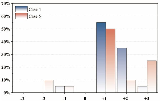
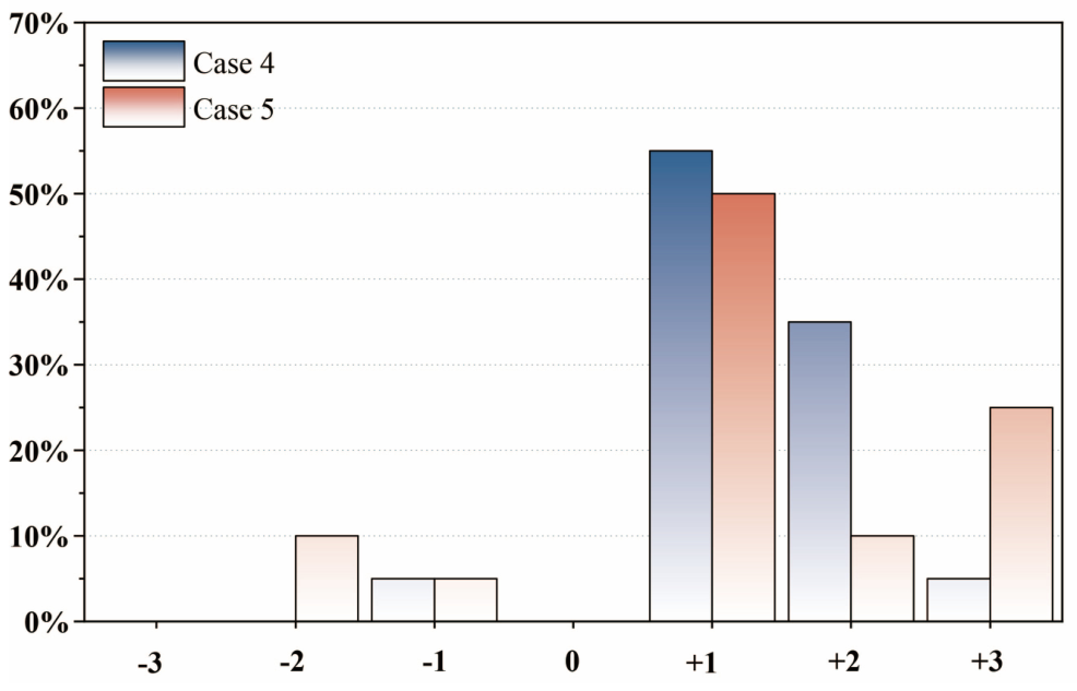
Audiovisual compatibility was assessed only in Cases 4 and 5, in which background music was present. As shown in Figure 12, the mean compatibility rating was 1.35 ± 0.81 for cool-toned artwork with music and 1.20 ± 1.51 for warm-toned artwork with music. Positive compatibility ratings were provided by 95% of participants in Case 4 and 85% in Case 5, and only 5% of participants gave a negative rating in Case 4 compared with 15% in Case 5. Responses in Case 4 were therefore more concentrated on the positive side of the scale, whereas Case 5 ratings ranged from −2 to +3 and had almost twice the standard deviation of Case 4, indicating substantially greater disagreement about the compatibility of music with warm-toned artwork. The mean difference between the two conditions was only 0.15 points and was not significant, W = 23.00, z = −0.47, p = 0.641, rank-biserial r = −0.164. The two colour-tone conditions therefore produced comparable average compatibility ratings, although the warm-tone condition elicited more heterogeneous individual judgements.
Figure 12.
Perceived music–artwork compatibility in cool- and warm-toned audiovisual conditions.
Across the four artwork-appraisal dimensions, warm-toned artwork consistently received higher mean ratings than cool-toned artwork: without background music, the warm–cool differences were 0.50 points for artwork liking, 0.55 points for viewing intention, 0.20 points for artistic appeal and 0.35 points for overall attractiveness, and with background music, they were 0.45, 0.35, 0.25 and 0.30 points. The differences were therefore of similar size in the music and no-music conditions, which accounts for the absence of significant music effects and colour tone × music interactions. In the primary analysis, artwork liking was the only appraisal dimension for which the colour tone contrast remained significant after FDR correction across the 12 contrast tests (F(1,19) = 12.73, p = 0.002, pFDR = 0.025, partial η2 = 0.401).
Table 3 provides an integrated summary of artwork appraisal and audiovisual compatibility. Panel A reports descriptive statistics for the four appraisal dimensions across Cases 2–5 together with the planned contrast results for colour tone, background music and their interaction, each given as F(1,19), p, pFDR and partial η2; Panel B reports the comparison of music–artwork compatibility between the two music-present conditions.
Table 3.
Effects of artwork colour tone and background music on artwork appraisal and audiovisual compatibility.
4. Discussion
The present study examined how warm- and cool-toned artwork and background music were associated with subjective affective states, perceived mental alertness and attention, artwork appraisal, and audiovisual compatibility within an indoor environment. Three principal findings emerged. First, the conditions were associated with significant differences in cheerfulness, anxiety and vitality, whereas relaxation, mental alertness and attention showed only descriptive changes. Second, within the four artwork conditions, higher vitality ratings were associated with the music-present conditions, and this contrast remained significant after FDR correction (pFDR = 0.042). Cheerfulness showed a similar pattern, although it did not remain significant after correction (pFDR = 0.068). No significant colour tone contrasts were identified for the six state measures. Third, warm-toned artwork received higher liking ratings than cool-toned artwork, with the colour tone contrast remaining significant after FDR correction (pFDR = 0.025), whereas background music was not significantly associated with artwork appraisal. Perceived music–artwork compatibility also did not differ significantly between the two colour tones. Overall, the findings suggest distinct patterns in subjective state and artwork appraisal, with no statistically significant colour tone × music interactions.
4.1. Effects of Artwork Colour Tone on Affect and Appraisal
In the primary analysis, warm-toned artwork received higher mean liking scores both without and with music, with the colour tone contrast remaining significant after FDR correction (pFDR = 0.025). However, the corresponding Wilcoxon sensitivity analysis did not reach the FDR-adjusted significance threshold (pFDR = 0.053), indicating some sensitivity to the analytical method. Overall attractiveness and viewing intention followed the same direction, although these effects were weaker. The warm-tone advantage was therefore not restricted to a particular music condition and was expressed primarily through aesthetic preference.
Previous research has shown that warm and cool colours are not simply associated with positive and negative emotions but often differ in arousal-related qualities. Warm-coloured interiors have been rated as more exciting, stimulating and arousing, whereas cool-coloured interiors have been perceived as more restful and spacious [13,14]. The higher liking of warm-toned artwork is compatible with the more stimulating qualities previously attributed to warm colours, while the lowest anxiety ratings and the relatively high attention scores observed under cool-toned artwork with music are consistent with the calmer qualities associated with cool environments.
These associations should not be interpreted as evidence that warm colours are universally preferred or that cool colours are necessarily more relaxing. Emotional responses to colour depend jointly on hue, saturation and brightness, and saturated and bright colours tend to produce higher valence and arousal ratings, while hue effects vary across the colour space [16]. The present experiment manipulated the overall warm or cool appearance of complete artworks rather than independently controlling hue, saturation and brightness, and the warm- and cool-tone conditions were represented by different paintings. The observed warm-tone effect may therefore reflect the combined influence of several visual properties, including subject matter and composition, rather than colour temperature alone.
Colour preference may also depend on learned associations and previous experience. The ecological valence theory proposes that people prefer colours associated with objects and experiences they evaluate positively [18]. From this perspective, the warm-tone preference observed here may reflect associations with warmth, sunlight, intimacy or familiar decorative environments, and it should be interpreted as a context-specific preference for the artworks used in this experiment rather than as a general preference for warm colours.
Research in occupied indoor environments similarly indicates that colour effects are embedded in a broader environmental system. A cross-cultural workplace study found that perceived lighting and colour design were related to occupants’ mood, although the effect depended on whether the environment was experienced as appropriately illuminated rather than on objective illumination alone [8]. The present findings extend this contextual perspective from wall and lighting colour to displayed artworks, indicating that relatively local visual elements may contribute to the affective character of an indoor environment even when the interior itself is not recoloured.
4.2. Background Music, Affective State and Perceived Cognitive State
The music-present conditions showed relatively high cheerfulness, vitality and relaxation and relatively low anxiety. The 2 × 2 analysis of the four artwork conditions showed a significant music-related contrast for vitality and nominally significant contrasts for cheerfulness and relaxation, whereas no significant colour tone contrast was observed for any state measure. This pattern is consistent with the literature suggesting that music listening can support emotional regulation. A meta-analysis of background music studies reported a null global effect across all outcomes but a small positive influence on emotional reactions when outcomes were analysed separately [19]. A meta-analysis of non-clinical samples similarly found a small reduction in self-reported anxiety after music listening, although physiological measures did not show a corresponding effect and the included studies were highly heterogeneous [22]. In the present study, the strongest music-related difference was observed for vitality, which reflects an activated rather than a purely pleasant state. However, because the music-present conditions were always presented later in the session, these differences cannot be clearly separated from possible order or time-related effects, including habituation, fatigue and carry-over.
In contrast to the affective outcomes, perceived mental alertness and attention did not differ significantly across conditions, which is consistent with evidence that the influence of background music on cognitive functioning is less stable than its influence on emotional experience. Systematic reviews have described the cognitive effects of background music as inconsistent and dependent on task type, musical features, participant characteristics and listening context [23]. Fast and loud music, for example, can impair reading comprehension, whereas slower or softer music may produce smaller or no detrimental effects [31].
The absence of significant changes in mental alertness and attention should not be interpreted as evidence that cognitive performance remained unchanged. These items measured perceived current states rather than task-based performance, and colour-related cognitive effects have been shown to depend on the specific task, with red facilitating detail-oriented performance and blue facilitating creative performance [32,33]. Without an objective task, the present study cannot determine whether the colour and music conditions affected particular cognitive processes.
4.3. Artwork Appraisal and Audiovisual Compatibility
Background music did not significantly increase artwork liking, viewing intention, artistic appeal or overall attractiveness. This result differs from some naturalistic museum research. In a study involving visitors viewing a Kandinsky painting, musical valence influenced the perceived pleasantness of the painting, and participants who liked the background music rated the artwork more positively in terms of valence, beauty and liking [33]. One possible explanation for the difference is that Braun Janzen and colleagues explicitly varied the emotional character of the music and took music likability into account, whereas the present study did not assess music preference, familiarity, or perceived musical valence and arousal. A music track may influence artwork appraisal primarily when its emotional qualities are sufficiently distinctive or when it is personally liked. Furthermore, because only one background audio recording was used, the findings may not generalise to other musical styles or recordings.
The absence of a significant music effect is nevertheless consistent with research separating perceptual compatibility from aesthetic preference. Rančić and Marković found that congruent music–painting combinations received higher matching ratings than incongruent combinations, but congruence did not increase the aesthetic pleasantness of the paintings [24]. Participants can therefore recognise that music and artwork correspond perceptually without necessarily liking the artwork more.
A more recent preregistered study reported a similar dissociation. Artist-intended music–art pairings were rated as more correspondent than randomly paired stimuli, but the intended pairings did not produce higher enjoyment, interest or viewing time, although audiovisual presentations were experienced as more moving than unimodal presentations [25]. Audiovisual correspondence, emotional impact and aesthetic evaluation therefore appear to be related but separable dimensions. Table 4 summarises how the present findings relate to the studies discussed above.
Table 4.
Comparison of the present findings with related studies.
4.4. Implications for Indoor Environmental Design
The results suggest that artwork colour tone and background music were associated with different aspects of occupant responses in this sample. However, the absence of a statistically significant interaction does not establish independence between these two factors. Artwork colour tone was associated with aesthetic appraisal: warm-toned works received higher mean liking ratings in both music-absent and music-present conditions. The colour tone contrast in artwork liking was significant in the primary analysis after FDR correction (pFDR = 0.025) but did not reach the significance threshold in the Wilcoxon sensitivity analysis (pFDR = 0.053). Where the aim is to make a space appear more appealing or more welcoming, the selection of displayed art may therefore be a comparatively direct design measure [35].
Background music, by contrast, was associated with subjective state rather than with appraisal. The music-present conditions were associated with higher vitality ratings and a similar, but less statistically robust, pattern in cheerfulness, whereas no significant music-related differences were observed in artwork appraisal. This dissociation argues against an assumption that additional sensory stimulation automatically improves occupant experience [9,36]. Combining visual and acoustic elements in a space should therefore be understood as a question of fit and of purpose: music may be used to support an intended emotional atmosphere, whereas it should not be expected to enhance the perceived quality of the visual elements present in the same setting.
The study also indicates the limits of what can be expected from such interventions. The effects observed here were modest in size, were not consistent across all outcome measures, and varied substantially between individuals, particularly in the music-present conditions. The Wilcoxon sensitivity analyses showed patterns consistent with the primary analyses for vitality and artwork liking, although the FDR-adjusted p-values were slightly above the significance threshold (both pFDR = 0.053). These findings suggest broadly consistent response patterns across the two analytical approaches while indicating some uncertainty regarding their statistical significance. Perceived mental alertness and attention did not differ reliably between conditions, and the present measures describe subjective states rather than task performance. Consequently, these findings should not be translated into claims that colour or music improve cognitive efficiency or productivity in indoor spaces [37]. Design decisions involving visual art and background music are better supported by the identification of the specific experience that is intended, together with an explicit recognition that responses differ between occupants and between contexts.
5. Conclusions
This study examined subjective responses to warm- and cool-toned artwork and background music in an indoor audiovisual environment. On the basis of questionnaire responses from 20 participants who each experienced all five conditions, the following conclusions were drawn.
Significant differences across the five experimental conditions were observed for cheerfulness, anxiety, and vitality (all pFDR ≤ 0.040). In the 2 × 2 analysis of the four artwork conditions, higher vitality ratings were associated with the music-present conditions (F(1,19) = 12.30, p = 0.002, pFDR = 0.042, partial η2 = 0.393). Cheerfulness showed a similar pattern (p = 0.008), but the difference did not remain significant after FDR correction (pFDR = 0.068). No significant colour tone contrasts or colour tone × music interactions were identified for the six subjective state measures.
Relaxation, mental alertness and attention showed positive numerical trends but no statistically significant differences. These findings therefore indicate changes in perceived states rather than reliable improvements in cognitive performance.
Warm-toned artwork received higher liking scores than cool-toned artwork, both without music (1.50 vs. 1.00) and with music (1.65 vs. 1.20). The colour tone contrast in artwork liking remained significant after FDR correction (p = 0.002, pFDR = 0.025), whereas neither the background music contrast nor the colour tone × music interaction was significant. Audiovisual compatibility was rated positively in both music-present conditions, with no significant difference between cool- and warm-toned artwork (1.35 vs. 1.20). Overall, artwork colour tone was associated with differences in artwork liking, while background music was associated with differences in subjective vitality, and no statistically significant interactions were detected. However, the corresponding Wilcoxon sensitivity analyses for vitality and artwork liking did not remain significant after FDR correction (both pFDR = 0.053), indicating that the statistical significance of these findings was sensitive to the analytical method.
Several limitations should be considered when interpreting these findings. The sample was small, the study relied entirely on self-reported responses, and each condition lasted only about eight minutes, so the results describe short-term subjective states rather than durable effects. The small sample size may also have limited the statistical power to detect smaller effects and interactions. Therefore, the absence of statistically significant interactions should not be interpreted as evidence that such interactions do not exist. The five conditions were always presented in the same order and were not counterbalanced, which means that sequence and fatigue effects cannot be separated from condition effects. Colour tone was also manipulated by selecting artworks that differed in overall warm or cool appearance, so it remains confounded with other properties of the images such as subject matter, saturation and composition, and characteristics of the background music such as valence, tempo and familiarity were not measured. In addition, the reliance on single-item subjective measures limits the assessment of measurement reliability and the breadth of the constructs evaluated. Furthermore, the controlled screen-based viewing environment does not fully represent the visual, spatial, and multisensory complexity of real indoor settings, limiting the direct generalisability of the findings to practical building design. Future work could address these limitations by counterbalancing the order of conditions, using artwork sets matched on all properties except colour tone, including physiological or behavioural measures, and recruiting a larger and more diverse sample. Such efforts could be complemented by visual and acoustic modelling and experiments under different illuminance levels, sound pressure levels, display configurations, and room conditions to assess the applicability of the findings across a wider range of indoor environments.
Author Contributions
Conceptualization, Q.L., Q.Q. and Y.C.; Methodology, Q.L. and Y.S.; Software, Q.L. and Y.S.; Investigation, Q.L., Y.S., Q.Q. and Y.C.; Resources, Y.S.; Data curation, Y.C.; Writing—original draft, S.X. and Q.Q.; Visualization, S.X. All authors have read and agreed to the published version of the manuscript.
Funding
This research received no external funding.
Institutional Review Board Statement
The study was conducted in accordance with the Declaration of Helsinki, and approved by the Research Ethics Committee of the Applied Technology College of Soochow University (Zhouzhuang College of Culture and Tourism, Suzhou, China) (protocol code 2026-04-131 and date of approval 25 April 2026).
Informed Consent Statement
Written informed consent was obtained from all participants involved in the study.
Data Availability Statement
The datasets generated and analysed during the current study are not publicly available due to participant confidentiality, but are available from the corresponding author on reasonable request.
Conflicts of Interest
The authors declare no conflicts of interest.
References
- Jia, C.; Rong, Y.; Geng, X.; Wang, M.; Zhang, Z.; Han, S.; Bie, X. People’s psychological and physiological responses to the combined smell-thermal environments. Build. Environ. 2023, 241, 110510. [Google Scholar] [CrossRef] [Scilit]
- Gousineyah, S.A.; Zaki, S.A.; Singh, M.K.; Rijal, H.B. The role of fragrance and physiological responses in enhancing thermal comfort: A review. Build. Environ. 2026, 289, 114007. [Google Scholar] [CrossRef] [Scilit]
- Cho, Y.; Karmann, C.; Andersen, M. Perception of window views in VR: Impact of display and type of motion on subjective and physiological responses. Build. Environ. 2025, 274, 112757. [Google Scholar] [CrossRef] [Scilit]
- Xu, M.; Gong, X.; Xu, L.; Si, R.; Xu, F. More senses, greater benefits? Evaluating the restorative effects of plant exposure on older adults in thermoneutral indoor environments. Build. Environ. 2026, 289, 114083. [Google Scholar] [CrossRef] [Scilit]
- Giraldo Vásquez, N.; Rupp, R.F.; Andersen, R.K.; Toftum, J. Occupants’ responses to window views, daylighting and lighting in buildings: A critical review. Build. Environ. 2022, 219, 109172. [Google Scholar] [CrossRef] [Scilit]
- Riva, A.; Rebecchi, A.; Capolongo, S.; Gola, M. Can homes affect well-being? A scoping review among housing conditions, indoor environmental quality, and mental health outcomes. Int. J. Environ. Res. Public Health 2022, 19, 15975. [Google Scholar] [CrossRef] [Scilit] [PubMed]
- Ibrahim, A.; Alsukkar, M.; Xu, Y.; Hermaputi, R.L.; Yin, S.; Xiao, Y. The potential of large language models for sustainable building performance: A review of applications, evaluation practices, and reliability. Energy Sustain. Dev. 2026, 95, 102104. [Google Scholar] [CrossRef] [Scilit]
- Küller, R.; Ballal, S.; Laike, T.; Mikellides, B.; Tonello, G. The impact of light and colour on psychological mood: A cross-cultural study of indoor work environments. Ergonomics 2006, 49, 1496–1507. [Google Scholar] [CrossRef] [Scilit] [PubMed]
- Latini, A.; Torresin, S.; Oberman, T.; Di Giuseppe, E.; Aletta, F.; Kang, J.; D’Orazio, M. Virtual reality application to explore indoor soundscape and physiological responses to audio-visual biophilic design interventions: An experimental study in an office environment. J. Build. Eng. 2024, 87, 108947. [Google Scholar] [CrossRef] [Scilit]
- Ibrahim, A.; Alsukkar, M.; Wang, L.; Hermaputi, R.L.; Dong, Y.; Yin, S.; Xiao, Y.; Hu, P. Targeting integrated daylighting comfort in deep office by multi-objective optimization using partial vertical deployment of adaptive corrugated shadings. Energy Built Environ. 2026, 7, 1556–1570. [Google Scholar] [CrossRef] [Scilit]
- Ibrahim, A.; Alsukkar, M.; Eltaweel, A.; Hermaputi, R.L. Multi-Objective Optimization of Daylighting for an Office Space in a Very Hot Climate: A Comparison of Corrugated, Perforated, and Separated Shadings. Buildings 2026, 16, 2625. [Google Scholar] [CrossRef] [Scilit]
- Wang, L.; Ibrahim, A.; Jiang, Y. Multi-Objective Optimization of Atrium Form Variables for Daylighting, Energy Consumption and Thermal Comfort of Teaching Buildings at the Early Design Stage in Cold Climates. Buildings 2025, 15, 4434. [Google Scholar] [CrossRef] [Scilit]
- Yildirim, K.; Hidayetoglu, M.L.; Capanoglu, A. Effects of interior colors on mood and preference: Comparisons of two living rooms. Percept. Mot. Ski. 2011, 112, 509–524. [Google Scholar] [CrossRef] [Scilit] [PubMed]
- Xu, J.; Li, M.; Cao, K.; Zhou, F.; Lv, B.; Lu, Z.; Cui, Z.; Zhang, K. A VR experimental study on the influence of Chinese hotel interior color design on customers’ emotional experience. Buildings 2022, 12, 984. [Google Scholar] [CrossRef] [Scilit]
- Wei, Y.; Zhang, Y.; Wang, Y.; Liu, C. A study of the emotional impact of interior lighting color in rural bed and breakfast space design. Buildings 2023, 13, 2537. [Google Scholar] [CrossRef] [Scilit]
- Wilms, L.; Oberfeld, D. Color and emotion: Effects of hue, saturation, and brightness. Psychol. Res. 2018, 82, 896–914. [Google Scholar] [CrossRef] [Scilit] [PubMed]
- Weijs, M.L.; Jonauskaite, D.; Reutimann, R.; Mohr, C.; Lenggenhager, B. Effects of environmental colours in virtual reality: Physiological arousal affected by lightness and hue. R. Soc. Open Sci. 2023, 10, 230432. [Google Scholar] [CrossRef] [Scilit] [PubMed]
- Palmer, S.E.; Schloss, K.B. An ecological valence theory of human color preference. Proc. Natl. Acad. Sci. USA 2010, 107, 8877–8882. [Google Scholar] [CrossRef] [Scilit] [PubMed]
- Kämpfe, J.; Sedlmeier, P.; Renkewitz, F. The impact of background music on adult listeners: A meta-analysis. Psychol. Music 2011, 39, 424–448. [Google Scholar] [CrossRef] [Scilit]
- Chong, H.J.; Kim, H.J.; Kim, B. Scoping review on the use of music for emotion regulation. Behav. Sci. 2024, 14, 793. [Google Scholar] [CrossRef] [Scilit] [PubMed]
- Morgan, R.M.; Marroquín, B. Music listening as emotion regulation: Associations with other emotion regulation strategies and symptoms of depression and anxiety. Music. Sci. 2023, 28, 591–605. [Google Scholar] [CrossRef] [Scilit]
- Panteleeva, Y.; Ceschi, G.; Glowinski, D.; Courvoisier, D.S.; Grandjean, D. Music for anxiety? Meta-analysis of anxiety reduction in non-clinical samples. Psychol. Music 2018, 46, 473–487. [Google Scholar] [CrossRef] [Scilit]
- Cheah, Y.; Wong, H.K.; Spitzer, M.; Coutinho, E. Background music and cognitive task performance: A systematic review of task, music, and population impact. Music Sci. 2022, 5, 20592043221134392. [Google Scholar] [CrossRef] [Scilit]
- Rančić, K.; Marković, S. The perceptual and aesthetic aspects of the music-paintings congruence. Vision 2019, 3, 65. [Google Scholar] [CrossRef] [Scilit] [PubMed]
- Fink, L.; Fiehn, H.; Wald-Fuhrmann, M. The role of audiovisual congruence in aesthetic appreciation of contemporary music and visual art. Sci. Rep. 2024, 14, 20923. [Google Scholar] [CrossRef] [Scilit] [PubMed]
- Spence, C. Exploring group differences in the crossmodal correspondences. Multisens. Res. 2022, 35, 495–536. [Google Scholar] [CrossRef] [Scilit] [PubMed]
- Spence, C.; Di Stefano, N. Coloured hearing, colour music, colour organs, and the search for perceptually meaningful correspondences between colour and sound. i-Perception 2022, 13, 20416695221092802. [Google Scholar] [CrossRef] [Scilit] [PubMed]
- Luo, D.; Doucé, L.; Nys, K. Multisensory museum experience: An integrative view and future research directions. Mus. Manag. Curatorsh. 2024, 41, 212–239. [Google Scholar] [CrossRef] [Scilit]
- Stamkou, E.; Keltner, D.; Corona, R.; Aksoy, E.; Cowen, A.S. Emotional palette: A computational mapping of aesthetic experiences evoked by visual art. Sci. Rep. 2024, 14, 19932. [Google Scholar] [CrossRef] [Scilit] [PubMed]
- Chen, K.; Kang, J.; Ma, H. Evaluation of healthy indoor acoustic environments in residential buildings by the occupants: A mixed-method approach. Build. Environ. 2023, 246, 110950. [Google Scholar] [CrossRef] [Scilit]
- Thompson, W.F.; Schellenberg, E.G.; Letnic, A.K. Fast and loud background music disrupts reading comprehension. Psychol. Music 2012, 40, 700–708. [Google Scholar] [CrossRef] [Scilit]
- Mehta, R.; Zhu, R.J. Blue or red? Exploring the effect of color on cognitive task performances. Science 2009, 323, 1226–1229. [Google Scholar] [CrossRef] [Scilit] [PubMed]
- Nolé Fajardo, M.L.; Higuera-Trujillo, J.L.; Llinares, C. Lighting, colour and geometry: Which has the greatest influence on students’ cognitive processes? Front. Archit. Res. 2023, 12, 575–586. [Google Scholar] [CrossRef] [Scilit]
- Braun Janzen, T.; de Oliveira, B.; Ventorim Ferreira, G.; Sato, J.R.; Feitosa-Santana, C.; Vanzella, P. The effect of background music on the aesthetic experience of a visual artwork in a naturalistic environment. Psychol. Music 2023, 51, 16–32. [Google Scholar] [CrossRef] [Scilit]
- Sedghikhanshir, A.; Zhu, Y.; Beck, M.R.; Jafari, A. The impact of visual stimuli and properties on restorative effect and human stress: A literature review. Buildings 2022, 12, 1781. [Google Scholar] [CrossRef] [Scilit]
- Guan, H.; Zhang, X.; Dong, J.; Shu, R.; Hu, S.; Tong, Z. Biophilic environment with auditory-olfactory stimuli contributes to psychophysiological restoration from stress. Build. Environ. 2025, 275, 112830. [Google Scholar] [CrossRef] [Scilit]
- Latini, A.; Torresin, S.; Oberman, T.; Di Giuseppe, E.; Aletta, F.; Kang, J.; D’Orazio, M. Effects of biophilic design interventions on university students’ cognitive performance: An audio-visual experimental study in an immersive virtual office environment. Build. Environ. 2024, 250, 111196. [Google Scholar] [CrossRef] [Scilit]

Disclaimer/Publisher’s Note: The statements, opinions and data contained in all publications are solely those of the individual author(s) and contributor(s) and not of MDPI and/or the editor(s). MDPI and/or the editor(s) disclaim responsibility for any injury to people or property resulting from any ideas, methods, instructions or products referred to in the content. |
© 2026 by the authors. Licensee MDPI, Basel, Switzerland. This article is an open access article distributed under the terms and conditions of the Creative Commons Attribution (CC BY) license.