Article

Youth Data Visualization Practices: Rhetoric, Art, and Design

Department of Theory and Practice in Teacher Education, University of Tennessee, Knoxville, TN 37996, USA
*
Author to whom correspondence should be addressed.
Educ. Sci. 2025, 15(6), 781; https://doi.org/10.3390/educsci15060781
Submission received: 25 April 2025 / Revised: 14 June 2025 / Accepted: 17 June 2025 / Published: 19 June 2025
(This article belongs to the Section Curriculum and Instruction)

Abstract

:
In the recent K-12 educational literature, arts-based data visualization has been positioned as a compelling means of rendering data science and statistical learning accessible, motivating, and empowering for youth, as data users and producers. However, the only research to attend carefully to youth’s data-based, artistic storytelling practices has been limited in scope to specific storytelling mechanisms, like youth’s metaphor usage. Engaging in design-based research, we sought to understand the art and design decisions that youth make and the data-based arguments and stories that youth tell through their arts-based data visualizations. We drew upon embodied theory to acknowledge the holistic, synergistic, and situated nature of student learning and making. Corresponding with emerging accounts of youth arts-based data visualization practices, we saw regular evidence of art, storytelling, and personal subjectivities intertwining. Contributing to this literature, we found that these intersections surfaced in a number of domains, including youth’s pictorial symbolism, visual encoding strategies, and data decisions like manifold pictorial symbols arranged to support complex, multilayered, ambiguous narratives; qualitative data melding community and personal lived experience; and singular statements making persuasive appeals. This integration of art, story, agency, and embodiment often manifested in ways that seemed to jostle against traditional notions of and norms surrounding data science.

1. Introduction

In recent years, data science has experienced increased educational momentum. Educational stakeholders have noted the intensified velocity and scale of data and related technologies, societal reliance on data for decision-making, and the hegemonies inherent to data-based messaging (Bargagliotti et al., 2020; National Academies of Sciences, Engineering, and Medicine, 2023; National Council of Teachers of Mathematics, 2024). They have called for data science and statistical learning to further infuse K-12 mathematics and K-12 education in general. As data visualization can function as both a data analysis technique and a communication tool, data visualization has been recognized as a critical component of this learning (Rubel et al., 2021). Accordingly, a growing body of literature (e.g., Chang et al., 2024; Jiang & Kahn, 2020) has explored data visualization practices in K-12 educational contexts.
As data visualization has gained ground as a topic of study in K-12 education, notions of these practices have expanded to include epistemologically and methodologically diverse forms. Specifically, arts-based approaches to data science and data visualization, including “data-art inquiry” (Matuk et al., 2022, p. 1159), “data walking,” (Hunter, n.d., p. 1), “data physicalization” (Ambrosini, 2022, p. 1), and “arts-based data visualization” (Bertling et al., 2025), have rapidly appeared in the educational literature. In drawing upon the innovative, data-based work of contemporary artists, designers, and performers (Bhargava et al., 2022; Woods et al., 2024), these curricula tend to foreground a range of affective, inventive, and conceptually rich data-based storytelling practices. For instance, the artist Cheung (2021) constructed an interactive sculptural “bamboo forest” installation with flowing thermochromic ink reflecting 63 years of carbon emissions. In the K-12 educational literature (e.g., Stornaiuolo, 2020; Vacca et al., 2022; Woods et al., 2024), these types of approaches have been positioned as compelling means of rendering data science and statistical learning accessible, motivating, and empowering for youth, as data users and producers.
As these novel arts-based approaches to data visualization have begun to be integrated in K-12 educational contexts, some research has investigated youth’s data visualization practices and the competencies and dispositions associated with youth’s engagement in these practices. For instance, some studies have examined youth’s development of critical data literacy (Amato et al., 2022; Stornaiuolo, 2020; Yalcinkaya, 2023) and critical visual literacy (Woods et al., 2024). Other studies have focused narrowly on specific cognitive processes, like mathematical and data reasoning (DesPortes et al., 2022; Matuk et al., 2022; Vacca et al., 2022). However, the only research to attend carefully to youth’s data-based storytelling practices1 involving the arts has been limited in scope to specific storytelling mechanisms, primarily, youth’s metaphor usage (Bertling et al., 2025; DesPortes et al., 2022).
While such foci are important, more comprehensive investigations into the breadth of youth’s data-based, artistic storytelling, including their rhetorical intentions and decision-making, are also needed. More holistic understandings of these practices could provide a stronger basis for supporting youth in these critically important sociocultural endeavors. Specifically, these investigations might offer insight into the ways youth comprehend these practices and help to identify practices that can serve as potential resources in supporting youth. Additionally, studies can assist in developing understandings of how youth improvise in the context of data analysis and interpretation practices, illuminating the ways in which youth agency might unfold within the context of data engagement. Typically, within educational contexts, content is viewed as something to be imparted rather than created, but these approaches have the potential to re-envision these relations.
Engaging in design-based research, we sought to understand the art and design decisions that youth make and data-based arguments and stories that youth tell through their arts-based data visualizations. Research questions (RQs) included:
What art and design decisions do youth data artists make in their data visualizations?
What data-based arguments and stories do youth data artists verbally articulate that they are telling through their data visualizations?
By investigating these two questions and then examining the connections between them, we expected to gain a better understanding of the nature of and potential for concrete integrations between art- and data-based approaches. Such knowledge may have important implications for conceptions of disciplinary integration more generally. As we explored these questions, we drew upon embodied theory to acknowledge the holistic, synergistic, and situated nature of student learning and making.

2. Theoretical Framework of Embodied Learning, Making, and Storytelling

Embodied cognition, now a well-established field of study in the cognitive and social sciences, emphasizes the integral connections between mind and body and underscores the embodied processes, like emotion and physical experience, which constitute and shape reasoning. Researchers, drawing upon theories of embodied cognition, have studied various manifestations of these relational understandings, including how spatial, body-based metaphors form the basis for conceptual understandings (Lakoff & Johnson, 2020); implicit emotions, felt at the unconscious level, regulate advanced cognition, like creative thinking (Wu et al., 2020); and embodied simulations form the basis for social-cognitive processes (Schmidt et al., 2021). Within this context, works of art have increasingly been conceptualized as embodied cognitive expressions: products of human somatic experience and environmental interactions. The relationship between artist and media has been understood as synergistic and multidirectional, with media coming to embody artists’ ideas but also with material experimentation giving rise to new conceptions that inform the final art products (Collins & Sullivan, 2020).
This intensified attention to the body and social, cultural, environmental, and material relationality has profound implications for comprehensions of art and making processes, to include arts-based data visualization practices. Specifically, it might inform our understanding of the ways in which: (1) youth’s subjectivities, to include their experiences, needs, and desires as embodied beings and situatedness in various sociocultural networks and material spaces, might shape their data visualization practices; and (2) art, narrative, and storytelling practices might leverage or integrate data to provide direction for community learning. In this paper, we draw upon embodiment theory to conceptualize youth learners, makers, and storytellers as corporeal, embedded, cultural beings; their learning, making, and storytelling processes as integrally shaped by these affectivities, subjectivities, and relationalities; and their data visualizations as relational sites for meaningful community engagement. These understandings were reflected in the Mathematizing, Visualizing, and Power (MVP) project’s curriculum that encouraged youth to leverage affect for impactful, locally oriented storytelling. They also informed our research analyses and interpretations as we attended to the complex, lively interplay of the bodily, sociocultural, and material factors associated with youth aesthetic decision-making.

3. Literature Review of Arts-Based Data Visualization in Education

A burgeoning body of literature explores the potential of arts-based data visualization for engaging and empowering youth. Although few research studies have examined out-of-school-time programs, multiple studies have attended to school-based programming and curricula. With the exception of a few school programs that appear to have been more event- or workshop-based (Taylor et al., 2019), research primarily has examined K-12 curricula in classrooms, including STEM (Bertling et al., 2024), mathematics (Vacca et al., 2022; Woods et al., 2024), and visual art and media arts (Stornaiuolo, 2020; Vacca et al., 2022; Woods et al., 2024) classes. In the following sections, we review this school-based literature, first exploring the general findings and, then, attending to the findings more specifically related to students’ art and design decisions.

3.1. Affordances and Tensions

In general, curriculum and educational programming integrating arts-based data visualization have demonstrated a number of positive student outcomes. Studies have shown that K-12 students have broadened their conceptions of data visualization (Bertling et al., 2024), made personal connections to data (Matuk et al., 2022; Woods et al., 2024; Yalcinkaya, 2023), strengthened their data visualization practices (Bertling et al., 2024) to include the telling of data-driven stories (Bhargava & D’Ignazio, 2017), and demonstrated comfort, interest, and excitement in engaging with data (Bhargava & D’Ignazio, 2017; Bhargava et al., 2016; Stornaiuolo, 2020). Moreover, in some cases, students have developed specific facets of critical data literacy, including their conceptualizing data as a means of obtaining knowledge, data visualization as a powerful tool for communication, and themselves as data actors (Stornaiuolo, 2020). Importantly, studies have shown that students can successfully visualize data relevant to their communities (Amato et al., 2022; Bertling et al., 2024; Taylor et al., 2019; Woods et al., 2024), develop “critical, data-based perspectives” (Matuk et al., 2022, p. 1169) surrounding these topics, and acquire confidence in their ability to use data visualization to address community concerns (Bertling et al., 2024).
While much attention has been paid to the affordances of data visualization in this emerging body of literature, some tensions have also been identified. Both Bertling et al. (2024) and Matuk et al. (2022) noted that typical siloed school contexts present challenges for fostering arts-based data visualization, as such inquiry necessarily crosses, integrates, and transcends disciplines. In both studies (Bertling et al., 2024; Matuk et al., 2022), teachers without sufficient supports designed or articulated plans to design disciplinary siloed curricula. Moreover, in Bertling et al.’s (2024) study, which was conducted in a school where the art class time was limited, art students conveyed some resistance to “doing math” in art class. Additionally, Matuk et al. (2022) identified schools’ asymmetrical treatment of mathematics and arts as a barrier to “data-art inquiry instruction” (p. 1159). With regard to media and technology, the findings have been mixed, with technology sometimes aiding (Taylor et al., 2019) and other times impeding learning and engagement (Matuk et al., 2022). Various arguments have been made. For instance, Bhargava and D’Ignazio (2017) concluded that hands-on, familiar, “low-tech” (p. 1) art media render data visualization inviting and accessible for novices to data visualization, while Taylor et al. (2019) touted digital media and mobile technologies for supporting youth data-based community engagement.
Data visualizations hold potential, but it is unclear how data visualization practices can address the challenges that young people face in making sense of data, such as focusing on individual points rather than important trends (Konold et al., 2015). Studies (Kahne & Bowyer, 2017; Zucker et al., 2020) show that youth can be challenged in determining the validity of data-based arguments in scientific and political areas. This challenge is significant as it has implications for the spread of misinformation (Erickson et al., 2019). In addition to challenges, other dominant tensions relate to the relationship between data and aesthetics, a topic we will explore further in the next section.

3.2. Data and Aesthetic Decisions

As youth have begun to visualize data using arts-based practices, a number of research studies (Stornaiuolo, 2020; Vacca et al., 2022; Yalcinkaya, 2023) have illustrated how K-12 students were able to describe data and make data-based arguments through practices commonly ascribed to the arts. Few studies have described visual encoding strategies for qualitative data, or at least, have been described as such; visual encoding of quantitative data has been more common. Some common visual encoding methods of quantitative data have included youths’ manipulation of pictorial and geometric symbols’ visual attributes, such as shape, size or length, repetition, color, and position (Yalcinkaya, 2023).
As data reasoning is integrally intertwined with data storytelling—the building of compelling narratives—Vacca et al.’s (2022) study assessing the ways in which youth demonstrated data reasoning through data visualization, is especially relevant. Focusing on a 7th grade data comic unit, Vacca et al. (2022) identified seven modes by which students reasoned with and communicated data-based ideas: (1) describing the data—listing a point, percentage, or other data descriptor; (2) contextualizing the data—placing a data relationship within a context; (3) infusing personal experience—considering their own experiences associated with a data point or relationship; (4) reflecting upon the implications of data—considering the extent to which the data might support a hypothesis; (5) inquiring into related data—connecting the data to other variables or relationships external to the original data set; (6) making proportional comparisons—using percentages to compare different categories; and (7) incorrectly interpreting data—making an argument unsupported by the data. Vacca et al. (2022) concluded that many of these forms of data reasoning were personal, as students often brought their own identities and lived experiences to the sensemaking process and interwove personal narratives into their data visualizations.
As data-based stories can be relevant personally and draw upon processes commonly associated with the arts, some research (Matuk et al., 2022; Woods et al., 2024; Yalcinkaya, 2023) has begun to engage with the subjectivities that are inherent to these processes. In addition to Vacca et al. (2022) citing instances where data visualizations visualized external information or ideas, in addition to or in place of the original data set, both Matuk et al. (2022) and Woods et al. (2024) noted tensions between student’s data-based intentions and aesthetic considerations, with aesthetics sometimes overriding students’ data-based ideas. Additionally, Yalcinkaya (2023) noted issues of clarity that confounded “clear interpretation” (p. 123), particularly in visualizations without legends and other annotations. While this emerging body of research represents some important preliminary explorations of youth data visualization practices, additional research is needed to delve into these complexities more fully. Specifically, research that describes the data visualization practices that youth apply, invent, and improvise is needed to identify the starting points and potential supports for instructional design.

4. Materials and Methods

Design-based research aims to design and test various innovations, including educational interventions, in the everyday contexts in which they unfold or are likely to occur (Campanella & Penuel, 2021). For this reason, design-based research employs an iterative approach. In this study, the design context represented the creative and data-rich informal learning spaces associated with MVP: (1) after-school youth learning sessions held at a youth community center; and (2) community learning events (CLEs) conducted at various community locations. Correspondingly, the design intervention represented MVP programming, aimed at supporting statistical artistry among communities and enabling youth to share their data visualizations with their communities for collective reflection and understanding. Engaging in two cycles of design-based research over the course of a 13-month period, January 2023 through February 2024, the MVP research team examined a series of questions related to: (1) MVP youth identities in relation to statistical literacy and empowerment; and (2) MVP youth and community-member learning. In this study, we qualitatively attended to youth data visualization practices, including youth argumentation, storytelling, and design decisions, situated within the larger MVP and community contexts.

4.1. Setting and Participants

In this study, we focused on the first two of three MVP programmatic iterations, or cycles, which were based at the same youth-programming-oriented community center located in a mid-sized city in the Appalachian region of the United States. In each cycle, MVP youth attended 1–1.5 h weekly learning sessions, for a total of 12 learning sessions in Cycle 1 and 14 sessions in Cycle 2. Additionally, MVP conducted three to four CLEs in each cycle. These events were held at community locations that the MVP on-site team, including community center partners, identified in Cycle 1, and that youth played a role in selecting in Cycle 2. CLEs were open to the public, including youths’ family members, MVP staff, community center staff, and other community members, and offered opportunities for MVP youth to explain their work and engage community members in relevant conversations.
Each cycle engaged a new cohort of MVP youth, with 27 youth participating in Cycle 1 programming and 23 youth participating in Cycle 2 programming. Though 8 youth in Cycle 1 and 21 youth in Cycle 2 participated in the research, fewer youths participated in all the research components. For this study, we elected to include as participants only youths who participated in all the primary data collection components, expressly, by producing a final data visualization and participating in a post-focus group or extensive discussion about their work at a final CLE. As such, this study’s participants included 6 Cycle 1 and 17 Cycle 2 youth.
The MVP programming engaged Grades 6–12 youth, ages 11–18. Across the two cycles, youth participants were evenly split by gender, with 11 youth identifying as girls and 12 youth as boys. Both cycles of MVP youth were ethnically, racially, and socioeconomically diverse. Participating youth identified as White (65%), Black/African-American (26%), Asian (4%), and Other (4%). The majority of MVP youth attended local middle and high schools receiving Title I federal funding.
To recruit youth for both cycles, the project coordinator reached out to the Community Center Director and Coordinator expressly to share information and a flyer about the project. This was a follow up to previous meetings when the Project was under development. The flyer was directed towards potential youth participants and their parents. It was distributed to all the parents and youth at the Community center through text through the Remind app. In addition, two members of the project team attended an orientation hosted by the Community center to introduce programming and guidelines for the coming semester. Flyers were posted through our University STEM Education Center social media platforms to encourage further participation. A subset of the project team also held an informational session prior to the start of the learning sessions. The brief application that interested youth and parents was made available through the flyer and included name, contact information, and the reason(s) for their interest in the project. The criteria for participation represented (1) being a middle-school or high-school student (2) who could attend the learning sessions and the CLEs and (3) expressed interest in the project. Participants were selected on a first-come basis with a limit of 30 participants for each cycle given the resources and capacity of the project team. For Cycle 1, the retention rate was 96%. For Cycle 2, the retention rate was 92%.
To safeguard participants’ rights and autonomy, the MVP project team followed an Institutional Review Board-approved protocol for obtaining informed consent and assent. The team used an age-appropriate script that communicated the study’s purpose, procedures, potential risks, and confidentiality measures to both students and their parents or guardians. A project team member who was not an instructional facilitator conducted all the consent and assent conversations with students and parents. Paper copies of the information sheet and consent/assent forms were provided, allowing families time to review the materials and indicate their decisions in writing. Parents also had the opportunity to ask questions about the study during student pick-up times. Participation in the research was entirely voluntary and had no impact on students’ involvement in the instructional program for subsequent cycles of the project.

4.2. Data Collection

Data collection was similar across MVP Cycles 1 and 2. Toward the end of each MVP cycle, youth created data visualizations with accompanying exhibition signage and presented them at the final CLE. Additionally, youth discussed the process and products in post-focus groups. Data sources common to both cycles included youth-produced data visualizations, exhibition signage, and datasets; final CLE audio and video and field notes; and post-focus groups with youth. Cycle 2 data collection differed from Cycle 1 in two key respects: (1) the addition of youth video artist statements; and (2) revisions to post-focus group protocols, to allow time for the interviewer to establish a rapport and for youth to describe their process and rationale for data-topic selection.
To identify the data-based arguments and stories youth articulated they were telling through their data visualizations (RQ1), we primarily relied upon post-focus group audio and video, final CLE audio and video of youth explaining their data visualizations, and, in Cycle 2, video artist statements. Post-focus groups were semi-structured, 45-min to 1-h interviews conducted with groups of two to four youth, such that each youth was interviewed once about their experiences of working with the data that they ultimately visualized and their understanding of the final products. Some prompts from the focus group guide included “Tell me about the data visualization you created,” “What does it show?” and “How did you use visual imagery to communicate data?” Final CLE audio and video recorded the youth and community dialogues that occurred. We had multiple audio and video recorders positioned around the gallery space. Participant–observer field notes from two research team members supplemented these final CLE data.
We reviewed the data visualizations and accompanying exhibition signage that youth designed during later MVP learning sessions. These reviews served as our primary means of identifying youth art and design decisions (RQ2), although we also attended to youth’s oral explanations of their decision-making processes. Between the two cycles, we reviewed 15 data visualizations. To help us further understand the art and design decisions, we also analyzed the data sets that youth’s visualized. In Cycle 1, we only analyzed one data set because Cycle 1 youth designed a large survey instrument that was administered to local youth at the after-school community club where MVP programming took place. Youth selected portions of this large data set to visualize. However, in Cycle 2, youth elected to gather or collect data more individually or in small groups, which resulted in more data sets. See Table 1 for additional data collection information and research-question alignment.

4.3. Data Analysis

To prepare the data for analysis, we created content logs of CLE audio and video with relevant portions transcribed, transcribed focus group audio, and printed data visualization images, exhibition signage, field notes, and transcripts. Next, to address both research questions, the first author color-coded the exhibition signage, field notes, and transcripts by “data aspects” that youth wanted to visualize and youth’s “arguments and intentions,” “art and design choices,” and considerations of “impact”—categories we identified through a preliminary review of the data that loosely aligned with our research questions. Subsequently, both authors independently analyzed the highlighted sections, using open coding to assign a code to each highlighted line. Some codes included “personally relevant topic,” “use of representational imagery,” “arbitrary visual elements,” and “encoding a binary.” Throughout this process, we appraised data visualizations as needed, to clarify our understanding of statements referencing the data visualizations. To further address RQ1 related to art and design decisions, both authors independently conducted a formal art analysis of each data visualization. First, we noted prominent imagery and symbols; elements of design, like line, color, and shape; principles of design, like balance, space, and contrast; contemporary creative strategies (Marshall & Donahue, 2014), like juxtaposition, layering, and visual metaphor; genres; media; techniques; and exhibition choices that might function as visual encoding practices or more generally contribute to meaning. Some codes included “organic shapes,” “graphical,” “expressionistic,” and “no annotations.”
Next, we used pattern coding (Saldaña, 2021) to compare art decisions, visualization arguments, and stories (RQ1 and RQ2) across the youth. As part of this process, we reviewed the first cycle codes across the body of data to uncover similar initial codes, which we assembled to weigh their commonalities and explore relationships. Ultimately, upon such reflection, we assigned comparably coded data segments a pattern code. These codes included “encoding personal reactions to data,” “encoding complex narratives,” and “advocating community action.”
Throughout all the data analysis stages, we engaged in extensive memoing. After each data analysis phase, we came together for consensus meetings, where we compared codes and shared emerging findings. When key areas of difference arose, we examined them closely with the goal of developing shared understanding.

4.4. The MVP Program

Through youth and community programming, the MVP project sought to develop statistical and data artistry among young people and enable youth to share their data visualizations with their communities for collective reflection and understanding. Thus, MVP brought together multiple layers of learning and participation through data works of art and hybrid spaces (Gutiérrez et al., 1999) as critical points of contact. The MVP design principles included: (1) build a discourse community for reflection and learning; (2) draw on meaningful problems with possibilities for action; (3) reposition young people as data artists and knowledge brokers; (4) leverage cultural practices and individual assets; and (5) implement CLEs that provide opportunities for substantial youth and community interaction.
In the Spring of 2023, the project team implemented Cycle 1, the first of three planned iterations of design-based research. The second iteration, Cycle 2, occurred in Fall 2023. Both cycles included activities designed to help youth make personal connections to the data. Cycle 1 included a segment on personally relevant data through the use of the book Dear Data (Lupi & Posavec, 2016) and the implementation of a related activity in which data artists collected personal data and created a data visualization to reflect learning about themselves. Cycle 2 included discussions and an activity focused on the data artists’ definitions of community and the communities to which they belonged. While both curricular iterations integrated community, for instance, with CLEs and professional arts-based data visualizations related to social and ecological issues of potential relevance to local communities with which youth could engage, Cycle 2 had a stronger community focus. This orientation infused many Cycle 2 activities, including instructor-posed whole-group questions, reflection questions, and data-visualization prompts, and eventually arose in youth data visualization practices.

5. Results

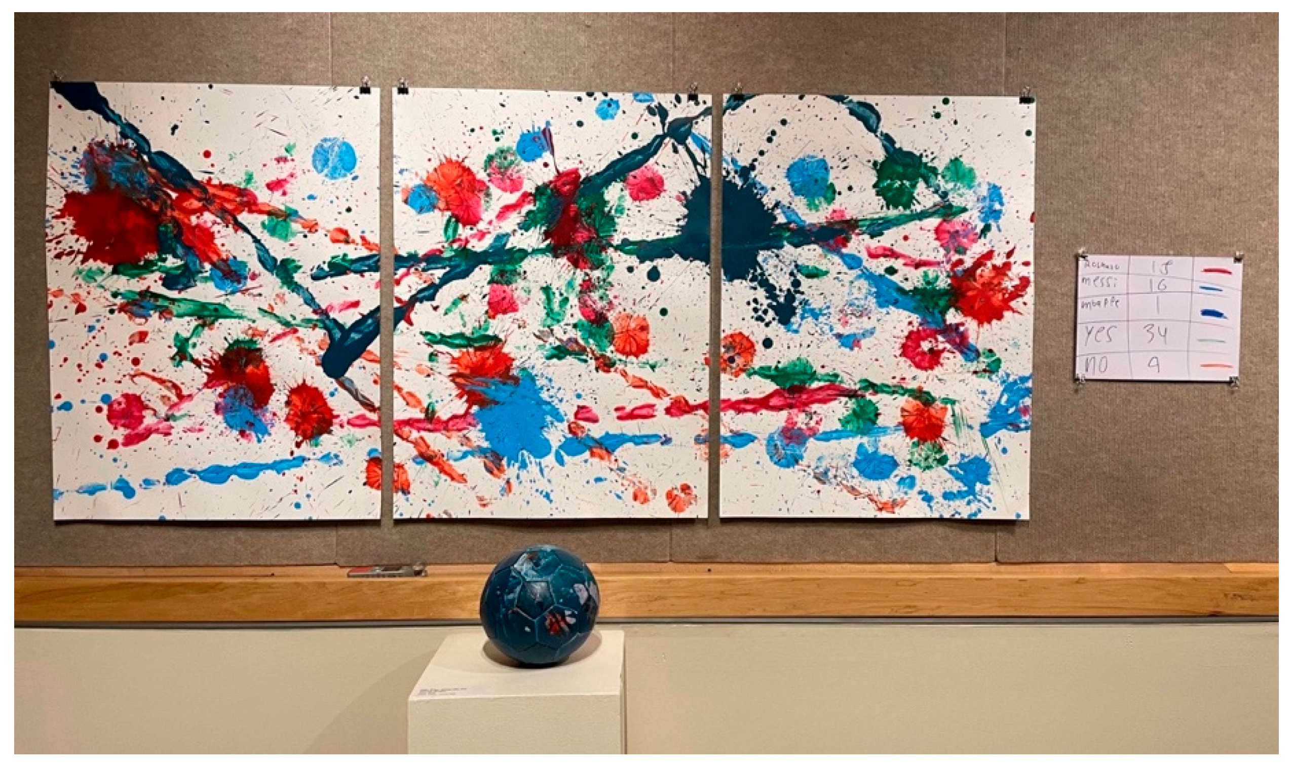
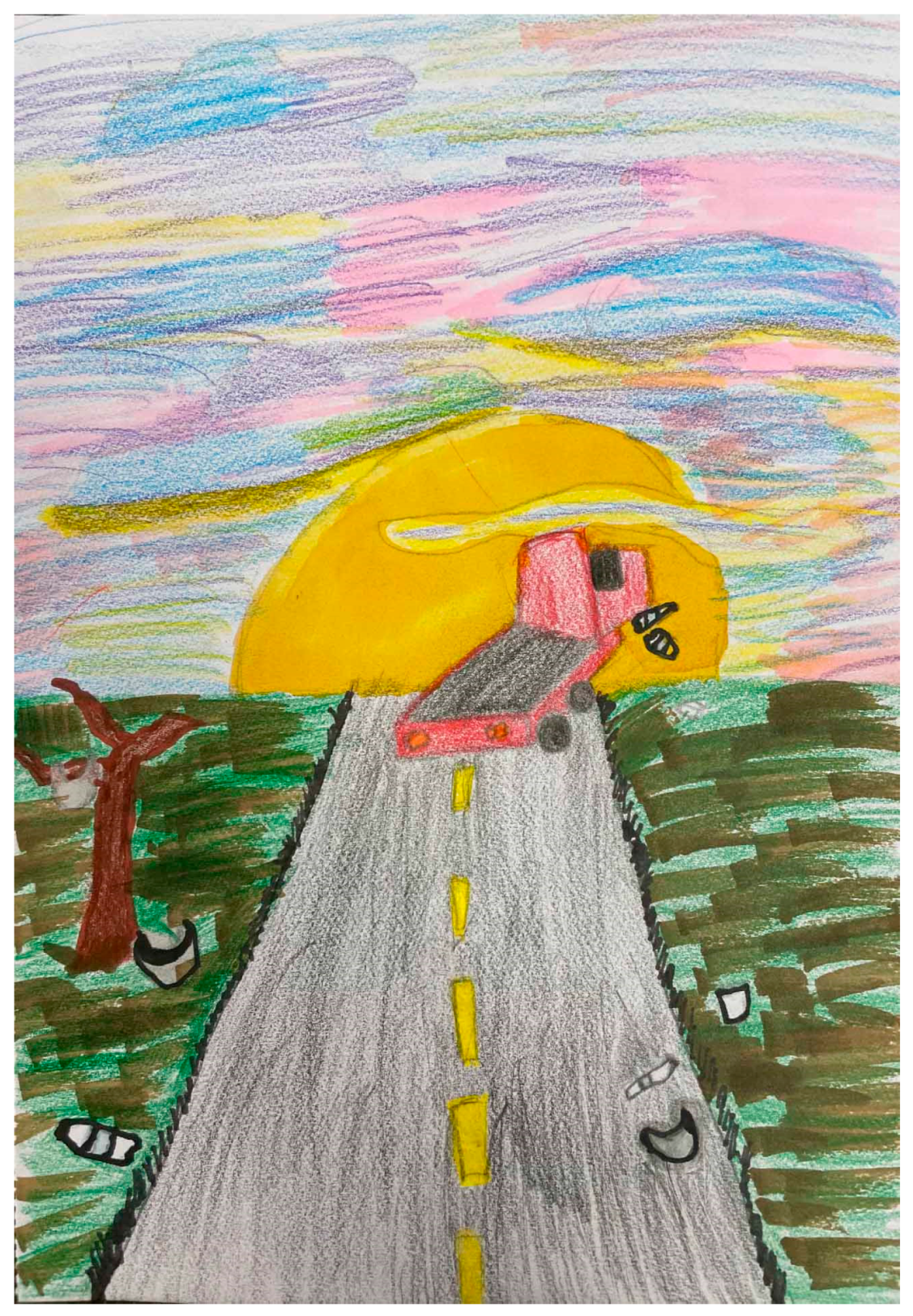
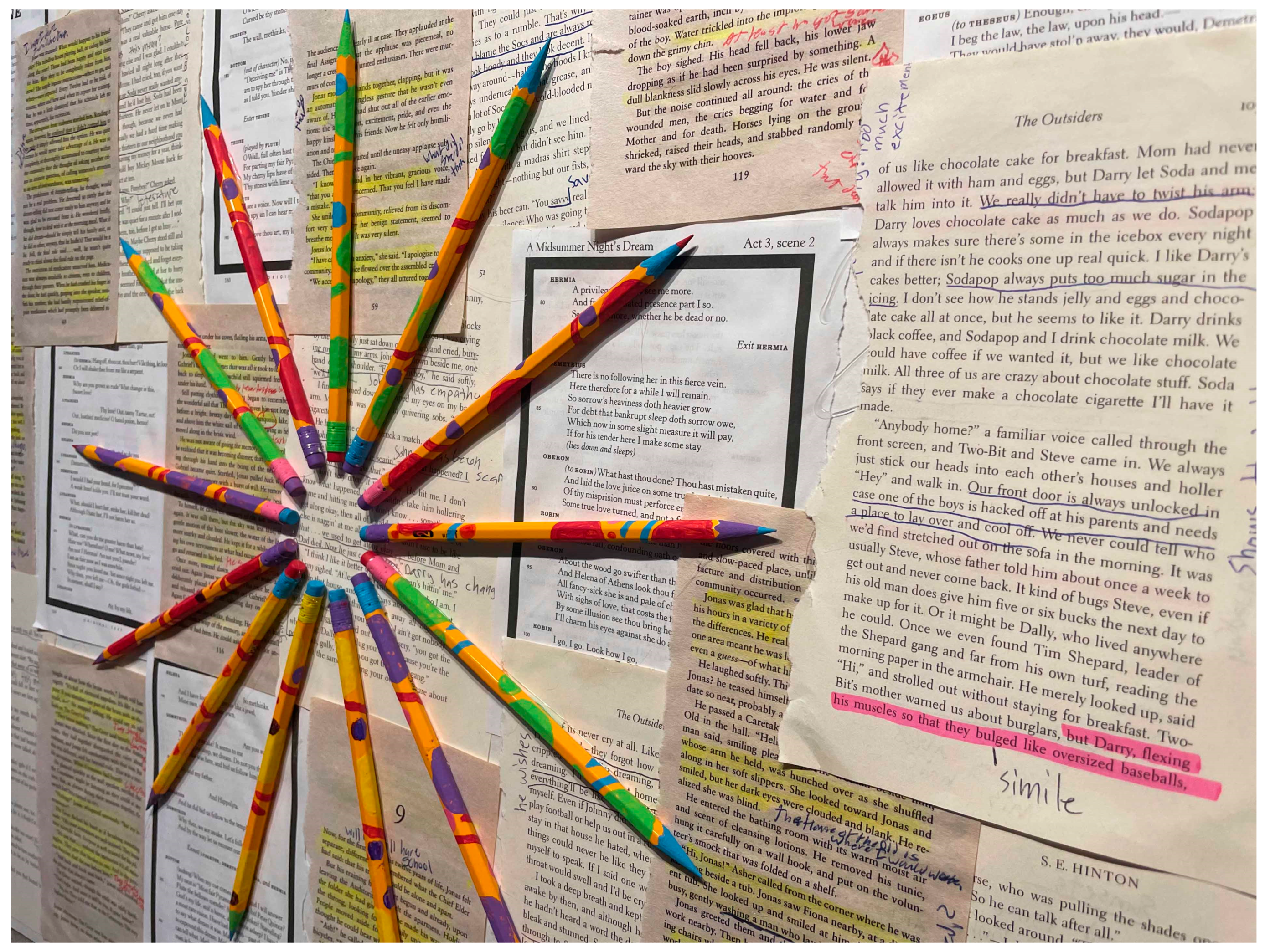
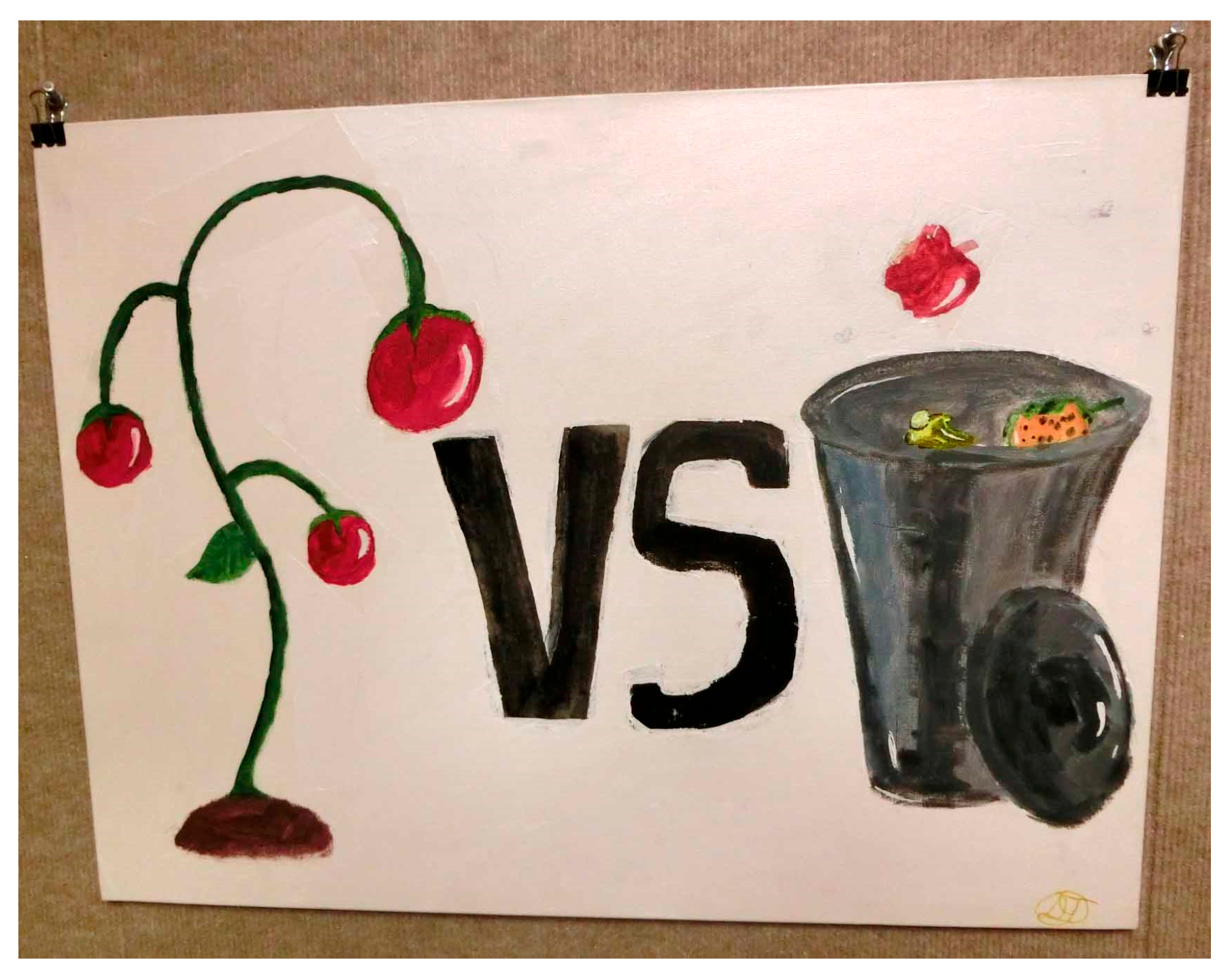
5.1. Youth Art and Design Decisions

Youth data visualizations varied by media and form. Youth primarily worked in two-dimensions using paint or mixed media, though a few visualizations were three-dimensional, with one clay sculpture, one sculptural installation, two interactive Post-it note graphical works, and two mixed media visualizations incorporating three-dimensional elements. While these encoding spaces tended to resemble artistic compositions, design-oriented formats were also present. In the following sections, we will examine the art genres, imagery and symbols, and visual encoding strategies that youth employed.

5.1.1. Adopting Genres as Encoding Spaces

Across both cycles, youth drew upon diverse, and often distinct, art and design traditions. Predominant genres, by order of prevalence, included representational art, including realist and somewhat expressive styles; modern art, including abstract expressionist, abstract, and pop art; graphic design; activist art; and comic art. Seemingly inspired by abstract expressionist practices, one Cycle 1 group visualizing soccer-related data dipped a soccer ball in paint and then rolled and bounced the ball on the canvas, with the final work resembling a Pollock (1950) action painting (see Figure 1). Alternately, a Cycle 2 youth, communicating ideas about alcohol abuse, drew stylized characters, one wearing a “Cheesehead hat,” which was situated within a comic-like scene. Though youth showed a penchant for using paint and canvas, including when this media usage seemed to conflict with genre (e.g., comic-style and design-oriented works), otherwise few data visualizations appeared to blend genres. Youth appeared to have defined the genre space clearly, including the artistic conventions and communicative norms. Thus, youth’s encoding space choices seemed to set the terms for their other data representation decisions.

5.1.2. Selecting Symbols

In keeping with this encoding space diversity, students employed a wide range of symbols, generally falling into three categories: pictorial, abstract, and textual. These symbols somewhat aligned with Börner et al.’s (2018) data visualization symbol typology of pictorial, geometric, and linguistic, with two key exceptions. First, pictorial symbols in this study included not only two-dimensional representations, as described by Börner et al.’s (2018), but also three-dimensional representations and physical objects. Second, as youth used geometric and organic lines and shapes, the broader term “abstract symbols” more accurately described this category.
We found few data visualizations included all three types of symbols. Pictorial symbols were most common. They included landscapes and indoor scenes, human figures, and household objects. Abstract symbols, such as organic shapes (e.g., irregular orbs and blobs), geometric shapes (e.g., circles), and expressive marks (e.g., paint splatters and painterly marks), also were widespread, particularly in the modern-art-oriented and graphic design works. Additionally, text was a prominent element, especially in visualizations that included legends or adopted genres where text is common, like graphic design, comic art, and activist poster art. As in one mixed media work, a youth illustrated cell-phone texts that local high school students had sent to their loved ones in the midst of a school shooting by contextualizing them on a cell-phone screen.
The symbols that youth used performed varied functions within data visualizations. First, all three types—(1) physical objects and pictorial imagery, (2) abstract symbols, and (3) text—were regularly used to represent specific data points. As one youth stated: “the green dots, the ones that are bigger—they represent number one [the most preferred school-lunch food].” However, we also found that pictorial imagery and, to a lesser extent, text were used to contextualize or humanize data topics and infuse affective or metaphoric elements. For instance, one youth represented a bent, “depressed” human figure, who was “getting bullied because of her style,” and another youth incorporated a wilted plant to add a “poetic sense” of loss to her visualization. Additionally, with legends and exhibition signage, text played an important explanatory role, identifying the data topic, variables, or visual encoding strategies.

5.1.3. Applying Visual Encoding Strategies

To communicate trends and patterns in data, youth used a number of common data visual encoding strategies (Börner et al., 2018), like color, value, size, and spatial position. However, in multiple cases, youth employed these strategies in novel ways that diverged from standard graphical data visualizations. For instance, Nina painted symbols of “a stick and a dot, like a letter ‘i’” to represent parent–child relationships, with each “i” pairing floating around the canvas signifying a questionnaire respondent’s relationship with their parents (see Figure 2). Nina explained how spatial position, color, and height operated in her visualization: “how far apart they are is whether they got along or not, and the colors correlate to that too,” and “their heights are how strict they are. So, if your parent is taller, they are stricter.”
Often, data visual encodings were highly pictorial, blending with artistic or media-arts-based modes of communicating meaning (i.e., visual encoding Hall, 1980). Additionally, sometimes the information encoded was less related to data trends and patterns and more personal perspectives. For instance, Jane, addressing the issue of litter, illustrated a bright, colorful sunset on the top half of her mixed media work and a duller green littered landscape with a truck below (see Figure 3). In this bifurcated composition, color, value, and spatial position served as visual encoding strategies establishing a “pretty” versus “ugly” binary and allowing Jane to comment on life without and with litter, whereas the truck image signified a key finding in Jane’s dataset related to the prevalence of vehicle-based littering.
When youth’s arguments were fixated on one aspect of the data, for instance, in only establishing the existence or primacy of a phenomenon, as with Jane’s argument about the prevalence of vehicle-based litter, pictorial symbols or text seemed to operate as primary encoders, with graphical variables (e.g., color and spatial position) in more subordinate encoding roles. For instance, Ruth painted a makeup palette to show the popularity of cosmetics. Though the makeup palette was large, filling the composition, with size and space perhaps contributing to a metaphor about makeup’s predominance in society, we perceived the presence of the palette, the sole icon on the canvas, as playing a more significant role in communicating this idea. Given some of these discrepancies between encoding strategy types, we might conclude that the nature and complexity of youth arguments and stories have some bearing on youth’s visual encoding. In the following section, we investigate these stories in more depth.

5.2. Youth Data-Based Arguments and Stories

In examining Research Question 1 related to youth’s data-based arguments and stories, we found that the narratives that youth articulated varied considerably within Cycle 2 and between the two cycles. From our analysis of youth’s verbal statements associated with their data visualizations, we identified five key dimensions distinguishing these narratives across both cycles: (1) ties to original data, (2) multiplicity of narratives, (3) metaphorical ambiguity, (4) affect, and (5) social engagement. We will summarize each dimension briefly and then delve more deeply into the specific ways that these dimensions manifested.
Youth arguments evinced differing degrees of connection to the data youth initially identified they would visualize. Most youth began with a pre-existing dataset, data they collected, or a collection of statistics that they found online while working with teaching assistants and facilitators. However, once they moved into the visualization process, some youth’s visualization processes became more of a response to the data. In such cases, youth often presented their general impressions of the phenomena, attended to their own lived experiences surrounding the topic, or advocated for certain courses of action that they perceived to be necessary.
Youth data visualizations and youth commentary surrounding the works varied in the degree to which they rhetorically expanded upon the data and put forth multiple narratives. Some youth presented strong assertions or stories framed around binaries, while other youth presented multifaceted narratives that necessitated multiple visual encoding strategies.
Some arguments and stories evinced more ambiguity as they were likely to inspire diverse interpretations. In reflecting on their visualizations, some youth were accepting or appreciative of ambiguity and suggested that they had intentionally sought to produce this quality. In cases where ambiguity was high, youth stories tended to rely upon metaphors, and, in most cases, youth seemed to adopt artistic notions surrounding the value of ambiguity.
We found that tales differed by the level of affect. Certainly, some data topics lent themselves more to more affective accounts than others, such as school shootings compared with stock-market functions. However, even among students working with similar topics, the extent of affective markers in their narratives could diverge.
Social engagement diverged. Some storylines were more socially oriented than others, first, by virtue of their data topic, and second, by their rhetorical aims. Regarding the latter, some stories moved beyond or fully bypassed informative narratives to focus on social and community impact or advocate for change.
Between the two cycles, a plethora of narratives was represented, though we found more internal consistency in Cycle 1. Cycle 2 stories employed more diverse narrative structures and, correspondingly, articulated more varied relationships to and notions of data. Amidst these various narratives, we found several story strands that were more frequent and worth noting, particularly with regard to youth’s dealings with data.

5.2.1. Expressing Data-Oriented, Artistic Stories in Cycle 1

First, we found Cycle 1 stories, along with a few Cycle 2 stories, had certain commonalities across the five dimensions. These stories: (1) remained closely tethered to the original data; (2) exhibited a multiplicity of narratives associated with multivariate data; (3) demonstrated some comfortability with ambiguity, albeit to differing degrees; and (4) engaged with and drew upon affect; but (5) evinced limited critical social engagement.
Karen’s In Our Words exemplifies this dominant storytelling strand. In Cycle 1, Karen designed questionnaire items related to 8th graders’ school experiences for a questionnaire administered to local youth. To visualize this data, she painted on the surface of pencils “represent[ing] the emotions we feel” and arranged them in a radial design, which she identified as a “clock” or “sun,” over used “pages [they] read in middle school” (see Figure 4), complete with highlighted text and notes in the margins. In a post-focus group, Karen explicated specific connections to the data set, like “Each pencil represented one person,” and “[I] represented the answers that I got through colors and individual things that I painted on the pencil.” As her questionnaire primarily consisted of multiple-response and open-ended response items, her dataset was sizeable, and the stories she expressed were dense, affective, and multilayered. For instance, she articulated arguments like “a lot of people were tired right now,” their middle-school experiences “were mainly negative,” and “some of them were excited [about high school], but a lot of them were nervous—scared.”
When asked about the clarity of the work, she replied, “I feel like it isn’t. When you look at it, you don’t know, ‘Oh, that’s about people’s emotions toward school.’” Notably, she suggested that this opacity was intentional: “I tried to make it more like, ‘Oh, I want to figure out what this is.’” Other Cycle 1 artists expressed similar ambiguity-embracing sentiments about their works, sometimes positioning them similar to puzzles or explicitly as “abstract art.” As Nina echoed, “I kind of like being dark and mysterious. I don’t like the answer to be right up in your face.”
In keeping with the other Cycle 1 visualizations and Cycle 2 visualizations in this storytelling vein, this work dealt with a personally relevant topic, in this case, a topic with social ties. However, this work did not explicitly address a wicked problem affecting communities like we saw occur with some Cycle 2 students’ data visualizations.

5.2.2. Narrating Data-Reconceiving, Community Stories in Cycle 2

In contrast to the Cycle 1 stories, we found many Cycle 2 narratives demonstrating substantial distance from the data that youth had originally stated they would visualize. In such cases, Cycle 2 Youth generalized data trends and patterns to such a degree that their resulting arguments could easily be perceived as opinions, personal experiences, general assertions, or illustrations of topics rather than traditional data-based arguments. We tend to conclude that these moments are reflective of places where the design of the program was unsuccessful in supporting youth in data visualization processes, as traditionally defined. In this section, we will focus on two such data-distancing, or data-reconceiving, story strands that emerged, primarily demarcated by their multiplicity of narratives and metaphorical ambiguity.

Putting Forth Narratives with a Strong Sense of Clarity

First, in Cycle 2, we found a preponderance of narratives drawing upon one to two “voices”, such as a single data point, statistic, or qualitative finding or youth’s own lived experiences and perspectives. This approach stands in contrast to more common data visualization processes that might involve youth taking in and then reflecting on multiple data points, trends, or patterns. In many cases, these particular Cycle 2 youth narratives took the form of direct statements, straightforward exhortations, or binary oppositions. Youth signified general understandings that could be gathered from the data, like litter tends to happen from vehicles, represented emotional appeals inspired by or existing prior to such engagement, such as “STOP GUN VIOLENCE”, and presented good/bad binaries, often drawing attention to current conditions that need to be remedied.
For instance, Dante produced a food-waste-oriented work oriented around a binary with an image of a thriving tomato plant on the left and a full trash can on the right, divided by the text “vs” (see Figure 5). In a focus group, Dante located food waste as the negative side of the binary: “I want to show that wasting food is a really bad habit for a lot of people.” Thus, the work’s narrative seemed to be oriented around Dante’s perspective. During the post-focus group, Dante opined, “everybody is throwing away stuff all the time from the stuff they pick up from the store”; offered alternative actions, like “you can always save [food] for another time when you get home”; and articulated his community awareness aspirations: “to get them thinking, and have them wonder about their daily lifestyle—how could that be affected and how could it affect your community.” In terms of data, Dante had found some statistics online related to food waste “thanks to Google” and, when prompted during the post-focus group, loosely articulated data-based justifications for his visualization, like “there is a lot more food being produced [than is being used].” Yet, the extent to which the statistics he found might have informed his perspective or were centered during his visualization process was unclear.
Some possible interpretations of youth’s production of these narratives could be that youth did not engage with enough data or with the data enough, they had already drawn strong conclusions about the story that they would tell concerning the topic, or they made the decision to present a personal response to a statistic more so than a data-tethered representation. In terms of sufficient data engagements, a large body of literature suggests that data analysis is not always intuitive and can be difficult (Konold et al., 2015; Rubin, 2020). Regarding the notion that youth might have had so much clarity around certain topics that they shifted in the direction of their own personal experiences and conclusions, this tendency is documented in the literature; students’ pre-existing understandings of topics have been found to get in the way of them interpreting the data and disseminating the findings (Enyedy & Mukhopadhyay, 2007). Concerning youth potentially choosing to respond to data more so than visualize it, our learning sessions’ emphasis on art and design may have played a role; youth might have ventured further into traditional understandings of these realms and loosened data ties in the process.

Constructing Multifaceted Narratives

In addition to the data-distant or data-reconceiving stories outlined above, we also identified more multifaceted stories that seemed to prioritize personal understandings and imaginative tellings. We found that these accounts intermingled personal perspectives with data to such a degree that the data informing the works became difficult to discriminate. Corresponding with this ambiguity surrounding the data, the works were metaphorically or narratively ambiguous.
Anna’s drawing, Have You Ever, serves as one example of the multiple ways in which ambiguity often infused these multilayered, issue-oriented story strands (see Figure 6). Interested in community members’ experiences with and understandings of bullying, Anna initially consulted some statistics and then interviewed attendees in Cycle 2’s two penultimate CLEs. In her short artist statement, she foregrounded her personal stance on the topic: “My work represents bullying, and I just feel like bullying should not happen.” During the final two CLEs and the post-focus group, she further focused on the personal relevance of the topic and work by describing her friends’ experiences with bullying on “a daily basis,” who she tries to protect, and the potential misperceptions of herself as a bully because of her tendency to tease friends. Pointing to different elements of the work, Anna narrated some portions of the elaborate narrative:
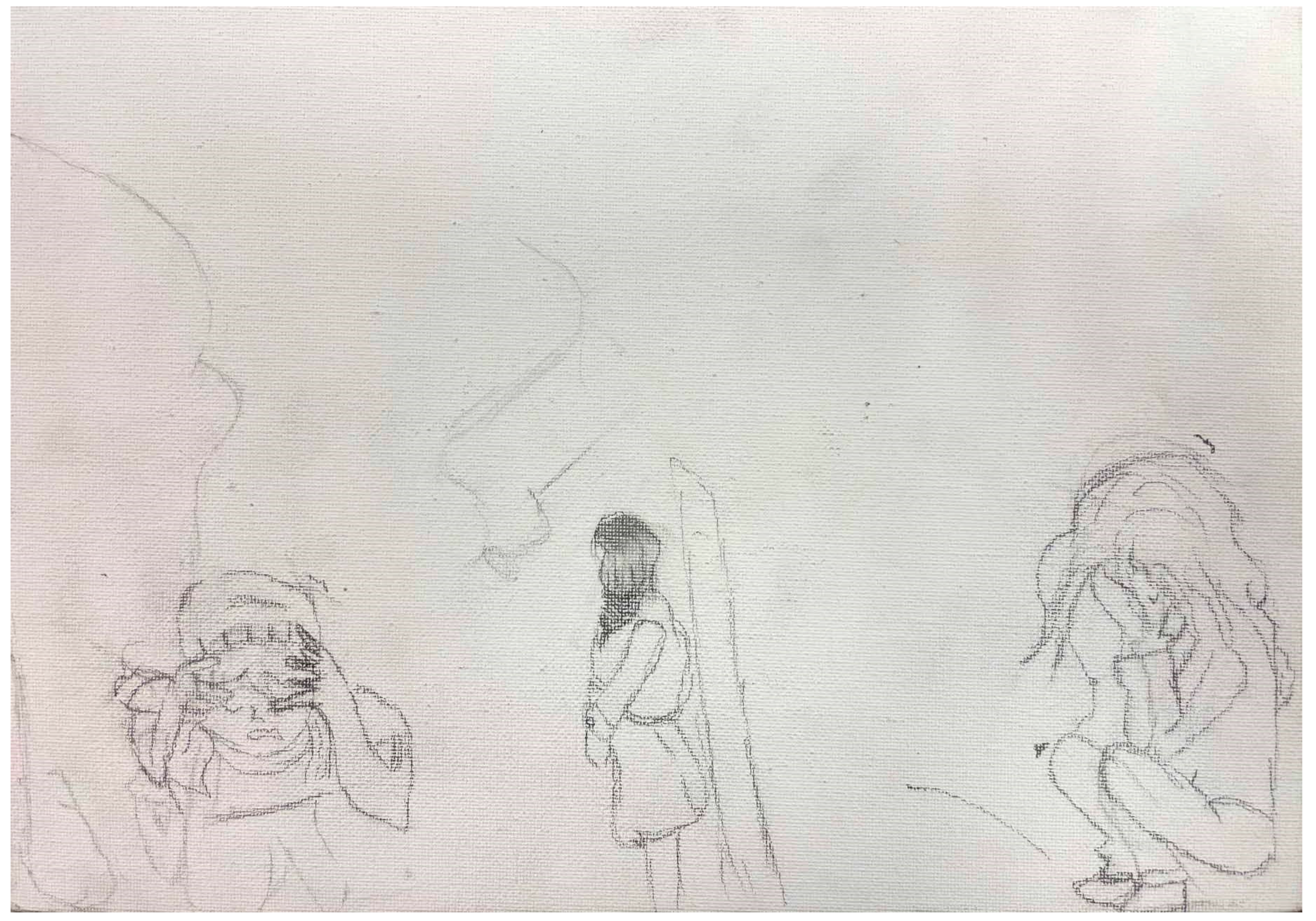
She’s basically like a bully. And then, she’s bullying her, because, she got a different type of style, and because, she thinks she might have more perfect hair. But that’s a mirror right there. … It’s on the other side of the mirror. This is her home because she got through stuff, if she don’t know how to express it. But at school, when she expresses her feelings, it’s bullying.
In describing the data and ideas that she intended to communicate through her visualization, boundaries between personal experiences, imaginative narratives, and data-based ideas blurred. As her own experiences and understandings seemed to inform the visualization heavily, we wondered if Anna and other youth employing similar approaches might be conceiving of data more expansively, beyond the online statistics and CLE interview data that they collected, to position their own internal thoughts, feelings, and desires for change as data sources.

6. Discussion

This study is subject to limitations that should be considered when interpreting the findings. First, participants self-selected into the project, which may have resulted in a sample composed of youth who were already inclined to engage in the project’s themes or goals. As a result, the perspectives captured may not reflect those of young people who did not choose to participate, potentially limiting the generalizability of the findings. Second, some members of the design and facilitation team also conducted the post-focus-group interviews. While this approach allowed for continuity and rapport, it may have introduced response bias, as participants might have shaped their reflections based on existing relationships or perceived expectations. Although efforts were made to foster open communication and minimize power dynamics, the dual roles of facilitator and interviewer may have influenced how participants expressed their experiences. In Table 2, we provide a summary of the key findings associated with both research questions, related to youth art, design decisions, and narrative storytelling. Additionally, we explore the potential connections between these findings. From this analysis, we can draw a number of implications for the field.
First, this study builds upon the existing educational literature to establish that youth, when supported by arts-based data-visualization-oriented curricula and programming, can describe data through arts-based data visualization, though this practice may not manifest consistently. As a few other studies (Bertling et al., 2024; Vacca et al., 2022) have shown evidence of youth data-based storytelling practices in school-based contexts, this study establishes these possibilities in informal learning contexts. However, as we also noted some Cycle 2 youth producing works with indistinct or abstract data connections, this study joins the emerging research (DesPortes et al., 2022; Woods et al., 2024) in raising questions about the potential impediments to youth’s data-bound representations, youth’s competing rhetorical priorities, and affordances associated with youth’s existing approaches. One continuing design question is how to cultivate youth’s interests in and positive valuations of inquiries that are both data-based and community-oriented. Thus, how might youth cultivate interest not only in the community topics themselves but in their understanding of these issues through data? How might the mathematizing element of these community-based inquiries be more present?
Second, this study confirms the affect upon which youth can draw and leverage in telling these stories. Youth’s use of visual imagery to illustrate and contextualize data-based phenomena or ideas represented one general movement toward such storytelling. Moreover, some youth-drew upon inherently affective subject matter, such as blood, encoded visual metaphors, such as dark hallways and wilting plants, and adopted expressive styles, as with bold, painterly strokes and eye-catching colors. Examining the findings from our two research questions in conjunction, we posit that, perhaps, youth’s use of diverse genres, symbols, and novel visual encoding strategies opened space for affect to play a role in their data-based stories. Even learning session discussions related to the availability of such unconventional strategies could have allowed opportunities for youth to reflect on affect more in the development and telling of their stories. As such, this study builds upon the existing literature (e.g., DesPortes et al., 2022) to corroborate that youth’s data-based affective storytelling is possible but also demonstrates the creative diversity of such storytelling practices. Yet, as a few visualizations were more conventionally graphical, this study also demonstrates some pedagogical challenges associated with supporting these affective practices consistently on a broad scale.
Third, in keeping with this movement toward affect, youth seemed to embrace their embodiment as data storytellers: they often infused their own individual experiences, knowledge, perspectives, and interests into their visualization practices. In such cases, the boundaries between personal knowledge and data blurred, sometimes to the point of indistinguishability. Such practices could be seen as agentic and “data reconceiving” in relocating individual or community experience as data. This personal, embodied turn in youth data visualization practices seemed to align with critical data literacy pedagogical aims for supporting youth in engaging with data in personally relevant ways, expanding and reframing notions of data, and understanding data visualization as a tool for narrating deeply meaningful stories (Stornaiuolo, 2020). As art is often perceived as deeply subjective, we assume that the MVP curricula’s foregrounding of art played a role in facilitating such personally empowering data engagements. Yet, as art is increasingly centered in such educational contexts, a design opportunity relates to the heightened integrations of art and data. How might the “art” practices associated with data visualization still be responsive to and intimately oriented around data-based understandings? By focusing on the connections between the two research questions across cycles, important instructional design issues become more evident. Considerations and design-based priorities arise related to the design of the learning contexts that might support youth’s authoring of multi-voice creative works that affectively and effectively communicate their data analysis and interpretations.
Within the field of mathematics and statistics education, arts-based visualization practices are often positioned as peripheral to mathematics learning. In such contexts, their primary function is to motivate students for mathematics and data science learning. We argue that these practices can support data learning but also can be viewed as an instructional goal in their own right, as they can support youth’s sense of affiliation with data and mathematics, rehumanize these domains, and afford youth opportunities for analysis that differ from the data analysis methods that predominate in mathematics education.

7. Implications for Practice

This study highlights several concrete implications for educators and curriculum designers with the purpose of making data science education more relevant, accessible, and embodied:
Integrate arts-based visualization as a core practice in data science education: Educators can incorporate opportunities for students to represent data through artistic forms—such as drawings, collages, or multimedia projects—to support the expression of lived experiences alongside data analysis. This approach builds engagement and students’ understanding of the data.
Use storytelling to support data literacy: Encourage students to approach data analysis as a form of storytelling. Asking students to narrate the story behind their data (e.g., why it matters, what it reveals, and for who) can help to make statistical reasoning more relevant.
Create space for personal and cultural knowledge: Classroom practices can be designed to validate and include students’ personal, cultural, and community knowledge. When students are invited to draw from their own embodied experiences and identities in relation to the data, they are more likely to see themselves as capable data users and producers.
Support collaborative and community-focused data projects: Teachers might consider facilitating group projects where students collect, analyze, and represent data on topics that matter to them or their communities. This positions students not only as learners but as contributors to meaningful inquiry, reinforcing the social purpose of data literacy. Iterative models involving community collaboration could be especially valuable in reinforcing the role that data visualizations can play in communities and encouraging inquiries that are simultaneously community-oriented and data-based.

8. Conclusions and Future Directions

Corresponding with the emerging accounts of youth arts-based data visualization practices (Stornaiuolo, 2020; Vacca et al., 2022; Woods et al., 2024), we saw regular evidence of art, storytelling, and personal subjectivities intertwining. Contributing to this literature, we found that these intersections surfaced in a number of domains, including youth’s pictorial symbolism, visual encoding strategies, and data decisions, like manifold pictorial symbols arranged to support complex, multilayered, ambiguous narratives; qualitative data melding community and personal lived experience; and singular statements making persuasive appeals. As this integration of art, story, agency, and embodiment often manifested in ways that seemed to jostle against the traditional notions of and norms surrounding data science, we recommend that future research explores these workings and tensions in more depth. Markedly, future studies should explore the nuances and unconventionality of the youth visual encoding strategies, which seemed to stretch conventional data visual encoding definitions. Such divergent acts of embodied cognition will require continued attention and investigation: when youth data visualizations are conceived as embodied cognitive expressions—much like works of art—lively affectivities, relationalities, and culturally situated perspectives can arise with important implications for community engagement.

Author Contributions

Conceptualization, J.G.B. and L.H.; methodology, J.G.B. and L.H.; formal analysis, J.G.B. and L.H.; investigation, J.G.B. and L.H.; resources, J.G.B. and L.H.; writing—original draft preparation, J.G.B.; writing—review and editing, L.H.; visualization, J.G.B.; project administration, L.H.; funding acquisition, L.H. All authors have read and agreed to the published version of the manuscript.

Funding

This work was supported by the National Science Foundation under Grant No. 2215004. Any opinions, findings, conclusions, or recommendations expressed in this material are those of the author(s) and do not necessarily reflect the views of the National Science Foundation.

Institutional Review Board Statement

This study was approved by the Institutional Review Board of the University of Tennessee (UTK IRB-23-07388-XP).

Informed Consent Statement

Informed consent was obtained from all subjects involved in the study.

Data Availability Statement

The data that support the findings of this research manuscript can be obtained by contacting the corresponding author.

Conflicts of Interest

The authors declare no conflict of interest.

Note

1
In statistic education, the idea of stories told through and with data is not an original concept; research has long characterized exploratory data analysis as storytelling (Roth, 2014).

References

  1. Amato, A., Matuk, C., DesPortes, K., Silander, M., Tes, M., Vacca, R., & Woods, P. (2022). Postcards and photo walks: Telling community data stories through photography. Available online: https://repository.isls.org//handle/1/8522 (accessed on 30 January 2024).
  2. Ambrosini, L. (2022). Data bricks space mission: Supporting teachers for children’s data literacy in primary schools through data physicalization [Master’s thesis, Linköping University]. DiVA. Available online: https://www.diva-portal.org/smash/get/diva2:1688090/FULLTEXT01.pdf (accessed on 30 January 2024).
  3. Bargagliotti, A., Franklin, C., Arnold, P., Gould, R., Johnson, S., Perez, L., & Spangler, D. A. (2020). Pre-K-12 guidelines for assessment and instruction in statistics education II (GAISE II). American Statistical Association. Available online: https://www.amstat.org/asa/files/pdfs/GAISE/GAISEIIPreK-12_Full.pdf (accessed on 30 January 2024).
  4. Bertling, J. G., Galbraith, A., Doss, T., Swartzentruber, R., Massey, M., & Christen, N. (2024). Transdisciplinary learning that elevates the arts? Insights from a data-visualization pilot project. International Journal of Education & the Arts, 25(16), 1–31. [Google Scholar] [CrossRef]
  5. Bertling, J. G., Galbraith, A., Wandell, T., & Swartzentruber, R. (2025). Plastic rivers and E. coli ice cream: Visual metaphors in middle-school students’ arts-based data visualizations. Studies in Art Education, 66(1), 53–77. [Google Scholar] [CrossRef]
  6. Bhargava, R., Brea, A., Palacin, V., Perovich, L., & Hinson, J. (2022). Data theatre as an entry point to data literacy. Educational Technology & Society, 25(4), 93–108. [Google Scholar]
  7. Bhargava, R., & D’Ignazio, C. (2017, June 10–14). Data sculptures as a playful and low-tech introduction to working with data [Paper presentation]. Designing Interactive Systems, Edinburgh, Scotland, UK. Available online: https://hdl.handle.net/1721.1/123453 (accessed on 22 September 2022).
  8. Bhargava, R., Kadouaki, R., Bhargava, E., Castro, G., & D’Ignazio, C. (2016). Data murals: Using the arts to build data literacy. The Journal of Community Informatics, 12(3), 197–216. [Google Scholar] [CrossRef]
  9. Börner, K., Bueckle, A., & Ginda, M. (2018). Data visualization literacy: Definitions, conceptual frameworks, exercises, and assessments. Proceedings of the National Academy of Sciences USA, 116(6), 1857–1864. [Google Scholar] [CrossRef] [PubMed]
  10. Campanella, M., & Penuel, W. R. (2021). Design-based research in educational settings: Motivations, crosscutting features, and considerations for design. In Z. Philippakos, E. Howell, & A. Pellegrino (Eds.), Design-based research in education: Theory and applications (pp. 3–22). Guilford Press. [Google Scholar]
  11. Chang, H.-Y., Chang, Y.-J., & Tsai, M.-J. (2024). Strategies and difficulties during students’ constructions of data visualizations. International Journal of STEM Education, 11, 1–22. [Google Scholar] [CrossRef]
  12. Cheung, C. (2021). Ink reveries [Installation]. Hong Kong Convention and Exhibition Centre. Available online: https://vimeo.com/569282865 (accessed on 1 June 2025).
  13. Collins, M., & Sullivan, G. (2020). Artistic research as praxis and pedagogy. In R. Mateus-Berr, & R. Jochum (Eds.), Teaching artistic research: Conversations across cultures (pp. 29–42). De Gruyter Brill. [Google Scholar]
  14. DesPortes, K., Vacca, R., Tes, M., Woods, P. J., Matuk, C., Amato, A., & Silander, M. (2022). Dancing with data: Embodying the numerical and humanistic sides of data. Available online: https://repository.isls.org//handle/1/8805 (accessed on 26 November 2024).
  15. Enyedy, N., & Mukhopadhyay, S. (2007). They don’t show nothing I didn’t know: Emergent tensions between culturally relevant pedagogy and mathematics pedagogy. Journal of the Learning Sciences, 16(2), 139–174. [Google Scholar] [CrossRef]
  16. Erickson, T., Wilkerson, M., Finzer, W., & Reichsman, F. (2019). Data moves. Technology Innovations in Statistics Education, 12(1), 44–49. [Google Scholar] [CrossRef]
  17. Gutiérrez, K. D., Baquedano-López, P., & Tejedo, C. (1999). Rethinking diversity: Hybridity and hybrid language practices in the third space. Mind, Culture, and Activity, 6(4), 286–303. [Google Scholar] [CrossRef]
  18. Hall, S. (1980). Encoding/decoding. In S. Hall, D. Hobson, A. Lowe, & Willis (Eds.), Culture, media, and language (pp. 128–138). Hutchison. [Google Scholar]
  19. Hunter, D. (n.d.). Data walking. Aspect Press. Available online: http://www.datawalking.com/ (accessed on 27 May 2023).
  20. Jiang, S., & Kahn, J. (2020). Data wrangling practices and collaborative interactions with aggregated data. International Journal of Computer-Supported Collaborative Learning, 15, 257–281. [Google Scholar] [CrossRef]
  21. Kahne, J., & Bowyer, B. (2017). Educating for democracy in a partisan age: Confronting the challenges of motivated reasoning and misinformation. American Educational Research Journal, 54(1), 3–34. [Google Scholar] [CrossRef]
  22. Konold, C., Higgins, T., Russell, S. J., & Khalil, K. (2015). Data seen through different lenses. Educational Studies in Mathematics, 88(3), 305–325. [Google Scholar] [CrossRef]
  23. Lakoff, G., & Johnson, M. (2020). The embodied mind. In S. Sarasvathy, N. Dew, & S. Venkataraman (Eds.), Shaping entrepreneurship research (pp. 80–103). Routledge. [Google Scholar]
  24. Lupi, G., & Posavec, S. (2016). Dear data. Princeton Architectural Press. [Google Scholar]
  25. Marshall, J., & Donahue, D. M. (2014). Art-centered learning across the curriculum: Integrating contemporary art in the secondary school classroom. Teachers College Press. [Google Scholar]
  26. Matuk, C., DesPortes, K., Amato, A., Vacca, R., Silander, M., Woods, P. J., & Tes, M. (2022). Tensions and synergies in arts-integrated data literacy instruction: Reflections on four classroom implementations. British Journal of Educational Technology, 53, 1159–1178. [Google Scholar] [CrossRef]
  27. National Academies of Sciences, Engineering, and Medicine. (2023). Foundations of data science for students in Grades K-12: Proceedings of a workshop. The National Academies Press. [Google Scholar] [CrossRef]
  28. National Council of Teachers of Mathematics. (2024). Teaching data science in high school: Enhancing opportunities and success [Position statement]. Available online: https://www.nctm.org/uploadedFiles/Standards_and_Positions/Position_Statements/NCTM_Data_Science_Position_Statement.pdf (accessed on 1 June 2025).
  29. Pollock, J. (1950). One: Number 31, 1950 [Painting]. The Museum of Modern Art. Available online: https://www.moma.org/collection/works/78386?sov_referrer=theme&theme_id=5117 (accessed on 14 June 2025).
  30. Roth, W. M. (2014). Uncertainty and graphing in discovery work: Implications for and applications in STEM education. Springer. [Google Scholar]
  31. Rubel, L. H., Nicol, C., & Chronaki, A. (2021). A critical mathematics perspective on reading data visualizations: Reimagining through reformatting, reframing, and renarrating. Educational Studies in Mathematics, 108, 249–268. [Google Scholar] [CrossRef]
  32. Rubin, A. (2020). Learning to reason with data: How did we get here and what do we know? Journal of the Learning Sciences, 29(1), 154–164. [Google Scholar] [CrossRef]
  33. Saldaña, J. (2021). The coding manual for qualitative researchers. Sage. [Google Scholar]
  34. Schmidt, S. N., Hass, J., Kirsch, P., & Mier, D. (2021). The human mirror neuron system—A common neural basis for social cognition. Psychophysiology, 58(5), e13781. [Google Scholar] [CrossRef]
  35. Stornaiuolo, A. (2020). Authoring data stories in a media makerspace: Adolescents developing critical data literacies. Journal of Learning Sciences, 29(1), 81–103. [Google Scholar] [CrossRef]
  36. Taylor, K. H., Silvis, D., Kalir, R., Negron, A., Cramer, C., Bell, A., & Riesland, E. (2019). Supporting public-facing education for youth: Spreading (not scaling) ways to learn data science with mobile and geospatial technologies. Contemporary Issues in Technology and Teacher Education, 19(3), 529–542. [Google Scholar]
  37. Vacca, R., Desportes, K., Tes, M., Silander, M., Matuk, C., Amato, A., & Woods, P. J. (2022). “I happen to be one of 47.8%”: Social-emotional and data reasoning in middle school students’ comics about friendship. In S. Barbosa, C. Lampe, C. Appert, D. Shamma, S. Drucker, J. Williamson, & K. Yatani (Eds.), CHI ’22: Proceedings of the 2022 CHI conference on human factors in computing systems (pp. 1–18). Association for Computing Machinery. [Google Scholar] [CrossRef]
  38. Woods, P. J., Matuk, C., DesPortes, K., Vacca, R., Tes, M., Vasudevan, V., & Amato, A. (2024). Reclaiming the right to look: Making the case for critical visual literacy and data science education. Critical Studies in Education, 65(5), 441–459. [Google Scholar] [CrossRef]
  39. Wu, L., Huang, R., Wang, Z., Selvaraj, J. N., Wei, L., Yang, W., & Chen, J. (2020). Embodied emotion regulation: The influence of implicit emotional compatibility on creative thinking. Frontiers of Psychology, 11, 1822. [Google Scholar] [CrossRef]
  40. Yalcinkaya, A. R. (2023). Creative data literacies with personal data crafting and storytelling through drawing [Doctoral dissertation, North Carolina State University]. ProQuest Dissertations & Theses. [Google Scholar]
  41. Zucker, A., Noyce, P., & McCullough, A. (2020). JUST SAY NO! Teaching students to resist scientific misinformation. The Science Teacher, 87(5), 24–29. [Google Scholar] [CrossRef]
Figure 1. Paint Balls. Note. Bob, Boo, and Jamos’ data visualization from Cycle 1 related to their favorite soccer players and soccer’s role in high-school sports. Notice the expressive paint marks are balanced across the composition—in keeping with action painting conventions.
Education 15 00781 g001
Figure 2. Parental Styles and Relationships. Note. Nina’s data visualization from Cycle 1 about feelings surrounding middle school and high school. Nina encoded data by individual questionnaire respondent as compared with aggregating the responses. Notice how she leveraged cultural color associations, in alignment with stoplight colors, and height metaphors for parental power dynamics when encoding the data.
Education 15 00781 g002
Figure 3. The Window. Note. Jane’s data visualization from Cycle 2 about vehicle-based litter. This pictorial work included multiple forms of visual encoding. Notice how the truck scene references a data trend (i.e., occurrence of vehicle-based litter), and the bifurcated composition signals Jane’s ideas about the topic.
Education 15 00781 g003
Figure 4. In Our Words. Note. Karen’s data visualization from Cycle 1 about local youth’s school experiences. Each questionnaire respondent is signified by a pencil, with their responses encoded by line, shape, and color. The pencil formation and literary pages contextualize these responses and metaphorically evoke different dimensions of their experience.
Education 15 00781 g004
Figure 5. Production vs. Waste. Note. Dante’s work from Cycle 2 about food waste. The two symbols on either side of the composition (i.e., the plant and trash can) set up a binary, reflective of Dante’s standpoint on this issue.
Education 15 00781 g005
Figure 6. Have You Ever. Note. Anna’s work from Cycle 2. Anna drew multiple figures in emotional poses and included other symbols, like mirrors and partially erased lines, to convey intricate, sometimes metaphorical, narratives about bullying.
Education 15 00781 g006
Table 1. Data collection method description and alignment with research questions.
CategoryMethodsNumber AnalyzedResearch Questions
Cycle 1Cycle 2RQ1 aRQ2
Products generated by youth during learning sessionsData visualizations 312X bX
Exhibition signage 312Xx c
Video artist statements --7xX
Data sets 110xx
Final community learning eventAudio and video34xX
Field notes12xx
Post programFocus groups d35xX
Note. a Research question. b Primary data collection method. c Secondary data collection method. d One interview per group of 2–4 youth.
Table 2. Key findings with connections between research questions.
Research Question 1 aResearch Question 2 bConnections and Implications
Youth… Diverse genres and symbol use along with novel applications of data visual encoding strategies might have opened space for youth to share and develop affective stories.
Drew upon diverse art genres.
Created highly pictorial compositions using a wide range of symbols.
Encoded data visually using traditional graphic variables, though often in unconventional ways.
Articulated diverse arguments and stories, which primarily varied by data ties, complexity, ambiguity, affect, and social engagement.
Communicated narratives that were more affective and ambiguous than traditional data-based argumentation.
Cycle 1 Youth… Some youth reflected multiple voices, including those of data, youth affect, and MVP participant responses to the data. Arts-based data visualization practices, which differ from school-based mathematical and statistical conventions, might have supported some youth in drawing on multiple sources.
Key instructional design issues relate to the design of learning contexts: How might arts-based visualization practices inform multi-voice creative works that both (1) communicate data analysis and interpretation and (2) generate affective responses of and from the data? How might youth critical social engagement continue to be centered in the midst of these endeavors?
Linked their arguments to data more closely.
Focused on topics of personal significance.
Cycle 2 Youth…
When encoding a central idea, relied upon pictorial symbols more than graphic variables for data visual encoding.Employed more diverse narrative structures.
Articulated more varied relationships with and notions of data.
Presented narratives with a strong sense of clarity.
Evinced more critical social engagement.
Note. a Youth art and design decisions. b The arguments and stories that youth tell.
Disclaimer/Publisher’s Note: The statements, opinions and data contained in all publications are solely those of the individual author(s) and contributor(s) and not of MDPI and/or the editor(s). MDPI and/or the editor(s) disclaim responsibility for any injury to people or property resulting from any ideas, methods, instructions or products referred to in the content.

