Abstract
To facilitate emotionally adaptive built environments, this study investigates how spatial color design interacts with individual personality traits to shape emotional reactions in virtual reality (VR). Based on the stimulus–organism–response (S-O-R) framework, the research explores these dynamics through a rigorous experimental design. Sixty-three participants were exposed to 24 indoor scenes systematically manipulated in three dimensions: color combination, color shape, and area proportion. Multidimensional responses were recorded using self-reported SAM scales (pleasure, arousal, dominance), liking, and the objective physiological indicator skin conductance level (Z-SCL). The data were analyzed using linear mixed models (LMM) to account for repeated measures. The results reveal a functional hierarchy of design elements: area proportion emerged as the dominant structural variable, significantly driving the sense of control (dominance) and physiological arousal, whereas color and shape primarily influenced esthetic hedonic valence. Crucially, the study provides empirical evidence that personality traits act as cognitive filters. For instance, conscientiousness significantly moderated the effect of area proportion on dominance, reflecting a trait-specific need for spatial order. Exploratory analysis further identified that neuroticism acts as a “physiological sentinel” (heightened Z-SCL sensitivity to large-scale stimuli), while extraversion manifests as a “sensation seeker.” These findings suggest that color space cognition is not universal, advocating for more refined, personality-aware design strategies to enhance user comfort and psychological well-being.
1. Introduction
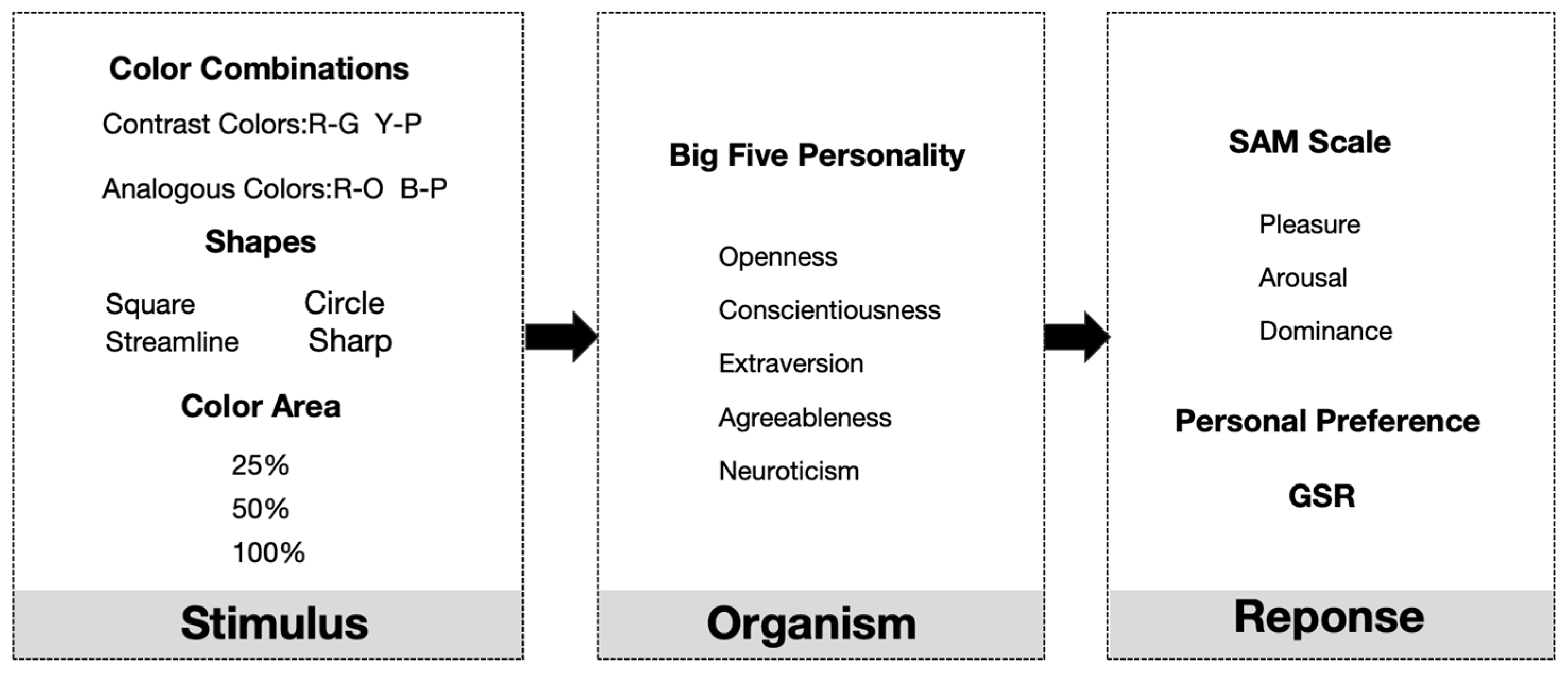
The spatial environment is intricately connected to individuals’ living conditions. The media not only facilitates human activity but also subtly influences cognitive and emotional experiences [1]. In light of this, the investigation of the ways in which spatial characteristics affect human affective perception has emerged as a fundamental concern in a variety of fields [2]. Among the many design elements that make up architectural space, color is widely recognized as one of the most expressive factors and one that has the most direct impact on users’ emotions and perceptual experiences. It is a powerful tool for people to perceive, understand and respond to stimuli [3]. Although many studies have shown that color is closely related to human emotional perception, current research on spatial color has mostly focused on the universal effects of single colors or basic color schemes [4]. The complexity of color combinations and how elements such as contours interact to influence human emotional experiences, as well as the individual differences in such influences, remain an area that requires further in-depth study [5]. To address the fragmented nature of research on color forms in interior spaces, this study adopts the classic stimulus–organism–response (S-O-R) framework proposed by Mehrabian and Russell (1974) [6], explaining the impact of virtual architectural spaces on individual emotional and physiological responses. This framework emphasizes that environmental stimuli (S) influence an individual’s internal state (O), thereby triggering behavioral and emotional responses (R). Within visually dominant architectural spaces, the composition of stimuli should be structured and layered, necessitating a clear delineation of stimulus factors based on the theoretical logic of spatial perception and environmental psychology.
S (Stimulus): In the context of architectural perception, visual “stimuli” are never singular elements. Based on Gestalt psychology [7] and Kandinsky’s theory of form [8], visual perception cannot be reduced to isolated parts; color cannot be perceived in a vacuum but must inherently adhere to specific geometric shapes and occupy a certain proportion within the field of vision to create a meaningful spatial atmosphere. Therefore, the form of color stimulation must be multifaceted. First, spatial color is the most comprehensive factor influencing environmental emotional experiences, as demonstrated by extensive research. A fundamental dimension of color psychology is the distinction between warm and cool tones. Typically, warm colors, represented by reds and yellows, are considered “advancing” and are often associated with positive emotions such as excitement and vitality, capable of inducing higher physiological arousal. Conversely, cool colors, represented by blues and greens, have a “receding” quality and are frequently linked to feelings of calmness, relaxation, and stability, which helps to lower arousal levels [9]. However, the impact of color is not limited to its tone alone. To fully understand the emotional impact of color, it is necessary to examine not only individual colors, but also factors such as color combinations, color shapes, and area proportion. Research indicates that pairings of analogous tones or colors that are diametrically opposed on the color wheel are more likely to provoke substantial emotional reactions in individuals [10]. In general, harmonious color pairings tend to elicit sentiments of joy and tranquility more than discordant color combinations [11]. Yildirim et al. (2011) discovered in a virtual living room setting experiment that participants exposed to high-contrast color combinations exhibited elevated arousal levels, whereas those in surroundings with analogous color combinations reported increased comfort and enjoyment [12]. Öztürk et al. (2010) discovered in an experiment on workplace colors that contrasting color combinations have a more pronounced visual impact but induce some anxiety, whereas analogous colors facilitate emotional recuperation [13].
Alongside color combinations, the shape and curves of colors significantly affect emotions. Psychological research indicate that sharp, angular contours are generally related with heightened arousal, whereas rounded, curved contours are frequently connected to sensations of safety and tranquility [14]. Color can frequently influence the intrinsic emotional effect of shapes. Research conducted by D’Anselmo et al. (2022) [15] indicates that individuals with preference curves can modify their subjective perceptions according to various color combinations. A diamond shape combined with positive hues may appear less intimidating than the same shape combined with red. Eaton’s color-shape synesthesia theory posits that there is a fixed correspondence between colors and geometric shapes, such as red corresponding to squares and yellow corresponding to triangles [16]. This suggests that forms and colors have intricate interacting effects, and their relationship cannot be examined in isolation in study. The ratio of color in the visual area markedly influences emotional intensity. Limited color patches may provoke distinct emotional reactions compared to the identical hue in an expansive visual context. Typically, extensive regions of intensely saturated colors are more prone to elicit robust physiological and emotional reactions. A substantial expanse of red may evoke a sense of oppression, yet red utilized as an accent may elicit a delightful surprise [9]. Simultaneously, research indicates that adherence to the 60–30–10 color design rule—where the primary color constitutes 60% of the space, the secondary color 30%, and the accent color 10%—is deemed more harmonious and esthetically pleasing in terms of color proportion balance [17]. The emotional influence of color is a multifaceted matter, intricately connected to color combinations, the feelings elicited by shapes, and the perceptual effects of size. Although these studies further explore the impact of different aspects of architectural color on human emotions, there is still no systematic and comprehensive description of the close relationship between architectural color forms and people’s emotional states.
O (Organism): In the S-O-R personality model, the cognitive filter “organism” mainly contains stable individual traits that filter environmental stimuli. A major limitation of current design research is that it regards organisms as “general users” and ignores the regulating role of individual differences [18]. Personality psychology provides a theoretical basis for predicting how specific traits regulate spatial perception, among which the “big five personality” traits constitute a highly stable classification system [19]. Existing literature shows that individuals with different personality traits show significantly different environmental preferences. For example, extrovert (E) is associated with a higher stimulus threshold, which usually leads individuals to prefer dynamic and complex environments [20]. The Luscher color test developed by Swiss psychologist Max Lüscher shows that red, orange and yellow—as warm and vibrant tones—represent happiness and positivity. These colors match the cheerful, optimistic and sociable traits of extroverts, so they are often chosen by extraverts [21]. Adam D. Pazda and Christopher A. In their study, Thorstenson explored how people wearing high saturation colors are perceived as more open and outgoing by others [22]. Subsequent meta-analysis further confirmed that high saturation colors will enhance others’ perception of individual extroversion and openness. From the perspective of color attributes, this conclusion confirms the phenomenon that extroverts prefer bright colors [23]. Neuroticism (N) is characterized by emotional instability, which may enhance the individual’s physiological sensitivity to environmental stress or visual interference [24]. Valérie Bonnardel used the big five personality table to evaluate personality traits and tested color preferences in her research. The results showed that in the male participants, the Neuroticism was positively correlated with pink and purple and negatively correlated with blue and green. In female participants, no such association was found between color preference and neuroticism [25]. Openness (O) is usually related to esthetic appreciation and the pursuit of novelty [26], while openness (A) is related to the preference for harmonious and soft design [27]. Among these characteristics, although conscientiousness (C) is directly related to environmental structure, it has received relatively little attention in spatial design research. The theoretical literature defines conscientiousness as includes dimensions such as “organization”, “self-discipline” and preference for structure [28]. People with high diligence have the inherent psychological need to pursue clarity and structural balance to reduce cognitive load. Therefore, our research focusses more on how the conscientiousness (C) personality is reflected in the color environment. At the same time, we conduct an exploratory analysis of the other four characteristics to fully understand how different groups interact with the environment.
R (Response): The “reaction” to spatial stimuli is not a single event, but a multi-level process involving conscious cognitive assessment and unconscious physiological response. To comprehensively capture this complexity, this study adopts a multimodal measurement method that combines subjective and objective indicators.
For the subjective measures, we use the self-assessment manikin (SAM) to quantify the three core dimensions of emotions: pleasure, arousal, and dominance (PAD). The non-verbal image evaluation scale was originally developed by Bradley and Lang (1994) [29], and is widely regarded as the “gold standard” for cross-cultural emotional research because it minimizes language processing bias and allows fast and intuitive reports in a virtual reality environment. In addition, we also incorporate the independent indicator of “liking” to capture the esthetic evaluation dimension as an indicator of conscious behavior of “avoidance” tendency. Objective measurement is equally important. To supplement self-reporting, we monitor the galvanic skin response (GSR) to evaluate the activity of the autonomic nervous system. In environmental psychology, the galvanic skin response (GSR) has been established as a reliable biological marker of physiological arousal and emotional intensity [30]. Crucially, it can capture the implicit stress response or alertness that participants may not be aware of or unable to express in words.
Through triangular verification of these subjective perceptions and objective physiological data, this study overcomes the limitation of relying only on self-reporting, so that the prediction of the S-O-R model can be strictly verified in a complex virtual environment (Figure 1).
Figure 1.
The theoretical framework proposed in this paper is based on the stimulus–organism–reaction (S-O-R) model.
From existing empirical research in the fields of color science and architecture on the relationship between color and human emotions, the following research gaps remain:
First, there is insufficient research on the interactive effects of color combinations and area proportion. Current research still focuses more on the effects of single colors and warm and cool tones. There is also some research on the effects of single colors combined with different area on human emotions [31], but in actual indoor spaces, color combinations are often more complex. However, current research has rarely systematically compared the interaction between different color combinations and Area proportion in real or virtual spaces. For example, large areas of contrasting colors may evoke stronger arousal and tension, while small areas of contrasting colors used as accents may create a pleasant and lively atmosphere. The mechanism behind this “color combination × area proportion” effect lacks empirical support, limiting the guidance value of color theory in interior design.
Second, there is a lack of research on the emotional effects of color boundary contours. Psychological research has long shown that curves and circles are more likely to be perceived as soft and pleasant than straight lines or sharp angles [32]. However, such studies have mostly remained at the level of two-dimensional images or abstract graphics, with little exploration of the impact of color boundary contours in real indoor spaces on emotions. This neglect has left indoor color research stuck at the macro color level, lacking research into the “morphological color” at the detail level.
Third, existing research methods rely on subjective evaluations and lack support from physiological indicators. Current studies on indoor color and mood mostly use subjective questionnaires or semantic differential scales for measurement. While this approach is intuitive, it is susceptible to individual expression biases and environmental factors [33]. In contrast, objective physiological indicators, such as galvanic skin response (GSR) and heart rate variability (HRV), can provide more reliable evidence of emotional responses. However, there are still few studies that combine subjective evaluations with physiological measurements to provide more scientific guidance for color research.
Fourth, there is a lack of consideration for individual differences. Existing evidence suggests that personality traits can significantly influence an individual’s emotional response to their environment. For example, extroverted individuals often prefer high-saturation or high-contrast color combinations, while those with high neuroticism may exhibit negative emotions toward high-contrast colors [34]. However, most indoor color studies remain focused on group-average effects, considering only demographic variables such as age, gender, or culture [35]. The neglect of personality factors makes it difficult to explain individual differences in research findings and limits the application of color design in personalized interior design and health interventions.
This study aims to address the various shortcomings in current research on the relationship between color and emotion in indoor spaces. First, by systematically examining the interactive effects of spatial color combinations (contrasting colors and analogous colors), color shapes (sharp, square, round, and streamlined), and area proportion (25%, 50%, 100%), this study expands beyond previous research that focused on single color variables, thereby filling the gap in research on the integration of multi-dimensional color elements in space. Second, this study introduces galvanic skin response (GSR) [36] as an objective physiological indicator, combined with the subjective SAM scale [37], overcoming the limitations of over-reliance on self-reporting and providing more reliable and multi-layered evidence for emotional responses. Third, to address the long-neglected issue of individual differences in color-emotion research, this study incorporates the Big Five Inventory (BFI) [38] to examine the moderating role of personality traits in emotional responses. By integrating multi-dimensional color variables, subjective and physiological data, and personality factors, this study establishes a more comprehensive research framework, providing new empirical foundations for personalized design and application of architectural interior colors in influencing emotions.
2. Materials and Methods
2.1. Participants
This experiment involved 63 individuals in all. Table 1 provides a summary of the sample’s demographic features. The participants, who ranged in age from 18 to 27 (M = 22.56), were chosen from Northeastern University in China. Importantly, in terms of ethnic and cultural background, all participants were native Chinese speakers who were born and reared in China, guaranteeing a common cultural basis in esthetic standards and color symbolism. All participants lived in similar environments and were of Han ethnicity. The participants had to be right-handed, have normal or corrected-to-normal vision, be free of neurological conditions or color blindness, and pass the Ishihara color test to be eligible for the experiment. Participants abstained from coffee and alcohol for a full day before the experiment. The participants freely utilized the HTC-Vive virtual reality headset and Shimmer 3 electrodermal activity acquisition device before taking part in the study, and they completed an informed consent form. With clearance number NEU-EC-2025B054S, the Northeastern University (China) Ethics Committee gave its approval to this study.
Table 1.
Demographic characteristics of participants (N = 63).
2.2. Experimental Design
The experimental materials of this study are designed and screened based on the research of predecessors. The main independent variables include color combination (two groups: complementary color and adjacent color, derived from Eton’s color wheel) [39], color shape (four types: sharp, square, round and streamlined) and Area proportion (three levels: 25%, 50%, 100%). Theoretically, all-factor design will produce 48 experimental conditions (4 × 4 × 3). However, in order to prevent participant fatigue and maintain high data quality, this study used the Taguchi Orthogonal Array method (Latin square design) [40] to select 24 representative subsets of spatial scenarios to ensure the balanced presentation of all factor levels. The detailed specifications for all 24 experimental conditions are listed in Supplementary Table S1. The key is that the study adopted the in-test design, which means that 63 participants experienced all 24 selected experimental scenarios.
During the generation of experimental stimuli, ten experts and graduate students in interior design were invited to co-develop and refine the spatial color forms to ensure professional and design validity. A pre-experiment was subsequently conducted by distributing an online questionnaire to 511 participants, and the results were used to evaluate the emotional contagion and visual comfort of the designed stimuli. Based on this evaluation, the 24 most suitable spatial color forms were selected as the final stimuli.
Regarding the presentation sequence, since order effects might be introduced by factors such as color combinations (warm vs. cool contrasts), area proportions (from small to large), and complexity of shapes, this study also employed a Latin Square randomization procedure to control stimulus order [41]. This ensured that each participant was exposed to a unique yet balanced sequence of spatial scenes, thereby improving the internal validity and reliability of the findings.
The experimental environment is built according to the standard VR development process. Three-dimensional spatial models are created in Blender (Blender Foundation) and imported into Unity Real-time Rendering Engine (Unity Technologies). The basic dimensions of the virtual space (length 4.0 m × width 2.0 m × height 6.0 m), geometric structure, and lighting conditions were kept constant, with only the color features varying according to the independent variables. To ensure the accuracy of color restoration, the project uses a linear workflow to set the sRGB color space. Table 2 details the specific RGB (0–255) and HSV parameters of color stimulation, which are strictly defined according to the Itten color wheel. The lighting environment is standardized by baking neutral white light (color temperature: 6500K, intensity: 1.0). Participants watched the scene through the HTC Vive Pro headset (dual AMOLED 3.5-inch screen; monocular resolution: 1440 × 1600 pixels; refresh rate: 90 Hz), and the brightness was set to a standardized comfort level. Physiological signals were recorded using the Shimmer3 GSR+ unit (Shimmer, Dublin, Ireland) at a sampling rate of 52 Hz. The experiment took place in a laboratory at Northeastern University, with temperature controlled at approximately 23 °C. The laboratory containing only the VR device, physiological data collection equipment, and seating, with room temperature maintained at a stable and comfortable level to minimize environmental disturbances.
Table 2.
Quantitative parameters of the color stimuli used in the experiment (sRGB space).
Before the formal experiment begins, all participants must first complete the revised Chinese version of the Big Five Inventory (BFI-2) [42]. The validity and reliability of the Chinese version have been demonstrated in previous studies. The questionnaire consists of 60 items and uses a five-point Likert scale (1 = strongly disagree, 5 = strongly agree) to assess five dimensions of personality traits: extraversion, agreeableness, conscientiousness, neuroticism, and openness.
During the experiment, participants’ subjective emotional responses were measured using the self-assessment manikin (SAM) [43], which evaluates four dimensions of affective states on a 9-point Likert scale (1 = lowest intensity, 9 = highest intensity): pleasure, arousal, dominance, and liking. To ensure proper understanding and accurate ratings, the experimenter provided verbal explanations of the SAM images prior to the formal task and offered illustrative examples, allowing participants to become familiar with the assessment tool and to correctly apply it during the evaluation of the spatial stimuli.
2.3. Experimental Procedure
Pre-experiment stage: All participants first signed an informed consent form and completed the Big Five Inventory (BFI-2) as well as the Ishihara color test to ensure appropriate visual conditions [44]. Following this, participants underwent a VR adaptation training session to familiarize themselves with the virtual environment and task flow. Prior to the formal experiment, baseline physiological data were collected by recording resting-state Galvanic Skin Response (GSR) for 2 min.
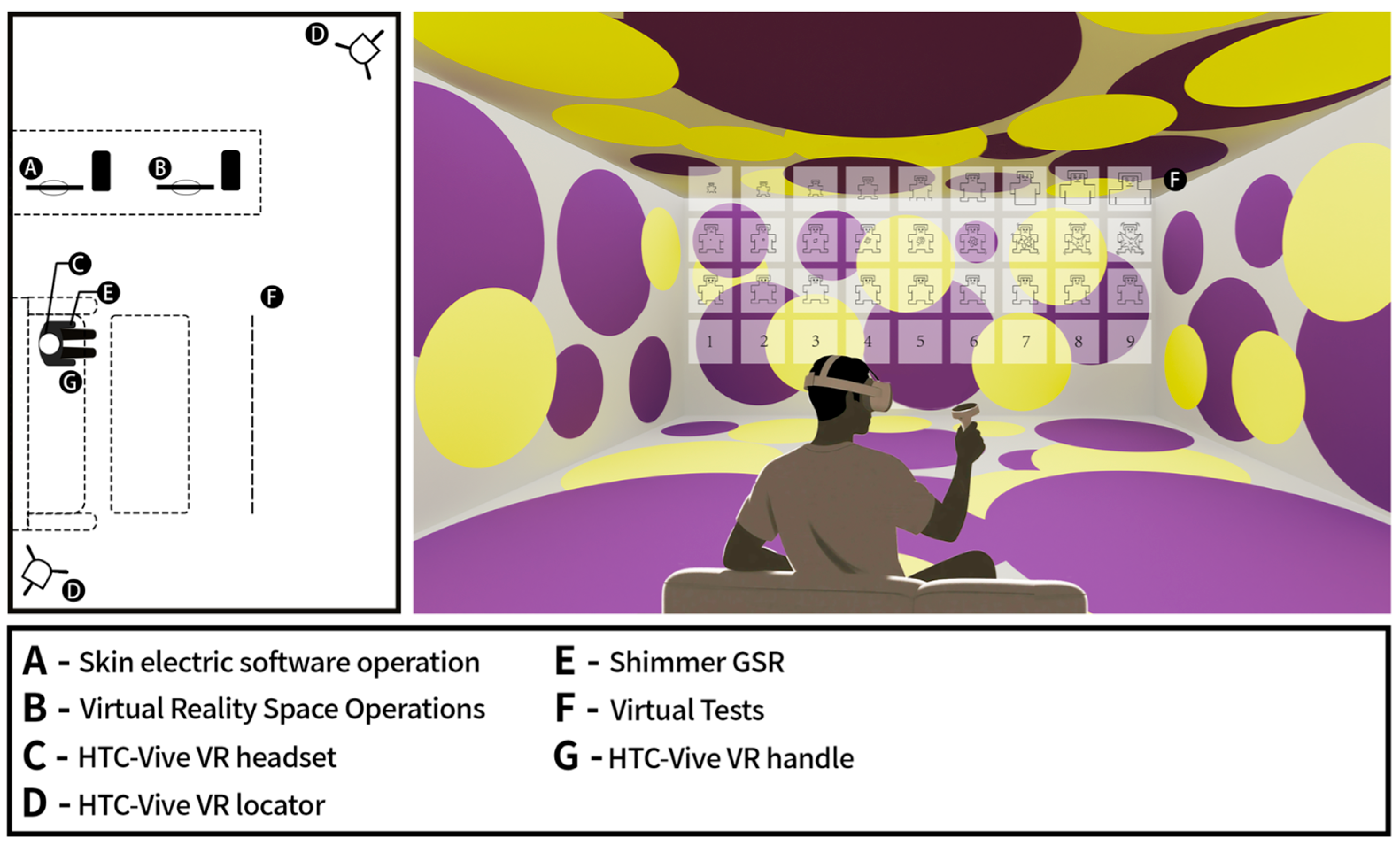
Formal experiment stage: To ensure physical stability and minimize the movement falsation in physiological data, the participants sat comfortably on the sofa throughout the experiment. They view the virtual environment through a head-mounted display (HMD). The Shimmer3 GSR sensor is worn on the finger of the left hand (non-operating hand) for continuous recording of skin conductivity without interference. Hold the VR handle with your right hand. In each experiment, after passively experiencing spatial color stimulation for 10 s, the participants used the handle in the right hand to complete the SAM scale and personal preference scoring in the virtual interface. The experimental stimuli comprised 24 virtual interior color scenes, systematically designed by manipulating color combinations, color shape (sharp, square, round, and streamlined), and Area proportions (25%, 50%, 100%), with the presentation order randomized using a Latin square design to control for sequence effects. Each scene was displayed for 10 s, followed by a self-assessment manikin (SAM) test, in which participants rated pleasure, arousal, dominance, and liking. The choice of this length is to capture the participants’ immediate and intuitive emotional response to the spatial atmosphere, while avoiding visual fatigue or cognitive over-analysis [45]. The rating period was not time constrained. To minimize carryover effects, a 5 s neutral baseline room (a plain white cubic space) was inserted between trials [46]. The 24 scenes were divided into three blocks of eight trials each, with optional rest periods provided between blocks to prevent fatigue. Throughout the experiment, participants were instructed to relax with eyes closed during rest intervals and to avoid intentional emotional regulation, ensuring natural affective responses (Figure 2) [47]. Event onset and offset markers were logged via Unity scripts, allowing precise synchronization of behavioral, self-report, and physiological data [48].
Figure 2.
Experimental process diagram. The left image shows the laboratory layout, illustrating the experimental process involving participants and the location of data collection equipment. The right image depicts the virtual space color test, where participants wear VR headsets to observe the space, with GSR devices on their left hands and VR controllers in their right hands to complete the SAM questionnaire and indicate color preferences.
Post-experiment stage: At the end of the experiment, participants engaged in a brief semi-structured interview. The collected qualitative feedback is used to assist the interpretation of quantitative data in the Section 4 and provide background information for specific color preferences.
2.4. Physiological Data Acquisition and Preprocessing
Physiological Data Preprocessing: We use skin conductance level (SCL) to evaluate the level of physiological arousal. Use the Shimmer3 GSR+ device to record the original skin conductivity signal at a sampling rate of 52 Hz. To ensure data quality and individual comparability, the following preprocessing steps are strictly implemented. Time window extraction: For each of the 24 spatial stimuli, extract the signal corresponding to the 10 s stimulus presentation window. Calculate the average SCL value (μs) during this period as the original indicator of physiological activation.
Artifact Rejection: Visual inspection of the original data. Exclude the test of excessive signal drift or motion artifacts (defined as a duration of more than 0.5 μs in 1 s and not a sudden spike caused by stimulation).
Standardization (Within-Subject Z-score): To solve the significant individual differences between the baseline tension level, the Z score conversion in the subject is carried out. For each participant i, the original average skin conductance level (SCL) value j(Xij) of the jth trial is standardized using the overall mean (μi) and standard deviation σi of the participants in all 24 trials:
This conversion standardizes the data of each participant to a mean of 0 and a standard deviation of 1, effectively eliminating the confusion effect of individual baseline differences, so that relative arousal changes under different conditions can be effectively compared.
Statistical Analysis: All statistical analyses were performed using SPSS 26.0 (IBM Corp., Armonk, NY, USA) [49]. To appropriately handle the hierarchical structure of the data (repeated measures nested within participants), we employed Linear Mixed Models (LMM). Model Specification: This model is utilized Restricted Maximum Likelihood (REML) estimation. The participant ID is incorporated into the model as a random effect (random intercept) to explain the non-independence between the variation between the subjects and the observed values. Design variables and personality traits are incorporated into the model as fixed effects.
Distribution Assumptions: The dependent variable (SAM ratings) is collected by a 9-point scale. According to the established psychometric guidelines [50], the 9-point scale provides sufficient granularity to be treated as a continuous variable in parameter analysis. We verified the model hypothesis by checking the Q-Q plots of the residuals, and the results show that the residual approximately followed the normal distribution and meets the requirements of the LMM.
Hypothetical Test and Multiple Comparison: This analysis is divided into two stages to distinguish between the verification target and the exploratory target.
Confirmatory analysis: Based on the theoretical framework of “conscientiousness”, we have strictly examined the theoretical basis of the role of due diligence in regulating spatial perception. Exploratory analysis: We examined the interaction of other personality characteristics (Neuroticism, Extraversion, Agreeableness, Openness) to identify the potential patterns generated by future hypotheses.
For the post-two comparison of the main effects (color, shape, area), we applied Bonferroni correction to control the family-wise error rate. For the interaction terms in the linear hybrid model, we report the exact p value and focus on the explanation based on the effect quantity and theoretical consistency and clearly mark the non-hypothetical findings as exploratory findings.
3. Results
The following section will introduce the results of empirical research on the relationship between spatial color design, personality traits and emotional responses. The analysis is divided into three parts: first, a descriptive overview of the emotional score of a specific spatial scene; second, the main effects of design elements (color combination, color shape, area proportion) are analyzed through the Linear Mixed model (LMM); finally, the regulating role of personality traits is discussed, especially It is to test the interaction effect hypothesized in the S-O-R framework.
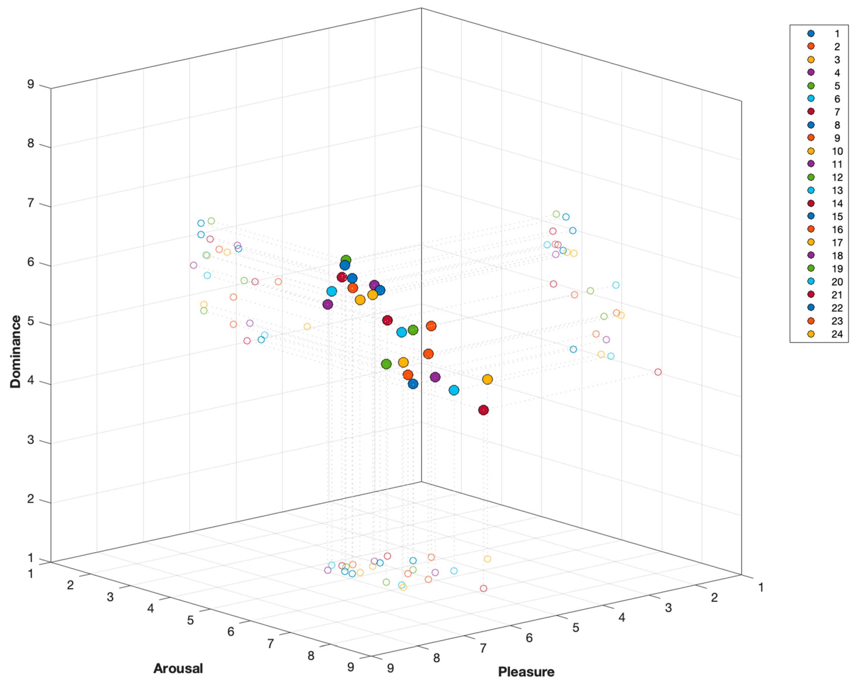
To visualize the overall emotional picture, we calculated and drew the average PAD (pleasure, arousal, dominance) score of each space in 24 experimental spaces (as shown in Figure 3). The results show that different spatial configurations show different emotional characteristics. Space 20 demonstrated a high overall PAD score, with a color scheme consisting of a 50% Area proportion of streamlined forms and a combination of red and orange hues. This spatial composition indicates that the combination of warm-toned analogous colors, moderate area coverage, and smooth contour forms has the most significant effect on stimulating positive emotions, particularly in terms of pleasure and a sense of control. In contrast, Space 14 achieved an intermediate PAD score, characterized by a square geometric form covering 50% of the area, combined with a blue-purple color scheme. This color-form relationship reflects a more neutral perceptual and emotional quality, placing it within the middle range of emotional responses. Space 6 received the lowest PAD score, primarily characterized by a sharp geometric form covering 100% of the area, combined with a red-green contrasting color scheme. This result indicates that the combination of fully covered sharp shapes and strong contrasting colors is most likely to evoke negative emotional experiences, significantly reducing pleasure and a sense of control while maintaining a high arousal level.
Figure 3.
Average score chart for the color space PAD scale.
3.1. Descriptive Statistical Analysis
3.1.1. Descriptive Statistics of the Dataset
A total of 1512 valid data points (63 participants × 24 virtual spaces) were collected in this study. Prior to the main analyses, a descriptive statistical analysis was conducted on the subjective emotional ratings and physiological data across all participants and spaces. The results are summarized in Table 3. The subjective emotional data were measured using the 9-point self-assessment manikin (SAM) scales and a liking scale. The results indicated that the mean for pleasure was 5.11 (standard deviation, SD = 1.56), the mean for arousal was 5.03 (SD = 1.77), the mean for dominance was 5.11 (SD = 1.76), and the mean for liking was 4.88 (SD = 1.76). The means for all subjective ratings were close to the scale’s midpoint of 5, and the median for each was also 5. This suggests that, overall, the emotional experiences elicited by the 24 spaces were relatively balanced between positive and negative, and between excitement and calmness. However, the full range of the scale was utilized, with minimum (Min = 1) and maximum (Max = 9) values observed for all rating dimensions. This, combined with the relatively large standard deviations (ranging from 1.56 to 1.77), clearly demonstrates that the virtual spaces designed for this study were effective as emotional stimuli, successfully inducing a wide and significantly varied spectrum of affective responses among the participants.
Table 3.
Descriptive statistical analysis of emotional dimensions in different color spaces.
For the physiological data, the standardized skin conductance level (Z-SCL) was used as an objective measure of physiological arousal. As defined by z-score standardization, the mean of this variable was 0.00 with a standard deviation of 1.00. The observed data ranged from −2.23 to 3.32, with a median of −0.21, confirming that the physiological response data also exhibited a good distribution and sufficient variability for subsequent statistical testing.
3.1.2. Descriptive Analysis of the Big Five Personality Traits
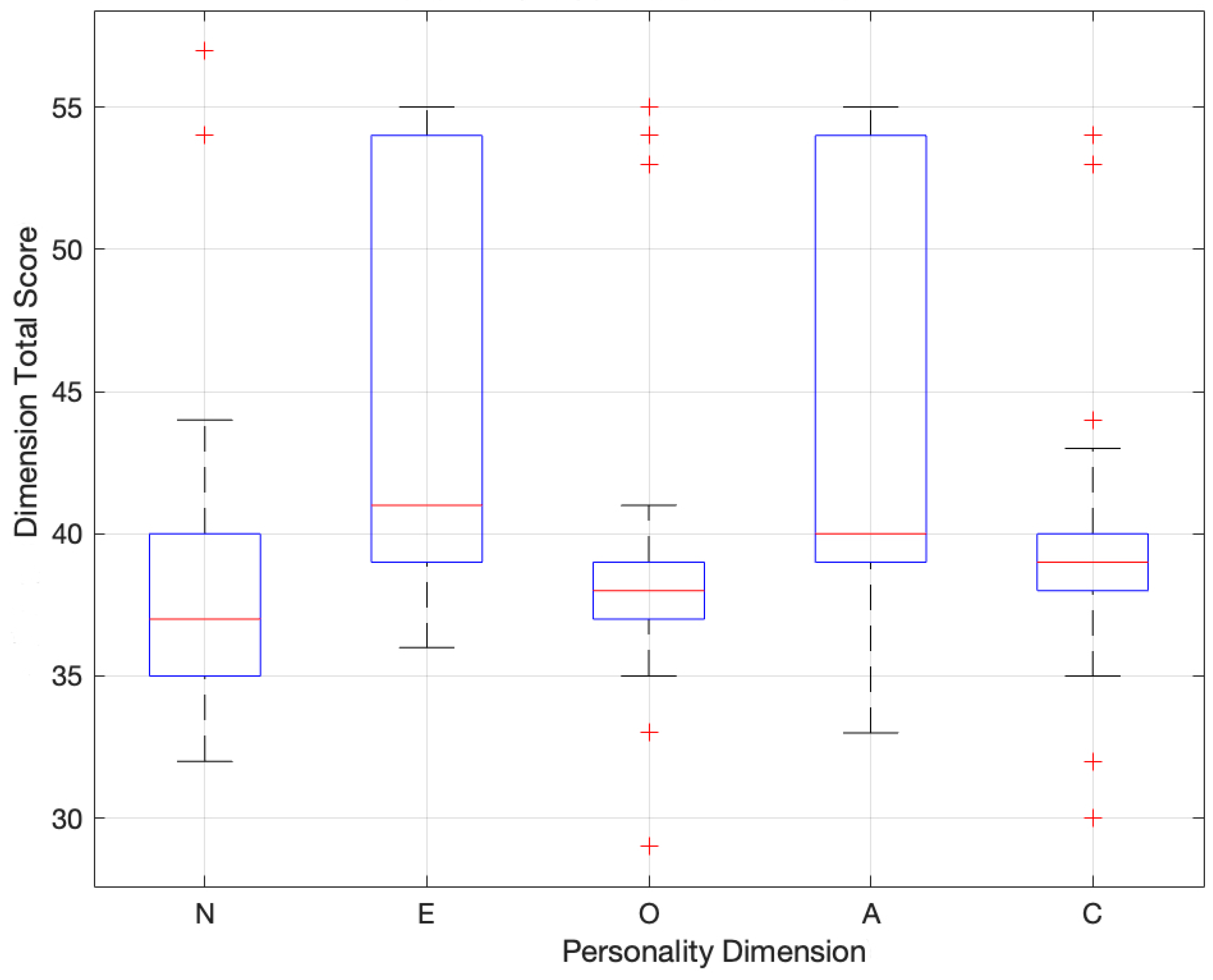
Figure 4 presents a descriptive analysis of the five major personality traits. This box plot indicates that the distribution and median scores for Extraversion (E) and agreeableness (A) are relatively high with a wide interquartile range, suggesting significant variation in performance among participants. Openness (O) exhibits a more balanced distribution, with data clustered around the median and moderately dispersed. In contrast, Neuroticism (N) and conscientiousness (C) show lower median scores and relatively narrower interquartile ranges, indicating more concentrated distributions for these traits. Some outliers are observed in this figure, suggesting individual variability within the survey population.
Figure 4.
Box plot of scores for each dimension of the Big Five personality traits.
Overall, the box plot analysis indicates that the subjects are well-represented across the five major personality dimensions, with no signs of extreme data skew. This establishes a solid foundation for subsequent personality-based groupings and provides theoretical support for exploring differences in emotional evaluations of virtual architectural interior color schemes among individuals with varying personality traits.
3.2. Main Effects of Spatial Design Elements
The LMM analysis reveals different influence patterns of three design variables (Table 4). Color combination: Pleasure (F = 22.09, p < 0.001) and liking (F = 16.39, p < 0.001) have significant main effects. Post hoc comparisons indicated that the score of similar color combinations (such as red-orange) is higher than that of complementary color combinations (such as red-green). The degree of arousal was also significantly affected (F = 12.31), and the warm tone score was higher, but no significant effects were observed in dominance and Z-SCL. Color shape: Shape has a significant impact on Pleasure (F = 6.79), arousal (F = 3.30) and Z-SCL (F = 3.60). The streamlined/circular shape triggers a higher degree of pleasure, while the sharp shape triggers the highest subjective arousal and physiological Z-SCL. Area proportion: Area becomes the most comprehensive predictor (p < 0.05). It is the only driving factor of dominance (F = 112.53), showing a strong negative correlation: when the coverage rate increases to 100%, the dominance score decreases significantly, while the arousal (F = 71.72) and Z-SCL (F = 3.91) peak.
Table 4.
Results of linear mixed models (LMM) examining the main effects of design elements.
3.3. The Moderating Role of Personality Traits
3.3.1. Confirmatory Analysis: Conscientiousness
To verify the theoretical model that personality traits act as a cognitive filter for environmental stimulation, we examined the regulatory effect of conscientiousness (C). The linear mixed model (LMM) shows that this characteristic significantly regulates the user’s perception and response to spatial design elements in multiple psychological and physiological dimensions (Table 5).
Table 5.
Moderating effects of conscientiousness (interaction terms) on emotional responses.
There is a significant interaction between conscientiousness (C) and area proportion, predictable dominance (F = 3.91, p < 0.05) and Z-SCL (F = 3.01, p < 0.05). Compared with low-conscientiousness individuals, high-conscientiousness individuals show a more significant decline in dominance under high-area coverage, and the increase in physiological arousal level is more obvious. In addition, there is also a significant interaction between the color combination and the arousal level (F = 2.81, p < 0.05)) and the shape with the pleasure (F = 2.64, p < 0.05), indicating that there are characteristic differences in individual sensitivity to esthetic and alert signals.
3.3.2. Exploratory Analysis: Neuroticism, Extraversion, and Agreeableness
To capture the complete spectrum of user-environmental interaction except for the existing conclusions, we conducted an exploratory linear mixed model (LMM) analysis of the remaining personality traits. Table 6 summarizes the significant interaction effects and reveals different characteristic-based processing modes.
Table 6.
Summary of significant exploratory interaction effects.
Neuroticism (N): There is a significant interaction between area proportion and neuroticism with Z-SCL (F = 5.60, p = 0.004). Highly neurotic participants showed a significant increase in the physiological arousal level in the face of large-area color stimulation, while neurotically stable individuals did not have this phenomenon. Extraversion (E): On the contrary, extraverts and regional proportions interact with Pleasure (F = 3.33, p = 0.036), and extraverts report higher pleasure in a high coverage environment. Agreeableness (A): This trait regulates the influence of color shape on the degree of Liking (F = 2.65, p = 0.047), and individuals with higher pleasantness prefer round shapes to sharp shapes.
Finally, we also examined openness (O) but found no significant interaction between any dimensions, which indicates that this trait may affect the overall esthetic appreciation, rather than the specific response to the structural variables manipulated in this study.
4. Discussion
This study employed a virtual reality experimental approach to comprehensively investigate the influence of color visual characteristics in architectural spaces on emotional responses. Furthermore, personality traits were incorporated to analyze the role of individual differences in emotional perception within spatial environments. Through systematic analysis, the following conclusions were drawn.
4.1. The Hierarchy of Visual Stimuli (S): Esthetics vs. Control
The results of the analysis of the Linear Mixed Models in this study provide further empirical support for the existing theoretical foundation. We found that different forms of color do have a significant impact on human emotional perception, which further proves the complexity of spatial color design [51].
Color combination: esthetic judgment and cultural background. Consistent with the color harmony theory [52], our data confirms that similar color combinations are more pleasant and liked than complementary color combinations [53]. However, we observed an interesting deviation: the preference score of the yellow-purple (complementary color) combination is unexpectedly high, comparable to the similar color combination, while the preference score of the red-green combination is the lowest. This may be attributed to young people’s greater inclination toward “individuality” and “conflict stimulation” [54]. In post-experiment interviews, many participants noted that spaces featuring the yellow-purple color combination evoked a sense of lightness and liveliness, which may also contribute to its high levels of enjoyment and preference. This preference may also be related to the cultural background of the participants. In traditional Chinese culture, yellow and purple carry symbolic meanings of “nobility” and “power,” potentially enhancing the acceptance of this color pairing [55]. The combination of blue and purple hues creates a sense of calm and stability in a space, resulting in neither particularly high levels of Pleasantness nor preference. The pairing of red and green is frequently regarded as emblematic of “kitsch” within the Chinese cultural context, consequently ranking lowest in preference-a finding consistent with existing research [56]. Regarding the arousal dimension, warm-toned color combinations elicit higher arousal levels than cool-toned combinations, consistent with Walters’ research findings [57]. Crucially, the results of the linear mixed model show that although color has a significant impact on subjective feelings, it has no significant effect on physiological arousal or dominance. This shows that the tone mainly plays the role of “esthetic skin” [51]—it shapes the hedonistic tone of the experience, but on its own, it lacks the structural power to trigger autonomic nerve stress or change the user’s spatial perception.
Color shape: Evolutionary threat detection. Color shapes show a deeper biological influence. The shape of color shows a double effect at both psychological and physiological levels, which once again confirms the research findings of Sivers [58]. The sharp shape not only reduces the sense of pleasure, but more importantly, it significantly increases the physiological arousal. This consistency between subjective discomfort and objective physiological activation supports the evolutionary “threat detection” hypothesis [14]. The sharp angular outlines in the environment may be considered a potential physical danger by the brain, thus triggering the subtle “fight or escape” mechanism in the autonomic nervous system [59]. In contrast, streamlined and circular modeling is associated with higher pleasure and lower physiological tension, confirming their role in creating a “psychological safety” environment suitable for rehabilitation design [60].
Area proportion: The structural determinant of control. The proportion of area has become the main variable, resulting in a double-edged sword effect. High color coverage maximizes the degree of arousal and physiological Z-SCL, which is consistent with Berlyne’s arousal theory on stimulus intensity [61]. However, this enhanced stimulus also has significant consequences: a significant decrease in control over Domination. This shows that immersive visual saturation will produce an “overload effect”, that is, the environment exerts excessive sensory pressure and weakens the user’s cognitive control [62]. This discovery puts forward an important warning to interior design: maximizing the visual impact may inadvertently cause stress and helplessness. On the contrary, a smaller color area in the space can bring surprise and pleasure. This discovery poses an important warning for indoor color design: the pursuit of maximizing visual impact may inadvertently cause pressure and helplessness, so it must be carefully considered when using color areas.
4.2. Core Findings: Personality as the Organism (O): Regulatory Mechanisms
This study shows that personality traits can indeed regulate an individual’s emotional perception of the environment, and also confirms the differences in individual color preferences [27]. We use LMM interaction analysis to identify the specific mechanism of personality as an environmental filter. Based on the results of data analysis, we have made several key findings.
Conscientiousness: The drive for order and control. The research results show that conscientiousness significantly regulates the influence of area proportion on dominance and Z-SCL. This discovery provides empirical support for the concept of “orderliness” in spatial psychology [63]. High-conscientiousness individuals rely on environmental structures to maintain cognitive balance. When exposed to visual interference with excessive area coverage, they will experience a significant loss of subjective control and a sharp increase in physiological stress [64]. Our data proves that for people with a strong conscientiousness, spatial chaos is a real source of pressure that will disturb their adjustment needs. In addition, their sensitivity to color and shape further shows that they generally prefer predictable and harmonious stimuli rather than chaotic stimuli [65].
Neuroticism vs. extraversion: Exploratory analysis revealed significant differences in the response of neuroticism (N) and extraversion (E) to environmental scale. Neuroticism as a physiological sentry: An important new discovery is that the interaction between Neuroticism and area on Z-SCL is very significant. Highly neuroticism individuals play the role of “physiological sentries” and show strong autonomic nervous responses to large-scale stimuli that emotionally stable individuals can tolerate well. This is consistent with the environmental sensitivity hypothesis [66], which shows that for emotionally unstable users, the immersive environment will amplify their physiological anxiety. Extraversion as a seeker of stimulation: On the contrary, the interaction between extravert and area can predict pleasure. The high-intensity environment will put pressure on neurotic introverts, but it can meet the needs of extraverts. This supports Eysenck’s “best stimulation level” theory [67], which believes that extraverts are biologically eager for external stimuli to reach the peak of their enjoyment due to a long-term low cortical arousal baseline level.
Agreeableness: The social-esthetic map. Finally, agreeableness (A) significantly regulates the relationship between color shape and liking. Although the public tends to favor the shape of the curve, pleasantness will significantly enhance this preference [68]. Highly pleasant individuals have the motivation to pursue social harmony, empathy and avoid conflict. Our research results show that this interpersonal orientation extends to the field of physics through the “social esthetic mapping” mechanism. Under the framework of body cognition theory, sharp and angular shapes are usually treated subconsciously as signals of “threat”, “attack” or “visual hostility” [69], while round and streamlined shapes are regarded as “acquit” and “friendly”. Highly pleasant individuals are particularly sensitive to warm and hostile social clues, and they seem to map these social judgements to spatial forms [70]. They showed obvious esthetic aversion to sharp and aggressive geometric shapes, as well as a strong preference for shapes that reflect a sense of softness. This means that for users with high pleasure, the “pleasant” space is essentially a “non-hostile” space, which strengthens the deep connection between social personality traits and environmental esthetic judgment.
5. Conclusions
Based on the stimulus–organism–response (S-O-R) framework and Linear Mixed Model (LMM) analysis, this study empirically tests the interaction between spatial design elements and personality traits in a virtual environment. The research results draw the following conclusions:
First, different design elements have different influence patterns on emotional experience. The analysis shows that the area ratio is a major structural variable, which significantly affects the sense of control and physiological arousal. In contrast, color combinations and color shapes mainly affect pleasure and liking. It is worth noting that objective physiological data shows that sharp color shapes are associated with higher physiological alertness compared with round shapes, which provides physiological support for shape-induced arousal.
Secondly, personality traits will regulate specific environmental responses. The statistical evidence provided by the study shows that environmental perception is not unified but varies according to personality. Regarding conscientiousness, we find that there is a significant interaction between this trait and the proportion of area on dominance. People with high conscientiousness scores seem to be more sensitive to spatial scale and its sense of control. Exploratory analysis further reveals that there is a significant interaction between Neuroticism and Area ratio, which can predict physiological arousal, indicating that individuals with low emotional stability may experience a higher level of physiological activation in a large color environment. On the contrary, extraversion is associated with a higher sense of pleasure in a similar highly stimulating environment.
Third, the practical significance of the design. These findings show that the “one-size-fits-all” approach may not be applicable to all users. On the contrary, the research results advocate a more meticulous and personalized interior design method. For example, in an environment that requires high cognitive control or low pressure, avoiding excessive color ratios and sharp contours may be particularly beneficial for conscientiousness or neuroticism users. Although further research is needed to verify the effectiveness of these effects in the real environment, this study provides a quantitative framework for understanding the differences in individual spatial emotions.
6. Limitations
This study provides innovative empirical evidence for the framework of “personality adaptive design”; however, to guide future research, the following limitations need to be pointed out.
First, about the characteristics and cultural background of the sample. The participants are mainly college students from homogeneous cultural backgrounds (China). Although this consistency reduces the error variance, it also limits the universal applicability of the study results to other age groups or cultural backgrounds. In addition, as mentioned in the discussion of color preferences, this study does not quantitatively measure cultural values. Therefore, the interpretation of cultural symbolism is still speculative. Future research should include cross-cultural samples and use a clear scale of cultural values to empirically test these associations.
Second, about the ecological validity of VR. Although VR provides a highly controllable platform for controlling design variables, there are inherent perception differences between the virtual environment and physical reality. Although previous studies have supported the effectiveness of VR in emotional assessment, the physiological sensitivity found in this study needs to be verified in a real architectural environment to establish its complete ecological validity.
Third, about the scope of personality interaction. Although this study has successfully identified the different regulatory mechanisms of conscientiousness, neuroticism, and extraversion, no significant interaction between Openness has been found. This may be due to the relative standard of the color shape used in our experiments. Future research can introduce more complex, avant-garde or unconventional design stimuli to specifically explore the esthetic boundaries and preferences of highly open individuals.
Finally, about physiological indicators. We focus on the skin conductivity level (Z-SCL) and use it as a reliable indicator of the degree of arousal. However, SCL cannot distinguish between emotional efficiency (positive and negative). Future research can integrate heart rate variability (HRV) or electroencephalogram (EEG) to provide more comprehensive physiological characteristics of the user’s emotional state.
Supplementary Materials
The following supporting information can be downloaded at: https://www.mdpi.com/article/10.3390/buildings15244525/s1. Table S1. The specific configurations of the 24 experimental conditions used in the study.
Author Contributions
Conceptualization, Y.Z.; methodology, X.D.; validation, Q.F.; formal analysis, Y.Z.; investigation, X.D.; resources, Q.F.; data curation, X.D., Y.L. and M.L.; writing—original draft preparation, X.D. and Y.L.; writing—review and editing, X.D. and M.L.; project administration, Y.Z.; funding acquisition, Y.Z. and Q.F. All authors have read and agreed to the published version of the manuscript.
Funding
This research was funded by the Fundamental Research Funds for the Central Universities, Ministry of Education of the People’s Republic of China (Grant No. N2422002, awarded to Y.Z.) and the National Social Science Fund of China (Art Project) (Grant No. 25BG140, awarded to Q. Fan). The funders had no role in the study design, data collection and analysis, decision to publish, or preparation of the manuscript.
Institutional Review Board Statement
This study was conducted in accordance with the Declaration of Helsinki and has received approval from the Ethics Committee of Northeastern University (Approval Number: NEU-EC-2025B054S; Approval Date: 27 March 2025).
Informed Consent Statement
Informed consent was obtained from all subjects involved in the study.
Data Availability Statement
The datasets generated and analyzed during the current study are available in the supplementary files submitted with this article.
Acknowledgments
All authors participated in the experimental procedures, data processing, and result analysis. We would like to express our sincere gratitude for their contributions. During the preparation of this work, we used ChatGPT-4 (OpenAI) to assist with language editing and to improve the clarity and readability of the manuscript. After using this tool, all authors reviewed and edited the content as needed and take full responsibility for the content of the publication.
Conflicts of Interest
The authors declare no conflicts of interest.
References
- Valentine, C. The impact of architectural form on physiological stress: A systematic review. Front. Comput. Sci. 2024, 5, 1237531. [Google Scholar] [CrossRef]
- Rui, L.; Firzan, M. Emotional Design of Interior Spaces: Exploring Challenges and Opportunities. Buildings 2025, 15, 153. [Google Scholar] [CrossRef]
- Chen, S.; Sleipness, O.; Christensen, K.; Yang, B.; Wang, H. Developing and testing a protocol to systematically assess social interaction with urban outdoor environment. J. Environ. Psychol. 2023, 88, 102008. [Google Scholar] [CrossRef]
- Moscoso-García, P.; Quesada-Molina, F. Analysis of Passive Strategies in Traditional Vernacular Architecture. Buildings 2023, 13, 1984. [Google Scholar] [CrossRef]
- Pallasmaa, J. The Eyes of the Skin: Architecture and the Senses; John Wiley & Sons: Hoboken, NJ, USA, 2024. [Google Scholar]
- Mehrabian, A.; Russell, J.A. An Approach to Environmental Psychology; The MIT Press: Cambridge, MA, USA, 1974. [Google Scholar]
- Helson, H. The Psychology of “Gestalt”. Am. J. Psychol. 1925, 36, 494–526. [Google Scholar] [CrossRef]
- Jacobsen, T. Kandinsky’s questionnaire revisited: Fundamental correspondence of basic colors and forms? Percept. Mot. Ski. 2002, 95, 903–913. [Google Scholar] [CrossRef]
- Wilms, L.; Oberfeld, D. Color and emotion: Effects of hue, saturation, and brightness. Psychol. Res. 2018, 82, 896–914. [Google Scholar] [CrossRef]
- González-Martín, C.; Carrasco, M.; Oviedo, G. Analysis of the use of color and its emotional relationship in visual creations based on experiences during the context of the COVID-19 pandemic. Sustainability 2022, 14, 12989. [Google Scholar] [CrossRef]
- Szabó, F.; Bodrogi, P.; Schanda, J. Experimental modeling of colour harmony. Color Res. Appl. 2010, 35, 34–49. [Google Scholar] [CrossRef]
- Yildirim, K.; Hidayetoglu, M.L.; Capanoglu, A. Effects of interior colors on mood and preference: Comparisons of two living rooms. Percept. Mot. Ski. 2011, 112, 509–524. [Google Scholar] [CrossRef]
- Öztürk, E. The Effects of Color Scheme on the Appraisal of an Office Environment and Task Performance. Master’s Thesis, Bilkent Universitesi, Ankara, Turkey, 2010. [Google Scholar]
- Bar, M.; Neta, M. Humans prefer curved visual objects. Psychol. Sci. 2006, 17, 645–648. [Google Scholar] [CrossRef]
- D’Anselmo, A.; Pisani, A.; Brancucci, A. A tentative I/O curve with consciousness: Effects of multiple simultaneous ambiguous figures presentation on perceptual reversals and time estimation. Conscious. Cogn. 2022, 99, 103300. [Google Scholar] [CrossRef]
- Hirschler, R.; Schwarz, A. Itten’s seven colour contrasts—A review Part I. Early contrast theories and the road to Itten’s contrast theory. J. Int. Colour Assoc. 2023, 33, 136–154. [Google Scholar]
- Manav, B. Color-emotion associations, designing color schemes for urban environment-architectural settings. Color Res. Appl. 2017, 42, 631–640. [Google Scholar] [CrossRef]
- Emery, K.J.; Webster, M.A. Individual differences and their implications for color perception. Curr. Opin. Behav. Sci. 2019, 30, 28–33. [Google Scholar] [CrossRef] [PubMed]
- Cobb-Clark, D.A.; Schurer, S. The stability of big-five personality traits. Econ. Lett. 2012, 115, 11–15. [Google Scholar] [CrossRef]
- Lucas, R.E.; Diener, E.; Grob, A.; Suh, E.M.; Shao, L. Cross-cultural evidence for the fundamental features of extraversion. J. Personal. Soc. Psychol. 2000, 79, 452. [Google Scholar] [CrossRef] [PubMed]
- Donnelly, F.A. The Luscher Color Test: Reliability and selection preferences by college students. Psychol. Rep. 1974, 34, 635–638. [Google Scholar] [CrossRef]
- Pazda, A.D.; Thorstenson, C.A. Extraversion predicts a preference for high-chroma colors. Personal. Individ. Differ. 2018, 127, 133–138. [Google Scholar] [CrossRef]
- Durrani, M.; Niinimäki, K. Colour matters: An exploratory study of the role of colour in clothing consumption choices. Cloth. Cult. 2021, 8, 219–241. [Google Scholar] [CrossRef]
- Tackett, J.L.; Lahey, B.B. Neuroticism. In the Oxford Handbook of the Five Factor Model; Oxford Academic: Oxford, UK, 2015. [Google Scholar]
- Bonnardel, V.; Lamming, L. Gender differences in colour preference: Personality and gender schemata factors. In Proceedings of the 2nd CIE Expert Symposium on Appearance, Ghent, Belgium, 8–10 September 2010. [Google Scholar]
- McCrae, R.R. Openness to experience as a basic dimension of personality. Imagin. Cogn. Personal. 1993, 13, 39–55. [Google Scholar] [CrossRef]
- Jue, J.; Ha, J.H. Exploring the relationships between personality and color preferences. Front. Psychol. 2022, 13, 1065372. [Google Scholar] [CrossRef]
- Dollinger, S.J.; Orf, L.A. Personality and performance in “personality”: Conscientiousness and openness. J. Res. Personal. 1991, 25, 276–284. [Google Scholar] [CrossRef]
- Bradley, M.M.; Lang, P.J. Measuring emotion: The self-assessment manikin and the semantic differential. J. Behav. Ther. Exp. Psychiatry 1994, 25, 49–59. [Google Scholar] [CrossRef]
- Higuera-Trujillo, J.L.; Maldonado, J.L.-T.; Millán, C.L. Psychological and physiological human responses to simulated and real environments: A comparison between Photographs, 360 Panoramas, and Virtual Reality. Appl. Ergon. 2017, 65, 398–409. [Google Scholar] [CrossRef]
- Pinto, L.M.; Matos, R. Exploring the Vital Role of Colors and Shapes in Architectural Design and Education. J. Mediterr. Cities 2024, 4, 114–129. [Google Scholar] [CrossRef]
- Friedenberg, J.; Lauria, G.; Hennig, K.; Gardner, I. Beauty and the sharp fangs of the beast: Degree of angularity predicts perceived preference and threat. Psychol. Res. 2023, 87, 2594–2602. [Google Scholar] [CrossRef] [PubMed]
- Sainz-de-Baranda Andujar, C.; Gutiérrez-Martín, L.; Miranda-Calero, J.Á.; Blanco-Ruiz, M.; López-Ongil, C. Gender biases in the training methods of affective computing: Redesign and validation of the Self-Assessment Manikin in measuring emotions via audiovisual clips. Front. Psychol. 2022, 13, 955530. [Google Scholar] [CrossRef] [PubMed]
- Watten, R.G.; Fostervold, K.I. Colour preferences and personality traits. Preprints 2021, 2021050642. [Google Scholar]
- Lee, H.; Lee, E. Effects of coloured lighting on pleasure and arousal in relation to cultural differences. Light. Res. Technol. 2022, 54, 145–162. [Google Scholar] [CrossRef]
- Dutta, S.; Mishra, B.K.; Mitra, A.; Chakraborty, A. An analysis of emotion recognition based on GSR signal. ECS Trans. 2022, 107, 12535. [Google Scholar] [CrossRef]
- Morris, J.D. Observations: SAM: The self-assessment manikin—An efficient cross-cultural measurement of emotional response. J. Advert. Res. 1995, 35, 63–68. [Google Scholar] [CrossRef]
- John, O.P.; Donahue, E.M.; Kentle, R.L. Big five inventory. J. Personal. Soc. Psychol. 1991. [Google Scholar]
- Karp, A. The Elements of Color by Johannes Itten. Leonardo 1972, 5, 180–181. [Google Scholar] [CrossRef]
- Fisher, R.A. Statistical methods for research workers. In Breakthroughs in Statistics: Methodology and Distribution; Springer: Berlin/Heidelberg, Germany, 1970; pp. 66–70. [Google Scholar]
- Fisher, R.A. Statistical Methods for Research Workers; Oliver and Boyd: Edinburgh, UK, 1928. [Google Scholar]
- Zhang, B.; Li, Y.M.; Li, J.; Luo, J.; Ye, Y.; Yin, L.; Chen, Z.; Soto, C.J.; John, O.P. The big five inventory–2 in China: A comprehensive psychometric evaluation in four diverse samples. Assessment 2022, 29, 1262–1284. [Google Scholar] [CrossRef]
- Bynion, T.-M.; Feldner, M.T. Self-assessment manikin. In Encyclopedia of Personality and Individual Differences; Springer: Berlin/Heidelberg, Germany, 2020; pp. 4654–4656. [Google Scholar]
- Marey, H.M.; Semary, N.A.; Mandour, S.S. Ishihara electronic color blindness test: An evaluation study. Ophthalmol. Res. Int. J. 2015, 3, 67–75. [Google Scholar] [CrossRef]
- Marín-Morales, J.; Higuera-Trujillo, J.L.; Greco, A.; Guixeres, J.; Llinares, C.; Gentili, C.; Scilingo, E.P.; Alcañiz, M.; Valenza, G. Real vs. immersive-virtual emotional experience: Analysis of psycho-physiological patterns in a free exploration of an art museum. PLoS ONE 2019, 14, e0223881. [Google Scholar] [CrossRef]
- Cha, S.H.; Zhang, S.; Kim, T.W. Effects of interior color schemes on emotion, task performance, and heart rate in immersive virtual environments. J. Inter. Des. 2020, 45, 51–65. [Google Scholar] [CrossRef]
- Marx, E.; Deutschländer, A.; Stephan, T.; Dieterich, M.; Wiesmann, M.; Brandt, T. Eyes open and eyes closed as rest conditions: Impact on brain activation patterns. Neuroimage 2004, 21, 1818–1824. [Google Scholar] [CrossRef] [PubMed]
- Hocking, J. Unity in Action: Multiplatform Game Development in C#; Simon and Schuster: New York, NY, USA, 2022. [Google Scholar]
- Allen, P.; Bennett, K.; Heritage, B. SPSS Statistics Version 22: A Practical Guide; Cengage Learning Australia: Victoria, Australia, 2014. [Google Scholar]
- Norman, G. Likert scales, levels of measurement and the “laws” of statistics. Adv. Health Sci. Educ. 2010, 15, 625–632. [Google Scholar] [CrossRef] [PubMed]
- Elliot, A.J.; Maier, M.A. Color psychology: Effects of perceiving color on psychological functioning in humans. Annu. Rev. Psychol. 2014, 65, 95–120. [Google Scholar] [CrossRef] [PubMed]
- Burchett, K.E. Color harmony. Color Res. Appl. 2002, 27, 28–31. [Google Scholar] [CrossRef]
- Terwogt, M.M.; Hoeksma, J.B. Colors and emotions: Preferences and combinations. J. Gen. Psychol. 1995, 122, 5–17. [Google Scholar] [CrossRef]
- Mai, P. Perceptions of Online photos—A Focus Group Study with Young Consumers. Theseus. 2021. Available online: https://urn.fi/URN:NBN:fi:amk-2021120724147 (accessed on 30 October 2025).
- Wang, L.; Guo, L. Exploring the Cultural Connotations of “Purple” and “Zi.”. Can. Soc. Sci. 2019, 15, 57–61. [Google Scholar]
- Liu, H. Study on the National Style in Packaging Design. In Proceedings of the 4th International Conference on Culture, Education and Economic Development of Modern Society (ICCESE 2020), Moscow, Russia, 13–14 March 2020; Atlantis Press: Beijing, China, 2020; pp. 235–237. [Google Scholar]
- Walters, J.; Apter, M.J.; Svebak, S. Color preference, arousal, and the theory of psychological reversals. Motiv. Emot. 1982, 6, 193–215. [Google Scholar] [CrossRef]
- Sievers, B.; Lee, C.; Haslett, W.; Wheatley, T. A multi-sensory code for emotional arousal. Proc. R. Soc. B 2019, 286, 20190513. [Google Scholar] [CrossRef]
- Damiano, C.; Walther, D.B.; Cunningham, W.A. Contour features predict valence and threat judgements in scenes. Sci. Rep. 2021, 11, 19405. [Google Scholar] [CrossRef] [PubMed]
- Küller, R.; Ballal, S.; Laike, T.; Mikellides, B.; Tonello, G. The impact of light and colour on psychological mood: A cross-cultural study of indoor work environments. Ergonomics 2006, 49, 1496–1507. [Google Scholar] [CrossRef]
- Berlyne, D. Stimulus intensity and attention in relation to learning theory. Q. J. Exp. Psychol. 1950, 2, 71–75. [Google Scholar] [CrossRef]
- Marucci, M.; Di Flumeri, G.; Borghini, G.; Sciaraffa, N.; Scandola, M.; Pavone, E.F.; Babiloni, F.; Betti, V.; Aricò, P. The impact of multisensory integration and perceptual load in virtual reality settings on performance, workload and presence. Sci. Rep. 2021, 11, 4831. [Google Scholar] [CrossRef]
- Li, K.; Lv, Y.; Dong, Y.; Wang, T.; Wu, J.; Zhang, Z.; Li, X.; Han, R.; Lin, F. Orderliness/disorderliness is mentally associated with construal level and psychological distance. Front. Psychol. 2019, 10, 2521. [Google Scholar] [CrossRef]
- Shahsavarani, A.M.; Ashayeri, H.; Lotfian, M.; Sattari, K. The effects of stress on visual selective attention: The moderating role of personality factors. J. Am. Sci. 2013, 9, 1–16. [Google Scholar]
- Pazda, A.D.; Thorstenson, C.A. Color intensity increases perceived extraversion and openness for zero-acquaintance judgments. Personal. Individ. Differ. 2019, 147, 118–127. [Google Scholar] [CrossRef]
- Pluess, M.; Lionetti, F.; Aron, E.N.; Aron, A. People differ in their sensitivity to the environment: An integrated theory, measurement and empirical evidence. J. Res. Personal. 2023, 104, 104377. [Google Scholar] [CrossRef]
- Eysenck, H.J. The inheritance of extraversion-introversion. Acta Psychol. 1956, 12, 95–110. [Google Scholar] [CrossRef]
- Manippa, V.; Tommasi, L. The shape of you: Do individuals associate particular geometric shapes with identity? Curr. Psychol. 2023, 42, 10042–10052. [Google Scholar] [CrossRef]
- Larson, C.L.; Aronoff, J.; Sarinopoulos, I.C.; Zhu, D.C. Recognizing threat: A simple geometric shape activates neural circuitry for threat detection. J. Cogn. Neurosci. 2009, 21, 1523–1535. [Google Scholar] [CrossRef]
- Wilkowski, B.M.; Robinson, M.D.; Meier, B.P. Agreeableness and the prolonged spatial processing of antisocial and prosocial information. J. Res. Personal. 2006, 40, 1152–1168. [Google Scholar] [CrossRef]
Disclaimer/Publisher’s Note: The statements, opinions and data contained in all publications are solely those of the individual author(s) and contributor(s) and not of MDPI and/or the editor(s). MDPI and/or the editor(s) disclaim responsibility for any injury to people or property resulting from any ideas, methods, instructions or products referred to in the content. |
© 2025 by the authors. Licensee MDPI, Basel, Switzerland. This article is an open access article distributed under the terms and conditions of the Creative Commons Attribution (CC BY) license (https://creativecommons.org/licenses/by/4.0/).