Abstract
Modern technological advances and trends require new pedagogy and delivery of mapping materials to prepare the future workforce in the disciplines of Science, Technology, Engineering, and Mathematics (STEM) for an increasingly technology-dominated society. The purpose of this study was to develop an Environmental Systems Research Institute (ESRI) Story Map “Soil Forming Factors: Climate” for multiple STEM disciplines based on the design guidelines from the Cognitive Theory of Multimedia Learning (CTML). The study incorporated a two-group post-test only design that utilized multiple methods of analysis, including a quality assessment of the ESRI Story Map using the five principles of effective storytelling, direct quantitative measures of learning (quiz), and surveys of participants’ perceptions (PowerPoint presentation versus ESRI Story Map) using QualtricsTM. Survey results were summarized by gender, academic classification (year), and academic major program. The newly developed ESRI Story Map was an effective teaching tool as demonstrated by quiz scores and students’ positive responses. Post-testing scores indicated that ESRI Story Maps were an effective way to learn and were viewed as effective as traditional teaching methods (e.g., PowerPoint). Additionally, students reported feeling comfortable using ESRI Story Maps. These positive responses were consistent by gender, major, and academic classification (year). This research indicates that adding audio may improve the use of this ESRI Story Map for educational concept delivery. Empirical studies such as this that include multifaceted quantitative and qualitative assessments are critical to understanding the benefits of new types of multimedia learning in an educational setting.
1. Introduction
There is an urgent need to upgrade the level of technology in STEM education. It is no longer acceptable to live in a world dominated by technology and to not provide access to these innovations and the key concepts around technology-based decision making to help manage natural resources. Students are entering a time when knowledge of technology is no longer optional but is required [1,2]. With the range of rapidly evolving technologies, there is a risk that undergraduate students are not trained or even exposed to these technological tools. Many new technologies rely on location-aware contextual information based on Global Position Systems (GPS) and Geographic Information Systems (GIS) [3]. Mapped information using GPS and GIS can help students understand how information varies in space and time.
Traditionally, geospatial education for STEM disciplines relied on paper maps, which are created from the subjective decisions of cartographers on a paper medium [4]. The cartographer has to decide the map’s scale, features, symbols, labels and ultimately the priority of such content [4]. Therefore, a traditional map is a static, paper-based product that can neither have updated content nor removal of irrelevant content [4]. According to Mayer [5], maps are multimedia presentations, which contain pictures and words (Figure 1). The Cognitive Theory of Multimedia Learning (CTML) provides guidelines on the effective use of multimedia learning, and it is based on three assumptions: (1) dual channels (separate processing channels for visual and auditory information), (2) limited capacity (each channel has a limited capacity to process information at one time), and (3) active processing (active learning by carrying out a coordinated set of cognitive learning processes) [5]. In addition to these assumptions, there are five cognitive multimedia learning processes, which include: (1) selection of relevant words, (2) selection of relevant images, (3) organization of these words into coherent verbal representation, (4) organization of these words into coherent pictorial representation, and (5) integration of these verbal and pictorial representations and prior knowledge [5] (Figure 1).
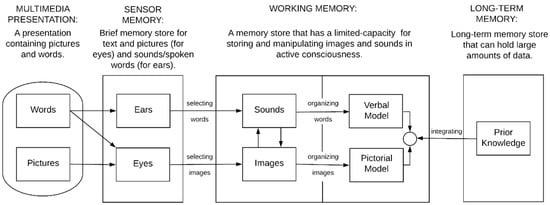
Figure 1.
Cognitive Theory of Multimedia Learning (CTML) and its components (adapted from [5]).
Digital maps, including ESRI Story Maps, are also multimedia presentations, which development can benefit from the guidelines based on the Cognitive Theory of Multimedia Learning (CTML). These digital maps are innovative educational tools that provide users with interactive maps comprised of multimedia content and informational text. ESRI interactive maps are created as web applications using ESRI’s online cloud-based mapping and analysis platform, ArcGIS Online. Interactive story maps combine data, locations, and people to create an effective medium for conveying information and providing an exemplary user experience [6]. Berendsen et al. [7] compared traditional maps to digital maps in an academic setting by developing story maps of the Wyoming Student Atlas, which are traditional atlas maps used for educational purposes. Both students and educators preferred the story maps over the traditional maps, specifically citing the story maps’ ease of use [7].
Digital maps are ubiquitous for everyday use such as navigating geographically, however, they are also becoming increasingly popular among educational institutions for both teaching and learning [4]. Furthermore, the versatility of digital maps has encouraged their use in private industries and businesses, all levels of government, and research institutions [4]. Interactive digital maps combine attractive map features to create a visual story that can effectively convey a message to a broader audience [8]. In an academic setting, there are numerous advantages of transitioning from traditional maps to digital maps: (1) digital maps can be developed and created by both students and educators, which can enrich the educational experience, (2) combining multiple maps at varying scales can help guide students towards discovering unique patterns and associations, and (3) digital maps (including content) can be easily updated, while avoiding the inevitable publication costs of traditional maps [7]. A definitive benefit of a digital map is the ability to manipulate and edit the content’s appearance [4]. However, there are also a few obstacles to overcome: (1) the challenge of creating a digital map with equal or greater quality of a traditional map, and (2) the challenge of preventing the digital map interaction from becoming a distraction from the objective of the educator [6]. Overall, the digital map permits users to get around the constraints that are characteristic of the traditional paper-based maps [4]. Digital map creation on a platform, such as ArcGIS Online, allows almost anyone to create a digital map or use existing publicly available data that could be used within an ESRI Story Map. Formal GIS training can speed the creation of complex online maps. However, any educator can create interactive and accurate maps using this type of platform. Extensive free online help is available through online documentation and help forums. The time required to create an ESRI Story Map will vary depending on the complexity of the map and content and the expertise level of the creators. This time could be as quick as days, or as long as months depending on these factors.
Storytelling in digital maps is an important approach to communicating and conceptualizing the endless accumulation of data [7]. Non-expert audiences usually learn science information through mass media by the use of narratives, therefore, narrative storytelling is a regarded method for conveying technical science information to non-experts in a comprehensible form of communication [9]. Storytelling supplements interactive maps by helping users to understand convoluted spatial relationships, while providing an exciting experience [8]. Furthermore, previous studies suggest storytelling has the ability to increase an audience’s willingness to learn and retention of material [10]. Narrative storytelling is an efficient tool to be utilized supplementary to traditional forms of communication [10].
Previous research has suggested the effectiveness of using ESRI story maps as educational tools. For example, Cope et al. [11] examined the effectiveness of the ESRI story map as an educational tool using quiz and assessment based on five principles of effective storytelling [6] and reported positive response by the students to the newly introduced method of teaching [11]. In the present study, the ESRI Story Map “Soil Forming Factors: Climate” was assessed using the five principles of effective storytelling [6]. These original five principles of effective storytelling were grouped by the following categories: (1) Audience suitability: “Connect with your audience”, (2) Appeal: “Lure people in”, (3) User experience: “Choose the best user experience”; (4) Easy-to-read maps: “Make easy-to-read maps”, and (5) Simplicity of the story: “Strive for simplicity.” The first principle, “Connect with your audience,” represents creating a story map with an understanding of the intended audience and striving to create suitable content. The second principle, “Lure people in,” describes the need to captivate and attract users to the story map through aesthetics and creative content. The third principle, “Choose the best user experience,” suggests the optimal user experience is based on choosing the appropriate story map template with consideration of the intended audience and the objective of the story. The fourth principle, “Make easy-to-read maps,” recommends creating concise, user-friendly interactive maps with clear and understandable content. The fifth principle, “Strive for simplicity,” advises incorporating simplification into the story map to enhance understanding and overall effectiveness.
A study by Strachan and Mitchell [12] introduced forty-two educators to ESRI Story Maps through an instructed training session that demonstrated story map creation and utilization. The study collected the age, the number of teaching years, the grade level(s) currently teaching, and subjects currently teaching from each participatory educator. After the ESRI Story Map training session, participants were subsequently surveyed about their perceptions of ESRI story maps as effective teaching tools. The survey showed that educators were exceedingly positive about the notion of story maps as effective teaching tools, specifically describing them as “captivating” and “user-friendly” [12].
Battersby and Remington [13] assigned undergraduates the objective of developing a story map in cooperation with a local agency. After producing their story maps, selected students were interviewed about their experiences with the story maps. The student’s experiences were overall positive with particular appreciation towards the story map’s ease of use. Importantly, the local agencies that worked in cooperation with the students were interested in using the story map as a tool to help analyze their own data and help convey particular issues to the public.
Recent studies allude to the capability of digital maps within an academic setting, however, there is limited quantitative research that evaluates the efficacy of the digital maps (e.g., based on gender, major, and academic year) in comparison to other more traditional multimedia presentation, such as PowerPoint presentations. This research study was carried out to fill in the quantitative gaps using QualtricsTM to analyze the perception of the ESRI Story Map as a teaching tool based on gender, major, and academic year. The objectives of this study were to: (i) develop an ESRI Story Map for teaching “Soil Forming Factors: Climate”, and (ii) assess the effectiveness of the newly-developed ESRI Story Map in comparison with a PowerPoint presentation on “Soil Forming Factors: Climate”.
2. Materials and Methods
2.1. Design
The ESRI Story Map “Soil Forming Factors: Climate” was prepared based on the PowerPoint presentation on the same topic used in the FNR 2040: Soil Information Systems course. Although, both ESRI Story Map and PowerPoint presentation are multimedia presentations, they can have different levels of effectiveness and limitations associated with them. This study incorporated a post-test only design (Table 1) that utilized multiple methods of analysis, including quality assessment of ESRI Story Map using the five principles of effective storytelling [6], direct measures of learning (quiz), and surveys of participants’ perceptions (PowerPoint presentation versus ESRI Story Map) using QualtricsTM. Experimental design of the post-test only design of the study is presented in Table 1.

Table 1.
Design steps of the study.
2.2. Background of “Comparison” and “Test” Courses
“Comparison” course: Geographic Information Systems (GIS) for Natural Resources (FOR/ENR 4340), is an upper-level undergraduate 3-credit course in the Department of Forestry and Environmental Conservation at Clemson University, Clemson SC [13]. This course “develops competence in Geographic Information Systems (GIS) technology and its application to various spatial analysis problems in natural resources. Topics include data development and management, spatial analysis techniques, critical review of GIS applications, needs analysis and institutional context. GIS hardware and software, hands-on application” [14]. It is a required course for forestry, wildlife, and environmental science majors. All students who were in this comparison group had previously taken Soil Information Systems (FNR 2040) or another equivalent introductory soils course. Since the “test” course (FNR 2040) was near the end of the semester, the backgrounds knowledge for climate as a soil forming factor should be similar for both the “comparison” and “test” courses.
“Test” course: Soil Information Systems (FNR 2040), is a 4-credit course in the Department of Forestry and Environmental Conservation at Clemson University, Clemson SC [14]. FNR 2040 is “an introductory soil course that focuses on the input, analysis, and output of soil information utilizing geographic information technologies (Global Positioning Systems, Geographic Information Systems, direct/remote sensing) and soil data systems (soil surveys, laboratory data, and soil data storage). Soil Information Systems course is a required course for forestry, wildlife, and environmental science majors” [14].
General information about the course based on the QualtricsTM web-based survey indicated that students were from forestry, environmental science, and wildlife biology majors at the sophomore, junior, and senior levels (Table 2).
Table 2.
General QualtricsTM web-based survey information about “comparison” course (FOR/ENR 4340: GIS for Natural Resources, n = 35), and “test” course (FNR 2040: Soil Information Systems course, n = 55).
2.3. Development of the ESRI Story Map “Soil Forming Factors: Climate”
The objective of this Story Map was to introduce students to climate as one of the five soil forming factors. The story map emphasizes temperature and precipitation as they are integral components of climate as a soil-forming factor. The ESRI Story Map “Soil-Forming Factors: Climate” introduces students to components of soil temperature regimes and soil moisture regimes via interactive web maps. The data sources for each of the ESRI Story Maps are listed in Table 3. The Köppen climate classification data were retrieved from the United States Geological Survey (USGS), and the soil temperature and moisture regimes map data were retrieved from the Natural Resources Conservation Service (NRCS). The Köppen climate classification, soil temperature regimes, and soil moisture regimes maps were imported into ArcMap 10.4 and combined with a U.S. State map using the Union tool. Subsequently, these three maps were exported from ArcMap as compressed (.zip) shapefiles and uploaded into ArcGIS Online as web maps. Cities and counties layers were subsequently added to each map using ESRI content data accessed from ArcGIS Online.
Table 3.
List of sources for each of the story pages from the ESRI Story Map “Soil Forming Factors: Climate”.
Within ArcGIS Online, legend widgets were created for each map, pop-ups were configured, and educational text was added to the sidebar in each map. The overall story map was created as a Web Mapping Application using Web Appbuilder in ArcGIS Online. However, each web map had to be embedded into a web mapping application of its own in order to add legend widgets, then added back to the overall story map. The tabbed map series was the chosen template for the story map (Figure 2). The story map application is composed of three teaching tabs, a quiz tab, and an assessment table. The three teaching tabs are: Köppen climate classification system, soil temperature regimes, and soil moisture regimes. The quiz and assessment tabs were created using Google Forms, then embedded into their own story map page. Each tab was designed into a presentable format to achieve each corresponding learning objective. The ESRI Story Map “Soil Forming Factors: Climate” was published online and publicly shared (Figure 1). Students were provided with instructions for the laboratory exercise involving ESRI Story Map (Figure 3).
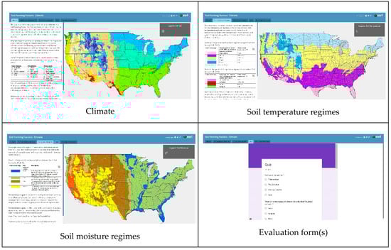
Figure 2.
Content of the ESRI Story Map “Soil Forming Factors: Climate.” https://arcg.is/0qPuzX. Each clickable teaching tab contains text, pictures, and interactive maps describing the role of climate in soil formation. The ESRI Story Map and evaluation forms (e.g., quiz, story map assessment) can be accessed and used on desktop, laptop, smartphone, or tablet devices.
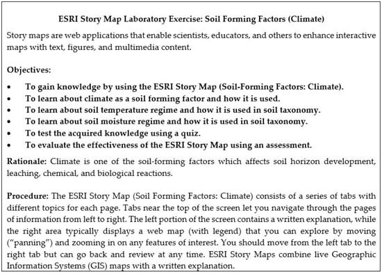
Figure 3.
Instructions for the ESRI Story Map laboratory exercise (adapted from [11]).
2.4. The Web-Based Survey Tool QualtricsTM
This study utilized the web-based survey tool QualtricsTM to systematically measure various constructs before and after the laboratory-based activity. QualtricsTM is an industry-standard, web-based platform that is used by universities worldwide and offers different question types to its subscribers. QualtricsTM ensures the security of data (including identifying information) by utilizing various methods, such as transport layer security (TLS) encryption and data storage in a specific U.S.-based location, not the “cloud.” QualtricsTM also maintains that it abides by the general requirements set forth by the Federal Information Security Management Act of 2002.
Participants were recruited via email and asked to complete a short, confidential questionnaire no more than 12 h before the laboratory activity. The online questionnaire was designed to obtain their consent to participate before providing access to the actual survey items as well as basic demographic information, such as gender and major program (Table 2). Following completion of the 1-h laboratory activity, participants were again contacted via email to complete a post-test evaluation of their experience. Participants were given 72 h to re-affirm their consent to participate and complete the confidential post-test questionnaire with at least one reminder sent to unfinished participants. In order to identify potential knowledge level and perceptions based on the laboratory activity, the post-test questionnaire again measured: familiarity with ESRI Story Maps, perceived effectiveness of ESRI Story Maps as teaching tools, comparison of PowerPoint to ESRI Story Map for teaching, perceived comfort of using ESRI Story Map as a learning tool. In addition to these constructs, the post-test questionnaire asked participants to compare the ESRI Story Maps with prior presentation using traditional PowerPoint presentation method based on ease-of-use, overall quality, and enjoyment. With all survey administrations, participants were emailed a URL unique to their email address, allowing for each participant’s follow-up responses to be connected to his/her initial responses for analyses.
2.5. The ESRI Story Map Assessment
ESRI [6] describes five principles for effective use of Story Maps, which were used in this study for the ESRI Story Map assessment using the following corresponding questions: (1) audience suitability (How would you rate the ability of the story map to help you understand the subject matter?), (2) appeal (How would you rate your satisfaction with the story map?), (3) user experience (How would you rate the combination of explanation and maps together?), (4) easy-to-read maps (How would you rate readability of the maps and legends?), and (5) simplicity of the story (How would you rate the clarity of the story?). In this study, the sixth component “Comments” was added in order to solicit additional and more detailed feedback from the users.
The ESRI Story Map assessment [6] was utilized to determine the overall quality using an online grading in the “Assessment” tab: one (“poor”) indicates that the ESRI Story Map failed to meet any requirements for the category, three (“average”) indicates that the ESRI Story Map met some of the requirements for the category, but not all, and five (“excellent”) indicates that the ESRI Story Map met all of the requirements for the category. For example, the first category is “audience suitability” where a rating of one (“poor”) indicates that the materials presented are not understandable. A rating of three (“average”) for “audience suitability” suggests that the content presented is somewhat understandable. Finally, a rating of five (“excellent”) for “audience suitability” suggests that the content presented is highly understandable.
2.6. Data Analysis
Data analyses were conducted using IBM SPSS Statistics for Mac, version 25.0 (IBM Corp., Armonk, NY, USA, 2017) [15]. Mean response scores for Likert-type and semantic differential items were calculated for all participants as well as for subgroups organized by self-reported gender, major, and academic classification (e.g., freshman sophomore etc.). For the scale of perceived usability relating to the ESRI Story Map, Cronbach’s alpha and the mean inter-item correlation were calculated [16].
3. Results
3.1. Quiz Results and Responses to the ESRI Story Map Assessment Questions
The purpose of the ESRI Story Map was to give participants a better understanding of climate as a soil forming factor and to evaluate the effectiveness of the story map as a teaching tool. The quiz was designed to assess the participants’ retention of the materials presented in the ESRI Story Map and the quiz scores were not statistically different between “comparison” (6.32 ± 0.90, n = 28) and “test” (5.59 ± 1.35, n = 58) courses (Table 4). Analysis of correct responses for each of the quiz questions revealed that students had the lowest percentage of correct responses to questions number 5 and 7, both related to the use of soil temperature and moisture regimes in the soil taxonomic classification (Table 4). For question 5, both the PowerPoint presentation and ESRI Story Map had the lowest score, possibly because of the complexity of the question related to the soil taxonomic classification. This indicates that another teaching approach may be necessary to better explain this topic. For questions 2 and 7 the PowerPoint presentation appeared to have higher results because it had a verbal explanation in addition to the visual content.
Table 4.
Comparison of responses to the quiz questions for ESRI Story Map “Soil Forming Factors: Climate” between “comparison” course (FOR/ENR 4340: GIS for Natural Resources) and “test” course (FNR 2040: Soil Information Systems course). Maximum quiz score is seven.
Responses to an assessment based on the ESRI “five principles of effective storytelling” [6] revealed that most students rated the story map for each of the five principles as “excellent”, especially “easy-to-read maps”, which received 79% of “excellent” ratings (Table 5).
Table 5.
Students’ responses to assessment questions about ESRI Story Map “Soil Forming Factors: Climate” (Fall 2018; FNR 2040: Soil Information Systems course, n = 58) based on the five principles of effective storytelling [6], and examples of additional comments by theme [17].
At the end of the story map assessment, participants were asked to provide additional written comments regarding their experience with the story map. Overall, additional comments were positive. Positive comments praised the visual appeal, interactivity, and included statements such as, “The information was very easy to follow. The layout was very organized” and “I think it was well designed and easy to use which is the best you can really ask for in a program like this!” (Table 5). Critical comments were focused on the amount of explanation, visual presentation, and some technical issues, for example, “Stories were too simple, would like a little more explanation”, “The map disappeared a lot and was difficult to pan around without it going away or going back a page”, and “The function to zoom in does not work well…” (Table 5).
3.2. Post-Testing Responses to the Web-Based Survey Tool QualtricsTM
A post-test was conducted to evaluate the impact of the activity on students’ familiarity with ESRI Story Maps, and the use of ESRI Story Maps as a teaching and learning tools compared to a traditional PowerPoint presentation (Table 6 and Table 7). Responses were collected on a Likert scale ranging from one (not at all familiar) to five (extremely familiar). Post-testing scores indicated that students were “somewhat familiar” to “moderately familiar” with ESRI Story Maps for students of all majors, gender, and academic levels (Table 6).
Table 6.
Post-testing responses to the survey question: “Please, rate your familiarity/agreement with the following statements on a five-point Likert scale (1 = not at all familiar, 2 = slightly familiar, 3 = somewhat familiar, 4 = moderately familiar, 5 = extremely familiar”).
Table 7.
Post-testing responses to the survey question: “Please, rate your familiarity/agreement with the following statements on a five-point Likert scale (1 = strongly disagree, 2 = disagree, 3 = neither disagree nor agree, 4 = agree, 5 = strongly agree)”.
Post-testing scores indicated that ESRI Story Maps were an effective way to learn while being seen as effective as traditional teaching methods (e.g., PowerPoint), and students were comfortable using them. Responses were collected on a Likert scale ranging from one (strongly disagree) to five (strongly agree). These positive responses were consistent by gender, major, and academic classification (year) (Table 7).
In another post-test instrument, participants were presented with three statements using a 5-point semantic differential scale measuring perception of the ESRI Story Map method of teaching compared with a previous, traditional method, a PowerPoint presentation. Cronbach’s alpha for the scale of perceived usability was 0.80, and the mean inter-item correlation for the scale was 0.59, with values ranging from 0.52 to 0.69 [16]. Both calculations indicate that the scale had strong internal consistency. The scale mean was 11.18 (SD = 2.06). Post-testing responses to the survey question “Please, select a point along the continuum that best describes your perception of the ESRI Story Map method of teaching compared with previous, traditional method, a PowerPoint presentation” revealed that students found the ESRI Story Map was “easier to use,” “much better,” and “more enjoyable” (Table 8). These results were consistent by gender, major program, and academic classification. (Table 8). Students’ responses to the post-testing QualtricsTM web-based survey questions to ESRI Story Map “Soil Forming Factors: Climate” indicated positive responses praising the newly developed ESRI Story Map for its interactivity, ease-of-use, and visual presentation (Table 9). Critical comments included technical issues and lack of personal connection due to lack of verbal explanation (Table 9).
Table 8.
Post-testing responses to the survey question: “Please, select a point along the continuum that best describes your perception of the ESRI Story Map method of teaching compared with previous, traditional method, a PowerPoint presentation on a five-point semantic differential scale (1 = negative response, 3 = neutral response, 5 = positive response)”.
Table 9.
Students’ responses to the post-testing QualtricsTM web-based survey questions to ESRI Story Map “Soil Forming Factors: Climate”.
4. Discussion
This study compared two multimedia methods for delivering educational content: a traditional PowerPoint presentation with verbal explanation and an interactive ESRI Story Map where students went through an independent learning exercise without verbal explanation. The PowerPoint lecture provided both words and pictures that impacted the ear and eye sensor memory which, through selecting words, allowed the learner to build both pictorial and verbal models in working memory [5] (Figure 4a). In contrast, the ESRI Story Map, as tested, was limited to visual words and pictures which allowed the learner to create pictorial models of concepts. Additionally, the ESRI Story Map allowed learner interactivity (Figure 4b) which was beneficial to reinforce the content by allowing the learner to interact repeatedly with the multimedia objects. Figure 4a shows the paths (indicated by darkened boxes) of processing of words (spoken and written), and images (static) for the PowerPoint presentation. In contrast, Figure 4b shows the paths (indicated by darkened arrows and boxes) of words (written), and images (interactive) for the ESRI Story Map with an added component of “interactivity” indicated by the double-arrowed dashed line.
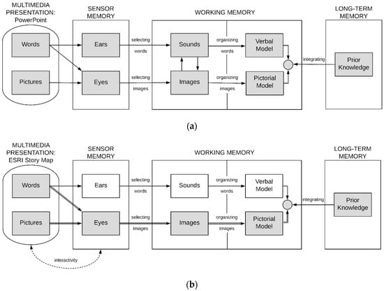
Figure 4.
Application of Cognitive Theory of Multimedia Learning (CTML) [5] to the two different multimedia presentations used in this study: (a) PowerPoint, (b) ESRI Story Map (based on [5]).
Quantitative assessment in the form of quiz revealed that although overall quiz scores were not statistically different between “comparison” and “test” courses, there were notable differences in scores for individual questions, especially in the questions related to taxonomic classification. This finding supports the need to re-design the individual slides (for PowerPoint), and pages (for ESRI Story Map) utilizing more careful selection and organization of words, images in order to integrate them to support the cognitive processes used by the learner [5].
Qualitative assessment of the newly developed ESRI Story Map in the form of students’ comments included frequently used descriptions when referring to the ESRI Story Map: “different”, “interactive”, “engaging”, “user-friendly”, “visual”, “accessible”, “enjoyable”, and “organized.” Students’ comments about the ESRI Story Map also revealed support for the three assumptions of CTML as demonstrated by the following examples:
- (1)
- Dual channels (e.g., “I am an auditory and visual learner so hearing someone explain the material helps a lot, but story map is easier to visualize than a PowerPoint”).
- (2)
- Limited capacity (e.g., “I liked the way information was organized next to the maps, broken into smaller parts for better understanding”, “Provided enough information, but not too much to overload the audience”, “Simple to use and to the point”).
- (3)
- Active processing (e.g., “I prefer this method to the typical PowerPoint presentation. User interaction provides more of a vested, interactive experience”).
There is a critical need for digital storytelling as a method of teaching and learning in STEM education in the 21st century. For students to succeed in the 21st century, they need to develop a skillset germane to media, information, and technology. However, there remain students with inadequate technical skills [18]. The inclusion of digital maps as part of the storytelling process has the added advantage of increasing interactivity which may enhance student engagement and learning [4]. Digital storytelling entails educational advantages across numerous curricula, such as science, math, social studies, and foreign languages [19]. Students can benefit from digital storytelling through the development and improvement of 21st-century literacy skills, such as digital, technology and informational literacy [19,20]. Furthermore, acquiring 21st-century skills through the utility of digital storytelling will benefit students entering the workforce and throughout their future careers [21]. Foelske [19] examined the impacts of digital storytelling from numerous peer-reviewed journal articles and found digital storytelling enhanced the interest and motivation of students while improving their 21st-century skills. There are six key components for acquiring 21st century skills: (1) emphasize core subjects, (2) emphasize learning skills, (3) use 21st-century tools to develop learning skills, (4) teach and learn in a 21st-century context, (5) teach and learn 21st-century content, and (6) use 21st-century assessments that measure 21st-century skills (Learning for the 21st century [20]). Digital storytelling strongly contributes to these particular key components: “Use 21st-century tools to develop learning skills” and “Teach and learn in a 21st-century context.”
Digital story map development was driven by storytelling demand and geovisual analytics [7]. Digital story maps function as important vehicles for effective storytelling [12]. It is an efficient method of communication for explaining and presenting a story on any topic to its users [22]. Digital text within story maps serves the important role of guiding the viewer and both explaining and placing the map content in the context of the learning objectives [7]. The organizational aspects of the story map combined with the inactivity of the included digital maps may serve to increase student motivation by limiting the complexity of the learning activity [23]. Recent studies have found teachers to favor story maps as an educational tool that meets academic standards [12]. The findings from the present study are consistent with previous research by Berendsen et al. [7] suggesting students also favor story maps over more traditional forms (e.g., paper-map atlas). Based on these findings, future development could transform the pedagogical approach by having the students developing their own story maps in order to synthesize the material. Teachers would act as facilitators for the students to become creators of their own content, and therefore, more actively responsible for their own learning process. The implementation of digital story maps as a medium for storytelling will provide students in STEM fields with numerous benefits, including the development and improvement of 21st-century skills and overall workforce readiness.
Digital story maps have the potential to become a powerful, conventional teaching tool in STEM education. Empirical studies, such as this one, are essential for providing insights on how to present multimedia material in ways that help students learn [5]. More research is needed to investigate the effectiveness of digital story maps independently and in conjunction with traditional teaching methods. However, increasing the effectiveness of digital story maps can potentially lead to the replacement of traditional teaching methods. There is a need for more research to further enhance the versatility, interactivity and educational efficacy of digital story maps.
5. Conclusions
This article summarizes the results of a study, which compares two multimedia presentations (traditional PowerPoint presentation and newly developed ESRI Story Map) based on the same topic “Soil Forming Factors: Climate.” The results of this study demonstrate that these multimedia presentations are different in their effectiveness and limitations. Students in this study acquired greater familiarity, perception, and confidence with digital story maps. In addition, participants rated the ESRI Story Map’s storytelling effectiveness as “excellent.” Additional comments following the digital map exercise exalted the effectiveness of digital maps as a teaching tool, while also providing insight into future improvements for prospective digital maps. Although the overall results for quiz responses were similar when comparing the “comparison” group of students that received a PowerPoint lecture with the students who were using the ESRI Story Map, there is some indication that both the PowerPoint lecture and the ESRI Story Map have room for improvement by better use of the five cognitive processes (selecting words, selecting images, organizing words, organizing images and integration). This research indicates that adding audio may improve the use of this ESRI Story Map for educational concept delivery. Including audio may require a specialized setting where each student has access to one computer with headphones. It may also require additional development time to write and read scripts. Including audio may improve retention by helping students build an auditory verbal memory model to complement the pictorial memory model as was indicated by having higher quiz scores on some questions for the PowerPoint presentation, which was accompanied by the verbal explanation.
Digital maps, such as ESRI Story Maps, can potentially have a significant impact on STEM education as an innovative teaching tool. There are benefits of transitioning from a traditional map to a digital map. For instance, students within STEM fields need experience with digital maps to develop and improve geographic skills, such as spatial pattern recognition and geographic visualization. The storytelling component of digital maps increases their educational versatility and ease of use. ESRI Story Maps are effective in STEM education and can be used in conjunction with traditional teaching tools and techniques or as independent teaching tools.
Author Contributions
Conceptualization, E.M. and G.G.; methodology, G.G., E.M., K.P., J.C., P.C.-D., C.P.; formal analysis, G.R., K.P., J.C.; writing—original draft preparation, G.R., E.M.; writing—review and editing, G.R., E.M., C.J., M.S., P.C.-D.; visualization, G.G. and P.C.-D.; supervision, E.M.; project administration, E.M.
Funding
This research received no external funding.
Acknowledgments
We wish to thank and acknowledge the students from FNR 2040: Soil Information Systems (Fall 2018) for their participation. This study was approved by the Clemson University Institutional Review Board (IRB2018-430).
Conflicts of Interest
The authors declare no conflict of interest.
References
- Gambrell, L.B.; Malloy, J.A.; Marinak, B.A.; Mazzoni, S.A. Evidence-based best practices for comprehensive literacy instruction in the age of the Common Core standards. In Best Practices in Literacy Instruction, 5th ed.; Gambrell, L.B., Marrow, L.M., Eds.; Guilford: New York, NY, USA, 2015; pp. 3–36. [Google Scholar]
- Mäenpää, H.; Varjonen, S.; Hellas, A.; Tarkoma, S.; Männistö, T. Assessing IoT projects in university education: A framework for problem-based learning. In Proceedings of the 39th International Conference on Software Engineering: Software Engineering and Education Track, Buenos Aires, Argentina, 20–28 May 2017; pp. 37–46. [Google Scholar]
- Jiang, B.; Yao, X. Location-based services and GIS in perspective. Comput. Environ. Urban Syst. 2006, 30, 712–725. [Google Scholar] [CrossRef]
- Jones, A.; Blake, C.; Davies, C.; Scanlon, E. Digital maps for learning: A review and prospects. Comput. Educ. 2004, 43, 91–107. [Google Scholar] [CrossRef]
- Mayer, R.E. Applying the science of learning: Evidence-based principles for the design of multimedia instruction. Am. Psychol. 2008, 63, 760–769. [Google Scholar] [CrossRef] [PubMed]
- ESRI. Story Maps. Available online: https://storymaps.arcgis.com/en/ (accessed on 15 November 2018).
- Berendsen, M.E.; Hamerlinck, J.D.; Webster, G.R. Digital story mapping to advanced educational atlas design and enable student engagement. Int. J. Geo-Inf. 2018, 7, 125. [Google Scholar] [CrossRef]
- Thony, M.; Schnurer, R.; Sieber, R.; Hurni, L.; Pajarola, R. Storytelling in interactive 3D geographic visualization systems. Int. J. Geo-Inf. 2018, 7, 123. [Google Scholar] [CrossRef]
- Dahlstrom, M.F. Using narratives and storytelling to communicate science with nonexpert audiences. Proc. Natl. Acad. Sci. USA 2014, 111, 13614–13620. [Google Scholar] [CrossRef] [PubMed]
- Sundin, A.; Andersson, K.; Watt, R. Rethinking communication: Integrating storytelling for increased stakeholder engagement in environmental evidence synthesis. Environ. Evid. 2018, 7, 1–6. [Google Scholar] [CrossRef]
- Cope, M.P.; Mikhailova, E.A.; Post, C.J.; Schlautman, M.A.; Carbajales-Dale, P. Developing and evaluating an ESRI Story Map as an educational tool. Nat. Sci. Educ. 2018, 47. [Google Scholar] [CrossRef]
- Strachan, C.; Mitchell, J. Teachers’ perceptions of Esri Story Maps as effective teaching tools. RIGEO 2014, 4, 195–220. [Google Scholar]
- Battersby, S.E.; Remington, K.C. Story Maps in the Classroom. Available online: https://www.esri.com/~/media/Files/Pdfs/news/arcuser/0313/storymaps.pdf (accessed on 15 November 2018).
- Clemson University. Undergraduate Announcements; Clemson University: Clemson, SC, USA, 2018–2019. [Google Scholar]
- IBM Corp. IBM SPSS Statistics for Mac; Version 24.0; IBM Corp.: Armonk, NY, USA, 2017. [Google Scholar]
- Cohen, J.W. Statistical Power Analysis for the Behavioral Sciences, 2nd ed.; Lawrence Erlbaum Associates: Hillsdale, NJ, USA, 1988. [Google Scholar]
- Redmond, C.; Davies, C.; Cornally, D.; Adam, E.; Daly, O.; Fegan, M.; O’Toole, M. Using reusable learning objects (RLOs) in wound care education: Undergraduate student nurse’s evaluation of their learning gain. Nurse Educ. Today 2018, 60, 3–10. [Google Scholar] [CrossRef] [PubMed]
- Malita, L.; Martin, C. Digital Storytelling as web passport to success in the 21st Century. Procedia Soc. Behav. Sci. 2010, 2, 3060–3064. [Google Scholar] [CrossRef]
- Foelske, M. Digital storytelling: The impact on student engagement and academic learning. Grad. Res. Thesis 2014, 167. Available online: https://scholarworks.uni.edu/cgi/viewcontent.cgi?article=1162&context=grp (accessed on 15 November 2018).
- Learning for the 21st Century: A Report and MILE Guide for 21st Century Skills. Available online: http://www.21stcenturyskills.org/index. php?option=com_content&task=view&id=255& Itemid=121 (accessed on 17 February 2019).
- Niemi, H.; Harju, V.; Vivitsou, M.; Viitanen, K.; Multisilta, J.; Kuokkanen, A. Digital storytelling for 21st-century skills in virtual learning environments. Creative Educ. 2014, 5, 657–671. [Google Scholar] [CrossRef]
- Antoniou, V.; Ragia, L.; Nomikou, P.; Bardouli, P.; Lampridou, D.; Ioannou, T.; Kalisperakis, I.; Stentoumis, C. Creating a story map using geographic information systems to explore geomorphology and history of Methana Peninsula. Int. J. Geo-Inf. 2018, 7, 484. [Google Scholar] [CrossRef]
- Roth, R.E. Interactive maps: What we know and what we need to know. JSIS 2013, 6, 59–115. [Google Scholar] [CrossRef]
© 2019 by the authors. Licensee MDPI, Basel, Switzerland. This article is an open access article distributed under the terms and conditions of the Creative Commons Attribution (CC BY) license (http://creativecommons.org/licenses/by/4.0/).