Digital Story Map Learning for STEM Disciplines


 , and
, and
Abstract
1. Introduction
2. Materials and Methods
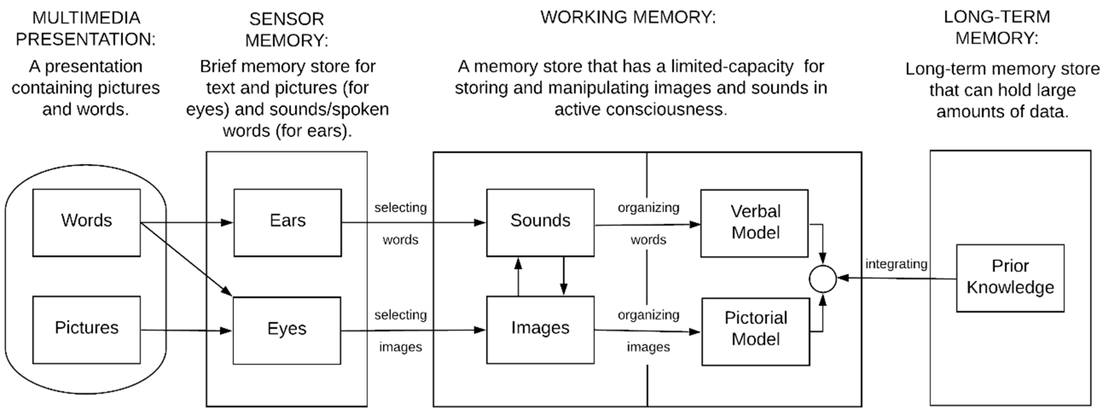
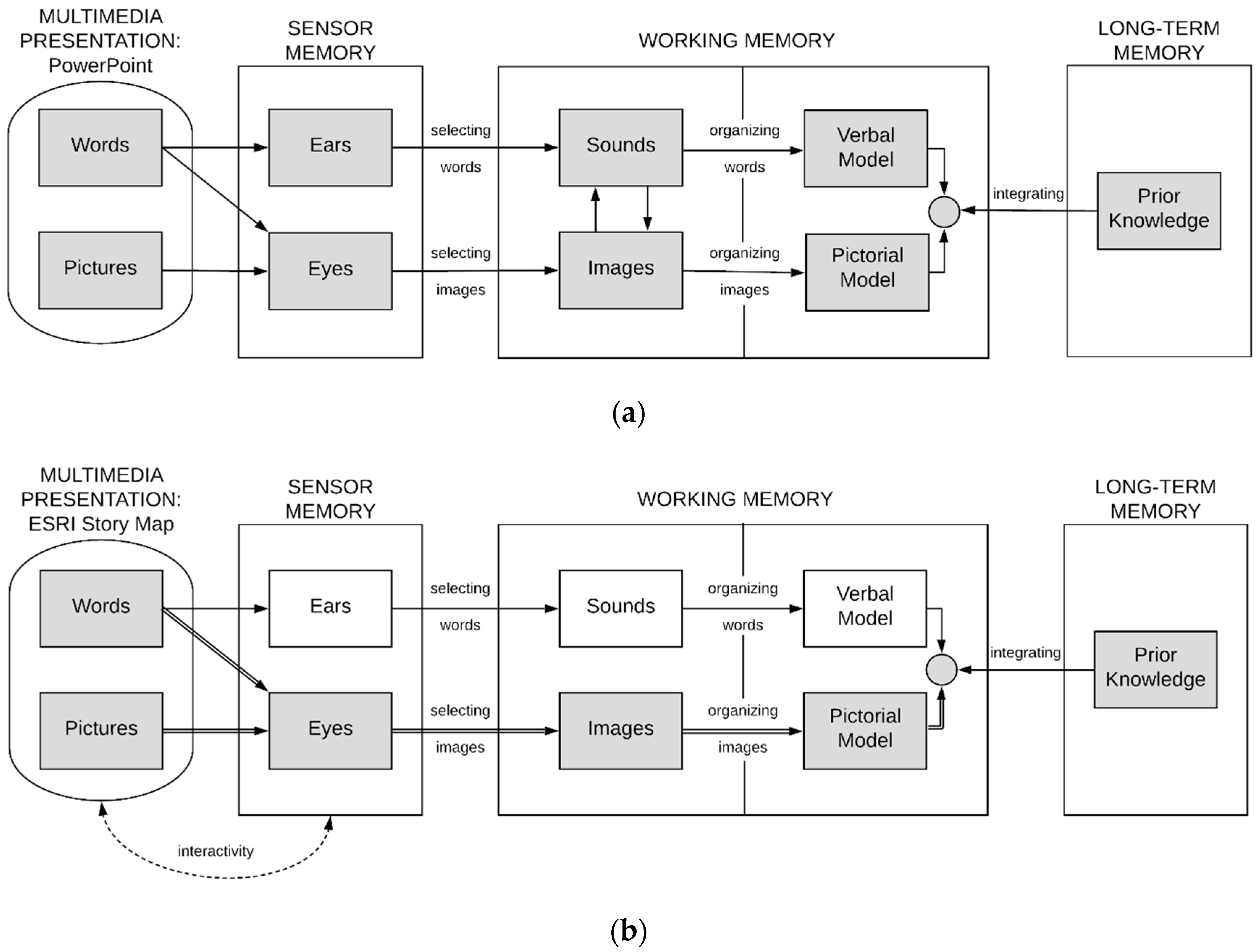
2.1. Design
2.2. Background of “Comparison” and “Test” Courses
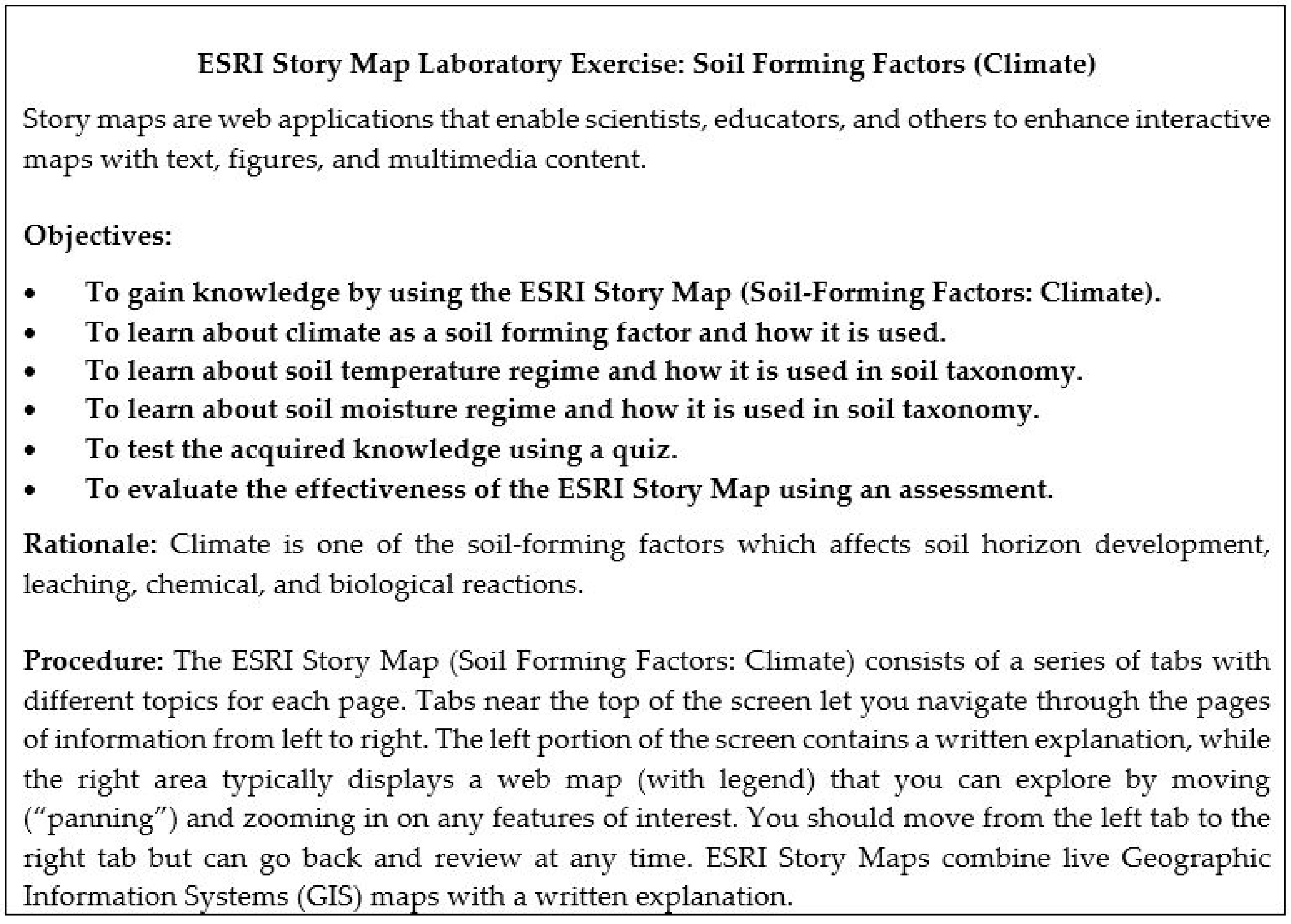
2.3. Development of the ESRI Story Map “Soil Forming Factors: Climate”
2.4. The Web-Based Survey Tool QualtricsTM
2.5. The ESRI Story Map Assessment
2.6. Data Analysis
3. Results
3.1. Quiz Results and Responses to the ESRI Story Map Assessment Questions
3.2. Post-Testing Responses to the Web-Based Survey Tool QualtricsTM
4. Discussion
- (1)
- Dual channels (e.g., “I am an auditory and visual learner so hearing someone explain the material helps a lot, but story map is easier to visualize than a PowerPoint”).
- (2)
- Limited capacity (e.g., “I liked the way information was organized next to the maps, broken into smaller parts for better understanding”, “Provided enough information, but not too much to overload the audience”, “Simple to use and to the point”).
- (3)
- Active processing (e.g., “I prefer this method to the typical PowerPoint presentation. User interaction provides more of a vested, interactive experience”).
5. Conclusions
Author Contributions
Funding
Acknowledgments
Conflicts of Interest
References
- Gambrell, L.B.; Malloy, J.A.; Marinak, B.A.; Mazzoni, S.A. Evidence-based best practices for comprehensive literacy instruction in the age of the Common Core standards. In Best Practices in Literacy Instruction, 5th ed.; Gambrell, L.B., Marrow, L.M., Eds.; Guilford: New York, NY, USA, 2015; pp. 3–36. [Google Scholar]
- Mäenpää, H.; Varjonen, S.; Hellas, A.; Tarkoma, S.; Männistö, T. Assessing IoT projects in university education: A framework for problem-based learning. In Proceedings of the 39th International Conference on Software Engineering: Software Engineering and Education Track, Buenos Aires, Argentina, 20–28 May 2017; pp. 37–46. [Google Scholar]
- Jiang, B.; Yao, X. Location-based services and GIS in perspective. Comput. Environ. Urban Syst. 2006, 30, 712–725. [Google Scholar] [CrossRef]
- Jones, A.; Blake, C.; Davies, C.; Scanlon, E. Digital maps for learning: A review and prospects. Comput. Educ. 2004, 43, 91–107. [Google Scholar] [CrossRef]
- Mayer, R.E. Applying the science of learning: Evidence-based principles for the design of multimedia instruction. Am. Psychol. 2008, 63, 760–769. [Google Scholar] [CrossRef] [PubMed]
- ESRI. Story Maps. Available online: https://storymaps.arcgis.com/en/ (accessed on 15 November 2018).
- Berendsen, M.E.; Hamerlinck, J.D.; Webster, G.R. Digital story mapping to advanced educational atlas design and enable student engagement. Int. J. Geo-Inf. 2018, 7, 125. [Google Scholar] [CrossRef]
- Thony, M.; Schnurer, R.; Sieber, R.; Hurni, L.; Pajarola, R. Storytelling in interactive 3D geographic visualization systems. Int. J. Geo-Inf. 2018, 7, 123. [Google Scholar] [CrossRef]
- Dahlstrom, M.F. Using narratives and storytelling to communicate science with nonexpert audiences. Proc. Natl. Acad. Sci. USA 2014, 111, 13614–13620. [Google Scholar] [CrossRef] [PubMed]
- Sundin, A.; Andersson, K.; Watt, R. Rethinking communication: Integrating storytelling for increased stakeholder engagement in environmental evidence synthesis. Environ. Evid. 2018, 7, 1–6. [Google Scholar] [CrossRef]
- Cope, M.P.; Mikhailova, E.A.; Post, C.J.; Schlautman, M.A.; Carbajales-Dale, P. Developing and evaluating an ESRI Story Map as an educational tool. Nat. Sci. Educ. 2018, 47. [Google Scholar] [CrossRef]
- Strachan, C.; Mitchell, J. Teachers’ perceptions of Esri Story Maps as effective teaching tools. RIGEO 2014, 4, 195–220. [Google Scholar]
- Battersby, S.E.; Remington, K.C. Story Maps in the Classroom. Available online: https://www.esri.com/~/media/Files/Pdfs/news/arcuser/0313/storymaps.pdf (accessed on 15 November 2018).
- Clemson University. Undergraduate Announcements; Clemson University: Clemson, SC, USA, 2018–2019. [Google Scholar]
- IBM Corp. IBM SPSS Statistics for Mac; Version 24.0; IBM Corp.: Armonk, NY, USA, 2017. [Google Scholar]
- Cohen, J.W. Statistical Power Analysis for the Behavioral Sciences, 2nd ed.; Lawrence Erlbaum Associates: Hillsdale, NJ, USA, 1988. [Google Scholar]
- Redmond, C.; Davies, C.; Cornally, D.; Adam, E.; Daly, O.; Fegan, M.; O’Toole, M. Using reusable learning objects (RLOs) in wound care education: Undergraduate student nurse’s evaluation of their learning gain. Nurse Educ. Today 2018, 60, 3–10. [Google Scholar] [CrossRef] [PubMed]
- Malita, L.; Martin, C. Digital Storytelling as web passport to success in the 21st Century. Procedia Soc. Behav. Sci. 2010, 2, 3060–3064. [Google Scholar] [CrossRef]
- Foelske, M. Digital storytelling: The impact on student engagement and academic learning. Grad. Res. Thesis 2014, 167. Available online: https://scholarworks.uni.edu/cgi/viewcontent.cgi?article=1162&context=grp (accessed on 15 November 2018).
- Learning for the 21st Century: A Report and MILE Guide for 21st Century Skills. Available online: http://www.21stcenturyskills.org/index. php?option=com_content&task=view&id=255& Itemid=121 (accessed on 17 February 2019).
- Niemi, H.; Harju, V.; Vivitsou, M.; Viitanen, K.; Multisilta, J.; Kuokkanen, A. Digital storytelling for 21st-century skills in virtual learning environments. Creative Educ. 2014, 5, 657–671. [Google Scholar] [CrossRef]
- Antoniou, V.; Ragia, L.; Nomikou, P.; Bardouli, P.; Lampridou, D.; Ioannou, T.; Kalisperakis, I.; Stentoumis, C. Creating a story map using geographic information systems to explore geomorphology and history of Methana Peninsula. Int. J. Geo-Inf. 2018, 7, 484. [Google Scholar] [CrossRef]
- Roth, R.E. Interactive maps: What we know and what we need to know. JSIS 2013, 6, 59–115. [Google Scholar] [CrossRef]


| “Comparison” Course (FOR/ENR 4340: GIS for Natural Resources) | “Test” Course (FNR 2040: Soil Information Systems) |
|---|---|
| Students complete general QualtricsTM web-based survey of familiarity with ESRI Story Maps. | Students complete general QualtricsTM web-based survey of familiarity with ESRI Story Maps. |
| Students are presented with PowerPoint presentation entitles “Soil Forming Factors: Climate.” | Students are presented with ESRI Story Map entitled “Soil Forming Factors: Climate.” |
| Post-test: Students complete paper-based Quiz to measure knowledge retention. | Post-test: Students complete electronic Quiz, ESRI Story Map assessment, and follow-up QualtricsTM web-based survey about experience with ESRI Story Map. |
| Survey Question | Responses | |||
|---|---|---|---|---|
| “Comparison” Course (FOR/ENR 4340: GIS for Natural Resources, n = 35) | ||||
| What is your major program? | FOR (9) | ENR (8) | WFB (18) | |
| How would you best describe your academic classification (year)? | Sophomore (0) | Junior (6) | Senior (29) | |
| How would you describe yourself? | Female (13) | Male (22) | Other/Prefer not to answer | |
| Do you own a laptop computer? | Yes (35) | No (0) | ||
| Do you own a smart phone? | Yes (34) | No (1) | ||
| Are you familiar with Geographic Information Systems (GIS)? | Yes (35) | No (0) | ||
| Do you have any previous experience with Environmental Systems Research Institute (ESRI) Story Maps? | Yes (11) | No (24) | ||
| “Test” Course (FNR 2040: Soil Information Systems, n = 55) | ||||
| What is your major program? | FPR (11) | ENR (18) | WFB (25) | Other (1) |
| How would you best describe your academic classification (year)? | Sophomore (26) | Junior (23) | Senior (5) | Other (1) |
| How would you describe yourself? | Female (29) | Male (26) | Other/Prefer not to answer | |
| Do you own a laptop computer? | Yes (55) | No (0) | ||
| Do you own a smart phone? | Yes (55) | No (0) | ||
| Are you familiar with Geographic Information Systems (GIS)? | Yes (37) | No (18) | ||
| Do you have any previous experience with Environmental Systems Research Institute (ESRI) Story Maps? | Yes (8) | No (47) | ||
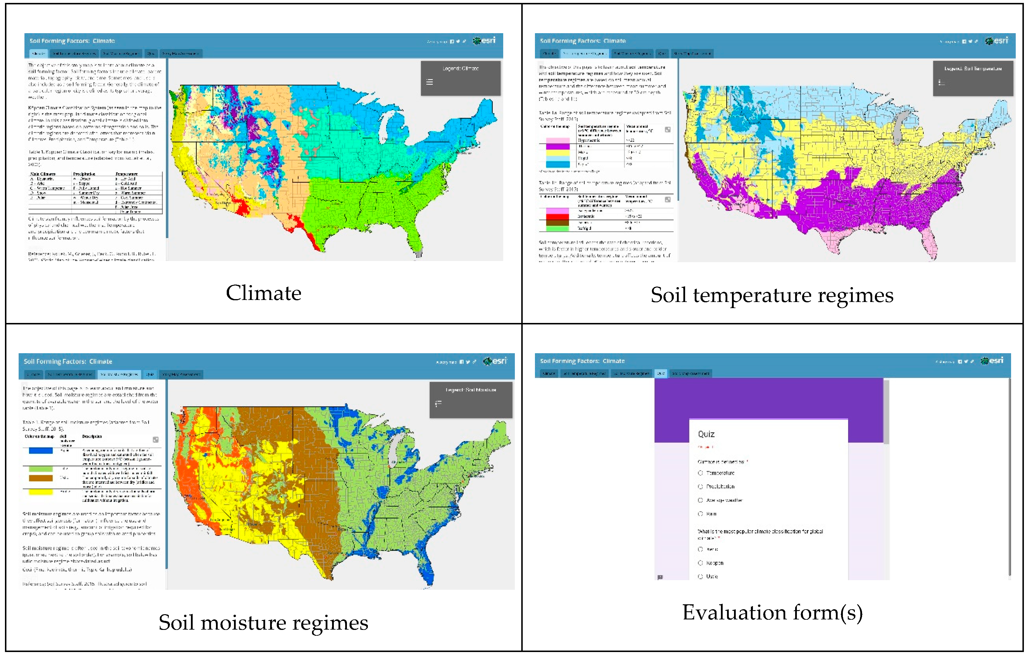
| Story Page by Title | Type | Source |
|---|---|---|
| Köppen Climate Classification | Vector-polygon | USGS |
| Soil Temperature Regimes | Vector-polygon | USDA/NRCS |
| Soil Moisture Regimes | Vector-polygon | USDA/NRCS |
| Correct Responses (%) | |||
|---|---|---|---|
| Questions | Answers | “Comparison” | “Test” |
| (n = 28) | (n = 58) | ||
| 1. Climate is defined as: | A. Temperature | 100.0 | 93.1 |
| B. Precipitation | |||
| C. Average weather | |||
| D. Rain | |||
| 2. What is the most popular | A. Xeric | 89.3 | 69.0 |
| climate classification for | B. Köppen | ||
| global climate? | C. Ustic | ||
| D. Frigid | |||
| 3. At what depth are soil | A. Surface | 85.7 | 70.7 |
| temperature regimes | B. 20-cm depth | ||
| determined? | C. 50-cm depth | ||
| D. 1-m depth | |||
| 4. Which soil temperature | A. Hyperthermic | 100.0 | 84.5 |
| regime is the coldest? | B. Mesic | ||
| C. Cryic | |||
| D. Thermic | |||
| 5. In what soil taxonomic | A. Family | 64.3 | 72.4 |
| category is the soil | B. Order | ||
| temperature regime used? | C. Great Group | ||
| D. Series | |||
| 6. Which soil moisture | A. Aridic | 96.4 | 100.0 |
| regime is the wettest? | B. Xeric | ||
| C. Ustic | |||
| D. Aquic | |||
| 7. In what soil taxonomic | A. Series | 96.4 | 67.2 |
| category is the soil | B. Suborder | ||
| moisture regime used? | C. Family | ||
| D. Great Group | |||
| Score: mean ± standard | 6.32 ± 0.90 | 5.59 ± 1.35 | |
| deviation | |||
| Responses (%) | ||
|---|---|---|
| Rating: 1 (Poor) | Rating: 3 (Average) | Rating: 5 (Excellent) |
| Audience suitability: How would you rate the ability of the story map to help you understand the subject matter? | ||
| 0.0 | 34.5 | 65.5 |
| Appeal: How would you rate your satisfaction with the story map? | ||
| 1.7 | 25.9 | 72.4 |
| User experience: How would you rate the combination of explanation and maps together? | ||
| 0.0 | 22.4 | 77.6 |
| Easy-to-read maps: How would you rate readability of the maps and legends? | ||
| 6.9 | 13.8 | 79.3 |
| Simplicity of the story: How would you rate the clarity of the story? | ||
| 0.0 | 27.6 | 72.4 |
| Comments: Please, provide additional comments about your experience using the story map. Examples of Additional Comments by Theme (Redmond et al., 2018): | ||
| T1. Enjoyment of learning | ||
| 1. Good stuff. | ||
| 2. I think it was well designed and easy to use which is the best you can really ask for in a program like this! | ||
| 3. It was a fun and interesting way to learn the material. I enjoyed it. | ||
| T2. Value of multimedia | ||
| 4. I think this is a great tool to use! | ||
| 5. This was a great way to learn because it included a lot of different methods of relaying information. | ||
| 6. I prefer this method to the typical PowerPoint presentation. User interaction provides more of a vested, interactive experience. | ||
| T3. Flexibility of learning | ||
| 7. I liked the way information was organized next to the maps, broken into smaller parts for better understanding. | ||
| 8. I liked that I could interact with the different regions of the map while also viewing the information directly. It was very convenient. | ||
| 9. The interactive map, including text, provided much more in-depth information than a regular map and legend. | ||
| T4. Applicability of content | ||
| 10. I feel like it would be a great way to understand and explore climate, soil temperature regimes, and soil moisture regimes throughout the United States. Would be a great tool for future classes. | ||
| 11. Provided enough information, but not too much to overload the audience. Very effective. | ||
| 12. Simple to use and to the point. | ||
| T5. Criticism | ||
| 13. City identification would be nice for reference. | ||
| 14. The map messed up a little when I clicked on it, but other than that I really enjoyed it. 15. The function to zoom in does not work well on Macbook, otherwise the maps are very user-friendly and easy to understand. | ||
| Group | N | Post-Test M (SD) |
|---|---|---|
| How Familiar Are You with ESRI Story Maps? | ||
| Overall | 45 | 3.31 (0.79) |
| Females only | 22 | 3.18 (0.66) |
| Males only | 23 | 4.18 (0.90) |
| FOR only | 11 | 3.36 (0.92) |
| ENR only | 14 | 3.14 (0.86) |
| WFB only | 19 | 3.37 (0.68) |
| Sophomores only | 23 | 3.04 (0.77) |
| Juniors only | 18 | 3.56 (0.78) |
| Seniors only | 3 | 4.00 (0.00) |
| Group | N | Post-Test M (SD) |
|---|---|---|
| ESRI Story Maps are an effective way for students to learn. | ||
| Overall | 54 | 4.07 (0.84) |
| Females only | 29 | 4.03 (1.02) |
| Males only | 25 | 4.12 (0.60) |
| FOR only | 10 | 4.10 (0.57) |
| ENR only | 18 | 3.94 (1.26) |
| WFB only | 25 | 4.16 (0.55) |
| Sophomores only | 26 | 4.31 (0.55) |
| Juniors only | 22 | 3.86 (1.08) |
| Seniors only | 5 | 3.80 (0.84) |
| I believe an ESRI Story Map is as effective as traditional methods (i.e., PowerPoint presentation) for learning. | ||
| Overall | 54 | 3.87 (0.97) |
| Females only | 29 | 3.90 (1.08) |
| Males only | 25 | 3.84 (0.85) |
| FOR only | 10 | 4.10 (0.88) |
| ENR only | 18 | 3.67 (1.28) |
| WFB only | 25 | 3.92 (0.76) |
| Sophomores only | 26 | 4.12 (0.71) |
| Juniors only | 22 | 3.64 (1.22) |
| Seniors only | 5 | 3.60 (0.89) |
| I feel comfortable using ESRI Story Maps as part of classroom activity or assignment. | ||
| Overall | 54 | 4.04 (0.93) |
| Females only | 29 | 3.93 (1.10) |
| Males only | 25 | 4.16 (0.69) |
| FOR only | 10 | 4.20 (0.79) |
| ENR only | 18 | 3.89 (1.28) |
| WFB only | 25 | 4.08 (0.70) |
| Sophomores only | 26 | 4.19 (0.75) |
| Juniors only | 22 | 3.86 (1.17) |
| Seniors only | 5 | 4.00 (0.71) |
| Group | N | Post-Test M (SD) |
|---|---|---|
| When comparing the ESRI Story Map-based method of teaching with prior (PowerPoint presentation) methods, the ESRI Story Map method is… Harder to use: Easier to use | ||
| Overall | 55 | 3.58 (0.99) |
| Females only | 29 | 3.76 (0.95) |
| Males only | 26 | 3.38 (1.02) |
| FOR only | 11 | 3.45 (1.29) |
| ENR only | 18 | 3.83 (0.92) |
| WFB only | 25 | 3.44 (0.92) |
| Sophomores only | 26 | 3.69 (0.93) |
| Juniors only | 23 | 3.48 (1.08) |
| Seniors only | 5 | 3.40 (1.14) |
| When comparing the ESRI Story Map-based method of teaching with prior (PowerPoint presentation) methods, the ESRI Story Map method is… Much worse: Much better | ||
| Overall | 55 | 3.65 (0.70) |
| Females only | 29 | 3.76 (0.69) |
| Males only | 26 | 3.54 (0.71) |
| FOR only | 11 | 3.64 (0.81) |
| ENR only | 18 | 3.72 (0.67) |
| WFB only | 25 | 3.60 (0.71) |
| Sophomores only | 26 | 3.73 (0.67) |
| Juniors only | 23 | 3.61 (0.78) |
| Seniors only | 5 | 3.40 (0.55) |
| When comparing the ESRI Story Map-based method of teaching with prior (PowerPoint presentation) methods, the ESRI Story Map method is… Much less enjoyable: Much more enjoyable | ||
| Overall | 55 | 3.95 (0.71) |
| Females only | 29 | 4.03 (0.73) |
| Males only | 26 | 3.85 (0.68) |
| FOR only | 11 | 3.91 (0.94) |
| ENR only | 18 | 4.00 (0.77) |
| WFB only | 25 | 3.92 (0.57) |
| Sophomores only | 26 | 4.08 (0.74) |
| Juniors only | 23 | 3.83 (0.65) |
| Seniors only | 5 | 3.80 (0.84) |
| Examples of Post-Test QualtricsTM Web-Based Comments by Theme [17]: |
|---|
| T1. Enjoyment of learning |
| 1. I liked it a lot! |
| 2. I liked it, it was interactive and interesting. |
| 3. I thoroughly enjoyed the ESRI Story Map interface. |
| T2. Value of multimedia |
| 4. The maps were much more interactive and engaging than your typical PowerPoint presentation. |
| 5. The maps are helpful in visualization of the different soil temperature and moisture regimes. |
| 6. I think that the story map was a great tool to use! Very user-friendly and the data is clear. 7. I thought it was a great visual representation of the usual pictures we see in the PowerPoint presentations. I think ESRI story map is more interactive with the students and helps them to engage with the lesson and focus more intently on the class material. |
| T3. Flexibility of learning |
| 8. A different way to learn. |
| 9. It was very easy to understand and an effective method of learning. |
| 10. I feel like it would make a nice addition to traditional instruction methods. |
| T4. Applicability of content |
| 11. I thought it was an interesting way to learn about soils. The map helped a lot in describing the information. It was enjoyable. |
| 12. ESRI Story Map was very well laid out and easy to use. |
| 13. I really liked that you can view the entire contiguous US at the same time and see how soil forming factors are affected by geography. |
| T5. Criticism |
| 14. I think the one thing you don’t get from the story maps is the personal connection. I am an auditory and visual learner so hearing someone explain the material helps a lot, but story map is easier to visualize than a PowerPoint. |
| 15. My map kept disappearing and then zooming in on Alaska, so I had to reload the page a few times. |
© 2019 by the authors. Licensee MDPI, Basel, Switzerland. This article is an open access article distributed under the terms and conditions of the Creative Commons Attribution (CC BY) license (http://creativecommons.org/licenses/by/4.0/).
Share and Cite
Groshans, G.; Mikhailova, E.; Post, C.; Schlautman, M.; Carbajales-Dale, P.; Payne, K. Digital Story Map Learning for STEM Disciplines. Educ. Sci. 2019, 9, 75. https://doi.org/10.3390/educsci9020075
Groshans G, Mikhailova E, Post C, Schlautman M, Carbajales-Dale P, Payne K. Digital Story Map Learning for STEM Disciplines. Education Sciences. 2019; 9(2):75. https://doi.org/10.3390/educsci9020075
Chicago/Turabian StyleGroshans, Garth, Elena Mikhailova, Christopher Post, Mark Schlautman, Patricia Carbajales-Dale, and Kayla Payne. 2019. "Digital Story Map Learning for STEM Disciplines" Education Sciences 9, no. 2: 75. https://doi.org/10.3390/educsci9020075
APA StyleGroshans, G., Mikhailova, E., Post, C., Schlautman, M., Carbajales-Dale, P., & Payne, K. (2019). Digital Story Map Learning for STEM Disciplines. Education Sciences, 9(2), 75. https://doi.org/10.3390/educsci9020075