Abstract
Measuring and comparing student performance have been topics of much interest for educators and psychologists. Particular attention has traditionally been paid to the design of experimental studies and careful analyses of observational data. Classical statistical techniques, such as fitting regression lines, have traditionally been utilized and far-reaching policy guidelines offered. In the present paper, we argue in favour of a novel technique, which is mathematical in nature, and whose main idea relies on measuring distance of the actual bivariate data from the class of all monotonic (increasing in the context of this paper) patterns. The technique sharply contrasts the classical approach of fitting least-squares regression lines to actual data, which usually follow non-linear and even non-monotonic patterns, and then assessing and comparing their slopes based on the Pearson correlation coefficient, whose use is justifiable only when patterns are (approximately) linear. We describe the herein suggested distance-based technique in detail, show its benefits, and provide a step-by-step implementation guide. Detailed graphical and numerical illustrations elucidate our theoretical considerations throughout the paper. The index of increase, upon which the technique is based, can also be used as a summary index for the LOESS and other fitted regression curves.
1. Introduction
Measuring and comparing student performance have been topics of much interest for educators and psychologists. Are higher marks in Mathematics indicative of higher marks in other subjects such as Reading and Spelling? Alternatively, are higher marks in Reading or Spelling indicative of higher marks in Mathematics? Do boys and girls exhibit similar associations between different study subjects? These are among the many questions that have interested researchers. The literature on these topics is vast, and we shall therefore note only a few contributions; their lists of references lead to earlier results and illuminating discussions.
Given school curricula, researchers have particularly looked at student performance in Mathematics, Science, Reading, and Writing (e.g., Ma [1]; Masci [2]; Newman and Stevenson [3]), and explored whether or not there are significant differences with respect to gender (e.g., Jovanovic and King [4]; McCornack and McLeod [5]; Mokros and Koff [6]). Differences between other attributes have also been looked at, including teacher performance (e.g., Alexander et al. [7]), oral and written assessments (e.g., Huxham et al. [8]), spatial and verbal domains (e.g., Bresgi et al. [9]). We shall later give a few more references related to certain statistical aspects.
Naturally, particular attention has been paid to the design of experimental studies and careful analyses of observational data. As a rule, the Pearson correlation coefficient, linear and non-linear regression, multilevel and other classical statistical techniques for describing and analyzing associations in bivariate and multivariate data have been utilized, and far-reaching policy guidelines offered. We also note that, in response to some deficiencies exhibited by the Pearson coefficient, the intraclass correlation coefficient (ICC) and the Spearman correlation coefficient have been extensively used in educational and psychometric literature. For enlightening discussions and references on the ICC, we refer to, e.g., Looney [10], Hedges and Hedberg [11], Zhou et al. [12], and on the Spearman coefficient, to Gauthier [13], Puth et al. [14], and references therein. It should be noted that the two coefficients are closely related to the Pearson correlation coefficient. Namely, the ICC is the Pearson correlation coefficient but with the pooled mean as the centering constant and the pooled variance as the normalizing constant. The Spearman correlation coefficient is the Pearson correlation coefficient of the ranks of the underlying random variables. Consequently, both the Spearman correlation coefficient and the ICC are symmetric with respect to the random variables, and we find this feature unnatural in the context of the present research.
There are other issues with the use of these coefficients when assessing trends, as we clearly see from Figure 1.
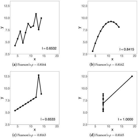
Figure 1.
Trends and indices of increase arising from the classical Anscombe’s [15] quartet.
Namely, all the four panels have very different trends but virtually identical Pearson correlation coefficients. We have produced these trends by connecting the classical Anscombe’s [15] bivariate data using straight lines.
Each panel of Figure 1 is also supplemented with the corresponding value of the index of increase, denoted by , which we shall introduce later in this paper, once the necessary preliminary work has been done. At the moment, we only note some of the properties of the index that convey its idea and main features.
Namely, the index is
- normalized, that is, its range is the unit interval ;
- take the value 1 when the trend is increasing;
- take a value in the interval when, loosely speaking, the trend is more increasing than decreasing;
- take a value in the interval when, loosely speaking, the trend is more decreasing than increasing;
- take the value 0 when the trend is decreasing;
- is symmetric only when the explanatory and response variables are interchangeable;
- has a clear geometric interpretation.
Keeping these features in mind, we can now familiarize ourselves with the numerical values of the index of increase reported in the four panels of Figure 1.
To address the issues noted above, in what follows we put forward arguments in favour of a novel technique, based on the aforementioned index, that has been designed specifically for illuminating directional associations between variables when, in particular, they follow non-linear and especially non-monotonic relationships. It should be noted at the outset that such relationships, and especially the need for assessing the extent of their non-monotonicity, arise naturally in a great variety of research areas, including life and social sciences, engineering, insurance and finance, in addition to, of course, education and psychology. An illustrative list of references on the topic, which is also associated with the notion of co-monotonicity, can be found in Qoyyimi and Zitikis [16].
We have organized the rest of the paper as follows. In Section 2 we describe a data set that we use to explore the new technique. In Section 3 we introduce an index for assessing directional associations in raw data, and illustrate the performance of the index. For those wishing to employ the index in conjunction with classical techniques of curve fitting, such as LOESS or other regression methods, in Section 4 we provide a recipe for accomplishing the task and so, for example, the proposed index can also be used as a summary index for the LOESS and other fitted curves. In Section 5 we demonstrate how the index of increase facilitates insights into student performance and enables comparisons between different student groups. In Section 6 we give a step-by-step illustration of how the index works on data. Section 7 concludes the paper with a brief overview of our main contributions, and it also contains several suggestions to facilitate further research in the area. Three appendices contain illustrative computer codes, some mathematical technicalities, and additional data-exploratory graphs.
We note at the outset that throughout this paper we deliberately restrain ourselves from engaging in interpretation and validation of the obtained numerical results, as these are subtle tasks and should be left to experts in psychology and education sciences to properly handle. We refer to Kane [17,18] and references therein for an argument-based approach to validation of interpretations. Throughout this paper, we concentrate on methodological aspects of educational data analysis.
2. Data
We begin our considerations from the already available solid classical foundations of statistics and data analysis. To make the considerations maximally transparent, we use the easily accessible data reported in the classical text of Thorndike and Thorndike-Christ [19] (pp. 24–25). A brief description of the data with relevant for our research details follow next.
The data set contains scores of 52 sixth-grade students in two classes, which we code by C1 and C2. The sizes of the two classes are the same: the enrollment in each of them is 26 students. Based on the student names, we conclude that there are 15 boys and 11 girls in class C1, and 11 boys and 15 girls in class C2; we code boys by B and girls by G. All students are examined in three subjects: Reading (R), Spelling (S), and Mathematics (M). The maximal scores for different subjects are different: 65 for Mathematics, 45 for Reading, and 80 for Spelling. The frequency plots of the three subjects are in Figure 2.
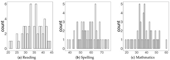
Figure 2.
Frequency plots of the scores of all students.
Our interest centers around the trends that arise when associating the scores of two study subjects. One of the classical and very common techniques employed in such studies is fitting linear regression lines which, for the sake of argument, we also do in Figure 3.
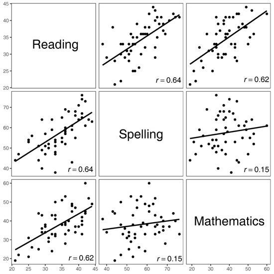
Figure 3.
Scatterplot matrix of the scores of all students.
We see from Figure 3 that all the fitted lines exhibit increasing trends, with the slopes of Spelling vs. Reading, Reading vs. Spelling, Mathematics vs. Reading, and Reading vs. Mathematics being similar, with the value of the Pearson correlation coefficient r between and . These slopes are considerably larger than those for Mathematics vs. Spelling and Spelling vs. Mathematics, whose correlation coefficient is . Of course, the coefficient is symmetric with respect to the two variables, and thus its values for, e.g., Spelling vs. Mathematics and Mathematics vs. Spelling are the same, even though the scatterplots (unless rotated) are different. More generally, we report the values of all the aforementioned correlation coefficients—Pearson, ICC, and Spearman—as well as of the index of increase to be introduced in the next section, in Table 1.

Table 1.
The index of increase and three classical correlation coefficients.
In addition, we have visualized—in two complementing ways—the data of Thorndike and Thorndike-Christ [19] (pp. 24–25) in Figure 4 and Figure 5.
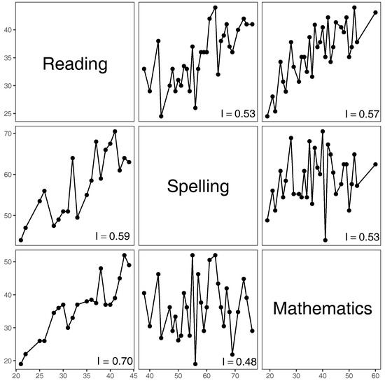
Figure 4.
Scatterplot matrix of piece-wise linear fits to the scores of all students.
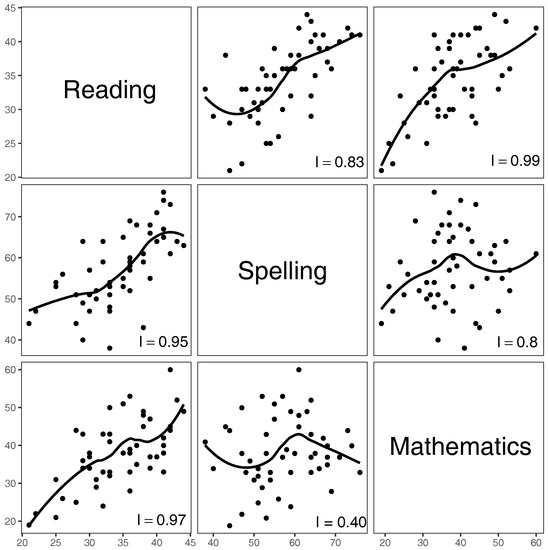
Figure 5.
The fitted LOESS curves () to the scores of all students.
A close inspection of the figures suggests non-linear and especially non-monotonic relationships. In Figure 5, we have used one of the most popular regression methods, called LOESS. Specifically, we have employed the loess function of the R Stats Package [20] with the default parameter value . There are of course numerous other regression methods that we can use (e.g., Koenker et al. [21]; Young [22]; and references therein). For example, the quantile regression method has recently been particularly popular in education literature (e.g., Haile and Nguyen [23]; Castellano and Ho [24]; Dehbi et al. [25]). These methods, however, are inherently smoothing methods and thus provide only general features of the trends, whereas it is the minute details that facilitate unhindered answers to questions such as those posited at the very beginning of Section 1.
Furthermore, when dealing with small data sets, which are common in education and psychology, we cannot reliably employ classical statistical inference techniques, such as goodness-of-fit, to assess the performance of curve fitting techniques. In this paper, therefore, we advocate a technique that facilitates unaltered inferences from data sets of any size, . We shall discuss and illustrate the technique using the classical Thorndike and Thorndike-Christ [19] (pp. 24–25) data sets, and we shall also use artificial data designed specifically for illuminating the workings of the new technique in a step-by-step manner.
3. Index of Increase
We see from Figure 4 and Figure 5 that trends are mostly non-monotonic. In such cases, how can we assess which of the trends are more increasing than others? We can fit linear regression lines as in Figure 3 and rank them according to their slopes or, alternatively, on the values of the Pearson correlation coefficient. However, the non-linear and especially non-monotonic trends make such techniques inadequate (e.g., Wilcox [26]). In this section, therefore, we put forward the idea of an index of increase, whose development has been in the works for a number of years (Davydov and Zitikis [27,28]; Qoyyimi and Zitikis [29,30]).
To illuminate the idea, we use a very simple yet informative example. Consider two very basic trigonometric functions, and on the interval , depicted in Figure 6.
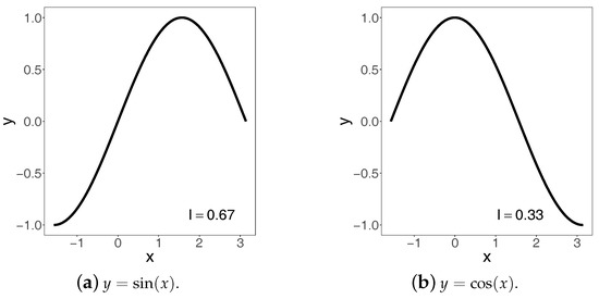
Figure 6.
Two functions and their indices of increase.
Obviously, neither of the two functions is monotonic on the interval, but their visual inspection suggests that sine must be closer to being increasing than cosine. Since one can argue that this assessment is subjective, we therefore employ the aforementioned index whose rigorous definition will be given in a moment. Using the computational algorithm presented in Section 4 below, the values of the index are for and for . Keeping in mind that 3 is the normalizing constant, these values imply that sine is at the distance 2 from the set of all decreasing functions on the noted interval, whereas cosine is at the distance 1 from the same set. In other words, this implies that sine is at the distance 1 from the set of all increasing functions on the interval, whereas cosine is at the distance 2 from the set of increasing function. Inspecting the graphs of the two functions in Figure 6, we indeed see that sine is ‘twice more increasing’ than cosine on the interval . For those willing to experiment with their own functions on various intervals, we provide a computer code in Appendix A.1.
The rest of the paper is devoted to a detailed description and analysis of the index.
3.1. Basic Idea
Suppose we possess pairs of data (all the indices to be introduced below can be calculated as long as we have at least two pairs), and let—for a moment—all the first coordinates (i.e., x’s) be different, as well as all the second coordinates (i.e., y’s) be different. Consequently, we can order all the first coordinates in the strictly increasing fashion, thus obtaining , called order statistics, with the corresponding second coordinates , called concomitants (e.g., David and Nagaraja [31]; and references therein). Hence, instead of the original pairs, we are now dealing with the pairs ordered according to their first coordinates. We connect these pairs, viewed as two-dimensional points, using straight lines and, unlike in regression, obtain an unaltered genuine description of the trend exhibited by the first coordinates plotted against the second ones (see Figure 4). Having the plot, we can now think of a method for measuring its monotonicity, and for this purpose we use the index of increase
where , , and denotes the positive part of real number z, that is, when and otherwise.
Obviously, the index is not symmetric, that is, is not, in general, equal to . This is a natural and desirable feature in the context of the present paper because student performance on different subjects is not interchangeable, and we indeed see this clearly in the figures above. The symmetry of the Pearson, ICC and Spearman correlation coefficients is one of the features that makes their uses inappropriate in a number of applications, especially when the directionality of associations is of particular concern. In general, there is a vast literature on the subject, which goes back to at least the seminal works of C. Gini a hundred years ago (e.g., Giorgi [32,33]) and, more generally, to the scientific rivalry between the British and Italian schools of statistical thought. For very recent and general discussions on the topic, we refer to Reimherr and Nicolae [34]; as well as to Furman and Zitikis [35], and references therein, where a (non-symmetric) Gini-type correlation coefficient arises naturally and plays a pivotal role in an insurance/financial context.
To work out initial understanding of the index , we first note that the numerator on the right-hand side of Equation (1) sums up all the upward movements, measured in terms of concomitants, whereas the denominator sums up the absolute values of all the upward and downward movements. Hence, the index is normalized, that is, always takes values in the interval . It measures the proportion of upward movements in the piece-wise linear plot originating from the pairs . Later in this paper (Note 3), we give an alternative interpretation of, and thus additional insight into, the index , which stems from a more general and abstract consideration of Davydov and Zitikis [28]. We note in passing that the index employed by Qoyyimi and Zitikis [30] is not normalized, and is actually difficult to meaningfully normalize, thus providing yet another argument in favour of the index that we employ in the present paper. A cautionary note is in order.
Namely, definition (1) shows that the index can be sensitive to outliers (i.e., very low and/or very high marks). The sensitivity can, however, be diminished by removing a few largest and/or smallest observations, which would mathematically mean replacing the sum in both the numerator and the denominator on the right-hand side of Equation (1) by the truncated sum for some integers . This approach to dealing with outliers has successfully worked in Statistics, Actuarial Science, and Econometrics, where sums of order statistics and concomitants arise frequently (e.g., Brazauskas et al. [36,37]; and references therein). In our current educational context, the approach of truncating the sum is also natural, because exceptionally well and/or exceptionally badly performing students have to be, and usually are, dealt with on the individual basis, instead of treating them as members of the statistically representative majority. This approach of dealing with outliers is very common and, in particular, has given rise to the very prominent area called Extreme Value Theory (e.g., de Haan and Ferreira [38]; Reiss and Thomas [39]; and references therein) that deals with various statistial aspects associated with exceptionally large and/or small observations.
We next modify the index so that its practical implementation would become feasible for all data sets, and not just for those whose all coordinates are different.
3.2. A Practical Modification
The earlier made assumption that the first and also the second coordinates of paired data are different prevents the use of the above index on many real data sets, including that of Thorndike and Thorndike-Christ [19] (pp. 24–25) as we see from the frequency histograms in Figure 2. See also panel (d) in Figure 1 for another example. Hence, a natural question arises: how can piece-wise linear plots be produced when there are several concomitants corresponding to the single value of a first coordinate? To overcome the obstacle, we suggest using the median-based approach that we describe next.
Namely, given arbitrary pairs , the order statistics of the first coordinates are with the corresponding concomitants . Let there be m () distinct values among the first coordinates, and denote them by . For each , there is always at least one concomitant, usually more, whose median we denote by . Hence, we have m pairs whose first coordinates are strictly increasing (i.e., ) and the second coordinates are unique. We connect these m pairs, viewed as two-dimensional points, with straight lines and obtain a piece-wise linear plot (e.g., Figure 4). The values of the index reported in the right-bottom corners of the panels of Figure 4 refer to the following modification
of the earlier defined index of increase. Note that index (2) collapses into index (1) when all the coordinates of the original data are different, thus implying that definition (2) is a genuine extension of definition (1), and it works on all data sets.
The index of increase is translation and scale invariant, which means that the equation
holds for all real ‘locations’ and , and all positive ‘scales’ and . A formal proof of this property is given in Appendix B. The property is handy because it allows us to unify the scales of each subject’s scores, which are usually different. In our illustrative example, the Mathematics scores are from 0 to 65, the Reading scores are from 0 to 45, and those of Spelling are from 0 to 80. Due to property (3), we can apply—without changing the value of —the linear transformation on the original scores , thus turning them into percentages, where is the maximal possible score for the subject under consideration, like 65 for Mathematics.
3.3. Discussion
To facilitate a discussion of the values of the index reported in the panels of Figure 4, we organize the values in the tabular form as follows:
The value 0.70 for Reading vs. Mathematics is largest, thus implying the most increasing trend among the panels. The value suggests that there is high confidence that those performing well in Reading would also perform well in Mathematics. Note that the value 0.57 for Mathematics vs. Reading is considerably lower than 0.70, thus implying lower confidence that students with better scores in Mathematics would also perform better in Reading.
The index value of Spelling vs. Mathematics is the smallest (0.48), which suggests neither an increasing nor a decreasing pattern, and we indeed see this in the middle-bottom panel of Figure 4: the scores in Mathematics form a kind of noise when compared to the scores in Spelling. In other words, the curve in the panel fluctuates considerably and the proportion of upward movements is almost the same as the proportion of downward movements. On the other hand, higher scores in Mathematics seem to be slightly better predictors of higher scores in Spelling, with the corresponding index value equal to 0.53.
Finally, the values of Reading vs. Spelling and Spelling vs. Reading are fairly similar, 0.59 and 0.53 respectively, even though higher Reading scores might suggest higher Spelling scores in a slightly more pronounced way than higher Spelling scores would suggest higher Reading scores.
Note 1.
On a personal note, having calculated the indices of increase for the three subjects and then having looked at the graphs of Figure 4, the authors of this article unanimously concluded that the trends do follow the patterns suggested by the respective index values. Yet, interestingly, prior to calculating the values and just having looked at the graphs, the authors were not always in agreement as to how much and in what form a given study subject influences the other ones. In summary, even though no synthetic index can truly capture every aspect of raw data, they can nevertheless be useful in forming a consensus about the meaning of data.
4. The Index of Increase for Fitted Curves
Raw data may not always be possible to present in the way we have done in Figure 4, because of a variety of reasons such as ethical and confidentiality. Indeed, nothing is masked in the figure—the raw data can be restored immediately. The fitted regression curves in Figure 5, however, mask the raw data and can thus be more readily available to the researcher to explore. Therefore, we next explain how the index of increase can be calculated when the starting point is not raw data but a smooth fitted curve, say h defined on an interval , like those we see in the panels of Figure 5 (for a computer code, see Appendix A.1). Hence, in particular, the index of increase can be used as a summary index for the LOESS or other fitted curves. Namely, the index of increase = for the function h is defined by the formula
where is the derivative of h. Two notes follow before we resume our main consideration.
Note 2.
Definition (4) is compatible with that given by Equation (1). Indeed, let the function h be piece-wise linear with knots such that the function h is linear on each interval whose union is equal to with and . The derivative in this case is replaced by for all . Index (4) for this piece-wise linear function is exactly the one on the right-hand side of Equation (1).
Note 3.
It is shown by Davydov and Zitikis [28] that the integral is a distance of the function h from the set of all non-decreasing functions, where denotes the negative part of real number z, that is, when and otherwise. Hence, the larger the integral, the farther the function h is from being non-decreasing. For this reason, the integral is called by Davydov and Zitikis [28] the index of lack of increase (LOI), whose normalized version—always taking values between 0 and 1 – is given by the formula
Since for every real number z, we have the relationship
which implies that the index of increase takes the maximal value 1 when the function h is non-decreasing everywhere; it also follows the other properties noted in the Introduction.
In general, given any differentiable function h, calculating index (4) in closed form is time consuming. Hence, an approximation at any pre-specified precision is desirable. This can be achieved in a computationally convenient way as follows. Let for be defined by
where n is sufficiently large: the larger it is, the smaller the approximation error will be. (We note that the underlying index of increase can be calculated whenever we have at least two pairs of data; the n used throughout the current section is the ‘tuning’ parameter that governs the precision of numerical integration.) The numerator on the right-hand side of Equation (4) can be approximated as follows:
Likewise, we obtain an approximation for the denominator on the right-hand side of Equation (4):
Consequently,
This approximation turns out to be very efficient, with no time or memory related issues when aided by computers, as we shall see from the next example.
Example 1.
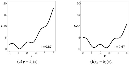
To illustrate the computation of the index via approximation (5), we use the functions and defined on the interval . We visualize them in Figure Figure 7.
Figure 7.
The functions h1 and h2 and their indices of increase
In the figure, the corresponding values of the index of increase are reported in the bottom-right corners of the two panels. They have been calculated using approximation (5) with , , and n=10,000. In order to check the approximation performance with respect to n, we have produced Table 2.
Table 2.
Performance of the approximation .
The ‘actual’ value in the bottom row of the table is based on Formula (4) and calculated using the integrate function of the R Stats Package (R Core Team [20]). We emphasize that the index of increase can be calculated as long as we have at least two pairs of data; the n used in the current example (and throughout Section 4) is the ‘tuning’ parameter that governs the precision of numerical integration. This concludes Example 1.
We now come back to Figure 5, whose all panels report respective values of the index of increase, calculated using approximation (5) with n = 10,000. To check whether this choice of n is sufficiently large, we have produced Table 3.
Table 3.
Convergence performance of each case in Figure 5.
Note that the index values when n = 10,000 and n = 20,000 are identical with respect to the reported decimal digits, and since in the panels of Figure 5 we report only the first two decimal digits, we can safely conclude that n = 10,000 is sufficiently large for the specified precision.
We see from the two bottom rows of Table 3 that the values for Spelling vs. Reading, Reading vs. Mathematics, Reading vs. Spelling, and Mathematics vs. Reading are the largest ones, similarly to what we have seen in Figure 4. However, the values for these four cases are larger when we use LOESS. This is natural because the technique has smoothed out the minute details of the raw data and thus shows only general trends. Of course, the LOESS parameters can be adjusted to make the fitted curves exhibit more details, but getting closer to the raw data would, in practice, make confidentiality issues more acute and thus perhaps unwelcome. At any rate, when it comes to minute details and raw data, which can be of any size as long as there are at least two pairs, we have the above introduced index of increase accompanied with an efficient method of calculation.
5. Group Comparisons
Suppose that we wish to compare two student groups, and —which could for example be the boys and girls in the data set of Thorndike and Thorndike-Christ [19] (pp. 24–25)—with respect to their monotonicity trends in Mathematics vs. Reading, Mathematics vs. Spelling, and so on. We could set out to calculate the indices of increase for and , and then compare the index values and make conclusions, but we have to be careful because of possibly different minimal and maximal scores for the two groups. Indeed, comparing monotonicity patterns over ranges of different length should be avoided because the wider the interval, the more fluctuations might occur. Hence, to make meaningful comparisons, we have to perform them over intervals of the same length, even though locations of the intervals can be different, due to the earlier established translation-invariance property (3).
In the context of our illustrative example, we find it meaningful to compare monotonicities of plots over the same range of scores. Hence, in general, given two groups and of sizes and , respectively, let the two data sets consist of the pairs
and
These data sets give rise to two piece-wise linear plots: the first one ranges from to , and the second one from to . The overlap of the two ranges is the interval , where
and
We identify and order the distinct first coordinates in each of the two samples and calculate the medians of the corresponding concomitants. We arrive at the following two sets of paired data:
and
where and are the numbers of distinct x’s in the original data sets. We next modify data set (6):
- Step 1:
- If , then we do nothing with the data set. If , then let the pairs and be such that is the closest first coordinate in data set (6) to the left of L, and thus is the closest one to the right of L. We delete all the pairs from set (6) whose first coordinates do not exceed , and then augment the remaining pairs with , whereFormula (8) is useful for computing purposes. We have visualized the pair as an interpolation result in panel (a) of Figure 8.
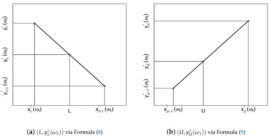 Figure 8. The two augmenting-pairs via the interpolation technique.
 - Step 2:
- If , then we do nothing with the data set. If , then let the pairs and be such that is the closest first coordinate in the data set to the left of U, and thus is the closest one to the right of U. From the set of pairs available to us after the completion of Step 1, we delete all the pairs whose first coordinates are on or above , and then augment the remaining pairs with , whereAs an interpolation result, we have visualized the pair in panel (b) of Figure 8.
In the case of data set (7), we proceed in an analogous fashion:
- Step 3:
- If , then we do nothing, but if , then we produce a new pair that replaces all the deleted ones on the left-hand side of data set (7).
- Step 4:
- If , then we do nothing with the pairs available to us after Step 3, but if , then we produce a new pair that replaces the deleted ones on the right-hand side of the data set obtained after Step 3.
In summary, we have turned data sets (6) and (7) into the following ones:
and
with some and that do not exceed and , respectively. Note that the smallest first coordinates and are equal to L, whereas the largest first coordinates and are equal to U. Hence, both data sets (10) and (11) produce piece-wise linear functions defined on the same interval . The corresponding index : = for any is calculated using the formula
To illustrate, we report the index values and the comparison ranges for boys and girls in the three subjects, and in all possible combinations in Table 4.
Table 4.
Performance of boys and girls in the two classes combined on the three subjects as measured by the index .
The values in the rows with span = N/A have been calculated based on the piece-wise linear fits. The rows with span values 0.35 and 0.75 are based on the LOESS curve fitting. We note in this regard that the parameter span controls the smoothness of the fitted curves: the larger the span, the smoother the resulting curve, with the default value span = 0.75 that we already used in Figure 5. The graphs corresponding to Table 4 are of interest, but since they are plentiful, we have relegated them to Appendix C at the end of the paper.
6. A Step-by-Step Guide
To have a better understanding and appreciation of the suggested method, we next implement it in a step-by-step manner using a small artificial data set. Namely, suppose that we wish to compare the performance of two groups of students, say and , in two subjects, which we call x and y. Let the scores, given in percentages, be those in Table 5.
Table 5.
Illustrative scores.
As the first step, we order the data according to the x’s and also record their concomitants, which are the y’s. The numerical outcomes are reported in Table 6.
Table 6.
Ordered scores and their concomitants.
Using piece-wise linear plots, we have visualized them in Figure 9.
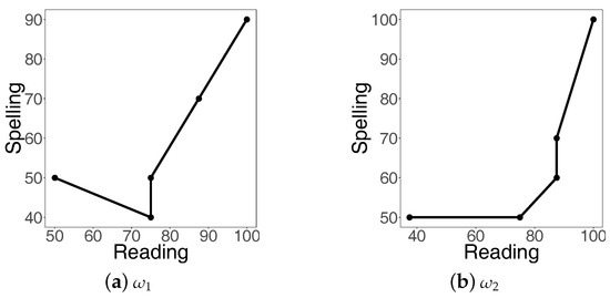
Figure 9.
Piece-wise linear fits to the illustrative scores.
In both panels of the figure, we see only five points, whereas the sample sizes of the two groups are six: and . The reason is that each of the two groups has two identical points: in the case of , and in the case of .
Next we apply the median-based aggregation: in the case of , the median of 40, 40, and 50 (which correspond to 75) is 40, and in the case of , the median of 50 and 50 (which correspond to 75) is 50, and that of 60 and 70 (which correspond to 87.5) is 65. (There are several definitions of median, but in this paper we use the one implement in the R Stats Package [20]: given two data points in the middle of the ranked sample, the median is the average of the two points.) We have arrived at two data sets with only and pairs, which are reported in Table 7.
Table 7.
Condensed scores using the median approach.
The corresponding piece-wise linear plots are given in Figure 10.
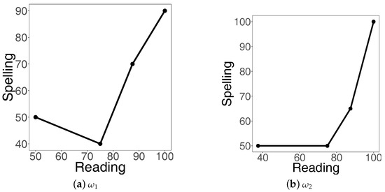
Figure 10.
Piece-wise linear fits to median adjusted data.
Note that the x-ranges of the two data sets are different: and . We therefore unify them. Since the range for is a subset of that for , we keep all the pairs, and thus . In the case of , the lower bound 50 is not among the x’s and thus we apply the interpolation method to find the y-value corresponding to . Using Equation (8), we have
For the upper bound U, since 100 is present in the data set, nothing needs to be done. We have because one pair was removed and one added. The new data set is reported in Table 8.
Table 8.
Ordered scores with unified ranges.
The corresponding piece-wise linear plots are depicted in Figure 11.
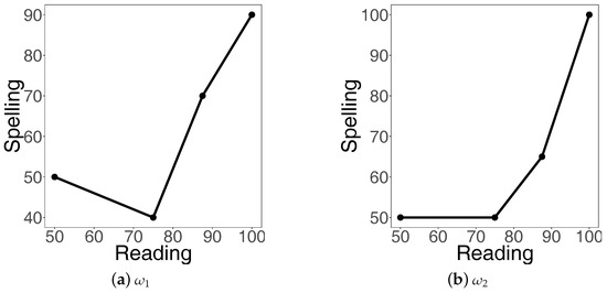
Figure 11.
Piece-wise linear fits with unified ranges.
For the pairs in Table 8, we can now calculate the index of increase according to Equation (12). Namely, for we have
and for we have
Both values are greater than 0.5, and thus both trends are more increasing than not, but the trend corresponding to is less increasing than that for , which is of course obvious from Figure 11. Finally, the index for is 1, which means that the corresponding trend is non-decreasing everywhere.
7. Conclusions
In many real-life applications, trends tend to be non-monotonic and researchers wish to quantify and compare their departures from monotonicity. In this paper, we have argued in favour of a technique that, in a well-defined and rigorous manner, has been designed specifically for making such monotonicity assessments.
We have illustrated the technique on a small artificial data set, and also on the larger data set borrowed from the classical text by Thorndike and Thorndike-Christ [19] (pp. 24–25). Extensive graphical and numerical illustrations have been provided to elucidate the workings of the new technique, and we have compared the obtained results with those arising from classical statistical techniques.
To facilitate free and easy implementation of the technique in various real-life contexts, we have conducted all our explorations using the R software environment for statistical computing and graphics [20]. We have implemented the new technique relying on our own R codes (see Appendix A for details). For data visualization, whenever possible, we have used the R packages ggplot2 [40] and GGally [41].
A large number of notes that we have incorporated in the paper have been inspired—directly or indirectly—by the many queries, comments, and suggestions by anonymous reviewers. A few additional comments follow next. First, there can, naturally, be situations where measuring and comparing the extent of decrease of various (non-monotonic) patterns would be of interest. In such cases, instead of, for example, the index of increase defined by Equation (1), we could use the index of decrease defined by
where is the negative part of z, that is, when and otherwise. The above developed computational algorithms do not need to be redone for the index because of the identity
which follows immediately from the equation that holds for all real numbers z. As a consequence of the identity, for example, the ratio
which can be used for measuring the extent of downward movements relative to the upward movements, can be rewritten as the “odds ratio”
with viewed as a probability, which can indeed be viewed this way because is the proportion of downward movements with respect to all—downward and upward—movements.
The next comment that we make is that, as noted by a reviewer, researchers may wish to assess the degree of non-exchangeability between and . In the case of, for example, the index of increase , such an assessment can be done either in absolute terms with the help of
or, in relative terms, using
It might be desirable to remove the absolute values from the right-hand sides of the above two definitions, thus making the newly formed two indices either positive or negative, and both of them being equal to 0 when .
Acknowledgments
We are grateful to the three anonymous reviewers for a wealth of insightful comments and suggestions, all of which—in one way or another—have been reflected in the current version of the paper. We are also indebted to Yuri Davydov, Edward Furman, Yijuan Ge, Danang Qoyyimi, and Jiang Wu for stimulating discussions of various educational and mathematical aspects related to this project. We gratefully acknowledge the grants “From Data to Integrated Risk Management and Smart Living: Mathematical Modelling, Statistical Inference, and Decision Making” awarded by the Natural Sciences and Engineering Research Council of Canada to the second author (R.Z.), and “A New Method for Educational Assessment: Measuring Association via LOC index” awarded by the national research organization Mathematics of Information Technology and Complex Systems, Canada, in partnership with Hefei Gemei Culture and Education Technology Co. Ltd., Hefei, China, to Jiang Wu and R.Z.
Author Contributions
The authors, with the consultation of each other, carried out this work and drafted the manuscript together. Both authors read and approved the final manuscript.
Conflicts of Interest
The authors declare no conflict of interest.
Appendix A. Computer Codes
The following three computer codes calculate the index of increase under various scenarios. The codes are written using the very accessible and free R software environment for statistical computing and graphics [20].
Appendix A.1. Function-Based Index of Increase
Suppose that we wish to calculate the index of increase of a function h on the interval for some . For this, we employ the computational algorithm described in Section 4. The desired precision is achieved by setting a large value of the discretization parameter n. Specifically, in the R Console, we run code:
indexh <- function(h,n=10000,L,U){
temp1 <- seq(L,U,length=n)
y <- h(temp1)
x <- data.frame(temp1,y)
denominator <- sum(abs(diff(x[,2])))
temp <- c()
for(i in 1:(length(x[,2])-1)){
temp[i] <- ifelse(diff(x[,2])[i] > 0, diff(x[,2])[i],0)
}
numerator <- sum(temp)
index <- numerator/denominator
return(index)
}
As an illustration, we next run the following code in order to calculate the index of increase for the function on the interval :
h <- function(x){sin(x)}
indexh(h,n=10000,L=-pi/2,U=pi)
The result is , which suggests (because ) that the trend is more increasing than decreasing.
Appendix A.2. Index of Increase for Discrete Data When the Are No Ties
In this appendix, we provide the code pertaining to the ‘basic idea’ described in Section 3.1. In this case, all of the first coordinates (i.e., x’s) are different, and all of the second coordinates (i.e., y’s) are also different. (When there are ties among the x’s or y’s, the next appendix provides a more general and complex code, which of course also works when there are no ties.) To begin with, in the R Console, we run the following code:
index <- function(data){
##order the dataset according to x’s
data <- data[order(data[,1]),]
##calculate the denominator of index I
denominator <- sum(abs(diff(data[,2])))
##calculate the numerator of index I
temp <- c()
for(i in 1:(length(data[,2])-1)){
temp[i] <- ifelse(diff(data[,2])[i] > 0, diff(data[,2])[i],0)
}
numerator <- sum(temp)
index <- numerator/denominator
return(index)
}
As an illustration, we calculate the index of increase for the three pairs , , and by running the following code:
x <- c(3,1,2)
y <- c(1,3,0)
data <- data.frame(x,y)
index(data)
The result is , which suggests (because ) that the trend is more decreasing than increasing.
Appendix A.3. Index of Increase for Arbitrary Discrete Data
The following code is an augmentation of the previous one in order to allow for ties among the x’s as well as for ties among the y’s. The code follows the median-adjusted methodology described in Section 3.2. We start by running the following code in the R Console:
indexmed <- function(data){
#order the dataset according to x’s
data <- data[order(data[,1]),]
#find all the distinct value of x
tempx <- unique(data[,1])
#for each distinct x, find the median of y’s
medy <- c()
for(i in 1:length(tempx)){
medy <- c(medy,median(data[data[,1]==tempx[i],2]))
}
newdata <- data.frame(tempx,medy)
#calculate the index value
denominator <- sum(abs(diff(newdata[,2])))
temp <- c()
for(i in 1:(length(newdata[,2])-1)){
temp[i] <- ifelse(diff(newdata[,2])[i] > 0,diff(newdata[,2])[i],0)
}
numerator <- sum(temp)
index <- numerator/denominator
return(index)
}
As an illustration, we calculate the index of increase for the data set that consists of the five pairs , , , , and . For this, we run the following code:
x <- c(1,2,2,3,3)
y <- c(1,3,2,1,2)
data <- data.frame(x,y)
indexmed(data)
The result is , which suggests (because ) that the trend is more increasing than decreasing.
Appendix B. Proof of Property (3)
Since is positive, the order of the coordinates of the vector is the same as the order of the coordinates of the vector , and the relationship between the order statistics is . Consequently, and also recalling that is positive, all the median-adjusted concomitants satisfy the relationship and so
This concludes the proof of property (3).
Appendix C. Graphs Pertaining to Section 5

Figure A1.
Piece-wise linear fits and their indices of increase for both classes combined.
Figure A1.
Piece-wise linear fits and their indices of increase for both classes combined.


Figure A2.
Continuation of piece-wise linear fits and their indices of increase for both classes combined.
Figure A2.
Continuation of piece-wise linear fits and their indices of increase for both classes combined.


Figure A3.
LOESS fits when span = 0.75 (thicker line) and 0.35 (thinner line; the index I in parentheses) for both classes combined.
Figure A3.
LOESS fits when span = 0.75 (thicker line) and 0.35 (thinner line; the index I in parentheses) for both classes combined.


Figure A4.
Continuation of LOESS fits when span = 0.75 (thicker line) and 0.35 (thinner line; the index I in parentheses) for both classes combined.
Figure A4.
Continuation of LOESS fits when span = 0.75 (thicker line) and 0.35 (thinner line; the index I in parentheses) for both classes combined.

References
- Ma, X. Stability of school academic performance across subject areas. J. Educ. Meas. 2001, 38, 1–18. [Google Scholar] [CrossRef]
- Masci, C.; Leva, F.; Agasisti, T.; Paganoni, A.M. Bivariate multilevel models for the analysis of mathematics and reading pupils’ achievements. J. Appl. Stat. 2017, 44, 1296–1317. [Google Scholar] [CrossRef]
- Newman, R.; Stevenson, H. Children’s achievement and causal attributions in mathematics and reading. J. Exp. Educ. 1990, 58, 197–212. [Google Scholar] [CrossRef]
- Jovanovic, J.; King, S.S. Boys and girls in the performance—Based science classroom: Whos doing the performing? Am. Educ. Res. J. 1998, 35, 477–496. [Google Scholar] [CrossRef]
- McCornack, R.; McLeod, M. Gender bias in the prediction of college course performance. J. Educ. Meas. 1988, 25, 321–331. [Google Scholar] [CrossRef]
- Mokros, J.R.; Koff, E. Sex-stereotyping of childrens success in mathematics and reading. Psychol. Rep. 1978, 42, 1287–1293. [Google Scholar] [CrossRef]
- Alexander, N.A.; Jang, S.T.; Kankane, S. The performance cycle: The association between student achievement and state policies tying together teacher performance, student achievement, and accountability. Am. J. Educ. 2017, 123, 413–446. [Google Scholar] [CrossRef]
- Huxham, M.; Campbell, F.; Westwood, J. Oral versus written assessments: A test of student performance and attitudes. Assess. Eval. High. Educ. 2012, 37, 125–136. [Google Scholar] [CrossRef]
- Bresgi, L.; Alexander, D.; Seabi, J. The predictive relationships between working memory skills within the spatial and verbal domains and mathematical performance of grade 2 South African learners. Int. J. Educ. Res. 2017, 81, 1–10. [Google Scholar] [CrossRef]
- Looney, M.A. When is the intraclass correlation coefficient misleading? Meas. Phys. Educ. Exerc. Sci. 2000, 4, 73–78. [Google Scholar] [CrossRef]
- Hedges, L.V.; Hedberg, E.C. Intraclass correlation values for planning group-randomized trials in education. Educ. Eval. Policy Anal. 2007, 29, 60–87. [Google Scholar] [CrossRef]
- Zhou, H.; Muellerleile, P.; Ingram, D.; Wong, S. Confidence intervals and F tests for intraclass correlation coefficients based on three-way mixed effects models. J. Educ. Behav. Stat. 2011, 36, 638–671. [Google Scholar] [CrossRef]
- Gauthier, T.D. Detecting trends using Spearman’s rank correlation coefficient. Environ. Forensics 2001, 2, 359–362. [Google Scholar] [CrossRef]
- Puth, M.-T.; Neuhäuser, M.; Ruxton, G.D. Effective use of Spearman’s and Kendall’s correlation coefficients for association between two measured traits. Anim. Behav. 2015, 102, 77–84. [Google Scholar] [CrossRef]
- Anscombe, F.J. Graphs in statistical analysis. Am. Stat. 1973, 27, 17–21. [Google Scholar]
- Qoyyimi, D.T.; Zitikis, R. Measuring the Lack of Monotonicity in functions. arXiv 2014, arXiv:1403.5841. [Google Scholar] [CrossRef]
- Kane, M. Validating the performance standards associated with passing scores. Rev. Educ. Res. 1994, 64, 425–461. [Google Scholar] [CrossRef]
- Kane, M.T. Validating the interpretations and uses of test scores. J. Educ. Meas. 2013, 50, 1–73. [Google Scholar] [CrossRef]
- Thorndike, R.M.; Thorndike-Christ, T. Measurement and Evaluation in Psychology and Education, 8th ed.; Prentice Hall: Boston, MA, USA, 2010; ISBN 978-0-13-240397-9. [Google Scholar]
- R Core Team. R: A Language and Environment for Statistical Computing; R Foundation for Statistical Computing: Vienna, Austria, 2013. [Google Scholar]
- Koenker, R.; Chernozhukov, V.; He, X.; Peng, L. Handbook of Quantile Regression; Chapman and Hall/CRC: Boca Raton, FL, USA, 2017; ISBN 978-1-49-872528-6. [Google Scholar]
- Young, D.S. Handbook of Regression Methods; Chapman and Hall/CRC: Boca Raton, FL, USA, 2017; ISBN 978-1-49-877529-8. [Google Scholar]
- Haile, G.A.; Nguyen, A.N. Determinants of academic attainment in the United States: A quantile regression analysis of test scores. Educ. Econ. 2008, 16, 29–57. [Google Scholar] [CrossRef]
- Castellano, K.E.; Ho, A.D. Contrasting OLS and quantile regression approaches to student “growth” percentiles. J. Educ. Behav. Stat. 2013, 38, 190–215. [Google Scholar] [CrossRef]
- Dehbi, H.; Cortina-Borja, M.; Geraci, M. Aranda-Ordaz quantile regression for student performance assessment. J. Appl. Stat. 2015, 43, 58–71. [Google Scholar] [CrossRef]
- Wilcox, R.R. Detecting nonlinear associations, plus comments on testing hypotheses about the correlation coefficient. J. Educ. Behav. Stat. 2001, 26, 73–83. [Google Scholar] [CrossRef]
- Davydov, Y.; Zitikis, R. An index of monotonicity and its estimation: A step beyond econometric applications of the Gini index. Metron Int. J. Stat. 2005, 63, 351–372, special issue in memory of Corrado Gini. [Google Scholar]
- Davydov, Y.; Zitikis, R. Quantifying non-monotonicity of functions and the lack of positivity in signed measures. arXiv 2017, arXiv:1705.02742. [Google Scholar]
- Qoyyimi, D.T.; Zitikis, R. Measuring the lack of monotonicity in functions. Math. Sci. 2014, 39, 107–117. [Google Scholar] [CrossRef]
- Qoyyimi, D.T.; Zitikis, R. Measuring association via lack of co-monotonicity: The LOC index and a problem of educational assessment. Depend. Model. 2015, 3, 83–97. [Google Scholar] [CrossRef]
- David, H.A.; Nagaraja, H.N. Order Statistics, 3rd ed.; Wiley: Hoboken, NJ, USA, 2005; ISBN 978-0-47-138926-2. [Google Scholar]
- Giorgi, G.M. Bibliographic portrait of the Gini concentration ratio. Metron Int. J. Stat. 1990, 48, 183–221. [Google Scholar]
- Giorgi, G.M. A fresh look at the topical interest of the Gini concentration ratio. Metron Int. J. Stat. 1993, 51, 83–98. [Google Scholar]
- Reimherr, M.; Nicolae, D.L. On quantifying dependence: A framework for developing interpretable measures. Stat. Sci. 2013, 28, 116–130. [Google Scholar] [CrossRef]
- Furman, E.; Zitikis, R. Beyond the Pearson correlation: Heavy-tailed risks, weighted Gini correlations, and a Gini-type weighted insurance pricing model. ASTIN Bull. J. Int. Actuar. Assoc. 2017, 47, 919–942. [Google Scholar] [CrossRef]
- Brazauskas, V.; Jones, B.L.; Zitikis, R. Robustification and performance evaluation of empirical risk measures and other vector-valued estimators. Metron Int. J. Stat. 2007, 65, 175–199. [Google Scholar]
- Brazauskas, V.; Jones, B.L.; Zitikis, R. Robust fitting of claim severity distributions and the method of trimmed moments. J. Stat. Plan. Inference 2009, 139, 2028–2043. [Google Scholar] [CrossRef]
- De Haan, L.; Ferreira, A. Extreme Value Theory; Springer: New York, NY, USA, 2006; ISBN 978-0-38-723946-0. [Google Scholar]
- Reiss, R.-D.; Thomas, M. Statistical Analysis of Extreme Values with Applications to Insurance, Finance, Hydrology and Other Fields, 3rd ed.; Birkhäuser: Basel, Switzerland, 2007; ISBN 376-4-37-230-3. [Google Scholar]
- Wickham, H. ggplot2: Elegant Graphics for Data Analysis; Springer: New York, NY, USA, 2009; ISBN 978-0-38-798140-6. [Google Scholar]
- Schloerke, B.; Crowley, J.; Cook, D.; Briatte, F.; Marbach, M.; Thoen, E.; Elberg, A.; Larmarange, J. GGally: Extension to ‘ggplot2’ (R Package Version 1.3.1). Available online: http://CRAN.R-project.org/package=GGally (accessed on 11 August 2017).


© 2017 by the authors. Licensee MDPI, Basel, Switzerland. This article is an open access article distributed under the terms and conditions of the Creative Commons Attribution (CC BY) license (http://creativecommons.org/licenses/by/4.0/).