Abstract
Modern telemedicine requires advanced analytical solutions for efficient management of chronic diseases. This study presents the development of a comprehensive business intelligence (BI) framework using Microsoft Power BI, applied to the optimization of diabetes mellitus management. The methodology integrates Power Query transformations, 35 DAX measures organized into five functional categories, and Python 3.14.2. capabilities for advanced statistical analysis. The framework was implemented and demonstrated using a public clinical dataset of 100,000 patient records, generating five interactive dashboards covering epidemiological, demographic, clinical, geographical, and equity perspectives. A global prevalence of 8.5%, exponential growth with age, gender differences (9.75% males against 7.62% females), and substantial connections between metabolic indicators (BMI, HbA1c, and blood glucose) are all confirmed by the results. Heart disease rates are 6.2 times higher in diabetic people, according to comorbidity research. Complete methodological openness through thorough documentation, Python integration for sophisticated visualizations, and interactive multidimensional drill-down features are some of the major additions. The predictive elements are included as interpretable, exploratory components embedded in the BI environment rather than as clinically validated prediction models. This approach provides an affordable and user-friendly approach that makes advanced analytical capabilities accessible to a broader range of healthcare organizations managing chronic diseases.
1. Introduction
We developed an applied, systems-oriented business intelligence framework for diabetes management in telemedicine using Microsoft Power BI as the primary analytical platform. The system processes the publicly available Comprehensive Diabetes Clinical Dataset 2024 from Kaggle [1], which contains 100,000 patient records. Our technical architecture integrates Power Query transformations, 35 DAX measures organized into five functional categories, and Python modules for advanced statistical visualizations. Implementation generated five interactive dashboards: general epidemiological perspectives, demographic and behavioral stratification, clinical assessments with exploratory predictive insights, regional geographic analyses, and equity identification with decision-support insights for intervention planning. A vital clinical need is met by this technical solution.
Hundreds of millions of adults worldwide suffer from diabetes, and estimates indicate that number will rise significantly over the next several decades. Diabetes and other chronic metabolic diseases have a substantial financial impact on healthcare systems and continue to have a major negative impact on people’s quality of life. Traditional approaches that rely on “in person” consultations and manual record keeping are becoming inadequate given the current scope of the problem.
In the face of severe resource limitations and regional differences in access to healthcare services, healthcare systems are under growing pressure to offer individualized, ongoing, and cost-effective care to growing diabetic populations [2].
These problems are speeding up the digital transformation of healthcare, which integrates technology into every aspect of disease prevention, diagnosis, treatment, and monitoring. Telemedicine is one recent advancement in the management of chronic conditions [3]. Without requiring “in person” clinic visits, it allows for continuous glucose monitoring for diabetes, remote consultations, patient education, and real-time treatment adjustments [3,4]. The COVID-19 pandemic has greatly accelerated the adoption of these technologies, demonstrating their viability even in settings with limited resources [5].
The potential of telemedicine systems to gather, evaluate, and present complex medical data in ways that help physicians make decisions is critical to their success. Evidence-based therapies and individualized treatment plans are made possible by BI technologies, which provide an analytical framework for transforming unprocessed data into useful insights. To support operational, tactical, and strategic decision-making, healthcare business intelligence (BI) comprises the collection, integration, analysis, and presentation of data [6].
Modern BI platforms enable real-time data exploration, prediction, and recommendation, in contrast to traditional reporting systems that only offer static analyses of the past [7]. Doctors can see dashboards that give them a full picture of patient populations, disease trajectories, treatment outcomes, and resource use patterns [8]. These tools help with pattern recognition, finding anomalies, and coming up with new ideas, all of which are important parts of clinical reasoning.
Microsoft Power BI has become very popular in healthcare organizations because it is easy to use, can be integrated with other programs, and has strong analytical capabilities [9]. The platform offers connectivity to diverse data sources (like databases, Excel, cloud, APIs) and the advanced Data Analysis Expressions (DAX) language for sophisticated calculated measures, with a rich library of interactive visualizations, scalable cloud-based architecture, and relatively low licensing costs compared to other proprietary enterprise solutions.
Complex systems specifically designed for diabetes management contexts remain underexplored in the literature, although multiple healthcare organizations have implemented Power BI for clinical decision support. Most healthcare BI implementations prioritize operational or financial metrics over clinical analytics that directly support patient care. There is a significant gap in demonstrating how a multidimensional BI approach can integrate descriptive, predictive, and prescriptive analytics for complex diabetes management.
Recent studies have addressed fragments of this issue. Previous research has explored the digital transformation through BI technology in diabetes management, which has provided valuable theoretical frameworks, examined the role of Big Data analytics with a focus on data architectures, demonstrated the integration of BI with Big Data and machine learning to reduce healthcare costs, and identified key practical issues in dashboard development.
The primary objective of this study is to design and demonstrate a comprehensive business intelligence framework that integrates descriptive and exploratory predictive analytics to support decision-making in telemedicine contexts.
This work is not intended to propose new predictive models, algorithms, or formal decision-making methods. From a systems perspective, the contribution is in the integration architecture, analytical workflow design, and interactive decision-support capabilities allowed by the business intelligence environment. The approach promotes exploratory analysis and educated human decision-making over automated or optimized prescriptive decision-making. Accordingly, model performance metrics and comparative benchmarking are outside the scope of this applied BI case study.
Besides its practical application, this study advances research by formalizing a reproducible, systems-level analytical methodology for telemedicine. The scientific originality is in illustrating how descriptive analytics, exploratory predictive components, and equity-oriented studies may all be implemented concurrently inside a single business intelligence framework. Like other Power BI healthcare projects, which focus on isolated dashboards or standalone use cases, this work prioritizes analytical orchestration, interpretability, and alignment with decision-support processes over algorithmic innovation.
For the purposes of supporting operational reporting, financial monitoring, or administrative performance evaluation, the majority of business intelligence solutions in the healthcare industry concentrate mostly on descriptive and retrospective analysis. Dashboards in these contexts are frequently static, restricted to historical summaries, have minimal analytical depth, and have little bearing on clinical decision-making. When predictive elements are included, they are typically created as independent analytical models and infrequently included in an interactive BI environment that healthcare professionals may use.
The approach described in this article expands the typical subject matter of healthcare BI by combining descriptive, predictive, and prescriptive analytics into a unified analytical architecture. Rather than serving as a reporting tool, the system allows for multidimensional analysis of population-level data, interactive drill-down across demographic, clinical, and geographic dimensions, and contextual interpretation of metabolic risk indicators.
Powerful statistical analyses and visualizations that surpass the platform’s built-in capabilities are made possible by the integration of Python with the Power BI environment, all the while retaining usability for non-programmers.
The recommended design sets itself apart from usual BI systems and improves diabetes care in telemedicine settings by fusing methodological clarity, interactive analytical depth, and a clear medical purpose.
The solution analyzes the 100,000 patient records in the publicly accessible “Comprehensive Diabetes Clinical Dataset 2024” on the Kaggle platform [1] using Microsoft Power BI (https://www.microsoft.com/en-us/power-platform/products/power-bi/downloads/, accessed on 20 October 2025). The analysis is arranged into five interconnected dashboards that cover the following:
- Overview and key indicators;
- Demographic and behavioral insights;
- Clinical performance and predictive metrics;
- Regional and geographic analyses;
- Equity considerations and decision-support insights for intervention planning.
The study’s contributions are mostly methodological, architectural, and practical in nature, with a focus on system integration and analytical workflow design rather than the creation of new prediction models or formal decision mechanisms. The study’s primary contributions are summarized as follows:
- -
- Methodological: A methodical approach that strikes a balance between clinical usability and technical sophistication when creating BI analyses in telemedicine settings.
- -
- Technical: Comprehensive documentation of data model architecture, visualization techniques, and DAX metrics relevant to healthcare analytics that makes replication easier.
- -
- Clinical: Finding relevant information about risk factors, comorbidity associations, diabetes prevalence trends, and health equity issues.
- -
- Practical: A scalable framework that healthcare organizations can modify for their own projects, based on easily accessible tools (Power BI) and publicly accessible data (Kaggle).
2. Relevant Literature
2.1. The Evolution of Business Intelligence in Healthcare
The use of BI systems in the healthcare industry has evolved significantly. They have moved from conventional decision-support systems that Power [6] outlined to integrated analytical platforms that facilitate real-time decision-making. BI and analytics are essential components of healthcare organizational strategies because they enable the conversion of large amounts of clinical data into actionable insights that can enhance patient outcomes and operational efficiency, according to Chen et al. [7].
The introduction of clinical data warehouses was a big step forward in this process because they let healthcare organizations combine data from many different sources and use it to manage long-term conditions.
According to Karami et al. [8], clinical data warehouses are useful for gathering information in pathology management because they let you objectively evaluate the quality of care and find ways to improve clinical outcomes. Raghupathi and Raghupathi [9] look at how Big Data affects healthcare.
They say that combining structured and unstructured data from many sources, like genomics, wearable technology, and electronic health records, opens up new possibilities for personalized medicine and population health management. The way professionals access and interpret complex data has completely changed as a result of interactive dashboards, which are crucial parts of contemporary healthcare BI ecosystems. Stadler and his colleagues [10] assert that the use of visualization dashboards greatly increases the effectiveness of healthcare analytics by cutting down the time needed to generate reports from hours to minutes and facilitating the quick identification of important trends.
By using real-time and historical data analysis to identify risk factors and early interventions, Ramesh and colleagues [3] show how Big Data analytics changes the traditional healthcare model and makes it possible to move from reactive to predictive and preventive approaches.
2.2. Business Intelligence in Telemedicine Diabetes Management
Utilizing BI in telemedicine diabetes management, information technology and long-term patient care have come together intelligently. Ghazisaeedi et al. [11] assert that telemedicine solutions for diabetes facilitate remote glucose monitoring, patient education, and efficient communication between patients and healthcare teams, thereby diminishing the necessity for frequent clinic visits and enhancing treatment adherence.
By combining data from glucometers, smartphone apps, and continuous glucose monitoring (CGM) devices into specialized dashboards, this combined approach, made possible by BI tools, offers appropriate clinical supervision.
KPIs must be set up and monitored in order to evaluate the effectiveness of telemedicine interventions for diabetes management. To develop a systematic method for identifying strategic KPIs in tertiary healthcare settings, Khalifa and Khalid [12] group indicators into categories like clinical outcomes, patient satisfaction, operational efficiency, and adherence to practice guidelines.
The authors emphasize that in order to allow for an objective assessment of progress and identification of areas that require improvement, clearly defined KPIs must be time-bound, relevant, quantifiable, achievable, and specific.
Due to its versatility, analytical prowess, and capacity to integrate with numerous data sources, Microsoft Power BI [13] has emerged as the platform of choice for BI solution implementation in the healthcare industry. With the help of the platform’s intuitive visualization tools, advanced data modeling capabilities through the DAX (Data Analysis Expressions) language, and native connectivity to electronic health record systems, healthcare professionals can create interactive dashboards without the need for complex programming knowledge.
The quick implementation of BI solutions for tracking performance indicators in diabetes management is made possible by the democratization of access to analytical tools.
2.3. Artificial Intelligence and Machine Learning in Diabetes Prediction
Machine learning (ML) techniques have revolutionized the ability to predict diabetes risk and provide higher accuracy than traditional statistical models by combining complex sets of clinical and demographic data. Fazakis et al. [14] demonstrate that machine learning algorithms can identify subtle patterns in data that are overlooked by conventional analyses in their assessment of multiple machine learning tools for the long-term prediction of type 2 diabetes risk. The study emphasizes the importance of feature selection, hyperparameter optimization, and comprehensive validation to ensure that models can be applied to a range of populations.
Comparative research offers important information about how well various machine learning algorithms perform in actual clinical settings. In a thorough assessment of diabetes classification and prediction, Butt et al. [15] use a variety of algorithms, such as ensemble methods, neural networks, and decision trees, and discover significant differences based on the dataset’s properties and the proportion of positive and negative classes. One significant finding is the illustration that the algorithms’ performance is highly dependent on the quality of the data preprocessing, the methods used to handle missing values, and the methods for class balancing in datasets that are not balanced.
The argument between interpretability and model complexity is still crucial to the clinical use of machine learning. According to Lynam et al. [16], logistic regression can perform comparably to more sophisticated machine learning algorithms in certain clinical settings when appropriately optimized. This suggests that traditional models’ interpretability and simplicity continue to be significant benefits for clinical decisions that need to be able to be explained and approved by experts.
This finding highlights how important it is to balance decision-making transparency with predictive power in medical applications.
Ensemble algorithms like XGBoost and Random Forest have attracted a lot of interest because they can aggregate predictions from multiple models to improve overall accuracy and robustness. Outperforming individual algorithms, Gündoğdu [17] proposes an efficient method to predict diabetes in its early stages by combining the XGBoost classifier with Random Forest feature selection. The technique demonstrates how ensemble approaches can reduce overfitting and enhance generalization to new data, making them particularly helpful for clinical datasets with high dimensionality and intricate variable relationships.
While most research in diabetes prediction focuses on improving machine learning performance through increasingly complex models, such approaches are often developed as standalone analytical solutions. In clinical practice, this emphasis on predictive accuracy may come at the expense of interpretability, transparency, and ease of integration with existing decision-support systems. In contrast, the objective of this research is to show how well-established machine learning techniques can be incorporated into a business intelligence environment to enhance exploratory analysis and clinical decision-making, rather than to suggest or assess a novel predictive approach. This framework’s predictive elements are purposefully interpretable and integrated into interactive dashboards, enabling users to contextualize model results alongside clinical, geographic, and demographic data. This design decision aligns the predictive layer with the overall objective of well-informed decision-making in telemedicine scenarios by giving accessibility and analytical understanding importance over algorithmic complexity.
For this reason, the paper does not report predictive performance metrics or external validation results, and the predictive layer is presented only as an integrated analytical component for exploratory use.
2.4. Data Visualization and Dashboard Design in Healthcare
The principles of information visualization, user requirements, and the particular clinical context in which they will be utilized must all be carefully considered when designing clinical dashboards.
Three main dimensions have been identified by Zhuang et al. [18] in their comprehensive system for assessing dashboards in the healthcare industry: the effectiveness of interactions, user experience, and the capacity to support clinical decision-making. The framework offers helpful advice to developers and designers, stressing the value of ongoing interface improvement based on user input and iterative testing.
The authors stress that good dashboards must balance information density and visual clarity to avoid cognitive overload, which can impair decision-making.
Stadler et al. [10] demonstrate through particular case studies how the use of data visualization dashboards improves the quality of communication amongst multidisciplinary healthcare teams as well as the efficacy of analyses. Quickly identifying trends, comparing data across units or time periods, and delving into particular data to examine anomalies or areas of interest are all made possible by dashboards.
2.5. Limitations and Challenges in Implementing BI Systems for Diabetes
BI systems have a lot of potential for diabetes management, but in order for these technologies to be used responsibly, some significant issues need to be recognized and fixed. Data quality is a key concern because BI and ML models depend on the accuracy, completeness, and representativeness of input data.
Luo [19] notes in his evaluation of the state of imputation techniques for handling missing values in clinical data that inefficient methods can lead to systematic biases that compromise the validity of results.
The study shows that sophisticated ML-based imputation techniques can outperform plain methods (mean, mode, forward fill), but they need thorough validation and knowledge of the mechanisms underlying missing data (completely randomly missing, randomly missing, non-randomly missing).
In clinical settings where trust depends on the decision-making process being transparent, the interpretability of machine learning models is a significant challenge.
3. Materials and Methods
3.1. Data Set—Description
The study uses the “Comprehensive Diabetes Clinical Dataset” (100k rows), publicly available on the Kaggle platform [1]. The dataset contains health and demographic information from 100,000 individuals from the USA and is designed for diabetes research and predictive modeling. It includes data on gender, age, location, race, hypertension, cardiovascular disease, smoking history, body mass index (BMI), HbA1c level, blood glucose level, and diabetes status.
The dataset offers extensive capabilities for multidimensional analysis, including predictive modeling to estimate the probability of diabetes based on demographic and health characteristics, analysis of correlations between different clinical metrics (BMI, HbA1c) and diabetes, demographic studies of the distribution of diabetes across population groups and locations, public health research to identify risk factors and target interventions to vulnerable groups and clinical research on the relationship between comorbidities such as hypertension and cardiovascular disease with diabetes.
The dataset comprises 100,000 patient records with 22 attributes covering demographic, clinical, and behavioral dimensions. The data structure is presented in Table 1.

Table 1.
Structure of the dataset used in the study.
The choice of a single public dataset is justified by the study’s purpose, which is to validate the suggested business intelligence framework rather than to statistically generalize clinical findings. The dataset’s huge size (100,000 records) and multidimensional structure allow for an evaluation of the framework’s internal coherence, scalability, and analytical behavior across demographic, clinical, geographic, and equity dimensions. Validation across various datasets or nations is essential for clinical generalization because it is outside the scope of this systems-oriented BI study.
3.2. Data Preparation and Cleaning in Power Query
The CSV connector was used to import the dataset into Power BI Desktop. To guarantee consistency and the data’s utility in further analyses, some preliminary changes had to be made in the Power Query editor. In order to facilitate multidimensional analysis of diabetes, the preparation process sought to both validate the data integrity and create derived variables.
Promoting the first row as a column header was the first step, and then data types were automatically detected. The numeric column Age was transformed into the categorical variable AgeGroup using a conditional structure that segments the population into four groups: 18–34 years, 35–49 years, 50–64 years, and over 65 years. To ensure correct chronological ordering in the visualizations, an additional column Age Order was created that assigns increasing numeric values (1–4) to each age category. The M-code associated with this transformation successively checks the membership of each interval, applying the logic if [Age] ≥ 18 and [Age] ≤ 34 then “18–34” else if [Age] ≥ 35 and [Age] ≤ 49 then “35–49” and so on.
In the field of clinical indicators, HbA1c values have been categorized according to international medical standards. Values below 5.7% are classified as normal, the range 5.7–6.4% defines the state of prediabetes and values of 6.5% or higher indicate the presence of diabetes. The implementation of this logic in Power Query uses a hierarchical conditional structure: if [HbA1c] < 5.7 then “Normal” else if [HbA1c] ≥ 5.7 and [HbA1c] < 6.5 then “Prediabetes” else “Diabetes”. Similarly, blood glucose was divided into three categories (normal below 100 mg/dL, prediabetic between 100 and 125 mg/dL, and diabetic above 125 mg/dL) using the same conditional approach.
Body mass index was classified into four categories according to the WHO criteria [2]: underweight (BMI < 18.5), normal weight (18.5–24.9), overweight (25–29.9), and obese (BMI ≥ 30). This categorization allows comparative analyses between weight groups and facilitates the identification of risk patterns. To improve the readability of the reports, the binary column Diabetes_binary (0/1) was converted to explicit text format by creating the column DiabetesFlagText, in which the value 0 becomes “No” and 1 becomes “Yes”, applying the formula if [Diabetes_binary] = 0 then “No” else “Yes”.
As a result each race was represented by a different binary column (WhiteOnly, BlackOnly, AsianOnly, NegativeAmericanOnly, OtherRace), the dataset’s one-hot encoding of racial information presented a unique challenge. We created the calculated column RaceCategory using sequential conditional logic in order to combine these five columns into a single categorical variable that could be used in the analyses: if [WhiteOnly] = 1 then “White”; if [BlackOnly] = 1 then “Black”; if [AsianOnly] = 1 then “Asian”; and so on. This ensured consistent representation of the racial dimension.
Following all modifications, there are 23 columns in the final schema, with 6 coming from Power Query and 17 from the original dataset. This preserves the 100,000 individual records on which further analysis is based.
3.3. Power BI Architecture and Data Model
Instead of using distinct dimension tables unique to the star model (star schema), the practical implementation of this study uses a simplified architecture with a single fact table (diabetes_dataset). This architectural decision is supported by the project’s educational goal and the dataset’s inherent characteristics, which do not require complex relational normalization.
In order to avoid multiple joins and streamline the logic of DAX measures, all analytical dimensions, demographic, clinical, behavioral, and geographic are directly integrated as attributes in the main table.
The diabetes_dataset table’s structure consists of 23 columns arranged into five functional categories based on themes. Stratified analyses on various population characteristics are made possible by the demographic dimension, which comprises the variables Age, AgeGroup, Age Order, Sex, and racial information. Clinical parameters that provide both quantitative and qualitative indicators of metabolic status include BMI, BMICategory, HbA1c, HbA1cStatus, Glucose, and GlucoseCategory. The binary variable HeartDiseaseorAttack, which is coded as 0 (absent) or 1 (present), represents cardiovascular risk factors.
This single-table architecture presents clear advantages in the current context: simplification of DAX measure development (all columns are directly accessible without relationships), increased performance for filtering and aggregation operations (absence of repeated joins), and model transparency for end users who can immediately understand the data structure. However, the model also presents inherent limitations: data redundancy (demographic information is duplicated for each record), scaling difficulties (adding new dimensions exponentially increases the complexity of the table), and reduced flexibility (structural changes require re-processing of the entire dataset). In production scenarios with large volumes of data and complex evolutionary requirements, the transition to a star schema architecture with separate dimension tables would become necessary to ensure system maintainability and extensibility.
3.4. Development of DAX Measures
Each of the five functional categories that comprise the framework’s analytical layer’s 35 DAX measures answers a different diabetes management question. Table 2 compiles the main metrics produced by the system and arranges them based on analytical dimensions.

Table 2.
Main DAX measures developed in the framework (representative selection).
Basic population indicators are provided by the basic measures (Basic Metrics): DiabeticCount uses CALCULATE([TotalPatients], diabetes_dataset[Diabetes_binary] = 1) to count patients with diabetes, whereas TotalPatients uses COUNTROWS(diabetes_dataset) to determine the total number of records. The prevalence of diabetes is expressed as a percentage by the measure DiabeticRate that applies the formula DIVIDE([DiabeticCount], [TotalPatients], 0), and the proportion of healthy patients is captured by NonDiabeticCount and HealthyRate for comparative analyses.
The clinical indicators category (Clinical Metrics) aggregates metabolic parameters at the population level. The AvgBMI, AvgHbA1c, and AvgGlucose measures calculate simple averages using the AVERAGE() function applied to the respective columns, providing a synthetic perspective on the overall metabolic status.
Dedicated metrics are used to quantify the prevalence of cardiovascular risk factors: HeartDiseaseRate, which is replicated in the structure for hypertension (HypertensionRate), establishes the percentage of patients with cardiovascular disease.
Demographic analyses (Demographic Analysis) decompose the prevalence of diabetes on multiple population dimensions. The Female_DiabeticRate measure, which is replicated for men (Male_DiabeticRate) and for every racial group, isolates the diabetes rate in women by applying a double filter: CALCULATE([DiabeticRate], diabetes_dataset[Sex] = “Female”).
Systematic disparities can be identified by stratifying the prevalence by age and race using the DiabeticRate_ByAgeGroup and DiabeticCount_ByRace measures.
Using risk ratios, the predictive dimension (Risk Analysis) measures the connections between diabetes and cardiovascular comorbidities. The HeartDiseaseRate measure shows how many times the risk is higher in the diabetic group by comparing the prevalence of cardiovascular disease between diabetics and non-diabetics. The same mechanism is applied for hypertension (HypertensionRate), generating a multidimensional risk profile essential for tertiary prevention strategies.
Lastly, contextual analyses compare clinical groups’ health behaviors. Geographic variations can be identified with the AvgGlucose_ByLocation measure, which uses AVERAGE(VALUES(diabetes_dataset[blood_glucose_level]) to calculate the average blood glucose by state. By using AVERAGE(VALUES(diabetes_dataset[HbA1cStatus]) to correlate BMI with HbA1c status, the composite measure AvgBMI_ByHbA1c makes it easier to analyze the relationships between metabolic parameters.
Complete analytical capabilities and modularity in creating visualizations for later dashboards are both provided by this hierarchical taxonomy of DAX measures.
3.5. Interactive Dashboard Design
Five interconnected dashboard pages, each with a unique analytical goal and interactive filters for multidimensional data exploration, make up the analytical framework. In accordance with accepted guidelines for information design for healthcare applications, this modular architecture enables users to move logically and intuitively from overviews to specialized analyses [20].
Each dashboard adheres to a predetermined format to facilitate efficient navigation and a smooth learning curve. The standard interactive slicers and descriptive titles for the following important dimensions are included in the top section: year, age group, gender, HbA1c status, and geographic location. By placing these filters consistently, users can apply the same selection criteria to every page while exploring, preserving analytical context. The main visualizations occupy the center section, with graphs and tables logically arranged from top to bottom and left to right, and KPI cards at the top for immediate visibility.
The lower or side area includes the Smart Narrative component, which automatically generates textual summaries of key insights, and the Data Governance & Ethics informative panel, present in the Overview dashboard to clarify the ethical aspects of data use. The five dashboards cover a logical analytical progression from the general view to specialized insights.
The first dashboard, Overview of the Diabetes Dataset, establishes the fundamental context by presenting the size of the study population, the overall prevalence of diabetes, and the average values of key clinical indicators. It includes eight KPI cards that display the total number of patients, the number and percentage of diabetics, the average age, the average BMI, the average HbA1c, and glucose levels. Complementary visualizations include a bar chart for age group distribution, a donut chart for smoking status, a stacked bar chart for gender and diabetes status distribution, a bar chart for diabetes rate by age group, and a geographic tree map showing the distribution of diabetic patients by state.
Unexpected trends are highlighted by the Smart Narrative, such as the fact that, because of the size of this cohort in the dataset, the “Under 30” category has the highest absolute number of patients.
Demographic Insights, the second dashboard, explores the behavioral and demographic trends that affect the prevalence of diabetes in greater detail. It shows that prevalence rises exponentially with age, reaching about 15% in the over-sixty group, and it shows notable differences by gender and age. Age and BMI are visualized using an inter-active scatter plot, which reveals a higher positive correlation in diabetic patients than in non-diabetics. Separate KPI cards for diabetes rates in men and women are included in the visualizations, emphasizing the gender gap noted in the literature [21], the geographic distribution, and the influence of smoking history on diabetes risk.
Clinical Performance & Metrics, the third dashboard, compares clinical indicator values between patients with and without diabetes in a methodical manner. It shows notable differences that support clinical diagnostic criteria. While a stacked bar chart illustrates the comorbidity rates for heart disease and hypertension, a clustered bar chart enables a direct comparison of the mean BMI, HbA1c, and glucose values between the two groups. Along with a line chart that illustrates the trend of HbA1c levels over time, the dashboard also provides a visual representation of the relative significance of various features for diabetes prediction based on machine learning principles. The total values for every clinical indicator are compiled in the calculated DAX measures table.
The fourth dashboard, Predictive & Regional Insights, combines predictive correlations between geographic analysis and clinical indicators. An interactive visual map that uses color gradations to identify high-prevalence areas that require targeted interventions shows the geographic distribution of diabetes rates in the United States.
A scatter matrix is used to visualize multidimensional correlations between BMI, HbA1c, and glucose levels, validating known clinical associations between these variables [22]. Stratified time graphs, which are separated by diabetes status and other relevant demographic factors, can be used to analyze the evolution of glucose levels over the study period.
The fifth dashboard, Equity & Prescriptive Insights, provides a critical perspective on equity in diabetes prevalence and management by analyzing health disparities along racial and gender dimensions. While a donut chart shows the distribution by race, a clustered bar chart further stratifies the diabetes distribution by gender, revealing complex intersections of vulnerability. The hierarchical causal analysis of the decomposition tree allows users to interactively explore the ways in which combinations of demographic factors contribute to variations in diabetes rates. The distribution of HbA1c levels by race is compared using a box plot, which highlights differences in glycemic control that could be caused by variations in socioeconomic status, treatment compliance, and access to healthcare services [23].
The applied principles of visual design ensure consistency, clarity, and cognitive efficiency. The visual hierarchy of each dashboard is established by placing high-impact KPIs with larger visual dimensions at the top, with secondary visualizations logically placed in the middle and lower sections.
The color palette is used consistently across all pages, with blue for non-diabetic patients and normal values, orange for diabetic patients and elevated values, green for healthy statuses, yellow for areas of concern and neutral gray for inconclusive categories. Cross-filtering interactivity allows selection of an element in one view to automatically filter all other views on the page, maintaining a consistent analytical context. Responsive layouts are optimized for standard desktop resolutions, scaling proportionally to maintain readability on different screen sizes.
A typical usage workflow guides users through progressive exploration of the data. A clinician or researcher starts in the Overview dashboard to understand the population size and overall prevalence, then applies filters to select a specific subset of interest, such as women over sixty in a specific state or time interval.
With filters applied, the user explores demographic patterns in Demographic Insights, assesses clinical and comorbidity indicators in Clinical Performance, investigates geographic disparities in Predictive & Regional, and concludes with an examination of equity and formulation of recommendations in Equity & Prescriptive Insights. This logical sequence facilitates the transition from understanding the overall context to identifying specific actionable insights and formulating targeted interventions. Table 3 summarizes the structure of the dashboards and their main components.

Table 3.
Structure of interactive dashboards and main analytical components.
The predictive and machine learning aspects built into the dashboard architecture are meant to enable exploratory analysis and analytical reasoning rather than serving as standalone prediction systems. These components are not presented as clinically validated models, but rather as illustrative analytical tools that show how interpretable machine learning techniques can be integrated into a business intelligence environment to supplement descriptive analytics and improve population-level insights.
3.6. Ethical Considerations and Data Governance
The use of this dataset and the development of the analytical framework comply with the fundamental ethical principles in research with health data, according to the Declaration of Helsinki and the GDPR guidelines for the protection of personal data [24,25]. The data are publicly available through the Kaggle platform [1], being completely anonymized without direct or indirect personal identifiers that would allow the re-identification of participants. According to the HIPAA regulation in the United States, anonymized public data can be used in research without specific individual consent [26]. Although the data are collected in the USA, the principles of the GDPR are respected by ensuring methodological transparency, limiting use to educational and research purposes, minimizing data to the attributes necessary for the proposed analyses, and storing locally without undeclared international transfer.
The study is conducted for strictly educational and research purposes, with the objectives of demonstrating the analytical capabilities of BI platforms in healthcare, developing skills in the design of interactive dashboards, and contributing to the academic literature on the topic of digital transformation in the field of healthcare. The framework is not a validated clinical tool and is not intended for direct use in clinical decisions without further medical validation. The dataset reflects a diverse population and has limitations in generalizability to other geographic or cultural contexts. Aggregate interpretations may mask patterns in small subgroups, and segmental analyses with small volumes below 100 patients require statistical caution due to limitations in representativeness. The cross-sectional nature of the data precludes causal inferences, as longitudinal follow-up data on the same patients over time are not included.
To ensure reproducibility and auditability, all technical aspects are documented exhaustively in this article. The Power Query M code for each derived column is presented in Section 3.2, the complete DAX formulas for the measures in Table 2 are detailed in Section 3.4, and a description of the visualizations and analytical logic is provided in Section 3.5. The direct link to the original dataset on Kaggle is provided in the references [1], allowing any practitioner with access to Microsoft Power BI Desktop to replicate the entire analytical system. This methodological transparency respects the principles of open science and facilitates independent validation of the results.
All results presented in Section 4 are reported exclusively at the aggregate level, reflecting cohorts, demographic groups, and population means, never at the individual level. No visualizations or tables present individual patient data. In cases where filtering produces very small subgroups, the statistical limitations and potential risk of indirect identification are explicitly stated, even if the data are anonymized. The best practice of avoiding reporting for sample sizes below 10 records in sensitive contexts is followed in the presentation of the results.
The Overview dashboard includes a dedicated panel entitled Data Governance & Ethics that is permanently visible to end users, which transparently communicates the limitations and purpose of the study. This panel specifies that the dataset is public and anonymized and used for educational purposes only, that there may be demographic imbalances that require cautious aggregate interpretations, and that reproducibility is ensured by fully documenting the Power Query transformations and DAX measures. The panel serves as a constant reminder of the limitations and prevents inappropriate use of the framework in contexts for which it has not been validated.
There are significant ethical issues when examining racial and gender disparities in the Equity & Prescriptive Insights dashboard. Legitimate objectives that support research on the social determinants of health include identifying vulnerable populations in need of focused interventions and drawing attention to disparities to educate the public. However, if higher rates in particular ethnic groups are misinterpreted and lead to the perpetuation of unfavorable stereotypes, there may be risks of stigma.
Data on access to health care, education, and material factors that help explain some of the observed racial gaps are not included in the dataset. Broad racial classifications, like “Asian”, can result in erroneous generalizations and obscure significant internal diversity. To reduce these risks, the interpretations in Section 5 will highlight the need for culturally appropriate interventions that respect the internal diversity of the demographic groups studied, steer clear of deterministic language in favor of correlational formulations, and contextualize observed disparities in relation to structural and socioeconomic factors in the literature.
4. Results and Discussion
4.1. Overview Dashboard—General Perspective on the Population
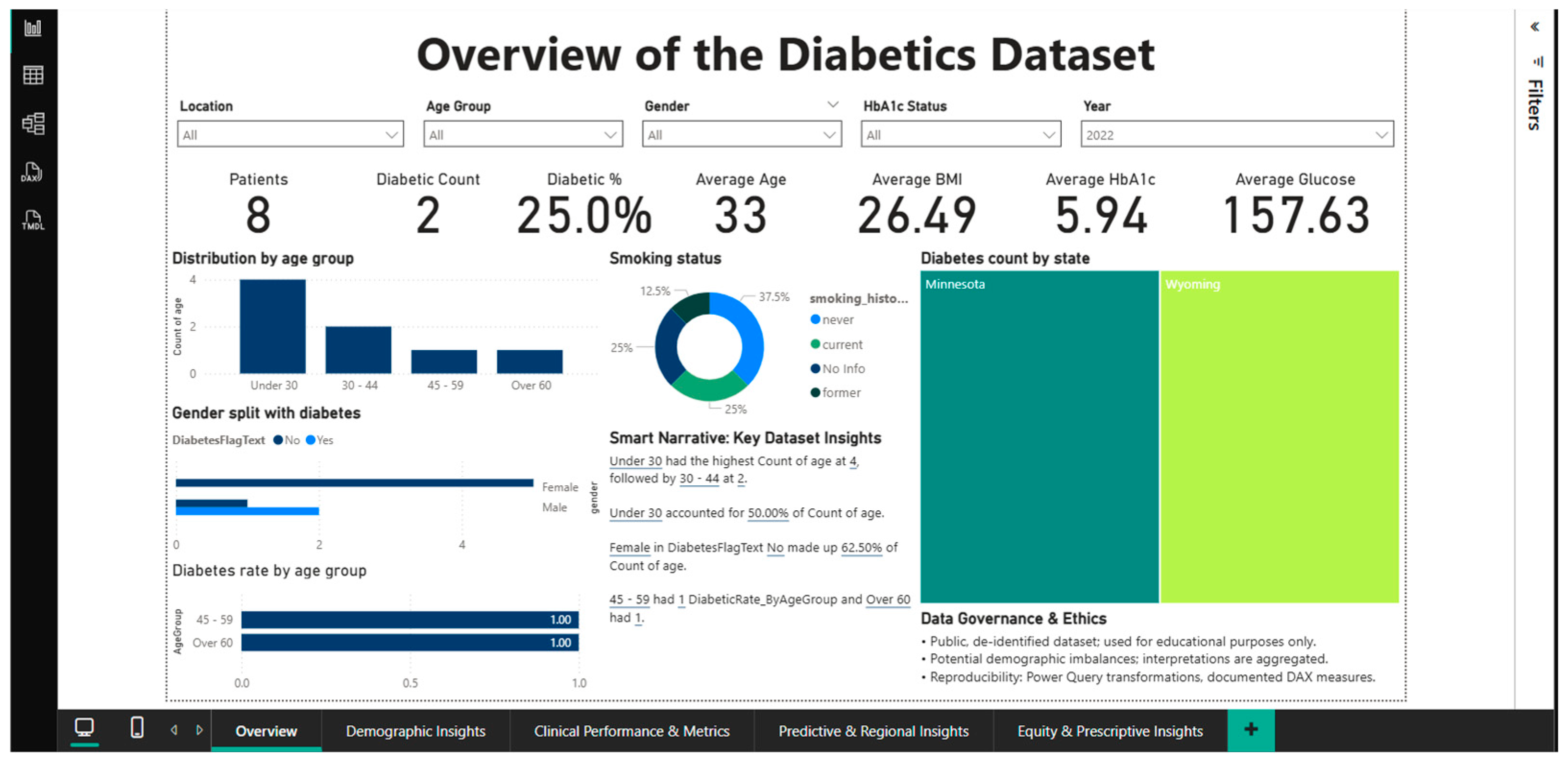
The Overview Dashboard (Figure 1) provides a complete synthesis of epidemiological and clinical indicators at the population level, serving as an entry point for exploring the analytical approach. The interface integrates six main KPI cards that instantly summarize the status of the cohort: a total of 100,000 patients, of which 8500 are diagnosed with diabetes, resulting in an overall prevalence of 8.5%. The complementary healthy person rate is 91.5%, while the average age of the studied population is 42 years.
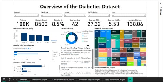
Figure 1.
Dashboard overview.
According to the WHO classification [2], the average BMI is 27.32, which is overweight; the average HbA1c level is 5.53%, which is within the normal range but near the prediabetes threshold; and the average blood glucose level is 138.06 mg/dL, which is marginally higher than the normal fasting blood glucose threshold of 100 mg/dL.
According to the age group distribution, the young adult (18–34 years old) group accounts for about 40% of the sample, with the 35–49, 50–64, and over 65 age groups following in decreasing order.
The rate increases exponentially with age, peaking in the over-65 age group, according to age-stratified diabetes prevalence analysis.
This pattern, which shows a progressive decline in insulin sensitivity and pancreatic beta cell function, supports the idea that aging is a major risk factor for the development of type 2 diabetes. The disease is far more common in men (9.75%) than in women (7.62%), which may indicate that biological or behavioral factors influence a person’s vulnerability to the illness. In this gender dimension, there are notable variations. A donut chart that divides the population into different groups and measures smoking status sheds light on the part that risky behaviors play in the epidemiology of diabetes.
The geographic distribution, which shows notable inter-state variations in the absolute number of diabetes cases, is depicted on a choropleth map of the United States.
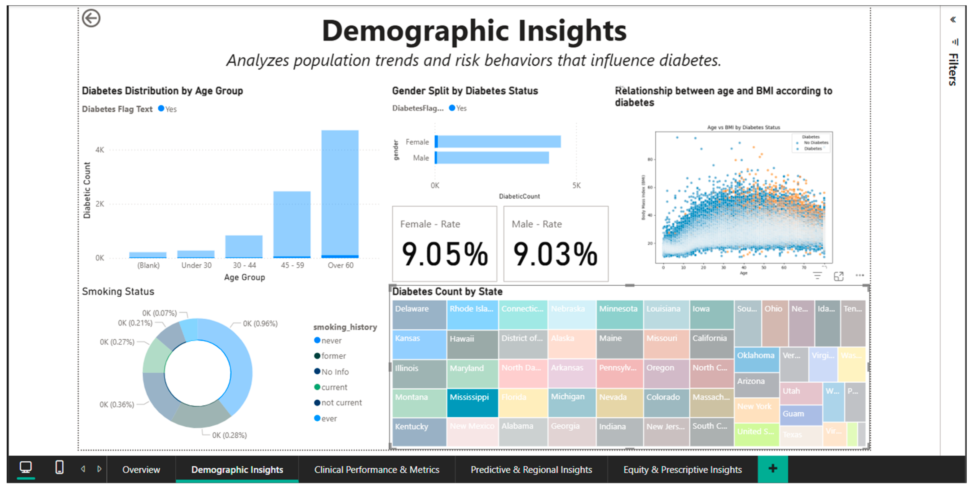
The second figure (Figure 2) displays a specific filtered scenario to demonstrate the dashboard’s interactive features. All KPI metrics and views are instantly altered when the filter for 2022 is applied, yielding a subset of just 8 patients for that time frame. The prevalence of diabetes increases to 25% (2 out of 8) and the mean age falls to 33 years in this small annual cohort. Consequently, the mean BMI is 26.49, the HbA1c is 5.94%, and the blood glucose level is 157.63 mg/dL.

Figure 2.
Dashboard overview—2022 filtering.
By combining filters (year, location, age, gender, and HbA1c status), physicians and management can quickly isolate and analyze specific cohorts. This multidimensional and temporal drill-down feature turns the dashboard from a static report into a dynamic analytical tool that can be tailored to specific decision-making needs, such as inter-period comparisons or yearly trend analyses.
Users are made fully aware that the data is de-identified, used exclusively for educational purposes, and that there may be demographic imbalances that need careful interpretation by the Data Governance & Ethics panel, which is prominently displayed at the bottom of the dashboard. This section highlights the dedication to ethical practices in the analysis of sensitive medical data and acts as a methodological disclaimer.
4.2. Demographic Insights Dashboard—Demographic Pattern Analysis
Once the epidemiological patterns of diabetes are broken down by age, gender, race, and risk behaviors, the Demographic Insights Dashboard (Figure 3) offers a comprehensive picture of the sociodemographic factors that contribute to the disease. Multiple graph types are integrated into the visual interface to enable direct comparisons between population subgroups and the identification of high-risk segments.
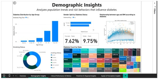
Figure 3.
Demographic Insights Dashboard—distributions by age, gender, and smoking status.
The age group of 18 to 34 has the lowest absolute numbers of cases, followed by the 35-to-49 and 50-to-64 age groups, with the over-65-year-old cohort exhibiting the largest increase.
This age-categorized vertical bar chart illustrates how the prevalence of diabetes increases exponentially with age. Since intensive screening and lifestyle modifications should be prioritized in the fourth and fifth decades of life, before the condition becomes clinically manageable, this age stratification aids in determining the ideal window of time for preventative actions.
Gender analysis reveals significant differences in prevalence: overall, men register a rate of 9.75%, while women register a rate of 7.62% (Figure 3), indicating a relative difference of about 28%. This disparity could be partially explained by variations in the distribution of adiposity (men are more likely to accumulate visceral fat, which increases metabolic risk) and health behaviors (men are less likely to be screened). A different view that accounts for other demographic factors is shown in Figure 4, where gender rates level off at roughly 9.05% for women and 9.03% for men. This suggests that the initial differences could be muddled by differences in the two groups’ racial composition or age distribution.

Figure 4.
Demographic Insights Dashboard—filtering on the state of Mississippi.
A biphasic scatterplot (shown in Figure 3 and Figure 4) that overlays the age-BMI axes with points representing patients with and without diabetes is used to examine the relationship between age and BMI based on diabetic status.
By demonstrating that diabetic patients, regardless of age, are more likely to be concentrated in the higher BMI range (>30), even though there is a significant overlap between the two groups, the visualization supports the role of obesity as an independent risk factor. By dividing the population into distinct groups (current, former, and never smokers), a donut chart that displays the distribution of smoking status provides important behavioral context for evaluating cumulative cardiovascular risk.
With an analysis restricted to the state of Mississippi, Figure 4 demonstrates the geographic filtering capability. Applying this spatial filter immediately modifies all demographic metrics, allowing the evaluation of this region’s distinct profile. With gender rates balancing out at roughly 9.05% for women and 9.03% for men in this small geographic cohort, it is possible that regionally specific cultural, socioeconomic, or health care access factors could significantly alter the gender disparities seen nationally across states.
Mississippi is visually highlighted on the choropleth geographic map, which makes it possible to place the state in the larger context of the US epidemiological landscape. For state-level public health initiatives, this geographic drill-down capability is crucial because it enables local officials to examine trends unique to their jurisdiction free from the influence of data from other areas.
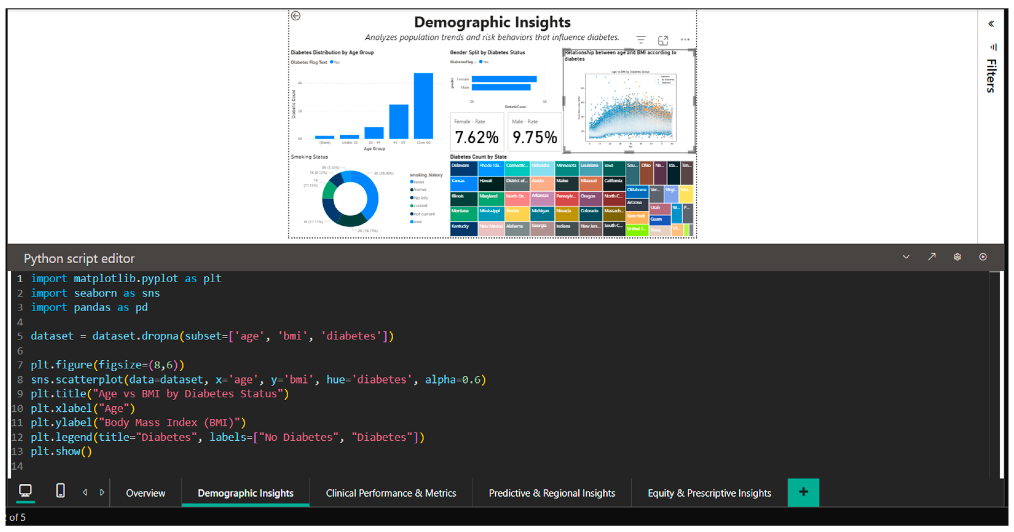
The illustration in Figure 5, which displays the seaborn code used to create the age-BMI scatterplot, demonstrates how Python capabilities can be integrated into Power BI. In order to handle overlapping points in dense areas, the Python script imports the pandas, matplotlib, and seaborn libraries, sets the figure size to (8,6), and generates a visualization with alpha = 0.6 transparency. By using different color palettes to visually distinguish between the two cohorts (diabetics and non-diabetics), the hue = ‘diabetes’ parameter facilitates the rapid identification of segregation patterns in the two-dimensional age-BMI space.
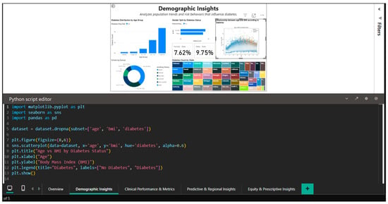
Figure 5.
Python editor in Power BI—generating age–BMI scatterplot with seaborn.
This Python integration extends Power BI’s native capabilities with advanced statistical visualizations designed for the data science community, demonstrating the platform’s versatility for complex exploratory analyses that go beyond the limitations of traditional charts.
This means that the Demographic Insights Dashboard functions as a population-level risk stratification tool, enabling the identification of vulnerable groups that necessitate the prioritization of prevention and management resources, such as elderly men with a high body mass index (BMI) or states like Mississippi with particular epidemiological profiles. Descriptive analysis becomes actionable intelligence for public health initiatives when it is possible to filter data simultaneously on several demographic and geographic dimensions.
4.3. Clinical Performance & Metrics Dashboard—Assessment of Metabolic Parameters and Comorbidities
To enable direct comparisons between the diabetic and non-diabetic cohorts, the Clinical Performance & Metrics Dashboard (Figure 6) offers a comprehensive understanding of the clinical indicators that characterize the metabolic and cardiovascular profile of the study population. The visual interface incorporates KPI cards with population-level aggregated values, including mean blood glucose of 138.06 mg/dL, mean BMI of 27.32, mean HbA1c of 5.53%, diabetes prevalence of 9% (rounded from 8.5%), and 100,000 total patients. The Risk Ratio for Hypertension of 0.39 is a crucial metric for evaluating cardiovascular risk, indicating a complicated relationship between diabetes and hypertension that needs more research.
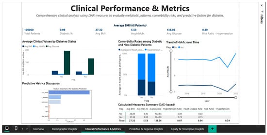
Figure 6.
Clinical Performance Dashboard—metabolic comparisons and cardiovascular comorbidities.
Significant differences are found in all important metabolic parameters when the mean clinical values of patients with and without diabetes are compared using a bar chart with grouped bars. According to WHO criteria, the diabetic cohort is moved from the overweight category to the class I obesity area by the mean BMI of 31.99 for flagged diabetic patients (Diabetes binary = 1), which is approximately 5.1 BMI points higher than the mean BMI of 26.89 for non-diabetics. The significantly worsened glycemic control in the affected group is reflected in the mean HbA1c level, which rises from 5.03% in non-diabetics to 6.53% in diabetics, a difference of 1.5 percentage points.
The greatest difference is seen in average blood glucose levels, which are 133.06 mg/dL in non-diabetics and 194.05 mg/dL in diabetics. This difference of more than 60 mg/dL demonstrates that dysregulation of glucose metabolism is a clear indicator of the disease.
The prevalence of risk factors in the two cohorts is measured by the analysis of cardiovascular comorbidities, which is shown as a stacked bar chart. The prevalence of hypertension is 5.6% in diabetics and 3% in non-diabetics, indicating an approximate 1.87 relative risk. With a risk ratio of more than six and a cardiovascular disease rate of 14.3% in the diabetic group compared to 2.3% in the non-diabetic group, it is clear that diabetes and ischemic heart disease are closely related. Regardless of other risk factors, these statistically supported values support the necessity of rigorous cardiovascular screening and preventive treatment with statins and antihypertensives for all diabetic patients.
A biphasic line chart showing the temporal trend of HbA1c from 2016 to 2022 sheds light on how glycemic control changed over time for both cohorts.
The line corresponding to diabetic patients (flagged) maintains a constant level around 6.5%, suggesting either stability of existing therapy or resistance to improved glycemic control in this population. The non-diabetic line remains stable at approximately 5.0%, confirming the absence of progression to prediabetes or diabetes in this group over the observed period. This longitudinal view is essential for assessing the effectiveness of diabetes management interventions at the population level and for detecting potential negative trends that would require public health interventions.
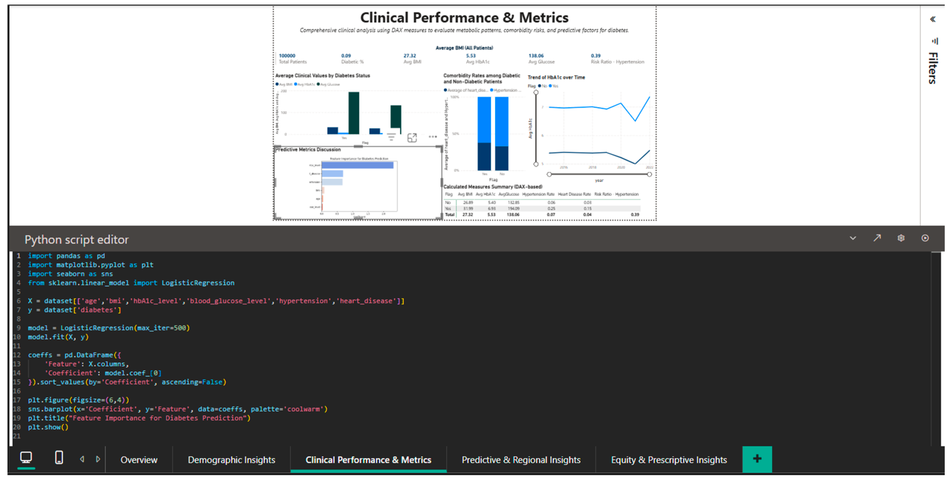
The integration of Python into Power BI is demonstrated in Figure 7, which shows an exploratory analytical script based on logistic regression from the scikit-learn library to illustrate the relative associations between selected clinical variables and diabetes status within the analyzed dataset. The script imports pandas for data manipulation, seaborn and matplotlib for visualization, and sklearn for the logistic regression model. The dataset is built with the variables: label (diabetes status), HbA1c_level, blood_glucose_level, hypertension, and heart_disease. After training the model, the regression coefficients are extracted and visualized through a seaborn bar plot that ranks the features by the magnitude of their impact on the prediction. The coefficients demonstrated in Figure 7 are not meant to indicate validated feature importance or predictive performance. Instead, they provide an exploratory, interpretable perspective of the relative relationships between selected clinical factors and diabetes status in the investigated dataset. The logistic regression model is only used as an analytical tool to enhance exploratory reasoning, and it demonstrates how traditional statistical models can be implemented in a business intelligence environment for contextual interpretation, in addition to descriptive analyses.
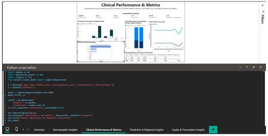
Figure 7.
Python editor—logistic regression coefficients used for exploratory analysis of clinical variable associations with diabetes status within the business intelligence framework.
This component is not responsible for model validation, performance evaluation, or comparison with baseline predictors because its goal is interpretability and integration within an interactive BI process rather than prediction accuracy.
In a clinical research or production deployment setting, the predictive layer would need clear training–testing separation, cross-validation processes, performance measures like AUC and sensitivity, and validation on independent datasets. These steps are purposely left out since the predictive component is intended mainly for exploratory interpretation inside the business intelligence workflow.
The Clinical Performance & Metrics Dashboard thus serves as a clinical benchmarking tool, allowing the assessment of gaps between current parameters and therapeutic targets recommended by international guidelines (e.g., HbA1c <7% for diabetics, BMI <25 for primary prevention). The ability to stratify patients based on the severity of comorbidities and metabolic values allows prioritization of resources towards segments with the highest cardiovascular risk, thus optimizing the efficiency of clinical interventions in the context of limited health system resources.
4.4. Predictive & Regional Insights Dashboard—Geographic Analysis and Predictive Correlations
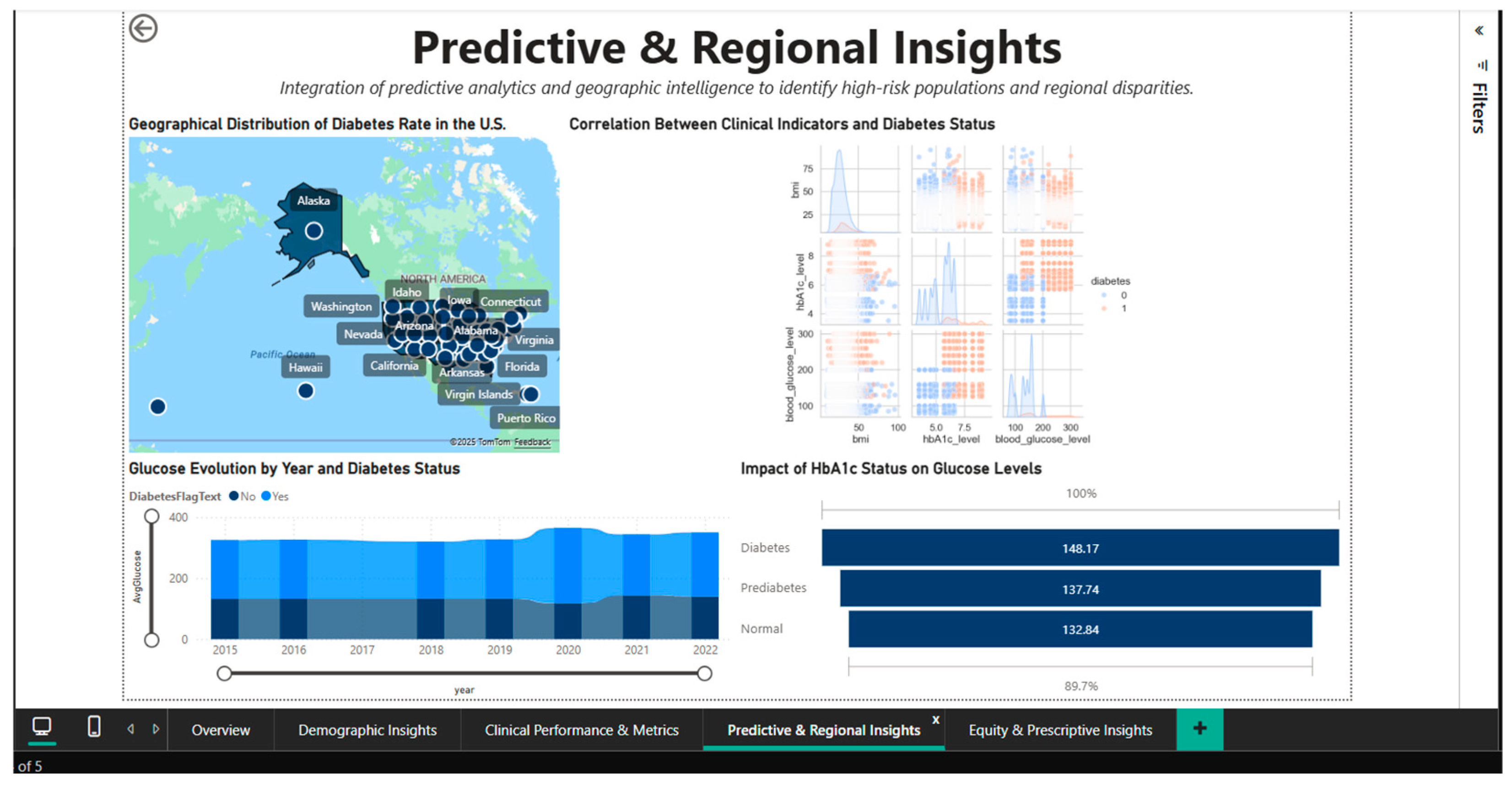
To discover regional differences and patterns of correlation between clinical biomarkers, the Predictive & Regional Insights Dashboard (Figure 8) combines predictive analytics and geographic intelligence. A choropleth map of the US that highlights the regional variations in disease prevalence by representing state-level diabetes rates using a color gradient serves as the main visual aid. It is possible to quickly identify states with higher or lower concentrations of cases visually thanks to this inhomogeneous geographic distribution, which suggests the influence of socioeconomic, cultural, and healthcare access factors that differ greatly between regions.
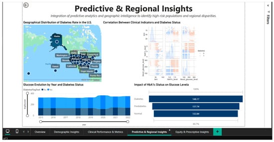
Figure 8.
Predictive & Regional Dashboard—geographic distribution and clinical correlations.
Located in the center of the dashboard, the correlation heatmap shows the quantitative relationships between three important clinical parameters: blood glucose, HbA1c, and diabetic status. The correlation matrix shows that blood glucose and HbA1c have strong positive associations (probable correlation coefficient > 0.7), indicating that these two biomarkers measure complementary aspects of the same metabolic disorder.
Blood glucose gauges the present condition, while HbA1c gauges long-term (3-month) glycemic control. The use of both metrics as monitoring and diagnostic tools is supported by their strong positive correlations with diabetes status. The creation of multivariable predictive models is informed by this visualization, which aids in understanding the structure of clinical interdependencies.
A bar chart with three categories, normal (132.84 mg/dL), prediabetes (137.74 mg/dL), and diabetes (148.17 mg/dL) is used to analyze and quantify the effect of HbA1c status on blood glucose levels. The blood glucose values’ linear progression through the three stages, with noticeable increases between categories, validates the metabolic continuum from normal to severe dysregulation.
The difference of approximately 15 mg/dL between the normal and diabetic statuses emphasizes the clinical significance of HbA1c classification and the need for intensive interventions in the prediabetes stage to prevent progression to overt diabetes.
A stacked bar chart that breaks down the annual volumes into the two cohorts shows the temporal evolution of blood glucose between 2015 and 2021, stratified by diabetic status. The distribution of diabetes cases over the course of seven years exhibits a relatively stable temporal pattern, with no discernible upward or downward trends. This suggests that management programs are consistently effective or that the new incidence and mortality rates in the diabetic population are dynamically balanced. For evaluating the effects of public health initiatives put into place during this time, a longitudinal viewpoint is crucial.
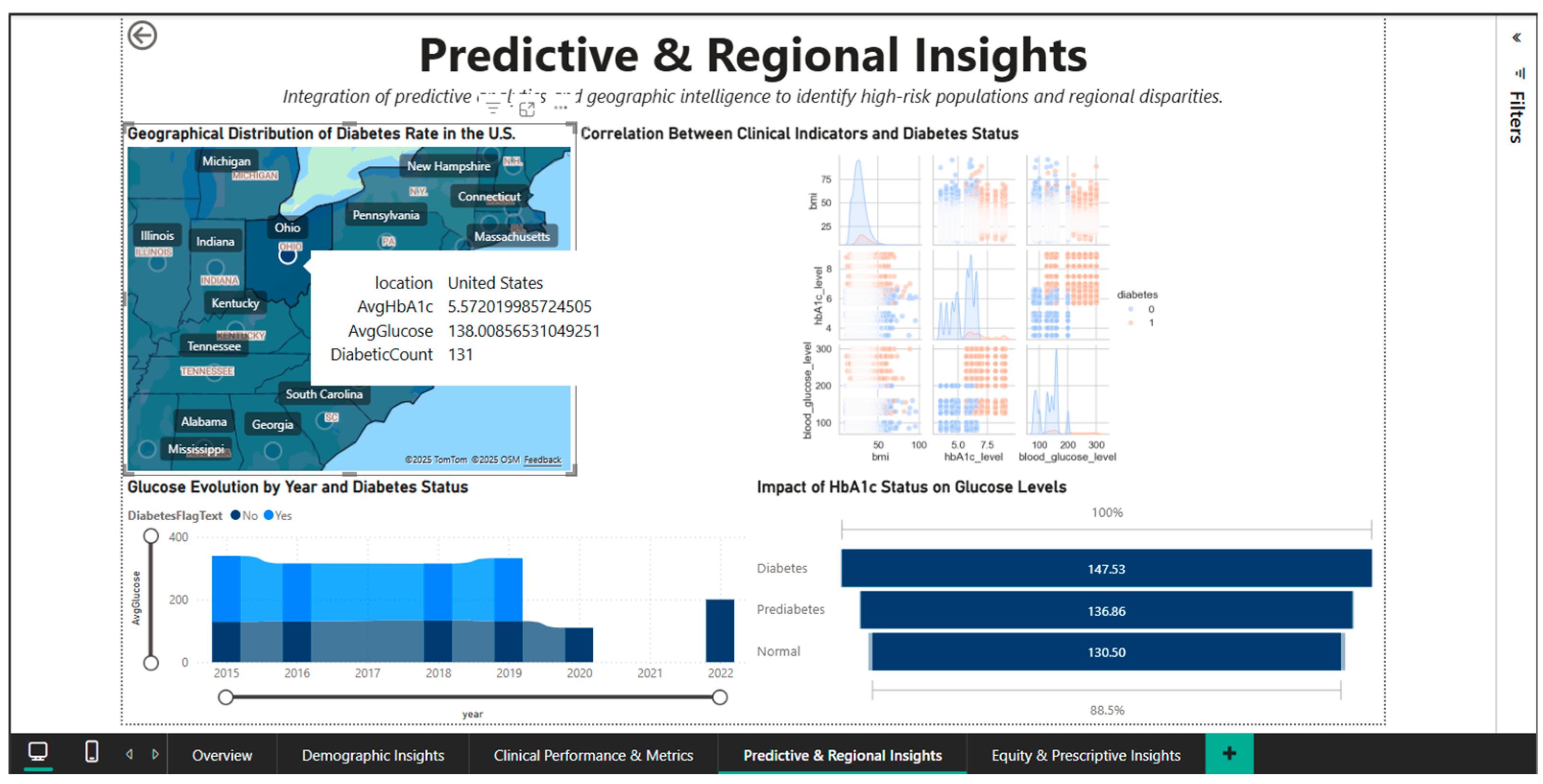
The geographic drill-down capability is demonstrated in Figure 9, which shows an interactive tooltip activated by hovering over the state of Ohio. The pop-up panel displays metrics specific to this region: AvgHbA1c of 5.57%, AvgGlucose of 138.01 mg/dL, and a DiabeticCount of 131 patients. Ohio’s HbA1c and blood glucose values are remarkably close to the national averages (5.53% and 138.06 mg/dL, respectively), suggesting that this state is close to the center of the national distribution, without extreme deviations. The relatively modest number of 131 diabetes cases in the dataset for Ohio reflects either the sample size in the Comprehensive Diabetes Clinical Dataset [1] for this state or a lower true prevalence compared to the “hotspots” in the Southeast. This contextual tooltip functionality allows users to quickly compare any state’s clinical profile with national benchmarks without leaving the main view, optimizing the efficiency of cross-state comparative analyses.

Figure 9.
Predictive & Regional Dashboard—interactive tooltip for Ohio.
The integration of Python into this dashboard is illustrated in Figure 10, which shows the seaborn script for generating a pairplot (matrix of scatter plots) of the relationships between HbA1c_level and blood_glucose_level, stratified by the diabetes variable. The code sets the seaborn style to ‘whitegrid’ and the context to ‘talk’ for visual optimization, uses the ‘coolwarm’ color palette to differentiate the two cohorts and specifies kind = ‘kde’ for overlaying the estimated kernel densities on the scatter plots. The plot_kws = {‘s’: 0.6} parameter adjusts the point size to handle overplotting in high density areas. The result is a multi-panel visualization that allows simultaneous observation of marginal distributions (diagonal histograms), bivariate scatter plots, and kernel densities, providing a complete perspective on the correlational structure.
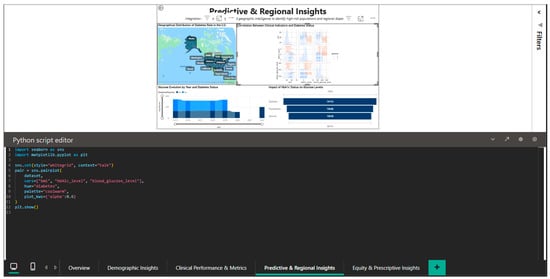
Figure 10.
Python editor—pairplot for exploring HbA1c–blood glucose correlations.
Finding non-linear patterns and outliers that might be obscured by straightforward univariate analyses requires the use of this exploratory data analysis technique.
Therefore, the Predictive & Regional Insights Dashboard serves as a geographic and analytical intelligence tool that enables the understanding of the predictive mechanisms by which clinical biomarkers can predict the onset of diabetes and the identification of high-risk areas that require resources to be allocated there first.
Raw data can be transformed into valuable insights for planning national and regional public health interventions through correlational analysis and geographic visualizations.
4.5. Equity & Prescriptive Insights Dashboard—Disparity Analysis and Targeted Recommendations
The Equity & Prescriptive Insights Dashboard (Figure 11) addresses the critical component of health equity by merely examining racial and gender disparities in diabetes prevalence. It offers scenario-driven analytics to pinpoint vulnerable groups and create culturally relevant interventions. The primary KPI cards provide the reference context for inter-group comparisons by summarizing the population-level metrics: 100,000 total patients, an 8.5% diabetes prevalence, a mean HbA1c of 5.53%, and a mean blood glucose of 138.06 mg/dL.
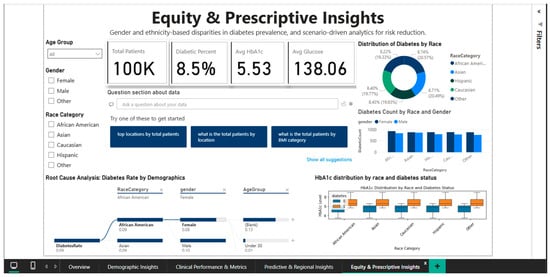
Figure 11.
Equity & Prescriptive Dashboard—racial disparities and root cause analysis.
The equity-related results should be taken with caution because the dataset uses simplified racial classifications and excludes critical socioeconomic variables including income, education, and healthcare access. As a result, the observed discrepancies are based on aggregated dataset connections rather than causative links or full representations of health inequalities.
A pie chart showing the distribution of diabetes prevalence by racial category shows notable ethnic variation: the highest prevalence is 9.39% among Caucasians, followed by Asians (8.74%), African Americans (8.22%), and Hispanics (7.08%). The current epidemiological literature, which frequently reports higher rates in African American and Hispanic populations, partially contradicts this hierarchy. Either particular features of the Comprehensive Diabetes Clinical Dataset [1] or the inherent limitations of broad racial categories that conceal significant internal diversity could be the cause of the disparity (for example, the category “Asian” includes subpopulations with very different risk levels: high-risk South Asians versus lower-risk East Asians).
The analysis stratified by gender and race, represented by a combined bar chart, decomposes the prevalence into eight segments resulting from the intersection of the four racial groups with the two gender categories. The visualization allows the identification of the highest-risk segments (e.g., Caucasian men or Asian women) who could benefit from intensive screening and targeted prevention programs. The root cause analysis panel present in the dashboard provides a hierarchical decomposition of the contributing factors to the diabetes rate of 0.09, stratifying by age (under 30 years versus 30–44 years), and highlighting that younger groups present higher rates than those of middle age, an unexpected pattern that requires further investigation to exclude potential artifacts of the data structure.
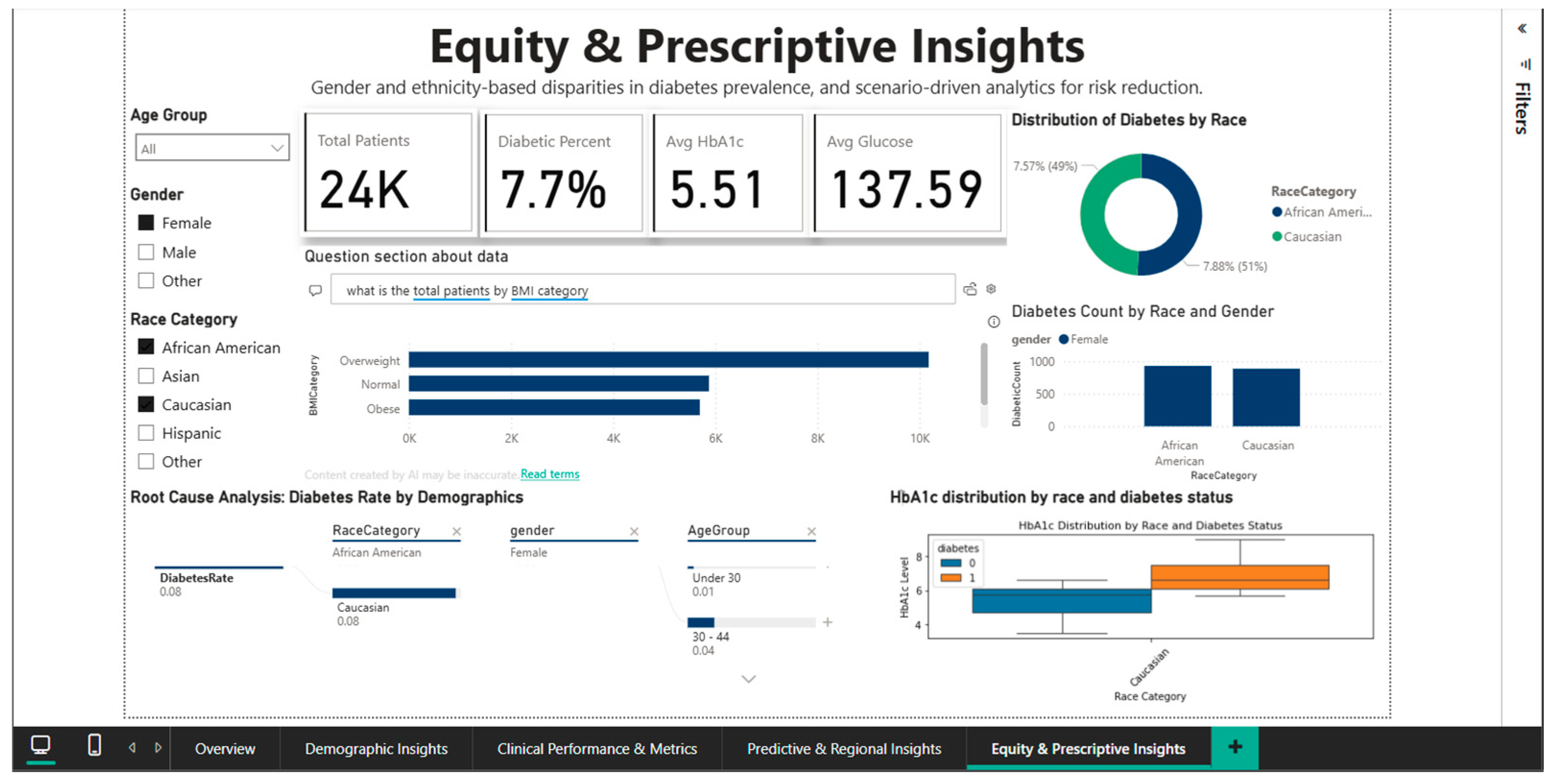
The ability to filter out specific demographic subgroups is demonstrated by Figure 12, which applies simultaneous filters for African American and Caucasian race and female gender. This narrowed subset includes 24,000 patients, with a diabetes prevalence of 7.7%, mean HbA1c of 5.51%, and mean blood glucose of 137.59 mg/dL. Direct comparison between the two racial groups in this female cohort shows very close rates: 7.57% for African American women versus 7.88% for Caucasian women, suggesting that racial disparities observed nationally may be substantially confounded by gender, indicating the need for intersectional analyses that simultaneously consider multiple demographic dimensions. Root cause analysis for this filtered subset shows a diabetes rate of 0.08 for both racial groups in the under-30 age category, decreasing to 0.04 in the 30–44 age group, again confirming the counterintuitive pattern of higher prevalence in younger and elderly women that requires validation in independent datasets.
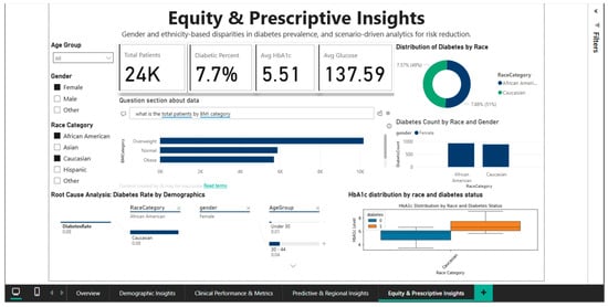
Figure 12.
Equity & Prescriptive Dashboard—African American vs. Caucasian (female) comparison.
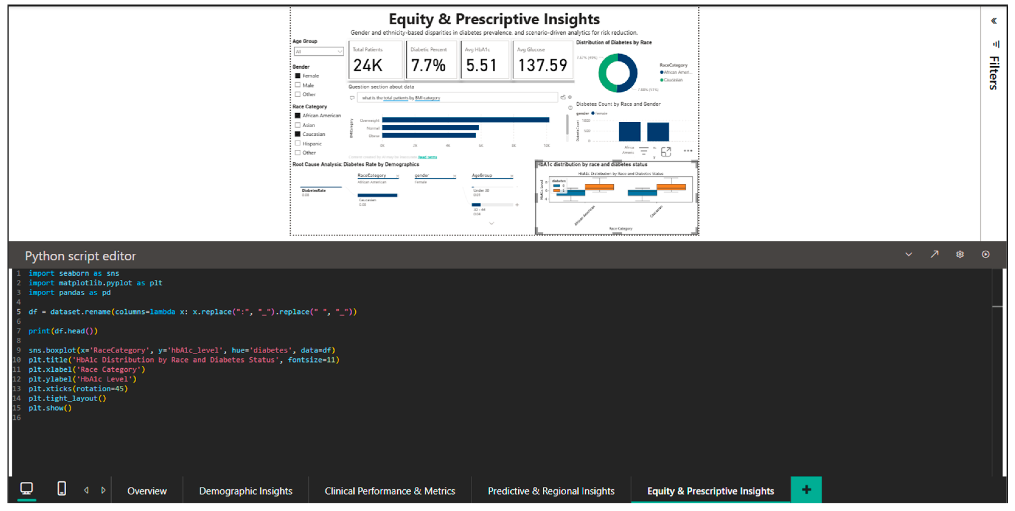
The integration of Python into this dashboard is illustrated by Figure 13, which shows the script for generating a boxplot of the HbA1c distribution by race and diabetic status.
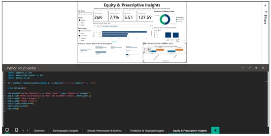
Figure 13.
Python editor—boxplot for HbA1c distribution by race and diabetes status.
The code generates a boxplot that stratifies HbA1c on the race (x-axis) and diabetic status (hue) axes using the pandas library for data manipulation and matplotlib and seaborn for visualization. Font size changes for labels and titles are among the customization options that guarantee the best possible readability within the Power BI dashboard. This visualization highlights possible differences in glycemic control that may reflect differences in treatment access or adherence by enabling simultaneous comparisons between the four racial groups and between diabetics and non-diabetics within each group. By showing the median, quartiles, and outliers, the boxplot offers a more nuanced view than straightforward mean comparisons and can spot highly variable segments that might point to uneven care quality.
Instead of using automated decision rules, this system provides prescriptive support through scenario-based analytical guidance. Examples include prioritizing screening programs for demographic segments with elevated HbA1c distributions, allocating preventive education resources to regions with persistently high prevalence, and promoting guideline-based follow-up strategies for cohorts clustered near diagnostic thresholds. Specific interventions are still selected and implemented by physicians or policymakers, and the system does not automate this process.
That means public health policymakers can prioritize resources for vulnerable populations and modify preventive messages to the cultural contexts unique to each demographic group by using the Equity & Prescriptive Insights dashboard as a tool for identifying systemic inequities and creating equitable interventions.
The limitations of the data, including the absence of information on health insurance access, education, and income, call for careful interpretation and emphasize the necessity of future framework enrichment with socioeconomic variables that explain the causal mechanisms behind the observed disparities.
4.6. Limitations, Practical Implications, and Future Directions
A cross-sectional layout of the Comprehensive Diabetes Clinical Dataset [1] complicates the identification of causal relationships between the variables being studied and the course of the disease. The descriptive method employed in this study provides a static view of diabetes management without accounting for the longitudinal dynamics of disease progression or response to therapeutic interventions. Future studies should use longitudinal data to ascertain the actual impact of telemedicine interventions on long-term clinical outcomes, such as preventing complications and preserving optimal glycemic control.
A further major weakness in the framework is that some of its elements, specifically, its machine learning capabilities for diabetes risk prediction, are simulated. Although predictive models have been developed and integrated into the dashboard architecture (Figure 8 and Figure 9), they are not experimentally validated and should not be interpreted as clinically deployable prediction tools. Their role in the framework is essentially demonstrative, with the goal of demonstrating how interpretable machine learning techniques can be integrated into a business intelligence environment to enable exploratory and analytical reasoning.
In order to facilitate adoption in actual clinical settings, this validation should involve assessing the models’ performance on a variety of populations, examining potential algorithmic biases, and making sure the predictions are explainable.
The dataset’s statistical power and the generalizability of the findings may be impacted by the comparatively small size of some demographic subgroups, especially for specific racial and comorbidity combinations.
Significant racial and regional group differences are shown in Figure 6, Figure 8 and Figure 9, but the interpretation of these findings must account for potential confounding variables that may not be in the data, such as variations in socioeconomic status, treatment adherence, or access to healthcare. A more comprehensive understanding of the mechanisms underlying the observed disparities may be obtained by extending the analyses to incorporate social determinants of health [27]. Furthermore, the integration of advanced business intelligence frameworks with AI-driven data modeling methodologies [28] could enhance the systematic capture, integration, and analysis of complex multidimensional health determinants from diverse data sources, enabling more robust predictive models and supporting the scalability required for enterprise-level chronic disease management systems.
Practically speaking, the solution shows how Power BI can be used as an approachable platform to apply BI solutions in diabetes management, lowering the financial and technological barriers for mid-sized healthcare organizations.
For the reason of the dashboard’s modular design, interfaces can be customized to meet the specific needs of different user types, such as managers who monitor performance indicators at the cohort level, clinicians who require detailed patient-level data, and policymakers who assess disparities at the population level.
A crucial component of the framework’s actual implementation is incorporating it into current clinical workflows. Integration solutions that link Power BI dashboards with EHR (electronic health record) systems, continuous glucose monitoring platforms, and mobile self-monitoring applications are necessary in order to fully utilize the vast amounts of structured and unstructured data produced by current telemedicine systems. This integration would enable proactive interventions based on alerts generated by the BI system and real-time updating of clinical indicators.
The ethical concerns related to the use of clinical data in BI solutions require ongoing attention, especially when risk prediction is being carried out using machine learning algorithms. Because algorithmic bias has the potential to exacerbate or reinforce existing healthcare disparities, it must be addressed by regularly auditing model performance on demographic subgroups and implementing explainability mechanisms that enable clinicians to understand and validate the system’s recommendations.
Compliance with data protection regulations (GDPR, HIPAA) remains essential to safeguard patient privacy and promote trust in digital health solutions.
Subsequent investigations ought to concentrate on broadening the scope of the solution by incorporating supplementary data sources, like genomic information, social determinants of health [28], or innovative biomarkers for more accurate risk classification. Using sophisticated predictive models that integrate machine learning with medical expertise could increase the precision of identifying high-risk patients and enable the customization of treatment plans. Furthermore, the BI system would change from a descriptive tool to an adaptive decision-support platform that learns and improves over time if dynamic feedback mechanisms were developed that enable dashboards to be updated continuously based on observed clinical outcomes.
5. Conclusions
The study’s objectives were met as follows: (i) a comprehensive business intelligence architecture for diabetes telemedicine was designed and implemented; (ii) exploratory predictive components were embedded within interactive dashboards to support analytical reasoning; (iii) equity-oriented analyses were operationalized to enable scenario-based decision support; and (iv) full methodological transparency ensured the frame’s reproducibility and transferability.
This study demonstrates the ability of contemporary BI platforms to convert raw medical data into actionable intelligence for various stakeholders in the healthcare ecosystem by demonstrating the viability and usefulness of creating a comprehensive business intelligence framework for diabetes management using Microsoft Power BI. Five interactive dashboards covering complementary dimensions were produced by applying the methodology to the Comprehensive Diabetes Clinical Dataset [1] with 100,000 patients. These dashboards included information on general epidemiological insights, stratified demographic analysis, clinical assessment of comorbidities, predictive geographic intelligence, and equity disparities.
The findings support epidemiological trends reported in the literature, including an 8.5% global prevalence, exponential age-related growth, notable gender differences (9.75% men versus 7.62% women), and robust associations between metabolic parameters (BMI, HbA1c, and glycemia) and the presence of diabetes.
An examination of cardiovascular comorbidities shows that the rates of heart disease in diabetics are more than six times higher than those in non-diabetics (14.3% versus 2.3%).
This demonstrates why this population requires stringent cardiovascular screening procedures. An analysis of racial disparities shows notable variation across ethnic groups, with rates ranging from 7.08% (Hispanics) to 9.39% (Caucasians), despite the dataset’s lack of socioeconomic variables restricting the ability to interpret these differences causally.
This study’s primary contributions are found where BI technology and medicine meet: (1) integrating Python capabilities for advanced statistical visualizations (scatterplots, correlation heatmaps, feature importance analysis) that go beyond the capabilities of native Power BI charts; (2) implementing a transparent architecture that strikes a balance between educational simplicity and practical utility; (3) demonstrating interactive temporal, geographic, and demographic drill-down functionalities that turn static reports into dynamic exploratory tools; and (4) complete reproducibility through thorough documentation of Power Query transformations and 35 DAX measures arranged into five functional categories.
Identified limitations include the cross-sectional nature of the data that precludes causal inferences, the absence of socioeconomic variables that would explain the mechanisms of the observed disparities, limited generalizability outside of a United States context, and the simplified single-table architecture, which would require refactoring for large-scale production deployments. These are partially offset by pragmatic benefits: modest implementation costs (Power BI Pro at ~$10/user/month), an accessible learning curve for practitioners without an advanced programming background, and full reproducibility which allows the framework to be replicated by any healthcare organization with access to Microsoft Power BI Desktop. The practical implications are immediate and multiple: clinical management can stratify patients by risk and prioritize limited resources towards vulnerable segments, telemedicine can remotely monitor large cohorts of patients with automatic updates from connected IoT devices, public health authorities can efficiently allocate resources to geographic regions with increased epidemiological burden, and researchers can use the platform as an exploratory tool for generating hypotheses on complex observational data. The extensibility of the framework to other chronic diseases (hypertension, cardiovascular disease, and obesity) and future integration with predictive ML models for early identification of patients at high risk of decompensation are natural directions of evolution that would amplify the impact of the system.
In conclusion, this study contributes to the growing literature on digital transformation in healthcare by demonstrating that commercial BI platforms, when rigorously applied with transparent methodology and deep understanding of the clinical context, can become democratized tools for analyzing medical data, accessible not only to academic centers with extensive resources, but also to community hospitals, private clinics and public health organizations in emerging economies. The ability to transform historical data into actionable intelligence in real time, combined with modest costs and complete reproducibility, positions BI as an essential component of telemedicine and chronic disease management ecosystems in the post-pandemic era.
Author Contributions
Conceptualization, E.-A.P., G.M. and C.-R.-M.I.; methodology, E.-A.P., G.M. and C.-R.-M.I.; software, E.-A.P., G.M. and C.-R.-M.I.; validation, E.-A.P., G.M. and C.-R.-M.I.; formal analysis, E.-A.P., G.M. and C.-R.-M.I.; investigation, E.-A.P., G.M. and C.-R.-M.I.; data curation, E.-A.P., G.M. and C.-R.-M.I.; writing—original draft preparation, E.-A.P., G.M. and C.-R.-M.I.; writing—review and editing, E.-A.P., G.M. and C.-R.-M.I.; Visualization, E.-A.P., G.M. and C.-R.-M.I. All authors have read and agreed to the published version of the manuscript.
Funding
This work was supported by a grant from the Romanian Ministry of Research, Innovation and Digitalization, the project with the title “Economics and Publicly Options for Climate Change Risk and Global Environmental Governance” (CF 193/28.11.2022, Funding Contract No. 760078/23.05.2023), within Romania’s National Recovery and Resilience Plan (PNRR)—Pil-lar III, Component C9, Investment 18 (PNRR/2022/C9/MCID/I8)—Development of a program to attract highly specialized human resources from abroad in research, development and innovation activities.
Data Availability Statement
The original data presented in the study are openly available in Kaggle at https://www.kaggle.com/datasets/priyamchoksi/100000-diabetes-clinical-dataset (accessed on 18 October 2025) (Comprehensive Diabetes Clinical Dataset, referenced as [1] in the manuscript). The Power BI Desktop file (.pbix) containing all transformations, DAX measures, and dashboard implementations is available upon reasonable request from the corresponding author.
Acknowledgments
This work was conducted as associate members of ECREB-East European Center for Research in Economics and Business, Faculty of Economics and Business Administration, West University of Timisoara.
Conflicts of Interest
The author declares no conflicts of interest.
Abbreviations
The following abbreviations are used in this manuscript:
| Acronym | Full Form |
| BI | Business Intelligence |
| BMI | Body Mass Index |
| DAX | Data Analysis Expressions |
| GDPR | General Data Protection Regulation |
| HbA1c | Hemoglobin A1c (Glycated Hemoglobin) |
| HIPAA | Health Insurance Portability and Accountability Act |
| IoT | Internet of Things |
| KPI | Key Performance Indicator |
| ML | Machine Learning |
| WHO | World Health Organization |
References
- Choksi, P. 100,000 Diabetes Clinical Dataset; Kaggle: San Francisco, CA, USA, 2024; Available online: https://www.kaggle.com/datasets/priyamchoksi/100000-diabetes-clinical-dataset (accessed on 18 October 2025).
- World Health Organization. Global Report on Diabetes; World Health Organization: Geneva, Switzerland, 2016; Available online: https://www.who.int/publications/i/item/9789241565257 (accessed on 18 October 2025).
- Ramesh, J.; Aburukba, R.; Sagahyroon, A. A Remote Healthcare Monitoring Framework for Diabetes Prediction Using Machine Learning. Healthc. Technol. Lett. 2021, 8, 2021. Available online: https://ietresearch.onlinelibrary.wiley.com/doi/full/10.1049/htl2.12010 (accessed on 18 October 2025).
- American Diabetes Association. Standards of Medical Care in Diabetes 2023. Diabetes Care 2023, 46, S1–S291. [Google Scholar] [CrossRef] [PubMed]
- Hollander, J.E.; Carr, B.G. Virtually Perfect? Telemedicine for COVID-19. N. Engl. J. Med. 2020, 382, 1679–1681. [Google Scholar] [CrossRef]
- Power, D.J. A Brief History of Decision Support Systems. DSSResources.com 2007, Version 4.1. Available online: http://DSSResources.COM/history/dsshistory.html (accessed on 19 October 2025).
- Chen, H.; Chiang, R.H.L.; Storey, V.C. Business Intelligence and Analytics: From Big Data to Big Impact. MIS Q. 2012, 36, 1165–1188. [Google Scholar] [CrossRef]
- Karami, M.; Rahimi, A.; Shahmirzadi, A.H. Clinical Data Warehouse: An Effective Tool to Create Intelligence in Disease Management. Healthc. Manag. 2017, 36, 380–384. Available online: https://journals.lww.com/healthcaremanagerjournal/abstract/2017/10000/clinical_data_warehouse__an_effective_tool_to.12.aspx (accessed on 22 October 2025). [CrossRef]
- Raghupathi, W.; Raghupathi, V. Big data analytics in healthcare: Promise and potential. Health Inf. Sci. Syst. 2014, 2, 3. [Google Scholar] [CrossRef]
- Stadler, J.G.; Donlon, K.; Siewert, J.D.; Franken, T.; Lewis, N.E. Improving the Efficiency and Ease of Healthcare Analysis Through Use of Data Visualization Dashboards. Big Data 2016, 4, 129–135. [Google Scholar] [CrossRef]
- Ghazisaeedi, M.; Ahmadi, M.; Sadoughi, F.; Safdari, R. An Assessment of Performance Dashboards in Healthcare Organizations: Key Practical Issues. Acta Inform. Med. 2015, 23, 317–321. [Google Scholar] [CrossRef]
- Khalifa, M.; Khalid, P. Developing Strategic Health Care Key Performance Indicators: A Case Study on a Tertiary Care Hospital. Procedia Comput. Sci. 2015, 63, 459–466. [Google Scholar] [CrossRef]
- Microsoft Corporation. Microsoft Power BI Desktop; Microsoft Corporation: Redmond, WA, USA, 2024; Available online: https://powerbi.microsoft.com (accessed on 20 October 2025).
- Fazakis, N.; Kocsis, O.; Dritsas, E.; Alexiou, S.; Fakotakis, N.; Moustakas, K. Machine Learning Tools for Long-Term Type 2 Diabetes Risk Prediction. IEEE Access 2021, 9, 103737–103757. [Google Scholar] [CrossRef]
- Butt, U.M.; Letchmunan, S.; Ali, M.; Hassan, F.H.; Baqir, A.; Sherazi, H.H.R. Machine Learning Based Diabetes Classification and Prediction for Healthcare Applications. J. Healthc. Eng. 2021, 2021, 9930985. [Google Scholar] [CrossRef]
- Lynam, A.L.; Dennis, J.M.; Owen, K.R.; Oram, R.A.; Jones, A.G.; Shields, B.M.; Hattersley, A.T. Logistic Regression Has Similar Performance to Optimised Machine Learning Algorithms in a Clinical Setting: Application to the Discrimination Between Type 1 and Type 2 Diabetes in Young Adults. Diagn. Progn. Res. 2020, 4, 6. [Google Scholar] [CrossRef]
- Gündoğdu, S. Efficient Prediction of Early-Stage Diabetes Using XGBoost Classifier with Random Forest Feature Selection Technique. Multimed. Tools Appl. 2023, 82, 32405–32423. [Google Scholar] [CrossRef] [PubMed]
- Zhuang, M.; Concannon, D.; Manisa, K.; Mathews, S.C.; Wang, F.; Brotman, D.; Hester, S.; Kharrazi, H.; Elkanan, O. A Framework for Evaluating Dashboards in Healthcare. IEEE Trans. Vis. Comput. Graph. 2022, 28, 5353–5364. Available online: https://ieeexplore.ieee.org/abstract/document/9721816 (accessed on 26 October 2025). [CrossRef] [PubMed]
- Luo, Y. Evaluating the State of the Art in Missing Data Imputation for Clinical Data. Brief. Bioinform. 2022, 23, bbab489. [Google Scholar] [CrossRef]
- Rabiei, R.; Bastani, P.; Ahmadi, H.; Dehghan, S.; Almasi, S. Developing Public Health Surveillance Dashboards: A Scoping Review on the Design Principles. BMC Public Health 2024, 24, 439. [Google Scholar] [CrossRef]
- Kautzky-Willer, A.; Harreiter, J.; Pacini, G. Sex and Gender Differences in Risk, Pathophysiology and Complications of Type 2 Diabetes Mellitus. Endocr. Rev. 2016, 37, 278–316. [Google Scholar] [CrossRef]
- Alzahrani, S.H.; Baig, M.; Aashi, M.M.; Al-Shaibi, F.K.; Alqarni, D.A.; Bakhamees, W.H. Association Between Glycated Hemoglobin (HbA1c) and the Lipid Profile in Patients with Type 2 Diabetes Mellitus at a Tertiary Care Hospital: A Retrospective Study. Diabetes Metab. Syndr. Obes. 2019, 12, 1639–1644. [Google Scholar] [CrossRef]
- Harris, M.I.; Eastman, R.C.; Cowie, C.C.; Flegal, K.M.; Eberhardt, M.S. Racial and Ethnic Differences in Glycemic Control of Adults with Type 2 Diabetes. Diabetes Care 1999, 22, 403–408. [Google Scholar] [CrossRef]
- European Union. Regulation (EU) 2016/679 of the European Parliament and of the Council of 27 April 2016 on the Protection of Natural Persons with Regard to the Processing of Personal Data and on the Free Movement of Such Data (General Data Protection Regulation). Off. J. Eur. Union 2016, L119, 1–88. Available online: https://eur-lex.europa.eu/eli/reg/2016/679/oj (accessed on 6 November 2025).
- World Medical Association. World Medical Association Declaration of Helsinki: Ethical principles for medical research involving human subjects. JAMA 2013, 310, 2191–2194. [Google Scholar] [CrossRef] [PubMed]
- U.S. Department of Health & Human Services. Health Insurance Portability and Accountability Act (HIPAA); HHS.gov: Washington, DC, USA, 1996. Available online: https://www.hhs.gov/hipaa/index.html (accessed on 7 November 2025).
- Hill-Briggs, F.; Adler, N.E.; Berkowitz, S.A.; Chin, M.H.; Gary-Webb, T.L.; Navas-Acien, A.; Thornton, P.L.; Haire-Joshu, D. Social determinants of health and diabetes: A scientific review. Diabetes Care 2020, 44, 258–279. Available online: https://pmc.ncbi.nlm.nih.gov/articles/PMC7783927/ (accessed on 7 November 2025). [CrossRef] [PubMed]
- Vines, A.; Bologa, A.-R.; Bostan, A.-I. Enabling Intelligent Data Modeling with AI for Business Intelligence and Data Warehousing: A Data Vault Case Study. Systems 2025, 13, 811. Available online: https://www.mdpi.com/2079-8954/13/9/811 (accessed on 8 November 2025). [CrossRef]
Disclaimer/Publisher’s Note: The statements, opinions and data contained in all publications are solely those of the individual author(s) and contributor(s) and not of MDPI and/or the editor(s). MDPI and/or the editor(s) disclaim responsibility for any injury to people or property resulting from any ideas, methods, instructions or products referred to in the content. |
© 2026 by the authors. Licensee MDPI, Basel, Switzerland. This article is an open access article distributed under the terms and conditions of the Creative Commons Attribution (CC BY) license.


