You are currently viewing a new version of our website. To view the old version click .
ISPRS International Journal of Geo-Information
  • Article
  • Open Access

1 September 2023

LBS Tag Cloud: A Centralized Tag Cloud for Visualization of Points of Interest in Location-Based Services

,
,
and
1
Faculty of Resources and Environmental Science, Hubei University, Wuhan 430062, China
2
Key Laboratory of Urban Land Resources Monitoring and Simulation, Ministry of Natural Resources, Shenzhen 518034, China
3
State Key Laboratory of Information Engineering in Surveying, Mapping and Remote Sensing, Wuhan University, Wuhan 430072, China
*
Author to whom correspondence should be addressed.
This article belongs to the Special Issue Application of Geographical Information System in Urban Design, Management or Evaluation

Abstract

Taking location-based service (LBS) as the research scenario and aiming at the limitation of visualizing LBS points of interest (POI) in conventional web maps, this article proposes a visualization method of LBS-POI based on tag cloud, which is called “LBS tag cloud”. In this method, the user location is taken as the layout center, and the name of the POI is converted into a text tag and then placed around the center. The tags’ size, color, and placement location are calculated based on other attributes of the POI. The calculation of placement location is at the core of the LBS tag cloud. Firstly, the tag’s initial placement position and layout priority are calculated based on polar coordinates, and the tags are placed in the initial placement position in the order of layout priority. Then, based on the force-directed model, a repulsive force is applied to the tag from the layout center to make it move to a position without overlapping with other tags. During the move, the quadtree partition of the text glyph is used to optimize the detection of overlaps between tags. Taking scenic spots as an example, the experimental results show that the LBS tag cloud can present the attributes and distribution of POIs completely and intuitively and can effectively represent the relationship between the POIs and user location, which is a new visualization form suitable for spatial cognition.

1. Introduction

With the development of mobile Internet and positioning technology, location-based services (LBS) have become the most popular spatial information service [,,]. In the information resources provided by LBS, points of interest (POI) are often the focus of users due to their important social functions, such as restaurants, hotels, parking lots, etc. []. In urban areas with high population densities, there are many POIs, and it is usually difficult for normal users to explore surrounding POIs quickly and comprehensively []. For this problem, some studies focused on information retrieval, e.g., recommending more relevant POIs according to user interests, preferences, and context [,]; the other studies concerned visualization of POIs, e.g., using spatial visualization and other methods to construct interactive forms suitable for user cognition [,]. This paper focuses on the latter and proposes a novel tag cloud for the visualization of POI in LBS.
Since the POI contains geographical locations, conventional visualization methods are almost all map-based. The map uses graphic symbols and map labels to visualize each POI, which can intuitively display the spatial distribution of POIs. However, such methods have a common problem: it is difficult to take into account the global context and local details []. In simple terms, a small-scale map can show the whole distribution of all POIs, but it cannot convey the local details; a large-scale map can display the local details but cause a loss of the map’s context. When users want to obtain an overview of the big picture, they tend to use a small-scale map to show as many POIs as possible. However, this leads to a common problem: a large number of POIs can create symbol congestion or conflicts that make it difficult to identify individual POIs. While map zooming alleviates these issues, it results in a loss of map context and can also cause users to get lost in zooming []. Researchers have designed a variety of methods, such as selection, aggregation [], displacement [], density surface fitting [], pagination design [], and multi-level structure [], to achieve legible visualization of POIs, but such methods lead to a very limited number of POIs that are visualized simultaneously on the map, which is not conducive to the user’s complete understanding of the surrounding environment. Therefore, it is of great research significance and application value to design a new visualization method that can integrate global distribution and local details and help users quickly and efficiently understand the surrounding POIs from a global perspective.
A tag cloud (also known as a word cloud, wordle, or weighted list in visual design) is a visual representation of text data only using tags, which is often used to depict keyword metadata on websites or to visualize free-form text [,]. Recent studies have shown that the tag cloud can effectively help users quickly understand the backbone information of text data [,]. Furthermore, many studies have explored a series of ways to improve the cognitive effect of tag clouds [,], and a lot of tag cloud variants for different applications have been proposed, such as SparkClouds [], PyramidTags [], etc. However, in general, the basic method of the tag cloud has not changed much; that is, according to the category and frequency of the word, a text symbol with a certain font color and font size is generated and placed in a two-dimensional or three-dimensional space without overlapping other symbols []. Usually, the font size is recognized as the most significant visual variable [], which generally corresponds to the frequency of the word; that is, the larger the symbol, the higher the frequency of the word. There are similarities between this intuitive visualization approach and the visualization requirements of LBS POIs. If a text symbol is generated based on the name of the POI, then the visual properties of the symbol can be used to represent the popularity, the price, the star rating, or other attributes that people are interested in. As a simple example, the larger the text symbol, the more popular the POI. However, the position of tags in a regular tag cloud is generally random, which does not conform to the paradigm of recording precise geographical locations in GIS. Therefore, the first problem to be solved in the tag-cloud-based POI visualization is to establish a mapping relationship between the geographical location of a POI and its corresponding text symbol’s position in the tag cloud. Starting from this problem, this paper proposes a POI visualization method based on the tag cloud for LBS, which is called the LBS tag cloud. The central point of the LBS tag cloud represents the user’s location, and the tags generated from POIs are placed around the central point. The position of the tag is calculated based on polar coordinates: the radial coordinate of the tag depends on the distance between the POI and the user’s location (not limited to Euclidean distance), while the angular coordinate depends on the direction of the POI relative to the user’s location.
The paper is structured as follows. After discussing related work in Section 2, we present the conceptual model and layout algorithm of the proposed LBS tag cloud in Section 3. Afterward, we present our experiment setup and results, respectively, in Section 4 and Section 5. In Section 6, we analyze the usability of the LBS tag cloud. Finally, in Section 7, we conclude the paper with a short discussion of our work and an outlook on future research.

3. Methodology

3.1. The Conceptual Model of LBS Tag Cloud

Driven by LBS users’ habit of exploring the surrounding POIs around their current location, most LBS-oriented visualizations adopt a “centralized” layout scheme, that is, building visualization graphics around a central point, such as isochrone maps []. This paper introduces a centralized layout scheme into the tag cloud, and a POI tag cloud centered on the user’s location (LBS tag cloud for short) is designed. Note that instead of placing the tags on the map, this method places the tags on a blank canvas with a reference to the central point. The conceptual model of the LBS tag cloud is designed as follows:
Centralized layout. A layout center has been introduced in the regular tag cloud. Take the user’s location as the central point of the LBS tag cloud, and use this central point as a reference point for placing tags. Users are used to exploring POIs closer to their current location, and taking this location as the layout center is consistent with the user’s intuitive perception.
Tags are generated based on the attributes of the POI. One POI corresponds to one tag, and a tag consists of two parts: text content and visual properties. The text content is usually the name of the corresponding POI, and the visual properties depend on other attributes of the POI that people are generally concerned about, such as the font size of the tag, which can indicate the star rating of the POI. Text tags have various visual variables suitable for expressing ordinal data, interval data, and ratio data, such as position, font color, font size, and font weight, as shown in Figure 1. Establish the mapping relationship between POI attributes and visual variables according to visualization requirements. For example, as recognized as the most significant visual variable in the tag cloud, font size is generally used to express the most interesting attribute of the POI: popularity. The attributes of the POI include “first-order attributes” that describe their characteristics, such as name, user rating, etc., and “second-order attributes” that describe the relationship with users, such as travel time and transportation convenience, all of which can be mapped to visual variables. Available mapping methods include unique types, class breaks, or continuous interpolation.
Figure 1. The visual variables of text tags.
Tags are placed according to their relationship to the user’s location. Based on the study of cognitive psychology, the visual proximity of graphic elements often gives people the psychological impression of a close relationship. Therefore, the basic principle of tag placement is that closely related POIs (such as those with short travel times) should be placed around the central point, while other POIs should be placed farther from the central point. The relationship used to determine the placement of tags is a relationship that has practical meaning in the real world. In addition to the Euclidean distance based on the Cartesian coordinate system, there are also many meaningful connections between the POI and the user’s location, such as road network distance, traffic time, traffic convenience, traffic flow, etc.
No other graphic symbols. There are no other graphic or map symbols in the LBS tag cloud. Like regular tag clouds, the layout of the LBS tag cloud needs to be as compact as possible to accommodate more POIs. In addition, tags cannot be nested, overlapped, or overlaid.
A schematic diagram of an LBS tag cloud is shown in Figure 2. The red marker in (a) indicates the user’s location, and the 5 POIs around the user are visualized by green markers, indicating an accurate geographical location. (b) is the corresponding LBS tag cloud; the red marker also indicates the user’s location, and the surrounding POIs are converted into tags with various font sizes and placed around the red marker. The larger the font size, the more popular the POI. It should be noted that the position of the tag can no longer indicate the accurate geographical location of the POI.
Figure 2. Map-based visualization versus LBS tag cloud.

3.2. The Layout Algorithm of LBS Tag Cloud

In this part, the design ideas of the layout algorithm are first introduced, then the step-by-step flow of the algorithm is given, and finally, the tag collision detection strategy used in the algorithm is explained.

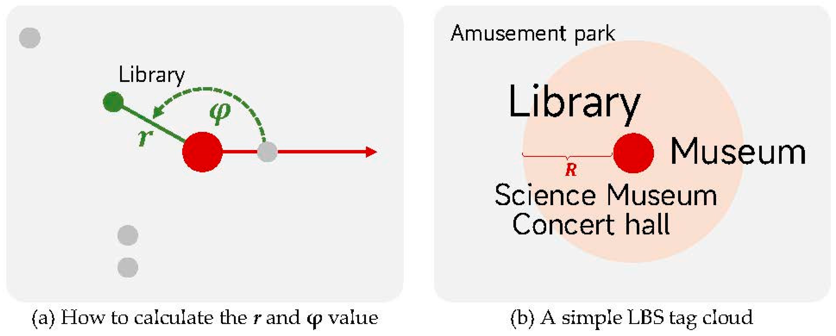
3.2.1. The Design Idea of the Layout Algorithm

Based on the conceptual model mentioned above, a layout algorithm that uses polar coordinates to determine how to place the tags is devised in this paper. The design idea for the algorithm is as follows:
Place tags based on polar coordinates. Taking the central point as the pole, calculate the radial and angular coordinates of each tag. The radial coordinate r is calculated depending on the distance between the POI and the central point, while the angular coordinate φ is calculated based on the direction of the POI relative to the central point. It should be noted that various relationships between the POI and user location can be used to calculate the r value, such as road network distance or driving time. Taking the library as an example, the calculation of r and the φ is shown in Figure 3a. POIs except the library are weakened by gray markers. When placing tags, the r value determines the placement priority of the tag, and the tag with the lowest r value has the highest placement priority and will be placed in the core area close to the central point. The φ value determines the direction in which the tag is placed.
Figure 3. How to place tags based on polar coordinates.
Take the LBS tag cloud in Figure 3b as an example. the direction of the tags relative to the central point is unchanged, and the distance (in pixels) from the central point is determined by the r value. If the tag has a small r value, it can be placed close to the central point, such as the museum, library, or science museum. If the r value is large and exceeds a certain threshold, the tag should be moved away from the central point to create a “farther” visual effect. As shown in Figure 3b, the amusement park is placed outside the R value of the central point. Two thresholds are critical during layout, Dfar and R: Dfar is used to denote “far” in people’s spatial cognition, such as 10 km or 60 min. If a tag has a value of r that exceeds Dfar, it means that the corresponding POI is too far from the user’s location, and placing the tag close to the central point will mislead the user, so it is placed away from the central point. The threshold R indicates how far apart the two tags can produce the effect of visual distance, such as 300 pixels.
This layout is in line with the laws of the real world and caters to the cognitive habits formed by people through the use of regular maps. Users can quickly learn from the tag cloud that the library is the most popular and closest, while the amusement park is farther away and less popular.
Avoid tag collisions with radial displacement. The layout space close to the central point is very limited, and when the tag with the lowest r is placed first in the core area, the tag with a higher r in the same direction cannot be placed properly. In this paper, a tag collision avoidance strategy called radial displacement is designed. When placing a new tag, first try to place it close to the central point, and if there is no conflict with other placed tags, the placement is successful. Otherwise, move the tag outward in the direction of its φ value until it does not conflict with any placed tags. As shown in Figure 4, the museum, library, and science museum (gray tags in the figure) have all been successfully placed according to the layout priority. The concert hall (black tag in the figure) will be placed next, but the space in the same direction has been occupied by the science museum; thus, the concert hall will move outward in the direction of its φ value (that is, the direction pointed by the red dotted arrow in the figure) until there is enough space. This method maintains the relative position relationship between POIs to a certain extent but changes the distance of the POI from the central point, resulting in distance deformation.
Figure 4. The radial displacement of tags.
Ensure the correct order of near and far by considering tag adjacency. The POIs are unevenly distributed around the user. If the distribution of POIs is dense in some directions, a large number of tags will compete for space in these directions, and the tag will displace radially more times and move farther outward. On the contrary, if the POIs are sparsely distributed in some directions, the tags easily obtain enough space to be placed without much displacement. Therefore, the distance deformation caused by radial displacement in different directions is inconsistent, which also means that the distance of tags in different directions is not comparable. However, for tags in the same direction or adjacent direction, the correct order of near and far should be ensured. In Figure 5, the red marker indicates the user location and the green markers indicate POIs. In (a), the concert hall and the museum have been placed, and the library should be placed next. Based on the radial displacement method described above, the library is moved outward from the central point along its φ value and looks for free space, but there is enough space just in the upper left of the concert hall, and the result is shown in Figure 5b. The order of near and far is incorrect, i.e., the lower-priority library turned out to be closer to the central point than the higher-priority concert hall, which is inconsistent with the basic layout principle set out in the conceptual model. So, when placing new tags, the distance between adjacent tags should be considered. This is executed by first calculating the maximum displacement distance of tags placed in adjacent directions and then placing the new tag according to this distance.
Figure 5. How to ensure the correct order of near and far by considering tag adjacency.
The following strategy is designed to identify the adjacent tag: for each placed tag, calculate four angular coordinates from the central point to the four corner points of its bounding rectangle, then obtain the angle range covered by the tag based on the minimum and maximum values of these four angular coordinates. If the angular coordinate of a new tag is within the angle range of an already placed tag, it means that the two are adjacent tags. As shown in Figure 5c, the angle range of the concert hall is α, and the angular coordinate of the new tag park is located outside the α, so the tag park is not adjacent to the concert hall, and thus there is no need to consider the concert hall when placing the park. Contrarily, the angular coordinate of the new tag library is located within the α, so the tag library is the adjacent tag of the concert hall and should be placed farther away than the concert hall. The layout result with the constraint of the adjacent tag is shown in Figure 5d, and the order of the library and the concert hall is accurate. However, when placing the next park tag, since the park is not adjacent to the concert hall, it may be placed closer to the central point than the concert hall. Because the directions of the two are too different, we think such a layout result is reasonable. Although the correct order of near and far is guaranteed, the compactness of the layout of the tag cloud is reduced. Therefore, it is necessary to balance the two in practical applications.
In addition, two tags that are too far apart should not be placed snugly together. If the radial coordinates of the library and the concert hall differ only slightly, it can be placed close to the concert hall, while if the difference is greater than the threshold Dfar mentioned above, it means that the library should be placed away from the concert hall and should continue to move a certain distance (R value mentioned above) outward based on the placement radius of the concert hall.

3.2.2. Steps and Processes of the Layout Algorithm

The input to the algorithm is one central point and n POIs. In general, the POI data returned by the LBS search engine only contains the name, address, and geographic location described by the latitude and longitude. To obtain more semantic information that users are concerned about, user review data can be retrieved from a third-party consumer review website and converted into a quantitative value that indicates the attractiveness or popularity of the POI. Further, the traffic cost from the user’s location to each POI is calculated based on the routing API provided by public map services to represent how easy it is for users to reach the POI, which can be simply called the convenience or accessibility of the POI. The popularity of the POI is not limited to user ratings, and similarly, the convenience is not limited to the traffic cost. Any attribute that can indicate the characteristics of the POI or the relationship with the user’s location can be used as a proxy index of popularity or convenience. The specific process of the algorithm is as follows:
Step 1: Canvas initialization. Initialize a blank canvas with width w and height h. Initialize two empty lists, TagListplaced, which stores placed tags, and TagListunplaced, which stores unplaced tags.
Step 2: Tag initialization. Generate a central tag based on the text of the central point and place it in the center of the canvas (w/2, h/2). Add the central tag to the list, TagListplaced. Create tags with the name or other attributes of the POIs as the text content and put them into the list of unplaced tags, after this, TagListunplaced = [Tag1, Tag2, Tag3, ..., Tagn].
Step 3: Visual variable mapping. Determine the visual variables of the tags in the unplaced tag list based on the popularity, convenience, or other attributes of the POI, including the font, font size, font color, and so on.
Step 4: Tag position calculation. Calculates the initial placement radius of the tag based on the geographic coordinates of the POI. Calculate the Euclidean distance from each POI to the central point as the r value (other types of distances can also be used) and the φ relative to the central point. Sort the TagListunplaced in ascending order by the r value and count the minimum rmin and maximum rmax of all r values. The tag with the rmin is placed close to the center of the canvas, and the tag with the rmax is placed h/4 away from the center. Calculate the initial placement radius Ri of the tag i as follows:
R i = r i r m i n r m a x r m i n × h 4
Step 5: Place the tag one by one. If the TagListunplaced is not empty, retrieve the first tag Tag1 and start placement.
5.1 The radial coordinate of Tag1 is r1, the angular coordinate is φ1, and the initial placement radius is calculated as R1.
5.2 Fix the initial placement radius. The R1 is corrected based on the furthest placement distance of the adjacent tags. Identify the placed tags adjacent to Tag1 from the TagListplaced and count the maximum radial coordinate rmax and the corresponding farthest placement radius Rmax. If R1 < Rmax, then R1 = Rmax; If r1rmax > Dfar, then R1 = Rmax + h/4. Place Tag1 on the canvas according to φ1 and the corrected R1.
5.3 Tag collision detection. Check whether Tag1 collides with the tags in the TagListplaced, and if it does, go to 5.4; if not, end the placement of Tag1 and add Tag1 to the TagListplaced.
5.4 Tag radial displacement. The central word exerts a repulsive force on Tag1, causing it to move outward. The direction of the force is the same as φ1, and the magnitude of the force is proportional to r1, which determines the step size of each displacement of the tag. After each displacement, go to 5.3.
Step 6: If the TagListunplaced is not empty, go to Step 5. If it is empty, it means that all tags have been placed.

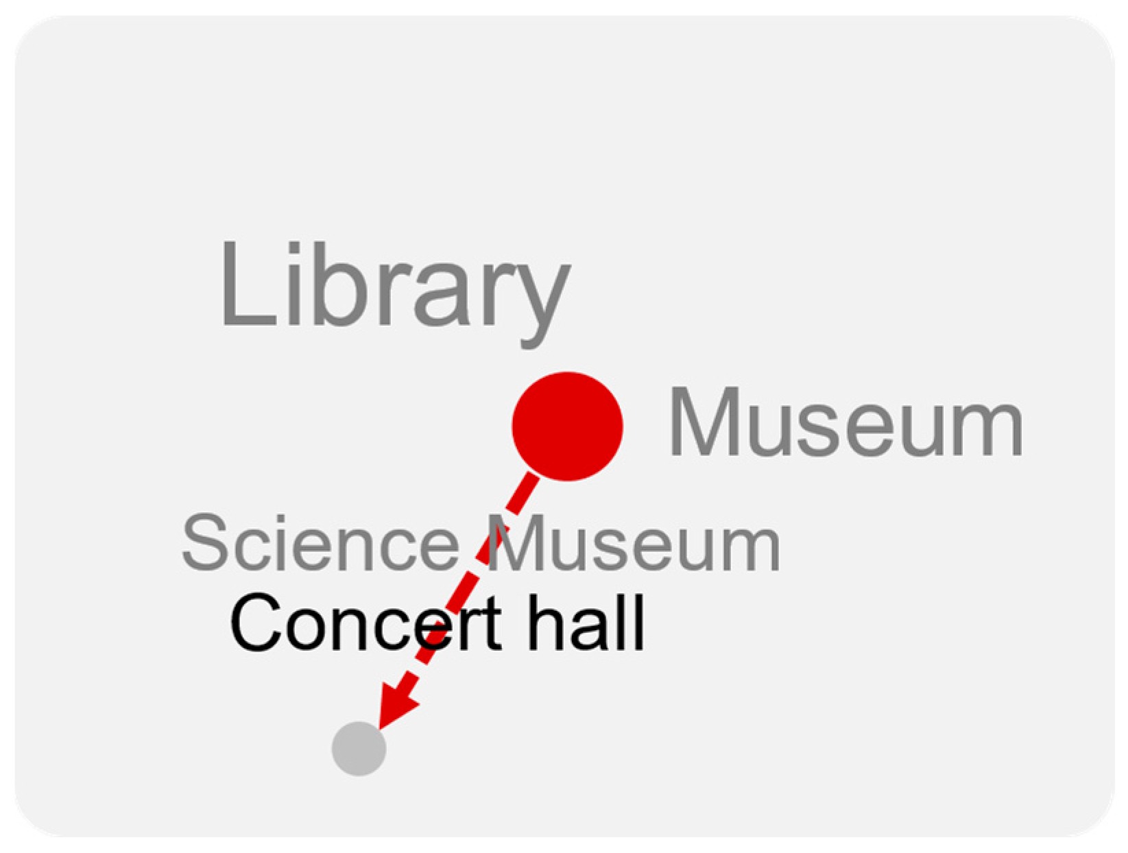
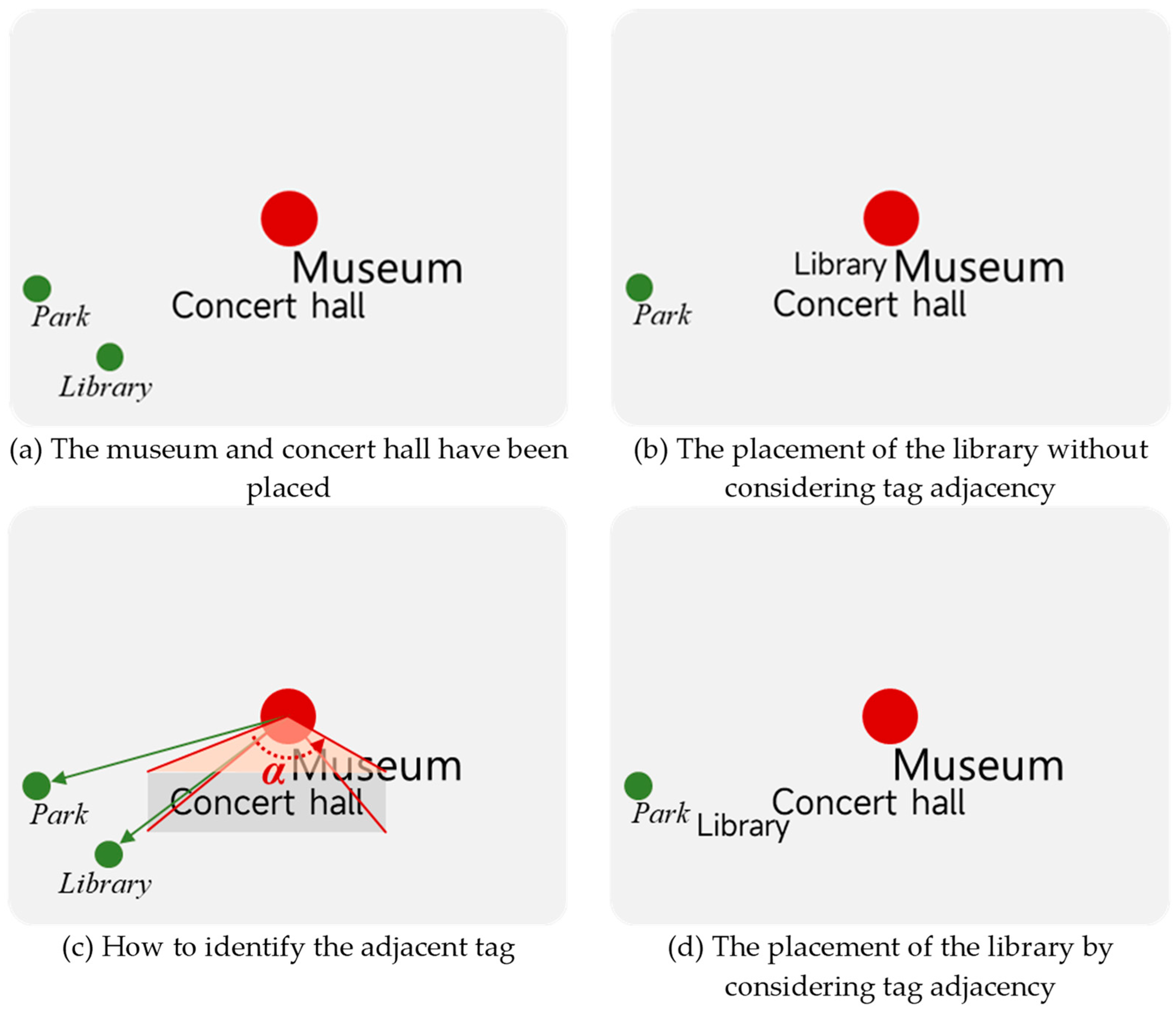
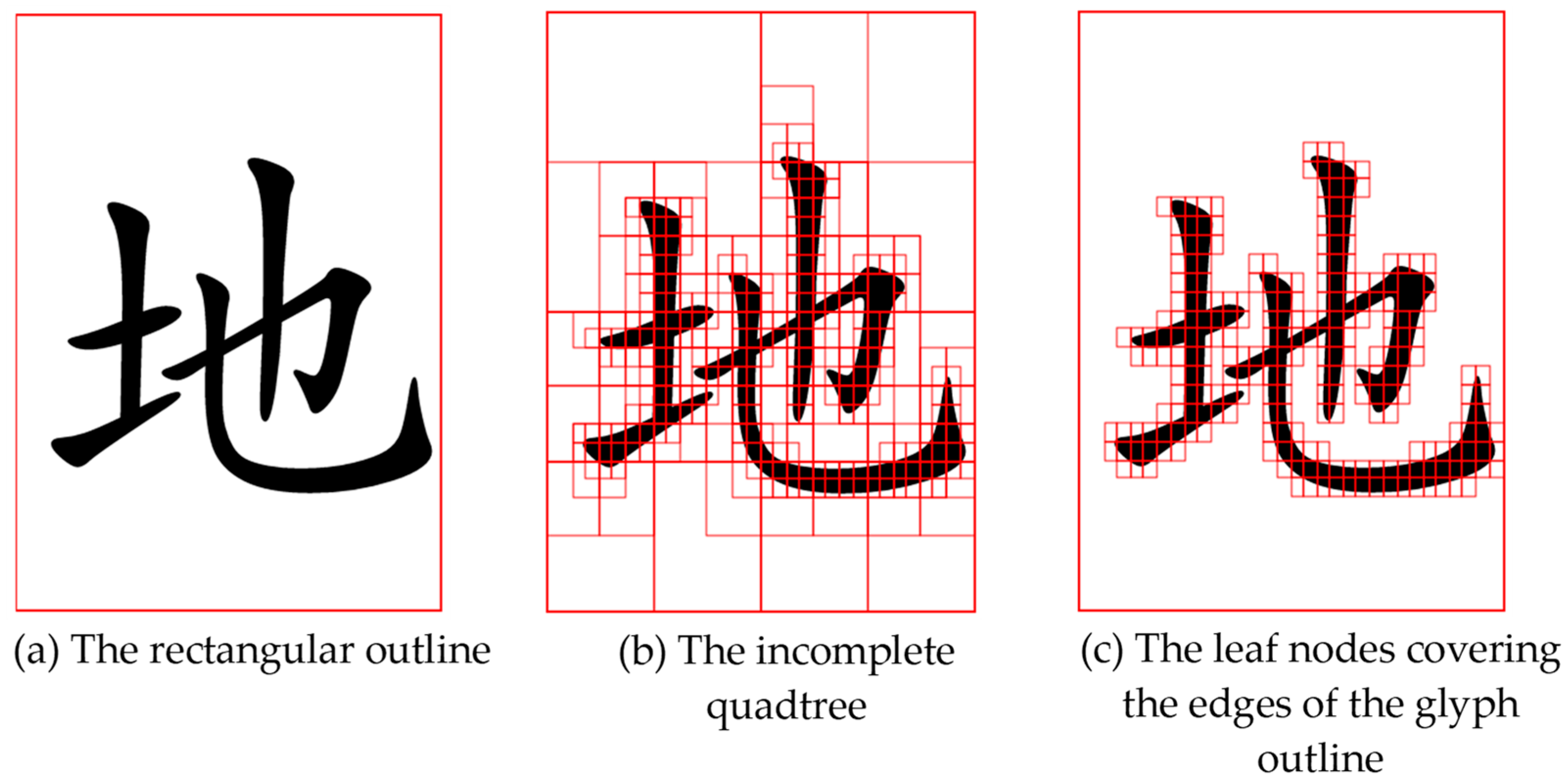
3.2.3. Tag Collision Detection

During the movement of tags, real-time collision detection is required to avoid capping or overlapping tags. However, due to the irregular shape of the text outline, it is very complicated to implement continuous collision detection, and the computational cost is also very high. In this paper, a quadtree partitioning model is used to approximate the glyph outline of the text to reduce the complexity of collision detection.
Take the bounding rectangle of the tag as the initial cell and the root node of the quadtree, then divide it into four sub-cells and check whether each sub-cell intersects the glyph outline. If a cell intersects the glyph outline, then it is added to the quadtree structure and divided into four sub-cells to continue the recursive judgment; otherwise, it is not included in the tree structure. The dividing process is stopped when the cell size is less than or equal to the minimum cell size. Finally, every tag corresponds to an incomplete quadtree with leaf nodes covering the edges of the glyph outline. The collision detection starts from the root node of the quadtree and traverses downward, and tags collide only when the leaf nodes of two trees intersect. Through the root node and the internal node, the impossible intersection can be quickly eliminated, and the leaf node can accurately determine whether two tags will collide.
Figure 6 uses the Text element in SVG (Scalable Vector Graphics) to show the bounding rectangle and quadtree partitioning of the character “地” in Chinese (font size 180 px). The red border in (a) is the bounding rectangle of the text symbol. Because of the font design and the internal margin of SVG elements, there is a lot of idle space between the text and the bounding rectangle, which is not conducive to the compact placement of tags. In (b), an incomplete quadtree corresponding to the character “地” is drawn with solid red lines, with a minimum cell size of 10 px. Based on this quadtree, only the leaf nodes covering the edges of the glyph outline are drawn in (c), while the bounding rectangle is also visible, which can help visually compare the approximate effect of the quadtree on the glyph outline. It is not difficult to conclude that the smaller the minimum cell size, the finer the quadtree depicts the glyph outline, and the more complex the collision detection.
Figure 6. Schematic diagram of approximate glyph outline based on quadtree. The red border in (a) is the rectangular outline of the Text element; (b) the incomplete quadtree corresponding to the character “地” is drawn with a solid red line; and (c) only the leaf nodes covering the edges of the glyph outline are drawn while retaining the rectangular outline.

4. Experiment Setup

This paper implements the layout algorithm of the LBS tag cloud in a web environment using JavaScript and SVG. Some functions of the algorithm are implemented based on the popular data visualization library “D3.js”, including the use of the “d3-force” module to simulate the motion process of tags and the “d3-quadtree” module to realize quadtree segmentation of text glyphs. The input of the algorithm is the user’s location and a POI list, and the output is the LBS tag cloud. The algorithm can be run on any browser that supports JavaScript and SVG. The experiments in this paper were conducted on the Edge browser of the Windows 10 operating system.
To prove the feasibility and scalability of the LBS tag cloud, this paper takes the “tourist attractions” that LBS users are commonly concerned about as an example and generates LBS tag clouds for different scenarios. The POI data representing tourist attractions is obtained through the Baidu Maps API, and the returned data includes name, latitude and longitude, user rating, number of user comments, etc. Since the data do not contain travel time or similar second-order attributes, Baidu Maps’ route planning API is used to calculate the public transportation and driving time from the user location to each attraction as additional attributes of the attraction.
Centered on a university in Wuhan and with a search radius of 100 km, 123 well-known attractions were collected. In the next experiment, taking the university as the hypothetical user location and combining the typical needs of LBS users, three scenarios are selected to discuss how LBS tag clouds can effectively help users explore their surroundings: (1) display all attractions; (2) display attractions with convenient transportation; and (3) display high-quality tourist attractions.

5. Results and Discussion

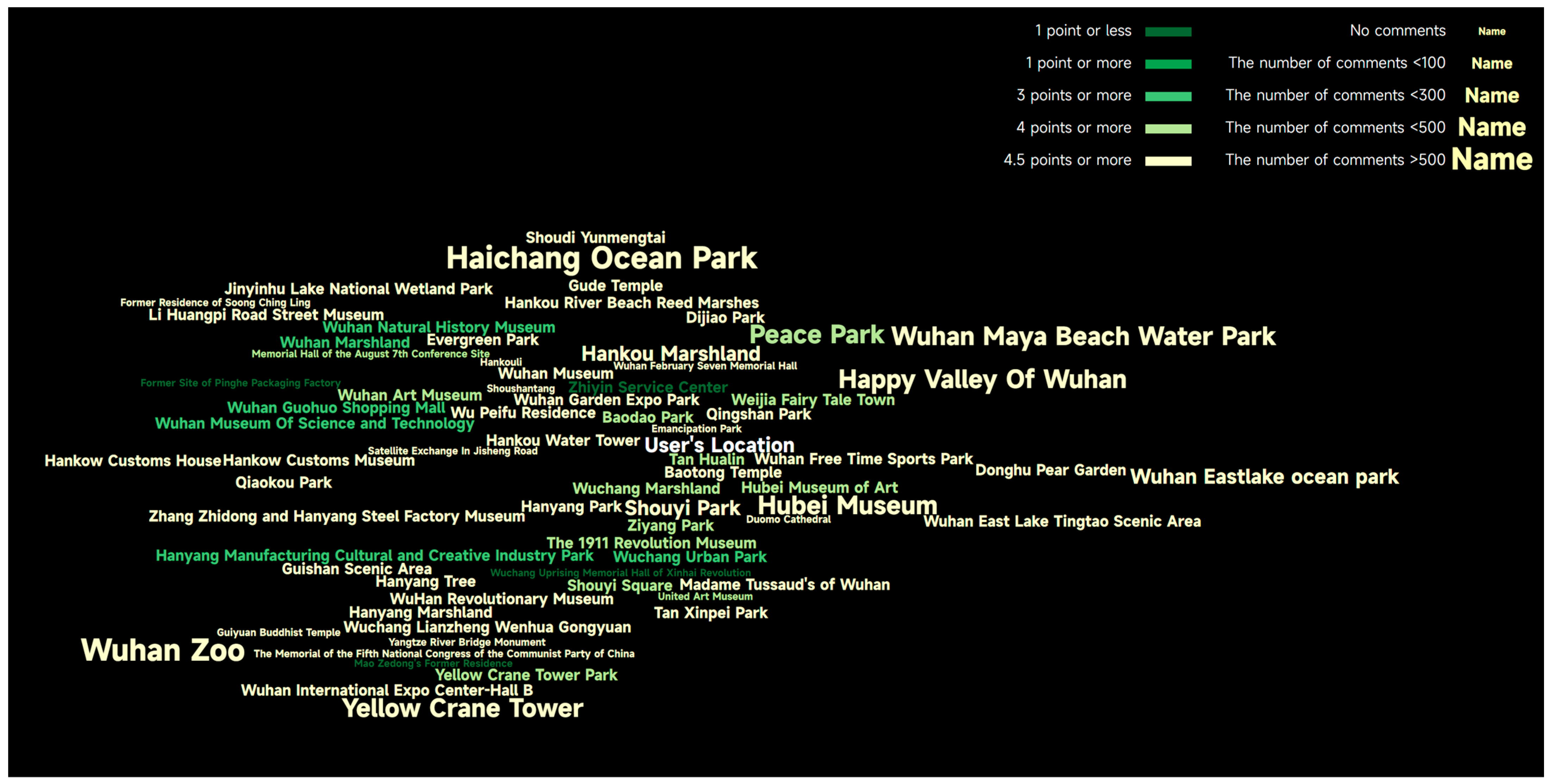
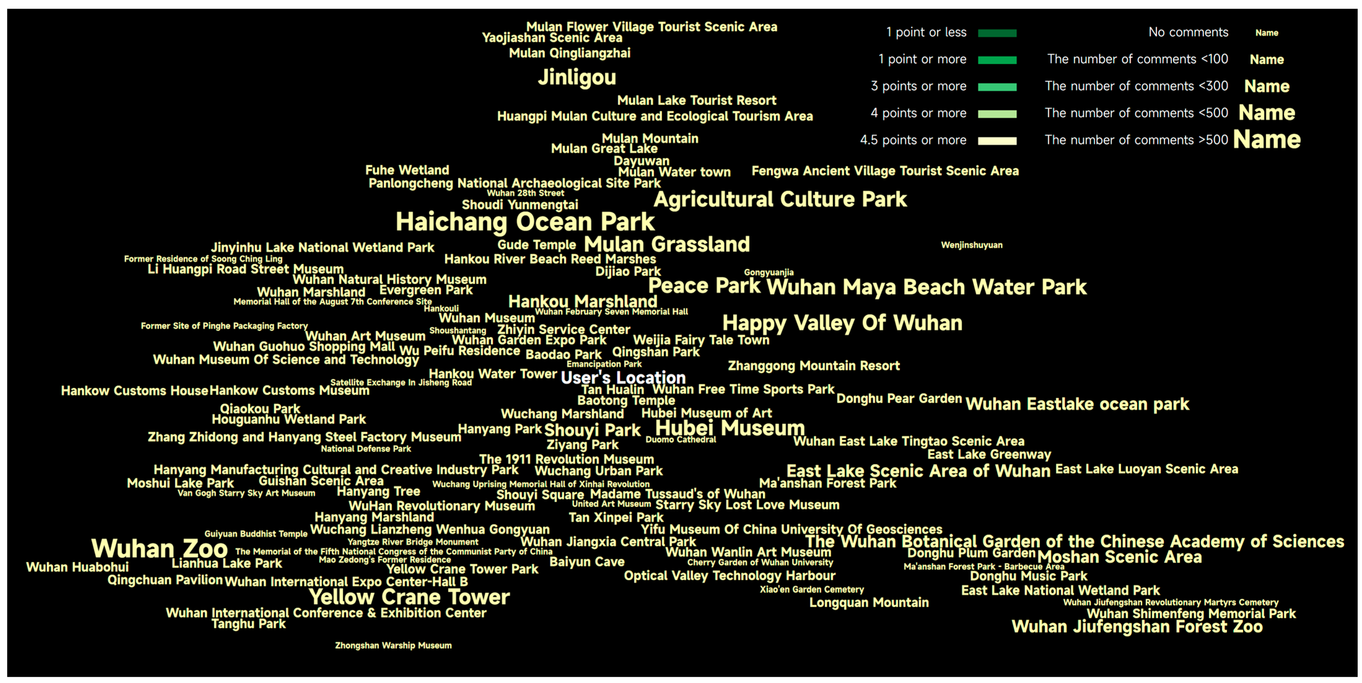
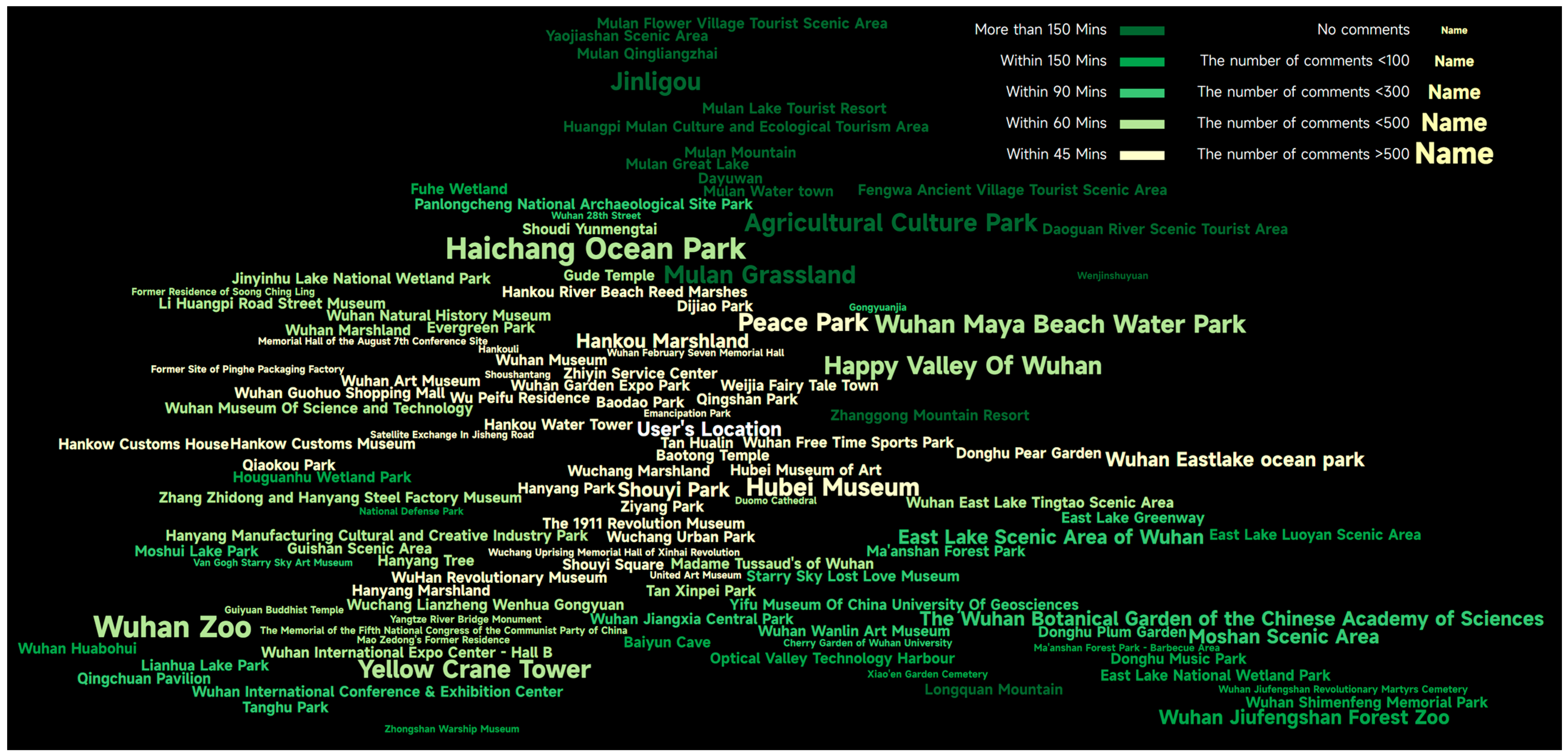
5.1. LBS Tag Cloud for All Tourist Attractions

Displaying all attractions at the same time provides LBS users with macro-level global information. When exploring all attractions, users focus both on popularity and travel time, so the following visual variable mapping scheme is adopted: the tag position indicates the travel time, and the font size indicates the popularity. Some of the parameters used in the experiment are as follows:
  • The size of the initial canvas is 2000 × 1000 px, and the background is black.
  • The number of user comments is taken as a proxy indicator of the popularity of the tourist attraction, and a simple assumption is made that the more comments, the higher the popularity of the attraction. The value is divided into five levels, and the correspondence with the font size is established. The lowest level corresponds to the minimum font size of 10 px, the highest level corresponds to the maximum font size of 30 px, and the adjacent level font size difference is 5 px.
  • The minimum cell size of a leaf node in quadtree segmentation is 5 px.
  • The value of parameter R is 200 px, while the value of parameter Dfar is taken for 60 min.
The resulting LBS tag cloud is shown in Figure 7, with a legend in the upper right. The central word “user location” is bolded in white to highlight the central location of the tag cloud and guide the user to interpret the tag cloud from that location. From the figure, it can be drawn:
Figure 7. LBS tag cloud containing all attractions (the tag position indicates the travel time and the font size indicates the number of comments).
  • All 123 attractions are completely expressed, and each attraction can be uniquely identified by its name. Users can quickly understand what attractions are around them.
  • Attractions with larger font sizes are easier to attract users’ attention and bring users “more important” psychological feelings, which is in line with the representation needs of tourist attractions.
  • Most attractions with short travel times are placed close to the central point, while attractions with longer travel times are more often placed in peripheral areas. The relative direction of the attraction to the central point also remains unchanged. However, it should be noted that the positional relationship of the tags in the tag cloud is an order relationship, which can only represent the order of new and far and cannot convey the precise travel time. In addition, such a relationship only applies to tags in the same or adjacent directions, such as “Mulan Grassland” which is farther away than “Peace Park”. For tags in different directions, the relationship between near and far is not comparable; for example, the “Yellow Crane Tower” at the bottom left of the central word looks significantly farther away than the “Hubei Provincial Museum” at the bottom right, which is inconsistent with the facts.

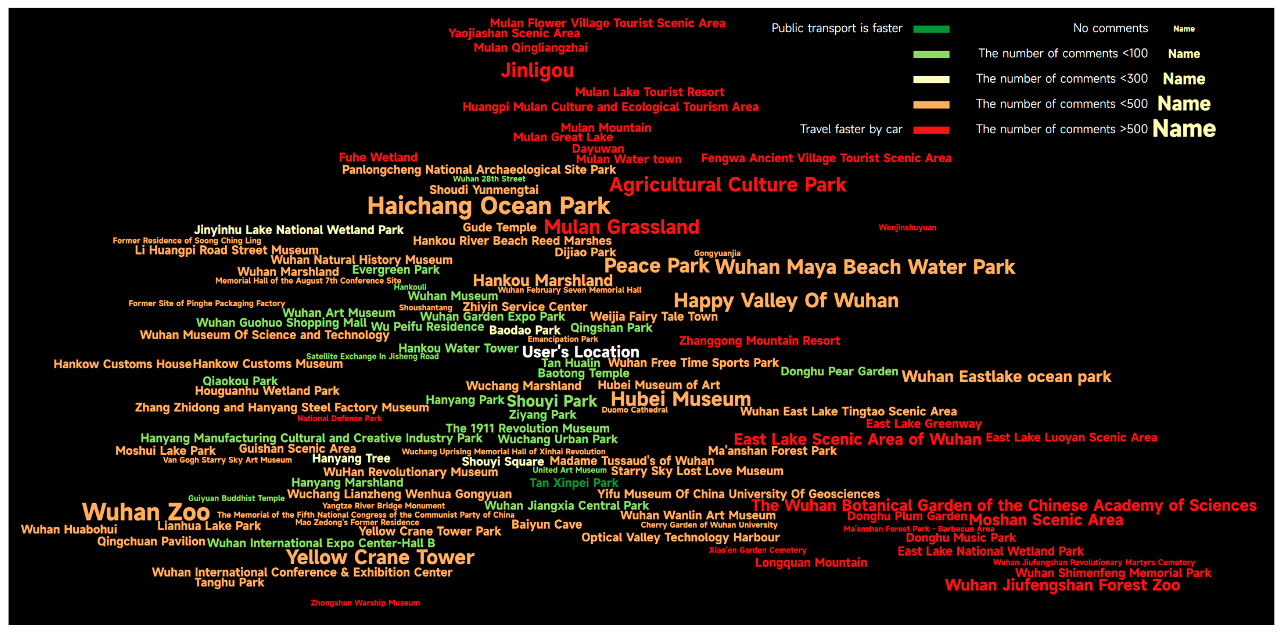
5.1.1. Introduction of the Color Variable

It is difficult for users to estimate accurate quantitative relationships based on the position of tags. Tags are distributed in all directions of the central word rather than on a single coordinate axis, making it difficult to quantitatively assess the exact distance and thus quantitatively infer the exact relationship. Inspired by isochrone maps, the LBS tag cloud introduces a color variable suitable for expressing quantitative grading information and uses color gradients to indicate the change of relationship accurately.
The travel time from the user’s location to each tourist attraction is taken as a proxy indicator of convenience. The value is divided into five levels, and the correspondence with a color ramp is established. A yellow-green gradient color ramp is selected; the shorter the travel time, the closer the color is to bright yellow, and the resulting LBS tag cloud is shown in Figure 8, with the legend in the upper right.
Figure 8. LBS tag cloud containing all attractions (the position and color indicate the travel time, and the font size indicates the number of comments).
On the one hand, the color enriches the visual level of the tag cloud, forming an obvious “center-edge” gradient effect. On the other hand, it also effectively corrects the travel time deviation caused by the position, and the difference in tag color will guide users to pay attention to the meaning of the color and then obtain a more accurate travel time.

5.1.2. Color Variable for More Generalized Relationships

The color-based visualization of travel times is slightly different from the representation on regular maps. Because the “location” in the regular maps is based on precise geographic coordinates, which implicitly express the accurate Euclidean distance, visual variables such as color and size are rarely used to express the distance relationship. The position in the LBS tag cloud can only show the order of near and far, so other visual variables should be integrated to accurately represent distance relationships. In addition to the Euclidean distance, many types of relationships, such as topology, direction, flow, connectivity, etc., exist between geographic objects, and these relationships may not be related to the Euclidean distance.
Taking travel time as an example, the time spent on public transportation is generally longer than that spent driving, but there are some attractions where public transportation is very convenient, so comparing the two types of time can provide users with a valuable reference from a new perspective. A new simple index is defined as the “public transport express index”, whose formula is “public transit travel time—driving time—15”. If the index is >0, it means that driving is more than 15 min faster than public transportation and that it is more convenient to drive by car. If the index is <0, it means that public transportation is slower only within 15 min or even faster than driving a car, and public transportation is recommended in the context of encouraging green and low-carbon travel. The LBS tag cloud generated based on this index is shown in Figure 9, which makes it easy for users to identify public transportation-friendly attractions (such as Tan Xinpei Park, Wuhan Garden Expo Park, etc.) and attractions suitable for driving (such as Peace Park, Hubei Provincial Museum, etc.). In this scenario, the public transport express index, represented by color, belongs to a generalized relationship. From this, it can be inferred that the color of the tag is very suitable for expressing relationships.
Figure 9. LBS tag cloud expressing the public transport express index.

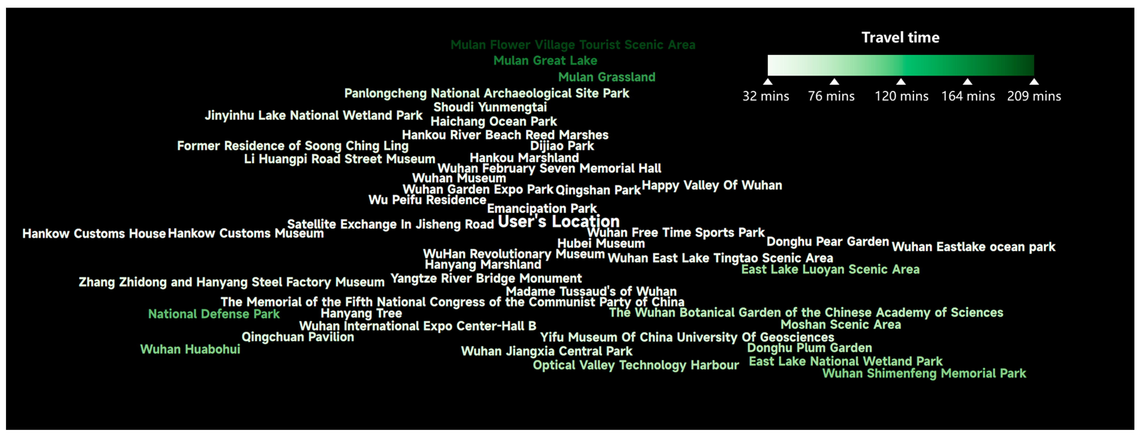
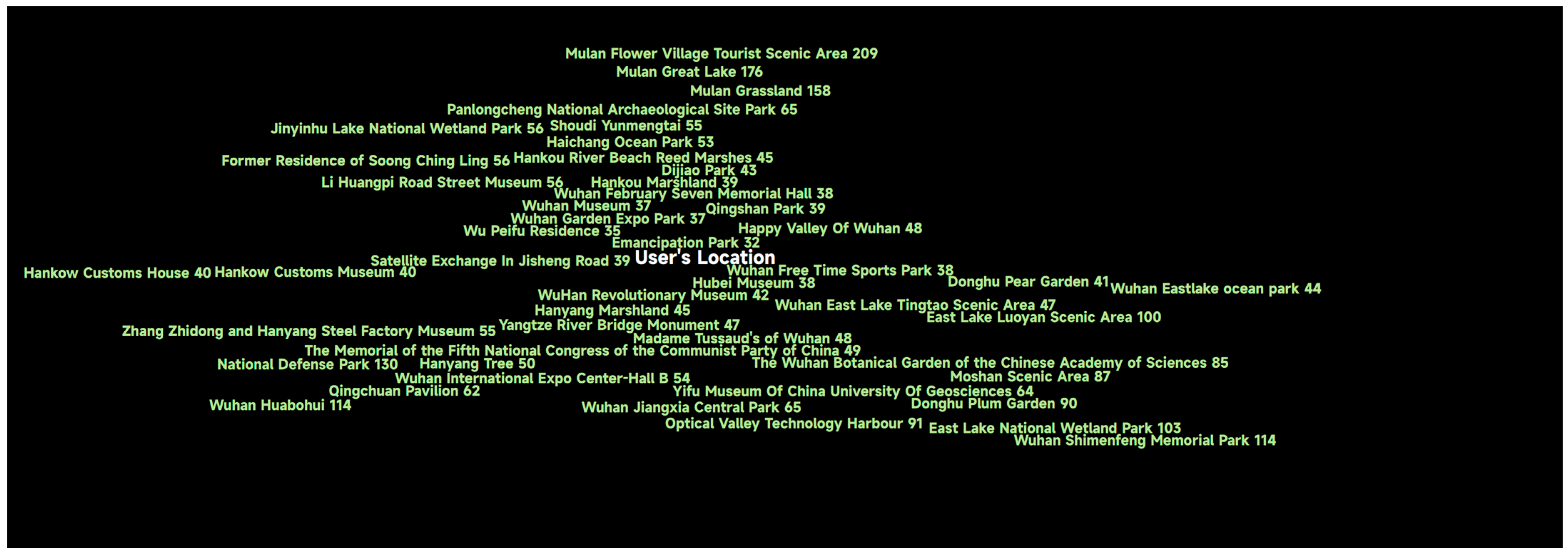
5.2. LBS Tag Cloud for Attractions with Convenient Transportation

Adding time constraints to attraction searches is a common requirement of LBS users, such as attractions with a travel time of less than 1 h (there are 72 in this experimental data). In this scenario, users no longer pay attention to the travel time with little difference but more to the rating, price, and other information about the attraction, so the following visual variable mapping scheme is designed: the tag position indicates the travel time, the font size indicates the number of comments, and the color indicates the rating. The number of comments is divided into five levels, and a mapping relationship is established with the font size. The more comments, the larger the font size. The rating is also divided into five levels, and a mapping relationship with a yellow-green gradient color ramp is established. The higher the score, the closer the color is to bright yellow. The resulting LBS tag cloud is shown in Figure 10. As can be seen from the figure, high-rated attractions and attractions with a large number of comments are highlighted, which makes it easier to attract the attention of users. The attractions with fewer comments have a smaller font size, and the color brightness of low-rated attractions is lower, reducing the tags’ visual stimulation and giving users a better sense of order and quantity. In addition, the combination of tag size and color also helps users explore the inconsistency of the number of comments and ratings, such as at “Guiyuan Temple”, “Emancipation Park” and other attractions with high ratings but few comments.
Figure 10. LBS tag cloud for attractions with a travel time of less than 1 h (the tag position indicates the travel time, the font size indicates the number of comments, and the color indicates the rating).

5.3. LBS Tag Cloud for High-Quality Tourist Attractions

In addition to travel time, reviews or ratings are often used as search criteria, such as showing only attractions rated between 4.6 and 5.0 (there are 47 in this experimental data). In this scenario, the travel time of attractions varies greatly, which should be highlighted, and the ratings of subtle differences can be weakened, so the following visual variable mapping scheme is designed: the position and color indicate the travel time, and the font size is the same, which does not indicate the difference in rating. A continuous single-hue color ramp is selected; the minimum travel time and the maximum travel time correspond to both ends of the color ramp, and the remaining travel time corresponds to the color ramp through linear interpolation. The resulting tag cloud is shown in Figure 11. Because the tags are all the same size, what catches the user’s attention is the position and color of the tag. The position helps users initially understand the direction and distance of the attraction, while the color further assists the user in accurately estimating the travel time. However, due to the large number of similar colors in the continuous color ramp, users rely on the legend to accurately identify the correspondence between color and time.
Figure 11. LBS tag cloud for attractions rated by users between 4.6 and 5.0 (the color indicates the travel time).
To show the travel time more directly, the numerical value can be embedded in the tag text and visualized in combination with the name of the attraction, and the resulting LBS tag cloud is shown in Figure 12. As can be seen from the figure, this method is simple and accurate in displaying the travel time and even does not need a legend, which is suitable for representing quantitative attributes with large differences.
Figure 12. LBS tag cloud for attractions rated by users between 4.6 and 5.0 (the travel time is part of the tag text).

6. Usability Evaluation

The LBS tag cloud in the three scenarios has different content and adopts different visual variable mapping schemes, which effectively highlights the information that attracts the most attention from users in each scenario and demonstrates the effectiveness and scalability of the LBS tag cloud. In this section, the usability of the LBS tag cloud is further analyzed. Firstly, the LBS tag cloud is compared with the web map and other methods, and its capability of representing LBS POIs is summarized. Then, based on user experiments, the usability of the LBS tag cloud is briefly discussed. Finally, the main innovations of the LBS tag cloud and future work are summarized.

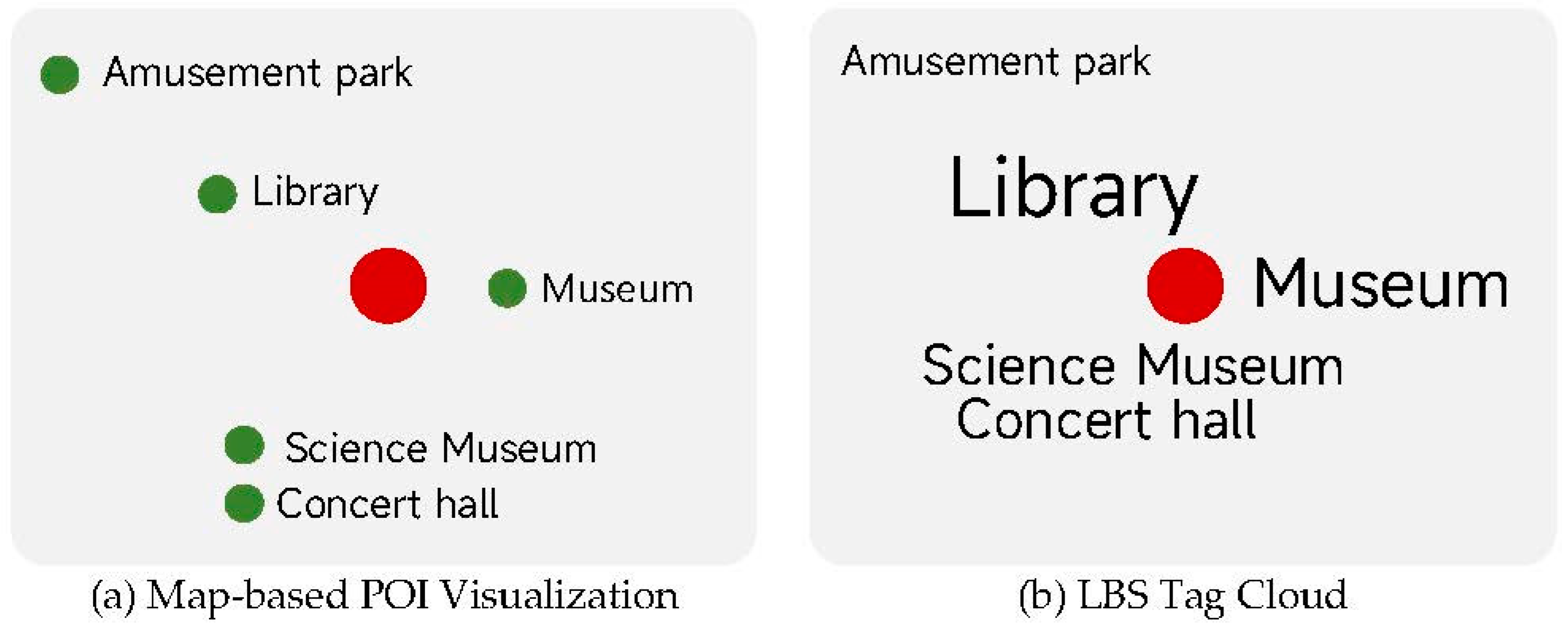
6.1. LBS Tag Cloud versus Existing Methods

Based on the Baidu Maps, surrounding attractions are retrieved and visualized; a screenshot of the visualization is shown in Figure 13. Numeric symbols and simple circular symbols are used to distinguish popular attractions from ordinary attractions, and the position of the symbols represents the geographical location of the attractions. Compared with this POI visualization based on such a web map, the LBS tag cloud has the following four advantages:
Figure 13. POI visualization based on Baidu Maps.
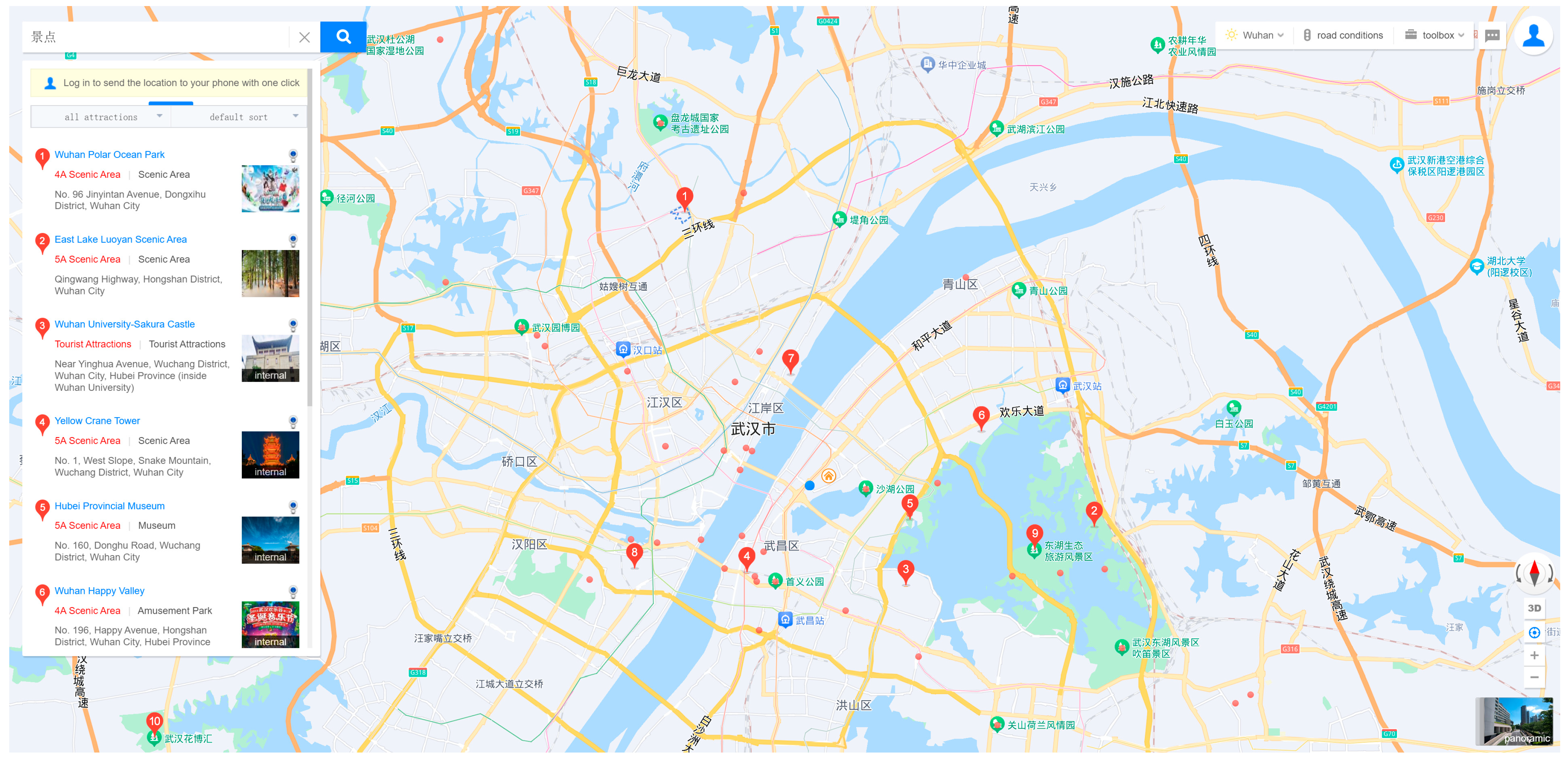
  • More POIs can be displayed. The current map extent has completely covered the main urban area of Wuhan, but there are only 10 numeric symbols and about 30 circular symbols, and the number of attractions that can be displayed is much smaller than the LBS tag cloud. In addition, the annotations for visible attractions are not fully displayed. The list on the left can be used to view the names of the numeric symbols one by one; however, the names of circular symbols cannot be viewed.
  • Global context and local details can be maintained. Users can zoom in on the map to explore more attractions, but at the same time, some attractions will fall out of the viewport, so users need to zoom and pan frequently, and in this process, it is difficult for users to consider the local details and global context of the map. In contrast, the LBS tag cloud contains both adjacent and distant POIs, so users can not only understand the distribution of POIs at the macro level but also explore the details of each POI at the micro level. If the interactive functions of zooming and panning are developed for the LBS tag cloud in the future, a better information communication effect can be achieved.
  • The relationship between the user and the POI can be represented. The rich and powerful visual variables in the tag cloud can fully express the multi-dimensional attributes of POI, especially the relationship between the POI and the user. Conversely, in Figure 13, neither attributes nor relationships are well expressed. The number in the numeric symbol is positively correlated with the popularity of the attraction, which can guide users to pay attention to the popular attractions but also require them to browse sequentially in the left list. The Euclidean distance from each POI can be estimated based on the geographical location of the symbol, but the obstruction of natural barriers and artificial features will cause considerable estimation errors. In addition, travel time and other meaningful relationships are difficult to estimate.
  • The graphic layout is simple and pure. In the LBS tag cloud, there are only text tags and no other graphic symbols that may cause interference. Users who know the text can quickly understand the meaning of the tag cloud. In stark contrast, there are too many features on the web map, resulting in cumbersome visualizations that interfere with users quickly capturing key information.
Based on the comparison with the web map, we analyze the visualization capabilities of the LBS tag cloud from 11 aspects. Because the existing tag map methods, such as Taggram [] and Worbel [], are not designed for POI visualization, they cannot be directly compared with the methods in this article. Methods such as Zoomless Map [] and Focus+Context map labeling [] also focus on how to consider both global context and local details, and it makes sense to compare the LBS tag cloud with them. The advantages and disadvantages of these methods are shown in Table 1. It can be seen that the LBS tag cloud can not only accommodate more POIs but also display the name, multi-dimensional attributes, and relationship between each POI and user location while showing the global distribution. The main disadvantage of the LBS tag cloud is that it cannot accurately express the geographical location, and it also lacks the georeference provided by topographic features. In addition, the interactive functions that have been implemented are relatively simple and limited. Since the other three methods are map-based, illiterate users who cannot read can also obtain a general idea of the type of POI through map symbols. The LBS tag cloud, on the other hand, has only text and can be difficult for users who cannot read. Therefore, the LBS tag cloud is language-dependent.
Table 1. LBS tag cloud versus existing methods.

6.2. User Experiments

This section explores the usability of the LBS tag cloud through a simple user experiment. A total of 27 people of any age, gender, education level, and no GIS education background were called upon to evaluate the LBS tag cloud containing all attractions in Figure 8. The subjects participating in the experiment did not have any prior knowledge about the LBS tag cloud and made a subjective evaluation based only on their experience.
First, the LBS tag cloud in Figure 8 was shown to each subject and introduced in one sentence: the central point of this figure is your current location, the text tag represents the attractions around you, the size of the tag represents the popularity of the attraction, and the color of the tag represents the public transportation time to reach the attraction. The subjects were then asked to complete two tasks: Task 1, find five popular attractions; Task 2, find five popular attractions within an hour of travel time. The duration of the task was recorded. If some subjects were proficient in using mobile maps, they were asked to repeat Task 1 using mobile maps. After completing the tasks, there are two optional questions: First, do you think this LBS tag cloud is better than mobile maps when expressing attractions? Second, what advice do you have for this LBS tag cloud? Finally, subjects were asked to rate the LBS tag cloud in five aspects: aesthetics, compactness, recognizability, layout satisfaction, and task completion. The rating was conducted on a 1–10 rating scale, with a minimum score of 1 being awful and a maximum score of 10 being outstanding.
All subjects completed both tasks, with an average time of 24 s to complete Task 1 and 37 s to complete Task 2. Three of the 27 subjects did not know how to use mobile maps, and they also completed two tasks, which showed that getting started with the LBS tag cloud is not too difficult. The average time for participants who are familiar with mobile maps to complete Task 1 using mobile maps is 18 s, which is faster than using the LBS tag cloud. However, nine subjects used the LBS tag cloud to complete Task 1 in less time. These results show that the LBS tag cloud is effective in helping some users find the surrounding POIs.
Since the first question was an yes or no question, all users answered. A total of 18 out of the 27 subjects believed that the LBS tag cloud was better than maps in visualizing surrounding POIs, proving that the LBS tag cloud was initially recognized by some subjects. User ratings also indicated that the LBS tag cloud is accepted by users. The statistics for each indicator are shown in Table 2. In general, using a questionnaire survey on a scale of 1–10, a score of 6 means OK, and a score of 8 can be considered good. The mean, mode, and median of all indicators were greater than 6, indicating that the overall impression of the subjects on the LBS tag cloud was not bad, and this new POI visualization method was accepted and recognized. The standard deviation of all indicators was less than 2, indicating that the scores were concentrated around the mean and followed a normal distribution. In terms of specific indicators, aesthetics and layout satisfaction scored the lowest, suggesting that future work should focus on how to improve the aesthetics of the LBS tag cloud. The compactness and task completion scored slightly higher than other indicators, indicating that despite the distance distortion, the LBS tag cloud is effective in helping users find surrounding POIs.
Table 2. Descriptive statistics for user ratings.
Only five participants answered the second question. Subjects reported that, due to the large number of tags placed compactly in view, they were often attracted to brightly colored and larger tags when browsing and ignored dark, smaller tags. Moreover, the subjects believed that the number of tags was too large and placed too densely, which increased cognitive load and easily caused visual fatigue, so they preferred a simpler layout, such as selectively presenting attractions with higher popularity. In addition, some subjects put forward requirements for an interactive function, hoping to choose their favorite themes, colors, etc., to personalize the LBS tag cloud.
Of course, at present, this user experiment is still very simple but verifies the usability of the LBS tag cloud. In future research, the usability of LBS tag clouds in different scenarios, the factors affecting usability, and the usability improvement strategies are worth discussing in depth.

6.3. Summarization and Future Work

Compared with conventional web maps, the LBS tag cloud can display more POIs in the same layout space and can effectively highlight the popularity and convenience attributes that users pay attention to through the combination of visual variables of the tags. At the same time, the LBS tag cloud weakens or deforms some unimportant attributes; for example, the geographic location of the POI is not accurate, but its relative direction to the user’s location is maintained to some extent. Therefore, the LBS tag cloud is similar to subway maps and belongs to the category of “schematic maps”. The main innovations of LBS tag clouds are as follows:
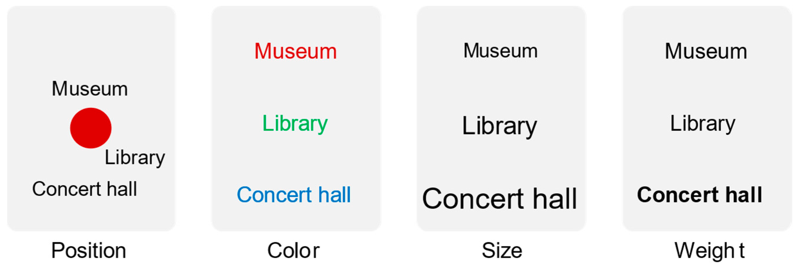
  • Text tags are simple in form but also rich in expression. The tag cloud only contains tags and does not contain complex graphic symbols, which simplifies the cognitive process on the one hand and avoids the occupation of space by graphic symbols on the other. However, the visual variables commonly used in the text symbol are rich enough that, in addition to font size, color, and position, other visual variables such as font, italic, luminescence, shading, etc., can also be combined with the LBS tag cloud to express meaningful multivariate information.
  • Coupling of first-order attributes with second-order attributes. LBS tag clouds can not only represent the attributes of the POI but also convey the relationship between the POI and the user’s location. It is worth mentioning that the visual variable mapping scheme adopted by the LBS tag cloud is flexible. In the LBS tag cloud containing all attractions, a typical visual variable mapping scheme in line with people’s cognitive habits is designed, which uses font size to express the first-order “popularity” of the POI and color and position to jointly express the second-order “convenience”.
  • Overview and detailed information can be represented together. When using the LBS tag cloud, users can quickly overview all POIs and understand the macro distribution without any complex operations. At the same time, the detailed information about each POI can be quickly identified through its corresponding tag.
Because of the lack of georeference provided by the map, the LBS tag cloud cannot convey the precise location of the POI, but this does not hinder its usability. LBS users pay attention to “what are the POIs in the vicinity, how are these POIs, and whether it is convenient to go to these POIs”. The LBS tag cloud contains only text tags, which intuitively identify the name of each POI. The font size of the tag is a visual variable that the user is particularly sensitive to, which is suitable for indicating the popularity of the POI. The color of the tag can accurately convey the connection between the user’s location and the POI (distance, travel time, etc.), which is an attribute that LBS users are concerned about. Therefore, the LBS tag cloud effectively integrates the information that users are concerned about, which is a new visualization form suitable for users’ spatial cognition and is expected to provide new visualization ideas for the research of spatial autocorrelation, spatial interaction, and location-based social networks.
However, the cognitive effect and efficiency of the LBS tag cloud need to be further studied. The LBS tag cloud places the tags based on relative position and is essentially a schematic map with deformation. Does this deformation cause cognitive biases? In addition, new layout methods and reasonable setting of parameters also deserve further attention, such as the number of tags, multi-center layout method, addition of user interaction, etc.
  • The number of tags that fit best. While the LBS tag cloud can show more POIs than the web map, there is an upper limit. In the user experiment, some subjects have suggested that the tags in the LBS tag cloud are too dense, causing information overload. Exploring the optimal number or density of tags will be the focus of subsequent usability assessment research.
  • What kind of user interaction should be designed? The current LBS tag cloud only supports simple user interaction, and in the future, operations such as clicking and zooming will be added to the LBS tag cloud based on the usage logic of touchscreen devices to provide richer information content.
  • Optimization and innovation of layout methods. On the one hand, it takes a long time to generate an LBS tag cloud. Each tag takes about 1 s for radial displacement and collision detection. Such a speed obviously does not meet the requirements of real-time applications. and the efficiency of the current layout algorithm needs to be optimized. On the other hand, this study is just a simple attempt at a layout method based on radial displacement, and many studies can be conducted in this regard, such as radial displacement to change the radial coordinates; can the angular coordinates of the tag be changed? If there are multiple centers, how should the tags be placed? How to employ the relationship between POIs to determine placement, etc.

7. Conclusions

Map-based POI visualization often fails to balance global distribution with local details, and this article attempts to solve this problem with a tag cloud. Our approach introduces a central point in the tag cloud and creates a new type of “centralized” tag cloud: LBS tag cloud. The LBS tag cloud takes the location of the LBS user as the layout central point, converts the POIs into tags and places them around the central point, and uses a combination of visual variables to represent the attributes of the POI. The LBS tag cloud integrates a large number of POIs around LBS users into one image, which can not only express more POIs than conventional web maps but also use text tags to represent multi-dimensional attributes such as the name, popularity, and convenience of each POI. Through this tag cloud, LBS users can not only fully grasp the distribution of surrounding POIs from a macro perspective but also understand the specific conditions of each POI. In particular, users can intuitively understand the relationship between each POI and their location, such as travel time or transportation convenience. Three scenarios in the experiment verify the usability and effectiveness of the LBS tag cloud and show that the LBS tag cloud has good scalability. User experiments also show that the LBS tag cloud has some usability, but there is still a lot of room for improvement.
This study only makes a preliminary study of the LBS tag cloud, and there are many problems worth further exploring in the future, such as cognitive bias caused by tag position deformation, the upper limit of the number of tags, richer user interaction, and simultaneous display of multiple types of POIs.

Author Contributions

Conceptualization, Xiaoqiang Cheng; Methodology, Xiaoqiang Cheng, Zhongyu Liu; Algorithm, Xiaoqiang Cheng, Zhongyu Liu, Haibo Xiao; Writing—original draft preparation, Xiaoqiang Cheng, Huayi Wu; Writing—review and editing, Xiaoqiang Cheng. All authors have read and agreed to the published version of the manuscript.

Funding

This research was funded by the Open Fund of the Key Laboratory of Urban Land Resources Monitoring and Simulation, Ministry of Natural Resources (Grant No. KF-2021-06-109) and Open Fund of the National Engineering Research Center for Geographic Information System, China University of Geosciences, Wuhan 430074, China (Grant No. 2021KFJJ09).

Institutional Review Board Statement

Not applicable.

Data Availability Statement

The data used in the study can be obtained using the Baidu Maps API.

Acknowledgments

We would like to thank the academic editors and three anonymous reviewers for their valuable comments and suggestions.

Conflicts of Interest

The authors declare no conflict of interest.

References

  1. Schiller, J.; Voisard, A. Location-Based Services; Elsevier: Amsterdam, The Netherlands, 2004. [Google Scholar]
  2. Jiang, B.; Yao, X. Location Based Services and GIS in Perspective. In Location Based Services and Telecartography; Gartner, G., Cartwright, W., Peterson, M.P., Eds.; Springer: Berlin/Heidelberg, Germany, 2007; pp. 27–45. [Google Scholar]
  3. Anagnostopoulos, V.; Havlena, M.; Kiefer, P.; Giannopoulos, I.; Schindler, K.; Raubal, M. Gaze-Informed location-based services. Int. J. Geogr. Inf. Sci. 2017, 31, 1770–1797. [Google Scholar] [CrossRef]
  4. Chuang, H.-M.; Chang, C.-H.; Kao, T.-Y.; Cheng, C.-T.; Huang, Y.-Y.; Cheong, K.-P. Enabling maps/location searches on mobile devices: Constructing a POI database via focused crawling and information extraction. Int. J. Geogr. Inf. Sci. 2016, 30, 1405–1425. [Google Scholar] [CrossRef]
  5. Liu, K.; Yin, L.; Lu, F.; Mou, N. Visualizing and exploring POI configurations of urban regions on POI-type semantic space. Cities 2020, 99, 102610. [Google Scholar] [CrossRef]
  6. Cai, L.; Xu, J.; Liu, J.; Pei, T. Integrating spatial and temporal contexts into a factorization model for POI recommendation. Int. J. Geogr. Inf. Sci. 2018, 32, 524–546. [Google Scholar] [CrossRef]
  7. Liu, Y.; Seah, H.S. Points of interest recommendation from GPS trajectories. Int. J. Geogr. Inf. Sci. 2015, 29, 953–979. [Google Scholar] [CrossRef]
  8. Gröbe, M.; Burghardt, D. Micro diagrams: Visualization of categorical point data from location-based social media. Cartogr. Geogr. Inf. Sci. 2020, 47, 305–320. [Google Scholar] [CrossRef]
  9. Gedicke, S.; Bonerath, A.; Niedermann, B.; Haunert, J.H. Zoomless Maps: External Labeling Methods for the Interactive Exploration of Dense Point Sets at a Fixed Map Scale. IEEE Trans. Vis. Comput. Graph. 2021, 27, 1247–1256. [Google Scholar] [CrossRef] [PubMed]
  10. Niedermann, B.; Haunert, J.-H. Focus+context map labeling with optimized clutter reduction. Int. J. Cartogr. 2019, 5, 158–177. [Google Scholar] [CrossRef]
  11. Touya, G. LostInZoom. Available online: https://lostinzoom.github.io/home/ (accessed on 10 August 2023).
  12. Beilschmidt, C.; Mattig, M.; Fober, T.; Seeger, B. An efficient aggregation and overlap removal algorithm for circle maps. GeoInformatica 2019, 23, 473–498. [Google Scholar] [CrossRef]
  13. Liu, H.; Zhang, L.; Long, Y.; Zheng, Y. Real-Time Displacement of Point Symbols Based on Spatial Distribution Characteristics. ISPRS Int. J. Geo-Inf. 2019, 8, 426. [Google Scholar] [CrossRef]
  14. Yuan, K.; Cheng, X.; Gui, Z.; Li, F.; Wu, H. A quad-tree-based fast and adaptive Kernel Density Estimation algorithm for heat-map generation. Int. J. Geogr. Inf. Sci. 2019, 33, 2455–2476. [Google Scholar] [CrossRef]
  15. Gedicke, S.; Jabrayilov, A.; Niedermann, B.; Mutzel, P.; Haunert, J.-H. Point feature label placement for multi-page maps on small-screen devices. Comput. Graph. 2021, 100, 66–80. [Google Scholar] [CrossRef]
  16. Xiao, Y.; Ai, T.; Yang, M.; Zhang, X. A Multi-Scale Representation of Point-of-Interest (POI) Features in Indoor Map Visualization. ISPRS Int. J. Geo-Inf. 2020, 9, 239. [Google Scholar] [CrossRef]
  17. Viégas, F.B.; Wattenberg, M.; Feinberg, J. Participatory Visualization with Wordle. IEEE Trans. Vis. Comput. Graph. 2009, 15, 1137–1144. [Google Scholar] [CrossRef] [PubMed]
  18. Viégas, F.B.; Wattenberg, M. TIMELINES Tag clouds and the case for vernacular visualization. Interactions 2008, 15, 49–52. [Google Scholar] [CrossRef]
  19. Seifert, C.; Kump, B.; Kienreich, W.; Granitzer, G.; Granitzer, M. On the Beauty and Usability of Tag Clouds. In Proceedings of the 2008 12th International Conference Information Visualisation, London, UK, 9–11 July 2008; pp. 17–25. [Google Scholar]
  20. Felix, C.; Franconeri, S.; Bertini, E. Taking Word Clouds Apart: An Empirical Investigation of the Design Space for Keyword Summaries. IEEE Trans. Vis. Comput. Graph. 2018, 24, 657–666. [Google Scholar] [CrossRef] [PubMed]
  21. Hearst, M.A.; Pedersen, E.; Patil, L.; Lee, E.; Laskowski, P.; Franconeri, S. An Evaluation of Semantically Grouped Word Cloud Designs. IEEE Trans. Vis. Comput. Graph. 2020, 26, 2748–2761. [Google Scholar] [CrossRef] [PubMed]
  22. Schrammel, J.; Leitner, M.; Tscheligi, M. Semantically structured tag clouds: An empirical evaluation of clustered presentation approaches. In Proceedings of the SIGCHI Conference on Human Factors in Computing Systems, Boston, MA, USA, 8 October 2009; pp. 2037–2040. [Google Scholar]
  23. Lee, B.; Riche, N.H.; Karlson, A.K.; Carpendale, S. SparkClouds: Visualizing Trends in Tag Clouds. IEEE Trans. Vis. Comput. Graph. 2010, 16, 1182–1189. [Google Scholar] [CrossRef]
  24. Knittel, J.; Koch, S.; Ertl, T. PyramidTags: Context-, Time- and Word Order-Aware Tag Maps to Explore Large Document Collections. IEEE Trans. Vis. Comput. Graph. 2021, 27, 4455–4468. [Google Scholar] [CrossRef]
  25. Liu, S.; Wang, X.; Collins, C.; Dou, W.; Ouyang, F.; El-Assady, M.; Jiang, L.; Keim, D.A. Bridging Text Visualization and Mining: A Task-Driven Survey. IEEE Trans. Vis. Comput. Graph. 2019, 25, 2482–2504. [Google Scholar] [CrossRef]
  26. Alexander, E.C.; Chang, C.C.; Shimabukuro, M.; Franconeri, S.; Collins, C.; Gleicher, M. Perceptual Biases in Font Size as a Data Encoding. IEEE Trans. Vis. Comput. Graph. 2018, 24, 2397–2410. [Google Scholar] [CrossRef] [PubMed]
  27. Bereuter, P.; Weibel, R. Real-time generalization of point data in mobile and web mapping using quadtrees. Cartogr. Geogr. Inf. Sci. 2013, 40, 271–281. [Google Scholar] [CrossRef]
  28. Luboschik, M.; Schumann, H.; Cords, H. Particle-based labeling: Fast point-feature labeling without obscuring other visual features. IEEE Trans. Vis. Comput. Graph. 2008, 14, 1237–1244. [Google Scholar] [CrossRef] [PubMed]
  29. Hu, M.; Wongsuphasawat, K.; Stasko, J. Visualizing Social Media Content with SentenTree. IEEE Trans. Vis. Comput. Graph. 2017, 23, 621–630. [Google Scholar] [CrossRef] [PubMed]
  30. Jaffe, A.; Naaman, M.; Tassa, T.; Davis, M. Generating summaries and visualization for large collections of geo-referenced photographs. In Proceedings of the 8th ACM International Workshop on Multimedia Information Retrieval, Santa Barbara, CA, USA, 26–27 October 2006; pp. 89–98. [Google Scholar]
  31. Slingsby, A.; Dykes, J.; Wood, J.; Clarke, K. Interactive Tag Maps and Tag Clouds for the Multiscale Exploration of Large Spatio-temporal Datasets. In Proceedings of the 2007 11th International Conference Information Visualization (IV ‘07), Zurich, Switzerland, 4–6 July 2007; pp. 497–504. [Google Scholar]
  32. Wood, J.; Dykes, J.; Slingsby, A.; Clarke, K. Interactive Visual Exploration of a Large Spatio-temporal Dataset: Reflections on a Geovisualization Mashup. IEEE Trans. Vis. Comput. Graph. 2007, 13, 1176–1183. [Google Scholar] [CrossRef] [PubMed]
  33. Reckziegel, M.; Cheema, M.F.; Scheuermann, G.; Janicke, S.; Scheuermann, G.; Cheema, M.F.; Reckziegel, M.; Janicke, S. Predominance Tag Maps. IEEE Trans. Vis. Comput. Graph. 2018, 24, 1893–1904. [Google Scholar] [CrossRef] [PubMed]
  34. Paelke, V.; Dahinden, T.; Eggert, D.; Mondzech, J. Location based context awareness through tag-cloud visualizations. In Proceedings of the Joint International Conference on Theory, Data Handing and Modeling in Geo Spatial Information Science, Hong Kong, China, 26–28 May 2010. [Google Scholar]
  35. Cidell, J. Content clouds as exploratory qualitative data analysis. Area 2010, 42, 514–523. [Google Scholar] [CrossRef]
  36. Ferreira, N.; Lins, L.; Fink, D.; Kelling, S.; Wood, C.; Freire, J.; Silva, C. BirdVis: Visualizing and Understanding Bird Populations. IEEE Trans. Vis. Comput. Graph. 2011, 17, 2374–2383. [Google Scholar] [CrossRef]
  37. Thom, D.; Bosch, H.; Koch, S.; Worner, M.; Ertl, T. Spatiotemporal anomaly detection through visual analysis of geolocated Twitter messages. In Proceedings of the 2012 IEEE Pacific Visualization Symposium, Songdo, Republic of Korea, 28 February–2 March 2012; pp. 41–48. [Google Scholar]
  38. Buchin, K.; Creemers, D.; Lazzarotto, A.; Speckmann, B.; Wulms, J. Geo word clouds. In Proceedings of the 2016 IEEE Pacific Visualization Symposium (PacificVis), Taipei, Taiwan, China, 19–22 April 2016; pp. 144–151. [Google Scholar]
  39. Bhore, S.; Ganian, R.; Li, G.; Nöllenburg, M.; Wulms, J. Worbel: Aggregating Point Labels into Word Clouds. In Proceedings of the 29th International Conference on Advances in Geographic Information Systems, Beijing, China, 2–5 November 2021; pp. 256–267. [Google Scholar]
  40. Nguyen, D.Q.; Schumann, H. Taggram: Exploring Geo-data on Maps through a Tag Cloud-Based Visualization. In Proceedings of the 2010 14th International Conference Information Visualisation, Washington, DC, USA, 26–29 July 2010; pp. 322–328. [Google Scholar]
  41. De Chiara, D.; Del Fatto, V.; Sebillo, M.; Tortora, G.; Vitiello, G. Tag@Map: A Web-Based Application for Visually Analyzing Geographic Information through Georeferenced Tag Clouds. In Proceedings of the Web and Wireless Geographical Information Systems: 11th International Symposium, W2GIS 2012, Naples, Italy, 12–13 April 2012; pp. 72–81. [Google Scholar]
  42. Martin, M.E.; Schuurman, N. Area-Based Topic Modeling and Visualization of Social Media for Qualitative GIS. Ann. Am. Assoc. Geogr. 2017, 107, 1028–1039. [Google Scholar] [CrossRef]
  43. Yang, N.; MacEachren, A.M.; Yang, L. TIN-based Tag Map Layout. Cartogr. J. 2019, 56, 101–116. [Google Scholar] [CrossRef]
  44. Yang, N.; MacEachren, A.M.; Domanico, E. Utility and usability of intrinsic tag maps. Cartogr. Geogr. Inf. Sci. 2020, 47, 291–304. [Google Scholar] [CrossRef]
  45. Forsch, A.; Dehbi, Y.; Niedermann, B.; Oehrlein, J.; Rottmann, P.; Haunert, J.-H. Multimodal travel-time maps with formally correct and schematic isochrones. Trans. GIS 2021, 25, 3233–3256. [Google Scholar] [CrossRef]
Disclaimer/Publisher’s Note: The statements, opinions and data contained in all publications are solely those of the individual author(s) and contributor(s) and not of MDPI and/or the editor(s). MDPI and/or the editor(s) disclaim responsibility for any injury to people or property resulting from any ideas, methods, instructions or products referred to in the content.

Article Metrics

Citations

Article Access Statistics

Multiple requests from the same IP address are counted as one view.