Abstract
The bus stop layout and route deployment may influence the efficiency of bus services. Evaluating the supply of bus service requires the consideration of demand from various urban activities, such as residential and job-related activities. Although various evaluation methods have been explored from different perspectives, it remains a challenging issue. This study proposes a spatial statistical approach by comparing the density of the potential demand and supply of bus services at bus stops. The potential demand takes jobs-housing locations into account, and the supply of bus services considers bus stops and their associated total number of daily bus arrivals. The kernel density estimation (KDE) and spatial autocorrelation analyses are employed to investigate the coupling relationship between the demand and supply densities at global and local scales. A coupling degree index (CDI) is constructed to standardize the measurement of demand-supply balance. A case study in Wuhan, China demonstrated that: (1) the spatial distribution of bus stops is reasonable at global level, (2) Seriously unbalanced locations for bus services have been detected at several stops. Related adjustments that can improve these defects are highly recommended.
1. Introduction
Establishing an effective and efficient public transport system is important for sustainable urban development, which may reduce car dependency and energy consumption [1,2,3]. Bus stops and bus routes are essential components of public transit systems. Suitable locations and distributions of bus stops are necessary to balance the efficiency and accessibility of bus services. Bus stop distributions that are improper or redundant not only lead to poor service quality but also waste public resources [4]. Therefore, evaluation researches towards the proper allocation of bus stops are necessary and meaningful, moreover, relevant studies have attracted considerable attention from the academic and policy-making communities.
Various approaches have been developed to evaluating the location-allocation of bus stops, however, an efficient and flexible evaluation method that gives insight into the relationship between demand and supply of bus services is in urgent need. Previous models mainly investigate the effect of factors involving the access coverage of stops [5], the accessibility of stops [6], and the spacing between stops [7]. One of the most widely used methods is the buffer analysis of bus stops. However, this type of method is incapable of properly detecting the relationship between demand and supply because of the ignorance of some critical elements on the supply-side (e.g., service capacity). Focusing on the coincidence between the deployment of public transit services and travel demand is vital for a decent evaluation method [8,9]. In line with this point, some innovative methods, such as the accessibility-type evaluation model [6,10], have been proposed. Nevertheless, the preliminary detection of the demand and supply relation still needs to be improved [11], moreover, the complexity of the model and the high requirement of the raw data bring new dilemmas such as how to properly set some key parameters [10,12], which may directly affect the accuracy and stability of the model and restrict the widely use of a corresponding one.
This study proposes a density-based approach for evaluating the coupling degree between the supply and potential demand of bus services. For the potential demand, detailed jobs-housing locations with the numbers of employees and residents are utilized. For the bus supply, the locations of bus stops and their associated total number of daily bus arrivals are taken into consideration. The approach compares the density of demand and supply based on kernel density estimation (KDE) and spatial autocorrelation analyses. Based on this approach, a coupling degree index (CDI) which reflects the balanced relationship between demand and supply is developed, and a visual representative method combining the Moran scatterplot and the CDI is also developed. The outcomes may effectively reveal locations where the potential demand and supply do not match and classify the bus stops in terms of the coupling relationship between demand and supply of bus services.
The remainder of the paper is organized as follows. The next section provides a literature review on the evaluation methods of the bus stop layout. Section 3 discusses the study area and data. Section 4 presents the methodology used in this study. Section 5 explains the results of the case study. Section 6 highlights the value and discusses the feasible improvements of the method. Section 7 concludes the paper.
2. Literature Review
There are four basic types of approaches for evaluating the suitability of a bus stop layout to potential demand. The first type uses the Euclidean or network distances based buffer approach to count the number of potential passengers within a given radius from a bus stop or walking time (e.g., 5 min or 400 m) [5,13,14]. The number of people covered by a buffer can easily be computed and used to evaluate the distribution of bus stops [5,14]. However, the access coverage models employed in these studies generally applied a clear-cut service radius to all bus stops rather than considering the variations in the service capacity (e.g., number of routes serving a bus stop) and other factors (e.g., walking environment or system accessibility) among bus stops. Therefore, conducting a comprehensive evaluation according to the relationship between demand and supply of bus services is hardly achievable. This defect undoubtedly leads to some biases in assessing the deployment of bus stops.
The second type of method treats stop-level or route-level accessibility as the evaluation metric [6,10,12,15,16,17,18]. The relationship between the bus supply and bus demand is computed. In these cases, social equality issues, like whether different income groups experience the similar system accessibility of bus routes [10], are generally the main concern. Notably, many relevant studies [6,10,12] have emphasized the relationship between the demand and supply of bus services using accessibility-based measures. However, the preliminary detection of the mutual relationship still needs to be improved [11] (e.g., the oversimplified provision-to-population ratio in [6,12]). Moreover, the comprehensiveness of models leads to highly complex parameters that may also impact the accuracy and stability of the model [10,12].
The third type of approach involves finding the best stop locations along a bus route based on stop spacing [7,19,20,21,22,23,24]. For a given bus route, deploying more stops reflects better walking accessibility for bus passengers but longer running time for bus service. Therefore, there should be a trade-off between the number of stops and system service capacity. In this type of approach, the demand and supply relationship of bus services is described by various complex mathematical models. For instance, the objective functions of the bi-level optimization model proposed by Ibeas et al. [21], and of the hybrid optimization model proposed by Chen et al. [24]. The stop spacing or the locations of bus stops will be optimized in terms of minimizing the parameters related to user costs and operator costs. However, most relevant studies [7,19,20] simplified the network form of an actual transit system or even considered a single route when focusing on the optimal spacing between bus stops.
The fourth approach involves using a coverage model to create an optimized bus stop set under various objectives, such as minimizing the number of stops [1] or maximizing the covered demand points [25]. Coverage models can be adapted to optimize the stop distribution in urban areas with or without existing bus services. In coverage models, the potential transit demand is associated with the centroids of analysis zones [1,25,26,27] or with candidate stops (using accessibility measurements based on distance decay functions) [4].
In general, bus stop layout evaluations are performed to address the question of how many stops are needed to satisfy the overall demand or how much of the potential demand can be satisfied by a given number of stops. Geospatial analysis and linear programming are applied to fulfill these tasks. The potential demand (mostly zone based) is taken into consideration for coverage calculations, but the service supply at each stop is often not well-measured. Without a detailed detection of the supply at bus stops and of the mutual relationship between demand and supply, it is unknown to what degree the supply matches the potential demand. Therefore, finding an evaluation method that can effectively detect the balanced relationship between demand and supply of bus services is the major aim of this study.
3. Study Area and Data
3.1. Study Area
The case study area, Wuhan, is one of the most populated cities in Central China with over 10 million people. As the capital city of Hubei Province, Wuhan has a strong position in terms of political, social, educational, and economic development. The administrative area of the city is 8494 square kilometers. This research focuses on the main urban districts, largely within the third ring road, with an area of around 600 square kilometers (Figure 1).
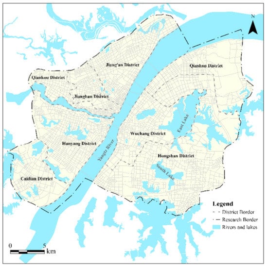
Figure 1.
The main urban area of Wuhan, China.
As an important part of daily life, the urban public transit system in Wuhan has undergone considerable development in recent years. According to the Wuhan Transportation Annual Report released in 2016, by the end of 2015, the urban rail transit system includes 4 lines, 102 stations, and 124 km of route length, and the public bus system includes 467 bus routes, 8301 buses, and 1750 km of total route length. This study focuses on the public bus system which still holds a principal position in daily commutes.
3.2. Data Collection and Preprocessing
This study utilized three types of point data, including residential location, employment location, and public bus data. These point data were, respectively, attributed with the number of residents, number of employees, and number of daily bus arrivals.
The residential location data set was composed of the spatial locations of residential buildings and the number of residents. These data were derived from the residential land use parcels data sets of the Information Center of Wuhan Natural Resource and Planning (ICWNRP). The residential land use parcels were comprised of residential buildings (attributed to building area and the number of the floors in buildings) and census population. To allocate the population to each building in a residential land use parcel, we employed a “volumetric method” that had been tested and verified as suitable for micro-spatial analysis [28]. The total number of residential location points is 289,772 for the year of 2015.
The employment location data included the spatial locations of employment units and the number of employees. These data were derived from the social insurance data set of ICWNRP. The number of employment locations is 12,378 for the year of 2015, and each employment location is attributed with the number of employees.
The residential and employment location data were merged into one data set using the Merge toolbox of the GIS software. These new point data were used to represent the demand for bus services. It should be noted that residential and employment activities bring about different demand patterns of transit travel (e.g., the reverse commuting direction of them). However, we choose to merge the two types of data based on the following considerations: Each trip has an origin and a destination (e.g., residential location and employment location), and both are regarded as “demand points”, and require transit service. Furthermore, we intend to detect demand-supply balance for the whole day (working days), which reflects a coupling relationship between the maximum potential demand and supply.
The bus stop location data with bus arrivals attributes were used to represent the supply of bus services. The bus stop location and bus route data were obtained from Gaode Map (https://developer.amap.com (accessed on 15 March 2021)) using web crawler technology, and were verified using online text-based route information from Wuhan Bus Company in the year of 2016. We simplify two bus stops located at the same location but on opposite sides of the road as one stop point in our data set (bus stop location) because these two stops serve the same bus route in opposite directions. The schedule information of all bus routes was also obtained from the Gaode map. To measure the supply of bus services at each bus stop, we calculated the total number of daily bus arrivals at each stop according to the service duration and headway of the bus routes. Similar measures of the service frequency were applied in service-related evaluation studies [17,29]. There are 1519 bus stops in the study area.
4. Methodology
The analysis in this study comprises three tasks. (1) KDE analysis was conducted to estimate the densities of both jobs-housing locations and bus stops. This approach provides the foundation for further spatial autocorrelation analyses. (2) Spatial autocorrelation analyses, i.e., bivariate Moran’s I and bivariate LISA (Local Indicators of Spatial Association), were performed to investigate the spatial pattern of the relationship between the demand and supply of bus services at the global scale and local scale. (3) Spatial coupling degree index (CDI) and a visual representative method were developed based on spatial autocorrelation analysis. The new methods directly indicate the coupling relationship between the demand and supply at each bus stop. To fulfill these tasks, we made use of several python packages, including pysal and matplotlib, and arcpy.
4.1. Generating the Density of Jobs-Housing Locations
KDE analysis was performed to identify the spatial clustering and convergence trends of the demand and supply of bus services, and to minimize the influence of the imprecise positions of the point sets [30,31]. The population at each jobs-housing location and the number of bus routes for each bus stop are weighting attributes in KDE analysis. The bivariate kernel estimator is defined as follows [32,33]:
where is regarded as the location where the estimation is performed, and is search radius. is the number of points located near x within distance . is the observed ith point (points representing bus stops or a jobs or housing activity) located near x within , and is the kernel weighting function with the distance decay characteristic. The population at each jobs-housing location, as well as the number of bus service arrivals per day of each stop, are adopted as weighting attributes in KDE analysis. The weighting attribute determines the number of times that a bus stop is counted in kernel density calculation.
It should be noted there is the phenomenon of distance decay in the usage of bus services, i.e., the closer to the stop, the relatively larger chance to take the bus services. We utilize the kernel estimator to reflect the phenomenon of distance decay. In this study, the search radius was set to 800 m. This is different from the commonly recognized 400 m, for the fact that the distance decay function has an inclination to underestimate the number of potential users of the bus stop. When utilizing the distance decay function, a longer distance is more reasonable (e.g., one-third mile radius in research by Kimpel et al. [34], and one-half mile radius in research by Zhao et al. [35]).
Based on the KDE maps of jobs-housing locations (demand) and bus stops (supply), we made use of a bilinear interpolation method to calculate the demand and supply density values at each bus stop. These two values were then used in the spatial autocorrelation analysis.
4.2. Detecting the Spatial Relationship between Demand and Supply
Bivariate Moran’s I was applied to test the spatial relationship between the demand and supply of bus services at the global scale of the whole study area. The bivariate LISA value reflects the spatial correlation between the demand and supply of bus services at the local scale of the bus stop. The results of the spatial autocorrelation analysis reflect the spatial association between the demand and supply of bus services, and to what extent the demand and the supply match at each bus stop.
Equation (2) demonstrates how to generate the standardized variables of density values. represents the density of the jobs-housing locations or density of bus stops. and represent the mean value and standard deviation value. Equations (3) and (4), respectively, give the bivariate Moran’s I and bivariate LISA formulas [36]
where n is the number of bus stops in the study area; and represent the standardized variables of the two different values (density of the jobs-housing locations and density of bus stops) of the stops and (two adjacent bus stops). is the spatial weight matrix (constructed using the queen contiguity). is the Bivariate Moran’s I. is the bivariate LISA index of stop .
In Equation (3), is the spatially lagged variable that represents the density of bus services in the areas surrounding stop . and are also utilized to obtain the Moran scatterplot, which is used to decompose the spatial association into four components: low–low and high–high positive associations and low–high and high–low negative associations [37]. In this study, bus stops will be classified into these four components by the Moran scatterplot.
4.3. Coupling Degree Index (CDI)
The standardized variable and spatially lagged variable represent the demand and supply of bus services, respectively. However, the LISA index could not denote the coupling degree between the two variables. Although a higher value of the LISA index may denote a stronger relationship, it is still difficult to judge the extent of demand–supply coupling as the bound of the LISA index could also be very large. Inspired by related studies exploring coupling relationship between two variables [38,39,40]. A new CDI is proposed to overcome this weakness. It can be used to subdivide the classification results of bus stops. Equation (5) give the formula of the CDI.
The function of CDI has three basic characteristics. First, the function has zero-order homogeneity, which is essential for a coupling model [41]. Second, the calculation results are consistent with the basic classification results of Moran scatterplot and the LISA index. The CDI values of bus stops belonging to the first or third quadrant are positive, and those of bus stops in the second or fourth quadrant are negative. Third, the CDI values are between −1 and 1. For every standardized variable and spatially lagged variable that satisfies , if , the CDI takes the maximum value of 1, and if , the CDI takes the minimum value of −1.
To better illustrate the Equation (5), four function images are plotted in graphs in Figure 2a–d. In the spatial rectangular coordinate system , the X, Y, and Z axes represent the standardized variable, spatially lagged variable and CDI variable, respectively. The plane is the plane where the Moran scatterplot is plotted. For a given CDI value , the projection of the contour lines of the function in the plane are two straight lines that pass through the origin of the plane (the red lines in Figure 2d). The corresponding functions of the two lines are inverse functions with slopes or (i.e., ). As approaches 1 (or −1), the two contours gradually approach the function (or ). This phenomenon embodies two other characteristics, i.e., first, if the coupling degree index of a bus stop is , the standardized value multiplied by (or ) equals the spatially lagged variable. This characteristic indicates that a certain kind of coupling relationship between the standardized variable and spatially lagged variable can be represented by a corresponding CDI value. Second, given and (satisfying ), in the plane, for all the bus stops falling between areas encompassed by and (i.e., the four areas marked with ‘①’ in Figure 2d), their corresponding CDI values are between and . Therefore, the CDI may serve as a clearer and more comparable index for illustrating the coupling degree of bus demand and supply at each bus stop.
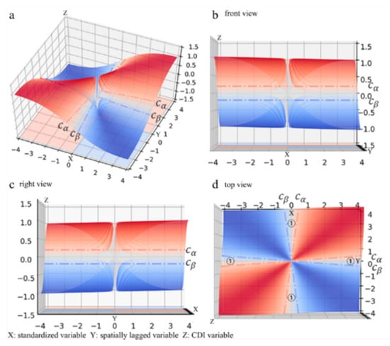
Figure 2.
Images of the CDI function. (a) Overview; (b) Front view; (c) Right view; (d) Top view.
5. Results
5.1. Spatial Patterns of the Demand and Supply of Bus Services
The KDE maps of Figure 3 illustrates the spatial clustering patterns of the demand (jobs-housing) and supply (bus stops) of bus services. In Figure 3a, the hotspots of jobs-housing locations are in the core area of the city. On the northwest side of the Yangtze River, hotspots are mainly distributed in districts (e.g., Jiang’an, Jianghan, and Qiaokou districts) that are the financial, business, and trade centers of the city. On the southeast side of the river, hotspots are mainly distributed in districts (e.g., Wuchang and Hongshan) characterized by the political (government), research, and education (universities and research institutions) sectors. Due to the fact that large-scale enterprises or institutions are only represented as individual points, there are several ‘island-type’ hotspots in the KDE map (notably, the hotspot at the BaoWu Steel Group Corporation).
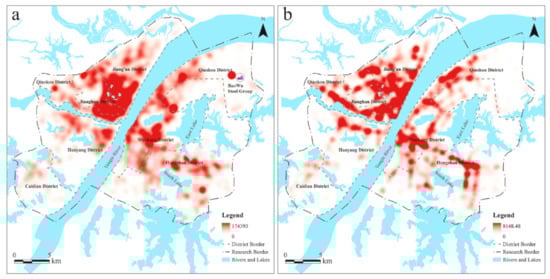
Figure 3.
KDE maps of the demand and supply of bus services. (a) Demand; (b) Supply.
The spatial clustering pattern of the supply of bus services shown in Figure 3b displays a trend similar to that of the spatial distribution of jobs–housing locations, i.e., with high and low hotspots, although some mismatches can be observed in several local areas. However, such findings cannot be directly used to determine the statistical significance of the relationship between the demand and supply of bus services. To overcome this limitation, spatial autocorrelation analysis is introduced to obtain a better understanding of the coupling degree between the demand and supply of bus services at the stop level, as discussed in the next sections.
5.2. Spatial Association between Demand and Supply at Bus Stops
A Moran scatterplot with a regression line is shown in Figure 4a. The horizontal axis describes the standardized data of the demand for bus services. The vertical axis represents the spatially lagged variables representing the supply of bus services. The bivariate Moran’s I indicator reflects the spatial dependency between the demand and supply of bus services, which is 0.558. With 9999 permutations, the z-value that corresponds to the computed Bivariate Moran’s I is 24.272. These values indicate a notable positive spatial autocorrelation. Therefore, high (low) density bus stops are generally clustered around areas with high (low) density jobs-housing locations. This finding further suggests that the spatial distribution of bus stops is reasonable at the global level from the perspective of the spatial relationship between demand and supply.
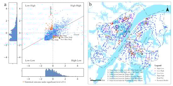
Figure 4.
Moran scatterplot and corresponding classification results of bus stops. (a) Moran scatterplot of the jobs-housing activity distribution and bus services distribution; (b) Classification results of bus stops based on the Moran scatterplot.
As shown in the Moran scatterplot, bus stops are divided into four groups. The upper right and lower left quadrants indicate the spatial associations of similar values (i.e., high–high and low–low). The upper left and lower right quadrants indicate the spatial associations of dissimilar values (i.e., low–high and high–low). Based on the method of standardizing variables (i.e., density values subtracted from the mean and divided by the standard deviation), a low or high value means that the density is below or above the mean value. For instance, a high–low bus stop association indicates that the demand for bus services around the bus stop is higher than the average level and the supply of bus services in this area is lower than the average level.
Based on the relationship, bus stops are classified into four groups, i.e., high–low, low–high, low–low, and high–high, Figure 4b shows the spatial locations of bus stops belonging to each group. The high–high and low–low groups are viewed as well-located bus stops because of the proper balance between the demand and supply, and these groups account for 31.01 and 45.29% of all bus stops, respectively. The high–high groups of bus stops are mainly distributed in the traditional downtown areas of the city (e.g., Jianghan and Jiang’an districts), which are densely occupied by financial institutions, companies, and residential areas. The locations of low–low results illustrate that relatively limited public bus services are related to relatively inactive demands, and stops in this group can be regarded as being properly located. These bus stops are mainly located in the periphery of the study region, where the economy and infrastructure are less developed compared with those in core areas. In general, bus services are rationally distributed in areas where they are needed. This outcome also indicates that the classification results meet the actual situation in general terms, which offer support for the effectiveness of the proposed method.
The high–low and low–high groups, respectively, accounting for 12.38 and 11.32% of bus stops, demonstrate that the demand and supply of bus services are imbalanced. High–low bus stops are mainly located on the west and north side of the south lake (Boxes A and B in Figure 4b), and near the Xingye Road (Box C). Stops in this group indicate an insufficient supply of bus services compared to the high density of jobs–housing activities there. For instance, Box A is the area where a densely residential zone is located. The car dependency problem and overcrowded buses there (especially in morning and evening peaks) have aroused wide public attention. The quantitative evaluation result leads to one of the main reasons that caused this dilemma.
Among the low–high group, bus stops in several areas deserve some exploration. These areas are marked with box D, box E, and box F. Bus stops in the area of box D are located close to the Hankou railway station. Bus stops in the area of box E are located near Hankou River beach park and some protected historical zones. Bus stops in the area of box F are located near the Wuchang railway station. The high supply of bus services in these areas has multiple functions, for example, transferring train passengers and serving tourists, rather than only serve daily commuters. Thus, they are detected as unbalanced when simply applying jobs–housing activity as the demand.
In general, while the bus stops in the high–low group represented locations where bus services were indeed insufficient, bus stops in the low–high group did not necessarily imply a situation of imbalance, as these stops might serve as other types of demand (in addition to the jobs–housing demand).
5.3. Identifying Bus Stops with Dismatched Demand and Supply
In this section, the significant local spatial clustering of bus stops is assessed using bivariate LISA analysis based on 9999 random permutations. A significant filter of 0.1 is used to detect the local spatial clusters of bus stops, and the results are shown in Figure 5a. To obtain a comprehensive and meaningful statistical outcome, Figure 5b also shows the local spatial clusters of bus stops at a significance level of 0.01.
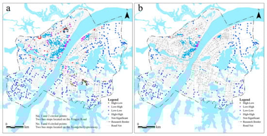
Figure 5.
Local spatial clusters of bus stops based on two significance filters. (a) A significance level of 0.1; (b) A significance level of 0.01.
When 0.1 is chosen as the significance filter, although many bus stops are removed by filtering, 859 of 1519 observations are still significantly clustered in the study area. These bus stops can also be called as leverage points [36,42]. This finding indicates that the local values at these points are very different from the mean values and that they strongly influence the spatial association of the jobs-housing demand with bus services.
Here, we focus on the significant high–low and low–high clusters of bus stops. The corresponding points are marked in the Moran scatterplot (the red points in Figure 4a). It can be concluded from the figure that all leverage points are located in areas where a notable disparity between the jobs–housing demand and bus services exists. For instance, each red point in the fourth quadrant indicates that a relatively high value of the standardized variable (significantly higher than the mean value in contrast with the blue points in this quadrant) or a relatively low value of the spatially lagged variable (significantly lower than the blue points in this quadrant) has been detected in the area around the corresponding bus stops. Here, two bus stops located on Xingye Road (the No. 1 and No. 2 bus stops in Figure 5a) are marked as examples. A visual evaluation of Figure 4a indicates that the two bus stops are far from the main body of the point cloud. The spatially lagged variables at these two points are, respectively, −0.812 and −0.740, indicating the supply of bus services in the corresponding area is significantly lower than the average service level. The standardized density values at these points are, respectively, 0.067 and 0.357, reflecting that the demand values in the areas around these stops are higher than the average level.
Based on the abovementioned approach, the high–low clusters of bus stops on the Xingye Road and the Xiongchu Expressway are regarded as seriously unbalanced locations for bus services. This result also indicates that bus stops with unbalanced demand and supply trend to cluster in spatial locations.
5.4. Coupling Degree Index of Each Bus Stop
In this section, four CDI values are selected to subdivided the classification results of the Moran scatterplot. The outcome can demonstrate the coupling relationship between the demand and supply of bus services at the bus stop level. To better illustrate the new index, a visual representative method combining the Moran scatterplot and the CDI is proposed.
In spatial rectangular system shown in Figure 6, the X, Y, and Z axes represent the standardized variable, spatially lagged variable and CDI variable, respectively. Figure 6b–d is the three views of the Figure 6a. Notably, Figure 6d can also be regarded as the Moran scatterplot. This visualization method can help to understand the subdivided principle and visualize the overall coupling relationship between the demand and supply of bus services.
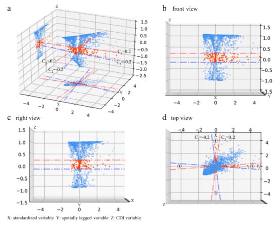
Figure 6.
A visual representative method combining the Moran scatterplot and CDI. (a) Overview; (b) Front view; (c) Right view; (d) Top view. “①”—Moran scatterplot.
To illustrate how the CDI values can be used to subdivide the bus stops. A group of bus stops with CDI values falling in [−0.2, 0.2] is taken as an example. The red points in Figure 6 are the corresponding visualization results. The blue and red lines are the contour lines of the CDI function. They correspond to the CDI values −0.2 and 0.2, respectively. Based on the visual results showing in Figure 6a–c and the basic mathematical properties mentioned in Section 3, in Figure 6d, the CDI values of the points encompassed by the four lines are all between [−0.2, 0.2]. Therefore, viewing from the Moran scatterplot showing in Figure 6d, these bus stops are subdivided by the CDI values which have actual meanings.
To better il lustrate the practical meanings of certain CDI values. A group of bus stops with CDI values falling in (0, 0.2] is taken as an example. The corresponding points fall in the orange region in the first quadrant of the Moran scatterplot (“①” area in Figure 7a). The practical meaning is that the demand for bus services around the stop is above the average level, whereas the supply of bus services in the surrounding area is above the average level by more than 10 times the former degree. The 10 times is calculated by (This calculation formula is constructed in basis of the mathematical properties of CDI mentioned in Section 3). It implies the demand and supply are not higher than the average in a consistent way (which means that the index does not equal 1). Some bus stops with indices in [−0.2, 0] are also selected as an example. The corresponding points fall in the orange region in the fourth quadrant of the Moran scatterplot (“②” area in Figure 7a). The practical meaning of this group of bus stops is that the demand for bus services around the corresponding bus stop is above the average level, whereas the supply of bus services in the surrounding area is lower than the average level; however, the latter degree is less than 0.1 times the former degree. This finding indicates that the demand and supply are not completely opposite (which means that the index does not equal −1). Generally, these two types of bus stops represent a situation in which the coupling degree between the demand and supply is “not that good” or “not that bad”.
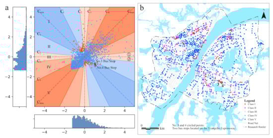
Figure 7.
The CDI subclassification results. (a) The subclassification result for Moran scatterplot (b) The cor-responding subclassification results of bus stops.
In this study, four CDI values which are C1 = −0.8, C2 = −0.2, C3 = 0.2, and C4 = 0.8 are selected to subdivide the classification results of the Moran scatterplot (shown in Figure 7a). In total, four CDI values actually make six value intervals which are [−1, −0.8), [−0.8, −0.2), [−0.2, 0), [0, 0.2), [0.2, 0.8), and [0.8, 1]. However, according to the actual meaning, we merge the intervals [−0.2, 0) and [0, 0.2) together. In total, five value intervals are name as Class I, Class II, Class III, Class IV, and Class V (corresponding to the I, II, III, IV, V regions of the Figure 7a and indicating the coupling degree are bad, relatively bad, not that good, relatively good, and good, respectively). Figure 7b shows the corresponding bus stops subdivided results.
To sum up, the CDI overcome the weakness that the Moran scatterplot and the LISA index cannot explicitly exhibit the coupling degree between demand and supply. In this paper, we choose the value intervals [0.8, 1] to represent the ‘good’ coupling group, and most of the bus stops belonging to high–high or low–low groups are subdivided into the ‘good’ coupling group in terms of the CDI outcomes. In practice, other combinations of value intervals may be chosen for satisfying specific requirements.
When evaluating the bus stop layout in terms of the new index, the coupling degree index should be utilized in combination with the spatial autocorrelation approach. For example, based on the analysis results in Section 4.2 and Section 4.3, the No. 3 and No. 4 bus stops in Figure 7b (they are also marked out in Figure 5a) are classified as seriously unreasonable, which means the demand for bus services is significantly higher than the average, and the supply of bus services around bus stop is significantly lower than the average. The corresponding coupling degree indices are −0.931 and −0.977, which means the degree of the above-average characteristic is almost totally opposite the degree of the below-average characteristic. Therefore, based on spatial clustering analysis and coupling degree index analysis, the bus services around these bus stops, which are located near Xiongchu Expressway (Figure 7b), are considered to be seriously unbalanced.
This result reflects the actual situation in the corresponding area. The No. 3 and 4 bus stops are deployed at a demand hotspot where one hospital, two large universities, and several residential communities are located. Although the service supply on corresponding stops looks enough (e.g., 489 daily bus arrivals at the No. 3 bus stop), we think that the relatively sparse distribution of bus stops still leads to the seriously unbalanced status between the demand and supply of bus services there.
6. Discussion
Urban bus transit systems should be planned and deployed as to effectively meet the travel demand. This study has proposed a density-based statistical approach for evaluating the coupling degree between demand and supply of bus service. We made use of KDE analysis to derive densities of demand and supply, in which population and employment locations were merged to generate demand density, and bus stops with daily served buses were utilized for supply density. The search radius was set to 800 m to reflect the phenomenon of distance decay. Based on spatial autocorrelation analysis, a coupling degree index (CDI) has been developed to indicate demand–supply balance, allowing assessing individual stops, as well as a comparison between stops. Our experiment in Wuhan has demonstrated the effectiveness of this approach.
Compared with the buffer analysis that seldom considers the service capacity of bus stops [5,14], the proposed approach carries out a detailed modeling of the service supply and directly detects the seriously unbalanced locations for bus services based on the spatial autocorrelation analysis. Compared with the accessibility-type evaluation method [10,12], the mathematical characteristics of the coupling degree index ensure the proposed method is able to reveal the specific balanced relationship with a corresponding index value (or with a value interval), which means the interaction between the demand and supply is investigated more comprehensively. Moreover, for some practical cases that are short of accurate or timely demand-side or supply-side data sets, other meaningful inputs, e.g., the number of routes serving the stop or community-level demographic data, can also be regarded as an alternative in the estimation of the demand or supply density. This feature of flexibility is valuable when conducting the quick evaluation of the bus stop layout in an evolutionary urban context.
Our density-based approach also takes a different perspective from those comprehensive transit assignment models [43,44] that may calculate the volume-capacity ratio for each bus route. For trip-related demand modeling, detailed information is necessary at the individual level of bus transit travelers, which costs much time and effort [45]. By avoiding the complex assignment tasks, our approach takes a statistical logic and aims to quickly and directly assess the coupling degree at both the global and bus stop scale. Therefore, this density-based approach may be regarded as falling between the simpler and more comprehensive transit demand modeling approaches.
The selection of source data for KDE analysis deserves additional attention. For the demand-side, while population and employment may only indicate potential demand in general terms, more accurate measurement necessitates incorporating detailed socioeconomic status (e.g., income, age, car ownership, etc.) and considering the time-varying characteristics of the travel demand (e.g., the reversed commuting direction in morning and evening peaks). For example, the transport need index [46] consisting of various socioeconomic characteristics has been proven effective in the identification of the public transport demand. Incorporating this indicator into the proposed method may substantially improve the estimation of the spatial pattern of demand (i.e., taking the indicator as the weighting attributes). Additionally, incorporating demand-side data with high temporal resolution (e.g., ridership flow data) may also lead to evaluation results with a high temporal resolution. For instance, the evaluation results of the morning and evening peaks can be obtained separately. Related outcomes have the potential to act as the guideline towards the flexible placement of bus stops. Meanwhile, for the supply-side, bus stops were weighted by their daily bus services, which also implied a simplification. A more reasonable improvement would be applying accessibility measurement as the weighting attribute to the stops. The accessibility model here should indicate the number of places or jobs that may be reached by the existing bus network given a specified time or monetary budget. There is also the possibility of making use of origin–destination data, from records of public transport IC cards or mobile phones, for assessing the demand–supply balance via the spatial autocorrelation analysis.
To sum up, we think that the characteristics of the method present policy implications at two levels: (1) At the macro level, the flexibility and efficiency of the density-based method ensure its value in quickly responding to scenarios of bus route and stop deployment or land use development in an evolutionary urban context; (2) At the detailed level, specific improvements including deploying more bus stops or increasing service frequencies of corresponding routes can be directly carried out in areas where extremely unbalanced phenomena are detected (e.g., high–low clusters of bus stops with a small coupling index value).
7. Conclusions
The density-based spatial autocorrelation analysis is advantageous to evaluating the coupling degree between demand and supply of bus transit service. The experiment in Wuhan has demonstrated the effectiveness of the approach. The bivariate Moran’s I indicated that bus services in Wuhan city generally satisfy bus travel demand at a global scale. However, the Moran scatterplot revealed there are significantly unbalanced bus stops in terms of bus demand and supply. The local spatial clusters of unbalanced bus stops could be identified with the bivariate LISA statistics based on a random permutation approach. The newly constructed coupling degree index further illustrated the coupling relationship between the demand and supply at each bus stop. This analyzing framework may effectively contribute to evaluating scenarios of urban bus system planning in a growing socio-economic context.
Further studies may be carried out from two perspectives. First, the methods of density generation can be improved for both the demand and the supply side. For the demand side, the socio-economic features of the bus travelers may be added to reflect the need for bus service more precisely. Trips with other special purposes such as education and shopping could also be taken into account. For the supply side, there is a good chance to incorporate accessibility measurements based on bus network configuration and operational dispatching. Second, the coupling degree between demand and supply of bus service can be regarded as an indicator of urban transport, and therefore may be applied in such studies as equality analysis for sustainable urban development.
Author Contributions
Conceptualization: Zhengdong Huang and Bowen Li; methodology, Zhengdong Huang, Bowen Ii and Jizhe Xia; formal analysis, Bowen Li; writing—original draft, Bowen Li; validation, Ying Zhang, Wenshu Li; writing—review and editing, Ying Zhang, Jizhe Xia, Wenshu Li and Zhengdong Huang All authors have read and agreed to the published version of the manuscript.
Funding
This work was funded by National Natural Science Foundation of China, No. 42071357; National Key Research and Development Project, No. 2018YFB2100704; National Natural Science Foundation of China-Joint Programming Initiative Urban Europe, No. 71961137003; Guangdong Science and Technology Strategic Innovation Fund (the Guangdong–Hong Kong–Macau Joint Laboratory Program), No.: 2020B1212030009.
Institutional Review Board Statement
The study did not require ethical approval.
Informed Consent Statement
Not applicable.
Data Availability Statement
The data presented in this study are available on request from the corresponding author.
Acknowledgments
The authors would like to thank three anonymous reviewers and the editor for their constructive comments and helpful suggestions.
Conflicts of Interest
No potential conflict of interest was reported by the authors.
References
- Murray, A.T. Strategic analysis of public transport coverage. Socio-Econ. Plan. Sci. 2001, 35, 175–188. [Google Scholar] [CrossRef]
- AlRukaibi, F.; AlKheder, S. Optimization of bus stop stations in Kuwait. Sustain. Cities Soc. 2019, 44, 726–738. [Google Scholar] [CrossRef]
- Cervero, R.; Kang, C.D. Bus rapid transit impacts on land uses and land values in Seoul, Korea. Transp. Policy 2011, 18, 102–116. [Google Scholar] [CrossRef]
- Huang, Z.; Liu, X. A Hierarchical Approach to Optimizing Bus Stop Distribution in Large and Fast Developing Cities. ISPRS Int. J. Geo-Inf. 2014, 3, 554–564. [Google Scholar] [CrossRef]
- Murray, A.T.; Davis, R.; Stimson, R.J.; Ferreira, L. Public transportation access. Transp. Res. Part D Transp. Environ. 1998, 3, 319–328. [Google Scholar] [CrossRef]
- Langford, M.; Fry, R.; Higgs, G. Measuring transit system accessibility using a modified two-step floating catchment technique. Int. J. Geogr. Inf. Sci. 2012, 26, 193–214. [Google Scholar] [CrossRef]
- Wirasinghe, S.C. Nearly optimal parameters for a rail/feeder-bus system on a rectangular grid. Transp. Res. Part A Gen. 1980, 14, 33–40. [Google Scholar] [CrossRef]
- Currie, G. Quantifying spatial gaps in public transport supply based on social needs. J. Transp. Geogr. 2010, 18, 31–41. [Google Scholar] [CrossRef]
- Michael, A.; Cecilia, J.; Currie, G. Exploring public transport equity between separate disadvantaged cohorts: A case study in Perth, Australia. J. Transp. Geogr. 2015, 43, 111–122. [Google Scholar] [CrossRef]
- Karner, A. Assessing public transit service equity using route-level accessibility measures and public data. J. Transp. Geogr. 2018, 67, 24–32. [Google Scholar] [CrossRef]
- Chen, X.; Jia, P.; Chen, X. A comparative analysis of accessibility measures by the two-step floating catchment area (2SFCA) method. Int. J. Geogr. Inf. Sci. 2019, 33, 1739–1758. [Google Scholar] [CrossRef]
- Langford, M.; Higgs, G.; Fry, R. Using floating catchment analysis (FCA) techniques to examine intra-urban variations in accessibility to public transport opportunities: The example of Cardiff, Wales. J. Transp. Geogr. 2012, 25, 1–14. [Google Scholar] [CrossRef]
- Demetsky, M.J.; Lin, B.B. Bus Stop Location and Design. J. Transp. Eng. 1982, 108, 313–327. [Google Scholar] [CrossRef]
- Foda, M.; Osman, A. Using GIS for Measuring Transit Stop Accessibility Considering Actual Pedestrian Road Network. J. Public Transp. 2010, 13, 23–40. [Google Scholar] [CrossRef]
- Golub, A.; Martens, K. Using principles of justice to assess the modal equity of regional transportation plans. J. Transp. Geogr. 2014, 41, 10–20. [Google Scholar] [CrossRef]
- Merlin, L.A.; Hu, L. Does competition matter in measures of job accessibility? Explaining employment in Los Angeles. J. Transp. Geogr. 2017, 64, 77–88. [Google Scholar] [CrossRef]
- Wu, B.; Hine, J. A PTAL approach to measuring changes in bus service accessibility. Transp. Policy 2003, 10, 307–320. [Google Scholar] [CrossRef]
- Martens, K. Justice in transport as justice in accessibility: Applying Walzer’s “Spheres of Justice” to the transport sector. Transportation 2012, 39, 1035–1053. [Google Scholar] [CrossRef]
- Tirachini, A. The economics and engineering of bus stops: Spacing, design and congestion. Transp. Res. Part A Policy Pract. 2014, 59, 37–57. [Google Scholar] [CrossRef]
- Avi, A.; Butcher, M.; Wang, L. Optimization of bus stop placement for routes on uneven topography. Transp. Res. Part B 2015, 74, 40–61. [Google Scholar] [CrossRef]
- Ibeas, Á.; Olio, L.; Alonso, B.; Sainz, O. Optimizing bus stop spacing in urban areas. Transp. Res. Part E 2010, 46, 446–458. [Google Scholar] [CrossRef]
- Li, H.; Bertini, R.L. Assessing a Model for Optimal Bus Stop Spacing with High-Resolution Archived Stop-Level Data. Transp. Res. Rec. 2009, 2111, 24–32. [Google Scholar] [CrossRef]
- Mamun, S.A.; Lownes, N.E. Access and Connectivity Trade-Offs in Transit Stop Location. Transp. Res. Rec. 2014, 2466, 1–11. [Google Scholar] [CrossRef]
- Chen, J.; Liu, Z.; Zhu, S.; Wang, W. Design of limited-stop bus service with capacity constraint and stochastic travel time. Transp. Res. Part E Logist. Transp. Rev. 2015, 83, 1–15. [Google Scholar] [CrossRef]
- Murray, A.T. A Coverage Model for Improving Public Transit System Accessibility and Expanding Access. Ann. Oper. Res. 2003, 123, 143–156. [Google Scholar] [CrossRef]
- Murray, A.T.; Wu, X. Accessibility tradeoffs in public transit planning. J. Geogr. Syst. 2003, 5, 93–107. [Google Scholar] [CrossRef]
- Delmelle, E.M.; Li, S.; Murray, A.T. Identifying bus stop redundancy: A gis-based spatial optimization approach. Comput. Environ. Urban Syst. 2012, 36, 445–455. [Google Scholar] [CrossRef]
- Lwin, K.K.; Murayama, Y. A GIS Approach to Estimation of Building Population for Micro-spatial Analysis. Trans. Gis 2009, 13, 401–414. [Google Scholar] [CrossRef]
- Delbosc, A.; Currie, G. Using Lorenz curves to assess public transport equity. J. Transp. Geogr. 2011, 19, 1252–1259. [Google Scholar] [CrossRef]
- Chainey, S.; Tompson, L.; Uhlig, S. The Utility of Hotspot Mapping for Predicting Spatial Patterns of Crime. Secur. J. 2008, 21, 4–28. [Google Scholar] [CrossRef]
- Zhang, Z.; Feng, Z.; Zhang, H.; Zhao, J.; Yu, S.; Du, W. Spatial distribution of grassland fires at the regional scale based on the MODIS active fire products. Int. J. Wildl. Fire 2017, 26, 209–218. [Google Scholar] [CrossRef]
- Silverman, B. Density Estimation For Statistics And Data Analysis; Chapman and Hall: London, UK, 1986. [Google Scholar]
- Gatrell, A.C.; Bailey, T.C.; Diggle, P.J.; Rowlingson, B. Spatial point pattern analysis and its application in geographical epidemiology. Trans. Inst. Br. Geogr. 1996, 21, 256–274. [Google Scholar] [CrossRef]
- Kimpel, T.J.; Dueker, K.J.; El-Geneidy, A.M. Using GIS to Measure the Effect of Overlapping Service Areas on Passenger Boardings at Bus Stops. URISA J. 2007, 19, 5–11. [Google Scholar]
- Zhao, F.; Chow, L.-F.; Li, M.-T.; Ubaka, I.; Gan, A. Forecasting Transit Walk Accessibility: Regression Model Alternative to Buffer Method. Transp. Res. Rec. 2003, 1835, 34–41. [Google Scholar] [CrossRef]
- Anselin, L. Local Indicators of Spatial Association—LISA. Geogr. Anal. 1995, 27, 93–115. [Google Scholar] [CrossRef]
- Anselin, L. The Moran Scatterplot as an ESDA Tool to Assess Local Instability in Spatial Association. In Spatial Analytical Perspectives on GIS in Environmental and Socio-Economic Sciences; Fischer, M., Scholten, H., Unwin, D., Eds.; Taylor & Francis: London, UK, 1996; Volume 4, pp. 111–125. [Google Scholar]
- He, J.; Wang, S.; Liu, Y.; Ma, H.; Liu, Q. Examining the relationship between urbanization and the eco-environment using a coupling analysis: Case study of Shanghai, China. Ecol. Indic. 2017, 77, 185–193. [Google Scholar] [CrossRef]
- Li, Y.; Li, Y.; Zhou, Y.; Shi, Y.; Zhu, X. Investigation of a coupling model of coordination between urbanization and the environment. J. Environ. Manag. 2012, 98, 127–133. [Google Scholar] [CrossRef]
- Yang, Z.; Chen, Y.; Qian, Q.; Wu, Z.; Zheng, Z.; Huang, Q. The coupling relationship between construction land expansion and high-temperature area expansion in China’s three major urban agglomerations. Int. J. Remote Sens. 2019, 40, 1–20. [Google Scholar] [CrossRef]
- Cong, X. Expression and Mathematical Property of Coupling Model, and Its Misuse in Geographical Science. Econ. Geogr. 2019, 39, 18–25. [Google Scholar] [CrossRef]
- Ping, J.L.; Green, C.J.; Zartman, R.E.; Bronson, K.F. Exploring spatial dependence of cotton yield using global and local autocorrelation statistics. Field Crop. Res. 2004, 89, 219–236. [Google Scholar] [CrossRef]
- De Cea, J.; Fernández, E. Transit assignment for congested public transport systems: An equilibrium model. Transp. Sci. 1993, 27, 133–147. [Google Scholar] [CrossRef]
- Wu, W.; Liu, R.; Jin, W.; Ma, C. Stochastic bus schedule coordination considering demand assignment and rerouting of passengers. Transp. Res. Part B 2019, 121, 275–303. [Google Scholar] [CrossRef]
- Huang, Z.; Ming, Z.; Liu, X. Estimating light-rail transit peak-hour boarding based on accessibility at station and route levels in Wuhan, China. Transp. Plan. Technol. 2017, 40, 624–639. [Google Scholar] [CrossRef]
- Currie, G. Gap Analysis of Public Transport Needs: Measuring Spatial Distribution of Public Transport Needs and Identifying Gaps in the Quality of Public Transport Provision. Transp. Res. Rec. 2004, 1895, 137–146. [Google Scholar] [CrossRef]


Publisher’s Note: MDPI stays neutral with regard to jurisdictional claims in published maps and institutional affiliations. |
© 2021 by the authors. Licensee MDPI, Basel, Switzerland. This article is an open access article distributed under the terms and conditions of the Creative Commons Attribution (CC BY) license (http://creativecommons.org/licenses/by/4.0/).