Abstract
This study investigated how the front-page designs of digital newspapers differ based on institutional origin—comparing platforms that were born-digital with those that have transitioned from print—focusing specifically on their appeal to Generation Z audiences. Grounded in Media Richness Theory, this research employed a mixed-methods approach that combined a quantitative visual content analysis with qualitative semi-structured interviews. In the quantitative phase, the front pages of ten Saudi digital newspapers (five digital-native and five digital-migrant) were systematically analyzed to identify differences in their layouts, typography, multimedia usage, and interactivity. The qualitative phase then explored Generation Z users’ perceptions of the design clarity, visual engagement, and interactive affordances, as well as their suggestions for improving interface usability. The results indicate that digital-native newspapers more closely adhere to contemporary digital design standards and demonstrate significantly higher levels of media richness. This study contributes to digital journalism scholarship by offering both theoretical insights into interface-centered richness and practical design recommendations for enhancing user experience and engagement among younger audiences.
1. Introduction
The transformation of journalism from traditional print to digital platforms has significantly reshaped how news is designed, distributed, and consumed. This shift has also introduced new theoretical questions regarding how digital formats impact user engagement. One of the key theoretical lenses for understanding this change is Media Richness Theory (MRT), developed by Daft and Lengel (1986). MRT posits that communication media vary in their richness based on factors, such as the number of cues transmitted, the immediacy of feedback, and their capacity to convey emotions. Traditionally, newspapers were classified as low-richness media due to their static, text-based nature and lack of interactivity (Hornung 2015). However, with the rise of digital journalism, newspapers now incorporate richer elements, such as multimedia, video, and interactive features, potentially altering their position on the media richness continuum (Tseng and Wei 2020).
Despite increased scholarly attention to digital journalism, few studies have directly compared digital-migrant (print-origin) and digital-native (born-digital) newspapers, even though their institutional origins profoundly shape their design strategies. The early digital newspapers in the 1990s largely replicated print structures with minimal interactivity (Arrese and Kaufmann 2016). In contrast, digital-native outlets—especially those that have emerged since 2010—are structurally aligned with the affordances of the web, embracing interactivity and visual storytelling as core features (Salaverría et al. 2020). This institutional distinction is not merely historical; it informs editorial logic, platform behavior, and interface design.
However, comparative studies of the layouts, interactivity, and media richness across these two types remain scarce. For example, while Karaaslan (2019) examined online newspaper design, the study treated digital media as a homogeneous category, overlooking critical distinctions in design evolution across publication types. Similarly, the Digital-Born News Media in Europe report (2016) addressed structural differences in funding and distribution, but neglected the user-facing design features that shape audience engagement. In addition to these gaps, Gilbert and Watkins (2020) found that born-digital news outlets are severely underrepresented in academic news databases, making it difficult for researchers to access their content for analysis. This form of institutional gatekeeping has contributed to the persistent invisibility of digital-native design practices in scholarly work. This limited representation has not only obscured the scholarly visibility of digital-native platforms, but has also constrained efforts to evaluate their distinct contributions to interactive journalism. In the Saudi context, the distinction between digital-migrant and digital-native newspapers is often applied implicitly, particularly in sampling strategies. For instance, Al-Sulami (2020) focused exclusively on born-digital platforms in his analysis of Saudi online newspapers, while Baothman and Salem (2019) based their sample entirely on print-origin outlets. Although such differentiation is not always theorized, it is recurrent across Saudi empirical studies. One notable exception that explicitly articulated the distinction and compared both types is the study by Alotaibi (2014), which found significant engagement differences between the two categories—Sabq (born-digital) showing higher interaction rates than Okaz (print-origin). Given these gaps in the literature, MRT serves as a strong framework for such an inquiry. As digital newspapers integrate multimedia, interactivity, and real-time feedback, they can move closer to “rich” media formats as defined by Daft and Lengel (1986) and later scholars like Kock (2005). Yet, studies applying MRT to digital journalism, particularly in the Saudi or Arab context, remain rare. An exception is a study by Abd Al-Elah et al. (2021), which applied MRT to evaluate science journalism in Saudi Arabia, illustrating the broader applicability of the theory in the digital media field.
Alongside these media changes, the audience itself has transformed. Generation Z—those born between the mid-1990s and early 2010s—is the first generation to grow up fully immersed in digital environments (Van den Bergh and Behrer 2016). They favor content that is fast, interactive, and visually engaging, including short videos, infographics, and social media-style storytelling (Newman 2022). Studies have shown that this generation values personalization, usability, and participation over traditional linear formats (Prensky and Berry 2001; Seemiller and Grace 2017). While global research has explored Gen Z preferences in Western contexts, there is still only a limited understanding of how young Saudi users engage with digital platforms (Abed 2024; Alosaimi 2024), particularly digital journalism of various institutional origins.
Saudi Arabia presents a particularly relevant case. The early digital newspapers in the Kingdom, such as Al-Jazirah, founded in 1995, faced challenges due to the lack of Arabic support for global design tools, resulting in static images rather than dynamic content (Alenizi 2006). These limitations persisted until technological advancements enabled full Arabic digital publishing. In recent years, under a Saudi national policy called Vision 2030, the country’s digital transformation has accelerated. The Kingdom has undergone a structured transformation of its media sector, driven by institutional initiatives aligned with Vision 2030. Notably, the Ministry of Media declared 2024 the ‘Year of Media Transformation’, launching a comprehensive strategy focusing on four key areas: governance and regulation, digital infrastructure, content innovation, and talent development (Ministry of Media 2024). These efforts reflect a deliberate shift from traditional journalism to a platform-driven, interactive media ecosystem that emphasizes audience participation and digital engagement. With over 71% of the population under the age of 35 (General Authority for Statistics 2023), and Vision 2030’s call for digital innovation and youth involvement, understanding how Saudi Gen Z audiences engage with digital-native versus digital-migrant newspapers represents a timely and critical inquiry.
This study adopted a mixed-methods approach. It began with a quantitative visual content analysis of the front pages of ten Saudi digital newspapers—five digital-migrant and five digital-native. To deepen the insights from this analysis, this study then moved to a qualitative phase involving semi-structured interviews. A total of 18 Generation Z participants were invited to evaluate two contrasting newspaper interfaces: Al-Riyadh, representing a digital-migrant platform with a print legacy, and Sabq, a purely digital outlet. After browsing the front pages of both newspapers, the participants shared their impressions regarding design clarity, interactivity, and perceived ease of use. This qualitative inquiry aimed to capture user-cantered interpretations of media richness and explore how institutional origin influences interface engagement from a generational perspective. The goal was to integrate the quantitative findings from the visual content analysis of the Saudi digital newspapers with user-cantered perspectives, providing a comprehensive evaluation of how institutional origin and interface design impact perceived media richness and user impressions.
This study is also a response to calls by Aitamurto et al. (2023) to expand digital journalism research beyond Western-centric contexts. They argued that most prior studies focused on Europe and North America, overlooking the unique values, challenges, and design practices emerging in Global South regions, such as the Middle East. By focusing on Saudi Arabia, this research contributes to a more diverse and globally inclusive understanding of digital journalism and design. To address these gaps, this research applies Media Richness Theory to assess how design elements—graphic layout, multimedia, and interactivity—vary between Saudi digital-native and digital-migrant newspapers. By focusing on Generation Z users and their perceptions of interface design, this study contributes to a more inclusive, theory-driven understanding of digital journalism in the Arab world.
1.1. Comparative Studies of Migratory and Original Digital Newspapers
The distinction between migratory (print-origin) and original (purely digital) newspapers offers a foundational analytical lens for understanding the divergent paths media institutions have followed in adapting to a digital environment. While migratory newspapers often bring inherited editorial hierarchies, design conventions, and legacy workflows with them, original digital newspapers tend to emerge from a clean slate—born into the logic of the web, they are structurally flexible and responsive to the dynamics of digital culture.
This study adopts a typological framework partly inspired by Marc Prensky’s (Prensky and Berry 2001) widely cited distinction between digital-immigrants and digital-natives. Originally developed to describe generational gaps in digital literacy, Prensky’s framework highlights how an early immersion in digital environments leads to fundamentally different cognitive and behavioral patterns, noting that “today’s students think and process information fundamentally differently from their predecessors” (Prensky and Berry 2001, p. 2). Extending this analogy to media systems, migratory newspapers “immigrate” from a print-based paradigm, while born-digital newspapers are native to the affordances of online media. This distinction is not merely chronological; it reflects different epistemologies of production, design, and engagement.
Empirical support for this typology is evident from multiple studies. Karaaslan (2019), in a comparative analysis of Turkish newspapers, observed that born-digital platforms employed more advanced interactive features and multimedia tools, while print-origin newspapers retained static layouts and linear editorial structures. Arrese and Kaufmann (2016) further demonstrated that, although the demographic profiles of readers may not differ drastically, digital-native platforms tend to attract more participatory behaviors and a preference for personalized, opinionated journalism—particularly among younger audiences—whereas legacy outlets maintain loyalty through brand recognition and perceived neutrality.
The distinction becomes even clearer from institutional analyses. Nicholls et al. (2016), in a report for Reuters Institute, found that born-digital news organizations are not only more agile but also strategically positioned to pursue innovation without the burden of inherited systems: “Digital-born organisations are better positioned to focus on future opportunities without having to manage inherited operations that often inhibit change” (p. 11). These institutions tend to embody participatory culture and media richness from the outset, making them more aligned with evolving digital expectations.
This dynamic is especially pronounced in Spain. Negredo et al. (2020), in their extensive study of over 3800 digital outlets, found that digital-native platforms expanded most aggressively during the Great Recession, often founded by displaced journalists seeking editorial freedom and low-barrier entry into the digital market. Platforms, like eldiario.es and El Confidencial, became successful not just due to their content, but due to their platform-native design, user trust strategies, and flexible revenue models. Their rise illustrates a form of Schumpeterian “creative destruction” within journalism—where the collapse of legacy systems gives rise to more adaptive, user-oriented models.
Yet, structural challenges persist. Gilbert and Watkins (2020) found that over 70% of the most read or award-winning born-digital news outlets were excluded from major news aggregator databases—a finding that reveals entrenched institutional biases favoring legacy media. Such exclusion affects not only their visibility and traffic but also their legitimacy within the broader digital ecosystem. As the authors argued, institutional origin thus extends beyond internal workflows to shape external access, recognition, and influence.
Together, these studies underscore the significance of institutional origin as a determinant of both design behavior and audience interaction. Migratory and original newspapers differ not just in their content delivery but in their conceptual architecture—their embedded philosophies of what news is, how it should be delivered, and how users should engage with it. The current study builds on this typological distinction to analyze Saudi digital newspapers, examining how legacy constraints or digital nativity influence the interface design, interactivity, and user experience—particularly for a Generation Z audience shaped by rich, participatory, and intuitive digital media.
1.2. Relevance of Generation Z to Media Richness in the Saudi Digital Context
This study focuses on Generation Z, who comprise approximately 36.7% of the Saudi population (Abed 2024), due to their distinct digital behaviors and expectations that reflect broader transformations in the country’s media landscape. Local scholarship has indicated that this generation favors interactive platforms, visually engaging designs, and systems that emphasize customization and participation. For instance, Alghamdi and Alzahrani (2024) found that both Saudi Gen Z and Millennials are more likely to engage with digital content presented through dynamic layouts, embedded multimedia, and participatory tools—preferences that align strongly with Media Richness Theory dimensions, such as immediacy, multiplicity of cues, and personalization.
Contrary to the perception that Gen Z is disengaged from the news, the evidence suggests otherwise. Alsulaiman (2022) found that Saudi youth—including members of Gen Z—actively consume news, but primarily through modern digital channels, particularly social media, with smartphones as their main access point. While their interaction with traditional media may be declining, this does not indicate disinterest in news itself, but rather a transformation in how news is accessed and experienced. These patterns further validate the need to examine how this generation interacts with the design of digital newspaper interfaces.
Although the Saudi context is unique, regional comparisons offer supportive insights. Zaid et al. (2022), in their study of UAE Millennials, found that Gulf youth display diverse but overlapping digital habits, characterized by a desire for novelty, digital independence, and mobile-centric usage. While not directly transferable, such findings suggest a broader generational shift toward media richness and interactivity across the Gulf, modulated by local cultural norms.
In the same vein, Abed (2024) reported that Saudi Gen Z users prioritize system quality, usability, and personalized digital environments—criteria central to perceived media richness. These findings collectively reinforce the relevance of applying Media Richness Theory to evaluate user experiences with digital newspaper interfaces in the Saudi context.
1.3. Theoretical Framework: Evolving Media Richness Toward Interface-Cantered Design
Media Richness Theory (MRT), introduced by Daft and Lengel (1986), was originally formulated to explain how communication media vary in their capacity to reduce ambiguity and enhance understanding. The theory identifies four key dimensions of media richness: (1) the immediacy of feedback, (2) the multiplicity of cues, (3) the use of natural language, and (4) personalization and social presence. Based on these dimensions, a hierarchy of media was proposed, with face-to-face communication considered the richest, and written or numeric media ranked as the leanest. MRT was designed primarily for internal organizational contexts where decision-making efficiency, clarity, and responsiveness are central.
Over time, critiques have emerged regarding the theory’s rigidity and technological determinism. Media Synchronicity Theory (Dennis and Valacich 1999) introduced a more task-oriented approach, suggesting that richness depends on the communication goals—conveyance or convergence—rather than on a fixed medium hierarchy. Simultaneously, Ferry et al. (2001) and others argued that richness should be viewed as a perceived construct influenced by the user context, cognitive effort, and media familiarity, especially in emerging digital environments. These shifts opened the door for reconceptualizing richness not as a fixed property of a medium, but as an experiential outcome shaped by the interface design, symbolic density, and interactivity.
Several studies have since applied MRT beyond interpersonal contexts. For instance, Sun and Cheng (2007) demonstrated that multimedia-rich learning environments enhance the comprehension of complex tasks. More recently, Mammadov (2022) reframed richness as a function of the interface architecture of political media platforms, showing that users prefer visually dense, real-time, and participatory environments during crisis situations.
However, despite these developments, MRT remains under-utilized for evaluating news interface design, particularly within non-Western digital ecosystems. Many recent studies have still focused on MRT’s original criteria—feedback, cues, and language—without adapting them to the affordances and symbolic features of contemporary media platforms.
This study addresses that gap by extending MRT from channel-based communication to interface-cantered public media, treating the front page of a digital newspaper as a complex communication medium in itself. We argue that richness is no longer solely defined by the media type, but by the interface attributes that shape user perceptions. These include the following: multimedia integration (images, videos), visual segmentation (clear content boundaries), interactivity (commenting, sharing), and personalization (font control, layout options). Table 1 below summarizes how the original dimensions of MRT are translated into interface-specific design indicators.

Table 1.
Core dimensions of media richness theory and their interface indicators.
MRT Dimensions’ Definitions in the Original Theory and their Interface Design Indicators
1. Immediacy of Feedback: the medium’s ability to enable real-time, two-way interaction, for example, the presence of comment sections, sharing buttons, and reaction tools (e.g., likes).
2. Multiplicity of Cues: the use of multiple sensory channels (e.g., visual, auditory, nonverbal signals) and the inclusion of images, videos, infographics, icons, and animations.
3. Use of Natural Language: the medium’s support for expressive, informal, and conversational language; clear headlines; simple and engaging language; and user-friendly narrative tone.
4. Personalization and Social Presence: the medium’s ability to create personalized, emotionally resonant communication; a customizable display; font size control; night mode, and user account personalization.
In addition to the classical MRT dimensions, this study introduces three applied interface-level indicators—navigability, visual segmentation, and visual appeal—to reflect the richness experienced on digital news interfaces. These additions are grounded in user-cantered design principles and empirical observations of Generation Z preferences.
- Navigability refers to the clarity and structure of the menu systems and page layout that support task efficiency and reduce disorientation.
- Visual segmentation denotes the use of spatial boundaries, white space, and organizational markers to separate content units and guide cognitive processing.
- Visual appeal captures the aesthetic harmony of the colors, typography, and imagery that influences emotional responses and initial engagement, particularly among Generation Z users who value visual aesthetics as a core part of digital credibility and usability.
Table 2 summarizes the justification and interface translation of these applied dimensions.
Table 2.
Applied interface-level extensions to Media Richness Theory.
This operationalization of Media Richness Theory provides a structured lens through which the design of digital newspaper interfaces can be evaluated in terms of their communicative capacity. By bridging the theoretical dimensions with concrete interface features, this framework enables a systematic comparison of digital-migrant and digital-native newspapers and offers insights into how institutional origin and interface design jointly shape perceived media richness—particularly among Generation Z users.
2. Materials and Methods
Although the digital transformation of journalism has attracted substantial academic attention, relatively few studies have systematically examined the institutional lens that differentiates publications that are purely digital from those with print-origin platforms (Salaverría 2019). One of the small number of exceptions is the work of Thurman and Myllylahti (2009), which investigated the affordances of a born-digital Finnish outlet free from print legacy constraints. Such comparative design-based inquiries, however, remain rare in the Middle Eastern, and specifically Saudi, context.
A notable regional effort is the doctoral research of Maqbul (2019), which explored audience trust in digital versus print-based Saudi news platforms. Although centered on media credibility, Maqbul’s work implicitly supported a typological distinction between digital-migrant and digital-native newspapers—an analytical lens this study adopts and further refines through the theoretical expansion of Media Richness Theory (MRT).
This study fills a critical gap by evaluating the front-page interface design of Saudi newspapers from both origins, applying an expanded model of MRT that shifts from channel-based communication to interface-centered richness. Here, richness is reconceptualized as a perceptual outcome shaped by design elements, such as multimedia integration, visual segmentation, navigability, interactivity, and personalization. These features are not merely functional but communicative, directly influencing how users—especially Generation Z—perceive emotional resonance, informational clarity, and system responsiveness in digital news environments.
To guide this empirical inquiry, this study formulates the following central research question and sub-questions.
Main Research Question:
How do Generation Z users perceive and evaluate the media richness of Saudi digital-native and digital-migrant newspapers after engaging with their front-page designs?
Sub-Questions:
RQ1: What specific differences exist in the use of graphic elements (e.g., images, typography, layouts) between Saudi digital-native and digital-migrant newspapers?
RQ2: How do digital-native and digital-migrant newspapers differ in their integration of multimedia elements (e.g., videos, audio, animations) on the front page?
RQ3: In what ways do the interactive features (e.g., embedded social media, interactive menus) vary between the two types of newspapers?
RQ4: What are Generation Z users’ impressions of the communicative richness reflected in the front-page designs of digital-native and digital-migrant newspapers?
2.1. Research Design
This study adopted an explanatory sequential mixed-methods design (Ivankova et al. 2006), beginning with a quantitative content analysis of Saudi digital newspapers to examine structural differences in interface design. This phase was followed by qualitative interviews aimed at interpreting how Generation Z users perceive those differences, particularly in relation to layout, multimedia integration, and interactivity. The two-phase structure is illustrated in Figure 1. This design was chosen to bridge the gap between objective interface features and subjective user impressions, allowing for a more layered understanding of communicative richness in digital journalism (Creswell and Plano Clark 2018). While the quantitative phase offered a systematic comparison of design elements across digital-native and digital-migrant platforms, it could not fully explain the affective and perceptual responses of users. The follow-up interviews therefore served to elaborate the initial findings by capturing post-browsing impressions, aligned with this study’s focus on perceived media richness. This approach is consistent with extended applications of Media Richness Theory in digital communication contexts, where richness is understood not only through the presence of cues, but also through their clarity, usability, and interpretive accessibility for the audience (Abd Al-Elah et al. 2021), By combining both methods, this study achieves a more comprehensive view of how institutional design logics are internalized and evaluated by younger audiences.
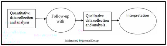
Figure 1.
Explanatory sequential mixed-methods design. Reprinted from Subedi (2016). Copyright © 2016 by Science and Education Publishing. Reprinted with permission.
2.2. Quantitative Phase
2.2.1. Sample Selection and Classification
A total of ten Saudi digital newspaper websites were selected based on historical Alexa rankings prior to its closure. These rankings were used to identify the top-performing digital news platforms in terms of traffic, engagement, and content consistency. The selection process involved screening over 30 Saudi digital newspapers. Final inclusion required demonstrated popularity, frequent updates, and accessibility. To ensure data stability, rankings were recorded at two points: 19 January 2022, and 25 February 2022.
Newspapers were classified into two categories based on their origin:
Digital-Migrant Newspapers: originally print publications that transitioned to digital.
Digital-Native Newspapers: founded as digital-only platforms.
This classification was confirmed using official sources, including the newspapers’ websites and their “About Us” sections. See Table 3.
Table 3.
Details of Saudi digital newspapers: online publication start date and origin.
2.2.2. Data Collection
To address the interactivity and immediacy of online news—which is inherently fluid and continuously updated—the concept of “freezing the flow” of digital content was applied (Karlsson and Strömbäck 2010). Screenshots were used to temporarily halt the dynamic stream of online news, making the content more manageable for visual and comparative analysis. To ensure consistency, Browshot software (version 1.31) was employed to take synchronized screenshots of the front pages of all ten websites during the study period. These captured images provided the foundation for the quantitative content analysis, enabling a standardized comparison of design features.
The analysis framework was adapted from White and Marsh (2006), Lima and Gresse von Wangenheim (2022) and was grounded in Media Richness Theory (Daft and Lengel 1986). Design features were categorized into three major groups.
Graphic Design Elements
In this study, graphic design elements refer to the visual architecture of the front pages of digital newspapers. This encompasses aspects, such as layout structure, typography, color schemes, and visual hierarchy, all of which contribute to the overall aesthetic and navigational logic of a platform. The specific variables used for coding—such as font size, grid type, and white space allocation—are detailed in Appendix A, Table A1, along with their operational definitions categorized by design domain.
Multimedia Elements
Multimedia elements denote the integration of visual and audiovisual materials on the front page to enrich storytelling and user engagement. These include photographs, illustrations, infographics, and videos, which serve both informational and emotional functions. The classification of multimedia types and their corresponding definitions are provided in Appendix A, Table A2.
Interactive Features
Interactive features refer to the functional components embedded in digital news interfaces that enable user participation, personalization, and two-way communication. These include elements, such as social media sharing tools, comment sections, and polls. A full typology of these features, including their operational definitions, is outlined in Appendix A, Table A3.
Coding and Inter-Rater Reliability
The primary coding of the data was conducted by a researcher (first researcher), while two additional coders (first coder) and (second coder) independently coded the data to ensure reliability and objectivity. Both coders were selected based on their qualifications and expertise relevant to the coding process. To assess inter-coder reliability, two main tests were employed:
- Intercoder Agreement Analysis
The Holsti Index (Holsti 1969) was used to measure the percentage agreement between coders, particularly in cases where the coders did not code the exact same data segments. The formula is
where A is the total number of agreements, N1 is the number of units coded by the first coder, and N2 is the number of units coded by the second coder. A value of r > 0.9 is considered indicative of good agreement (Lombard et al. 2002). In this study, the calculated agreement ratios ranged between 90.47 and 97.62. This information is summarized in Table 4.
PA (Holsti) = 2A/(N1 + N2)
Table 4.
Intercoder agreement scores for digital newspaper coding using the Holsti Index.
- 2.
- Test–Retest Reliability
Test–retest reliability (sometimes called retest reliability) measures test consistency, which is the reliability of the test measured over time. To find the test–retest reliability coefficient, the correlation was calculated between the test and the retest using Pearson’s correlation coefficient:
N is the total number of pairs of test and retest scores.
The strength of Pearson correlation defines 0.20–0.39 as “low”, 0.40–0.69 as “moderate”, 0.70–0.89 as “high”, and 0.90 and above “very high” (Cohen and Holliday 1982). For data collection, the calculated correlation coefficient between test and retest for online newspapers that have a print version ranged between (0.75) and (1.00), with an average of (0.99); and for online newspapers that are stand-alone, it ranged between (0.41) and (1.00), with an average of (0.94).
Additionally, test–retest reliability was calculated using Pearson’s correlation coefficient, yielding average correlations of 0.99 for digital-migrants and 0.94 for digital-natives, which fall within the “very high” reliability range (Cohen and Holliday 1982).
2.2.3. Data Analysis
Data from the quantitative phase were analyzed using SPSS (v.28). Descriptive statistics (mean, standard deviation) were computed first to summarize the characteristics of each design variable. Subsequently, a Mann–Whitney U test was employed to examine differences between digital-native and digital-migrant newspapers, as it is suitable for comparing two independent groups when the sample size is small and the data do not follow a normal distribution (Mann and Whitney 1947).
The coded variables reflect different data types: categorical variables (such as font type and background color) were recorded as nominal categories without ordinal ranking; binary variables (such as the presence of comment counts, PDF replicas, and embedded videos) were coded as 0 = absent and 1 = present; and continuous variables (such as font sizes and number of images) were measured using real numerical values. This structured coding approach allowed for a multifaceted comparison of interface features across newspaper types and ensured appropriate use of non-parametric statistical tests.
Figure 2 and Figure 3 illustrate examples of front-page screenshots of Saudi digital newspapers, with Figure 2 representing digital-migrant outlets and Figure 3 representing digital-native ones.
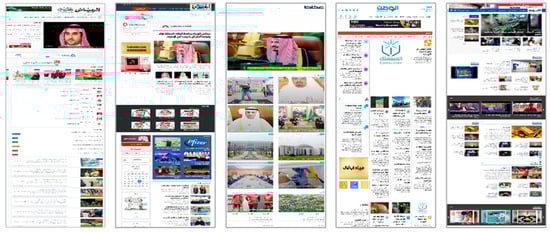
Figure 2.
Screenshots of Saudi digital-native newspapers.
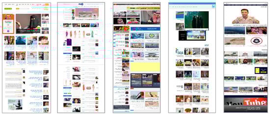
Figure 3.
Screenshots of digital-migrant newspapers originating from print media.
2.3. Qualitative Phase
2.3.1. Participant Recruitment
A total of 30 individuals from Generation Z (born 1995 or later) initially agreed to participate in this study. However, due to scheduling conflicts and last-minute cancellations—particularly among male students—the final number of completed interviews was 18, including 11 females and 7 males. Although this gender imbalance may appear uneven, it is consistent with patterns observed in previous Saudi qualitative research. AlArfaj and Solaiman (2022) reported that while male and female participants may initially show equal interest, actual attendance tends to skew female due to various cultural and logistical barriers faced by male participants, such as family obligations or hesitations around participating in structured academic sessions. Therefore, this distribution is not considered a methodological limitation but rather a reflection of the practical realities of research participation in conservative Saudi society. Participants were not required to be regular news readers. The eligibility criteria included the following: (1) belonging to Generation Z and (2) current enrollment at a university in Riyadh. Participants were recruited from three major public institutions—King Saud University, Imam Mohammad Ibn Saud Islamic University, and Princess Nourah Bint Abdulrahman University—which represent a diverse cross-section of the Saudi student population in terms of gender, academic disciplines, and social background. Recruitment followed a snowball sampling strategy, with WhatsApp used as the primary communication tool. This platform was selected for its widespread cultural acceptance and effectiveness for reaching young Saudis through informal and trusted channels. Prior research (AlArfaj and Solaiman 2022) has affirmed that WhatsApp outperforms email and public social media for promoting participant engagement within conservative settings. All interviews were conducted remotely via Zoom, recorded with participants’ consent, and followed a semi-structured format. This format provided flexibility and privacy, particularly for female participants, and is supported by previous studies advocating remote, audio-based qualitative methods in the Saudi context (Al-Saggaf and Williamson 2004). In accordance with cultural norms and ethical guidelines, no financial incentives or gift cards were offered. As noted by AlArfaj and Solaiman (2022), voluntary participation is generally preferred in the Saudi context, and monetary compensation may generate discomfort. Instead, participants were acknowledged with culturally appropriate symbolic gestures that conveyed appreciation without compromising ethical integrity.
2.3.2. Sample Size and Data Saturation
This study conducted semi-structured interviews with 18 participants from Generation Z in Riyadh. The sample size aligns with established qualitative research standards, particularly in studies involving relatively homogeneous populations and focused research questions. Guest et al. (2006) suggested that code saturation may be reached within the first 12 interviews under such conditions, while Hennink and Kaiser (2022) noted that thematic saturation commonly emerges by the 16th or 17th interview.
In the present study, thematic consistency became increasingly evident during the later stages of data collection, as participant responses began to reinforce previously identified codes rather than introduce substantially new insights. This pattern reflects what Malterud et al. (2016) described as “information power”—the idea that rich, relevant data from a well-defined sample may be sufficient even with modest sample sizes.
Accordingly, the final sample of 18 participants provided both methodological adequacy and contextual validity, enabling an in-depth exploration of Generation Z’s perceptions of digital newspaper design while accommodating the cultural and logistical dynamics of participant recruitment in Saudi Arabia. Detailed demographic information for each participant, including their majors, is presented in Table 5.
Table 5.
Participant demographics and their majors.
2.3.3. Newspaper Selection: Al-Riyadh and Sabq as Case Studies
The two newspapers selected for this study—Al-Riyadh and Sabq—are among the most popular and widely accessed news platforms in Riyadh. They represent two contrasting institutional models in Saudi digital journalism: a print-origin (digital-migrant) platform and a born-digital (digital-native) outlet. Al-Riyadh, launched online in 1998, reflects traditional editorial structures and a legacy media approach. In contrast, Sabq, established in 2007, is the leading born-digital newspaper in the Kingdom, especially in Riyadh. As Riyadh is both the recruitment site for all participants and a national media hub with high digital engagement—especially among Generation Z—the selection of these two platforms ensured contextual relevance. It also enabled a meaningful comparison of user perceptions of newspapers with different institutional origins and digital design strategies.
2.3.4. Procedure
To ensure contextual familiarity, participants were first asked to browse the homepage of two Saudi digital newspapers—Sabq (a born-digital outlet) and Al-Riyadh (a digital-migrant outlet). This browsing took place prior to the interviews and aimed to provide a basis for later reflection on design, layout, and interactivity. While these sessions were part of a broader user experience study, this paper focuses exclusively on participants’ perceptual responses as captured in semi-structured interviews. During the interviews, participants were encouraged to reopen the websites on their personal devices if needed, and some were invited to share their screens or refer to specific interface elements to support their explanations. This approach allowed for more accurate recall and deeper engagement without formal task observation. All interviews were audio-recorded and transcribed verbatim. The interview guide is provided in Appendix B.
The design of the interview guide was informed by the results of the quantitative phase. Differences that were identified in layout structure, visual segmentation, typographic hierarchy, and homepage interactivity helped shape the thematic focus of the interview questions. Although the questions remained open-ended and impression-based, they were crafted to encourage reflection on the design dimensions that emerged as most distinctive during the earlier content analysis. By grounding the qualitative inquiry in empirical patterns identified quantitatively, this study maintained methodological coherence with its explanatory sequential design and facilitated a more integrated understanding of how interface features—including strengths and limitations of layout and interactivity—are perceived by Generation Z users.
2.3.5. Data Analysis and Thematic Analysis
This section outlines the qualitative procedures used to explore Generation Z users’ perceptions of digital newspaper interfaces. A total of 18 participants took part in semi-structured interviews after browsing two contrasting Saudi digital platforms: Al-Riyadh, a digital-migrant newspaper with a print legacy, and Sabq, a born-digital platform designed natively for online interaction. The browsing session was not a formal usability test but served as a stimulus to ground participants’ reflections in recent and comparable experiences with both interfaces. Participants were invited to comment on their impressions of layout clarity, interactivity, ease of navigation, and visual structure. These reflections formed the basis for a thematic analysis aimed at uncovering how interface design and institutional origin shape perceived media richness and engagement.
The analysis employed a hybrid coding strategy. Deductive codes were initially informed by the core dimensions of Media Richness Theory—such as feedback immediacy, cue multiplicity, and personalization—yet most of the final themes emerged inductively from the data itself. This ensured that the analysis remained theoretically grounded while being open to user-defined perspectives and insights. Coding was conducted independently by two researchers using NVivo (version 14) software. Two additional researchers reviewed a subsample of transcripts for verification, and any discrepancies were resolved through discussion to ensure analytical consistency.
Thematic analysis followed Braun and Clarke’s (2006) six-phase model, encompassing familiarization, code generation, theme identification, theme review, naming, and final reporting. Ultimately, seven salient themes were identified, capturing nuanced differences in design logic, user perception, and platform interactivity between the two newspaper types.
2.4. Ethical Considerations
This study was approved by the Human Ethics Research Committee of La Trobe University (Approval No. HEC20386). All participants provided informed consent prior to participation. To protect participants’ identities, pseudonyms were assigned, and no identifying information, such as names, was collected or stored in association with the responses. Audio recordings were securely stored on an encrypted, password-protected institutional server and were accessible only to the primary researcher. Transcriptions were anonymized prior to analysis. At no stage were real names or contact details included in published results. All data handling procedures followed the ethical guidelines of La Trobe University and were designed to comply with local privacy laws and international research ethics standards.
3. Results
3.1. Quantitative Findings
3.1.1. Graphic Elements: (a) Layout Elements
This study assessed eight layout-related variables to examine how digital-native and digital-migrant Saudi newspapers structure their front pages. These variables captured both the general web interface components (e.g., navigation menus, grid systems) and the journalism-specific elements inherited from print culture (e.g., mastheads, downloadable PDF copies). A statistically significant difference emerged in the availability of downloadable PDF replicas of the print edition. These were exclusively present in the digital-migrant newspapers (M = 1.00, SD = 0.00) and entirely absent from the digital-native platforms (M = 0.00, SD = 0.00) (p = 0.003 < 0.01). This design choice reflects the legacy orientation of migrant outlets and their attempt to retain audiences who remain attached to print-based formats. It also suggests a dual approach, wherein a platform offers a familiar print experience.
The masthead visibility followed a distinct pattern across the two groups. The digital-native newspapers were more likely to display a visible masthead (M = 0.60, SD = 0.55), whereas no full mastheads were observed on the front pages of the digital-migrant platforms (M = 0.00, SD = 0.00) (p = 0.050 < 0.10). This contrast, however, does not indicate an absence of branding in the migrant outlets; rather, it reflects a reliance on minimalistic logotypes and icon-based headers, which align more closely with general web interface conventions than with journalistic tradition. In contrast, the deliberate use of a masthead by digital-native newspapers may serve not only as a visual design feature but also as a signal of editorial legitimacy. By adopting a prominent masthead—even in a modernized digital form—these platforms can position themselves as credible news sources, invoking the conventions historically associated with authoritative print journalism. This design decision suggests an effort to assert institutional identity and public trust, distinguishing their content from ephemeral or entertainment-based digital media.
From the perspective of Media Richness Theory, a masthead can be viewed as a symbolic cue that enhances communicative richness by embedding historical and institutional signals within the interface. It adds a layer of credibility, recognition, and trust—features especially valued in news consumption. Other layout components—such as the navigation menu type, number of columns, grid usage, layout style, and footer presence—did not exhibit statistically significant differences (p > 0.10). Both groups predominantly employed horizontal top-bar navigation and modular grid structures. A modest, non-significant difference was noted in the presence of a “hamburger” menu icon, which appeared slightly more often on migrant platforms (M = 0.40) than on native ones (M = 0.20) (p = 0.513).
3.1.2. Graphic Elements: (b) Location Elements
To complement the layout analysis, this study evaluated the spatial placement of the key interface components across the newspapers’ front pages. These location-based variables included the positioning of the primary navigation menus, logos, search bars, social media icons, and contact information. This dimension reflects how design choices affect user orientation, visual scanning, and perceived accessibility—components related to cue multiplicity and personalization in Media Richness Theory. Among these elements, only the visibility of the contact information showed a statistically significant difference. The digital-native newspapers were more likely to feature visible contact details—including both phone numbers and email addresses—on their front pages (M = 2.80, SD = 2.59), while the digital-migrant platforms generally excluded this information (M = 0.00, SD = 0.00) (p = 0.053 < 0.10). While younger users may not actively use voice calls or email as their primary communication tools, the inclusion of contact data remains a widely recognized indicator of institutional transparency and user support.
Other spatial features—such as the placement of the navigation menus, logos, and search tools—did not yield significant differences (p > 0.10). Both newspaper types consistently positioned these elements in conventional, user-friendly locations (e.g., top horizontal bars for menus, top-left or center for logos), adhering to established usability standards. The placement of social media icons varied in numeric value, but not significantly across the groups. These findings suggest a general convergence in interface conventions between the two newspaper types, with digital-native platforms slightly more likely to emphasize user outreach features, such as contact information and social integrations.
3.1.3. Graphic Elements: (c) Typography Elements
This section analyzes eight typography-related variables, comparing Saudi digital-native and digital-migrant newspapers. The variables include the type and size of the fonts used in the lead headlines, subheadings, navigation menus, and body text. The font type was recorded using a categorical 10-point scale (0–9), where each number uniquely identified a specific font. The scale was used solely for statistical distinction and carries no evaluative or aesthetic meaning. Differences were assessed using a Mann–Whitney U test.
Two statistically significant differences emerged:
Lead headline font type: the digital-native newspapers had a higher average score (M = 5.60, SD = 2.88) than the digital-migrant ones (M = 2.80, SD = 1.92) (p = 0.072 < 0.10).
Headline menu font type: Again, the digital-native platforms scored higher ((M = 6.00, SD = 3.24) vs. (M = 2.80, SD = 1.92)) (p = 0.075 < 0.10). Other typography elements, including font sizes and body text fonts, showed no significant differences (p > 0.10), with relatively close mean values across the groups. Two personalization-related features—the ability to change the reading font and font size—also showed no significant differences (p = 0.317 and p = 0.513, respectively), although some digital-migrant platforms included them as accessibility options. While the classification scale did not assess font quality, the observed differences in headline font usage may reflect institutional design choices and visual identity strategies. These patterns will be revisited in the integrated analysis through the lens of Media Richness Theory.
3.1.4. Graphic Elements: (d) Color Schemes
Six color-related variables were analyzed to examine the differences in color schemes between digital-native and digital-migrant Saudi newspapers. These included the background color, body text color, headline and subhead line colors, and the color of the navigation menu. All the color variables were coded using a categorical scheme, where each number represented a distinct color style or tone. This scale was used strictly for identification purposes and does not reflect an aesthetic evaluation or the visual quality. The only statistically significant difference was found for the body text color. The digital-migrant newspapers more frequently used black text (coded as 2), yielding a higher average score (M = 1.80, SD = 0.45), while the digital-native platforms consistently used medium gray (coded as 1) (M = 1.00, SD = 0.00) (p = 0.014 < 0.05). This result indicates a divergence in typographic color choices, with the digital-migrant outlets leaning toward the traditional, high-contrast readability associated with print legacy, while the digital-native platforms adopt more contemporary, screen-friendly tones. Other color variables—including the background color, headline color, subhead line color, and menu color—did not show statistically significant differences (all p-values > 0.10), as most of the platforms followed similar neutral or monochrome schemes. Although the color-coding system used does not convey visual quality or user preference, the significant difference observed in the body text color may suggest differing design orientations between the platforms. This difference will be explored further in the integrated analysis, particularly in relation to perceived visual comfort and institutional identity signaling, as discussed within the framework of Media Richness Theory.
3.1.5. Multimedia Elements
To address RQ2, this study analyzed the presence and frequency of multimedia elements across digital-migrant and digital-native Saudi newspapers. The indicators included the number of images, infographics, illustrations, and embedded videos. According to Media Richness Theory, such features enhance cue multiplicity and deepen interpretive engagement by offering varied sensory inputs.
A statistically significant difference was observed in the number of images, with the digital-native platforms displaying a higher average image count (M = 80.20, SD = 37.15) compared to the digital-migrant platforms (M = 36.60, SD = 15.58) (p = 0.059 < 0.10). This indicates a stronger visual orientation among the born-digital newspapers, consistent with contemporary preferences for imagery-rich digital environments. Additionally, the digital-native outlets featured significantly more embedded videos (M = 0.19, SD = 0.15) than their migrant counterparts (M = 0.04, SD = 0.03) (p = 0.015 < 0.05). This reflects an active integration of dynamic content formats that enhance interactivity and immediacy—two core components of media richness. Conversely, the digital-migrant newspapers featured significantly more infographics (M = 0.04, SD = 0.02), while none were observed on the digital-native front pages (M = 0.00, SD = 0.00) (p = 0.034 < 0.05). This reliance on static, print-style visualizations may reflect legacy design tendencies that emphasize editorial authority and a structured data display over fluid visual storytelling. Other elements—such as photo illustrations, dominant imagery, and illustration frequency—did not show statistically significant differences (p > 0.10). However, both types of platforms relied primarily on static images for visual engagement. Overall, the results suggest that digital-native platforms are more structurally aligned with media richness principles, particularly in their integration of video and high-density image content, which support richer cue environments and promote faster, more engaging information processing for Generation Z audiences.
3.1.6. Interactivity
To address RQ3, this study explored differences in the interactive designs by assessing various user-facing engagement features visible on the front page, including the comment counts and social media cues. These indicators align with Media Richness Theory’s emphasis on the immediacy of feedback and participatory communication. A statistically significant difference was observed in the visibility of the comment counts on the homepages: the digital-native newspapers displayed this metric more frequently (M = 0.80, SD = 0.45) compared to the digital-migrant outlets, which did not show any comment numbers (M = 0.00, SD = 0.00) (p = 0.014 < 0.05). It is important to clarify that this variable refers to the presence of numerical comment indicators (e.g., “12 comments”) on article previews—not the availability of full comment sections, which may still be present within the internal pages.
Conversely, the digital-migrant newspapers were more likely to display a “most read” section on their homepages (M = 1.00) compared to the native platforms (M = 0.20) (p = 0.014 < 0.05), reflecting a preference for traditional, editor-curated indicators of news value. Notable but weaker differences were found in the placement of social media icons and contact information, with the migrant outlets presenting these elements more prominently (p = 0.050 < 0.10). However, no statistically significant differences were observed for other interactive components, such as like buttons, “most commented” sections, or search box positioning (p > 0.10). These results suggest that digital-native platforms are more inclined to emulate social media logic by integrating real-time engagement cues, while digital-migrant newspapers continue to reflect more conventional, editorially structured interface models.
3.2. Qualitative Findings
This section presents the insights gathered from the semi-structured interviews, which were thematically coded and analyzed using NVivo. The thematic analysis followed an inductive approach aligned with the structure of the research questions. The participants were asked to reflect on their browsing experience of Sabq and Al-Riyadh digital newspapers. Through this process, six prominent themes emerged, highlighting notable differences in design, functionality, and user engagement.
- Theme 1: Page Layout and Organization
Sabq was consistently praised for its logical layout and user-friendly interface. The participants frequently described the browsing experience as smooth and well structured. When asked why he preferred Sabq, Fares explained that he appreciated the overall interface design. Reem remarked, “I immediately found what I was looking for; the sections are well organized, and everything feels in the right place”. In contrast, Al-Riyadh was often described as visually dense and poorly organized. Abdu noted that “The site looks messy; it’s not easy to figure out where one article ends and another begins”. Similarly, Ahmad commented that the “Al-Riyadh newspaper, unfortunately, did not satisfy me as a reader because of the presence of several advertisements and the lack of a news interface befitting the newspaper’s identity”.
Additionally, a notable number of the participants expressed an appreciation for Al-Riyadh’s inclusion of replicas of the print edition in PDF format. This feature was seen as a valuable option by readers who preferred a more traditional reading experience, allowing them to access the newspaper’s layout and structure in a format closely aligned with its print legacy.
- Theme 2: Clarity of Borders Between News Items
The participants consistently appreciated Sabq’s clear visual segmentation and content structure. Saad stated that “I liked its design and arrangement, especially the news categories tab (Stations–Media–Sabq Trend–Dialogues–Tourism) divided according to what I want”. Similarly, Fahad emphasized the importance of the top-level organization: “I like the list of news categories that appears at the top”. Another participant remarked that “With Sabq, I could easily tell where one story ended and another began, even without thinking.“ In contrast, Al-Riyadh was described as visually cluttered and lacking clear boundaries between news items. Saad added that “The design of the newspaper in terms of news arrangement is not clear—everything is stacked together without order”. Shahad noted that “There are many details, and there are no white spaces that are a little comfortable for the eye and help focus on some titles”. Lama echoed this critique by saying that “Riyadh is a random interface. I didn’t like the borders of the page—if they enlarged the page, it would be better than putting a frame and white space on the edges and narrowing the content”. At the same time, a few participants felt that Sabq, while better structured, employed more white space than necessary, which reduced the density of the visible content and occasionally made the layout feel sparse. This contrast highlights how insufficient white space in Al-Riyadh undermined readability, while excessive white margins in Sabq—although visually clean—were perceived as reducing information compactness.
Advertisement placement emerged as a recurring point of frustration, particularly in Al-Riyadh. Nouf observed that “In Al-Riyadh, there are too many ads that block content. It’s true that there are advertisements in Sabq also, but they do not block access to the articles”. Similarly, Jamilah stated that “In Al-Riyadh, too many ads prevent me from reading the content. In Sabq, there were ads, but fewer than in Al-Riyadh”. These impressions were echoed by several other participants, who expressed greater irritation toward Al-Riyadh’s ad placements, citing their obstructive positioning and visual dominance.
Collectively, these perspectives underscore the importance of balanced segmentation, proportional content spacing, and unobtrusive ad integration for enhancing digital readability and overall user satisfaction.
- Theme 3: Typography and Fonts
Many of the participants appreciated Al-Riyadh’s customization features, which allowed them to adjust both the font type and size—functions that offered a sense of control over the reading interface. Although Al-Riyadh’s default typography was sometimes perceived as outdated, the ability to personalize the display resonated with Generation Z’s preference for flexible and user-centered digital environments. Sarah noted that “I really liked being able to adjust the font size. It helped a lot with my reading comfort”. Similarly, Hanan commented that “If you compare it with Al-Riyadh, Sabq does not give the user the freedom to choose. You cannot choose the type of font or the background color like you can in Al-Riyadh”. In contrast, Sabq’s typography was consistently described as visually modern, simple, and inherently readable. Abeer stated that “The fonts were simple and easy to read. It felt very modern and professional”. However, some participants expressed frustration at the lack of customization. Walaa observed that “I would have liked to be able to adjust the font size. It would make it easier to read for longer periods”. Thus, while Sabq delivered strong default readability, Al-Riyadh appealed to users through its personalization features, despite its less contemporary font choices. This trade-off highlights the importance of both aesthetic clarity and interactive flexibility in designing news interfaces for younger audiences.
- Theme 4: Color and Visual Identity
Overall, the participants offered mixed but insightful feedback regarding the color schemes used by the two platforms. Sabq employed a vibrant and light-toned palette that attracted attention and gave the interface a modern look. Ahmad noted that “I like the variety of colours”, while others found the intensity distracting. Walla, for instance, remarked that “The colors were too bright and distracting”. By contrast, Al-Riyadh adopted a darker and more subdued color scheme, which several participants associated with balance and professionalism. As Wafa observed, “The level of colours in Al-Riyadh was better than Sabq because in Sabq the colours were light and this is not preferred for me. In Al-Riyadh, they were darker and gave a sense of balance”. Walla echoed this sentiment, stating that “I appreciate the muted colours. They make the site feel professional and trustworthy”. These comments reflect the tension between visual stimulation and readability. While vibrant designs may engage younger users initially, excessive brightness can reduce legibility and comfort. Conversely, more muted color schemes, though less striking, were associated with credibility and ease of reading, especially for longer browsing sessions.
- Theme 5: Multimedia and Image Placement
The participants consistently observed a contrast in multimedia usage between Sabq and Al-Riyadh. Sabq employed large, high-resolution images across most news items, which many participants found visually appealing. Nouf remarked that “The pictures are eye-catching, and they make the stories more interesting”. She also praised the paper’s consistent visual strategy: “Sabq relies on pictures in all news, both important and unimportant. I liked Sabq’s method”. This extensive image integration aligns with Generation Z’s preference for visually rich interfaces.
However, some participants perceived the visual distinction between the two platforms as marginal. Nouf also commented that “The design of the two newspapers is similar. They are all simple; I see them the same”. Still, she acknowledged that Al-Riyadh’s more selective approach to imagery focused attention on the priority stories, whereas Sabq’s denser visual layout made the homepage feel more dynamic.
Not all the impressions were positive. Farah expressed concern about the overuse of images: “Honestly, the designs of the two newspapers need to be modified. I felt that they should put each title with a picture, but this was distracting. The titles are the most important thing—then the pictures. This focus on images feels outdated, like an old style. For example, on Twitter, headlines come first, and then images follow”. Similarly, Hanan critiqued Al-Riyadh’s visual structure: “It’s somewhat crowded, and the site’s design doesn’t feel modern enough. It feels older than before—especially the way images are boxed or framed”.
- Theme 6: User Interface and Interactivity
The participants’ feedback highlighted their contrasting experiences regarding interface responsiveness and interactive features. While Sabq’s homepage was generally perceived as user friendly, several participants expressed dissatisfaction with the complexity of its comment system. Sara noted that “I didn’t like the comment feature in Sabq because it requires a login, and this makes the process difficult”. Similarly, Reem observed that “Most of Sabq was good, except when I tried to add a comment. It was a little more complicated than Al-Riyadh. I had to set up an account with the newspaper, not just enter an email and submit the comment”. Overall, the participants valued ease of participation and transparency in the comment systems, indicating that interactive features must balance accessibility with account-based moderation to foster user engagement—particularly for Generation Z users accustomed to seamless input mechanisms across platforms.
3.3. Integrated Discussion of Quantitative and Qualitative Findings
The integrated analysis of the quantitative and qualitative data reveals that while some structural elements appeared statistically similar between the digital-native and digital-migrant Saudi newspapers, meaningful divergences emerged in both the typographic and experiential dimensions. The quantitative results show statistically significant differences in the typographic styling of the lead headlines and headline menus—favoring digital-native platforms—while the qualitative findings highlight even sharper contrasts in clarity, navigability, and perceived interactivity. These differences suggest that institutional origin continues to shape not only the visual structure of online newspapers but also how these structures are interpreted and experienced by Generation Z users. The differences in layout perception exemplify this divergence. Although the grid systems and menu types did not differ significantly between the groups, the participants described Sabq’s interface as more intuitive and visually segmented, while Al-Riyadh was frequently seen as cluttered and cognitively demanding. This discrepancy underscores that visual organization cannot be fully captured by structural indicators alone. Instead, layout clarity often emerges from the synergy between segmentation, whitespace, and ad placement—factors central to Media Richness Theory’s emphasis on cue clarity and interpretability. The differences in typography further highlight this divergence. Unlike earlier assumptions of parity, the statistical analysis reveals significant differences in the fonts used for the lead headlines and headline menus, with the digital-native platforms employing more screen-appropriate typographic choices. The participants echoed this alignment, frequently describing Sabq’s fonts as “modern” and “clean”, and reporting higher visual comfort despite the absence of customization features. Conversely, Al-Riyadh offered functional advantages, such as font resizing, yet its default typography was often perceived as outdated and visually heavy. This contrast suggests that inherent visual clarity and typographic harmony may outweigh personalization features when the default design is well-optimized. These findings underscore the primacy of the aesthetic readability in shaping user satisfaction—particularly for digitally native audiences. Color usage reinforces this pattern. Quantitatively, a statistically significant difference was found in the body text color (p = 0.014), with the digital-migrant newspapers more frequently using black text—consistent with print traditions—while the digital-native platforms adopted medium-gray tones. Although the color coding was categorical and not evaluative, this distinction reflects diverging visual strategies: one grounded in high-contrast readability, the other in screen-friendly minimalism. The participants’ reactions aligned with this divergence. Sabq’s lighter palette was praised by some for its vibrancy and modernity, though a few described it as tiring for the eyes. Conversely, Al-Riyadh’s darker tones were associated with professionalism and visual balance. These impressions reinforce the idea that the color in interface design plays a communicative role beyond aesthetics—it signals institutional identity, usability intentions, and visual accommodation, all of which are relevant to Media Richness Theory’s emphasis on interpretability and user alignment. Multimedia integration was a particularly striking area of divergence. Sabq embedded more images and videos (p = 0.059, p = 0.015), aligning with MRT’s principle of cue multiplicity. The participants viewed this as enhancing engagement and narrative flow, though some noted that excessive visuals could disrupt reading continuity. In contrast, Al-Riyadh relied more on static visuals and occasional infographics, reflecting a more traditional editorial logic. This comparison illustrates that media richness is not defined solely by the volume of content, but by how multimedia elements are balanced to support comprehension and user flow. The interactivity added a final layer of contrast. The quantitative data show that the digital-native platforms more frequently displayed comment counts—visual cues associated with participatory affordances. However, the qualitative feedback reveals functional barriers: the participants reported that Sabq required full account registration to post comments, reducing the ease of interaction. Al-Riyadh, while less visibly interactive, occasionally allowed simpler forms of input within articles. This highlights the distinction between apparent interactivity and actual user access, reinforcing MRT’s principle that richness includes both feedback immediacy and interaction usability—especially important to Generation Z users. Taken together, these findings affirm that media richness in digital journalism is not simply a matter of design volume or interface complexity, but a reflection of how institutional histories are translated into contemporary user experiences. Digital-native platforms appear more attuned to the expectations of younger users, offering smoother navigation, visually optimized typography, and surface interactivity—though not without functional gaps. Digital-migrant platforms, in turn, still reflect elements of legacy design that may limit adaptability, despite ongoing digital transitions. These results support this study’s central proposition: media richness is shaped not just by the medium, but by the interface logic through which media institutions engage users.
4. Discussion
This study’s findings support an expanded interpretation of Media Richness Theory (MRT), wherein communicative richness is not determined solely by a medium’s technical channels, but is also embedded in the visual and structural choices that reflect institutional identity and evolving audience expectations. While the structural layout elements showed limited statistical divergence, the quantitative analysis revealed significant differences in the typography and body text color—two variables that directly shaped users’ perceptual experiences. These measurable distinctions were reinforced by the qualitative insights, which revealed pronounced experiential contrasts between Sabq and Al-Riyadh, particularly among Generation Z participants, who emphasized clarity, ease of use, and visual appeal as central to digital engagement.
One clear example lies in the typographic domain. The Mann–Whitney U test revealed statistically significant differences in the fonts used for the lead headlines and headline menus, with the digital-native platforms employing more screen-appropriate typographic choices. Sabq’s use of modern, readable fonts was consistently praised by the participants, who reported greater visual comfort despite the platform’s lack of font customization options. In contrast, Al-Riyadh offered personalization features, such as font resizing, yet was often described as typographically outdated and visually dense. These results echo Pérez-Seijo and Silva-Rodríguez (2024), who argued that the default visual clarity often has a stronger impact on engagement than personalization, especially among digitally fluent users. The color scheme usage similarly shaped users’ perceptions. A statistically significant difference was found in the color of the body text (p = 0.014), with Al-Riyadh favoring traditional black and Sabq adopting screen-optimized medium gray. While this variable was coded categorically, the result suggests divergent design orientations. The participants viewed Sabq’s lighter palette as fresh and visually pleasant, though a few noted potential eye strain. Conversely, Al-Riyadh’s darker tones were seen as more serious but less visually appealing. These results support the view of Abd Al-Elah et al. (2021) that richness in media contexts must encompass clarity, usability, and aesthetic cues, especially when information must be processed efficiently. They are also aligned with the work of Alyahyan et al. (2016), who found that Saudi users prefer interfaces that emphasize high visual clarity, culturally compatible color tones, and functional layouts.
Multimedia integration was another domain of strong divergence. Sabq featured significantly more images and embedded videos (p = 0.059, p = 0.015), aligning with MRT’s principle of cue multiplicity. The participants responded positively to this dense visual strategy, often associating it with immediacy and engagement. However, several users expressed concerns about visual clutter, reinforcing the importance of balancing richness with cognitive manageability. Karaaslan (2019) similarly emphasized that the homepage is the strategic focal point of online newspapers, where modular design, media embedding, and user-focused structure converge to enhance reader interaction. In line with this, Peña-Fernández et al. (2021) observed that modern news platforms have shifted from rigidity to exuberance—adopting multimedia-dense, vertically saturated homepages designed to capture fragmented attention. Interactivity, though less emphasized statistically, emerged as a key experiential divide. Sabq displayed more participatory cues (comment counts), but the qualitative feedback revealed functional barriers: users noted that interaction required full account registration, hindering the ease of engagement. In contrast, Al-Riyadh occasionally allowed simpler input via article pages despite its less interactive appearance. This gap between visual affordance and functional accessibility highlights what Pérez-Seijo and Silva-Rodríguez (2024) called the need for user-cantered innovation, rather than merely technical enhancement.
Notably, however, some legacy elements embedded in Al-Riyadh’s interface were not perceived negatively. For example, the inclusion of PDF replicas of the print edition was appreciated by several participants, as a format offering structure, familiarity, and formality. These impressions suggest that certain traditional design elements may still evoke trust and recognition when employed strategically, particularly in culturally conservative media environments. This aligns with Kitsa’s (2019) assertion that news design communicates not only information, but also emotional and aesthetic identity—a semiotic layer that enhances user orientation and trust. In this light, media richness may stem not only from interactivity or cue density, but also from symbolic design features that position the outlet within a continuum of institutional legacy and public reliability. Urban et al. (2020) reminded us that media richness is not only visible, but infrastructural. An interface’s effectiveness also depends on the back-end logic, such as content delivery systems, personalization algorithms, and registration mechanisms. Although not directly measured in this study, the user feedback alluded to the impact of such hidden elements—especially when friction, such as a mandatory login, disrupted the flow. This highlights the layered nature of richness in digital media: both interface cues and architectural logic must work together to create coherent and accessible user experiences. Taken together, these findings reinforce this study’s central proposition: that media richness in digital journalism is shaped not just by the content volume or visual design, but by how institutional histories and interface logics converge to support generational user needs. Platforms like Sabq demonstrate that screen-optimized typography, modular content structures, and visual interactivity can offer a more fluid and engaging experience—even when personalization is limited. In contrast, Al-Riyadh’s interface, though functional in places, remains constrained by legacy editorial structures that limit participatory openness and navigational ease. These insights call for a broader reconceptualization of Media Richness Theory—one that moves beyond technical channel classification toward interface-cantered user-sensitive metrics. In this model, richness is not only about offering more features, but about minimizing friction; enhancing flow; and aligning with emotional, cognitive, and cultural expectations. As Alyahyan et al. (2016) and Kitsa (2019) suggested, future implementations of MRT must account for local user preferences, symbolic interface cues, and media literacy levels to remain theoretically and practically relevant in transitional media systems like Saudi Arabia’s.
In terms of contributions and implications, this study advances Media Richness Theory by proposing an interface-cantered framework that incorporates visual, structural, and symbolic design features in digital journalism. Through both quantitative and qualitative analyses, the findings demonstrate that elements, like layout clarity, typographic consistency, and multimedia integration, significantly shape the perceived richness—especially among Generation Z users. Importantly, this study shows that visual coherence often outweighs personalization in fostering user comfort, while select legacy elements—such as PDF editions and mastheads—can reinforce institutional credibility. This highlights that richness may stem not only from interactivity, but also from symbolic cues that reflect editorial identity. Practically, the research provides design guidance for digital-migrant platforms aiming to engage younger audiences. It stresses that richness depends on the coherent integration of features, not their quantity. Methodologically, it offers a replicable model for analyzing interface-level richness through mixed methods and sets the stage for future cross-cultural and generational research into news design and user experience.
The study’s limitations and suggestions for future research are as follows. While this study offers valuable insights into the interface-centered application of Media Richness Theory in digital journalism, several limitations warrant consideration. First, the sample was limited to ten Saudi newspaper platforms and eighteen Generation Z participants. While this focused scope enabled a context-sensitive comparison of institutional design logics and generational perceptions, the findings may not be fully generalizable to other cultures, age groups, or news ecosystems. Future research should consider expanding the sample size and incorporating cross-national comparisons to test the robustness of the interface-level richness indicators. Second, this study centered exclusively on the front-page design and did not account for user interaction beyond the homepage. As a result, the behavioral dimensions of engagements, such as scroll depth, click-through patterns, or time-on-task, were not captured. To build a more dynamic picture of interface richness, future studies could incorporate methods, such as eye-tracking, heatmaps, or real-time behavioral analytics, that reflect how users navigate and interpret cue-dense environments.
Third, while the integration of quantitative and qualitative user data provided a comprehensive view of the perceived richness, this study did not include perspectives from newsroom stakeholders—such as designers, developers, and editors—whose insights could illuminate the strategic intentions behind specific interface decisions. Incorporating these institutional voices would help bridge the gap between user-centered perception and editorial logic, especially for legacy-driven platforms where symbolic design elements (e.g., PDF formats) may reflect strategic branding rather than aesthetic inertia. Fourth, although this study advances a more flexible and generationally responsive application of Media Richness Theory, further research is needed to develop a validated typology of interface-level richness indicators. Such a typology could help clarify the functional, aesthetic, and symbolic dimensions of richness across various media systems and support comparative analyses of different institutional models (e.g., public vs. commercial, digital-native vs. hybrid). Finally, future research should explore emerging back-end variables—such as AI-driven personalization engines, recommendation systems, and invisible interaction barriers—that shape the perceived richness and user trust without being visible on the interface. In line with the layered view of richness proposed by Urban et al. (2020), these dimensions deserve closer attention using mixed-method designs that combine visual, infrastructural, and perceptual analytics. Additionally, comparative studies across generational cohorts (e.g., Gen Z vs. Gen X), media genres (e.g., science journalism vs. breaking news), or regional systems (e.g., Gulf-based vs. European outlets) may further refine our understanding of how media richness is culturally embedded and institutionally mediated.
5. Conclusions
This exploratory study affirmed the analytical value of applying an interface-cantered interpretation of Media Richness Theory (MRT) to the design and perception of digital journalism. By extending MRT beyond its original focus on communication channels to encompass the visual, structural, and interactive elements of a user interface, this study demonstrated that perceived media richness is not solely a function of the medium type, but of how the design choices facilitate cue multiplicity, feedback immediacy, and usability—especially among Generation Z users.
The quantitative analysis revealed statistically significant differences in the typographic elements and color schemes, along with broader descriptive contrasts in the multimedia integration, interactivity, and layout structure between digital-native and digital-migrant Saudi newspapers. These patterns were further enriched by the qualitative insights, which captured the participants’ perceptual responses after a direct interaction with each platform. The key impressions centered on navigability, visual segmentation, and typographic clarity—dimensions proposed in this study as applied markers of interface-based richness.
While Sabq, as a digital-native platform, was more frequently associated with dynamic and intuitive design aligned with younger users’ expectations, it was not immune to criticism. The participants noted issues, such as visual clutter, excessive imagery, and interactive friction (e.g., account login requirements). Conversely, Al-Riyadh reflected legacy design conventions, including PDF replicas, which—surprisingly—were appreciated by some users as markers of editorial credibility and institutional identity. This suggests that interface richness may derive not only from innovation and interactivity, but also from symbolic continuity and visual trust cues.
By reconceptualizing Media Richness Theory through the lens of interface logic, institutional history, and generational user experience, this study offers a tentative framework for evaluating digital news platforms in hybrid media environments like Saudi Arabia. It also introduces the need for developing a formal typology of interface-level richness indicators, combining both structural metrics and perceptual evaluations.
Although limited in scope, the findings raise important theoretical and practical considerations for news organizations seeking to attract younger audiences. They highlight the importance of aligning interface design not just with functionality, but with the aesthetic, cultural, and cognitive expectations of users. Future research may extend this framework by incorporating broader samples, real-time usability testing, institutional interviews, and cross-cultural comparisons to further refine our understanding of how design, origin, and audience intersect to shape media richness and digital news engagement.
Supplementary Materials
The following supporting information can be downloaded at: https://www.mdpi.com/article/10.3390/socsci14060353/s1.
Author Contributions
Conceptualization, E.A. and N.B.; methodology, E.A. and N.B.; software, E.A.; validation, E.A. and N.B; formal analysis, E.A. and N.B.; investigation, E.A.; resources, E.A. and N.B.; data curation, E.A. and N.B.; writing—original draft preparation, E.A.; writing—review and editing, N.B.; visualization, E.A. and N.B.; supervision, N.B.; project administration, E.A. and N.B. All authors have read and agreed to the published version of the manuscript.
Funding
This research received no external funding.
Institutional Review Board Statement
The study was approved by the Ethics, Integrity & Biosafety Committee of La Trobe University (16/03/2021) for studies involving humans.
Informed Consent Statement
Informed consent was obtained from all subjects involved in the study.
Data Availability Statement
The original contributions presented in this study are included in the article/Supplementary Materials.
Acknowledgments
The author(s) would like to express sincere gratitude to Rawan Mohammed Al-Mahfouz and Zahraa Tariq Al-Qahtani for their valuable assistance in coding the quantitative data. Special thanks are also extended to Alaa Sultan Bahabri and Basmah Mubarak Al-Dosari and for their support in conducting the thematic coding of the interview data. Their contributions were instrumental in the data organization process, and their support is deeply appreciated.
Conflicts of Interest
The authors declare no conflict of interest.
Abbreviations
The following abbreviations are used in this manuscript:
| MRT | Media Richness Theory |
| Gen Z | Generation Z |
Appendix A
Table A1.
The graphic design variables by domain, with the operational definitions used for coding.
Table A1.
The graphic design variables by domain, with the operational definitions used for coding.
| Type | Definition |
|---|---|
| Layout Style | The overall structure and spatial organization of the content on the homepage, classified into modular, hierarchical, or single-column formats. |
| Navigation Menu Design | The observable structure, visual style, and spatial placement of the primary navigation menu on the homepage. |
| Masthead | The visual branding element representing the newspaper’s nameplate, designed in the style of traditional print titles. It serves as a symbolic anchor of institutional identity and heritage within the digital interface. |
| Font Types | Specific typefaces used across the front page for different textual roles. |
| Font Sizes | Relative sizes of the different textual components, influencing visual hierarchy and readability. |
| Column Count | Number of vertical columns used to structure the page layout. |
| Grid Type | Grid structure (e.g., modular, hierarchical) used to organize the spatial layout. |
| Color Scheme | General application of background and accent colors on the front page. |
| Color Scheme Identity | Consistency of color usage across the background, text, and navigation elements to establish a platform’s identity. |
| Contact Information Placement | Positioning of organizational contact information for user accessibility. |
| Element Location | Strategic placement of key elements (logo, search bar, and contact info) across the interface. |
| Footer Design | Structural organization and content composition of the page footer. |
| Hamburger Button | Presence of a collapsible navigation menu for mobile or responsive design. |
| Headline and Subhead | Typographic treatment and visual prominence of the primary headlines and supporting subheadings. |
| Headline/Body Text Color | Color choices for the headlines and body text to support visual segmentation. |
| Print Copy Availability | Availability of a printable version of the newspaper’s front page. |
| Search Box Placement | Position of the search functionality for easy access. |
| Social Media Icon Placement | Placement and visibility of social media access points. |
| White Space Allocation | Deliberate use of empty space to improve legibility and focus attention. |
Table A2.
Classification of multimedia elements used on front pages.
Table A2.
Classification of multimedia elements used on front pages.
| Type | Definition |
|---|---|
| Photograph | Standard editorial or news photographs used to accompany textual content and provide visual support for storytelling. |
| Photo Illustration | Photograph that has been digitally altered or enhanced for editorial emphasis or creative storytelling purposes. |
| Illustration | Digitally created or hand-drawn visual depiction of events, concepts, or characters used to support or extend the narrative. |
| Infographic | Data-driven visual representation of complex information through charts, graphs, diagrams, and timelines to facilitate comprehension. |
| Video | Embedded or linked audiovisual content, including dynamic reports, interviews, live coverage, and supplementary news features, enriching the storytelling experience. |
Table A3.
Classification of interactive features on digital newspaper interfaces.
Table A3.
Classification of interactive features on digital newspaper interfaces.
| Type | Definition |
|---|---|
| Contact Information | Availability of phone numbers, email addresses, or inquiry links enabling direct user communication. |
| Cross-linking | Embedded hyperlinks connecting users to internal sections or external websites for enhanced navigation. |
| Interaction Options (Likes/Shares) | Features allowing users to express feedback by liking, sharing, or reacting to articles. |
| Polls/Surveys | Interactive questionnaires or polls enabling users to submit opinions or vote on topical issues. |
| Social Media Integration | Embedding of dynamic content streams from platforms, such as Twitter, Facebook, and Instagram. |
Appendix B. Semi-Structured Interview Questions
The following interview questions were used in the qualitative phase of this study to gather insights from the Generation Z participants about their perceptions of the front-page design, interactivity, and overall media richness of two Saudi digital newspapers (Sabq and Al-Riyadh).
- Which newspaper design did you prefer overall?
- What positive features did you like about Sabq newspaper?
- Is there anything you disliked or found negative about Sabq?
- What negative aspects did you notice in Al-Riyadh newspaper?
- Is there anything you liked about Al-Riyadh?
- In your opinion, if newspapers improved their design to align with readers’ expectations, would readership increase?
- And what about you personally—would such changes affect your level of engagement?
- If newspapers adopted designs more like social media platforms, do you think they would attract more readers?
References
- Abd Al-Elah, Husni, Refat Husni, and Shukria Kawkaz Al-Saraj. 2021. Science Journalism within the framework of Media Richness Theory. PalArch’s Journal of Archaeology of Egypt/Egyptology 18: 2835–44. [Google Scholar]
- Abed, Salma S. 2024. Acceptance and use of artificial intelligence in online tourism services by Generation Z in Saudi Arabia. IEEE Access 12: 164533–542. [Google Scholar] [CrossRef]
- Aitamurto, Tanja, Eddy Borges-Rey, and Nicholas Diakopoulos. 2023. The future of design + journalism: A manifesto for bridging digital journalism and design. Digital Journalism 11: 399–410. [Google Scholar] [CrossRef]
- AlArfaj, Aisha Ahmed, and Ellis Solaiman. 2022. Comparing different qualitative methods to understand user experience in Saudi Arabia [Preprint]. arXiv arXiv:2212.04232. [Google Scholar]
- Alenizi, Saleh Zaid. 2006. Producing Saudi electronic newspapers in light of the communication features of the Internet. Masters dissertation, Imam Mohammad ibn Saud Islamic University, Riyadh, Saudi Arabia. Available online: https://shorturl.at/tsOJG (accessed on 1 February 2025).
- Alghamdi, Hassan, and Naif Alzahrani. 2024. Evolving Adoption of eLearning Tools and Developing Online Courses: A Practical Case Study from Al-Baha University, Saudi Arabia. International Journal of Advanced Computer Science & Applications 15: 573. [Google Scholar]
- Alosaimi, A. 2024. The Influence of Social Media in Travel Decision-Making: A Case Study of Saudi Arabia. Doctoral dissertation, University of Exeter, Open Research Exeter, Exeter, UK. Available online: https://ore.exeter.ac.uk/repository/handle/10871/136050 (accessed on 3 February 2025).
- Alotaibi, Nasser N. 2014. Interactivity in Saudi online journalism. Journal of Media and Communication Studies 6: 165–73. [Google Scholar]
- Al-Saggaf, Yeslam, and Kirsty Williamson. 2004. Online communities in Saudi Arabia: Evaluating the impact on culture through online semi-structured interviews. Forum Qualitative Sozialforschung/Forum: Qualitative Social Research 5: 3. [Google Scholar]
- Alsulaiman, Saud A. 2022. Understanding Saudi millennials’ news consumption in a digital world. Online Journal of Communication and Media Technologies 12: e202220. [Google Scholar] [CrossRef]
- Al-Sulami, M. H. 2020. Attitudes of Saudi electronic newspaper editors toward Twitter rumors. Abhath Journal 20: 344–74. [Google Scholar]
- Alyahyan, Lulwa, Hamza Aldabbas, and Khalid Alnafjan. 2016. Preferences of Saudi users on Arabic website usability. International Journal of Web & Semantic Technology (IJWesT) 7: 1–8. [Google Scholar]
- Arrese, Ángel, and Jürg Kaufmann. 2016. Legacy and native news brands online: Do they show different news consumption patterns? International Journal on Media Management 18: 75–97. [Google Scholar] [CrossRef]
- Baothman, Raneem Yahya, and Duaa Fathi Salem. 2019. Output of Saudi electronic newspapers and its relationship with the public readability for these newspapers: Field study. مجلة العلوم الإنسانية والاجتماعية 3: 137–58. [Google Scholar]
- Braun, Virginia, and Victoria Clarke. 2006. Using thematic analysis in psychology. Qualitative Research in Psychology 3: 77–101. [Google Scholar] [CrossRef]
- Cohen, Louis, and Michael G. Holliday. 1982. Statistics for Social Scientists: An Introductory Text with Computer Programs in Basic. Manhattan: Harper and Row. [Google Scholar]
- Creswell, John W, and Vicki L Plano Clark. 2018. Designing and Conducting Mixed Methods Research. Los Angeles: SAGE Publications. [Google Scholar]
- Daft, Richard L., and Robert H. Lengel. 1986. Organizational information requirements, media richness and structural design. Management Science 32: 554–71. [Google Scholar] [CrossRef]
- Dennis, Alan R., and Joseph S. Valacich. 1999. Rethinking media richness: Towards a theory of media synchronicity. Paper presented at the 32nd Annual Hawaii International Conference on Systems Sciences, HICSS-32, Abstracts and CD-ROM of Full Papers, Maui, HI, USA, January 5–8. [Google Scholar]
- Ferry, Diane L., Christine T. Kydd, and John E. Sawyer. 2001. Measuring facts of media richness. Journal of Computer Information Systems 41: 69–78. [Google Scholar] [CrossRef]
- General Authority for Statistics. 2023. Population Estimates and Indicators for Saudi Arabia. Available online: https://www.stats.gov.sa (accessed on 3 February 2025).
- Gilbert, Stacy, and Alexander Watkins. 2020. A comparison of news databases’ coverage of digital-native news. Newspaper Research Journal 41: 317–32. [Google Scholar] [CrossRef]
- Guest, Greg, Arwen Bunce, and Laura Johnson. 2006. How many interviews are enough? An experiment with data saturation and variability. Field Methods 18: 59–82. [Google Scholar] [CrossRef]
- Hennink, Monique, and Bonnie N. Kaiser. 2022. Sample sizes for saturation in qualitative research: A systematic review of empirical tests. Social Science & Medicine 292: 114523. [Google Scholar] [CrossRef]
- Holsti, Ole R. 1969. Content Analysis for the Social Sciences and Humanities. Boston: Addison-Wesley. [Google Scholar]
- Hornung, Jenicka M. 2015. Revisiting Media Richness Theory: Social Cues Impact on Understanding in a Textual World. Doctoral dissertation, Pace University, New York, NY, USA. [Google Scholar]
- Ivankova, Nataliya V., John W. Creswell, and Sheldon L. Stick. 2006. Using mixed-methods sequential explanatory design: From theory to practice. Field Methods 18: 3–20. [Google Scholar] [CrossRef]
- Karaaslan, İlknur Aydoğdu. 2019. Gazetecilik eğitiminin dijitalleşmesi: Gelişmiş ve gelişmekte olan ülkeler üzerinde yapılan karşılaştırmalı analiz. Erciyes İletişim Dergisi 1: 105–24. [Google Scholar] [CrossRef]
- Karlsson, Michael, and Jesper Strömbäck. 2010. Freezing the flow of online news. Journalism Studies 11: 2–19. [Google Scholar] [CrossRef]
- Kitsa, Mariana. 2019. Design of the newspaper as an important factor in attracting young audience. Медиаoбразoвание 1: 49–60. [Google Scholar]
- Kock, Ned. 2005. Media richness or media naturalness? IEEE Transactions on Professional Communication 48: 117–30. [Google Scholar] [CrossRef]
- Lima, Adriano Luiz de Souza, and Christiane Gresse von Wangenheim. 2022. Assessing the visual esthetics of user interfaces. International Journal of Human–Computer Interaction 38: 144–64. [Google Scholar] [CrossRef]
- Lombard, Matthew, Jennifer Snyder-Duch, and Cheryl Campanella Bracken. 2002. Content analysis in mass communication. Human Communication Research 28: 587–604. [Google Scholar] [CrossRef]
- Malterud, Kirsti, Volkert Dirk Siersma, and Ann Dorrit Guassora. 2016. Sample size in qualitative interview studies: Guided by information power. Qualitative Health Research 26: 1753–60. [Google Scholar] [CrossRef]
- Mammadov, Rashad. 2022. Media choice in times of uncertainty—Media richness theory in context of media choice in times of political and economic crisis. Advances in Journalism and Communication 10: 53–69. [Google Scholar] [CrossRef]
- Mann, Henry B., and Donald R. Whitney. 1947. On a test of whether one of two random variables is stochastically larger than the other. The Annals of Mathematical Statistics 18: 50–60. [Google Scholar] [CrossRef]
- Maqbul, Abdullah. 2019. The Credibility of News in Saudi Arabia: A Comparative Study of Print Newspapers with Their Online Counterparts and Exclusively Online Newspapers Among Saudis. Ph.D. thesis, University of Salford, Salford, UK. [Google Scholar]
- Ministry of Media. 2024. Annual Report of the Ministry of Media 2024 (Media Version). Available online: https://media.gov.sa (accessed on 3 February 2025).
- Negredo, Samuel, María-Pilar Martínez-Costa, James Breiner, and Ramón Salaverría. 2020. Journalism expands in spite of the crisis. Media and Communication 8: 73–85. [Google Scholar] [CrossRef]
- Newman, Ariel. 2022. Behind the Mask: Teaching Gen Z as One of Its Own. Perspectives 29: 54–57. [Google Scholar]
- Nicholls, Tom, Nabeelah Shabbir, and Rasmus Nielsen. 2016. Digital-Born News Media in Europe. Oxford: Reuters Institute for the Study of Journalism, University of Oxford. Available online: https://reutersinstitute.politics.ox.ac.uk/ (accessed on 3 February 2025).
- Peña-Fernández, Simón, Miguel Ángel Casado-del-Río, and Daniel García-González. 2021. From Rigidity to Exuberance: Evolution of News on Online Newspaper Homepages. Future Internet 13: 150. [Google Scholar] [CrossRef]
- Pérez-Seijo, Sara, and Alba Silva-Rodríguez. 2024. Innovation in digital media beyond technology: The audience-centered approach and pending challenges. Journalism and Media 5: 311–24. [Google Scholar] [CrossRef]
- Prensky, Marc, and Bruce D. Berry. 2001. Do they really think differently? On the Horizon 9: 1–9. [Google Scholar]
- Salaverría, Ramón. 2019. Digital journalism: 25 years of research. El Profesional de la Información 28: e280101. [Google Scholar] [CrossRef]
- Salaverría, Ramón, Nataly Buslón, Fernando López-Pan, Bienvenido León, Ignacio López-Goñi, and María-Carmen Erviti. 2020. Desinformación en tiempos de pandemia: Tipología de los bulos sobre la COVID-19. Profesional de la Información 29: e290315. [Google Scholar] [CrossRef]
- Seemiller, Corey, and Meghan Grace. 2017. Generation Z: Educating and engaging the next generation of students. About Campus 22: 21–26. [Google Scholar] [CrossRef]
- Subedi, Dhanapati. 2016. Explanatory sequential mixed method design as the third research community of knowledge claim. American Journal of Educational Research 4: 570–77. [Google Scholar]
- Sun, Pei-Chen, and Hsing Kenny Cheng. 2007. The design of instructional multimedia in e-Learning: A Media Richness Theory-based approach. Computers & Education 49: 662–676. [Google Scholar]
- Thurman, Neil, and Merja Myllylahti. 2009. Taking the paper out of news. Journalism Studies 10: 691–708. [Google Scholar] [CrossRef]
- Tseng, Chi-Hsing, and Li-Fun Wei. 2020. The efficiency of mobile media richness across different stages of online consumer behavior. International Journal of Information Management 50: 353–64. [Google Scholar] [CrossRef]
- Urban, Tobias, Martin Degeling, Thorsten Holz, and Norbert Pohlmann. 2020. Beyond the front page: Measuring third party dynamics in the field. Paper presented at the Web Conference 2020, Taipei, Taiwan, April 20–24; pp. 1275–86. [Google Scholar]
- Van den Bergh, Joeri, and Mattias Behrer. 2016. How Cool Brands Stay Hot. London: Kogan Page Publishers. [Google Scholar]
- White, Marilyn Domas, and Emily E. Marsh. 2006. Content analysis: A flexible methodology. Library Trends 55: 22–45. [Google Scholar] [CrossRef]
- Zaid, Bouziane, Jana Fedtke, Don Donghee Shin, Abdelmalek El Kadoussi, and Mohammed Ibahrine. 2022. Digital Islam and Muslim Millennials: How Social Media Influencers Reimagine Religious Authority and Islamic Practices. Religions 13: 335. [Google Scholar] [CrossRef]
Disclaimer/Publisher’s Note: The statements, opinions and data contained in all publications are solely those of the individual author(s) and contributor(s) and not of MDPI and/or the editor(s). MDPI and/or the editor(s) disclaim responsibility for any injury to people or property resulting from any ideas, methods, instructions or products referred to in the content. |
© 2025 by the authors. Licensee MDPI, Basel, Switzerland. This article is an open access article distributed under the terms and conditions of the Creative Commons Attribution (CC BY) license (https://creativecommons.org/licenses/by/4.0/).