Abstract
Colored glass in the form of stained-glass windows has been used to decorate buildings for over a thousand years. Due to various late-twentieth-century technological achievements, this material allows for a broad spectrum of design solutions. Glass can be used both in contemporary and historical buildings. This paper presents an analysis of the work of Tomasz Urbanowicz, an artist who works with glass, and its objective is to present not only the body of work of this artist but also the means of using colored glass in creating new values in architecture. The work is based on a study of the literature that covers the contemporary application of colored glass, on-site analysis of projects, and a series of interviews with the artist before, during, and after project completion, as well as the authors’ personal experience in the matter. One of the main research methods used was an analysis of the artist’s stance, as to him, the very process of pursuing creative inspiration is a fundamental procedure. Glassworks by Urbanowicz were displayed at the EXPO 2000 in Hanover (Germany), the EXPO 2005 in Aichi (Japan), and the EXPO 2008 in Saragossa (Spain). The United Earth glass sphere has been decorating the agora of the European Parliament building in Strasbourg (France) since 2004. In the paper, the artist’s projects are presented in two groups: The first includes solutions that employ monochromatic color schemes, whereas in the second, color has been used to create a strong contrast. The analysis presented includes interventions in historical buildings under heritage conservation, but also compositions from architectural glass in newly built buildings and that reference place-based history. Both the initial vision and the final effect of the glass architectural compositions are site-specific. The analysis of these differences and how the artist works allowed us to formulate a scheme of how he operates. Urbanowicz’s glass interventions affect the quality of the spaces they create and highlight their existing or expected features. The influence of the works can either play a primary and dominant role in relation with the surrounding space or be a secondary and delicate addition. Applied color may have different functions, from highlighting specific aspects of a building to introducing symbolic or direct reference. In many projects, color works as a source of a building interior’s atmosphere. The artistic interventions in historic spaces emphasize their features without disrupting pre-existing authenticity, whereas contemporary projects with no historic reference offer a wide variety of color applications that focus on the function and form of architecture, landscape, or surroundings.
1. Introduction—Contemporary Techniques in Artistic Glass in Architecture
Glass is an exceptional material in the context of color in architecture due to its translucency and reflective properties. It provides a broad range of possible visual interventions that affect the internal and external space. Contemporary technologies of large-scale artistic glass casting allows one to modify the parameters of flat glass, resulting in multicolor compositions that change along with the movement of the observer, lighting, or the surroundings. The analysis of the projects may show the impact that compositions have on architectural space.
Stained glass has been present in (religious) architecture as a decorative element for over 1500 years (Hall 2007), introducing light and color to architecture (Włodarczyk 2019). Up to the end of the twentieth century, colored artistic glass was used in stained-glass windows. Over the past forty years, many artists have developed new forms of creative expression in the use of glass. This is possible because of significant technological progress made in the twentieth and twenty-first centuries. One of the most important events that contributed to the present-day possibilities of using this material were technological advances and the invention of technologies that allowed large panes of flat float glass to be made. The process of producing float glass was invented in 1953 by Sir Alastair Pilkington (Wala 2012). This breakthrough moment allowed artists to access new means of creating large-scale works without divisions, which had been forced by the size of individual glass elements, their thickness, and their durability. Ancient blown-glass lamination techniques were developed for float-glass sheets, which allowed for the elimination of the visual division of lead muntins. Still, it was blown glass that was the element to introduce color, whereas the large colorless pane was the structural carrier of aperture glazing. Another means of applying color to glass, which is currently one of the most popular in buildings, was the painting of flat, colorless glass with enamels, either applied manually, sprayed, or digitally printed. After firing a painted pane in a furnace, the color fuses with its surface and becomes transparent, dying the glass in a manner visually similar to solid-colored glass.
Color is often introduced to glazed architecture by the application of foil used to laminate safety glass, which is uniformly colored. It possesses a dichroic coating that refracts light into colors or includes a digital print that has preset graphical parameters. The methods presented above create a similar visual effect, which is sometimes difficult to tell apart with the naked eye from flat-glass staining. One contemporary technique that stands out here, although it is rarely used, is the casting of either one or several sheets of float glass in kilns, which allows one to obtain a monolithic, textured object (kiln-formed glass). Such a glass object can be later painted using metal oxides or fired again to fuse the color with the surface of the glass. When the color is fused, the object can be bent into the desired shape. One of the first artists to work with kiln-formed glass in a large-format space and in relation to architecture already in the 1970s was Florian Lechner (Schönmetzler and von Samsonow 2013). Contemporary artists with significant achievements in this field include Thierry Boissel (Jung et al. 2012), Udo Zembok (Lagier et al. 2008), and Tomasz Urbanowicz (Moor 1989, 2006).
This paper focuses on the work of Tomasz Urbanowicz, who is a representative of artists who utilize kiln-formed artistic glass (relief glass) and who operate internationally. His glass works represented Poland three times at international expositions: the EXPO 2000 in Hanover (Germany), the EXPO 2005 in Aichi (Japan), and the EXPO 2008 in Saragossa (Spain). The glass sphere entitled United Earth has been decorating the agora of the European Parliament in Strasbourg (France) since 2004, and the composition Blue Sunset in the Ocean is a part of a permanent exhibition on display at the RMS Queen Mary 2 transatlantic ocean liner (Maciąg 2014). Urbanowicz’s works function in combination with both historical (such as the Baroque Main Building of the University of Wrocław or the historical architecture of Ostrów Tumski in Poznań) and contemporary architecture (e.g., the new Podlasie Opera and Philharmonic or the Białystok University Campus). This paper presents the original, innovative approach of the artist to the use of color in compositions made from artistic glass in relation to architecture.
This text discusses the complex history of the works’ creation, and their ideative identity, symbolism, contextuality, and creative assumptions.
The multiple-case study presented here demonstrates the two main ways in which Urbanowicz uses color in his work. The first is based on the use of strong contrasts with multicolored compositions, whereas the second presents nigh-monochrome and visually uniform forms in a historical or contemporary context. The research of several diverse projects allows a general scope of interventions and roles that color in glass may play in the architectural space to be found. The paper also aims to discuss the value of contemporary kiln-formed colored glass shown in different environments.
The research method is based on the analysis of the literature that covers the contemporary application of colored glass, on-site field research of projects, and a series of interviews with the artist before, during, and after project completion, drawing conclusions from the conducted research and analyses and the authors’ personal experience in the matter.
2. State of Research
There are many studies on the general topic of the theory of color, yet some of them focus also on its contemporary architectural context. One of the recent monographs addressing this subject is Color for Architects by Juan Serra Lluch (Lluch 2019). The research outlines both the basics of the perception of color and its practical architectural applications. The monograph Color Studies provides a deep analysis of four dimensions of color—hue, value, intensity, and temperature—consolidating the terminology and indicating color’s contemporary role and influence in design (Feisner and Reed 2014). The relation between color and architectural space and light interaction is studied in Color–Communication in Architectural Space. (Meerwein et al. 2007). The Color Research & Application journal focuses on the topic of color in multiple disciplines, including the application fields of design, art, and architecture. The articles “Three color strategies in architectural compositions” (Lluch 2012) and “Colour research with architectural relevance: How can different approaches gain from each other?” (Anter and Billiger 2010) analyze the influence on the perception of the space and different approaches to color and symbolism in architectural communication. Marcin Brzezicki’s research focus on glass in architecture and relates to many of its technical and visual aspects (Brzezicki 2014). Among other things, he deals with the issues of color and light transmission through glass. In the context of color, glass, unlike opaque materials, may play a substantial role since it allows the color to be introduced into the space along with the incoming filtered light, modifying the character of the space.
The subject matter of contemporary art glass in architecture has been studied by a number of authors and artists. An extensive review of contemporary art-glass technologies in architecture was presented by Andrew Moor in his monograph Colours of Architecture (Moor 2006). One of the many techniques he described was glass casting, presented in the example of works by Florian Lechner, Thierry Boissel, Narcissus Quagliata, and Tomasz Urbanowicz and Renato Santarossa. The books Techniques of Kiln-Formed Glass and Contemporary Kiln-Formed Glass by Keith Cummings are fully dedicated to kiln-formed glass casts, as well as in contexts other than architectural (Cummings 2002, 2009). Cummings describes various work methods used by artists from over fifty countries, including Udo Zembok, Peter Bremers, David Ruth, Lhotsky Studio, and Tomasz Urbanowicz.
Sources of knowledge on contemporary trends and capabilities in the field of architectural art glass include catalogs and monographs dedicated to the works of various artists, including Brian Clarke. Architectural Artist (Clarke 1994); Narcissus Quagliata: Archetypes and Visions in Light and Glass (Barovier et al. 2013); Chihuly (Kuspit 1998; Kuspit et al. 2014); Alexander Beleschenko: Glass Interventions (Calleen et al. 2003); Thierry Boissel: Glass, Light, Architecture (Jung et al. 2012); Florian Lechner and Glass (Schönmetzler and von Samsonow 2013); and Udo Zembok: Spaces of Light (Lagier et al. 2008). These publications present the individual design approaches of artists, along with presenting their assumptions and the processes of their work. Additional information on these complicated design and production activities can be found in publications by three leading German studios that produce contemporary compositions from glass in cooperation with artists, such as Derix Glasstudios—Kunst aus Glas in der Architektur. 125 Jahre Derix Glas Studios Taunusstein (Beeh-Lustenberger 1991) and Raum für Kunst aus Glas. 150 Jahre Derix Glas Studios Taunusstein (Jung 2016), Mayer’sche Hofkunstanstalt—Franz Mayer of Munich (Mayer 2013), and Glasmalerei Peters Studios—Art, Glass & Architecture. Glasmalerei Peters Studios (Schanz et al. 2012).
In reference to works in kiln-formed glass by Urbanowicz, literary sources include both the previously mentioned monographs by Andrew Moor and Keith Cummings, as well as other academic works. The monograph Współczesne Witraże Polskie by Maria Żychowska showcases the leading studios in this field, including, among others, Urbanowicz’s early works, made using the stained-glass technique (Żychowska 1999). The work Szkło we współczesnej architekturze by Ewa Wala discusses ornamentation in glass, using Urbanowicz’s works as examples (Wala 2012). In his thesis, David Llewellyn focused on the materials and processes used in the production of large-format spatial glass pieces by Urbanowicz (Llewellyn 2016).
Papers by Barbara Siomkajło (Siomkajło 2001), Tadeusz Sawa-Borysławski (Sawa-Borysławski 2003), Leszek Maluga (Maluga 2005), and Alina Lipowicz-Budzyńska (Lipowicz-Budzyńska 2014a) and Barbara Gronostajska (Gronostajska 2013) present various projects that Urbanowicz has produced over the years. Urbanowicz himself publishes the effects of his works in papers such as “Magia kolorowego szkła” (Urbanowicz 1994) and “Nowoczesne szkła artystyczne we wnętrzach prywatnych” (T. Urbanowicz 2007), as well as in conference proceedings of the Third International Academic Conference: “Witraż w architekturze–Architektura na witrażu” (Urbanowicz 2003). The process of searching for inspiration and solving the successive design and production stages, as well as the presentation of the final effects of these efforts, is also shown in interviews with the artist published in professional journals: “Świat Architektury” (Fabiańska 2012) and “Dom i Wnętrze” (Maciąg 2014). The documentary 850 °C. Szkło Tomasza Urbanowicza by studio Camera Nera (Śródka 2013) is a visual presentation of the artist’s work. A different look at Urbanowicz’s oeuvre is shown in national and international exhibition catalogs, for which the artist presents series of works that are not tied to a specific location and are inspired by his own experiences or independent events. This is how Glass Universe (Urbanowicz and Urbanowicz 2001) and Glasshenge (Gawron 2013) were made.
However, Urbanowicz’s projects are typically dedicated to specific spaces. The production technology is a secondary element, as it differs depending on the subject and where a work is to be placed. The most crucial and overarching thing is to build a narrative within the interior that is to exhibit a work or that it is to create. When we analyze the artist’s projects over the years, we can observe increasingly greater freedom in creating compositions while deliberately reducing structural elements. Early works, from the 1990s, were relatively two-dimensional. The glass pieces were framed by safety frames. Some newer pieces appear to defy the laws of physics, seemingly levitating in the air without visible load-bearing elements. The composition The Spirit of the Piano exhibited at the EXPO 2005 in Aichi is composed of two three-dimensional glass objects, each weighing 300 kg, suspended at three points from a distant ceiling using lines hanging from different directions. The artist managed to find a technical solution for this design task and in effect to subordinate the final form to the initial theoretical proposal (Mimura and Ingarden 2005).
3. Materials and Methods
One of the main research methods used was an analysis of the artist’s stance, as to him, the very process of pursuing creative inspiration is a fundamental procedure. Furthermore, the research focused on the analysis of the artistic form of the compositions, with particular emphasis on the color aspect, based on the selected implementations.
The general introduction of artist and his work within the representative group of individuals or glass-art studios is included in the monographs by Andrew Moor and Keith Cummings. Both of them underline the variety of approaches and applied techniques: “Despite having started in stained glass Urbanowicz became increasingly involved in developing techniques of moulding, fusing, and pigmenting glass. His work has a rugged earthiness that is quite distinctive, and different from the textures that are more commonly seen in slumped glass. (…) His work involves all the skills of the painter, the sculptor, and the architectural glass artist, and is almost evenly split between private and public commission” (Moor 2006). Keith Cummings also emphasizes the individual approach to color: “Tomasz specializes in slumping sheet glass into moulds on a massive scale, while at the same time colouring the forms and textures by a variety of original methods, which exploit the ability of softened glass to absorb colour both from locally placed oxides and from applied enamels. His combination of control and experiment is truly remarkable” (Cummings 2009). As Urbanowicz puts it in the above-mentioned book monograph, “My technique varies according to the effect I want to achieve.” Therefore, to examine and analyze the workflow and possible effects, the study presented in the article required a wide set of examples of projects from different types of buildings, environments, and inspirations that initiated the design.
The monograph by Maria Jolanta Żychowska describes a wide variety of Polish stained-glass studios, including Archiglass by Urbanowicz and their stained-glass works and early kiln-formed commissions. The approach to colors, forms, and techniques in the compositions’ creation is regarded as unique by the author: “They started with traditional stained glass, gradually moving to more sophisticated techniques. Their glass appears to be soft like plasticine and allows to be formed into any shape. And its texture, rich, unique and original, always adapts to the designers’ intentions. Similarly, colors-they appear in the specifically designed places on the surfaces. (…) It is certainly one of the most interesting art studios, although it is difficult to talk about stained glass, because experiments with glass go far beyond the traditional framework of this art” (Żychowska 1999). The early multicolored designs described in the research include the first stained-glass commission in a children’s hospital in Cracow, stained-glass windows for banks in Brzeg and Jelenia Góra, and projects based on the rainbow theme in Paris, Lubin, and Wrocław.
Ewa Wala describes selected contemporary works by Urbanowicz in the monograph on glass in contemporary architecture. The list of decorative, individual applications of glass art includes such projects as The United Earth, three compositions at EXPOs (Germany 2000, Japan 2005, Spain 2008), and commissions at the Faculty of Electrical Engineering of the Wrocław University of Science and Technology and the Faculty of Theology of the Silesian University in Katowice. She relates to the color scheme of the composition in Wrocław: “The color of glass art walls is green, which harmonizes well with the ecru floor and walls. The darker parts of the composition are sharp and clear. The rest seems slightly brighter and the images are blurred, acting as a background. The glass thickness is considerable and therefore the images are highly picturesque” (Wala 2012). At the Silesian University she notices color accents in the monochromatic interior: “(…) Their spectacular artistic features give a simple interior a sacred character. Three glass art panels in the windows show colorful symbols of Christianity against a single solid background (…). The material, emanating translucent light, exposes it as symbols of the interior’s functions and the conveyed content.”
The dissertation by David Johns Llewellyn is research that focuses mainly on technology in Urbanowicz’s works: “Materials and processes suitable for the production of large-scale three dimensional glass as exemplified in the work of Tomasz Urbanowicz.” The author describes the types of textured glass and compares them to the characteristics of individual glass by Urbanowicz and other artists such as Colin Reed, Rena Holford, Dany Lane, and Atelier 70 (Llewellyn 2016). He shows selected stages of the Big Bang project at the Campus of the University of Białystok as one of the examples of the artist’s workflow: “This time the supporting steelwork is an integral part of the design. From the initial drawings and a full size maquette the construction of the steel framework was made at the same time as the glass panels.”
Barbara Siomkajło points out the symbolic issues in Urbanowicz’s glass in an article entitled “Matryce Wyobraźni.” She refers to the plasticity of matter, cooperation with light, and the individual depth of colors: “The scale and form of the presented works almost impose symbolic references. (…) The structure of thick layers of transparent material seemingly pulsates in the light. The deeply relief-treated surface with a diverse drawing pattern and color scheme characteristic of each composition is intriguing” (Siomkajło 2001). Tadeusz Sawa-Borysławski, describing the artworks from the Glass Universe collection, recalls, “References to well-known symbols are simple, sometimes formally blurred as a consequence of the technique adopted. As a result, however, they are consistent and homogeneous. They are fascinating with color, light, sculpting, and you feel like you want to touch these streaks of glass, reliefs, thickenings” (Sawa-Borysławski 2003). In the pages of the trade journal Archivolta, Leszek Maluga presented four of the studio’s projects and their relation with architectural space: “(…) four different artistic proposals, yet in each case the forms are precisely aligned with their place and derived from the same original source of visual and conceptual inspirations” (Maluga 2005). One of these works was the investigated project from the Theological Faculty of the Silesian University in Katowice. Alina Lipowicz-Budzyńska highlighted the link between Urbanowicz’s works with the building’s function and their impact on space based on selected compositions: “All works placed in the Electrical Faculty building reference the structure’s purpose. Despite subtle means of expression and sparing graphics, the glazings strongly impact the space by modulating the light intensity in the interior” (Lipowicz-Budzyńska 2014a). The co-author of the article also noted the link between watercolor painting and the glass-based oeuvre of the artist, as well as the direct translation of design ideas to the projects: “He took his first steps with painting watercolors, which even today constitutes an important link in the creative process. (…) It is watercolor that is the first record of thoughts. Every object, before it is created in the so-called real space, three-dimensional spaces, and in a suitable format, is first precisely designed using watercolor” (Gronostajska 2013).
The artist’s individual publications grant us insight into the design assumptions of selected compositions. They include the stained-glass projects from Cracow and Brzeg presented here earlier: “I made the stained-glass piece in Cracow using a traditional technique from ancient colored glass bound in lead. The next two stained-glass windows in the PKO S.A. bank in Brzeg were made similarly, yet the method of painting the glass was different, more watercolor-like, more original, I think” (Urbanowicz 1994). Later articles concern projects using kiln-fired glass. In his publications, Urbanowicz notes the fact that the perception of color in kiln-fired glass is variable: “(Kiln-fired glass) is a type of contemporary <living> painting, whose color changes along with the direction from where light falls during the day. Their expression also changes under artificial illumination” (T. Urbanowicz 2007).
Interviews with the artist, published in trade journals such as Świat Architektury and Dom i Wnętrze, are a source of insight into the method of work and techniques Urbanowicz uses, as well as the details of inspirations and relations with clients and architectural designers in each case. Direct references include the design located in Głogów: “The inspiration for the glass pieces in the town hall in Głogów came from the vaults. I thought that we could define the character of each interior by placing in them circular, thick, glass paintings, which would reference the historical vaults in form and color” (Fabiańska 2012). The essence of watercolor in Urbanowicz’s work was highlighted in an interview from 2014, in which he stated, “Every project begins with colorful drawing—I think using watercolor. It produces an atmosphere, a color, it is quick and, just like glass, it is unique” (Maciąg 2014). The most extensive and complete recorded statement on the artist’s work is presented in the short documentary entitled 850 °C. The Glass of Tomasz Urbanowicz (Śródka 2013).
In the analyses presented, the active participation of the paper’s co-author, Konrad Urbanowicz, in the design and production of the latest compositions, which included the presented The Spirit of Health in the IMC clinic or The Spirit of the Palatium in Poznań, was an essential factor. Understanding the different treatment of color in these projects allowed the division into the monochromatic and multicolored approaches to be highlighted in the paper. The process of the creation of the latter project was described in a chapter in the book Tu się wszystko zaczęło. Świadectwa początków polskiej państwowości na Ostrowie Tumskim w Poznaniu, where the author states, “The delicate greenish color of the glass casts and graphics references the patina-covered spires of the cathedral, tying the structure visually with the historical surroundings of Ostrów Tumski (…)” (Urbanowicz 2021).
4. The Creative Ideas of Tomasz Urbanowicz
Tomasz Urbanowicz is an architect by education, and his interest in glass began towards the end of his university-student years. Like most contemporary glass artists, he started his artistic work with this medium with stained-glass design, learning stained-glass window conservation at the Faculty of Fine Arts of the Nicolaus Copernicus University in Toruń.
Color has had a profound significance in Urbanowicz’s works since the beginning of his career. Watercolor has been an important element in the artist’s work. During the initial phase of a project, he presents his creative ideas in the form of watercolor and then moves on to successive stages of artistic work. It is not without significance that Urbanowicz is an architect. It is thanks to his engineering knowledge that he is able to solve difficult structural problems associated with the assembly and joining of elements and producing non-standard shapes (bent shells, spherical forms). Internal partitions, which are to introduce light into an interior and illuminate the surroundings with a colorful image after dark, are a frequent element of Urbanowicz’s work (Urbanowicz 1994).
The first large-scale site-specific stained-glass project by Urbanowicz was a competition-winning design for the American-Polish children’s hospital in Cracow (Sawa-Borysławski 2003), where a curved composition of a partially openwork stained-glass window and its intense, vivid colors, inspired by Cracow’s architecture and fairy-tale landscapes, break the mood of anxiety accompanying visits to the hospital (Żychowska 1999). The following projects were a series of stained-glass windows for banks in Brzeg (Figure 1a) and Jelenia Góra. Color in the first of them plays a key role. The composition, consisting of two panels, shows the courtyard of the Castle of the Silesian Piasts in Brzeg. The choice of colors creates a spatial effect—one side seems to be shaded in predominantly cold blue in skimpy shades, whereas the other, opposite side of the courtyard is illuminated by warm sunlight. Chiaroscuro highlights the body of the building, as well as the arcades and individual stories of the building.

Figure 1.
(a) Diptych stained glass by Tomasz Urbanowicz depicting the courtyard of the Castle of the Silesian Piasts in Brzeg, Poland, 1993; (b) pigmented resin-laminated rainbow by Tomasz Urbanowicz at College George Brassens in Paris, France, 1993 (Tomasz Urbanowicz).
The rainbow is a recurring motif in Urbanowicz’s early works. The fascination with the shift in color and the palette of this natural phenomenon found its place in a number of his projects, whose final spatial form has always been quite diverse. One work based on this motif, and one that also introduces technological innovation, is a glass rainbow displayed at College George Brassens in Paris, made in cooperation with architect Grzegorz Żabicki in 1993 (Figure 1b). The project, in the building by Manuel Nunez Yankowsky, was probably the first-ever colored lamination on this scale. The composition, with an area of 40 m2, made using tempered glass and suspended high up in the building’s hall using mullions, is the sole color accent and the central point of the interior, which has an intentionally designed window recess. The freestanding rainbow from 1995, as a spatial element, decorates the Pekao S.A. bank building in Lublin, whose façade is made of reflective glass. The perpendicular placement of the 12 m-tall arch, along with its reflection in the façade, creates a semicircle and visual complementation of the rainbow, enhancing the building and the city’s public space (Żychowska 1999). Urbanowicz’s fascination with the material led to further technological exploration intended to find the proper and contemporary means of expression on the architectural scale, yet without losing the detail, color intensity, and natural reception of glass. Kiln-formed relief glass has become the technique that Urbanowicz finds the most suitable, and most of his post-1990s works are casts—solid-colored, painted, and bent. In 1997, the artist designed and built his own 180 × 300 cm kiln, with a height of over 100 cm, which allowed him to create large-format projects without unnecessary divisions and limitations relative to the architectural scale.
The most essential of Tomasz Urbanowicz’s projects that introduce colorful kiln-formed glass into architecture are, among others, the compositions:
- o
- In the Podlasie Opera and Philharmonics in Białystok (Figure 2a);
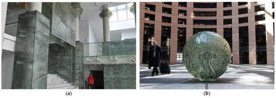 Figure 2. (a) Glass-art interior by Tomasz Urbanowicz at the Podlasie Opera and Philharmonic in Białystok, Poland, 2012; (b) United Earth glass sphere by Tomasz and Beata Urbanowicz in the European Parliament in Strasbourg, France, 2004 (Tomasz Urbanowicz).
 - o
- In the interiors of the Wrocław University of Science and Technology and the University of Wrocław;
- o
- The installation Blue Sunset in the Ocean on the RMS Queen Mary 2 transatlantic ocean liner,
- o
- Compositions in the hall of the Holsten brewery in Hamburg.
Important projects that permanently supplement public space include the United Earth glass sphere in the European Parliament building in Strasbourg, France, which has been located there since 2004 (Figure 2b); the Big Bang sculpture at the Białystok University Campus; and one of his latest projects, which overshadows all previous ones in terms of scale—a glass outline of the walls of a palatium from over 1000 years ago on Ostrów Tumski in Poznań, built in cooperation with one of this paper’s authors (Konrad Urbanowicz). Urbanowicz’s glassworks, with a more sculptural, object-like character, participated in international EXPO expositions three times: first in the form of a glass bear in 2000 in Hanover, Germany; then with a glass piano in 2005 in Aichi, Japan; and then with a glass spinnaker sail in 2008 in Saragossa, Spain (Fabiańska 2012).
Both his multicolored and his monochromatic compositions are installed in historical and newly built buildings.
5. Tomasz Urbanowicz’s Design Process and His Techniques of Working with Color
Each of the works presented in this paper is dedicated to a specific space. As Urbanowicz stressed in an interview, “My commissions absorb me, so I work for clients with a specific budget, in a specific building and interior. When ideas are concerned, when I enter a given place I typically already know how it should look like” (Fabiańska 2012). However, cooperation does not always start when a work of architecture has already been built. Design studies often involve the artist already during the conceptual or technical design, as in the case of the Podlasie Opera and Philharmonics Building in Białystok: “I was involved with the design from the moment when Professor Marek Budzyński and his team formulated a competition proposal. I had worked with him on the Supreme Court building in Warsaw earlier” (Urbanowicz 2012). The place and specific musical notation were chosen by the designers, while the final visual form lay with the artist: “What we wanted was not the graphics of the musical notation, but something that could be named using words—for there to be a soul in the glass, to create a spirit of the space, to create Beauty. The glass pieces (…) have a rich texture and very constrained color, which fits the interiors’ scale. There are numerous flaws, murky patches and stains in the mass, so as to produce a unique atmosphere, hold or reflect light using each fragment.” In private buildings, it is often the developer themselves who directly asks for a work that would supplement a planned or existing interior. The inspiration sometimes lies in the building’s architecture—its function or form—or its surroundings and the natural landscape: “Once a client proposed that I make a wall from glass at a swimming pool. When I reached Srebrna Góra, it turned out that the area was rich with natural stone so I decided to create a stone and glass wall. I created glass meteors that sped through space against a stone wall.” Sometimes the start of a design is a victory in a competition, as in the first commission for the Cracow hospital (Żychowska 1999), or the latest winning proposal for the Cursed Soldiers monument in Wrocław (Róg 2020).
When a given space, location, and inspirations are identified, an idea appears in the artist’s mind, which is then transferred onto paper as a watercolor: “Every design begins from a colorful drawing. I think using watercolor” (Maciąg 2014). In the case of the design for the Baroque interior of the Wrocław University Main Building, this idea was a glass egg that was to play the role of a reception desk (Figure 3a) (Urbanowicz and Urbanowicz 2019). Specifying the original idea often requires making a mockup to scale or additional views, cross-sections, and details. The egg was modeled by Urbanowicz in linden wood, to a scale of 1:15 (Figure 3b). This allowed the proportions of the mass to be specified, yet in this case the mockup also served as an inspiration for producing the relief in the glass. Work on unique, fire-resistant forms that are used to cast the glass is another stage of the process. In the case of the design for Wrocław University, the layout of wood rings in the linden wood mass created an interesting and dynamic pattern—horizontal on the left and vertical on the right. The artist translated this structure into the language of kiln-fired glass (Figure 3c) by making negative reliefs that modelled the layout of the rings (Figure 3d). Flat glass is placed on such forms and is then heated to a temperature of 850 °C. The material melts and creates a monolithic mass, whose underside is a print of the negative form. Appropriately cooled glass can be placed in the kiln again, on three-dimensional forms, and fired at a lower temperature of around 600 °C to add curvature (Figure 3e). Color in a glass object thus made depends on the base color of the flat glass used to make the cast. In this case, the slightly greenish tint stemmed from the composition of float glass. It is possible to obtain a purer, diamond-like or colorful glass based on melting solid-colored glass (e.g., greens, blues, dark blues, graphites, browns). The color intensity in cast glass rises as it gets thicker, so in places where the relief is deeper, the color intensity is much greater, which allows the artist to create a colorful pattern on the surface of the glass. In addition, as the surface layout changes direction (concavities, convexities), the light falls in different ways, refracting, scattering, and reflecting, which underscores the image.
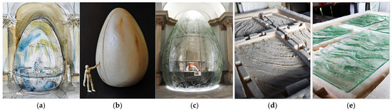
Figure 3.
Glass art EGG by Tomasz Urbanowicz and Konrad Urbanowicz in the main building of the University of Wrocław, Poland, 2019: (a) watercolor project; (b) wooden scale model 1:15 (Tomasz Urbanowicz); (c) completed commission; (d) forms in the kiln before glass casting; (e) relief glass structure before glass bending (Konrad Urbanowicz).
Such a monochromatic, relief-based object from artistic glass can be painted, and the applied pigment can be fused in another thermal process. Tomasz Urbanowicz uses metal oxides as color carriers (Figure 4a). He mostly adds them by airbrushing (Figure 4b). Each color is sprayed in layers, and their interweaving forms the final color effect. Due to the staining process being difficult to recreate and multi-staged, all the glass elements in a given composition must be stained at the same time, in a layout that corresponds to the final presentation at the target site. This allows the artist to obtain a perfect color continuity between elements and maintain uniform color transitions and coherent shades in the entire composition (Figure 4c).
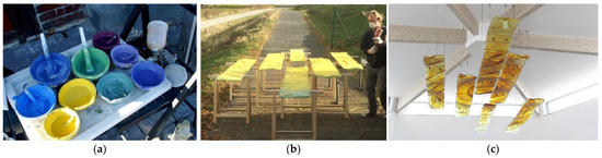
Figure 4.
(a) Colorful metal oxides at the Archiglass studio, 2018; (b) Tomasz Urbanowicz pigmenting The Spirit of Health glass composition using airbrushing at the Archiglass studio, 2018; (c) The Spirit of Health suspended glass art composition by Tomasz Urbanowicz and Konrad Urbanowicz at the Integrative Medical Center in Żerniki Wrocławskie, Poland, 2018 (Konrad Urbanowicz).
The spraying on of metal oxides is not without significance. The perpendicular direction of pigment application is used to obtain a surface effect, which fills the backgrounds (Figure 5a). The background color intensity depends on the amount of the oxide sprayed, its dilution, and its type. An oblique spraying embosses the relief pattern of the glass trace, underlining the form’s spatiality (Figure 5b). A completely parallel spraying allows for the precise accentuating of the form’s greatest convexities (Figure 5c). After the application of all color layers, the glass elements are once again placed in the kiln, where, after being heated to a temperature of around 600 °C, the metal oxides combine and fuse with the glass surface, while also attaining transparency. Another method of staining glass is to introduce metal oxides between flat layers of base float glass (Figure 5d). The color obtained by firing is thus located inside the glass mass and produces surprising painterly results. Urbanowicz often mixes these techniques to produce a complex image, whose expression is read holistically both from a distance and from up close, when details are visible.
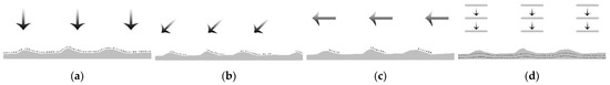
Figure 5.
Methods of color applications: (a) perpendicular airbrushing; (b) oblique airbrushing; (c) parallel airbrushing; (d) mid-layer pigmenting (Konrad Urbanowicz).
An introductory analysis of the complexity of applying pigment to glass was performed on the basis of the comprehensive project entitled The Spirit of Health, located at the Integrative Medical Center in Żerniki Wrocławskie. The original idea of presenting the spirit of health was based on referencing the rising sun (Figure 6a). The visual reflection here was to be attained by central compositions, whose center was intensively honey-colored, and the sides would transition into increasingly delicate amber hues (Figure 6b). Obtaining such a transitive surface color of the background required the application of perpendicular airbrushing of each metal oxide. The placement of glass elements for pigmentation was as close to the final result as possible (Figure 4b), and all the elements were stained at the same time. The first diagram (Figure 6c) presents the intensity of the oxide application, with white denoting the lack of color, whereas black shows its full intensity. The rising level of dilution towards the edges of the composition and the lower number of applied layers produces a brightening and diminishing of the color. By analogy, the second diagram (Figure 6d) shows the spatial form and relief of the glass elements. The parallel-stained pattern becomes more dynamic in the center and more subtle near the edges of the hanging composition (Figure 4c).
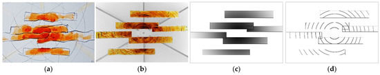
Figure 6.
The Spirit of Health suspended glass art composition at the Integrative Medical Center in Żerniki Wrocławskie, Poland, 2018: (a) watercolor project (Tomasz Urbanowicz); (b) finished project (Tomasz Urbanowicz and Konrad Urbanowicz); (c) glass background color intensity; (d) glass relief color and structure (Konrad Urbanowicz).
The two types of operating with color presented above define the direct division used in the paper. Monochromatic projects are those wherein the color of the glass composition stems primarily from solid-colored glass mass, and changes in its thickness (relief). Meanwhile, multicolored installations include those projects in which the color is the result of metal oxides applied using different techniques, and later thermally fused into the glass structure. This technological distinction also carries over to the visual reception of the projects, whose visual character directly depends on the technique applied.
6. Contemporary Artistic Glass in the Context of Historical Buildings
Interventions in historical buildings are aligned with Urbanowicz’s field of interest. It sometimes happens that color is the primary pretext for him to create his glassworks, whereas in others it is a background and an element shared between the new and the old.
The symbolic significance of color changes depending on the culture of a given community and the historical period (Gage 2008). The context and the manner of experiencing it affects a work’s interpretation. However, the color itself can also be an inspiration and a starting point for creating a work or linking a new work with historical tissue.
In the context of historical places, inspirations in Urbanowicz’s work typically concern the architecture of a building (either an existing or non-existing one), the unique properties of its structural system, or the urban and natural surroundings and cultural heritage. The production technique is a changing and secondary element adapted to achieve the goals intended. It is based on kiln-formed glass but is also enhanced by technological innovation in the pursuit of visual solutions that meet expectations and reflect the artist’s idea and original intent in the best possible manner (Cummings 2009).
6.1. Multicolored Projects
The glass compositions for the “Pod Starym Głogiem” (“Under the Old Hawthorn”) restaurant, in the cellars of the town hall on the market square of Głogów, Poland (2009), are a project situated in a historical context, and whose starting point were color and glass compositions. The building, whose beginnings date to the first half of the fourteenth century, has had a tumultuous history. It was remodeled several times, mostly due to fires. During the building’s reconstruction in the sixteenth century, a small hall with a diamond vault was built, along with a larger hall, which had a stellar vault. Due to numerous instances of heavy damage, only the building’s cellars survived from the Gothic period, along with stellar and diamond vaults on the ground floor. Due to the wartime destruction brought about by the Second World War, the town hall suffered heavy damage, and its ruins were left as a trace of and a witness to history. They awaited reconstruction for forty years (Cwynar 1994). In the middle of the 1980s, a decision to rebuild the town hall was finally reached. The town hall was rebuilt on the surviving cellar walls and fragments of original elements of Gothic vaults, in a form and with décor almost alike to the one from before 1945 (Sieledczyk 1994).
The restaurant in the cellars of Głogów’s town hall had already existed during the time of transition between the Gothic and the Renaissance periods. In 2009, private investors decided to resurrect the restaurant in the building’s cellar. The interior design was prepared by architect Anna Morasiewicz from Autorska Pracownia Projektowa “Linea,” who invited Tomasz Urbanowicz to participate during the conceptual stage, tasking him with finding an overarching idea for the interior’s character. The artist decided that the role of the primary inspiration and leading motif for the design of glass decorations would be played by the Gothic vaults of the halls. The character of each interior was enhanced using suitably shaped objects that highlighted the uniqueness of the historical vaults. The general idea was transferred to paper in the form of a watercolor (Figure 7a), which was used as a basis for making glass elements (Figure 7b) with detail and color (Figure 7c) that corresponded to the ribs of the vaults (Fabiańska 2012).
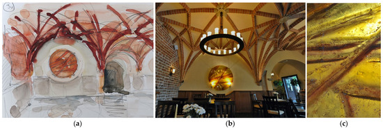
Figure 7.
Glass composition by Tomasz Urbanowicz inspired by the stellar vault of the cellar’s interior of the town hall in Głogów, Poland, 2009: (a) watercolor design; (b) glass wall-art implementation; (c) detail of the use of color creating the effect referring to the character of the vault’s ribs (Tomasz Urbanowicz).
The designs of glass elements for each of the interiors differ in color, detail, and relief. The scale and technique of the works are the same, as they are framed as round, thick glass images that have been suspended from the walls at central locations and highlighted by the shape of the paneling. The glass images’ primary motifs in the main area come in the form of intense, rusty orange and amber, taken from the hue of the brick ribs of the structure of the stellar vaults. The lines of the relief introduce a dynamism that corresponds to the outline of the vault, and the background retains a greater uniformity of the pattern and a brighter color, referencing the fields between the ribs and supplementing the composition. The design of the glasswork for the hall with groin vaults was based on a unitary sandstone-like color scheme and arched shapes in the relief (Figure 8a), which referenced the calmer spatial characteristic of the interior (Figure 8b). The interior of the small hall with a diamond vault received a cooler and purer visual effect, aligned with its character (Figure 8c). The kiln-formed glass in this interior is much more heavily sculpted in the relief detail, and the color scheme highlights the ideative reference and contributes to visually expanding the small space (Figure 8d).
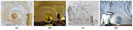
Figure 8.
Architectural glass art compositions by Tomasz Urbanowicz inspired by vaults in the corresponding rooms of the cellar in the town hall in Głogów, Poland, 2009: (a) a watercolor design for a groin vault room; (b) glass-art result with a relief and warm tones related to the interior; (c) a watercolor design for a diamond vault room; (d) glass-art result with a relief and cold tones related to the interior (Tomasz Urbanowicz).
Between the halls, glass portals with very light, neutral green hues were designed, with sanded door frames that complemented the outline of arched reliefs of ornamental glass. They acoustically dampen parts of the building and visually separate the colors of the different zones and vaults. The main hall, located on an upper floor, is characterized by cuboid geometry. That is why the glass object that defines its character was given a different, harsh form, and the relief pattern featured on it was based on rectangles (Figure 9a). In terms of color, it is tied in with the green accents of the entrance zone, which remained in a state of contrast with the exterior of the building. The warm tone of the vertical part of the composition directs the viewer downwards to the cellar, where the restaurant is located (Figure 9b).
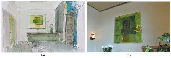
Figure 9.
Architectural glass art composition by Tomasz Urbanowicz in the entry hall of the town hall in Głogów, Poland, 2009: (a) watercolor design; (b) final glass element (Tomasz Urbanowicz).
The presence of colored, contrasting artistic glass in the architecture of a different, newly built building symbolically restored a historical image of a fragment of Wrocław. The hotel and commercial building Just In Center by ARCH-E Biuro Projektowe was built in 2009 at a site where a monumental Baroque Revival of the Imperial Main Post Office had stood before the Second World War (Figure 10). The structure, which was demolished after the war, was designed in 1888 by Berlin-based architects Walter Kyllmann, Adolph Heyden, and Carl Doflein (Czechowicz et al. 1997).
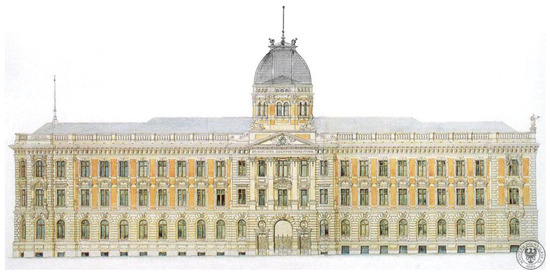
Figure 10.
Design of the façade of the Imperial Main Post Office by Walter Kyllmann, Adolph Heyden, and Carl Doflein in Breslau, Germany, 1884–1888 (collections of the building archive in Wrocław (Czechowicz et al. 1997)).
Intending to preserve a trace and impression of the presence of historical architecture in contemporary Wrocław, Tomasz Urbanowicz—invited by architect Marek Skorupski to cooperate—created a modern glass façade inspired by the building’s non-existent form (Lipowicz-Budzyńska 2014a). The façade, with a height of 10 m, is the main entrance to the new building and, via its transparency and the play of light, enlivens the space of the hall and the street. The technological solution combines kiln-formed glass with flat glass panes using the principle of lamination to the surface of an external façade. Thus, the façade attained a delicate spatiality of a large-format relief, generating changing reflections, especially with vertical, top-down illumination, when the hall interior is less illuminated (Figure 11a). To make it possible to laminate flat glass, the smooth side had to achieve an ideal surface, which is why after casting the relief, each of the manually formed artistic glass pieces was once again kiln fired “upside down” so as to obtain perfect smoothness. The colorful metal oxides placed on the relief surface of the glass also required fusion at a high temperature. Furthermore, the dye, with an intensive, warm amber and lemon hues, was introduced with water during the first glass-firing stage between the float layers, generating an effect of depth in the produced artistic elements. The painterly color and semi-spatial detail of the façade, which remains in a relationship with the historical, no-longer-existing building, can be observed from a close distance both inside and outside the building (Figure 11b).
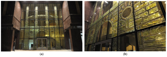
Figure 11.
Glass façade by Tomasz Urbanowicz in the Just In Center at Krawiecka Street in Wrocław, Poland, 2009: (a) the laminated casted-glass elements in a layout reminiscent of the destroyed building of the Imperial Main Post Office; (b) detail of the façade’s kiln-formed glass casts introducing the texture and color of the original stone rustication (Tomasz Urbanowicz).
6.2. Monochromatic Projects
The matter of color in an artistic architectural glass designed in the historical space of Ostrów Tumski in Poznań (2021) was treated in a clearly different, more subtle manner, which helped in building the relationship between new and historical substance. The design, treading the line between architecture and art, was an intervention in the public sphere of the city. It concerned the exposition of the remains of a palatium of Mieszko I and his wife, Dobrawa, an early Piast building from over one thousand years ago, which was probably the first monumental building in the Piast state (Kóčka-Krenz 2004). The genesis of the design reaches back to 1999, when a team of archaeologists headed by Hanna Kóčka-Krenz from Adam Mickiewicz University made the extraordinary discovery of the relics of the palatium in the immediate vicinity of the Church of Holy Mary. Based on many years of research on the uncovered relics, it was possible to collect many pieces of detailed information about the history of the structure (Kóčka-Krenz 2010). The princely residence had a form similar to a rectangle, oriented along the north–south direction, whose dimensions were around 11.8 m x over 27 m, and its outer walls had a width of up to 1.3 m.
From the east, a chapel abutted the building. The central part of the palatium is located underneath the existing church (Figure 12a) (Kóčka-Krenz 2021), with the entirety of the relics at a depth of around 1.5–2 m underground, which significantly contributed to excluding the possibility of exposing the original ruins. It was thus decided that glass would be the most suitable for this presentation, as it was historically not used on this scale, which means that its application did not bear the risk of imitating historical tissue. Furthermore, glass is made from sand, which symbolically references the fact that the original walls of the palatium had been buried under it for hundreds of years. The sand in the glass metaphorically restored the building to Poznań’s urban space (Kóčka-Krenz 2021). The design of displaying the building around the Church of Holy Mary using a wall raised around 60 cm above the floor level was proposed by architect Przemysław Woźny. Up to that moment, the manner of preparing the glass and the possibility of implementing it on this scale in the public space of the city had been largely unexplored. The designer invited Tomasz Urbanowicz and Konrad Urbanowicz to cooperate on reflecting the artistic “spirit” of the historical building in the glass. The safety of the structure, as well as its use and conservation in open public space, also had to be maintained.
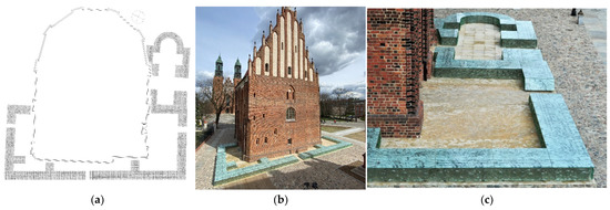
Figure 12.
Glass art installation by Tomasz and Konrad Urbanowicz representing the outline of the first Piast Dynasty residence and chapel, Poznań, Wrocław, 2021: (a) a plan of the wall’s outline with a large-scale graphic design of approx. 25 × 30 m; (b) aerial view from the northwest corner towards the cathedral; (c) aerial view from the southwest corner towards the cathedral (Konrad Urbanowicz).
After becoming familiar with the findings of archaeological studies, as well as an in-depth analysis of collected materials, the team proposed a glass solution that combined various processing techniques. They were to produce a cohesive and safe structure that featured an educational historical message that would enhance the value of the literal presentation of the building’s outline and include its material and visual character (Urbanowicz 2021). Design guidelines required that the upper glass be able to bear significant weight, since it would be used directly by people and would ensure safety in the event of suffering damage. The side glass, hidden underneath the upper glass and not under direct load, could be approached with greater freedom. Both glass types were also to convey a historical message while also constituting a modern memorial for a no-longer-existing heritage structure. The wall was to engage the observer to pursue and expand knowledge of the edifice. The structure that was to support the entire work was to remain unseen and be light, so as not to disrupt the artistic reception or inhibit access to light, whose role in contact with the glass is crucial. The support structure was designed in the form of a modular stainless-steel frame that would allow for the independent attachment of glass panels using mullions while maintaining safe assembly joints. The glass sheets were “uplifted” in space, which ensured safety on the one hand (no direct contact between the glass elements), while on the other, allowed for the maximum illumination of the installation, its maintenance, and keeping it in good condition. Photographs from archaeological digs were a direct inspiration for preparing the form of the glass. The final work is an original, intuitive, and modern imagining of the outline of the palatium’s walls (Figure 12b), along with a chapel in the form of a Latin cross (Figure 12c).
The vertical blocks of the wall were design as casts from kiln-formed relief glass, which was made at the Archiglass architectural glass art studio (Figure 13a). The casts, made in infrared kilns, were produced out of the glass with a base thickness of 40 mm, in handmade forms that referenced the pattern of stones, which allowed the elements to imitate the structure and character of the foundations and walls of the stone palatium from over a thousand years ago. After firing the glass at a temperature of 850 °C, the form was destroyed and recreated by hand after each use, which made all the glass elements unique, while the cohesive preparation of contact points between modules ensured visual continuity. After casting in kilns, the relief glass, depending on the form, achieved local thicknesses of between 20 and 80 mm. Along with the changing natural and artificial lighting, the light shimmers, attracting the sight of moving observers. In the eastern corner of the palatium—the site of the chapel’s discovery—the vertical glass pieces were additionally bent in a long thermal gravitational procedure, which resulted in reflecting the internal and external curvature of the chapel’s apse using specially prepared forms.
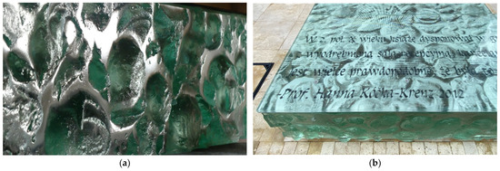
Figure 13.
(a) Vertical relief kiln-formed cast glass; (b) horizontal UV screen-printed graphic on the bottom layer of the laminated glass (Konrad Urbanowicz).
Horizontal and diagonal elements of the wall, which formed the upper surface of the composition, were designed to be made from tempered and laminated glass from three layers of 10 mm each (ESG. VSG 10.10.10) with a print that allowed all of the wall’s glass parts to be visually tied together (Figure 13b). The graphics of the print were based on a cast made in the same technology as the side glass pieces, and then photographed and rasterized. The graphics were then designed to a scale of 1:1 on a surface 25 × 30 m (within the outline of the square around the church) and printed using UV print technology onto the lower of the three laminated glass layers. Historical quotes chosen by the investor with substantive cooperation from the Archaeological Museum in Poznań were printed using raster dots. Due to the incorporation of historical quotes in specific places of the wall that they concern, the installation invites observers to discover the history, to interact in searching for the structure’s significance and its form (Stempin 2021).
The color scheme of the new structure was based on the natural color of float glass, whose slightly greenish tint intensifies as the thickness and coarseness of the vertical kiln-formed relief glass elements increases. This effect harmonizes with the natural color of the nearby Poznań Cathedral’s patinated copper spires (Figure 14a). In order to obtain a similar color in the flat horizontal glass elements, the raster print was made on the lowest layer of the glass. Only two neutral colors were used to make the UV print—white and black. The white background of the stone pattern is filtered by two layers of glass above (each 10 mm thick), which gives it the greenish tint of float glass (Figure 14b). The black text, visible from a distance against the bright background of sand-colored pavers or internal illumination, is complemented by black accents of the surroundings—the shaded details of towers, articulately sculpted buttresses, and the window recesses of churches.
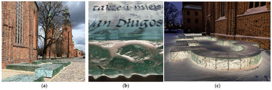
Figure 14.
(a) The visual relationship of the color of the cathedral’s patinated copper spires and the architectural glass art composition; (b) details of the horizontal and vertical glass representing the play of colors and shades of green; (c) illumination of the installation after dusk in the historic setting (Konrad Urbanowicz).
The design emphasized the authenticity of the materials, which was also reflected in their true colors. Stone presented its actual color; original medieval brick displayed a rusty, grated palette of tones; and glass, harmonizing with the spires of towers and chapels, complemented this spectacle of noble materials. The subtle combination of illumination with existing historical tissue allowed the installation and fragments of the church to be lit up, especially in places where the historical structure enters below the foundations. The color and intensity of light (ever essential when in contact with glass), play a crucial role in the design at night. They combine the installation with the illuminated structures of the historical surroundings. The effect of the palatium’s remains levitating appears as if a symbolic “spirit” of the one-thousand-year-old building has been summoned (Figure 14c).
The project at the palace in Opypy features a similar color scheme, that of natural float glass, but it is exposited as a primary or even the sole intensive color motif in a clean white interior. The palace in Opypy is a historical building that was rebuilt towards the end of the nineteenth and the beginning of the twentieth century (Jakobielski 2016), and then once again in the 1990s. Around 2000, a bold approach by a private developer and cooperating architects from Studio Projektowe i Wzorcownia Narada (architect Wiesław Michałek and architect Katarzyna Jucha) initiated the introduction of a significant amount of artistic glass by Urbanowicz to the interior. The self-supporting, undivided balustrades (Figure 15a), glass decorations and light walls, glass rotating door with a weight of over 400 kg, and even glass floor fragments all decorate the palace building. All of these large-scale elements were made by the artist as kiln-formed relief glass without additional staining, which is why their color manifested itself in the thickness and shape of the relief. The color and natural-looking pattern of the glass acts as a dominant element in the building’s neutral interiors (Figure 15b). To obtain a clean visual effect, the structural elements were hidden (underneath the floors, in walls, in stringers) and fully highlight the glass itself, which is emphasized by Andrew Moor’s description: “In his work it is often the details that the eye fails to perceive easily that are the secret ingredient that gives his work that indefinable quality of excellence” (Moor 2006).
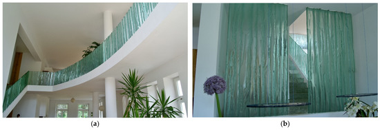
Figure 15.
Interiors featuring glass elements by Tomasz Urbanowicz at the Palace in Opypy, Poland, 2000: (a) continuous balustrade of kiln-formed glass embedded in the floor; (b) dominant greenish cast-glass walls and decorative elements in a neutral interior design (Tomasz Urbanowicz).
7. Contemporary Artistic Glass in Architecture without Historical Context
Another group of kiln-formed artistic-glass projects by Tomasz Urbanowicz consists of works in contemporary buildings, but without historical references. In these works, the artist’s creative inspirations were tied in with the function and characteristic of a given building and with symbolism. Here, color fulfilled an essential, albeit different, role. Again, the approach to color is diverse, as sometimes it is used as a nigh-monochromatic complement, whereas at others, it dominates the interior with a multicolored composition.
7.1. Multicolored Projects
In his contemporary projects, Urbanowicz also uses color in a more varied manner that is directly tied to its meaning, creating a narrative within space.
The multicolored compositions are located in the Church of the Savior of a parish of the Evangelical Church of the Augsburg Confession in Działdowo. The newly built building, which combines typical Masurian architecture with contemporary elements, was designed by architects Robert and Grażyna Futerhendler from Consulting-Project. Their artistic cooperation with Urbanowicz also began at an early design stage, which allowed a suitable exposition and lighting to be produced for the religious works and their incorporation into the entire architectural and symbolic concept. The windows of the eastern side of the church were designed to feature artistic glass in the form of a 6 m-tall cross and stepped panels. The central strip of the floor was given a gloss finish, which contrasts with the matte sides. These solutions allowed for the use of the effect of natural light and highlight the impact of the glazed surfaces in the church’s interior.
The glass décor uses three colors, whose symbolism is tied to religion (Figure 16a). Purple represents the suffering and passion that became the consequence of the original sin. White symbolizes purity, the innocence of Christ, who, as the Lamb of God, sacrificed his own life. Green references hope and eternal life. A small red smudge in the place of the wound inflicted on Christ is a small yet essential touch. When we observe the composition from the left, the passage from purple (suffering) to green (eternal life) is possible due to the presence of white (innocence and Christ’s sacrifice) (Figure 16b).
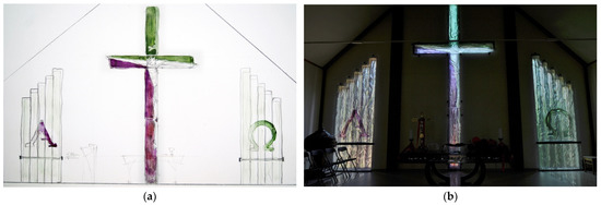
Figure 16.
Glass design by Tomasz Urbanowicz for the Church of the Savior of the Parish of the Evangelical Church of the Augsburg Confession in Działdowo, Poland, 2008: (a) watercolor project; (b) glass-art realization (Tomasz Urbanowicz).
The central cross plays a dominant role in the interior via its height of 6 m. According to the artist’s intent, it presents Jesus’s victory over death due to his resurrection (Figure 17a). Christ’s face was made using kiln-formed glass in a special manner. Around the eyes, the form was prepared to be deep enough that the glass would not touch the relief at those two points (Figure 17b). This created a sort of pair of lenses, which makes the face of the glass relief appear as if it observes the faithful gathered in the church, regardless of where they are in it, as if trailing them with its eyes.
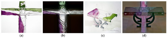
Figure 17.
Details of glass elements with religious symbolism: (a) part of the crucifix design; (b) corresponding final glass appearance; (c) altar design; (d) the complete glass altar with a visible effect of reflections on the floor (Tomasz Urbanowicz).
The glazed surfaces on both sides of the cross reference Christ’s words: “I am the alpha and the omega, the beginning and the end.” In form, they reference the decalogue with the Greek letters alpha and omega, and their color continues the idea of a gradient from the purple color of suffering to the green of hope and the white of innocence. The tricolor altar is supported by a base in the shape of the letter omega (Figure 17c). The light cast by the glass cross in the façade reflects off of the gloss section of the floor, passing through the base of the letter omega and crossing through the entire interior, visually expanding the scale of the cross (Figure 17d). The suspended form and shape of the division of the altar’s color scheme references the tear in the temple’s curtain at the moment of Christ’s death. The inscription “I am the path, the truth, and the life” is impressed in the frontal part of the kiln-formed glass. The glass décor of the interior, maintained in a cohesive color scheme, is completed by the ambo, the Bible holder, and the balcony balustrade with impressed visages of the first Christian symbol—Ichthys (Ekumeniczny Uniwersytet Trzeciego Wieku 2014).
Artistic glass with a vivid application of color was used in the building of the Faculty of Theology of the University of Silesia in Katowice (2004). The building, with contemporary interiors, was designed by architects from Stabil. Urbanowicz’s glass installations complement the interiors of the chapel and reception desk in the building’s main hall. Christian symbols formed an inspiration for the artistic interventions in the chapel. The delicate application of varied colors highlights the patterns in kiln-formed glass. Green (Figure 18a) and yellow shades of the glass panels (Figure 18b) harmonize with the neutral color scheme of the chapel’s interior. A red touch in the form of a cross is the only intense and contrasting color in the space (Figure 18c).
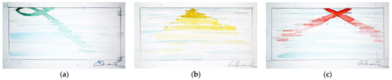
Figure 18.
Glass-art designs by Tomasz Urbanowicz for the Faculty of Theology of the University of Silesia in Katowice, Poland, 2004: (a) watercolor with the green ichthus theme; (b) watercolor with the yellow Holy Trinity theme; (c) watercolor with the red cross theme (Tomasz Urbanowicz).
All three depictions blur away in their lower parts and connect with various visually coherent elements used in the chapel’s architecture (Figure 19a). The glass architectural details co-form the spatial and organizational framework of the interior and blend into the compositional and visual order of the monochromatic space. The colorless kiln-formed glass supplements the stone cladding of the walls, floors, and flat glass partition walls. Multicolored stone accents illuminated by natural light underscore the symbolism of the interior and the message it conveys (Maluga 2005).
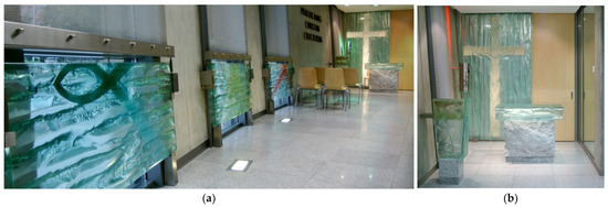
Figure 19.
The subdued interior design of the chapel with glass compositions: (a) glass panels introducing color through three Christian symbols; (b) glass elements of liturgical furniture and interior design (Tomasz Urbanowicz).
The large-format altar composition entitled Crucifixion and the glass liturgical furniture maintain the predominant monochromatic character of the interior with the delicate relief pattern (Figure 19b). The spectacular artistic features of the works give the simple and universal interior a religious character (Wala 2012).
In a pilot study on the degree of user satisfaction and general assessment of the building, the Faculty of Theology of the University of Silesia in Katowice was given very high ratings, not only due to its functional layout and technical equipment but also due to the aesthetic features of its interiors (Winnicka-Jasłowska 2011). Site-specific compositions that are aligned with the character of the interiors and complement their appearance by using color and light in a delicate, accentuating, and symbolic manner are their cohesive component.
7.2. Monochromatic Design
Dominant, monochromatic glass pieces were introduced in the building of the Science and Research Center of the new Faculty of Electrical Engineering at Wroclaw University of Science and Technology (2006). The work began at an early stage of the architectural conceptual design. The starting point for Urbanowicz was the theme and function of the building and the color scheme of the planned architecture. The façade of the tall building was designed to be built out of sandstone cladding with large glazings from green-tinted reflective glass. Artistic glass compositions in the building’s interior reference electricity in color and motifs (Lipowicz-Budzyńska 2014b).
The compositions were divided into three main scales and depict electricity. Low-intensity electricity references electric circuits, presented in the counters of the reception desk and cloakroom. Medium- and high-intensity electric currents are symbolically depicted as power lines and transmission towers, and placed on large-format glass panes in tall window frames (Figure 20a). The highest current, as natural electric discharge in the form of lightning, is shown in a wall composition near the audiovisual conference room. The height of the pane and the change in shape from rectangular to a circular further highlights the power of natural atmospheric discharge (Figure 20b) (B. Urbanowicz 2007).
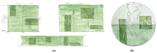
Figure 20.
Watercolor designs of the electricity-inspired compositions by Tomasz Urbanowicz for the Science and Research Center of the Faculty of Electrical Engineering, Wrocław University of Technology, Poland, 2006: (a) fixed window-glass designs at the lobby and reception desk; (b) round glass-art design by the audiovisual conference room (Tomasz Urbanowicz).
Medium- and high-current compositions (Figure 21a), as well as the one that depicts the lightning bolt (Figure 21b), fill the external display windows on the building’s ground floor. By filtering natural light that is introduced in the interior, they give it a light tint. After dark, the effect on the space is reversed. A green-tinted glow illuminates the composition outside the building, attracting the attention of passersby. The monochromatic green color is the basis for all compositions. It corresponds to the floor and walls, which are ecru. The original idea of presenting glass images was based on introducing fragments with more intense greenery, in which the precision of the glass relief was much higher and intended for viewing up close, along with its details. Fragments with delicate greenery have much more subtle and blurred painterly patterns. They are a form of background that is to be observed from a greater distance, from the hall, or from the external space. From a technological standpoint, these fragments were prepared in a different manner, which allowed for such a diverse graphical effect in a single material. The relief form of the darker fragments was made in precisely yet still manually carved fire-resistant sheets. The form of the remaining parts was based on using powdery aluminosilicates. The base color was the result of the type of solid-colored glass. In addition, parts of high-precision fragments were painted from the kiln-formed side using metal oxides after the first firing and then re-fired in a kiln at around 600 °C for consolidation.
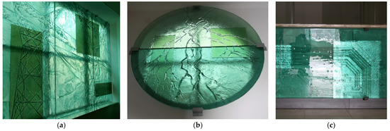
Figure 21.
Completed compositions with predominant green tones: (a) medium- and high-current representations in kiln-formed glass; (b) lightning depiction in artistic glass; (c) glass panels of the reception desk with rectangular mirror inserts (Tomasz Urbanowicz).
The kiln-formed glass used for the reception desk was produced in a similar manner. The differences between the display cases are magnified by the illumination method. Due to the absence of natural light that would directly penetrate this part of the composition, the artist decided to apply mirrors in rectangular forms, which would be similar to the fragments of the high-precision form in the glass pieces (Figure 21c). This produced a similar visual effect and provided cohesion to all compositions. Furthermore, reflections in the mirrors, filtered by glass, generate dynamic changes in the installation along with the movement of the observer and any other person present.
Innovation in the use of color in the design and the completed project in the Science and Research Center of the Wrocław University of Science and Technology gained acclaim in a national architectural competition. The design received third prize in the Maciej Nowicki competition organized by Architektura i Biznes and the International Poznań Expo under the patronage of the SARP for innovative solutions in Polish architecture (First Edition—“Architecture of color,” Cracow, May 2007). In the conferment statement, the jury, which included Romuald Loegler, stated that the award was given for “an original introduction of color as an architectural component that combines in itself the properties of an individual, artistic ‘gesture’ that introduces color-based and graphical effects into a work of architecture and, due to changing lighting conditions, can be registered both from outside and inside the building” (I Edycja Konkursu o Nagrodę Im. Macieja Nowickiego Rozstrzygnięta n.d.).
8. Discussion and Conclusions
In the cases presented, color plays a variety of roles, yet always remains an important factor in the design of both the work and its surroundings. The presence of contemporary art glass in architecture and public spaces can fulfill the following functions:
- Primary and dominant in relation to the character of the space in which they are placed, due to the scale of application or visual contrast produced;
- Secondary and seemingly unseen during short and initial observation of a space, by delicately accentuating structural, formal, or functional elements of a building.
The cases studied, designed by artist Tomasz Urbanowicz and made using kiln-formed glass, are characterized by a strong subordination to their respective overarching and leading concepts, whose inspirations are closely tied to a given building. In contrast to the works of other artists, Urbanowicz’s projects are characterized by visual and technological diversity. Each time, the artist changes the technique in which a composition is made, depending on the planned artistic result. Both the manner of treating the material and the approach to color are different in each project. We can list a number of design approaches in the context of color:
- Color that highlights a given aspect of a building (drawing attention);
- Color in a symbolic reference (indirect message);
- Color in an actual reference (direct message);
- Color as a source of building an interior’s atmosphere.
In multicolor projects, color typically introduces contrast and presents selected elements of a building. It can also refer to a stronger symbolic meaning by the application of precisely selected hues. In monochromatic works, color’s role is often to produce a holistic atmosphere in an interior or to supplement existing color sets by acting as a harmonizing, secondary complement to an interior’s character.
Color-application techniques in glassmaking depend directly on the type of building in which an intervention is to take place—regardless of whether it is historical or newly built.
Despite the modern technology and contemporary visual expression of a project, its relationship with historical tissue has a positive impact on the reception and architectural features of the space that they complement. New interventions, via the skillful use of color, transparency, and light, underscore the strong points and individual parameters of both contemporary and historical buildings. The application of the natural material does not conflict with the original character of the surroundings, while the scale of the composition and the technology of its making rules out the risk of erroneously identifying an intervention as historical.
New implementations in old buildings or historical spaces highlight their own features without disrupting pre-existing authenticity while retaining the dismantlement and future conservation. In historical interventions, color can have either a dominant or a subtle and complementary character that highlights various features, depending on guidelines, inspiration, the design, and the surroundings themselves.
In the contemporary projects without historical references studied here, kiln-formed artistic glass uses the wealth of features tapped into by using color in architecture. The inspiration to use color is provided by both the function and the form of a work of architecture, as well as the landscape or natural phenomena. Color introduces symbolism to a space that is cohesive with the place of its application. Its impact can also be either dominant or secondary. Employing an artist during the early stage of architectural design opens up the considerable potential of implementing glass and properly expositing it in combination with light, whether natural or artificial.
In a standard construction perspective, glass is treated as a transparent curtain or a reflective screen, which either transmits or reflects an image. The contemporary possibilities of artistic-glass processing utilize an entire array of diverse means of expression obtained due to the many different visual, decorative, and color-related properties of glass. To paraphrase William Morris, natural beauty lies in the material itself, and it is the job of the artist to expose it (Wala 2009). In this exposition, color often plays an essential or leading role. In the context of kiln-formed glass, the techniques of introducing color into works are highly varied, and the production process of a work is of great significance to the final visual effect and the manner in which the symbolic message of the work is transmitted. The potential of using site-specific kiln-formed glass compositions in historical reconstructions is immense, from the standpoint of creating form, introducing color, and distributing it via light. In contemporary architecture, the compositions can act as elements of a narrative and of individualizing a space, and when applied on a large scale, can act as a tool that affects the character in which interior architecture, the architecture of buildings, or that of urban public space is received.
Author Contributions
All authors have contributed equally to the writing of this article. All authors have read and agreed to the published version of the manuscript.
Funding
This research received no external funding.
Institutional Review Board Statement
Not applicable.
Informed Consent Statement
Not applicable.
Data Availability Statement
Not applicable.
Acknowledgments
We thank Tomasz Urbanowicz for profound contribution in sharing his experience in the field of architectural glass art in reference to color and providing access to original watercolor projects and photographs of realized projects.
Conflicts of Interest
The authors declare no conflict of interest.
References
- Anter, Karin Friedell, and Monica Billiger. 2010. Colour Research with Architectural Relevance: How Can Different Approaches Gain from Each Other? Color Research and Application 35: 145–52. [Google Scholar] [CrossRef]
- Barovier, Rosa, William Warmus, Pearl Chou, and Maricruz Patiño. 2013. Narcissus Quagliata: Archetypes and Visions in Light and Glass. Stuttgart: Arnoldsche Verlagsanstalt. [Google Scholar]
- Beeh-Lustenberger, Suzanne. 1991. Kunst Aus Glas in Der Architektur. 125 Jahre Derix Glas Studios Taunusstein. Wiesbaden: Derix Glasstudios GmbH&CoKG. [Google Scholar]
- Brzezicki, Marcin. 2014. Spostrzeganie Przezroczystości w Architekturze Współczesnej. Aspekty Wizualne i Kognitywne. Wrocław: Oficyna Wydawnicza Politechniki Wrocławskiej. [Google Scholar]
- Calleen, Justinus Maria, Stephen Knapp, Michael Mayer, Richard MacCormac, and Iris Nestler. 2003. Alexander Beleschenko: Glass Intrerventions. Edited by Iris Nestler. Linnich: Deutsches Glasmalerei-Museum Linnich VG-Bildkunst. [Google Scholar]
- Clarke, Brian. 1994. Brian Clarke. Architectural Artist. Edited by Andrea Bettella, Nicola Hodges, Mark Lane and John Ashing. London: Academy Editions. [Google Scholar]
- Cummings, Keith. 2002. Techniques of Kiln-Formed Glass. London: A & C Black Limited. [Google Scholar]
- Cummings, Keith. 2009. Contemporary Kiln-Formed Glass. A World Survey. London: A&C Black Publishers, Philadelphia: University of Pennsylvania Press. [Google Scholar]
- Cwynar, Józef. 1994. Ratusz-Architektura, Ratusz-Historia Budynku. In Encyklopedia Ziemi Głogowskiej, Zeszyt 11. Edited by Antoni Bok, Janusz Chutkowski, Jerzy Dymytryszyn, Zenon Hendel and Jerzy Sadowski. Głogów: Towarzystwo Miłośników Głogowa, pp. 13–16. Available online: http://www.glogow.pl/tzg/bibioteka_mulimedialna/ezg/11.pdf (accessed on 23 November 2021).
- Czechowicz, Bogusław, Jan Harasimowicz, Stefan Arczyński, Stanisław Klimek, Jerzy Krzysztof Kos, Krzysztof Burski, Bogna Krynicka-Rzechonek, and Artur Kwaśniewski. 1997. Atlas Architektury Wrocławia. Edited by Jan Harasimowicz. Wrocław: Wydawnictwo Dolnośląskie, vol. 1. [Google Scholar]
- Ekumeniczny Uniwersytet Trzeciego Wieku. 2014. Ekumeniczna Wizyta Studyjna Na Mazurach. Available online: https://www.eutw.edu.pl/2014/11/ekumeniczna-wizyta-studyjna-na-mazurach/ (accessed on 23 November 2021).
- Fabiańska, Patrycja. 2012. Szkło w Architekturze–Tomasz Urbanowicz. Wywiad Patrycji Fabiańskiej z Tomaszem Urbanowiczem. Świat Architektury no. 12. Available online: https://barwyszkla.pl/szklo-w-architekturze-tomasz-urbanowicz/ (accessed on 23 November 2021).
- Feisner, Edith Anderson, and Ron Reed. 2014. Color Studies, 3rd ed. New York: Fairchild Books. [Google Scholar]
- Gage, John. 2008. Kolor i Kultura. Teoria i Znaczenie Koloru Od Antyku Do Abstrakcji. Kraków: Universitas. [Google Scholar]
- Gawron, Kamil. 2013. Szklany Krąg Na Wrocławskim Lotnisku. Świat Szkła. Available online: https://www.swiat-szkla.pl/aktualnoci/112-wydarzenia/7862-szklany-krag-na-wroclawskim-lotnisku.html (accessed on 23 November 2021).
- Gronostajska, Barbara. 2013. Przestrzeń Architektoniczna ‘Zapisana’ Szkłem. In Definiowanie Przestrzeni Architektonicznej: Zapis Przestrzeni Architektoniczej: Praca Zbiorowa. T. 1. Edited by Maria Misiągiewicz and Dariusz Kozłowski. Kraków: Wydawnictwo Politechniki Krakowskiej, pp. 82–87. [Google Scholar]
- Hall, Sarah. 2007. The Color of Light. Commissioning Stained Glass for a Church. Chicago: Liturgy Training Publications. [Google Scholar]
- I Edycja Konkursu o Nagrodę Im. Macieja Nowickiego Rozstrzygnięta. n.d. W-A.Pl ArchitekturaDesignBudownictwo. Available online: http://w-a.pl/aktualnosci.php?artykul=116 (accessed on 4 March 2021).
- Jakobielski, Michał. 2016. Polskie Zabytki. Katalog zamków, pałaców i dworów w Polsc. Available online: http://www.polskiezabytki.pl/m/obiekt/3823/Opypy/ (accessed on 23 November 2021).
- Jung, Christine. 2016. Raum Für Kunst Aus Glas. 150 Jahre Derix Glas Studios Taunusstein. Geisenheim: Derix Glasstudios GmbH&CoKG. [Google Scholar]
- Jung, Christine, Carlo Baumschlager, August Heuser, Ulrike Hoppe-Oehl, Florian Hufnagl, Florian Matzner, Sara Sepehri Shakib, and Jerzy Zeniuk. 2012. Thierry Boissel: Glass, Light, Architecture. Edited by Florian Hufnagl. Stuttgart: Arnoldsche Verlagsanstalt. [Google Scholar]
- Kóčka-Krenz, Hanna. 2004. Ostrów Tumski We Wczesnym Średniowieczu. In Ostrów Tumski-Kolebka Poznania. Edited by Leszek Wilczyński. Poznań: Wydawnictwo Rys, pp. 21–38. [Google Scholar]
- Kóčka-Krenz, Hanna. 2010. Palatia Wczesnopiastowskie. In Średniowiecze w Rozjaśnieniu. Edited by Krzysztof Skupieński. Warszawa: Wydawnictwo DiG, pp. 119–32. [Google Scholar]
- Kóčka-Krenz, Hanna. 2021. Gród Na Ostrowie, Przy Którym Dziś Jest Poznań. In Tu Się Wszystko Zaczęło. Świadectwa Początków Polskiej Państwowości Na Ostrowie Tumskim w Poznaniu. Edited by Agnieszka Stempin. Poznań: Muzeum Archeologiczne w Poznaniu, pp. 34–103. [Google Scholar]
- Kuspit, Donald. 1998. Chihuly, Volume 1, 1968–1996. Seattle: Portland Press. [Google Scholar]
- Kuspit, Donald, Dale Chihuly, and Nathalie Bondil. 2014. Chihuly: Volume 2, 1997–2014. Seattle: Chihuly Workshop. [Google Scholar]
- Lagier, Jean-Francois, Sonia Lesot, and Pascale Zembok. 2008. Udo Zembok: Les Espaces de La Lumière/Spaces of Light. Chartres: Editions Gaud. [Google Scholar]
- Lipowicz-Budzyńska, Alina. 2014a. Pomiędzy Światłem a Materią. Współistnienie Sztuki i Techniki w Kontekście Rozwoju Współczesnego Szkła Artystycznego w Architekturze. In Integracja Sztuki i Techniki w Architekturze i Urbanistyce. Edited by Józef Flizikowski and Krzysztof Pawłowski. Bydgoszcz: Wydawnictwa Uczelniane Uniwersytetu Technologiczno-Przyrodniczego w Bydgoszczy, pp. 57–68. [Google Scholar]
- Lipowicz-Budzyńska, Alina. 2014b. Szklane Realizacje Reliefowe i Półprzestrzenne w Architekturze-Techniki Wysokotemperaturowe-Część 1. Świat Szkła 12. Available online: https://www.swiat-szkla.pl/kontakt/9698-szklane-realizacje-reliefowe-i-polprzestrzenne-w-architekturze-techniki-wysokotemperaturowe-czesc-1.html (accessed on 23 November 2021).
- Llewellyn, David Jones. 2016. Materials and Processes Suitable for the Production of Large-Scale Three Dimensional Glass as Exemplified in the Work of Tomasz Urbanowicz. Swansea: University of Wales Trinity St. David. [Google Scholar]
- Lluch, Juan Serra. 2012. Three Color Strategies in Architectural Composition. Color Research and Application 38: 238–50. [Google Scholar] [CrossRef]
- Lluch, Juan Serra. 2019. Color for Architects. New York: Princeton Architectural Press. [Google Scholar]
- Maciąg, Ewa. 2014. Mógłbym Być Premierem. Tomasz Urbanowicz, Najlepszy Polski Szklarz Wśród Architektów. Dom & Wnętrze 5: 22–30. [Google Scholar]
- Maluga, Leszek. 2005. Formy Szklane w Przestrzeni Architektonicznej. Archivolta 4: 70–73. [Google Scholar]
- Mayer, Gabriel. 2013. Franz Mayer of Munich. Edited by Gabriel Mayer, Brian Clarke, Bernhard Graf, Martin Harrison and Gottfried Knapp. Monachium: Hirmer Verlags. [Google Scholar]
- Meerwein, Gerhard, Bettina Rodeck, and Frank Mahnke. 2007. Color—Communication in Architectural Space. Basel: Birkhäuser Basel. [Google Scholar] [CrossRef]
- Mimura, Mikihiro, and Krzysztof Ingarden. 2005. Pawilon Polski Na EXPO 2005. Architektura-Murator. 7, pp. 29–37. Available online: http://www.iea.com.pl/publikacje/2005/2005-MM-Pawilon-Polski-na-Expo.pdf (accessed on 23 November 2021).
- Moor, Andrew. 1989. Architectural Glass. A Guide for Design Professionals. Nowy York: Whitney Library of Design, London: Mitchell Beazley International Ltd. [Google Scholar]
- Moor, Andrew. 2006. Colours of Architecture. Coloured Glass in Contemporary Buildings. Edited by Mitchell Beazley. London: Octopus Publishing Group Ltd. [Google Scholar]
- Róg, Lucyna. 2020. We Wrocławiu Stanie Pomnik Żołnierzy Wyklętych. Zaprojektowany Przez Naszego Doktoranta i Absolwenta. Politechnika Wrocławska-Aktualności. Available online: https://pwr.edu.pl/uczelnia/aktualnosci/we-wroclawiu-stanie-pomnik-zolnierzy-wykletych-zaprojektowany-przez-naszego-doktoranta-i-absolwenta-11625.html (accessed on 23 November 2021).
- Sawa-Borysławski, Tadeusz. 2003. Wszechświat-Vesemir. Patent 1: 18–19. [Google Scholar]
- Schanz, Anke, Wilhelm Peters, and Jan Peters. 2012. Art, Glass & Architecture. Glasmalerei Peters Studios. Paderborn: Glasmalerei Peters Studios. [Google Scholar]
- Schönmetzler, Klaus Jörg, and Elisabeth von Samsonow. 2013. Florian Lechner and Glass. Edited by Peter Schmitt. Stuttgart: Arnoldsche Verlagsanstalt. [Google Scholar]
- Sieledczyk, Ryszard. 1994. Ratusz-Odbudowa. In Encyklopedia Ziemi Głogowskiej, Zeszyt 11.1. Edited by Antoni Bok, Janusz Chutkowski, Jerzy Dymytryszyn, Zenon Hendel and Jerzy Sadowski. Głogów: Towarzystwo Miłośników Głogowa, pp. 17–18. Available online: http://www.glogow.pl/tzg/bibioteka_mulimedialna/ezg/11.pdf (accessed on 23 November 2021).
- Siomkajło, Barbara. 2001. Matryce Wyobraźni: W Szklanym Wszechświecie Tomasza Urbanowicza. Archivolta 3: 36–41. [Google Scholar]
- Śródka, Łukasz. 2013. 850 °C. Szkło Tomasza UrbanowiczaCamera Nera. Camera Nera. Available online: https://www.cameranera.com/pl/films/non-commercials/91/850-c-the-glass-of-tomasz-urbanowicz (accessed on 23 November 2021).
- Stempin, Agnieszka. 2021. Tu Się Wszystko Zaczęło - Ekspozycja Śladów Początków Państwowości Polskiej Na Ostrowie Tumskim w Poznaniu. In Tu Się Wszystko Zaczęło. Świadectwa Początków Polskiej Państwowości Na Ostrowie Tumskim w Poznaniu. Edited by Agnieszka Stempin. Poznań: Muzeum Archeologiczne w Poznaniu, pp. 11–30. [Google Scholar]
- Urbanowicz, Beata. 2007. Sztuka Szkła Formatu XL w Architekturze. Świat Szkła October, 10: 4, 5. Available online: https://www.swiat-szkla.pl/kontakt/895-sztuka-szkla-formatu-xl-w-architekturze.html (accessed on 23 November 2021).
- Urbanowicz, Konrad. 2021. Proces Tworzenia Szkła Artystycznego-Ekspozycja Reliktów Palatium Mieszka I i Jego Żony Dobrawy. In Tu Się Wszystko Zaczęło. Świadectwa Początków Polskiej Państwowości Na Ostrowie Tumskim w Poznaniu. Edited by Agnieszka Stempin. Poznań: Muzeum Archeologiczne w Poznaniu, pp. 30–33. [Google Scholar]
- Urbanowicz, Tomasz. 1994. Magia Kolorowego Szkła. Architektura & Biznes 7/8: 24–25. [Google Scholar]
- Urbanowicz, Tomasz. 2003. Autorskie Szkła Artystyczne Do Architektury. In Witraż w Architekturze—Architektura Na Witrażu. Wrocław: Stowarzyszenie Miłośników Witraży Ars Vitrea Polona; Muzeum Architektury we Wrocławiu, pp. 22–23. [Google Scholar]
- Urbanowicz, Tomasz. 2007. Nowoczesne Szkła Artystyczne We Wnętrzach Prywatnych. Świat Szkła, 33–35. [Google Scholar]
- Urbanowicz, Tomasz. 2012. Dusza w Szkle. Architektura-Murator 11: 80. [Google Scholar]
- Urbanowicz, Tomasz, and Beata Urbanowicz. 2001. Tomasz Urbanowicz. Szklany Wszechświat. Edited by Marek Puchała. Wrocław: BWA Wrocław Galeria Sztuki Współczesnej. [Google Scholar]
- Urbanowicz, Tomasz, and Konrad Urbanowicz. 2019. JAJO-Gmach Główny Uniwersytetu Wrocławskiego. In Regionalny Przegląd Architektury 2019. Edited by Bogdan Kaczmarzyk. Wrocław: Stowarzyszenie Architektów Polskich Oddział Wrocław, p. 65. [Google Scholar]
- Wala, Ewa. 2009. Szklana Architektura w Kontekście Trwałości, Użyteczności i Piękna. Czasopismo Techniczne. Architektura. 106, pp. 568–72. Available online: https://repozytorium.biblos.pk.edu.pl/redo/resources/33846/file/suwFiles/WalaE_SzklanaArchitektura.pdf (accessed on 23 November 2021).
- Wala, Ewa. 2012. Szkło We Współczesnej Architekturze. Gliwice: Wydawnictwo Politechniki Śląskiej. [Google Scholar]
- Winnicka-Jasłowska, Dorota. 2011. Jakość Przestrzeni Publicznej w Budynkach Wyższych Uczelni. Praktyczne Zastosowanie Metody POE w Badaniach Jakościowych w Architekturze. Czasopismo Techniczne. Architektura. 2-A/1/2011, pp. 251–60. Available online: https://repozytorium.biblos.pk.edu.pl/redo/resources/32262/file/suwFiles/WinnickaJaslowskaD_JakoscPrzestrzeni.pdf (accessed on 23 November 2021).
- Włodarczyk, Adam. 2019. Witraż–Mit Światła. DYSKURS Pismo Naukowo-Artystyczne ASP We Wrocławiu. 27, pp. 254–65. Available online: https://wuwr.pl/dyskurs/article/view/10659/9951 (accessed on 23 November 2021).
- Żychowska, Maria Jolanta. 1999. Współczesne Witraże Polskie. Kraków: Wydawnictwo Politechniki Krakowskiej. [Google Scholar]
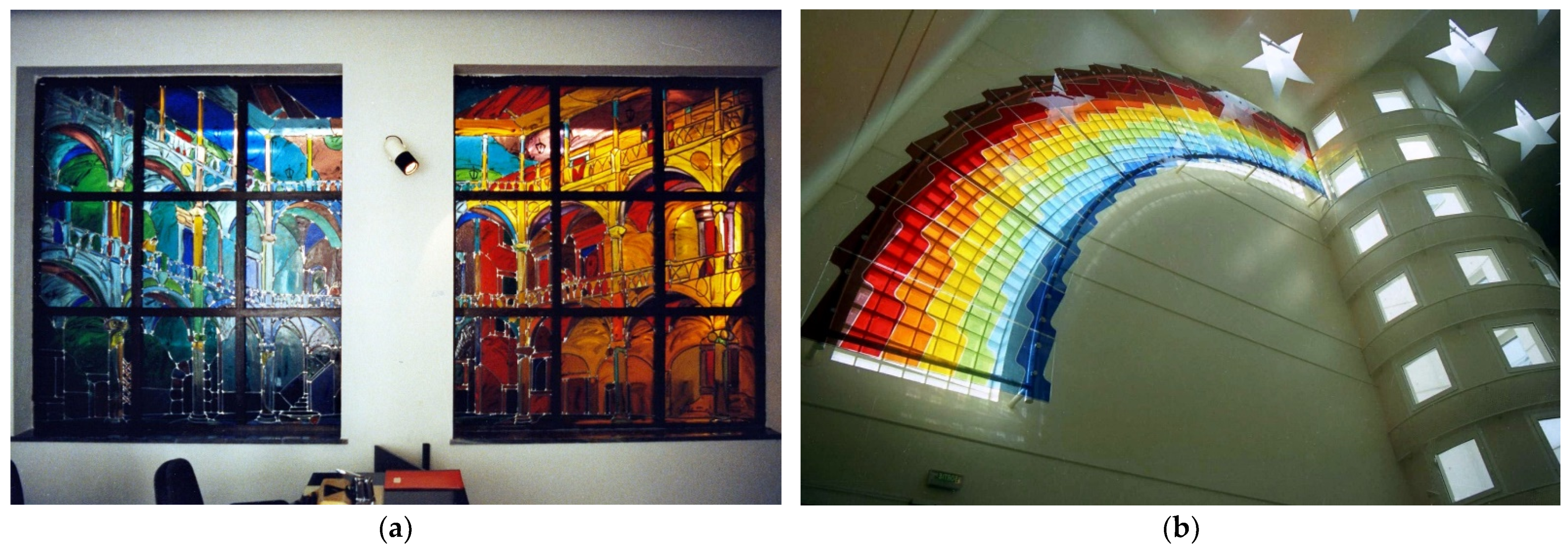


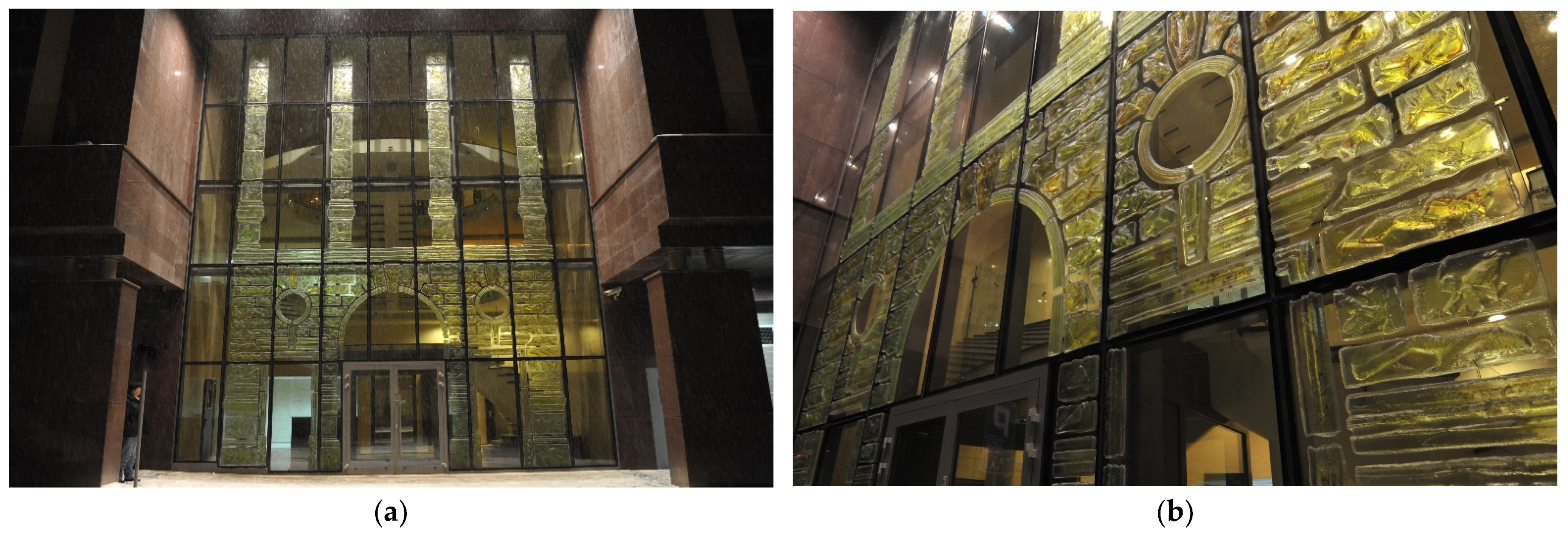


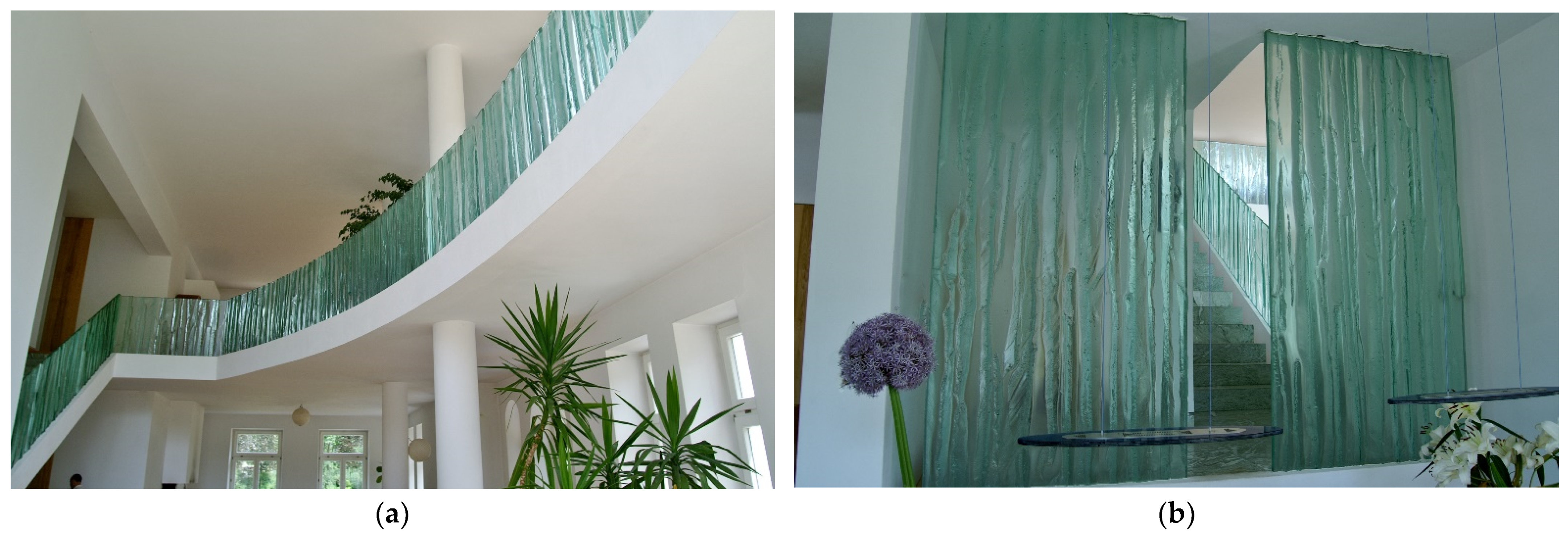


Publisher’s Note: MDPI stays neutral with regard to jurisdictional claims in published maps and institutional affiliations. |
© 2021 by the authors. Licensee MDPI, Basel, Switzerland. This article is an open access article distributed under the terms and conditions of the Creative Commons Attribution (CC BY) license (https://creativecommons.org/licenses/by/4.0/).