


Unlocking Brilliance: A Smart Approach to Icon Colour Design Inspired by Universal Design Principles


Abstract
1. Introduction
- (1)
- Diverse user groups: Around 4% of the global population have visual impairments, and visual acuity tends to decrease with age, with around half of individuals over the age of 50 experiencing some level of visual decline [1]. Therefore, the universality of visual interface icon design is essential for individuals with visual impairments [11].
- (2)
- Diverse devices: It is essential to ensure that interactive products can effectively convey information across various devices [12], including older versions or low-performance devices.
- (3)
2. From the Study of Intelligent Icon Colour Designs to the Digitalization and Intelligent Design Assistant Program
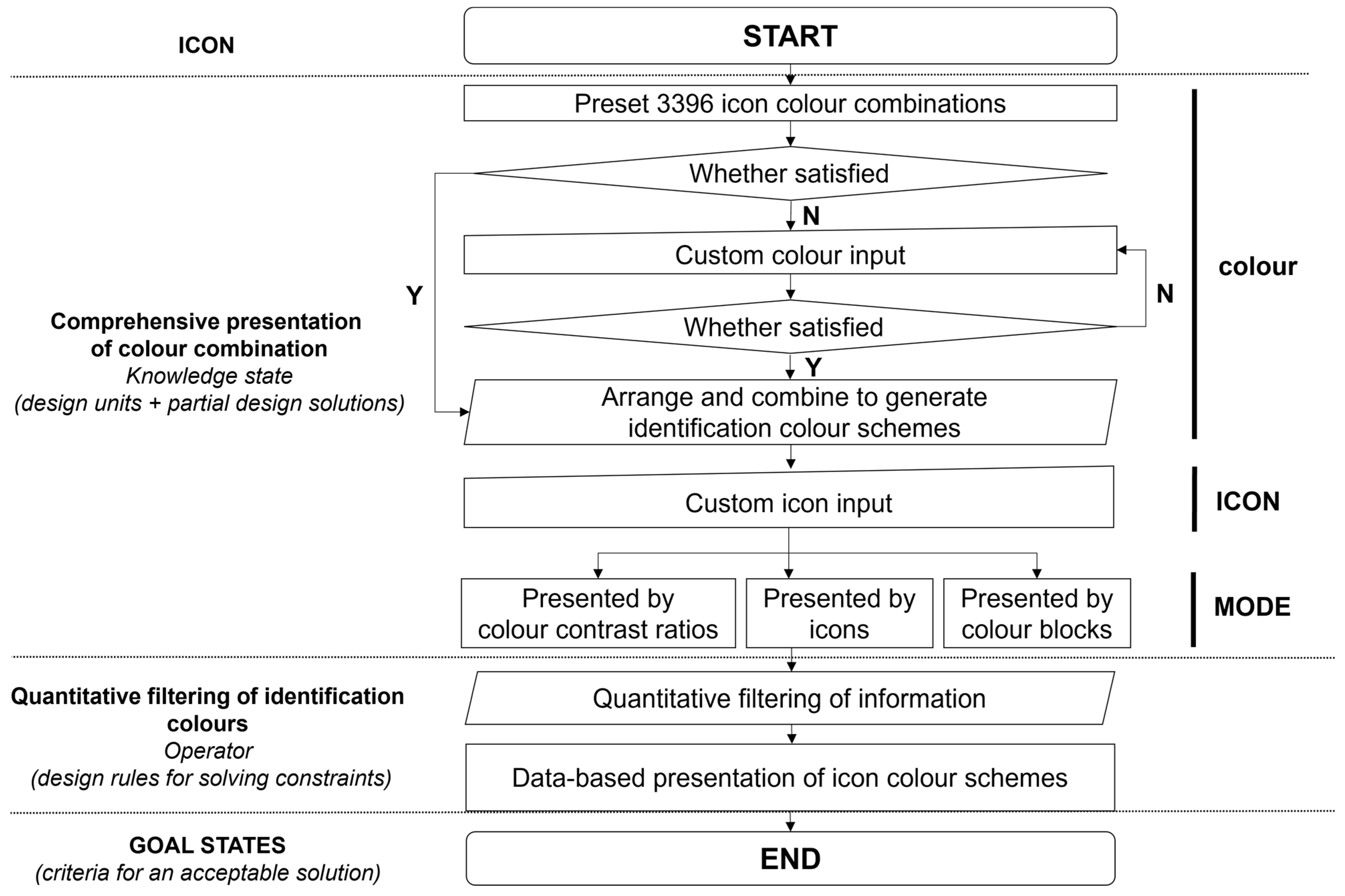
2.1. The Logic of the Intelligent Icon Colour Design Method
- (1)
- The comprehensive presentation of a colour scheme: Exhaustively present all possible colour configuration schemes to ensure inclusiveness.
- (2)
- Universality in icon design: Utilize the calculation method of the colour contrast ratio recommended by Web Content Accessibility Guidelines (WCAG) 2.2 (Equation (1)) [48] in conjunction with quantitative filtering tools to screen colour contrast ratios and meet the requirement of universality.
- (3)
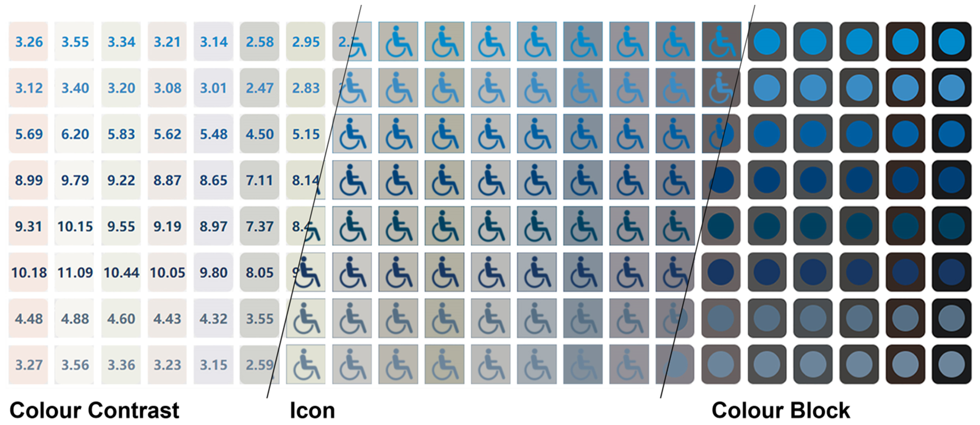
- The visualization of colour information: Visualize colour combinations and the corresponding quantitative data to facilitate designers’ making universally applicable colour schemes.
- (4)
- Control and randomness in the design process: Exert control over the colour contrast ratio to ensure universality while allowing the designer to meet personalised design requirements.
- (5)
- Replicable and scalable design methods: Ensure the usability and general applicability of the methods, facilitating their use by diverse groups and their compatibility across multiple platforms and media, making the design methods replicable and scalable.
2.2. Digitalization and Intelligent Design Assistant Program
3. Methodology of Experiment Design
4. Results
4.1. SUS Questionnaire Results
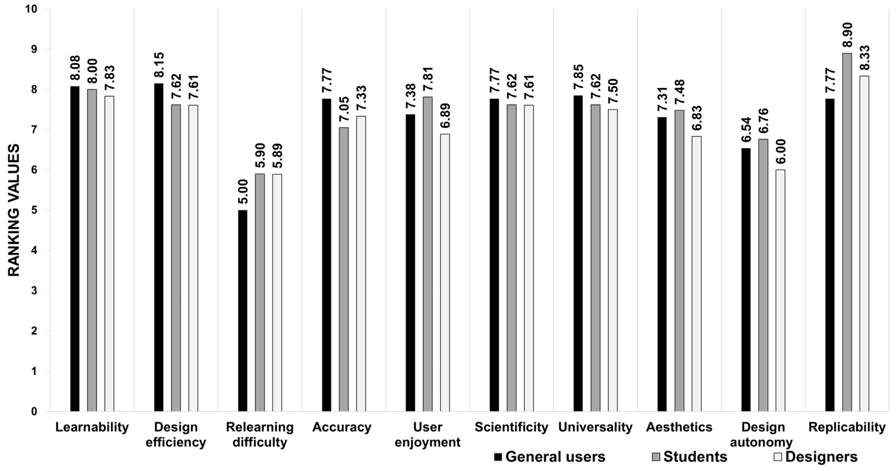
4.2. The Evaluation of Usability Factors for Both Methods
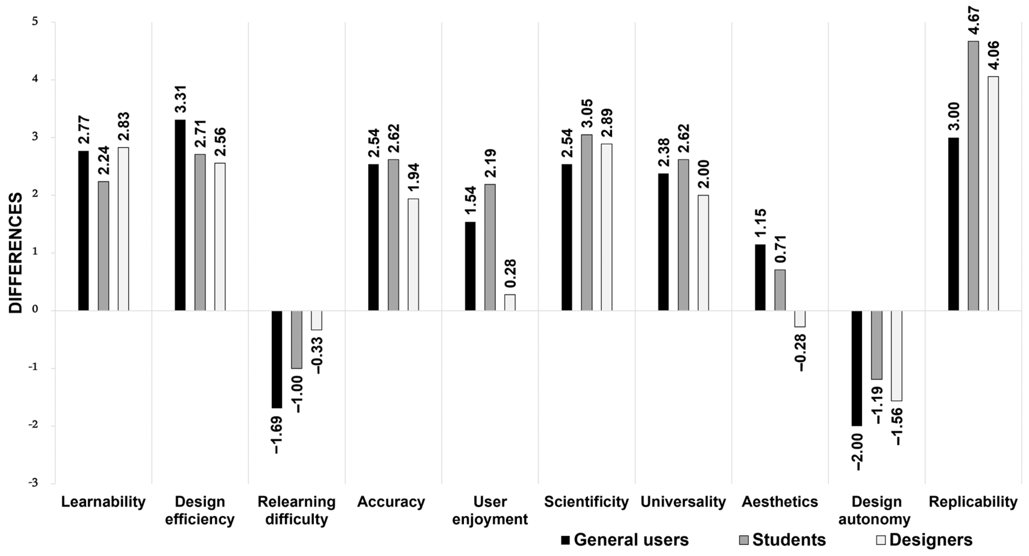
4.3. The Evaluation of the Universality and Design Time of the Colour Scheme
5. Discussion
5.1. Discussion of Experimental Results
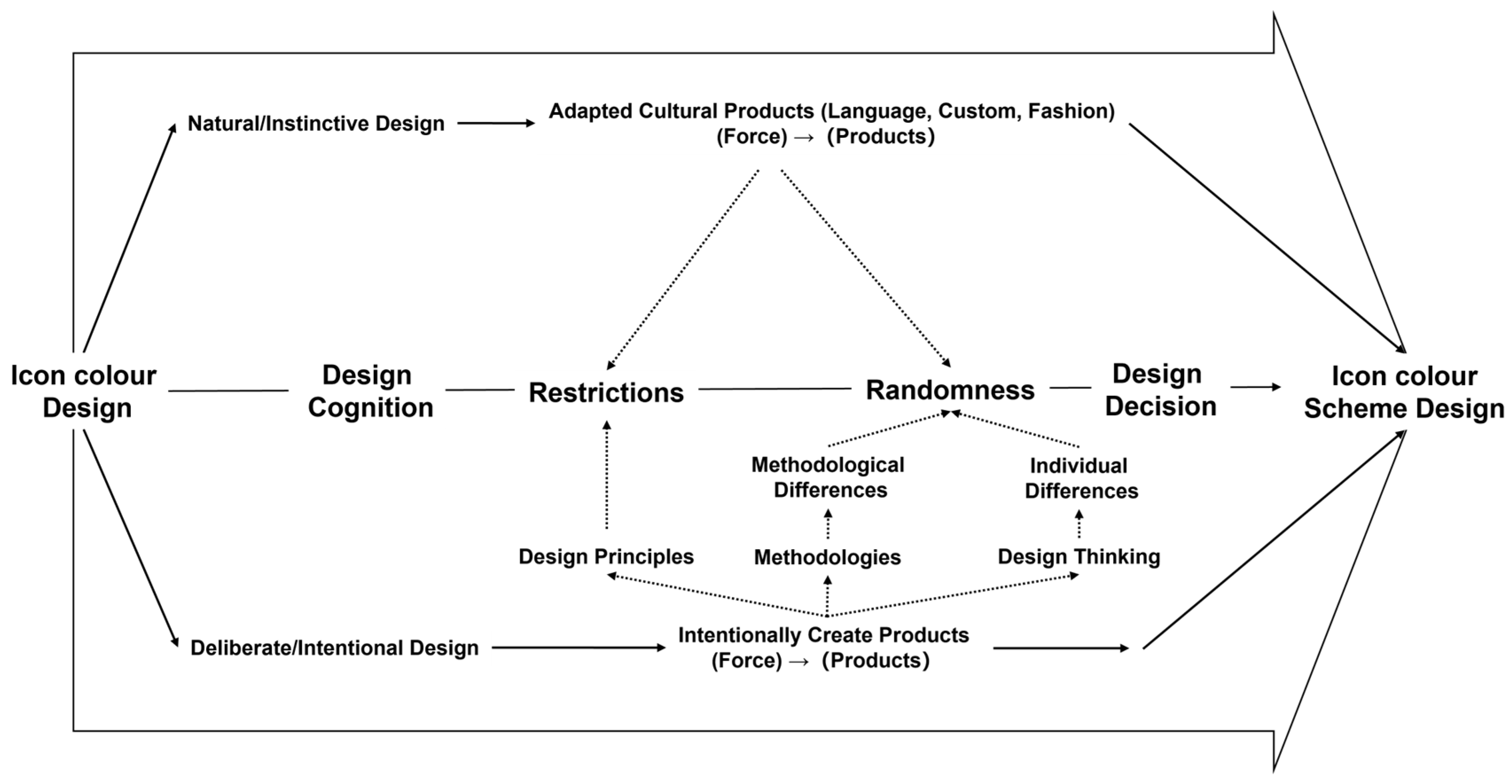
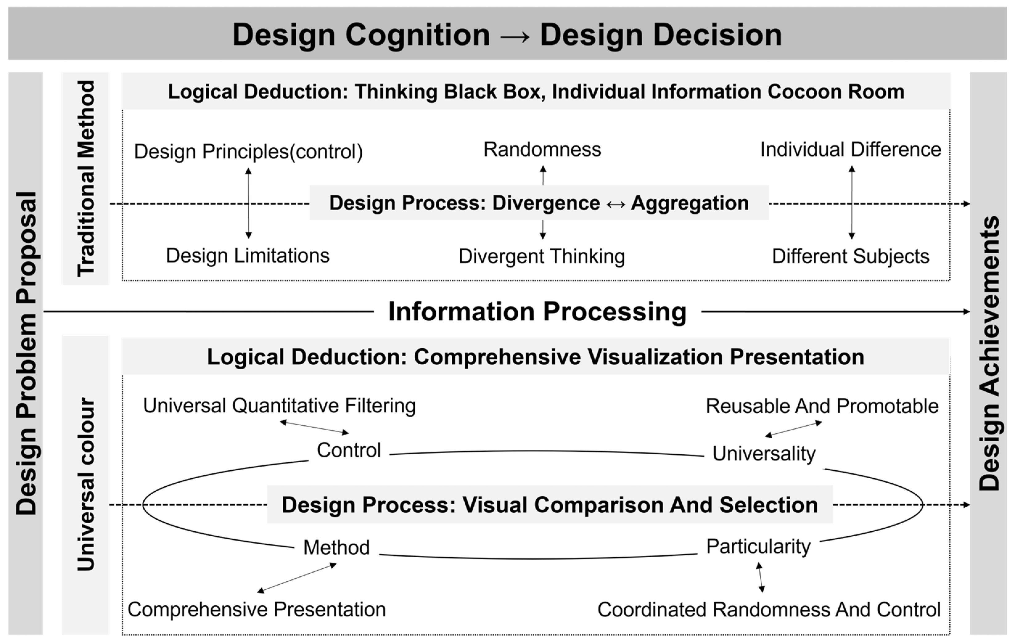
5.2. Randomness and Control in Design Cognition and Decision-Making
6. Conclusions, Recommendations and Future Prospects
- (1)
- Although a unified platform was used, the experiment’s results may still be affected by objective factors such as device and network variations, leading to potential errors. Future research should include a comparison of the efficiency among different computer-assisted icon design platforms.
- (2)
- Due to the differences in educational backgrounds and design experiences, the traditional methods adopted by all user groups in Experiment Module One varied, generally characterised by low design efficiency, difficulty in quantification, and lengthy duration. However, over 95% of users found Universal Colour to be straightforward and easy to use.
- (3)
- This study focused solely on the issue of icon colour design and did not consider compatibility with the interface or other aspects. In fact, icon colour design is a highly complex task that requires targeted designs to meet diverse user needs. Therefore, further refinement is necessary for the Universal Colour design method and software platform. Additionally, the discussion on the randomness and control in design cognition and decision-making in this paper was based solely on the case of icon colour design. Future research on this topic will require more quantitative data and case studies for support.
Author Contributions
Funding
Data Availability Statement
Conflicts of Interest
Abbreviations
| WHO | World Health Organization |
| UI | User Interface |
| W3C | World Wide Web Consortium |
| WCAG | Web Content Accessibility Guidelines |
| ADA | Alternative Distribution Alliance |
| CUD | Colour Universal Design |
| SUS | Software Usability Scale |
| ISO | International Organization for Standardization |
| ANSI | American National Standards Institute |
| HFES | Human Factors and Ergonomics Society |
References
- World Health Organization. World Report on Vision; World Health Organisation: Geneva, Switzerland, 2019.
- Lindberg, T.; Näsänen, R. The effect of icon spacing and size on the speed of icon processing in the human visual system. Displays 2003, 24, 111–120. [Google Scholar] [CrossRef]
- Liu, H.; Wang, W.; Liu, Y.; Song, F.; Wang, S.; Guo, H. Study on the Differences of Icon Cognition of Graphical Interface for Age-Friendly Design. J. Gerontol. Soc. Work 2023, 66, 662–679. [Google Scholar] [CrossRef] [PubMed]
- Wu, J.; Jiao, D.; Lu, C.; Li, C.; Huang, X.; Weng, S. How Do Older Adults Process Icons in Visual Search Tasks? The Combined Effects of Icon Type and Cognitive Aging. IJERPH 2022, 19, 4525. [Google Scholar] [CrossRef] [PubMed]
- Zhou, C.; Yuan, F.; Huang, T.; Zhang, Y.; Kaner, J. The Impact of Interface Design Element Features on Task Performance in Older Adults: Evidence from Eye-Tracking and EEG Signals. IJERPH 2022, 19, 9251. [Google Scholar] [CrossRef] [PubMed]
- Bühler, D.; Hemmert, F.; Hurtienne, J. Universal and intuitive? Scientific guidelines for icon design. In Proceedings of the MuC’20: Mensch und Computer, Magdeburg, Germany, 6–9 September 2020; ACM: New York, NY, USA, 2020; pp. 91–103. [Google Scholar] [CrossRef]
- Cao, Y.; Ding, Y.; Deng, Y.; Zhang, X. Effects of Mobile Application Icon Complexity and Border on College Students’ Cognition. In Advances in Affective and Pleasurable Design; Fukuda, S., Ed.; Springer: Berlin/Heidelberg, Germany, 2020; pp. 273–279. [Google Scholar] [CrossRef]
- Arditi, A. Rethinking ADA signage standards for low-vision accessibility. J. Vis. 2017, 17, 8. [Google Scholar] [CrossRef] [PubMed]
- Adeyemo, O.; Jeter, P.E.; Rozanski, C. Living with ultra-low vision: An inventory of self-reported visually guided activities by individuals with profound visual impairment. Transl. Vis. Sci. Technol. 2017, 6, 10. [Google Scholar] [CrossRef] [PubMed]
- Giudice, N.A.; Legge, G.E. Blind navigation and the role of technology. In The Engineering Handbook of Smart Technology for Aging, Disability, and Independence; John Wiley & Sons: Hoboken, NJ, USA, 2008; pp. 479–500. [Google Scholar]
- Lin, H.; Hsieh, Y.-C.; Wu, F.-G. A study on the relationships between different presentation modes of graphical icons and users’ attention. Comput. Hum. Behav. 2016, 63, 218–228. [Google Scholar] [CrossRef]
- Chiu, C.-J.; Hu, Y.-H.; Lin, D.-C.; Chang, F.-Y.; Chang, C.-S.; Lai, C.-F. The attitudes, impact, and learning needs of older adults using apps on touchscreen mobile devices: Results from a pilot study. Comput. Hum. Behav. 2016, 63, 189–197. [Google Scholar] [CrossRef]
- Ho, H.-H.; Tzeng, S.-Y. Using the Kano model to analyze the user interface needs of middle-aged and older adults in mobile reading. Comput. Hum. Behav. Rep. 2021, 3, 100074. [Google Scholar] [CrossRef]
- Shi, Y.; Zhang, Y.; Wang, T.; Li, C.; Yuan, S. The Effects of Ambient Illumination, Color Combination, Sign Height, and Observation Angle on the Legibility of Wayfinding Signs in Metro Stations. Sustainability 2020, 12, 4133. [Google Scholar] [CrossRef]
- Weisman, G.D. Way-Finding in the Built Environment: A Study in Architectural Legibility; ProQuest: Ann Arbor, MI, USA, 1981. [Google Scholar]
- Arthur, P.; Passini, R. Wayfinding: People, Signs, and Architecture; McGraw-Hill Book Co.: New York, NY, USA, 1992. [Google Scholar]
- American National Standards Institute (ANSI) and Illuminating Engineering Society (IES). Lighting and the Visual Environment for Senior Living (ANSI/IES RP-28-16); Illuminating Engineering Society of North America: New York, NY, USA, 2016; pp. 1–87. Available online: https://webstore.ansi.org/preview-pages/IESNA/preview_ANSI+IES+RP-28-16.pdf (accessed on 26 March 2023).
- Shieh, K.-K.; Lin, C.-C. Effects of screen type, ambient illumination, and color combination on VDT visual performance and subjective preference. Int. J. Ind. Erg. 2000, 26, 527–536. [Google Scholar] [CrossRef]
- Shen, Z.; Zhang, L.; Li, R.; Hou, J.; Liu, C.; Hu, W. The effects of color combinations, luminance contrast, and area ratio on icon visual search performance. Displays 2021, 67, 101999. [Google Scholar] [CrossRef]
- Cao, Y.; Qu, Q.; Duffy, V.G.; Ding, Y. Attention for Web Directory Advertisements: A Top-Down or Bottom-Up Process? Int. J. Hum.-Comput. Interact. 2019, 35, 89–98. [Google Scholar] [CrossRef]
- Hu, B.; Ning, X. Cervical spine biomechanics and task performance during touchscreen computer operations. Int. J. Ind. Ergon. 2016, 56, 41–50. [Google Scholar] [CrossRef]
- Shen, Z.; Xue, C.; Li, J.; Zhou, X. Effect of Icon Density and Color Contrast on Users’ Visual Perception in Human Computer Interaction. In Engineering Psychology and Cognitive Ergonomics; Harris, D., Ed.; Springer International Publishing: Cham, Switzerland, 2015; pp. 66–76. [Google Scholar] [CrossRef]
- Liu, W.; Cao, Y.; Proctor, R.W. How do app icon color and border shape influence visual search efficiency and user experience? Evidence from an eye-tracking study. Int. J. Ind. Ergon. 2021, 84, 103160. [Google Scholar] [CrossRef]
- Yeh, Y.-Y.; Lee, D.-S.; Ko, Y.-H. Color combination and exposure time on legibility and EEG response of icon presented on visual display terminal. Displays 2013, 34, 33–38. [Google Scholar] [CrossRef]
- Deng, L.; Zhang, Z.; Zhou, F.; Liu, R. Effects of App Icon Border Form and Interface Background Color Saturation on User Visual Experience and Search Performance. Adv. Multimed. 2022, 2022, 1166656. [Google Scholar] [CrossRef]
- Zhang, M.; Gong, Y.; Deng, R.; Zhang, S. The effect of color coding and layout coding on users’ visual search on mobile map navigation icons. Front. Psychol. 2022, 13, 1040533. [Google Scholar] [CrossRef]
- Yu, N.; Ouyang, Z. Effects of background colour, polarity, and saturation on digital icon status recognition and visual search performance. Ergonomics 2023, 67, 433–445. [Google Scholar] [CrossRef] [PubMed]
- Michalski, R.; Grobelny, J. The role of colour preattentive processing in human–computer interaction task efficiency: A preliminary study. Int. J. Ind. Ergon. 2008, 38, 321–332. [Google Scholar] [CrossRef]
- Hu, K.; Xu, Z.; Wang, X.; Wang, Y.; Li, H.; Zhang, Y. Research on Street Color Environment Perception Based on CEP-KASS Framework. Buildings 2023, 13, 2649. [Google Scholar] [CrossRef]
- Jylhä, H.; Hamari, J. An icon that everyone wants to click: How perceived aesthetic qualities predict app icon successfulness. Int. J. Hum.-Comput. Stud. 2019, 130, 73–85. [Google Scholar] [CrossRef]
- Kim, H.; Lee, H. Cognitive Activity-Based Design Methodology for Novice Visual Communication Designers. Int. J. Art. Des. Educ. 2016, 35, 196–212. [Google Scholar] [CrossRef]
- Lawson, B. The Design Student’s Journey: Understanding How Designers Think; Routledge: London, UK, 2018. [Google Scholar]
- Lee, J.H.; Ostwald, M.J. The relationship between divergent thinking and ideation in the conceptual design process. Des. Stud. 2022, 79, 101089. [Google Scholar] [CrossRef]
- Raina, A.; Cagan, J.; McComb, C. Transferring Design Strategies from Human to Computer and Across Design Problems. J. Mech. Des. 2019, 141, 114501. [Google Scholar] [CrossRef]
- Cokely, E.T.; Feltz, A.; Ghazal, S.; Allan, J.N.; Petrova, D.; Garcia-Retamero, R. Decision making skill: From intelligence to numeracy and expertise. Cambridge handbook of expertise and expert performance. In Cambridge Handbook of Expertise and Expert Performance, 2nd ed.; Ericsson, K.A., Hoffman, R.R., Kozbelt, A., Williams, A.M., Eds.; Cambridge University Press: New York, NY, USA, 2018; pp. 476–505. [Google Scholar]
- Borovcnik, M.; Kapadia, R. Modelling in Probability and Statistics: Key Ideas and Innovative Examples. In Real-World Problems for Secondary School Mathematics Students: Case Studies; Springer: Berlin/Heidelberg, Germany, 2011; pp. 1–43. [Google Scholar] [CrossRef]
- Gonçalves, M.; Cardoso, C.; Badke-Schaub, P. Inspiration choices that matter: The selection of external stimuli during ideation. Des. Sci. 2016, 2, e10. [Google Scholar] [CrossRef]
- De Vries, J.P.; Hooge, I.T.C.; Wertheim, A.H.; Verstraten, F.A.J. Background, an important factor in visual search. Vis. Res. 2013, 86, 128–138. [Google Scholar] [CrossRef] [PubMed]
- Borovcnik, M.; Kapadia, R. Reasoning with Risk: Teaching Probability and Risk as Twin Concepts. In Teaching and Learning Stochastics: Advances in Probability Education Researc; Batanero, C., Chernoff, E.J., Eds.; Springer International Publishing: Cham, Switzerland, 2018; pp. 3–22. [Google Scholar] [CrossRef]
- Lee, C. Information Processing and Moral Problem Solving. Comput. Econ. 2021, 57, 911–922. [Google Scholar] [CrossRef]
- Dinar, M.; Shah, J.J.; Cagan, J.; Leifer, L.; Linsey, J.; Smith, S.M.; Hernandez, N.V. Empirical Studies of Designer Thinking: Past, Present, and Future. J. Mech. Des. 2015, 137, 021101. [Google Scholar] [CrossRef]
- Chan, C.S. Design Cognition: Cognitive Science in Design; China Architecture and Building Press: Beijing, China, 2008. [Google Scholar]
- WebAIM Contrast Checker. Web Accessibility in Mind. Available online: https://webaim.org/resources/contrastchecker/?fcolor=9999FF&bcolor=303030 (accessed on 26 March 2023).
- Contrast Grid. Eightshapes. Available online: https://contrast-grid.eightshapes.com/ (accessed on 26 March 2023).
- Contrast Ratio. Siegemedia. Available online: https://contrast-ratio.com/ (accessed on 26 March 2023).
- Donielle, B.; Adrian, R. Color Safe. Available online: http://colorsafe.co/ (accessed on 26 March 2023).
- Adobe Color. Adobe. Available online: https://color.adobe.com/create/color-contrast-analyzer (accessed on 26 March 2023).
- Web Content Accessibility Guidelines Advisory Committee. Web Content Accessibility Guidelines (WCAG) 2.2. Available online: https://www.w3.org/TR/WCAG22/#sotd (accessed on 23 July 2023).
- US Department of Justice. ADA Standards for Accessible Design. Available online: http://www.ada.gov/regs2010/2010ADAStandards (accessed on 20 March 2024).
- Color Universal Design Recommendation Color Set Production Committee. Model Color Palette for Color Universal Design Guide Book, 2nd ed.; DIC Color Design Co., Ltd.: Tokyo, Japan, 2018. (In Japanese) [Google Scholar]
- Bangor, A. Determining What Individual SUS Scores Mean: Adding an Adjective Rating Scale. J. Usability Stud. 2009, 4, 114–123. [Google Scholar]
- Sauro, J. Quantifying the User Experience: Practical Statistics for User Research; Morgan Kaufmann Publishers Inc.: San Mateo, CA, USA, 2012. [Google Scholar]


| Platform | Brief Introduction | Advantages | Disadvantages |
|---|---|---|---|
| Contrast Checker [43] | Aids designers in gaining the colour contrast ratios between the characters and their background. | The colour can be adjusted online, and the colour combinations are presented as text. | Has poor adaptability to icons and can only present the colour contrast ratios of the combinations of two colours. |
| Contrast Grid [44] | Identifies the contrast between two colours and generates various combinations of colours and text sizes to assist designers in selecting the optimal solution. | Multiple colour combinations can be tested in an intuitive way. | Is only applicable to text rather than icons, and the quantitative fixed-range filtering method cannot meet the demands of more diverse scenarios. |
| Contrast Ratios [45] | Outputs the contrast between two colours according to the user’s input. | Easy to use with a fast output speed. | Is limited to the scenarios of two colours and texts, and is not suitable for icons. |
| Colour Safe [46] | Users can select different base colours and make various hue adjustments to create a colour scheme. | Provides predefined colour palettes and outputs colour schemes by colour families. | It displays only one colour at a time, is applicable only to text, and is not suitable for icons. |
| Adobe Colour [47] | Helps designers evaluate colour contrast ratios in websites or applications. | The colour can be adjusted online | Displays only one colour at a time. |
| Usability Factor | Group Statistics | Z-Test | ||||
|---|---|---|---|---|---|---|
| Method | Cases | Mean | Standard Deviation | Z-Value | p-Value | |
| Learnability | Universal Colour | 52 | 5.38 | 2.078 | −6.061 | 0.000 |
| Traditional method | 52 | 7.96 | 1.188 | |||
| Design efficiency | Universal Colour | 52 | 4.94 | 1.873 | −6.489 | 0.000 |
| Traditional method | 52 | 7.75 | 1.607 | |||
| Relearning difficulty | Universal Colour | 52 | 6.62 | 2.311 | −1.812 | 0.070 |
| Traditional method | 52 | 5.67 | 2.610 | |||
| Accuracy | Universal Colour | 52 | 4.96 | 2048 | −5.307 | 0.000 |
| Traditional method | 52 | 7.33 | 1.790 | |||
| User enjoyment | Universal Colour | 52 | 6.02 | 2.288 | −3.218 | 0.001 |
| Traditional method | 52 | 7.38 | 1.510 | |||
| Scientificity | Universal Colour | 52 | 4.79 | 2.023 | −6.494 | 0.000 |
| Traditional method | 52 | 7.65 | 1.341 | |||
| Universality | Universal Colour | 52 | 5.29 | 1.974 | −5.720 | 0.000 |
| Traditional method | 52 | 7.63 | 1.585 | |||
| Aesthetics | Universal Colour | 52 | 6.73 | 1.880 | −1.385 | 0.166 |
| Traditional method | 52 | 7.21 | 1.696 | |||
| Design autonomy | Universal Colour | 52 | 7.96 | 1.559 | −4.221 | 0.000 |
| Traditional method | 52 | 6.44 | 1.893 | |||
| Replicability | Universal Colour | 52 | 4.38 | 1.972 | −7.926 | 0.000 |
| Traditional method | 52 | 8.42 | 1.334 | |||
| Usability Factor | Group Statistics | F-Test | T-Test | |||||
|---|---|---|---|---|---|---|---|---|
| Method | Cases | Mean | Standard Deviation | F-Value | p-Value | T-Value | p-Value | |
| Learnability | Universal Colour | 13 | 5.310 | 2.689 | 6.067 | 0.021 | −3.302 | 0.003 |
| Traditional method | 13 | 8.080 | 1.382 | |||||
| Design efficiency | Universal Colour | 13 | 4.846 | 1.819 | 1.347 | 0.257 | −5.273 | 0.000 |
| Traditional method | 13 | 8.154 | 1.345 | |||||
| Relearning difficulty | Universal Colour | 13 | 6.692 | 2.359 | 0.187 | 0.669 | 1.699 | 0.102 |
| Traditional method | 13 | 5.000 | 2.708 | |||||
| Accuracy | Universal Colour | 13 | 5.231 | 2.682 | 6.505 | 0.018 | −3.100 | 0.005 |
| Traditional method | 13 | 7.769 | 1.235 | |||||
| User enjoyment | Universal Colour | 13 | 5.846 | 2.968 | 9.216 | 0.006 | −1.707 | 0.101 |
| Traditional method | 13 | 7.385 | 1.325 | |||||
| Scientificity | Universal Colour | 13 | 5.231 | 2.127 | 2.007 | 0.169 | −3.447 | 0.002 |
| Traditional method | 13 | 7.769 | 1.589 | |||||
| Universality | Universal Colour | 13 | 5.462 | 1.761 | 0.594 | 0.448 | −3.696 | 0.001 |
| Traditional method | 13 | 7.846 | 1.519 | |||||
| Aesthetics | Universal Colour | 13 | 6.154 | 2.267 | 1.686 | 0.206 | −1.410 | 0.171 |
| Traditional method | 13 | 7.308 | 1.888 | |||||
| Design autonomy | Universal Colour | 13 | 8.539 | 1.127 | 4.253 | 0.050 | 3.064 | 0.005 |
| Traditional method | 13 | 6.539 | 2.067 | |||||
| Replicability | Universal Colour | 13 | 4.769 | 1.833 | 0.620 | 0.439 | −4.281 | 0.000 |
| Usability Factor | Group Statistics | F-Test | T-Test | |||||
|---|---|---|---|---|---|---|---|---|
| Method | Cases | Mean | Standard Deviation | F-Value | p-Value | T-Value | p-Value | |
| Learnability | Universal Colour | 21 | 5.667 | 1.983 | 7.574 | 0.009 | −4.719 | 0.000 |
| Traditional method | 21 | 8.000 | 1.095 | |||||
| Design efficiency | Universal Colour | 21 | 4.905 | 1.786 | 0.972 | 0.330 | −4.902 | 0.000 |
| Traditional method | 21 | 7.619 | 1.802 | |||||
| Relearning difficulty | Universal Colour | 21 | 6.905 | 1.841 | 4.992 | 0.031 | 1.451 | 0.155 |
| Traditional method | 21 | 5.905 | 2.567 | |||||
| Accuracy | Universal Colour | 21 | 4.429 | 1.832 | 0.222 | 0.640 | −4.115 | 0.000 |
| Traditional method | 21 | 7.048 | 2.269 | |||||
| User enjoyment | Universal Colour | 21 | 5.619 | 2.156 | 5.907 | 0.020 | −4.028 | 0.000 |
| Traditional method | 21 | 7.810 | 1.250 | |||||
| Scientificity | Universal Colour | 21 | 4.571 | 2.315 | 4.781 | 0.035 | −5.240 | 0.000 |
| Traditional method | 21 | 7.619 | 1.322 | |||||
| Universality | Universal Colour | 21 | 5.000 | 2.302 | 4.420 | 0.042 | −4.369 | 0.000 |
| Traditional method | 21 | 7.619 | 1.499 | |||||
| Aesthetics | Universal Colour | 21 | 6.762 | 1.814 | 2.577 | 0.116 | −1.442 | 0.157 |
| Traditional method | 21 | 7.476 | 1.365 | |||||
| Design autonomy | Universal Colour | 21 | 7.952 | 1.658 | 0.291 | 0.592 | 2.361 | 0.023 |
| Traditional method | 21 | 6.762 | 1.610 | |||||
| Replicability | Universal Colour | 21 | 4.238 | 1.998 | 7.196 | 0.011 | −9.582 | 0.000 |
| Traditional method | 21 | 8.905 | 0.995 | |||||
| Usability Factor | Group Statistics | F-Test | T-Test | |||||
|---|---|---|---|---|---|---|---|---|
| Method | Cases | Mean | Standard Deviation | F-Value | p-Value | T-Value | p-Value | |
| Learnability | Universal Colour | 18 | 5.000 | 1.609 | 0.227 | 0.637 | −5.988 | 0.000 |
| Traditional method | 18 | 7.833 | 1.200 | |||||
| Design efficiency | Universal Colour | 18 | 5.056 | 2.100 | 2.445 | 0.127 | −4.129 | 0.000 |
| Traditional method | 18 | 7.611 | 1.577 | |||||
| Relearning difficulty | Universal Colour | 18 | 6.222 | 2.798 | 0.088 | 0.768 | .367 | 0.716 |
| Traditional method | 18 | 5.889 | 2.654 | |||||
| Accuracy | Universal Colour | 18 | 5.389 | 1.720 | 2.203 | 0.147 | −3.620 | 0.001 |
| Traditional method | 18 | 7.333 | 1.495 | |||||
| User enjoyment | Universal Colour | 18 | 6.611 | 1.851 | 0.000 | 0.987 | −0.455 | 0.652 |
| Traditional method | 18 | 6.889 | 1.811 | |||||
| Scientificity | Universal Colour | 18 | 4.722 | 1.602 | 2.194 | 0.148 | −6.045 | 0.000 |
| Traditional method | 18 | 7.611 | 1.243 | |||||
| Universality | Universal Colour | 18 | 5.500 | 1.757 | 0.407 | 0.528 | −3.382 | 0.002 |
| Traditional method | 18 | 7.500 | 1.791 | |||||
| Aesthetics | Universal Colour | 18 | 7.111 | 1.641 | 0.627 | 0.434 | 0.467 | 0.644 |
| Traditional method | 18 | 6.833 | 1.917 | |||||
| Design autonomy | Universal Colour | 18 | 7.556 | 1.653 | 0.337 | 0.566 | 2.479 | 0.018 |
| Traditional method | 18 | 6.000 | 2.086 | |||||
| Replicability | Universal Colour | 18 | 4.278 | 2.109 | 12.457 | 0.001 | −7.108 | 0.000 |
| Traditional method | 18 | 8.333 | 1.188 | |||||
| Method | Colour Contrast ≥3 | Colour Contrast ≥4.5 | Colour Contrast ≥7 | |
|---|---|---|---|---|
| Designer | Universal Colour | 47% | 22% | 5% |
| Traditional method | 85% | 54% | 19% | |
| Students | Universal Colour | 65% | 34% | 16% |
| Traditional method | 82% | 64% | 31% | |
| General Users | Universal Colour | 47% | 22% | 4% |
| Traditional method | 81% | 68% | 33% | |
| All Groups | Universal Colour | 50% | 27% | 9% |
| Traditional method | 87% | 62% | 27% |
| Method | Colour Contrast ≥3 | Colour Contrast ≥4.5 | Colour Contrast ≥7 | |
|---|---|---|---|---|
| Designer | Universal Colour | 4.76 | 10.06 | 45.25 |
| Traditional method | 2.36 | 3.67 | 10.77 | |
| Students | Universal Colour | 3.37 | 6.48 | 13.83 |
| Traditional method | 2.59 | 3.32 | 6.93 | |
| General Users | Universal Colour | 3.98 | 8.42 | 43.80 |
| Traditional method | 2.36 | 2.84 | 5.74 | |
| All Groups | Universal Colour | 4.24 | 7.90 | 23.71 |
| Traditional method | 2.34 | 3.30 | 7.47 |
Disclaimer/Publisher’s Note: The statements, opinions and data contained in all publications are solely those of the individual author(s) and contributor(s) and not of MDPI and/or the editor(s). MDPI and/or the editor(s) disclaim responsibility for any injury to people or property resulting from any ideas, methods, instructions or products referred to in the content. |
© 2024 by the authors. Licensee MDPI, Basel, Switzerland. This article is an open access article distributed under the terms and conditions of the Creative Commons Attribution (CC BY) license (https://creativecommons.org/licenses/by/4.0/).
Share and Cite
Zhang, E.; Yang, Z.; Zhao, W.; Mei, Z.; Xia, Y.; Chen, F. Unlocking Brilliance: A Smart Approach to Icon Colour Design Inspired by Universal Design Principles. Buildings 2024, 14, 1522. https://doi.org/10.3390/buildings14061522
Zhang E, Yang Z, Zhao W, Mei Z, Xia Y, Chen F. Unlocking Brilliance: A Smart Approach to Icon Colour Design Inspired by Universal Design Principles. Buildings. 2024; 14(6):1522. https://doi.org/10.3390/buildings14061522
Chicago/Turabian StyleZhang, Erke, Zhexi Yang, Wei Zhao, Zihan Mei, Yuanyuan Xia, and Fei Chen. 2024. "Unlocking Brilliance: A Smart Approach to Icon Colour Design Inspired by Universal Design Principles" Buildings 14, no. 6: 1522. https://doi.org/10.3390/buildings14061522
APA StyleZhang, E., Yang, Z., Zhao, W., Mei, Z., Xia, Y., & Chen, F. (2024). Unlocking Brilliance: A Smart Approach to Icon Colour Design Inspired by Universal Design Principles. Buildings, 14(6), 1522. https://doi.org/10.3390/buildings14061522