Article

Ink Tone Analysis of Printed Character Images towards Identification of Medieval Korean Printing Technique: The Song of Enlightenment (1239), the Jikji (1377), and the Gutenberg Bible (~1455)

1
WaferMasters, Inc., Dublin, CA 94568, USA
2
Institute of Humanities Studies, Kyungpook National University, Daegu 41566, Republic of Korea
Heritage 2023, 6(3), 2559-2581; https://doi.org/10.3390/heritage6030135
Submission received: 30 December 2022 / Revised: 13 February 2023 / Accepted: 27 February 2023 / Published: 28 February 2023

Abstract

:
To identify printing techniques for medieval Korean books, ink tone analysis of printed characters is proposed. Ink tones of printed character images in two ancient books, The Song of Enlightenment with Commentaries by Buddhist Monk Nammyeong Cheon (南明泉和尙頌證道歌), designated as Korean treasures in 1984 and 2012, were compared and analyzed. Both books have been misidentified and disclosed by the Cultural Heritage Administration of Korea as woodblock-printed versions from the Goryeo dynasty of Korea in the 13th century. Ink tone analysis showed clear differences in brightness histograms between printed characters on the two books, suggesting printing technique differences. Statistical ink tone analysis of printed characters in the two books revealed totally different brightness (or darkness) histograms of pixels, within inked areas, suggesting differences in printing techniques and materials used for the two books. Ink tone analysis was performed for the Jikji (直指: metal type printed in Korea in 1337) and the Gutenberg Bible (metal type printed in Europe around 1455) for comparisons. As additional references, the ink tone analysis was conducted for two sets of old Korean books titled Myeongeuirok (明義錄), printed in 1777, and Sok-Myeongeuirok (續明義錄), printed in 1778, using both metal type and re-carved woodblocks. The Gongin version of The Song of Enlightenment, designated as a Korean treasure in 2012, showed very similar distribution and average brightness of ink with the metal-type-printed books from Korea and Europe from the 14th to 18th centuries. All metal-type-printed books from Korea and the Gutenberg Bible showed spotty prints with lighter ink tones and more symmetrical histograms compared with woodblock-printed Korean books from the 14th to 18th centuries. Ink tone analysis of printed character images can provide additional insights into a printing technique identification method. It is additional evidence for metal type printing of the Gongin version (空印本) of The Song of Enlightenment, designated as a Korean treasure in 2012. The version of interest is the world’s oldest extant book, printed using metal type in Korea in September 1239, as indicated in the imprint. This predates Jikji (1377) by 138 years and the 42-line Gutenberg Bible (~1455) by 216 years.

1. Introduction

As reported in previous papers [1,2,3,4,5,6,7], several individuals, including former and current collectors, have expressed their opinions about the possibility of The Song of Enlightenment (南明泉和尙頌證道歌) being the world’s oldest metal-type-printed book since the 1980s [8,9,10]. The author invited Professor Yun Jae Seug, Director of the Institute of Humanities Studies, Kyungpook National University, Daegu, Korea, and Mr. Hyungwon Kang, two-time (at Associated Press in 1999 and at L.A. Times in 1993) Pulitzer Award Winning Syndicated Korean–American columnist and photojournalist, for the “Visual History of Korea”, Korea Herald and The Korea Times Los Angeles, to inspect and witness the book at a Buddhist Temple in the Yangsan city of South Gyeongsang province of Korea on 10 October, 2022. Both support the author’s study results and recommendations towards the Korean National Treasure designation and registration of an application to the UNESCO World Heritage List.
In this paper, additional evidence of metal type printing in the Gongin version (空印本) of The Song of Enlightenment (南明泉和尙頌證道歌) from ink tone analysis is introduced. The same analysis was performed on the woodblock-printed Samseong version (三省本) of The Song of Enlightenment (南明泉和尙頌證道歌) to visualize the difference in ink tones between the metal-type-printed version and the woodblock-printed version. Furthermore, the same ink tone analysis technique was applied to other metal-type-printed books of the East and the West: the Jikji (直指) printed in Korea in 1377 [11,12,13,14] and the Gutenberg Bible printed in Germany in ~1455 [15]. In addition, two sets of old Korean books titled Myeongeuirok (明義錄) printed in 1777, and Sok-Myeongeuirok (續明義錄) printed in 1778, both using metal type in the central government and re-carved woodblocks in the local governments of the Joseon dynasty of Korea [6,16,17], were examined to verify the validity of ink tone analyses for identification of the printing technique.

2. Woodblock Printing and Metal Type Printing in Korea

2.1. Early History of Printing in Korea

The oldest surviving woodblock print in the world seems to be the Pure Light Dharani-sutra (Korean: 무구정광대다라니경, Chinese: 無垢淨光大陀羅尼經), a small Buddhist scroll discovered in 1966 at the Bulguk-sa Temple (佛國寺) in Gyeongju (慶州), Korea. Historians have reached the initial conclusion that it was published under the Silla (新羅) dynasty (57 BC–935) around 751. Artisans in the Silla dynasty had achieved great proficiency in woodblock printing.
The Tripitaka Koreana is one of the greatest accomplishments of the Goryeo dynasty in the art of woodblock printing. It consists of a monumental 6000 chapters based on a Buddhist text imported from Sung (宋) of China in 991. This project was motivated by the desire to enlist the aid of the Buddha in an attempt to withstand foreign invasion.
The first set of woodblocks (初雕大藏經), completed in 1013, was destroyed two centuries later when the Mongols invaded Korea in 1232. The Goryeo government-in-exile began the monumental task of restoring the destroyed Buddhist books. The project took place for 16 years and resulted in over 80,000 woodcut blocks. They are referred to as Tripitaka Koreana (高麗大藏經 or 八萬大藏經) and are preserved in the Haein-sa Temple (海印寺) in Hapcheon (陜川), Korea. It has been listed in the Memory of the World Programme in 2007 [18]. The art of printing had a long and rich history in Korea, taking place more than five hundred years before the invention of movable metal type in Korea and seven hundred years before Gutenberg’s invention of the printing press.

2.2. Reported Characteristics of Ink Tone for Midieval Korean Metal Type Print

A book titled “Early Printings in Korea” by Ok, Young Jung, was published in English as the second book of The Understanding Korea Series (UKS) from The Academy of Korean Studies Press in December 2013 [19]. It consists of 120 pages.
Yang Young-Kyun, Director of the Center for International Affairs of The Academy of Korean Studies, expressed his praise for the book in the acknowledgment as follows [19].
“This book demonstrates the excellence and rich features of early Korean printing culture. It begins with the origins of printing culture in the world and in Korea and development, moving on to discuss in detail about woodblock printing and movable type printing in Korea that include many artifacts registered as memory of the world. Especially, the book contains illustrated discussion on the invention and development of metal movable type printing. Although this book is written to broaden the understanding of Korean culture, the contents are written from a bibliographic perspective making the book a valuable reference to students of Korean bibliography.”
The book covers the following contents from early printing history in Korea including culture, materials, printing techniques, development of metal movable type printing, and publishing practices in medieval Korea. It is a well-summarized textbook for general researchers. The author of the book described difficulties in identifying printing techniques of ancient books as follows [19].
“Extensive experiences and careful observations are required when making these distinctions. In many cases, antique books tend to suffer damage from various factors over time, whether it be their covers or contents; when there is considerable wear and tear or corrections, it is especially difficult to differentiate the prints. Even so, some typical differentiating factors can be identified.”
Nevertheless, the author summarized major differences between metal type prints and woodblock prints as follows [19].
“Metal movable types are cast using molds and thus tend to be thinner, more uniform and regular. Wooden types, on the other hand, have no identical-looking letters, even when using the same characters, so their strokes tend to be irregular. When the types are worn down, metal type strokes become even thinner, and deformed in some cases, but the strokes are usually still intact. For wooden ones, the wear tends to blot out the letters, so the print appears more coarse. There are no engraving marks in metal type prints whereas clear chisel marks are apparent in wooden types at times, and sometimes knife marks appear in the crossing point of vertical and horizontal strokes. The metal types are finished with a file after casting, so the end of each stroke usually appears round; no tattered parts are shown in wooden type prints. Because the metal type prints typically use yuyeonmuk (plant oil charcoal ink), spots can be observed if seen under a microscope. Songyeonmuk (pine charcoal ink) is used for wooden types, and the ink color tends to be more intense as a result. When seen under the microscope, ink is smeared around the letters.”
For metal type printing, plant oil charcoal ink called “Yuyeonmuk(油煙墨)” is used to improve the wetting properties of ink with metal surfaces. Oil-containing ink is lighter in color and printed characters become spotty due to the nonuniform coating of ink on metal type. For woodblock printing, pine charcoal ink called “Songyeonmuk (松煙墨)” is used. It gives a uniform darker (or intense) print. Ink tone analysis of printed characters should provide additional insights into the printing technique. Quantitative analysis of ink tone will reduce the subjectivity of examiners and improve the objectivity of the examination.

2.3. Description of The Song of Enlightenment (南明泉和尙頌證道歌) in Books and Articles

In the book titled “Early Printings in Korea,” there is a brief introduction on The Song of Enlightenment (南明泉和尙頌證道歌). The last two printed pages of the Samseong version (三省本) were introduced with the following sentences. The word “beongakbon (飜刻本, re-engraved edition)” stands for a woodblock print using woodblock recreated from an existing movable type print or woodblock print.
“Among Korea’s beongakbon, the earliest confirmed one is Nammyeongcheonhwasangsongjeungdoga (南明泉和尙頌證道歌, Hymn of Monk Cheon in Homage to the Buddha). In the 26th year of Goryeo’s King Gojong’s reign (1239), it was published by engraving an upside down copy of an original movable type print. In Korea there is a large quantity of antique books created by beongakbon due to the convenience of the method. Since an already existing book was used, a new manuscript was not necessary.”
The Samseong version (三省本) has many chisel marks, knife marks, gaps, and missing strokes due to weakened age rings. These are the direct evidences of “beongakbon (飜刻本, re-engraved edition)” from a metal type print dated 1239. No one disagrees that the Samseong version (三省本) is a woodblock print. However, there is an argument about the printing date of the Samseong version (三省本). Korean historians have been insisting that this version is the first version of “beongakbon (飜刻本, re-engraved edition)” from the Goryeo dynasty in the 13th century [20,21,22]. They believe that the Gongin version (空印本) was also a beongakbon (飜刻本, re-engraved edition) woodblock print in the 15th or 16th century [23,24]. However, all textbooks and articles use the images of the Samseong version (三省本) and misstate that there is no surviving metal type print without looking at the Gongin version (空印本). They simply copy information from previous articles and repeat the same incorrect statement [19,20,23,24,25,26,27].
As reported in a previous paper, the author believes that the Samseong version (三省本) was printed using woodblock in the 16th century, not in the 13th century. The printing sequence was identified as follows: The Gongin version (空印本) by metal type print in 1239 → Banyasa Temple version (般若寺本) → Daegu version (大邱本) in 1472 → Samseong version (三省本) → Jongno Public Library version (鍾路圖書館本) in 1526 → National Library of Korea version (國立中央圖書館本) [4,5]. The Gongin version (空印本) is the surviving metal-type-printed version from 1239 and the world’s oldest metal-type-printed version [1,2,3,4,5,6,7]. The other five versions are “beongakbon (飜刻本, re-engraved edition)” from a metal type print or a woodblock print.

3. Materials and Methods

3.1. The Song of Enlightenment (南明泉和尙頌證道歌) 1239~

The Song of Enlightenment (證道歌, 证道歌, 증도가) is a Chan (禪, 禅, 선, Zen; meaning: mediation or meditative state) discourse believed to be written sometime in the first half of the 8th century in the Tang dynasty (唐: 618–907) in China by the Zen Master Yongjia Xuanjue (永嘉禪師, 665–713 or 675–713). The true authorship of the work is a matter of debate. It is also translated as the Song of Awakening or the Song of Freedom. There are many different versions of The Song of Enlightenment, with or without commentaries. In this study, the particular book of interest for identification of the printing technique using ink tone analysis is called Nammyeong Cheon Hwasangsong Jeungdoga (南明泉和尙頌證道歌) in Korean. The title of the book is translated as The Song of Enlightenment with Commentaries by Buddhist Monk Nammyeong Cheon by the Cultural Heritage Administration of Korea [20,21]. Details of The Song of Enlightenment can be found in previously published papers [1,2,3,4,5,6,7].
There are six nearly identical old books of Nammyeong Cheon Hwasangsong Jeungdoga (南明泉和尙頌證道歌; The Song of Enlightenment with Commentaries by Buddhist Monk Nammyeong Cheon) reported in Korea since the 1920s. The National Library of Korea version (國立中央圖書館本) was reported first in the 1920s. In the 1960s–1970s, the Samseong version (三省本) and the Gongin version (空印本) were found. They were designated as Korean treasures in 1984 and 2012, respectively. After 2000, the Daegu version (大邱本) and the Banyasa Temple version (般若寺本) were found. The Jongno Public Library version (鍾路圖書館本) was designated as a treasure of the Metropolitan city of Seoul, Korea, in 2021 [22] even though it was collected in the 1920s during the Japanese colonial period. Details of the characteristics of all six versions, as well as the author’s thoughts on the printing technique and printing sequence, can be found in previous publications [1,2,3,4,5,6,7]. The author believes that the Gongin version (空印本) was printed using metal type in 1239 and is the world’s oldest metal-type-printed version. Five other versions were woodblock-printed versions printed in the following sequence: Banyasa Temple version (般若寺本) → Daegu version (大邱本) in 1472 → Samseong version (三省本) → Jongno Public Library version (鍾路圖書館本) in 1526 → National Library of Korea version (國立中央圖書館本).
In this paper, ink tones of images for the two Korean treasures, Gongin version (空印本) and Samseong version (三省本), were compared and analyzed for printing technique identification. Figure 1 shows images of page 9 of the Gongin version (空印本) and Samseong version (三省本) of The Song of Enlightenment. Seven Chinese characters from the top of line four, from the right, are compared and analyzed. They are highlighted by rectangles with white border lines.

3.2. The Jikji (直指) (1377)

Jikji (直指) is the abbreviated title of a Korean Buddhist document Baegun hwasang chorok buljo jikji simche yojeol (백운화상초록불조직지심체요절, 白雲和尙抄錄佛祖直指心體要節) which can be translated as “Anthology of Great Buddhist Priests’ Zen Teachings”. This volume contains the essentials of Zen Buddhism compiled by the Zen Master Baegun (白雲, 1299–1374) in the late Goryeo (高麗, 918–1392) dynasty and was printed in the old Heungdeok-sa (興德寺) temple in Cheongju (淸州) city, using movable metal types in July 1377. This book is recognized as the world’s oldest movable metal-type-printed book. It is an important technical change in the print history of humanity [11,12,14]. UNESCO confirmed Jikji (直指) as the world’s oldest metal-type-printed book in September 2001 and includes it in the Memory of the World Programme.
The Jikji (直指) originally consisted of 2 volumes totaling 307 chapters. The first volume of the Jikji (直指) is now lost, and today, only the second volume survives and is kept at the Manuscrits Orientaux division of the National Library of France (BnF). The BnF provides a digital copy online [14].

3.3. Myeongeuirok (明義錄) (1777) and Sok-Myeongeuirok (續明義錄) (1778)

Myeongeuirok (明義錄) is a book compiled by King Jeongjo’s (正祖, 1752–1800) order immediately after his accession to the throne in 1777. Contrary to King Yeongjo’s (英祖, 1694–1776) will, this book was written for the purpose of revealing to the general public the crimes of political groups who tried to prevent King Jeongjo’s proxy cleanup and enthronement, and who carried out the conspiracy to assassinate King Jeongjo after his accession to the throne [16].
Sok-Myeongeuirok (續明義錄) details the cases of treason such as Hong Sang Beom (洪相範) at the beginning of King Jeongjo’s (正祖) accession, sequentially from July 1777 to February 1778, and then states the opinions of the government officials [17].
Both books were first printed by the central government using metal type and distributed to local governments for circulation. Local governments made woodblocks by engraving an upside-down copy of an original movable type print for circulation within their administrated districts. Image analysis of metal-type-printed versions and duplicated woodblock-printed versions of these books are excellent examples for understanding the publication practice and differences in appearances between books printed by different printing techniques in the Joseon (朝鮮, 1392–1897) dynasty of Korea in the 18th century.

3.4. The Gutenberg Bible (~1455)

The first metal-type-printed book in the west is the 42-line Gutenberg Bible [15,28,29]. It was printed from cast-metal type in Mainz, Germany, in about 1455. The type-casting process is conventionally attributed to Gutenberg. It begins by carving a single type character on the end of a steel punch and the carved steel character is then “punched” into a softer copper matrix. It is then justified and inserted into the base of an adjustable hand mold used to cast large numbers of individual lead-alloy type characters for printing.
Both the 42-line Gutenberg Bible and the Jikji were inscribed in UNESCO’s Memory of the World register in 2001 to mutually recognize their “outstanding universal value” [28,29]. They are excellent examples for comparing similarities and differences between medieval printing techniques used in the East and West. They can also be used as references to determine printing techniques for newly discovered medieval documents.

3.5. Ink Tone Analysis Using Image Analysis Software (PicMan)

The author previously reported a series of image comparisons and analysis results on all six versions of The Song of Enlightenment [1,2,3,4,5,6,7]. However, many Korean researchers in the field of bibliography (or discipline book studies) still have doubts about the author’s claim that the Gongin version (空印本) is the world’s oldest metal-type-printed book. Image comparisons and analyses were conducted using image analysis software (PicMan ver. 22.12 from WaferMasters, Inc., Dublin, CA, USA) page-by-page, line-by-line, and character-by-character for all six versions. The image analysis software, PicMan, was developed by the author’s group. It is widely used for automatic and quantitative analysis of varied types of digital images in semiconductors, materials science, nanotechnology, the food industry, biology, medical research, and colorimetric characterization of cultural heritage paintings [30,31,32,33,34,35,36,37,38].
Digital humanities has become a very important research area. Images are playing an increasingly prominent role in humanities research. Printing techniques and printing periods can be identified through image analysis of digitized historical images. Mass analysis of digitized historical images, using deep learning (DL), has been proposed for the classification of printing technology for digitized images by a research group in Germany [39].
All images used in this paper were photographed with color checkers and calibrated before image comparisons and histogram analysis. Ink tone comparisons and analyses of images from different books were performed using PicMan to extract quantitative data for scientific reasoning towards objective conclusions. PicMan has more automated functions compared with other commercially available or open-source image editing/analysis software. In principle, the same image comparison and analysis can be carried out by combinations of other commercial or open-source image editing/analysis software, such as Photoshop, Illustrator, Paint, Lightroom, Image J, etc. However, the implementation becomes very complicated and very time consuming, perhaps requiring more than 10 times the effort for the same results. Therefore, this approach is not highly recommended based on personal experience. The author’s group developed specific functions and integrated them into PicMan as a solution. Even if combinations of other software were used instead of PicMan, the results should be identical because the brightness and color information on every pixel is digitized in the image files under identical numerical operations.
All the images of the analyzed books were taken from different digital sources. As long as the images are taken with auto-contrasted and white-balanced raw image files, they are generally acceptable for meaningful image comparisons and analysis. Histograms of all images were verified, whether there were any signatures of intentional contrast stretching or not. No signature of contrast stretching was found in all the images used in this paper.
For Korean ancient books, histograms of the entire pages of The Song of Enlightenment (南明泉和尙頌證道歌), the Jikji (直指), the Myeongeuirok (明義錄), and the Sok-Myeongeuirok (續明義錄) were compared and analyzed. For the Gutenberg Bible, selected pages of images available from the University of Cambridge website [29] were analyzed. Only small portions of representing images are shown in this paper.
A histogram for a quantitative variety of images divides the range of the values into brightness classes from 0 (darkest) to 255 (brightest), and then counts the number of observations falling into each class interval between 0 to 255. The count (or area of each bar for brightness level) in the histogram is proportional to the frequency in the brightness class. The histogram reveals if the data are normally distributed, skewed (shifted to the left or right), bimodal (has more than one peak), and so on. It can help to characterize the difference in the ink tones between digital images of different books.

4. Results and Discussions

4.1. Ink Tone Analysis of the Gongin Version (空印本) and Samseong Version (三省本)

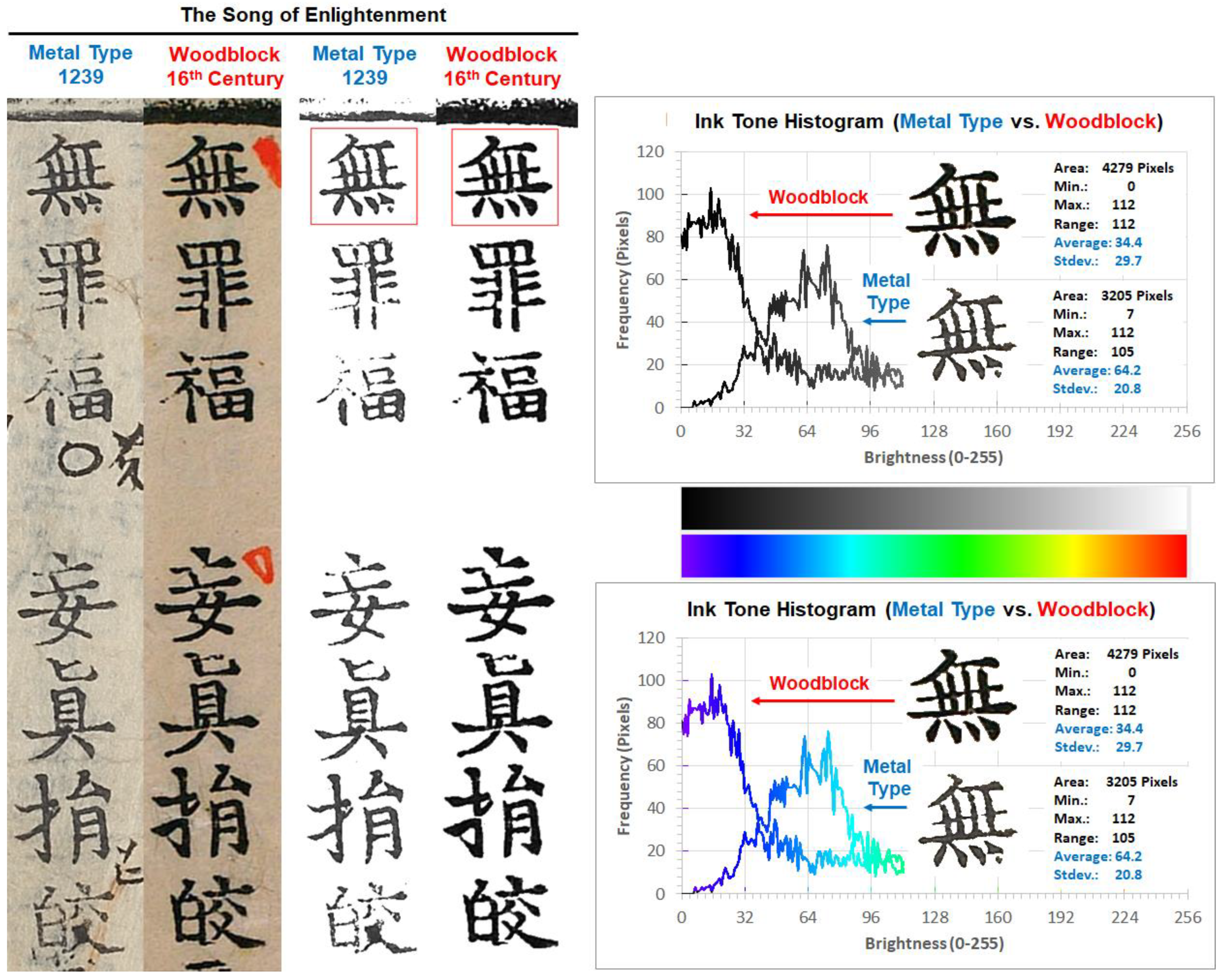
To quantify the characteristics of printed characters in the Gongin version (空印本) and Samseong version (三省本), ink tone analysis was performed on page nine of the metal type print, Gongin version (空印本), and the woodblock print, Samseong version (三省本), of The Song of Enlightenment. Figure 2 shows the characters of interest and their ink tone analysis results. The seven Chinese characters (無罪福妄眞捐皎) from the top of line four from the right on page nine of the metal type print, Gongin version (空印本), and the woodblock print, Samseong version (三省本), of The Song of Enlightenment before and after removing the paper color are shown on the left side of Figure 2. Ink tone histogram, statistics, and character images without the background paper tone of the first character 無 in the two versions in grayscale (top right) and false color scale (bottom right) are shown for easy comparison.
The appearance of the first character無 is much different compared with the metal type print and woodblock print. The woodblock-printed character 無 is darker (or intense) in ink color and larger in printed area compared with the metal-type-printed one. The inked area and average ink tone brightness for the woodblock-printed character 無 were 4279 pixels and 34.4 out of 0–255 brightness levels. The printed ink color was heavily skewed to the left (towards the darker side) and the standard deviation (1σ) of the brightness of 4279 pixels was 29.7 which was significantly larger considering the average brightness of 34.4. On the other hand, the inked area and the average ink tone brightness for the metal-type-printed character 無 were 3205 pixels and 64.2 out of 0–255 brightness levels. The printed ink color was shifted to the right (towards the brighter side) compared with the woodblock print and the standard deviation (1σ) of the brightness of the 3205 pixels was 20.8, which was significantly smaller than the woodblock-printed value of 29.7.
The ink tone histogram was almost symmetrical at 64.2 with a standard deviation of 20.8, suggesting that the ink color is lighter than the woodblock print, but the ink tone has normal distribution. The printed area of the woodblock print of the character 無 is 33.5% larger than that of the metal type print. This is the typical phenomenon observed in beongakbon (飜刻本, re-engraved edition) woodblock prints [1,5]. The difference (29.8) in average ink tone values for the woodblock print (34.4) and metal type print (64.2) suggests that the metal-type-printed character is almost twice as bright (or lighter) than the woodblock-printed character. This phenomenon agrees well with the description quoted from the book titled “Early Printings in Korea” [19].
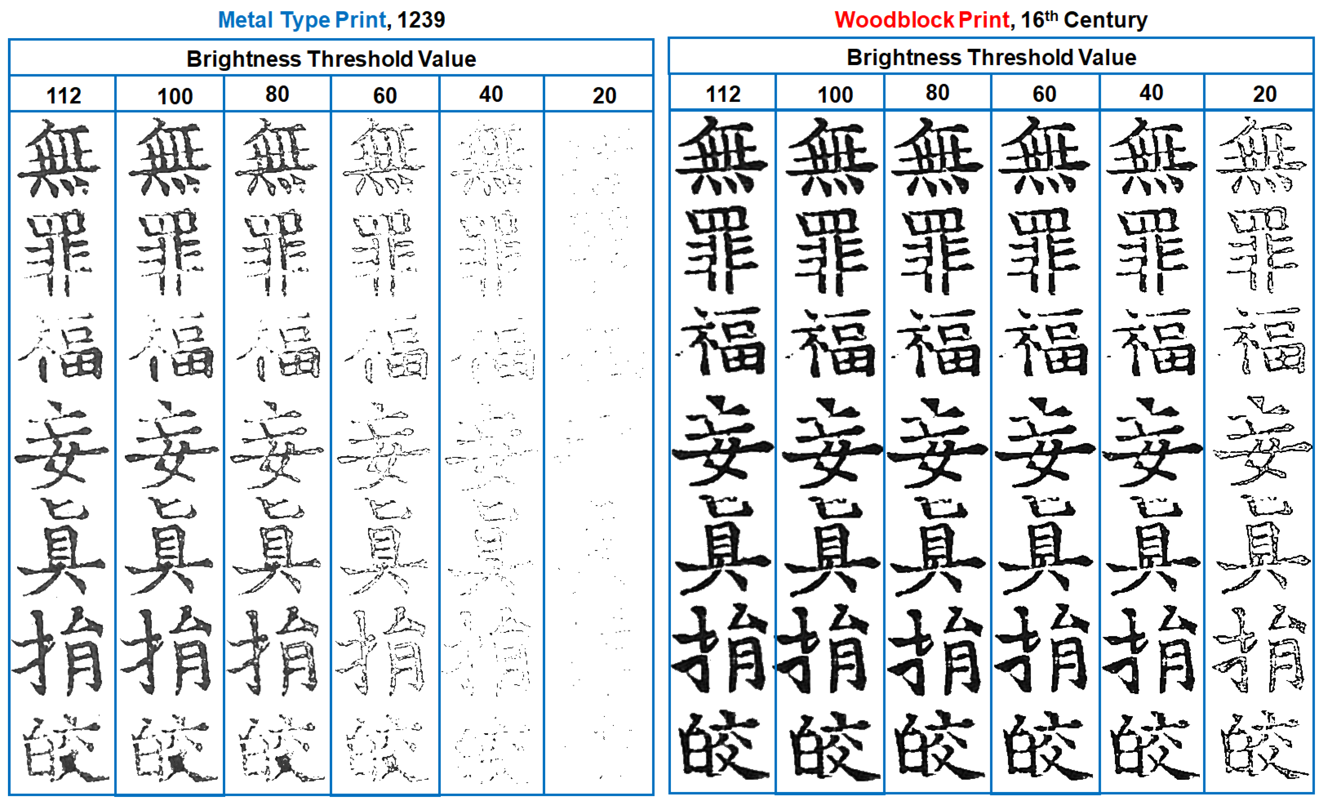
Figure 3 summarizes the seven Chinese characters (無罪福妄眞捐皎) of metal type print (left) and woodblock print (right) at various saturation threshold levels (112, 100, 80, 60, 40, and 20 on a 0–255 brightness scale) to demonstrate the spatial distribution of ink tone or ink concentration within the inked area. While the metal-type-printed characters start to show spotty patterns at the brightness threshold level of 80, the woodblock-printed characters maintain a solid pattern until the brightness threshold level of 40 and become spotty at the brightness threshold level of 20, as seen in the histograms on the right side of Figure 3. Ink tone histograms and statistics of the first character 無 are shown in the two versions in grayscale (top right) and false color scale (bottom right) for easy recognition of the ink tone brightness distribution. This phenomenon clearly demonstrates that the inks used for the Gongin version (空印本) and the Samseong version (三省本) are significantly different. Perhaps the plant oil charcoal ink with a lighter tone called “Yuyeonmuk (油煙墨)” was used for the Gongin version (空印本) metal type printing to improve the wetting property of the ink on metal surfaces. For the Samseong version (三省本) woodblock printing, pine charcoal ink called “Songyeonmuk (松煙墨)” with an intense (darker) tone was used. This provides additional evidence for the Gongin version (空印本) being based on metal type printing with the accumulated knowledge introduced in the early printing textbook [19].
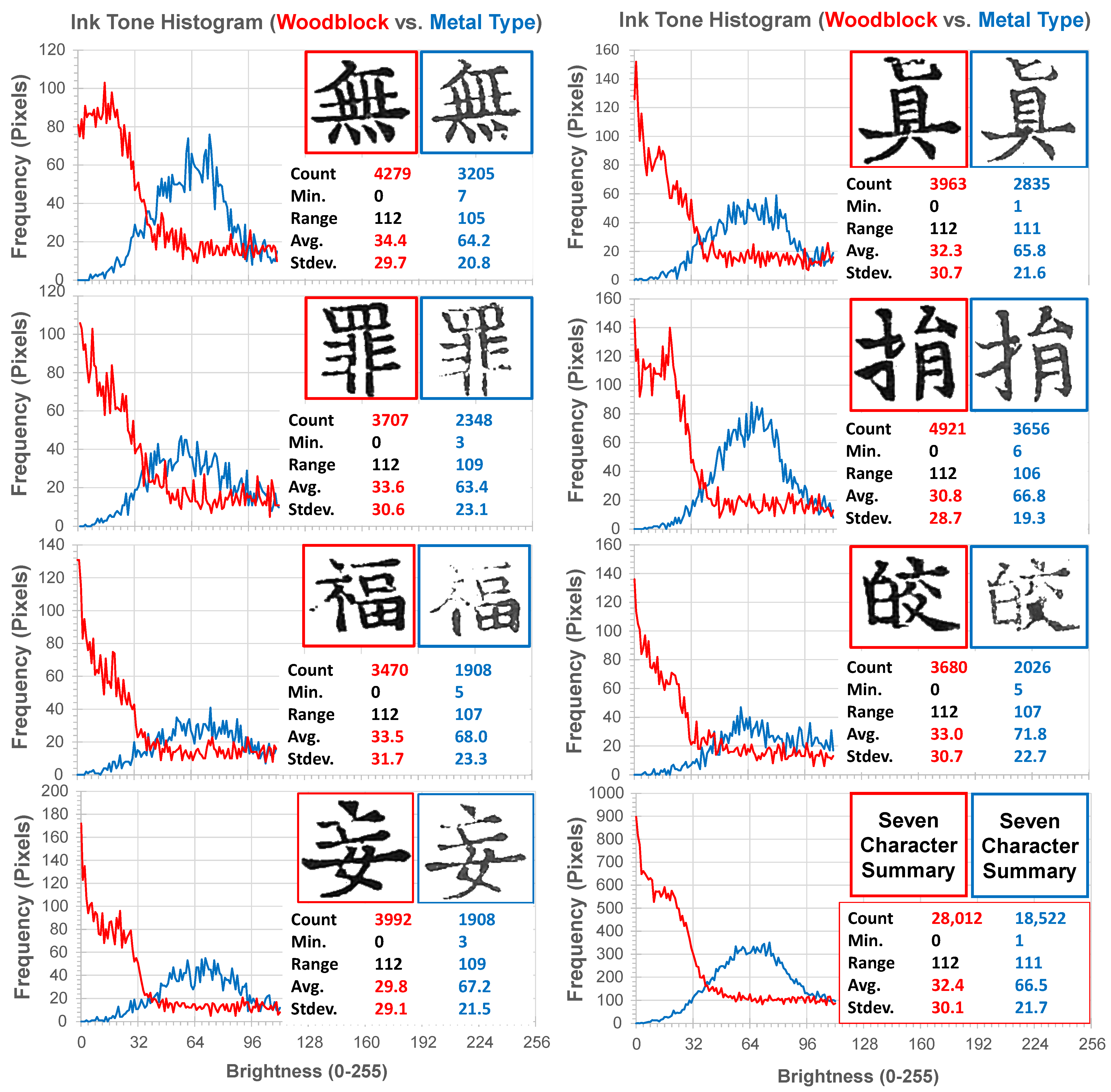
To verify the consistency of the histograms of individual characters and the histogram of the total inked areas of seven characters, the ink tone histograms of seven individual characters and the sum of the ink tone histograms are summarized in Figure 4. All ink tone histograms showed very similar characteristics suggesting the ink used for the Gongin version (空印本) and the Samseong version (三省本) are absolutely different. This is another piece of quantitatively analyzed information to determine the printing techniques used for the Gongin version (空印本) and the Samseong version (三省本).

4.2. Ink Tone Analysis of Jikji (直指)

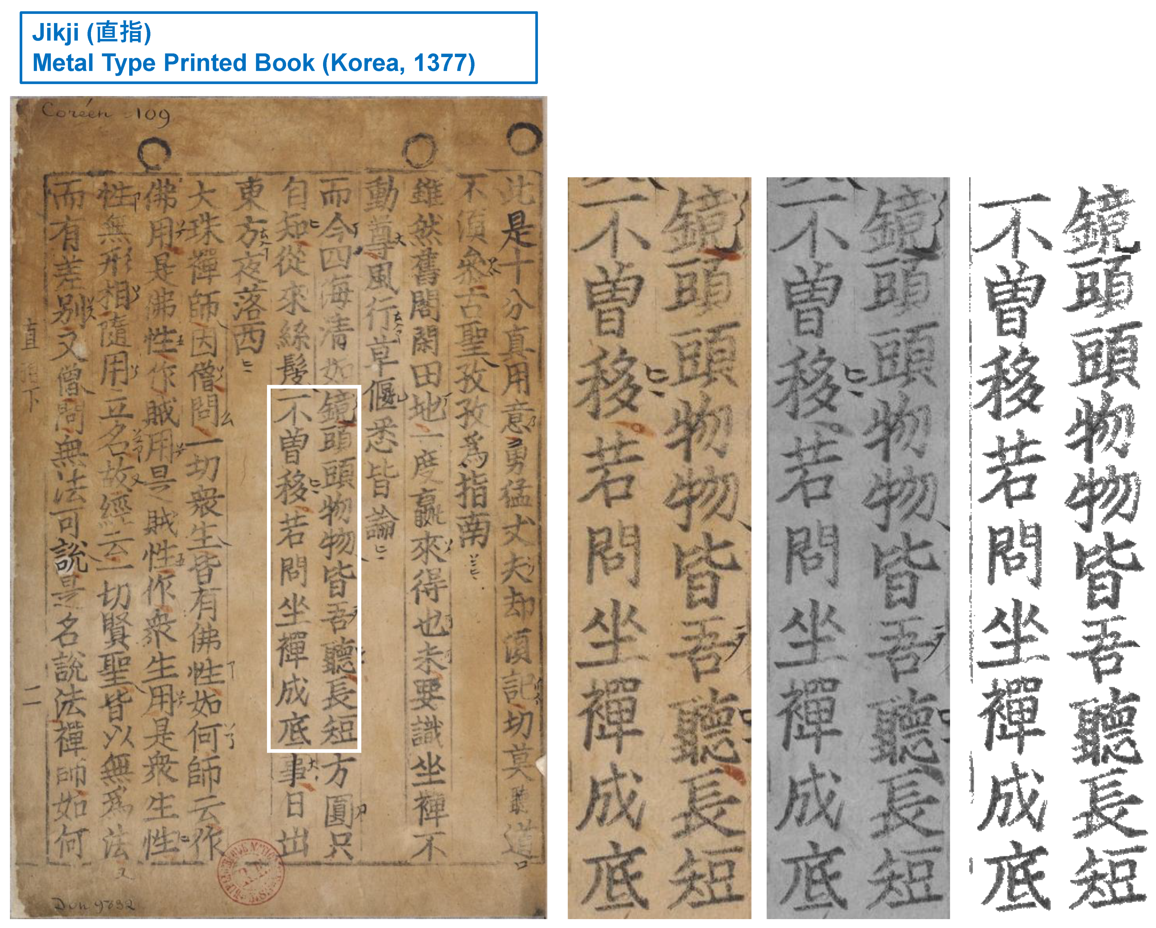
Jikji (直指) is known as metal type document printed during the Goryeo dynasty of Korea in 1377. It is often referred to be “the oldest surviving metal-type-printed book” or “the oldest extant metal-type-printed book.” It was recognized by UNESCO as the world’s oldest metal-type-printed book in September 2001 and is included it in the UNESCO Memory of the World Programme. To understand the characteristics of printed ink tones of Jikji (直指) and compare the results with other prints of interest, a one-page image of Jikji (直指) was selected from the BnF digital archives [14]. From the one-page image, a reasonably sized block of area containing 20 characters without additional markings was selected for fair comparisons. The one-page image and cropped images before and after the inked area extraction for ink tone analysis are shown in Figure 5.
As seen in the image with the background paper color removed (right), the printed characters are light in color, non-uniform in ink tone, and spotty, which are characteristics of medieval Korean metal type print described in the book [19]. Histogram analysis of printed characters can be a valuable resource to determine the printing techniques of ancient books.

4.3. Ink Tone Analysis of The Song of Enlightenment (南明泉和尙頌證道歌) and Jikji (直指)

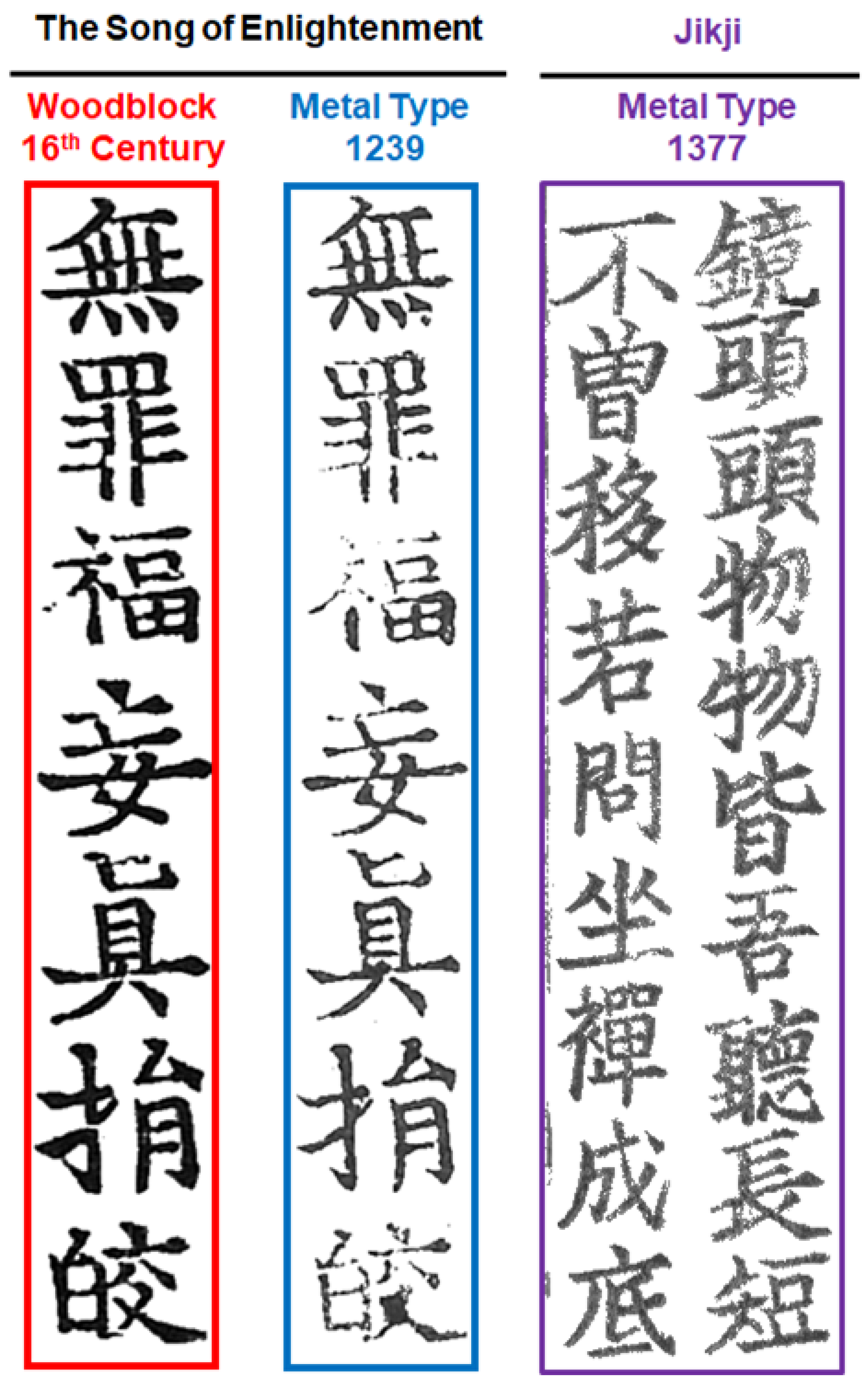
Figure 6 shows the cropped images of characters from the Gongin version (空印本) and Samseong version (三省本) of The Song of Enlightenment and Jikji (直指) after background color removal for visual inspection of similarities and differences between prints. Metal type prints show lighter tone characters and spotty ink patterns on paper.
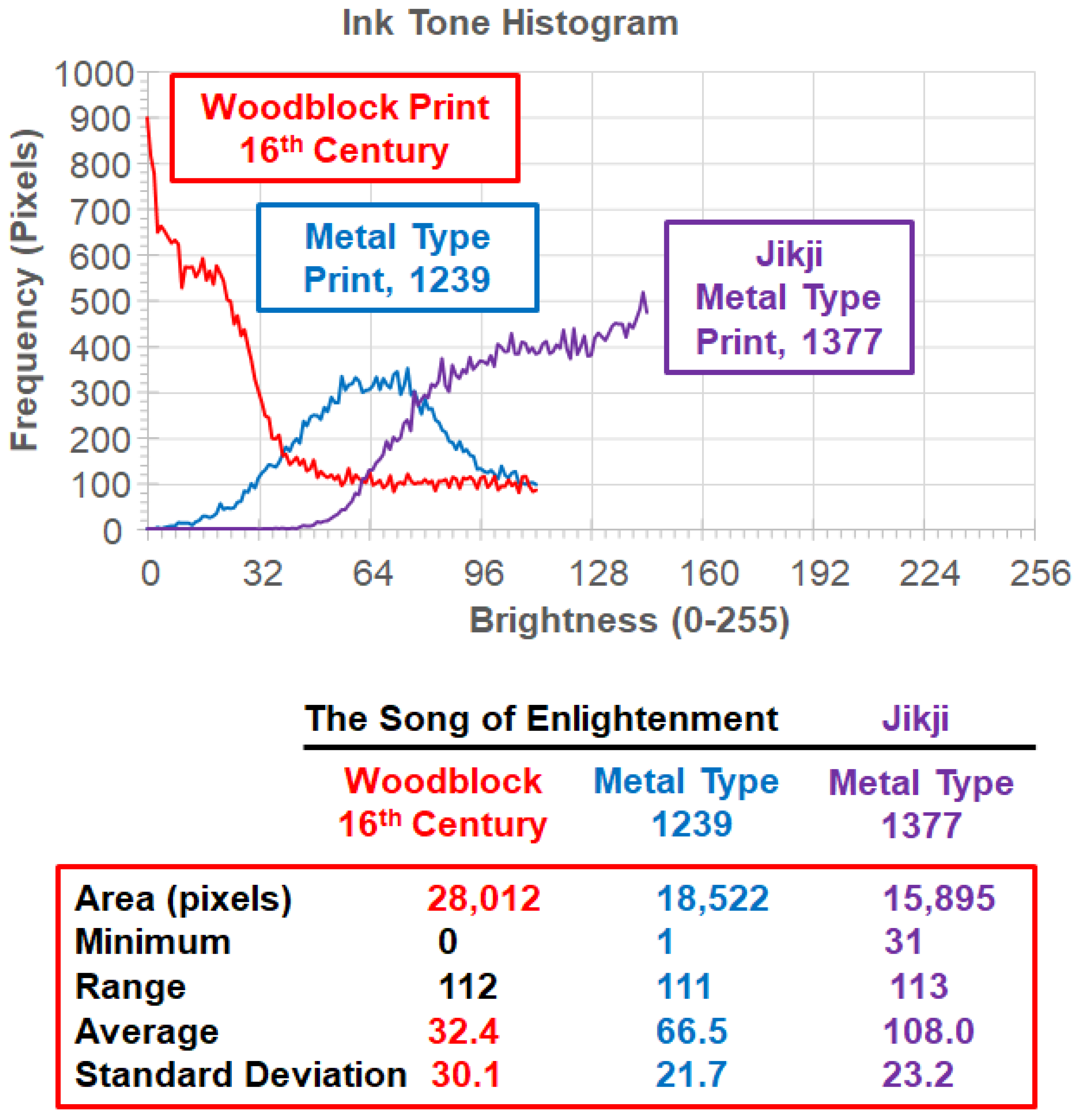
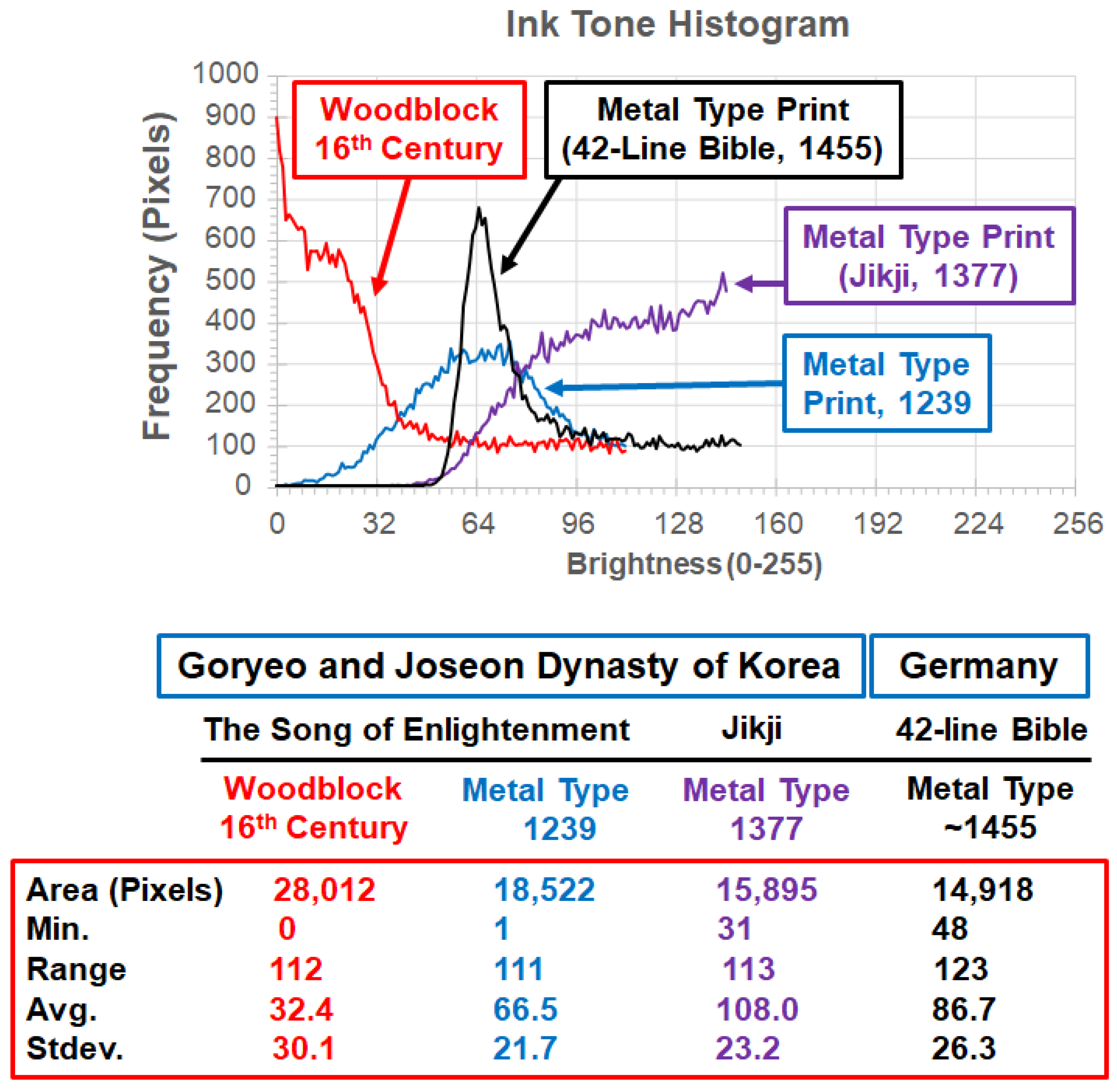
Ink tones of the seven Chinese characters (無罪福妄眞捐皎) from the metal-type-printed Gongin version (空印本) and the woodblock-printed Samseong version (三省本) of The Song of Enlightenment and twenty Chinese characters from Jikji (直指) were analyzed after removal of the background paper color. Figure 7 shows the ink tone histogram on the top and the summary of the statistics of ink tone analysis at the bottom. The Gongin version (空印本) and the Samseong version (三省本) are referred as to Metal Type Print, 1239, and Woodblock Print 16th Century in Figure 7. The printed characters of Jikji (直指) with an average ink tone brightness of 108.0 in a 0–255 brightness level range is much lighter than the characters of the Gongin version (空印本) with an average ink tone brightness of 66.5. Due to the bright color of the paper of Jikji (直指) from aging (oxidation with time) and the lighter ink tone of the printed characters, the ink tone histogram curve looked open ended where the tone of paper is at a brightness level of 144 on the 0–255 scale. Considering the tone of the aged paper of Jikji (直指), the ink tone histograms should have been approximately symmetrical, as is the Gongin version (空印本). The woodblock prints showed a more intense tone compared with the metal type prints.

4.4. Ink Tone Analysis of Other Books Printed in Joseon Dynasty of Korea in 18th Century

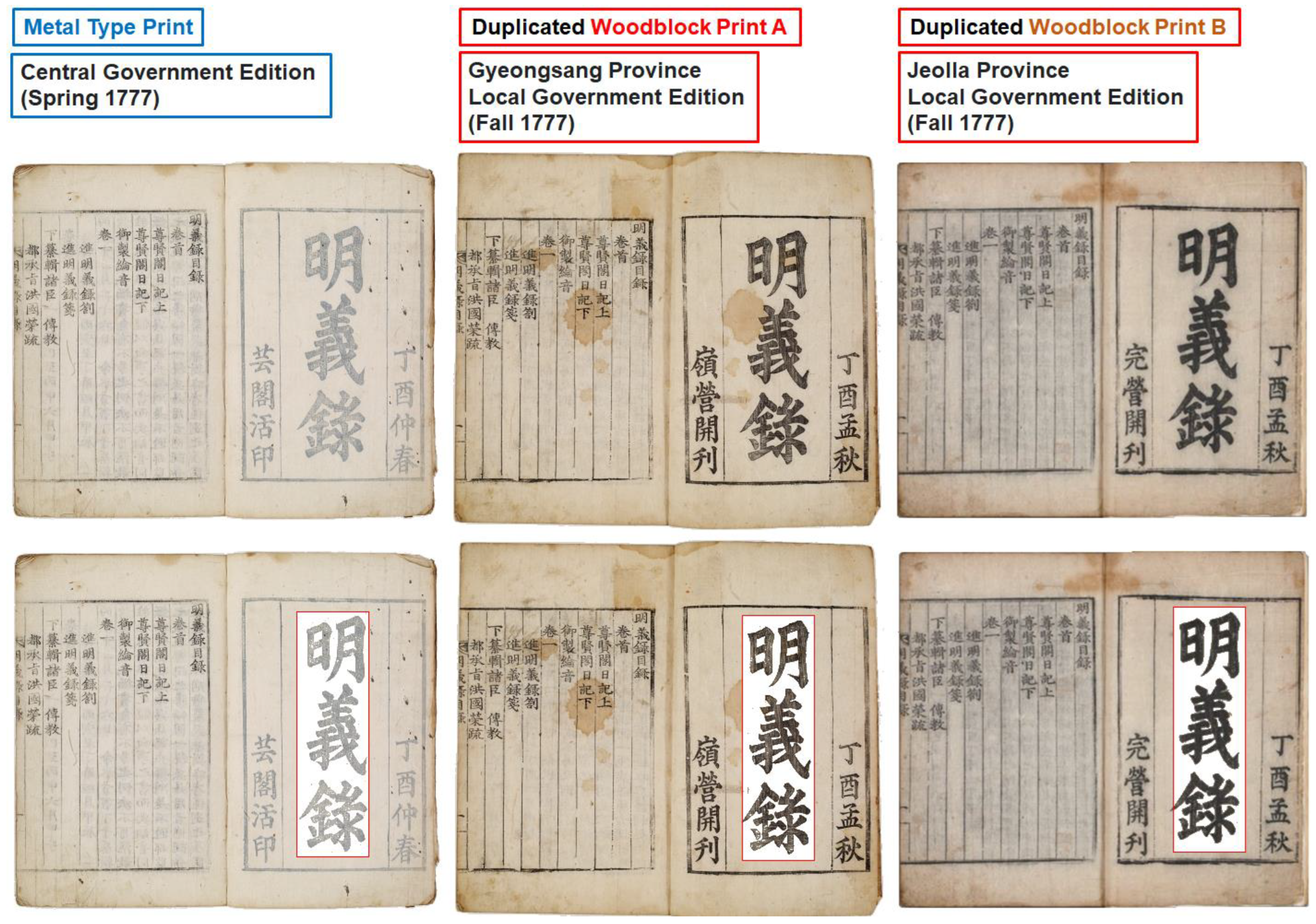
Figure 8 shows images of the metal-type-printed Myeongeuirok (明義錄) and two woodblock-printed Myeongeuirok (明義錄) images (top). Extracted titles of the three versions (bottom) are shown. The metal-type-printed version was printed by the central government in the spring of 1777 and the woodblocks were re-engraved from the metal type prints by two separate local governments (Gyeongsang (慶尙) province and Jeolla (全羅) province) and printed in the Fall of 1777. As seen from the photographic images of the books, the ink tone of the metal-type-printed version was much lighter than the woodblock-printed versions.
Ink tone analysis of three printed title characters of Myeongeuirok (明義錄) after character extraction was carried out for quantification of ink tone characteristics between printed versions and printing technique. Ink tone histograms (left), extracted title characters (top right), and statistics (bottom right) of the ink tone of three printed title characters of Myeongeuirok (明義錄) from the metal-type-printed version as well as the woodblock-printed versions are shown in Figure 9.
While the average ink tone values of woodblock prints were 94.3 and 78.2, the average ink tone value for the metal type print was 170.7 and was almost twice as bright as the woodblock prints. This clearly shows that the ink material used for metal type prints and woodblock prints is significantly different. Based on the difference in the ink tone histogram, ink materials used for woodblock prints in the two different local governments are likely different. They may have used ink sticks from their own local suppliers.
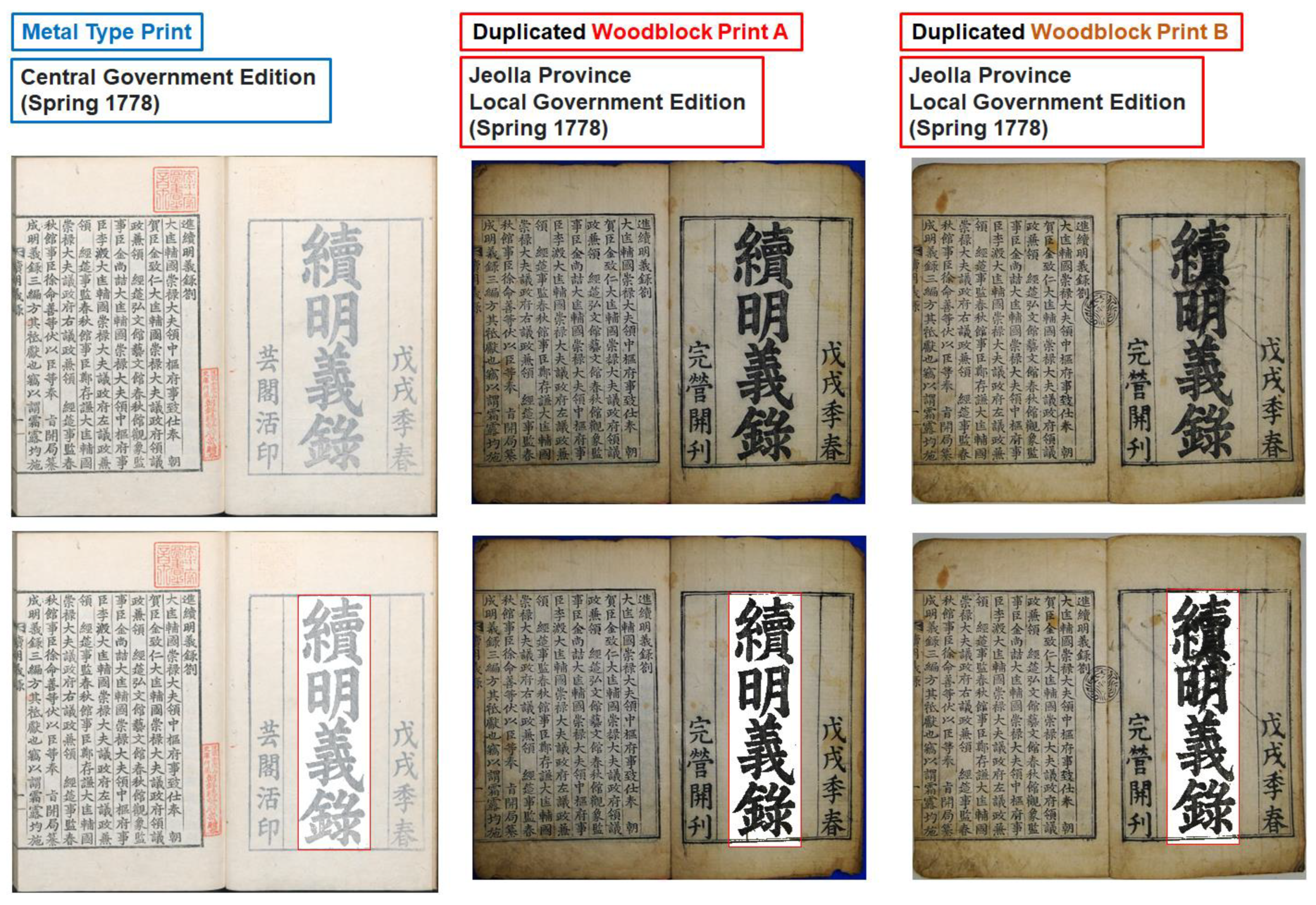
Figure 10 shows the metal-type-printed Sok-Myeongeuirok (續明義錄) and two woodblock-printed Sok-Myeongeuirok (續明義錄) images (top). Extracted titles of the three versions (bottom) are shown. The metal-type-printed version was printed by the central government in the spring of 1778 and the woodblocks were re-engraved from the metal type prints by a local government of Jeolla (全羅) province and printed in the spring of 1778. As can be observed from the photographic images of the books, the ink tone of the metal-type-printed version was much lighter than the woodblock-printed versions.
Ink tone analysis of three printed title characters of Sok-Myeongeuirok (續明義錄) after character extraction was conducted for quantification of ink tone characteristics for printed versions and printing technique. Ink tone histograms (left), extracted title characters (top right), and statistics (bottom right) of the ink tones of three printed title characters of Sok-Myeongeuirok (續明義錄) from the metal-type-printed version and the woodblock-printed versions are shown in Figure 11.
While the average ink tone values of woodblock prints were 42.8 and 49.3, the average ink tone value for the metal type print was 178.7 and was almost four times brighter than the woodblock prints. This also confirms that the ink material used for metal type prints and woodblock prints is significantly different. Since the two woodblock prints were printed by the same local government at the same time, the ink must have been made using the same ink stick. Thus, the ink tone histogram of the two woodblock-printed books seems to overlap as can be observed in Figure 11.
The ink tone histogram of the duplicated woodblock print A of Myeongeuirok (明義錄) in Figure 9 and the ink tone histograms of the duplicated woodblock prints A and B of Sok-Myeongeuirok (續明義錄) in Figure 11 seemed to be similar because they were printed by the same local government of Jeolla (全羅) province. Ink sticks from the same supplier may have been used for the woodblock prints. Ink tone histogram analysis may be further used for identifying suppliers, fabrication methods, and source materials in the future when we collect enough datasets and make ink stick databases available.

4.5. Ink Tone Analysis of the Gutenberg Bible

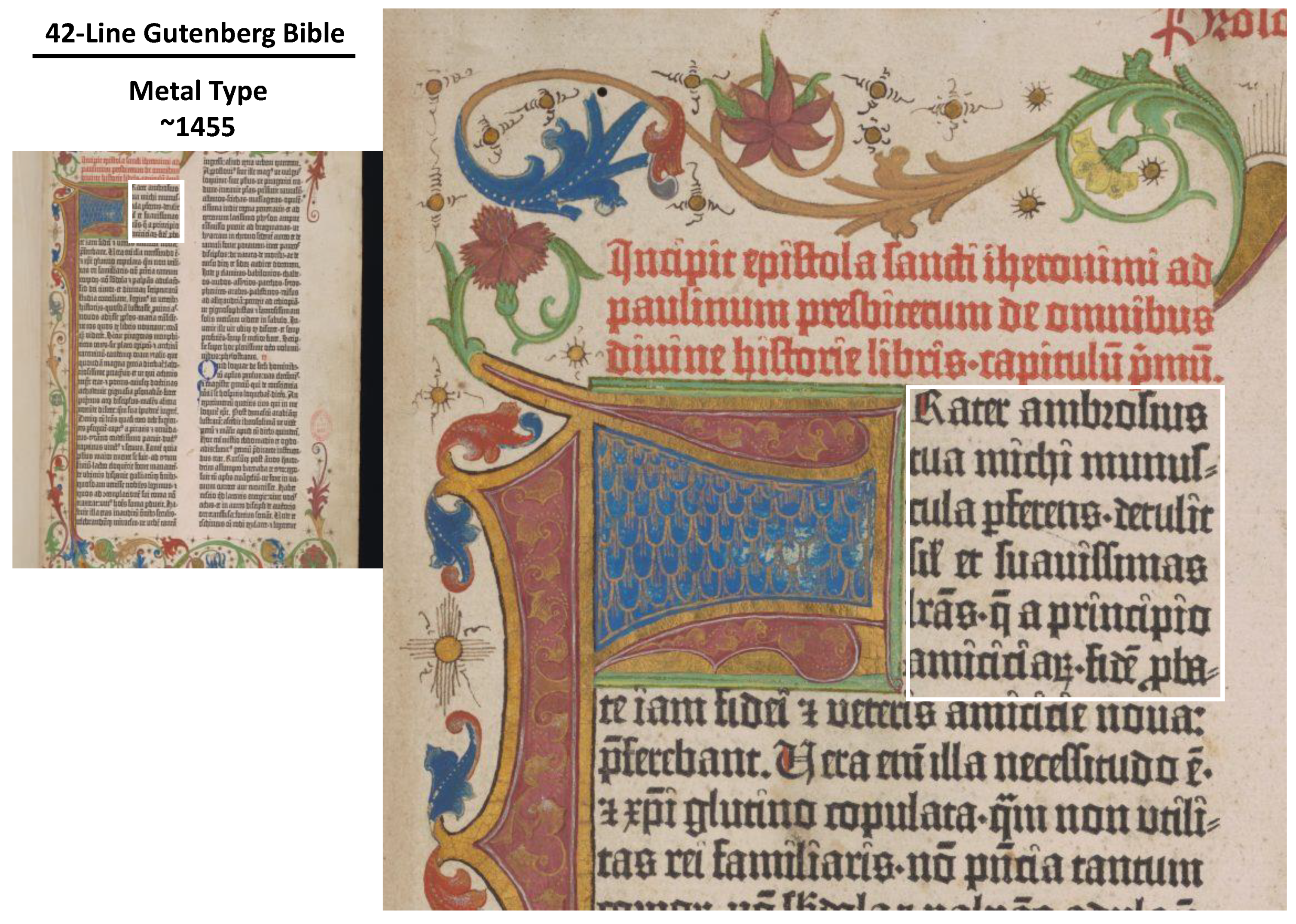
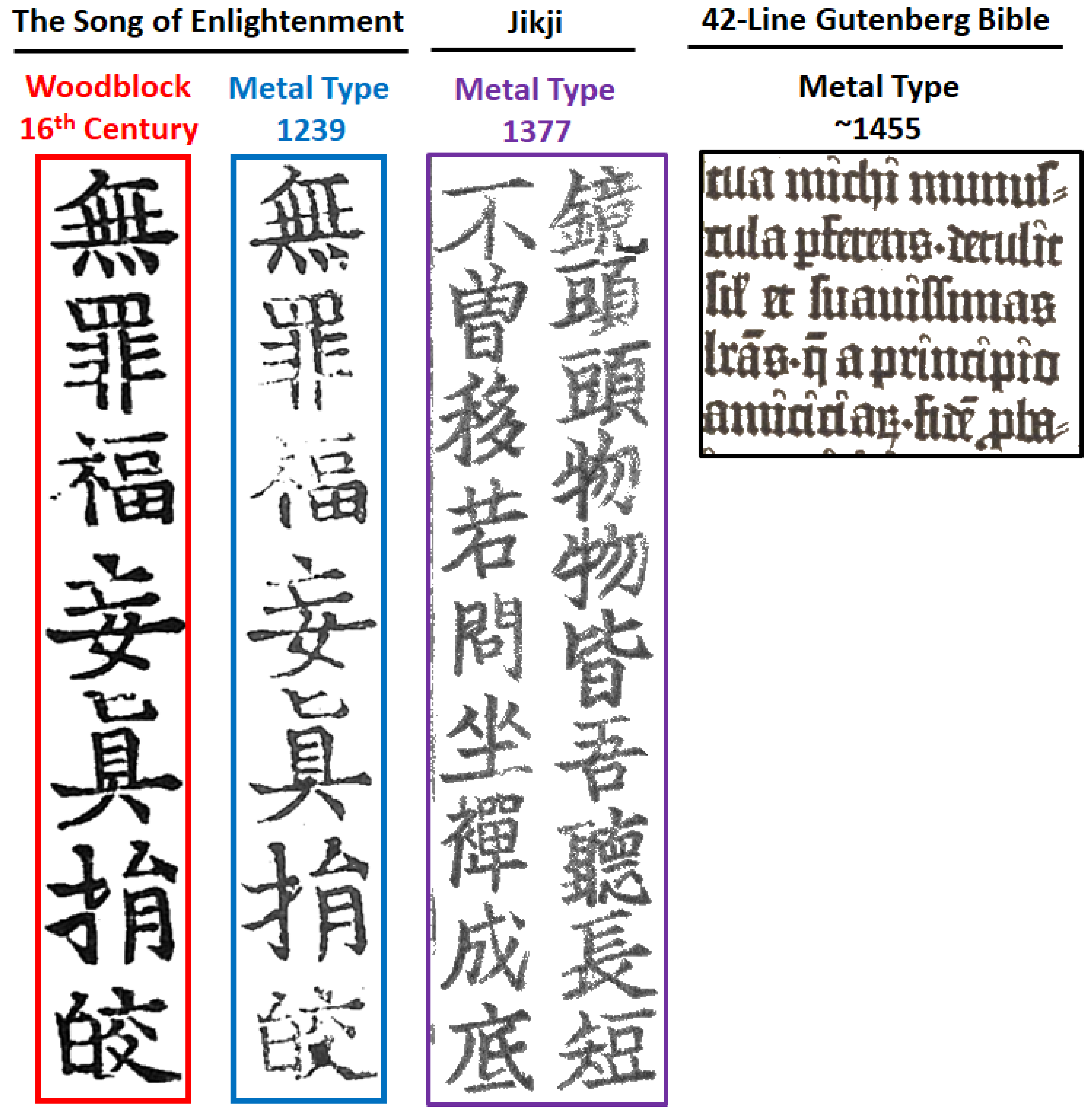
An image from the 42-line Gutenberg Bible was downloaded from the University of Cambridge [16] for image analysis. Areas of interest for ink tone analysis are highlighted by a rectangle with a white border line (Figure 12). Only black-lettered areas were selected for fair comparisons with other medieval Korean prints. Figure 13 shows cropped images and background-removed images for ink tone analysis. Seven Chinese characters (無罪福妄眞捐皎) from both the woodblock-printed Samseong version (三省本) and the metal-type-printed Gongin version (空印本) of The Song of Enlightenment (Left), as well as twenty Chinese characters from both the Jikji (直指) (center) and the Gutenberg Bible (right), were selected for visual inspection after removal of the background paper. These images were used for ink tone analysis using the image processing and analysis software (PicMan).
Figure 14 summarizes ink tone histograms and statistics of the metal-type-printed Gongin version (空印本) and the woodblock-printed Samseong version (三省本) of The Song of Enlightenment, as well as from metal-type-printed Jikji (直指) for easy comparisons. The ink tone of images with the background paper color removed in Figure 13 was analyzed. The average darkness of the printed characters in the Gutenberg Bible was approximately 30% lighter than the Gongin version (空印本) of The Song of Enlightenment printed using metal type in 1239 (216 years earlier in the Goryeo dynasty of Korea). In medieval Korean printed books, metal type prints show lighter and spotty printed patterns while the woodblock prints showed intense, solid printed patterns. However, the ink tone of the Gutenberg Bible appeared to be more uniform compared with all Korean printed books. The peak width of the Gutenberg Bible was the narrowest of all. This is likely due to the difference in ink and paper used at the time of printing and in the region.

4.6. Discussions

To provide additional, yet objective, evidence of metal type printing in the Gongin version (空印本) of The Song of Enlightenment in 1239, ink tone analysis of printed characters form various ancient books, including the Jikji (直指) printed in 1337 and the Gutenberg Bible printed in ~1455, were analyzed. To understand the difference in ink tones of metal type prints and woodblock prints in Korean ancient books, the 18th century printed books of Myeongeuirok (明義錄) and Sok-Myeongeuirok (續明義錄) using metal types and re-carved woodblocks were also analyzed. An ink tone histogram seemed to be very informative to understand characteristics of ink used for specific printing techniques of the region and time. Ink tone histograms and statistics obtained from ink tone analysis after simple image processing (i.e., background paper color removal) can be used as a “fingerprint” of the printing technique, materials, region, and time range once sufficient data are gathered.
The final appearance of the ink tone of printed characters is determined by the characteristics of light-absorbing material (ink) and printing media (paper). The spectral light absorbance of ink and the ink density (amount per unit area near the surface) are major factors in influencing the resulting ink tone. If the same amount of identical ink is used on papers with different absorption and diffusion characteristics, the resulting ink tone will be much different. The traditional Korean paper (Hanji (韓紙)) is generally very porous and has a rough surface. As a result, ink penetrates deeply, reducing ink density near the surface. Ink is absorbed very easily. Thus, it is used for ink-and-wash painting (水墨畵, sumie in Japanese). To increase ink absorption resistance, the surface of Hanji (韓紙) is smoothed by beating it on a fulling block, depending on applications.
The woodblock-printed Samseong version (三省本) of The Song of Enlightenment was printed on the surface smoothed Hanji (韓紙). As a result, the ink layer became thicker after drying and the ink tone histogram was skewed to the left side (darker side). In contrast, the four woodblock-printed books of Myeongeuirok (明義錄) and Sok-Myeongeuirok (續明義錄) were printed on regular Hanji (韓紙) without the surface flattening treatment. Thus, the histograms of ink are shifted towards the right side (brighter side). Based on the histograms, the Hanji (韓紙) paper used for printing the Gongin version (空印本) of The Song of Enlightenment and the Jikji (直指) can be determined to be regular paper without special surface flattening treatment.
Judging from the ink tone histogram, the Gutenberg Bible also seemed to be treated by surface flattening, as ink-absorption-resistant paper must have been used for printing. The ink was not very dark and did not penetrate the paper. Thus, the ink tone histogram showed a very narrow peak at the average brightness level.
Ink tone analysis can provide very objective insight into paper-based cultural heritage, in particular, ancient printing materials. Therefore, it is a great resource for scientific reasoning.

5. Conclusions

After a lengthy (~10,000 h) investigation from the beginning of 2017, the author has collected circumstantial and direct evidence for metal type printing in 1239 from the ancient book called the Gongin version (空印本) of The Song of Enlightenment [1,2,3,4,5,6,7,8,9,10]. Despite much evidence, the author’s report has been denied in Korea, presumably to maintain the prestigious status of the Jikji (直指), listed as the oldest-surviving metal-type-printed book in the UNESCO Memory of the World Programme. It is not only an inappropriate decision by Korean scholars and researchers in the related fields, as well as the Cultural Heritage Administration of Korea, but also a violation of the founding spirit of the UNESCO Memory of the World Programme.
To further provide scientific evidence of the Gongin version (空印本) of The Song of Enlightenment being the metal-type-printed version, ink tone analysis of printed characters is proposed for medieval Korean books. The ink tone of printed character images in two ancient books, the Samseong version (三省本) (Korean Treasure, 1984) and the Gongin version (空印本) (Korean Treasure, 2012), were compared and analyzed. Both ancient books registered as Korean treasures have been misidentified and disclosed by the Cultural Heritage Administration of Korea as woodblock-printed versions from the Goryeo dynasty of Korea in the 13th century.
Ink tone and printed pattern analyses showed clear differences in the presence of spotty printed patterns and brightness (or darkness) of ink tone histograms between printed characters on the two ancient books suggesting printing technique differences between metal type print and woodblock print. Printed pattern and statistical ink tone analysis of printed characters in the two books revealed totally different brightness (or darkness) histograms of pixels, within inked areas, suggesting differences in printing technique and materials used for the two books. Ink tone analysis was also performed for the Jikji (直指: metal type printed in Korea in 1337) and the Gutenberg Bible (metal type printed in Europe around 1455) for fair comparisons. Metal type prints show lighter and spotty printed patterns while the woodblock prints showed intense, solid printed patterns.
As additional references, an ink tone analysis was conducted for two sets of old Korean books titled Myeongeuirok (明義錄), printed in 1777, and Sok-Myeongeuirok (續明義錄), printed in 1778, using both metal type and re-carved woodblocks. The Gongin version (空印本) of The Song of Enlightenment, designated as a Korean treasure in 2012, showed very similar distribution and average brightness of ink with the metal-type-printed books from Korea and Europe from the 14th to 18th centuries. All metal-type-printed books from Korea and the Gutenberg Bible showed lighter ink tones compared with the woodblock-printed books in Korea. More symmetrical histograms compared woodblock-printed Korean books from the 14th to 18th centuries. Ink tone analysis of printed character images can be used as a printing technique identification method for ancient books from the East and West, and for books of all ages.
Ink tone and printed pattern analysis results are two of many evidences for metal type printing of the Gongin version (空印本) of The Song of Enlightenment, designated as a Korean treasure in 2012. The version of interest is the world’s oldest extant book, printed using metal type in Korea in September 1239, as indicated in the imprint. The Gongin version (空印本) of The Song of Enlightenment predates Jikji (1377) by 138 years and the 42-line Gutenberg Bible (~1455) by 216 years.

Funding

This research received no external funding.

Institutional Review Board Statement

Not applicable.

Informed Consent Statement

Not applicable.

Data Availability Statement

Not applicable.

Acknowledgments

The author would like to thank his colleagues Jung Gon Kim and Kitaek Kang, and James Schram of WaferMasters, Inc., for their understanding and support during this very exciting cultural heritage image analysis and evaluation project. He is also thankful to Jae Seug Yun and Kwon Hee Nam of Kyungpook National University, Daegu, Korea; Yun Pyo Hong of Yonsei University, Seoul, Korea; Tae-Ho Choi of Chungbuk National University, Cheongju, Korea; and Jae-Young Chung of KOREATECH (Korea University of Technology and Education), Cheonan, Korea for their introduction and study materials on this very topic. He is also thankful to the collector and Buddhist Monk Won-Jin, Yangsan, Korea, for providing the opportunity to inspect the Gongin version (空印本) of The Song of Enlightenment with Commentaries by Buddhist Monk Nammyeong Cheon (南明泉和尙頌證道歌) multiple times upon request. He would also like to thank Sang Keun Lee, Chairman of the Cultural Heritage Restoration Foundation, Seoul, Korea, and Hyungwon Kang, Syndicated Korean–American columnist and photojournalist for the “Visual History of Korea” Korea Herald and The Korea Times Los Angeles, for their interest, encouragement, understanding, and support.

Conflicts of Interest

The author declares no conflict of interest.

References

  1. Yoo, W.S. Direct Evidence of Metal Type Printing in The Song of Enlightenment, Korea, 1239. Heritage 2022, 5, 3329–3358. [Google Scholar] [CrossRef]
  2. Yoo, W.S.; Kim, J.G. Comparative Study on Very Similar Jeungdoga Scripts through Image Analysis—Fundamental Difference between Treasure No. 758-1 and Treasure No. 758-2. J. Conserv. Sci. 2021, 37, 791–800, (In Korean with English Abstract). [Google Scholar] [CrossRef]
  3. Yoo, W.S. The World’s Oldest Book Printed by Movable Metal Type in Korea in 1239: The Song of Enlightenment. Heritage 2022, 5, 1089–1119. [Google Scholar] [CrossRef]
  4. Yoo, W.S. How Was the World’s Oldest Metal-Type-Printed Book (The Song of Enlightenment, Korea, 1239) Misidentified for Nearly 50 Years? Heritage 2022, 5, 1779–1804. [Google Scholar] [CrossRef]
  5. Yoo, W.S. Identification of Metal Type Prints, Recarved Woodblock Prints and Woodblock Recarving Sequences through Image Analyses-Comparisons among Six Versions of Jeungdoga Scripts. J. Conserv. Sci. 2022, 38, 404–414, (In Korean with English Abstract). [Google Scholar] [CrossRef]
  6. Yoo, W.S. Quantification of Characteristics of Metal Type and Woodblock Prints through Image Analysis and Its Application to Four Versions of Jeungdoga Scripts. J. Study Buddh. Philos. JSBP 2022, 11, 327–361, (In Korean with English Abstract). [Google Scholar]
  7. Yoo, W.S. Estimation of the Printing Order, Printing Period and Printing Method by Comparing Images of Four Printing Versions of Nanmingquan Song Zhengdaoge (南明泉和尙頌證道歌). J. East-West Humanit. (JEWH) 2022, 20, 357–396, (In Korean with English Abstract). [Google Scholar] [CrossRef]
  8. Park, D.S. Goryeo Metal-Type Printing, ‘Nammyeongcheon Hwasangsong Jeungdoga’ Hyangto Andong; Society for the Study of Local History of Andong: Andong, Republic of Korea, 1988; Volume 1, pp. 15–192. [Google Scholar]
  9. Park, S.K. Nammyeong Jeungdoga, the World’s First Metal Type Print; Gymmyoung Publishers: Seoul, Republic of Korea, 2020. (In Korean) [Google Scholar]
  10. Park, S.K. Nammyeongcheon Hwasangsong Jeungdoga, Birth of the World’s First Metal Type Print; Gymmyoung Publishers: Seoul, Republic of Korea, 2020. (In Korean) [Google Scholar]
  11. UNESCO. Baegun Hwasang Chorok Buljo Jikji Simche Yojeol (Vol.II), the Second Volume of “Anthology of Great Buddhist Priests’ Zen Teachings”. Available online: https://fr.unesco.org/silkroad/node/470 (accessed on 19 November 2022).
  12. UNESCO. MOW JIKJI Prize. Available online: https://en.unesco.org/prizes/jikji-mow-prize (accessed on 19 November 2022).
  13. Kyunghyang Shinmun. 3 Types of Old Books Owned by Jongno Library, Designated as a Tangible Cultural Property by the Seoul Metropolitan Government. 2021. Available online: https://m.khan.co.kr/national/education/article/202103111201001#c2b (accessed on 19 November 2022). (In Korean).
  14. BnF. (The Bibliothèque nationale de France), 백운화상초록불조직지심체요절. 白雲和尙抄錄佛祖直指心體要節 Päk un (1298–1374). Auteur du texte. Available online: https://gallica.bnf.fr/ark:/12148/btv1b52513236c/f5.item# (accessed on 19 November 2022).
  15. University of Cambridge. 50 Religious Treasures of Cambridge. Gutenberg Bible. Available online: https://www.50treasures.divinity.cam.ac.uk/treasure/gutenberg-bible/ (accessed on 19 November 2022).
  16. KRpia (Korean Database). 명의록 (明義錄). Available online: https://www.krpia.co.kr/product/main?plctId=PLCT00008015 (accessed on 19 November 2022). (In Korean).
  17. Encyclopedia of Korean Culture. 속명의록 (續明義錄). Available online: http://encykorea.aks.ac.kr/Contents/Item/E0030410 (accessed on 19 November 2022). (In Korean).
  18. UNESCO. Memory of the World. Available online: https://en.unesco.org/silkroad/silk-road-themes/documentary-heritage/printing-woodblocks-tripitaka-koreana-and-miscellaneous (accessed on 15 December 2022).
  19. Ok, Y.J. Early Printings in Korea; Cultural Heritage Administration (Korea); The Academy of Korean Studies Press: Seoul, Republic of Korea, 2013. [Google Scholar]
  20. Nammyeong Cheon Hwasangsong Jeungdoga (Song of Enlightenment with Commentaries by Buddhist Monk Nammyeong). Available online: http://www.heritage.go.kr/heri/cul/culSelectDetail.do?pageNo=1_1_2_0&ccbaCpno=1121107580000 (accessed on 25 June 2022).
  21. Cultural Heritage Administration (Korea). Nammyeong Cheon Hwasangsong Jeungdoga (Song of Enlightenment with Commentaries by Buddhist Monk Nammyeong). Available online: http://www.heritage.go.kr/heri/cul/culSelectDetail.do?ccbaCpno=1123807580200 (accessed on 25 June 2022).
  22. Cultural Heritage Administration (Korea). Nammyeong Cheon Hwasangsong Jeungdoga (Song of Enlightenment with Commentaries by Buddhist Monk Nammyeong). Available online: http://www.heritage.go.kr/heri/cul/culSelectDetail.do;jsessionid=EsDv0h414RnB79FYIGRzGm9UWRDBBzDT3FXGSlDsZDu0AlJAJxx3m8rIvbk6Iu95.cpawas_servlet_engine1?culPageNo=35&region=&searchCondition=&searchCondition2=&s_kdcd=&s_ctcd=11&ccbaKdcd=21&ccbaAsno=04840000&ccbaCtcd=11&ccbaCpno=2111104840000&ccbaCndt=&ccbaLcto=11&stCcbaAsno=&endCcbaAsno=&stCcbaAsdt=&endCcbaAsdt=&ccbaPcd1=&chGubun=&header=region&returnUrl=%2Fheri%2Fcul%2FculSelectRegionList.do&pageNo=1_1_3_1&sngl=Y (accessed on 19 November 2022).
  23. Cheon, H.B. The World’s First Invention, Metal Type Printing in Goryeo Dynasty (高麗鑄字印刷). Gyujanggak 1984, 8, 63–75. Available online: https://www.kci.go.kr/kciportal/ci/sereArticleSearch/ciSereArtiView.kci?sereArticleSearchBean.artiId=ART002632708 (accessed on 19 November 2022). (In Korean with English Abstract).
  24. Cheon, H.B. On the Recarved Edition of Priest Nanmingchuan’s Chengtao-ko, Printed with Metal Type in the Koryo Dynasty. J. Korean Libr. Sci. Soc. 1988, 15, 267–280. Available online: https://scienceon.kisti.re.kr/srch/selectPORSrchArticle.do?cn=JAKO198825720296247&dbt=NART (accessed on 19 November 2022). (In Korean with English Abstract).
  25. Sohn, P.-K. Early Korean Printing. J. Am. Orient. Soc. 1959, 79, 96–103. [Google Scholar] [CrossRef]
  26. Sohn, P.K. Early Korean Typography; Korean Library Studies Association: Seoul, Republic of Korea, 1971. (In Korean) [Google Scholar]
  27. Chon, H.B. 200 Years before Gutenberg: The Master Printers of Koryo. Available online: https://en.unesco.org/courier/december-1978/200-years-gutenberg-master-printers-koryo (accessed on 19 November 2022).
  28. UNESCO. Memory of the World. Available online: https://en.unesco.org/programme/mow (accessed on 19 November 2022).
  29. The University of Utah; “From Jikji to Gutenberg”. Available online: https://jikji.utah.edu/ (accessed on 19 November 2022).
  30. Yoo, Y.; Yoo, W.S. Digital Image Comparisons for Investigating Aging Effects and Artificial Modifications Using Image Analysis Software. J. Conserv. Sci. 2021, 37, 1–12. [Google Scholar] [CrossRef]
  31. Yoo, W.S.; Kim, J.G.; Ahn, E.J. An Experimental Study on the Printing Characteristics of Traditional Korean Paper (Hanji) Using a Replicated Woodblock of Wanpanbon Edition Shimcheongjeon. J. Conserv. Sci. 2021, 37, 289–301, (In Korean with English Abstract). [Google Scholar] [CrossRef]
  32. Yoo, W.S.; Kim, J.G.; Ahn, E.J. An Experimental Reproduction Study on Characteristics of Woodblock Printing on Traditional Korean Paper (Hanji). J. Conserv. Sci. 2021, 37, 579–689, (In Korean with English Abstract). [Google Scholar] [CrossRef]
  33. Yoo, W.S. Comparison of Outlines by Image Analysis for Derivation of Objective Validation Results: “Ito Hirobumi’s Characters on the Foundation Stone” of the Main Building of Bank of Korea. J. Conserv. Sci. 2020, 36, 511–518, (In Korean with English Abstract). [Google Scholar] [CrossRef]
  34. Kim, G.; Kim, J.G.; Kang, K.; Yoo, W.S. Image-Based Quantitative Analysis of Foxing Stains on Old Printed Paper Documents. Heritage 2019, 2, 2665–2677. [Google Scholar] [CrossRef] [Green Version]
  35. Yoo, W.S.; Kim, J.G.; Kang, K.; Yoo, Y. Extraction of Colour Information from Digital Images towards Cultural Heritage Characterisation Applications. SPAFA J. 2021, 5, 1–14. [Google Scholar] [CrossRef]
  36. Digital Image Analysis Program Manual for Diagnosis of Conservation Status of Painting Cultural Heritage; Konkuk University and National Research Institute of Cultural Heritage (Korea): Daejeon, Republic of Korea, 2022; ISBN 978-89-299-2570-3. (In Korean)
  37. Yoo, W.S.; Kang, K.; Kim, J.G.; Yoo, Y. Extraction of Color Information and Visualization of Color Differences between Digital Images through Pixel-by-Pixel Color-Difference Mapping. Heritage 2022, 5, 3923–3945. [Google Scholar] [CrossRef]
  38. Yoo, W.S.; Kim, J.G.; Kang, K.; Yoo, Y. Development of Static and Dynamic Colorimetric Analysis Techniques Using Image Sensors and Novel Image Processing Software for Chemical, Biological and Medical Applications. Technologies 2023, 11, 23. [Google Scholar] [CrossRef]
  39. Im, C.; Kim, Y.; Mandl, T. Deep learning for historical books: Classification of printing technology for digitized images. Multimed. Tools Appl. 2022, 81, 5867–5888. [Google Scholar] [CrossRef]
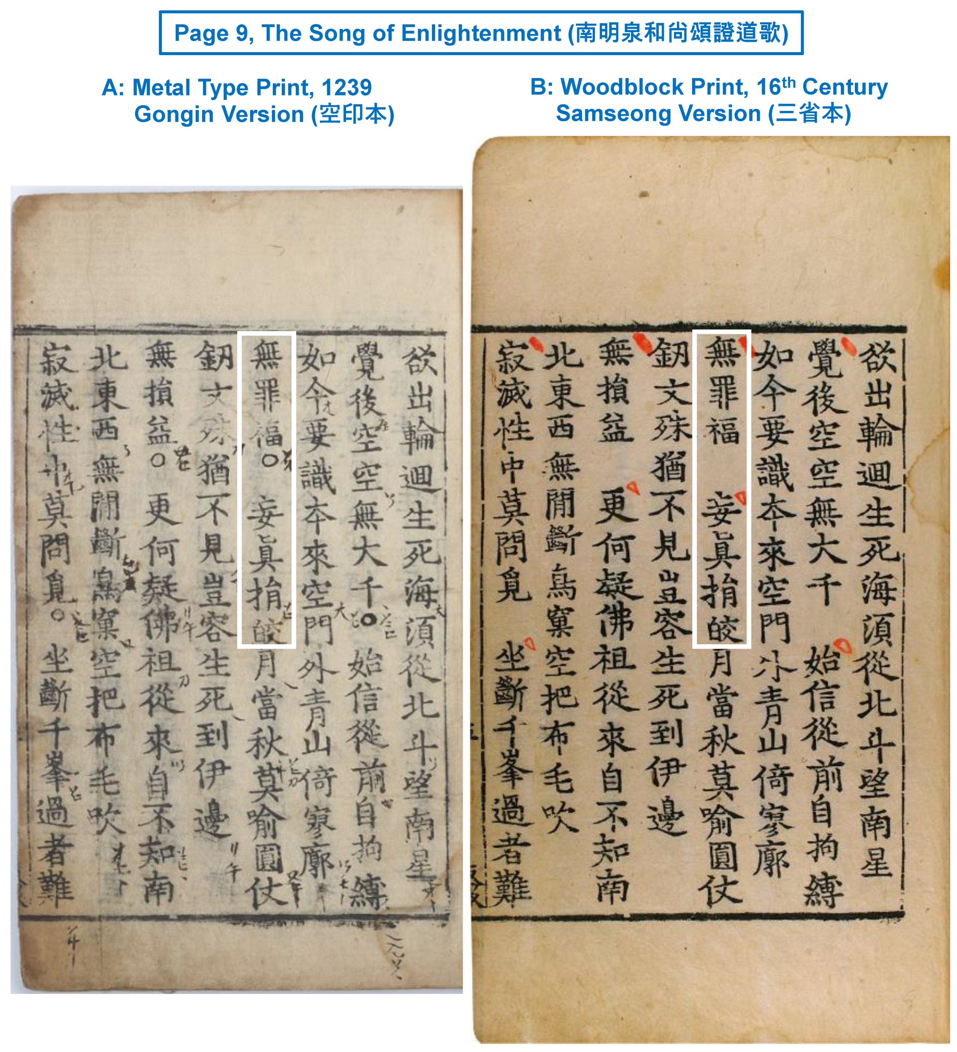
Figure 1. Images of page 9 of (A) the Gongin version (空印本) and (B) Samseong version (三省本) of The Song of Enlightenment. Seven Chinese characters from the top of the line four from the right (highlighted by rectangles with white border lines) are compared and analyzed.
Heritage 06 00135 g001
Figure 2. Seven Chinese characters (無罪福妄眞捐皎) from the top of line 4 and from the right on page 9 of the metal type print, Gongin version (空印本), and the woodblock print, Samseong version (三省本), of The Song of Enlightenment before and after removing the paper color (left). Ink tone histogram and statistics of the first character 無 are shown in the two versions in grayscale (top right) and false color scale (bottom right).
Heritage 06 00135 g002
Figure 3. Seven Chinese characters (無罪福妄眞捐皎) from the metal type print, Gongin version (空印本) (left), and the woodblock print, Samseong version (三省本) (right), of The Song of Enlightenment at various saturation threshold levels (112, 100, 80, 60, 40, and 20 on a 0–255 brightness scale).
Heritage 06 00135 g003
Figure 4. Ink tone histogram and statistics of seven individual Chinese characters (無罪福妄眞捐皎) from the metal-type-printed Gongin version (空印本) and the woodblock-printed Samseong version (三省本) of The Song of Enlightenment and the sum of the ink tone histograms of all seven characters (bottom right).
Heritage 06 00135 g004
Figure 5. One page image of Jikji (直指) printed using metal type in 1377 and cropped images before and after the inked area extraction for ink tone analysis. A reasonably sized block of area containing 20 characters without additional markings was selected for fair comparisons.
Heritage 06 00135 g005
Figure 6. Cropped and background color removed images of characters from the Samseong version (三省本) and Gongin version (空印本) of The Song of Enlightenment and Jikji (直指).
Heritage 06 00135 g006
Figure 7. Ink tone histogram (top) and statistics (bottom) of seven Chinese characters (無罪福妄眞捐皎) from the metal-type-printed Gongin version (空印本) and the woodblock-printed Samseong version (三省本) of The Song of Enlightenment and twenty Chinese characters from Jikji (直指).
Heritage 06 00135 g007
Figure 8. A metal-type-printed Myeongeuirok (明義錄) and two woodblock-printed Myeongeuirok (明義錄) images (top) and extracted titles of the three versions (bottom). All versions were printed during the Joseon dynasty of Korea in 1777.
Heritage 06 00135 g008
Figure 9. Ink tone histogram (left), extracted title characters (top right), and statistics (bottom right) of ink tone of three printed title characters of Myeongeuirok (明義錄) from the metal-type-printed version and the woodblock-printed versions.
Heritage 06 00135 g009
Figure 10. A metal-type-printed Sok-Myeongeuirok (續明義錄) and two woodblock-printed Sok-Myeongeuirok (續明義錄) images (top) and extracted titles of the three versions (bottom). All versions were printed during the Joseon dynasty of Korea in 1778.
Heritage 06 00135 g010
Figure 11. Ink tone histogram (left), extracted title characters (top right), and statistics (bottom right) of the ink tones of three printed title characters of Sok-Myeongeuirok (續明義錄) from the metal-type-printed version and the woodblock-printed versions.
Heritage 06 00135 g011
Figure 12. Image of the 42-line Gutenberg Bible [15] and area of interest for ink tone analysis (highlighted by a rectangle with white border line).
Heritage 06 00135 g012
Figure 13. Cropped and background-removed images for ink tone analysis: seven Chinese characters (無罪福妄眞捐皎) from the woodblock-printed Samseong version (三省本) and the metal-type-printed Gongin version (空印本) of The Song of Enlightenment (Left) and twenty Chinese characters from the Jikji (直指) (center) and the Gutenberg Bible (right).
Heritage 06 00135 g013
Figure 14. Ink tone histogram (top) and statistics (bottom) of seven Chinese characters (無罪福妄眞捐皎) from the metal-type-printed Gongin version (空印本) and the woodblock-printed Samseong version (三省本) of The Song of Enlightenment and twenty Chinese characters from the Jikji (直指) and the Gutenberg Bible.
Heritage 06 00135 g014
Disclaimer/Publisher’s Note: The statements, opinions and data contained in all publications are solely those of the individual author(s) and contributor(s) and not of MDPI and/or the editor(s). MDPI and/or the editor(s) disclaim responsibility for any injury to people or property resulting from any ideas, methods, instructions or products referred to in the content.