
IMGG: Integrating Multiple Single-Cell Datasets through Connected Graphs and Generative Adversarial Networks

 , , ,
, , ,
Abstract
:1. Introduction
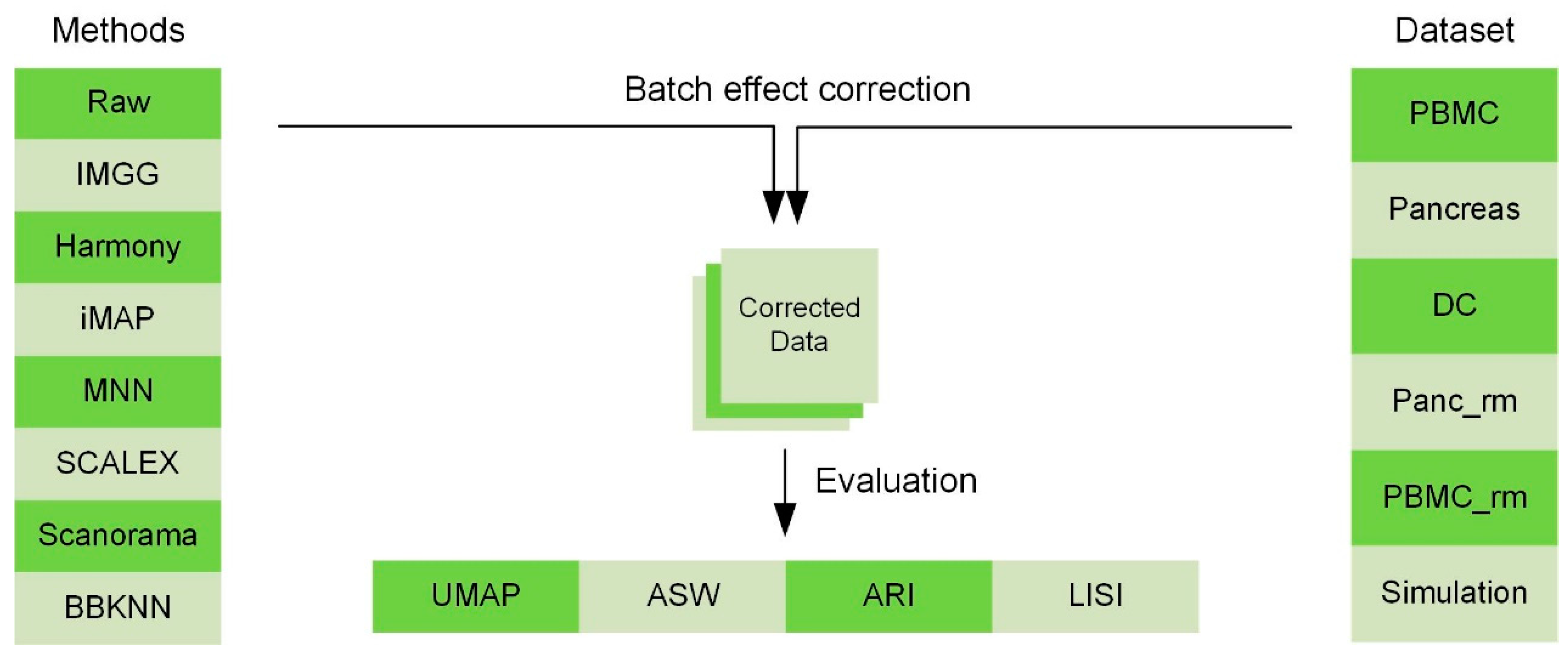
2. Results
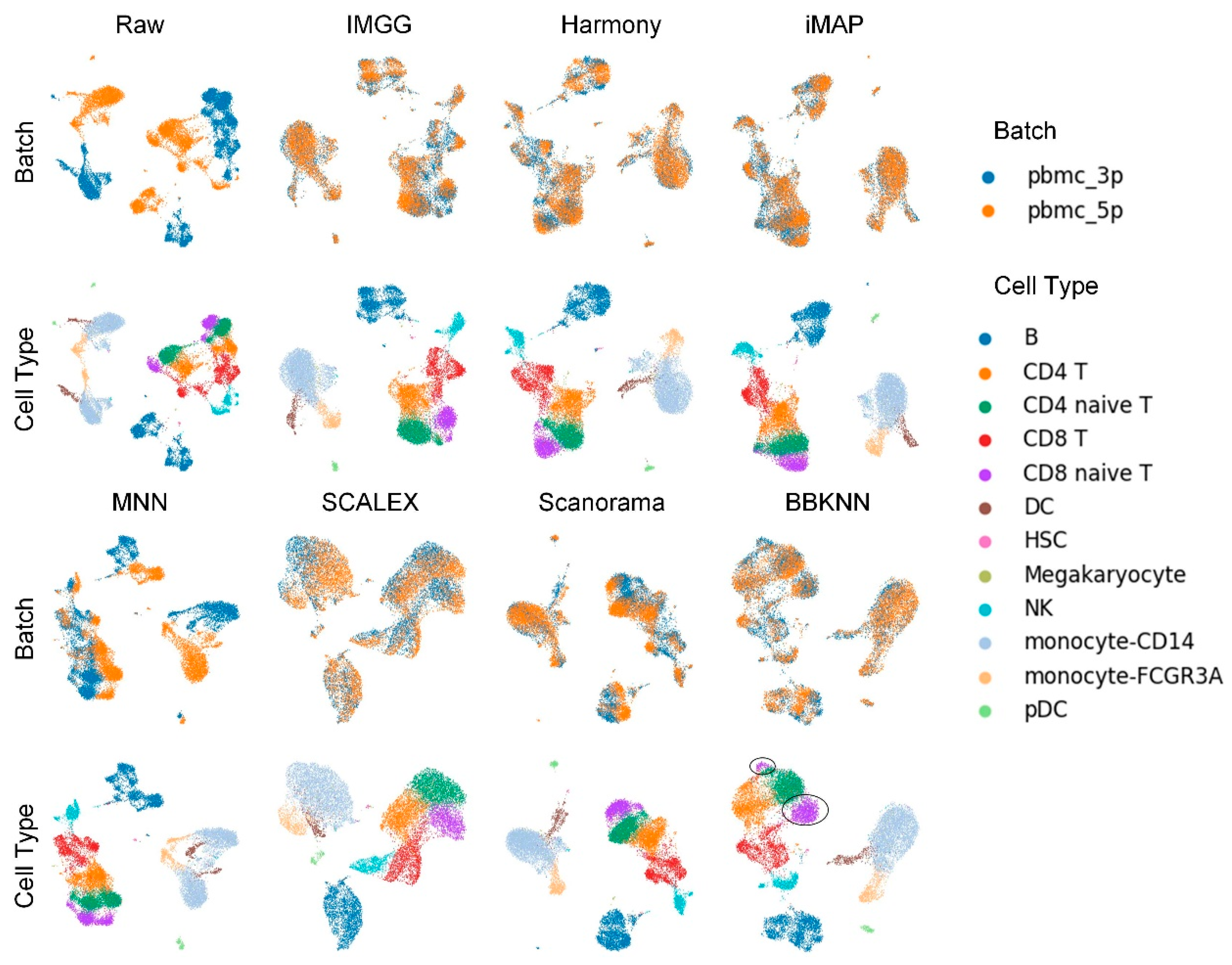
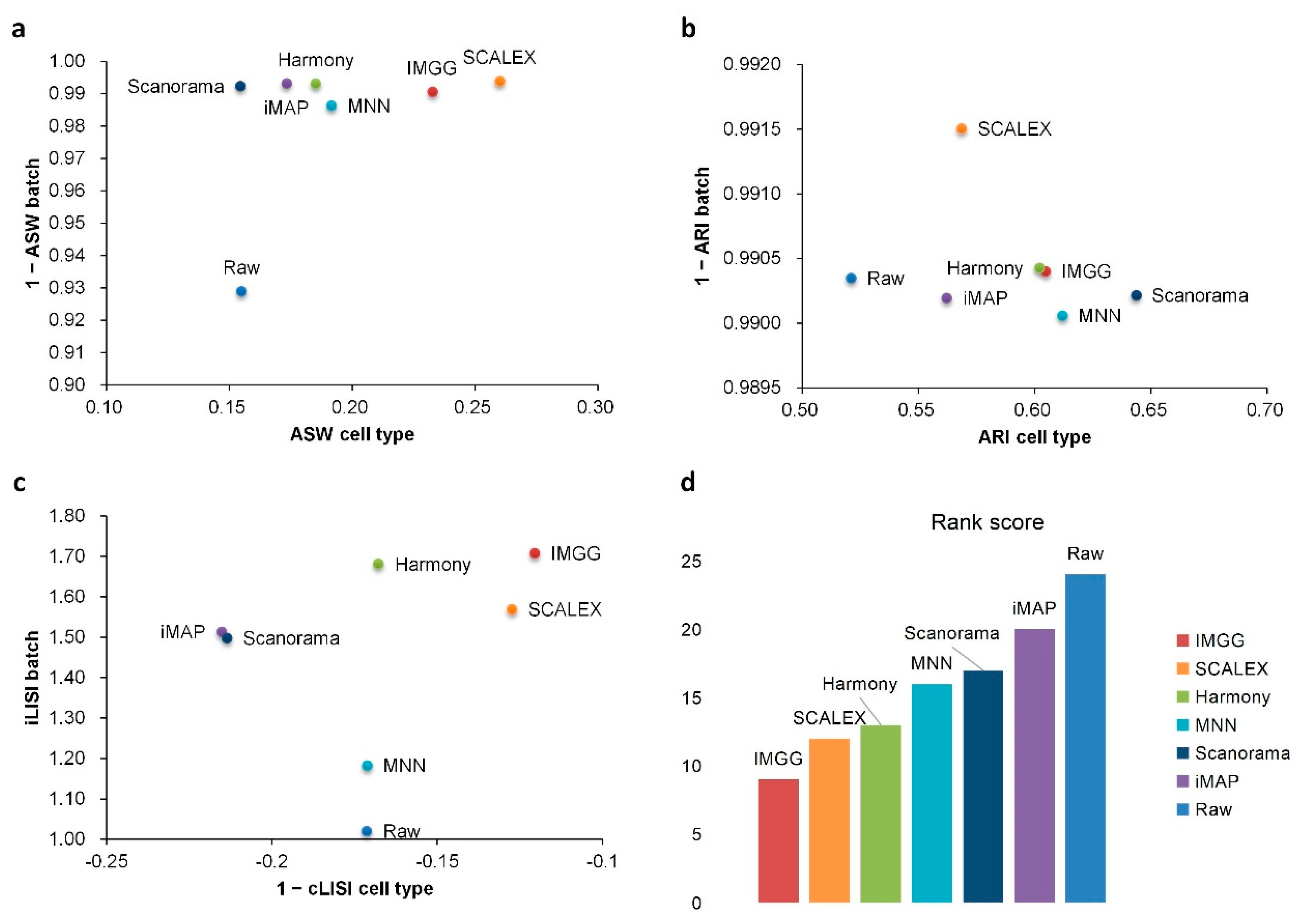
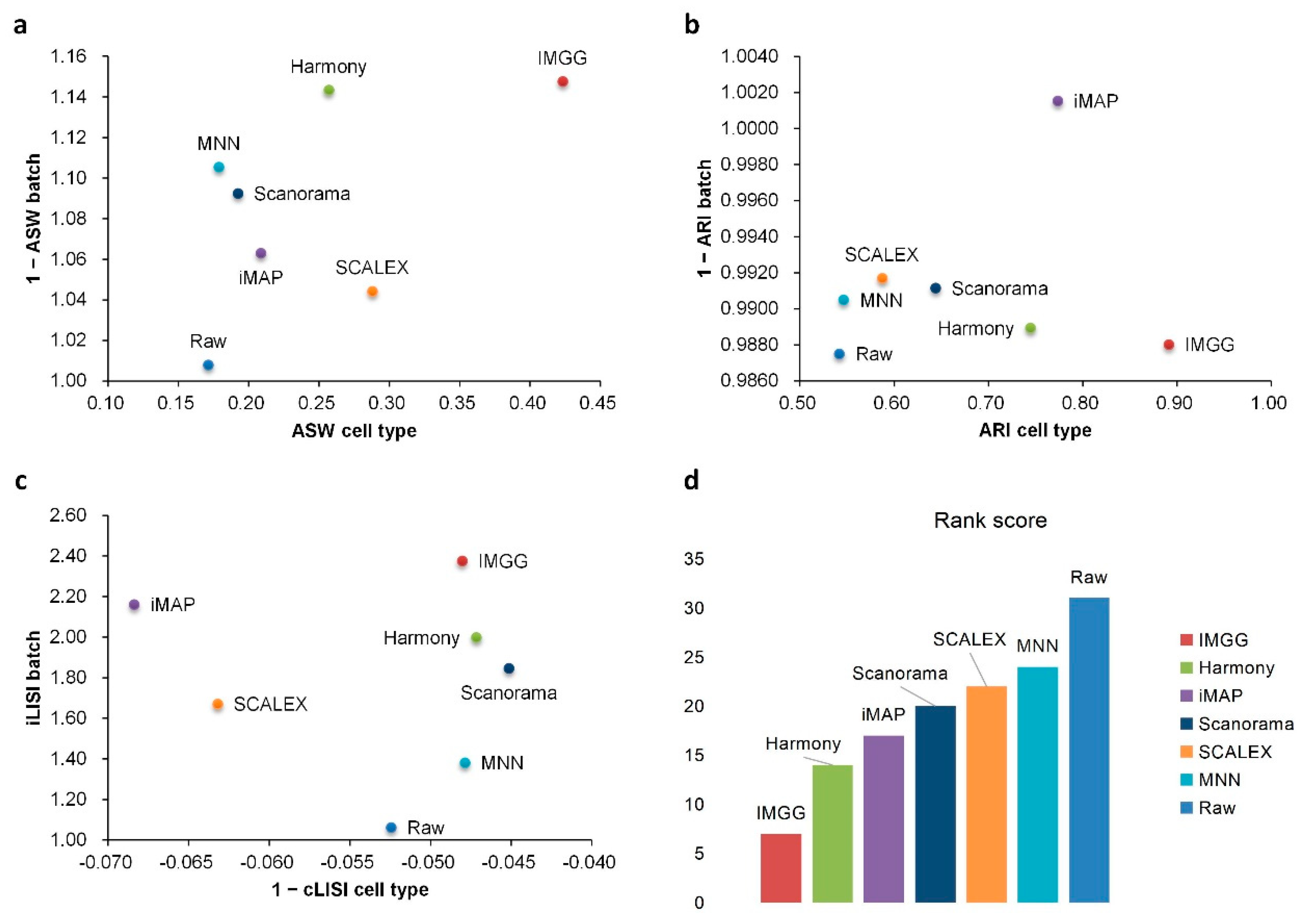
2.1. IMGG Outperforms Existing Methods on Two Batches of Overlapping Data
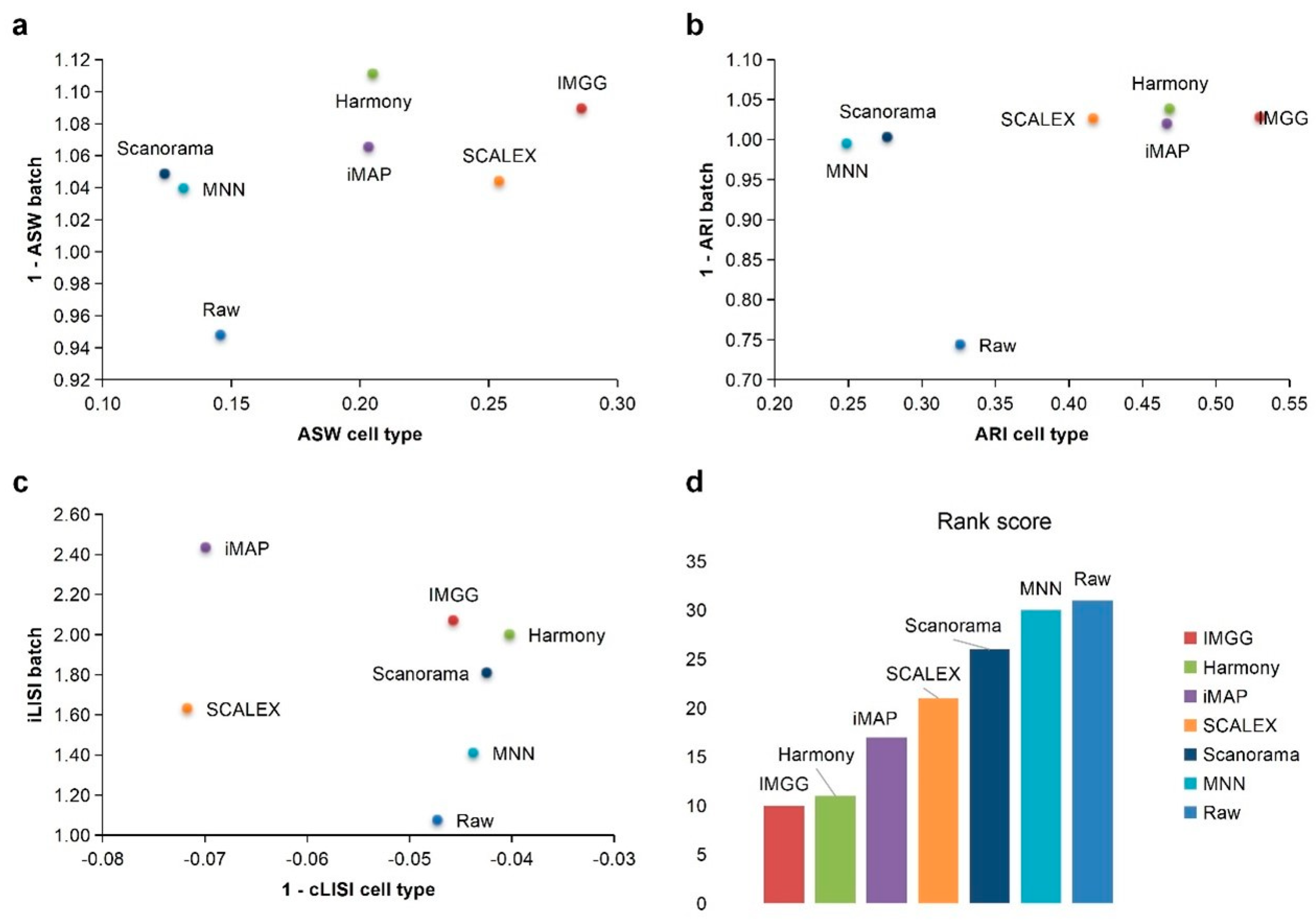
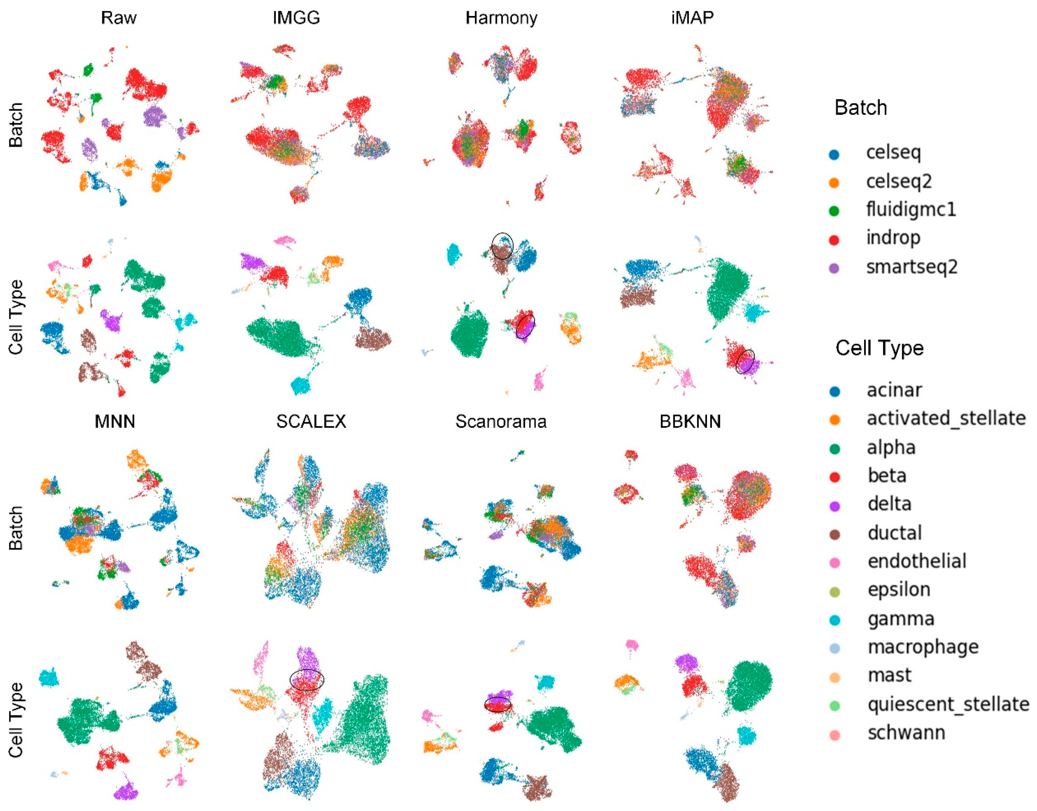
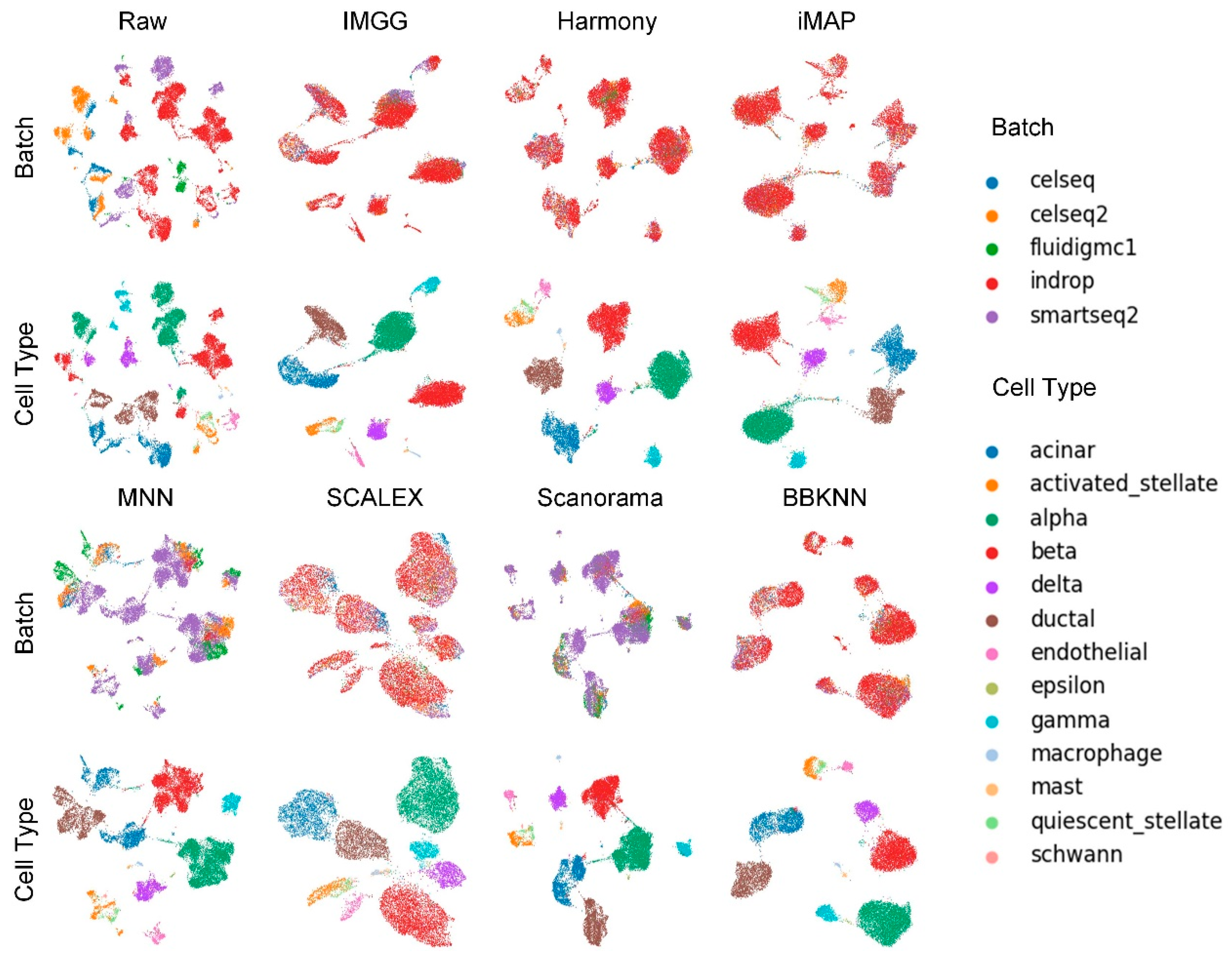
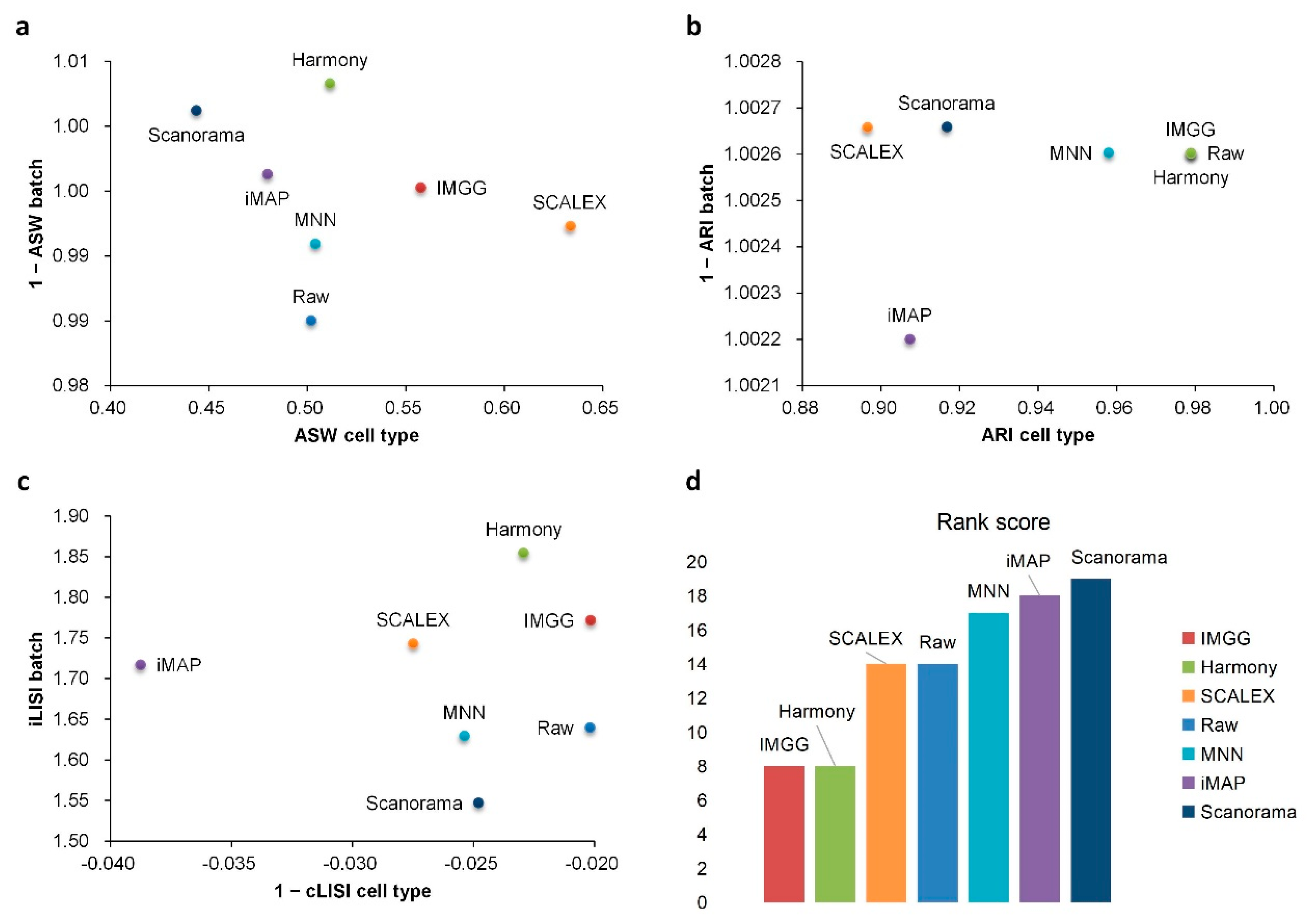
2.2. IMGG Outperforms Existing Methods on Multiple Batches of Overlapping Data
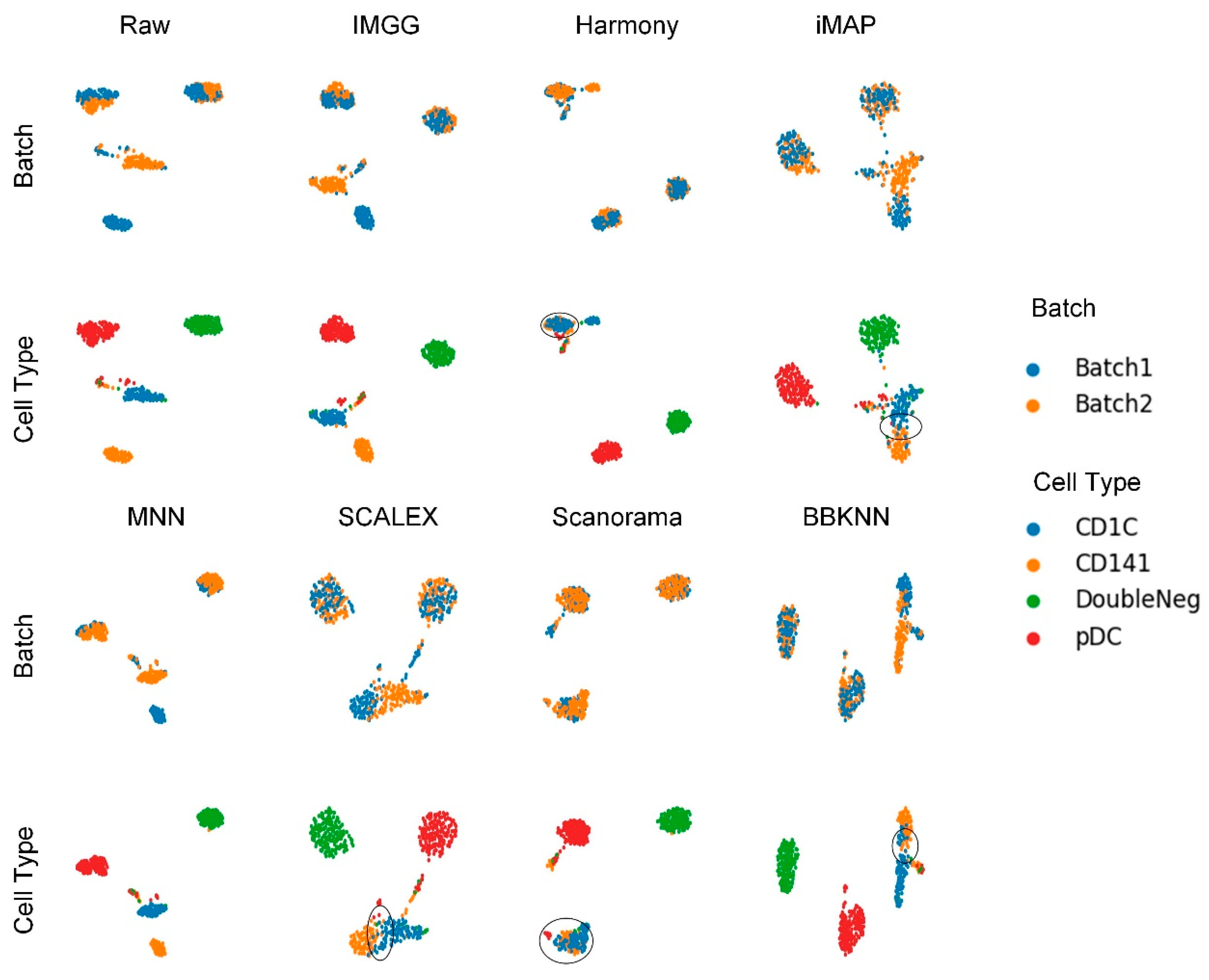
2.3. IMGG Outperforms Existing Methods on Non-Overlapping Data
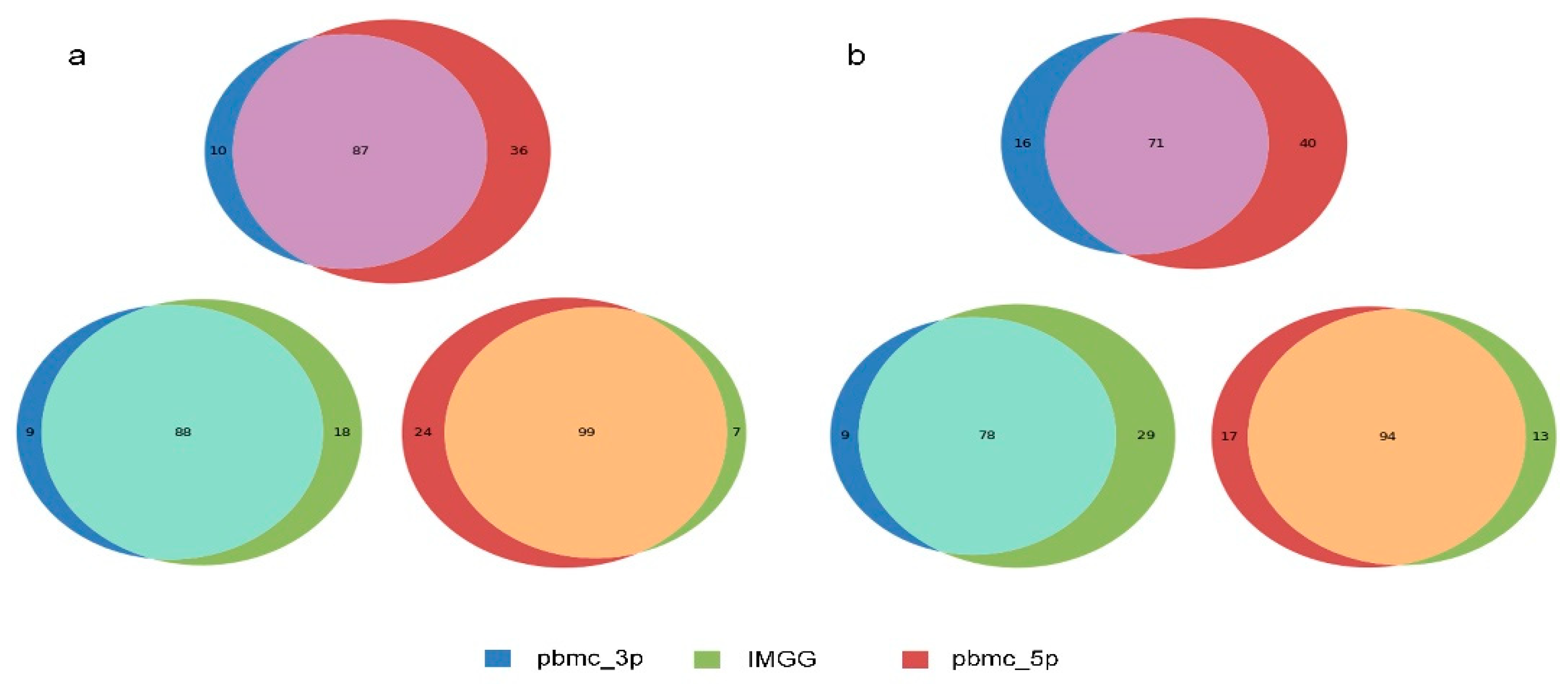
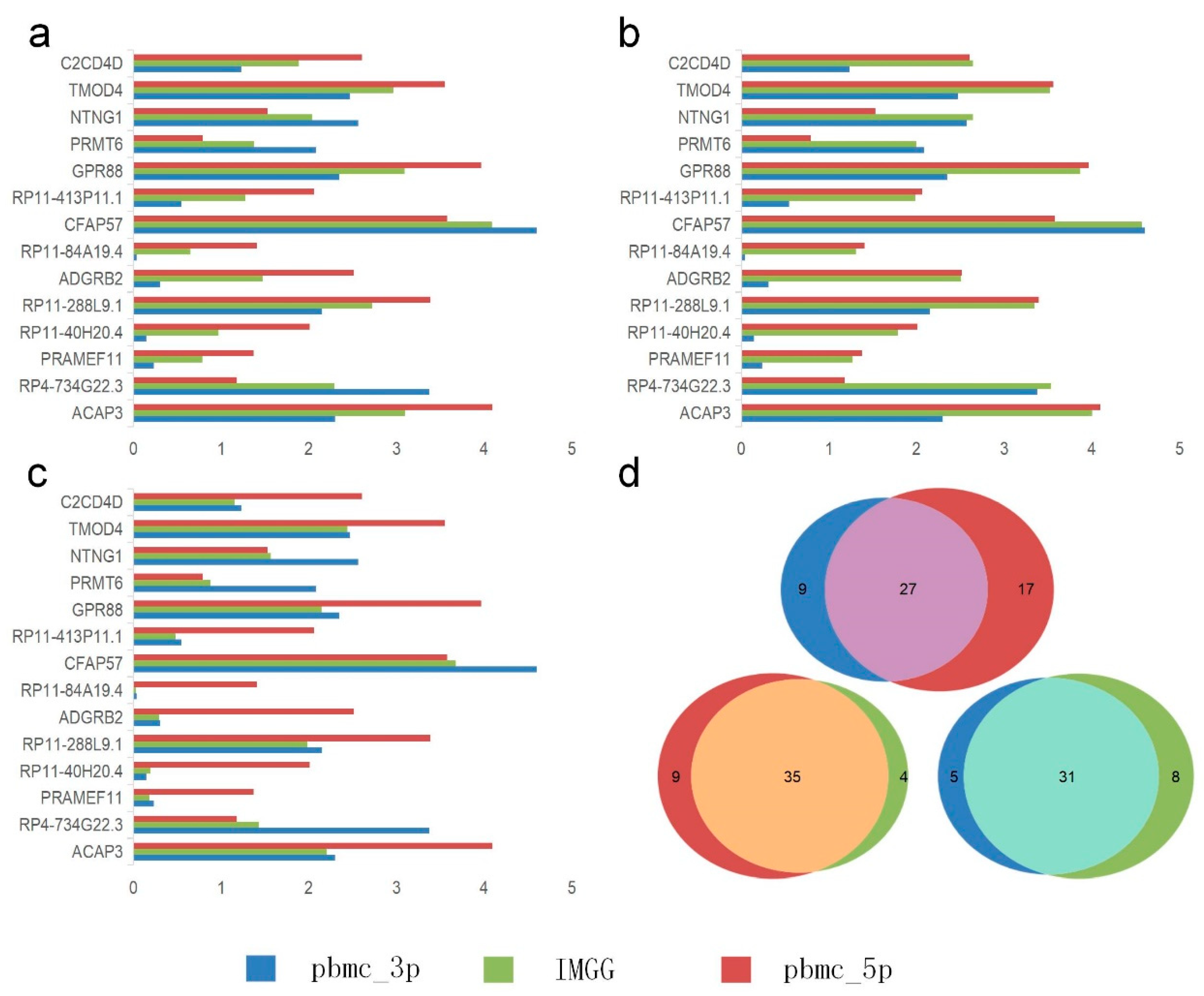
2.4. IMGG-Corrected Data Can Integrate Features from Multiple Batches
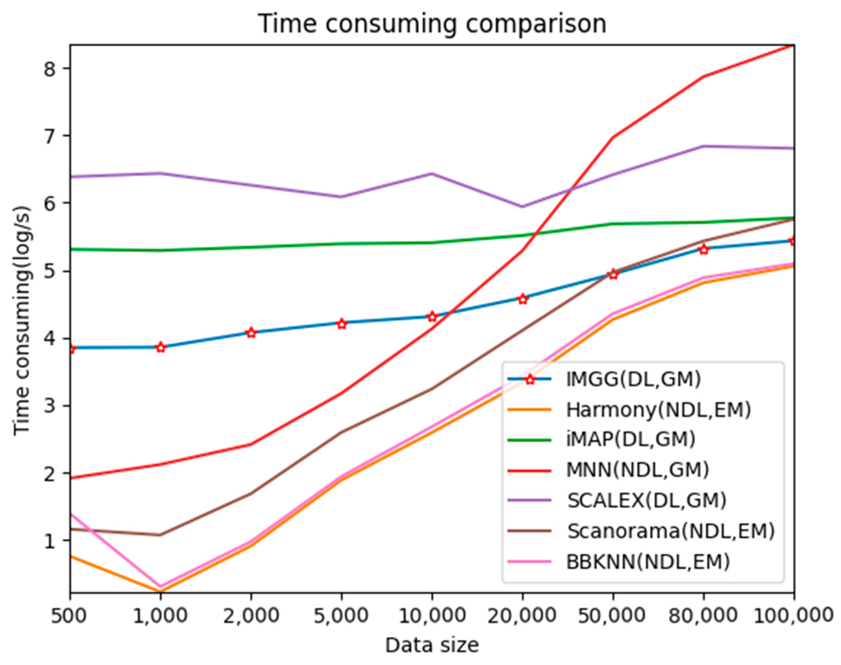
2.5. IMGG Performs at an Excellent Level in Terms of Time Overhead
3. Discussion
4. Materials and Methods
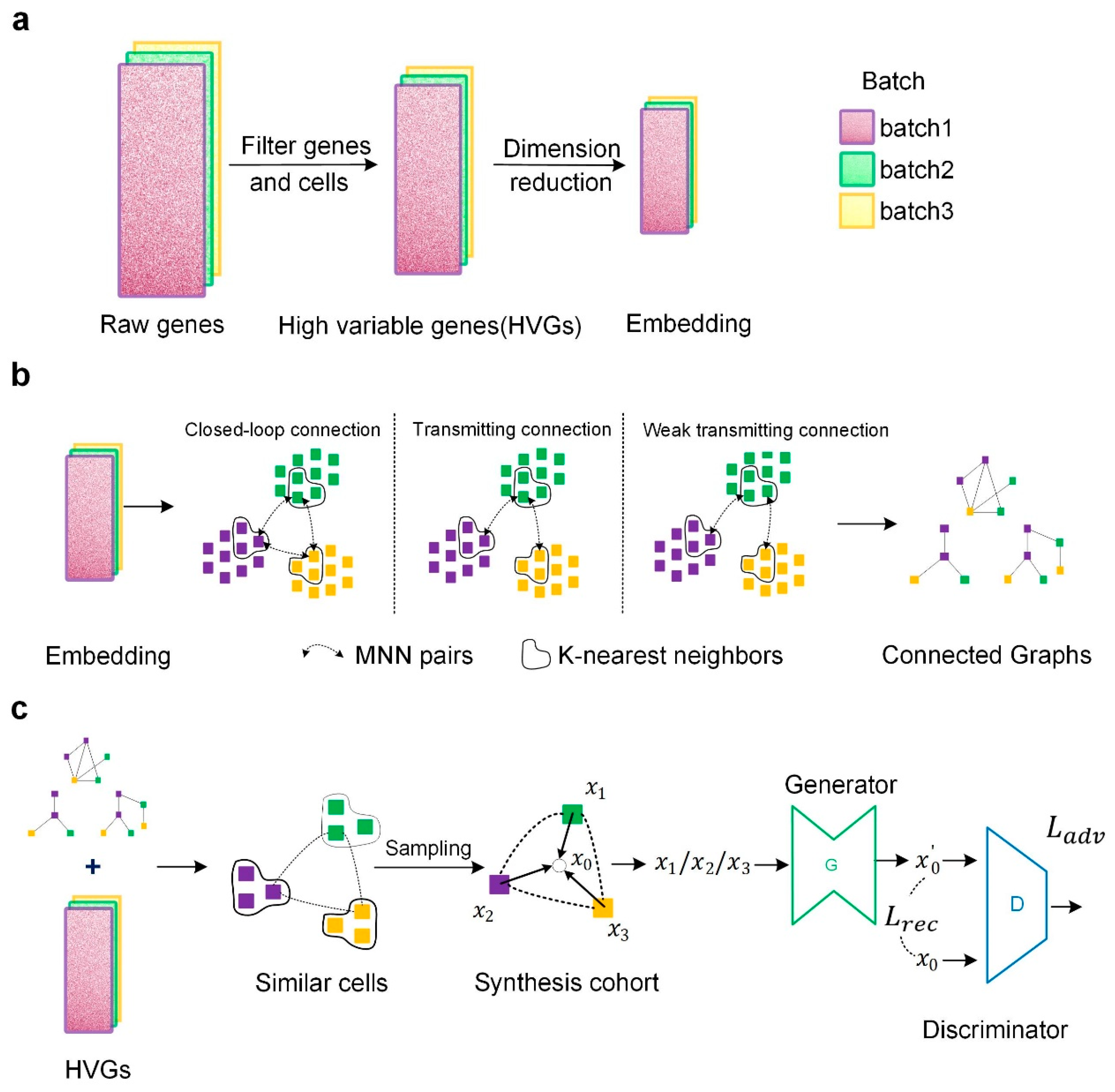
4.1. Data Preprocessing
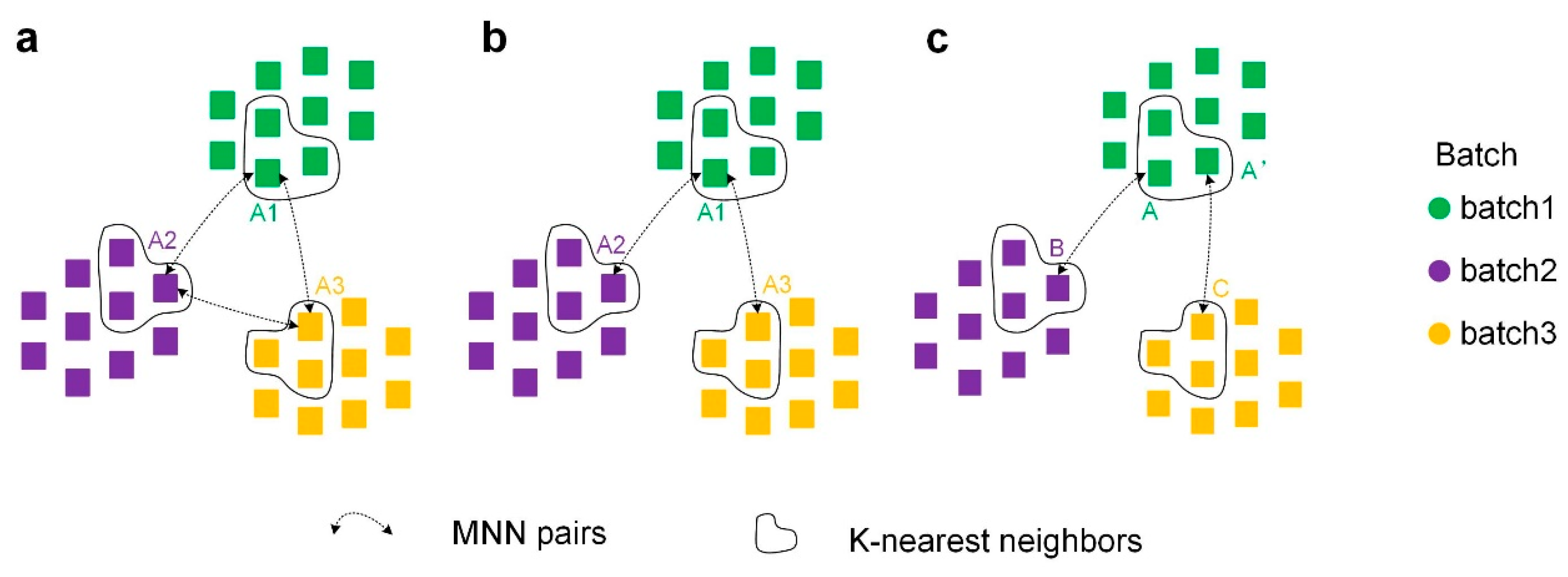
4.2. Constructing Cross-Batch Similar-Cell Connected Graphs
4.3. Correcting Batch Effects by GAN
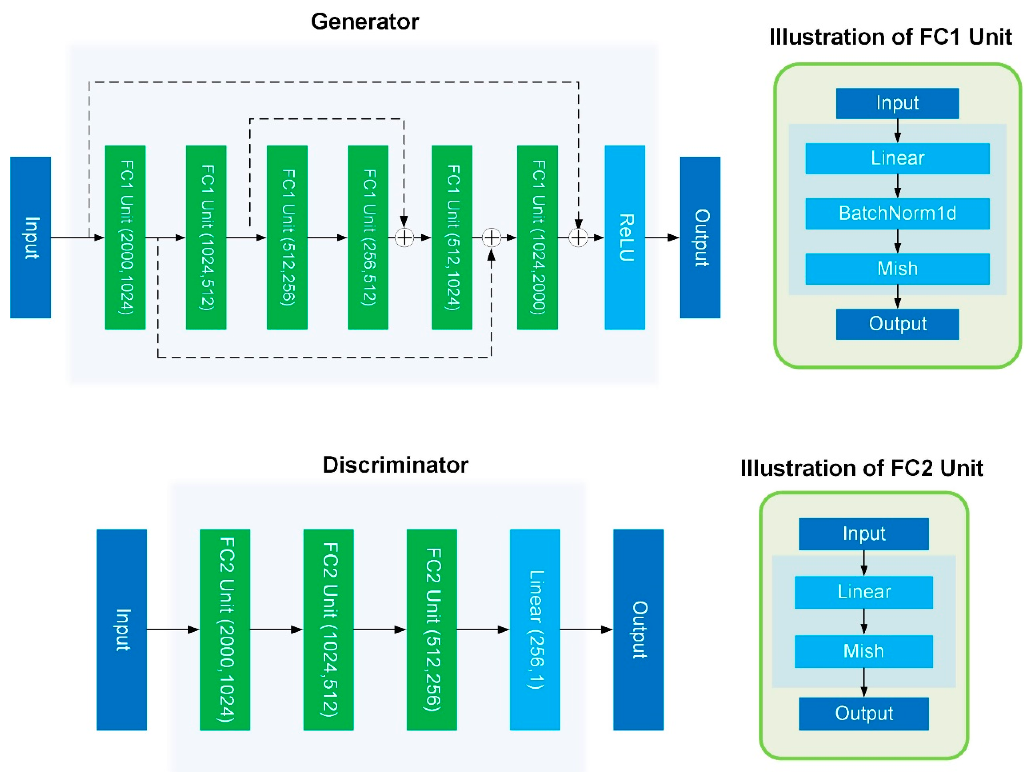
4.4. Model Details
Author Contributions
Funding
Institutional Review Board Statement
Informed Consent Statement
Data Availability Statement
Acknowledgments
Conflicts of Interest
Appendix A
Appendix A.1. Evaluation Indicators
Appendix A.1.1. Average Silhouette Width (ASW)
Appendix A.1.2. Adjusted Rand Index (ARI)
Appendix A.1.3. Local Inverse Simpson’s Index (LISI)
Appendix A.1.4. Differential Gene Expression Analysis (DEG)
Appendix A.1.5. Uniform Manifold Approximation and Projection (UMAP) Visualization
Appendix A.2. Datasets

| Dataset | Description | Batch (Number of Cells) | Number of Cell Types | Genes | Overlap |
|---|---|---|---|---|---|
| PBMC | human peripheral blood mononuclear cells | pbmc_3p (8098) | 12 | 33,694 | True |
| pbmc_5p (7378) | 12 | ||||
| Pancreas | human pancreas | Indrop (8569) | 13 | 34,363 | True |
| smartseq2 (2394) | 13 | ||||
| celseq2 (2285) | 13 | ||||
| Celseq (1004) | 13 | ||||
| fluidigmc1 (638) | 13 | ||||
| DC | human dendritic cells | Batch1 (283) | 3 | 26,593 | False |
| Batch2 (286) | 3 | ||||
| Panc_rm | Panc_rm | Indrop (5147) | 11 | 34,363 | False |
| smartseq2 (1898) | 11 | ||||
| celseq2 (1808) | 11 | ||||
| Celseq (725) | 11 | ||||
| fluidigmc1 (592) | 11 | ||||
| PBMC_rm | PBMC_rm | pbmc_3p (150) | 2 | 33,694 | True |
| pbmc_5p (150) | 2 |
| Number of Cells | Batch1:Batch2:Batch3:Bath4 | Group1:Group2:Group3:Group4 | Genes |
|---|---|---|---|
| 1000 | 1:1:1:1 | 1:1:1:1 | 10,000 |
| 2000 | 1:1:1:1 | 1:1:1:1 | 10,000 |
| 5000 | 1:1:1:1 | 1:1:1:1 | 10,000 |
| 10,000 | 1:1:1:1 | 1:1:1:1 | 10,000 |
| 20,000 | 1:1:1:1 | 1:1:1:1 | 10,000 |
| 50,000 | 1:1:1:1 | 1:1:1:1 | 10,000 |
| 80,000 | 1:1:1:1 | 1:1:1:1 | 10,000 |
| 100,000 | 1:1:1:1 | 1:1:1:1 | 10,000 |
Appendix A.3. Comparison Methods
| Tools | Output | Language | Availability |
|---|---|---|---|
| iMAP [7] | Normalized gene expression matrix | Python | https://github.com/Svvord/iMAP (last access date: 12 February 2022) |
| MNN [6] | Normalized gene expression matrix | Python/R | https://github.com/MarioniLab/MNN2017 (last access date: 12 February 2022) |
| Scanorama [9] | Normalized dimension reduction vectors | Python/R | https://github.com/brianhie/scanorama (last access date: 12 February 2022) |
| Harmony [10] | Normalized feature reduction vectors | Python/R | https://github.com/immunogenomics/harmony (last access date: 12 February 2022) |
| SCALEX [8] | Normalized feature reduction vectors and Normalized gene expression matrix | Python | https://github.com/jsxlei/SCALEX (last access date: 12 February 2022) |
| BBKNN [12] | Connectivity graph and normalized dimension reduction vectors | Python | https://github.com/Teichlab/bbknn (last access date: 12 February 2022) |
Appendix A.4. Experiment 1

Appendix A.5. Experiment 2

Appendix A.6. Experiment 3
| Batch | |||
|---|---|---|---|
| Raw | 0.511844 | 0.505531 | 0.518933 |
| pbmc_3p | 0.496737 | 0.498288 | 0.511863 |
| pbmc_5p | 0.578334 | 0.574564 | 0.590644 |
| IMGG-corrected | 0.703968 | 0.70964 | 0.714085 |
Appendix A.7. Detailed Evaluation Index Score Data
| Method | ASW|Rank | ARI|Rank | LISI|Rank | Total Ranking Score | |||
|---|---|---|---|---|---|---|---|
| Raw | 0.93|2 | 0.15|5 | 0.99|1 | 0.52|6 | 1.02|7 | −0.17|3 | 24 |
| IMGG | 0.99|1 | 0.23|2 | 0.99|1 | 0.60|3 | 1.71|1 | −0.12|1 | 9 |
| Harmony | 0.99|1 | 0.19|3 | 0.99|1 | 0.60|3 | 1.68|2 | −0.17|3 | 13 |
| iMAP | 0.99|1 | 0.17|4 | 0.99|1 | 0.56|5 | 1.51|4 | −0.22|5 | 20 |
| MNN | 0.99|1 | 0.19|3 | 0.99|1 | 0.61|2 | 1.18|6 | −0.17|3 | 16 |
| SCALEX | 0.99|1 | 0.26|1 | 0.99|1 | 0.57|4 | 1.57|3 | −0.13|2 | 12 |
| Scanorama | 0.99|1 | 0.15|5 | 0.99|1 | 0.64|1 | 1.50|5 | −0.21|4 | 17 |
| Method | ASW|Rank | ARI|Rank | LISI|Rank | Total Ranking Score | |||
|---|---|---|---|---|---|---|---|
| Raw | 1.01|7 | 0.17|7 | 0.99|2 | 0.54|7 | 1.06|7 | −0.05|1 | 31 |
| IMGG | 1.15|1 | 0.42|1 | 0.99|2 | 0.89|1 | 2.38|1 | −0.05|1 | 7 |
| Harmony | 1.14|2 | 0.26|3 | 0.99|2 | 0.74|3 | 2.00|3 | −0.05|1 | 14 |
| iMAP | 1.06|5 | 0.21|4 | 1.00|1 | 0.77|2 | 2.16|2 | −0.07|3 | 17 |
| MNN | 1.11|3 | 0.18|6 | 0.99|2 | 0.55|6 | 1.38|6 | −0.05|1 | 24 |
| SCALEX | 1.04|6 | 0.29|2 | 0.99|2 | 0.59|5 | 1.67|5 | −0.06|2 | 22 |
| Scanorama | 1.09|4 | 0.19|5 | 0.99|2 | 0.64|4 | 1.85|4 | −0.05|1 | 20 |
| Method | ASW|Rank | ARI|Rank | LISI|Rank | Total Ranking Score | |||
|---|---|---|---|---|---|---|---|
| Raw | 0.99|2 | 0.50|4 | 1.00|1 | 0.98|1 | 1.64|5 | −0.02|1 | 14 |
| IMGG | 1.00|1 | 0.56|2 | 1.00|1 | 0.98|1 | 1.77|2 | −0.02|1 | 8 |
| Harmony | 1.00|1 | 0.51|3 | 1.00|1 | 0.98|1 | 1.85|1 | −0.02|1 | 8 |
| iMAP | 1.00|1 | 0.48|5 | 1.00|1 | 0.91|4 | 1.72|4 | −0.04|3 | 18 |
| MNN | 0.99|2 | 0.50|4 | 1.00|1 | 0.96|2 | 1.63|6 | −0.03|2 | 17 |
| SCALEX | 0.99|2 | 0.63|1 | 1.00|1 | 0.90|5 | 1.74|3 | −0.03|2 | 14 |
| Scanorama | 1.00|1 | 0.44|6 | 1.00|1 | 0.92|3 | 1.55|7 | −0.02|1 | 19 |
| Method | ASW|Rank | ARI|Rank | LISI|Rank | Total Ranking Score | |||
|---|---|---|---|---|---|---|---|
| Raw | 0.95|6 | 0.15|5 | 0.74|6 | 0.33|5 | 1.07|7 | −0.05|2 | 31 |
| IMGG | 1.09|2 | 0.29|1 | 1.03|2 | 0.53|1 | 2.07|2 | −0.05|2 | 10 |
| Harmony | 1.11|1 | 0.21|3 | 1.04|1 | 0.47|2 | 2.00|3 | −0.04|1 | 11 |
| iMAP | 1.06|3 | 0.20|4 | 1.02|3 | 0.47|3 | 2.43|1 | −0.07|3 | 17 |
| MNN | 1.04|5 | 0.13|6 | 0.99|5 | 0.25|7 | 1.41|6 | −0.04|1 | 30 |
| SCALEX | 1.04|5 | 0.25|2 | 1.03|2 | 0.42|4 | 1.63|5 | −0.07|3 | 21 |
| Scanorama | 1.05|4 | 0.12|7 | 1.00|4 | 0.28|6 | 1.81|4 | −0.04|1 | 26 |
References
- Rozenblatt-Rosen, O.; Stubbington, M.J.T.; Regev, A.; Teichmann, S.A. The Human Cell Atlas: From Vision to Reality. Nature 2017, 550, 451–453. [Google Scholar] [CrossRef] [PubMed] [Green Version]
- Hon, C.C.; Shin, J.W.; Carninci, P.; Stubbington, M.J. The Human Cell Atlas: Technical Approaches and Challenges. Brief. Funct. Genom. 2017, 17, 283–294. [Google Scholar] [CrossRef] [PubMed] [Green Version]
- Hicks, S.C.; Townes, F.W.; Teng, M.; Irizarry, R.A. Missing Data and Technical Variability in Single-Cell RNA-Sequencing Experiments. Biostatistics 2017, 19, 562–578. [Google Scholar] [CrossRef] [PubMed]
- Tung, P.Y.; Blischak, J.D.; Hsiao, C.J.; Knowles, D.A.; Burnett, J.E.; Pritchard, J.K.; Gilad, Y. Batch Effects and the Effective Design of Single-Cell Gene Expression Studies. Sci. Rep. 2017, 7, 39921. [Google Scholar] [CrossRef] [PubMed] [Green Version]
- Leek, J.T.; Scharpf, R.B.; Bravo, H.C.; Simcha, D.; Langmead, B.; Johnson, W.E.; Geman, D.; Baggerly, K.; Irizarry, R.A. Tackling the Widespread and Critical Impact of Batch Effects in High-Throughput Data. Nat. Rev. Genet. 2010, 11, 733–739. [Google Scholar] [CrossRef] [Green Version]
- Haghverdi, L.; Lun, A.T.L.; Morgan, M.D.; Marioni, J.C. Batch Effects in Single-Cell RNA-Sequencing Data Are Corrected by Matching Mutual Nearest Neighbors. Nat. Biotechnol. 2018, 36, 421–427. [Google Scholar] [CrossRef]
- Wang, D.; Hou, S.; Zhang, L.; Wang, X.; Zhang, Z. IMAP: Integration of Multiple Single-Cell Datasets by Adversarial Paired Transfer Networks. Genome Biol. 2021, 22, 63. [Google Scholar] [CrossRef]
- Xiong, L.; Tian, K.; Li, Y.; Zhang, Q.C. Construction of Continuously Expandable Single-Cell Atlases through Integration of Heterogeneous Datasets in a Generalized Cell-Embedding Space. bioRxib 2021. [Google Scholar] [CrossRef]
- Hie, B.; Bryson, B.; Berger, B. Efficient Integration of Heterogeneous Single-Cell Transcriptomes Using Scanorama. Nat. Biotechnol. 2019, 37, 685–691. [Google Scholar] [CrossRef]
- Korsunsky, I.; Millard, N.; Fan, J.; Slowikowski, K.; Raychaudhuri, S. Fast, Sensitive and Accurate Integration of Single-Cell Data with Harmony. Nat. Methods 2019, 16, 1289–1296. [Google Scholar] [CrossRef]
- Li, X.; Wang, K.; Lyu, Y.; Pan, H.; Zhang, J.; Stambolian, D.; Susztak, K.; Reilly, M.P.; Hu, G.; Li, M. Deep Learning Enables Accurate Clustering with Batch Effect Removal in Single-Cell RNA-Seq Analysis. Nat. Commun. 2020, 11, 2338. [Google Scholar] [CrossRef] [PubMed]
- Polański, K.; Park, J.E.; Young, M.D.; Miao, Z.; Teichmann, S.A. BBKNN: Fast Batch Alignment of Single Cell Transcriptomes. Bioinformatics 2019, 36, 964–965. [Google Scholar] [CrossRef] [PubMed]
- Mcinnes, L.; Healy, J. UMAP: Uniform Manifold Approximation and Projection for Dimension Reduction. J. Open Source Softw. 2018, 3, 861. [Google Scholar] [CrossRef]
- Rousseeuw, P.J. Silhouettes: A Graphical Aid to the Interpretation and Validation of Cluster Analysis. J. Comput. Appl. Math. 1987, 20, 53–65. [Google Scholar] [CrossRef] [Green Version]
- Hu Be Rt, L.; Arabie, P. Comparing Partitions. J. Classif. 1985, 2, 193–218. [Google Scholar] [CrossRef]
- Tran, H.; Ang, K.S.; Ch Evrier, M.; Zhang, X.; Ch En, J. A Benchmark of Batch-Effect Correction Methods for Single-Cell RNA Sequencing Data. Genome Biol. 2020, 21, 12. [Google Scholar] [CrossRef] [Green Version]
- Zheng, G.; Terry, J.M.; Belgrader, P.; Ryvkin, P.; Bent, Z.W.; Wilson, R.; Ziraldo, S.B.; Wheeler, T.D.; Mcdermott, G.P.; Zhu, J. Massively Parallel Digital Transcriptional Profiling of Single Cells. Nat. Commun. 2017, 8, 14049. [Google Scholar] [CrossRef] [Green Version]
- Grün, D.; Muraro, M.; Boisset, J.C.; Wiebrands, K.; Lyubimova, A.; Dharmadhikari, G.; Van Den Born, M.; Van Es, J.; Jansen, E.; Clevers, H. De Novo Prediction of Stem Cell Identity Using Single-Cell Transcriptome Data. Cell Stem Cell 2016, 19, 266–277. [Google Scholar] [CrossRef] [Green Version]
- Muraro, M.; Dharmadhikari, G.; Grün, D.; Groen, N.; Dielen, T.; Jansen, E.; Vangurp, L.; Engelse, M.; Carlotti, F.; Dekoning, E.P. A Single-Cell Transcriptome Atlas of the Human Pancreas. Cell Syst. 2016, 3, 385–394.e3. [Google Scholar] [CrossRef] [Green Version]
- Lawlor, N.; George, J.; Bolisetty, M.; Kursawe, R.; Sun, L.; Sivakamasundari, V.; Kycia, I.; Robson, P.; Stitzel, M.L. Single-Cell Transcriptomes Identify Human Islet Cell Signatures and Reveal Cell-Type–Specific Expression Changes in Type 2 Diabetes. Genome Res. 2017, 27, 208–222. [Google Scholar] [CrossRef]
- Baron, M.; Veres, A.; Wolock, S.L.; Faust, A.L.; Yanai, I. A Single-Cell Transcriptomic Map of the Human and Mouse Pancreas Reveals Inter- and Intra-Cell Population Structure. Cell Syst. 2016, 3, 346–360.e4. [Google Scholar] [CrossRef] [PubMed] [Green Version]
- Wang, Y.J.; Schug, J.; Won, K.J.; Liu, C.; Naji, A.; Avrahami, D.; Golson, M.L.; Kaestner, K.H. Single-Cell Transcriptomics of the Human Endocrine Pancreas. Diabetes 2016, 65, db160405. [Google Scholar] [CrossRef] [PubMed] [Green Version]
- Villani, A.-C.; Satija, R.; Reynolds, G.; Sarkizova, S.; Shekhar, K.; Fletcher, J.; Griesbeck, M.; Butler, A.; Zheng, S.; Lazo, S.; et al. Single-Cell RNA-Seq Reveals New Types of Human Blood Dendritic Cells, Monocytes, and Progenitors. Science 2017, 356, eaah4573. [Google Scholar] [CrossRef] [PubMed] [Green Version]
- Goodfellow, I.J.; Pouget-Abadie, J.; Mirza, M.; Xu, B.; Warde-Farley, D.; Ozair, S.; Courville, A.; Bengio, Y. Generative Adversarial Networks. Adv. Neural Inf. Process. Syst. 2014, 3, 2672–2680. [Google Scholar] [CrossRef]
- Wolf, F.A.; Angerer, P.; Theis, F.J. SCANPY: Large-Scale Single-Cell Gene Expression Data Analysis. Genome Biol. 2018, 19, 15. [Google Scholar] [CrossRef] [Green Version]
- Misra, D. Mish: A Self Regularized Non-Monotonic Neural Activation Function. arXiv 2019, arXiv:1908.08681. [Google Scholar]
- Gulrajani, I.; Ahmed, F.; Arjovsky, M.; Dumoulin, V.; Courville, A. Improved Training of Wasserstein GANs. arXiv 2017, arXiv:1704.00028. [Google Scholar]
- Kingma, D.; Ba, J. Adam: A Method for Stochastic Optimization. arXiv 2014, arXiv:1412.6980. [Google Scholar]
- Zappia, L.; Phipson, B.; Oshlack, A. Splatter: Simulation of Single-Cell RNA Sequencing Data. Genome Biol. 2017, 18, 174. [Google Scholar] [CrossRef]

Publisher’s Note: MDPI stays neutral with regard to jurisdictional claims in published maps and institutional affiliations. |
© 2022 by the authors. Licensee MDPI, Basel, Switzerland. This article is an open access article distributed under the terms and conditions of the Creative Commons Attribution (CC BY) license (https://creativecommons.org/licenses/by/4.0/).
Share and Cite
Wang, X.; Zhang, C.; Zhang, Y.; Meng, X.; Zhang, Z.; Shi, X.; Song, T. IMGG: Integrating Multiple Single-Cell Datasets through Connected Graphs and Generative Adversarial Networks. Int. J. Mol. Sci. 2022, 23, 2082. https://doi.org/10.3390/ijms23042082
Wang X, Zhang C, Zhang Y, Meng X, Zhang Z, Shi X, Song T. IMGG: Integrating Multiple Single-Cell Datasets through Connected Graphs and Generative Adversarial Networks. International Journal of Molecular Sciences. 2022; 23(4):2082. https://doi.org/10.3390/ijms23042082
Chicago/Turabian StyleWang, Xun, Chaogang Zhang, Ying Zhang, Xiangyu Meng, Zhiyuan Zhang, Xin Shi, and Tao Song. 2022. "IMGG: Integrating Multiple Single-Cell Datasets through Connected Graphs and Generative Adversarial Networks" International Journal of Molecular Sciences 23, no. 4: 2082. https://doi.org/10.3390/ijms23042082
APA StyleWang, X., Zhang, C., Zhang, Y., Meng, X., Zhang, Z., Shi, X., & Song, T. (2022). IMGG: Integrating Multiple Single-Cell Datasets through Connected Graphs and Generative Adversarial Networks. International Journal of Molecular Sciences, 23(4), 2082. https://doi.org/10.3390/ijms23042082