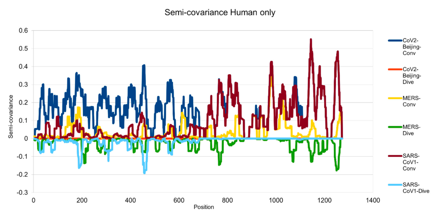
Figure 1.
Semicovariance coefficient among the spike proteins from human coronaviruses SARS-CoV-2, SARS-CoV-1 and MERS. The spike protein sequence of Wuhan SARS-CoV-2 strain is used as a reference for comparison with the spike proteins of SARS-CoV-2 viral strain isolated from Beijing Xinfadi wholesale market (carrying D614G mutation), SARS-CoV-1, and MERS. Mathematically speaking, the diagram/curve above the X-axis is the positive correlation (convergent or conv in the figure). The higher the value, the greater the similarity of charge patterns between the compared viral spike proteins. SARS-CoV2 strain isolated in Beijing Xinfadi wholesale market is the same as the SARS-CoV-2 strain isolated in Wuhan throughout the entire sequence except D614G mutation. SARS-CoV-1 shows a similar pattern with SARS-CoV-2 after amino acid residue 700; while MERS shows a similar pattern with SARS-CoV-2 only around the amino acid sequence 1000. The second similar region of the MERS spike protein sequence with SARS-CoV-2 lies around amino acid residue 200. The diagram/curve below the X-axis is the negative correlation (divergent or dive in the figure). The lower the value, the more oppositely charged, thus the greater the disdissimilarity between the compared viruses. MERS has more opposite charges around amino acid position 200, 800 and 1200 as compared to SARS-CoV-2; while SARS-CoV-1 has a few opposite charges around amino acid position 200 and 450 as compared to SARS-CoV-2, indicating more similarity between the spike proteins from SARS-CoV-1 and SARS-CoV-2 but not between SARS-CoV-2 and MERS.

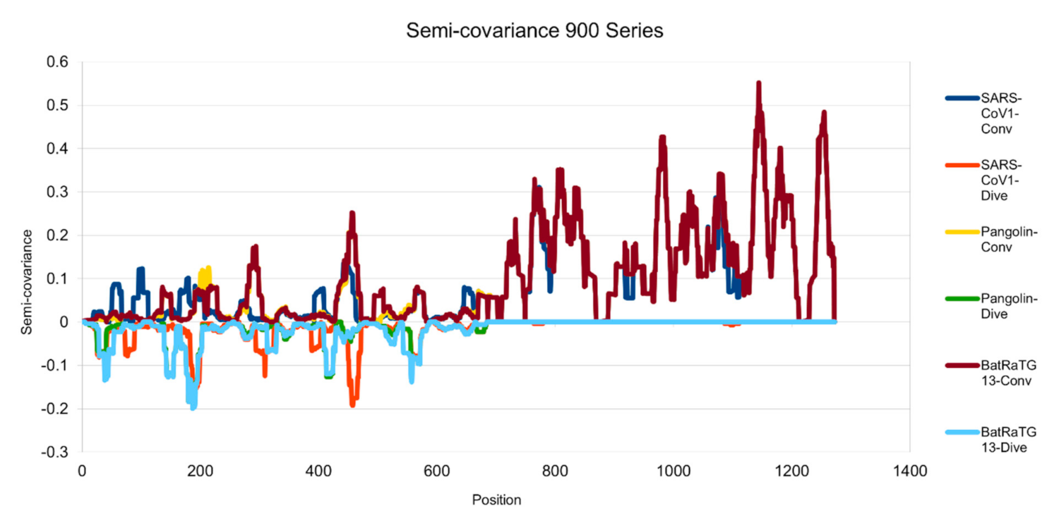
Figure 2.
Semicovariance coefficient of SARS-CoV-2 spike protein with the spike proteins from SARS-CoV-1, pangolin and bat coronaviruses (900 series). The diagram/curve above the X-axis is positive correlation (convergent or conv in the figure). The higher the value, the greater the similarity of the charge patterns between the compared viruses. The spike protein of SARS-CoV-1 is similar to the spike protein of Wuhan SARS-CoV-2 from amino acid residues 700 onwards, as well as the spike proteins from pangolin and bat coronavirus. The spike proteins of SARS-CoV-1, bat and pangolin coronaviruses overlap each other more after amino acid residues 700. The diagram/curve below the X-axis is negative correlation (divergent or dive in the figure). The lower the value, the more oppositely charged, thus the more dissimilarity between the compared viruses. The spike proteins of the pangolin and the bat peak around position 200, suggesting that the charge pattern is not similar at this region or the variations/mutations occurred more at this region between SARS-CoV-2 and the pangolin/bat coronaviruses. Similarly, SARS-CoV-1 peaks around 200 and 450 amino acid residue positions, suggesting that the charge patterns are different between SARS-CoV-1 and SARS-CoV-2 at this region or the mutations have made this region different between the two viruses.

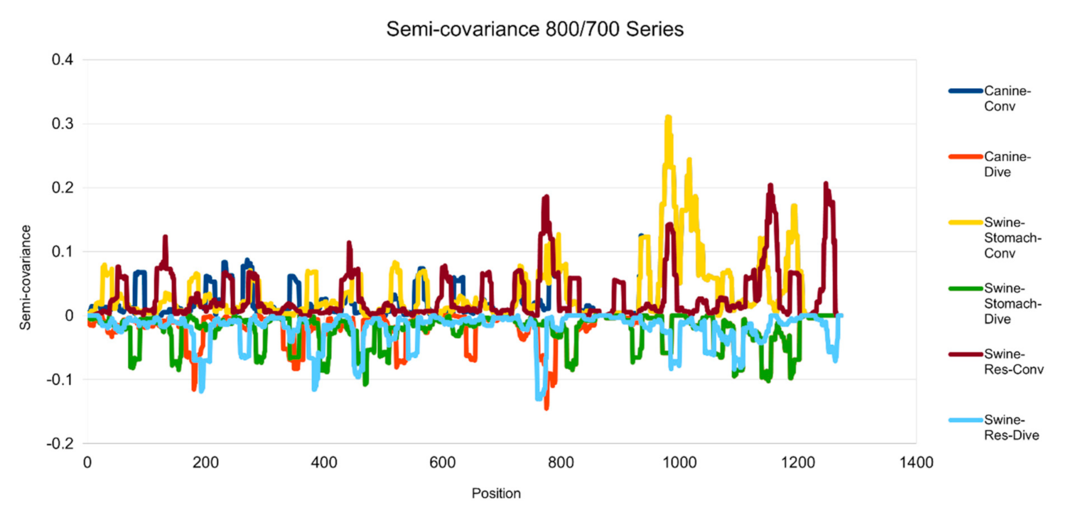
Figure 3.
Semicovariance coefficient of SARS-CoV-2 spike protein with the spike proteins from MERS, canine and swine coronaviruses (700/800 series). The diagram/curve above the X-axis is the positive correlation (convergent or conv in the figure) between the compared viral spike proteins. The higher the value, the greater the similarity of charge patterns among the compared viruses. Canine and swine transmissible gastroenteritis virus (Swine-Stomach) are similar to Wuhan SARS-CoV-2 strain from the amino acid residue 1000 onwards, as well as porcine respiratory coronavirus (Swine-Res), but with less similarity. The diagram/curve below the X-axis is the negative correlation (divergent or dive in the figure). The lower the value, the more oppositely charged and the greater the dissimilarity between the compared viruses are. The spike proteins from canine, swine transmissible gastroenteritis virus (Swine-Stomach) and Swine-Res coronaviruses have opposite charge patterns at different positions. The spike proteins from canine and Swine-Res coronaviruses peak around 800, and the one from Swine-Stomach coronavirus peaks around amino acid residue positions 450 and 1150.

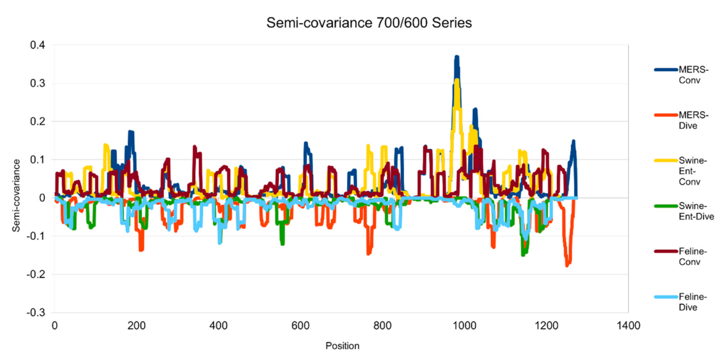
Figure 4.
Semicovariance coefficient of SARS-CoV-2 spike protein with the spike proteins from MERS, swine and feline coronaviruses (700/600 series). The diagram/curve above the X-axis is the positive correlation (convergent or conv in the figure). The higher the value, the greater the similarity of charge patterns between the compared viruses. The spike proteins from MERS and Swine-Ent coronaviruses are similar to Wuhan SARS-CoV-2 around amino acid residues 1000; while the spike protein from feline coronavirus is not similar to Wuhan SARS-CoV-2. The diagram/curve below the X-axis is the negative correlation (divergent or dive in the figure). The lower the value, the more oppositely charged, the greater the dissimilarity between the compared viruses. The spike proteins from MERS, Swine-Ent and feline coronaviruses have opposite charge patterns at different positions. The spike proteins of feline and Swine-Ent coronaviruses peak around 400 and the spike protein of MERS peaks around amino acid residue positions 750 and 1250.

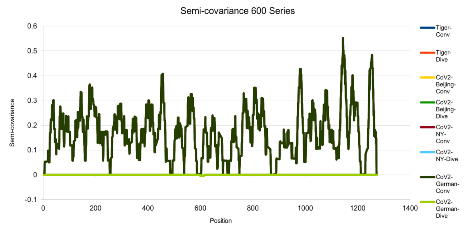
Figure 5.
Semicovariance coefficient of Wuhan SARS-CoV-2 spike protein with the spike proteins of SARS-CoV-2 isolated in Beijing, New York, Germany, and New York Zoo tiger (600 series). The diagram/curve above the X-axis is the positive correlation (convergent or conv in the figure). The higher the value, the greater the similarity of charge patterns between the compared viruses. SARS-CoV-2 isolated in Beijing Xinfadi wholesale market, New York, Germany and the New York zoo tiger overlap and are almost identical to Wuhan SARS-CoV-2. The diagram/curve below the X-axis is the negative correlation (divergent or dive in the figure). The lower the value, the more oppositely charged and the greater the dissimilarity between the compared viruses are. SARS-CoV-2 spike proteins from Beijing, New York, Germany and the New York zoo tiger carry D614G mutation and have the only opposite charge at amino acid residue 614 position (D614G mutation as reported in the literature).
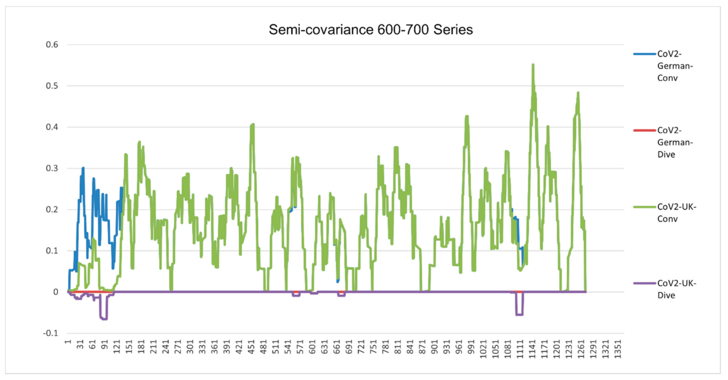
Figure 6.
Semicovariance coefficient of Wuhan SARS-CoV-2 spike protein with the spike proteins of SARS-CoV-2 isolated in UK (variant B.1.1.7) (700 series) and Germany (600 series). The diagram/curve above the X-axis is the positive correlation (convergent or conv in the figure). The higher the value, the greater the similarity of charge patterns between the compared viruses. SARS-CoV-2 variants isolated in the UK (Wales) (B.1.1.7) and Germany are almost identical to Wuhan SARS-CoV-2, except the beginning part of B.1.1.7 is mutated back to SARS-COV-1. The diagram/curve below the X-axis is the negative correlation (divergent or dive in the figure). The lower the value, the more oppositely charged and the greater the dissimilarity between the compared viruses are. The UK variant B.1.1.7 has not only the opposite charge around 600 amino acid residue position (D614G mutation as reported in the literature) but also at the old one around 100 (SARS-CoV-1) and at a new position (1000). The mutation sites occur towards both sides of the 600 series. It flips back more like bat coronavirus as well. The gaps between the mutation sites are as follows: 69 = 3 × 23; 73; 355 = 3 × 71; 69 = 3 × 23; 44 = 2 × 2 × 11; 67; 35 = 5 × 7; 266 = 2 × 7 × 19; 136 = 2 × 2 × 2 × 17; 155 = 5 × 31. There are three groups of prime numbers involved. The first group is 2,3,5, which belongs to cusps modular (Langlands) prime number. It might be related to the fractal shell-like growing structure. The second group is 7, 11, 19, 23, which belongs to 4k + 3 prime number, also called the Gaussian prime number. The latter is a closed field number on a complex plane, meaning that the numbers form a total ordered chain. It might be attribute to the 3D chain structure of the spike protein. The third group is 31, 67, 71, 73, which belongs to the prime numbers of binary digits. It might be attributed to the long folding structure of the protein.

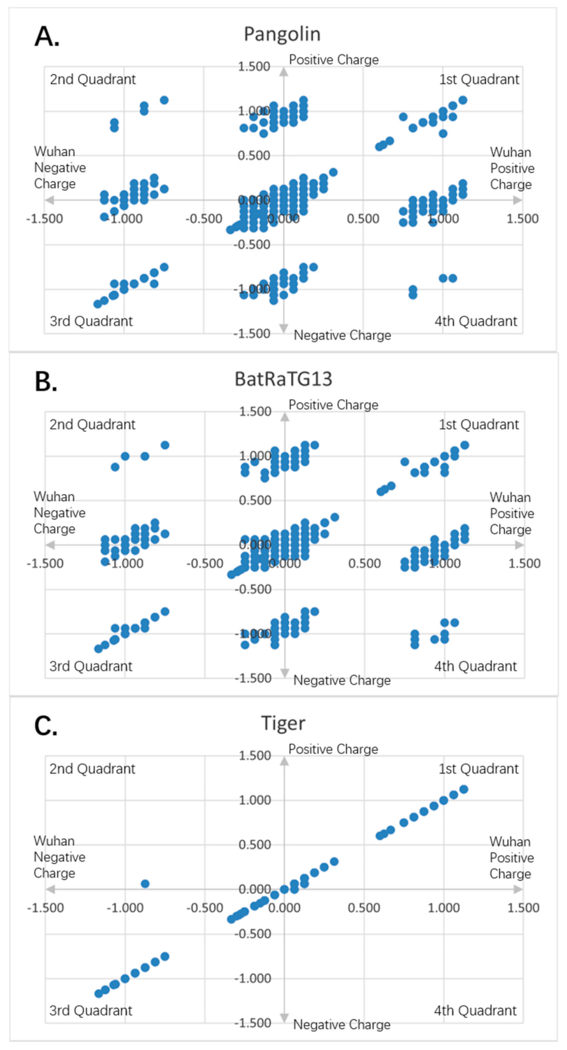
Figure 7.
Charge scatter patterns for spike proteins of pangolin, bat and tiger coronaviruses relative to that of Wuhan strain SARS-CoV-2: (
A) Charge scatter plot of Cartesian coordinates with four quadrants is used to display values for two variables for a set of data. The data are displayed as a collection of points, each having the value of one variable (amino acid charge value from Wuhan strain sequence) to determine the position on the horizontal axis (for Wuhan strain) and the value of the other variable (amino acid charge value from spike protein of pangolin coronavirus) determining the position on the vertical axis (for other). A scatter plot can suggest various kinds of correlations between variables with a certain linear or nonlinear pattern. Correlations may be positive (rising), negative (falling), or neither (uncorrelated). If the pattern of dots slopes from lower left to upper right, it indicates a positive correlation between the variables being studied. If the pattern of dots slopes from upper left to lower right, it indicates a negative correlation. If the dots are continuously connected one after another, it is a simple linear relationship. If the dots form a few islands, it is the nonlinear pattern. The island on the map means there is a domain of related charge event data that is highly correlated within the domain only, but independent from other domains. If both the patterns are there, it is the mixed domain of linear and nonlinear patterns. If within the islands, it is linear, it can be called local linear, globally nonlinear, or piece wised linear. It means only a particular charged piece of the entire sequence is linear correlated within that piece. If the island is viewed as a super dot, and super dots forming a linear relationship, it is called as global linear and local nonlinear. It means the specially charged pieces of the entire sequence are linearly correlated among the pieces. Each piece has its unique electro-biological functions. The first and third quadrants are the pieces where Wuhan strain sequence has the same charge as the pangolin’s. The second and fourth quadrants are the pieces where the Wuhan sequence has the opposite charge to the pangolin viral spike protein. (
B) Charge scatter pattern of spike protein from bat coronavirus relative to that of Wuhan strain SARS-CoV-2. (
C) Charge scatter pattern of spike protein from the coronavirus isolated from the New York Zoo tiger relative to that of Wuhan strain SARS-CoV-2. The charge pattern is identical to
Figure 8A–C, indicating the tiger virus was transmitted from human SARS-CoV-2 strain.

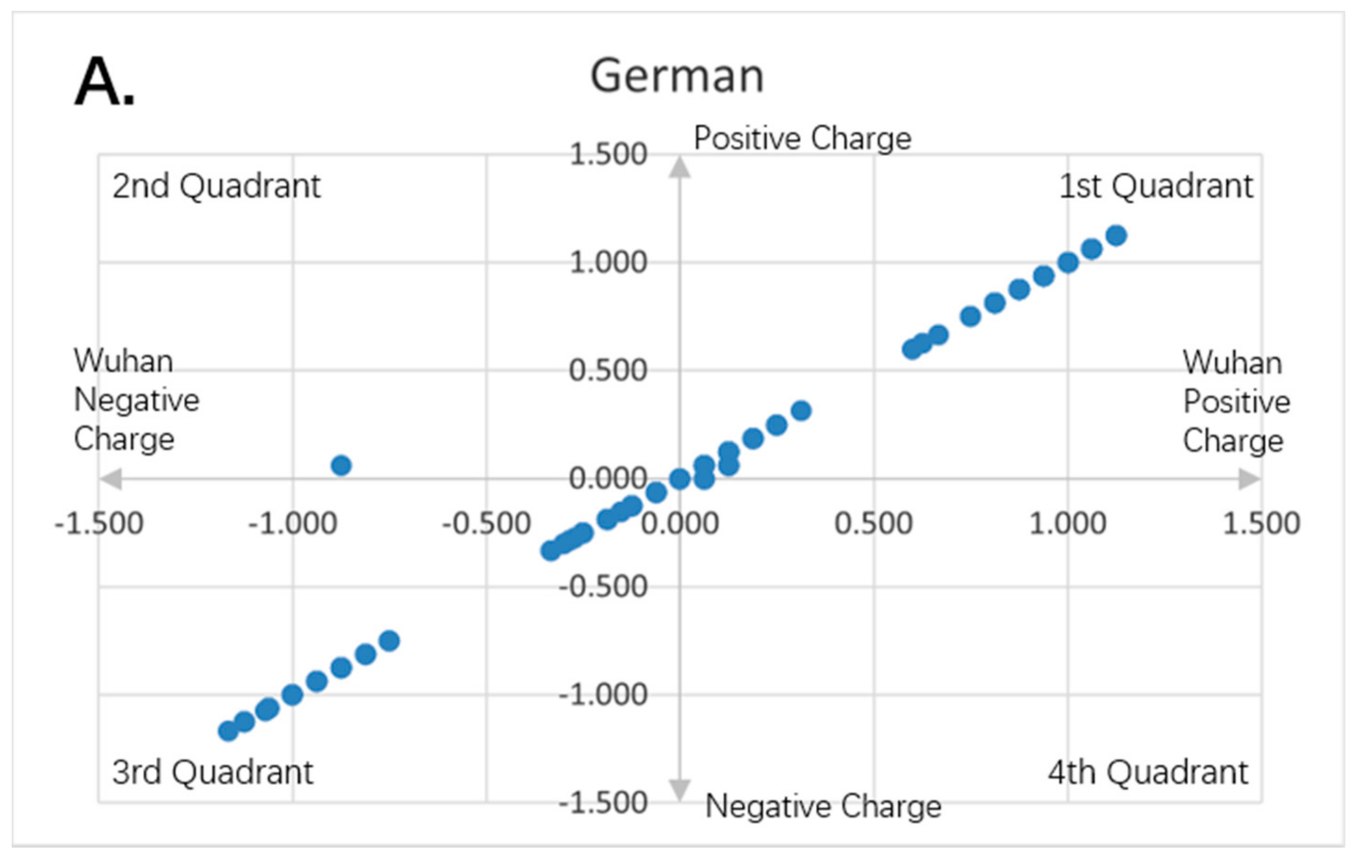
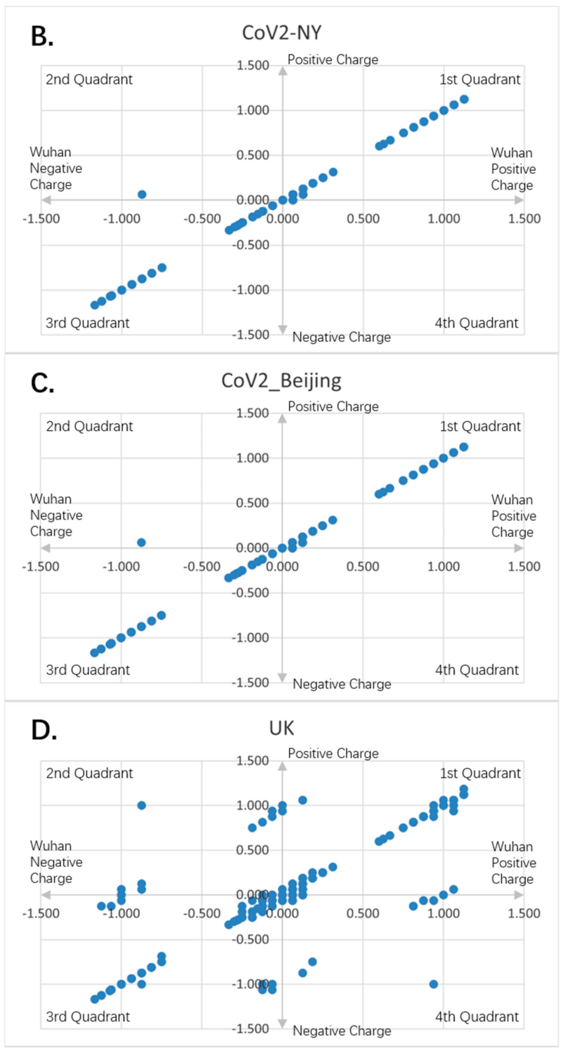
Figure 8.
Charge scatter patterns for spike proteins of SARS-CoV-2 strains isolated from various locations relative to that of Wuhan strain SARS-CoV-2. The first and third quadrants of the graphs are the pieces where Wuhan strain sequence has the same charge as the compared sequence. The second and fourth quadrants are the pieces where Wuhan strain sequence has the opposite charge to the compared spike protein sequence. (A) Charge scatter pattern of spike protein from SARS-CoV-2 strain isolated in German strain relative to that of Wuhan strain SARS-CoV-2. (B) Charge scatter pattern of spike protein from SARS-CoV-2 strain isolated in New York relative to that of Wuhan strain SARS-CoV-2. (C) Charge scatter pattern of spike protein from SARS-CoV-2 strain isolated in Beijing wholesale market relative to that of Wuhan strain SARS-CoV-2. (D) Charge scatter pattern of spike protein from UK variant B.1.1.7 relative to that of Wuhan strain SARS-CoV-2. There is significant dissimilarity between Wuhan strain SARS-CoV-2 and UK variant B.1.1.7 as compared to panels (A–C).


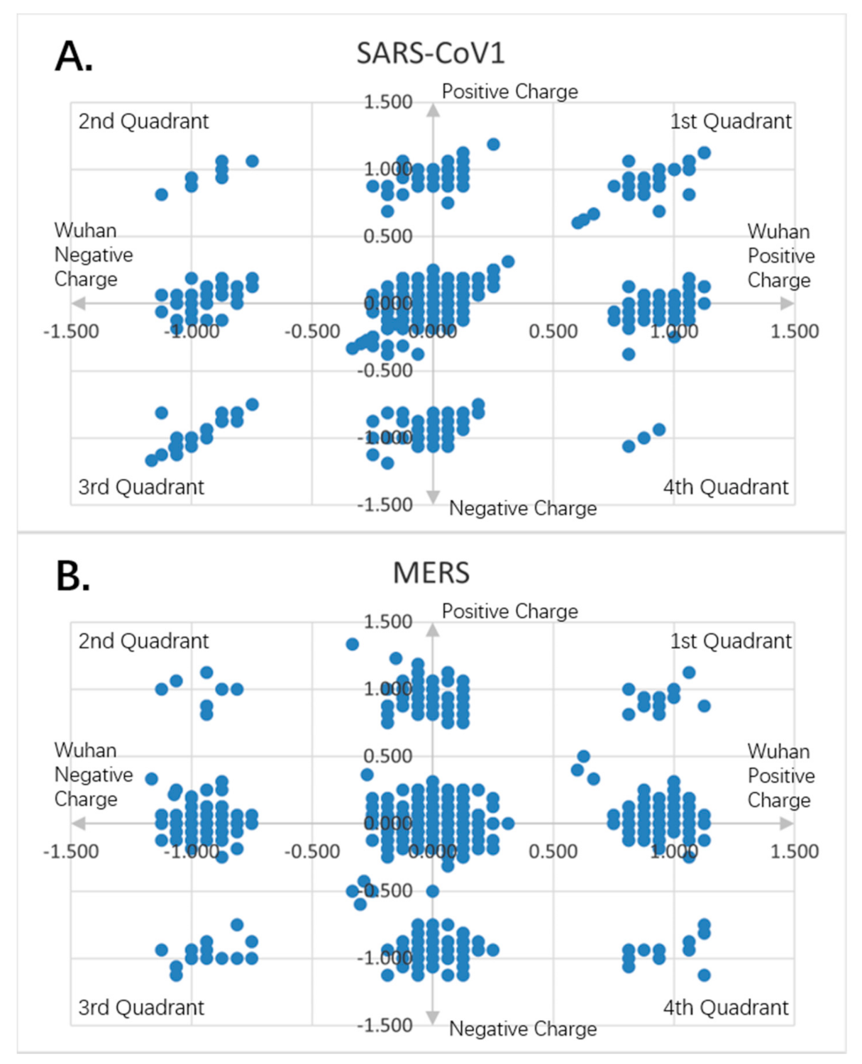
Figure 9.
Charge scatter patterns for spike proteins of SARS-CoV-1 and MERS relative to that of Wuhan SARS-CoV-2 strain. The first and third quadrants of the graphs are the pieces where Wuhan strain sequence has the same charge as the compared sequence. The second and fourth quadrants are the pieces where Wuhan strain sequence has the opposite charge to the compared spike protein sequence. (A) Charge scatter pattern of spike protein from SARS-CoV-1 relative to that of Wuhan SARS-CoV-2 strain. The pattern shows both linear and nonlinear relationship. (B) Charge scatter pattern of spike protein from MERS relative to that of Wuhan SARS-CoV-2 strain. The pattern shows a nonlinear relationship, indicating a strong dissimilarity between MERS and Wuhan strain SARS-CoV-2.
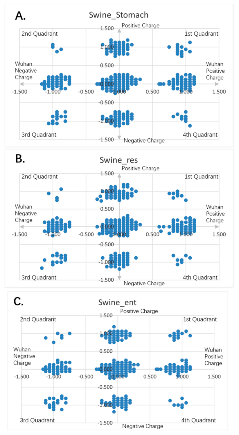
Figure 10.
Charge scatter patterns of spike proteins from animal coronaviruses relative to that of Wuhan strain SARS-CoV-2. The first and third quadrants of the graphs are the pieces where Wuhan strain sequence has the same charge as the compared sequence. The second and fourth quadrants are the pieces where Wuhan strain sequence has the opposite charge to the compared spike protein sequence. (A) Charge scatter pattern for the coronavirus of swine stomach disease relative to that of Wuhan strain SARS-CoV-2. (B) Charge scatter pattern for coronavirus of swine respiratory disease relative to that of Wuhan strain SARS-CoV-2. (C) Charge scatter pattern for coronavirus of swine enteritis relative to that of Wuhan strain SARS-CoV-2. (D) Charge scatter pattern for feline coronavirus relative to that of Wuhan strain SARS-CoV-2. (E) Charge scatter pattern for canine coronavirus relative to that of Wuhan strain SARS-CoV-2. The above patterns show a nonlinear relationship between these viral spike proteins and Wuhan strain spike protein, indicating strong dissimilarity between them.


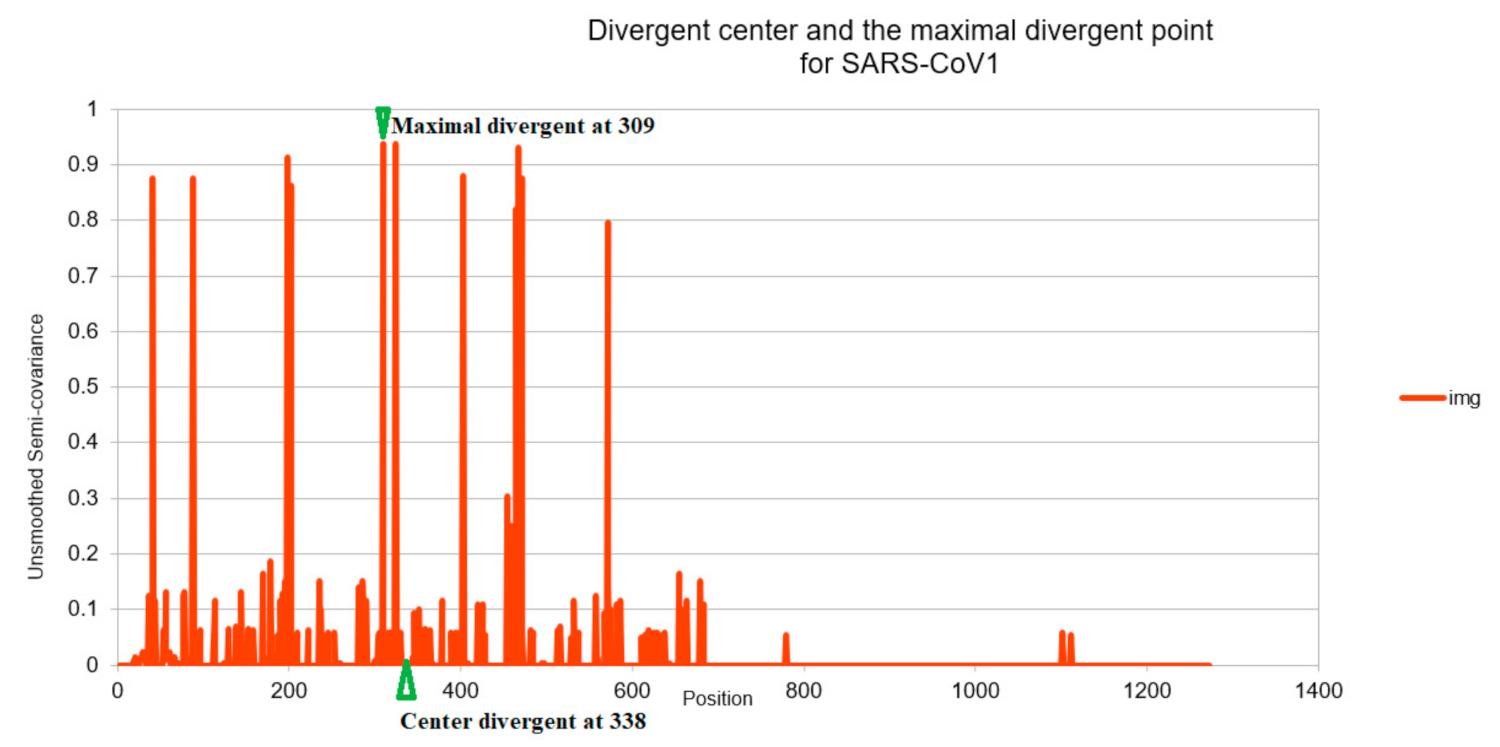
Figure 11.
Charge distance illustration for SARS-CoV-1 relative to SARS-CoV-2. The maximal divergent point is defined as the position where the negative semicovariance before been smoothed (we smoothed
Figure 1,
Figure 2,
Figure 3,
Figure 4,
Figure 5 and
Figure 6 for easier comparison) that obtains the peak value. The divergent center is defined as the position where the center of the charge (related to Coulomb force) of the entire sequence landed on (as if all the charges are originated from that one point). The distance (338−309 = 29) between these two positions (after beingbeen normalized) is proportional to the shift distance (18) between SARS-CoV-1 and the SARS-CoV-2 (Wuhan baseline). It is also proportional to the fatality (9.56%) of the virus (SARS-CoV-1) as seen in
Table 2.
Table 1.
Pearson and Semicovariance Coefficient Analysis of Spike Proteins between Wuhan strain SARS-CoV-2 * and other Coronaviruses.
Table 1.
Pearson and Semicovariance Coefficient Analysis of Spike Proteins between Wuhan strain SARS-CoV-2 * and other Coronaviruses.
| | Pearson Coefficient Analysis |
|---|
| Pearson Rank | 2 | 4 | 3 | 7 | 6 | 10 | 9 | 5 | 1 | 8 | 1 | 1 | 1 | 1 |
| Source of coronaviruses | Pangolin | SARS-CoV1 | Bat RaTG13 | Canine | Swine-Stomach | Swine-Res | MERS | Swine-Ent | CoV2-UK (B117) | Feline | NY-Tiger | CoV2-Beijing | CoV2-NY | CoV2-German |
| Genbank ID/GISAID ID | PCoV_GX-P4L | NC_004718 | QHR63300.2 | AEQ61968.1 | AQT01349 | KR270796.1 | NC_019843.3 | KR061459.1 | EPI_ISL_744131 | ASB16887.1 | MT365033.1 | EPI_ISL_46924 | QKT21302.1 | QJC19431.1 |
| Year of viral isolation | 2020 | 2003 | 2020 | 2012 | 2016 | 2015 | 2012 | 2015 | 2021 | 2017 | 2020 | 2020 | 2020 | 2020 |
| Maximum Pearson Value | 0.4911 | 0.4533 | 0.4727 | 0.0810 | 0.0929 | 0.0655 | 0.0684 | 0.1026 | 0.9043 | 0.0748 | 0.9978 | 0.9978 | 0.9978 | 0.9978 |
| Offset for the above Max # | −6 | −18 | −4 | 179 | 154 | −35 | 74 | 86 | −4 | 161 | 0 | 9 | 0 | 0 |
| | Semicovariance coefficient analysis |
| Convergent-Covariance Rank | 2 | 4 | 3 | 8 | 7 | 10 | 5 | 6 | 1 | 9 | 1 | 1 | 1 | 1 |
| Convergent Correlation | 0.5728 | 0.5421 | 0.5693 | 0.2048 | 0.2190 | 0.1813 | 0.2240 | 0.2228 | 0.9192 | 0.2037 | 0.9981 | 0.9981 | 0.9981 | 0.9981 |
| Divergent-Covariance Rank | 2 | 3 | 4 | 8 | 5 | 7 | 9 | 6 | 1 | 5 | 1 | 1 | 1 | 1 |
| Divergent Correlation | 0.0809 | 0.0887 | 0.0967 | 0.1396 | 0.1411 | 0.1271 | 0.1652 | 0.1256 | 0.0145 | 0.1222 | 0.0003 | 0.0003 | 0.0003 | 0.0003 |
| Series (conserved region) | 900 | 800 | 700 | 600 |
| Center Convergence (conserved center) | 906 | 905 | 904 | 801 | 784 | 751 | 737 | 727 | 702 | 683 | 658 | 658 | 658 | 658 |
| Center Divergence | 318 | 338 | 314 | 691 | 657 | 650 | 698 | 654 | 432 | 635 | 614 | 614 | 614 | 614 |
| Maximal convergent position | 1262 | 1262 | 1262 | 983 | 983 | 1262 | 983 | 983 | 1262 | 278 | 1262 | 1262 | 1262 | 1262 |
| Maximal divergent position | 191 | 309 | 558 | 1107 | 1107 | 775 | 214 | 49 | 97 | 843 | 614 | 614 | 614 | 614 |
| Convergent-rank | 4 | 10 | 2 | 8 | 9 | 5 | 3 | 7 | 1 | 6 | 1 | 1 | 1 | 1 |
| Number convergent irrelevant positions | 76 | 103 | 67 | 81 | 101 | 78 | 75 | 77 | 57 | 79 | 31 | 31 | 31 | 31 |
| Divergent-rank | 3 | 9 | 2 | 8 | 10 | 5 | 4 | 6 | 1 | 7 | 1 | 1 | 1 | 1 |
| Number divergent irrelevant positions | 103 | 73 | 106 | 83 | 68 | 98 | 97 | 94 | 109 | 87 | 123 | 123 | 123 | 123 |
| Over all rank | 2.6 | 6.0 | 2.8 | 7.8 | 7.4 | 7.4 | 6.0 | 6.0 | 1.0 | 7.0 | 1.0 | 1.0 | 1.0 | 1.0 |
Table 2.
Fatality Rate Related to Sequence Structures’ Pearson Correlation Coefficients.
Table 2.
Fatality Rate Related to Sequence Structures’ Pearson Correlation Coefficients.
| Coronaviruses | SARS-CoV-1 | MERS | SARS-CoV-2 |
|---|
| Fatality Rate | 9.56% * | 34.4% * | 2.21% * |
| Offset Value for the Max Pearson | 18 | 74 | 9 |
| Correlation to Offset | 0.9981 |
| Coulomb Center to Max Force Ratio | 338/309 = 1.094 | 698/214 = 3.262 | 614/614 = 1.000 |
| Correlation to Divergence | 0.9958 |


