
Anatomy of a Data Science Software Toolkit That Uses Machine Learning to Aid ‘Bench-to-Bedside’ Medical Research—With Essential Concepts of Data Mining and Analysis Explained


Abstract
:1. Introduction
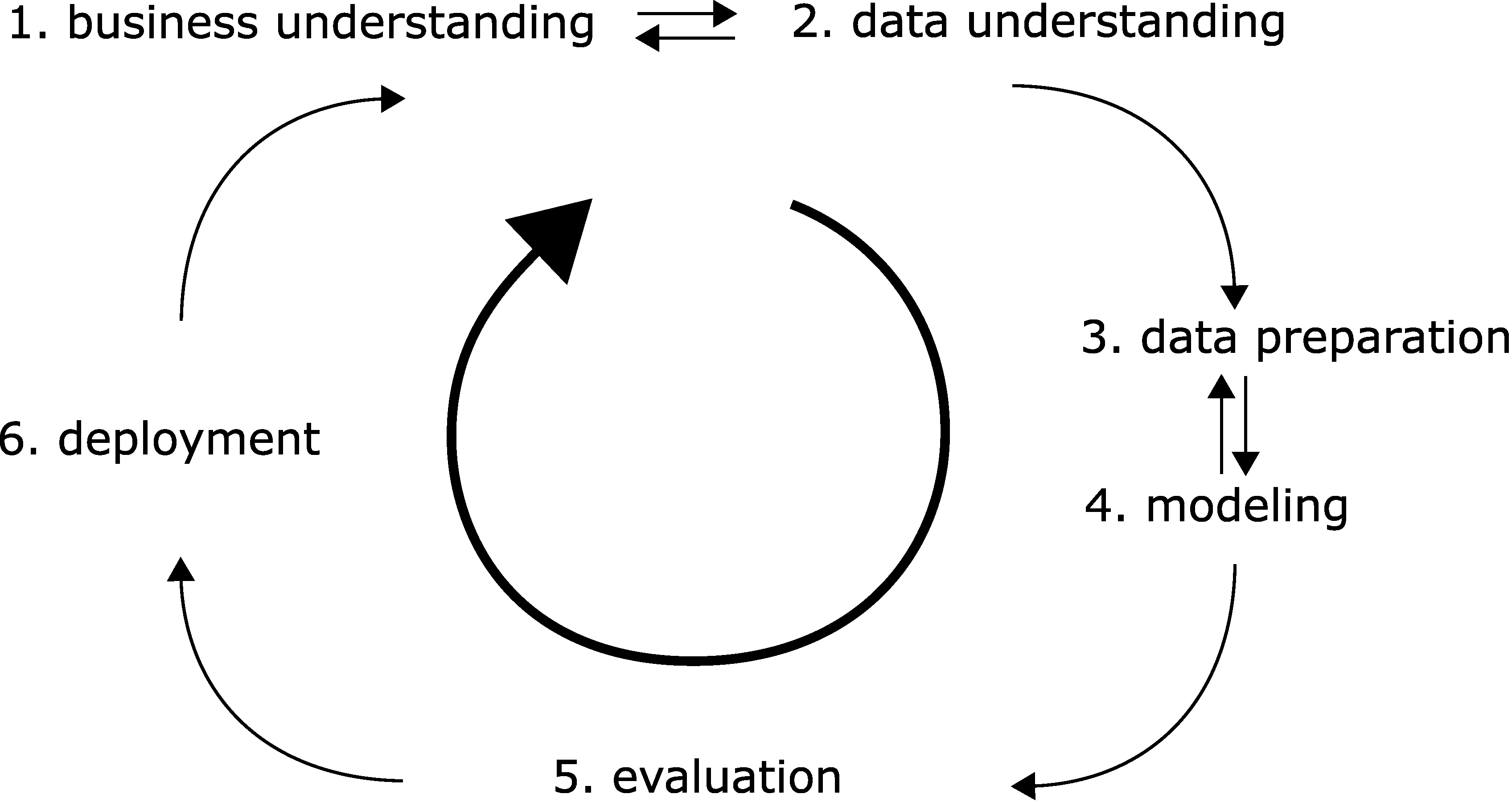
2. Data Science Project Organisation—Industry ’Best Practices’
- Business understanding. In the medical field, we would need to determine if the project is for research purposes only. Do we have obvious clinical implications (with rigorous safety, regulatory and legal requirements)? Do we eye business potential—which in turn may need strict documentation and reporting?
- Data understanding. In the medical and life science field, we often have to gather data via experiments ourselves, and the quality of this data will be crucial. (In the era of big data, many projects may rely on published open data sources.) What data can we gather and in what amount? Can we collect enough in a realistic timeframe? Will the data be sufficient for the questions asked? Do we have good recipes so that the data is reproducible over large timespans, with changing personnel?
- Data preparation. We must gather data from handwritten notes or other sources, collect them in machine-readable form, and normalize or otherwise standardize them. Watch out for reproducibility issues often encountered with difficult experiments. Can our data be quantified and compared across different investigators and with human subjects involved? Even standard laboratory tests may differ in testing methodology. With human subjects, legal issues also arise privacy rights need to be respected, and data anonymized.
- Modelling. We need to use our data—somehow. Do we have continuous variables or categorical ones? Do we have an initial hypothesis to test, or do we need methods that are suitable for ‘walking in the dark’?
- Evaluation. We need to use metrics by which we quantify ‘successes. Do we have concise research questions so that an answer to them can be made? Are we descriptive or do we have new hypotheses as a result? Without clear questions, no metrics will be satisfactory, as metrics are often meaningless themselves. Can we compare our work to that of others via the metrics?
- Deployment. Pure research may result in scientific outputs, such as presentations or scientific papers or openly published datasets. However, does our research yield tangible results such as new scientific hypotheses? Does our research have clinical implications?
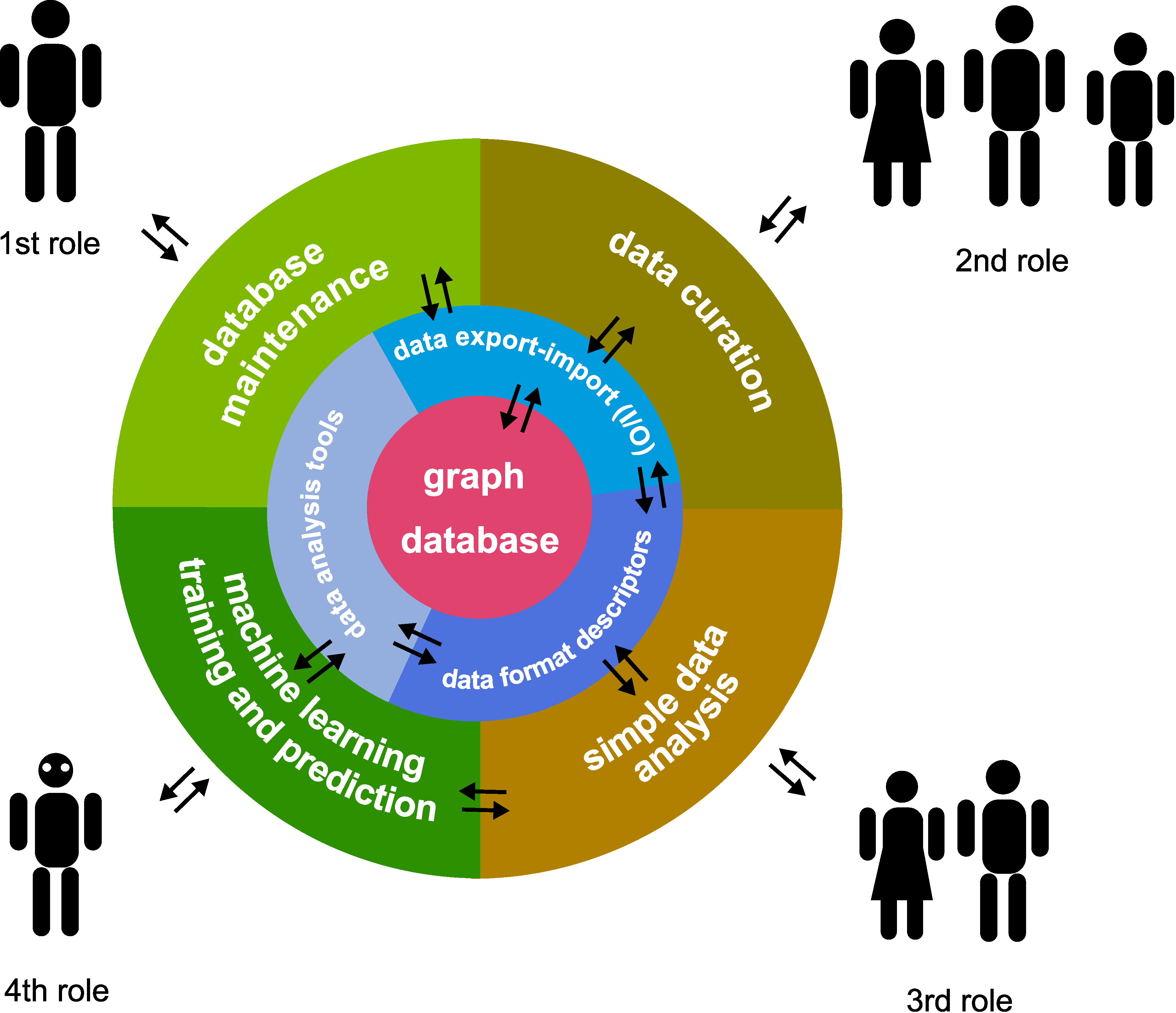
2.1. Software Architecture—Incorporation of ‘Best Practices’ for User-Friendliness
- Assistants, who usually have a narrow, well-defined scope of work.
- Junior researchers (e.g., undergraduate students) and other personnel, who are strongly dependent on input in their work.
- Senior researchers (e.g., postdocs), who are able to work independently with minimal input.
- Principal investigator, who oversees the whole project and sets goals.
- Software/database manager, who manages the software; may not need to be a research person; sets up environment and checks database and software function.
- Data curator, the role of assistants and junior researchers; collects and inputs data into the system.
- Simple data analyser, the role of more senior researchers; may perform simple analyses on certain selected data.
- Complex model builder and analysis, the role of the most senior researchers; sets up different machine learning models.
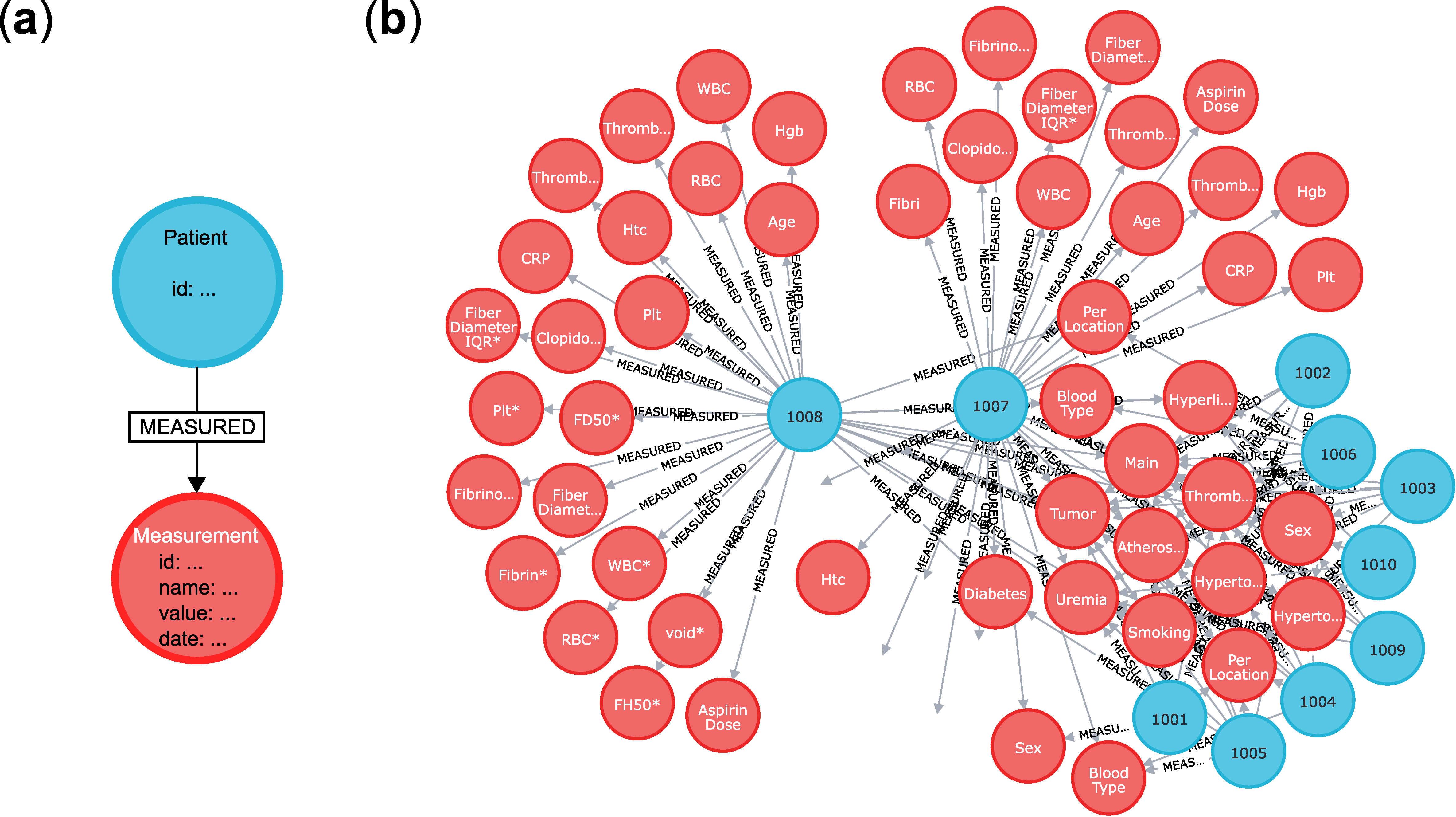
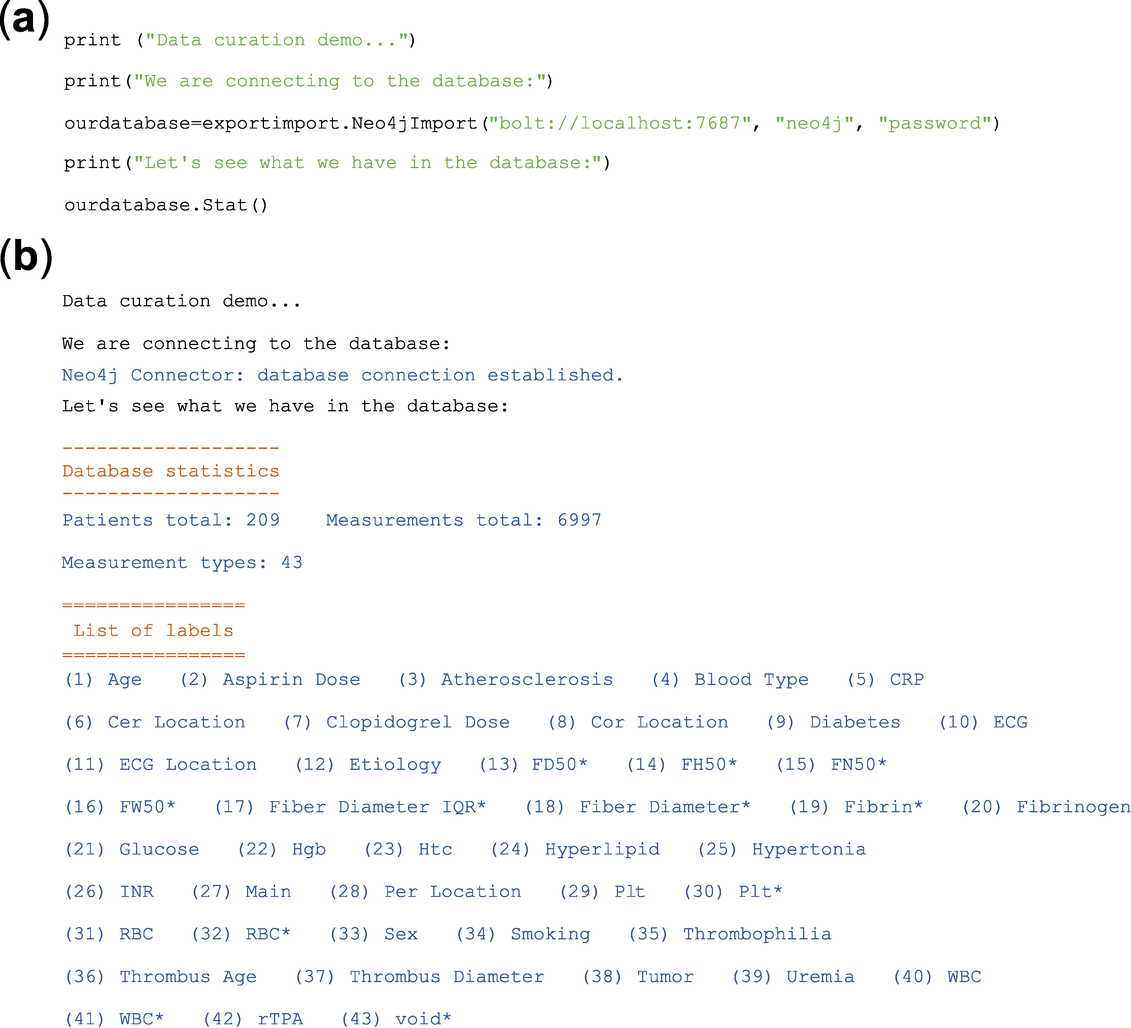
2.2. Data Storage and Organisation—An Up-to-Date Solution Using a Graph Database
2.3. Data Analysis—Typical Tasks, Terms and Algorithms
- Regression/classification analysis. We would like to predict Y from given X. X is the independent variable and Y is the dependent variable (X → Y).
- Hypothesis testing. If, e.g., given two patient populations (YA and YB), is the so-called null hypothesis true? The ‘null hypothesis’ usually is that the two populations are different (YA → X is not equal to YB → X). The ‘alternative hypothesis’ is the opposite, exclusive hypothesis: the two populations are identical.
- Clustering/dimensionality reducing algorithms. Sometimes we do not even have labelled data (here denoted Y), only raw data X. We need algorithms that work when we want to reduce the complexity somehow. In effect, can we cluster/label/group/classify the data based on X alone?
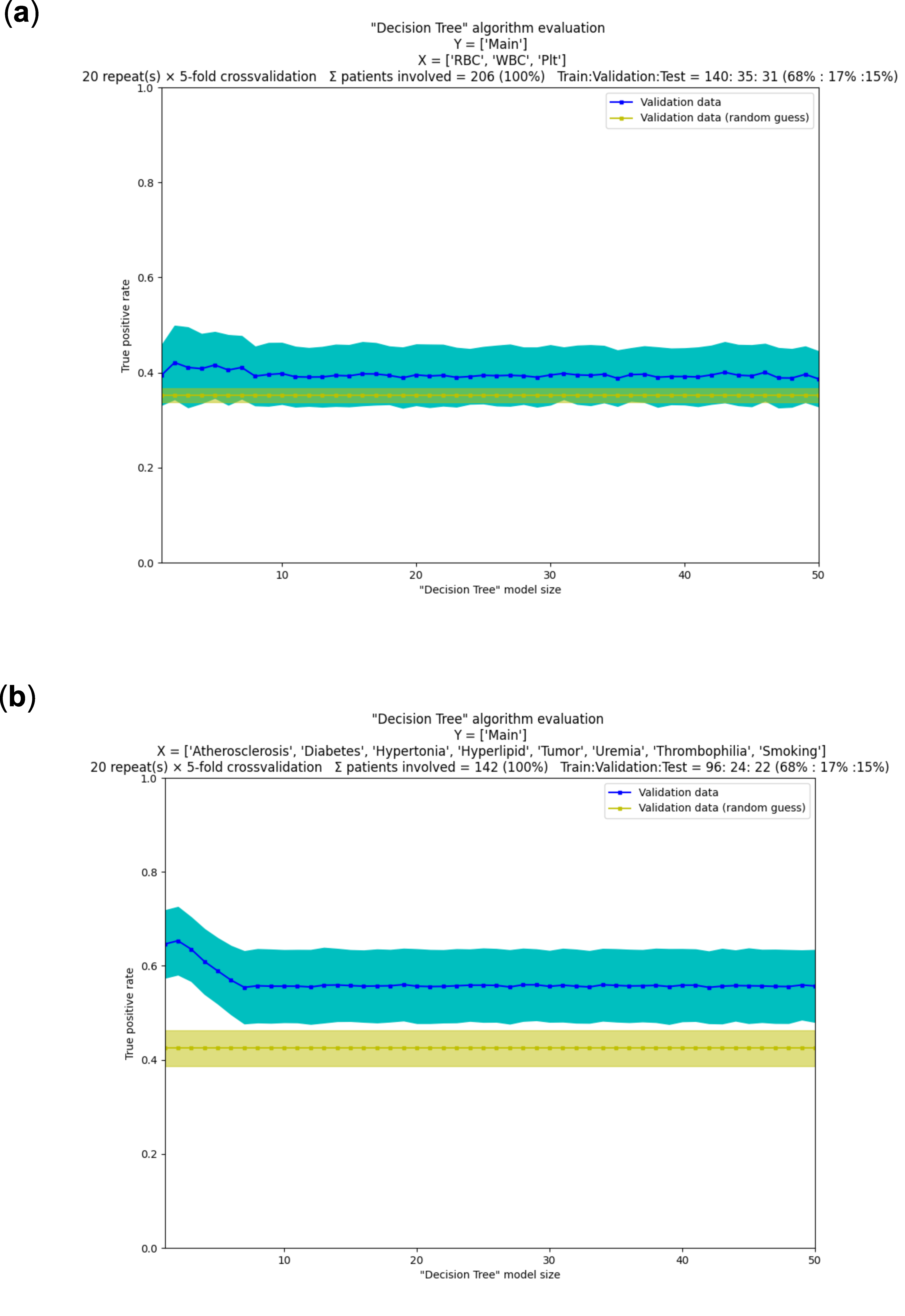
2.4. A Machine Learning Workflow—Common Processes Explained with Examples
3. Conclusions and Remarks
- First, from the perspective of the software developer involved in a ‘decision making’ project, it is notable that software specification is a bottleneck during the initial steps. This often stems from a lack of clarity and vision during the initial stages of the project. Going forward in the project, the tuning of the machine learning models (‘hyperparameter tuning’) becomes the bottleneck and this remains so until the end. Curiously, the choice of algorithms does not appear critical now. Computational capacities are larger than ever, and several highly advanced machine learning methods are available (in fact, often more than needed in a project). Projects, however, may fail easily because of data quality issues, and this brings us to the second set of conclusions below.
- Second, from the perspective of the medical professional, the bottleneck is usually a lack of understanding between them and software specialists during the initial stages of the project. Going forward, the single but often critical bottleneck is the quality of their data. Experiments may span years and may be performed by different personnel over time. This may lead to inconsistent procedures, even if for mundane reasons, e.g., because of no longer available reagents or altered cell lines. These can introduce large systematic errors that make even advanced machine learning algorithms ineffective. Other kinds of experiments are inherently difficult to perform consistently for physical, economical or legal reasons. For example, in our case, the blood clots of ex vivo human origin pose a significant problem, since the number of experiments is severely limited. In summary, medical professionals must do everything to ensure reproducibility and consistency of their experiments and data over long timespans in sufficient quantity.
Author Contributions
Funding
Institutional Review Board Statement
Informed Consent Statement
Data Availability Statement
Conflicts of Interest
References
- The top 10 Causes of Death. Available online: https://www.who.int/news-room/fact-sheets/detail/the-top-10-causes-of-death (accessed on 11 November 2021).
- Santos-Gallego, C.G.; Bayón, J.; Badimón, J.J. Thrombi of Different Pathologies: Implications for Diagnosis and Treatment. Curr. Treat. Options Cardiovasc. Med. 2010, 12, 274–291. [Google Scholar] [CrossRef] [PubMed]
- Undas, A.; Ariëns, R.A.S. Fibrin Clot Structure and Function. Arterioscler. Thromb. Vasc. Biol. 2011, 31, e88–e99. [Google Scholar] [CrossRef] [PubMed] [Green Version]
- Shearer, C. The CRISP-DM Model: The New Blueprint for Data Mining. J. Data Warehous. 2000, 5, 13–22. [Google Scholar]
- Chapman, P.; Clinton, J.; Kerber, R.; Khabaza, T.; Reinartz, T.; Shearer, C.; Wirth, R. Step-by-Step Data Mining Guide. Available online: https://the-modeling-agency.com/crisp-dm.pdf (accessed on 11 November 2021).
- Manifesto for Agile Software Development. Available online: https://agilemanifesto.org/ (accessed on 11 November 2021).
- Dalpiaz, F.; Brinkkemper, S. Agile Requirements Engineering with User Stories. In Proceedings of the 2018 IEEE 26th International Requirements Engineering Conference (RE), Banff, AB, Canada, 20–24 August 2018; pp. 506–507. [Google Scholar] [CrossRef]
- Welcome to Python.org. Available online: https://www.python.org/ (accessed on 11 November 2021).
- Angles, R. A Comparison of Current Graph Database Models. In Proceedings of the 2012 IEEE 28th International Conference on Data Engineering Workshops, Arlington, VA, USA, 1–5 April 2012; pp. 171–177. [Google Scholar] [CrossRef]
- MySQL. Available online: https://www.mysql.com/ (accessed on 11 November 2021).
- Sahatqija, K.; Ajdari, J.; Zenuni, X.; Raufi, B.; Ismaili, F. Comparison between Relational and NOSQL Databases. In Proceedings of the 2018 41st International Convention on Information and Communication Technology, Electronics and Microelectronics (MIPRO), Opatija, Croatia, 21–25 May 2018; pp. 0216–0221. [Google Scholar] [CrossRef]
- Farkas, Á.Z.; Farkas, V.J.; Gubucz, I.; Szabó, L.; Bálint, K.; Tenekedjiev, K.; Nagy, A.I.; Sótonyi, P.; Hidi, L.; Nagy, Z.; et al. Neutrophil Extracellular Traps in Thrombi Retrieved during Interventional Treatment of Ischemic Arterial Diseases. Thromb. Res. 2019, 175, 46–52. [Google Scholar] [CrossRef] [PubMed]
- Neo4j Graph Data Platform—The Leader in Graph Databases. Available online: https://neo4j.com/ (accessed on 11 November 2021).
- Alam, M.T.; Ahmed, C.F.; Samiullah, M.; Leung, C.K. Mining Frequent Patterns from Hypergraph Databases. In Proceedings of the Advances in Knowledge Discovery and Data Mining; Karlapalem, k., Cheng, h., Ramakrishnan, N., Agrawal, R.K., Reddy, P.K., Srivastava, J., Chakrabortya, T., Eds.; Springer International Publishing: Cham, Switzerland, 2021; pp. 3–15. [Google Scholar]
- Landau, S.; Everitt, B. A Handbook of Statistical Analyses Using SPSS; Chapman & Hall/CRC: Boca Raton, FL, USA, 2004. [Google Scholar]
- Hastie, T.; Tibshirani, R.; Friedman, J. The Elements of Statistical Learning: Data Mining, Inference, and Prediction, Edition, 2nd ed.; Springer Series in Statistics; Springer: New York, NY, USA, 2009. [Google Scholar] [CrossRef]
- Hossin, M.; Sulaiman, M.N. A Review on Evaluation Metrics for Data Classification Evaluations. Int. J. Data Min. Knowl. Manag. Process 2015, 5, 1. [Google Scholar] [CrossRef]
- Fawcett, T. ROC graphs: Notes and practical considerations for researchers. Mach. Learn. 2004, 31, 1–38. [Google Scholar]
- Saito, T.; Rehmsmeier, M. The Precision-Recall Plot Is More Informative than the ROC Plot When Evaluating Binary Classifiers on Imbalanced Datasets. PLoS ONE 2015, 10, e0118432. [Google Scholar] [CrossRef] [Green Version]
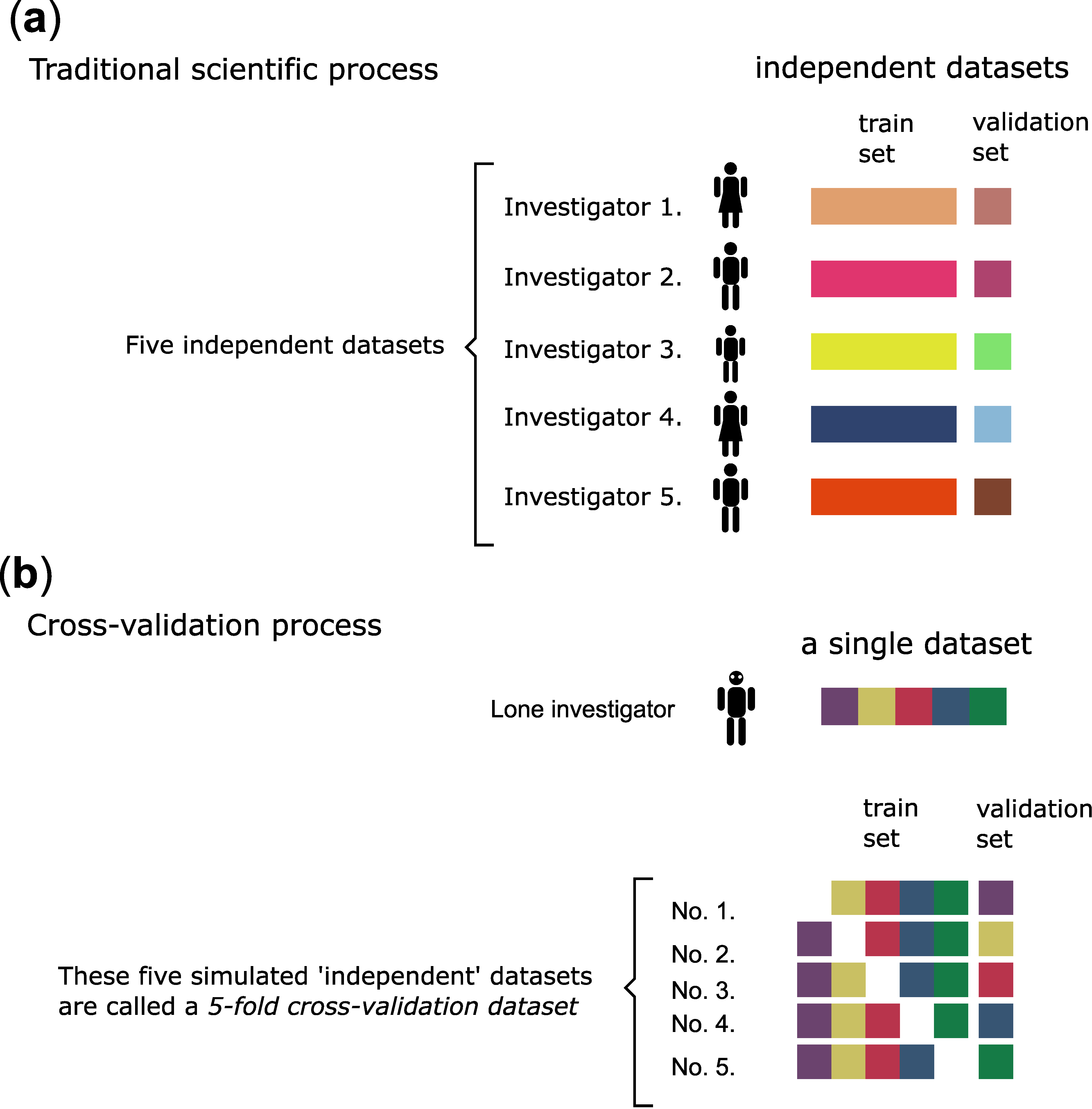
- Yadav, S.; Shukla, S. Analysis of K-Fold Cross-Validation over Hold-Out Validation on Colossal Datasets for Quality Classification. In Proceedings of the 2016 IEEE 6th International Conference on Advanced Computing (IACC), Bhimavaram, India, 27–28 February 2016; pp. 78–83. [Google Scholar] [CrossRef]
- Wong, T.-T.; Yeh, P.-Y. Reliable Accuracy Estimates from K-Fold Cross Validation. IEEE Trans. Knowl. Data Eng. 2020, 32, 1586–1594. [Google Scholar] [CrossRef]

| Name of Method | Recommended Use | Method Type | Input Variables | Output | Reference to Python Implementation |
|---|---|---|---|---|---|
| Decision tree | To visusalize and break down complex decision making processes. It also provides an explainable output. | Supervised learning (in its basic form it is used for classification, but can be extended for regression) | Discrete and continuous data | Trained model (tree, in the case of CART it is a binary tree), cllassified points, (predicted values in the case of regression) | From sklearn.tree import DecisionTreeClassifier, from sklearn.tree import DecisionTreeRegressor |
| Random forest | It performs well on large datasets and reduces overfitting compared to decision trees. Random Forest is faster than Bagging | Supervised learning (both Classification and Regression) | Discrete and continuous data | trained model (trees for decision making) and classified points or predicted values (in the case of regression) | From sklearn.ensemble import RandomForestClassifier, from sklearn.ensemble import RandomForestRegressor |
| SVM (support vector machine) | It is often used for text classification tasks such as category assignment, image recognition, and performs especially well in aspect-based recognition. It can be used in linearly separable and non-separable cases as well. | Supervised learning (both Classification and Regression) In basic form it supports binary classification, but it can be extended for multiclass classification problems and for regression (support vector regression, SVR) as well. | Discrete and continuous data | Trained model, classified points or predicted values (in the case of regression) | From sklearn.svm import SVC |
| KNN (K-nearest neighbour) | It is a very simple algorithm, which performs much better if all of the data have the same scale, and works well with a small number of input variables, but struggles when the number of inputs is very large. It is also needed, that the training is continuous and it only works when new data is coming. | Supervised learning (classification) | Discrete and continuous data | Classified points or predicted values (in the case of regression) | From sklearn.neighbors import KNeighborsClassifier |
| Linear Regression | One of the most frequently used regression methods, when a linear relationship is assumed between the input and output variables. | Supervised learning (Regression) | Continuous data | Regression line (predicted points) | From sklearn.neighbors import KNeighborsClassifier |
| Logistic regression | It is a commonly used algorithm for solving binary classification problems. | Supervised learning (Binary Classification with Softmax extension it can solve multiclass classification problems) | Discrete and continuous data | Classified points-binary (discrete) value | From sklearn.linear_model import LogisticRegression |
| ANN (artificial neural network) | State of the art. It performs well on a large and multi-dimensional dataset, and should be applied when there is no explicit mathematical equation for solving the problem. it is especially useful in image analysis, text classification, voice processing tasks. The results are not explainable. | Supervised learning (both classification and regression). It can be used also for unsupervised learning tasks, but it is not so widespread. | Discrete and continuous data | Trained model, classified points or predicted values (in the case of regression) | From sklearn.neural_network import MLPClassifier, from sklearn.neural_network import MLPRegressor |
| k-means | Clustering is used when we want to divide our datapoints into groups according to smilarity. The k-means algorithm can find spherical clusters easily, while DBSCAN can find clusters of any shape as long as the dataset has balanced density. Moreover, there are algorithms which are also good at the clustering of datasets with unbalanced density, such as mean-shift. | Unsupervised learning (clustering) | Discrete and Continuous data | Trained model, clusters | From sklearn.cluster import KMeans |
| DBSCAN | From sklearn.cluster import DBSCAN | ||||
| Gaussian mixture model | From sklearn.mixture import GaussianMixture | ||||
| Mean-shift | From sklearn.cluster import MeanShift | ||||
| Others | From sklearn.cluster import AffinityPropagation, from sklearn.cluster import AgglomerativeClustering, from sklearn.cluster import Birch | ||||
| PCA (principal component analysis) | Dimensionality reduction can serve as data preparation, as the machine learning algortihms work better on low-dimension data. However, the reduction can be the main exercise too. | Unsupervised learning (dimensionality reduction) | Discrete and continuous data | Data with reduced dimensionality (less features), where as much information as possible about the original data is preserved. | From sklearn.decomposition import PCA |
| LDA (linear discriminant analysis) | From sklearn.discriminant_analysis import LinearDiscriminantAnalysis | ||||
| Others | From sklearn.decomposition import TruncatedSVD, from sklearn.manifold import Isomap, from sklearn.manifold import LocallyLinearEmbedding | ||||
| Association | One uses Association when the aim is to study the connection between the datapoints, and make recommendation for new datapoints. | Unsupervised learning (association) | Discrete and continuous data | Association rules, associations | From mlxtend.frequent_patterns import apriori, association_rules |
| T-test | To compare the means of 2 groups. It assumes that the samples are (approximately) normally distributed and are independent, and have a similar amount of variance within each group. | Hypothesis testing | Continuous data, normally distributed, small sample with unknown variance | t-value, p-value, degrees of freedom | From scipy.stats import ttest_ind |
| F-test | The hypothesis that the means of a given set of normally distributed populations, all having the same standard deviation, are equal. The hypothesis that a proposed regression model fits the data well. (lack-of-fit sum of squares). The hypothesis that a data set in a regression analysis follows the simpler of two proposed linear models that are nested within each other. | Hypothesis testing | Independent and normally distributed data with a common variance. | F-value, p-value, degrees of freedom | From scipy.stats import f_oneway |
| Z-test | One can use Z-test when the sample size is greater than 30, the data points are independent from each other, the data is (approximately) normally distributed, sample sizes are equal. To check whethet sample mean of the two groups are equal or not. | Hypothesis testing | Independent and normally distributed data with large (>50) sample size or the variance is known | Z-value, p-value, degrees of freedom | From statsmodels.stats.weightstats import ztest |
| Chi-cquare Test | Chi-squared test is used to determine whether there is a statistically significant difference between the expected frequencies and the observed frequencies in one or more categories. | Hypothesis testing | Random sample that are classified into k mutually exclusive classes | p-value | From scipy.stats import chisquare |
| Name of Error Metrics | Recommended Use | Typical Drawback | Input Variable | Output Type and Range | Reference to Python Implementation |
|---|---|---|---|---|---|
| Mean absolute error/MAE | Regression. Gives an absolute measure; can be used to compare regression models on the same dataset. | Specific for the given model and dataset. | Continuous | Continuous value, [0; ∞] | From sklearn.metrics import mean_absolute_error |
| Mean square error/MSE | From sklearn.metrics import mean_squared_error | ||||
| Root mean square error/RMSE | From sklearn.metrics import mean_squared_error | ||||
| Standard error/residual standard error | From scipy.stats import sem | ||||
| R2-value/R squared | Regression. A basic metric to evaluate regression models. | Does not take into account the number of independent variables. | Continuous | Continuous value, [0; 1] | From sklearn.metrics import r2_score |
| Adjusted R2/adjusted R square | Regression. Useful to compare models with differing numbers of independent variables. | Continuous | Continuous value, [0; 1] | Import statsmodels.api | |
| Confusion matrix | Classification. Can be used to calculate other classification metrics. | The simple quantities of true positives (TP)/true negatives (TN)/false positives (FP)/false negatives (FN) refer only to the given model and dataset. | Discrete | Matrix for each classes values [0; ∞] | From sklearn.metrics import confusion_matrix |
| True positive rate/TPR/recall/sensitivity/probability of detection | Classification. Recommended when the costs of FN is high (such as sick patient detection). | Not recommeded to use alone. | Discrete | Continuous value, [0; 1] | From sklearn.metrics import recall_score |
| True negative rate/TNR/specificity | Classification | From sklearn.metrics import confusion_matrix | |||
| False positive rate/FPR/type I error | Classification | From sklearn.metrics import confusion_matrix | |||
| False negative rate/FNR/type II error | Classification | From sklearn.metrics import confusion_matrix | |||
| Accuracy | Classification. Useful to compare classification models on the same dataset. Recommended when every class is equally important. | Can be largely contributed by a large number of TN. Not recommended when the costs of having a mis-classified actual positive is high (ex. virus carrier). Not recommeded to use alone. | Discrete | Continuous value, [0; 1] | From sklearn.metrics import accuracy_score |
| Misclassification rate/classification error | Classification. Since it is = 1-Accuracy, all properties are the same | ||||
| Precision | Classification. Recommended when the costs of FP is high (such as email spam detection). | Not recommeded to use alone. | Discrete | Continuous value, [0; 1] | From sklearn.metrics import precision_score |
| F1 score/F-score/F-measure | Classification. To have a balance between Precision and Recall and there is an uneven class distribution (large number of actual negatives) | Discrete | Continuous value, [0; 1] | From sklearn.metrics import f1_score | |
| F2 score | Classification. The same as F1 score, but we nominate twice importance to recall over precision. | From sklearn.metrics import fbeta_score | |||
| Micro F1, macro F1, weighted F1 | Multi-class classification. Advanced versions of F1 score where the difference (micro, macro, weighted) is the type of averaging performed on the data. Micro precision, micro recall weighted precision, macro precision, etc., also exist. | Discrete | Continuous value, [0; 1] | From sklearn.metrics import f1_score | |
| ROC (receiver operating characteristics) | Classification. Visualizes the tradeoff between TPR and FPR. | In some cases, can be difficult to compare more curves *2 | Discrete | Curve, X axis = FPR, Y axis = TPR | From sklearn.metrics import roc_curve |
| ROC AUC (area under ROC) | Classification. A quantity to describe the ROC curve. | Not recommended when the data is heavily imbalanced *3 | Discrete | Continuous value, [0; 1] | From sklearn.metrics import roc_auc_score |
| PR curve (precision–recall curve) | Classification. Combines precision and recall in a single visualization. | Discrete | Curve, X axis = Recall, Y axis = Precision | From scikitplot.metrics import plot_precision_recall | |
| PR AUC (area under PR curve) | Classification. A quantity to describe the PR curve. | Discrete | Continuous value, [0; 1] | From sklearn.metrics import average_precision_score |
Publisher’s Note: MDPI stays neutral with regard to jurisdictional claims in published maps and institutional affiliations. |
© 2021 by the authors. Licensee MDPI, Basel, Switzerland. This article is an open access article distributed under the terms and conditions of the Creative Commons Attribution (CC BY) license (https://creativecommons.org/licenses/by/4.0/).
Share and Cite
Beinrohr, L.; Kail, E.; Piros, P.; Tóth, E.; Fleiner, R.; Kolev, K. Anatomy of a Data Science Software Toolkit That Uses Machine Learning to Aid ‘Bench-to-Bedside’ Medical Research—With Essential Concepts of Data Mining and Analysis Explained. Appl. Sci. 2021, 11, 12135. https://doi.org/10.3390/app112412135
Beinrohr L, Kail E, Piros P, Tóth E, Fleiner R, Kolev K. Anatomy of a Data Science Software Toolkit That Uses Machine Learning to Aid ‘Bench-to-Bedside’ Medical Research—With Essential Concepts of Data Mining and Analysis Explained. Applied Sciences. 2021; 11(24):12135. https://doi.org/10.3390/app112412135
Chicago/Turabian StyleBeinrohr, László, Eszter Kail, Péter Piros, Erzsébet Tóth, Rita Fleiner, and Krasimir Kolev. 2021. "Anatomy of a Data Science Software Toolkit That Uses Machine Learning to Aid ‘Bench-to-Bedside’ Medical Research—With Essential Concepts of Data Mining and Analysis Explained" Applied Sciences 11, no. 24: 12135. https://doi.org/10.3390/app112412135
APA StyleBeinrohr, L., Kail, E., Piros, P., Tóth, E., Fleiner, R., & Kolev, K. (2021). Anatomy of a Data Science Software Toolkit That Uses Machine Learning to Aid ‘Bench-to-Bedside’ Medical Research—With Essential Concepts of Data Mining and Analysis Explained. Applied Sciences, 11(24), 12135. https://doi.org/10.3390/app112412135