Article

Research on Architectural Color and Visual Comfort in Historic Landscape Areas

1
College of Communication and Art Design, University of Shanghai for Science and Technology, Shanghai 200093, China
2
College of Furnishings and Industrial Design, Nanjing Forestry University, Nanjing 210037, China
*
Author to whom correspondence should be addressed.
Buildings 2023, 13(4), 1004; https://doi.org/10.3390/buildings13041004
Submission received: 9 March 2023 / Revised: 31 March 2023 / Accepted: 7 April 2023 / Published: 11 April 2023
(This article belongs to the Section Architectural Design, Urban Science, and Real Estate)

Abstract

:
New buildings continue to be constructed in historic districts as urbanization accelerates. This leads to incongruities between historic and modern buildings, as well as degradation of the historic landscape. As a means of resolving these problems, this study uses the expert scoring method to solicit opinions from relevant experts through anonymous methods for architectural samples and establishes two groups of architectural images that have been screened for objective color attribute analysis. Comparing the architectural color codes on site was conducted using the Chinese Architectural Color Card based on the Munsell color system. Furthermore, questionnaires were used to measure the differences in visual comfort between different building types by asking the subjects to rate architectural colors when viewing architectural images. This study will also combine the advantages of measurement and analysis of objective objects with the study of human perceptual experience in order to enhance its practicality. In general, the buildings in the West Nanjing Road Historic Landscape District are painted in warm yellow, and the public is aware of its comforting color. Both historical and modern buildings in the historic district are mostly of medium and high brightness, and both use low-purity colors for the main body of their structures. Despite some differences between people of different genders, ages, and literacy levels, all of them agree on the main tone of warm yellow color in architectural colors.

1. Introduction

The colors of historic buildings are inextricably linked to their historical background, regional culture, and humanistic spirit. In spite of this, the colors of historic buildings are gradually being destroyed gradually destroyed by accelerated urbanization. An analysis of the color characteristics and evolution of historical buildings can provide insight into the regional culture and characteristics of cities. It plays an important role in the sustainable development of architectural design, conservation, and continuation of the locality.
Between 1899 and 1941, the West Nanjing Road Historic Landscape District was largely shaped by the great expansion of the Shanghai Public Concession and became the center of Shanghai prior to the outbreak of the Pacific War (Table 1). Having been influenced by several cultures, Shanghai’s modern architecture has a very rich history, with almost all the styles of the world’s architecture from all periods represented, just like the history of the world’s architecture. Public buildings in the style area include the Shanghai Exhibition Center, as well as the Children’s Hospital, Huaien Hall, Maggie’s Theatre, and other medical, religious, cultural, and recreational facilities. Also included are a lot of residential buildings with beautiful and proportional architectural shapes and detailed details, like garden houses and apartments, designed by famous people or celebrities, with high artistic standards and humanistic values.
The positive theory aims to explain particular phenomena in terms of universal natural laws. This is the process of searching for universal natural laws that can be used to explain particular phenomena. In Newton’s work on optics, he clarified that color is a product of light, and through a trigonal prism, he divided sunlight into seven colors: red, orange, yellow, green, cyan, blue, and violet [1]. Color and light are now considered basic knowledge, which can be demonstrated through simple experiments and in the natural environment. Thomas Young introduced the concept of RGB (Three Primary Colors), which suggests that the human eye has three different types of color perception receivers: red, green, and blue [2]. Goethe improved on Newton’s theory and in 1810, in his book Theory of Colors/Zur Farbenlehre, proposed a six-equivalent balanced color ring scheme and argued that the magenta color outside the spectrum should appear in the complete color ring [3]. Phillip Otto Runge developed a spherical 3D color model (Color Sphere), based on hue and black and white. Matthias Klotz, like him, also endorsed the three basic color theories. Based on this, he proposed a nine-step gradient grayscale, which was revolutionary at the time [4]. Maxwell made the world’s first color photograph based on the theory of three primary colors and color mixing, and his work is considered to be the basis of modern colorimetry [5]. The Munsell color system, which is based on a phenomenological model of human perception, has been tested for 15 years and used by hundreds of participants [6]. It was the first widely accepted color order system, and today it is one of the two major systems in the field of paints and pigments, along with the later Natural Color System.
In the practical exploration of color, it was advocated to classify the discourse on color by period and according to the speakers and summarized the main features of the discourse on color and present ideas on the use of tools from color science in color design [7]. To enhance understanding of the strategic use of color in architectural practice, the researcher proposes three sets of complementary stylistic strategies to help architects express the colors used in a given composition [8]. And in the latest color research, the Pleasure-Arousal-Dominance (PAD) theory has been proposed. The researcher asserts that (PAD) theory can help designers better understand the opposites conveyed by light and dark colors (high and low values) and illustrates how this thought process can be applied to the practice of architectural design [9].
The following topics are currently addressed by the academic community in the study of color in relation to architectural heritage, and the energy sustainability aspects of historic buildings. When retrofitting historic buildings to improve their energy performance, it is necessary to weigh different aspects, such as energy efficiency, modernization, and comfort. And it is also important to install solar systems in historic buildings, establishing an evaluation criterion at each step to improve their energy performance [10]. It was also noted that PV systems should be designed as an element of the landscape to which they belong, based on an “inclusive” design approach that focuses not only on the overall energy efficiency of the system but also extends to other additional ecological and landscape objectives to contribute to the better environmental performance of the PV landscape [11]. The use of BIPV technology can support the transition to low-carbon energy systems by facilitating on-site energy production and enhancing self-consumption. And when combined with electricity or thermal storage, it can also support the transformation of buildings or district energy systems [12]. Considering the multiple impacts, the application of PV systems on cultural heritage requires appropriate policies and design standards to ensure compatibility with the values of the cultural heritage [13].
Using technological improvements to enhance the preservation of architectural heritage. In order to render the reflective properties of artwork on many types of displays to achieve perceptual fidelity, researchers have proposed a 3D reality-based color management modeling approach. A good compromise that strikes a balance between ensuring the fidelity of the reproduced data and the ease of use of development tools [14]. By using modern technologies based on photogrammetry and 3D scanning to generate accurate, measured, and calibrated 3D models, new methods for the assessment, conservation, restoration, and valorization of cultural heritage can be provided. And it can be used for research, restoration, education, recreation, and tourism purposes [15]. In addition, 3D digitization methods have been noted as powerful tools for the preservation and use of cultural heritage. By studying the Hayman House in the city of Oradea, Romania, researchers have shown how three-dimensional laser scanning (TLS) and mapping methods can be used to document buildings in order to prevent further damage. All of these initiatives undoubtedly broaden the options for approaches to heritage conservation [16].
Color psychology is an important branch of psychology, which mainly studies the influence of color on human psychology and behavior. To verify the effect of color on emotion, a color science-based color emotion model was developed and three color emotion factors were identified through factor analysis: color vibrancy, color weight, and color heat [17]. And chroma and brightness are the most important factors in color mood, while hue and cultural background have very limited influence [18]. In addition, a communicational study has been conducted on the aesthetics of architectural heritage, where researchers have tried to describe the social concept of architectural heritage on Instagram and explore whether aesthetic appeal resources influence its communication [19].
The analysis of color characteristics of building materials has focused primarily on the properties, age, and evolution of color, with the goal of providing useful guidance for the conservation and planning of historic building colors. Research has been conducted on the development of urban-scale color measurement methods for façades and the functional classification of buildings using deep learning techniques and streetscape images. Providing city managers with a cost-effective method of assessing façade colors and building functions in urban areas [20]. It is also important to emphasize that satisfaction with the environment is one of the most important aspects of the study, by designing an environment that incorporates personal color preferences, testing three main aspects of residents’ use of public spaces, assessing and choosing the correct color for facades, focusing on semantic differences and analyzing sample building facades through the use of color elements [21]. A method for measuring color harmony in five metropolitan areas (London, Tokyo, Chicago, Paris, and Beijing) in 2020 has been developed by researchers using data collected by Sentinel-2A remote sensing satellites [22]. Additionally, three environmental factors are analyzed using a Geographic Information System (GIS) utilizing spatial sensitivity analysis, allowing the level of coordination and intensity of control of urban color in urban color planning to be determined [23].
However, color psychology only examines people’s emotional responses from a subjective perspective, which means that a multifaceted enhancement solution is required for today’s comprehensive urban planning requirements. The emotional response to a single color is insignificant from a spatial perspective at a large scale. Based on Kevin Lynch’s concept of urban imagery, the combination of color with architecture and landscape also has an impact on people’s sensory experience, which has a distinct impact on building a unique cultural imagery of the city. Traditionally, architectural color research has concentrated on the surface characteristics embodied by color, updating spatial color measurement methods. However, little attention has been paid to feedback from objective objects to people, even disregarding the issue of human comfort in space. Modern urban architecture with primitive geometric shapes creates an unnaturally minimalist, unnatural urban environment, which leads to the creation of an aggressive and homogeneous visual field, which negatively impacts the citizen’s organism, reducing efficiency and strengthening apathy and irritation. In addition, some researchers suggest that a large number of decorative elements create an emotional and aesthetically pleasing visual environment, and it is no wonder that these cities have become tourism centers due to their rich historical and architectural heritage [24]. At present, few studies have been conducted on the architectural comfort of historic preservation districts, and studies that focus on exotic architecture with a cross-cultural background are still rare, as are studies that combine the two. Moreover, in the field of color characteristics research, some scholars have used the color block concept and fragmentation index for quantitative analysis in order to guide a rational urban renewal program [25]. Consequently, conducting research that measures and analyzes both objective objects and human perceptions will avoid the shortcomings of using a single research methodology.
The following article describes the supported methods of the study. Section 2 describes the supporting methods. The architecture, the data analysis, and in particular the screening of the architecture, the design of the questionnaire, and the number of participants are discussed in more detail. The results of the study are presented in Section 3. Section 4 summarizes the differences between the studied historical buildings and modern buildings, as well as directions for improving visual comfort in the future.

2. Materials and Methods

This study aims to identify suitable and valuable architectural samples, which are scored by experts anonymously, and to statistically and analytically analyze the opinions of the experts to produce an objective color attribute analysis. This analysis is based on the Munsell color system, and the Chinese Architectural Color Card is used to compare the architectural color codes with the architectural pictures obtained after the expert screening. Color codes were used as the basis for analyzing the color attribute values of the main colors, secondary colors, and accent colors. As well, the main color, auxiliary color, and embellishment color of the buildings were extracted. Meanwhile, the main color, auxiliary color, and embellishment data of the buildings were extracted for color analysis and a color network composition was created. This section describes the materials and research methods used in the study in detail.

2.1. Screening of Architectural Samples

The sample of historic buildings was drawn from the list of the 5th batch of outstanding historic buildings published on the website of the Shanghai Municipal Government, while a sample of modern buildings was chosen based on their popularity with the general public. The two categories of buildings were divided according to the time when the Public Concession was occupied in 1941, and the top 20 images of each group of historical and modern buildings were selected by invited experts for subsequent research.

2.2. Selection of Research Sites

Shanghai, an eastern coastal city of China, is the subject of this study, which is located in the West Nanjing Road Historic Landscape District. As an international metropolis, its prosperity and continuous development have also promoted the development and diversity of Shanghai’s urban architectural colors. The West Nanjing Road Historic Landscape District has a long history and a number of excellent historical buildings have been preserved in the course of urban development. Thus, this study classifies the architectural samples into five categories: cultural and recreational buildings, commercial buildings, office buildings, residential buildings, and educational buildings according to the architectural functions of the excellent historical buildings classified by the Shanghai Municipal Government, and these buildings are listed in Table 2.
The historical and modern buildings were selected for color testing and numbered, and the visual comparison method was applied by using the national standard “Chinese Architectural Color Card” (GB/T18922-2008) as a guide.

2.3. Questionnaire Design

After viewing the pictures according to their classification, the subjects completed the questionnaire and were assessed. The purpose of the questionnaire was to investigate the subjects’ perceptions of the color and comfort of the images of each building type, according to the Richter scale. It was determined that the comfort level should be evaluated according to the design principles of the Richter scale on five levels: very uncomfortable, uncomfortable, average, comfortable, and very comfortable, with the values 1, 2, 3, 4, and 5 representing the weight settings [26]. The results of the questionnaire resulted in the following summary formula of weights:
C o m f o r t a b l e D e g r e e = 5 r a t i o i × i .

2.4. Participant Selection

To ensure the validity of the data, a non-probability sampling method was used to recruit people for the survey by posting the questionnaire online and without restricting the geographical location. For the purpose of ensuring the validity of the data, the participants for the building color comfort test were randomly selected without regard to their geographical origin. A total of 50 people participated in the test and completed it, and the validity of the questionnaire was 93.3%. Males accounted for 56% (n = 28) and females accounted for 44% (n = 22). The age of the survey respondents ranged from under 18 years old to over 50 years old. The attributes of respondents included their gender, age, and educational background. As an international metropolis and a famous tourist city, Shanghai attracts a large number of domestic and foreign tourists every year, of which non-local tourists make up a considerable proportion. According to statistics, Shanghai received about 361.41 million domestic tourists in 2019, including 171.86 million tourists from other provinces and cities. This is why the questionnaire deliberately includes non-local residents for relevant tests.

3. Results

3.1. Architectural Sample Color Attribute Characteristics

3.1.1. Architectural Color Attributes

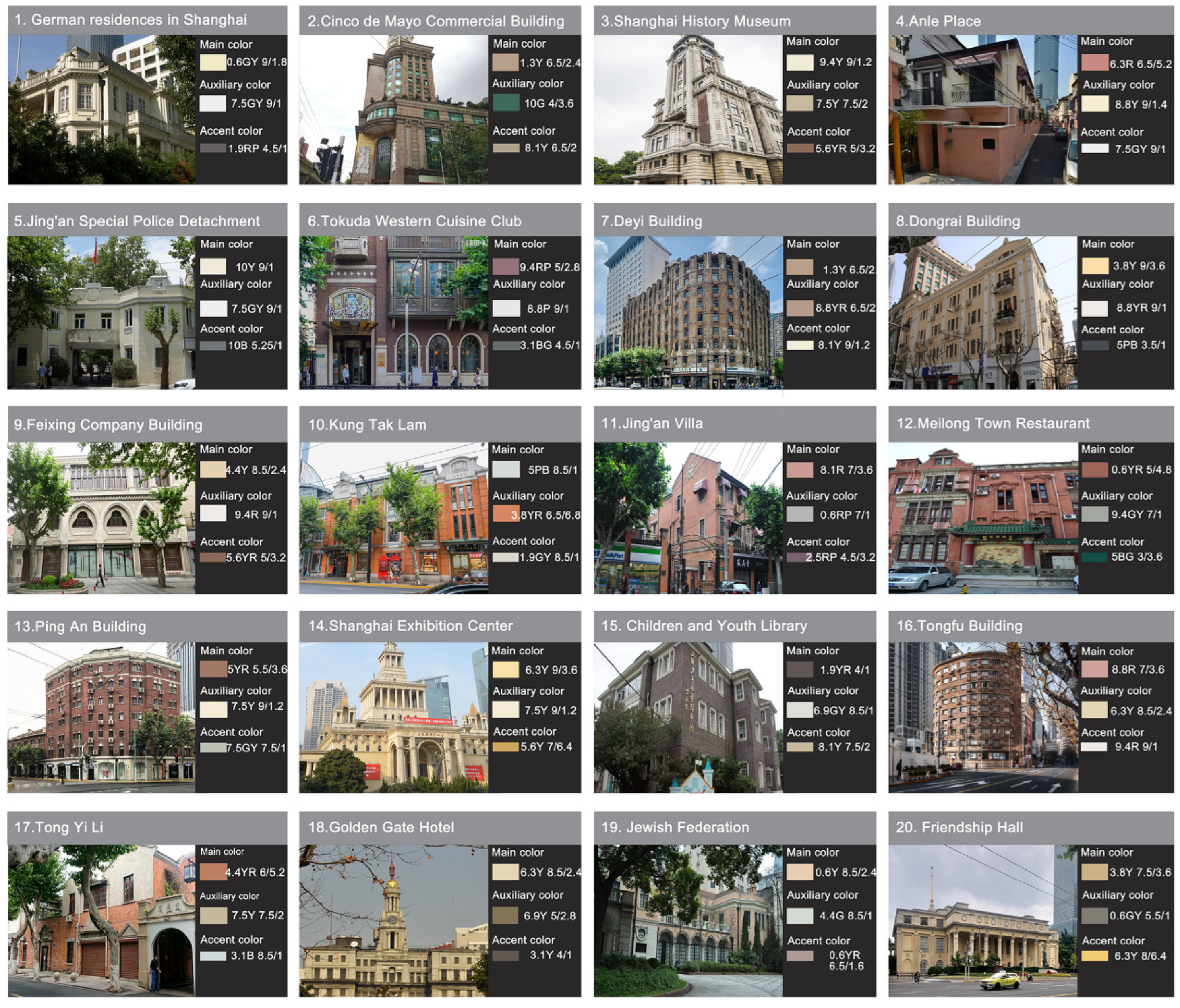
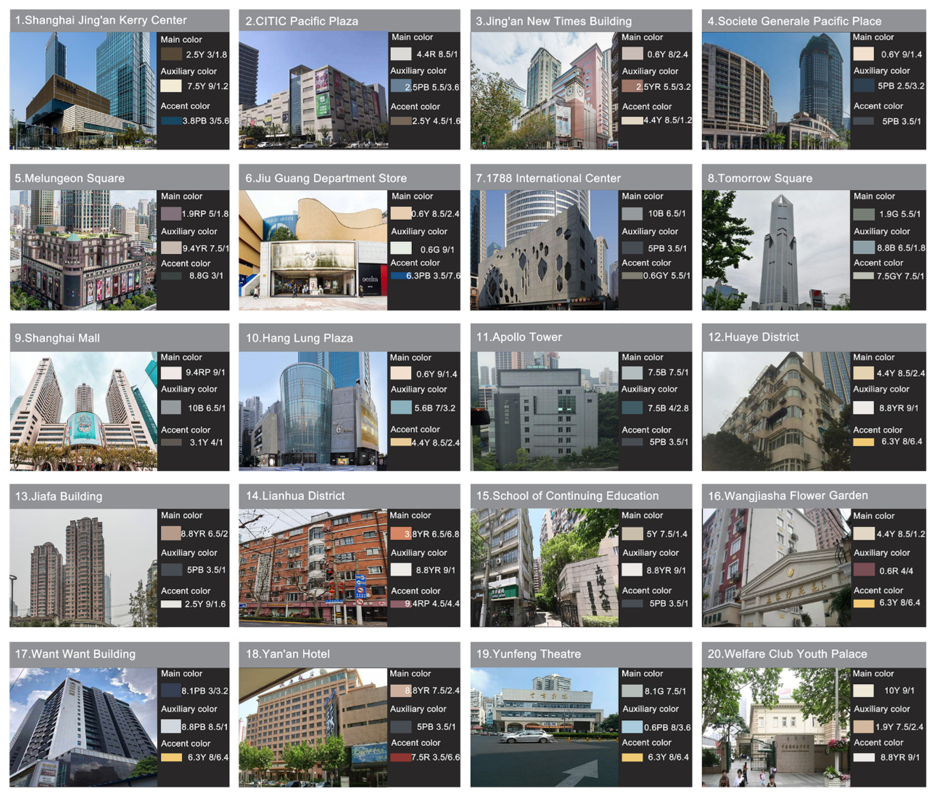
According to research, West Nanjing Road is generally divided into two categories: excellent historical buildings and modern buildings. Based on the research analysis, the buildings of the two periods have different characteristics. For example, excellent historical buildings tend to be constructed primarily of brick and wood structures, and the color palette of the buildings is primarily dominated by warm hues (Figure 1). Modern buildings are typically made up of concrete structures and are primarily painted in cool colors (Figure 2). The main color of excellent historical buildings is warm, while the auxiliary colors and accent colors differ from the main color. A variety of cold colors are also used to enhance the visual effect of a building in the local part of the building as a complement to the color of its facade. Since the building form has changed, the main color of modern architecture has widened, and some buildings use cold colors as their main color, while their proportion of accent and auxiliary colors has increased significantly.

3.1.2. Architectural Color Lightness and Purity Analysis

Considering that architectural colors must be expressed visually, this paper analysis Munsell’s trichromatic values, which correspond to architectural main colors, auxiliary colors, and accent colors. Based on measurement comparison data, the hue (H), value (V), and chroma (C) scales are divided into three categories: high (H) (threshold: 7 to 10), medium (M) (threshold: 4 to 7), and low (L) (threshold: 1 to 4). The purity was divided into three scales high (h) (threshold: 8 to 12), medium (m) (threshold: 4 to 8), and low (l) (threshold: 1 to 4) [27].
Comparative analysis of architectural color luminosity indicates that the main color luminosity of historical and modern buildings is generally in the medium-high luminosity range, and the luminosity of individual historical buildings is significantly higher than that of modern buildings (Figure 3). This indicates that excellent historical buildings tend to use architectural colors with a higher degree of luminosity. The auxiliary colors of historical buildings tend to be medium-high brightness colors, whereas the brightness of the auxiliary colors of modern buildings varies greatly, with low, medium, and high brightness colors being used. According to a contrast analysis of embellishment color brightness, a distinct difference appears, particularly in the embellishment colors of historical buildings, which are still in the medium-high brightness range, and most historical building embellishment colors are brighter than those in modern buildings. However, color brightness in modern building embellishments fluctuates more than in historical building embellishments, and modern building embellishments are available in low, medium, and high brightness.
Historical buildings and modern buildings tend to use low purity of the main color, but historical buildings tend to have a higher degree of color purity than modern buildings, and historical buildings are primarily used in the low purity range of higher purity architectural colors. In the architectural embellishment color chart, the architectural color purity fluctuates widely, but the architectural auxiliary color purity also reflects a tendency to use low-purity architectural colors. In modern architecture, low-purity colors are not the only color used by most buildings, but some buildings even use medium-purity embellishment colors as the building’s local color, with the difference being that most historical buildings still tend to use low-purity colors.

3.2. Architectural Color Evaluation Results

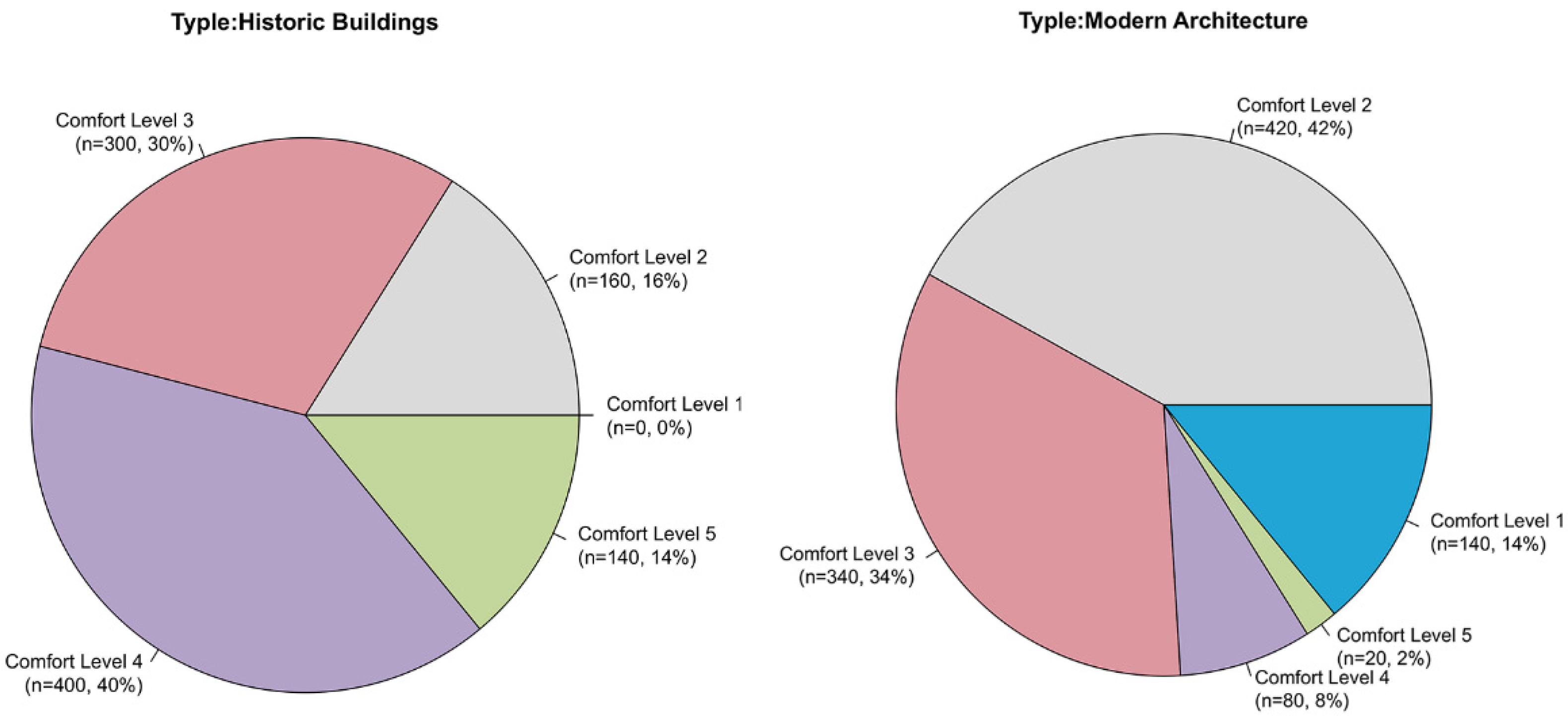
Historic buildings receive a color evaluation grade of 5, representing a proportion of very comfortable buildings of 14%; historical buildings receive a color evaluation grade of 4, representing a proportion of relatively comfortable buildings of 40%; color evaluation grades are 3, representing 30% of no obvious feelings; color evaluation grades are 2, representing 16% of less comfortable; color evaluation grades are 1, representing 0% of very uncomfortable. In modern buildings, 2% of buildings have color evaluation grades 5, representing very comfortable; 8% have color evaluation grades 4, representing relatively comfortable; 34% have color evaluation grades 3, representing no obvious feeling; 42% have color evaluation grades 2, representing less comfortable, and 14% have color evaluation grades 1, representing very uncomfortable (Figure 4).
In accordance with the survey results, the overall color comfort level of historical buildings is more comfortable and upper-middle level, while the overall color comfort level of modern buildings is poor and lower-middle level. The overall ratings of the two different types of buildings exhibit totally opposite situations, and the following sections will elaborate further on the distribution of participant groups and building color comfort under different conditions.

3.2.1. Percentage of Evaluation Grades by Gender

Based on the results of the evaluation ratings of historical buildings and modern buildings for different age categories, the evaluation ratings of architectural comfort for historical buildings are primarily concentrated in the upper part of the ratings (Figure 5). Most men believe that historical buildings provide good visual comfort, and they prefer the color composition of historical buildings. A majority of women rated the architectural color comfort of historic buildings as being in the better part of the comfort scale. The proportion of females with poorer rating levels is significantly higher than that of males, and the overall distribution of rating levels is more moderate than that of males.
This graph indicates that the above distribution of evaluation ratings of modern architecture has changed, and the relevant data indicate that the majority of men’s evaluation ratings of architectural color comfort of modern architecture are concentrated in the poorest and most problematic areas. Similarly, women’s ratings of architectural color comfort are concentrated in the worst part of the comfort spectrum, but the proportion of higher ratings for this group is much lower than that for men. According to this analysis, both females and males perceive modern architecture as providing a low level of comfort, as well as bad experiences with its architectural color characteristics, especially among females.

3.2.2. Percentage of Evaluation Levels by Age

The study indicates that the distribution of the rating levels of the comfort of historic buildings by the young participants aged 18–30 years indicates that most of the young people consider the color comfort of historic buildings to be high and gives a more comfortable sense of visual enjoyment (Figure 6). Middle-aged participants aged 31–50 years old were distributed according to their age, indicating that most middle-aged participants rated historic buildings as medium and better in color comfort, but the sense of visual experience was less comfortable for this group. The distribution of the comfort level of historic buildings among participants under the age of 18 indicates that most teenagers evaluate the comfort level of historic buildings in better areas, and their visual experience is more satisfying. It has been found that there are some correlations between age and comfort rating levels in historical buildings, with comfort rating levels tending to increase with age.
There is a difference in the distribution of evaluation levels for modern architecture. According to the distribution of evaluation levels of comfort of modern architecture among young participants aged 18–30, most young individuals feel that the color comfort of modern architecture is poor and particularly bad in terms of the visual experience feeling. It is apparent from the distribution of middle-aged participants aged 31–50 years old on the level of evaluation of the comfort of modern architecture based on the difference in age. This indicates that the majority of middle-aged participants assess color comfort in modern architecture mainly from a general feeling perspective, and think the architectural color is not so obvious from a visual perspective. The distribution of older participants aged 50 years old and older on the evaluation level of comfort of historical architecture indicates that older people’s color tends to have a more positive influence on the evaluation level of comfort of historical architecture. The distribution of the comfort evaluation levels of historical buildings by participants under 18 years old indicates that most teenagers rate color comfort in modern buildings at a middle to low level, and their visual perception is poor. Using tests related to modern architecture, it is evident that the relationship between age and comfort rating levels is less pronounced as education increases, with comfort rating levels concentrated more toward areas where the perception is less pronounced.

3.2.3. Percentage of Evaluation Levels for Different Educational Backgrounds

It is shown that the distribution of evaluation grades of historical buildings is influenced by the educational background in the following ways. The distribution of the evaluation levels of the comfort of historical buildings by participants with junior high school education indicates that most people with junior high school education backgrounds believe that the color comfort of historical buildings is higher and provides a more comfortable visual experience (Figure 7). Most people with a high school education believe that the visual experience sense of colors in historic buildings is average, based on the distribution of their evaluation levels of comfort levels. Participants with a bachelor’s degree were more likely to consider the color comfort of historic buildings to be at a higher level when evaluating the comfort level. The distribution of the comfort level of historic buildings among participants with a master’s degree or above indicates that the majority of participants with a master’s degree or above are in the better and better area in terms of color comfort of historic buildings, and their sense of visual experience can be enhanced. The trend between educational background and comfort rating levels can be observed in the tests related to historical buildings, with the comfort rating levels increasing as education level increases.
According to the distribution of evaluation grades of modern architecture, most people with junior high school education backgrounds believe that the color comfort of modern architecture is poor, or even not noticeable. It appears that most people with a high school education feel that the sense of the visual experience of the color of modern buildings is the worst or average, as determined by their evaluation grades of the comfort of historical buildings. Among participants with bachelor’s degrees, the distribution of evaluation ratings of color comfort of modern buildings indicates that most participants have poor ratings for color comfort. According to the distribution of rating levels for participants with a master’s degree and higher regarding the comfort of historical buildings, the majority of participants with master’s degrees and above assess modern buildings as being comfortable in terms of color, and the color comfort of buildings does not have a more obvious impact on these individuals. In the tests related to modern architecture, one can see the trend between educational background and comfort evaluation ratings, with the comfort evaluation ratings concentrating more toward the region of less obvious and average feelings with increasing education.

3.3. Architectural Color Characteristics

There is a difference between the main, auxiliary, and accent colors of excellent historical buildings and modern buildings in the West Nanjing Road Historical Landscape District. The overall tone of the architectural colors as well as the local colors display different tendencies. Following is an analysis and description of the differences between historic and modern architecture with respect to color and color trends.

3.3.1. Chromatic Characteristics of Historic and Modern Architectural Colors

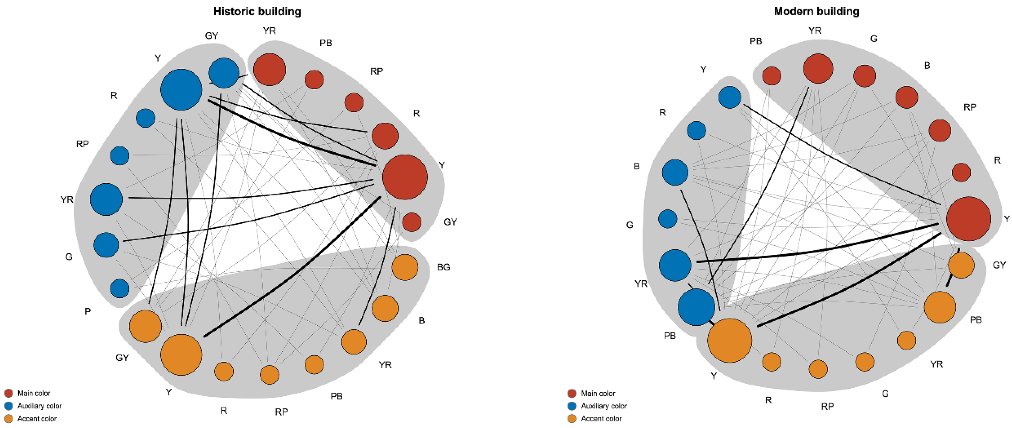
According to the relevant results, most of the main colors, auxiliary colors, and accent colors of historical buildings are based on the Y color scheme (Figure 8). Furthermore, there is a wider variety and flexibility in the choice of primary colors among different color attributes, while maintaining the overall warm color tendency of the building. Main colors, secondary colors, and accent colors are still dominated by the warm Y, YR, and Y colors. In comparison with historical architecture, modern architecture has a simpler and more concentrated color network.
In comparison to modern buildings, historical buildings have a more colorful color phase. In historical buildings, the main colors tend to be GY, Y, R, RP, PB, YR, the auxiliary colors tend to be GY, Y, R, RP, YR, G, P, and the accent colors tend to be GY, Y, R, RP, PB, YR, B, BG. Historical buildings have a predominantly red-yellow color scheme, Y, R, and YR; the auxiliary color scheme is primarily yellowish colors, referred to as GY, Y, and YR; the embellishment color is also predominantly the color of GY, Y, and YR (Figure 9). Yellow is generally used as the dominant color scheme in historical buildings.
Colors used in modern architecture tend to be Y, R, RP, B, G, YR, PB; auxiliary colors tend to be Y, R, B, G, YR, PB; and embellishment colors tend to be Y, R, RP, G, YR, PB, GY. The main color of modern architecture occupies more proportion in the use of the red-yellow color system represented by Y and YR; the auxiliary color occupies a greater proportion in the use of the blue color system represented by B and PB; the use of embellishment colors is mostly in Y and PB color, suggesting modern architecture is freer in its use of color. According to the proportion of colors, modern architecture also uses red and yellow as its primary colors, whereas it uses blue as its secondary color.

3.3.2. Brightness Characteristics of Historic and Modern Architectural Colors

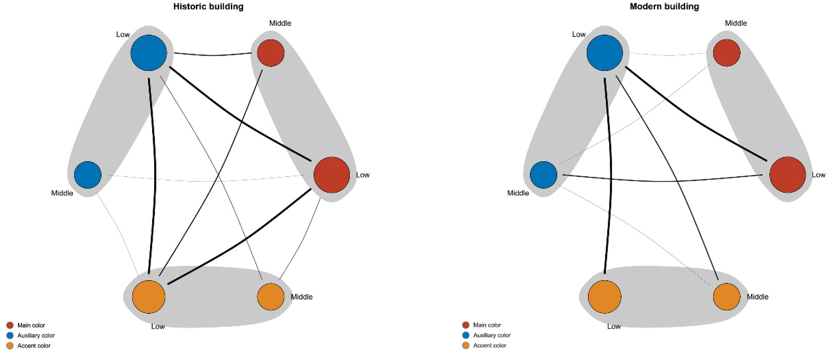
According to the color brightness level composition network, the main color of high brightness in historical architecture will mainly tend to use high brightness secondary colors and medium brightness accent colors, followed by medium brightness secondary colors and high brightness accent colors to match; and when the main color of medium brightness is used, it will mainly tend to use high brightness secondary colors and high brightness accent colors as the color scheme (Figure 10). Modern architecture utilizes low, medium, and high brightness auxiliary colors and low and high brightness accent colors as the main color scheme when using bright main colors. Accordingly, modern architecture makes use of a greater variety of color brightness levels than historical architecture, and modern architecture uses secondary colors with low brightness and accent colors with low brightness as its primary colors.
The data on architectural color brightness ratio shows that the brightness of the main color of historical buildings is mainly concentrated at the middle and high levels and that more uniform color schemes are used. The use of auxiliary colors is more apt to utilize bright colors; as opposed to the first two, accent colors are used more frequently to enhance the color of the building facade through the use of low-purity colors, while still maintaining a tendency to use medium and high brightness colors (Figure 11).
There is a more balanced brightness ratio of the main color of modern architecture, and all levels of brightness are used. However, the choice of the brightness of the main color is more focused on high-brightness colors. In short, modern buildings prefer to use low and high-brightness colors, while historical buildings prefer to use medium and high-brightness colors.

3.3.3. Purity Characteristics of Color in Historic and Modern Architecture

The color purity level composition network shows that both historic and modern buildings primarily use a color scheme of low-purity main colors, low-purity secondary colors, and low-purity accent colors. The difference is that historic buildings will use a medium purity main color, low purity secondary color, and low purity accent color scheme as a secondary choice (Figure 12).
According to the percentage of data, the use of color purity in historical buildings is dominated by low purity, and medium purity of local colors to match. The general trend of color use in modern architecture is also dominated by low purity, supplemented by medium purity. However, unlike historical buildings, the use of low-purity colors in modern buildings is lower in accent colors, and the use of medium-purity colors in accent colors has increased instead (Figure 13).

4. Discussion

In order to determine the differences in architectural color and visual comfort between the outstanding historical buildings and contemporary buildings in the West Nanjing Road Historic Landscape District, the study selected the top 20 historical buildings as study samples and 20 modern buildings as study samples. In order to test the visual comfort of architectural color via the internet, a questionnaire was developed to recruit 50 individuals. Study findings indicate that the visual comfort of heritage buildings in the West Nanjing Road Historic District is significantly higher than that of new buildings, with a significant difference in color and brightness. It may be attributed to differences in architectural design ideas and material preferences. Traditionally, architecture and landscape design have been concerned with bringing people’s visual perceptions and humanistic values together. The rapid development of the city, however, destroys the overall appearance of the historical conservation area, and the new buildings form a disharmonious relationship with the historical buildings.
As the color of the building facade occupies a large proportion of the spatial field of view, the first thing that comes to mind when entering the historic district is the large area of color on the building. This feature enables people to develop a more concrete impression of the historic landscape district as a result of this feature. By regulating the color of the facade of the buildings in the area, an overall color combination can be optimized to give the area a unique historical appearance based on the original broken appearance of the buildings. Additionally, it can contribute to the continuation of architectural history and culture, increase people’s sense of pleasure, and enhance the spiritual and cultural experience of the people.
Regarding the study of Shanghai’s historical buildings, someone once did a study on the color development of Shanghai’s historical buildings on the North Bund and pointed out that the colors can be divided into five periods, each with its own unique color characteristics [28]. Specifically, this study examines the differences in visual comfort between historic and new buildings as well as the color schemes represented by each group of building samples. It is more about enhancing the visual experience and maintaining the unique look of the historic district by protecting the colors used in historic structures.
The results of the study are only applicable to the West Nanjing Road Historic District and do not suggest a universal method for improving the color of buildings in all different types of historic preservation areas in Shanghai. Aside from the color attributes discussed in this paper, different massing combinations, architectural styles, and building materials can all influence the perception of a building. Therefore, it is necessary to collect more detailed color and architectural data in order to analyze the color composition of building facades in depth.

5. Conclusions

(1) In general, the buildings in the West Nanjing Road Historic Landscape District are painted with a warm yellow tone, and the public has a very good sense of comfort with this color. Many factors contribute to the formation of this warm yellow tone, including politics, economy, and culture. Despite the fact that both the historical buildings and the modern buildings in the West Nanjing Road Historic Landscape Area are decorated with yellow hues, their color schemes and materials reflect the psychological needs of people from different periods in history. With the use of different colors and materials, the district is characterized by a heavy, warm feeling with a good sense of visual comfort and atmosphere.
(2) The study shows that the color brightness of historical buildings and modern buildings in the historic district is primarily distributed in the medium and high brightness range, and in terms of color purity, the main colors of both buildings are primarily low-purity colors, but historical buildings use auxiliary and accent colors that have a high brightness and a low purity, while modern buildings have a greater variation in brightness and purity. The color comfort of historical buildings is higher than that of modern buildings as a result of the differences in specific color schemes. Consequently, the use of medium to high levels of brightness and a warm color system for architectural color in the historic landscape area can result in a pleasant visual experience, which is in harmony with the overall atmosphere of the historic landscape area and contributes to a building’s historical appearance. The color effect of buildings in the urban historic district can be improved effectively by using this method.
(3) The study indicates that the color brightness of historical buildings and modern buildings in the historic district is primarily distributed in the medium and high brightness range, and for color purity, the primary colors of both buildings are mainly low-purity colors, but historical buildings use auxiliary and accent colors that have a high brightness and a low purity, while modern buildings have a greater variation in brightness and purity. Historically, color comfort in historical buildings is higher than in modern buildings due to differences in color schemes. Consequently, the use of medium to high levels of brightness and a warm color system for architectural color within the historic landscape area can result in a pleasant visual experience in harmony with the overall atmosphere of the historic landscape area as well as contributing to the historical appearance of a building. In the urban historic district, this method can be used to enhance the color effect of the buildings.
Compared with previous studies, which are mostly of the type of objective color analysis and description or subjective body reaction, this paper focuses on the exotic development and conservation of foreign historical buildings, while taking into account the comfort of architectural color in historic preservation areas from the perspective of human experience, in order to find a strategic approach that can organically integrate historical culture and visual experience, and then improve the situation of existing buildings with mixed colors and no experience.
Developing more comprehensive color data should begin with the development of more color measurement methods and equipment references under this theme, followed by the development of more new technological devices, including virtual reality, eye-tracking, electrocardiograms, and others, to measure people’s perceptions.
Generally speaking, drawing upon the highly regarded colors of historical buildings to correct the color pattern of modern buildings is beneficial to the preservation of historical landscapes. As a result, unique urban imagery is formed, urban cultural brands are formed, cultural consumption is promoted, and heritage buildings will be protected from color damage without a doubt.
Author Contributions

Z.W. carried out the conception and design of the research, and J.L. participated in the acquisition of data. H.S. carried out the analysis and interpretation of data. H.S. performed the statistical analysis. Z.W. and H.S. drafted the manuscript and J.L. participated in the revision of the manuscript for important intellectual content. All authors have read and agreed to the published version of the manuscript.

Funding

This research did not receive any specific grant from funding agencies in the public, commercial, or not-for-profit sectors.

Data Availability Statement

The data that support the findings of this study are available from the corresponding author upon reasonable request.

Conflicts of Interest

The authors declare that they have no competing interest.

References

  1. Jaeger, W. Die Ordnungsprinzipien Der Farbsysteme Des 17. Jahrhunderts. (Franciscus Aguilonius—Athanasius Kircher—Isaac Newton). Klin. Mon. Für Augenheilkd. 1984, 184, 321–325. [Google Scholar] [CrossRef] [PubMed]
  2. Millington, E.C. History of the Young-Helmholtz Theory of Colour Vision. Ann. Sci. 1942, 5, 167–176. [Google Scholar] [CrossRef]
  3. Duck, M.J. Newton and Goethe on Colour: Physical and Physiological Considerations. Ann. Sci. 1988, 45, 507–519. [Google Scholar] [CrossRef]
  4. Kuehni, R.G. Forgotten Pioneers of Color Order. Part II: Matthias Klotz (1748–1821). Color Res. Appl. 2008, 33, 341–345. [Google Scholar] [CrossRef]
  5. Cat, J. Maxwell, Sutton, and the Birth of Color Photography: A Binocular Study; Palgrave Macmillan: London, UK, 2013; ISBN 978-1-137-33831-0. [Google Scholar]
  6. Cochrane, S. The Munsell Color System: A Scientific Compromise from the World of Art. Stud. Hist. Philos. Sci. Part A 2014, 47, 26–41. [Google Scholar] [CrossRef]
  7. Caivano, J.L. Research on Color in Architecture and Environmental Design: Brief History, Current Developments, and Possible Future. Color Res. Appl. 2006, 31, 350–363. [Google Scholar] [CrossRef]
  8. Serra, J. Three Color Strategies in Architectural Composition. Color Res. Appl. 2012, 38, 238–250. [Google Scholar] [CrossRef]
  9. Divers, E. Theory to Practice: Pleasure-Arousal-Dominance (PAD) Theory for Architectural Color Design. Color Res. Appl. 2023, 1–8. [Google Scholar] [CrossRef]
  10. López, C.S.P.; Frontini, F. Energy Efficiency and Renewable Solar Energy Integration in Heritage Historic Buildings. Energy Procedia 2014, 48, 1493–1502. [Google Scholar] [CrossRef] [Green Version]
  11. Scognamiglio, A. ‘Photovoltaic Landscapes’: Design and Assessment. A Critical Review for a New Transdisciplinary Design Vision. Renew. Sustain. Energy Rev. 2016, 55, 629–661. [Google Scholar] [CrossRef]
  12. Pelle, M.; Lucchi, E.; Maturi, L.; Astigarraga, A.; Causone, F. Coloured BIPV Technologies: Methodological and Experimental Assessment for Architecturally Sensitive Areas. Energies 2020, 13, 4506. [Google Scholar] [CrossRef]
  13. Lucchi, E. Integration between Photovoltaic Systems and Cultural Heritage: A Socio-Technical Comparison of International Policies, Design Criteria, Applications, and Innovation Developments. Energy Policy 2022, 171, 113303. [Google Scholar] [CrossRef]
  14. Apollonio, F.I.; Gaiani, M.; Baldissini, S. Color Definiton of Open-Air Architectural Heritage and Archaeology Artworks with the Aim of Conservation. Digit. Appl. Archaeol. Cult. Herit. 2017, 7, 10–31. [Google Scholar] [CrossRef] [Green Version]
  15. Herman, G.V.; Caciora, T.; Ilies, D.C.; Ilies, A.; Deac, A.; Sturza, A.; Sonko, S.M.; Suba, N.S.; Nistor, S. 3D Modeling of the Cultural Heritage: Between Opportunity and Necessity. J. Appl. Eng. Sci. 2020, 10, 27–30. [Google Scholar] [CrossRef]
  16. Grama, V.; Ilies, G.; Safarov, B.; Ilies, A.; Caciora, T.; Hodor, N.; Ilies, D.C.; Kieti, D.; Berdenov, Z.; Josan, I.; et al. Digital Technologies Role in the Preservation of Jewish Cultural Heritage: Case Study Heyman House, Oradea, Romania. Buildings 2022, 12, 1617. [Google Scholar] [CrossRef]
  17. Ou, L.-C.; Luo, M.R.; Woodcock, A.; Wright, A. A Study of Colour Emotion and Colour Preference. Part I: Colour Emotions for Single Colours. Color Res. Appl. 2004, 29, 232–240. [Google Scholar] [CrossRef]
  18. Gao, X.-P.; Xin, J.H.; Sato, T.; Hansuebsai, A.; Scalzo, M.; Kajiwara, K.; Guan, S.-S.; Valldeperas, J.; Lis, M.J.; Billger, M. Analysis of Cross-Cultural Color Emotion. Color Res. Appl. 2007, 32, 223–229. [Google Scholar] [CrossRef]
  19. López-Chao, V.; Lopez-Pena, V. Aesthetical Appeal and Dissemination of Architectural Heritage Photographs in Instagram. Buildings 2020, 10, 225. [Google Scholar] [CrossRef]
  20. Zhang, J.; Fukuda, T.; Yabuki, N. Development of a City-Scale Approach for Façade Color Measurement with Building Functional Classification Using Deep Learning and Street View Images. ISPRS Int. J. Geo. Inf. 2021, 10, 551. [Google Scholar] [CrossRef]
  21. Tosca, T.F. Coexisting or Mingling: The Visual Aspect of the Problem in the Urban Context. Color Res. Appl. 1990, 15, 129–150. [Google Scholar] [CrossRef]
  22. Naige, C.; Xiaofan, X.; Minghong, T.; Xianming, W. A Spatial Analysis of Urban Color Harmony in Five Global Metropolises. J. Resour. Ecol. 2022, 13, 238–246. [Google Scholar] [CrossRef]
  23. Li, M.; Xu, J.; Zhang, X. Spatial-Sensitivity Analysis for Urban Color Planning: Study of Luoyang City, China. J. Urban Plan. Dev. 2017, 143, 05016014. [Google Scholar] [CrossRef]
  24. Zvyagina, N. Eye Tracking Parameters as Markers of Urban Architecture Comfort. In Proceedings of the SGEM International Multidisciplinary Scientific GeoConference EXPO Proceedings, Albena, Bulgaria, 2–8 July 2018. [Google Scholar]
  25. Wang, J.; Wang, J.; Gou, A. Colour Fragmentation Measurement in a Historic Area: Using Shanghai Old Town as an Example. Color Res. Appl. 2020, 45, 926–940. [Google Scholar] [CrossRef]
  26. Liu, Y.; Kang, J. Research on Visual Comfort Level of Urban Building Color Attributes In Haze Weather. J. Harbin Inst. Technol. 2018, 50, 167–173. [Google Scholar] [CrossRef]
  27. Tian, T.; Wang, X.; Bai, Y. The Research of Architectural Color Evaluation Based on Image Processing. In Proceedings of the 2011 Fourth International Symposium on Computational Intelligence and Design, Hangzhou, China, 28–30 October 2011; IEEE: Piscataway, NJ, USA, 2011; pp. 290–293. [Google Scholar]
  28. Gou, A.; Wang, X.; Wang, J. The Development of Color of Historic Buildings on the North Bund of Shanghai. Color Res. Appl. 2021, 46, 402–429. [Google Scholar] [CrossRef]
Figure 1. Summary diagram of the study of the color status of typical historical buildings on West Nanjing Road. (Source for the photos of the buildings: https://image.baidu.com (accessed on 11 April 2022)).
Buildings 13 01004 g001
Figure 2. Summary diagram of the study of the color status of typical modern buildings on West Nanjing Road. (Source for the photos of the buildings: https://image.baidu.com (accessed on 11 April 2022).
Buildings 13 01004 g002
Figure 3. Comparison analysis of color brightness and purity between historical and modern buildings.
Buildings 13 01004 g003
Figure 4. Percentage of comfort rating of historic buildings and modern buildings.
Buildings 13 01004 g004
Figure 5. Percentage of evaluation levels by gender.
Buildings 13 01004 g005
Figure 6. Percentage of evaluation levels by age groups.
Buildings 13 01004 g006
Figure 7. Percentage of evaluation levels with differences in educational background.
Buildings 13 01004 g007
Figure 8. Chromatic composition network of historic and modern buildings.
Buildings 13 01004 g008
Figure 9. The color ratio of historic buildings to modern buildings.
Buildings 13 01004 g009
Figure 10. Composition network of color brightness levels of historic and modern buildings.
Buildings 13 01004 g010
Figure 11. Percentage of the luminosity of historic and modern buildings.
Buildings 13 01004 g011
Figure 12. Composition network of color purity levels of historic and modern buildings.
Buildings 13 01004 g012
Figure 13. Purity ratio of historic buildings to modern buildings.
Buildings 13 01004 g013
Table 1. Outstanding Historic Buildings and Years Built.
YearNameYearName
1926Wah On Building1928Shanghai History Museum
1928Sai Chiao YMCA Building1935Tong Fu Building
1934International Hotel1932Calder Building
1933Da Guangming Cinema1911Jewish Federation
1926Shanghai Happy Valley Building1925Tong Yi Li
1917Feixing Company Building1926McStreet Apartments
1920UP Sports Federation Club1930Jing’an Villa
1941Maggie’s Grand Theatre1917Nanyang Building
1925Ping An Building1934Huaye Apartment
1938German expatriates in Shanghai1940Children and Youth Library
1936Golden Gate Hotel1955Shanghai Exhibition Center
1936Alinden Apartments1933Paramount dance catty
1922Kung Tak Lam1920Friendship Hall
1940Shanghai History Museum1930Dongrai Building
1950Jing’an Special Police Detachment1934Anle Place
1930Deyi Building1887Tokuda Western Cuisine Club
1920Feixing Company Building1930Meilong Town Restaurant
Table 2. Name of building sample.
Civic BuildingsCommercial BuildingsOffice BuildingsResidential BuildingsEducational Buildings
Shanghai History Museum,Tokuda Western Cuisine Club,Cinco de Mayo Commercial BuildingGerman residences in Shanghai,Children and Youth Library,
Shanghai Exhibition Centre,Kung Tak
Lam,
Jewish
Federation,
Anle
Place,
School of Continuing Education,
Friendship
Hall,
Meilong Town
Restaurant,
Tomorrow
Square,
Deyi
Building,
Welfare Club Youth Palace,
Yunfeng
Theatre,
Golden Gate
Hotel,
Apollo
Tower,
Dongrai
Building,
Jing’an Special Police Detachment,
Yan’an HotelShanghai Jing’an Kerry Centre,Want Want BuildingJing’an
Villa,
CITIC Pacific Plaza, Ping An Building,
Jing’an New Times Building, Tongfu
Building,
Societe Generale Pacific Place, Tong Yi
Li,
Melungeon Square, Huaye District,
Jiu Guang Department Store, Jiafa
Building,
1788 International Centre, Lianhua
District,
Shanghai
Mall,
Wangjiasha Flower Garden
Hang Lung Plaza
Disclaimer/Publisher’s Note: The statements, opinions and data contained in all publications are solely those of the individual author(s) and contributor(s) and not of MDPI and/or the editor(s). MDPI and/or the editor(s) disclaim responsibility for any injury to people or property resulting from any ideas, methods, instructions or products referred to in the content.