Using Depth Cameras to Detect Patterns in Oral Presentations: A Case Study Comparing Two Generations of Computer Engineering Students

 , , ,
, , ,
Abstract
1. Introduction
- RQ1: How many and which are the different groups of patterns found in the students’ oral presentations?
- RQ2: Which are the similarities and differences among the presentations of the different years?
- RQ3: Is it possible to observe patterns in the learning outcomes of students from both years in terms of corporal postures?
2. Related Work
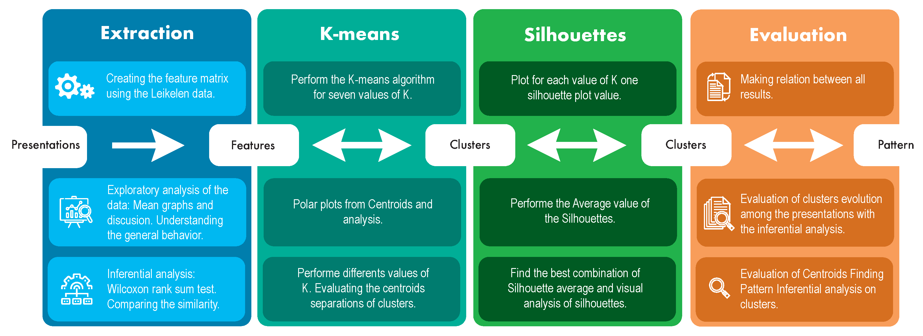
3. Materials and Methods
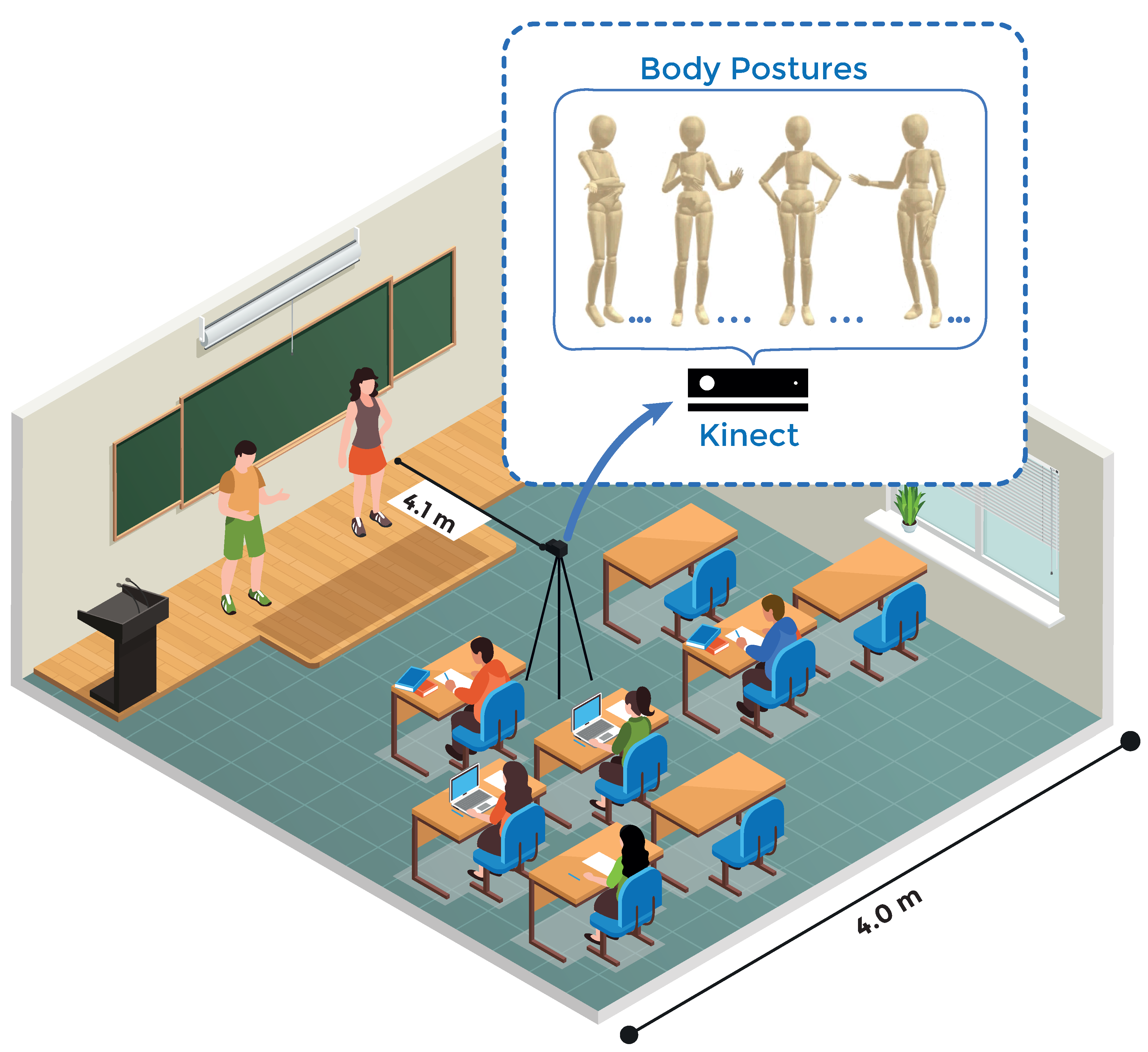
3.1. Case Description
3.2. Microsoft Kinect
3.3. Procedures and Data Collection
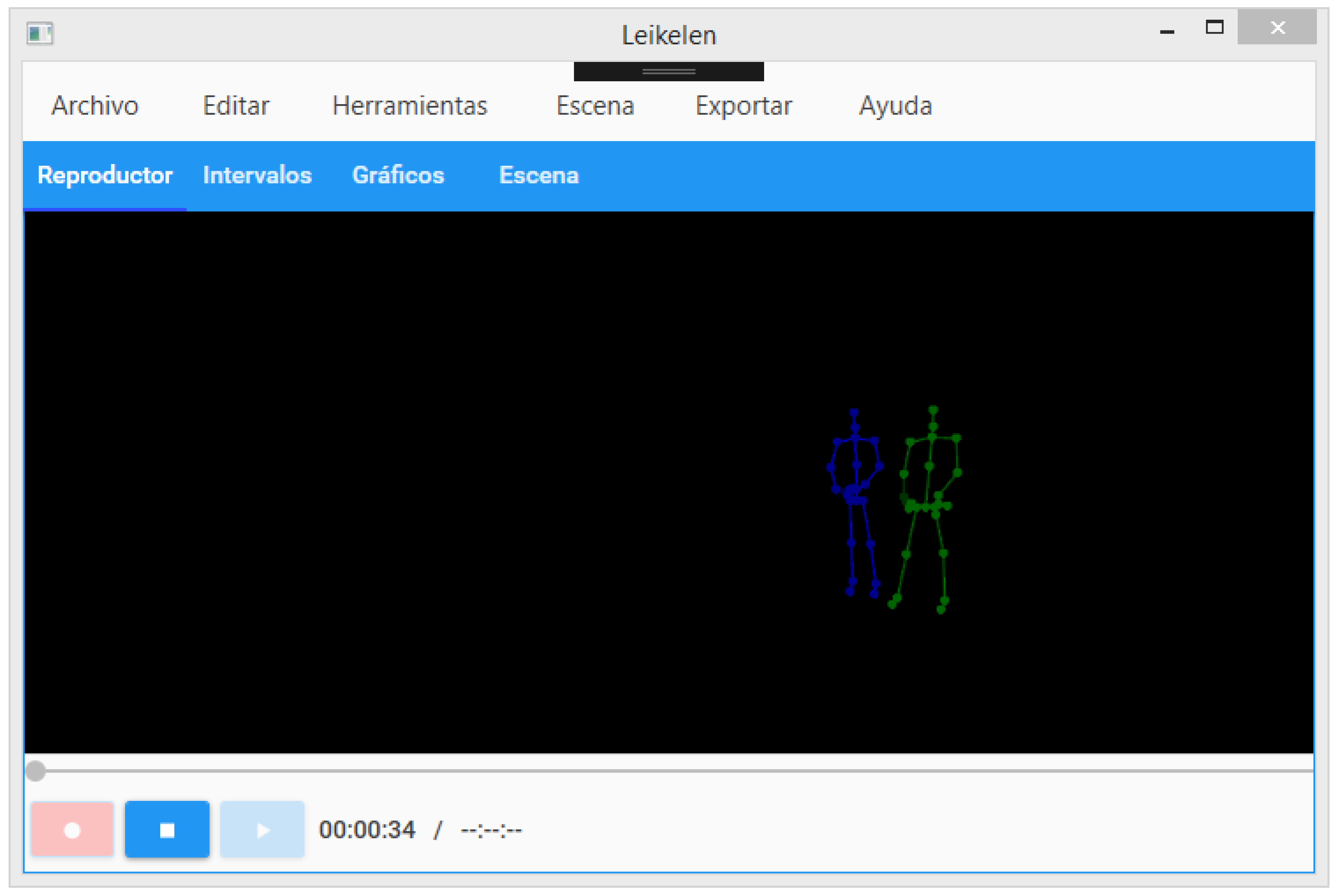
3.4. Lelikelen Tool
3.4.1. Features Collected
3.4.2. Data Description
4. Results
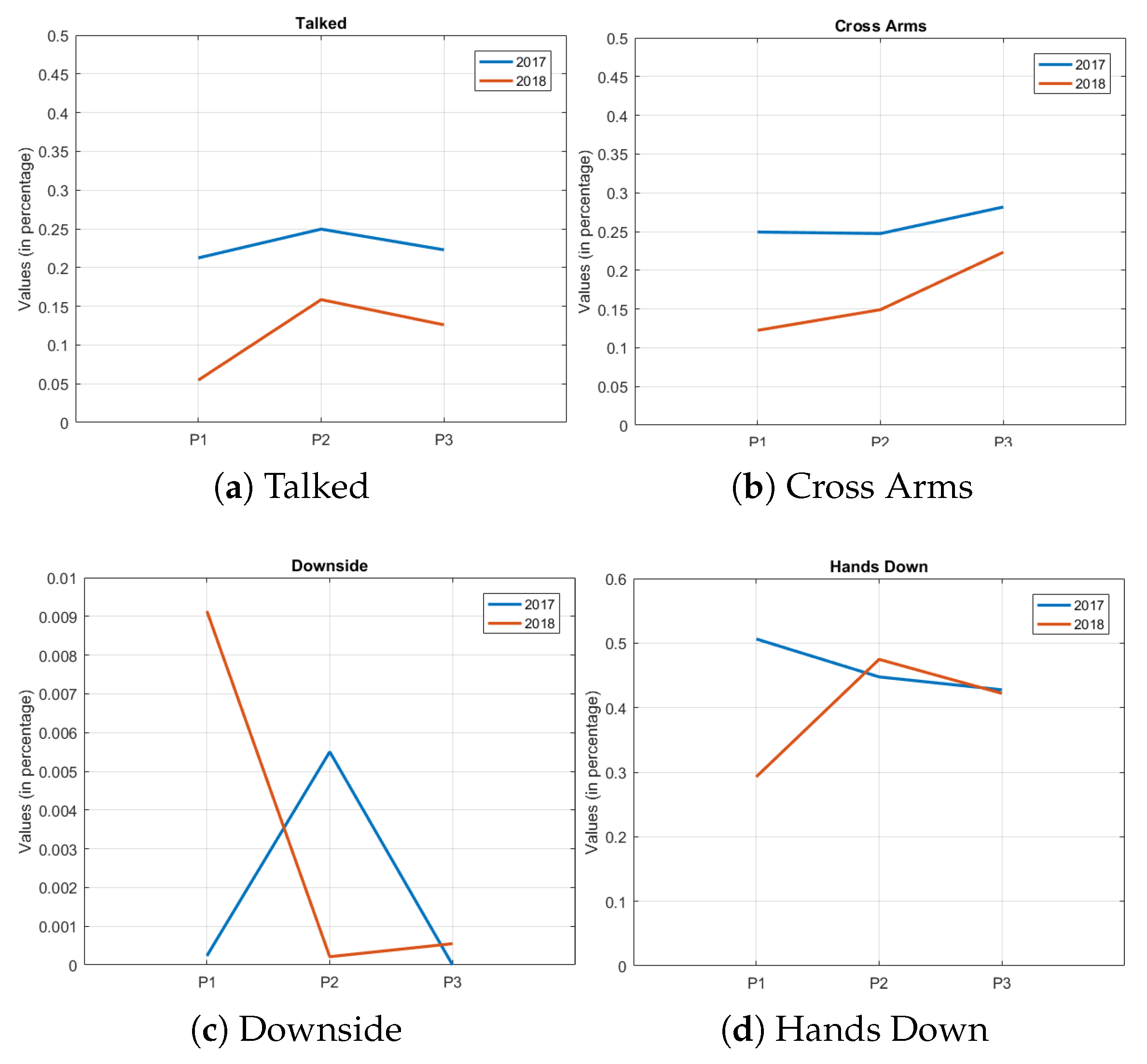
4.1. Comparing the Attributes between Data Sets
4.2. Clustering
4.2.1. K-Means
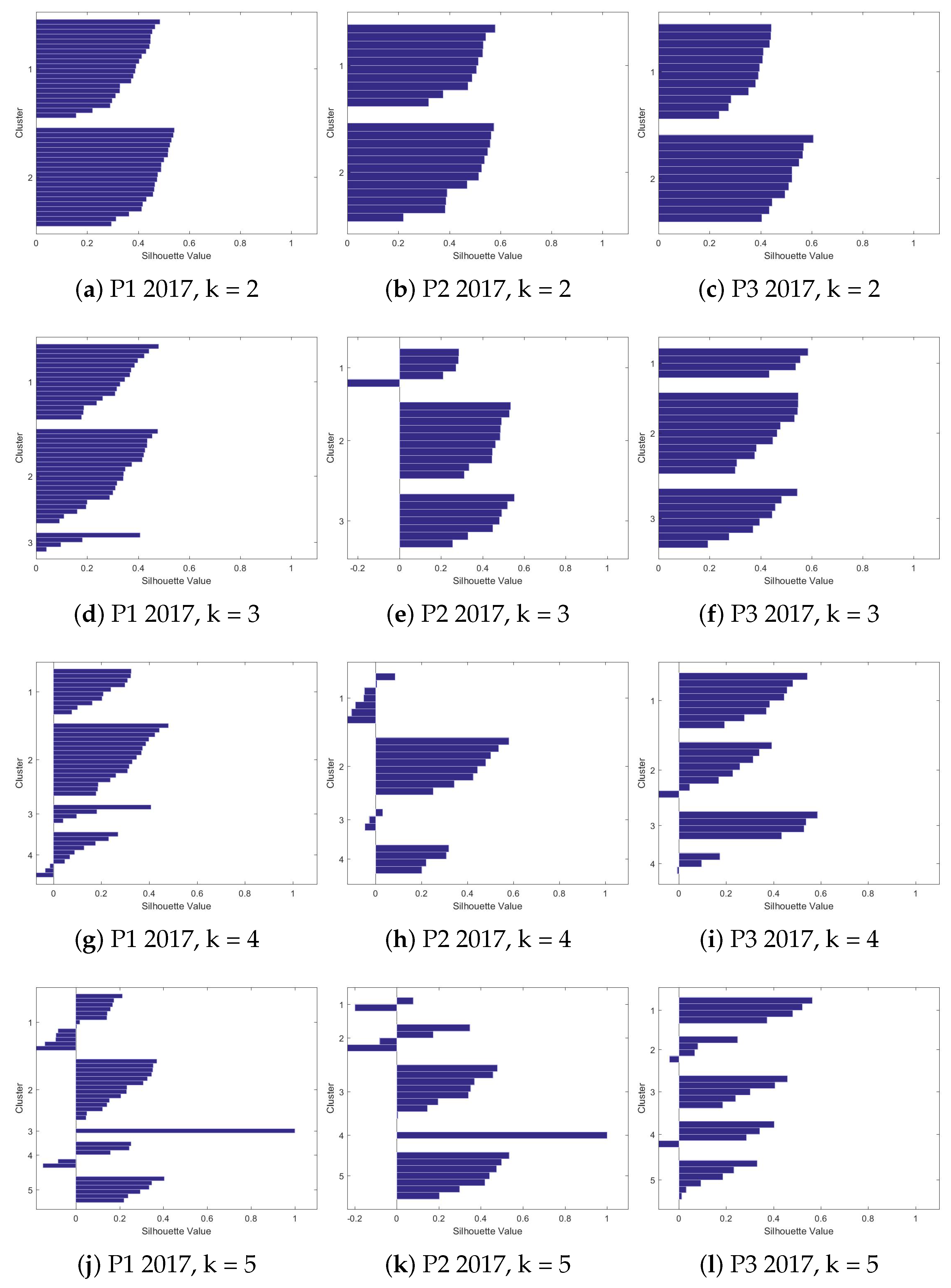
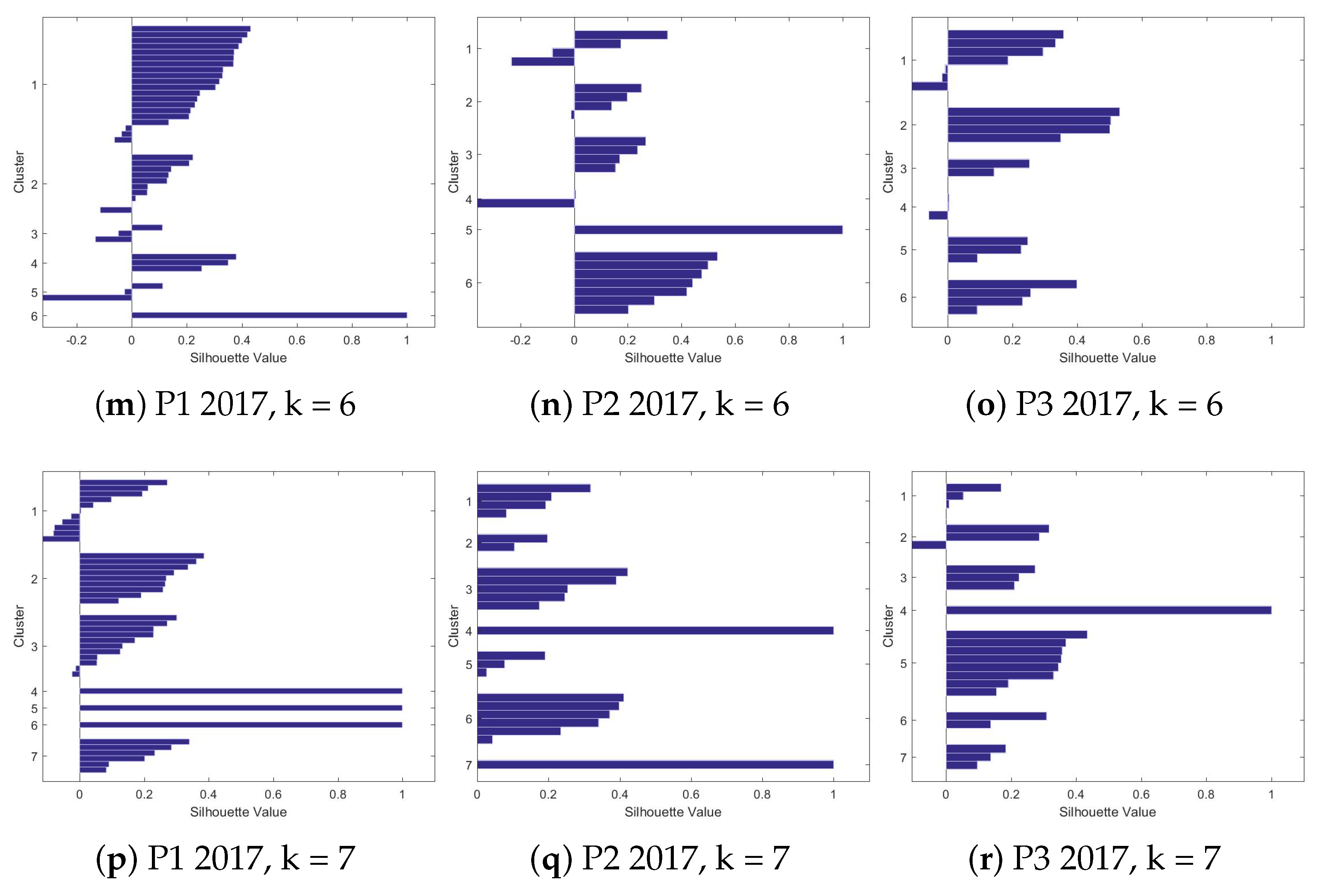
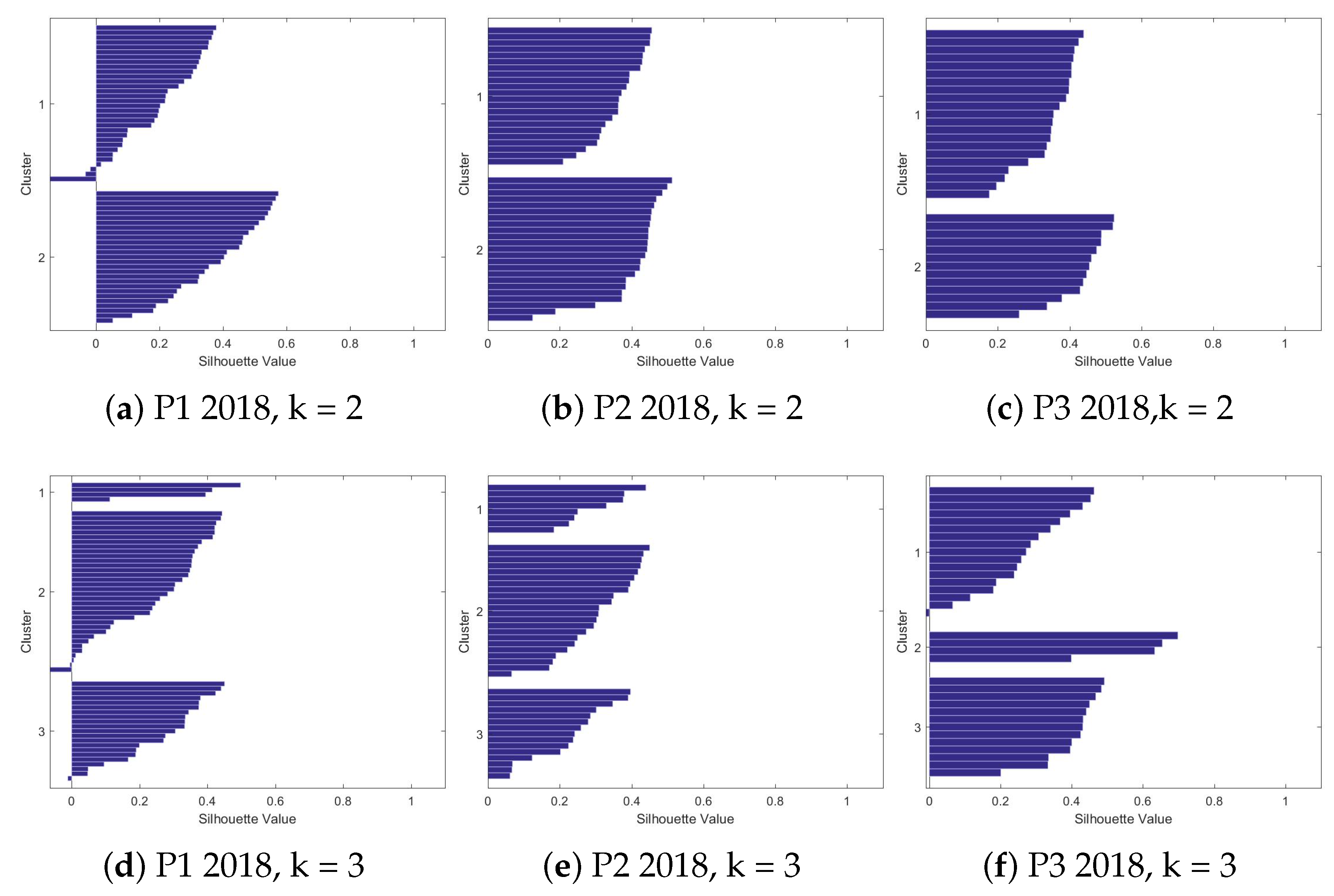
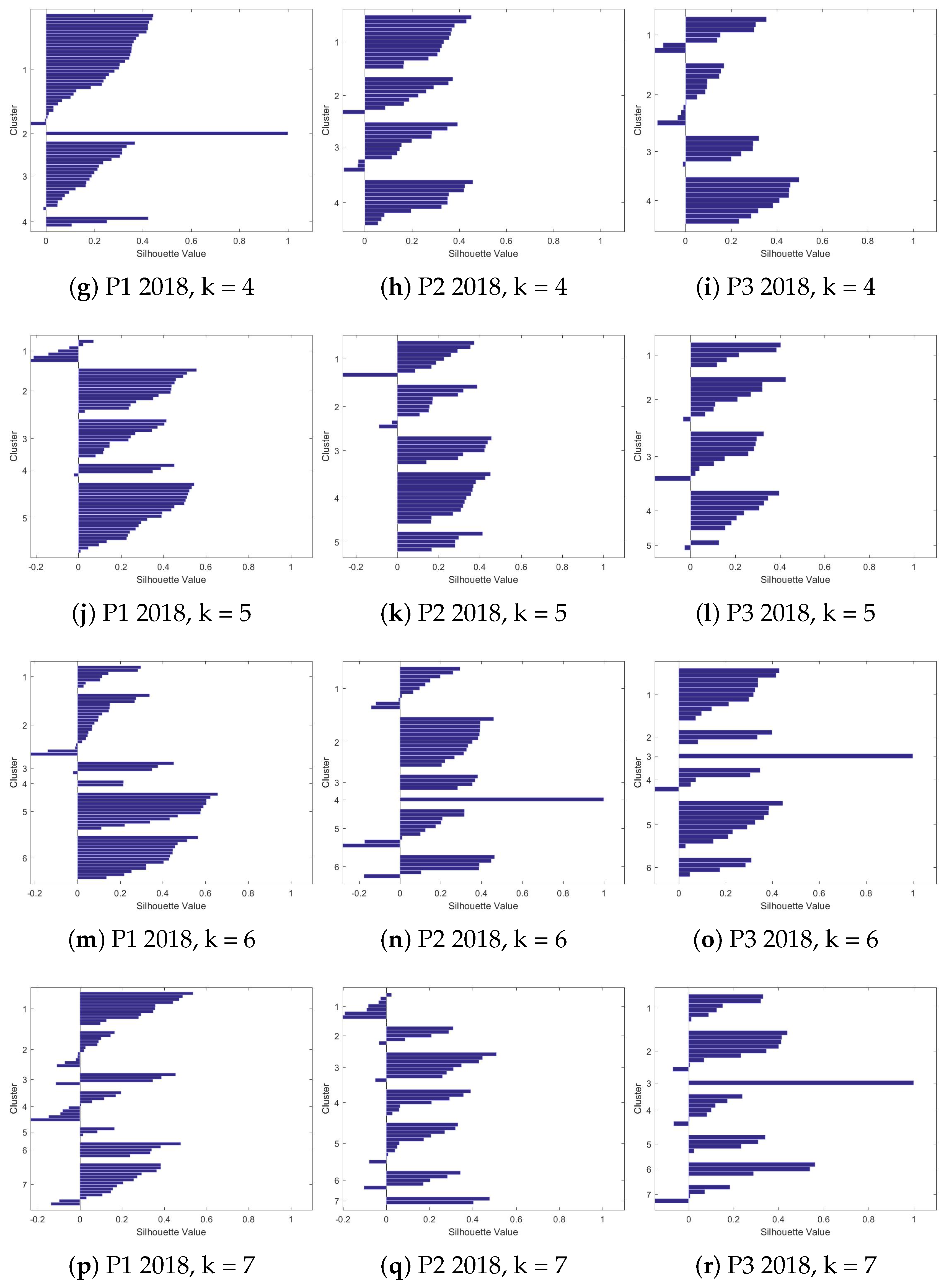
4.2.2. Silhouettes
4.2.3. The Clusters
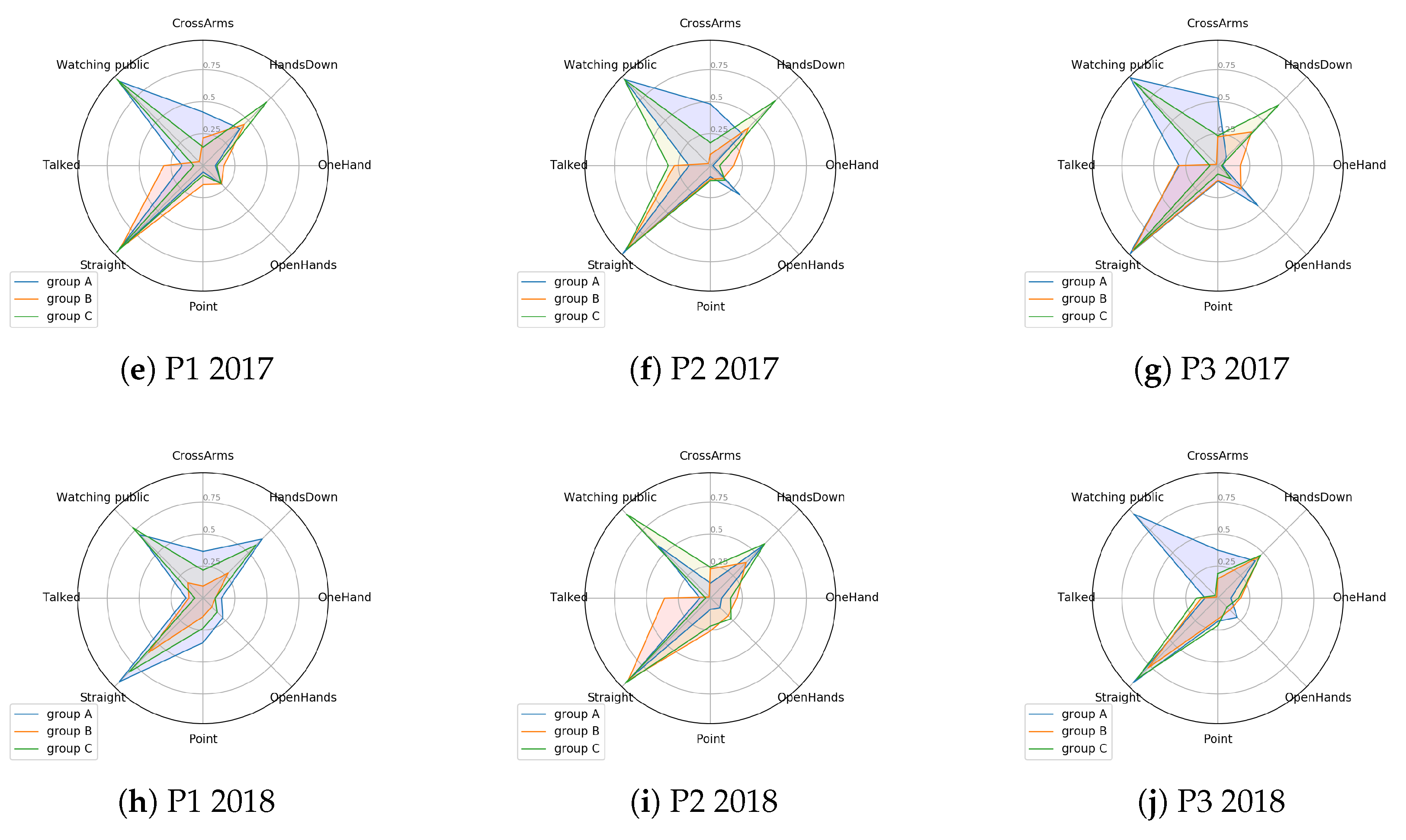
4.3. Comparison among Clusters - Centroid Analysis
4.3.1. 2017 Presentations
4.3.2. 2018 Presentations
4.3.3. Comparison among Years
5. Conclusions
Author Contributions
Funding
Acknowledgments
Conflicts of Interest
References
- Shuman, L.J.; Besterfield-Sacre, M.; McGourty, J. The ABET “Professional Skills”—Can They Be Taught? Can They Be Assessed? J. Eng. Educ. 2005, 94, 41–55. [Google Scholar] [CrossRef]
- Sabin, M.; Alrumaih, H.; Impagliazzo, J.; Lunt, B.; Zhang, M.; Byers, B.; Newhouse, W.; Paterson, B.; Peltsverger, S.; Tang, C.; et al. Curriculum Guidelines for Baccalaureate Degree Programs in Information Technology; Technical Report; ACM: New York, NY, USA, 2017. [Google Scholar]
- Lucas, S. The Art of Public Speaking, 11th ed.; McGraw-Hill Education: New York, NY, USA, 2011. [Google Scholar]
- York, D. Investigating a Relationship between Nonverbal Communication and Student Learning. Ph.D. Thesis, Lindenwood University, St. Charles, MO, USA, 2013. [Google Scholar]
- Munoz, R.; Villarroel, R.; Barcelos, T.S.; Souza, A.; Merino, E.; Guiñez, R.; Silva, L.A. Development of a Software that Supports Multimodal Learning Analytics: A Case Study on Oral Presentations. J. Univers. Comput. Sci. 2018, 24, 149–170. [Google Scholar]
- Mehrabian, A. Nonverbal Communication; Routledge: Abingdon-on-Thames, UK, 2017. [Google Scholar] [CrossRef]
- Noel, R.; Riquelme, F.; Lean, R.M.; Merino, E.; Cechinel, C.; Barcelos, T.S.; Villarroel, R.; Munoz, R. Exploring Collaborative Writing of User Stories With Multimodal Learning Analytics: A Case Study on a Software Engineering Course. IEEE Access 2018, 6, 67783–67798. [Google Scholar] [CrossRef]
- Ochoa, X. Multimodal Learning Analytics. In The Handbook of Learning Analytics, 1st ed.; Lang, C., Siemens, G., Wise, A.F., Gaševic, D., Eds.; Society for Learning Analytics Research (SoLAR): Banff, AB, Canada, 2017; pp. 129–141. [Google Scholar]
- Schneider, B.; Pea, R. Real-time mutual gaze perception enhances collaborative learning and collaboration quality. Int. J. Comput.-Supported Collab. Learn. 2013, 8, 375–397. [Google Scholar] [CrossRef]
- Ochoa, X.; Domínguez, F.; Guamán, B.; Maya, R.; Falcones, G.; Castells, J. The RAP System: Automatic Feedback of Oral Presentation Skills Using Multimodal Analysis and Low-cost Sensors. In Proceedings of the 8th International Conference on Learning Analytics and Knowledge, LAK ’18, Sydney, New South Wales, Australia, 7–9 March 2018; ACM: New York, NY, USA, 2018; pp. 360–364. [Google Scholar] [CrossRef]
- Worsley, M.; Blikstein, P. Analyzing engineering design through the lens of computation. J. Learn. Anal. 2014, 1, 151–186. [Google Scholar] [CrossRef]
- D’Mello, S.K.; Craig, S.D.; Witherspoon, A.; McDaniel, B.; Graesser, A. Automatic detection of learner’s affect from conversational cues. User Model. User-Adapt. Interact. 2008, 18, 45–80. [Google Scholar] [CrossRef]
- Thompson, K. Using micro-patterns of speech to predict the correctness of answers to mathematics problems: An exercise in multimodal learning analytics. In Proceedings of the 15th ACM on International Conference on Multimodal Interaction, Sydney, Australia, 9–13 December 2013; ACM: New York, NY, USA, 2013; pp. 591–598. [Google Scholar]
- Oviatt, S.; Cohen, A. Written and multimodal representations as predictors of expertise and problem-solving success in mathematics. In Proceedings of the 15th ACM on International Conference on Multimodal Interaction, Sydney, Australia, 9–13 December 2013; ACM: New York, NY, USA, 2013; pp. 599–606. [Google Scholar]
- Worsley, M.; Blikstein, P. What’s an Expert? Using Learning Analytics to Identify Emergent Markers of Expertise through Automated Speech, Sentiment and Sketch Analysis. In Proceedings of the 4th International Conference on Educational Data Mining, Eindhoven, The Netherlands, 6–8 July 2011; pp. 235–240. [Google Scholar]
- Ochoa, X.; Worsley, M. Augmenting Learning Analytics with Multimodal Sensory Data. J. Learn. Anal. 2016, 3, 213–219. [Google Scholar] [CrossRef]
- Ochoa, X.; Worsley, M.; Weibel, N.; Oviatt, S. Multimodal learning analytics data challenges. In Proceedings of the Sixth International Conference on Learning Analytics & Knowledge-LAK16, Edinburgh, UK, 25–29 April 2016; ACM Press: New York, NY, USA, 2013; pp. 599–606. [Google Scholar] [CrossRef]
- Duda, R.O.; Hart, P.E.; Stork, D.G. Pattern Classification and Scene Analysis, 2nd ed.; Wiley Interscience: Hoboken, NJ, USA, 1995. [Google Scholar]
- Riquelme, F.; Munoz, R.; Lean, R.M.; Villarroel, R.; Barcelos, T.S.; de Albuquerque, V.H.C. Using multimodal learning analytics to study collaboration on discussion groups. Univers. Access Inf. Soc. 2019. [Google Scholar] [CrossRef]
- Blikstein, P. Multimodal learning analytics. In Proceedings of the Third International Conference on Learning Analytics and Knowledge, Leuven, Belgium, 8–13 April 2013; ACM: New York, NY, USA, 2013; pp. 102–106. [Google Scholar]
- Scherer, S.; Worsley, M.; Morency, L. 1st international workshop on multimodal learning analytics. In Proceedings of the ACM International Conference on Multimodal Interaction—ICMI’12, Santa Monica, CA, USA, 22–26 October 2012. [Google Scholar] [CrossRef]
- Worsley, M. Multimodal Learning Analytics’ Past, Present, and, Potential Futures. In Proceedings of the International Conference on Learning Analytics & Knowledge, Sydney, NSW, Australia, 7–9 March 2018. [Google Scholar]
- Bidwell, J.; Fuchs, H. Classroom Analytics: Measuring Student Engagement with Automated Gaze Tracking; Technical Report; Department of Computer, University of North Carolina at Chapel Hill: Chapel Hill, NC, USA, 2011. [Google Scholar]
- Ochoa, X.; Chiluiza, K.; Méndez, G.; Luzardo, G.; Guamán, B.; Castells, J. Expertise Estimation Based on Simple Multimodal Features. In Proceedings of the 15th ACM on International Conference on Multimodal Interaction, ICMI ’13, Sydney, Australia, 9–13 December 2013; ACM: New York, NY, USA, 2013; pp. 583–590. [Google Scholar] [CrossRef]
- Raca, M.; Dillenbourg, P. System for Assessing Classroom Attention. In Proceedings of the Third International Conference on Learning Analytics and Knowledge, LAK ’13, Leuven, Belgium, 8–12 April 2013; ACM: New York, NY, USA, 2013; pp. 265–269. [Google Scholar] [CrossRef]
- Raca, M.; Tormey, R.; Dillenbourg, P. Sleepers’ Lag—Study on Motion and Attention. In Proceedings of the Fourth International Conference on Learning Analytics In addition, Knowledge, LAK ’14, Indianapolis, IN, USA, 24–28 March 2014; ACM: New York, NY, USA, 2014; pp. 36–43. [Google Scholar] [CrossRef]
- Cohen, I.; Li, H. Inference of human postures by classification of 3D human body shape. In Proceedings of the 2003 IEEE International SOI Conference. Proceedings (Cat. No.03CH37443), Nice, France, 17 October 2003; pp. 74–81. [Google Scholar] [CrossRef]
- Mo, H.C.; Leou, J.J.; Lin, C.S. Human Behavior Analysis Using Multiple 2D Features and Multicategory Support Vector Machine. In Proceedings of the MVA2009 IAPR Conference on Machine Vision Applications, Yokohama, Japan, 20–22 May 2009. [Google Scholar]
- Zhao, H.; Liu, Z.; Zhang, H. Recognizing Human Activities Using Nonlinear SVM Decision Tree. In Intelligent Computing and Information Science; Chen, R., Ed.; Springer: Berlin/Heidelberg, Germany, 2011; pp. 82–92. [Google Scholar]
- Chella, A.; Dindo, H.; Infantino, I. A System for Simultaneous People Tracking and Posture Recognition in the context of Human-Computer Interaction. In Proceedings of the EUROCON 2005—The International Conference on “Computer as a Tool”, Belgrade, Serbia, 21–24 November 2005; Volume 2, pp. 991–994. [Google Scholar] [CrossRef]
- Moghaddam, Z.; Piccardi, M. Human Action Recognition with MPEG-7 Descriptors and Architectures. In Proceedings of the First ACM International Workshop on Analysis and Retrieval of Tracked Events and Motion in Imagery Streams, ARTEMIS ’10, Firenze, Italy, 29–29 October 2010; ACM: New York, NY, USA, 2010; pp. 63–68. [Google Scholar] [CrossRef]
- Le, T.; Nguyen, M.; Nguyen, T. Human posture recognition using human skeleton provided by Kinect. In Proceedings of the 2013 International Conference on Computing, Management and Telecommunications (ComManTel), Ho Chi Minh City, Vietnam, 21–24 January 2013; pp. 340–345. [Google Scholar] [CrossRef]
- Echeverría, V.; Avendaño, A.; Chiluiza, K.; Vásquez, A.; Ochoa, X. Presentation Skills Estimation Based on Video and Kinect Data Analysis. In Proceedings of the 2014 ACM Workshop on Multimodal Learning Analytics Workshop and Grand Challenge, MLA ’14, Istanbul, Turkey, 12 November 2014; ACM: New York, NY, USA, 2014; pp. 53–60. [Google Scholar] [CrossRef]
- Reilly, J.; Ravenell, M.; Schneider, B. Exploring Collaboration Using Motion Sensors and Multi-Modal Learning Analytics. In Proceedings of the 11th International Conference on Educational Data Mining, Buffalo, NY, USA, 15–18 July 2018. [Google Scholar]
- Luzardo, G.; Guamán, B.; Chiluiza, K.; Castells, J.; Ochoa, X. Estimation of Presentations Skills Based on Slides and Audio Features. In Proceedings of the 2014 ACM Workshop on Multimodal Learning Analytics Workshop and Grand Challenge, MLA ’14, Istanbul, Turkey, 12 November 2014; ACM: New York, NY, USA, 2014; pp. 37–44. [Google Scholar] [CrossRef]
- Gan, T.; Wong, Y.; Mandal, B.; Chandrasekhar, V.; Kankanhalli, M.S. Multi-sensor Self-Quantification of Presentations. In Proceedings of the 23rd ACM International Conference on Multimedia, MM ’15, Brisbane, Australia, 26–30 October 2015; ACM: New York, NY, USA, 2015; pp. 601–610. [Google Scholar] [CrossRef]
- Zhang, Z. Microsoft kinect sensor and its effect. IEEE Multimed. 2012, 19, 4–10. [Google Scholar] [CrossRef]
- Freund, Y.; Schapire, R.E. A Decision-Theoretic Generalization of on-Line Learning and an Application to Boosting. J. Comput. Syst. Sci. 1997, 55, 119–139. [Google Scholar] [CrossRef]
- Hall, E.T.; Birdwhistell, R.L.; Bock, B.; Bohannan, P.; Diebold, A.R.; Durbin, M.; Edmonson, M.S.; Fischer, J.L.; Hymes, D.; Kimball, S.T.; et al. Proxemics [and Comments and Replies]. Curr. Anthropol. 1968, 9, 83–108. [Google Scholar] [CrossRef]
- Chen, L.; Leong, C.W.; Feng, G.; Lee, C.M.; Somasundaran, S. Utilizing multimodal cues to automatically evaluate public speaking performance. In Proceedings of the 2015 International Conference on Affective Computing and Intelligent Interaction (ACII), Xi’an, China, 21–24 September 2015; pp. 394–400. [Google Scholar]
- Lilliefors, H.W. On the Kolmogorov–Smirnov test for normality with mean and variance unknown. J. Am. Stat. Assoc. 1967, 62, 399–402. [Google Scholar] [CrossRef]
- Gibbons, J.D.; Chakraborti, S. Nonparametric statistical inference. In International Encyclopedia of Statistical Science; Springer: Berlin/Heidelberg, Germany, 2011; pp. 977–979. [Google Scholar]
- Lloyd, S. Least squares quantization in PCM. IEEE Trans. Inf. Theory 1982, 28, 129–137. [Google Scholar] [CrossRef]
- Rousseeuw, P.J. Silhouettes: A graphical aid to the interpretation and validation of cluster analysis. J. Comput. Appl. Math. 1987, 20, 53–65. [Google Scholar] [CrossRef]
- Cavanagh, M.; Bower, M.; Moloney, R.; Sweller, N. The effect over time of a video-based reflection system on preservice teachers’ oral presentations. Aust. J. Teach. Educ. 2014, 39, 1. [Google Scholar] [CrossRef]
- Kelly, S.D.; Manning, S.M.; Rodak, S. Gesture gives a hand to language and learning: Perspectives from cognitive neuroscience, developmental psychology and education. Lang. Linguist. Compass 2008, 2, 569–588. [Google Scholar] [CrossRef]
- Schneider, B.; Blikstein, P. Unraveling students’ interaction around a tangible interface using multimodal learning analytics. J. Educ. Data Min. 2015, 7, 89–116. [Google Scholar]


| Features | Description |
|---|---|
| CrossArms | The presenter crossed both arms. |
| Downside | The tilt of the presenter is greater than 0.333, with −1 tilted back and 1 tilted forward. |
| Straight | The tilt of the presenter is between −0.333 and 0.333, with −1 tilted back and 1 tilted forward. |
| Watching public | The presenter is looking at the audience. |
| HandOnFace | The presenter has a hand on the chin. |
| OpenHands | The presenter is explaining with both hands (both hands with arms folded). |
| HandsDown | The presenter is holding hands down. |
| OneHand | The presenter is explaining with one hand down and the other doubled in an explanatory position. |
| HandOnHip | The presenter has his hands on his waist. |
| HandOnHead | The presenter has a hand at the nape of the neck. |
| Point | The presenter is pointing with one hand. |
| Talked | Presenter voice is detected. |
| Year | Presentation | Number of Students |
|---|---|---|
| P1 | 40 | |
| 2017 | P2 | 22 |
| P3 | 22 | |
| P1 | 59 | |
| 2018 | P2 | 45 |
| P3 | 34 |
| 2017 | 2018 | |||||
|---|---|---|---|---|---|---|
| P1 | P2 | P3 | P1 | P2 | P3 | |
| CrossArms | 0.249 | 0.247 | 0.281 | 0.207 | 0.188 | 0.243 |
| Downside | 0 | 0.005 | 0 | 0.012 | 0 | 0 |
| Straight | 0.930 | 0.935 | 0.939 | 0.808 | 0.901 | 0.856 |
| WatchingPublic | 0.493 | 0.529 | 0.496 | 0.473 | 0.468 | 0.365 |
| HandOnFace | 0.074 | 0.061 | 0.053 | 0.112 | 0.072 | 0.084 |
| OpenHands | 0.201 | 0.209 | 0.249 | 0.148 | 0.170 | 0.157 |
| HandsDown | 0.506 | 0.447 | 0.427 | 0.465 | 0.518 | 0.442 |
| OneHand | 0.132 | 0.102 | 0.100 | 0.111 | 0.148 | 0.145 |
| HandOnHip | 0.034 | 0.048 | 0.026 | 0.050 | 0.067 | 0.041 |
| Point | 0.105 | 0.099 | 0.099 | 0.230 | 0.183 | 0.180 |
| HandOnHead | 0.001 | 0.003 | 0.002 | 0.009 | 0.003 | 0.004 |
| Talked | 0.212 | 0.249 | 0.222 | 0.107 | 0.169 | 0.124 |
| 2017 | 2018 | |||||
|---|---|---|---|---|---|---|
| P1 | P2 | P3 | P1 | P2 | P3 | |
| 1 | Straight | Straight | Straight | Straight | Straight | Straight |
| 2 | HandsDown | Watching public | Watching public | HandsDown | Watching public | HandsDown |
| 3 | Watching public | HandsDown | HandsDown | Watching public | HandsDown | Watching public |
| 4 | CrossArms | Talked | CrossArms | Cross Arms | Cross Arms | Point |
| 5 | Talked | CrossArms | OpenHands | Point | Point | CrossArms |
| 2017 | 2018 | 2017X2018 | |||||||
|---|---|---|---|---|---|---|---|---|---|
| P1xP2 | P1xP3 | P2xP3 | P1xP2 | P1xP3 | P2xP3 | P1xP1 | P2xP2 | P3xP3 | |
| CrossArms | 0.900 | 0.622 | 0.741 | 0.338 | 0.590 | 0.310 | 0.309 | 0.197 | 0.459 |
| Downside | 0.046 | 0.290 | 0.017 | 0 | 0.001 | 0.744 | 0 | 0.023 | 0.251 |
| Straight | 0.213 | 0.926 | 0.369 | 0.006 | 0.084 | 0.425 | 0.003 | 0.607 | 0.510 |
| Talked | 0.361 | 0.954 | 0.495 | 0.060 | 0.493 | 0.282 | 0 | 0.030 | 0.065 |
| Watching public | 0.888 | 0.684 | 0.829 | 0.624 | 0.065 | 0.590 | 0.917 | 0.376 | 0.168 |
| HandOnFace | 0.842 | 0.357 | 0.357 | 0.669 | 0.804 | 0.831 | 0.509 | 0.952 | 0.317 |
| OpenHands | 0.653 | 0.082 | 0.346 | 0.321 | 0.734 | 0.666 | 0.025 | 0.179 | 0.007 |
| HandsDown | 0.327 | 0.216 | 0.657 | 0.259 | 0.876 | 0.164 | 0.283 | 0.248 | 0.763 |
| OneHand | 0.168 | 0.497 | 0.593 | 0.029 | 0.102 | 0.909 | 0.493 | 0.017 | 0.102 |
| HandOnHip | 0.906 | 0.054 | 0.108 | 0.952 | 0.105 | 0.150 | 0.723 | 0.784 | 0.604 |
| Point | 0.900 | 0.858 | 0.691 | 0.309 | 0.352 | 0.964 | 0.002 | 0.062 | 0.086 |
| HandOnHead | 0.264 | 0.138 | 0.029 | 0.291 | 0.050 | 0.384 | 0.030 | 0.826 | 0.189 |
| Total | 1 | 0 | 2 | 3 | 1 | 0 | 6 | 3 | 1 |
| 2017 | 2018 | |||||
|---|---|---|---|---|---|---|
| P1 | P2 | P3 | P1 | P2 | P3 | |
| k = 2 | 0.417259 | 0.478511 | 0.437844 | 0.280178 | 0.38786 | 0.380755 |
| k = 3 | 0.310087 | 0.382019 | 0.44329 | 0.259083 | 0.2838 | 0.36101 |
| k = 4 | 0.227186 | 0.192535 | 0.310865 | 0.237299 | 0.247055 | 0.190905 |
| k = 5 | 0.173825 | 0.286057 | 0.247999 | 0.274679 | 0.255968 | 0.204827 |
| k = 6 | 0.19337 | 0.232454 | 0.20892 | 0.26236 | 0.23061 | 0.268057 |
| k = 7 | 0.217924 | 0.303317 | 0.253029 | 0.165628 | 0.163419 | 0.21593 |
© 2019 by the authors. Licensee MDPI, Basel, Switzerland. This article is an open access article distributed under the terms and conditions of the Creative Commons Attribution (CC BY) license (http://creativecommons.org/licenses/by/4.0/).
Share and Cite
Roque, F.; Cechinel, C.; Weber, T.O.; Lemos, R.; Villarroel, R.; Miranda, D.; Munoz, R. Using Depth Cameras to Detect Patterns in Oral Presentations: A Case Study Comparing Two Generations of Computer Engineering Students. Sensors 2019, 19, 3493. https://doi.org/10.3390/s19163493
Roque F, Cechinel C, Weber TO, Lemos R, Villarroel R, Miranda D, Munoz R. Using Depth Cameras to Detect Patterns in Oral Presentations: A Case Study Comparing Two Generations of Computer Engineering Students. Sensors. 2019; 19(16):3493. https://doi.org/10.3390/s19163493
Chicago/Turabian StyleRoque, Felipe, Cristian Cechinel, Tiago O. Weber, Robson Lemos, Rodolfo Villarroel, Diego Miranda, and Roberto Munoz. 2019. "Using Depth Cameras to Detect Patterns in Oral Presentations: A Case Study Comparing Two Generations of Computer Engineering Students" Sensors 19, no. 16: 3493. https://doi.org/10.3390/s19163493
APA StyleRoque, F., Cechinel, C., Weber, T. O., Lemos, R., Villarroel, R., Miranda, D., & Munoz, R. (2019). Using Depth Cameras to Detect Patterns in Oral Presentations: A Case Study Comparing Two Generations of Computer Engineering Students. Sensors, 19(16), 3493. https://doi.org/10.3390/s19163493