Abstract
Biochips are engineered substrates that have different spots that change colour according to biochemical reactions. These spots can be read together to detect different analytes (such as different types of antibiotic, pathogens, or biological agents). While some chips are designed so that each spot on its own can detect a particular analyte, chip designs that use a combination of spots to detect different analytes can be more efficient and detect a larger number of analytes with a smaller number of spots. These types of chip can, however, be more difficult to design, as an efficient and effective combination of biosensors needs to be selected for the chip. These need to be able to differentiate between a range of different analytes so the values can be combined in a way that demonstrates the confidence that a particular analyte is present or not. The study described in this paper examines the potential for information visualisation to support the process of designing and reading biochips by developing and evaluating applications that allow biologists to analyse the results of experiments aimed at detecting candidate bio-sensors (to be used as biochip spots) and examining how biosensors can combine to identify different analytes. Our results demonstrate the potential of information visualisation and machine learning techniques to improve the design of biochips.
1. Introduction
Biochips (also known as lab-on-a-chip technologies) are small flat surfaces with groups of adjacent cells that allow biologists to monitor different biochemical reactions in parallel. In effect, they allow multiple experiments to be run at the same with a higher throughput in short period of time. They can be used to detect a range of analytes (i.e., substances whose chemical constituents are being identified and measured). These include mRNA for drug discovery [1], pathogens for disease diagnosis [2], biological agents [3], and antibiotic residue [4,5].
This paper examines how information visualisation can be used to aid biologists in the design and use of biochips. The first stage in the development of biochips is to select the biosensors for the biochip spots. Occasionally, biochips will be designed with a biosensor for each analyte that they aim to detect. However, using combinations of bio-sensors that can be read together to differentiate between analytes can be more efficient. Here, the combinations must also be read in a way that shows the degree of certainty that a given analyte is present or not [6,7] accounting for imprecise bio-sensor readings can be caused by the manufacturing process or environmental factors (e.g., temperature, humidity, pH level, etc.). Hence, biosensors need to be selected that can be used together to detect analytes in a robust manner. The process of selecting spots that work together effectively is not straightforward, as there are many different combinations and no direct way to understand how the spots will work together when they are combined on a chip. Therefore, biologists designing chips need to have some way to be able to test how different biosensors might work together if they are used for the different spots on a single biochip.
After selecting candidate biosensors, the biologists need to be able to understand how effective their chip is for detecting analytes when used with an appropriate machine learning model. Here, the biologists need to be able to account for some degree of uncertainty when reading a biochip. They need to determine how the classification changes with different biosensor readings. Effectively, the biologist needs to be able to observe both how the individual biosensors perform (to differentiate between analytes) and how they can perform together with a machine learning model when combined on a chip.
As the selection of biosensors and evaluation of biochips can involve the exploration of data and require the biologists to apply their domain knowledge and judgment (for example, making decisions related to the economics of manufacturing the chip or deciding to improve the accuracy of detecting a particular analyte at the expense of another) and information visualisation has previously proven valuable for this sort of task, this paper investigates how information visualisation can be used in the design of biochips. Specifically, we examine at how information visualisation can help biologists to select candidate biosensors and evaluate their performance together on a chip when used with an appropriate machine learning model.
2. Related Work
Information visualisation has been applied in the area of biochip manufacture for a number of different applications. For example, Grimson et al. [8] visualised the result of digital microfluidic biochip static synthesis simulation by using a plain text format both for experiment input and output. Schmidt et al. [9] designed an application for the modelling and simulating framework for microfluidic microchips. This demonstrates a biochip architecture layout that was able to ease and speed up the design of a biochips. Stoppe et al. [10] created a more interactive visualisation showing the droplet movement of analytes for a single-target biochip. This consists of two-dimensional electrical grids that are controlled by electrodes and their electrical actuation and includes the chip layout as well as various chip properties. Kallioniemi et al. [11] visualised microarray data generated from experiments investigating the treatment of prostate cancer. Wen et al. [12] use a colorimetric signal intensity view of data generated by novel plastic biochips for sensitive colorimetric detection demonstrating sensor unit formation, signal transduction, and visualisation on the plastic substrate. To date, there have been no applications that use visualisation to aid the design of chips where spots values are combined to detect analytes such as antibiotics.
The prototypes presented in this paper use interactive information visualisation and machine learning models to assist biologists and highlight potential biosensors to detect or differentiate between different antibiotics and determine how biosensors can be combined to identify different analytes. The visualisation allows users to interact with the data through and determine the effectiveness of different biosensor combinations.
2.1. Information Visualisation
Information visualisation is defined as “the representation of data by using dimensional or graphical ways to ease comparison, pattern recognition, change detection, and other cognitive skills by making use of visual system” [13]. It has been proven to help users analyse data, particularly large-scale and complex data, and help generate useful insight into those data. Notable examples of visualisation used in the area of bioinformatics are the Craig et al. visualisation technique [14,15,16] using animation to find temporal patterns in large-scale microarray data or the Graham et al. interface [17] using curves to enhance parallel coordinates for taxonomic data. Information visualisation is also used in diverse fields such as scientific research, financial data analysis, digital libraries, market studies, data mining, and manufacturing production control. Common visualisation techniques include scatter plots, surface plots, histograms, heatmaps, parallel coordinate plots, and tree maps.
According to Task by Data Type Taxonomy for Information Visualisations presented by Ben Shneiderman [18], it is can be useful to classify visualisations by data type in order to find similar visualisations that can be re-applied or adapted for re-use. According to the taxonomy published, the data generated by biochips can largely be classified as multi-dimensional data with numerical attributes. However, none of the seven categories presented are as easily applicable to the task of comprehending machine learning classification. Furthermore, uncertainty in the data can significantly impact the analysis and subsequent decision-making. As a result, uncertainty needs to be one of the primary considerations when analysing this type of data.
2.2. Uncertainty Visualisation
Uncertainty can be a particularly challenging aspect of data to handle within a visualisation, and there are various types of uncertainty that need to be managed. These can appear from data analysis in the phases of measurement, modelling, or forecasting [19]. In our case, the process of combining several biosensors to detect analytes can result in uncertainty in the sensitivity of the biosensors due to imperfections from the manufacturing process or environmental conditions. Either of these factors can result in inaccurate biosensor readings, and it is important for biologists to be aware of the degree of uncertainty when accounting for the performance of each biosensor to distinguish analytes. This is an important issue to be considered for both the effective development and reading of a biochip.
Visualising uncertainty is often precipitated by a need to create scientific transparency [20]. Often, researchers need to study the nature (and possible origin) of uncertainty in order to make more informed and qualified decisions. A cognitive aid that offers uncertainty information to assist people in carrying out these activities is known as an uncertainty visualisation [21]. Uncertainty in the data needs to be considered wisely, as it can significantly impact data analysis and the resulting decision-making process. Therefore, uncertainty needs to be considered when analysing and communicating visual data. Dots, lines, and icons are common techniques to display uncertainty directly, including error bars to show the confidence level of the data. Kinkeldey et al. [22] states that “Overall, based on studies reviewed, uncertainty visualization has tended to result in a positive effect”. Uncertainty visualisation has been approached in a number of different ways, such as interpretation of hurricane forecast uncertainty visualisations [23], visualising uncertainty using bubble tree maps [24], and visualising uncertainty in medical volume rendering using probabilistic animation [25].
In summary, uncertainty visualisation is an important consideration, as researchers can make a significant improvement in the communication of uncertainty. Although uncertainty can make decision-making more difficult, its representation is often a crucial aspect of the decision-making process itself.
2.3. Explainable AI
Explainable AI (XAI) is a technique in artificial intelligence that allows human users to understand and trust the results and output generated by machine learning algorithms [26]. As biochips can perform more efficiently and effectively if multiple spots yield a reading for each analyte and machine learning algorithms are used to read the results, it is important to consider XAI for biochip visualisation as making the machine learning more understandable could help the users interpret the generated result. XAI aims to describe how machine learning models predict the results. It is critical in the process development to let users have an understand of the process of AI decision-making and not to blindly trust AIs. Thus, XAI can help humans understand and explain machine learning algorithms. This can assist in characterising models and improve accuracy, fairness, transparency, and outcomes [27].
In the field of bioinformatics, Lamy et al. [28] studied a case-based reasoning approach based on explainable AI that can be implemented naturally as an algorithm and can display a combination of scatter plots and rainbow boxes to contribute visual explanations (visual reasoning) for diagnosing breast cancer.
Another example from So [29] presented an XAI histogram technique for visualisation as a prediction mechanism for human sentiment. Joo et al. [30] applied a heatmap in deep reinforcement learning using XAI for game development. Hudon et al. [31] visualised how artificial intelligence predictions can affect users’ cognitive loads and confidence, also using a heatmap. In each of these examples, explainable AI proves its value by allowing users to build trust and confidence when applying machine learning models. Explainable AI has also been used in applications for education, recommender systems, sales, lending, and fraud detection [32].
As artificial intelligence develops quickly to become increasingly complex, we face more challenges in interpreting and retracing how the machine learning algorithms generate results. Machine learning models often act as “black boxes”, which are virtually impossible to visualise in any meaningful way due to the massive number of different connections and nodes that contribute to the result to varying degrees. Neural networks are one of the types of models that are very difficult for humans to understand the workings of [33]. However, by visualising the degree of correct and incorrect analysed values in the data model, we can move towards an understanding based solely on input and output.
Ultimately, explainable AI has become one of the solutions for applying responsible machine learning model. In general, the design in this case study follows several aspects. The first is simplicity and readability, where the interface is human-readable and understandable. Furthermore, the interface is easy to understand and learn. The content of our prototype is designed to be comprehensible without having to read the documentation or develop an understanding through extended usage.
3. Well Experiment: Biosensors Selection
To select suitable biosensors for a biochip, biologists set up experiments using a number of prospective biosensors monitored over a period of time after being exposed to different analytes. This process is recorded to video and each frame of the video (Figure 1) is analysed by extracting the colour values to gauge the effect of each analyte on each biosensor at each point in time.
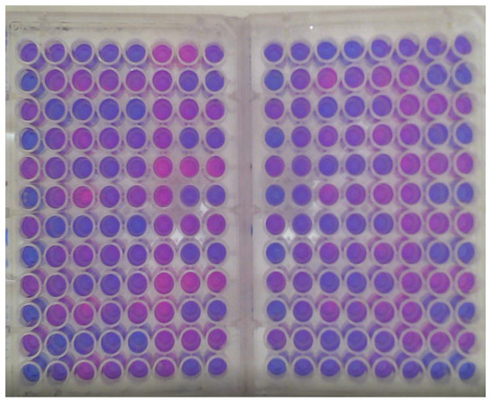
Figure 1.
Well experiment at a certain time point.
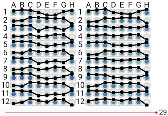
A sample of the data generated by these experiments is shown in Figure 2. Here, each plate is divided into blocks of eight rows (A–H) and 12 columns (1–12). For each plate, the blocks starting at A1, A3, A5, A9, and A11 are always filled with a positive control. Thus, negative controls are located on H4, H8, and H12. The blocks starting on plate 1 (A3, 7, 11) all have antibiotic a, and blocks starting on plate 2 (A3, 7, 11) all have antibiotic b.
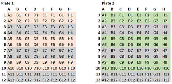
Figure 2.
The well experiment data.
4. Visualisation Interfaces
To fulfil the requirement of the project as described above to support the design and reading of biochips, we propose two types of interactive interfaces. These are called the Well-Explorer, showing the well plate experiment, and implementing a glyph view to indicate the usefulness of each biosensor, and BioChipVis, a classification interface which applies a random forest classifier to read the chip with an indication of uncertainty.
In order to visualise the data effectively, we follow the five guidelines proposed by Smith and Mosier [34], which include consistency of data display, efficient information assimilation by the user, minimal memory load on users, compatibility, and flexibility for control of data display. This helps users focus on only relevant information. Finally, flexibility is important to consider for user navigation of data display, this is achieved when users can interact with the display with incremental updating of the results to explore the time in the original experiment and the input/output of the classification model.
The process of how this application fits into a biologists’ workflow is shown in Figure 3. At first, biologists perform the well experiment to select potential biosensors, as mentioned in Section 3. The Well-Explorer can ease the process of the selection of biosensors. Afterwards, biologists combine the biosensors into a biochip. Finally, the biochip can be tested in the real environment where BioChipVis (or Biochip Explorer) is used to read the chip. BioChipVis can also be used by chip designers to reveal flaws in the machine learning model which can be retrained with new data accordingly.
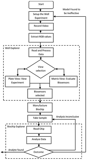
Figure 3.
Flow diagram of the application usage process.
4.1. Well-Explorer
The well-Explorer is a prototype designed to help biologists better understand patterns in biochip well experiments in order to select the most effective biosensors for the development of an effective and efficient biochip. Well-Explorer includes two principal views in different tabbed panes. The first of these is a replication of the well experiment. This is combined with a glyph view in a matrix which shows the results of the wells experiment during the data collection phase. We chose to use glyphs to represent the biosensors as it integrates with computer-based video analysis and human-centred visualization [35]. The experiment is divided into two sections, one on each of the right and left sides, which correspond to the two distinct antibiotics that are exposed to duplicate sensors. The two antibiotics were examined in pairs because it enables researchers to determine which biosensors are responding to particular analytes and which biosensors can be used to differentiate between analytes.
The objectives of designing this interface for the biologists to verify the data from their experiments are as follows.
- Determining which biosensors can detect one or more antibiotics.
- Determining which biosensors can differentiate between the antibiotics.
- Identifying the best duration for the chip to be exposed to the sample before the reading is taken.
These objectives could not be fulfilled by visually reviewing the experiment video unless the effect on a biosensor was very pronounced and persisted for a long time. This was not the case with any of the antibiotic tests, because the effects were nuanced and manifested gradually. The biologists were therefore unable to determine which biosensors were efficient only through visual inspection.
In order to choose which biosensor is a candidate for inclusion on the chip, biologists might need to consider certain factors based on specialised domain knowledge, such as the size of the effect, length, and timing of the effect, and how the effect may be identified using different duplicate values. Without the aid of our visualisation interface, biologists would spend more time searching for the potential biosensors. Well-Explorer can aid biologists in identifying biosensors, and this can help save valuable time during the design process.
4.1.1. Visualising the Plate Experiment
Our visualisation design’s initial phase is a replication of the original well experiment with enhanced colours. This might be considered a “detail view” that enables the biologists to compare any conclusions with a more accurate depiction of the original data.
For the original colour plate view (Figure 4 and Figure 5), principal component analysis [36] was applied to convert the RGB values of each spot into a single numeric value which was then translated to a colour scale to enhance the original colours and make it simpler to distinguish between values. To help users better understand the changes between values, a line graph is an additional option that can be placed on the display. The interface is designed to allow the user to change the point in time shown by manipulating a slider at the bottom of the screen. Three options of colour selection are provided:
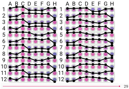
Figure 4.
View of biosensor visualisation in the original colour, dark purple to pink.
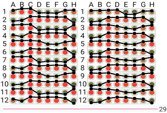
Figure 5.
View of biosensor visualisation with the colours transformed to the green to red colour scale.
4.1.2. Glyph View
A table view with glyphs is used in conjunction with our plate view to aid the biologists in identifying biosensors that have a high potential for detecting or differentiating between antibiotics shown in Figure 7. The biological sensors are represented by the letters and numerals A1, B1, C1, etc. on the vertical left side. The time in minutes is indicated by the numerals 1 through 30 on the top horizontal. The results of the t-test used to determine the statistical significance of the difference between antibiotic replicate values and antibiotic and control values are shown as glyphs in each cell of the table. The purpose of the glyph is to draw readers’ attention to more important results in the Table [37] that either demonstrate a very substantial difference over a shorter time period or a significant difference over a longer time period. Significant differences from the control demonstrate the antibiotic’s detection, and variations across antibiotics demonstrate the biosensor’s ability to distinguish between them. The detail of the glyph is shown in Figure 8.
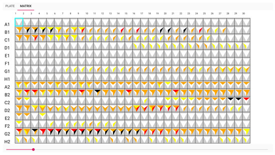
Figure 7.
The table view with glyphs visualisation.
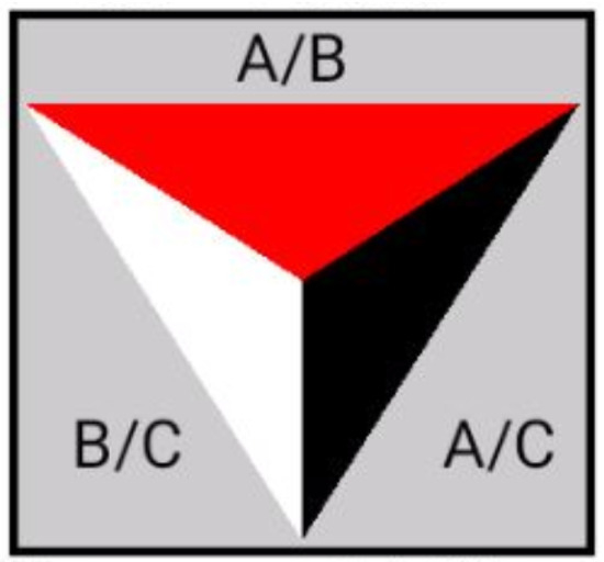
Figure 8.
Design of the glyph.
We divide the glyphs into three sections, and for each row and time point, we perform three paired t-tests on each row and every time point. The t-test result between antibiotics A and B is displayed on top, the result contrasted with antibiotics A and the control is shown on the right, and the result between antibiotic B and the control is shown on the left. The colour represents how well the sensor can distinguish between the two antibiotics and the control. The triangle’s five colour selections are coloured as the following:
- White for value greater than 0.1;
- Yellow for values between 0.1 and 0.05;
- Orange for values between 0.05 and 0.01;
- Red for values between 0.01 and 0.005;
- Black for values smaller than 0.005.
The glyph representing white on A1, E1, and F1 in Figure 9 indicates that no antibiotic has been discovered. Another illustration from the sample, G2, shows that an antibiotic was discovered from minutes 5 to 17, as seen by the dark colour in Figure 10. It had a good performance distinguishing between A and B samples with a t-test score between 0.01 and 0.005. However, the biosensor was unable to distinguish between sample B and the control. The adoption of these prototypes can help biologists communicate more clearly and place more emphasis on the wells. This visualisation can aid in recognizing the pattern.
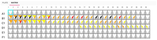
Figure 9.
Matrix view: sensors A1, E1, and F1 detect no antibiotic.
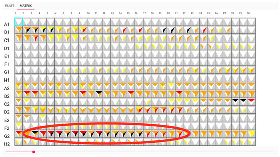
Figure 10.
Matrix view: sensor G2 can detect antibiotic A from approximately time point 5 to 17.
4.2. BioChipVis
BioChipVis is an interactive mobile interface that works in a smartphone or tablet that allows users to quickly recalculate input values when input values are changed by classifying biochip data to show the classification changes for adjustments in each value. Users can observe the changes in the data classification and observe the classification changes of individual biosensor values. Interactive visualisations are applied in this interface that let us to rerun classifiers with different values and display the results. This interface implements a random forest classifier, and the machine learning model is able to predict imprecise measurements where a small difference in any input value can potentially change the output of the model.
The objectives of designing this interface are listed as follows.
- Evaluate the overall effectiveness of the model.
- Evaluate the effectiveness of the model for different classes.
- Evaluate the effectiveness of the model for different patterns in the data.
In order to evaluate the overall effectiveness of a supervised learning model, we can assess its accuracy with a test data set that is distinct from the training data. Accuracy is defined as the number of elements that are correctly classified divided by the total number of elements and is expressed as a number in a range from one (all elements correctly classified) to zero (no elements correctly classified).
Typically, a data set is trained using a randomly selected portion of a labelled data set and evaluated (for accuracy, etc.) with the remainder of the same labelled data set. As mentioned before, our data are multidimensional data, and uncertainty can be multiplied and hard to quantify. Therefore, the classification value is viewable and able to animate the classification result in our interface.
As biologists would like to evaluate the effectiveness of the model for different classes, another statistical tool known as a confusion matrix [38] can be used. This gives a more thorough understanding of a model’s performance by displaying how the actual classes of items correspond to the anticipated class for each pair of classes. This is mostly display as a grid (with every class represented as a row and column) and can be colour coded to emphasize classes that are confused by the model.
In order to evaluate the effectiveness of the model for different patterns in the data, we can demonstrate the effectiveness of the model for patterns already present in the test data set using the approaches outlined above; these methods and metrics will not be applicable for patterns that are not present in the test data set and the model will not be able to accurately categorise such patterns. These unidentified patterns might be interpreted as gaps in the training data.
There are several elements included in the BioChipVis’s interface. The results panel shows the classification result for the current attribute values by displaying the percentage of the total classification score given to each separate class. This makes use of a large rectangle separated into sections that are colour coded and whose widths are proportional to the percentage for each class. The segments are labelled and coloured using a colour scheme modified from the Brewer colour scheme [39].
The central attributes panel contains wide rectangles (attribute boxes) that indicate to the users which attribute values are selected and how changes in the values change the classification result. The attributes that are most effective for categorizing the training data into different classes are positioned closer to the top and ordered according to the information gain for the training data attribute values. The selected value is indicated for each attribute box by a red line. If the values for all other attributes remain constant, the boxes can also serve as stacked bar charts [40] showing the relative score for each class for each attribute value. Additionally, the user can select and drag the red line to observe how the classification changes when the value is altered. When this occurs, the red line gradually moves to follow the mouse cursor to ensure a smooth transition [16,41] (Figure 11). The user can then examine how sensitive the classification is to variations in the values of the individual attributes.
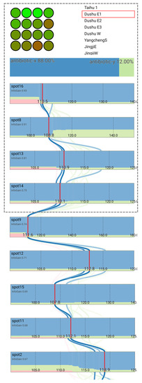
Figure 11.
The interface showing the results of scanning a biochip with the classification and contribution of different spot values. The four spot values that obtain the greatest information gain to alter the classification are on the screen first, and the user is able to scroll down to observe more spot values.
The centre attribute panel’s curving lines serve as a parallel coordinates plot [17,42] to show the values for the training data set instances that are closest to the currently chosen values. In order to make training data instances that are more similar to one another appear darker and those that are less similar to one another fade into the white background, the weight of the colour of each line is proportional to the Euclidean distance between the training data instance and the selected values in normalized attribute space. As a result, the user may observe which training data are comparable to their own data and can determine how effectively the model will categorize their data.
Users can interact with the interface to investigate the sensitivity of their classification to changing spot values. This can assist users in better comprehending the classification and uncertainty in their data. For instance, by choosing the sample DushuE 2019-31-7 (Figure 12), the classification antibiotic x may be sensitive to shifts in the value of spot 8. We can identify the possible difference in the confidence in the classification toward antibiotic y by clicking and dragging to change this spot value (with the red line and classification animation gradually to a new hypothetical value) (Figure 13).
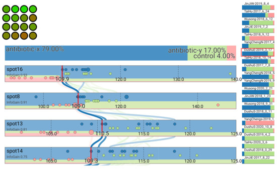
Figure 12.
Classification of sample DushuE 2019-31-7.
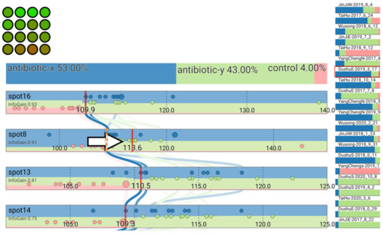
Figure 13.
Classification result changes after adjusting the value for spot 8.
The design philosophy of our application was that it would be to provide the users the results of the classifier and how changes in their data changed the results as opposed to attempting to show anything about how the classifier processes the data. This was because the users’ goals relate almost exclusively to their data rather than the algorithm used to classify the data. The user is interested with the output of the algorithm rather than its workings and it is easier to understand the output of the algorithm than the details of how it classifies the data. Hence, our design shows the data and classification results without showing any details of the internal process of the classification algorithm itself. In fact, the visualisation is largely independent of the supervised classification algorithm, allowing us to use more complex algorithms such as random forest and neural networks that are known to be more accurate for most types of data [43]. Ultimately, we used a random forest algorithm, as this was found to run efficiently for calculating values rapidly on a standard mobile device, allowing us to rapidly update the display when the user changes their selection.
Our design is also specifically aimed at allowing us to satisfy the objectives that we felt were not adequately served by existing techniques. Therefore, users can quickly obtain an indication of how changes in their data would change the classification results by examining at the colour coding in the attribute bars. They can also click and drag attribute values to observe exactly what the changes indicate (Figure 12 and Figure 13) and use this process to progressively explore the output space and obtain a sense of how the input maps to the output. Users can also observe how different patterns affect the classification by either clicking and dragging to explore or observing how the test data are classified. Examination of test data that are not well classified can also allow users to find patterns that are not well represented in their model. This, in turn, can help them understand how their model might be retrained and improved.
5. Case Study
As a case study, we evaluated our application interfaces with a group of seven biologists working on the design of a biochip to be used in the detection of antibiotic pollution. While antibiotics are an important tool to help fight against many types of bacterial infections, antibiotic pollution (i.e., antibiotics escaping into the environment) can lead to the development of antibiotic-resistant bacteria that are incredibly difficult to treat and manage in a hospital environment. Hence, researchers and government agencies are beginning to focus their attention on initiatives to monitor and control antibiotic pollution. Biochips for antibiotic pollution are one such initiative.
In order to evaluate our applications, we used a modified version of the insight-based methodology for bioinformatics visualisation evaluation proposed by Saraiya et al. [44,45,46,47]. This matched the needs of our study well. The insights that could be gained from the data were the most important requirement from the biologists, and they were a lot less concerned with finding obvious patterns in their data or the time it took for the analysis to be completed. In addition to using the applications developed for this paper, the biologists also employed their normal workflow using the raw images and videos generated from the experiment as well as software to extract RGB values numerically and statistical analysis methods with basic visualisations in commercially available spreadsheet software. To account for the smaller number of biologists involved in the study and the potential for bias by performing either technique first, the biologists were asked to reflect on whether or not patterns found using either technique could also be found using the other technique. This allowed us to count the number of significant patterns that could be found exclusively using the software developed.
A summary of the patterns found during the evaluation of the well explorer application is shown in Table 1. By using the traditional method, our test users were able to find a total of seven distinct insights. Using the software developed for this study, they were able to find an additional 10 patterns and 17 patterns in total. Typically, these were more complicated insights where distinct patterns needed to be combined. An example of this is shown in Figure 10. Here, we can observe that both spot B1 and G2 can both detect and differentiate antibiotic A and B. This indicated that these biosensors are good candidates to be included as spots in the resulting biochip design. Overall, the results indicate that our software has the capability to reveal patterns from experimental data that can better support biochip design.

Table 1.
This table summarises the comparison of total number of insights found by using the traditional method and well explorer software.
A summary of the patterns found during the evaluation of BiochipVis is shown in Table 2. Here, we could find five distinct patterns that allowed us to improve the biochip design that could not be found using traditional methods. Two of these were patterns demonstrating ambiguity in the biochip reading where an additional biosensor would be needed to detect a particular antibiotic. The remaining three showed that biosensors were redundant, as they served the same function of distinguishing antibiotics as other biosensors. Each of these patterns required the biologists to adjust the value sliders to control the data. The biologists felt that each of these patterns could probably be found using some custom statistical method developed for the data. However, the large search space and potential number of possible patterns would make this time consuming, and the data would likely need to be visualised in order to confirm the patterns’ existence. The biologists felt that using the BioChipVis tool made finding the patterns a lot easier, and that it was a more satisfying process. These results indicate that the software can improve the process of biochip design.
Table 2.
This table summarises the comparison of total number of insights found by using the traditional method and BioChipVis software.
In addition to the evaluation described above, a survey was used together with a description of the test study with a group of fourteen biology students (ages 20 to 23) to gauge their perception of the software’s utility and the practicality of using the software for finding patterns that assist in the design of biochips. Here, we asked the participants to rate the software, together with the traditional technique, on a scale of one to five according to how strongly they agreed with a set of statements indicating the software’s usefulness. The results of the survey are shown in Table 3. This demonstrates the potential that users observe for this type of software to be applied in the design of biochips.
Table 3.
Summary of survey results.
Our evaluation demonstrates the potential for visualisation software to improve the process of the designing biochips. The biologists involved in the evaluation were able to analyse their experimental data, find more insights in their data, and felt that the process was more efficient, effective, and more satisfying overall. Currently, a group of biologists involved in one of our case studies have designed a chip and are looking to manufacturing this design for use with food safety inspectors. This demonstrates the potential for visualisation of antibiotic pollution detection chips as well as other applications such as the detection of pathogens or biological agents.
6. Conclusions
We have developed interactive information visualisation applications for the process of biochip design. The software helps biologists select biosensors that can be used together to detect a range of antigens and test the design by reading chips with a view of the confidence in the classification.
The Well-Explorer application uses a glyph matrix type visualisation to accelerate the process of biosensor selection. The visualisation shows which biosensors have the best ability to detect and identify analytes by showing the results of t-test comparing results for biosensors exposed to different analytes.
The BioChipVis prototype allows biologists to test their biochip design by applying a random forest classifier on up to sixteen numeric attributes that can display the classification difference and three or four classifications with around fifty or a hundred data instances in the training data set. The application was developed to run on smartphones and tablets, allowing biologists to gain a perspective on how the classifier works by incrementally adjusting spot values with immediate feedback. This allows users to evaluate uncertainty in the classification model according to changes in attribute values. Users are able to determine how their classification performs and observe how new data can fit their model. This allows them to test their model and can indicate if their design needs to be adjusted.
Both techniques were evaluated with a case study in the area of antibiotic pollution detection. The results demonstrate the potential of information visualisation, and specifically interactive visualisation combined with machine learning, for biochip design.
Author Contributions
Conceptualization, P.C. and B.T.; methodology, P.C., R.N., J.H., Y.L.; writing—original draft preparation, P.C. and R.N.; writing—review and editing: P.C. and R.N.; supervision, P.C.; resources, B.T. and S.L. All authors have read and agreed to the published version of the manuscript.
Funding
The work presented in this paper was supported by Xi’an Jiaotong-Liverpool University Key Program Special Fund project KSF-E-10.
Institutional Review Board Statement
Not applicable.
Informed Consent Statement
Not applicable.
Data Availability Statement
Not applicable.
Conflicts of Interest
The authors declare no conflict of interest.
References
- Wick, I.; Hardiman, G. Biochip platforms as functional genomics tools for drug discovery. Curr. Opin. Drug Discov. Dev. 2005, 8, 347–354. [Google Scholar]
- Dou, M.; Macias, N.; Shen, F.; Bard, J.D.; Domínguez, D.C.; Li, X. Rapid and accurate diagnosis of the respiratory disease pertussis on a point-of-care biochip. EClinicalMedicine 2019, 8, 72–77. [Google Scholar] [CrossRef]
- Tang, J.; Ibrahim, M.; Chakrabarty, K.; Karri, R. Toward secure and trustworthy cyberphysical microfluidic biochips. IEEE Trans. Comput.-Aided Des. Integr. Circuits Syst. 2018, 38, 589–603. [Google Scholar] [CrossRef]
- Barrasso, R.; Bonerba, E.; Savarino, A.E.; Ceci, E.; Bozzo, G.; Tantillo, G. Simultaneous quantitative detection of six families of antibiotics in honey using a biochip multi-array technology. Vet. Sci. 2018, 6, 1. [Google Scholar] [CrossRef]
- Shi, H.; Lioe, T.; Eng, K.; Suryajaya, R.; Feng, Z.; Tefsen, B.; Linsen, S. ARED: Antibiotic Response determined by Euclidean Distance with highly sensitive Escherichia coli biosensors. Res. Sq. 2021. [Google Scholar] [CrossRef]
- Chung, W.C.; Cheng, P.Y.; Li, Z.; Ho, T.Y. Module placement under completion-time uncertainty in micro-electrode-dot-array digital microfluidic biochips. IEEE Trans. Multi-Scale Comput. Syst. 2018, 4, 811–821. [Google Scholar] [CrossRef]
- Torrinha, Á.; Oliveira, T.M.; Ribeiro, F.W.; Correia, A.N.; Lima-Neto, P.; Morais, S. Application of nanostructured carbon-based electrochemical (bio) sensors for screening of emerging pharmaceutical pollutants in waters and aquatic species: A review. Nanomaterials 2020, 10, 1268. [Google Scholar] [CrossRef]
- Grissom, D.; O’Neal, K.; Preciado, B.; Patel, H.; Doherty, R.; Liao, N.; Brisk, P. A digital microfluidic biochip synthesis framework. In Proceedings of the 2012 IEEE/IFIP 20th International Conference on VLSI and System-on-Chip (VLSI-SoC), Santa Cruz, CA, USA, 7–10 October 2012; pp. 177–182. [Google Scholar]
- Schmidt, M.F.; Minhass, W.H.; Pop, P.; Madsen, J. Modeling and simulation framework for flow-based microfluidic biochips. In Proceedings of the 2013 Symposium on Design, Test, Integration and Packaging of MEMS/MOEMS (DTIP), Barcelona, Spain, 16–18 April 2013; pp. 1–6. [Google Scholar]
- Stoppe, J.; Keszocze, O.; Luenert, M.; Wille, R.; Drechsler, R. Bioviz: An interactive visualization engine for the design of digital microfluidic biochips. In Proceedings of the 2017 IEEE Computer Society Annual Symposium on VLSI (ISVLSI), Bochum, Germany, 3–5 July 2017; pp. 170–175. [Google Scholar]
- Kallioniemi, O.P. Biochip technologies in cancer research. Ann. Med. 2001, 33, 142–147. [Google Scholar] [CrossRef]
- Wen, J.; Shi, X.; He, Y.; Zhou, J.; Li, Y. Novel plastic biochips for colorimetric detection of biomolecules. Anal. Bioanal. Chem. 2012, 404, 1935–1944. [Google Scholar] [CrossRef]
- Holzinger, A. Interactive machine learning for health informatics: When do we need the human-in-the-loop? Brain Inform. 2016, 3, 119–131. [Google Scholar] [CrossRef]
- Craig, P.; Cannon, A.; Kukla, R.; Kennedy, J. MaTSE: The microarray time-series explorer. In Proceedings of the 2012 IEEE Symposium on Biological Data Visualization (BioVis), Seattle, WA, USA, 14–15 October 2012; pp. 41–48. [Google Scholar]
- Craig, P.; Cannon, A.; Kukla, R.; Kennedy, J. MaTSE: The gene expression time-series explorer. BMC Bioinform. 2013, 14, 1–15. [Google Scholar] [CrossRef]
- Craig, P.; Seïler, N.R.; Cervantes, A.D.O. Animated geo-temporal clusters for exploratory search in event data document collections. In Proceedings of the 2014 18th International Conference on Information Visualisation, Paris, France, 16–18 July 2014; pp. 157–163. [Google Scholar]
- Graham, M.; Kennedy, J. Using curves to enhance parallel coordinate visualisations. In Proceedings of the Seventh International Conference on Information Visualization, London, UK, 18 July 2003; pp. 10–16. [Google Scholar]
- Shneiderman, B. The Eyes Have It: A Task by Data Type Taxonomy for Information Visualization. In Proceedings of the Proc IEEE Symposium on Visual, Boulder, CO, USA, 3–6 September 1996. [Google Scholar]
- Pang, A.T.; Wittenbrink, C.M.; Lodha, S.K. Approaches to uncertainty visualization. Vis. Comput. 1997, 13, 370–390. [Google Scholar] [CrossRef]
- Levine, R.A.; Piegorsch, W.W.; Zhang, H.H.; Lee, T.C. Computational Statistics in Data Science; John Wiley & Sons: Hoboken, NJ, USA, 2022. [Google Scholar]
- Levontin, P.; Walton, J.; Kleineberg, J. Visualising Uncertainty a Short Introduction; Sad Press: London, UK, 2020. [Google Scholar]
- Kinkeldey, C.; MacEachren, A.M.; Schiewe, J. How to assess visual communication of uncertainty? A systematic review of geospatial uncertainty visualisation user studies. Cartogr. J. 2014, 51, 372–386. [Google Scholar] [CrossRef]
- Ruginski, I.T.; Boone, A.P.; Padilla, L.M.; Liu, L.; Heydari, N.; Kramer, H.S.; Hegarty, M.; Thompson, W.B.; House, D.H.; Creem-Regehr, S.H. Non-expert interpretations of hurricane forecast uncertainty visualizations. Spat. Cogn. Comput. 2016, 16, 154–172. [Google Scholar] [CrossRef]
- Görtler, J.; Schulz, C.; Weiskopf, D.; Deussen, O. Bubble treemaps for uncertainty visualization. IEEE Trans. Vis. Comput. Graph. 2017, 24, 719–728. [Google Scholar] [CrossRef]
- Lundström, C.; Ljung, P.; Persson, A.; Ynnerman, A. Uncertainty visualization in medical volume rendering using probabilistic animation. IEEE Trans. Vis. Comput. Graph. 2007, 13, 1648–1655. [Google Scholar] [CrossRef]
- Doran, D.; Schulz, S.; Besold, T.R. What does explainable AI really mean? A new conceptualization of perspectives. arXiv 2017, arXiv:1710.00794. [Google Scholar]
- Roscher, R.; Bohn, B.; Duarte, M.F.; Garcke, J. Explainable machine learning for scientific insights and discoveries. IEEE Access 2020, 8, 42200–42216. [Google Scholar] [CrossRef]
- Lamy, J.B.; Sekar, B.; Guezennec, G.; Bouaud, J.; Séroussi, B. Explainable artificial intelligence for breast cancer: A visual case-based reasoning approach. Artif. Intell. Med. 2019, 94, 42–53. [Google Scholar] [CrossRef]
- So, C. Understanding the prediction mechanism of sentiments by XAI visualization. In Proceedings of the 4th International Conference on Natural Language Processing and Information Retrieval, Seoul, Republic of Korea, 18–20 December 2020; pp. 75–80. [Google Scholar]
- Joo, H.T.; Kim, K.J. Visualization of deep reinforcement learning using grad-CAM: How AI plays atari games? In Proceedings of the 2019 IEEE Conference on Games (CoG), London, UK, 20–23 August 2019; pp. 1–2. [Google Scholar]
- Hudon, A.; Demazure, T.; Karran, A.; Léger, P.M.; Sénécal, S. Explainable Artificial Intelligence (XAI): How the Visualization of AI Predictions Affects User Cognitive Load and Confidence. In Proceedings of the NeuroIS Retreat; Springer: Berlin/Heidelberg, Germany, 2021; pp. 237–246. [Google Scholar]
- Gade, K.; Geyik, S.C.; Kenthapadi, K.; Mithal, V.; Taly, A. Explainable AI in industry. In Proceedings of the 25th ACM SIGKDD International Conference on Knowledge Discovery & Data Mining, Anchorage, AK, USA, 4–8 August 2019; pp. 3203–3204. [Google Scholar]
- Tzeng, F.Y.; Ma, K.L. Opening the Black Box-Data Driven Visualization of Neural Networks; IEEE: Piscataway, NJ, USA, 2005. [Google Scholar]
- Smith, S.L.; Mosier, J.N. Guidelines for Designing User Interface Software; Citeseer: Princeton, NJ, USA, 1986. [Google Scholar]
- Botchen, R.P.; Bachthaler, S.; Schick, F.; Chen, M.; Mori, G.; Weiskopf, D.; Ertl, T. Action-based multifield video visualization. IEEE Trans. Vis. Comput. Graph. 2008, 14, 885–899. [Google Scholar] [CrossRef]
- Jolliffe, I.T. Principal component analysis. Technometrics 2003, 45, 276. [Google Scholar]
- Borgo, R.; Kehrer, J.; Chung, D.H.; Maguire, E.; Laramee, R.S.; Hauser, H.; Ward, M.; Chen, M. Glyph-based Visualization: Foundations, Design Guidelines, Techniques and Applications. In Proceedings of the Eurographics (State of the Art Reports), Girona, Spain, 6–10 May 2013; pp. 39–63. [Google Scholar]
- Parker, J. Rank and response combination from confusion matrix data. Inf. Fusion 2001, 2, 113–120. [Google Scholar] [CrossRef]
- Harrower, M.; Brewer, C.A. ColorBrewer. org: An online tool for selecting colour schemes for maps. Cartogr. J. 2003, 40, 27–37. [Google Scholar] [CrossRef]
- Alsbury, Q.; Becerra, D. Displaying Stacked Bar Charts in a Limited Display Area. U.S. Patent 8,239,765, 7 August 2012. [Google Scholar]
- Craig, P.; Roa-Seïler, N. A vertical timeline visualization for the exploratory analysis of dialogue data. In Proceedings of the 2012 16th International Conference on Information Visualisation, Montpellier, France, 11–13 July 2012; pp. 68–73. [Google Scholar]
- Yuan, X.; Guo, P.; Xiao, H.; Zhou, H.; Qu, H. Scattering points in parallel coordinates. IEEE Trans. Vis. Comput. Graph. 2009, 15, 1001–1008. [Google Scholar] [CrossRef]
- Caruana, R.; Niculescu-Mizil, A. An empirical comparison of supervised learning algorithms. In Proceedings of the 23rd International Conference on Machine Learning, Pittsburgh, PA, USA, 25–29 June 2006; pp. 161–168. [Google Scholar]
- Saraiya, P.; North, C.; Duca, K. An insight-based methodology for evaluating bioinformatics visualizations. IEEE Trans. Vis. Comput. Graph. 2005, 11, 443–456. [Google Scholar] [CrossRef]
- Saraiya, P.; North, C.; Lam, V.; Duca, K.A. An insight-based longitudinal study of visual analytics. IEEE Trans. Vis. Comput. Graph. 2006, 12, 1511–1522. [Google Scholar] [CrossRef]
- Saraiya, P.; North, C.; Duca, K. Comparing benchmark task and insight evaluation methods on timeseries graph visualizations. In Proceedings of the 3rd BELIV’10 Workshop: BEyond Time and Errors: Novel Evaluation Methods for Information Visualization, Atlanta, GA, USA, 10–11 April 2010; pp. 55–62. [Google Scholar]
- Saraiya, P.; North, C.; Duca, K. An evaluation of microarray visualization tools for biological insight. In Proceedings of the IEEE Symposium on Information Visualization, Austin, TX, USA, 10–12 October 2004; pp. 1–8. [Google Scholar]
Publisher’s Note: MDPI stays neutral with regard to jurisdictional claims in published maps and institutional affiliations. |
© 2022 by the authors. Licensee MDPI, Basel, Switzerland. This article is an open access article distributed under the terms and conditions of the Creative Commons Attribution (CC BY) license (https://creativecommons.org/licenses/by/4.0/).