Featured Application
Students’ instructions, creative task performance, different media.
Abstract
Teachers often serve as creators of written instructions that students use to complete assignments. This research investigates whether the speed at which the instructions are read is impacted by different visual designs (such as typeface shape, colour, and layout) and the media through which they are presented (digital or traditional). The objective is to determine if these factors influence reading time; therefore, an experiment was carried out. The experiment employed a 5 × 5 Latin square design, with student participants reading the same task instructions in both digital (near and far) and traditional formats. Each set of instructions was presented in a different typographic solution. Reading times were self-recorded and analysed using ANOVA to assess the effects of typographic solutions and reading media. The study did not reveal any statistically significant differences in reading speed based on the colour of the text and background as well as typographic solutions. However, it did find a statistically significant variation between reading media, with variations between digital and traditional formats. These results are crucial for enhancing the design of instructional materials, suggesting the necessity of carefully considering reading media in educational contexts.
1. Introduction
Language serves as the predominant media for the dissemination of knowledge among individuals [1]. Clear and comprehensive instructions for reading tasks play a pivotal role in the educational process, as the presentation and structure of written and reading materials can significantly impact the speed and effectiveness of reading. This influence stems from the intricate interplay between automatic and strategic cognitive processes, which enable the reader to formulate a mental representation of the text [2]. Contemporary studies delve into diverse factors that exert influence on reading, encompassing technology utilization, assessment methodologies, reading patterns, and the implications of remote work [3]. A fundamental inquiry pertaining to textual presentation revolves around ascertaining whether the manner in which a textbook is displayed influences its legibility, reusability, and comprehension. Perceptual science has long been engaged in investigating the impact of typeface attributes and letter perception on text comprehension. Scholars such as Peterson and Tinker have been immersed in this domain since the 1920s [4]. Subsequently, various attributes affecting text legibility have undergone scrutiny, including type size [5], serifs versus sans-serifs [6], light contrast [7], colour contrast [8], and others.
Numerous empirical studies have examined the characteristics of written text and its perception when read on paper [9,10,11] as well as on electronic devices [12,13,14]. However, the findings from these studies concerning the correlation between reading speed and typeface characteristics are diverse and occasionally conflicting [15].
1.1. The Effect of Typeface Characteristics on Speed of Reading
The design of the typeface and the shape of the glyph affect legibility. Legibility tests consider the reading speed and comprehension of a text [16,17,18,19,20,21]. Typographic features, such as parts of letters, distinctive letter strokes, serif shapes, x-height, ascender, counter size, stroke thickness, typeface style, and type size, influence reading speed [22,23,24,25,26].
The influence of typeface characteristics, method of displaying the typeface, position of the lettering, and colour combinations on information processing was tested in a research study conducted by Pušnik [27]. The research revealed that regardless of the screen size, certain typefaces (Verdana, Calibri, Trebuchet, Georgia) were equally optimal for information processing, while Swiss 721 performed poorly. Labels in upper positions were processed faster by the lateral test subjects. The results also indicated that inverse colour combinations are better suited for uppercase letters, and positive combinations are better for lowercase letters.
In another study by Franken [28], the authors examined the reading speed of two typefaces in different sizes, differences between inverse and positive texts, and various lighting conditions. The test subjects read on computer screens under controlled laboratory conditions, including wall colours, lighting, and distance to the screen. The researchers used the quantitative method of eye-tracking to measure reading time, number of fixations and saccades for each text. The study showed that the inverse version is suitable for shorter texts and larger sizes of the Verdana typeface.
The choice of typeface can significantly impact reading speed and engagement. It is crucial to bear in mind that typefaces with excessive decorative or intricate elements can impede reading speed [29]. Conversely, overly simplistic typefaces may fail to sufficiently engage readers. Striking a delicate balance between typeface attributes that foster both engagement and legibility is imperative in instructional design, particularly for tasks necessitating profound comprehension and creativity [30].
The four typefaces, namely Arial, Helvetica, Avenir Next, and Times/Times New Roman, are widely recognized by readers as they are pre-installed on MacOS and Windows/Office systems. For low-resolution screens, five typefaces, including Arial, Helvetica, Calibri, Noto Sans, and Times, are considered suitable. These typefaces exhibit anatomical features associated with enhanced legibility, such as moderate x-heights, open counters, low stroke contrast, wider letters, and smaller ascenders. Among these typefaces, Times was selected as the basis for studying perceived type size and reading speed due to its prevalence in print media and on screens [31,32]. Calibri, being the default typeface in Microsoft Word and Excel, is widely recognized, leading to faster average reading speeds among readers [33].
Additionally, type size and spacing also play a role in reading speed and comprehension. Larger typefaces can enhance reading speed by reducing visual load, which, in turn, reduces cognitive load [34]. The design elements of a text, such as typeface and colour, play a significant role in influencing reader engagement and motivation [35]. Colours and typeface shapes can affect the mood and energy levels of readers, as well as their ability to understand instructions quickly. Studies have indicated that certain colours can improve attention and memory, suggesting that strategically choosing typeface colours in learning materials could enhance learning outcomes. Mehta and Zhu [36] demonstrated that the colour red (compared to blue) primarily triggers an avoidance motivation, while blue promotes an approach of motivation. Additionally, red was found to improve performance on detail-oriented tasks, whereas blue boosts performance on creative tasks.
The colour and shape of a typeface also impact cognitive processes like attention, reading, and memory [37]. According to Elliott and Maier [38], typeface colours and shapes can evoke different emotional responses and either enhance or impede reading performance. For instance, stimulating colours like red can increase attention [39]. Lennie [40] has studied the physiological aspects of vision related to colour contrast and its effect on visual processing performance, showing that colour contrast between text and background significantly impacts legibility. High contrast, such as black text on a white background, typically improves legibility. On the other hand, excessive use of font colours or poor colour combinations can reduce reading efficiency [41].
Bernard and Chaparro [34] suggest that the choice of colour and typeface should be tailored to the target audience and the nature of the task. It is also important to consider the context of use and adapt the reading media accordingly.
1.2. Digital vs. Traditional Reading Media
In light of the increasing integration of digital devices in the educational sphere, an exploration into the efficacy of digital and traditional (paper-based) reading media in facilitating learning becomes imperative. Research findings indicate that reading from paper may yield superior outcomes in terms of reading comprehension and retention compared to reading from digital displays [42]. This advantage has been linked to the tactile feedback and spatial navigation cues inherent in paper-based reading materials, which are absent in digital media. However, it is essential to acknowledge the flexibility and accessibility offered by digital media, emphasizing the necessity of a balanced approach within educational environments [43]. This need is partly underpinned by disparities in sensory experiences and text interaction methods.
Mayes, Sims, and Koonce [44] conducted an analysis of disparities in reading speed, comprehension, and mental workload between computer screens and printed books. Their findings revealed that reading from computer screens was significantly slower compared to reading from paper. They posited that individuals reading from screens might experience reduced comprehension due to the heightened physical and mental demands associated with screen reading, partly attributable to the strain induced by the direct light emitted by computer, smartphone, and tablet screens.
Conversely, in a study by Noves and Garland [45], a replication of the Mayes et al. [44] study found no significant variance in reading speed or comprehension between computer screens and traditional paper-based reading media. Additionally, a meta-analysis by Delgado et al. [46] reviewed studies published between 2000 and 2007, analysing the effects of paper-based and digital reading on comprehension. The results indicated a general preference for paper-based reading over digital reading, especially when considering time constraints. Kong, Seo, and Zai [47] also found that while there was no difference in reading speed between digital and traditional reading media, reading comprehension was better with paper-based reading. They concluded that the choice of reading medium (paper or screen) significantly influences text reading, depending on the task type and the reader’s psychophysical characteristics [48]. Despite ongoing research, the rapid evolution of digital devices, especially in education, is noteworthy. It is anticipated that the concept of the reading experience will be redefined in the future due to the increasing prevalence of digital text [49,50].
Understanding the interplay between typeface colour, format (i.e., typographic solution), and reading media in relation to reading speed in creative tasks is imperative for educators, instructional designers, and cognitive researchers. By optimizing these visual elements, instructional materials can be tailored to enhance learning outcomes, effectively engage students, and foster a deeper understanding of intricate instructions. It is essential for future research to delve into these associations, particularly within the ever-evolving digital learning landscapes and technologies [3].
The primary objective of the research was to devise effective instructional designs for practical tasks within the realm of graphic design. While extensive research has focused on text reading speed in the educational domain, there exists a dearth of exploration in the field of visual communication, specifically concerning the comprehension of instructions for practical creative tasks. The research aimed to ascertain the expeditiousness with which secondary school students grasp instructions for brief creative tasks related to writing and reading media. Consequently, the following research hypotheses were formulated:
- H1: the colour of the typeface in the task instructions influences the speed of reading the task instructions.
- H2: the typeface solution in the task instructions influences the speed of reading the task instructions.
- H3: disparities in the speed of reading the task instructions exist based on the media utilized.
The research is further divided into two experiments which methodologically lead to central findings about the influence of typographical solutions on the reading speed of instructions for solving visual tasks. Experiment 1 examines the reading speed of five different typographic solutions for five different task instructions. Experiment 2 investigates the influence of the reading medium on the reading speed of different typographic solutions. In both cases, the time measurement methodology with statistical ANOVA analysis was used to determine the speed of reading instructions. The experimental part is followed by the results with a discussion of the main findings on the speed of reading instructions for different variables for both experiments with graphical and statistical representations. In the conclusion, the novelty of the research is presented with suggestions for teaching methods and the design of text learning materials.
2. Materials and Methods
2.1. Experimental Section
The experimental plan for the research is delineated in Figure 1, depicting the sequential phases of the study. These encompass the design phase, encompassing the selection of typography, text, and reading media. Subsequently, the plan incorporates the analysis phase, focusing on the assessment of the speed of reading typefaces within the instructions. The final phase entails ANOVA statistical analysis and the interpretation of the results.
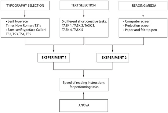
Figure 1.
Experimental plan.
Five distinct sets of instructions (Figure 2) were developed utilizing five different typographic solutions to investigate the potential impact of visual design elements such as colour, shape, and typeface placement within the frame (referred to as typographic solutions) on the reading speed of task instructions. The instructions were customized for reading on three distinct media platforms (computer screen, projection screen, and paper) based on the specific attributes of each medium (Figure 1 and Appendix A).
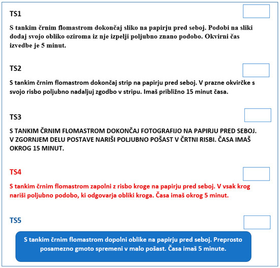
Figure 2.
Examples of the design of five tasks and the upper right corner above the instructions.
The task completion instructions were formatted as follows (Figure 2):
- Serif typeface Times New Roman in black, type size 14 pt—TS1;
- Sans-serif typeface Calibri in black, type size 14 pt—TS2;
- Sans-serif uppercase letters of Calibri in black, type size 14 pt—TS3;
- Sans-serif typeface Calibri in red, type size 14 pt—TS4;
- Sans-serif typeface Calibri in white on a blue rounded frame, type size 14 pt—TS5.
The Times New Roman typeface is widely used in both print and digital media [31,32]. Calibri was chosen for the study as it is the default typeface in Microsoft Word and Excel, making it widely recognized. This familiarity was considered likely to contribute to faster reading speeds on average when using Calibri [32,33]. The instructions for a graphic design practical task, printed on a sheet of commercial office paper (format A4) and projected onto the screen, consisted of 127 to 167 characters without spaces: Task 1 consisted of 167 characters, Task 2 of 136 characters, Task 3 of 142 characters, Task 4 of 163 characters, and Task 5 of 127 characters.
The same instructions, adapted for completing the task digitally on the computer screen, consisted of 179 to 238 characters without spaces: Task 1 consisted of 238 characters, Task 2 of 199 characters, Task 3 of 202 characters, Task 4 of 227 characters, and Task 5 of 179 characters.
The following tools were used to effectively present the instructions for performing the tasks: Computer PC-17 (2022)—a high-performance computer equipped with 64 GB of RAM and an RX3070 graphics card; Monitor Dell S2721HS: Display: 27 in, IPS, W-LED, 1920 × 1080 pixels (2021); Graphics Tablet XP-Pen Artist 12 S (2022)—this tablet was used for digital drawing and performing creative tasks; Projector Sony WPL-PH 2 50 (2022); Projection screen AWSc 200 (2016).
2.2. Research Sample
The research encompassed a cohort of 200 students, aged between 15 and 18, who underwent testing as an integral component of the learning process. Notably, the study cohort comprised students enrolled in the Design Technician training program at the Secondary School of Design Maribor (Slovenia). In Table 1, demographic data of students participating in the research are presented.

Table 1.
Demographic data of students participating in the research.
In both experiments, female students dominate the participant group (on average about 74%). Male students’ participation remains consistently lower, with small differences between class types. The uneven distribution in our study is not relevant to the research topic. Similarly, the differences between the media and design technician classes are not statistically significant for our study.
In the first experiment, the research focused on assessing the speed at which students read instructions to execute a task, with emphasis on the typeface and colour. A subgroup of 125 students was selected as reference tasks for this phase.
The second experiment sought to gauge the speed at which students read instructions across varied mediums (screen-based, both near and far, and on paper), considering the typeface and colour. For this phase, tasks were selected from a cohort of 75 students.
2.3. Data Collection Procedure
The research was carried out during practical design lessons as an integral part of the regular teaching of practical skills. Data collection took place during a single 45 min class session in each department. The research activities encompassed various tasks, including lesson preparation, development of task content and instructions, completion of five equivalent tasks, task printing, creation of digital tasks, preparation of instructions for the supervising teachers, data collection, and results analysis. Prior to participating in the research, students and their guardians provided consent by signing a form. They were duly informed about the research procedure, purpose, and conduct before the commencement of the experiment. Notably, the experimental research was conducted anonymously, with students’ first and last names omitted from the tasks. For digital tasks, participants were assigned a code for submission to a shared folder on the Microsoft Teams platform.
2.4. Research Instrumentation
2.4.1. Experiment 1: Measuring the Speed of Reading Instructions Based on Shape, Colour, and Typeface Solution
In the first experiment, 125 students received task instructions printed on A5 sheets of paper. Each task and its corresponding instructions were presented on separate sheets. At the outset of the lesson, students were provided with all five sheets and permitted to progress through them sequentially. Notably, the tasks were subject to specific time constraints: the first task was allotted 5 min, the second task 10 min, the third task 5 min, the fourth task 10 min, and the fifth task 5 min. Prior to engaging with the instructions for each task, students initiated a stopwatch on their mobile devices. Upon completion of the instructions, they recorded the time in a designated area above the instructions, after which they commenced the task. Throughout this process, the instructor oversaw the timing and duration of each task.
To optimize efficiency and mitigate the influence of instruction complexity on typographical and colour appeal, the task instructions were structured in accordance with the Latin square model (Table 2). Each instruction was presented in each of the five typographical and colour combinations, and for each task, a distinct combination was employed. This approach aimed to standardize and balance the visual and typographic elements across the tasks.
Table 2.
Latin square model design.
2.4.2. Experiment 2: Measuring the Speed of Reading Instructions According to the Reading Media
In Experiment 2, the students were divided into three groups. The first group, consisting of 25 students, completed the test using digital media in the Adobe Photoshop computer program with the aid of a graphics tablet and a computer (Figure 3). The second group, also comprising 25 students, followed instructions displayed on the projection screen and completed the task using a felt-tip pen on paper (Figure 4). The third group, consisting of 25 students, completed the test on paper along with the tasks (Figure 5). Each reader, i.e., student reads from one medium only, i.e., from a computer screen, projection screen or paper and felt-tip pen.
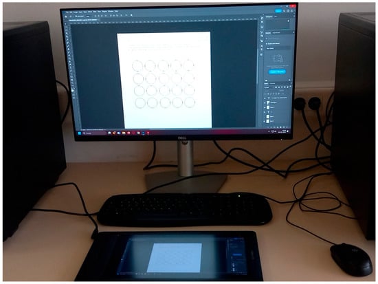
Figure 3.
Instructions for performing the task on the computer screen.
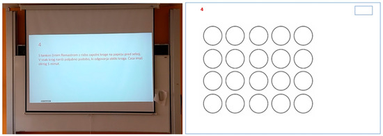
Figure 4.
Instructions for performing the task on the projection screen and sheet of paper without task instruction.
Figure 5.
Instructions for performing the task on the sheet of paper.
The time taken by students to read the task instructions was measured in the computer classroom, as depicted in the provided images (Figure 6, Figure 7 and Figure 8). Additionally, under the supervision of the teacher, a maximum of 15 students in the classroom measured the time taken to read the instructions and complete the tasks. The time framework, method of time measurement, and type of tasks in Experiment 2 were consistent with those in Experiment 1, with the exception that in Experiment 2, all instructions across the five tasks did not adhere to the Latin square model design observed in Experiment 1. The first group of students completed digital tasks on computers using a graphics tablet. The tasks had been pre-installed on the desktop of the computers and stored in a designated folder. Upon completing the tasks, students recorded the time taken to comprehend the instructions. The tasks were presented in A4 format (Figure 3). Figure 6 illustrates the spatial arrangement of the classroom while the students were engaged with the computer screen.
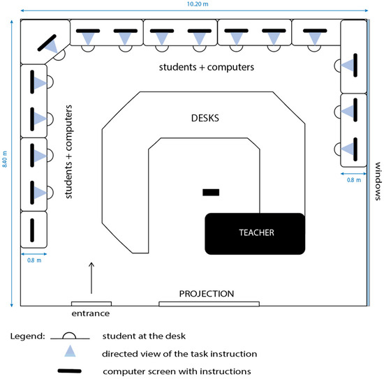
Figure 6.
Presentation of the classroom where the research was conducted using a computer screen.
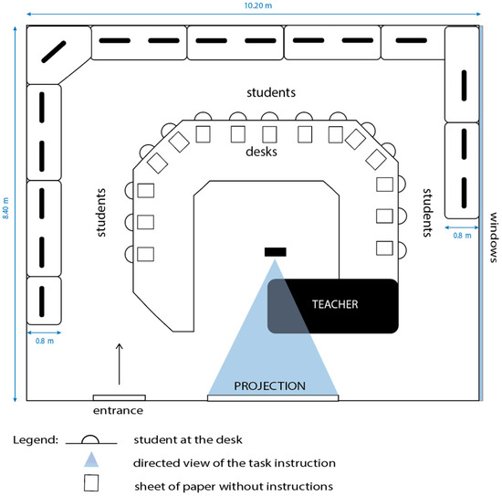
Figure 7.
Presentation of the classroom where the research was carried out with the help of projection.
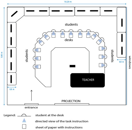
Figure 8.
Presentation of the classroom where the research was conducted using a sheet of paper.
The second group completed their tasks at their respective desks and referred to the instructions displayed on the project screen, as depicted in Figure 4. They were provided with the tasks on A5 sheets of paper, along with a designated space to record the time taken to comprehend the instructions, albeit without the actual instructions. The spatial arrangement of the classroom during the students’ utilization of the projection screen is illustrated in Figure 7.
2.5. Statistical Analysis
Statistical analysis of the results was conducted using the IBM SPSS Statistics program. Descriptive statistics were performed for each combination of variables within the Latin square. The migration of empirical data to the SPSS platform facilitated a comprehensive statistical analysis. The characteristics of the variables were scrutinized and presented in tables and graphs, including frequencies, arithmetic means, and standard deviations (Table 3).
Table 3.
Factors, independent and dependent variables of Experiment 1 and Experiment 2.
The independent samples ANOVA parametric test was utilized to analyse the data collected using the Latin square. This analysis was employed to determine whether statistically significant differences existed in the speed of text reading between the combinations of variables. In cases where statistically significant differences were identified, further analysis was conducted using the Tukey post hoc test. Statistically significant values were considered at a 5% level or lower (p ≤ 0.050).
For Experimental 1, the results obtained (measured time to read instructions) were categorized for statistical analysis according to the Latin square model (Table 3). Using this procedure, the average number of seconds students needed to read the instructions for each task was calculated based on the media and typography. In Table 4, TS1 to TS5 are TASK1 to TASK5 accordingly, whole letters A to E are the category of the 5 × 5 Latin square design (presented in Table 2).
Table 4.
Latin square design with the average time (second) of each category for Experiment 1.
In Experiment 2, a design similar to the Latin square used in Experiment 1 (Table 4) was employed to statistically analyze the reading speed of instructions across different media. The average time taken by students to comprehend these instructions was calculated as part of the analysis.
3. Results with Discussion
3.1. Experiment 1: Speed of Reading of Task Instructions in Terms of Typographic Solution
Figure 9 (table values are in Appendix B) shows a descriptive statistic of Experiment 1 presenting mean values of reading time for Tasks 1–5 (task factors) with standard deviation for the typographic solution.
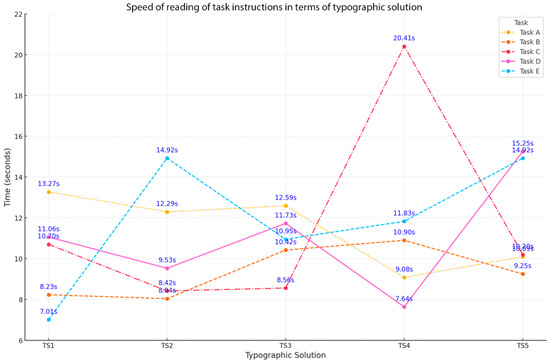
Figure 9.
Descriptive statistics on the speed of reading of task instructions in terms of typographic solution.
Upon analysing the descriptive statistics for five distinct tasks and the typographic solution devised for the instructions (Latin square), the following outcomes were derived. It is evident from Figure 9 that students displayed consistent reading speeds when presented with instructions in black typefaces (TS1 mean = 10.05 s, SD = 2.47 s; TS2 mean = 10.64 s, SD = 2.91 s; TS3 mean = 10.85 s, SD = 1.52 s). Conversely, a slightly longer duration was observed for reading instructions presented in red typeface (TS4) (mean = 11.97 s, SD = 4.99 s) and in white typeface on a blue frame (TS5) (mean = 11.94 s, SD = 2.90 s).
Figure 10 presents the estimated marginal means of Time for groups of the Latin square A–E (Experiment 1).
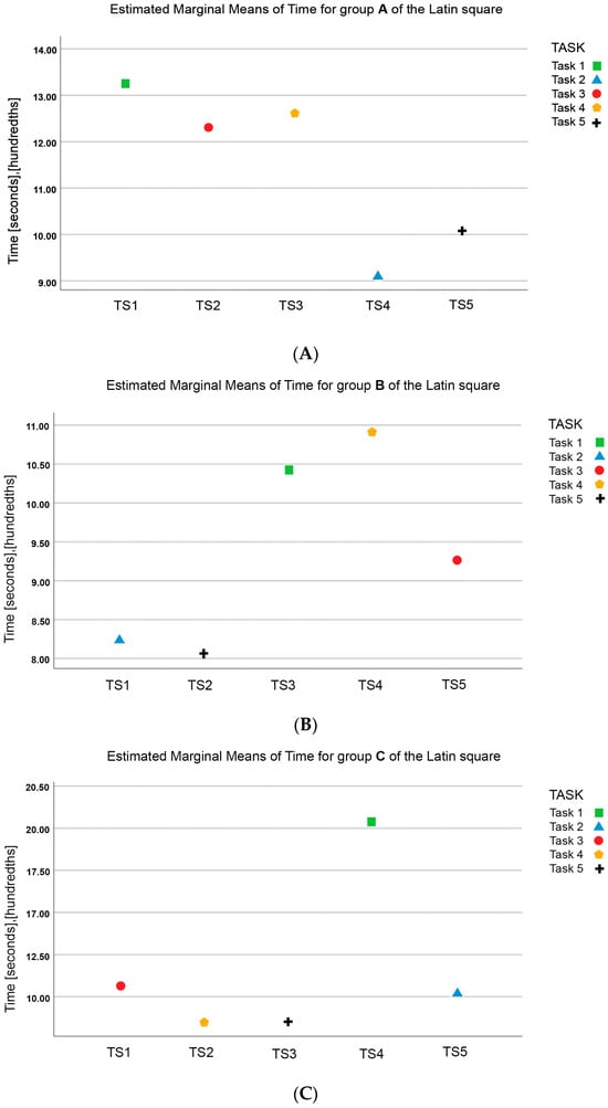
Figure 10.
Estimated marginal means of Time for groups of the Latin square (A–E) in Experiment 1 analysing dependent variable reading time in dependence of variables tasks Task 1–5 and typographic solutions TS1–TS5.
The data indicate that the highest estimated marginal means for the dependent variable, reading time, were observed for Task 1 with typographic solutions TS1–TS5, followed by Task 4 and Task 3. Conversely, the lowest values were associated with Task 2 and Task 5.
Table 5 presents the ANOVA statistical analysis results for the reading speed of the task instructions using typographic solutions, with time as the dependent variable.
Table 5.
Tests of between-subject effects. Dependent variable: time.
Upon examining the variables in Table 5, it is apparent that neither the shape nor the colour of the typeface in which the instructions are presented yields statistically significant effects on the speed of reading the task instructions. Both the Typographic solution factor and the combination of instructions with typographic solution exhibit p-values greater than 0.05, indicating a lack of statistical significance. However, the analysis indicates statistical significance in the case of the Task factor, with a p-value of 0.005, suggesting that the speed of reading the instructions is contingent upon the content of the task text.
To identify significantly different groups within this variable, an additional post hoc analysis was conducted using Tukey’s multiple comparison procedure, revealing two homogeneous subsets. The 1st subset comprises instructions for the 5th and 2nd tasks, showing no significant difference in the speed of reading. The second subset includes Tasks 3 and 4, as well as Task 1, with no difference between Tasks 3 and 4 and a significant difference from the fifth and second tasks in terms of reading speed.
Regarding task 1, also belonging to subset 2, the analysis demonstrates that students took the longest average time (mean = 14.85 s) to read the instructions for completing the task. Conversely, students took the least time on average to read the instructions for the 5th task (mean = 8.27 s), irrespective of the shape and colour of the typeface.
3.2. Experiment 2: Speed of Reading of Task Performance Instructions Based on Solution, and the Reading Media on Which the Instructions Are Read
In Figure 11 (table values in Appendix B), the descriptive statistics for Experiment 2 are presented, detailing the mean values of reading speed for task instructions (task factor) categorized by typographic solution and the reading media for the instructions. Additionally, the standard deviation for the typographic solution factor is included.
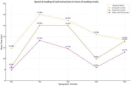
Figure 11.
Descriptive statistics: speed of reading task performance instructions in terms of reading media based on the typographic solution.
The analysis of the descriptive statistics encompassed five distinct tasks, each employing a different typographic solution for communicating instructions across various information mediums. The findings presented in Figure 11 reveal that students dedicated the greatest amount of time to reading instructions formatted in a typeface with serifs (TS1) when displayed on a computer screen (mean = 11.88 s) and the least amount of time when presented on a sheet of paper (mean = 7.95 s). Similarly, for instructions presented in sans-serif typeface (TS2), the students invested the most time when viewed on a computer screen (mean = 17.99 s) and the least time when viewed on a sheet of paper (mean = 13.31 s).
In addition, instructions set in capital letters (TS3) and instructions presented in typeface in white colour within a rounded blue frame (TS5) demanded the longest reading time on a computer screen (TS3 mean = 16.95 s and TS5 mean = 13.40 s). Conversely, the least time was required to read instructions presented in red colour typeface (TS4) in comparison to reading from a sheet of paper (mean = 8.41 s).
In the examination of typographic solutions and their impact on reading time, it was observed that students exhibited the lengthiest reading time when presented with instructions in a sans-serif typeface (TS2) on a computer screen, with a mean time of 16.02 s. Conversely, the shortest reading time was noted for instructions set in a typeface with serifs (TS1), with a mean time of 8.54 s. When the instructions were displayed on a computer screen, students required the most time to read the sans-serif typeface (TS2) instructions, and the least time to read the instructions on a white-coloured typeface in a rounded blue frame (TS5), with mean times of 16.02 s and 13.40 s, respectively. When presented on a sheet of paper, students dedicated the most time to reading the sans-serif typeface (TS2) instructions, and the least time to reading the serif typeface (TS1) instructions, with mean times of 13.31 s and 7.95 s, respectively. Overall, the findings indicate that students spent the most time reading instructions when presented on a computer screen, with a mean time of 14.92 s, and the least time when presented on a sheet of paper, with a mean time of 10.52 s.
Table 6 shows the results of the ANOVA statistical analysis for the speed of reading of the instructions to perform the task according to the typographic solution and the reading media on which the instructions are read.
Table 6.
Tests of between-subject effects. Dependent variable: time.
The results of the ANOVA statistical analysis revealed a statistically significant difference (p < 0.001) for both typographic solution and media factors concerning the dependent variable, time (refer to Table 6). Subsequently, a post hoc test was conducted. The findings of Tukey’s post hoc test for the Reading media factor align with the descriptive statistics, demonstrating that students allocated the most time to reading instructions when presented on a computer screen (M = 14.92), followed by a projection screen (M = 12.72), and the least time when presented on a sheet of paper (M = 10.52).
Regarding the Typographic solution factor, the post hoc test segmented the dependent variable, speed of reading instructions, into four subsets:
- Subset 1: Serif typeface (TS1) and sans-serif typeface in red colour (TS4) were read the fastest.
- Subset 2: Sans-serif typeface in red colour (TS4) and sans-serif typeface in white colour in a blue frame (TS5) were read moderately slowly.
- Subset 3: Sans-serif typeface in white colour in a blue rectangle (TS5) and capital letters of sans-serif typeface in black colour (TS3) were read at a median speed.
- Subset 4: Sans-serif typeface (TS2) and capital letters of sans-serif typeface (TS3) took the longest to read.
The findings indicate that students achieve their highest reading speeds when interacting with instructions on paper, challenging Prensky’s [51] assertion that digital natives may process digital information more efficiently than analog or printed formats. Empirical studies, including the present research, consistently demonstrate that participants read faster when engaging with printed text compared to digital text [52,53]. Considering the critical role of the reading medium in influencing reading processes [46,47,52,54], it is essential for researchers and educators to acknowledge how the medium affects text processing speed [55]. As educational materials continue to shift from print to digital formats, conducting comprehensive research on reading speed across different media becomes crucial to support this transformation in literacy practices [56].
4. Conclusions
The primary objective of this study was to examine the potential impact of typeface shapes and colours on the speed of reading task instructions. Among the typographical solution variables analysed in the study, the type of reading medium proved to be the most statistically significant variable. Experiment 1 yielded results indicating no statistically significant difference in reading speed based on typeface attributes, thereby refuting Hypotheses 1 and 2. Subsequently, Experiment 2 was conducted to test Hypothesis 3, which proposed that the reading medium would influence reading speed. The findings confirmed this hypothesis, revealing a statistically significant difference in reading speed based on the reading medium.
The novelty of the research findings is the results of the interaction of typographic solutions and the type of reading media on instructions for short visual tasks. The two most commonly used serif and sans-serif typefaces in reading media were used, depending on font colour and background. Our findings demonstrate that students exhibit the highest reading speed when presented with instructions on paper. Empirical evidence, including our own, suggests that participants achieve greater reading speeds when presented with printed as opposed to digital text. Our research findings hold the potential to inform the development of more effective pedagogical strategies, learning materials, and instructional methodologies for educational and professional contexts. It is imperative for researchers and educators to recognize the influence of the medium on text processing speed. As educational materials transition from printed to digital formats, comprehensive research on text reading speed becomes imperative to facilitate this evolving literacy.
The principal limitation of this study lies in its exclusive focus on high school students from a specific educational program. It is essential to recognize that demographic variables may exert an influence on the pace of information processing, particularly in relation to the reading media, typeface, and colour, thereby impacting the outcomes of our research. In further studies, it would be useful to divide readers into groups (gender, school level, etc.) and compare their results on reading speed according to typographical solution and reading medium. The results could contribute to guidelines for more effective personalization or preparation of learning materials to increase the reading speed of specific groups of learners, focusing on the design of typographic solutions (typeface, typeface colour and background) and the choice of reading medium. Future studies should encompass also a more diverse array of typographic alternatives, including a broader spectrum of colours and font styles.
Author Contributions
Conceptualization, M.T. and K.M.; methodology, M.T. and K.M.; formal analysis, M.T.; validation, M.T. and H.G.T.; investigation, M.T.; resources, M.T.; writing—original draft preparation, M.T.; writing—review and editing, H.G.T. and K.M.; visualization, M.T.; supervision, M.T., H.G.T. and K.M.; funding acquisition, H.G.T. and K.M. All authors have read and agreed to the published version of the manuscript.
Funding
This research was founded by the Slovenian Research Agency (No. P2-0450).
Institutional Review Board Statement
The study was conducted in accordance with the Declaration of Helsinki, and approved by the Ethics Commission of the Faculty of Education of the University of Ljubljana (protocol code 6/2023, 10 May 2023).
Informed Consent Statement
Informed consent was obtained from all subjects involved in the study.
Data Availability Statement
The data presented in this research are available upon request from the corresponding author.
Conflicts of Interest
The authors declare no conflicts of interest.
Appendix A
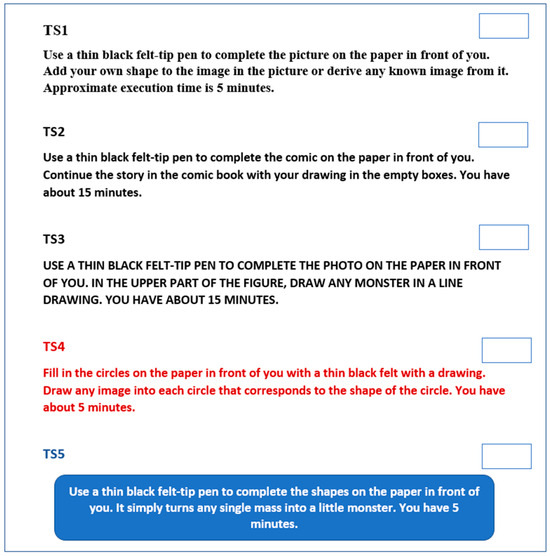
Figure A1.
Translated text of the instruction in English.
Appendix B
Table A1.
Descriptive statistics on the speed of reading of task instructions in terms of typographic solution.
Table A1.
Descriptive statistics on the speed of reading of task instructions in terms of typographic solution.
| Typographic Solution | TASK | INSTRUCTION/Typographic Solution | Mean (s) | Standard Deviation |
|---|---|---|---|---|
| TS1 | Task 1 | A | 13.270 | |
| Task 2 | B | 8.230 | ||
| Task 3 | C | 10.700 | ||
| Task 4 | D | 11.060 | ||
| Task 5 | E | 7.010 | ||
| Total | 10.054 | 2.468 | ||
| TS2 | Task 1 | A | 12.290 | |
| Task 2 | B | 8.040 | ||
| Task 3 | C | 8.420 | ||
| Task 4 | D | 9.530 | ||
| Task 5 | E | 14.920 | ||
| Total | 10.640 | 2.914 | ||
| TS3 | Task 1 | A | 12.590 | |
| Task 2 | B | 10.420 | ||
| Task 3 | C | 8.560 | ||
| Task 4 | D | 11.730 | ||
| Task 5 | E | 10.950 | ||
| Total | 10.850 | 1.520 | ||
| TS4 | Task 1 | A | 9.080 | |
| Task 2 | B | 10.900 | ||
| Task 3 | C | 20.410 | ||
| Task 4 | D | 7.640 | ||
| Task 5 | E | 11.830 | ||
| Total | 11.972 | 4.988 | ||
| TS5 | Task 1 | A | 10.090 | |
| Task 2 | B | 9.250 | ||
| Task 3 | C | 10.200 | ||
| Task 4 | D | 15.250 | ||
| Task 5 | E | 14.920 | ||
| Total | 11.942 | 2.895 |
Table A2.
Descriptive statistics: speed of reading task performance instructions. Dependent Variable: Time.
Table A2.
Descriptive statistics: speed of reading task performance instructions. Dependent Variable: Time.
| Typographic Solution | Reading Media | Mean (Seconds) | Standard Deviation |
|---|---|---|---|
| TS1 | Computer screen | 11.8800 | |
| Projection screen | 8.5390 | ||
| Paper and felt-tip pen | 7.9480 | ||
| Total | 9.4557 | 2.12023 | |
| TS2 | Computer screen | 17.9900 | |
| Projection screen | 16.0230 | ||
| Paper and felt-tip pen | 13.3060 | ||
| Total | 15.7730 | 2.35199 | |
| TS3 | Computer screen | 16.9490 | |
| Projection screen | 15.9740 | ||
| Paper and felt-tip pen | 11.7760 | ||
| Total | 14.8997 | 2.74875 | |
| TS4 | Computer screen | 14.3790 | |
| Projection screen | 9.9380 | ||
| Paper and felt-tip pen | 8.4070 | ||
| Total | 10.9080 | 3.10191 | |
| TS5 | Computer screen | 13.4000 | |
| Projection screen | 13.1439 | ||
| Paper and felt-tip pen | 11.1700 | ||
| Total | 12.5713 | 1.22030 | |
| Total | Computer screen | 14.9196 | 2.51925 |
| Projection screen | 12.7236 | 3.42411 | |
| Paper and felt-tip pen | 10.5214 | 2.28264 | |
| Total | 12.7215 | 3.17903 |
References
- Miller, G.A. The Science of Words; Scientific American Library: New York, NY, USA, 1991; Available online: https://archive.org/details/scienceofwords00mill?utm_source=chatgpt.com (accessed on 4 May 2023).
- Madrazo, C.A.; Francisco, L.D. Reading Habits, Reading Comprehension and Academic Performance of Grade V Pupils. Asian ESP J. 2019, 15, 138–165. [Google Scholar]
- McClain, C.; Vogels, E.A.; Perrin, A.; Sechopoulos, S.; Rainie, L. The Internet and the Pandemic; Pew Research Center: Washington, DC, USA, 2021; Available online: https://www.jstor.org/stable/resrep57756 (accessed on 4 May 2023).
- Paterson, D.G.; Tinker, M.A. Studies of Typographical Factors Influencing Speed of Reading. J. Appl. Psychol. 1931, 15, 241–247. [Google Scholar] [CrossRef]
- Legge, G.E.; Bigelow, C.A. Does Print Size Matter for Reading? A Review of Findings from Vision Science and Typography. J. Vis. 2011, 11, 8. [Google Scholar] [CrossRef] [PubMed]
- Arditi, A.; Cho, J. Serifs and Font Legibility. Vis. Res. 2005, 45, 2926–2933. [Google Scholar] [CrossRef]
- Blommaert, F.J.; Timmers, H. Letter Recognition at Low Contrast Levels: Effects of Letter Size. Perception 1987, 16, 421–432. [Google Scholar] [CrossRef] [PubMed]
- McLean, M.V. Brightness Contrast, Color Contrast, and Legibility. Hum. Factors 1965, 7, 521–527. [Google Scholar] [CrossRef] [PubMed]
- Legge, G.E.; Pelli, D.G.; Rubin, G.S.; Schleske, M.M. Psychophysics of Reading—I. Normal Vision. Vis. Res. 1985, 25, 239–252. [Google Scholar] [CrossRef] [PubMed]
- Bigelow, C. Typeface Features and Legibility Research. Vis. Res. 2019, 165, 11–19. [Google Scholar] [CrossRef]
- Chung, S.T.L.; Legge, G.E.; Pelli, D.G.; Yu, C. Visual factors in reading. Vis. Res. 2019, 161, 60–62. [Google Scholar] [CrossRef] [PubMed]
- Bernard, M.; Lida, B.; Riley, S.; Hackler, T.; Janzen, K. A Comparison of Popular Online Fonts: Which Size and Type Is Best. Available online: https://researchinuserexperience.wordpress.com/2002/01/10/a-comparison-of-popular-online-fonts-which-size-and-type-is-best/ (accessed on 4 May 2023).
- Bruijn, D.D.; Mul, S.D.; van Oostendorp, H.V. The Influence of Screen Size and Text Layout on the Study of Text. Behav. Inform. Technol. 1992, 11, 71–78. [Google Scholar] [CrossRef]
- Dyson, M.C. How Physical Text Layout Affects Reading from Screen. Behav. Inform. Technol. 2004, 23, 377–393. [Google Scholar] [CrossRef]
- Sun, Y.; Wang, J.; Dong, Y.; Zheng, H.; Yang, J.; Zhao, Y.; Dong, W. The Relationship between Reading Strategy and Reading Comprehension: A Meta-analysis. Front. Psychol. 2021, 12, 635289. [Google Scholar] [CrossRef]
- Bix, L.; Lockhart, H.; Selke, S.; Cardoso, F.; Olejnik, M. Is X-height a Better Indicator of Legibility than Type Size for Drug Labels? Packag. Technol. Sci. 2003, 16, 199–207. [Google Scholar] [CrossRef]
- Tai, Y.; Sheedy, J.; Hayes, J. Effect of letter spacing on legibility, eye movements, and reading speed. J. Vis. 2010, 6, 994. [Google Scholar] [CrossRef]
- Beier, S. Reading Letters: Designing for Legibility; BIS: Amsterdam, The Netherlands, 2012; pp. 10–11. [Google Scholar]
- Sharmin, S.; Špakov, O.; Räihä, K.J. The Effect of Different Text Presentation Formats on Eye Movement Metrics in Reading. J. Eye Mov. Res. 2012, 5, 1–9. [Google Scholar] [CrossRef]
- Spichtig, A.N.; Pascoe, J.P.; Ferrara, J.D.; Vorstius, C. A Comparison of Eye Movement Measures across Reading Efficiency Quartile Groups in Elementary, Middle, and High School Students in the U.S. J. Eye Mov. Res. 2017, 10, 5. [Google Scholar] [CrossRef] [PubMed]
- Gabrijelčič Tomc, H.; Culjkar, P.; Zupin, Ž.; Možina, K. Legibility of 3D printed typography at smaller sizes. Ergonomics 2023, 66, 2091–2105. [Google Scholar] [CrossRef] [PubMed]
- Reynolds, L. Legibility of Type. Baseline Int. Typogr. J. 1988, 10, 26–29. [Google Scholar]
- Gaultney, V. Balancing Typeface Legibility and Economy: Practical Techniques for the Type Designer: Research Essay; University of Reading: Reading, UK, 2001; pp. 1–9. [Google Scholar]
- Možina, K. Knjižna Tipografija; Filozofska Fakulteta, Naravoslovnotehniška Fakulteta: Ljubljana, Slovenia, 2003; pp. 111–119, 130–133, 216–223. [Google Scholar]
- Tracy, W. Letters of Credit: A View of Type Design; David R. Godine: Boston, MA, USA, 2003; pp. 13–21, 30–32. [Google Scholar]
- Tarasov, D.A.; Sergeeva, A.P.; Filimonova, V. Legibility of Textbooks: A Literature Review. Procedia Soc. Behav. Sci. 2015, 174, 1300–1308. [Google Scholar] [CrossRef]
- Pušnik, N. Vpliv Barve in Tipografije na Hitrost Zaznavanja Napisov na Konvencionalni in Mobilni Televiziji. Ph.D. Thesis, University of Ljubljana, Ljubljana, Slovenia, 2016. [Google Scholar]
- Franken, G. Čitljivost Upodobitev na LCD Zaslonih ob Različnih Osvetlitvenih Pogojih. Ph.D. Thesis, University of Ljubljana, Ljubljana, Slovenia, 2015. [Google Scholar]
- Chung, S.T.L. The effect of letter spacing on reading speed in central and peripheral vision. Investig. Ophthalmol. Vis. Sci. 2002, 43, 1270–1276. [Google Scholar]
- Yang, L.; Holtz, D.; Jaffe, S.; Suri, S.; Sinha, S.; Weston, J.; Teevan, J. The Effects of Remote Work on Collaboration among Information Workers. Nat. Hum. Behav. 2022, 6, 43–54. [Google Scholar] [CrossRef] [PubMed]
- Chatrangsan, M.; Petrie, H. The Effect of Typeface and Font Size on Reading Text on a Tablet Computer for Older and Younger People. In Proceedings of the 16th Web for All 2019 Personalization-Personalizing the Web, ACM, San Francisco, CA, USA, 13–15 May 2019; Asociation of Computing Machinery: New York, NY, USA, 2019. Article. No. 5. pp. 1–10. [Google Scholar] [CrossRef]
- Wallace, S.; Bylinskii, Z.; Dobres, J.; Kerr, B.; Berlow, S.; Treitman, R.; Kumawat, N.; Arpin, K.; Miller, D.B.; Huang, J.; et al. Towards Individuated Reading Experiences: Different Fonts Increase Reading Speed for Different Individuals. ACM Trans. Comput. Hum. Interact. 2022, 29, 38. [Google Scholar] [CrossRef]
- Beier, S.; Larson, K. How Does Typeface Familiarity Affect Reading Performance and Reader Preference? Inf. Des. J. 2013, 20, 16–31. [Google Scholar] [CrossRef]
- Bernard, M.; Liao, C.H.; Mills, M. The Effects of Font Type and Size on the Readability and Reading Time of Online Text in Older Adults. In Proceedings of the CHI EA ‘01: CHI ‘01 Extended Abstracts on Human Factors in Computing Systems, Seattle, WA, USA, 31 March–5 April 2001; Association for Computing Machinery: New York, NY, USA, 2001; pp. 175–176. [Google Scholar] [CrossRef]
- Lu, Z.; Yang, H.; Xiao, L. Aesthetics Headline Typeface in Fashion Typography and Creativity. In Proceedings of the 28th International Conference on Automation and Computing (ICAC), Birmingham, UK, 30 August–1 September 2023; IEEE: Piscataway, NJ, USA, 2023; pp. 1–6. [Google Scholar] [CrossRef]
- Mehta, R.; Zhu, R. Blue or red? Exploring the effect of color on cognitive task performances. Science 2009, 323, 1226–1229. [Google Scholar] [CrossRef] [PubMed]
- Tinker, M.A. Legibility of Print; Iowa State University Press: Ames, IO, USA, 1963. [Google Scholar]
- Elliott, A.J.; Maier, M.A. Color Psychology: Effects of Perceiving Color on Psychological Functioning in Humans. Annu. Rev. Psychol. 2014, 65, 95–120. [Google Scholar] [CrossRef] [PubMed]
- Wright, B.; Rainwater, L. The Meanings of Color. J. Gen. Psychol. 1962, 67, 89–99. [Google Scholar] [CrossRef]
- Lennie, P. Physiology of Color Vision; Center for Neural Science, New York University: New York, NY, USA, 2022; p. 244. [Google Scholar]
- Agić, A.; Mandić, L.; Stanić Loknar, N. Legibility of Typefaces and Preferences of Text/Background Color Variations in Virtual Environment. In Proceedings of the Eleventh International Symposium GRID 2022, Novi Sad, Serbia, 3–5 November 2022; Faculty of Technical Sciences, Department of Graphic Engineering and Design: Novi Sad, Serbia, 2022; pp. 835–841. [Google Scholar] [CrossRef]
- Mangen, A.; Velay, J.L. Digitizing Literacy: Reflections on the Haptics of Writing. Adv. Haptics 2010, 1, 385–401. [Google Scholar] [CrossRef]
- Capodieci, A.; Cornoldi, C.; Doerr, E.; Bertolo, L.; Carretti, B. The Use of New Technologies for Improving Reading Comprehension. Front. Psychol. 2020, 11, 513436. [Google Scholar] [CrossRef] [PubMed]
- Mayes, D.K.; Sims, V.K.; Koonce, J.M. Comprehension and Workload Differences for VDT and Paper-based Reading. Int. J. Ind. Ergon. 2001, 28, 367–378. [Google Scholar] [CrossRef]
- Noves, J.M.; Garland, K.J. VDT versus Paper-based Text: Reply to Mayes, Sims and Koonce. Int. J. Ind. Ergon. 2003, 31, 411–443. [Google Scholar] [CrossRef]
- Delgado, P.; Vargas, C.; Ackerman, R.; Salmerón, L. Don’t Throw Away Your Printed Books: A Meta-analysis on the Effects of Reading Media on Reading. Educ. Res. Rev. 2018, 25, 23–38. [Google Scholar] [CrossRef]
- Kong, Y.; Seo, Y.S.; Zhai, L. Comparison of Reading Performance on Screen and on Paper: A Meta-analysis. Comput. Educ. 2018, 123, 138–149. [Google Scholar] [CrossRef]
- Singer Trakman, L.; Alexander, P.A. Reading on Paper and Digitally: What the Past Decades of Empirical Research Reveal. Rev. Educ. Res. 2017, 87, 1007–1041. [Google Scholar] [CrossRef]
- Baron, N.S. Words Onscreen: The Fate of Reading in a Digital World; Oxford University Press: New York, NY, USA, 2015. [Google Scholar]
- Pae, H.K. Script Effects as the Hidden Drive of the Mind, Cognition, and Culture; Springer Nature: Berlin/Heidelberg, Germany, 2020. [Google Scholar]
- Prensky, M. Digital natives, digital immigrants part 1. Horizon 2001, 9, 1–6. [Google Scholar] [CrossRef]
- Clinton, V. Reading from Paper Compared to Screens. J. Res. Read. 2019, 42, 288–325. [Google Scholar] [CrossRef]
- Yu, J.; Zhou, X.; Yang, X.; Hu, J. Mobile-assisted or Paper-based? The Influence of the Reading Medium on the Reading of English as a Foreign Language. Comput. Assist. Lang. Learn. 2022, 35, 217–245. [Google Scholar] [CrossRef]
- Latini, N.; Bråten, I.; Salmerón, L. Does Reading Medium Affect Processing and Integration of Textual and Pictorial Information? A Multimedia Eyetracking Study. Contemp. Educ. Psychol. 2020, 62, 101870. [Google Scholar] [CrossRef]
- Mayer, R.E. Multimedia Learning; Cambridge University Press: Cambridge, UK, 2001; pp. 47–50. [Google Scholar]
- Huang, H.C. E-reading and E-discussion: EFL Learners’ Perceptions of an E-book Reading Program. Comput. Assist. Lang. Learn. 2013, 26, 258–281. [Google Scholar] [CrossRef]
Disclaimer/Publisher’s Note: The statements, opinions and data contained in all publications are solely those of the individual author(s) and contributor(s) and not of MDPI and/or the editor(s). MDPI and/or the editor(s) disclaim responsibility for any injury to people or property resulting from any ideas, methods, instructions or products referred to in the content. |
© 2024 by the authors. Licensee MDPI, Basel, Switzerland. This article is an open access article distributed under the terms and conditions of the Creative Commons Attribution (CC BY) license (https://creativecommons.org/licenses/by/4.0/).