Next Article in Journal
Culture Shapes How We Look: Comparison Between Chinese and African University Students
Previous Article in Journal
Learning to Search. The Importance of Eye Movements in the Decrease of Response Times During a Visual Choice Reaction Time Task
 
 
Journal of Eye Movement Research is published by MDPI from Volume 18 Issue 1 (2025). Previous articles were published by another publisher in Open Access under a CC-BY (or CC-BY-NC-ND) licence, and they are hosted by MDPI on mdpi.com as a courtesy and upon agreement with Bern Open Publishing (BOP).
Article

An Eye Tracking Study of Attention to Print Advertisements: Effects of Typeface Figuration

by
Irma Puškarević
1,
Uroš Nedeljković
1,
Vladimir Dimovski
1 and
Klementina Možina
2
1
University of Novi Sad, 21000 Novi Sad, Serbia
2
University of Ljubljana, 1000 Ljubljana, Slovenia
J. Eye Mov. Res. 2016, 9(5), 1-18; https://doi.org/10.16910/jemr.9.5.6 (registering DOI)
Submission received: 4 July 2016 / Published: 28 November 2016

Abstract

:
The use of rhetorical figures has become a widely–accepted method for capturing attention and positively increasing cognitive effort in print advertisements. So far research studies mostly analyzed the effect of rhetorical figures in the written as well as pictorial elements of an ad. However, there have been few studies addressing the effect of rhetorical figuration in the specific area of typeface design. This study analyzes the effects of typeface figuration (i.e., regular vs. irregular stylization of the form) on attention and attitude of the viewers. The study also looks at how the effect of typeface figuration changes in relation to the type of a product (hedonistic vs. utilitarian) being advertised. Through the use of a 2 × 2 experi-mental design, the study measures data using a combination of eye tracking (an objective method) and attitude scaling (a subjective method). Sixty–five volunteers participated in the study. The eye tracking results show that using rhetorical figures in typeface mainly affects attention of the viewers. We have also determined that they influence their attitude. Additionally, the study shows that a typeface and a type of products are correlated; it shows that the hedonistic type of products can benefit more from the figuration. In conclusion, our study builds on and expands the current understanding of the use of rhetorical figures by proving that there is a correlation between the use of rhetorical figures in typeface and view-ers’ attention, depending on the type of product being advertised.

Introduction

The role of advertising is to present the advertised message in such a way as to hold viewers’ attention. Advertisements that fail to meet this objective cannot be considered effective. In modern communication environment, where advertisements appear in abundance, it is very difficult to attract and keep viewers’ attention. To increase the argumentative power of advertisements, advertisers use rhetorical figuration. This figuration is regarded as a creative form of expression that is different from the expected one. The rhetorical figuration is mostly found in the pictorial part of an advertisement (Delbaere, Mcquarrie, & Phillips, 2011; Gkiouzepas & Hogg, 2011; Mcquarrie & Mick, 1999), due to the superior effect of the pictorial over textual elements. According to cognitive psychology, an image holds a greater recognition power in comparison to verbal cue (Childers & Houston, 1984; Kostić, 2006). Since an advertisement is composed of the key elements (picture, slogan, logo, typeface) that influence perception, each of the key elements has a distinct effect on viewers’ response. A key element that has been neglected in modern communication studies is the rhetorical figuration of typefaces and their effects on attention and attitude.
In the studies on advertising effectiveness and theory, a great focus is placed on the effects of the pictorial rhetoric in marketing communication (Mick, 1986; Mick & Politi, 1989; Scott, 1994). According to Kjeldsen (2012), rhetorical figures in the pictorial part of an advertisement provide a certain kind of argument. Even though images play an important role in visual marketing, typefaces are undoubtedly the most ubiquitous elements of marketing materials. The art of typography, according to Trummel (1988), is the integral part of the art of rhetoric, where the parallel between the work of the typographer and rhetorician exists. Consequently, typeface figuration may be an argument in its own right. Arguably, a procession of typeface figuration results in the formation of the semantic code which exists independently of the semantic nature of the verbal part (Foltz, Poltrock, & Potts, 1984; Lewis & Walker, 1989). Thus, we can discuss the concept of words being “dressed up” in typographic styles, which implies that typeface figuration is an important key element for attention, and consequently, brand information processing in advertisements.
The methodology of the previous studies on the influence of typeface characteristics was predominantly subjective (e.g., Henderson, Giese, & Cote, 2004; Morrison, 1986; Rowe, 1982). Although subjective measures can provide more detailed insights of viewers’ responses, because of the human factors (fatigue, bias, etc.) we also need the objective methods when testing effects of advertisement key elements. The methodology of tracking eye movements is one such objective method. Eye movements are considered indicators of visual attention, and that is why analysing eye–paths during advertisement gazing has been an interest of numerous studies in recent years (Higgins, Leinenger, & Rayner, 2014; Rayner, Miller, & Rotello, 2008; Wedel, 2013). However, inferences based on previous eye tracking studies refer to the picture figuration effect and integration of the picture with longer passages of text–a common element of the advertisement design solution in the past. These findings, although considerable and informative, need an update. There is a need for the research that would better explain effects of certain key elements in the contemporary advertising environment, namely the appearance of the shorter passages of text. New design solutions of advertisements have a tendency to “say” more with fewer visual elements. Hence, rhetorical figurativeness of typefaces emerged as a new key element for communication. Consequently, typeface design for shorter slogans became more complex. Therefore, the purpose of this study is to employ an objective and a subjective method to measure the effects of typeface figuration on attention and attitudes. These effects will be investigated in different contexts (types of products). Advertisements that are not word–driven will be tested, where a typeface serves as a “dressing” style for headlines or short slogans.

Theoretical background

Rhetoric is regarded as a discipline of argumentation that seeks the most effective persuasive method to present a message. It frequently uses rhetorical figures–figures of speech. In the traditional sense, “a rhetorical figure of speech is one that differs from normal usage to make communication more effective” (Bonsiepe, 1965). Saussure (1972), who studied functions of signs in linguistics, believed that language is only one aspect of the system of signs. From this point of view, interpretation of signs and codes (figures of speech) originating from literary and linguistic contexts became a point of interest in other areas of communication. Theoreticians of visual communication and semiotics (Bonsiepe, 1965; Eco, 1973, 1976) recognised stylistic properties of text in visual marketing materials (e.g., advertisements). They began interpreting visuals using the analogy with interpreting signs and codes from linguistics. Bonsiepe (1965) considered rhetorical figures a contribution to the stylistic properties of the text. He believed that this stylisation is the most important tool when it comes to analysing advertised message.
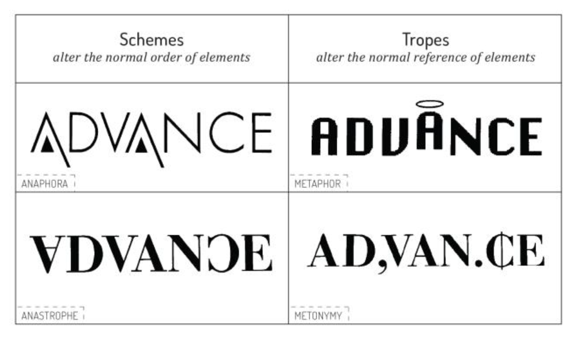
Influenced by the theory of semiotics, Bonsiepe (1965) and Eco (1976) made first analytical attempts of systematisation of the verbal rhetoric terminology in the visual domain of advertisements. Following their work, Mcquarrie & Mick (1996) proposed a conceptual taxonomy of rhetorical figures in advertising language (Figure 1). The same text–interpretative approach was subsequently applied to pictorial rhetoric (Mcquarrie & Mick, 1999). The authors divide all rhetorical figures on account of the regularity (schemes) or irregularity (tropes) of the expression/image, that is, on account of the level of deviation from the expected outcome. The main proposition of this approach is that schemes yield less cognitive processing effort because of their excess regularity (simplicity in form) whereas tropic figures increase cognitive effort due to their irregularity (complexity in form). Similarly, Groupe Mu (1992) proposes a categorization of rhetorical figures according to the increasing amount of cognitive effort. Furthermore, a correlating proposition can be seen in the handbook by Hanno and Lupton (1988) where typeface design is analytically categorised according to different levels of figuration (Figure 2). In addition to their analysis, semiotic theory indicates that letter forms can become signifiers (Leeuwen, 2006). They can bear connotation through e.g., analogy. Since metaphor is one of the semiotic principles, when applied to letter forms, this principle can exert a metaphorical potential to a typeface.
Rhetoric and typeface effects
The use of rhetoric for increasing the effectiveness of e.g., print advertising has been highlighted in numerous studies (DeRosia, 2008; Mothersbaugh, Huhmann, & Franke, 2002). Most of this research addresses the effects of rhetorical figuration for the pictorial part (Childers, 1992; Delbaere, Mcquarrie, & Phillips, 2011; Gkiouzepas & Hogg, 2011; Mcquarrie & Mick, 1999) and verbal cue (McQuarrie & Mick, 2003; Toncar & Munch, 2001). The authors of these studies suggest application of rhetorical figures for strategically organising advertising elements with persuasive potential. Kjeldsen (2012) highlights the argumentative power of visual rhetorical figuration in advertising, addressing it not as a mere ornamentation but also as a kind of argument about the product and a brand. For example, expressions and forms that differ more from the expected (they are more complex) demand that viewer makes “conclusions” to understand their intended meaning. As a result, it leads to better likability and recognition.
Another group of studies addresses the effects of typeface characteristics (e.g., serifs) mainly on legibility (Franken, Podlesek, & Možina, 2014; Lewis & Walker, 1989; Nedeljković et al., 2013), personality (Brumberger, 2003; Mackiewicz & Moeller, 2004), feeling tone (Brinton, 1961; Davis & Smith, 1933; Nedeljković et al., 2014), and word recognition (Pušnik, Možina, & Podlesek, 2016; Pušnik, Podlesek, & Možina, 2016), Also, researchers test the perceived impression of the attributes such as the weight of letters (Rowe, 1982; White, 1988; Nedeljković, Novaković, Pinćjer, forthcoming 2017), or cursive form (Tannenbaum, Jacobson, & Norris, 1964). From the findings of these studies, it is possible to conclude that typeface characteristics, or modifications of the form of letters, have an impact on viewer’s response.
The effects of typeface characteristics have also been examined in advertising research (Childers & Jass, 2002; Doyle & Bottomley, 2006). Findings confirm that appropriateness of the style of the typeface (e.g., elegant, casual) and the type of product leads to font–product congruity which influences consumer choice and memory. McCarthy & Mothersbaugh (2002) propose the model of the role of typography listing the effects of typographic factors in advertising. Effects of these factors have the potential to influence consumer’s motivation, opportunity, and ability to process brand information. One of these factors is the complexity of the form. Literature shows that novelty and originality (usually associated with complexity and irregularity) may enhance attention and motivate processing (Berlyne, 1971). Complexity may increase both processing motivation (Morrison & Dainoff, 2008) and liking (Anderson & Jolson, 1980). However, complexity and irregularity may have negative effects where a possible conflict between legibility and more detailed typeface design may arise. Nonetheless, when ad appearance is considered, one might expect complexity to enhance consumer’s attention and attitude.
When it comes to testing methods of advertising effectiveness, the role of attitudes (attitude toward the ad; attitude toward the brand) and intentions (purchase intention) is indispensable (Morris et al., 2002). Research suggests that observations about the brand stimulated during the incidental exposure (low involvement) to an advertisement, can be considered a causal precondition for the formation of an attitude toward the brand (Mitchell & Olson, 1981; Wright, 1973). Attitude towards the ad, directly and indirectly, influences attitude toward the brand. By its affective dimensions (e.g., favourability), attitude toward the ad is regarded as a mediating variable through which advertising influences brand attitudes and purchase intention (Mackenzie, Lutz, & Belch, 1986; Mitchell & Olson, 1981). On the basis of this discussion, the following main effect of typeface figuration on attitudes (ad and brand) and purchase intention is hypothesised:
  • H1: Typeface figuration will have a positive influence on viewers’ response. Particularly, the figuration that generates a more irregular form of the typeface (trope) will positively influence attitude toward an ad and a brand, as well as have the positive influence on purchase intention in low involvement conditions of viewing advertisements.

Attention and information processing

Capturing viewers’ attention is a very important goal of print advertising. Numerous studies confirm the vital role of attention for effective communication process (Berger, Wagner, & Schwand, 2012; Lee & Ahn, 2012; Pieters, Wedel, & Batra, 2010). However, faced with the current demands of the visually literate viewers, communication models are successful if they manage to find new ways to attract attention. Previous findings show that, for example, larger, brighter and faster-moving objects are spotted more easily among uniform attention distracters (Treisman & Gormican, 1988). Still, it is necessary to consider bottom-up and top-down factors of human behaviour as they have distinct ways of guiding attention (Couronné et al., 2010). Bottom-up factors suggest that attention is automatically shifted towards salient visual elements, whereas top-down factors presume attention to be guided by our internal goals and intentions. Since top-down factors are closely related to the high-level cognitive processes (Desimone & Duncan, 1995), they are excluded from the control of advertisers. Hence, advertisers manipulate bottom-up factors to increase stimuli salience and help increase attention.
At the same time, if the advertiser’s goal is to increase the persuasiveness of his argument, catching viewers’ attention is not enough. Viewers need to process the information to act upon it (memorise it or develop an attitude toward it; see Figure 3) (Wedel & Pieters, 2000). Nonetheless, without catching viewers’ attention there would be no further processing and, subsequently, there would be no effect on decision making. Therefore, increased attention will lead to increased possibility of information processing and memory.
Visual complexity, usually associated with originality, was found to increase attention (Pieters et al., 2010) and attitude (Cox & Cox, 1988; Peracchio & Meyers-Levy, 1994). For example, Berlyne (1958, 1974) discovered that aesthetic qualities of visual complexity were engaging and that people looked longer at more complex abstract forms. Pieters, Wedel & Barta (2010), who test advertising effectiveness, made additional effort in distinguishing between two types of visual complexity: feature complexity and design complexity. Feature complexity (more detail and variation in the basic visual features) has been found to hurt ad performance, whereas design complexity (more detailed design regarding shapes, objects, and patterns) has been found to help ad performance. In other words, design complexity helps attention to the pictorial part of advertisements, and consequently, ad as a whole. This benefit of design complexity is specific to the key element of an advertisement in which it is mostly present. Therefore, if design complexity would reside in the typeface design, increasing typeface figuration, we could expect attentional benefits to an advertisement in likeable ways.
Attention and eye movements are closely connected. The analysis of eye movements has gained acceptance among research methodologies within the framework of market communication (Lee & Ahn, 2012; Pieters, Wedel & Batra, 2010; Wedel & Pieters, 2000). This acceptance was because such method provides information about patterns of visual attention in real time (Russo, 1978; Wedel & Pieters, 2008). Research on the characteristics of eye movements in print advertisements, where text and pictures are integrated, suggests that pictures are viewed longer than text (Rayner et al., 2001). Findings also indicate eye–catching qualities of originality and familiarity of objects (Pieters, Warlop, & Wedel, 2002). It can be observed that longer passages of text in ad stimuli have been a common component in these studies. Due to such design solutions, alternation between text and picture is slower (Rayner et al., 2001; Rayner, Miller, & Rotello, 2008) which can have slightly negative effects in producing a mental model of the complete message. Shorter portions of text might overcome this effect. Additionally, shorter text in an advertisement enables application of more complex (i.e., irregular) typefaces which serve the new marketing demands—“saying” more with less. Therefore, typeface figuration can become an element that is capable of influencing the viewer’s attention.
Measures of attention that are most commonly reported in eye tracking studies, as indicators of attention, are fixation frequency (density measure) and total fixation duration (duration measure). The frequency of fixations is indicated by a number of fixations on the specific feature of the stimulus. Total fixation duration is indicated by the total amount of time viewers fixate on a stimulus or specific feature of the stimulus. In previous studies on eye movements, while viewing advertisements, greater fixation frequency could be found on the pictorial part (larger portion) in comparison to the textual part (smaller portion) of an advertisement (Pieters & Wedel, 2004). These findings imply that different features of the stimulus will have different fixation frequency. If perceptual objects were to occupy approximately the same portion of an advertisement, a significant difference in fixation frequency would not be expected. Concerning the duration of the fixations, more engaging elements, such as original pictures (Pieters et al., 2002) or more complex forms, cause longer viewing time (Lee & Ahn, 2012; Rayner et al., 2001) which reflects a cognitive and perceptual dedication to the stimulus. For the purposes of measuring attention in this study, a specific feature of the stimulus will be tested–typeface figuration on a slogan. Two conditions will be tested (figuration vs. no figuration of the typeface). Verbal cue and size of the letters will be the same in both conditions. Therefore, the following two–part hypothesis is proposed:
  • H2a: Typeface figuration compared to no figuration of a typeface will have no significant impact on fixation frequency for typefaces that are approximately the same in size.
  • H2b: Typeface figuration will have an impact on total fixation duration. Particularly, total fixation duration is expected to be greater for the figuration that generates a more irregular form of the typeface (trope).

Effects of the product type and spokesperson type

Research on marketing communication recognises the effect of situational variables on purchase behaviour (Russel, 1975). In similar fashion, contingency approach emerged which emphasised the effects of context on the performance of ad elements. The relevance of contingency approach has been indicated by studies that confirm dependency of ad characteristic and effectiveness on the type of product (Hanssens & Weitz, 1980; Holbrook & Lehmann, 1980; Holbrook & O’Shaughnessy, 1984). For example, the findings of Johar & Sirgy (1991) indicate that ad elements may perform differently across product types, more precisely, they refer to utilitarian versus hedonic product values. Such distinction on “rational” and “emotional” stems from FCB Strategy Planning Model (Vaughn, 1980), providing valuable guidelines for studies with a focus on the product benefit effect. Additionally, researchers have also found the connection between the type of the service and spokesperson type (Bush, Moncrief & Ziethaml, 1987; Stafford, Stafford, & Day, 2002). Stafford, Stafford, & Day (2002) suggest that hedonic services may benefit the most from the spokesperson effect. In their study on managing typeface impressions, Henderson, Giese & Cote (2004) refer to spokesperson research. They highlight the similarities between the measurement of responses to celebrity endorsers as the message advocates and responses that Osgood, Suci & Tannenbaum (1957), Mehrabian & Russel (1974), and Ohanian (1990) study about typeface perception. The similarities are noticeable in the evaluation, pleasantness, and attractiveness dimensions. Accordingly, the following interaction is proposed:
  • H3: Typeface figuration will be more beneficial when hedonic features as compared to utilitarian features of the product are highlighted.

Method

Design and stimuli

With the intention to test the formulated hypothesis, a 2 (typeface rhetoric: figuration vs. no figuration) × 2 (type of product: utilitarian vs. hedonic) between subjects’ design experiment was conducted. Before the main study, preliminary tests were carried out to evaluate certain characteristics that will be included in the design stimuli. In the pretest, 26 undergraduate students were asked to evaluate gradation of typeface figuration, type of the product and brand names. The perceived typeface figuration was tested on four dimensions: complexity, likability, passiveness, and attention-grabbing, corresponding to attribute scale and taxonomy of rhetorical figures developed in previous studies (Henderson, Giese & Cote, 2004; Mcquarrie & Mick, 1996). For the product type evaluation, we considered a modified semantic differential scale developed by Voss, Spangenberg & Grohmann (2003). On the five-point scale on ten items, participants rated ice cream as a hedonic product, whereas toothpaste was a utilitarian product. According to literature, there is a strong relationship between figuration in the pictorial part and consumer response (Delbaere, Mcquarrie & Phillips, 2011; Gkiouzepas & Hogg, 2011). If picture rhetorical figuration is not controlled in the experiment, it will provide the superior effect of the picture over other ad elements. For this reason, an additional pretest was conducted to evaluate the level of picture figuration using a seven-point semantic differential scale with two end points “artful, clever” “plain, matter of fact” (McQuarrie & Mick, 1996). Based on the assessment of these two scale items, the averaged value was used as an indication for picture realism (Cronbach’s alpha ɑ = .83). The final pretest evaluated fictional brand name for neutralness on one-seven-point differential scale. The brand name “Batat” was found to be neutral for the utilitarian product (M = 3.78) and “Melian” was neutral for the hedonic product (M = 4.02).
The data acquired in the preliminary tests were used to construct two sets of target advertisements (Figure 4). Professional graphic designers were consulted for a design of the ad stimuli. The pictorial part of the targeted ads, the brand name and the copy (verbal cue) were the same in both treatment groups. Additional three advertisements, promoting different product types (a fabric softener, coffee, museum) were also designed based on the guidelines for target ads. These advertisements had a role of filler advertisement where typefaces for slogans had different levels of figuration. The aim was to produce a variety of letter shapes so that an unequal amount of attention would not be directed at the two target ads.

Independent variables

Following prior research (Gkiouzepas & Hogg, 2011; Henderson, Giese & Cote, 2004) the typeface of the ad headline was manipulated. The typeface manipulation used nonfigurative (no stylization) and figurative (stylisation in the form of a trope) characteristics acquired in the pretesting study. Independent trained judge in visual rhetoric categorised each of the typefaces in the pretest according to Mcquarrie & Mick (1996) taxonomy of rhetorical figures to match the perceived complexity to rhetorical operations. Typefaces that were rated most complex by participants corresponded to the most irregular rhetorical operations from the taxonomy. This procedure yielded metonymy as the most irregular form in the sample. Each of the target ads, for a specific condition (hedonic vs. utilitarian), was created in two versions. One version was where the rhetorical figure was present in a typeface design (“treatment”), and one version where that figure was removed (“control”) (see Table 1). Participants viewed one version of each of the target ads (one treatment and one control ad for each product type). The two ads from the treatment condition contained a trope (metonymy), and two ads without the treatment contained a typeface without figuration. The product type conditions were distributed among groups of participants respectively.

Measures

Eye tracking methodology. Eye movements are indicators of visual attention (Deubel & Schneider, 1996; Wedel & Pieters, 2000). Visual attention is measured through fixations which are states where eyes fixate on the observed object or area. When the interest is to find out the eye gaze intensity on the particular location (e.g., key elements of advertisements), then individual fixations are accumulated to provide density and duration measures. In this regard, most commonly used measures are fixation frequency and total fixation duration (Wedel & Pieters, 2008). Fixation frequency represents the spatial distribution of fixations (Duchowski, 2007). They are an indicator of the number of fixations on a specific feature of the stimulus (region of interest–ROI). Measurement of the frequency of fixations that fall in the region of interest enables to determine the coverage of the respective part. These measures are then correlated with the subjective measure on the informativeness of the stimulus. Total fixation duration is a parameter that is defined as the total duration of all the fixations on the stimulus or ROI. This measure provides information about the extent of the cognitive and perceptual dedication to that stimulus (Rayner, 1998, 2009).
For this research, target advertisements were divided into regions of interest (ROI) according to the key element of advertisement (text, picture and logo). Using measures of fixation frequency [count per selected region] and total fixation duration [sec] we gathered detailed information about which regions most effectively captured attention. For collecting data on eye movements, we used Tobii X120 with the accompanying Tobii Studio 3.1.3 software. This device uses infrared light to illuminate the eyes of the viewer. Infrared sensor on the device’s display collects the resulting reflections and delivers them to the software to estimate eye positions (Djamasbi, Siegel, & Tullis, 2010; Tobii White Paper). Eye movements are assembled with 120Hz frequency and then processed for calculation of eye fixation frequency and duration.
Attitude scales. The attitude toward the ad was measured as the overall reaction to the advertisement using a five-point Likert scale (Mackenzie, Lutz, & Belch, 1986) with three items: likeable, favourable and interesting (Cronbach’s alpha ɑ = .71). Attitude toward the brand was measured with a five-point Likert scale with two items: favourable and good (Cronbach’s alpha ɑ = .80). Finally, purchase intention, as a probability to purchase the advertised item when it becomes available in stores, was measured using a five-point Likert scale with two items: probable and possible (Cronbach’s alpha ɑ = .93).

Participants and procedure

In this study 65 undergraduate students from University of Ljubljana voluntarily took part. All the participants had a normal or corrected vision and normal colour vision. The experimental procedure took place in an isolated room with matt grey walls according to ISO 3664 (2015). Upon entering the room, participants were assigned to one of the treatment groups. The control group viewed advertisements without typeface figuration; the experimental group viewed the advertisements where a typeface was manipulated with a rhetorical figure. Both treatment groups viewed advertisements for utilitarian and hedonic products. Before the start of the experiment, each participant was allowed to adjust to the light conditions in the room, followed by 9-point calibration on the screen. From there on, introduction pages appeared on the screen after which came a test advertisement. Clicking a mouse button they would proceed to attitude and intention rating scales. Once the participants confirmed they understood the procedure, five advertisements were shown to them, stylistically designed as the majority of advertisements printed in magazines. Participants were instructed to flip through the advertisements at their pace. Among these advertisements were the two target ads, one for each target product type. The presentation of ad stimuli was randomised across participants. At the end of the experiment, the authors thanked each participant for their involvement.

Results

Effects of typeface figuration on attitude

Considering the type of the date in the case of a Likert scale, Mann-Whitney U test was used for the analysis. The nontreatment group rated ads lower on the likability scale (Mdn = 4; Mean rank = 26.77) than participants in the treatment group (Mdn = 4.5; Mean rank = 39.42). MannWhitney U value was found to be statistically significant U = 322 z = –2.909, p = 0.004 and the difference between the treatment and nontreatment group was medium (r = 0.36). The attitude toward the brand for the likability dimension also showed statistically significant result: nontreatment group (Mdn = 4; Mean rank = 25.21); treatment group (Mdn = 4; Mean rank = 41.03), U = 271, z = –3.583, p < 0.001, r = 0.45. When evaluating how good the advertised product is, participants in the treatment group provided better ratings (Mdn = 4; Mean rank = 38.19) than the nontreatment group (Mdn = 4; Mean rank = 27.97) where the statistical significance was obtained U = 362, z = −2.362, p = 0.02, r = 0.28. Additionally, the purchase intention for the probability dimension was found to be statistically significant where the participants rated ads better when the rhetorical figures were applied to the typeface (Mdn = 4; Mean rank = 38.36; Mdn = 3; Mean rank = 27.80), U = 356, z = –2.321, p = 0.02, r = 0.28. Main effects for other dimensions are not interpretable and will not be discussed further.
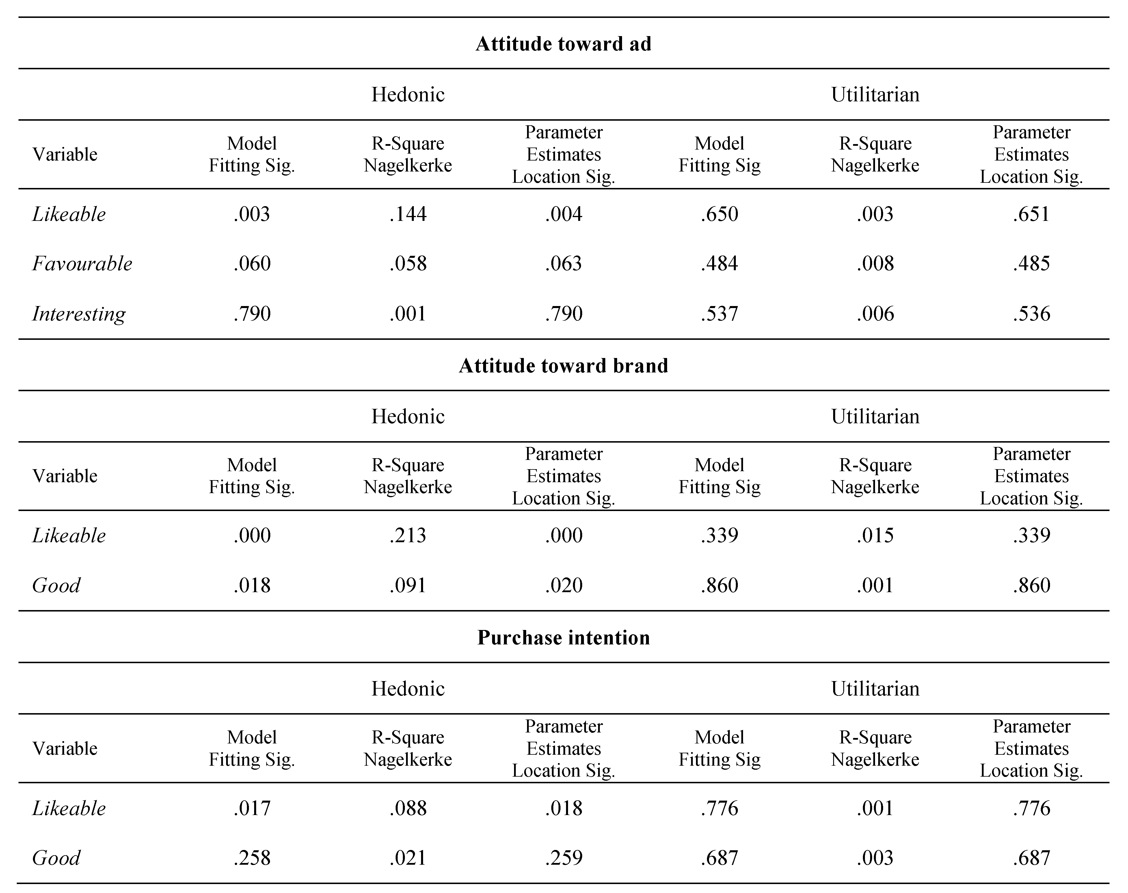
To determine whether the figurative typography mediated the attitude, we conducted an additional ordinal regression analysis using the type of the product and gradation of figuration as independent variables with attitude dimensions as dependent variables. Table 2 shows the results of the regression analysis. The results show that perceived difference between groups, according to regression coefficient, is statistically significant (direct influence of the figuration = –1.464, p = 0.004, R2 = 0.144) indicating the moderating effect of typeface rhetoric. Similar trend was revealed for the attitude toward the brand (direct influence of the figuration = –1.829, p = 0.000, R2 = 0.213), whereas the purchase intention had lower effect (direct influence of the figuration = –1.087, p = 0.018, R2 = 0.088). Thus, hypothesis 1 was supported.
Effects of typeface figuration on attention
In the second hypothesis, we expect a positive effect of the typeface figuration on attention. To test this assumption, we used a series of one-way ANOVA (analysis of variance) with fixation frequency and total fixation duration as independent variables. The main effect of figuration on fixation frequency was found to be not significant (F < 1) as was expected. On the other hand, participants in the treatment group paid significantly more attention to figurative typeface than the ones in the control group (Table 3). Hence, the effect on the total fixation duration F (1,45) = 8.481, p = 0.006, ηp2 = 0.15, supporting the hypothesis 2.
One additional analysis was made to examine whether typeface figuration of the verbal cue had any influence on brand ROI (logo) viewing time. Analysis of variance (ANOVA) was used to determine if there was a significant difference in viewing time between the two treatment groups (Table 4). The difference was not found to be significant (F < 1) indicating that attention paid to the appearance of the verbal cue did not influence the viewing of the brand logo.

Interaction between figuration and product type

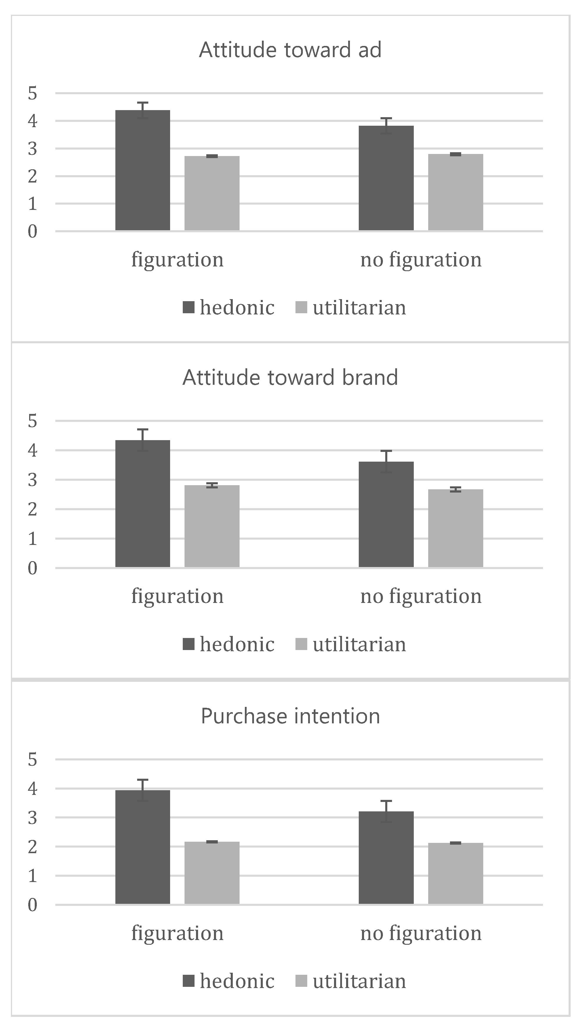
A two-way ANOVA (analysis of variance) between groups was performed for testing the interaction of typeface figuration and type of the product and the effect this interaction might have on the attitude components. First we will discuss the results of the effect on attitude toward the ad. Analysis revealed that the interaction between the typeface figuration and type of the product was statistically significant F (1,126) = 4.642, p = 0.03, ηp2 = 0.03. This reposrts that participants rated more positively an ad for a hedonic product when the typeface figuration was used (M = 4.38) than when there was no figuration (M = 3.82). This effect was found to be insignificant in the evaluation of an ad for a utilitarian product, where the average values in both groups were approximately the same (M = 2.72; M = 2.79). Interaction was revealed for the attitude toward the brand F (1,126) = 4.304, p = 0.04, ηp2 = 0.03. The likeability of the brand was rated better by the participants in the treatment group for both types of products (hedonic: M = 4.34; M = 3.61; utilitarian: M = 2.81; M = 2.67). The results of the IVs interaction affecting purchase intention did not show statistically significant result F (1,126) = 2.954, p = 0.08, ηp2 = 0.23. Only the main effect of the product type was significant F (1,126) = 51.133, p < 0.001, ηp2 = 0.23. Overall, participants showed significant tendency to rate more positively their attitude when the hedonic product was advertised using a typeface figuration for the ad copy, supporting the hypothesis 3 (Figure 5).

Discussion

Implications and conclusions

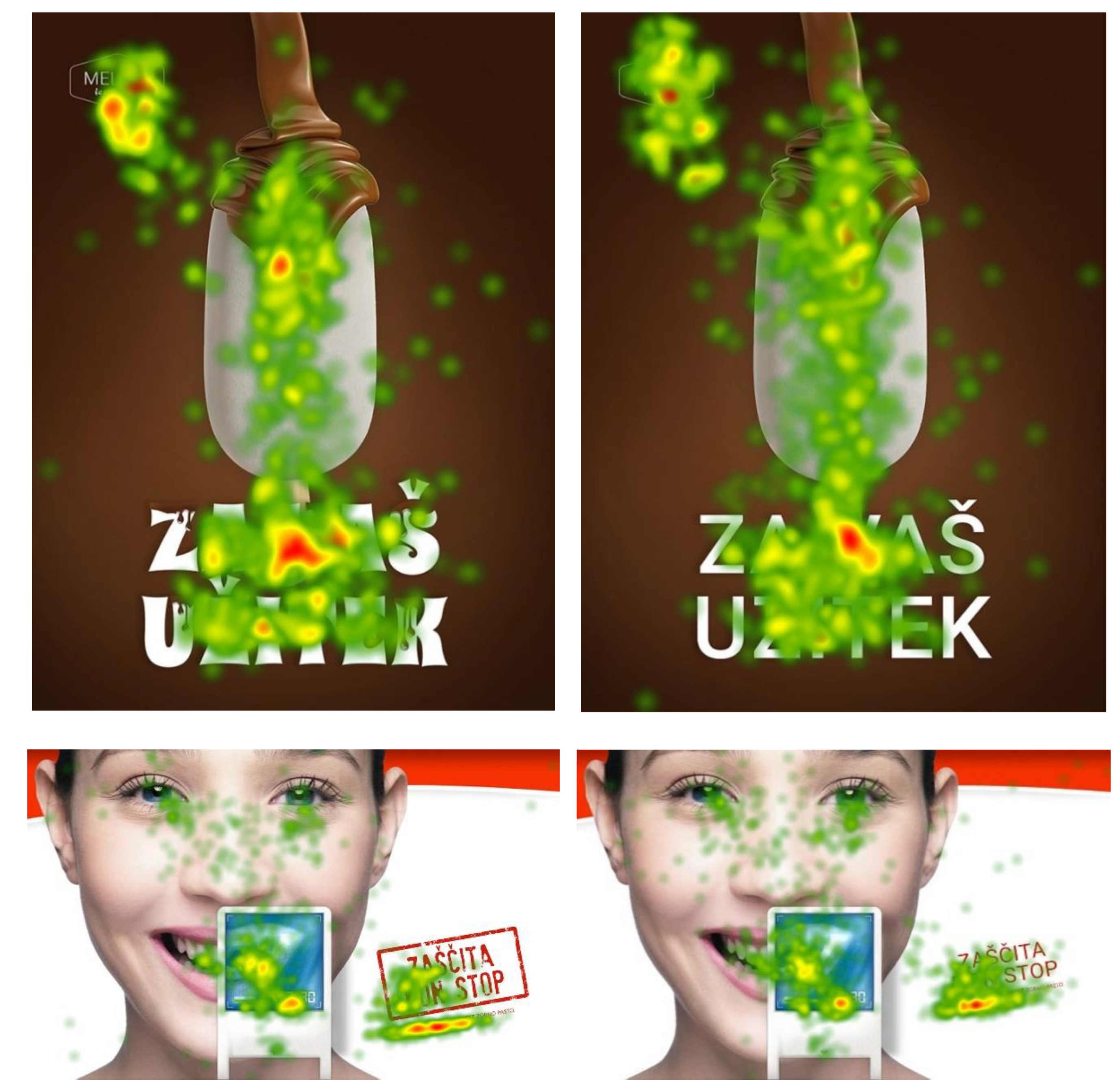
The goal of this study was to examine the effectiveness of rhetorical figuration applied to a typeface in print advertisements that promote different product types. These effects were evaluated based on eye movements, attitudes and intentions of the viewers under incidental exposure to an advertisement (Figure 6). As credited by Wedel & Pieters (2008), attention has emerged as a major parameter in processing visual stimuli and should, therefore, be attended accordingly. Our attempt to measure and analyse attention to print advertisements in relation to typeface figuration, has been met with several inferences. Firstly, our findings indicate that consumers pay more attention to advertisements when the typeface used for a short verbal cue is depicted through a rhetorical figuration. Drawing from the literature, we argue that this preference is directed by the fact that individuals pay more attention to salient elements of advertisements which is in agreement with the bottom-up factors (Berger, Wagner & Schwand, 2012), especially in the low-involvement situations. Typefaces with extensive figuration can be descriptively placed in a complex letter group. These typefaces are distinguished by their persuasive character more than e.g., geometrical letterforms (Henderson et al., 2004). Moreover, Pieters, Wedel & Batra (2010) confirm a positive effect of design complexity on attention. Even though, a sample of advertisements in their study do not depict gradations of typeface figuration in the form of tropes (more complex forms), an application of their ad design principles has a universal character, and thus the complexity of a design can be seen as a structural variance within certain shapes and objects. Accordingly, rhetorical figures i.e., artful deviation (Corbett, 1990) applied to letter forms of a certain typeface contribute to the design complexity and, consequently, to ad liking. We base our implications on Higgins, Leinenger & Rayner’s (2014) insights who explain that shorter ad headline, ornamented with figuration, leads viewers to perceive it as a stand-alone advertising element and not as a textual element. While watching the advertisement consumers might not adopt a reading but a “sampling” approach to the verbal cue. However, extensive complexity in letter forms may hinder letter recognition (Pelli et al., 2006) and may reduce motivation for processing (Lowrey, 1998). Therefore, researchers and practitioners interested in the relationship between typeface figuration and attention need to consider readability of typeface manipulation as a control factor.
Additionally, the link between the complexity and ad comprehensibility should be reviewed. To comprehend an advertisement, consumers must first identify the brand being advertised. The results we obtained from duration fixations on brand logo ROI confirm that typeface figuration did not have an impact on brand identification, suggesting that typeface rhetoric is not likely to hurt attention to a brand logo.
The second implication of this study refers to the main effect of the typeface figuration on viewers’ attitudes where a positive effect was confirmed. Our findings align with those of Gkiouzepas & Hogg (2011) who investigated the outcomes of the visual rhetoric placed in the pictorial part of advertisements. Likewise to studies which imply that more complex design (Palmer, 1999) and original forms (McQuarrie & Mick, 2003) may visually engage the viewer and are liked more. Arguably, the importance of the relationship between a typeface, as a key element, and the predictive character of attitude dimensions resonates in the pretesting methodologies, such as diagnostic commercial pretesting (Mackenzie, Lutz, & Belch, 1986). Thus our results contribute to the general literature of typeface impressions management.
Finally, we can discuss the interaction of the product type and the typeface rhetoric which was found to be significant. The interaction results showed that viewers have more positive reaction toward the ad for a hedonic product that chooses to “dress up” its verbal cue in a more complex typeface figuration. Although the interaction effect was insignificant for the conative attitude component (purchase intention), the main effect found for the product type to the probability of the purchase was significant for the hedonic product, which aligns with the previous findings of Roy & NG (2012).The results show that attractive and rhetorically charged typeface takes on the role of a spokesperson, levelling with a celebrity type (Stafford, Stafford, & Day, 2002) and performing a significant effect on the reception of a hedonic product.
On the managerial front, our study can also provide some insights to advertisers. In time, viewers develop an attitude and preference toward visual content they are exposed to. Therefore, advertisers should consider how general design characteristics play an important role in decision-making process. To this end, the findings of this study indicate the significance of the typeface figuration when displaying the verbal cue of an advertisement. Notice to advertisers is that rhetorical figures applied to a typeface draw and retained attention. Based on the attitude component analysis, advertisers can expect to have more positive ad and brand liking, as well as the probability of purchase intention. These inferences should be taken with caution. Products that promote hedonic characteristics interact better with rhetorically enhanced typefaces when the pictorial part is closer to picture realism, that is when picture figuration is not present. When promoting a utilitarian product, advertisers need not reject the possibility of typeface figuration, but the expected outcome might be less likeable. The same principle can be applied when the pictorial part is closer to picture realism than creative expression.
In conclusion, the findings of this study offer clear support to the prior theory of the positive impact of rhetorical figures, as well as to the effects of typeface characteristics. The results also reflect the impact and effect of enhanced typeface stylistic dimensions on attention when promoting products with hedonic benefits which, to our knowledge, has not yet been discussed in prior studies. Therefore, the contribution of our findings lies in bridging the gap in the literature between analytical studies about the semantic quality of typefaces and empirical findings. Further analysis of the semiotics of typography may benefit from these results, especially in the social and commercial communication context where typeface connotative dimensions are treated as a key element for meaning production.

Limitations and future research

Even though the results of this study contribute to advertising literature, there are still several limitations to apprehend. First, we did not measure over an extended array of figures but used only one gradation of rhetorical figures (metonymy). One reason to apply this particular figuration lies in its confirmed positive effect on consumer response (Eco, 1973; Gkiouzepas & Hogg, 2011). Although we used only one type of the stylisation of the typeface, we presume no effect on this part since the figuration used is the focus of attention. The aesthetic quality of the metonymy concept is familiar to viewers which should contribute to the generalizability of our findings to a certain extent. Future research might thus consider testing other figuration gradations that might provide superior results, or reveal an instance when the effect of such manipulation is nullified.
Another limitation is given in using a single visual figuration–realistic symbiosis (Gkiouzepas & Hogg 2011). The positive effect of visual rhetoric in advertisements has been well documented. Nonetheless, it would be interesting to measure attention and persuasiveness of advertisement elements when both pictorial part and appearance of the verbal cue are rhetorically enhanced. These future hypotheses would also align with empirical findings of homogeneity and ad congruence (Childers & Jass, 2002). However, when we consider different advertising contexts (situational variables), eye tracking research can be extended by testing visual figuration combining multiple levels of advertisement layout and exposure (involvement). Furthermore, participants in this study were exposed to an ad stimulus only once. Repeated exposures might alter results regarding the aesthetic experience of the verbal cue. Potentially significant future investigations should consider persuasiveness of advertisements that “dress up” their verbal cue within the visually oversaturated environment.

Acknowledgments

This research was supported by grant No.: 35027 from the Serbian Ministry of Science and Technological Development. Also, the work on this research was supported by the Ceepus project CIII-RS-0704-04-1516—Research and Education in the Field of Graphic Engineering and Design.

References

  1. Anderson, R. E., and M. A. Jolson. 1980. Technical wording in advertising: Implications for market segmentation. The Journal of Marketing 44, 1: 57–66. [Google Scholar] [CrossRef]
  2. Berger, S., U. Wagner, and C. Schwand. 2012. Assessing Advertising Effectiveness: The Potential of GoalDirected Behavior. Psychology & Marketing 29, 6: 411–421. [Google Scholar]
  3. Berlyne, D. 1971. Aesthetics and psychobiology. Retrieved from http://doi.apa.org/psycinfo/1973-00821-000. [Google Scholar]
  4. Bonsiepe, G. 1965. Visual/verbal rhetoric. Ulm: Journal of the Ulm School of Design 14/15: 69–82. [Google Scholar]
  5. Brinton, J. E. 1961. The “feeling”of type faces. CA Magazine 3: 43–45. [Google Scholar]
  6. Brumberger, E. R. 2003. The Rhetoric of Typography: The Persona of Typeface and Text. Technical Communication 50, 2: 206–223. [Google Scholar]
  7. Bush, A. J., W. C. Moncrief, and V. A. Ziethaml. 1987. Source effects in professional services advertising. Current Issues and Research in Advertising 10, 1–2: 153–171. [Google Scholar]
  8. Childers, T. L. 1992. The Role of Expectancy and Relevancy in Memory for Verbal and Visual Information: What Is Incongruency? Journal of Consumer Research 18, 4: 475–492. [Google Scholar]
  9. Childers, T. L., and M. J. Houston. 1984. Conditions for a picture-superiority effect on consumer memory. Journal of Consumer Research 11, 2: 643–654. [Google Scholar] [CrossRef]
  10. Childers, T. L., and J. Jass. 2002. All Dressed Up With Something to Say: Effects of Typeface Semantic Associations on Brand Perceptions and Consumer Memory. Journal of Consumer Psychology 12, 2: 93–106. [Google Scholar] [CrossRef]
  11. Corbett, E. P. J. 1990. Classical rhetoric for the modern student. Oxford University Press. [Google Scholar]
  12. Couronné, T., A. Guérin-Dugué, M. Dubois, P. Faye, and C. Marendaz. 2010. A statistical mixture method to reveal bottom-up and top-down factors guiding the eye-movements. Journal of Eye Movement Research 3, 2: 1–13. [Google Scholar] [CrossRef]
  13. Cox, D. S., and A. D. Cox. 1988. What does familiarity breed? Complexity as a moderator of repetition effects in advertisement evaluation. Journal of Consumer Research 15, 1: 111–116. [Google Scholar]
  14. Davis, R. C., and H. J. Smith. 1933. Determinants of feeling tone in type faces. Journal of Applied Psychology 17, 6: 742. [Google Scholar] [CrossRef]
  15. De Saussure, F. 1972. Edited by C. Bailly and A. Séchehaye. Cours de linguistique générale. In Collection Payothèque. Collection Payothèque, Grande Bibliothèque Payot. [Google Scholar]
  16. Delbaere, M., E. F. Mcquarrie, and B. J. Phillips. 2011. Personification in Advertising Using a Visual Metaphor to Trigger Anthropomorphism. Journal of Advertising 40, 1: 121–130. [Google Scholar] [CrossRef]
  17. DeRosia, E. D. 2008. Edited by E. F. McQuarrie and B. J. Phillips. Rediscovering theory: Integrating ancient hypotheses and modern empirical evidence of the audience-response effects of rhetorical figures. In Go Figure! New Directions in Advertising Rhetoric. M.E. Sharpe: pp. 23–50. [Google Scholar]
  18. Desimone, R., and J. Duncan. 1995. Neural mechanisms of selective visual attention. Annual Review of Neuroscience 18, 1: 193–222. [Google Scholar] [CrossRef]
  19. Deubel, H., and W. X. Schneider. 1996. Saccade target selection and object recognition: Evidence for a common attentional mechanism. Vision Research 36, 12: 1827–1837. [Google Scholar] [CrossRef]
  20. Djamasbi, S., M. Siegel, and T. Tullis. 2010. Generation Y, web design, and eye tracking. International Journal of Human-Computer Studies 68, 5: 307–323. [Google Scholar]
  21. Doyle, J. R., and P. a. Bottomley. 2006. Dressed for the Occasion: Font-Product Congruity in the Perception of Logotype. Journal of Consumer Psychology 16, 2: 112–123. [Google Scholar] [CrossRef]
  22. Duchowski, A. 2007. Eye tracking methodology: Theory and practice. Eye Tracking Methodology: Theory and Practice. Springer. [Google Scholar] [CrossRef]
  23. Eco, U. 1973. Kultura, informacija, komunikacija (Original t). Nolit, Beograd. [Google Scholar]
  24. Eco, U. 1976. A Theory of Semiotics. Indiana University Press. [Google Scholar]
  25. Foltz, G. S., S. E. Poltrock, and G. R. Potts. 1984. Mental comparison of size and magnitude: Size congruity effects. Journal of Experimental Psychology: Learning, Memory, and Cognition 10, 3: 442. [Google Scholar] [CrossRef]
  26. Franken, G., A. Podlesek, and K. Možina. 2014. Eyetracking Study of Reading Speed from LCD Displays: Influence of Type Style and Type Size. Journal of Eye Movement Research 8, 1: 1–8. [Google Scholar] [CrossRef]
  27. Gkiouzepas, L., and M. Hogg. 2011. Articulating a new framework for visual metaphors in advertising. Journal of Advertising 40, 1: 103–120. [Google Scholar] [CrossRef]
  28. Hanno, E., and E. Lupton. 1988. Rhetorical handbook: An illustrated manual for graphic designers. Design Papers 5: 1–39. [Google Scholar]
  29. Hanssens, D. M., and B. A. Weitz. 1980. The effectiveness of industrial print advertisements across product categories. Journal of Marketing Research 17, 3: 294–306. [Google Scholar]
  30. Henderson, P. W., J. L. Giese, and J. A. Cote. 2004. Impression management using typeface design. Journal of Marketing 68, 4: 60–72. Available online: http://www.jstor.org/stable/10.2307/30162016. [CrossRef]
  31. Higgins, E., M. Leinenger, and K. Rayner. 2014. Eye movements when viewing advertisements. Frontiers in Psychology 5, MAR: 1–21. [Google Scholar] [CrossRef]
  32. Holbrook, M. B., and D. R. Lehmann. 1980. Form versus content in predicting Starch scores. Journal of Advertising Research 20, 4: 53–62. [Google Scholar]
  33. Holbrook, M. B., and J. O’Shaughnessy. 1984. The role of emotion in advertising. Psychology & Marketing 1, 2: 45–64. [Google Scholar]
  34. ISO 3664:2009, 2015, Conditions, Graphic Technology and Photography—Viewing.
  35. Johar, J. S., and M. J. Sirgy. 1991. Value-expressive versus utilitarian advertising appeals: When and why to use which appeal. Journal of Advertising 20, 3: 23–33. [Google Scholar]
  36. Kjeldsen, J. E. 2012. Pictorial Argumentation in Advertising: Visual Tropes and Figures as a Way of Creating Visual Argumentation. In Topical themes in argumentation theory. Springer Netherlands: pp. 239–255. [Google Scholar] [CrossRef]
  37. Kostić, A. 2006. Edited by S. G. Marković and M. Isić. Kognitivna psihologija. In Zavod za udžbenike i nastavna sredstva. Beograd. [Google Scholar]
  38. Lee, J., and J.-H. Ahn. 2012. Attention to Banner Ads and Their Effectiveness: An Eye-Tracking Approach. International Journal of Electronic Commerce 17, 1: 119–137. [Google Scholar] [CrossRef]
  39. Leeuwen, T. van. 2006. Towards a semiotics of typography. Information Design Journal 4, 2: 139–155. [Google Scholar]
  40. Lewis, C., and P. Walker. 1989. Typographic influences on reading. British Journal of Psychology 80, 2: 241–257. Available online: http://www.ncbi.nlm.nih.gov/pubmed/2736343. [CrossRef]
  41. Lowrey, T. M. 1998. The effects of syntactic complexity on advertising persuasiveness. Journal of Consumer Psychology 7, 2: 187–206. [Google Scholar]
  42. Mackenzie, S. B., R. J. Lutz, and G. E. Belch. 1986. The Role of Attitude Toward the Ad as a Mediator of Advertising Effectiveness: A Test Competing Explanations. Journal of Marketing Research 23, 2: 130–143. [Google Scholar] [CrossRef]
  43. Mackiewicz, J., and R. Moeller. 2004. Why people perceive typefaces to have different personalities. International Professional Communication Conference, 2004. IPCC 2004. Proceedings, 304–313. [Google Scholar] [CrossRef]
  44. McCarthy, M. S., and D. L. Mothersbaugh. 2002. Effects of typographic factors in advertising-based persuasion: A general model and initial empirical tests. Psychology and Marketing 19, 7–8: 663–691. [Google Scholar] [CrossRef]
  45. McQuarrie, E. F., and D. G. Mick. 1996. Figures of rhetoric in advertising language. Journal of Consumer Research 22, 4: 424–438. Available online: http://www.jstor.org/stable/10.2307/2489791. [CrossRef]
  46. Mcquarrie, E. F., and D. G. Mick. 1999. Visual Rhetoric in Advertising: Text-Interpretive, Experimental, and Reader-Response Analyses. Journal of Consumer Research 26, 1: 37–54. [Google Scholar]
  47. McQuarrie, E. F., and D. G. Mick. 2003. Visual and verbal rhetorical figures under directed processing versus incidental exposure to advertising. Journal of Consumer Research 29, 4: 579–587. [Google Scholar] [CrossRef]
  48. Mehrabian, A., and J. A. Russell. 1974. An approach to environmental psychology. Massachusetts Institute of Technology Press. [Google Scholar]
  49. Mick, D. 1986. Consumer research and semiotics: Exploring the morphology of signs, symbols, and significance. Journal of Consumer Research 13, 2: 196–213. [Google Scholar]
  50. Mick, D. G., and L. G. Politi. 1989. Consumers’ interpretations of advertising imagery: A visit to the hell of connotation. Interpretive Consumer Research Special Vo: 85–96. [Google Scholar]
  51. Mitchell, A. A., and J. C. Olson. 1981. Are product attribute beliefs the only mediator of advertising effects on brand attitude? Journal of Marketing Research 18, 3: 318–332. [Google Scholar]
  52. Morris, J. D., C. Woo, J. A. Geason, and J. Kim. 2002. The power of affect: Predicting intention. Journal of Advertising Research 42, 3: 7–17. [Google Scholar]
  53. Morrison, B. J., and M. J. Dainoff. 1972. Advertisement Complexity and Looking Time. Journal of Marketing Research 9, 4: 396–400. [Google Scholar]
  54. Morrison, G. R. 1986. Communicability of the emotional connotation of type. ECTJ 34, 4: 235–244. [Google Scholar]
  55. Mothersbaugh, D. L., B. A. Huhmann, and G. R. Franke. 2002. Combinatory and Separative Effects of Rhetorical Figures on Consumers’ Effort and Focus in Ad Processing. Journal of Consumer Research 28, 4: 589–602. [Google Scholar] [CrossRef]
  56. Groupe, Mu. 1992. Traité du Signe Visuel Pour Une Rhétorique de L’Image. Seuil. [Google Scholar]
  57. Nedeljković, U., D. Novaković, I. Puškarević, and I. Tomić. 2014. Helvetica as a type convention for the youthful and trendy image: A consumer response to designer safe option. Marketing 45, 1: 50–62. [Google Scholar]
  58. Nedeljković, U., I. Puškarević, B. Banjanin, and I. Pinćjer. 2013. Legibility based on differentiation of characters: A review of empirical findings fundamental for type design practice. Journal of Graphic Engineering and Design 4, 1: 17–27. [Google Scholar]
  59. Nedeljković, Uroš, Dragoljub Novaković, and Ivan Pinćjer. 2015 forthcoming 2017. Detecting universal structure and effects of typefaces. Tehnički vjesnik/Technical Gazette 24, 2. [Google Scholar]
  60. Ohanian, R. 1990. Construction and validation of a scale to measure celebrity endorsers’ perceived expertise, trustworthiness, and attractiveness. Journal of Advertising 19, 3: 39–52. [Google Scholar]
  61. Osgood, C. E., G. J. Suci, and P. H. Tannenbaum. 1957. The measurement of meaning. University of Illinois Press. [Google Scholar]
  62. Palmer, S. E. 1999. Vision science: Photons to phenomenology. MIT press: vol. 1. [Google Scholar]
  63. Pelli, D. G., C. W. Burns, B. Farell, and D. C. Moore-Page. 2006. Feature detection and letter identification. Vision Research 46, 28: 4646–4674. [Google Scholar]
  64. Peracchio, L. A., and J. Meyers-Levy. 1994. How ambiguous cropped objects in ad photos can affect product evaluations. Journal of Consumer Research 21, 1: 190–204. [Google Scholar]
  65. Pieters, R., L. Warlop, and M. Wedel. 2002. Breaking Through the Clutter: Benefits of Advertisement Originality and Familiarity for Brand Attention and Memory. Management Science 48, 6: 765–781. [Google Scholar] [CrossRef]
  66. Pieters, R., and M. Wedel. 2004. Attention Capture and Transfer in Advertising: Brand, Pictorial, and TextSize Effects. Journal of Marketing 68, 2: 36–50. [Google Scholar] [CrossRef]
  67. Pieters, R., M. Wedel, and R. Batra. 2010. The stopping power of advertising: Measures and effects of visual complexity. Journal of Marketing 74, 5: 48–60. [Google Scholar]
  68. Pušnik, N., K. Možina, and A. Podlesek. 2016. Effect of typeface, letter case and position on recognition of short words presented on-screen. Behaviour & Information Technology 35, 6: 442–451. [Google Scholar] [CrossRef]
  69. Pušnik, N., A. Podlesek, and K. Možina. 2016. Typeface comparison− Does the x-height of lower-case letters increased to the size of upper-case letters speed up recognition? International Journal of Industrial Ergonomics 54: 164–169. [Google Scholar] [CrossRef]
  70. Rayner, K. 1998. Eye movements in reading and information processing: 20 years of research. Psychological Bulletin 124, 3: 372. [Google Scholar] [CrossRef]
  71. Rayner, K. 2009. Eye movements and attention in reading, scene perception, and visual search. The Quarterly Journal of Experimental Psychology 62, 8: 1457–1506. [Google Scholar]
  72. Rayner, K., B. Miller, and C. M. Rotello. 2008. Eye movements when looking at print advertisements: The goal of the viewer matters. Applied Cognitive Psychology 22, 5: 697–707. [Google Scholar]
  73. Rayner, K., C. M. Rotello, a J. Stewart, J. Keir, and S. A. Duffy. 2001. Integrating text and pictorial information: Eye movements when looking at print advertisements. Journal of Experimental Psychology Applied 7, 3: 219–226. [Google Scholar] [CrossRef]
  74. Rowe, C. L. 1982. The connotative dimensions of selected display typefaces. Information Design Journal 3, 1: 30–37. [Google Scholar] [CrossRef]
  75. Roy, R., and S. NG. 2012. Regulatory focus and preference reversal between hedonic and utilitarian consumption. Journal of Consumer Behaviour 11, 1: 81–88. [Google Scholar] [CrossRef]
  76. Russel, W. B. 1975. Situational variables and consumer behavior. Journal of Consumer Research 2, 3: 156–164. [Google Scholar]
  77. Russo, J. E. 1978. Edited by K. Hunt, A. Abor and MI. Eye fixations can save the world: A critical evaluation and a comparison between eye fixations and other information processing methodologies. In NA-Advances in consumer research. Association for Consumer Research: Vol. 5. [Google Scholar]
  78. Scott, L. M. 1994. Images in Advertising: The Need for a Theory of Visual Rhetoric. Journal of Consumer Research 21, 2: 252–273. [Google Scholar]
  79. Stafford, M. R., T. F. Stafford, and E. Day. 2002. A Contingency Approach: The Effects of Spokesperson Type and Service Type on Service Advertising Perceptions. Journal of Advertising 31, 2: 17–35. [Google Scholar] [CrossRef]
  80. Tannenbaum, P. H., H. K. Jacobson, and E. L. Norris. 1964. An experimental investigation of typeface connotations. Journalism & Mass Communication Quarterly 41, 1: 65–73. [Google Scholar]
  81. Tobii eye tracking: An introduction to eye tracking and Tobii Eye Trackers. n.d., Retrieved from http://acuity-ets.com/downloads/TobiiEyeTracking Introduction Whitepaper.pdf.
  82. Toncar, M., and J. Munch. 2001. Consumer Responses to Tropes in Print Advertising. Journal of Advertising 30, 1: 55–65. [Google Scholar]
  83. Treisman, A., and S. Gormican. 1988. Feature analysis in early vision: Evidence from search asymmetries. Psychological Review 95, 1: 15. [Google Scholar]
  84. Trummel, P. 1988. Rhetoric+Typography: Creative Interaction in Modern Communication. IEEE Transactions on Professional Communication 31, 3: 124–129. [Google Scholar]
  85. Vaughn, R. 1980. How advertising works: A planning model. Journal of Advertising Research 20, 5: 27–33. [Google Scholar]
  86. Wedel, M. 2013. Attention Research in Marketing: A Review of Eye Tracking Studies. Robert H. Smith School Research Paper No. RHS, 1–28. [Google Scholar]
  87. Wedel, M., and R. Pieters. 2000. Eye fixations on advertisements and memory for brands: A model and findings. Marketing Science 19, 4: 297–312. [Google Scholar]
  88. Wedel, M., and R. Pieters. 2000. Eye Fixations on Advertisements and Memory for Brands: A Model and Findings. Marketing Science 19, 4: 297–312. [Google Scholar] [CrossRef]
  89. Wedel, M., and R. Pieters. 2008a. A review of eyetracking research in marketing. Review of Marketing Research 4, 2008: 123–147. [Google Scholar]
  90. Wedel, M., and R. Pieters. 2008b. Eye tracking for visual marketing. Now Publishers Inc. [Google Scholar]
  91. White, J. V. 1988. Graphic design for the electronic age. Watson-Guptill Publications. [Google Scholar]
  92. Wright, P. L. 1973. The Cognitive Processes Mediating Acceptance of Advertising. Journal of Marketing Research 10, 1: 53–62. [Google Scholar] [CrossRef]
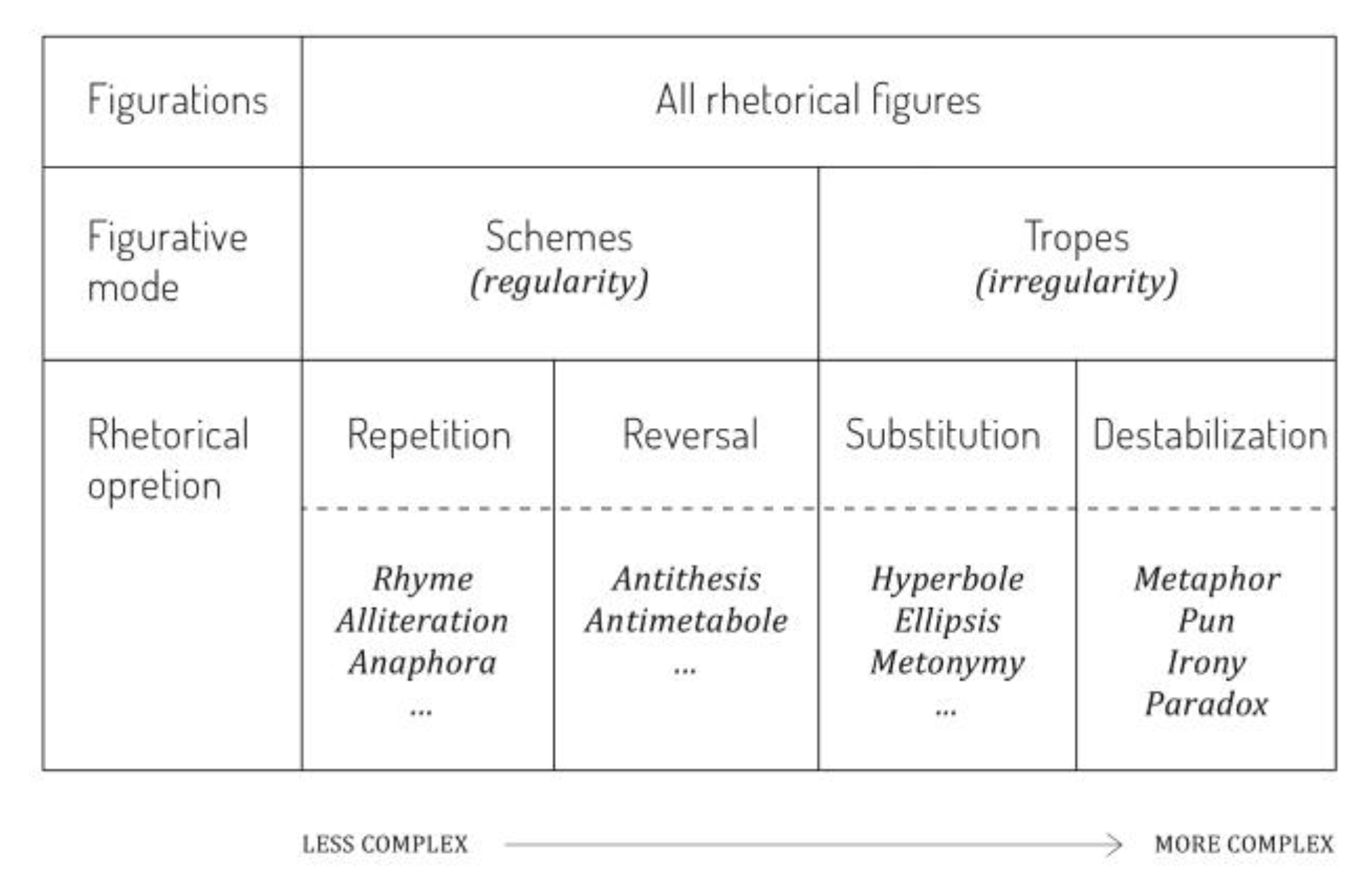
Figure 1. A taxonomy of rhetorical figures devised by McQuarrie and Mick (1996). The grid shows three–step categorization where division of rhetorical figures is based on the regularity or irregularity of the form.
Jemr 09 00028 g001
Figure 2. Examples of rhetorical figures applied to typeface design (Hanno & Lupton, 1988). Anaphora (involves repetition of an element or series of elements at the beginning of a sequence) and anastrophe (inverts normal grammatical order) fall under schematic devices which have more regularity in their representation. Metaphor (an implied comparison between two unlike objects that have some structural similarity) and metonymy (represents one term with another which is close to it in time, space, or causation) fall under tropic devices which are more irregular.
Jemr 09 00028 g002
Figure 3. Process model of how attention influences cognitive dimensions and cognitive processes.
Jemr 09 00028 g003
Figure 4. Example stimuli. Ice cream ad copy “For your pleasure”; toothpaste ad copy “Non-stop protection”.
Jemr 09 00028 g004
Figure 5. Attitude (Scale measure) as the function of typeface figuration and product type (condition: hedonic vs. utilitarian).
Jemr 09 00028 g005
Figure 6. Heat maps comparing the eye movements of the experimental and control group. From left to right: An ad promoting a hedonic product with slogan visually amplified with rhetorical figuration. An ad promoting a hedonic product with slogan visually without rhetorical figuration. An ad promoting a utilitarian product with slogan visually amplified with rhetorical figuration. An ad promoting a utilitarian product with slogan visually without rhetorical figuration.
Jemr 09 00028 g006
Table 1. Target ads and manipulations.
Jemr 09 00028 g007
Table 2. Mediating effect of typeface figuration on attitude and intention dimensions across product types (hedonic vs. utilitarian).
Jemr 09 00028 g008
Table 3. Means (M) and Standard Deviation (SD) of Attention Measures for Ad Copy Typeface ROI: Fixation frequency (Number of Fixations) and Total Fixation Duration (Total Looking Time in Seconds).
Jemr 09 00028 g009
Table 4. Means (M) and Standard Deviation (SD) of Attention Measures for Brand Logo ROI: Fixation frequency (Number of Fixations) and Total Fixation Duration (Total Looking Time in Seconds).
Jemr 09 00028 g010