
The Myth of Methuselah and the Uncertainty of Death: The Mortality Fan Charts


Abstract
:1. Introduction
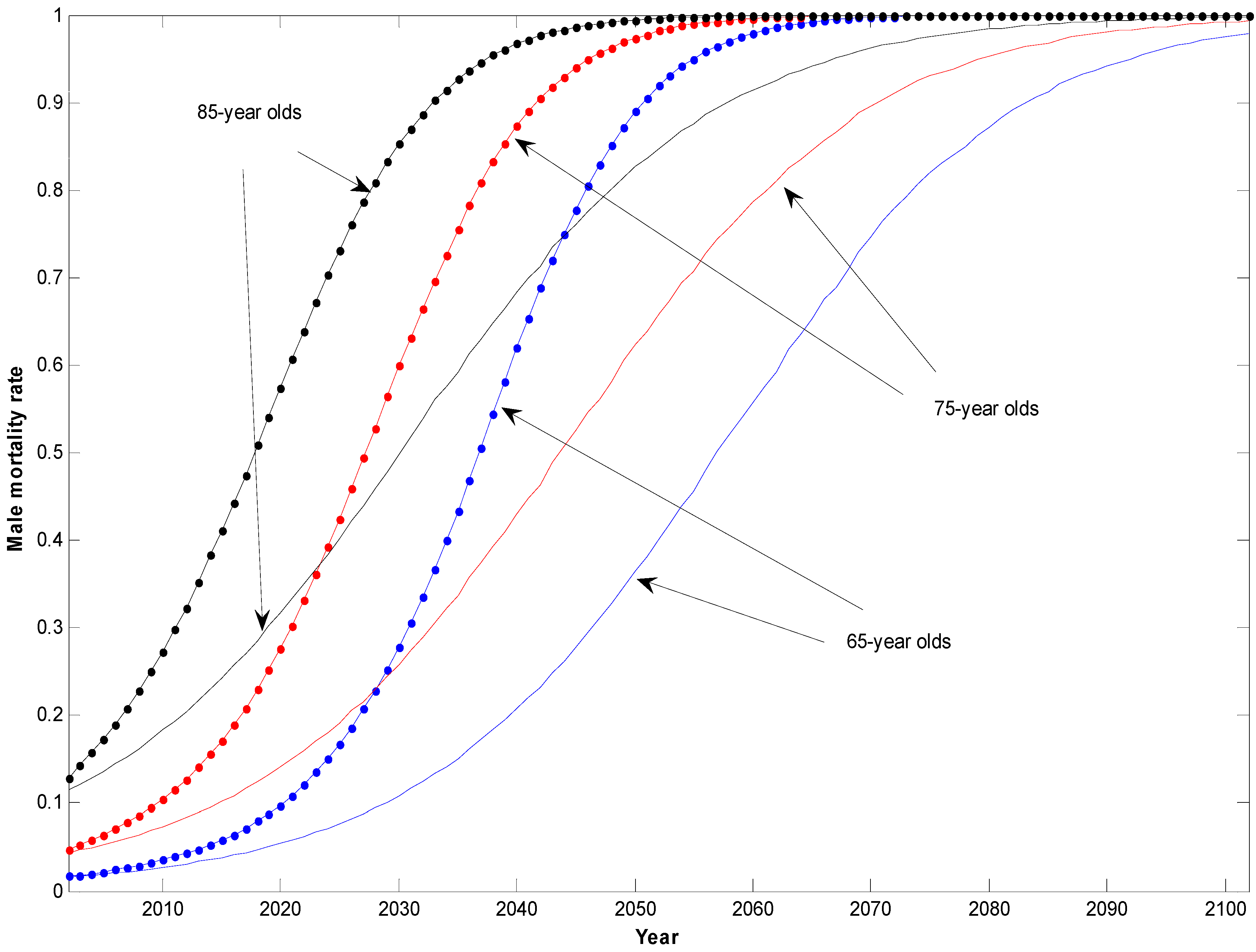
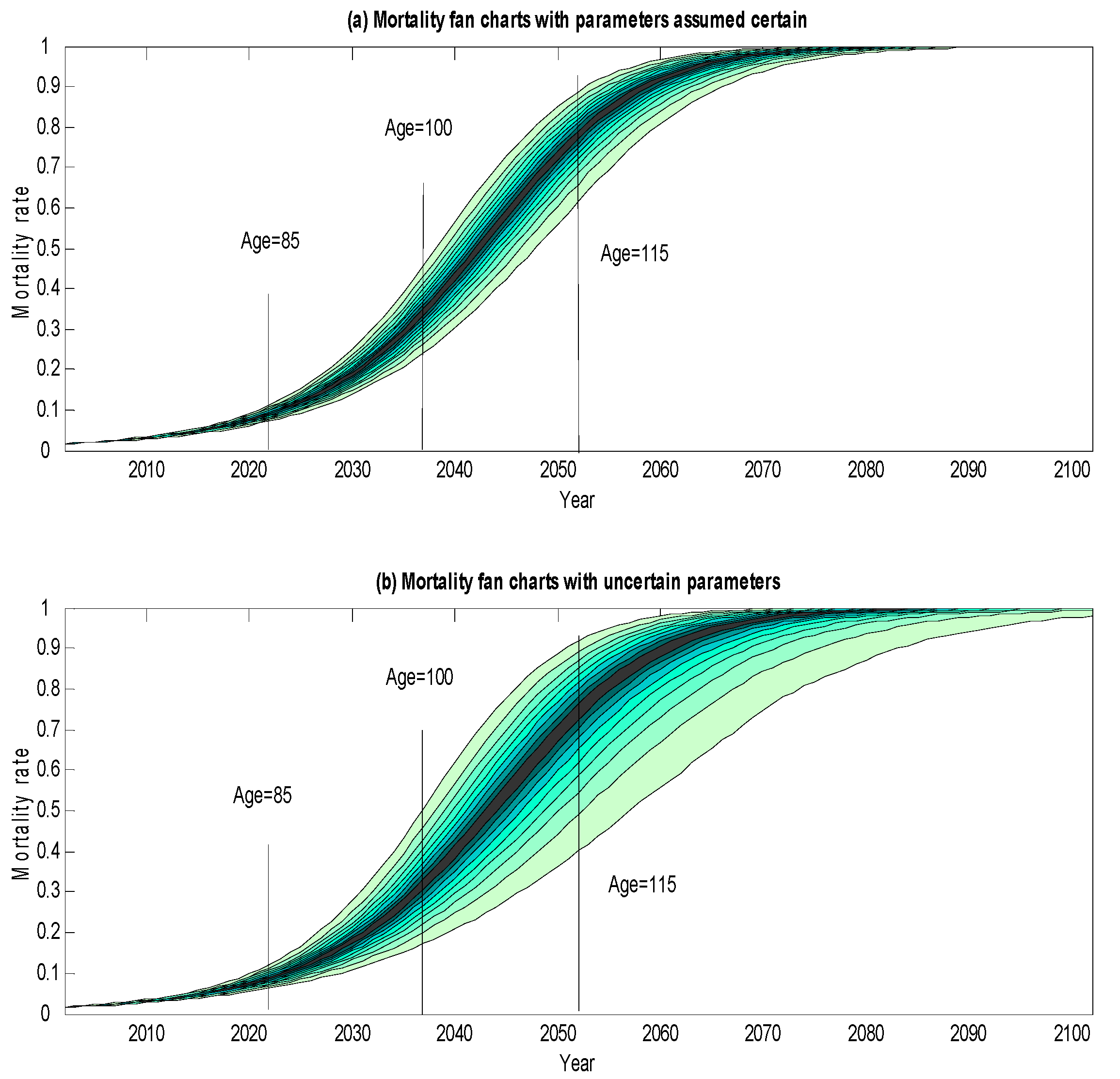
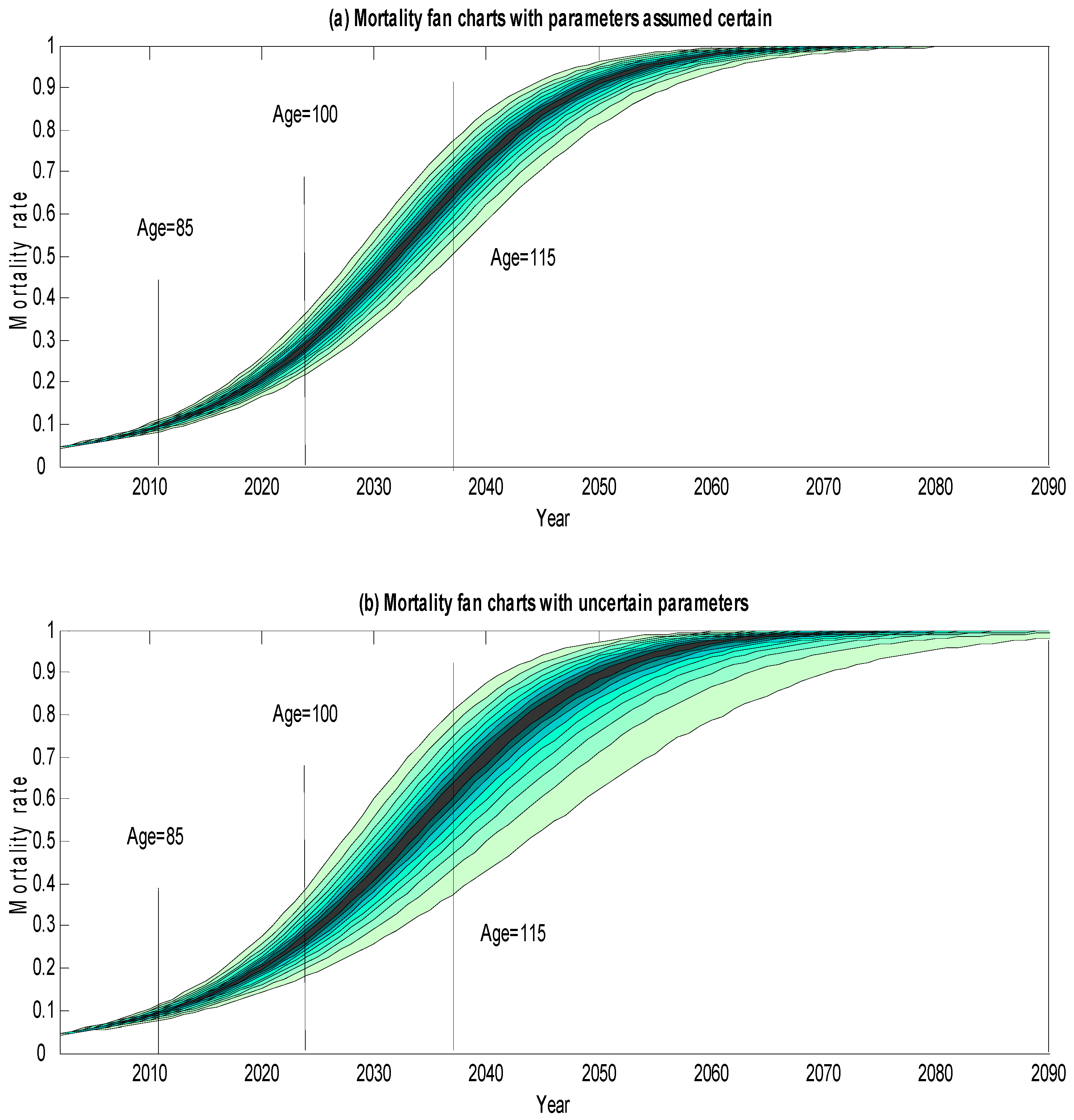
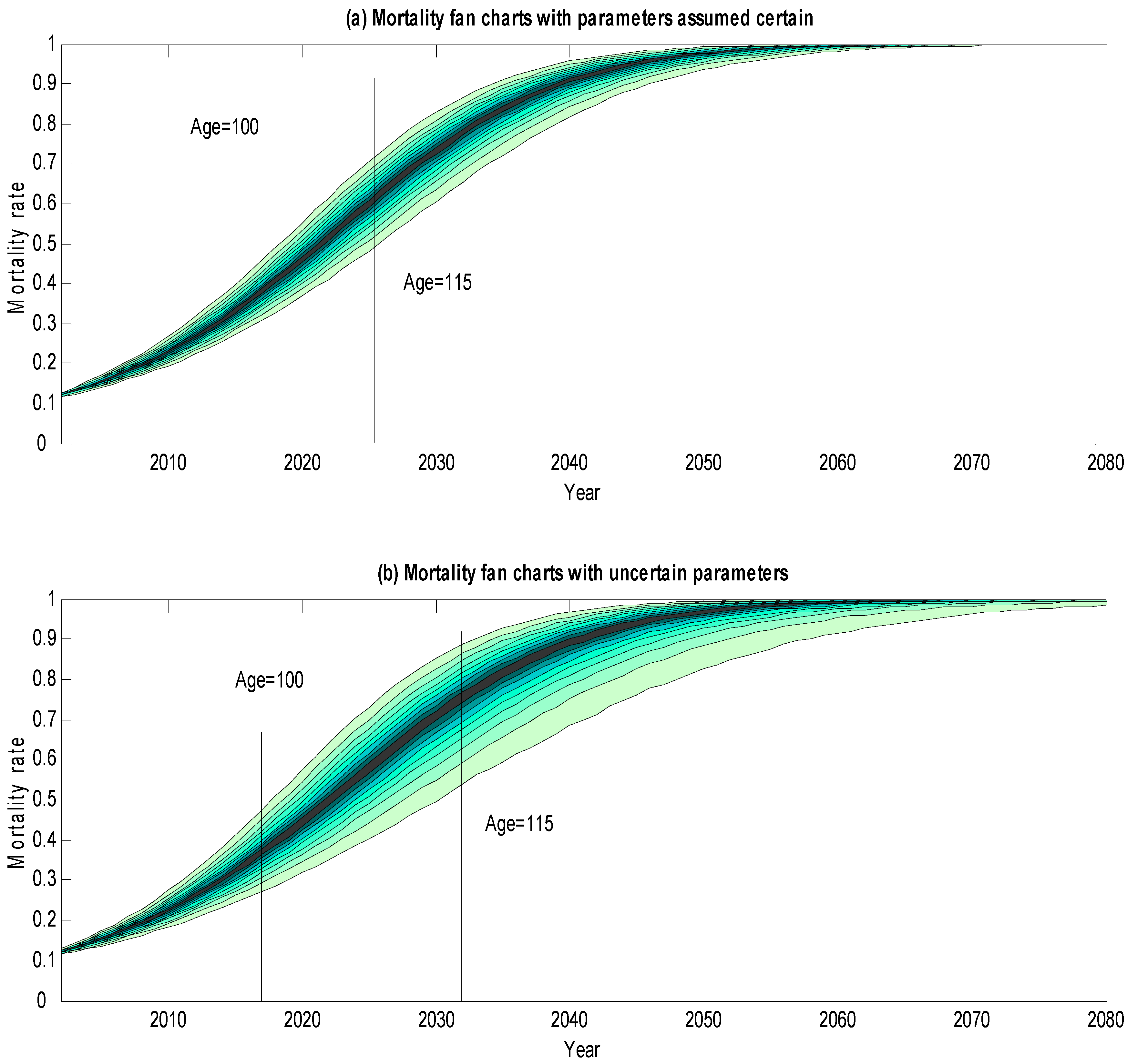
2. Mortality Fan Charts
3. Conclusions
Author Contributions
Conflicts of Interest
Appendix: A Mortality Model
References
- J. Vaupel, J. Carey, K. Christensen, T. Johnson, A. Yashin, V. Holm, I. Iachine, V. Kannisto, A. Khazaeli, P. Liedo, and et al. “Biodemographic Trajectories of Longevity.” Science 280 (1998): 855–860. [Google Scholar] [CrossRef] [PubMed]
- S. Tuljapurkar, N. Li, and C. Boe. “A Universal Pattern of Mortality Decline in the G7 Countries.” Nature 405 (2000): 789–792. [Google Scholar] [CrossRef] [PubMed]
- J. Oeppen, and J.W. Vaupel. “Broken Limits of Life Expectancy.” Science 296 (2002): 1029–1031. [Google Scholar] [CrossRef] [PubMed]
- S. Tuljapurkar. “Future Mortality: A Bumpy Road to Shangri-La? ” Sci. Aging Knowl. Environ. 2005 (2005). [Google Scholar] [CrossRef] [PubMed]
- S.J. Olshansky, B.A. Carnes, and C. Cassel. “In Search of Methuselah: Estimating the Upper Limits to Human Longevity.” Science 250 (1990): 634–640. [Google Scholar] [CrossRef] [PubMed]
- S.J. Olshansky, B.A. Carnes, and A. Désesquelles. “Prospects for Human Longevity.” Science 291 (2001): 1491–1492. [Google Scholar] [CrossRef] [PubMed]
- S.J. Olshansky, D. Passaro, R. Hershow, J. Layden, B.A. Carnes, J. Brody, L. Hayflick, R.N. Butler, D.B. Allison, and D.S. Ludwig. “A Potential Decline in Life Expectancy in the United States in the 21st Century.” N. Engl. J. Med. 352 (2005): 1103–1110. [Google Scholar] [CrossRef] [PubMed]
- T. Mizuno, I.-W. Shu, H. Makimura, and C. Mobbs. “Obesity Over the Life Course.” Sci. Aging Knowl. Environ. 2004 (2004). [Google Scholar] [CrossRef]
- I. Loladze. “Rising Atmospheric CO2 and Human Nutrition: Toward Globally Imbalanced Plant Stoichiometry? ” Trends Ecol. Evolut. 17 (2002): 457–461. [Google Scholar] [CrossRef]
- A.D.N.J. De Grey. “Extrapolaholics Anonymous: Why Demographers’ Rejections of a Huge Rise in Cohort Life Expectancy in This Century are Overconfident.” Ann. N. Y. Acad. Sci. 1067 (2006): 83–93. [Google Scholar] [CrossRef] [PubMed]
- N.K. Sandars. The Epic of Gilgamesh: An English Version with an Introduction, 3rd ed. Harmondsworth, Middlesex, UK: Penguin, 1972. [Google Scholar]
- A.J.G. Cairns, D. Blake, and K. Dowd. “A Two-Factor Model for Stochastic Mortality with Parameter Uncertainty: Theory and Calibration.” J. Risk Insur. 73 (2006): 687–718. [Google Scholar] [CrossRef]
- Bank of England. Inflation Report. London, UK: Bank of England, 1996. [Google Scholar]
- M.A. King. What Fates Impose: Facing up to Uncertainty? London, UK: The British Academy, 2004. [Google Scholar]
- D. Blake, A.J.G. Cairns, and K. Dowd. “Longevity Risk and the Grim Reaper’s Toxic Tail: The Survivor Fan Charts.” Insur. Math. Econ. 42 (2008): 1062–1066. [Google Scholar] [CrossRef]
- K. Dowd, D. Blake, and A.J.G. Cairns. “Facing up to Uncertain Life Expectancy: The Longevity Fan Charts.” Demography 47 (2010): 67–78. [Google Scholar] [CrossRef] [PubMed]
- J.S.H. Li, A.C.Y. Ng, and W.S. Chan. “Stochastic Life Table Forecasting: A Time-Simultaneous Fan Chart Application.” Math. Comput. Simul. 93 (2013): 98–107. [Google Scholar] [CrossRef]
- W. Perks. “On Some Experiments in the Graduation of Mortality Statistics.” J. Inst. Actuar. 63 (1932): 12–57. [Google Scholar]
- B. Benjamin, and J.H. Pollard. The Analysis of Mortality and Other Actuarial Statistics, 3rd ed. London, UK: Institute of Actuaries, 1993. [Google Scholar]
- 1Book of Genesis 5:27: ‘And all the days of Methuselah were nine hundred sixty and nine years: and he died.’
- 2Sandars ([11], p. 107).
- 3The first inflation fan chart was published by the Bank of England in 1996 (Bank of England [13]), and inflation fan charts have been published in each of the Bank’s quarterly Inflation Reports ever since. Some longevity fan charts were published in King [14] and further mortality-related fan charts are shown in Blake et al. [15], Dowd et al. [16] and Li et al. [17].
- 4Details of the calculations underlying the mortality fan charts are given in the Appendix.
- 5The principal reason for this increased width is uncertainty in the underlying trend rather than in the volatility of mortality rates. As the time horizon increases, uncertainty in the trend dominates all other sources of risk in influencing the width of the lower side fan chart.
- 6Of course, in interpreting the fan chart forecasts, we also need to be on our guard against possible biases in the model. (1) The mortality forecasts have a possible upward bias, in so far as they do not take account of future improvements to medical science (e.g., miracle cures of major illnesses) that we cannot predict; (2) On the other hand, the forecasts have a possible downward bias in that they ignore important factors such as the impact of obesity that threaten to increase future mortality but have not yet fed through into the mortality data on which our model is calibrated. Readers who have strong views on these issues might wish to take them into account in interpreting the fan charts.


| Probability Assuming: | ||
|---|---|---|
| Survival to Age | Parameters Certain | Parameters Uncertain |
| Survival Probabilities for Males Aged 65 in 2002 (%) | ||
| 70 | 90.77 | 90.78 |
| 75 | 78.42 | 78.49 |
| 80 | 62.52 | 62.75 |
| 85 | 43.61 | 44.19 |
| 90 | 24.34 | 25.25 |
| 95 | 9.33 | 10.23 |
| 100 | 1.92 | 2.37 |
| 105 | 0.15 | 0.23 |
| 110 | 0.00 | 0.01 |
| Survival Probabilities for Males Aged 65 in 2002, Conditional on Reaching 85 (%) | ||
| 90 | 55.81 | 57.13 |
| 95 | 21.39 | 23.16 |
| 100 | 4.40 | 5.37 |
| 105 | 0.34 | 0.52 |
| 110 | 0.01 | 0.01 |
| 115 | 0.00 | 0.00 |
| Survival Probabilities for Males Aged 65 in 2002, Conditional on Reaching 100 (%) | ||
| 105 | 7.66 | 9.64 |
| 110 | 0.13 | 0.25 |
| 115 | 0.00 | 0.00 |
© 2016 by the authors; licensee MDPI, Basel, Switzerland. This article is an open access article distributed under the terms and conditions of the Creative Commons Attribution (CC-BY) license (http://creativecommons.org/licenses/by/4.0/).
Share and Cite
Dowd, K.; Blake, D.; Cairns, A.J.G. The Myth of Methuselah and the Uncertainty of Death: The Mortality Fan Charts. Risks 2016, 4, 21. https://doi.org/10.3390/risks4030021
Dowd K, Blake D, Cairns AJG. The Myth of Methuselah and the Uncertainty of Death: The Mortality Fan Charts. Risks. 2016; 4(3):21. https://doi.org/10.3390/risks4030021
Chicago/Turabian StyleDowd, Kevin, David Blake, and Andrew J. G. Cairns. 2016. "The Myth of Methuselah and the Uncertainty of Death: The Mortality Fan Charts" Risks 4, no. 3: 21. https://doi.org/10.3390/risks4030021
APA StyleDowd, K., Blake, D., & Cairns, A. J. G. (2016). The Myth of Methuselah and the Uncertainty of Death: The Mortality Fan Charts. Risks, 4(3), 21. https://doi.org/10.3390/risks4030021