Article

Best Practices for Applying and Interpreting the Total Operating Characteristic

by
Tanner Honnef
and
Robert Gilmore Pontius, Jr.
*
Graduate School of Geography, Clark University, Worcester, MA 01610, USA
*
Author to whom correspondence should be addressed.
ISPRS Int. J. Geo-Inf. 2025, 14(4), 134; https://doi.org/10.3390/ijgi14040134
Submission received: 30 January 2025 / Revised: 1 March 2025 / Accepted: 18 March 2025 / Published: 23 March 2025

Abstract

:
The Total Operating Characteristic (TOC) is an improvement on the quantitative method called the Relative Operating Characteristic (ROC), both of which plot the association between a binary variable and a rank variable. TOC curves reveal the sizes of the four entries in the confusion matrix at each threshold, which make TOC curves more easily interpretable than ROC curves. The TOC has become popular, especially to assess the fit of simulation models to predict land change. However, the literature has shown variation in how authors apply and interpret the TOC, creating some misleading conclusions. Our manuscript lists best practices when applying and interpreting the TOC to help scientists learn from TOC curves. An example illustrates these practices by applying the TOC to measure the ability to predict the gain of crop in Western Bahia, Brazil. The application compares four ways to design the rank variable based on the distance to either pixels or patches of either the presence or change of crop. The results show that the gain of crop during the validation time interval is more strongly associated with the distance to patches rather than pixels of crop. The Discussion Section reveals that if authors show the TOC curves, then readers can interpret the results in ways that the authors might have missed. The Conclusion encourages scientists to follow best practices to learn the wealth of information that the TOC reveals.

1. Introduction

The Total Operating Characteristic (TOC) measures the degree to which presence observations for a binary variable correspond to earlier-ranked observations for a rank variable [1]. The TOC has many applications in Geo-Information and beyond. TOC curves have become popular for comparing machine learning algorithms and remotely sensed indices that rank observations in terms of the predicted presence of the binary variable. A TOC curve plots the cumulative presence of the binary variable versus the ranks of the rank variable. Thus, the TOC curve shows a tremendous amount of potentially useful information. A threshold applied to any particular rank creates a point on the TOC curve. Each point reveals the sizes in the corresponding 2-by-2 confusion matrix’s four entries: hits, false alarms, misses, and correct rejections. Those four entries are also known, respectively, as true positives, false positives, false negatives, and true negatives. Those four entries can generate a variety of potentially relevant metrics, depending on the research question. In this sense, the TOC gives the total information in each confusion matrix for each point on the TOC curve.
The Relative Operating Characteristic (ROC) is the predecessor of the TOC [2,3]. The computation of the TOC follows a logic similar to the logic of the ROC, meaning that both the TOC and ROC compare a binary variable to multiple thresholds of the rank variable. However, the ROC shows less information than the TOC. The TOC shows the size of binary presence and the size of the extent, which the ROC does not show. For each threshold, the ROC plots sensitivity versus 1 minus specificity, where sensitivity = hits/(hits + misses) and 1 minus specificity = false alarms/(false alarms + correct rejections). These two ratios do not reveal the sizes of the four entries. Some authors [4] have proposed plots of precision versus recall where precision = hits/(hits + false alarms) and recall = hits/(hits + misses), which also fail to reveal the sizes of the four entries that the TOC reveals.
The TOC, ROC, and precision versus recall curves generate a metric called the Area Under the Curve (AUC), which integrates the strength of association across the plotted thresholds. The AUC is a unitless metric that ranges from zero to one. An AUC of zero indicates that absence is associated perfectly with early ranks; an AUC of a half is the association expected from random ranks; an AUC of one indicates that presence is associated perfectly with early ranks. The AUC can be remarkably misleading when interpreted without the context of additional types of information [5,6,7,8]. Any single metric expresses a single aspect of the results, while TOC curves show many aspects of the results.
Early adopters have used TOC curves to reveal helpful information that ROC curves would not have shown. However, some authors have missed important concepts concerning the computation, presentation, and interpretation of TOC curves. Therefore, Table 1 offers guidance on best practices for using the TOC. Many of these ideas apply also to the ROC. These best practices are ideas that authors should consider when using the TOC. Several of these best practices relate to when scientists use maps to calibrate a simulation model with an earlier time interval then predict change during a subsequent validation time interval.
The list begins with the most important step, which is to specify the purpose, which can be tricky. An initial purpose might be to assess the classification accuracy, but upon further consideration, this purpose might be insufficiently precise. Several conversations might be necessary to develop a sufficiently precise purpose that a quantitative method can assess. Practices 2–4 allow readers to gain insight into the data quality and spatial characteristics that TOC curves do not necessarily show. Practice 5 is important because a temptation can be to use randomness as a baseline when randomness is uninteresting. An example of a non-random baseline for a land change simulation model is to predict that the future gain of a class will occur near the edge of the existing class. Practice 6 is important when the purpose is to predict exclusively the gain of a class, in which case pixels that show the class at the start of the prediction are not candidates for gain, and thus must be masked from the analysis. Practice 7 is important especially for machine learning algorithms that use sampling. Practice 8 is essential to see where TOC curves cross. Practice 9 is important because the points are on the upper bound to the right of the point where the curve touches the upper bound. Practices 10–11 will inspire authors to avoid smoothing the curves; smoothing makes readers blind to the thresholds. Practice 12 inspires the interpretation of the slope of each segment as the intensity of the presence within each segment of the TOC curve. Practice 13 relates to 12 because concavity is related to slope. Practice 14 is important when comparing various methods of classification. Practice 15 is relevant when the thresholds near the origin are most relevant to the research question. Practice 16 reveals spatial relations that the TOC curves do not show. Practice 17 is crucial because many irrelevant metrics exist. Authors must not report metrics merely because the metric is popular. Practice 18 is essential when the algorithm does not choose each unique rank as a threshold. Practice 19 will force authors to think deeply concerning the precision of the research question.
Our literature search found publications by early adopters of TOC curves. Several articles demonstrate numerous best practices; in particular, Cushman et al. (2018) interpreted the shape of TOC curves in their comparison of several algorithms to a non-random baseline model that predicted deforestation in Borneo [9]. Other applications would have benefitted from applying the best practices. Some publications show the ROC or TOC curves but do not show the thresholds, in which case interpretation is difficult [10,11]. Some publications illustrate the benefit of showing markers that allow readers to see the thresholds on the TOC curves [12,13,14,15]. If an independent variable is the distance to presence, then many pixels likely have a tied smallest distance, producing a large segment near the origin that a marker shows [13]. Large segments in the right-hand regions of the parallelogram might not be important, even when those large segments cause TOC curves to cross. Some articles are particularly effective at distinguishing the training fit from the testing fit [16,17,18]. For example, Shafizadeh-Moghadam et al. (2021) used TOC curves to show that the calibration fit of a complex model was stronger than a baseline model that predicted urban gain near urban presence; however, the validation fit of the complex model was no better than that of the baseline model [18]. Some publications reported AUCs without showing the curves, which does not allow readers to interpret the AUC properly [19]. The literature demonstrates that some of the most helpful best practices are to show the TOC curves and the maps [20,21]. TOC curves and maps allow readers to interpret the results in ways that the authors did not. The literature contains additional publications concerning model assessment that emphasize how authors must select a metric that assesses the research question, which can be remarkably challenging [22,23,24,25].
Some readers might now be learning of the TOC. Therefore, our manuscript illustrates several of the best practices by applying the TOC to a case study. Figure 1 shows the study area in western Bahia, Brazil. This region in the Cerrado biome has experienced extensive land change because of the gain of temporary crops such as soybeans, cotton, and corn [26]. Our purpose is to illustrate how to compare methods to predict the gain of temporary crops within the nine municipalities in Figure 1 using straightforward procedures that rely on minimal information.

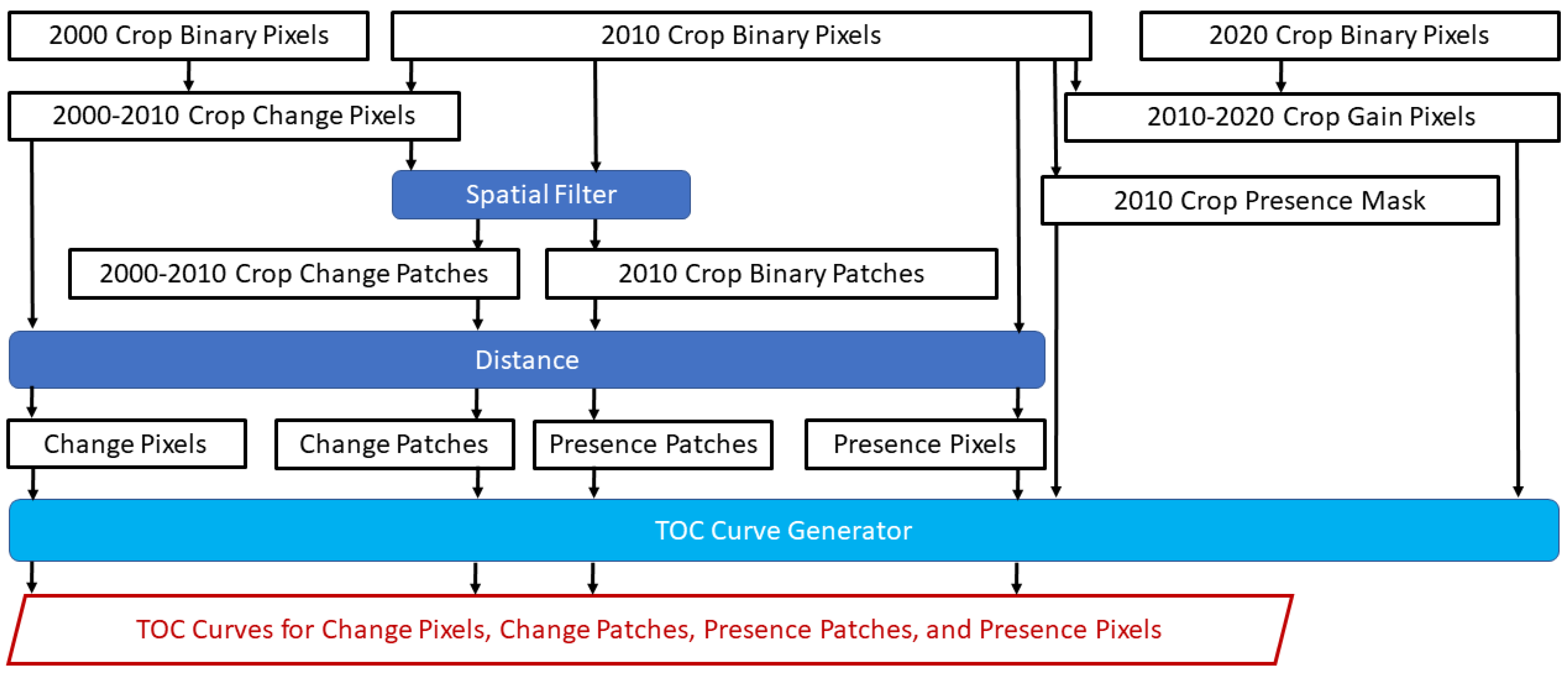
2. Materials and Methods

Figure 2 gives a flow diagram of the procedure, which begins with maps that show the presence or absence of crop at three time points: 2000, 2010, and 2020. Overlays generate maps of crop change during 2000–2010 and 2010–2020. A spatial filter converts some isolated pixels from crop presence to crop absence so the result has crop presence only in large patches. A distance operation generates four maps that feed into the TOC Curve Generator, which also reads a map of crop gain during 2010–2020 and a mask to focus exclusively on pixels that are candidates to gain crop after 2010. The outputs are four TOC curves in one TOC parallelogram.
The data derive from MapBiomas (https://brasil.mapbiomas.org/ accessed 1 January 2024), which formed in 2015 as a collective of non-governmental organizations, universities, laboratories, and technology startups. MapBiomas has hundreds of experts in remote sensing and landscape ecology who produce annual maps of land cover for each of Brazil’s biomes. MapBiomas, via its collection 7.1, provides 30 m resolution raster maps where each pixel shows the presence or absence of temporary crops at 2000, 2010, and 2020 [27]. Temporary crops are crops that have a growing cycle of less than one year, which includes soybean, cotton, and corn. For brevity, this manuscript uses the single word “crop” to refer to this class. MapBiomas conducts many steps for quality control. MapBiomas collected 85 thousand sample points at each year from 1985 to 2022 using three visual interpreters per point. The commission error rates for the crop class in the Cerrado biome are 18%, 14%, and 8% at 2000, 2010, and 2020, respectively. The omission error rates for the crop class in the Cerrado biome are 9%, 6%, and 4% at 2000, 2010, and 2020, respectively. These error rates indicate an overestimation of the size of crop at the three time points but do not indicate the data quality concerning temporal change. MapBiomas has started to analyze data quality concerning change but has not yet published their results.
Figure 3 shows the trajectories of how crop is stable or not during the two time intervals of 2000–2010 and 2010–2020. The three upper case letters in the name of each trajectory indicate a pixel’s status at 2000, 2010, and 2020, where P indicates the presence and A indicates the absence of crop. Pixels are candidates to gain crop during the second time interval when the middle letter is A. The black polygon is the union of the nine municipalities of western Bahia. Figure 3 shows the regions outside the black polygon because these regions will contribute to the computation of the distances to crop. Agriculture in the west tends to be on large industrial farms that use pivot irrigation more so than in the southeast. Agriculture in the southeast tends to be on smaller farms. Individual isolated pixels of crop presence or crop change surrounded by crop absence are so small that they are not visible in Figure 3.
The spatial filter defines a crop patch as a cluster of 1000 or more touching pixels. The spatial filter eliminates crops that appear in clusters of fewer than 1000 touching pixels by converting those pixels from crop presence to crop absence. The spatial filter keeps the crop that resides in patches. The spatial filter uses 1000 pixels because that is the size of a typical irrigation pivot. The western region within the black polygon includes many crop patches. The southeast has fewer crop patches but includes many isolated crop pixels that do not form patches. The crop’s gross gain is 9.89 million pixels during 2000–2010 and 7.75 million pixels during 2010–2020.
We use the maps at 2000 and 2010 to compute four distance maps using the distance module in the GIS software TerrSet version 19.0.8. The first distance is to the crop change pixels during the time interval 2000–2010; thus, the crop change pixels display a distance of zero and other pixels display a positive distance. The second distance is to the crop presence pixels at 2010. The third distance is to the crop change patches during 2000–2010, where a change patch is 1000 or more connected change pixels. The fourth distance is to the crop presence patches at 2010, where a presence patch is 1000 or more connected presence pixels. Figure 4 expresses the distances as Log base 10 of meters + 1 to facilitate visual interpretation. A distance of zero meters appears as zero in the legend. A distance of approximately 1000 m appears as approximately 3 in the legend because Log base 10 of 1000 equals 3. The Log transformation maintains the ranking of the distances; thus, TOC curves are insensitive to the Log transformation. Figure 4a shows the first distance map while Figure 4b shows the fourth distance map, where the darker shades show farther distances for the region within the black polygon. The change pixels are white in Figure 4a, while the presence patches are white in Figure 4b. In the east, Figure 4a shows more smaller distances than Figure 4b because the east has many isolated crop pixels that do not form patches. In the west, Figure 4a shows positive distances from the change pixels, where Figure 4b shows zero distance from the presence patches. This indicates how Figure 4a ignores the stable presence during 2000–2010; thus, Figure 4a shows positive distances in some pixels that have crop presence at 2010, which are not candidates to gain crop during the validation interval.
The TOC Curve Generator is free software that reads GIS and other types of files to generate TOC curves [28]. The TOC Curve Generator plots in one TOC parallelogram a TOC curve for each of the methods to compute the distance. A mask restricts the spatial extent to the 74.6 million pixels that display the absence of crop at 2010 because these are the only pixels where crop can gain during the validation interval. The 7.75 million pixels that gained crop during 2010–2020 constitute presence in the binary variable for the TOC curves. The procedure uses all the pixels in the masked extent, meaning without sampling. Smaller distances appear earlier in the ranking for each of the four distance variables. Thresholds from zero to five appear in increments of 0.2 on a Log base 10 scale. We examined the sensitivity of the results to various increments.

3. Results

Figure 5 shows the four TOC curves for the validation. The presence patches curve derives from the distance to patches of crop presence at 2010. The change patches curve derives from the distance to the patches of crop change during 2000–2010. The presence pixels curve derives from the distance to the presence pixels at 2010. The change pixels curve derives from the distance to the change pixels during 2000–2010. All four TOC curves are above the uniform line and concave down, which indicates that gains during the validation interval are more intensive within segments of shorter distances. The two pixel curves cross near the threshold of the correct quantity. The two patch curves touch through the entire graph. The AUCs of the presence patches, change patches, presence pixels, and change pixels are, respectively, 0.84, 0.84, 0.78, and 0.77. The spatial filter increases the predictive accuracy in both cases of analyzing presence and change. The thresholds at smaller increments show also that the curves are concave down and the AUCs for the patches are greater than the AUCs for the pixels.
The change pixels curve has labels on the thresholds at 100 m and 1 km to illustrate how the algorithm selected thresholds at 2 = Log(100 m) and 3 = Log(1000 m). The presence patch curve has thresholds at 2.8 = Log(631 m), 3 = Log(1000 m), and 4 = Log(10,000 m). The first highlighted threshold on those two curves in Figure 5a is the threshold closest to the correct quantity of gain, as indicated by its position below the upper left corner of the bounding parallelogram. The patch curves are above the presence curves at this horizontal position of the correct quantity. A segment on the TOC curve is parallel to the uniform line when the gain intensity in the segment equals the uniform intensity in the extent. Figure 5 shows that segments parallel to the uniform line appear approximately half way from left to right in the TOC space. All segments to the left of the correct quantity are steeper than the uniform line.
For the threshold at 1 km on the presence patches curve, Figure 5a illustrates how the TOC curve shows the sizes of hits, false alarms, correct rejections, and misses. This is the case for each point on the TOC curve. The size of hits is the distance from the vertical axis to the left bound of the parallelogram. The size of false alarms is the distance from the left bound of the parallelogram to the point on the TOC curve. The size of correct rejections is the distance from the point on the TOC curve to the right bound of the parallelogram. The size of misses is the distance from the right bound of the parallelogram to the maximum value of the horizontal axis.
Figure 5b zooms into the origin of the TOC parallelogram to compare the thresholds for the red change pixels curve to the green presence pixels curve. The change pixels curve has a threshold at zero meters, which indicates the pixels where crop lost during 2000–2010. This threshold at zero is the only reason why the change pixels curve is above the presence pixels curve near the origin. Both curves have a threshold at 30 m, which captures pixels neighboring the change or presence pixels. The segments immediately to the right of 0 m for the change pixels are flatter than the corresponding segments for the presence pixels, which causes the curves to cross near the threshold of the correct quantity.
Figure 6 shows maps of misses, hits, false alarms, and correct rejections that derive from the threshold at 100 m for the change pixels and the threshold at 631 m for the presence patches. Figure 6a has fewer hits than Figure 6b. Figure 6a shows the false alarms in the east are far from the misses in the west. Figure 6b shows the false alarms in the west are near misses in the west. In approximate million pixels, Figure 6a has 2.7 hits, 5.0 misses, and 5.0 false alarms, while Figure 6b has 3.1 hits, 4.6 misses, and 4.6 false alarms. The Figure of Merit (FOM) is a summary metric defined as hits/(hits + misses + false alarms) [29]. FOM is 0.21 for Figure 6a and 0.25 for Figure 6b. These FOM values do not consider the distances between the misses and false alarms.

4. Discussion

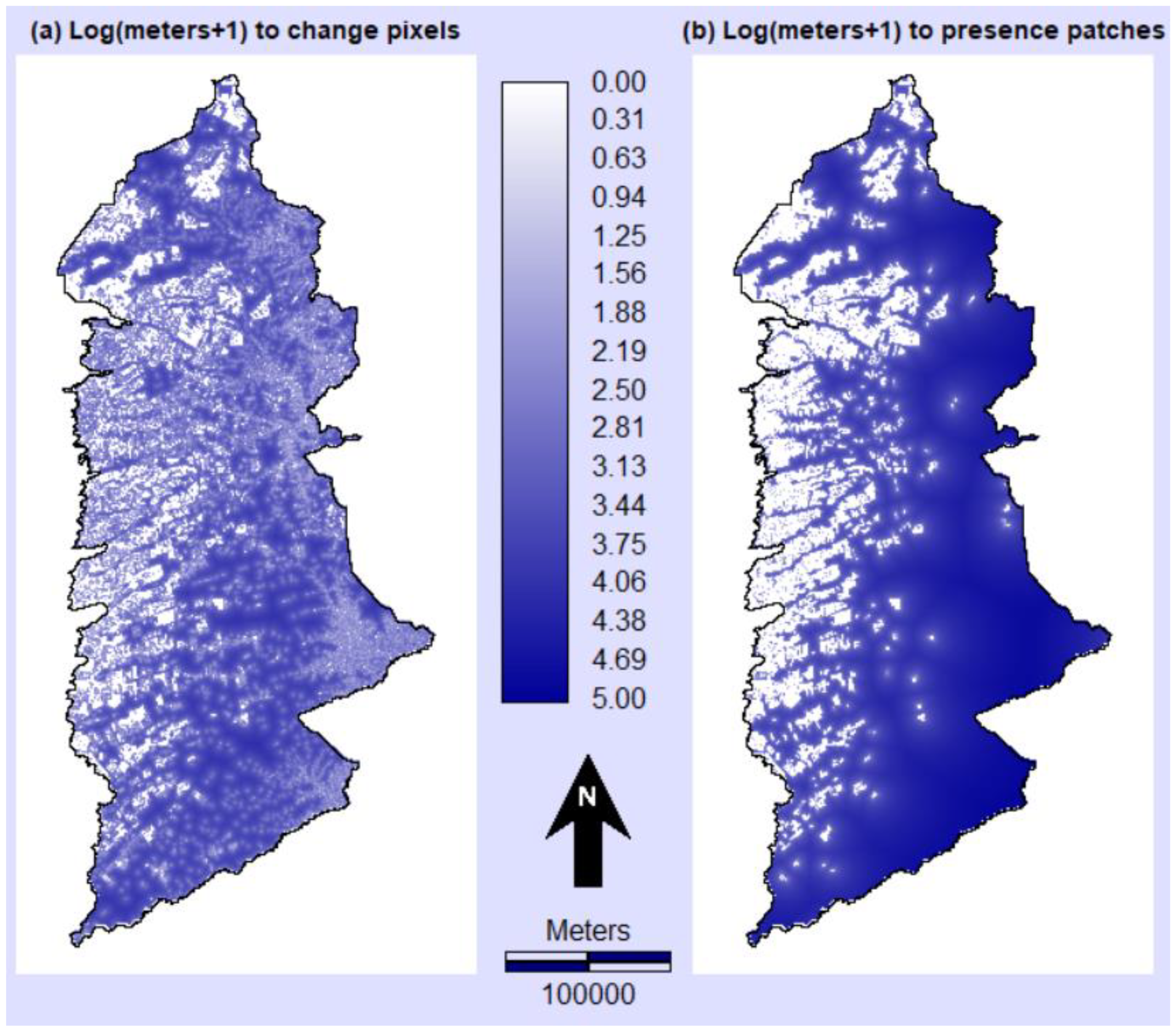
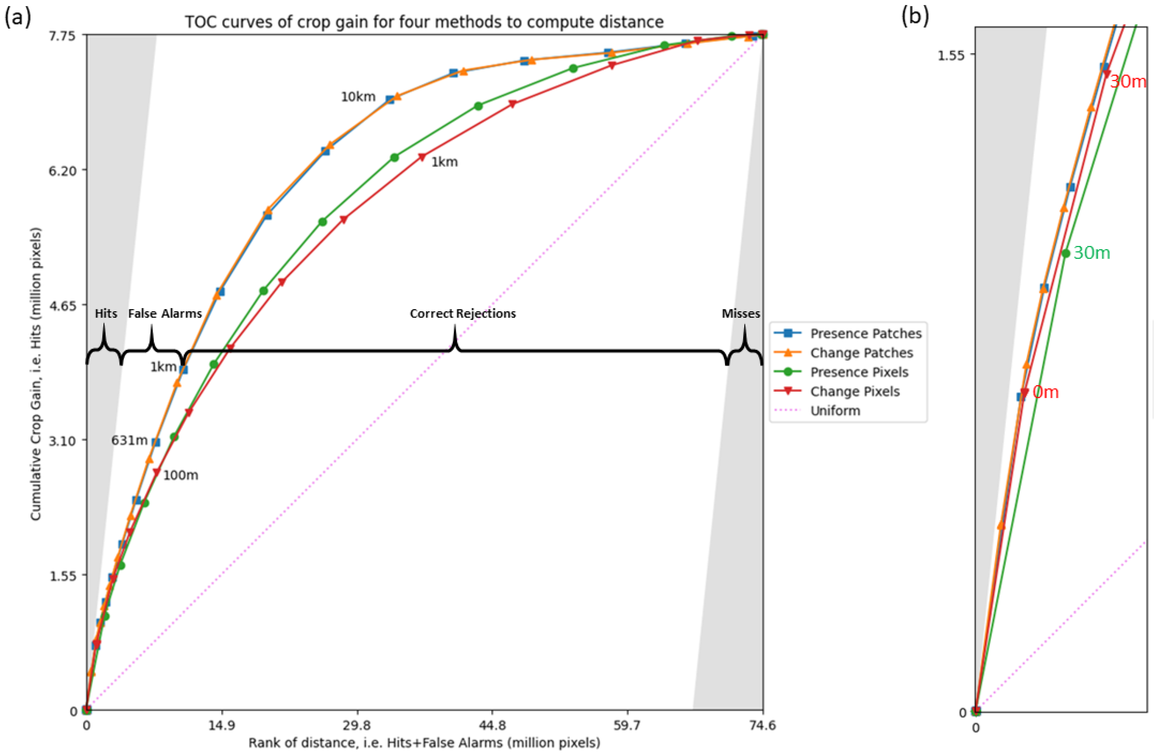
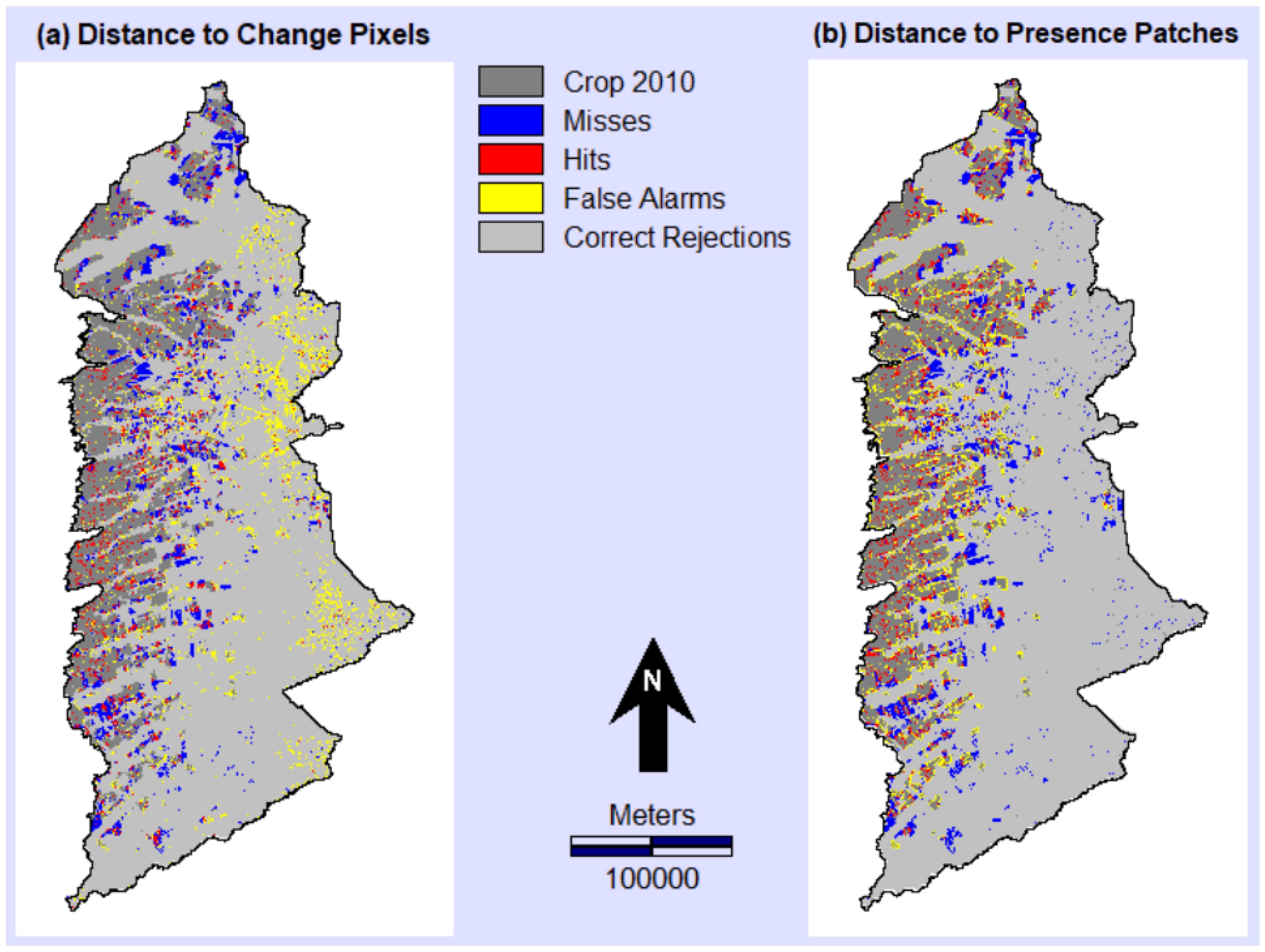
4.1. Interpretation of Results

Our application demonstrates four possibilities to use exclusively the maps of the dependent variable to predict change. This is important because scientists always have the dependent variable, while the compilation and analysis of several independent variables can be burdensome. Our application considers two methods to consider the information through time. The first method considers the change between the two time points that precede the validation interval. The second method considers the single time point at the start of the validation interval. The second method requires less information but can be more helpful than the first method. The second method considers the entire presence at the start of the time interval, which is likely to be much larger than the change that the first method considers. The results show that the TOC curve for the presence pixels is above the TOC curve for the change pixels at the thresholds to the right of the correct quantity. The TOC curve for the presence patches is indistinguishable from the TOC curve for the change patches, which demonstrates that a simpler map of the presence patches can have as much predictive power as the more complicated map of the change patches. This illustration does not prove a general rule. Bilintoh et al. (2024) found that the distance to change is more helpful than the distance to presence to predict gain where loss precedes gain in a temporal pattern called alternation [30,31]. A similar pattern exists in Figure 5b, where the TOC curve for the change pixels is above the TOC curve for the presence pixels at thresholds near the origin.
The TOC curves for patches are above the TOC curves for pixels. This indicates that the decision to use spatial filtering to remove isolated pixels of crop is more important than the decision to use change or presence when computing the distance maps. Spatial filtering is important for a variety of reasons. First, commission error is more likely to generate isolated pixels of crop than large patches of crop. Thus, the spatial filtering might reduce the error in the dependent variable. Second, isolated small farms account for a smaller portion of crop than large farms. These large farms tend to be near each other; thus, spatial filtering to identify patches is helpful for focusing on the large farms that account for most of the crop. Third, an isolated pixel of crop generates the smallest possible distances on all sides of the pixel; thus, a map of the distance to pixels tends to have more of the smallest possible distance than a map of distance to patches. If many of the earliest ranked pixels have a tied smallest distance, then the first segment that emanates from the TOC curve’s origin is so large that it is difficult to distinguish among TOC curves. The spatial filtering reduces these weaknesses of isolated pixels.
We have not seen other literature that uses spatial filters in the way our manuscript demonstrates. Other literature typically follows procedures that are much more complicated. For example, others have used numerous independent variables such as elevation, slope, soils, temperature, precipitation, protected areas, human population, administrative units, distance to transportation infrastructure, distance to central business districts, distance to particular land covers, etc. [9,10,11,12,14,16,17,18,19,21,32,33,34,35,36,37]. However, these independent variables are likely to be highly correlated, and thus redundant with the four distance variables that our manuscript considers. Therefore, the value added by the additional independent variables is questionable, but testable via substantial effort. If scientists use additional independent variables, then the scientists are likely to use an algorithm to calibrate a model. Many algorithms exist, such as logistic regression, neural nets, etc. Each algorithm has numerous parameters. Some algorithms require substantial expertise and computing resources. Thus, additional variables require scientists to make several subjective decisions, many of which might not generate much more additional predictive power than the four variables we considered. We recommend that scientists first follow the example in our manuscript. If scientists find the results insufficient for their purposes, then there might be justification to use algorithms that consider additional independent variables.

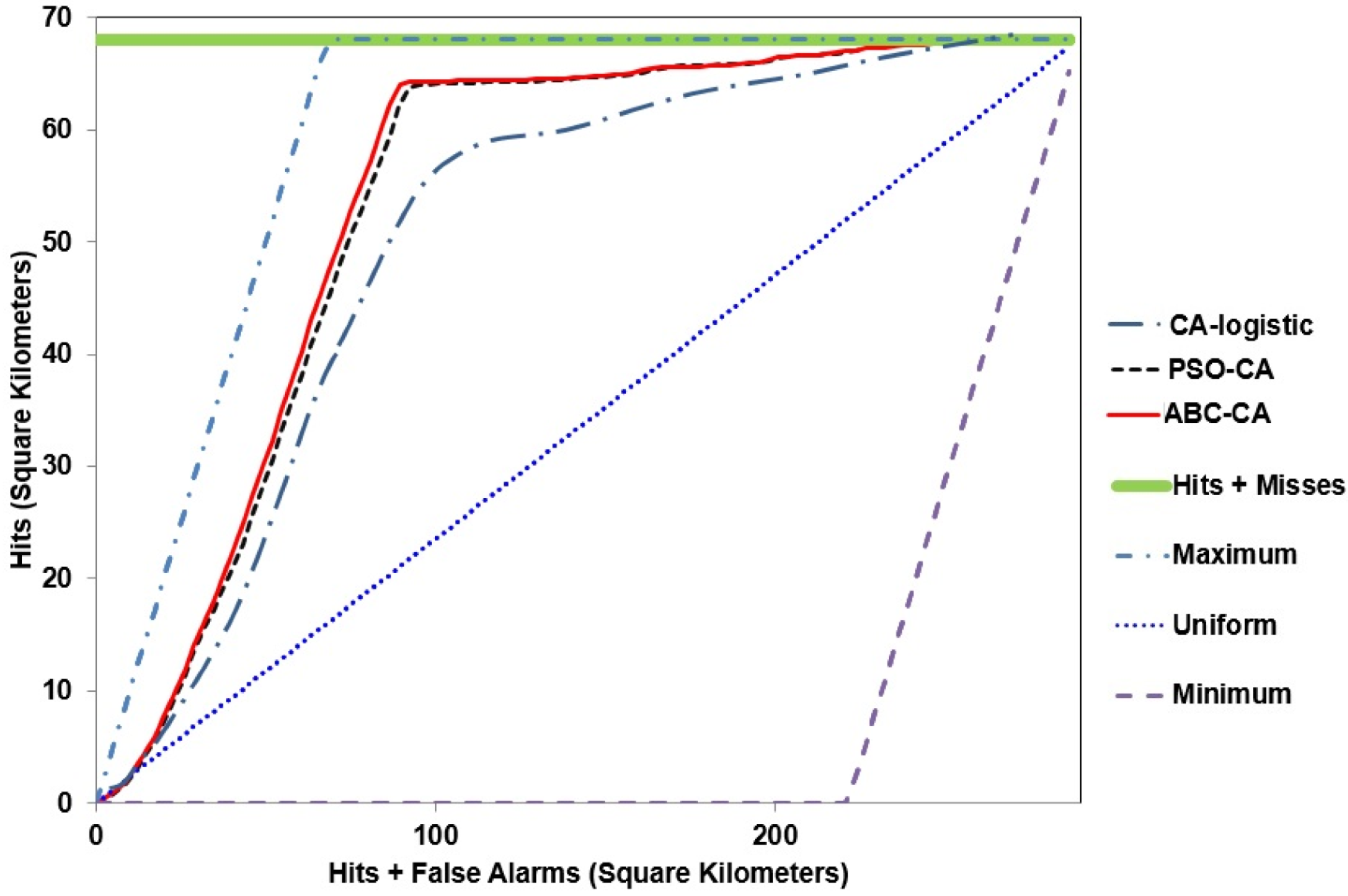
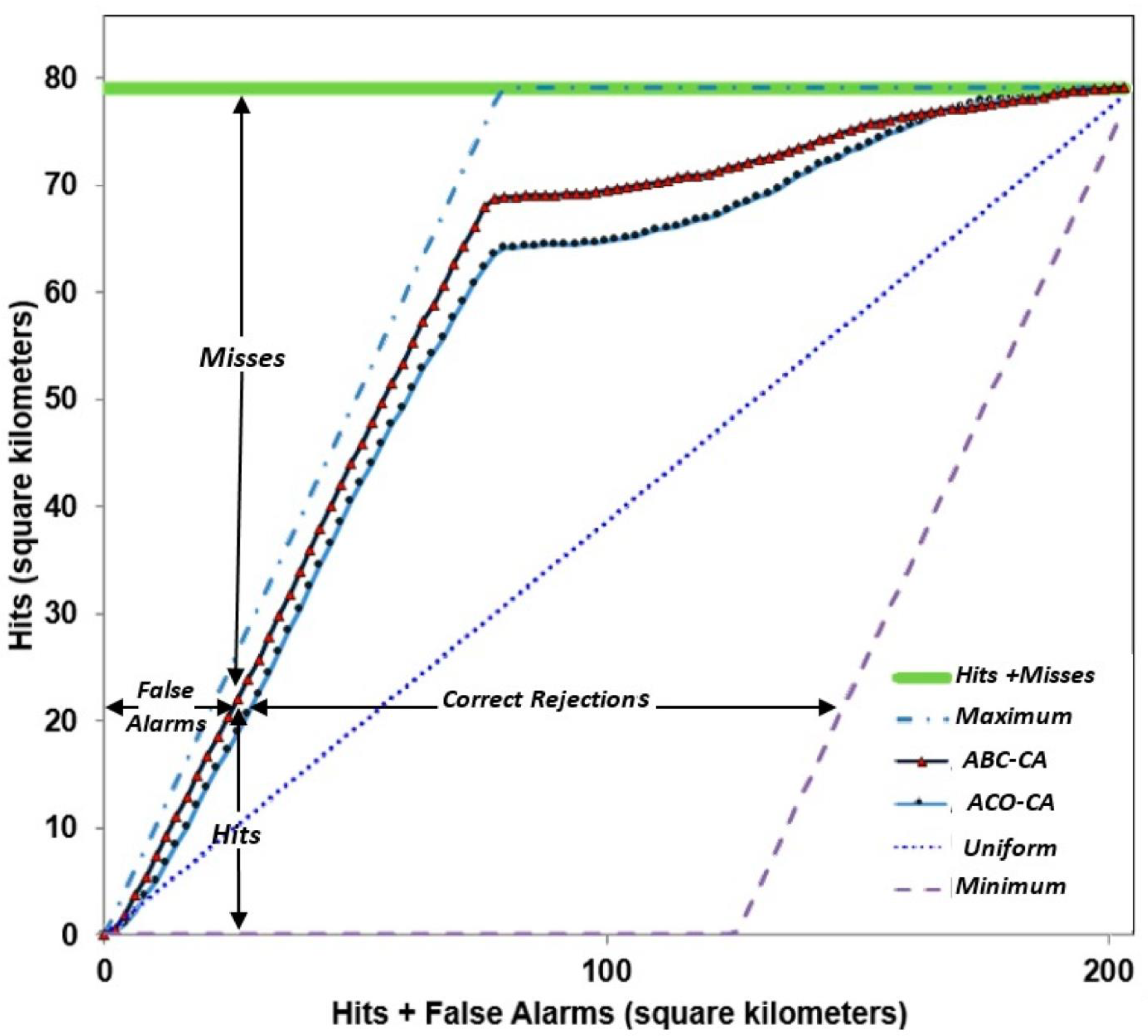
4.2. Examples of TOC Curves in the Literature

This subsection examines three particularly revealing journal articles where the authors used some best practices but not others. We did not receive responses when we contacted the authors to help us interpret their publications. One of the best decisions by the authors was to use and show the TOC rather than the ROC, because the insights below would have been impossible using the ROC. Insights from the best practices allow readers to draw conclusions that differ from the authors’ conclusions.
Figure 7 shows the TOC curves of Naghibi and Delavar (2016) [36]. Their purpose is to compare three algorithms that simulate urban growth. CA-logisitc is a cellular automata model that uses logistic regression, which serves as a non-uniform baseline. PSO-CA is a particle swarm optimization algorithm that uses cellular automata. ABC-CA is an artificial bee colony algorithm that uses cellular automata. Their goal is to examine urban growth, not urban presence; thus, it is necessary to eliminate the urban areas at the start of the simulation when generating the TOC curves. The article does not report whether the authors masked the existing urban areas from the spatial extent. The shapes of the TOC curves make us suspect that existing urban areas are included in the spatial extent, which can have a profound effect on the shapes of the TOC curves and the AUCs. All three algorithms generate TOC curves on the uniform line near the origin, which indicates that all three models are as accurate as random for the earliest ranking pixels. Then, the TOC curves tend to run parallel to the left bound of the TOC parallelogram to near the upper left corner of the parallelogram. If the authors did not eliminate the existing urban areas, then those straight segments likely indicate urban persistence rather than urban gain. The tops of those straight segments show more hits than errors, which would imply a Figure of Merit greater than a half, but this contradicts the results in the authors’ Table 4. Then, the curves are flat immediately to the right of where the segments are parallel to the left bound. This could indicate that the models are worse than random at predicting the urban gain. Then, the curves show a change in concavity as the slopes of the TOC segments increase, which indicates that the later-ranked pixels are more intensively concentrated in the places of urban gain. If the urban at the start of the validation interval were masked, as best practices dictate, then the models would likely show AUC values of less than a half. Table 4 in [36] compares the three models at distinct thresholds, where the threshold for logistic regression shows the most change while the threshold for ABC-CA shows the least change. These thresholds make it challenging to compare the models because each threshold predicts a distinct quantity. When models simulate less change, they tend to generate fewer false alarms. The ABC-CA threshold simulated the least change, and thus appears to perform best according to the Figure of Merit. The TOC curves are much more helpful for evaluating the models because the reader can compare each model at any particular quantity.
Figure 8 presents the TOC curves from Naghibi et al. (2016), which compare two models of urban growth [37]. ABC-CA is an artificial bee colony algorithm that uses cellular automata. ACO-CA is an ant colony optimization algorithm that uses cellular automata. Figure 8 is similar to Figure 7 concerning the shapes of the curves; thus, many of the comments in Figure 7 apply also to Figure 8. The TOC curves are parallel to the left bound until they reach the thresholds at slightly less than the correct quantity at the upper right corner of the parallelogram. The loss of urban during the calibration interval combined with the lack of masking existing urban would produce this pattern in the TOC curve. Similar patterns exist in other journal articles [34,35,38]. If the authors had followed the additional best practice of discussing the changes in concavity, then they might have gained deeper insights. Figure 8 shows false alarms as the distance between a threshold and the vertical axis, but false alarms are actually the distance between a threshold and the left bound of the parallelogram.
Figure 9 presents the TOC curves from Kamusoko and Gamba (2015), which compare three algorithms to simulate the urban gain in Harare, Zambia [33]. The authors use TOC curves to compare three transition potential maps that derive from three algorithms: random forest, support vector machine, and logistic regression. The authors conclude that the random forest model performed better than the support vector machine and logistic regression, because of the relatively more accurate transition potential maps. However, the interpretation of the shapes of the TOC curves leads to opposite conclusions. The random forest TOC curve is perfectly flat from the origin to beyond the point under the upper left corner of the parallelogram. The flat segment indicates that the earliest ranking pixels reside on non-urban persistence, not urban gain. This same phenomenon exists in other literature [32]. The authors based their analysis on the three points highlighted in each of the TOC curves in Figure 9. Those points indicate thresholds that predict twice as much urban gain as what occurred. If the authors had selected the thresholds at the correct quantity under the upper left corner of the parallelogram, then they would have concluded that random forest had a perfectly wrong predictive power. This illustrates how helpful it is to show and interpret TOC curves. If the authors had not shown the TOC curves, then readers would not have had the opportunity for these types of insights.
Figure 7, Figure 8 and Figure 9 show changes in concavity, which exist in additional publications such as Chakraborti et al. (2018) [35], Simwanda and Murayama (2018) [39], Singh et al. (2021) [38], Azari et al. (2022) [34], and Chen et al. (2020) [32]. Chen et al. simulated urban sprawl and reported AUC values of 0.7 and 0.9. They followed some of the best practices to show maps and TOC curves; thus, readers can interpret the AUCs. Their TOC curves near the origin are concave up while below or near the uniform line. Their maps of misses, hits, false alarms, and correct rejections show that the extent includes vast regions of correct rejections far from the existing urban sprawl, which inflates the AUC. Their TOC curves touch the upper bound at less than half of the extent. If the spatial extent were to have been reduced to the point where the TOC curves touch the upper bound, as recommended by best practices, then the AUCs would have been less than 0.5.

4.3. Future Research

A question for future research is “Why do authors choose to report particular metrics?” The literature review shows a variety of metrics, with some being extremely popular, such as the AUC. These metrics are available in software; thus, they are tempting to report by default, but that does not make them relevant for a particular question [24,25].
Another question is “What metrics and qualitative criteria are appropriate for assessing models to inform policy and landscape management?” The interests of technical modelers might deviate dramatically from the interests of policy managers. Furthermore, the purpose of some models is to output maps of future change according to scenario storylines that deviate from past patterns. For these applications, validation with historic data is irrelevant, while verification to test whether the software performs as the user intends is essential [22].

5. Conclusions

This manuscript provides a list of best practices for using the TOC. The best practices inspire authors to see information in the TOC curve that no single summary metric measures. If authors show their TOC curves plotted according to best practices, then readers can interpret the results in ways that the authors might have missed and in ways that the ROC fails to show. This manuscript also illustrates a straightforward approach for allocating change in a predictive model based on the distance to patches rather than the distance to pixels. We recommend this straightforward approach before the daunting task of considering other independent variables and algorithms.
Most importantly, authors should show and interpret the shapes of TOC curves to gain insights into the patterns in the data, not to anoint the results as good or acceptable. Reliance on a single metric, such as the area under the curve, gives exactly one measure of the results; thus, any single metric cannot describe various features of the results. Metrics are necessary; however, it can be challenging to select a metric that assesses a particular research question, especially when the question is insufficiently precise. If authors use our provided list of best practices, then both authors and readers are likely to gain deeper insights than any single metric can convey.

Author Contributions

Tanner Honnef performed the data curation, formal analysis, investigation, validation, visualization, and writing. Robert Gilmore Pontius, Jr. performed the conceptualization, funding acquisition, project administration, supervision, and editing. All authors have read and agreed to the published version of the manuscript.

Funding

The United States National Aeronautics and Space Administration funded this research through the Land-Cover and Land-Use Change Program via grant number 80NSSC23K0508 entitled Irrigation as climate change adaptation in the Cerrado biome of Brazil evaluated with new quantitative methods, socio-economic analysis, and scenario models.

Data Availability Statement

The data are at https://doi.org/10.6084/m9.figshare.28029164.v1. These data derive from https://brasil.mapbiomas.org/ accessed 1 January 2024.

Acknowledgments

Christopher Williams and Thomas Bilintoh provided advice for this work. Clark Labs facilitated this work by creating the GIS software TerrSet®. MapBiomas provided data for free. Zhen Liu created the TOC Curve Generator, which generated the TOC curves. This manuscript contributes to the Global Land Programme (https://glp.earth/).

Conflicts of Interest

The authors declare no conflicts of interest. The funders had no role in the design of the study; in the collection, analyses, or interpretation of the data; in the writing of the manuscript; or in the decision to publish the results.

References

  1. Pontius, R.G., Jr.; Si, K. The Total Operating Characteristic to Measure Diagnostic Ability for Multiple Thresholds. Int. J. Geogr. Inf. Sci. 2014, 28, 570–583. [Google Scholar] [CrossRef]
  2. Swets, J.A. Measuring the Accuracy of Diagnostic Systems. Science 1988, 240, 1285–1293. [Google Scholar] [CrossRef] [PubMed]
  3. Swets, J.A.; Dawes, R.M.; Monahan, J. Better DECISIONS through SCIENCE. Sci. Am. 2000, 283, 82–87. [Google Scholar]
  4. Saito, T.; Rehmsmeier, M. The Precision-Recall Plot Is More Informative than the ROC Plot When Evaluating Binary Classifiers on Imbalanced Datasets. PLoS ONE 2015, 10, e0118432. [Google Scholar] [CrossRef]
  5. Pontius, R.G., Jr. Metrics That Make a Difference: How to Analyze Change and Error; Advances in Geographic Information Science; Springer International Publishing: Cham, Switzerland, 2022; ISBN 978-3-030-70764-4. [Google Scholar] [CrossRef]
  6. Lobo, J.M.; Jiménez-Valverde, A.; Real, R. AUC: A Misleading Measure of the Performance of Predictive Distribution Models. Glob. Ecol. Biogeogr. 2008, 17, 145–151. [Google Scholar] [CrossRef]
  7. Peterson, A.T.; Papes, M.; Soberon, J. Rethinking Receiver Operating Characteristic Analysis Applications in Ecological Niche Modeling. Ecol. Model. 2008, 213, 63–72. [Google Scholar] [CrossRef]
  8. Hand, D.J.; Anagnostopoulos, C. When Is the Area under the Receiver Operating Characteristic Curve an Appropriate Measure of Classifier Performance? Pattern Recognit. Lett. 2013, 34, 492–495. [Google Scholar] [CrossRef]
  9. Cushman, S.A.; Macdonald, E.A.; Landguth, E.L.; Malhi, Y.; Macdonald, D.W. Multiple-Scale Prediction of Forest Loss Risk across Borneo. Landsc. Ecol. 2017, 32, 1581–1598. [Google Scholar] [CrossRef]
  10. Zhuang, H.; Chen, G.; Yan, Y.; Li, B.; Zeng, L.; Ou, J.; Liu, K.; Liu, X. Simulation of Urban Land Expansion in China at 30 m Resolution through 2050 under Shared Socioeconomic Pathways. GIScience Remote Sens. 2022, 59, 1301–1320. [Google Scholar] [CrossRef]
  11. Liu, X.; Liang, X.; Li, X.; Xu, X.; Ou, J.; Chen, Y.; Li, S.; Wang, S.; Pei, F. A Future Land Use Simulation Model (FLUS) for Simulating Multiple Land Use Scenarios by Coupling Human and Natural Effects. Landsc. Urban Plan. 2017, 168, 94–116. [Google Scholar] [CrossRef]
  12. Deng, Z.; Quan, B. Intensity Characteristics and Multi-Scenario Projection of Land Use and Land Cover Change in Hengyang, China. Int. J. Environ. Res. Public Health 2022, 19, 8491. [Google Scholar] [CrossRef] [PubMed]
  13. Harati, S.; Perez, L.; Molowny-Horas, R.; Pontius, R.G., Jr. Validating Models of One-Way Land Change: An Example Case of Forest Insect Disturbance. Landsc. Ecol 2021, 36, 2919–2935. [Google Scholar] [CrossRef]
  14. Ahmadlou, M.; Karimi, M.; Sammen, S.S.h.; Alsafadi, K. Three Novel Cost-Sensitive Machine Learning Models for Urban Growth Modelling. Geocarto Int. 2024, 39, 2353252. [Google Scholar] [CrossRef]
  15. Andaryani, S.; Nourani, V.; Haghighi, A.T.; Keesstra, S. Integration of Hard and Soft Supervised Machine Learning for Flood Susceptibility Mapping. J. Environ. Manag. 2021, 291, 112731. [Google Scholar] [CrossRef]
  16. Amato, F.; Tonini, M.; Murgante, B.; Kanevski, M. Fuzzy Definition of Rural Urban Interface: An Application Based on Land Use Change Scenarios in Portugal. Environ. Model. Softw. 2018, 104, 171–187. [Google Scholar] [CrossRef]
  17. Shojaei, H.; Nadi, S.; Shafizadeh-Moghadam, H.; Tayyebi, A.; Van Genderen, J. An Efficient Built-up Land Expansion Model Using a Modified U-Net. Int. J. Digit. Earth 2022, 15, 148–163. [Google Scholar] [CrossRef]
  18. Shafizadeh-Moghadam, H.; Minaei, M.; Pontius, R.G., Jr.; Asghari, A.; Dadashpoor, H. Integrating a Forward Feature Selection Algorithm, Random Forest, and Cellular Automata to Extrapolate Urban Growth in the Tehran-Karaj Region of Iran. Comput. Environ. Urban Syst. 2021, 87, 101595. [Google Scholar] [CrossRef]
  19. Wang, B.; Liang, Y.; Peng, S. Harnessing the Indirect Effect of Urban Expansion for Mitigating Agriculture-Environment Trade-Offs in the Loess Plateau. Land Use Policy 2022, 122, 106395. [Google Scholar] [CrossRef]
  20. Estoque, R.C.; Murayama, Y. Quantifying Landscape Pattern and Ecosystem Service Value Changes in Four Rapidly Urbanizing Hill Stations of Southeast Asia. Landsc. Ecol 2016, 31, 1481–1507. [Google Scholar] [CrossRef]
  21. Du, S.; Van Rompaey, A.; Shi, P.; Wang, J. A Dual Effect of Urban Expansion on Flood Risk in the Pearl River Delta (China) Revealed by Land-Use Scenarios and Direct Runoff Simulation. Nat Hazards 2015, 77, 111–128. [Google Scholar] [CrossRef]
  22. Viana, C.M.; Pontius, R.G., Jr.; Rocha, J. Four Fundamental Questions to Evaluate Land Change Models with an Illustration of a Cellular Automata–Markov Model. Ann. Am. Assoc. Geogr. 2023, 113, 2497–2511. [Google Scholar] [CrossRef]
  23. Pontius, R.G., Jr.; Castella, J.-C.; de Nijs, T.; Duan, Z.; Fotsing, E.; Goldstein, N.; Kok, K.; Koomen, E.; Lippitt, C.D.; McConnell, W.; et al. Lessons and Challenges in Land Change Modeling Derived from Synthesis of Cross-Case Comparisons. In Trends in Spatial Analysis and Modelling; Behnisch, M., Meinel, G., Eds.; Geotechnologies and the Environment; Springer International Publishing: Cham, Switzerland, 2018; Volume 19, pp. 143–164. ISBN 978-3-319-52520-4. [Google Scholar] [CrossRef]
  24. Pontius, R.G., Jr.; Francis, T.; Millones, M. A Call to Interpret Disagreement Components during Classification Assessment. Int. J. Geogr. Inf. Sci. 2025, 1–18. [Google Scholar] [CrossRef]
  25. Hand, D.J. Assessing the Performance of Classification Methods. Int Stat. Rev. 2012, 80, 400–414. [Google Scholar] [CrossRef]
  26. Pousa, R.; Costa, M.H.; Pimenta, F.M.; Fontes, V.C.; Brito, V.F.A.d.; Castro, M. Climate Change and Intense Irrigation Growth in Western Bahia, Brazil: The Urgent Need for Hydroclimatic Monitoring. Water 2019, 11, 933. [Google Scholar] [CrossRef]
  27. Souza, C.M., Jr.; Z. Shimbo, J.; Rosa, M.R.; Parente, L.L.; A. Alencar, A.; Rudorff, B.F.T.; Hasenack, H.; Matsumoto, M.; G. Ferreira, L.; Souza-Filho, P.W.M.; et al. Reconstructing Three Decades of Land Use and Land Cover Changes in Brazilian Biomes with Landsat Archive and Earth Engine. Remote Sens. 2020, 12, 2735. [Google Scholar] [CrossRef]
  28. Liu, Z.; Pontius, R.G., Jr. The Total Operating Characteristic from Stratified Random Sampling with an Application to Flood Mapping. Remote Sens. 2021, 13, 3922. [Google Scholar] [CrossRef]
  29. Pontius, R.G., Jr. Criteria to Confirm Models that Simulate Deforestation and Carbon Disturbance. Land 2018, 7, 14. [Google Scholar] [CrossRef]
  30. Bilintoh, T.M.; Pontius, R.G., Jr.; Liu, Z. Analyzing the Losses and Gains of a Land Category: Insights from the Total Operating Characteristic. Land 2024, 13, 1177. [Google Scholar] [CrossRef]
  31. Bilintoh, T.M.; Pontius, R.G., Jr.; Zhang, A. Methods to Compare Sites Concerning a Category’s Change during Various Time Intervals. GISci. Remote Sens. 2024, 61, 2409484. [Google Scholar] [CrossRef]
  32. Chen, S.; Feng, Y.; Ye, Z.; Tong, X.; Wang, R.; Zhai, S.; Gao, C.; Lei, Z.; Jin, Y. A Cellular Automata Approach of Urban Sprawl Simulation with Bayesian Spatially-Varying Transformation Rules. GISci. Remote Sens. 2020, 57, 924–942. [Google Scholar] [CrossRef]
  33. Kamusoko, C.; Gamba, J. Simulating Urban Growth Using a Random Forest-Cellular Automata (RF-CA) Model. ISPRS Int. J. Geo-Inf. 2015, 4, 447–470. [Google Scholar] [CrossRef]
  34. Azari, M.; Billa, L.; Chan, A. Multi-Temporal Analysis of Past and Future Land Cover Change in the Highly Urbanized State of Selangor, Malaysia. Ecol. Process 2022, 11, 2. [Google Scholar] [CrossRef]
  35. Chakraborti, S.; Das, D.N.; Mondal, B.; Shafizadeh-Moghadam, H.; Feng, Y. A Neural Network and Landscape Metrics to Propose a Flexible Urban Growth Boundary: A Case Study. Ecol. Indic. 2018, 93, 952–965. [Google Scholar] [CrossRef]
  36. Naghibi, F.; Delavar, M. Discovery of Transition Rules for Cellular Automata Using Artificial Bee Colony and Particle Swarm Optimization Algorithms in Urban Growth Modeling. ISPRS Int. J. Geo-Inf. 2016, 5, 241. [Google Scholar] [CrossRef]
  37. Naghibi, F.; Delavar, M.; Pijanowski, B. Urban Growth Modeling Using Cellular Automata with Multi-Temporal Remote Sensing Images Calibrated by the Artificial Bee Colony Optimization Algorithm. Sensors 2016, 16, 2122. [Google Scholar] [CrossRef]
  38. Singh, R.K.; Sinha, V.S.P.; Joshi, P.K.; Kumar, M. Modelling Agriculture, Forestry and Other Land Use (AFOLU) in Response to Climate Change Scenarios for the SAARC Nations. Environ. Monit. Assess. 2020, 192, 236. [Google Scholar] [CrossRef]
  39. Simwanda, M.; Murayama, Y. Spatiotemporal Patterns of Urban Land Use Change in the Rapidly Growing City of Lusaka, Zambia: Implications for Sustainable Urban Development. Sustain. Cities Soc. 2018, 39, 262–274. [Google Scholar] [CrossRef]
Figure 1. Maps of the study area showing the nine municipalities in western Bahia, Brazil.
Ijgi 14 00134 g001
Figure 2. Flow diagram of the methods. Black rectangles represent maps. Dark blue polygons are GIS operations.
Ijgi 14 00134 g002
Figure 3. Map of overlay of absence or presence of crop at 2000, 2010, and 2020. The sequence of three letters in the legend indicates the trajectory through time. For example, AAP means absence at 2000, absence at 2010, and presence at 2020.
Ijgi 14 00134 g003
Figure 4. (a) Map for Log base 10 of meters + 1 to change pixels during 2000–2010. (b) Map for Log base 10 of meters + 1 to presence patches at 2010.
Ijgi 14 00134 g004
Figure 5. TOC curves showing the fit during the validation interval for (a) full TOC parallelogram and (b) zoom into the origin. The red annotation of 0 m and 30 in (b) refers to the thresholds on the red curve for change pixels. The green annotation of 30 in (b) refers to the threshold on the green curve for presence pixels.
Ijgi 14 00134 g005
Figure 6. Validation maps for distance to (a) change pixels and (b) presence patches.
Ijgi 14 00134 g006
Figure 7. TOC curves from [36].
Ijgi 14 00134 g007
Figure 8. TOC curves from [37].
Ijgi 14 00134 g008
Figure 9. TOC curves comparing outputs from models that use (a) random forest, (b) support vector machine, and (c) logistic regression [33].
Ijgi 14 00134 g009
Table 1. Best practices when using the Total Operating Characteristic.
IDDescription
1Specify the purpose, particularly whether the TOC measures calibration or validation.
2Report what is known concerning data quality.
3Show an overlay of the maps at the time points that bound the time intervals.
4Show maps of the independent and rank variables.
5Compare to a non-random baseline ranking.
6Mask pixels that are not candidates for the particular type of change.
7Describe the sampling scheme and how the method accounts for the sampling.
8Plot TOC curves including the baseline in the same parallelogram.
9Consider extent reduction so the curve first touches the upper bound at the right corner.
10Include threshold markers on the curves.
11Label relevant thresholds, especially the threshold at the correct quantity.
12Interpret slopes of the segments of the TOC curves relative to the uniform line.
13Discuss the reasons for any changes in the concavity of the curves.
14Investigate the points where TOC curves touch or cross.
15Zoom into the origin of the TOC parallelogram to interpret early thresholds.
16Show maps of misses, hits, false alarms, and correct rejections for relevant thresholds.
17Report exclusively the metric(s) that relate to the research question.
18Test the sensitivity of results to the threshold selections.
19Avoid stating model performance in simple universal words such as “good”.
Disclaimer/Publisher’s Note: The statements, opinions and data contained in all publications are solely those of the individual author(s) and contributor(s) and not of MDPI and/or the editor(s). MDPI and/or the editor(s) disclaim responsibility for any injury to people or property resulting from any ideas, methods, instructions or products referred to in the content.

