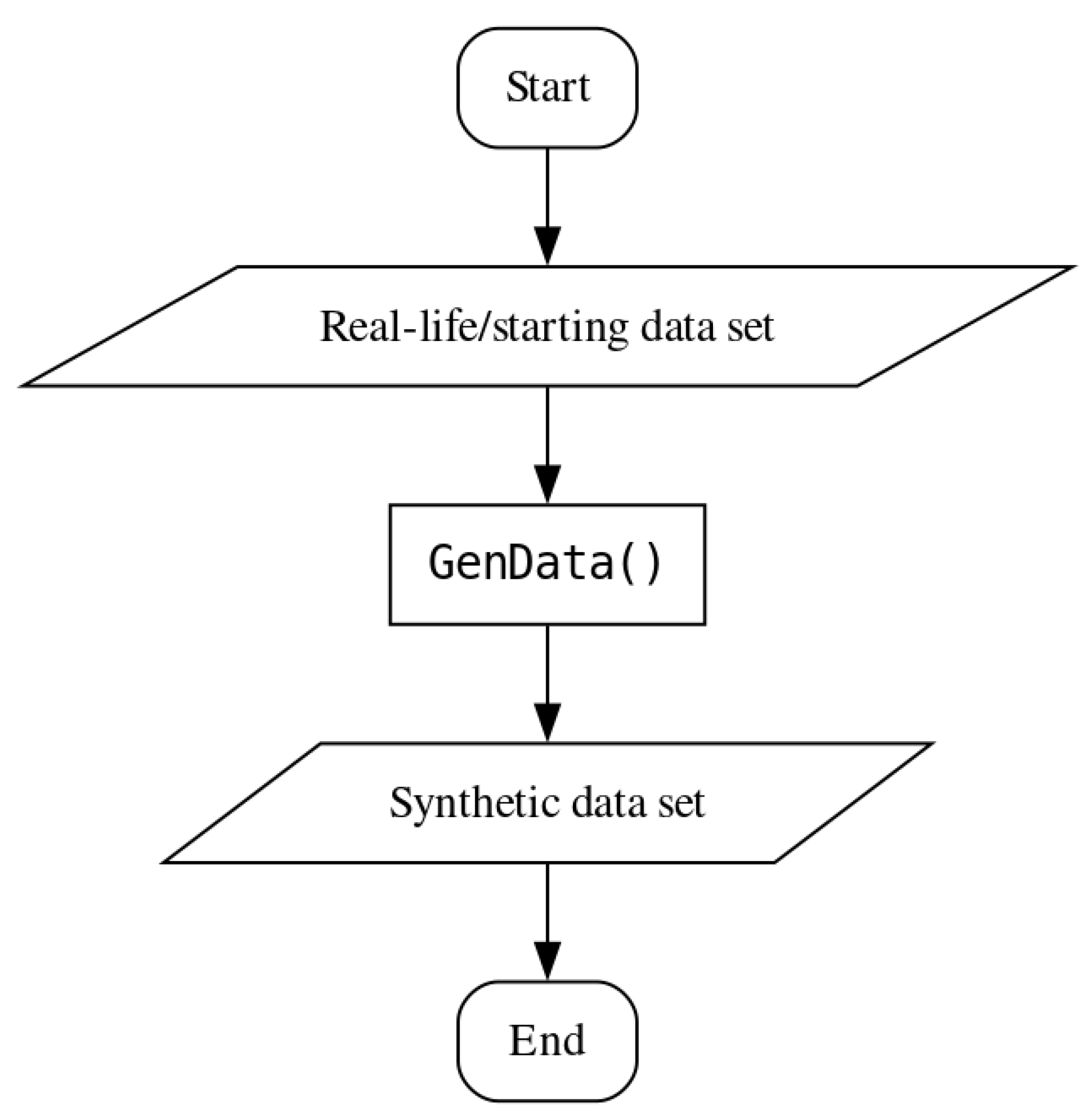
Appendix A. Analysis and Synthetic Data Generation for the “Yeast” Data Set
The “yeast” data set is an additional data set used to test the method described in this paper. The data set consists of 8 attributes, 1484 instances, and 10 classes the instances can belong to. There are no missing values in the data set. All the attributes are numerical in value. The number of instances per class is highly imbalanced, as can be seen in
Table A1. As with the “texture” data set, the “yeast” data set is a real-life data set.
Table A1.
Number of instances per class in the “yeast” data set.
Table A1.
Number of instances per class in the “yeast” data set.
| Class | CYT | ERL | EXC | ME1 | ME2 | ME3 | MIT | NUC | POX | VAC |
| No. of instances | 463 | 5 | 35 | 44 | 51 | 163 | 244 | 429 | 20 | 30 |
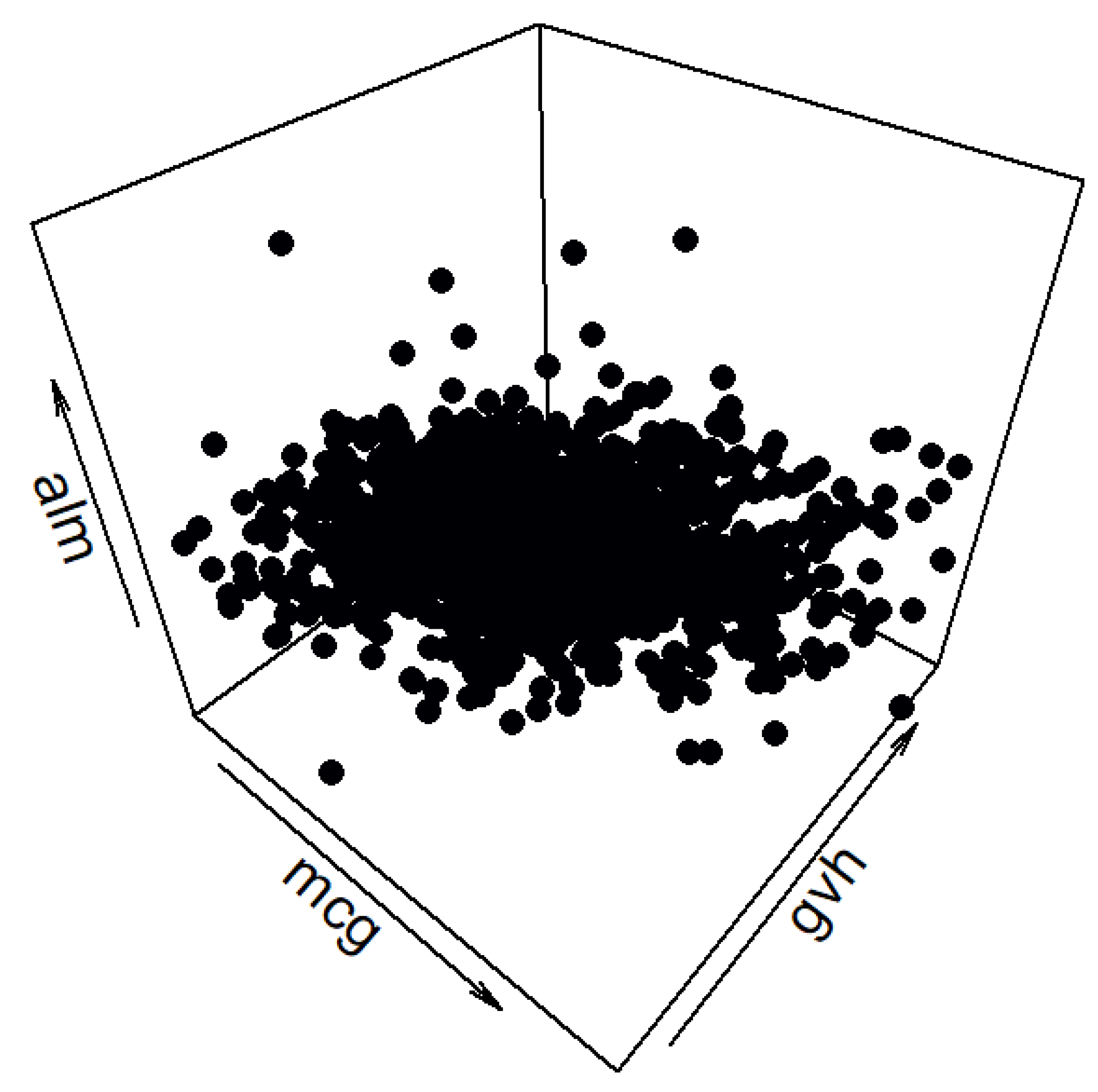
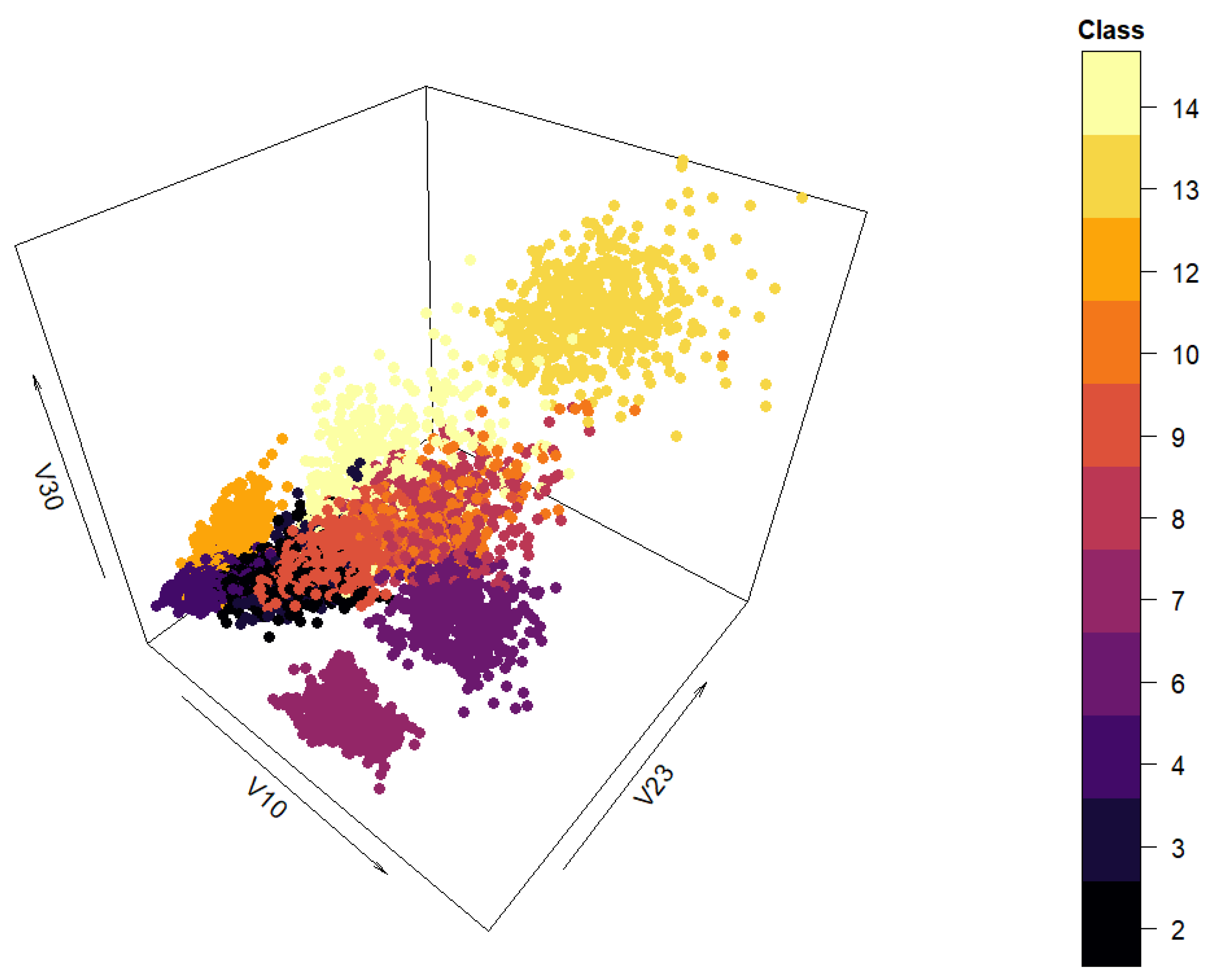
The spatial distribution of the data set can be seen in
Figure A1. Since the graph clearly indicates clustering would not be an appropriate downstream task for this data set, classification was chosen instead.
Figure A1.
Three-dimensional view of the “yeast” data set.
Figure A1.
Three-dimensional view of the “yeast” data set.
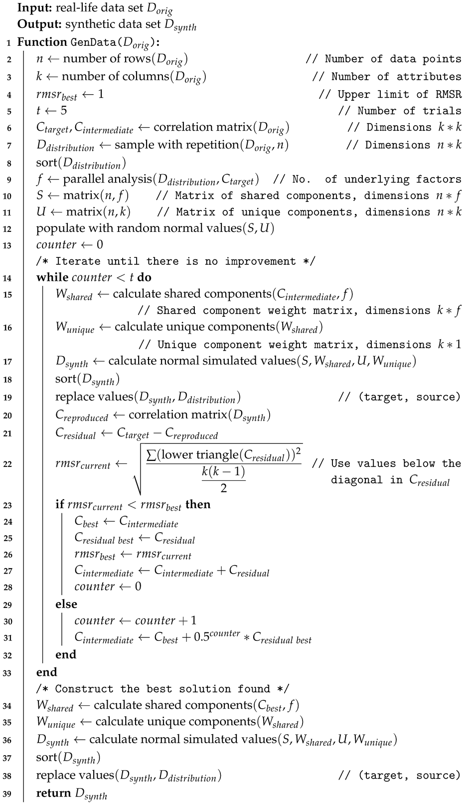
This data set posed two challenges when generating synthetic data. The first challenge was that the values of the attributes ‘erl’ and ‘pox’ have very little variation. When splitting the data into classes before data generation, some of the subsets had only one value of these attributes, which led to the occurrence of undefined values (denoted by the logical constant NA in the R programming language) when calculating the class correlation matrices. There is a simple solution that can be built into the synthetic data generation methods (either the benchmark method or the cluster preserving one) without losing any previous functionality or generality—the attributes with no variance are excluded from the data interpolation and data generation step. Once data generation has been carried out, the attributes are added back into the synthetic data set. The second challenge stems from the smallest cluster having only five instances. Namely, Algorithm 3 uses parallel analysis to determine the number of underlying factors in a starting data set (if the value is not explicitly stated when calling the function in a program). This entails creating an (number of instances * number of attributes) sized matrix and populating it with attribute instances sampled with replacement from the starting data set. This matrix is used to calculate a correlation matrix whose eigenvalues are then computed. The small size of the ‘ERL’ class makes the probability of sampling the same value for all the instances of an attribute fairly likely. This leads to a higher likelihood of NA values occurring in the correlation matrix. The solution to this challenge can also be built into the approaches without changing their prior behavior and generality—the matrix populated with randomly sampled values should be checked for value uniqueness. If the values of the instances of an attribute are all the same, the value sampling should be redone. The sampling should be repeated until there are no columns (attributes) with just one value. Once the two challenges have been solved, a synthetic “yeast” data set can be generated.
Synthetic data set generation closely followed the approach described in
Section 3. The real-life data set was split by class. Quantiles, class proportions, and correlation matrices were calculated for each of the classes (the correlation matrix of the whole real-life data set was calculated for the benchmark method). The quantiles and the class proportions were used to create an interpolated data set for each of the classes. Those data and the corresponding correlation matrices were used to generate synthetic classes that were combined into a single data set (the interpolated data were also combined into one starting data set and used alongside the whole data set correlation matrix to generate a synthetic data set using the benchmark method).
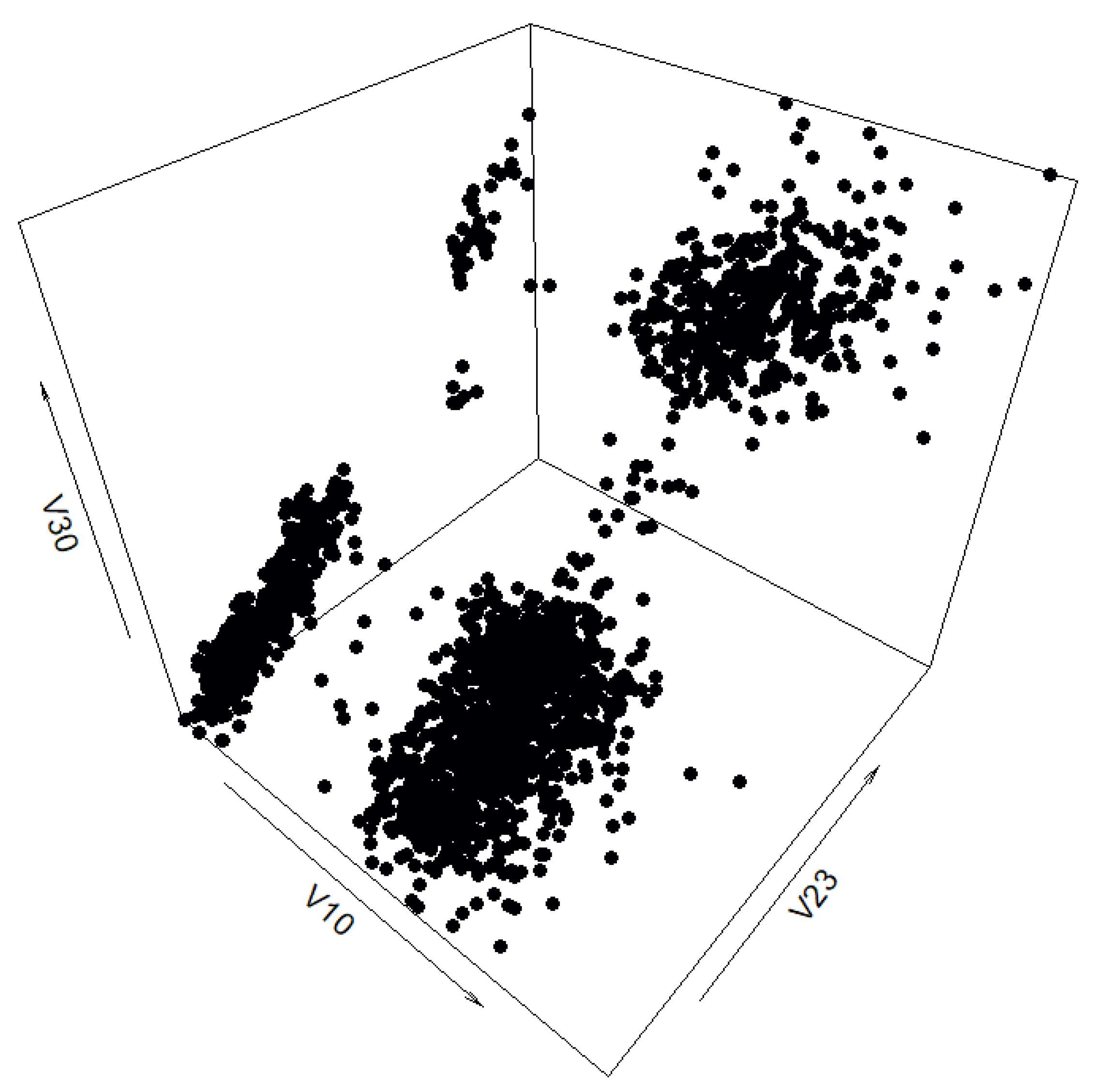
The synthetic data set generated by the benchmark method can be seen in
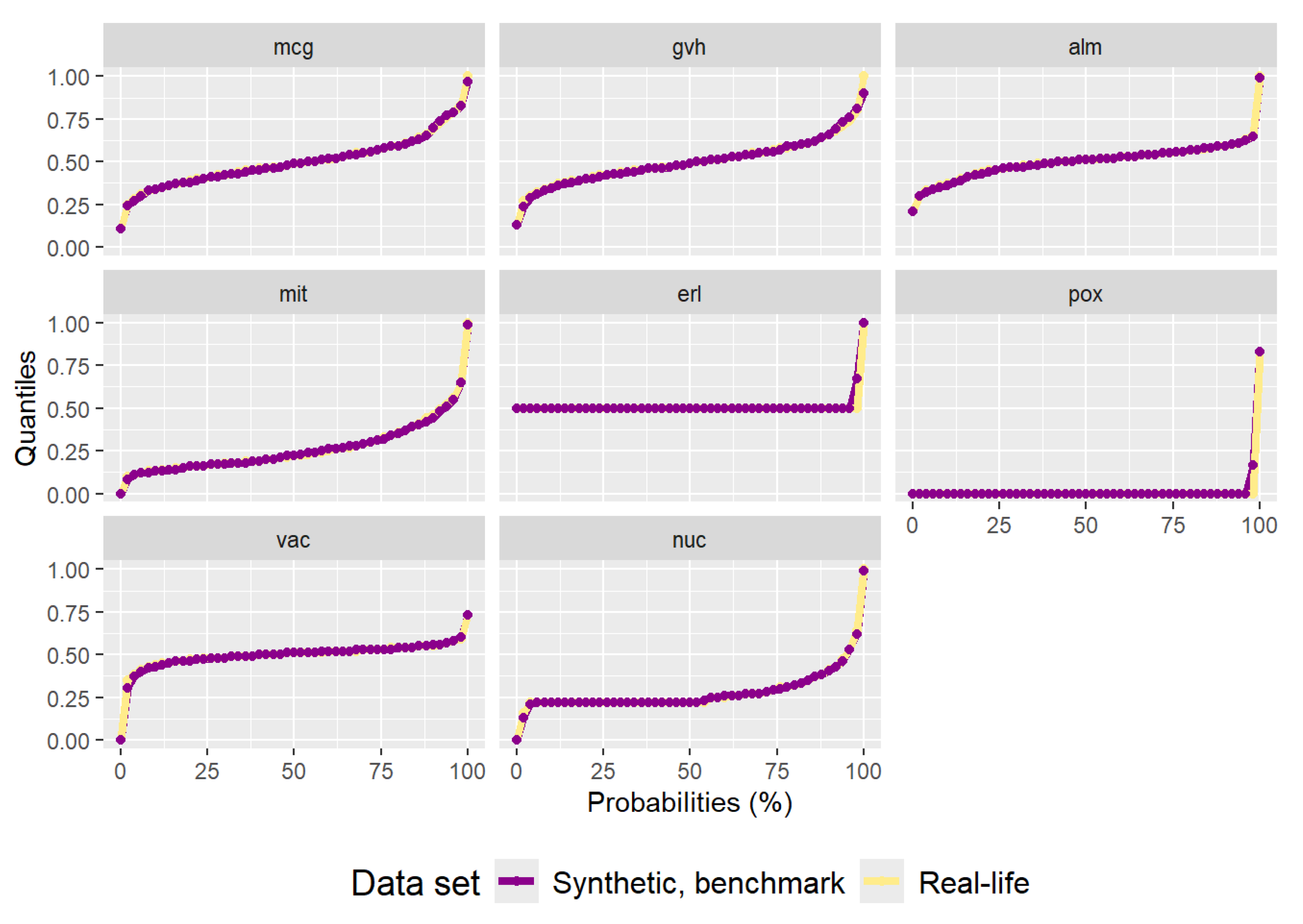
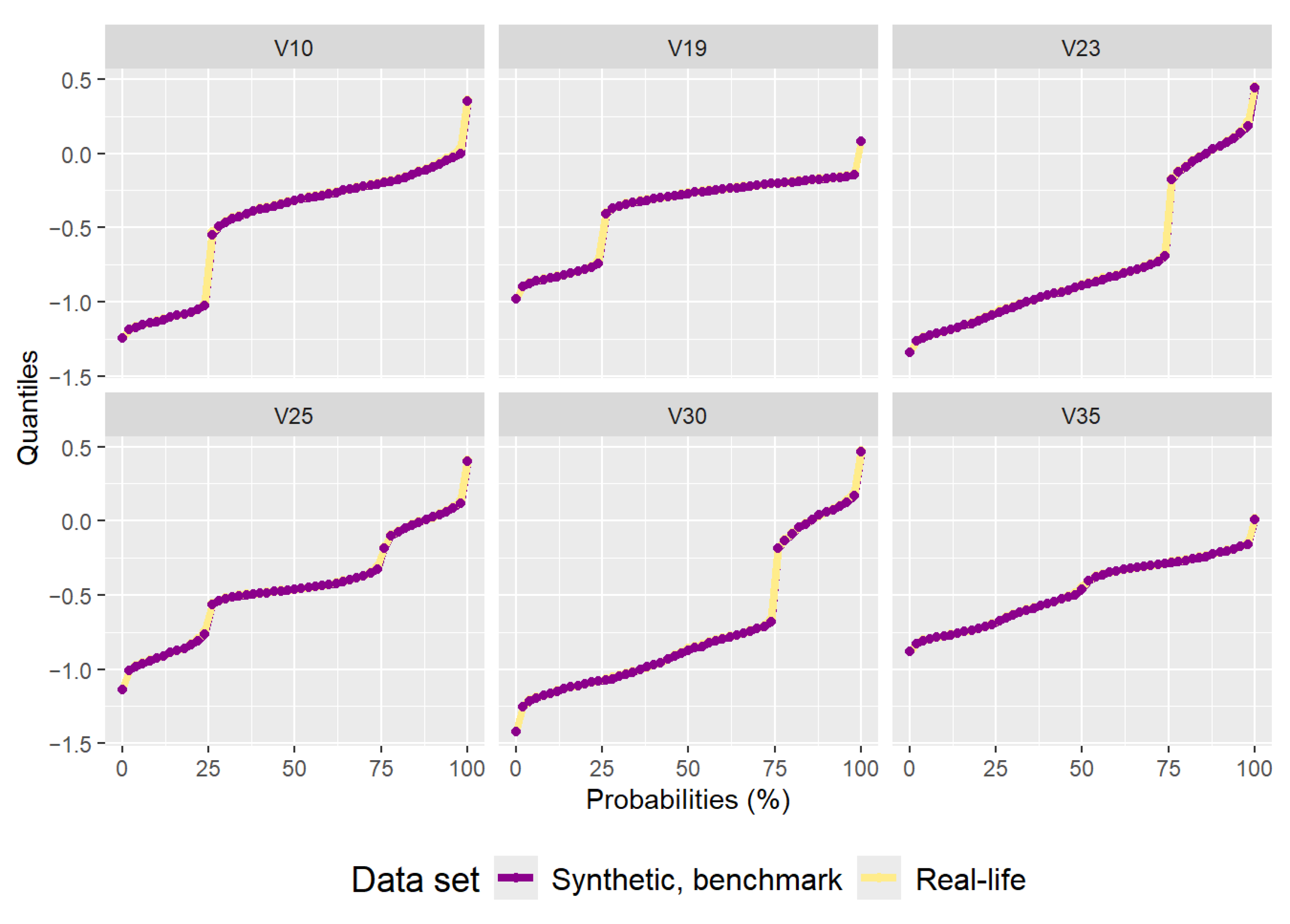
Figure A2. It has 1483 data points. Even though the data points are not of different colors, it is visible that the data do not follow the distribution of the real-life data set. The quantiles are almost perfectly replicated, as can be seen in
Figure A3, as with the “texture” data set. The very low variance of the ‘erl’ and ‘pox’ attributes can clearly be seen in the quantiles. The residual correlation matrix can be seen in
Figure A4. The sum of the residuals in the matrix above the main diagonal is
and the average residual value is
. The results of the statistical tests can be seen in
Table A2. Due to the low variance of some of the attributes the statistical tests reject (Anderson–Darling) or almost reject (DTS) the hypothesis the synthetic data are from the same distribution as the real-life data set.
Figure A2.
Three-dimensional view of the synthetic “yeast” data set generated by the benchmark method.
Figure A2.
Three-dimensional view of the synthetic “yeast” data set generated by the benchmark method.
Figure A3.
Plot of quantiles calculated for the real-life “yeast” data set and the synthetic data set generated by the benchmark method.
Figure A3.
Plot of quantiles calculated for the real-life “yeast” data set and the synthetic data set generated by the benchmark method.
Figure A4.
Residual correlation matrix of the synthetic “yeast” data set generated by the benchmark method.
Figure A4.
Residual correlation matrix of the synthetic “yeast” data set generated by the benchmark method.
Table A2.
Table of p-values calculated by the Anderson–Darling and DTS statistical tests comparing the distributions of the attributes of the real-life “yeast” data set and the attributes of the synthetic data set generated by the benchmark method.
Table A2.
Table of p-values calculated by the Anderson–Darling and DTS statistical tests comparing the distributions of the attributes of the real-life “yeast” data set and the attributes of the synthetic data set generated by the benchmark method.
| Attribute | Anderson–Darling | DTS |
|---|
| mcg | 0.7715 | 0.7390 |
| gvh | 0.8530 | 0.5705 |
| alm | 0.9485 | 0.8020 |
| mit | 0.6165 | 0.7790 |
| erl | 0.0025 | 0.0615 |
| pox | 0.0020 | 0.0530 |
| vac | 0.6205 | 0.2050 |
| nuc | 0.2915 | 0.8525 |
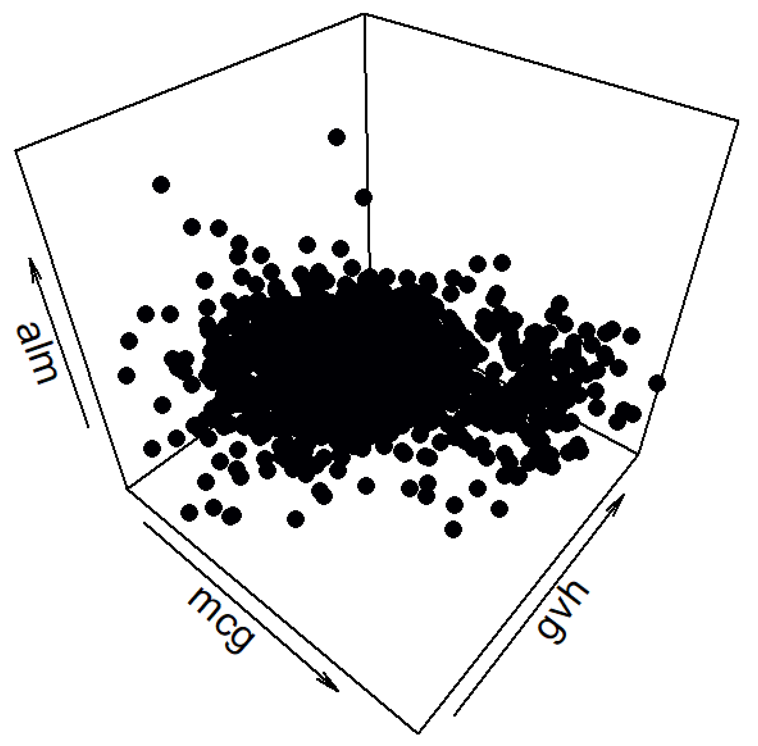
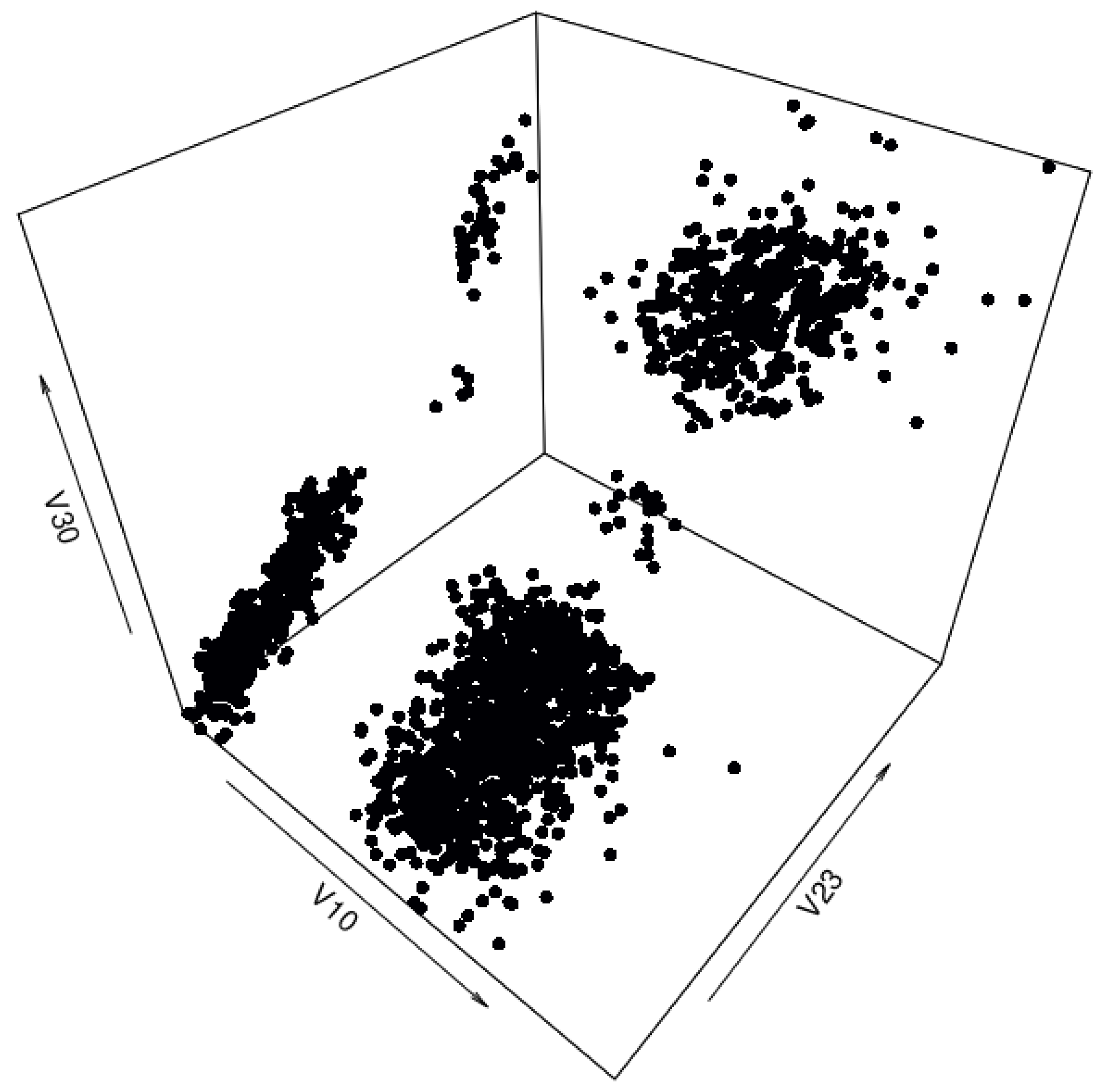
The synthetic data set generated by the cluster preserving method can be seen in
Figure A5. Even though it is not immediately evident, the spatial distribution of the synthetic data is closer to that of the real-life data. The synthetic data set has 1483 data points. The quantiles of the synthetic data set correspond to the quantiles of the real-life data set, as can be seen in
Figure A6. As with the “texture” data set, using the cluster preserving method to generate the synthetic “yeast” data set results in smaller correlation residuals, as evidenced by
Figure A7. The sum of residuals above the main diagonal is
and the average residual value is
—both a significant reduction from the residual values of the synthetic data set generated by the benchmark method. However, the apparent improvement in correlation matrix residuals is absent from the
p-values in
Table A3.
Figure A5.
Three-dimensional view of the synthetic “yeast” data set generated by the cluster preserving method.
Figure A5.
Three-dimensional view of the synthetic “yeast” data set generated by the cluster preserving method.
Figure A6.
Plot of quantiles calculated for the real-life “yeast” data set and the synthetic data set generated by the cluster preserving method.
Figure A6.
Plot of quantiles calculated for the real-life “yeast” data set and the synthetic data set generated by the cluster preserving method.
Figure A7.
Residual correlation matrix of the synthetic “yeast” data set generated by the cluster preserving method.
Figure A7.
Residual correlation matrix of the synthetic “yeast” data set generated by the cluster preserving method.
Table A3.
Table of p-values calculated by the Anderson–Darling and DTS statistical tests comparing the distributions of the attributes of the real-life “yeast” data set and the attributes of the synthetic data set generated by the cluster preserving method.
Table A3.
Table of p-values calculated by the Anderson–Darling and DTS statistical tests comparing the distributions of the attributes of the real-life “yeast” data set and the attributes of the synthetic data set generated by the cluster preserving method.
| Attribute | Anderson–Darling | DTS |
|---|
| mcg | 0.7805 | 0.7450 |
| gvh | 0.8515 | 0.5760 |
| alm | 0.9555 | 0.7910 |
| mit | 0.6370 | 0.7785 |
| erl | 0.0005 | 0.0620 |
| pox | 0.0045 | 0.0465 |
| vac | 0.6410 | 0.1965 |
| nuc | 0.3130 | 0.8315 |
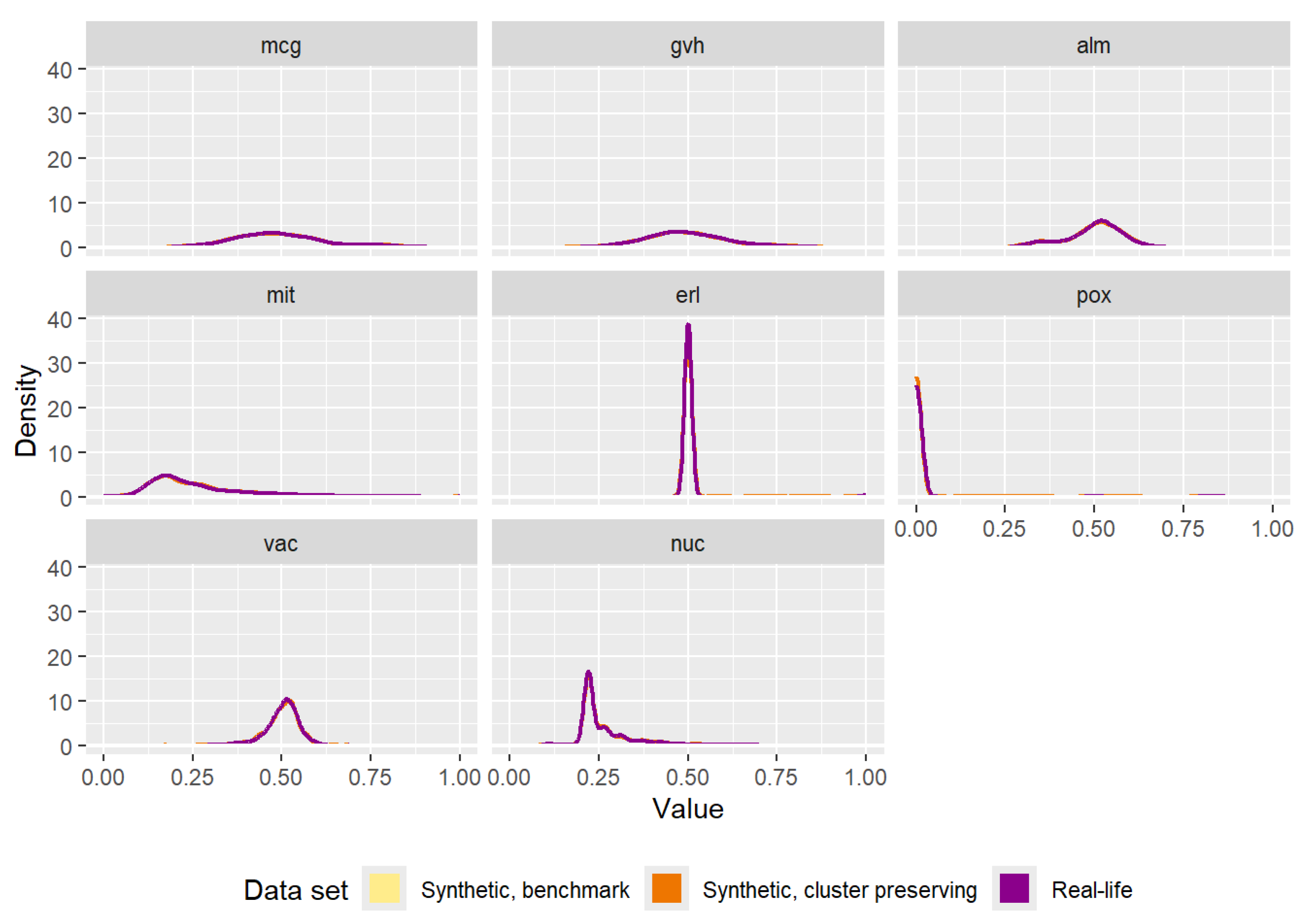
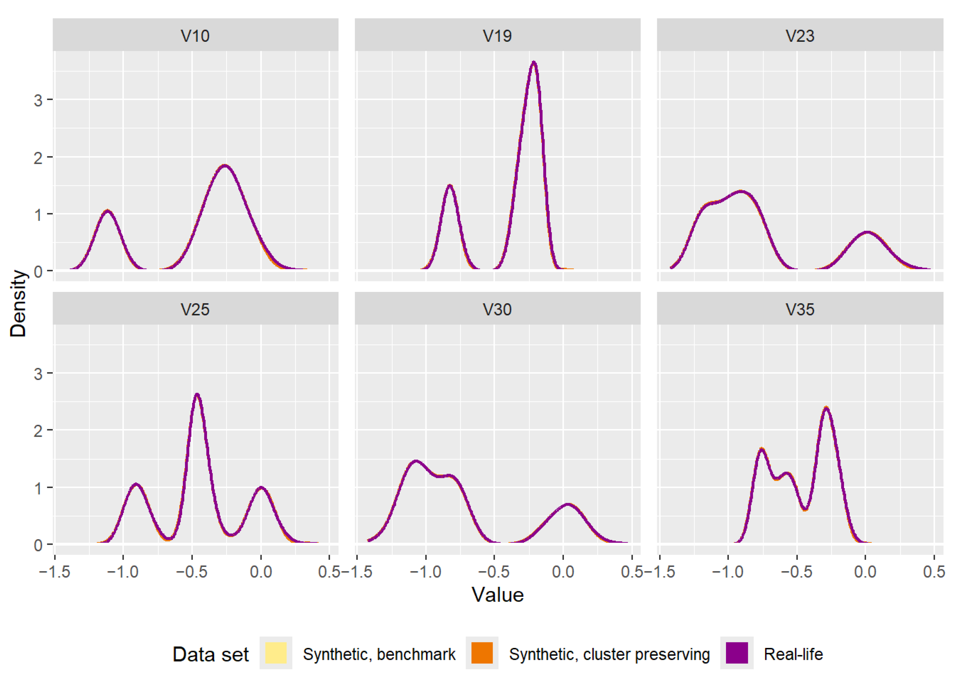
The densities of each attribute in the three data sets can be seen in
Figure A8. There are clear similarities between the “yeast” data set and the “texture” data set when comparing the effects of data generation. All the densities of the three data sets are nearly impossible to separate from one another. Furthermore, the results of the statistical tests in
Table A4 and
Table A5 show the heterogeneous nature of the data set.
Table A4.
Table of p-values calculated by the Anderson–Darling statistical test comparing the distributions of each of the attributes (“Attr.” in table) of the real-life data set and the synthetic data set (cluster preserving method) depending on the class (“Cls.” in table).
Table A4.
Table of p-values calculated by the Anderson–Darling statistical test comparing the distributions of each of the attributes (“Attr.” in table) of the real-life data set and the synthetic data set (cluster preserving method) depending on the class (“Cls.” in table).
| | Anderson–Darling |
|---|
| | Cls. | CYT | ERL | EXC | ME1 | ME2 | ME3 | MIT | NUC | POX | VAC |
| Attr. | |
| mcg | 0.972 | 0.424 | 0.622 | 0.975 | 0.764 | 0.538 | 0.707 | 0.922 | 0.769 | 0.316 |
| gvh | 0.958 | 0.318 | 0.886 | 0.626 | 0.500 | 0.517 | 0.743 | 0.986 | 0.692 | 0.364 |
| alm | 0.947 | 0.311 | 0.990 | 0.747 | 0.560 | 0.497 | 0.846 | 0.942 | 0.897 | 0.541 |
| mit | 0.987 | 0.290 | 0.844 | 0.845 | 0.521 | 0.562 | 0.828 | 0.970 | 0.827 | 0.146 |
| erl | 0.264 | 1.000 | 1.000 | 1.000 | 0.020 | 0.067 | 1.000 | 0.240 | 1.000 | 1.000 |
| pox | 0.039 | 1.000 | 1.000 | 1.000 | 1.000 | 1.000 | 0.304 | 1.000 | 0.006 | 1.000 |
| vac | 0.936 | 1.000 | 0.838 | 0.464 | 0.810 | 0.316 | 0.714 | 0.928 | 0.350 | 0.122 |
| nuc | 0.658 | 0.408 | 0.330 | 0.806 | 0.238 | 0.616 | 0.807 | 0.983 | 0.006 | 0.010 |
Table A5.
Table of p-values calculated by the DTS statistical test comparing the distributions of each of the attributes (“Attr.” in table) of the real-life data set and the synthetic data set (cluster preserving method) depending on the class (“Cls.” in table).
Table A5.
Table of p-values calculated by the DTS statistical test comparing the distributions of each of the attributes (“Attr.” in table) of the real-life data set and the synthetic data set (cluster preserving method) depending on the class (“Cls.” in table).
| | DTS |
|---|
| | Cls. | CYT | ERL | EXC | ME1 | ME2 | ME3 | MIT | NUC | POX | VAC |
| Attr. | |
| mcg | 0.970 | 0.386 | 0.929 | 0.909 | 0.903 | 0.576 | 0.848 | 0.760 | 0.706 | 0.383 |
| gvh | 0.885 | 0.278 | 0.954 | 0.651 | 0.493 | 0.427 | 0.428 | 0.983 | 0.912 | 0.337 |
| alm | 0.722 | 0.277 | 0.989 | 0.579 | 0.768 | 0.785 | 0.800 | 0.901 | 0.853 | 0.299 |
| mit | 0.914 | 0.388 | 0.961 | 0.426 | 0.606 | 0.786 | 0.836 | 0.773 | 0.705 | 0.178 |
| erl | 0.355 | 1.000 | 1.000 | 1.000 | 0.083 | 0.141 | 1.000 | 0.337 | 1.000 | 1.000 |
| pox | 0.136 | 1.000 | 1.000 | 1.000 | 1.000 | 1.000 | 0.336 | 1.000 | 0.034 | 1.000 |
| vac | 0.728 | 1.000 | 0.888 | 0.418 | 0.728 | 0.566 | 0.262 | 0.528 | 0.402 | 0.272 |
| nuc | 0.938 | 0.600 | 0.749 | 0.419 | 0.364 | 0.587 | 0.513 | 0.875 | 0.267 | 0.187 |
Figure A8.
Comparison of the densities of the attributes of the real-life data set and the attributes of the synthetic data sets (one generated by the benchmark method, the other generated by the cluster preserving method).
Figure A8.
Comparison of the densities of the attributes of the real-life data set and the attributes of the synthetic data sets (one generated by the benchmark method, the other generated by the cluster preserving method).
Appendix A.1. Downstream Task—Classification
To test the hypothesis a model could be trained on the synthetic data generated by the cluster preserving method and then evaluated on the real-life data set, a simple classification was performed using Support Vector Machines (SVM) from the R package “e1071” (“Misc Functions of the Department of Statistics, Probability Theory Group (Formerly: E1071), TU Wien.”,
https://cran.r-project.org/web/packages/e1071/e1071.pdf, accessed on 25 April 2025). Both the real-life data set and the synthetic data set generated by the cluster preserving method were split into training and testing subsets, with
of the data set being used for training and the remainder for testing. All the attributes were used to predict the class and no further optimizations were implemented.
Evaluating the model trained on the real-life training set on the real-life test set yielded an accuracy of . Evaluating the model trained on the synthetic training set on the synthetic test set yielded an accuracy of . Finally, evaluating the model trained on the synthetic training set on the real-life test set yielded an accuracy of . These results indicate the hypothesis that the synthetic data generated by the cluster preserving method can be used to train a model that can then function well with real-life data holds.
Appendix B. Additional Graphs for the “Texture” Data Set
As was stated in
Section 4, only a selection of variables and classes of the full real-life data set was used to make the results visually interpretable. This section provides more detailed three-dimensional graphs to further illustrate the differences between the benchmark method (
Section 2.2.2) and the cluster preserving method (
Section 3).
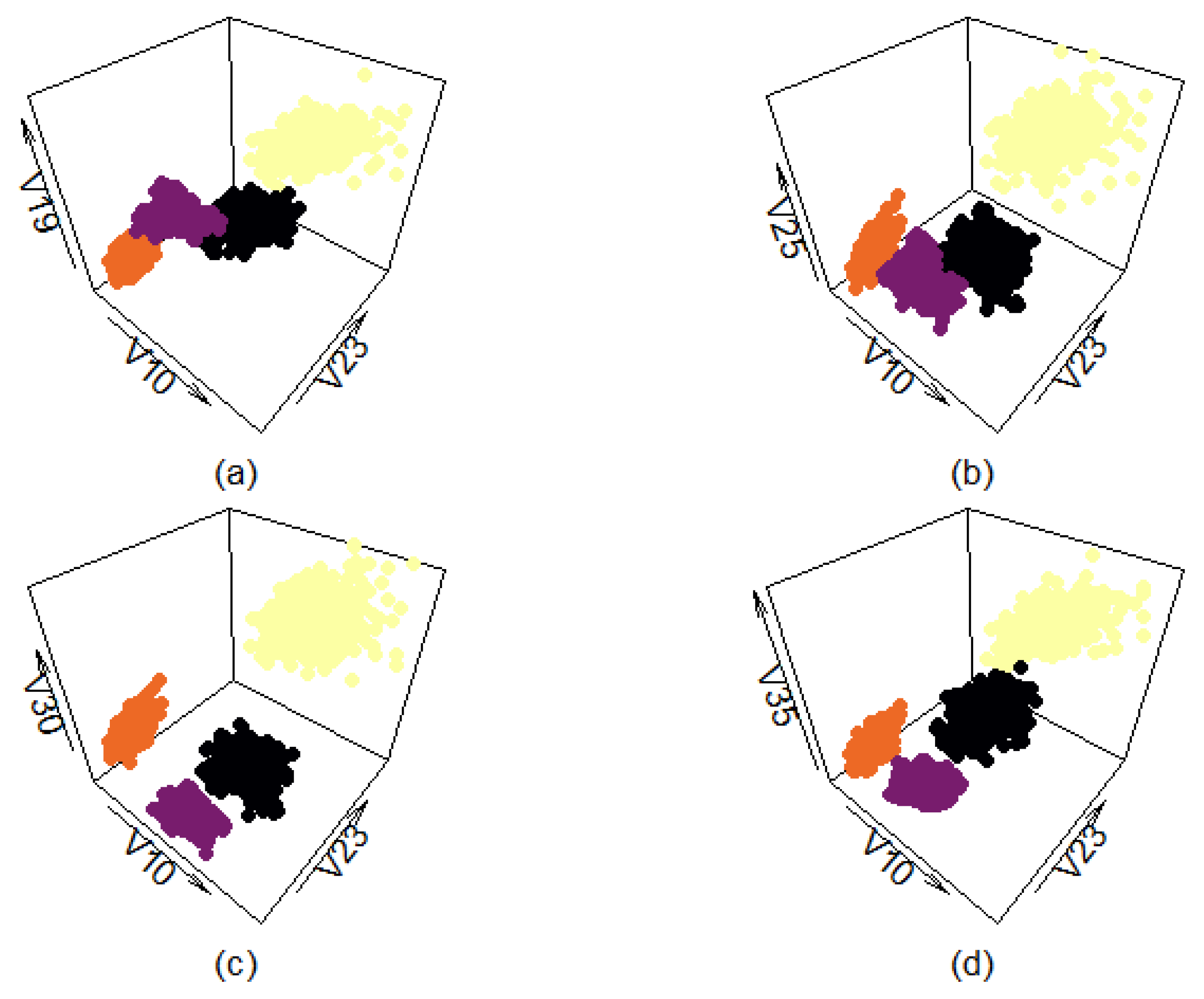
Figure A9 shows four different views of the filtered real-life data set. Each of the four different classes is presented in a different color to make it more easily distinguishable from the others. Variables ‘V10’ and ‘V23’ were chosen as the x- and y-axis because they provide the most open and easily interpretable plane. The additional four variables are used as the z-axis to provide more comprehensive views. Graphs (a,b) show that even the filtered classes have a certain amount of overlap, depending on how the data points are plotted.
Figure A9.
Three-dimensional view of classes selected from “texture” data set. Plotted with different z-axes.
Figure A9.
Three-dimensional view of classes selected from “texture” data set. Plotted with different z-axes.
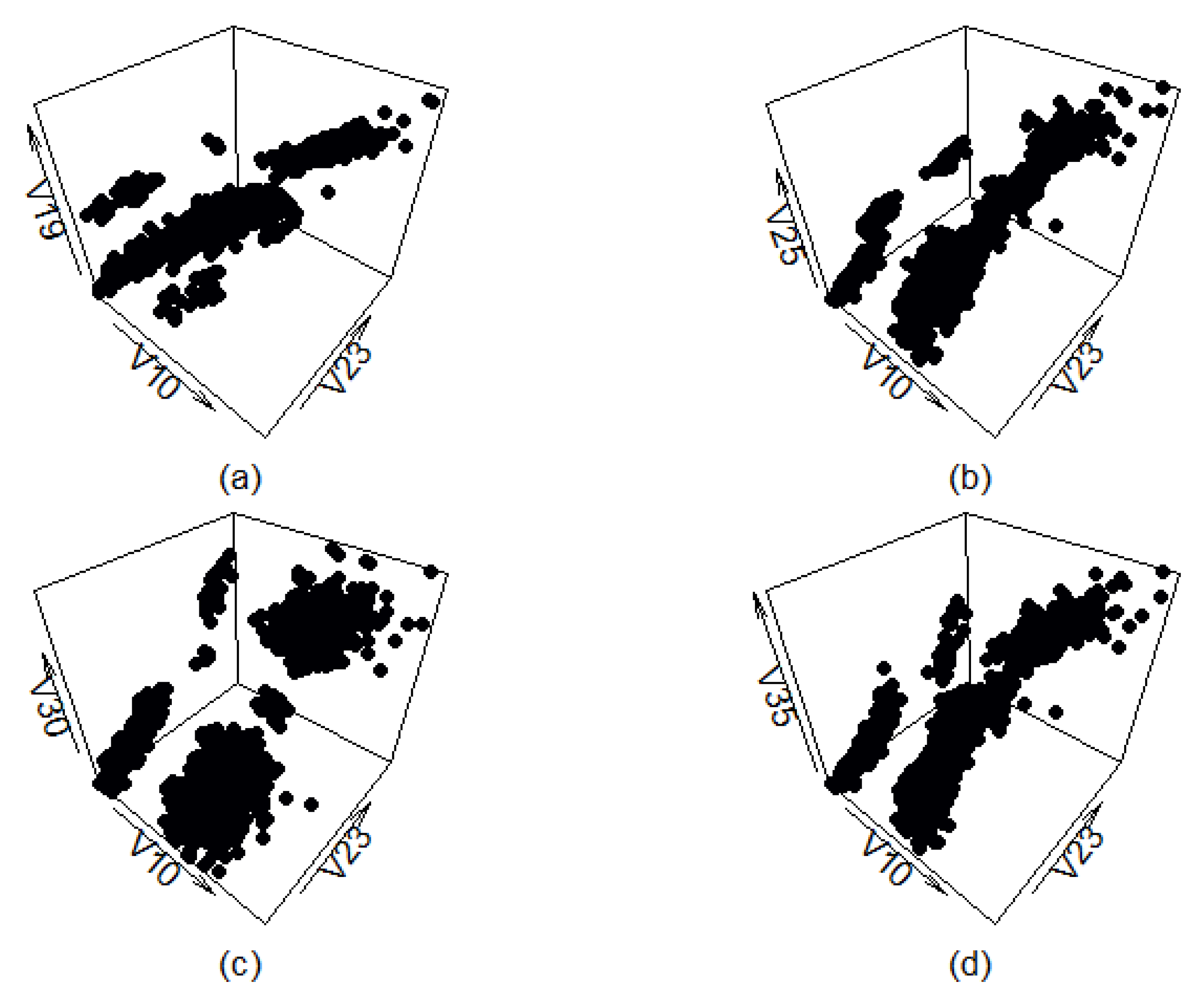
Figure A10 shows four different views of the synthetic data set generated by the benchmark method. As can be seen, the synthetic data roughly follow the orientation of the real-life data, and, in some cases (graph (c)), even mostly replicate the layout of the real-life data set. However, this method produces multiple artifacts as well, which result in data points being present in places the filtered real-life data set does not have any.
Figure A10.
Three-dimensional view of classes generated by the benchmark method. Plotted with different z-axes.
Figure A10.
Three-dimensional view of classes generated by the benchmark method. Plotted with different z-axes.
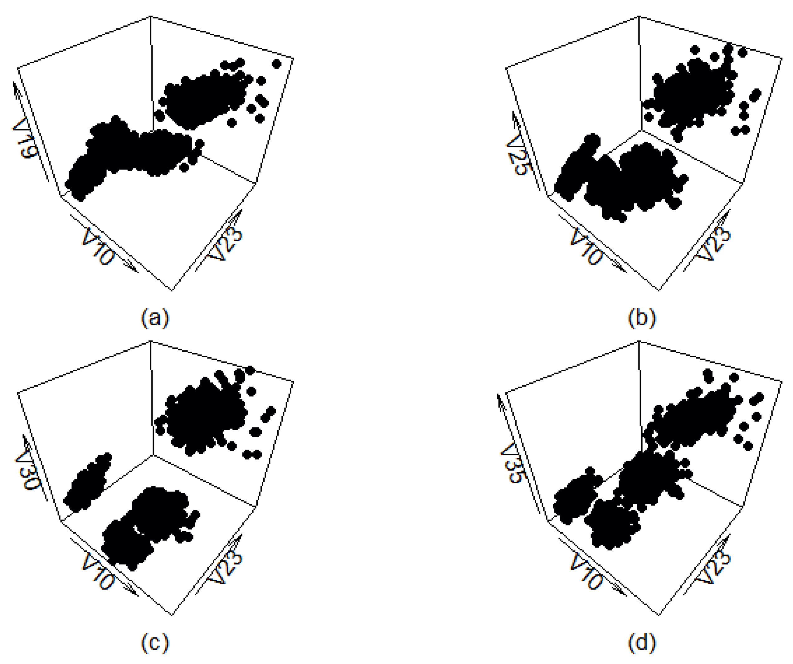
Figure A11 shows four different views of the synthetic data set generated by the cluster preserving method. There is very little visual difference between this data set and the filtered real-life data set (apart from the classes being of different color in
Figure A9). The cluster shapes do not correspond to the cluster shapes of the real-life data set completely, but that is expected and even desired. It is likely the generated data points are not present in the real-life data set, indicating that using data generated by the cluster preserving method to test the abilities of machine learning or clustering methods could be worthwhile.
Figure A11.
Three-dimensional view of classes generated by the cluster preserving method. Plotted with different z-axes.
Figure A11.
Three-dimensional view of classes generated by the cluster preserving method. Plotted with different z-axes.


