1. Introduction
Aesthetic quality has transitioned from a supplementary attribute to a fundamental component of interface design [
1]. As functional requirements are progressively fulfilled, aesthetic considerations have become essential for enhancing a product’s core competitiveness, increasing user satisfaction, and fostering long-term loyalty [
2,
3]. High-quality aesthetic design can significantly improve users’ experiences by arousing positive emotions and trust [
4,
5], thereby playing a crucial role in shaping brand identity and potentially improving users’ task performance [
6]. The well-documented phenomenon known as the “Aesthetic-Usability Effect” posits that users tend to perceive visually appealing products as more usable, exhibiting greater tolerance for minor imperfections [
7,
8]. Despite a broad consensus on the significance of aesthetic considerations, evaluating aesthetic quality remains a challenging task [
9,
10].
Aesthetics is an inherently subjective psychological construct, with perceptions and evaluative criteria heavily influenced by individual differences and cultural contexts [
1,
11]. Variations in the interpretation of color metaphors, spatial arrangements, and graphical symbols across users are commonplace [
12,
13], and identical visual elements may evoke contrasting emotional responses [
14]. Furthermore, factors such as age, professional background, aesthetic literacy, and emotional state significantly impact aesthetic judgment [
15,
16]. The multifaceted, diverse, and dynamically evolving nature of aesthetic preferences renders the development of a universal, standardized aesthetic evaluation system particularly challenging [
17]. Early investigations primarily assessed interface aesthetics through parameters such as layout density, grouping, and complexity [
18], the appropriateness of layout [
19], decision nodes in interactive multimedia [
20], and aesthetic fitness scores [
21]. With advancements in expert evaluation and factor analysis methodologies, research progressively decomposed interface aesthetics into fundamental dimensions, including simplicity, diversity, colorfulness, and craftsmanship [
1]. Subsequent efforts incorporated user experience factors (such as efficiency, unity, intensity, and comfort) into the evaluative framework [
3,
9,
22,
23] and enhanced the correlation among various indicators [
24]. However, these approaches largely remained qualitative or semi-quantitative, lacking rigorous mathematical modeling and systematic quantitative analysis of the interactions among variables and their underlying mechanisms in human aesthetic judgment [
25,
26,
27,
28].
The aesthetic formula M = O/C (Aesthetic Measure = Order/Complexity), proposed by Birkhoff in 1933 [
29], served as a foundational framework for the quantitative analysis of interface aesthetics. Nevertheless, the model has encountered substantive limitations in practical applications, primarily due to the absence of precise operational definitions for the concepts of “order” and “complexity” [
30]. To mitigate these limitations, subsequent research has sought to expand and refine Birkhoff’s original framework from diverse perspectives. For instance, Beebe-Center and Pratt [
31] decomposed the construct of “order” into sub-dimensions, including vertical and rotational symmetry, balance, horizontal and vertical cross-order, and asymmetry, thereby enhancing the correlation between the model’s quantitative outputs and subjective aesthetic judgments. Building upon these developments, Ngo et al. [
32] introduced 13 visual indicators (such as balance, symmetry, and unity) to address layout challenges in data input interfaces, establishing a more systematic and quantifiable framework for aesthetic evaluation. Further contributions to this framework include Bauerly and Liu’s development of a computational model that examines how balance, symmetry, and the number of components affect interface aesthetics [
33]. Moreover, Lai et al. [
34] performed a quantitative analysis of visual balance and symmetry in color interfaces using the HSV color space. Zhou et al. [
35] also identified key aesthetic factors, including balance, proportion, simplicity, and echo. They developed a twelve-item assessment system to measure interface aesthetics, supporting the systematic and practical application of these aesthetic theories. As understanding of aesthetic principles has evolved, prototype systems for automatic aesthetic assessment have been developed [
26,
36]. Collectively, these works depict a research path that combines perceptual cognition with computational methods, gradually developing an aesthetic evaluation framework that merges cognitive modeling and image recognition techniques. This offers efficient, objective quantitative support for rapid interface design iterations [
26].
Despite their theoretical prominence, existing aesthetic evaluation systems often exhibit a disconnect between conceptual rigor and practical applicability in real-world design contexts [
37]. These assessment frameworks, which typically involve a wide range of quantitative and qualitative indicators, impose considerable time, labor, and cognitive demands on users [
38]. A critical comparative analysis reveals that such reductionist and atomized approaches are fundamentally misaligned with the way humans process visual aesthetics, as they evaluate components in isolation rather than through the integrative, Gestalt-based processes that characterize natural aesthetic judgment [
39]. Empirical evidence demonstrates that users form initial aesthetic impressions within mere hundreds or even tens of milliseconds, relying on rapid, holistic perceptual mechanisms rather than sequential, detail-oriented analysis [
40,
41,
42,
43,
44]. In contrast, standard itemized methodologies lack the capacity to capture these immediate responses, introducing a methodological incongruity. For example, while Zhou et al. [
35] implemented dimensionality reduction using techniques such as factor analysis and grey relational analysis to streamline later stages of evaluation, such methods do not address the foundational inefficiencies of exhaustive indicator collection and measurement. In comparison to traditional, calculation-heavy assessments, a more effective evaluative approach would prioritize the identification and quantification of core visual dimensions directly responsible for overall appeal, aligning computational models more closely with the immediate, integrative nature of human perception [
33,
45,
46].
Among various aesthetic qualities of an interface, layout appropriateness is fundamental to ensuring effective information transmission and overall system performance [
19]. Improper layout in high-risk systems significantly increases the risk of safety accidents by amplifying hazards, delaying response, and escalating accident consequences [
47]. Conversely, an expertly designed layout can effectively organize the information hierarchy, guide visual flow, and reduce unnecessary search behaviors, thereby decreasing users’ cognitive load and improving operational efficiency [
48]. Visual balance constitutes a core principle in layout design [
27,
40]. It pertains to the equitable distribution of “visual weight” among interface elements based on attributes such as size, color, shape, and texture, ultimately fostering a composition that appears stable and harmonious [
49,
50]. Empirical studies have demonstrated a significant positive correlation between perceived balance and aesthetic appeal [
34]. Visually balanced interfaces foster user comfort and a sense of stability, whereas unbalanced layouts elevate cognitive load, precipitate confusion or anxiety, and can prompt user disengagement [
14,
40]. This phenomenon is especially pronounced on small-screen devices, where limited screen real estate amplifies the perceptual and operational drawbacks of imbalance [
51]. Notably, sensitivity to balance does not require professional training [
52]. Research by Wilson and Chatterjee [
53] shows that whether users are ordinary or experienced designers, most can quickly recognize an interface imbalance and instinctively prefer layouts that appear more balanced. This suggests that human judgment of visual balance is a highly automatic perceptual process driven by deep cognitive preferences. More importantly, Zhou et al. [
35] conducted a factor analysis on multiple aesthetic dimensions and found that the variable “balance” accounted for as much as 42.267% of the variance, far surpassing other traditional aesthetic indicators such as “simplicity” and “proportion,” making it the most significant factor influencing overall aesthetic judgment. This finding strongly supports the dominant role of visual balance in intuitive aesthetic assessment [
40,
49,
54].
The principle of balance is a fundamental organizing force in both the physical universe and human cognition [
55]. The second law of thermodynamics states that entropy in isolated systems tends to increase toward equilibrium, a state of maximum energy uniformity. By contrast, open systems such as living organisms sustain internal homeostasis through ongoing exchange of matter and energy with their surroundings [
56]. This drive for balance is reflected in psychological processes. For example, the opposing concepts of “Psychic Entropy” and “Flow,” as described by Csikszentmihalyi [
57], demonstrate how the mind constantly seeks order and simplicity to manage environmental complexity and resist chaos. The propensity to maintain internal coherence, evident in both biological and psychological systems, reflects a converging imperative for stability amid rising entropy [
58]. Gestalt psychology further explicates that the human visual system is predisposed to perceive order, harmony, and stability, with symmetry, particularly axial and central forms, serving as prototypical instantiations of balance due to their structured, readily processed configurations [
50,
59]. Nevertheless, in the context of contemporary digital interface design, strict adherence to geometric symmetry may constrain creative potential and produce monotonous layouts that fail to engage users [
51,
60]. As a result, modern interface design emphasizes a higher-level concept of “dynamic balance” [
61] or “asymmetric balance” [
62]. Designers have increasingly embraced the idea of dynamic or asymmetric balance, in which visual harmony is created by deliberately pairing differing visual weights, such as balancing large images with brief text or offsetting dense informational areas with strategically placed negative space [
50,
63].
Although notable shifts in contemporary interface design paradigms, most existing automated aesthetic assessment systems continue to operate within frameworks centered on absolute balance and fragmented measurements [
26]. These systems typically rely on extracting a wide array of features, such as color distribution, layout density, element alignment, and symmetry ratios from user interfaces [
32]. While such quantitative features may offer some explanatory power, they often involve complex mathematical operations and multi-parameter fusion strategies, and heavily rely on manually defined weighting systems to compute final aesthetic scores [
12]. This approach not only increases computational cost but also introduces the risk of subjective bias. More importantly, such feature-based quantitative methods are fundamentally different from the rapid and holistic aesthetic perception mechanism of humans. As prior research has indicated [
42], human evaluators can form holistic aesthetic judgments in as little as fifty milliseconds. Yet existing models fail to adequately capture the inherent holism and immediacy of human aesthetic perception. This cognitive misalignment results in a pronounced gap between the computationally derived aesthetic quality and users’ actual aesthetic experience [
46]. The discrepancy becomes especially evident when evaluating novel, AI-generated interfaces that incorporate fluid transitions, organic shapes, and irregular structures. Traditional models, designed for regular and predictable elements, tend to yield higher prediction errors in such cases [
26,
50].
To address these challenges, this study introduces a computational cognitive model named Visual Moment Equilibrium (VME). Grounded in mechanisms of human visual cognition, the model captures the visual balance of both regular and irregular interface components in mathematical terms. Our goal is to develop an aesthetic evaluation cognitive model that more accurately represents the principles of human visual perception, thereby bridging the gap between computational aesthetic assessment and actual user experience. As interface design continues to evolve toward more expressive and adaptive forms, the Visual Moment Balance model offers a scalable and cognitively grounded foundation for automated aesthetic evaluation in next-generation human–computer interaction, UI/UX optimization, and generative design systems.
The rest of this paper is organized as follows.
Section 2 defines the VME model, explaining its cognitive basis, mathematical structure, and extensions for irregular elements.
Section 3 outlines the validation experimental approach, including stimulus design, benchmark setup using the AHP method, and baseline model.
Section 4 presents the results of the computational and perceptual balance assessments, along with their correlation. Finally,
Section 5 discusses the implications and limitations of our findings and outlines directions for future research.
Section 6 concludes the paper.
3. Methodology for Validation
3.1. Experimental Design
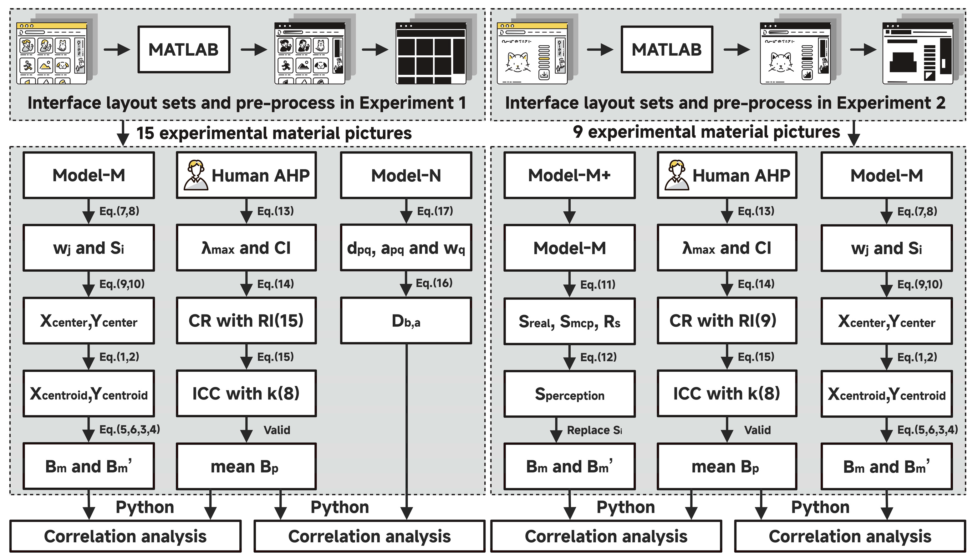
This study used a computational modeling validation framework to assess the effectiveness of the proposed visual balance evaluation model across different interface layouts configurations, specifically regular element-based and irregular element-based interfaces. As shown in
Figure 1, the validation protocol comprised two sub-experiments: (1) the comparative performance analysis of calculation methods on regular interfaces, and (2) the validation of calculation methods enhancements on irregular interfaces. In both sub-experiments, the human-perceived visual balance scores derived from a single-level Analytic Hierarchy Process (AHP) served as the benchmark criterion. The performance evaluation involved assessing how closely the model’s results aligned with human subjective judgments.
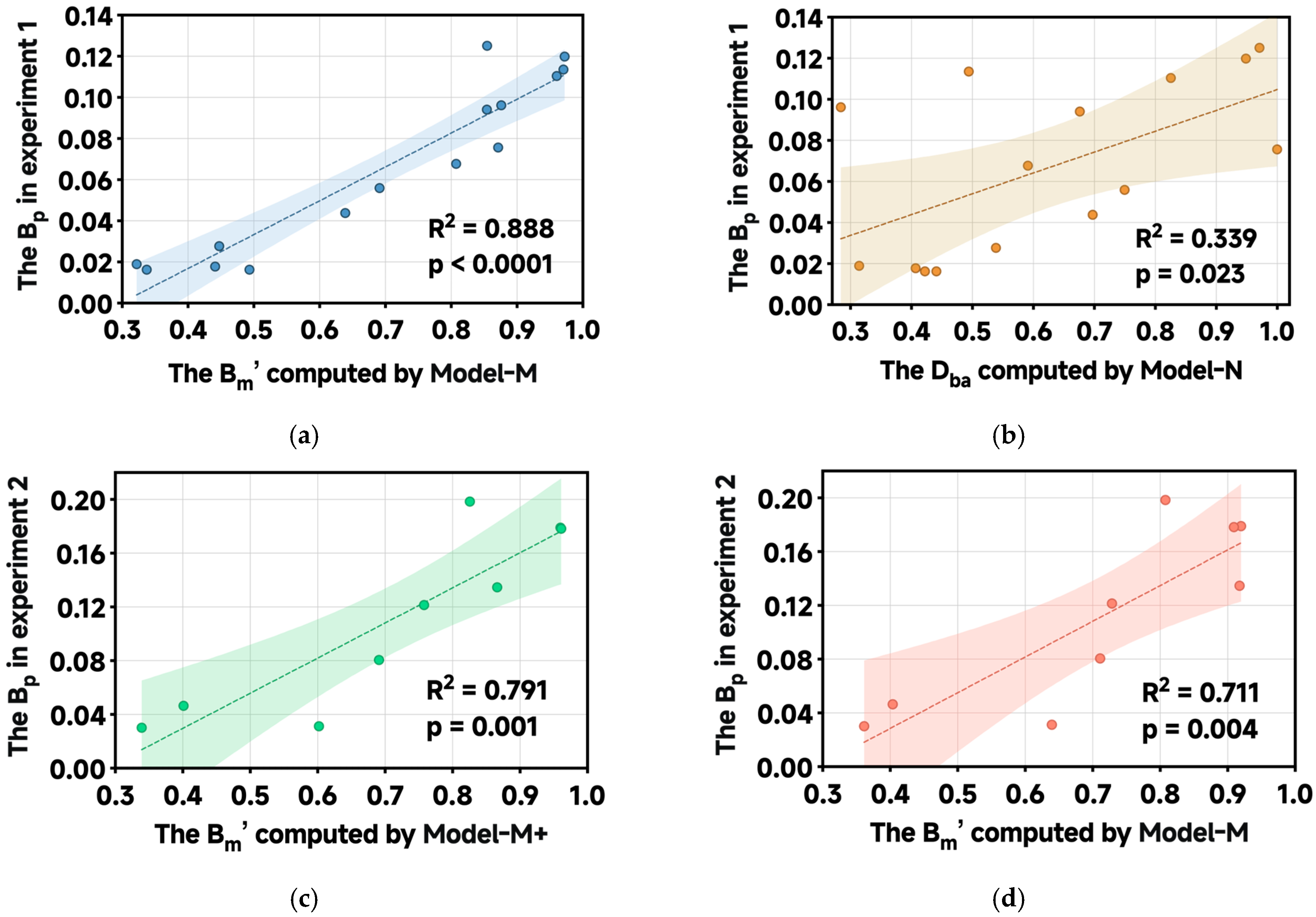
The first sub-experiment compares the proposed central part of the VME model, which contains Equations (1)–(10), and which we call “Model-M” for short, with the traditional calculation method developed by Ngo et al. [
32], which we label “Model-N.” The primary objective was to evaluate whether Model-M predicts human balance perceptions more accurately than Model-N for regular interface layouts. The second sub-experiment evaluates the effectiveness of the optimized version, “Model-M+,” which adds Equations (11) and (12) to Model-M and is designed to handle irregular interface geometries. The performance of Model-M+ is compared with that of its predecessor, Model-M, to determine whether it better reflects human visual balance perception at irregular element interfaces.
3.2. Experimental Materials
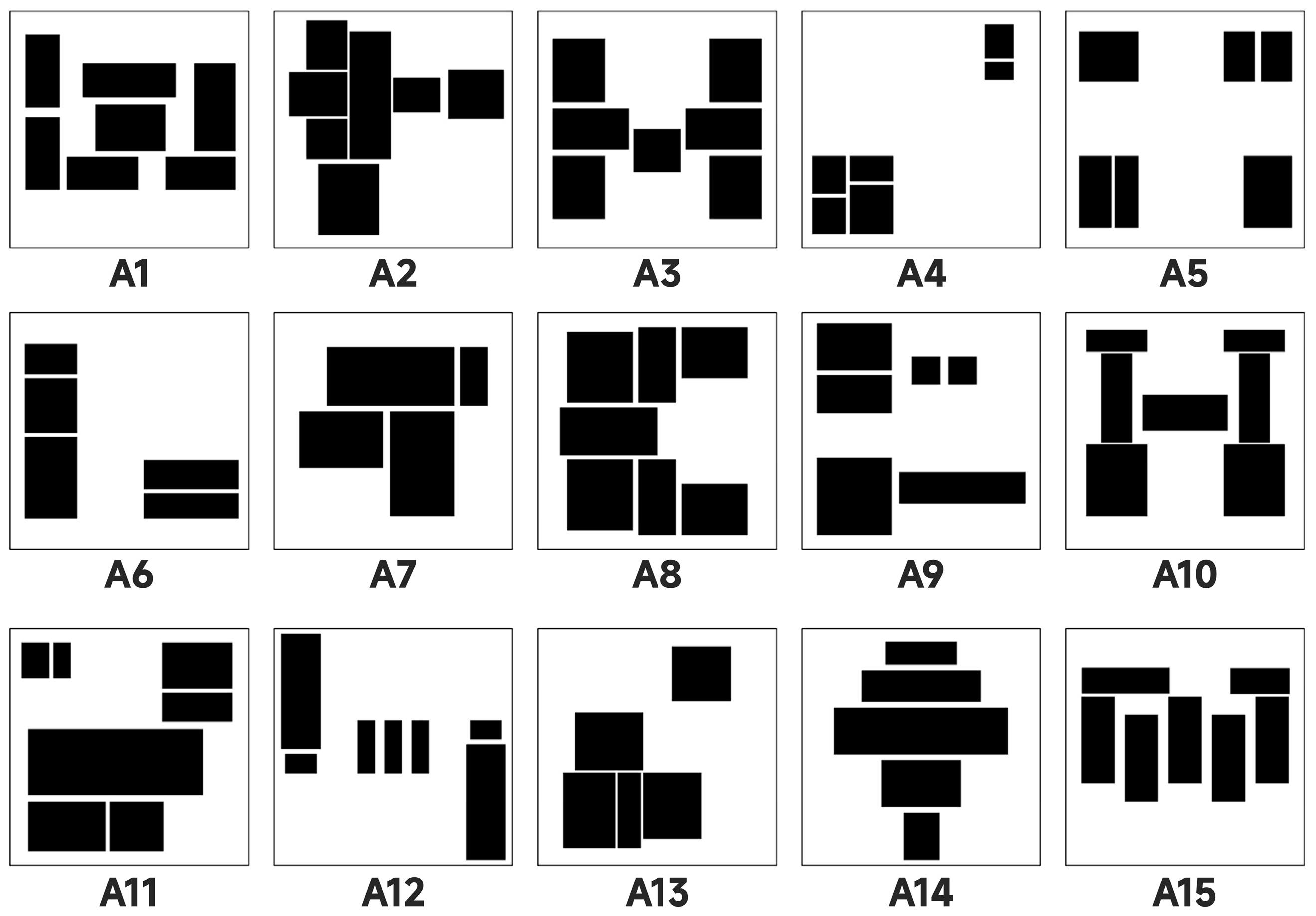
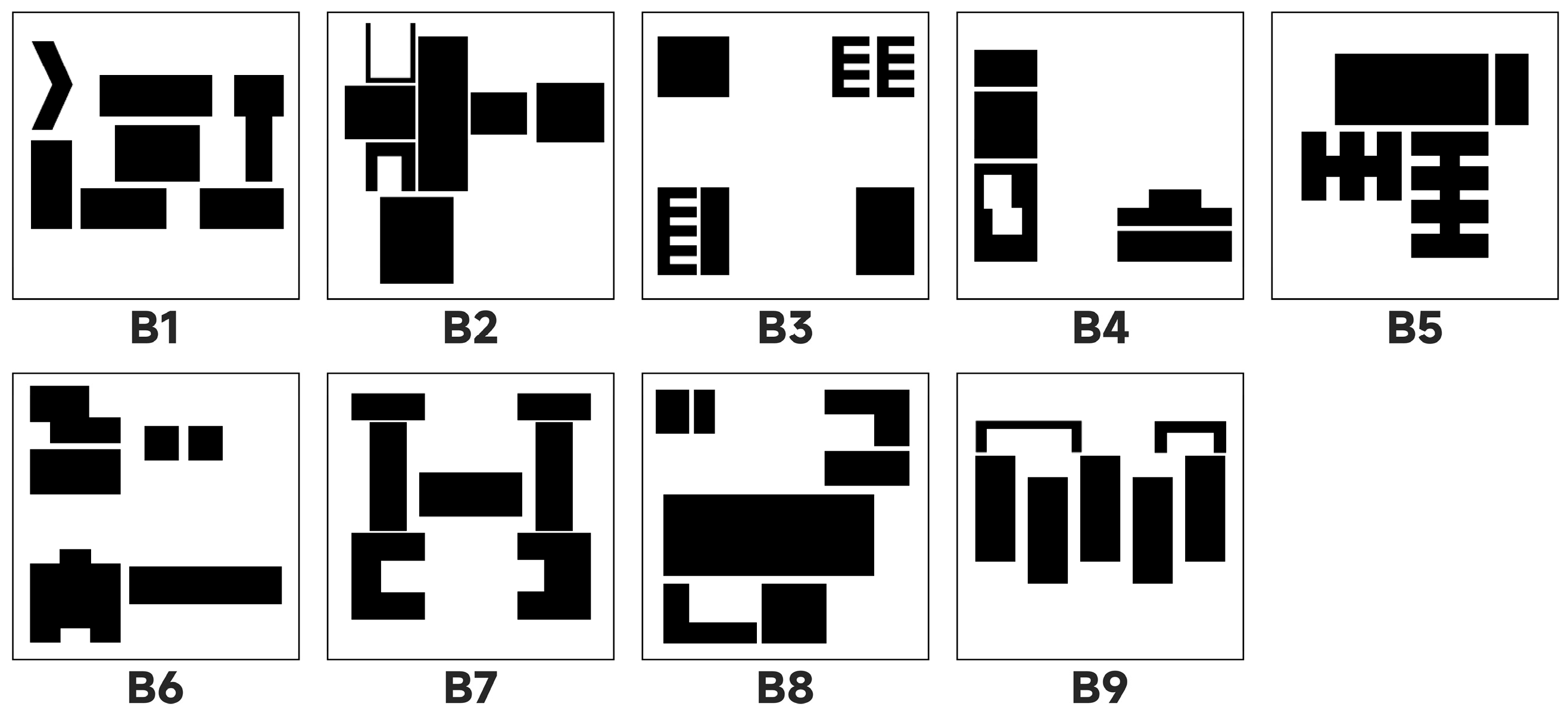
The materials employed in this investigation consisted of two sets of highly abstracted interface layout pictures, as illustrated in
Figure 2 and
Figure 3. These designs are built on paradigms from earlier research that transform real interfaces into block-overlaid images [
104]. The main approach involves systematically abstracting real user interfaces with textual content, such as web pages and mobile app interfaces. It retains the spatial positions, relative sizes, and layout structures of elements from the original interface while converting specific content elements, like text blocks, icons, and buttons, into non-semantic geometric shapes. This method effectively removes the influence of higher cognitive factors such as language comprehension, functional expectations, and brand familiarity on the observer’s judgment, allowing a focus on pure visual organization rules [
25]. Specifically, two distinct material sets were developed: the first set consisted of 15 interfaces composed entirely of regular rectangular elements. These rectangles are highly uniform in shape, with clear boundaries, and their arrangement includes various typical layout patterns such as central symmetry, grid distribution, and linear alignment, representing the common structured design style in modern digital interfaces. The second group contains 9 interfaces, whose elements feature irregular and organic contours, mimicking the free forms in nature or hand-drawn styles, aiming to explore the impact of non-standardized and more artistic layout forms on visual perception [
25,
26,
105].
It is worth noting that the core objective of the two experiments is to verify the computational model’s effectiveness in simulating human visual perception, particularly its ability to calculate and evaluate the aesthetic features of interface layouts. It does not aim to conduct a broad investigation of user interface design itself. Instead, the stimuli used in the research were not randomly selected or randomly generated images, but carefully planned and structurally designed visual samples. The aim was to present a series of key visual elements systematically. These stimuli covered multiple classic aesthetic dimensions, including balance and imbalance, symmetry and asymmetry, the concentration and dispersion of element distribution, the different positions of the visual center in the picture (such as top, bottom, left, right or geometric center), the strategic use of negative space (i.e., blank space), the linear arrangement method, and whether the graphics have symbolic or representational features.
The various dimensions mentioned above do not exist independently; they are interconnected through specific, opposing, or complementary relationships, forming the basic framework of visual balance in digital interfaces. For example, a symmetrical layout usually conveys stability and order, while asymmetrical designs can create dynamic tension. The shifting of the visual center of gravity influences where users focus their attention, and proper use of negative space can improve information hierarchy and create a sense of breathing room. By controlling these variables, researchers can test how the model responds to different composition patterns under controlled conditions and determine whether it accurately reflects the perceptual tendencies of human observers when they encounter similar layouts.
Although the stimulus set used in this study is not large or diverse for real-world interfaces (e.g., colorful or multimodal), its highly intentional and representative design ensures it includes the common visual structures typically found in interface design. Therefore, it is adequate to endorse an in-depth analysis of the model’s performance. This refined and targeted design approach renders this dataset particularly suitable for assessing the capability of computational models to comprehend the arrangement of layouts, perceive structural stability, identify attentional guiding mechanisms, and infer implicit shapes or pathways.
Standardizing stimulus processing is essential in experimental design. By keeping image sizes within a consistent range, researchers can effectively eliminate perceptual biases caused by varying original image sizes. Differences in screen sizes, resolutions, and display ratios across devices can lead to issues such as stretching, compression, or uneven white space, distorting human perception of spatial relationships. From a cognitive psychology perspective, when the human visual system processes two-dimensional information, it naturally creates a reference coordinate system based on the bounding box. Then it assesses the relative positions and visual weight of elements. Ensuring all images share the same enclosing rectangle makes comparisons easier within a consistent spatial framework, preventing shifts in the psychological reference system caused by different canvas sizes. Therefore, all visual stimuli were uniformly scaled to a fixed size of 300 × 300 pixels to ensure that the results reflect human perception of the interface layout rather than unintended effects from external presentation conditions.
Based on Equations (7), (9) and (10), the geometric center coordinates of the interface perceived by humans (
,
) were calculated as (149, −144), with the Cartesian origin (O) at the top-left corner. To ensure consistency of visual elements, a high-contrast monochromatic color scheme was adopted (RGB: information block 0, 0, 0; background 255, 255, 255), effectively minimizing confounding effects of color and texture. This image-processing strategy ensured that the layout’s influence on the perception of balance could be reliably isolated and measured, thereby supporting the internal validity of the experiment [
105]. Additionally, by maintaining comparable total sizes of informational blocks, consistent spatial spacing, and limiting the number of blocks between 4 and 7 [
106], the potential influence of visual complexity on expert cognitive load and attentional focus was effectively controlled.
3.3. Benchmark: Evaluation of Perceived Visual Balance Based on Single-Level AHP
Using subjective ratings from human subjects as the benchmark for computational aesthetics evaluations was regarded as one of the most dependable and widely accepted methods for connecting human aesthetic experiences with computational models [
61]. While common subjective rating instruments such as Likert scales or semantic differential scales offer ease of application, they frequently lack the capacity to accurately represent the relative preferences among design alternatives with the requisite mathematical precision for computational modeling, as they typically generate ordinal data rather than ratio data [
107]. The Analytic Hierarchy Process (AHP), formulated by Saaty [
108], was a rigorous decision-making framework grounded in analytical hierarchy theory. It systematically decomposed complex problems into structured hierarchical components comprising criteria and alternatives. Utilizing a standardized scale for pairwise comparisons, AHP effectively managed multi-criteria decision analysis by translating subjective judgments into quantitative ratio-scale data. This methodological approach facilitated the integration and modeling of multiple evaluation dimensions, thereby enhancing decision accuracy and consistency. Nevertheless, in contexts such as evaluating interface layout aesthetics, where subjective, intuitive perception predominates, comprehensive judgment frequently surpasses the linear aggregation of individual criteria [
42]. To precisely gauge users’ overall perception of visual equilibrium in interface layouts, this study omitted the criteria tier and adopted the core structure of AHP, specifically a single-level model [
109]. Participants were directly prompted to perform pairwise comparisons of sample designs within the overarching category of “overall balance perception.” This methodology preserved AHP’s principal advantage, transforming subjective evaluations into a ratio scale, while minimizing cognitive load during multiple judgments and more accurately capturing the holistic “Gestalt” perception of balance [
110].
3.3.1. Participants
The reliability of decision-making in the Analytic Hierarchy Process (AHP) depends more on evaluators’ professional competence than on the number of participants [
108]. It typically involved a panel of 2 to 11 experts selected based on their relevant expertise and familiarity with the subject matter [
111,
112,
113].
Utilizing purposeful sampling methods, 8 aesthetic evaluation experts (comprising 4 males and 4 females; mean age = 37.13 years, standard deviation = 4.22) were recruited for this investigation, aligning with the conventional “rule of thumb” concerning the number of experts necessary [
114]. This panel included 6 industry practitioners and 2 academic researchers. All participants were required to satisfy the following inclusion criteria:
A minimum of eight years of professional experience in related fields such as visual design, user interface design, or human–computer interaction;
Possession of a master’s degree or higher, along with holding a senior position (such as senior designer or associate professor) in their respective institutions;
Good health status, with no history of neurological or visual impairments.
Since the AHP relied exclusively on subjective online scoring, without recordings or photographs, and all expert data were provided anonymously, ethical approval was not required for this study. Participants voluntarily signed a written informed consent form after fully understanding the study’s purpose. Participant demographics are shown in
Table 2. Their expertise encompassed interaction design, visual aesthetics, and familiarity with composition principles, thereby ensuring informed evaluations from both practical and theoretical perspectives.
3.3.2. AHP Evaluation Process
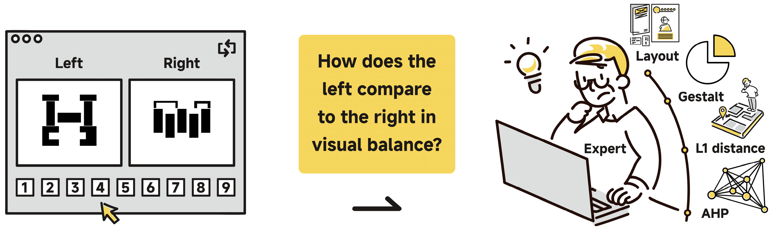
The Analytic Hierarchy Process (AHP) evaluation for Experiments 1 and 2 was conducted using the online survey platform Wenjuanxing on experts’ personal computers. During each iteration of independent assessments, the platform presented pairs of pictures, either both regular or both irregular, positioned adjacently to facilitate evaluation (see
Figure 4). The picture pairs were randomized to prevent bias. Experts were asked to assess the relative importance of the left image compared to the right in terms of overall perceived balance using the Saaty 1–9 scale [
115]. Within this scale, a value of 1 signifies equal balance between pictures, 3 indicates a slight dominance of one over the other in terms of balance, 5 reflects a strong dominance, 7 denotes a very strong dominance, and 9 signifies an extreme dominance. Intermediate values (2, 4, 6, 8) were employed to allow for nuanced judgments. In cases where the right picture was perceived as more balanced than the left, reciprocal values (e.g., 1/3, 1/5) were assigned accordingly.
Before each experimental session, three calibration training sessions were conducted to ensure that experts understood the concept of overall perception of visual balance, which differed from symmetry, and to confirm their familiarity with the AHP pairwise comparison process and the 1–9 scale. The platform automatically recorded the experts’ assessments and used these data to construct a comprehensive × pairwise comparison matrix (15 × 15 for regular groups and 9 × 9 for irregular groups).
To ensure the logical reliability of expert judgments, consistency checks were performed. The Consistency Index (
) was calculated as
where
n is the number of pictures. The Consistency Ratio (
) was then computed by comparing
to the Random Index (
), which is the average
of randomly generated matrices:
The
value depends on
; standard values for
= 1 to 15, defined by Saaty [
115,
116], are listed in
Table 3. A
value below 0.1 indicates acceptable consistency. In this study,
= 1.59 was used for experiment 1, while
= 1.46 was applied for experiment 2. Participants with matrices having
≥ 0.1 were excluded from further analysis to ensure data quality.
Since the experts in the experiment came from a fixed group, the focus was on the consistency of the ratings given by this specific group of experts. To quantify the degree of consistency among expert raters, the intraclass correlation coefficient (
) was calculated. The average measurement reliability under the two-way mixed-effects model
(3,1) was adopted [
117]. The calculation formula for
is as follows:
where
represents the between-items mean square,
is the residual mean square, and
is the number of experts. This model assesses the variation in scores among experimental materials, excluding systematic errors caused by evaluators. An
close to 1 indicates higher rater consistency; values above 0.75 are considered good, and those above 0.9 are regarded as excellent [
118].
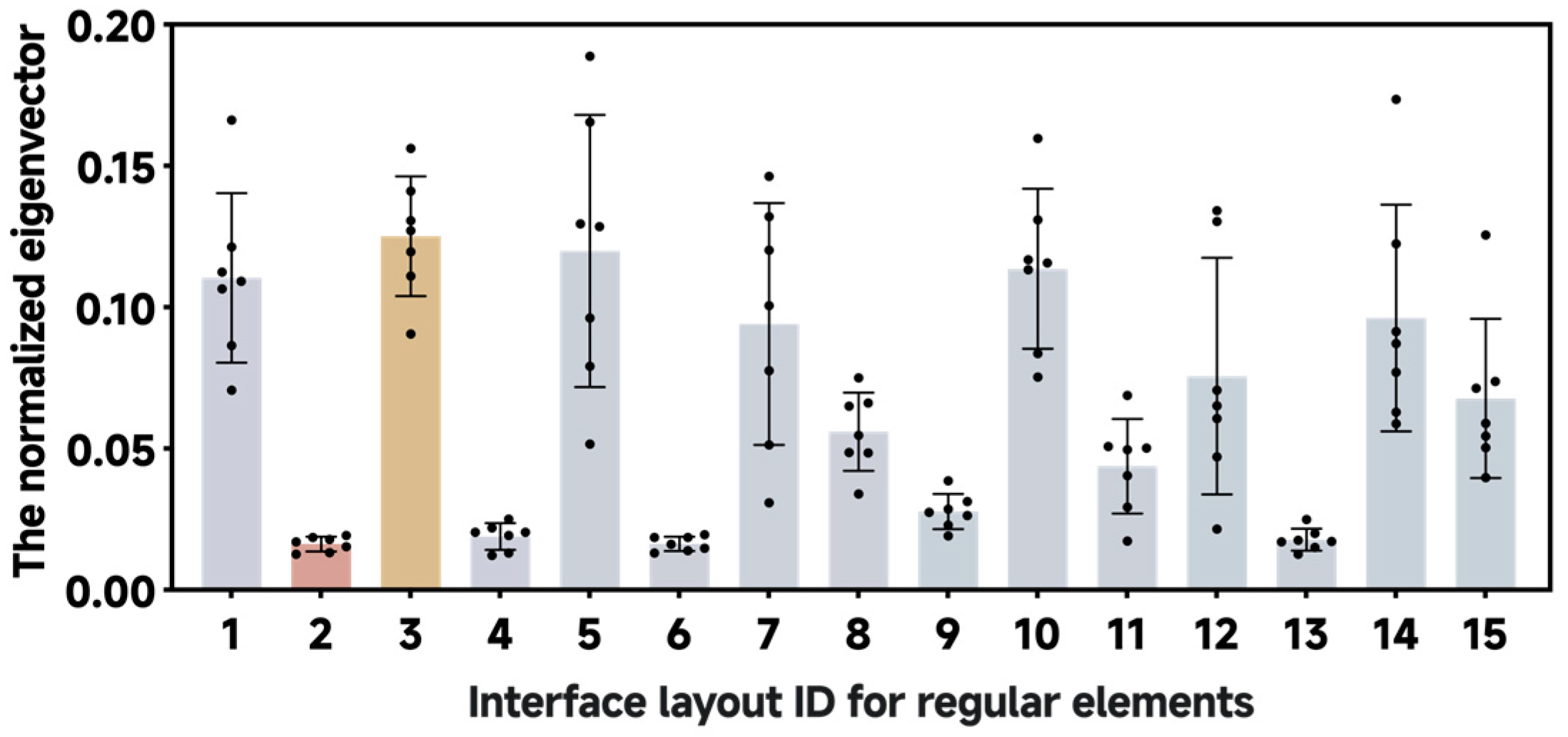
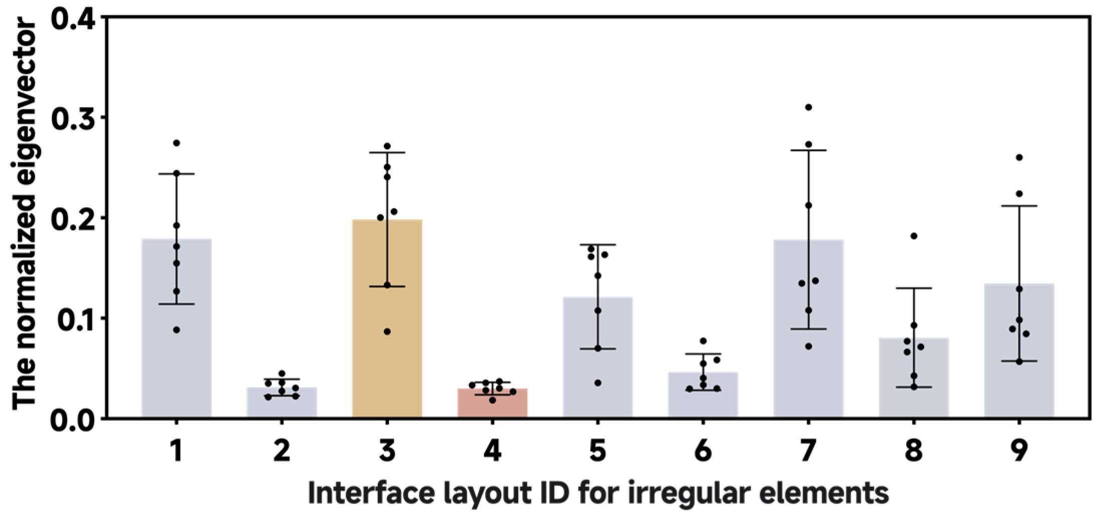
In relation to the judgment matrix that has successfully undergone the consistency check, the priority vectors (also known as weights), which represented the relative importance of each picture, were derived by calculating the eigenvector associated with the maximum eigenvalue () of each comparison matrix. This eigenvector was solved using the “eig()” function in MATLAB R2023b. Subsequently, the eigenvector was normalized to ensure its components sum to unity, thereby providing the weight for each picture. This normalized eigenvector served as an indicator of the participant’s perceived visual balance () scores. To determine an overall score that reflects the collective judgment of the expert panel, the arithmetic mean of the perceived visual balance () was calculated from those experts whose comparison matrices passed the Consistency Ratio () check for the same picture.
3.4. Baseline Model for Comparison
The classic balance degree calculation model proposed by Ngo et al. [
32], denoted as Model-N in the current study, served as the baseline method for Experiment 1. This model has been widely adopted in prior research on interface aesthetics and visual structure analysis due to its conceptual simplicity and mathematical transparency [
25,
26,
35,
36,
49,
75,
105]. Its core mechanism is an analogy based on the principle of leverage, which measures interface balance through a normalized asymmetry metric that assesses disparities in visual weight distribution along the horizontal and vertical axes. The balance degree
is defined as
where
,
,
,
represent the aggregated visual weights in the left, right, top, and bottom regions of the interface, respectively. These regions are identified by dividing the canvas along its central vertical and horizontal axes, allowing for a quadrant-based evaluation of mass distribution. The resulting balance metric
ranges from 0 to 1, with values closer to 1 indicating higher visual balance. The visual weight
for each region
is computed as
where
represents the area of the
-th object in region
,
denotes the Euclidean distance between the centroid of object
and the central axis of the interface,
indicates the total number of objects within region
.
Model-N utilizes symmetry axis analysis coupled with visual weight moment calculations, rendering it particularly suitable for layouts comprising regular geometric shapes aligned to a grid. Nevertheless, its applicability was confined to structured compositions and did not extend to dynamically balanced or complex arrangements. Therefore, this model was exclusively employed for comparison with the proposed initial model (Model-M) using the 15 regular interface pictures in Experiment 1.
3.5. Interface Elements Recognition
All computations related to the recognition of interface elements were performed using MATLAB R2023b, with the primary image processing operations supported by the Image Processing Toolbox.
The input pictures in
Figure 2 and
Figure 3 underwent preprocessing through binarization, employing an automatic threshold segmentation technique based on the Otsu algorithm, which maximizes between-class variance. The optimal threshold was determined using the “graythresh()” function, and the binary image was subsequently generated with the “imbinarize()” function. This approach effectively simplified the image data while preserving critical contour features. Subsequently, the binary image was subjected to connected component labeling for 8-connected regions. The “bwlabel()” function was utilized to identify discrete, connected regions, and the “regionprops()” function was employed to extract various geometric properties of each region, including the area of visual elements in Equations (8) and (17), centroid coordinates in Equations (1), (2) and (18), as well as the
and
in Equation (11).
3.6. Data Processing and Statistical Analysis
A statistical correlation analysis was conducted to assess the goodness of fit between the objective scores derived from each model and the human subjective benchmark scores. The raw numerical outputs generated by the proposed model for each subject were considered as the independent variable (). The AHP scores (the arithmetic mean of normalized eigenvectors), obtained from either experiment 1 or 2, served as the reference standard for measuring balance and were designated as the dependent variable (). The relationship between the computational results and the AHP standard was examined through simple linear regression analysis. All programming, statistical calculations, and analyses were performed using Python 3.12.4.
In each regression analysis conducted, the following statistical indices were systematically reported: (1) The results of the regression hypothesis test include the Shapiro–Wilk residual normality test (W), the linear hypothesis test (RESET p-value), the Breusch-Pagan homoscedasticity test (BP), the effect size (Cohen’s f2), and the power of the regression analysis (1 − β). (2) Overall model significance was evaluated using an ANOVA table comprising the F-statistic, degrees of freedom, and the associated p-value. A p-value less than 0.05 was interpreted as evidence of a statistically significant linear relationship between the independent and dependent variables, indicating the model’s general effectiveness. (3) Model goodness-of-fit was assessed through multiple metrics, including the coefficient of determination (R2 and Adjusted R2), the Pearson correlation coefficient (r), and the standard error of the estimate (Sy.x). An R2 value exceeding 0.7 (equivalent to r2 in simple linear regression) was indicative of strong explanatory power. Conversely, a lower Sy.x signified enhanced predictive accuracy. (4) Parameter estimates, specifically the slope and -intercept, were reported alongside their standard errors. Smaller standard error values were taken to imply higher reliability of these estimates. (5) Confidence intervals for the regression parameters were also provided, with particular emphasis on the 95% confidence intervals for the slope. For models that failed the regression hypothesis test or power analysis, we reported the confidence intervals calculated using the Bootstrap method (BCa, 5000 resampling iterations) to provide more reliable statistical inferences. If the confidence interval for the slope did not include zero, it was construed as evidence that the independent variable exerted a statistically significant effect on the dependent variable.