Article

Visual Moment Equilibrium: A Computational Cognitive Model for Assessing Visual Balance in Interface Layout Aesthetics

School of Mechanical Engineering, Southeast University, Suyuan Avenue 79, Nanjing 211189, China
*
Author to whom correspondence should be addressed.
Symmetry 2026, 18(1), 41; https://doi.org/10.3390/sym18010041
Submission received: 1 December 2025 / Revised: 19 December 2025 / Accepted: 22 December 2025 / Published: 24 December 2025
(This article belongs to the Section F: Engineering and Materials)

Abstract

Quick visual balance perception in layouts is essential for a positive user experience. However, existing computational models often struggle to accurately capture this key aesthetic aspect, particularly in interfaces with asymmetric elements. This paper introduces Visual Moment Equilibrium (VME), a new cognitive model that redefines visual balance as a unified perceptual force field, similar to moment equilibrium in physical systems. Based on principles from Gestalt psychology, spatial cognition, and psychophysics, we incorporate three main innovations: (1) a Measured Balance index enhanced with psychophysical transformations to enable sensitive quantification of visual imbalance; (2) a nine-grid visual weighting system combined with Manhattan distance to reflect human attentional distribution and non-Euclidean spatial reasoning; and (3) a Shape Sparsity Ratio with a piecewise compensation function that formally operationalizes the Gestalt principle of closure, especially for irregular visual elements. Validation against human perceptual benchmarks from the Analytic Hierarchy Process shows that the VME model has a strong correlation with expert judgments regarding regular interfaces (Pearson’s r = 0.942, accounting for 88.8% of the variance), outperforming the widely used model (33.9%). VME also maintains high predictive accuracy for irregular interfaces (r = 0.890), emphasizing its wide applicability across various design configurations.

1. Introduction

Aesthetic quality has transitioned from a supplementary attribute to a fundamental component of interface design [1]. As functional requirements are progressively fulfilled, aesthetic considerations have become essential for enhancing a product’s core competitiveness, increasing user satisfaction, and fostering long-term loyalty [2,3]. High-quality aesthetic design can significantly improve users’ experiences by arousing positive emotions and trust [4,5], thereby playing a crucial role in shaping brand identity and potentially improving users’ task performance [6]. The well-documented phenomenon known as the “Aesthetic-Usability Effect” posits that users tend to perceive visually appealing products as more usable, exhibiting greater tolerance for minor imperfections [7,8]. Despite a broad consensus on the significance of aesthetic considerations, evaluating aesthetic quality remains a challenging task [9,10].
Aesthetics is an inherently subjective psychological construct, with perceptions and evaluative criteria heavily influenced by individual differences and cultural contexts [1,11]. Variations in the interpretation of color metaphors, spatial arrangements, and graphical symbols across users are commonplace [12,13], and identical visual elements may evoke contrasting emotional responses [14]. Furthermore, factors such as age, professional background, aesthetic literacy, and emotional state significantly impact aesthetic judgment [15,16]. The multifaceted, diverse, and dynamically evolving nature of aesthetic preferences renders the development of a universal, standardized aesthetic evaluation system particularly challenging [17]. Early investigations primarily assessed interface aesthetics through parameters such as layout density, grouping, and complexity [18], the appropriateness of layout [19], decision nodes in interactive multimedia [20], and aesthetic fitness scores [21]. With advancements in expert evaluation and factor analysis methodologies, research progressively decomposed interface aesthetics into fundamental dimensions, including simplicity, diversity, colorfulness, and craftsmanship [1]. Subsequent efforts incorporated user experience factors (such as efficiency, unity, intensity, and comfort) into the evaluative framework [3,9,22,23] and enhanced the correlation among various indicators [24]. However, these approaches largely remained qualitative or semi-quantitative, lacking rigorous mathematical modeling and systematic quantitative analysis of the interactions among variables and their underlying mechanisms in human aesthetic judgment [25,26,27,28].
The aesthetic formula M = O/C (Aesthetic Measure = Order/Complexity), proposed by Birkhoff in 1933 [29], served as a foundational framework for the quantitative analysis of interface aesthetics. Nevertheless, the model has encountered substantive limitations in practical applications, primarily due to the absence of precise operational definitions for the concepts of “order” and “complexity” [30]. To mitigate these limitations, subsequent research has sought to expand and refine Birkhoff’s original framework from diverse perspectives. For instance, Beebe-Center and Pratt [31] decomposed the construct of “order” into sub-dimensions, including vertical and rotational symmetry, balance, horizontal and vertical cross-order, and asymmetry, thereby enhancing the correlation between the model’s quantitative outputs and subjective aesthetic judgments. Building upon these developments, Ngo et al. [32] introduced 13 visual indicators (such as balance, symmetry, and unity) to address layout challenges in data input interfaces, establishing a more systematic and quantifiable framework for aesthetic evaluation. Further contributions to this framework include Bauerly and Liu’s development of a computational model that examines how balance, symmetry, and the number of components affect interface aesthetics [33]. Moreover, Lai et al. [34] performed a quantitative analysis of visual balance and symmetry in color interfaces using the HSV color space. Zhou et al. [35] also identified key aesthetic factors, including balance, proportion, simplicity, and echo. They developed a twelve-item assessment system to measure interface aesthetics, supporting the systematic and practical application of these aesthetic theories. As understanding of aesthetic principles has evolved, prototype systems for automatic aesthetic assessment have been developed [26,36]. Collectively, these works depict a research path that combines perceptual cognition with computational methods, gradually developing an aesthetic evaluation framework that merges cognitive modeling and image recognition techniques. This offers efficient, objective quantitative support for rapid interface design iterations [26].
Despite their theoretical prominence, existing aesthetic evaluation systems often exhibit a disconnect between conceptual rigor and practical applicability in real-world design contexts [37]. These assessment frameworks, which typically involve a wide range of quantitative and qualitative indicators, impose considerable time, labor, and cognitive demands on users [38]. A critical comparative analysis reveals that such reductionist and atomized approaches are fundamentally misaligned with the way humans process visual aesthetics, as they evaluate components in isolation rather than through the integrative, Gestalt-based processes that characterize natural aesthetic judgment [39]. Empirical evidence demonstrates that users form initial aesthetic impressions within mere hundreds or even tens of milliseconds, relying on rapid, holistic perceptual mechanisms rather than sequential, detail-oriented analysis [40,41,42,43,44]. In contrast, standard itemized methodologies lack the capacity to capture these immediate responses, introducing a methodological incongruity. For example, while Zhou et al. [35] implemented dimensionality reduction using techniques such as factor analysis and grey relational analysis to streamline later stages of evaluation, such methods do not address the foundational inefficiencies of exhaustive indicator collection and measurement. In comparison to traditional, calculation-heavy assessments, a more effective evaluative approach would prioritize the identification and quantification of core visual dimensions directly responsible for overall appeal, aligning computational models more closely with the immediate, integrative nature of human perception [33,45,46].
Among various aesthetic qualities of an interface, layout appropriateness is fundamental to ensuring effective information transmission and overall system performance [19]. Improper layout in high-risk systems significantly increases the risk of safety accidents by amplifying hazards, delaying response, and escalating accident consequences [47]. Conversely, an expertly designed layout can effectively organize the information hierarchy, guide visual flow, and reduce unnecessary search behaviors, thereby decreasing users’ cognitive load and improving operational efficiency [48]. Visual balance constitutes a core principle in layout design [27,40]. It pertains to the equitable distribution of “visual weight” among interface elements based on attributes such as size, color, shape, and texture, ultimately fostering a composition that appears stable and harmonious [49,50]. Empirical studies have demonstrated a significant positive correlation between perceived balance and aesthetic appeal [34]. Visually balanced interfaces foster user comfort and a sense of stability, whereas unbalanced layouts elevate cognitive load, precipitate confusion or anxiety, and can prompt user disengagement [14,40]. This phenomenon is especially pronounced on small-screen devices, where limited screen real estate amplifies the perceptual and operational drawbacks of imbalance [51]. Notably, sensitivity to balance does not require professional training [52]. Research by Wilson and Chatterjee [53] shows that whether users are ordinary or experienced designers, most can quickly recognize an interface imbalance and instinctively prefer layouts that appear more balanced. This suggests that human judgment of visual balance is a highly automatic perceptual process driven by deep cognitive preferences. More importantly, Zhou et al. [35] conducted a factor analysis on multiple aesthetic dimensions and found that the variable “balance” accounted for as much as 42.267% of the variance, far surpassing other traditional aesthetic indicators such as “simplicity” and “proportion,” making it the most significant factor influencing overall aesthetic judgment. This finding strongly supports the dominant role of visual balance in intuitive aesthetic assessment [40,49,54].
The principle of balance is a fundamental organizing force in both the physical universe and human cognition [55]. The second law of thermodynamics states that entropy in isolated systems tends to increase toward equilibrium, a state of maximum energy uniformity. By contrast, open systems such as living organisms sustain internal homeostasis through ongoing exchange of matter and energy with their surroundings [56]. This drive for balance is reflected in psychological processes. For example, the opposing concepts of “Psychic Entropy” and “Flow,” as described by Csikszentmihalyi [57], demonstrate how the mind constantly seeks order and simplicity to manage environmental complexity and resist chaos. The propensity to maintain internal coherence, evident in both biological and psychological systems, reflects a converging imperative for stability amid rising entropy [58]. Gestalt psychology further explicates that the human visual system is predisposed to perceive order, harmony, and stability, with symmetry, particularly axial and central forms, serving as prototypical instantiations of balance due to their structured, readily processed configurations [50,59]. Nevertheless, in the context of contemporary digital interface design, strict adherence to geometric symmetry may constrain creative potential and produce monotonous layouts that fail to engage users [51,60]. As a result, modern interface design emphasizes a higher-level concept of “dynamic balance” [61] or “asymmetric balance” [62]. Designers have increasingly embraced the idea of dynamic or asymmetric balance, in which visual harmony is created by deliberately pairing differing visual weights, such as balancing large images with brief text or offsetting dense informational areas with strategically placed negative space [50,63].
Although notable shifts in contemporary interface design paradigms, most existing automated aesthetic assessment systems continue to operate within frameworks centered on absolute balance and fragmented measurements [26]. These systems typically rely on extracting a wide array of features, such as color distribution, layout density, element alignment, and symmetry ratios from user interfaces [32]. While such quantitative features may offer some explanatory power, they often involve complex mathematical operations and multi-parameter fusion strategies, and heavily rely on manually defined weighting systems to compute final aesthetic scores [12]. This approach not only increases computational cost but also introduces the risk of subjective bias. More importantly, such feature-based quantitative methods are fundamentally different from the rapid and holistic aesthetic perception mechanism of humans. As prior research has indicated [42], human evaluators can form holistic aesthetic judgments in as little as fifty milliseconds. Yet existing models fail to adequately capture the inherent holism and immediacy of human aesthetic perception. This cognitive misalignment results in a pronounced gap between the computationally derived aesthetic quality and users’ actual aesthetic experience [46]. The discrepancy becomes especially evident when evaluating novel, AI-generated interfaces that incorporate fluid transitions, organic shapes, and irregular structures. Traditional models, designed for regular and predictable elements, tend to yield higher prediction errors in such cases [26,50].
To address these challenges, this study introduces a computational cognitive model named Visual Moment Equilibrium (VME). Grounded in mechanisms of human visual cognition, the model captures the visual balance of both regular and irregular interface components in mathematical terms. Our goal is to develop an aesthetic evaluation cognitive model that more accurately represents the principles of human visual perception, thereby bridging the gap between computational aesthetic assessment and actual user experience. As interface design continues to evolve toward more expressive and adaptive forms, the Visual Moment Balance model offers a scalable and cognitively grounded foundation for automated aesthetic evaluation in next-generation human–computer interaction, UI/UX optimization, and generative design systems.
The rest of this paper is organized as follows. Section 2 defines the VME model, explaining its cognitive basis, mathematical structure, and extensions for irregular elements. Section 3 outlines the validation experimental approach, including stimulus design, benchmark setup using the AHP method, and baseline model. Section 4 presents the results of the computational and perceptual balance assessments, along with their correlation. Finally, Section 5 discusses the implications and limitations of our findings and outlines directions for future research. Section 6 concludes the paper.

2. Formalizing Visual Moment Equilibrium

2.1. Visual Balance from a Gestalt Perspective

Established in the 1920s by German psychologists Wertheimer, Koffka, and Kohler, Gestalt psychology provides a systematic framework for understanding how human perception organizes fragmented sensory inputs [1,64,65]. The core idea of this school is that “the whole is greater than the sum of its parts,” meaning that when people perceive the world, they do not identify each point, line, or color in isolation but tend to integrate visual elements into meaningful overall structures automatically. In interface design, Gestalt principles are widely applied to explain how users quickly recognize spatial relationships, functional connections, and visual hierarchies among interface elements [66,67]. For example, when multiple buttons are neatly arranged and spaced similarly, users will still perceive them as a functional group even without borders or grouping indicators.
As Koffka [68] clearly stated in his classic work “Principles of Gestalt Psychology,” there exists a structural correspondence, or “Isomorphism,” between perceptual experience and neural activity in the brain. He believed that the patterns of electrical activity in the cerebral cortex triggered by external stimuli are structurally consistent with subjective perceptual experiences [69]. Vision is not a passive process of receiving light signals but rather an active psychological process of construction [12]. This theory, which compares psychological processes to physical systems, is known as the “Psycho-physical Field” [68,70]. It explains why humans feel stable and harmonious about certain layouts while feeling confused or uneasy about others. When light enters the eye and projects onto the retina, it triggers a photochemical reaction. The signal is then transmitted via the optic nerve to the primary visual cortex (V1 area), and feature extraction and integration occur in higher-level visual areas [71,72]. This series of neural activities not only encodes basic geometric information, such as edges, directions, and movements, but also, through complex network interactions, generates higher-order perceptual attributes, including “visual weight,” “visual direction,” and “visual balance” [73]. Therefore, visual balance should not merely be regarded as an aesthetic preference but rather understood as a natural manifestation of brain physiological activities at the perceptual level, with an intrinsic mechanism structurally similar to mechanical systems in the physical world.
Arnheim [52] further explained in “Art and Visual Perception” that visual elements can generate perceptual “forces,” and when these forces reach a dynamic balance of mutual cancellation within a composition, a stable, comfortable, and aesthetically pleasing perceptual experience results. This mechanism closely resembles the principle of moment equilibrium in classical physics. In physics, the moment of force describes the tendency of a force to rotate an object around a specific point, calculated by the formula M   =   F   ×   d , where F is the magnitude of the applied force, and d is the perpendicular distance from the rotation axis to the line of action of the force (the lever arm). When multiple moments act around a reference point, such as a fulcrum, and the total moments in the clockwise and counterclockwise directions are equal, the system is in a state of equilibrium or uniform rotation, known as moment balance, which is mathematically expressed as M = 0 [74]. Arnheim’s theory reveals the isomorphism between perceptual activities and physical mechanics in structure. This isomorphism is not a simple metaphor but implies that we can borrow the rigorous mathematical models of physics to describe and quantify perceptual phenomena. Just as neuroeconomics employs game-theoretic models, establishing a mathematical model based on torque for visual balance has strong theoretical foundations [12,32,33].
Drawing on the physical composition of a moment, Zhou et al. [75] pioneered the concept of “moment” into visual analysis. They proposed the components of “visual moment,” which consist of two main elements: one is the “visual weight” triggered by interface elements, including their size or other visual attributes (e.g., color, shape, contrast [49]); the other is the “visual distance” between the element and the center of the interface, usually manifested as the centrifugal distance or the relative position in the layout. The visual moment can be expressed as the product of an element’s visual weight and its visual distance. This means that a small but brightly colored button may have a significant visual weight. If placed far from the center, the visual moment it generates will be significantly amplified. However, the field still lacks a unified, computable core concept that can precisely describe the overall layout balance state. Most existing studies have continued to use the qualitative term “visual balance” and have failed to elevate it to a theoretical construct with strict mathematical definitions and operational feasibility.
To fill this conceptual gap and lay the foundation for our computational model, this study formally proposes and defines “Visual Moment Equilibrium” as follows:
Visual Moment Equilibrium is achieved when the visual moments generated by all interface elements relative to a designated reference point (typically the interface’s visual center) counterbalance each other, resulting in a net moment of zero. This state corresponds to the user’s perception of a visually balanced interface.
Since the distribution of visual weight in a composition can be thought of as analogous to the distribution of mass in a physical object, and its balance point is conceptually similar to the center of mass, an interface attains a state of “visual moment equilibrium” when the aggregate centroid of all visual elements precisely aligns with the user’s psychologically anticipated visual center [12,62]. Mathematically, this equilibrium condition is defined as follows:
i n S i x i x c e n t r o i d = 0
i n S i y i y c e n t r o i d = 0
where S i represents the area occupied by each visual element in the interface. x i and y i represent the centroid coordinates of each visual element in the Cartesian coordinate system. x c e n t r o i d and y c e n t r o i d denote the coordinates of the overall centroid of all visual elements within the interface, indicating the ideal balanced position.
Moreover, a simple and effective quantitative index, termed the Measured Balance ( B m ), is proposed to quantify the deviation between the ideal balanced position and the anticipated visual center. This metric is defined as follows:
B m = 1 D c e n t r o i d D m a x
B m = e 5 · B m 1
where D c e n t r o i d represents the maximum distance from the ideal balanced position of the interface to its closest layout boundary, it specifically measures the distance from the centroid of all visual elements to the farthest of the four interface boundaries (top, bottom, left, and right). This metric reflects the actual spatial offset of the element’s centroid within the Cartesian coordinate system. D m a x , on the other hand, is the distance from the geometric center of the interface to the farthest boundary in the same direction, which should align with perceptual considerations in human cognition. The ratio D c e n t r o i d by D m a x quantifies the extent to which the actual centroid of the visual element deviates from the geometric center of the interface from a perceptual perspective. B m ranges from 0 to 1. When B m → 1, it indicates that the overall centroid of all visual elements is very close to the center of the interface, leading to a well-balanced overall layout; when B m → 0+, it suggests that the centroid significantly deviates from the perceived center, which can cause discomfort or distraction for users during browsing [51].
Additionally, to improve the sensitivity of B m to highly balanced layouts, a nonlinear transformation, B m , for normalization, is introduced, grounded in the universal law of psychophysical functions. This transformation is grounded in the psychophysical principle that the relationship between perceptual intensity and physical stimulus magnitude is inherently nonlinear. Specifically, human perception exhibits heightened sensitivity as the stimulus approaches an ideal or threshold state [76,77]. Building on this principle, the proposed transformation employs an exponential function with a coefficient of 5 to amplify subtle deviations and impose more substantial penalties on imbalanced layouts. This coefficient was determined through preliminary sensitivity analysis to closely align with the nonlinear characteristics observed in human perceptual judgment. As a result, this method guarantees that in the critical high-balance range ( B m > 0.9), even slight differences in visual mass are greatly amplified.

2.2. The Cognitive Process of Perceiving Visual Distance

In computer vision and machine learning, the choice of distance metric significantly affects computational performance [78]. Euclidean distance is one of the commonly used metrics [79], widely applied in tasks such as clustering (e.g., k-means), k-nearest neighbor classification, dimensionality reduction, and feature matching to measure the similarity of samples [80,81]. Its two-dimensional form is the straight-line distance between two points: d = x 2 x 1 2 + y 2 y 1 2 . This metric assumes that the data is located in an isotropic, continuous, and uniform space, where the cost of moving a unit distance in any direction is the same, and there are no path obstacles. This assumption provides good rotational, translational, and scale invariance, making it a common choice for evaluating visual distance in computational aesthetics [32,33,46,49].
However, in real-world human perception and behavior, the geometric assumption that “the straight line is the shortest” often fails to hold. Human spatial cognitive mechanisms significantly deviate from strict Euclidean rules. As early as 1979, Cadwallader [82] found through a series of behavioral experiments that people exhibit apparent asymmetry and non-transitivity when estimating spatial distances. For instance, the cognitive distance from location A to B might be greater than that from B back to A; the relative distances among three points may also violate the triangle inequality. These phenomena indicate that humans do not represent space with precise Cartesian coordinates but rely on context-dependent, experience-driven mental maps for reasoning. Subsequent extensive research has further confirmed that there is a systematic deviation between “cognitive distance” and “physical distance,” a phenomenon known as “distance distortion” [83,84]. This distortion occurs when humans overestimate or underestimate physical distances during spatial cognition. For example, in urban environments, influenced by factors such as landmark distribution, path complexity, and visual occlusion, pedestrians tend to significantly overestimate the length of sections with frequent turns or poor visual continuity.
Further research indicated that human judgment of spatial relations does not rely on directly extracting Euclidean parameters, but instead involves a complex cognitive integration process. The psychophysical experiments by Dopkins and Sargent [85] demonstrated that when judging the distance between two sets of points, people do not automatically calculate the straight-line distance. Instead, they estimate the horizontal and vertical displacement components separately and then combine them using some weighted method. In visual balance and composition judgment tasks, Gershoni and Hochstein [86] found that observers’ aesthetic judgments depend on global processing mechanisms, including figure grouping, object recognition, and a focus on horizontal and vertical elements, rather than mechanical calculation. Warren [87], based on virtual reality navigation tasks, proposed that human spatial knowledge resembles a “tagged graph” structure. This model consists of nodes (such as intersections and landmarks) and connecting edges (paths), and the entire network lacks a unified global coordinate system. This distributed and fragmented representation offers a more comprehensive explanation for the systematic violations of metric rules in human navigation.
Although these cognitive characteristics of the human visual system (HVS) are manifested as “biases” in a strict measurement sense, they offer significant insights for enhancing computational models [88]. Čadik [89] and McNamara et al. [90] noted that the HVS is better at quickly extracting structural information such as edges, contours, directions, and contrasts, but is relatively weak at accurately estimating absolute distances, angles, or areas. Because of this, recent studies have increasingly explored alternative measurement methods that are more cognitively reasonable, with the most prominent being the Manhattan distance, also known as the city block distance or L1 distance [91]. It is defined as d   =   | x 2     x 1 |   +   | y 2     y 1 | , representing the sum of the absolute differences in each coordinate axis. This metric mimics the actual path length traveled along a grid-like road system of vertical and horizontal streets, without cutting across blocks. It aligns more closely with natural human movement patterns in structured environments, such as city streets, building corridors, or chessboard layouts. From a computational efficiency view, Manhattan distance offers notable advantages. Since it involves only simple operations such as integer addition, subtraction, and absolute value, without floating-point multiplication or square root calculations (as in Euclidean distance), it far surpasses Euclidean distance in computational complexity, speed, and hardware resources [92].
Building upon the mathematical formulation of Manhattan distance, the metrics D c e n t r o i d and D m a x in Equation (3) are computed as follows:
D c e n t r o i d = x c e n t r o i d x c e n t e r + y c e n t r o i d y c e n t e r
D m a x = x m a x x c e n t e r + y m a x y c e n t e r
where x c e n t e r and y c e n t e r represent the geometric center coordinates of the interface that humans perceive.

2.3. Factors Affecting Visual Weight

The assessment of interface balance conventionally uses the geometric center as a reference point [32,33]. However, empirical evidence from visual psychology indicates that the perceived center of balance is often situated slightly above the true geometric center, influenced by physiological factors and reading habits [93]. This perceptual asymmetry is further modulated by functional hemispheric lateralization [94]. Given that the left cerebral hemisphere is predominantly responsible for language processing in most individuals, there is an increased attentional sensitivity to information presented on the right side of the visual field [95]. Consequently, elements on the left side of an interface are often seen as lighter, while those on the right carry greater visual weight, conveying a more solemn or stable impression [96]. Research by McManus et al. [97] further suggested that balance along the vertical axis (left-right balance) is perceptually more critical for aesthetic appeal than balance along the horizontal axis (top-bottom balance). This aligns with the natural visual flow, which typically proceeds from left to right and top to bottom [98].
Building on this foundation, Zhou et al. [35] introduced the quantifiable concept of “visual dominance,” positing that the cognitive processing efficiency for interface information is not uniform but varies systematically across distinct regions. They partitioned the interface into four quadrants, assigning specific ratios: upper-left (33%), upper-right (28%), lower-left (23%), and lower-right (16%) [35]. This distribution pattern closely aligns with the F-shaped reading pattern [60]. In a complementary view, Jahanian [27], drawing upon Arnheim’s structural skeleton theory [52], emphasized the paramount role of the central interface region as a locus of visual attention and perceptual stability. Their findings demonstrated that a densely information-rich central zone can preserve overall compositional equilibrium, even in the presence of peripheral asymmetry. Although Jahanian’s research findings are compelling qualitatively and his heat map of hotspots closely aligns with Arnheim’s predicted “visual hotspots,” it has not yet established precise quantitative proportion parameters, which limits its use in automated design tools.
While the quadrant-based model accounts for salience variations along both horizontal and vertical directions, it offers a coarse subdivision that lacks granularity in the critical central area. Established compositional techniques, such as the golden ratio and the rule of thirds (nine-grid method), are predicated on the high attentional priority of the central zone and its strategic points. To align with established visual habits and to operationalize the distribution of visual attention within a computational model, we adopted a nine-grid layout as a cognitively reasonable parametric framework, initialized based on existing visual attention literature. The integration of quadrant-based visual dominance data derived from digital interface research [35] provided a foundational distribution, which was then interpolated across the finer nine-grid structure. Each cell was assigned a normalized contribution coefficient based on its position, proximity to high-attention intersection points, and alignment with dominant scanning patterns, as detailed in Table 1. This parameterization serves as a theoretically informed starting point for modeling attentional bias, acknowledging the assumed continuity of core cognitive mechanisms (e.g., central preference, reading-direction bias) across visual media [27].
The calculation for visual dominance weight in nine-grid redistribution is as follows:
w j = k : j Q k D k · C k j
where w j is the visual dominance weight of the j -th cell in the nine-grid distribution, with j ranging from 1 to 9. Q k denotes the set of k quadrants to which cell j belongs. D k is the visual dominance ratio of the k -th quadrant, as defined by [35], with k from 1 to 4. C k j is the contribution coefficient of cell j within quadrant k , described in Table 1. Based on Equation (7), the redistribution weights for the nine-grid visual dominance are as follows: cell 1 (8%), cell 2 (14%), cell 3 (7%), cell 4 (13%), cell 5 (23%), cell 6 (12%), cell 7 (6%), cell 8 (11%), and cell 9 (6%). Building upon the concept of visual dominance weight w j , the metric S i in Equations (1) and (2) is computed as
S i = j = 1 9 w j · a i j
where a i j is the number of filled pixels belonging to the i -th visual element that are located within the j -th cell. Accordingly, x c e n t e r and y c e n t e r in Equations (5) and (6) are computed as
x c e n t e r = i = 1 3 x i W i x i = 1 3 x i W i
y c e n t e r = j = 1 3 y j W j y j = 1 3 y j W j
where W i and W j represent the sums of the visual dominance weight assignments along the x -axis and y -axis segments, respectively. As the interface is divided into three segments along each axis, the indices i and j range from 1 to 3.

2.4. Visual Weight Calculation for Irregular Elements Interface

Graphics and shapes constitute fundamental units of the visual language employed to interpret both the physical and digital realms. From a geometric standpoint, graphical elements can be broadly categorized into regular and irregular forms. Regular graphics, such as circles, rectangles, and regular polygons, are characterized by symmetrical, uniform structures governed by geometric principles that can be expressed by precise mathematical formulations, thereby facilitating straightforward modeling and computational processing. Conversely, irregular graphics, exemplified by natural landform coastlines and venation patterns in botanical leaves, generally lack consistent geometric constraints, exhibit intricate and convoluted boundaries, and often display fractal characteristics or non-linear shapes. These complex forms resist direct articulation through a singular mathematical expression, necessitating the application of decomposition-sum strategies or approximate fitting methods for numerical analysis [99]. In human–computer interaction contexts, irregular graphical elements are prevalent and serve crucial aesthetic and functional roles. These elements diverge from conventional geometric shapes, often comprising complex paths or more organic, naturalistic forms. Typical instances include, but are not limited to, linear or planar pictographic icons (e.g., menus or search functions), corporate logos or character imagery, irregularly shaped interactive buttons (such as the “Like” button on Instagram), pop-up notification bubbles, rounded-rectangle cards equipped with diffuse shadows, specialized sidebar designs (e.g., fan-shaped menus emerging from screen corners), curved bottom navigation bars (e.g., capsule or tray shapes), data visualization charts (including line graphs, river plots, or Venn diagrams), as well as boundary effects such as magnetic edges or ripple effects during drag-and-drop operations.
Previously, irregularly shaped layout interfaces were often approximated by regular geometric shapes [28]. Human perception, however, functions not merely as a passive recording mechanism for physical features but as an active process of organization and interpretation. In this perceptual process, the law of closure, as articulated by Gestalt psychology, plays a key role [100]. Specifically, when an observer perceives a shape with an incomplete outline (such as an arc that is nearly complete), the visual system instinctively interpolates the missing segments, thereby perceiving the shape as a whole. This tendency towards perceptual completion implies that human perception synthesizes incomplete or irregular visual stimuli into more coherent and stable percepts. Consequently, the perceptual weight of an irregular shape cannot be solely determined by its pixel area or geometric dimensions. Instead, it is predominantly influenced by the perceived area of the entire, regularized shape, constructed by the brain via perceptual completion. Relying solely on pixel distribution as a metric for visual weight may thus lead to misestimations of the perceptual impact of irregular shapes [101].
To better address this perceptual bias and provide a general strategy for visual balance assessment of interface graphics with irregular elements, we proposed a correction method based on the minimum convex polygon for calculating visual weight. The minimum convex polygon serves as a perceptual proxy because it provides a balance between computational efficiency and cognitive plausibility. Its regular, convex form aligns with the Gestalt principle of good form, which emphasizes smooth and cohesive shapes as indicators of visual unity. In contrast, concave hulls tend to incur excessive computational complexity, and bounding rectangles inadequately capture the orientation and overall shape of the visual element. This method identifies the outer contour of the graphical element. It estimates the area enclosed by the shape after shape finalization, thereby providing a cognitive-level correction to traditional pixel-based visual weight calculations. This approach yields a practical and reliable approximation for a broad range of irregular interface elements (such as icons and speech bubbles), particularly in engineering contexts demanding rapid computation across numerous elements. The formula is provided as follows:
R s = S r e a l S m c p
where S r e a l is the actual pixel-based area of the irregular shape, S m c p is the area of its minimum convex polygon, representing the maximum contour as it approaches completion. R s , introduced in this study, denotes the shape sparsity ratio that balances “seeing the true shape” and “seeing the shape after Gestalt completion,” ranging from 0 to 1. This indicator measures the “filling degree” of the shape. If R s approaches 0, it indicates the shape is sparse (e.g., a thin circular or L-shaped frame) with a small area. If R s approaches 1, it suggests the shape is dense, filling the convex hull (e.g., a solid cloud shape), with a large area.
To compute the perceptual visual weight, denoted as S p e r c e p t i o n , a piecewise function is formulated to simulate the nonlinear attenuation of the Gestalt cognitive compensation phenomenon during human perception of irregular elements within interfaces. This nonlinear relationship is inspired by the concept of “support-ratio” strength in the perceptual system, particularly in relation to illusory figures [102]. The support-ratio denotes the proportion of a contour or structure that is explicitly defined in the stimulus relative to the segment that must be extrapolated or inferred by the observer. In well-documented phenomena like the Kanizsa square, which has a high support ratio, observers can reliably perceive edges and shapes even when the visual information is discontinuous or incomplete. This cognitive modeling approach is supported by electrophysiological evidence of visual perception, particularly in how the human brain tends to fill in missing information to create coherent and recognizable patterns [103]. The cognitive compensation effect is strongest when a figure requires only minimal filling to close, resulting in a higher perceived salience or visual weight. Conversely, as the figure becomes more complete and less inferential processing is needed, the magnitude of this compensatory effect decreases rapidly. The computational formulation of S p e r c e p t i o n is expressed as follows:
S p e r c e p t i o n = 2 R s · S r e a l ,   0 < R s 0.5 2 e 2.773 · 1 R s 2 · S r e a l ,   0.5 < R s 1
The segment for 0 < R s ≤ 0.5 indicates a strong closure effect. The expression 2 R s · S r e a l models the regime where the visual closure effect is most prominent. In this range, the visual system shows a strong tendency to perceptually complete figures, including sparse shapes such as wireframes or thin-line icons. The linear term 2 R s acts as a decaying amplifier factor, ensuring that as R s → 0+, the perceived weight approaches twice the actual area, imposing a plausible upper bound for extremely sparse structures. The linear decay with increasing R s shows that the closure effect weakens as the shape becomes less sparse. At R s = 0.5, S p e r c e p t i o n = 1.5 S r e a l , indicating a 50% perceptual amplification.
The segment for 0.5 < R s ≤ 1 indicates an attenuated closure effect. The expression 2 e 2.773 · 1 R s 2 · S r e a l governs the behavior for denser shapes, where the closure effect diminishes smoothly. The design of this segment is based on an exponential decay kernel. The term 1 R s quantifies the “degree of incompleteness.” Its square, 1 R s 2 , ensures smoother dynamics near R s = 1. The exponential function e 2.773 · 1 R s 2 captures the rapid initial decline and subsequent asymptotic vanishing of the perceptual effect as the shape approaches completeness. The specific parameter 2.773 is found by solving the mathematical constraints that ensure the continuity of the function value and the smoothness of the first derivative at R s = 0.5. Crucially, as R s → 1, the term 1 R s approaches 0, causing the exponential term to approach 1 and thus S p e r c e p t i o n to approach S r e a l . This convergence ensures that the perceptual weight equals the physical area for fully solid shapes, where no visual completion is needed.

2.5. Visual Balance Assessment Framework with the VME Model

This section combines the model’s components into the unified Visual Moment Equilibrium (VME) and presents the visual balance assessment framework.
The framework begins with interface preprocessing, employing image recognition to binarize the interface. This allows each stimulus element to be recognized as black blocks and automatically extracts their position data, including the centroid coordinates, and calculates each element’s pixel area. After gathering this essential information, we apply the equations defined in the VME model to perform the calculation. The central part of the VME model evaluates the visual balance of interface layout with regular elements and processes these elements in order:
  • Calculates a cognitively adjusted visual weight for each element by integrating its pixel area with the nine-grid dominance weights in Equation (8).
  • The perceptual center of the interface is then determined as the fulcrum for moment calculation (Equations (9) and (10)). The model subsequently computes the aggregate visual moments relative to this center (Equations (1) and (2)).
  • The deviation from perfect equilibrium is quantified by the Measured Balance index B m , derived from the Manhattan distance offset of the visual centroid (Equations (3), (5) and (6)).
  • A final psychophysical transformation in Equation (4) yields the score B m , enhancing sensitivity for high-balance layouts.
  • For irregular elements, a pre-processing extension is applied. It calculates the shape sparsity ratio R s in Equation (11). It uses a piecewise function Equation (12) to compute a perceptually corrected visual weight, S p e r c e p t i o n , which accounts for the Gestalt closure effect. This weight is then fed directly into the central part of the VME model.

3. Methodology for Validation

3.1. Experimental Design

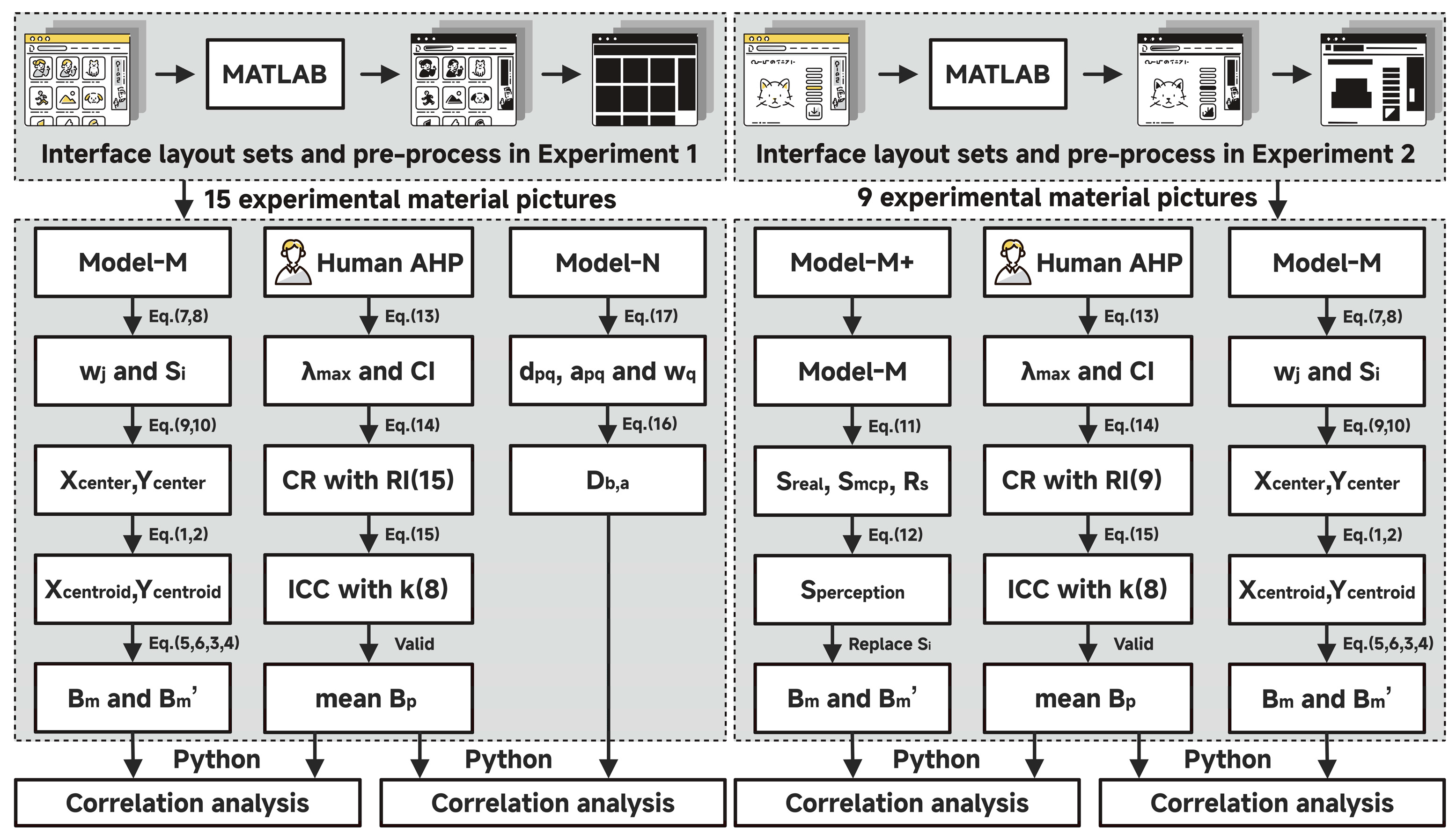
This study used a computational modeling validation framework to assess the effectiveness of the proposed visual balance evaluation model across different interface layouts configurations, specifically regular element-based and irregular element-based interfaces. As shown in Figure 1, the validation protocol comprised two sub-experiments: (1) the comparative performance analysis of calculation methods on regular interfaces, and (2) the validation of calculation methods enhancements on irregular interfaces. In both sub-experiments, the human-perceived visual balance scores derived from a single-level Analytic Hierarchy Process (AHP) served as the benchmark criterion. The performance evaluation involved assessing how closely the model’s results aligned with human subjective judgments.
The first sub-experiment compares the proposed central part of the VME model, which contains Equations (1)–(10), and which we call “Model-M” for short, with the traditional calculation method developed by Ngo et al. [32], which we label “Model-N.” The primary objective was to evaluate whether Model-M predicts human balance perceptions more accurately than Model-N for regular interface layouts. The second sub-experiment evaluates the effectiveness of the optimized version, “Model-M+,” which adds Equations (11) and (12) to Model-M and is designed to handle irregular interface geometries. The performance of Model-M+ is compared with that of its predecessor, Model-M, to determine whether it better reflects human visual balance perception at irregular element interfaces.

3.2. Experimental Materials

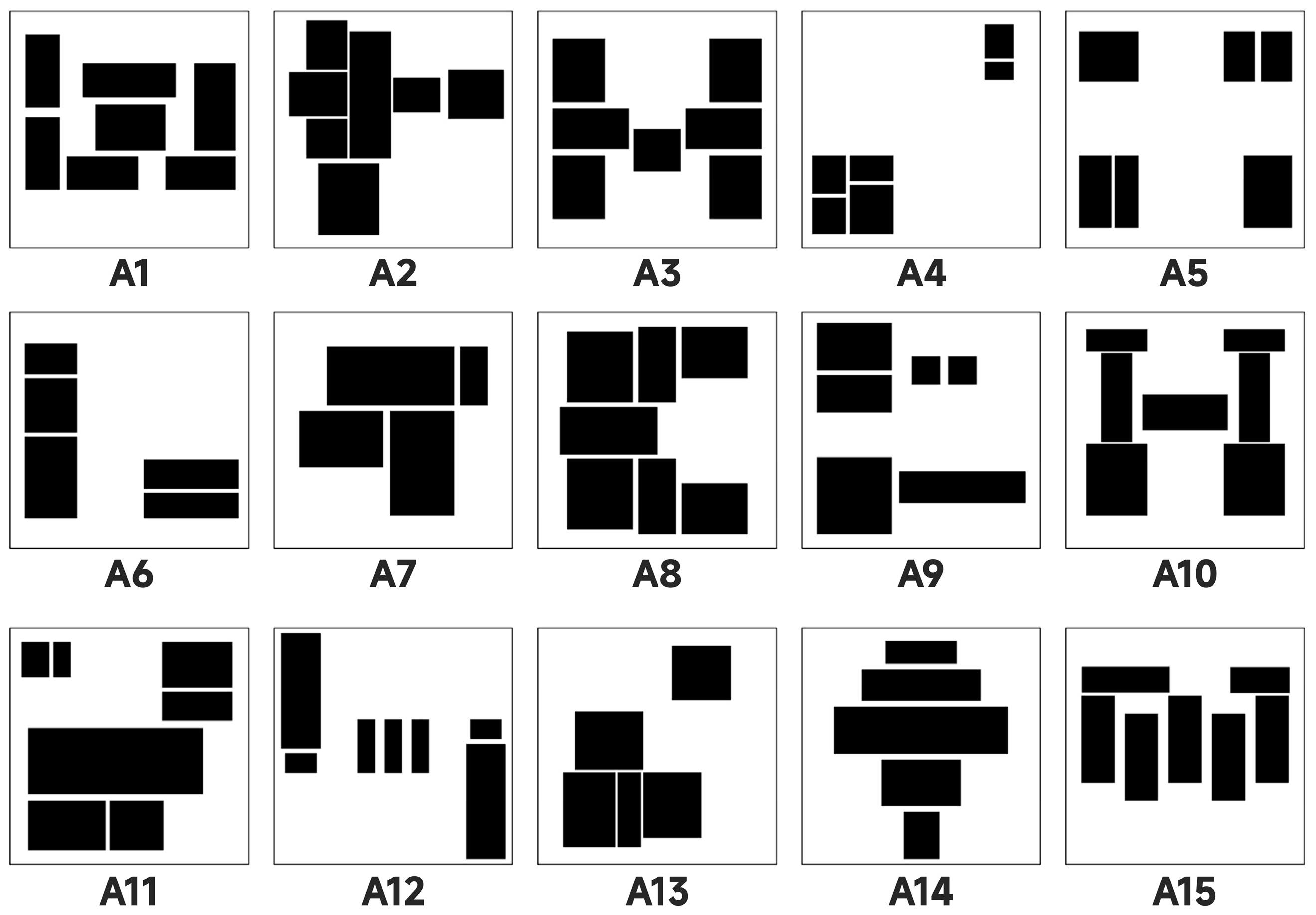
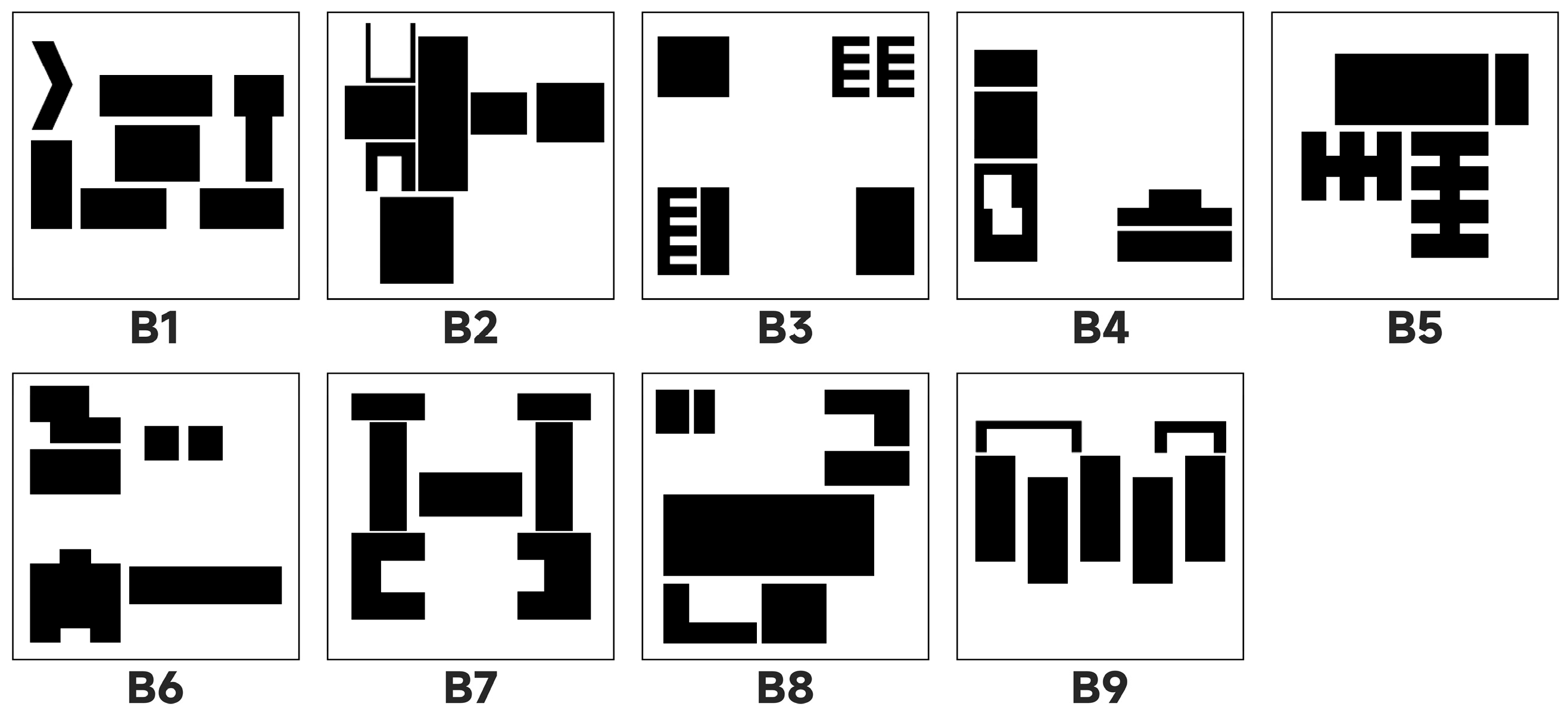
The materials employed in this investigation consisted of two sets of highly abstracted interface layout pictures, as illustrated in Figure 2 and Figure 3. These designs are built on paradigms from earlier research that transform real interfaces into block-overlaid images [104]. The main approach involves systematically abstracting real user interfaces with textual content, such as web pages and mobile app interfaces. It retains the spatial positions, relative sizes, and layout structures of elements from the original interface while converting specific content elements, like text blocks, icons, and buttons, into non-semantic geometric shapes. This method effectively removes the influence of higher cognitive factors such as language comprehension, functional expectations, and brand familiarity on the observer’s judgment, allowing a focus on pure visual organization rules [25]. Specifically, two distinct material sets were developed: the first set consisted of 15 interfaces composed entirely of regular rectangular elements. These rectangles are highly uniform in shape, with clear boundaries, and their arrangement includes various typical layout patterns such as central symmetry, grid distribution, and linear alignment, representing the common structured design style in modern digital interfaces. The second group contains 9 interfaces, whose elements feature irregular and organic contours, mimicking the free forms in nature or hand-drawn styles, aiming to explore the impact of non-standardized and more artistic layout forms on visual perception [25,26,105].
It is worth noting that the core objective of the two experiments is to verify the computational model’s effectiveness in simulating human visual perception, particularly its ability to calculate and evaluate the aesthetic features of interface layouts. It does not aim to conduct a broad investigation of user interface design itself. Instead, the stimuli used in the research were not randomly selected or randomly generated images, but carefully planned and structurally designed visual samples. The aim was to present a series of key visual elements systematically. These stimuli covered multiple classic aesthetic dimensions, including balance and imbalance, symmetry and asymmetry, the concentration and dispersion of element distribution, the different positions of the visual center in the picture (such as top, bottom, left, right or geometric center), the strategic use of negative space (i.e., blank space), the linear arrangement method, and whether the graphics have symbolic or representational features.
The various dimensions mentioned above do not exist independently; they are interconnected through specific, opposing, or complementary relationships, forming the basic framework of visual balance in digital interfaces. For example, a symmetrical layout usually conveys stability and order, while asymmetrical designs can create dynamic tension. The shifting of the visual center of gravity influences where users focus their attention, and proper use of negative space can improve information hierarchy and create a sense of breathing room. By controlling these variables, researchers can test how the model responds to different composition patterns under controlled conditions and determine whether it accurately reflects the perceptual tendencies of human observers when they encounter similar layouts.
Although the stimulus set used in this study is not large or diverse for real-world interfaces (e.g., colorful or multimodal), its highly intentional and representative design ensures it includes the common visual structures typically found in interface design. Therefore, it is adequate to endorse an in-depth analysis of the model’s performance. This refined and targeted design approach renders this dataset particularly suitable for assessing the capability of computational models to comprehend the arrangement of layouts, perceive structural stability, identify attentional guiding mechanisms, and infer implicit shapes or pathways.
Standardizing stimulus processing is essential in experimental design. By keeping image sizes within a consistent range, researchers can effectively eliminate perceptual biases caused by varying original image sizes. Differences in screen sizes, resolutions, and display ratios across devices can lead to issues such as stretching, compression, or uneven white space, distorting human perception of spatial relationships. From a cognitive psychology perspective, when the human visual system processes two-dimensional information, it naturally creates a reference coordinate system based on the bounding box. Then it assesses the relative positions and visual weight of elements. Ensuring all images share the same enclosing rectangle makes comparisons easier within a consistent spatial framework, preventing shifts in the psychological reference system caused by different canvas sizes. Therefore, all visual stimuli were uniformly scaled to a fixed size of 300 × 300 pixels to ensure that the results reflect human perception of the interface layout rather than unintended effects from external presentation conditions.
Based on Equations (7), (9) and (10), the geometric center coordinates of the interface perceived by humans ( x c e n t e r , y c e n t e r ) were calculated as (149, −144), with the Cartesian origin (O) at the top-left corner. To ensure consistency of visual elements, a high-contrast monochromatic color scheme was adopted (RGB: information block 0, 0, 0; background 255, 255, 255), effectively minimizing confounding effects of color and texture. This image-processing strategy ensured that the layout’s influence on the perception of balance could be reliably isolated and measured, thereby supporting the internal validity of the experiment [105]. Additionally, by maintaining comparable total sizes of informational blocks, consistent spatial spacing, and limiting the number of blocks between 4 and 7 [106], the potential influence of visual complexity on expert cognitive load and attentional focus was effectively controlled.

3.3. Benchmark: Evaluation of Perceived Visual Balance Based on Single-Level AHP

Using subjective ratings from human subjects as the benchmark for computational aesthetics evaluations was regarded as one of the most dependable and widely accepted methods for connecting human aesthetic experiences with computational models [61]. While common subjective rating instruments such as Likert scales or semantic differential scales offer ease of application, they frequently lack the capacity to accurately represent the relative preferences among design alternatives with the requisite mathematical precision for computational modeling, as they typically generate ordinal data rather than ratio data [107]. The Analytic Hierarchy Process (AHP), formulated by Saaty [108], was a rigorous decision-making framework grounded in analytical hierarchy theory. It systematically decomposed complex problems into structured hierarchical components comprising criteria and alternatives. Utilizing a standardized scale for pairwise comparisons, AHP effectively managed multi-criteria decision analysis by translating subjective judgments into quantitative ratio-scale data. This methodological approach facilitated the integration and modeling of multiple evaluation dimensions, thereby enhancing decision accuracy and consistency. Nevertheless, in contexts such as evaluating interface layout aesthetics, where subjective, intuitive perception predominates, comprehensive judgment frequently surpasses the linear aggregation of individual criteria [42]. To precisely gauge users’ overall perception of visual equilibrium in interface layouts, this study omitted the criteria tier and adopted the core structure of AHP, specifically a single-level model [109]. Participants were directly prompted to perform pairwise comparisons of sample designs within the overarching category of “overall balance perception.” This methodology preserved AHP’s principal advantage, transforming subjective evaluations into a ratio scale, while minimizing cognitive load during multiple judgments and more accurately capturing the holistic “Gestalt” perception of balance [110].

3.3.1. Participants

The reliability of decision-making in the Analytic Hierarchy Process (AHP) depends more on evaluators’ professional competence than on the number of participants [108]. It typically involved a panel of 2 to 11 experts selected based on their relevant expertise and familiarity with the subject matter [111,112,113].
Utilizing purposeful sampling methods, 8 aesthetic evaluation experts (comprising 4 males and 4 females; mean age = 37.13 years, standard deviation = 4.22) were recruited for this investigation, aligning with the conventional “rule of thumb” concerning the number of experts necessary [114]. This panel included 6 industry practitioners and 2 academic researchers. All participants were required to satisfy the following inclusion criteria:
  • A minimum of eight years of professional experience in related fields such as visual design, user interface design, or human–computer interaction;
  • Possession of a master’s degree or higher, along with holding a senior position (such as senior designer or associate professor) in their respective institutions;
  • Good health status, with no history of neurological or visual impairments.
Since the AHP relied exclusively on subjective online scoring, without recordings or photographs, and all expert data were provided anonymously, ethical approval was not required for this study. Participants voluntarily signed a written informed consent form after fully understanding the study’s purpose. Participant demographics are shown in Table 2. Their expertise encompassed interaction design, visual aesthetics, and familiarity with composition principles, thereby ensuring informed evaluations from both practical and theoretical perspectives.

3.3.2. AHP Evaluation Process

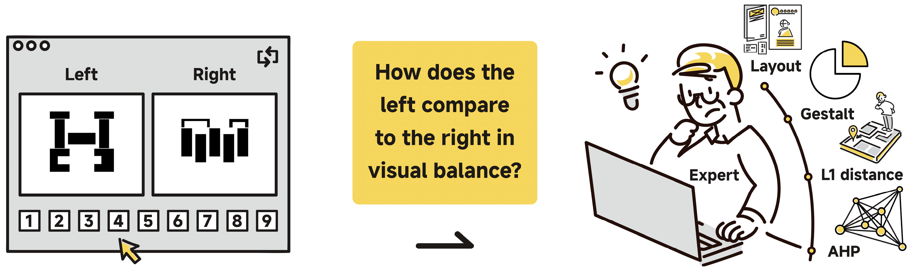
The Analytic Hierarchy Process (AHP) evaluation for Experiments 1 and 2 was conducted using the online survey platform Wenjuanxing on experts’ personal computers. During each iteration of independent assessments, the platform presented pairs of pictures, either both regular or both irregular, positioned adjacently to facilitate evaluation (see Figure 4). The picture pairs were randomized to prevent bias. Experts were asked to assess the relative importance of the left image compared to the right in terms of overall perceived balance using the Saaty 1–9 scale [115]. Within this scale, a value of 1 signifies equal balance between pictures, 3 indicates a slight dominance of one over the other in terms of balance, 5 reflects a strong dominance, 7 denotes a very strong dominance, and 9 signifies an extreme dominance. Intermediate values (2, 4, 6, 8) were employed to allow for nuanced judgments. In cases where the right picture was perceived as more balanced than the left, reciprocal values (e.g., 1/3, 1/5) were assigned accordingly.
Before each experimental session, three calibration training sessions were conducted to ensure that experts understood the concept of overall perception of visual balance, which differed from symmetry, and to confirm their familiarity with the AHP pairwise comparison process and the 1–9 scale. The platform automatically recorded the experts’ assessments and used these data to construct a comprehensive n × n pairwise comparison matrix (15 × 15 for regular groups and 9 × 9 for irregular groups).
To ensure the logical reliability of expert judgments, consistency checks were performed. The Consistency Index ( C I ) was calculated as
C I = λ m a x n n 1
where n is the number of pictures. The Consistency Ratio ( C R ) was then computed by comparing C I to the Random Index ( R I ), which is the average C I of randomly generated matrices:
C R = C I R I
The R I value depends on n ; standard values for n = 1 to 15, defined by Saaty [115,116], are listed in Table 3. A C R value below 0.1 indicates acceptable consistency. In this study, R I = 1.59 was used for experiment 1, while R I = 1.46 was applied for experiment 2. Participants with matrices having C R ≥ 0.1 were excluded from further analysis to ensure data quality.
Since the experts in the experiment came from a fixed group, the focus was on the consistency of the ratings given by this specific group of experts. To quantify the degree of consistency among expert raters, the intraclass correlation coefficient ( I C C ) was calculated. The average measurement reliability under the two-way mixed-effects model I C C (3,1) was adopted [117]. The calculation formula for I C C is as follows:
I C C 3,1 = M S R M S E M S R + k 1 · M S E
where M S R represents the between-items mean square, M S E is the residual mean square, and k is the number of experts. This model assesses the variation in scores among experimental materials, excluding systematic errors caused by evaluators. An I C C close to 1 indicates higher rater consistency; values above 0.75 are considered good, and those above 0.9 are regarded as excellent [118].
In relation to the judgment matrix that has successfully undergone the consistency check, the priority vectors (also known as weights), which represented the relative importance of each picture, were derived by calculating the eigenvector associated with the maximum eigenvalue ( λ m a x ) of each comparison matrix. This eigenvector was solved using the “eig()” function in MATLAB R2023b. Subsequently, the eigenvector was normalized to ensure its components sum to unity, thereby providing the weight for each picture. This normalized eigenvector served as an indicator of the participant’s perceived visual balance ( B p ) scores. To determine an overall score that reflects the collective judgment of the expert panel, the arithmetic mean of the perceived visual balance ( B ¯ p ) was calculated from those experts whose comparison matrices passed the Consistency Ratio ( C R ) check for the same picture.

3.4. Baseline Model for Comparison

The classic balance degree calculation model proposed by Ngo et al. [32], denoted as Model-N in the current study, served as the baseline method for Experiment 1. This model has been widely adopted in prior research on interface aesthetics and visual structure analysis due to its conceptual simplicity and mathematical transparency [25,26,35,36,49,75,105]. Its core mechanism is an analogy based on the principle of leverage, which measures interface balance through a normalized asymmetry metric that assesses disparities in visual weight distribution along the horizontal and vertical axes. The balance degree D b , a is defined as
D b , a = 1 w L w R max w L , w R + w T w B max w T , w B 2
where w L , w R , w T , w B represent the aggregated visual weights in the left, right, top, and bottom regions of the interface, respectively. These regions are identified by dividing the canvas along its central vertical and horizontal axes, allowing for a quadrant-based evaluation of mass distribution. The resulting balance metric D b , a ranges from 0 to 1, with values closer to 1 indicating higher visual balance. The visual weight w q for each region q is computed as
w q = p = 1 n q a p q · d p q
where a p q represents the area of the p -th object in region q , d p q denotes the Euclidean distance between the centroid of object p and the central axis of the interface, n q indicates the total number of objects within region q .
Model-N utilizes symmetry axis analysis coupled with visual weight moment calculations, rendering it particularly suitable for layouts comprising regular geometric shapes aligned to a grid. Nevertheless, its applicability was confined to structured compositions and did not extend to dynamically balanced or complex arrangements. Therefore, this model was exclusively employed for comparison with the proposed initial model (Model-M) using the 15 regular interface pictures in Experiment 1.

3.5. Interface Elements Recognition

All computations related to the recognition of interface elements were performed using MATLAB R2023b, with the primary image processing operations supported by the Image Processing Toolbox.
The input pictures in Figure 2 and Figure 3 underwent preprocessing through binarization, employing an automatic threshold segmentation technique based on the Otsu algorithm, which maximizes between-class variance. The optimal threshold was determined using the “graythresh()” function, and the binary image was subsequently generated with the “imbinarize()” function. This approach effectively simplified the image data while preserving critical contour features. Subsequently, the binary image was subjected to connected component labeling for 8-connected regions. The “bwlabel()” function was utilized to identify discrete, connected regions, and the “regionprops()” function was employed to extract various geometric properties of each region, including the area of visual elements in Equations (8) and (17), centroid coordinates in Equations (1), (2) and (18), as well as the S r e a l and S m c p in Equation (11).

3.6. Data Processing and Statistical Analysis

A statistical correlation analysis was conducted to assess the goodness of fit between the objective scores derived from each model and the human subjective benchmark scores. The raw numerical outputs generated by the proposed model for each subject were considered as the independent variable ( x ). The AHP scores (the arithmetic mean of normalized eigenvectors), obtained from either experiment 1 or 2, served as the reference standard for measuring balance and were designated as the dependent variable ( y ). The relationship between the computational results and the AHP standard was examined through simple linear regression analysis. All programming, statistical calculations, and analyses were performed using Python 3.12.4.
In each regression analysis conducted, the following statistical indices were systematically reported: (1) The results of the regression hypothesis test include the Shapiro–Wilk residual normality test (W), the linear hypothesis test (RESET p-value), the Breusch-Pagan homoscedasticity test (BP), the effect size (Cohen’s f2), and the power of the regression analysis (1 − β). (2) Overall model significance was evaluated using an ANOVA table comprising the F-statistic, degrees of freedom, and the associated p-value. A p-value less than 0.05 was interpreted as evidence of a statistically significant linear relationship between the independent and dependent variables, indicating the model’s general effectiveness. (3) Model goodness-of-fit was assessed through multiple metrics, including the coefficient of determination (R2 and Adjusted R2), the Pearson correlation coefficient (r), and the standard error of the estimate (Sy.x). An R2 value exceeding 0.7 (equivalent to r2 in simple linear regression) was indicative of strong explanatory power. Conversely, a lower Sy.x signified enhanced predictive accuracy. (4) Parameter estimates, specifically the slope and y -intercept, were reported alongside their standard errors. Smaller standard error values were taken to imply higher reliability of these estimates. (5) Confidence intervals for the regression parameters were also provided, with particular emphasis on the 95% confidence intervals for the slope. For models that failed the regression hypothesis test or power analysis, we reported the confidence intervals calculated using the Bootstrap method (BCa, 5000 resampling iterations) to provide more reliable statistical inferences. If the confidence interval for the slope did not include zero, it was construed as evidence that the independent variable exerted a statistically significant effect on the dependent variable.


4. Results

4.1. AHP Scores for Perceptual Visual Balance

4.1.1. Consistency Check

After screening for consistency, the two experiments retained the valid AHP scores of 7 experts each for further analysis (see Table 4). Only the data from 2 experts (P03 in Experiment 1 and P05 in Experiment 2) were excluded because their CR value was above 0.1.
The two-way mixed-effects model (ICC 3,1) revealed that in Experiment 1, the ratings of the balance evaluation of 15 standard interfaces demonstrated high inter-rater reliability, with an ICC of 0.916 (95% CI: 0.853 to 0.966), F (14, 84) = 11.97, p < 0.001. Similarly, in Experiment 2, ratings concerning 9 irregular interfaces also exhibited high consistency, with an ICC of 0.885 (95% CI: 0.752 to 0.966), F (8, 48) = 8.65, p < 0.001. These high ICC values demonstrate a high level of agreement among the expert panel, confirming that the single-level AHP produced a highly consistent and reliable perceptual benchmark.

4.1.2. Perceptual Visual Balance of Each Interface from Experts

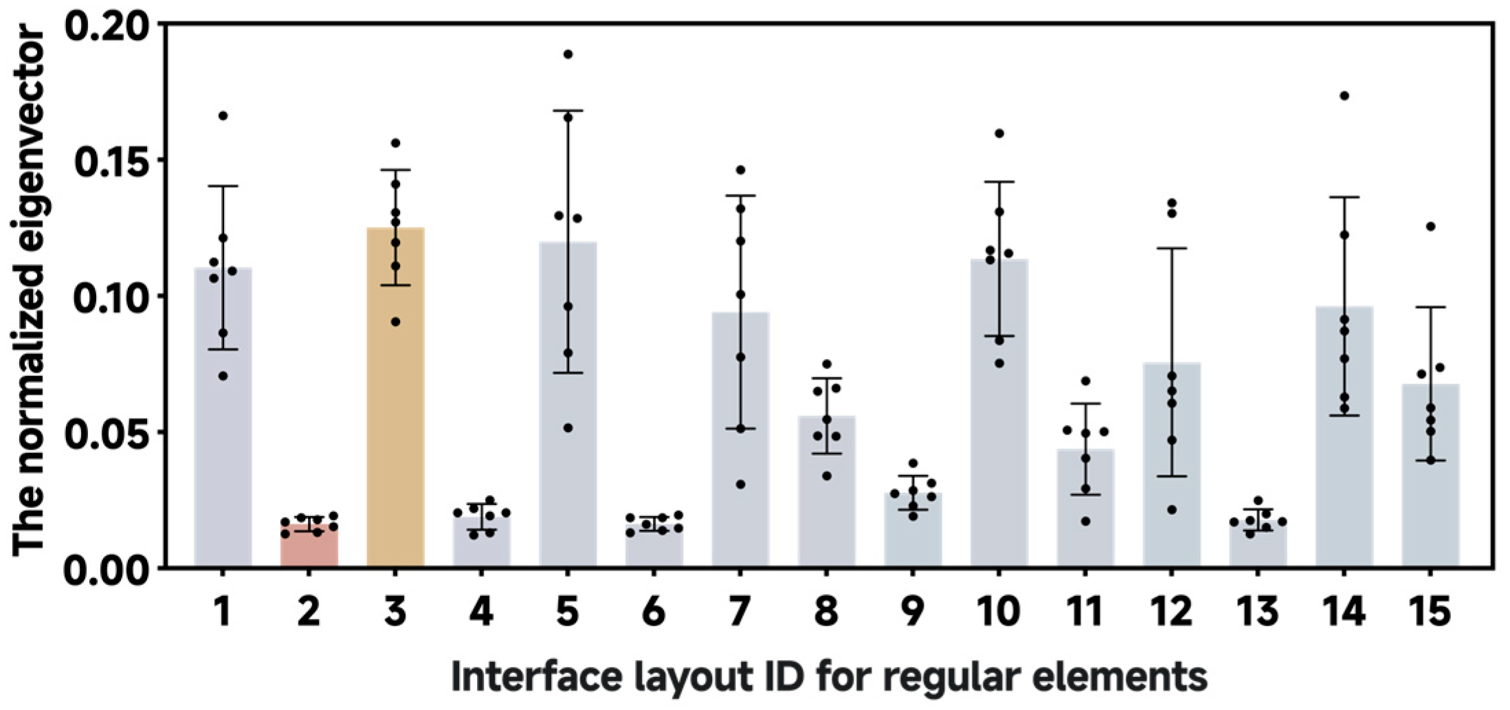
The perceived visual balance ( B p ) of each interface was indicated by the AHP eigenvector values provided by each expert. As shown in Figure 5, in Experiment 1, A3 was rated as the most balanced, while A2 received the least balanced. The pictures were ranked by their B ¯ p values as follows: A3 (0.125143395) > A5 (0.119895755) > A10 (0.113602678) > A1 (0.110387792) > A14 (0.096172909) > A7 (0.094107694) > A12 (0.075649194) > A15 (0.067740286) > A8 (0.055990474) > A11 (0.043778156) > A9 (0.027743374) > A4 (0.018912162) > A13 (0.017768941) > A6 (0.016328061) > A2 (0.016262864).
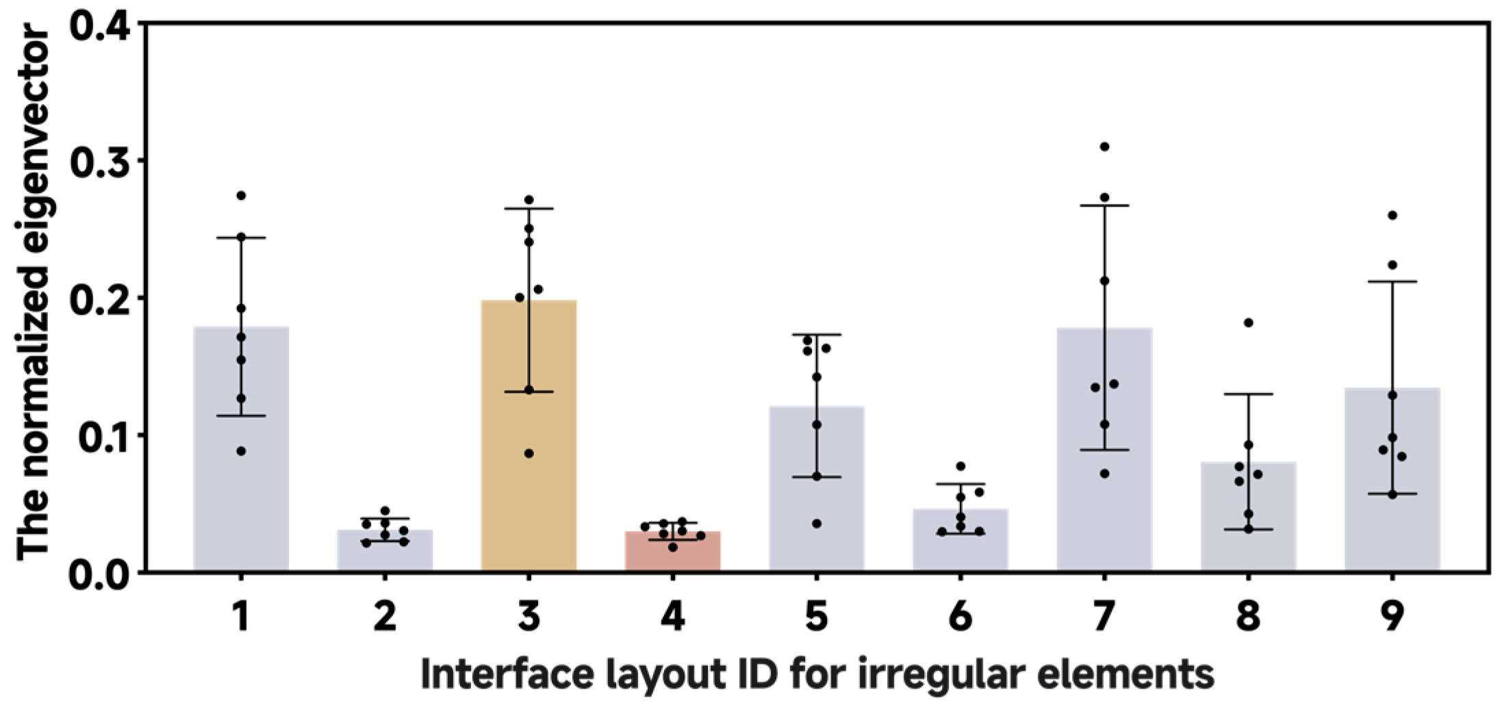
As shown in Figure 6, in Experiment 2, B3 was identified as the most balanced, while B4 was identified as the least balanced. The pictures were ranked by their B ¯ p values in the following order: B3 (0.198380000) > B1 (0.178972286) > B7 (0.178259571) > B9 (0.134626286) > B5 (0.121379571) > B8 (0.080664000) > B6 (0.046430714) > B2 (0.031197286) > B4 (0.030091143).

4.2. Models Performance for Computing Visual Balance

The outputs of Model-M, introduced in this study, and Model-N proposed by Ngo et al. [32] were compared in Table 5 to assess the visual balance of the interface based on regular elements in Experiment 1. The D b , a values showed that the highest visual balance was A12, and the lowest was A14; however, the B m values indicated that the highest balance was A5, and the lowest was A4. The effects of the optimized Model-M+ and the original Model-M were further compared in Table 6 for assessing the visual balance of the interface based on irregular elements in Experiment 2. When using the unoptimized Model-M, the B m values showed that the highest visual balance was B1, and the lowest was B4. After optimization by Model-M+, the interface with the highest visual balance changed to B7.

4.3. Correlation Comparisons for Computational and Perceptual Visual Balance

To assess the validity and statistical strength of the regression analysis, relevant diagnostic tests and analyses were performed. The results of the hypothesis tests for the regression model (including normality, linearity, and homoscedasticity tests) are summarized in Table 7, and the results of the retrospective effect size and statistical power analyses are shown in Table 8.
The results show that the proposed VME-based models (namely, Model-M from Experiment 1, and both Model-M and Model-M+ from Experiment 2) satisfy all regression assumptions and have large effect sizes with sufficient statistical power. In contrast, the model proposed by Ngo et al. [32] (Model-N) meets the linearity and homoscedasticity assumptions, displays a large effect size, but has insufficient statistical power, suggesting its reliability might require a larger sample size.
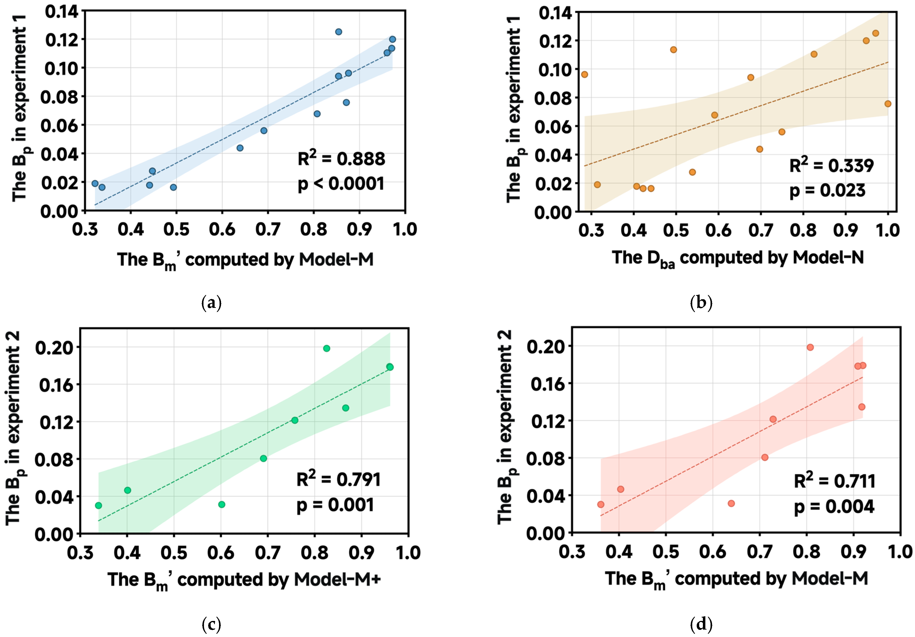
Figure 7 presents the correlations between outputs of different computational models and human perceptual balance scores. Linear regression analysis revealed a significant relationship between the computational visual balance scores from Model-M and the perceptual visual balance scores in Experiment 1 (n = 15), F (1, 13) = 103.3, p < 0.0001. The Pearson correlation coefficient was r = 0.942, reflecting a very strong association. As illustrated in Figure 7a, the regression equation was y   =   0.165 x     0.049 , with a 95% confidence interval for the slope ranging from 0.130 to 0.200. The high coefficient of determination (R2 = 0.888) indicates that Model-M accounts for 88.8% of the variance in human perceptual ratings, demonstrating excellent explanatory power, while the low standard error of the estimate (Sy.x = 0.014) reflects high predictive precision. Surprisingly, although statistically significant, the linear regression using Model-N showed a considerably weaker fit (F (1, 13) = 6.673, p = 0.023) with a moderate Pearson correlation coefficient (r = 0.5824). As shown in Figure 7b, the corresponding regression equation was y   =   0.102 x + 0.003 (95% Bootstrap CI of slope: 0.009 to 0.173). The substantially lower R2 value (0.339) indicates that Model-N explains only 33.9% of the variance in human assessments, and the higher standard error (Sy.x = 0.035) further confirms its reduced predictive accuracy compared to Model-M.
The comparative results of the linear regression analysis between human perceptual balance and Model-M+ for Experiment 2 (n = 9) are presented in Figure 7c. The optimized Model-M+ model demonstrated a highly significant linear relationship (F (1, 7) = 26.52, p = 0.001) and a strong positive correlation (r = 0.890). The regression equation was y   =   0.261 x   0.075 , with a 95% confidence interval for the slope ranging from 0.141 to 0.381. The high coefficient of determination (R2 = 0.791) indicates that Model-M+ accounts for 79.1% of the variance in human perceptual ratings, while the low standard error of the estimate (Sy.x = 0.033) reflects its high predictive precision. In comparison, as shown in Figure 7d, the original Model-M also demonstrated a statistically significant fit (F (1, 7) = 17.24, p = 0.004) with a strong correlation (r = 0.843). Its regression equation was y   =   0.266 x 0.078 (95% CI of slope: 0.114 to 0.417). The model established a strong foundation, explaining 71.1% of the variance (R2 = 0.711) with Sy.x = 0.038. The performance improvement from Model-M+ is demonstrated by up to an 11.25% relative increase in R2 (p = 0.026, 95% Bootstrap CI of slope: 0.005 to 0.173) and a 14.96% decrease in standard error, confirming the effectiveness of the calculation correction refinements.

5. Discussions

5.1. General Discussion of Experimental Results

This study introduced and validated a computational framework for interface aesthetics grounded in the principle of moment equilibrium, and investigated whether this approach could surpass traditional symmetry-based models in predicting human aesthetic judgments. The experimental results provide strong evidence that the VME model represents a paradigm shift in computational aesthetics. The results reveal a stark performance disparity, with Model-M accounting for 88.8% of the variance in expert judgments for regular interfaces, whereas the classical Model-N, as described by Ngo et al. [32], explained only 33.9%. This pronounced difference transcends a mere improvement in accuracy; it revealed a fundamental misalignment between traditional analysis and the integrative nature of human aesthetic perception.
The core limitation of Model-N lies in its reductionist framework. By deconstructing balance into independent left-right and top-bottom comparisons, the model operates on the implicit assumption that the visual system processes these directional imbalances independently. Our findings fundamentally contradict this assumption. The superior performance of Model-M’s holistic moment equilibrium suggests that human perception perceives the compositional field as a unified force system. This emergent Gestalt property is lost when the composition is broken apart [39]. A heavy element on the far left, for instance, can be balanced not only by an equally heavy element on the right but also by multiple lighter elements arranged strategically, creating a complex interplay of forces that Model-N’s fragmented summation cannot fully capture. Thus, the bias of Model-N is not a calculation error but a conceptual bias, which captures the correct properties but within an insufficient framework that overlooks their essential interactions.
Secondly, Model-N’s reliance on geometric symmetry as a proxy for balance proves to be a critical weakness in the context of modern interface design. The model is inherently biased towards layouts that are perfectly symmetrical about their central axes. Our data clearly illustrate this point: Interface A12, a classic symmetrical layout, was scored as perfectly balanced by Model-N ( D b , a = 1). In contrast, interfaces like A5 and A10, which achieved high scores from human experts and Model-M, exemplify an asymmetric balance, a harmonious arrangement of dissimilar visual weights that Model-N’s symmetry-centric model is unable to appreciate. This demonstrates that Model-N often confuses symmetry with balance, whereas our VME model captures the more nuanced and practically relevant concept of dynamic equilibrium [50,61], which is essential for creating visually engaging and distinctive interfaces that avoid monotonous repetition.
Third, the issue of cognitive plausibility in spatial measurement further differentiates the models. Model-N’s use of Euclidean distance assumes that the human visual system calculates cognitive distances using the Pythagorean theorem, an assumption that conflicts with substantial evidence from spatial cognition [82,85]. When implementing the Manhattan distance, we base it on the navigation method of “city blocks” in a structured environment, aiming to align the calculation process with known perceptual biases. The significant improvement in model performance is clearly linked to the cognitive rationality of its basic operations, which, to some extent, reflects the important role of cognitive rationality in its effectiveness. In contrast, Model-N’s use of Euclidean distance emphasizes mathematical tradition rather than perceptual accuracy, which may cause it to differ from human perceptual experience when representing spatial cognitive relationships.
The success of the VME model can also be attributed to its other cognitively aligned innovations. The nine-grid weighting mechanism is a significant improvement over traditional quadrant-based models [32,35], offering a more detailed and psychologically realistic explanation of attentional distribution. This mechanism effectively captures both the well-documented F-shaped reading pattern [60] and the increased attentional importance of the central composition area [27,52], recognizing that a unit of area in the central or primary visual zones holds more perceptual significance than an identical unit in the periphery. Additionally, the psychophysical normalization of the balance index in Equation (4) reflects the nonlinear relationship between physical stimulus and perceptual response [76,77], ensuring that the model’s sensitivity to differences aligns with that of human observers, especially in the critical high-balance range where designers aim for perfection and the human eye is most critical.
Regarding irregular elements, the statistically significant improvement of Model-M+ over Model-M (R2 from 0.711 to 0.791) confirms the value of including perceptual completion mechanisms. The shape sparsity ratio, R s , in Equation (11) and the piecewise compensation function in Equation (12) provide a new quantitative formalization of Gestalt closure principles, translating a core idea of perceptual psychology into a computationally efficient calculation method. However, the finding that performance improvements were somewhat limited suggests that additional cognitive factors beyond geometric completion, such as semantic associations and contour aesthetics, are not yet captured in the current model [101]. For instance, a heart-shaped icon might evoke more emotional response than a similarly shaped amorphous form, highlighting areas for future model development.

5.2. Theoretical Implications

This study makes significant contributions to the theoretical foundations of computational aesthetics by formalizing Visual Moment Equilibrium as a precise mathematical construct. By defining the equilibrium condition M = 0 as its central principle, this work directly tackles the conceptual ambiguity that has hindered quantitative aesthetic models since Birkhoff’s groundbreaking proposal [30]. This marks a clear shift from using physical concepts metaphorically in aesthetic theory [52] to employing a rigorous mathematical formalism that allows for thorough testing and refinement. The model offers a unified language to describe both static and dynamic balance, creating a bridge between classical art theory and modern computational methods design.
A particularly innovative theoretical contribution lies in the integrated modeling of multiple cognitive mechanisms within a unified framework. The VME model successfully reconciles principles from Gestalt psychology, spatial cognition, and psychophysics, which have traditionally been studied separately, into a coherent explanation of how they interact to influence aesthetic perception. The nine-grid system offers a preliminary psychologically plausible account of attentional distribution, while the Manhattan distance metric aligns computational methods with the asymmetric nature of human spatial reasoning [87,91]. This integrative approach represents a significant departure from existing models, which typically focus on individual aesthetic dimensions (or the simplicity of computational process), and provides a more comprehensive and explanatory framework for understanding aesthetic experience.
For irregular element processing, this study introduces novel theoretical constructs (the shape sparsity ratio) and the piecewise perceptual compensation function, which provide among the first quantitative formalizations of Gestalt closure principles. These innovations establish a new paradigm for the computational treatment of non-geometric elements by modeling how the human visual system assigns perceptual weight based on an element’s potential for closure rather than its physical properties alone. This marks a significant shift from earlier methods that reduced irregular shapes to bounding boxes [28], which overlooked the active, constructive nature of human perception.
On a broader level, this study helps clarify apparent contradictions in the research regarding the hierarchical importance of aesthetic dimensions. The finding that the VME model achieves high predictive accuracy while focusing only on balance suggests that visual balance may serve as a core perceptual foundation upon which other aesthetic judgments are built. This idea aligns with evidence that balance judgments occur quickly and automatically, possibly preceding more deliberate aesthetic evaluations [40,53]. It positions balance not just as one aesthetic factor among many, but as a key prerequisite for perceptual stability, which then enables the appreciation of more complex aesthetic qualities.

5.3. Practical Implications

From an applied perspective, this study provides meaningful contributions to contemporary design practice and computational design systems. The most immediate use is in professional design workflows, where the VME model acts as an effective diagnostic tool for layout assessment. The model’s computational efficiency, thanks to its use of integer-based Manhattan distance, makes it especially suitable for integration into standard interface design and cognitive walkthrough platforms as a real-time feedback tool. This allows designers to quantitatively evaluate and iteratively improve layout balance while also relying on their intuitive judgments.
The model’s wide applicability in handling both regular and irregular interface elements make it especially well-suited to addressing the evolving challenges of modern interface design. This includes the increasing trend toward more expressive, brand-focused visual languages that use organic shapes and asymmetrical layouts. Nonetheless, the most impactful application involves AI-generated design systems. The rapid progress of generative artificial intelligence has created a critical need for strong, perceptually grounded evaluation metrics that can operate at large scale without human input. The VME model directly tackles this by offering a cognitively plausible objective function that can steer generative systems to produce outputs that are both functionally coherent and aesthetically balanced. Without these perceptually aligned metrics, the aesthetic quality of AI-generated interfaces remains largely unoptimized, potentially leading to many designs that are functionally sufficient but perceptually discordant, which can erode user trust and satisfaction. This study, therefore, offers a timely solution to a pressing issue at the intersection of HCI and AI, supporting more effective and trustworthy human-AI collaboration in creative design tasks.

5.4. Limitations and Future Directions

Notwithstanding these contributions, certain limitations of the current study should be acknowledged to provide a clear path for subsequent research. The most notable restriction concerns the static, theoretically informed parameterization of visual weight redistribution in the nine-grid model. While the initial weights are informed by prior empirical evidence [27,35], they represent fixed values that may not fully capture contextual nuances across diverse digital interface types, user tasks, and individual differences. Future research must therefore prioritize obtaining direct empirical evidence from digital contexts. A key direction is to develop dynamic attention models calibrated with real-time eye-tracking data to create adaptive weight distribution systems that accurately reflect users’ actual viewing behavior, thereby empirically validating and refining the proposed weighting scheme.
A second limitation relates to the primary geometric focus in processing irregular elements. The current model does not adequately incorporate semantic and affective factors that influence shape perception. For example, an icon of a star and a blob of the same size and sparsity are assigned the same visual weights, which may not accurately reflect their true perceptual effects. Future research should explore hybrid models that combine geometric analysis with semantic feature extraction or affective computing techniques to explain why certain shapes “feel” heavier than their formal properties suggest.
Thirdly, the current research framework was constructed within controlled experimental conditions. The validation relies on static, fixed-sized interfaces, thereby constraining the ecological validity of the VME model. All stimuli were uniformly presented within a 300 × 300-pixel square canvas and displayed as static images. However, in practical applications, users are exposed to visual content across a variety of media, which feature significantly different screen sizes, aspect ratios, and resolutions. Furthermore, in the contemporary digital environment, the majority of visual experiences are inherently dynamic and interactive. Yet, the current model only handles static images and does not account for temporal and interactive factors. Future research should concentrate on enhancing the model’s adaptability and systematically evaluating its performance across various canvas sizes, aspect ratios, resolutions, and dynamic presentation techniques using a larger sample size.

6. Conclusions

This study introduces and validates the Visual Moment Equilibrium (VME) model, a pioneering computational framework that redefines how visual balance in interface layouts is evaluated by grounding it in the physical principle of moment equilibrium. The model’s primary theoretical contribution lies in its effective integration of various cognitive principles, including Gestalt closure, psychophysical scaling, and non-Euclidean spatial cognition, into a unified, mathematically rigorous formalism. This synthesis directly addresses the longstanding gap between reductionist computational metrics and the holistic, rapid nature of human aesthetic perception. Our validation experimental results support this theoretical advancement. The VME model’s clear superiority over traditional symmetry-based benchmarks confirms that visual balance is not simply about geometric symmetry but involves a dynamic equilibrium of perceptual forces. The extensions for irregular elements, formalized through the shape sparsity ratio and piecewise compensation function, further highlight the model’s evaluative capability and wide applicability, providing one of the first quantitative measurement methods for Gestalt closure. Practically, this work provides a powerful tool for automated design evaluation, enabling quick and objective iteration within UI/UX workflows. More importantly, it establishes a cognitively aligned objective function for generative AI systems, opening the path for creating inherently balanced and visually coherent interfaces. Future research will focus on developing dynamic attention models calibrated with real-time eye-tracking data and expanding the VME framework to capture temporal balance in animated interactions, thus further bridging the gap between computational theory and perception reality.

Author Contributions

Conceptualization, X.Z.; methodology, X.Z.; software, X.Z.; validation, X.Z. and C.X., formal analysis, X.Z.; investigation, X.Z.; resources, X.Z.; data curation, X.Z.; writing—original draft preparation, X.Z.; writing—review and editing, X.Z.; visualization, X.Z.; supervision, C.X.; project administration, C.X.; funding acquisition, C.X. All authors have read and agreed to the published version of the manuscript.

Funding

This research was funded by the National Natural Science Foundation of China, grant numbers 72271053 and 71871056.

Data Availability Statement

Data are contained within the article.

Acknowledgments

The authors would like to gratefully acknowledge the editors and anonymous reviewers for their insightful and constructive comments. Appreciation is also extended to the field experts who participated in this study.

Conflicts of Interest

The authors declare that they have no known financial conflicts of interest or personal relationships that could have influenced the work reported in this paper.

Abbreviations

The following abbreviations are used in this manuscript:
VMEVisual Moment Equilibrium

References

  1. Moshagen, M.; Thielsch, M.T. Facets of Visual Aesthetics. Int. J. Hum. Comput. Stud. 2010, 68, 689–709. [Google Scholar] [CrossRef] [Scilit]
  2. Shirole, D.; Chowdhury, A.; Dhar, D. Identification of Aesthetically Favourable Interface Attributes for Better User Experience of Social Networking Application. In Ergonomics in Caring for People; Ray, G.G., Iqbal, R., Ganguli, A.K., Khanzode, V., Eds.; Springer: Singapore, 2017; pp. 251–259. ISBN 978-981-10-4979-8. [Google Scholar]
  3. Wu, B. Research on the Aesthetic Experience of Consumers in Product Design. In Proceedings of the 2017 3rd International Conference on Economics, Social Science, Arts, Education and Management Engineering (ESSAEME 2017), Huhhot, China, 29–30 July 2017; Atlantis Press: Huhhot, China, 2017. [Google Scholar]
  4. Fogg, B.J.; Soohoo, C.; Danielson, D.R.; Marable, L.; Stanford, J.; Tauber, E.R. How Do Users Evaluate the Credibility of Web Sites? A Study with over 2500 Participants. In Proceedings of the 2003 Conference on Designing for User Experiences, New York, NY, USA, 6–7 June 2003; ACM: San Francisco, CA, USA, 2003; pp. 1–15. [Google Scholar]
  5. Joshi, D.; Datta, R.; Fedorovskaya, E.; Luong, Q.-T.; Wang, J.; Li, J.; Luo, J. Aesthetics and Emotions in Images. IEEE Signal Process. Mag. 2011, 28, 94–115. [Google Scholar] [CrossRef] [Scilit]
  6. Miller, C. Aesthetics and E-Assessment: The Interplay of Emotional Design and Learner Performance. Distance Educ. 2011, 32, 307–337. [Google Scholar] [CrossRef] [Scilit]
  7. Kurosu, M.; Kashimura, K. Apparent Usability vs. Inherent Usability: Experimental Analysis on the Determinants of the Apparent Usability. In Proceedings of the Conference companion on Human factors in computing systems—CHI ’95, Denver, CO, USA, 7–11 May 1995; ACM Press: Denver, CO, USA, 1995; pp. 292–293. [Google Scholar]
  8. Moshagen, M.; Musch, J.; Göritz, A.S. A Blessing, not a Curse: Experimental Evidence for Beneficial Effects of Visual Aesthetics on Performance. Ergonomics 2009, 52, 1311–1320. [Google Scholar] [CrossRef] [Scilit]
  9. Jiang, Z.; Wang, W.; Tan, B.C.Y.; Yu, J. The Determinants and Impacts of Aesthetics in Users’ First Interaction with Websites. J. Manage. Inform. Syst. 2016, 33, 229–259. [Google Scholar] [CrossRef] [Scilit]
  10. Lima, A.L.D.S.; Gresse Von Wangenheim, C. Assessing the Visual Esthetics of User Interfaces: A Ten-Year Systematic Mapping. Int. J. Hum. Comput. Interact. 2021, 38, 144–164. [Google Scholar] [CrossRef] [Scilit]
  11. Jacobsen, T. Beauty and the Brain: Culture, History and Individual Differences in Aesthetic Appreciation. J. Anat. 2010, 216, 184–191. [Google Scholar] [CrossRef] [Scilit]
  12. Parada-Castellano, R. Study of Balance of Images Using Visual Weight. Color Res. Appl. 2015, 41, 175–187. [Google Scholar] [CrossRef] [Scilit]
  13. Karim, A.K.M.R.; Proulx, M.J.; De Sousa, A.A.; Likova, L.T. Do We Enjoy What We Sense and Perceive? A Dissociation Between Aesthetic Appreciation and Basic Perception of Environmental Objects or Events. Cogn. Affect. Behav. Neurosci. 2022, 22, 904–951. [Google Scholar] [CrossRef] [Scilit]
  14. Silvennoinen, J.M.; Jokinen, J.P.P. Jokinen Appraisals of Salient Visual Elements in Web Page Design. Adv. Hum. Comput. Interact. 2016, 2016, 1–14. [Google Scholar] [CrossRef] [Scilit]
  15. Hartmann, J.; Sutcliffe, A.; Angeli, A.D. Towards a Theory of User Judgment of Aesthetics and User Interface Quality. ACM Trans. Comput. Hum. Interact. 2008, 15, 1–30. [Google Scholar] [CrossRef] [Scilit]
  16. Galindo, J.A.; Dupuy-Chessa, S.; Mandran, N.; Ceret, E. Using User Emotions to Trigger UI Adaptation. In Proceedings of the 2018 12th International Conference on Research Challenges in Information Science (RCIS), Nantes, France, 29–31 May 2018; IEEE: Nantes, France, 2018; pp. 1–11. [Google Scholar]
  17. Aleem, H.; Correa-Herran, I.; Grzywacz, N.M. A Theoretical Framework for How We Learn Aesthetic Values. Front. Hum. Neurosci. 2020, 14, 345. [Google Scholar] [CrossRef] [Scilit]
  18. Tullis, T.S. Screen Design. In Handbook of Human-Computer Interaction; Elsevier: Amsterdam, The Netherlands, 1988; pp. 377–411. ISBN 978-0-444-70536-5. [Google Scholar]
  19. Sears, A.L. Layout Appropriateness: Guiding User Interface Design with Simple Task Descriptions; University of Maryland College Park: College Park, MD, USA, 1993; ISBN 979-8-208-95055-5. [Google Scholar]
  20. Reiser, H.; Reiser, B. Aesthetic Considerations Unique to Interactive Multimedia. IEEE Comput. Graph. Appl. 1995, 15, 24–28. [Google Scholar] [CrossRef] [Scilit]
  21. World, L. Aesthetic Selection: The Evolutionary Art of Steven Rooke [About the Cover]. IEEE Comput. Graph. Appl. 1996, 16, 4. [Google Scholar] [CrossRef] [Scilit]
  22. Hassenzahl, M. The Interplay of Beauty, Goodness, and Usability in Interactive Products. Hum. Comput. Interact. 2004, 19, 319–349. [Google Scholar] [CrossRef] [Scilit]
  23. Liu, Y.; Zhang, Q. Interface Design Aesthetics of Interaction Design. In Design, User Experience, and Usability. Design Philosophy and Theory; Marcus, A., Wang, W., Eds.; Lecture Notes in Computer Science; Springer International Publishing: Cham, Switzerland, 2019; Volume 11583, pp. 279–290. ISBN 978-3-030-23569-7. [Google Scholar]
  24. Tuch, A.N.; Roth, S.P.; Hornbæk, K.; Opwis, K.; Bargas-Avila, J.A. Is Beautiful Really Usable? Toward Understanding the Relation Between Usability, Aesthetics, and Affect in HCI. Comput. Hum. Behav. 2012, 28, 1596–1607. [Google Scholar] [CrossRef] [Scilit]
  25. Mõttus, M.; Lamas, D.; Pajusalu, M.; Torres, R. The Evaluation of Interface Aesthetics. In Proceedings of the International Conference on Multimedia, Interaction, Design and Innovation, Warsaw, Poland, 24 June 2013; ACM: Warsaw, Poland, 2013; pp. 1–10. [Google Scholar]
  26. Zen, M.; Vanderdonckt, J. Assessing User Interface Aesthetics Based on the Inter-Subjectivity of Judgment. In Proceedings of the Electronic Workshops in Computing, Poole, UK, 11–15 July 2016. [Google Scholar]
  27. Jahanian, A. Quantifying Aesthetics of Visual Design Applied to Automatic Design; Springer Theses; Springer International Publishing: Cham, Switzerland, 2016; ISBN 978-3-319-31485-3. [Google Scholar]
  28. Deng, L.; Wang, G. Quantitative Evaluation of Visual Aesthetics of Human-Machine Interaction Interface Layout. Comput. Intell. Neurosci. 2020, 2020, 1–14. [Google Scholar] [CrossRef] [Scilit]
  29. Birkhoff, G.D. Aesthetic Measure; Harvard University Press: Cambridge, MA, USA, 1933; ISBN 978-0-674-73022-9. [Google Scholar]
  30. Douchová, V. Birkhoff’s Aesthetic Measure. AUC Philos. Hist. 2016, 2015, 39–53. [Google Scholar] [CrossRef] [Scilit]
  31. Beebe-Center, J.G.; Pratt, C.C. A Test of Birkhoff’S Aesthetic Measure. J. Gen. Psychol. 1937, 17, 339–353. [Google Scholar] [CrossRef] [Scilit]
  32. Ngo, D.C.L.; Teo, L.S.; Byrne, J.G. Modelling Interface Aesthetics. Inf. Sci. 2003, 152, 25–46. [Google Scholar] [CrossRef] [Scilit]
  33. Bauerly, M.; Liu, Y. Computational Modeling and Experimental Investigation of Effects of Compositional Elements on Interface and Design Aesthetics. Int. J. Hum. Comput. Stud. 2006, 64, 670–682. [Google Scholar] [CrossRef] [Scilit]
  34. Lai, C.-Y.; Chen, P.-H.; Shih, S.-W.; Liu, Y.; Hong, J.-S. Computational Models and Experimental Investigations of Effects of Balance and Symmetry on the Aesthetics of Text-Overlaid Images. Int. J. Hum. Comput. Stud. 2010, 68, 41–56. [Google Scholar] [CrossRef] [Scilit]
  35. Zhou, L.; Xue, C.; Tang, W.; Li, J.; Niu, Y. Aesthetic Evaluation Method of Interface Elements Layout Design. J. Comput. Aided Des. Comput. Graph. 2013, 25, 758–766. [Google Scholar]
  36. Wang, X.; Tong, M.; Song, Y.; Xue, C. Utilizing Multiple Regression Analysis and Entropy Method for Automated Aesthetic Evaluation of Interface Layouts. Symmetry 2024, 16, 523. [Google Scholar] [CrossRef] [Scilit]
  37. Zeleny, M. In Search of Cognitive Equilibrium: Beauty, Quality and Harmony. J. Multi-Criter. Decis. Anal. 1994, 3, 3–13. [Google Scholar] [CrossRef] [Scilit]
  38. Redding, R.E. Taking Cognitive Task Analysis into the Field: Bridging the Gap from Research to Application. Proc. Hum. Factors Soc. Annu. Meet. 1990, 34, 1304–1308. [Google Scholar] [CrossRef] [Scilit]
  39. Papachristos, E. Assessing the Performance of Short Multi-Item Questionnaires in Aesthetic Evaluation of Websites. Behav. Inform. Technol. 2018, 38, 469–485. [Google Scholar] [CrossRef] [Scilit]
  40. Brady, L.; Phillips, C. Aesthetics and Usability: A Look at Color and Balance. Usability News 2003, 5, 2–5. [Google Scholar]
  41. Tractinsky, N.; Cokhavi, A.; Kirschenbaum, M.; Sharfi, T. Evaluating the Consistency of Immediate Aesthetic Perceptions of Web Pages. Int. J. Hum. Comput. Stud. 2006, 64, 1071–1083. [Google Scholar] [CrossRef] [Scilit]
  42. Lindgaard, G.; Fernandes, G.; Dudek, C.; Brown, J. Attention Web Designers: You Have 50 Milliseconds to Make a Good First Impression! Behav. Inform. Technol. 2006, 25, 115–126. [Google Scholar] [CrossRef] [Scilit]
  43. Miniukovich, A.; De Angeli, A. Computation of Interface Aesthetics. In Proceedings of the 33rd Annual ACM Conference on Human Factors in Computing Systems, Seoul, Republic of Korea, 18 April 2015; ACM: Seoul, Republic of Korea, 2015; pp. 1163–1172. [Google Scholar]
  44. Schmidt, T.; Wolff, C. The Influence of User Interface Attributes on Aesthetics. i-com 2018, 17, 41–55. [Google Scholar] [CrossRef] [Scilit]
  45. Reinecke, K.; Yeh, T.; Miratrix, L.; Mardiko, R.; Zhao, Y.; Liu, J.; Gajos, K.Z. Predicting Users’ First Impressions of Website Aesthetics with a Quantification of Perceived Visual Complexity and Colorfulness. In Proceedings of the SIGCHI Conference on Human Factors in Computing Systems, Paris, France, 27 April 2013; ACM: Paris, France, 2013; pp. 2049–2058. [Google Scholar]
  46. Brachmann, A.; Redies, C. Computational and Experimental Approaches to Visual Aesthetics. Front. Comput. Neurosci. 2017, 11, 102. [Google Scholar] [CrossRef] [Scilit] [PubMed]
  47. Ruddro, R.A.; Mohna, H.A. Visual Communication in Industrial Safety Systems: A Review of UI/UX Design for Risk Alerts and Warnings. Am. J. Sch. Res. Innov. 2023, 2, 217–345. [Google Scholar] [CrossRef] [Scilit]
  48. Shao, J.; Wu, J.; Tang, W.; Xue, C. How Dynamic Information Layout in GIS Interface Affects Users’ Search Performance: Integrating Visual Motion Cognition into Map Information Design. Behav. Inform. Technol. 2022, 42, 1686–1703. [Google Scholar] [CrossRef] [Scilit]
  49. Chen, X.; Lu, Y.; Hao, G. Balanced Aesthetics: How Shape, Contrast, and Visual Force Affect Interface Layout. Int. J. Hum. Comput. Interact. 2023, 40, 8750–8763. [Google Scholar] [CrossRef] [Scilit]
  50. Roy, A.; Kapoor, R. Faculty at School of Fashion Design, Lingayas Vidyapeeth, University in Faridabad, Haryana Visual Dissonance and Dynamic Harmony: A Study of Asymmetrical Balance. Int. J. Arts. Arch. Des. 2025, 3, 45–61. [Google Scholar] [CrossRef] [Scilit]
  51. Wang, J.; Hsu, Y. The Relationship of Symmetry, Complexity, and Shape in Mobile Interface Aesthetics, from an Emotional Perspective—A Case Study of the Smartwatch. Symmetry 2020, 12, 1403. [Google Scholar] [CrossRef] [Scilit]
  52. Arnheim, R. Art and Visual Perception: A Psychology of the Creative Eye; University of California Press: Los Angeles, CA, USA, 1955; Volume 68, ISBN 978-0-520-02613-1. [Google Scholar]
  53. Wilson, A.; Chatterjee, A. The Assessment of Preference for Balance: Introducing a New Test. Empir. Stud. Arts 2005, 23, 165–180. [Google Scholar] [CrossRef] [Scilit]
  54. Altaboli, A.; Lin, Y. Investigating Effects of Screen Layout Elements on Interface and Screen Design Aesthetics. Adv. Hum. Comput. Interact. 2011, 2011, 1–10. [Google Scholar] [CrossRef] [Scilit]
  55. Sapovadia, V.K. The Art of Balance: Learn from Nature. SSRN J. 2025. [Google Scholar] [CrossRef] [Scilit]
  56. Prigogine, I.; Lefever, R. Symmetry Breaking Instabilities in Dissipative Systems. II. J. Chem. Phys. 1968, 48, 1695–1700. [Google Scholar] [CrossRef] [Scilit]
  57. Csikszentmihalyi, M. Flow: The Psychology of Optimal Experience; Harper Perennial Modern Classics; 1st Harper Perennial Modern Classics ed.; HarperPerennial: New York, NY, USA; London, UK; Toronto, ON, Canada; Sydney, Australia; New Delhi, India; Auckland, New Zealand, 1991; Volume 8, ISBN 978-0-06-016253-5. [Google Scholar]
  58. Wartofsky, M.; Arnheim, R. Entropy and Art: An Essay on Disorder and Order. J. Aesthet. Art Critic. 1973, 32, 280. [Google Scholar] [CrossRef] [Scilit]
  59. Wagemans, J. Characteristics and Models of Human Symmetry Detection. Trends Cognit. Sci. 1997, 1, 346–352. [Google Scholar] [CrossRef] [Scilit]
  60. Xu, Z.; Wang, S. Interactive Design of Personalized Website Search Interface Based on Visual Communication. Comput. Intell. Neurosci. 2022, 2022, 2125506. [Google Scholar] [CrossRef] [Scilit]
  61. Kandemir, B.; Zhou, Z.; Li, J.; Wang, J.Z. Beyond Saliency: Assessing Visual Balance with High-Level Cues. In Proceedings of the on Thematic Workshops of ACM Multimedia, Mountain View, CA, USA, 23 October 2017; ACM: Mountain View, CA, USA, 2017; pp. 26–34. [Google Scholar]
  62. Hübner, R.; Fillinger, M.G. Perceptual Balance, Stability, and Aesthetic Appreciation: Their Relations Depend on the Picture Type. i-Perception 2019, 10, 2041669519856040. [Google Scholar] [CrossRef] [Scilit]
  63. Mika, A. Principles of Design Balance. 2025. Available online: https://www.ramotion.com/blog/principles-of-design-balance/ (accessed on 10 October 2025).
  64. Todorovic, D. Gestalt Principles. Scholarpedia 2008, 3, 5345. [Google Scholar] [CrossRef] [Scilit]
  65. Wagemans, J.; Elder, J.H.; Kubovy, M.; Palmer, S.E.; Peterson, M.A.; Singh, M.; Von Der Heydt, R. A Century of Gestalt Psychology in Visual Perception: I. Perceptual Grouping and Figure–Ground Organization. Psychol. Bull. 2012, 138, 1172–1217. [Google Scholar] [CrossRef] [Scilit]
  66. Liang, Y. Application of Gestalt Psychology in Product Human-Machine Interface Design. IOP Conf. Ser. Mater. Sci. Eng. 2018, 392, 062054. [Google Scholar] [CrossRef] [Scilit]
  67. Ripalda, D.; Guevara, C.; Garrido, A. Relationship Between Gestalt and Usability Heuristics in Mobile Device Interfaces. In Human Systems Engineering and Design III; Karwowski, W., Ahram, T., Etinger, D., Tanković, N., Taiar, R., Eds.; Advances in Intelligent Systems and Computing; Springer International Publishing: Cham, Switzerland, 2020; Volume 1269, pp. 156–161. ISBN 978-3-030-58281-4. [Google Scholar]
  68. Koffka, K. Principles of Gestalt Psychology; Harcourt, Brace: Oxford, UK, 1935; Volume 27, p. 720. [Google Scholar]
  69. Pomerantz, J.R.; Kubovy, M. Perceptual Organization: An Overview. In Perceptual Organization; Kubovy, M., Pomerantz, J.R., Eds.; Routledge: Abingdon, UK, 2017; pp. 423–456. ISBN 978-1-315-51237-2. [Google Scholar]
  70. Reiser, O.L.; Koffka, K. Principles of Gestalt Psychology. Philos. Rev. 1936, 45, 412. [Google Scholar] [CrossRef] [Scilit]
  71. Mishkin, M.; Ungerleider, L.G.; Macko, K.A. Object Vision and Spatial Vision: Two Cortical Pathways. Trends Neurosci. 1983, 6, 414–417. [Google Scholar] [CrossRef] [Scilit]
  72. Chen, C.; Liu, Z.; Jin, Z. Theoretical Models on the Mechanisms of Feature Binding. Adv. Psychol. Sci. 2003, 11, 616. [Google Scholar]
  73. Chu, C. Analysis of Visual Perceptual Forces in Exhibition Design. Museum 2019, 3, 111–118. [Google Scholar] [CrossRef] [Scilit]
  74. Pearson, S. Moments. Narrat. Inq. Bioeth. 2020, 10, 110–112. [Google Scholar] [CrossRef] [Scilit] [PubMed]
  75. Zhou, L.; Xue, C.-Q.; Tomimatsu, K. Research of Interface Composition Design Optimization Based on Visual Balance. In Practical Applications of Intelligent Systems; Wen, Z., Li, T., Eds.; Advances in Intelligent Systems and Computing; Springer: Berlin/Heidelberg, Germany, 2014; Volume 279, pp. 483–493. ISBN 978-3-642-54926-7. [Google Scholar]
  76. Stevens, S.S. On the Psychophysical Law. Psychol. Rev. 1957, 64, 153–181. [Google Scholar] [CrossRef] [Scilit]
  77. Krantz, D.H. Measurement Structures and Psychological Laws: Measurement of Psychological Variables Is Closely Linked to the Testing of Qualitative Psychological Laws. Science 1972, 175, 1427–1435. [Google Scholar] [CrossRef] [Scilit]
  78. Subramanian, B.; Paul, A.; Kim, J.; Chee, K.-W.-A. Metrics Space and Norm: Taxonomy to Distance Metrics. Sci. Program. 2022, 2022, 1–11. [Google Scholar] [CrossRef] [Scilit]
  79. Salzberg, S. Distance Metrics for Instance-Based Learning. In Methodologies for Intelligent Systems; Ras, Z.W., Zemankova, M., Eds.; Lecture Notes in Computer Science; Springer: Berlin/Heidelberg, Germany, 1991; Volume 542, pp. 399–408. ISBN 978-3-540-54563-7. [Google Scholar]
  80. Salzberg, S. A Nearest Hyperrectangle Learning Method. Mach. Learn. 1991, 6, 251–276. [Google Scholar] [CrossRef] [Scilit]
  81. Mehta, V.; Bawa, S.; Singh, J. Analytical Review of Clustering Techniques and Proximity Measures. Artif. Intell. Rev. 2020, 53, 5995–6023. [Google Scholar] [CrossRef] [Scilit]
  82. Cadwallader, M. Problems in Cognitive Distance: Implications for Cognitive Mapping. Environ. Behav. 1979, 11, 559–576. [Google Scholar] [CrossRef] [Scilit]
  83. Shu, H.; Edwards, G.; Qi, C. Cognitive Distance. In Proceedings of the Object Detection, Classification, and Tracking Technologies, Wuhan, China, 24 September 2001; Shen, J., Pankanti, S., Wang, R., Eds.; SPIE: Washington, DC, USA, 2001; Volume 4554, pp. 290–296. [Google Scholar]
  84. Qi, C.; Shu, H.; Xu, A. Formal Properties of Cognitive Distance in Geographical Space. In Proceedings of the 16th International Conference on Artificial Reality and Telexistence—Workshops (ICAT’06), Hangzhou, China, 29 November–1 December 2006; IEEE: New York, NY, USA, 2006; pp. 408–412. [Google Scholar]
  85. Dopkins, S.; Sargent, J. Analyzing Distances in a Frontal Plane. Atten. Percept. Psychophys. 2013, 76, 420–437. [Google Scholar] [CrossRef] [Scilit]
  86. Gershoni, S.; Hochstein, S. Measuring Pictorial Balance Perception at First Glance Using Japanese Calligraphy. i-Perception 2011, 2, 508–527. [Google Scholar] [CrossRef] [Scilit]
  87. Warren, W.H. Non-Euclidean Navigation. J. Exp. Biol. 2019, 222, jeb187971. [Google Scholar] [CrossRef] [Scilit]
  88. Hepburn, A.; Laparra, V.; Malo, J.; McConville, R.; Santos-Rodriguez, R. Perceptnet: A Human Visual System Inspired Neural Network for Estimating Perceptual Distance. In Proceedings of the 2020 IEEE International Conference on Image Processing (ICIP), Abu Dhabi, United Arab Emirates, 25–28 October 2020; IEEE: New York, NY, USA, 2020; pp. 121–125. [Google Scholar]
  89. Čadik, M. Human Perception and Computer Graphics; Postgraduate Study Report DC-PSR-2004-06; Department of Computer Science and Engineering, Czech Technical University: Prague, Czech, 2004. [Google Scholar]
  90. McNamara, A.; Mania, K.; Gutierrez, D. Perception in Graphics, Visualization, Virtual Environments and Animation. In Proceedings of the SIGGRAPH Asia 2011 Courses, Hong Kong, China, 12 December 2011; ACM: Hong Kong, China, 2011; pp. 1–137. [Google Scholar]
  91. Del Giudice, M. Individual and Group Differences in Multivariate Domains: What Happens When the Number of Traits Increases? Personal. Individ. Differ. 2023, 213, 112282. [Google Scholar] [CrossRef] [Scilit]
  92. Liao, X.; Wang, W.; Wang, W.; Liang, C. Research on Multidimensional Image Intelligent Matching Algorithm of Artificial Intelligence Image Recognition Technology. Mobile Inf. Syst. 2021, 2021, 1–10. [Google Scholar] [CrossRef] [Scilit]
  93. Nachshon, I. Directional Preferences in Perception of Visual Stimuli. Int. J. Neurosci. 1985, 25, 161–174. [Google Scholar] [CrossRef] [Scilit]
  94. Chokron, S.; Kazandjian, S.; De Agostini, M. Effects of Reading Direction on Visuospatial Organization: A Critical Review. In Quod Erat Demonstrandum: From Herodotus’ Ethnographic Journeys to Cross-Cultural Research: Proceedings from the 18th International Congress of the International Association for Cross-Cultural Psychology; Aikaterini, G., Mylonas, K., Eds.; Grand Valley State University: Allendale, MI, USA, 2009. [Google Scholar] [CrossRef] [Scilit]
  95. Bryden, M.P.; Mondor, T.A. Attentional Factors in Visual Field Asymmetries. Can. J. Psychol./Rev. Can. Psychol. 1991, 45, 427–447. [Google Scholar] [CrossRef] [Scilit]
  96. Deng, X.; Kahn, B.E. Is Your Product on the Right Side? The “Location Effect” on Perceived Product Heaviness and Package Evaluation. J. Mark. Res. 2009, 46, 725–738. [Google Scholar] [CrossRef] [Scilit]
  97. McManus, I.C.; Stöver, K.; Kim, D. Arnheim’s Gestalt Theory of Visual Balance: Examining the Compositional Structure of Art Photographs and Abstract Images. i-Perception 2011, 2, 615–647. [Google Scholar] [CrossRef] [Scilit]
  98. Parush, A.; Shwarts, Y.; Shtub, A.; Chandra, M.J. The Impact of Visual Layout Factors on Performance in Web Pages: A Cross-Language Study. Hum. Factors 2005, 47, 141–157. [Google Scholar] [CrossRef] [Scilit]
  99. Kappraff, J. The Geometry of Coastlines: A Study in Fractals. Comput. Math. Appl. 1986, 12, 655–671. [Google Scholar] [CrossRef] [Scilit]
  100. Wertheimer, M. Untersuchungen Zur Lehre von Der Gestalt. Gestalt. Theory 2017, 39, 79–89. [Google Scholar] [CrossRef] [Scilit]
  101. Yousif, S.R.; Keil, F.C. Area, Not Number, Dominates Estimates of Visual Quantities. Sci. Rep. 2020, 10, 13407. [Google Scholar] [CrossRef] [Scilit]
  102. Shipley, T.F.; Kellman, P.J. Strength of Visual Interpolation Depends on the Ratio of Physically Specified to Total Edge Length. Percept. Psychophys. 1992, 52, 97–106. [Google Scholar] [CrossRef] [Scilit]
  103. Poscoliero, T.; Girelli, M. Electrophysiological Modulation in an Effort to Complete Illusory Figures: Configuration, Illusory Contour and Closure Effects. Brain Topogr. 2017, 31, 202–217. [Google Scholar] [CrossRef] [Scilit]
  104. Bauerly, M.; Liu, Y. Effects of Symmetry and Number of Compositional Elements on Interface and Design Aesthetics. Int. J. Hum. Comput. Interact. 2008, 24, 275–287. [Google Scholar] [CrossRef] [Scilit]
  105. Zhou, L.; Xue, C.; Tang, W.; Li, J.; Niu, Y. User Perceptual Prediction Model of Product Information Interface. Comput. Integr. Manuf. Syst 2014, 20, 544–554. [Google Scholar] [CrossRef]
  106. Miller, G.A. The Magical Number Seven, plus or Minus Two: Some Limits on Our Capacity for Processing Information. Psychol. Rev. 1994, 101, 343–352. [Google Scholar] [CrossRef]
  107. Annett, J. Subjective Rating Scales: Science or Art? Ergonomics 2002, 45, 966–987. [Google Scholar] [CrossRef] [Scilit] [PubMed]
  108. Saaty, T.L. Decision Making with the Analytic Hierarchy Process. Int. J. Serv. Sci. 2008, 1, 83–98. [Google Scholar] [CrossRef] [Scilit]
  109. Yang, J.-B.; Sen, P. A General Multi-Level Evaluation Process for Hybrid MADM with Uncertainty. IEEE Trans. Syst. Man Cybern. 1994, 24, 1458–1473. [Google Scholar] [CrossRef] [Scilit]
  110. Wan, J.; Krishnamurty, S. Comparison-Based Decision Making in Engineering Design. In Proceedings of the 11th International Conference on Design Theory and Methodology, Las Vegas, NV, USA, 12 September 1999; American Society of Mechanical Engineers: New York, NY, USA, 2021; Volume 3, pp. 41–54. [Google Scholar]
  111. Saaty, T.L. Pengambilan Keputusan Bagi Para Pemimpin; PT Pustaka Binaman Pressindo: Jakarta, Indonesia, 1993. [Google Scholar]
  112. Stoilova, S.D. An Integrated Approach for Selection of Intercity Transport Schemes on Railway Networks. Promet-Traffic Transp. 2018, 30, 367–377. [Google Scholar] [CrossRef] [Scilit]
  113. Nurhabib, A.; Sartimbul, A.; Primyastanto, M.; Widodo, M.S.; Handoko, L.T.; Rahayu, A.R.; Martudi, S. Sustainable Pangasius Aquaculture Management Strategy Using Multidimensional Scaling (MDS) and Analytical Hierarchy Process (AHP) in Tulungagung Regency, East Java, Indonesia. J. Ilm. Perikan. Dan Kelaut. 2024, 16, 66–91. [Google Scholar] [CrossRef] [Scilit]
  114. Veen, D.; Stoel, D.; Zondervan-Zwijnenburg, M.; Van De Schoot, R. Proposal for a Five-Step Method to Elicit Expert Judgment. Front. Psychol. 2017, 8, 2110. [Google Scholar] [CrossRef] [Scilit]
  115. Saaty, R.W. The Analytic Hierarchy Process—What It Is and How It Is Used. Math. Modell. 1987, 9, 161–176. [Google Scholar] [CrossRef] [Scilit]
  116. Okpara, J.N.; Tarhule, A. Evaluation of Drought Indices in the Niger Basin, West Africa. J. Geogr. Earth Sci. 2015, 3, 1–32. [Google Scholar] [CrossRef] [Scilit]
  117. Shrout, P.E.; Fleiss, J.L. Intraclass Correlations: Uses in Assessing Rater Reliability. Psychol. Bull. 1979, 86, 420–428. [Google Scholar] [CrossRef]
  118. Koo, T.K.; Li, M.Y. A Guideline of Selecting and Reporting Intraclass Correlation Coefficients for Reliability Research. J. Chiropr. Med. 2016, 15, 155–163. [Google Scholar] [CrossRef] [Scilit]
Figure 1. Schematic of the two-stage experimental validation framework.
Symmetry 18 00041 g001
Figure 2. The 15 regular interface layouts used in Sub-experiment 1.
Symmetry 18 00041 g002
Figure 3. The 9 irregular interface layouts used in Sub-experiment 2.
Symmetry 18 00041 g003
Figure 4. Illustration of the online pairwise comparison process using the single-level AHP.
Symmetry 18 00041 g004
Figure 5. Expert single-level AHP scores for regular element-based interfaces.
Symmetry 18 00041 g005
Figure 6. Expert single-level AHP scores for irregular element-based interfaces.
Symmetry 18 00041 g006
Figure 7. Correlations between computational model outputs and human perceptual balance scores. Scatter plot (a) showing the strong linear relationship between the balance scores from the proposed Model-M and the human benchmark (AHP scores) for the 15 regular interfaces in Experiment 1. The solid line represents the linear regression fit, and the shaded area denotes the 95% confidence interval. Scatter plot (b) showing the weaker relationship between the balance scores from the baseline Model-N and the human benchmark for the same 15 regular interfaces in Experiment 1. Scatter plot (c) demonstrating the performance of the optimized Model-M+ in predicting human balance scores for the 9 irregular interfaces in Experiment 2. Scatter plot (d) showing the performance of the original Model-M (without the irregular shape optimization) for the 9 irregular interfaces in Experiment 2.
Symmetry 18 00041 g007
Table 1. Contribution coefficient allocation based on quadrant dominance and scanning rules.
QuadrantContaining CellsContribution CoefficientScanning Patterns Rules
Q1 (upper-left)1, 2, 4, 5Cell 1: 24%The starting point on the upper-left has a high weight, but cell 1 is off-center, so the proportion is moderate; cells 2 and 5 are given priority
Cell 2: 30%
Cell 4: 20%
Cell 5: 26%
Q2 (upper-right)2, 3, 5, 6Cell 2: 15%Cells 5 and 6 have a higher proportion, reflecting a central concentration and visual weight on the right side
Cell 3: 25%
Cell 5: 30%
Cell 6: 30%
Q3 (lower-left)4, 5, 7, 8Cell 4: 28%The weight in the lower-left corner is relatively low, but cells 4 and 8 obtain a moderate proportion due to the vertical path
Cell 5: 20%
Cell 7: 26%
Cell 8: 26%
Q4 (lower-right)5, 6, 8, 9Cell 5: 10%Cell 9 has a high proportion to balance the visual weight on the right side, while cell 5 has a lower proportion
Cell 6: 22%
Cell 8: 31%
Cell 9: 37%
Table 2. Expert panel demographics (n = 8).
IDGenderAgeProfessional BackgroundWork ExperienceHighest Degree
P01Male34Senior interaction designer, leading internet company9 yearsMaster
P02Male45Professor, school of design, key university19 yearsPh.D.
P03Male38Design department head, automotive tech company12 yearsMaster
P04Female33Product design lead, smart hardware company8 yearsMaster
P05Male38Creative director, digital creative agency13 yearsMaster
P06Female40Lab director, human factors engineering, research institute14 yearsPh.D.
P07Female32UI/UX design specialist, fintech company8 yearsMaster
P08Female37Independent photographer with a visual art background10 yearsMaster
Table 3. Random consistency index ( R I ) values for n = 1 to 15.
n123456789101112131415
RI000.520.891.121.261.361.411.461.491.521.541.561.581.59
Table 4. Consistency test results from Experiments 1 and 2 in pairwise comparison matrices.
P01P02P03P04P05P06P07P08
Experiment 1CI0.1160.1530.2480.1040.1450.0500.0920.131
CR0.0730.0960.1560.0650.0910.0310.0580.082
Experiment 2CI0.0760.0790.0640.0530.2110.0490.0920.052
CR0.0520.0540.0440.0360.1440.0330.0630.036
Table 5. Model comparison for visual balance calculation of regular elements.
Picture No. in Experiment 1 D b , a (Computed by Model-N) B m (Computed by Model-M)
A10.8257331000.960453208
A20.4408446000.493413675
A30.9708725000.854456573
A40.3142895000.322135605
A50.9487466000.972454293
A60.4224226000.337442958
A70.6762039000.854108320
A80.7498263000.691354267
A90.5387063000.447691489
A100.4942529000.970600472
A110.6975585000.639015049
A121.0000000000.871356356
A130.4071433000.441387471
A140.2844130000.876211794
A150.5912059000.807691838
Table 6. Model comparison for visual balance calculation of irregular elements.
Picture No. in Experiment 2 B m (Computed by Model-M) B m (Computed by Model-M+)
B10.9199585080.960035181
B20.6395352500.602077936
B30.8079357400.825580901
B40.3614010690.339233091
B50.7284940300.757910862
B60.4037145940.401144121
B70.9091776410.961190740
B80.7111553770.691132556
B90.9178089530.866235679
Table 7. Model summary of regression hypothesis testing.
rR2Adjusted R2Shapiro–Wilk aRESET p bBreusch-Pagan c
Experiment 1Model-M0.9430.8880.880W = 0.935 (p = 0.322)0.132BP = 0.129 (p = 0.720)
Model-N0.5820.3390.288W = 0.833 (p = 0.010)0.391BP = 1.511 (p = 0.219)
Experiment 2Model-M0.8430.7110.670W = 0.925 (p = 0.438)0.192BP = 0.064 (p = 0.801)
Model-M+0.8900.7910.761W = 0.966 (p = 0.854)0.273BP = 0.007 (p = 0.935)
a Shapiro–Wilk test: Report the test statistic W and its p-value to determine whether the residuals follow a normal distribution. If p > 0.05, the null hypothesis cannot be rejected, indicating that the residuals conform to normality. b RESET test: Report the p-value, which is used to test whether the model has specification error due to the omission of nonlinear relationships. If p > 0.05, it indicates that the current model specification can be accepted. c Breusch-Pagan test: Report the test statistic BP and its p-value to determine whether the variance of the model residuals is constant (i.e., homoscedastic). If p > 0.05, the data support the null hypothesis of constant residual variance and indicate no heteroscedasticity.
Table 8. Model summary of post hoc effect size and power analysis.
Cohen’s f2 aPower (1 − β) b
Experiment 1Model-M7.9460.999
Model-N0.5130.660
Experiment 2Model-M2.4630.881
Model-M+3.7900.950
a. Cohen’s f2: Reflects the effect size of the independent variable on the dependent variable. Generally, f2 ≥ 0.02, 0.15, and 0.35 are considered to correspond to small, medium, and large effects, respectively. b. Power (1 − β): Represents the probability that a test can correctly reject the null hypothesis when the effect truly exists. Generally, a Power of ≥ 0.80 is considered an acceptable statistical power.

Disclaimer/Publisher’s Note: The statements, opinions and data contained in all publications are solely those of the individual author(s) and contributor(s) and not of MDPI and/or the editor(s). MDPI and/or the editor(s) disclaim responsibility for any injury to people or property resulting from any ideas, methods, instructions or products referred to in the content.