
Novel Insights in Spatial Epidemiology Utilizing Explainable AI (XAI) and Remote Sensing

 ,
,  ,
, 
Abstract
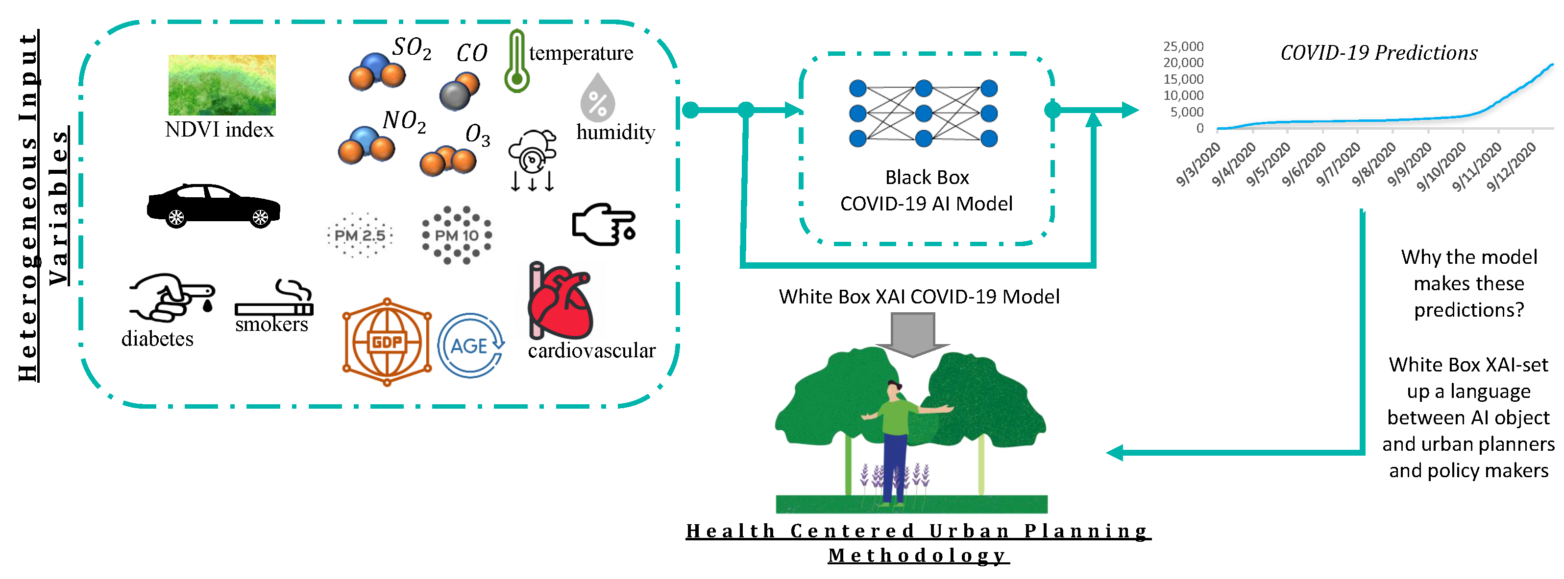
:1. Introduction
Contribution
2. Related Work
2.1. COVID-19 Prediction Models Using ML
2.2. Explainable AI Frameworks
3. Mathematical Formulation of the Pandemic Spatio-Temporal Evolution
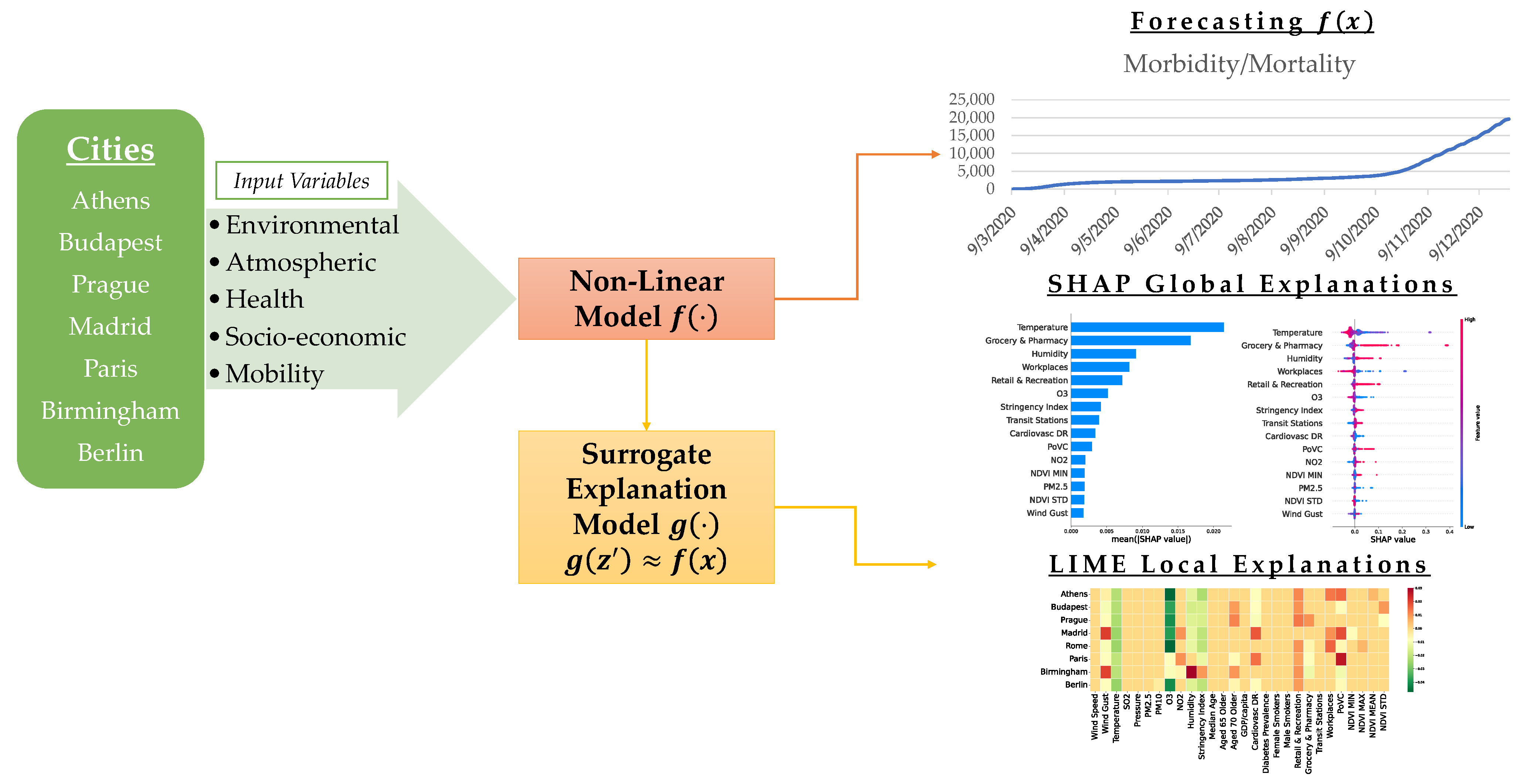
4. Spatio-Temportal Modeling of Heterogeneous Big Data for COVID-19 with Tree-Based Ensemble Learning
4.1. Improving the Interpretability of the Random Forest Regressor
4.1.1. Shapely Additive Explanation (SHAP)
4.1.2. Local Interpretable Model-Agnostic Explanations (LIME)
5. Experimental Results and Discussion
5.1. Dataset Description
5.2. Model Performance Evaluation
5.2.1. Comparisons for Different Machine Learning Models
5.2.2. Temporal Variability of the Performance Errors—Analysis for Different Time Periods
5.2.3. Spatial Variability of the Performance Errors-Per City Analysis
5.2.4. Spatio-Temporal Variability of the Performance Errors
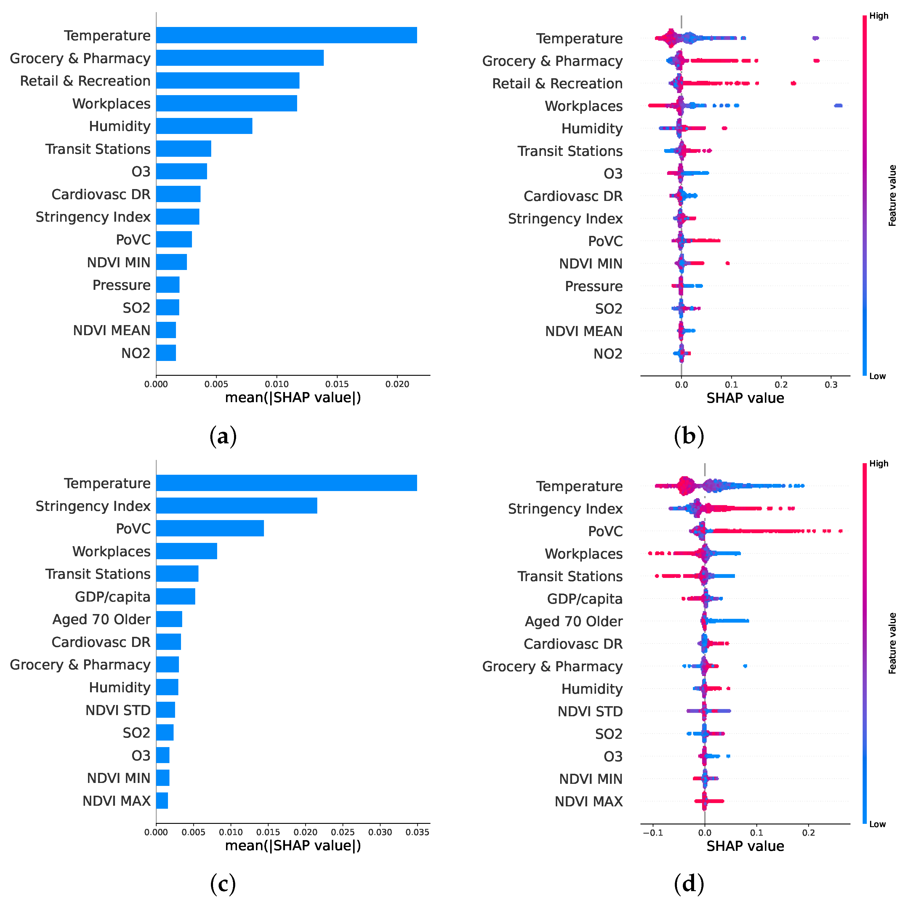
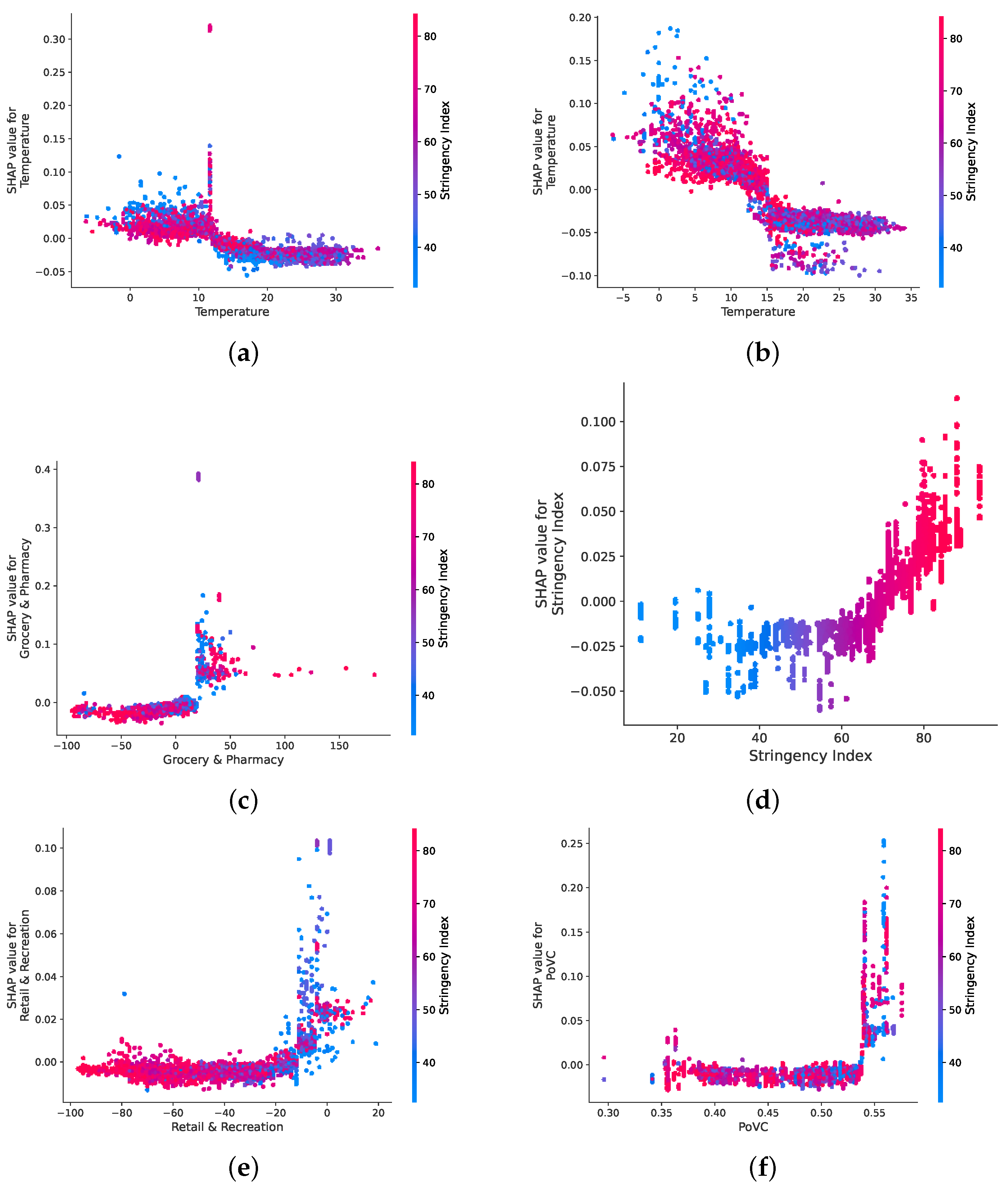
5.3. Global and Local Explanations
5.4. Feature Understanding and Feature Explanation
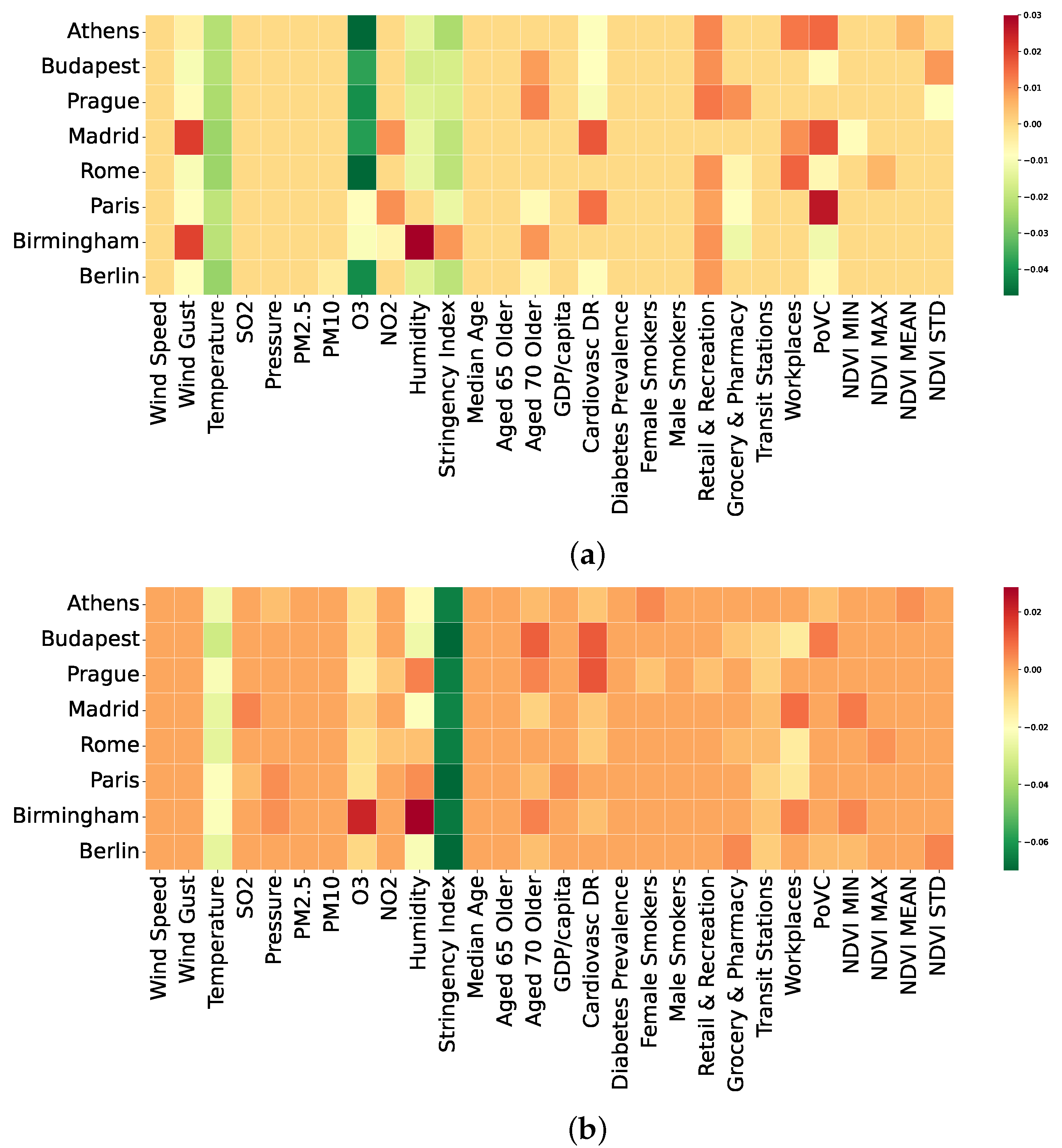
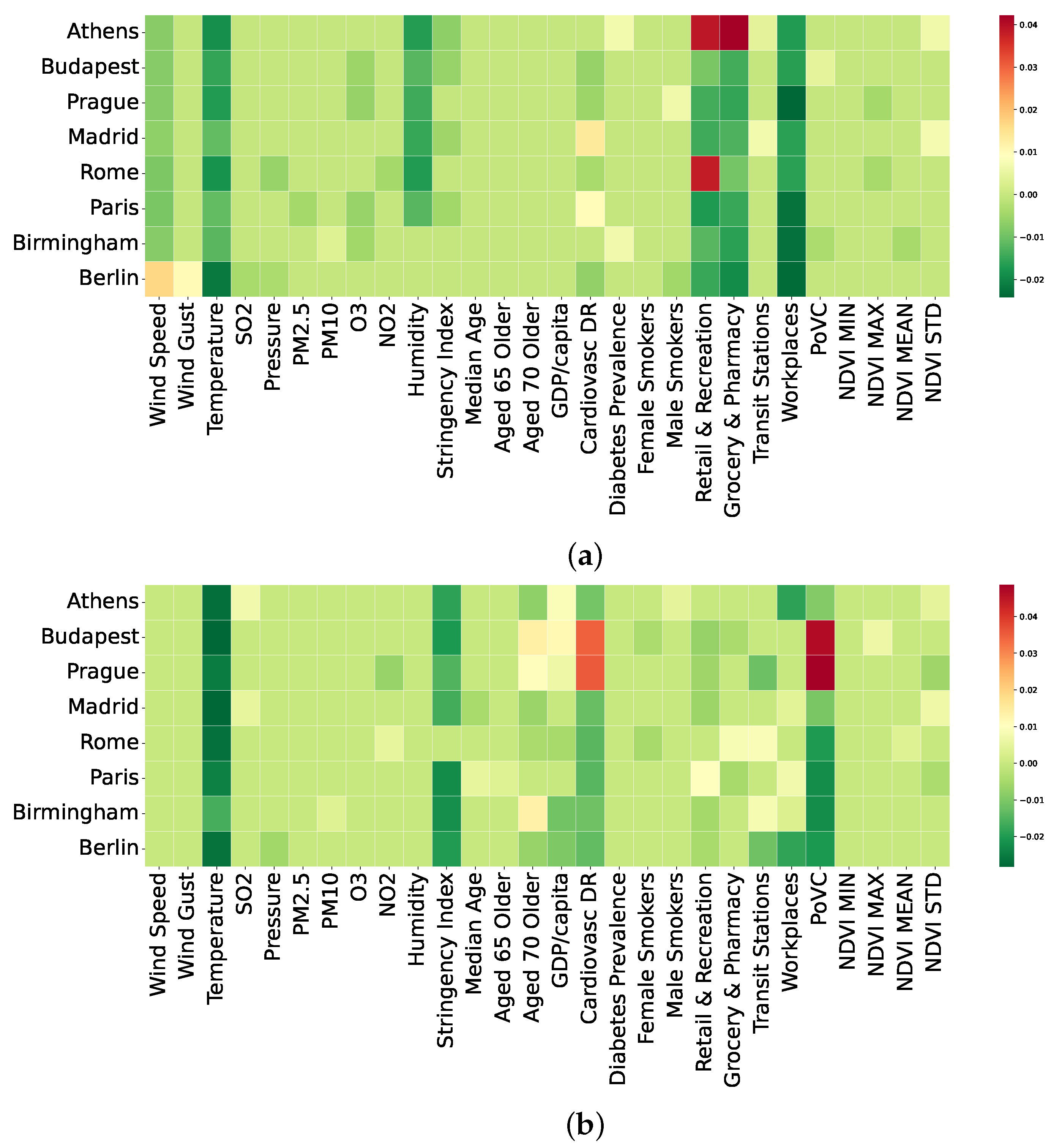
5.5. City-to-City and Year-to-Year Analysis with LIME
6. Conclusions
Author Contributions
Funding
Data Availability Statement
Acknowledgments
Conflicts of Interest
References
- Yang, X.; Yu, Y.; Xu, J.; Shu, H.; Liu, H.; Wu, Y.; Zhang, L.; Yu, Z.; Fang, M.; Yu, T.; et al. Clinical course and outcomes of critically ill patients with SARS-CoV-2 pneumonia in Wuhan, China: A single-centered, retrospective, observational study. Lancet Respir. Med. 2020, 8, 475–481. [Google Scholar] [CrossRef] [Green Version]
- Cucinotta, D.; Vanelli, M. WHO declares COVID-19 a pandemic. Acta Bio Med. Atenei Parm. 2020, 91, 157. [Google Scholar]
- Rosenthal, P.J.; Breman, J.G.; Djimde, A.A.; John, C.C.; Kamya, M.R.; Leke, R.G.; Moeti, M.R.; Nkengasong, J.; Bausch, D.G. COVID-19: Shining the light on Africa. Am. J. Trop. Med. Hyg. 2020, 102, 1145. [Google Scholar] [CrossRef] [PubMed]
- Burke, S.; Parker, S.; Fleming, P.; Barry, S.; Thomas, S. Building health system resilience through policy development in response to COVID-19 in Ireland: From shock to reform. Lancet Reg. Health Eur. 2021, 9, 100223. [Google Scholar] [CrossRef]
- Sanfelici, M. The Italian response to the COVID-19 crisis: Lessons learned and future direction in social development. Int. J. Community Soc. Dev. 2020, 2, 191–210. [Google Scholar] [CrossRef]
- Kavouras, I.; Kaselimi, M.; Protopapadakis, E.; Bakalos, N.; Doulamis, N.; Doulamis, A. COVID-19 Spatio-Temporal Evolution Using Deep Learning at a European Level. Sensors 2022, 22, 3658. [Google Scholar] [CrossRef]
- Lau, H.; Khosrawipour, V.; Kocbach, P.; Mikolajczyk, A.; Schubert, J.; Bania, J.; Khosrawipour, T. The positive impact of lockdown in Wuhan on containing the COVID-19 outbreak in China. J. Travel Med. 2020, 27, taaa037. [Google Scholar] [CrossRef] [Green Version]
- Carlson, C.J.; Albery, G.F.; Merow, C.; Trisos, C.H.; Zipfel, C.M.; Eskew, E.A.; Olival, K.J.; Ross, N.; Bansal, S. Climate change increases cross-species viral transmission risk. Nature 2022. [Google Scholar] [CrossRef]
- Sharifi, A.; Khavarian-Garmsir, A.R. The COVID-19 pandemic: Impacts on cities and major lessons for urban planning, design, and management. Sci. Total Environ. 2020, 749, 142391. [Google Scholar] [CrossRef]
- Travaglio, M.; Yu, Y.; Popovic, R.; Selley, L.; Leal, N.S.; Martins, L.M. Links between air pollution and COVID-19 in England. Environ. Pollut. 2021, 268, 115859. [Google Scholar] [CrossRef]
- Manzanedo, R.D.; Manning, P. COVID-19: Lessons for the climate change emergency. Sci. Total Environ. 2020, 742, 140563. [Google Scholar] [CrossRef] [PubMed]
- Kaselimi, M.; Voulodimos, A.; Daskalopoulos, I.; Doulamis, N.; Doulamis, A. A Vision Transformer Model for Convolution-Free Multilabel Classification of Satellite Imagery in Deforestation Monitoring. IEEE Trans. Neural Netw. Learn. Syst. 2022; early access. [Google Scholar] [CrossRef]
- Alassafi, M.O.; Jarrah, M.; Alotaibi, R. Time series predicting of COVID-19 based on deep learning. Neurocomputing 2022, 468, 335–344. [Google Scholar] [CrossRef] [PubMed]
- Gautam, Y. Transfer Learning for COVID-19 cases and deaths forecast using LSTM network. ISA Trans. 2021, 124, 41–56. [Google Scholar] [CrossRef] [PubMed]
- Devaraj, J.; Elavarasan, R.M.; Pugazhendhi, R.; Shafiullah, G.; Ganesan, S.; Jeysree, A.K.; Khan, I.A.; Hossain, E. Forecasting of COVID-19 cases using deep learning models: Is it reliable and practically significant? Results Phys. 2021, 21, 103817. [Google Scholar] [CrossRef] [PubMed]
- Sun, D.; Xu, J.; Wen, H.; Wang, D. Assessment of landslide susceptibility mapping based on Bayesian hyperparameter optimization: A comparison between logistic regression and random forest. Eng. Geol. 2021, 281, 105972. [Google Scholar] [CrossRef]
- Zhan, C.; Zheng, Y.; Zhang, H.; Wen, Q. Random-forest-bagging broad learning system with applications for covid-19 pandemic. IEEE Internet Things J. 2021, 8, 15906–15918. [Google Scholar] [CrossRef]
- Kavouras, I.; Kaselimi, M.; Protopapadakis, E.; Doulamis, N. Machine Learning Tools to Assess the Impact of COVID-19 Civil Measures in Atmospheric Pollution. In Proceedings of the The 14th PErvasive Technologies Related to Assistive Environments Conference, Corfu, Greece, 29 June–2 July 2021; pp. 396–403. [Google Scholar]
- Xie, X.; Wu, T.; Zhu, M.; Jiang, G.; Xu, Y.; Wang, X.; Pu, L. Comparison of random forest and multiple linear regression models for estimation of soil extracellular enzyme activities in agricultural reclaimed coastal saline land. Ecol. Indic. 2021, 120, 106925. [Google Scholar] [CrossRef]
- Grekousis, G.; Feng, Z.; Marakakis, I.; Lu, Y.; Wang, R. Ranking the importance of demographic, socioeconomic, and underlying health factors on US COVID-19 deaths: A geographical random forest approach. Health Place 2022, 74, 102744. [Google Scholar] [CrossRef]
- Shin, D. The effects of explainability and causability on perception, trust, and acceptance: Implications for explainable AI. Int. J. Hum. Comput. Stud. 2021, 146, 102551. [Google Scholar] [CrossRef]
- Yang, G.; Ye, Q.; Xia, J. Unbox the black-box for the medical explainable ai via multi-modal and multi-centre data fusion: A mini-review, two showcases and beyond. Inf. Fusion 2022, 77, 29–52. [Google Scholar] [CrossRef]
- Lundberg, S.; Lee, S. A unified approach to interpreting model predictions. In Proceedings of the Advances in Neural Information Processing Systems 30 (NIPS 2017), Long Beach, CA, USA, 4–9 December 2017. [Google Scholar]
- Ribeiro, M.T.; Singh, S.; Guestrin, C. “Why Should I Trust You?”: Explaining the Predictions of Any Classifier. arXiv 2016, arXiv:1602.04938. [Google Scholar]
- Sarkodie, S.A.; Owusu, P.A. Global effect of city-to-city air pollution, health conditions, climatic & socio-economic factors on COVID-19 pandemic. Sci. Total Environ. 2021, 778, 146394. [Google Scholar] [PubMed]
- Rashed, E.A.; Hirata, A. One-Year Lesson: Machine Learning Prediction of COVID-19 Positive Cases with Meteorological Data and Mobility Estimate in Japan. Int. J. Environ. Res. Public Health 2021, 18, 5736. [Google Scholar] [CrossRef] [PubMed]
- Zoran, M.A.; Savastru, R.S.; Savastru, D.M.; Tautan, M.N. Assessing the relationship between ground levels of ozone (O3) and nitrogen dioxide (NO2) with coronavirus (COVID-19) in Milan, Italy. Sci. Total Environ. 2020, 740, 140005. [Google Scholar] [CrossRef]
- Wu, X.; Nethery, R.C.; Sabath, M.B.; Braun, D.; Dominici, F. Air pollution and COVID-19 mortality in the United States: Strengths and limitations of an ecological regression analysis. Sci. Adv. 2020, 6, eabd4049. [Google Scholar] [CrossRef]
- Aurna, N.F.; Yousuf, M.A.; Taher, K.A.; Azad, A.; Moni, M.A. A classification of MRI brain tumor based on two stage feature level ensemble of deep CNN models. Comput. Biol. Med. 2022, 146, 105539. [Google Scholar] [CrossRef]
- Balleyguier, C.; Vanel, D.; Athanasiou, A.; Mathieu, M.; Sigal, R. Breast radiological cases: Training with BIRADS® classification. Eur. J. Radiol. 2005, 54, 97–106. [Google Scholar] [CrossRef]
- Chen, X.; Duan, Q.; Wu, R.; Yang, Z. Segmentation of lung computed tomography images based on SegNet in the diagnosis of lung cancer. J. Radiat. Res. Appl. Sci. 2021, 14, 396–403. [Google Scholar] [CrossRef]
- Soulami, K.B.; Kaabouch, N.; Saidi, M.N.; Tamtaoui, A. Breast cancer: One-stage automated detection, segmentation, and classification of digital mammograms using UNet model based-semantic segmentation. Biomed. Signal Process. Control 2021, 66, 102481. [Google Scholar] [CrossRef]
- Arras, L.; Osman, A.; Samek, W. CLEVR-XAI: A benchmark dataset for the ground truth evaluation of neural network explanations. Inf. Fusion 2022, 81, 14–40. [Google Scholar] [CrossRef]
- Veerappa, M.; Anneken, M.; Burkart, N.; Huber, M.F. Validation of XAI explanations for multivariate time series classification in the maritime domain. J. Comput. Sci. 2022, 58, 101539. [Google Scholar] [CrossRef]
- Van der Velden, B.H.; Kuijf, H.J.; Gilhuijs, K.G.; Viergever, M.A. Explainable artificial intelligence (XAI) in deep learning-based medical image analysis. Med. Image Anal. 2022, 79, 102470. [Google Scholar] [CrossRef] [PubMed]
- Rostami, M.; Oussalah, M. A novel explainable COVID-19 diagnosis method by integration of feature selection with random forest. Inform. Med. Unlocked 2022, 30, 100941. [Google Scholar] [CrossRef] [PubMed]
- Muhammad, L.J.; Algehyne, E.A.; Usman, S.S.; Ahmad, A.; Chakraborty, C.; Mohammed, I.A. Supervised Machine Learning Models for Prediction of COVID-19 Infection using Epidemiology. SN Comput. Sci. 2021, 2, 11. [Google Scholar] [CrossRef]
- Qiao, K.; Xing, S.; Xiaying, X.; Bing, C.; Yuanzhu, C.; Xudong, Y.; Baiyu, Z. Machine Learning-Aided Causal Inference Framework for Environmental Data Analysis: A COVID-19 Case Study. Environ. Sci. Technol. 2021, 55, 13400–13410. [Google Scholar]
- Yeşilkanat, C.M. Spatio-temporal estimation of the daily cases of COVID-19 in worldwide using random forest machine learning algorithm. Chaos Solitons Fract. 2020, 140, 110210. [Google Scholar] [CrossRef]
- Prakash, K.B.; Imambi, S.S.; Ismail, M.; Kumar, T.P.; Pawan, Y. Analysis, prediction and evaluation of covid-19 datasets using machine learning algorithms. Int. J. 2020, 8, 2199–2204. [Google Scholar] [CrossRef]
- Gupta, V.K.; Gupta, A.; Kumar, D.; Sardana, A. Prediction of COVID-19 confirmed, death, and cured cases in India using random forest model. Big Data Min. Anal. 2021, 4, 116–123. [Google Scholar] [CrossRef]
- Sagi, O.; Rokach, L. Ensemble learning: A survey. Wiley Interdiscip. Rev. Data Min. Knowl. Discov. 2018, 8, e1249. [Google Scholar] [CrossRef]
- Dong, X.; Yu, Z.; Cao, W.; Shi, Y.; Ma, Q. A survey on ensemble learning. Front. Comput. Sci. 2020, 14, 241–258. [Google Scholar] [CrossRef]
- Lundberg, S.; Erion, G.; Lee, S. Consistent Individualized Feature Attribution for Tree Ensembles. arXiv 2018, arXiv:1802.03888. [Google Scholar]
- Ritchie, H.; Mathieu, E.; Rodés-Guirao, L.; Appel, C.; Giattino, C.; Ortiz-Ospina, E.; Hasell, J.; Macdonald, B.; Dattani, S.; Roser, M. Coronavirus Pandemic (COVID-19). Our World In Data. 2020. Available online: https://ourworldindata.org/coronavirus (accessed on 25 May 2022).
- Bernal, J.L.; Andrews, N.; Gower, C.; Gallagher, E.; Simmons, R.; Thelwall, S.; Stowe, J.; Tessier, E.; Groves, N.; Dabrera, G.; et al. Effectiveness of Covid-19 vaccines against the B. 1.617. 2 (Delta) variant. N. Engl. J. Med. 2021, 385, 585–594. [Google Scholar] [CrossRef] [PubMed]
- Mathieu, E.; Ritchie, H.; Ortiz-Ospina, E.; Roser, M.; Hasell, J.; Appel, C.; Giattino, C.; Rodés-Guirao, L. A global database of COVID-19 vaccinations. Nat. Hum. Behav. 2021, 5, 947–953. [Google Scholar] [CrossRef] [PubMed]
- Andrews, N.; Stowe, J.; Kirsebom, F.; Toffa, S.; Rickeard, T.; Gallagher, E.; Gower, C.; Kall, M.; Groves, N.; O’Connell, A.M.; et al. Covid-19 vaccine effectiveness against the Omicron (B. 1.1. 529) variant. N. Engl. J. Med. 2022, 386, 1532–1546. [Google Scholar] [CrossRef]
- Shi, P.; Dong, Y.; Yan, H.; Zhao, C.; Li, X.; Liu, W.; He, M.; Tang, S.; Xi, S. Impact of temperature on the dynamics of the COVID-19 outbreak in China. Sci. Total Environ. 2020, 728, 138890. [Google Scholar] [CrossRef]
- Xie, J.; Zhu, Y. Association between ambient temperature and COVID-19 infection in 122 cities from China. Sci. Total Environ. 2020, 724, 138201. [Google Scholar] [CrossRef]
- Notari, A. Temperature dependence of COVID-19 transmission. Sci. Total Environ. 2021, 763, 144390. [Google Scholar] [CrossRef]
- Velias, A.; Georganas, S.; Vandoros, S. COVID-19: Early evening curfews and mobility. Soc. Sci. Med. 2022, 292, 114538. [Google Scholar] [CrossRef]
- Panarello, D.; Tassinari, G. One year of COVID-19 in Italy: Are containment policies enough to shape the pandemic pattern? Socio-Econ. Plan. Sci. 2022, 79, 101120. [Google Scholar] [CrossRef]
- Chisadza, C.; Clance, M.; Gupta, R. Government Effectiveness and the COVID-19 Pandemic. Sustainability 2021, 13, 3042. [Google Scholar] [CrossRef]
- Deb, P.; Furceri, D.; Ostry, J.D.; Tawk, N. The economic effects of Covid-19 containment measures. Open Econ. Rev. 2022, 33, 1–32. [Google Scholar] [CrossRef]
- Rathod, A.; Sahu, S.; Singh, S.; Beig, G. Anomalous behaviour of ozone under COVID-19 and explicit diagnosis of O3-NOx-VOCs mechanism. Heliyon 2021, 7, e06142. [Google Scholar] [CrossRef] [PubMed]


| Input Variables | Description | Class | Notation | Units | Source | Mean | Std | Min | Max |
|---|---|---|---|---|---|---|---|---|---|
| Wind speed | Avg. daily wind speed | Atm | m/s | AQ | 3.2 | 1.65 | 0.2 | 13.1 | |
| Wind Gust | Avg. daily wind dust | Atm | m/s | AQ | 6.91 | 3.73 | 0.4 | 26.2 | |
| Pressure | Avg. daily atmospheric pressure values | Atm | mb | AQ | 1014.64 | 8.31 | 973 | 1041 | |
| Temperature | Avg. daily temperature values | Atm | °C | AQ | 14.53 | 7.72 | −6.4 | 36.1 | |
| Humidity | Avg. daily humidity | Atm | % | AQ | 68.41 | 16.98 | 20 | 98 | |
| SO2 | Avg. daily sulfur dioxide values | Atm | µg/m3 | AQ | 1.75 | 1.32 | 0.1 | 9.9 | |
| PM2.5 | Avg. daily fine particulate matter () | Atm | µg/m3 | AQ | 42.74 | 20.01 | 5 | 171 | |
| PM10 | Avg. daily fine particulate matter () | Atm | µg/m3 | AQ | 17.93 | 9.01 | 3 | 77 | |
| O3 | Avg. daily ground level ozone values | Atm | µg/m3 | AQ | 21.71 | 9.47 | 0.8 | 55.2 | |
| NO2 | Avg. daily nitrogen dioxide values | Atm | µg/m3 | AQ | 10.04 | 5.01 | 0.7 | 43.7 | |
| Cardiovascular DR | Country cardiovascular death rate | Heal | / | OWD | 156.41 | 64.43 | 86.06 | 278.3 | |
| Diabetes Prevalence | Country % number of diabetics | Heal | % | OWD | 5.98 | 1.47 | 4.28 | 8.31 | |
| Male smokers | Country % male smokers per city | Heal | % | OWD | 34.81 | 7.8 | 24.7 | 52 | |
| Female smokers | Country % female smokers per city | Heal | % | OWD | 27.24 | 4.95 | 19.8 | 35.3 | |
| Median age | Population median age per city | Soc | % | OWD | 44.4 | 2.23 | 40.8 | 47.9 | |
| Aged 65 older | Population over 65 | Soc | % | OWD | 20.04 | 1.48 | 18.52 | 23.02 | |
| Aged 70 older | Population over 70 | Soc | % | OWD | 13.73 | 1.61 | 11.58 | 16.24 | |
| GDP per capita | Gross Domestic Product | Soc | $ | OWD | 34,233.25 | 6265.04 | 24,574.38 | 45,229.25 | |
| PoVC | % of land cover in vegetation | Env | % | Copernicus | 0.46 | 0.06 | 0.3 | 0.58 | |
| NDVI mean | Mean value of NDVI image | Env | - | Copernicus | 0.27 | 0.12 | 0 | 0.5 | |
| NDVI max | Max value of NDVI image | Env | - | Copernicus | 0.95 | 0.09 | 0.63 | 1 | |
| NDVI min | Min value of NDVI image | Env | - | Copernicus | −0.78 | 0.21 | −1 | −0.17 | |
| NDVI std | Std. value of NDVI image | Env | - | Copernicus | 0.19 | 0.04 | 0.06 | 0.27 | |
| Retail Recreation | Daily mobility trends for retail and recreation | Mob | % | −33.84 | 22.98 | −97 | 19 | ||
| Grocery Pharmacy | Daily mobility trends for grocery and pharmacy | Mob | % | −4.99 | 21.33 | −95 | 182 | ||
| Transit Stations | Daily mobility trends for transit stations | Mob | % | −36.12 | 18.26 | −93 | 12 | ||
| Workplaces | Daily mobility trends for places of work | Mob | % | −33.28 | 20.54 | −92 | 95 |
| Machine Learning Algorithm | Cases (/ People) | Deaths (/ People) | ||
|---|---|---|---|---|
| RMSE | MAE | RMSE | MAE | |
| Linear regression | 436.12 | 268.28 | 3.63 | 2.41 |
| Decision tree regressor | 380.41 | 210.23 | 4.00 | 2.62 |
| Support vector regressor | 340.43 | 249.57 | 3.22 | 2.42 |
| Lasso regression | 498.76 | 267.02 | 4.94 | 3.65 |
| Gaussian process regressor | 436.14 | 268.13 | 3.63 | 2.41 |
| Multi-layer percepton | 252.13 | 149.39 | 2.98 | 1.87 |
| XGBoost regressor | 209.86 | 125.44 | 2.60 | 1.56 |
| Light GBM regressor | 208.40 | 97.63 | 2.20 | 1.18 |
| Proposed random forest regressor | 192.44 | 93.76 | 2.15 | 1.12 |
| 2020 | 2021 | |||||||
|---|---|---|---|---|---|---|---|---|
| ML Algorithm | Cases ( People) | Deaths ( People) | Cases ( People) | Deaths ( People) | ||||
| RMSE | MAE | RMSE | MAE | RMSE | MAE | RMSE | MAE | |
| Linear regression | 149.70 | 93.85 | 3.31 | 2.37 | 549.06 | 359.03 | 3.96 | 2.54 |
| DT regressor | 156.39 | 98.70 | 3.75 | 2.38 | 503.17 | 303.63 | 4.19 | 2.74 |
| SVM regressor | 133.15 | 89.79 | 2.74 | 1.97 | 354.89 | 262.07 | 3.63 | 2.52 |
| Lasso regression | 193.34 | 136.94 | 5.00 | 3.91 | 723.90 | 399.82 | 5.40 | 3.60 |
| GP regressor | 149.68 | 94.00 | 3.32 | 2.37 | 549.15 | 359.14 | 3.97 | 2.54 |
| MLP regressor | 146.96 | 95.50 | 2.61 | 1.69 | 296.33 | 181.64 | 3.42 | 2.06 |
| XGBoost egressor | 116.78 | 63.58 | 2.43 | 1.40 | 255.89 | 144.41 | 2.89 | 1.45 |
| LightGBrM regressor | 112.12 | 56.30 | 2.33 | 1.23 | 240.39 | 124.76 | 2.86 | 1.24 |
| RF regressor | 111.40 | 54.04 | 2.27 | 1.16 | 226.03 | 110.25 | 2.65 | 1.12 |
| City | Cases (/ People) | Deaths (/ People) | ||
|---|---|---|---|---|
| RMSE | MAE | RMSE | MAE | |
| Athens | 149.79 | 69.50 | 1.31 | 0.84 |
| Budapest | 255.22 | 118.34 | 3.67 | 1.92 |
| Prague | 293.91 | 163.54 | 2.16 | 1.25 |
| Madrid | 245.08 | 138.69 | 2.62 | 1.20 |
| Rome | 72.38 | 39.22 | 1.26 | 0.76 |
| Paris | 196.97 | 102.83 | 2.16 | 1.25 |
| Birmingham | 87.85 | 56.80 | 1.60 | 1.07 |
| Berlin | 118.48 | 69.11 | 0.97 | 0.60 |
| 2020 | 2021 | |||||||
|---|---|---|---|---|---|---|---|---|
| City | Cases ( People) | Deaths ( People) | Cases ( People) | Deaths ( People) | ||||
| RMSE | MAE | RMSE | MAE | RMSE | MAE | RMSE | MAE | |
| Athens | 53.11 | 26.11 | 1.06 | 0.56 | 105.46 | 74.07 | 1.21 | 0.73 |
| Budapest | 115.18 | 62.46 | 1.58 | 0.91 | 297.97 | 150.31 | 5.25 | 2.57 |
| Prague | 189.40 | 92.46 | 2.48 | 1.12 | 430.92 | 224.67 | 4.25 | 2.06 |
| Madrid | 144.78 | 74.20 | 3.92 | 2.12 | 201.98 | 104.45 | 1.77 | 0.97 |
| Rome | 58.97 | 35.72 | 1.42 | 0.83 | 86.87 | 45.95 | 0.90 | 0.53 |
| Paris | 118.13 | 68.06 | 2.64 | 1.51 | 218.63 | 125.18 | 1.59 | 0.78 |
| Birmingham | 63.86 | 43.93 | 2.19 | 1.50 | 99.20 | 77.95 | 0.89 | 0.64 |
| Berlin | 61.21 | 36.02 | 1.00 | 0.62 | 132.55 | 79.44 | 1.00 | 0.52 |
Publisher’s Note: MDPI stays neutral with regard to jurisdictional claims in published maps and institutional affiliations. |
© 2022 by the authors. Licensee MDPI, Basel, Switzerland. This article is an open access article distributed under the terms and conditions of the Creative Commons Attribution (CC BY) license (https://creativecommons.org/licenses/by/4.0/).
Share and Cite
Temenos, A.; Tzortzis, I.N.; Kaselimi, M.; Rallis, I.; Doulamis, A.; Doulamis, N. Novel Insights in Spatial Epidemiology Utilizing Explainable AI (XAI) and Remote Sensing. Remote Sens. 2022, 14, 3074. https://doi.org/10.3390/rs14133074
Temenos A, Tzortzis IN, Kaselimi M, Rallis I, Doulamis A, Doulamis N. Novel Insights in Spatial Epidemiology Utilizing Explainable AI (XAI) and Remote Sensing. Remote Sensing. 2022; 14(13):3074. https://doi.org/10.3390/rs14133074
Chicago/Turabian StyleTemenos, Anastasios, Ioannis N. Tzortzis, Maria Kaselimi, Ioannis Rallis, Anastasios Doulamis, and Nikolaos Doulamis. 2022. "Novel Insights in Spatial Epidemiology Utilizing Explainable AI (XAI) and Remote Sensing" Remote Sensing 14, no. 13: 3074. https://doi.org/10.3390/rs14133074
APA StyleTemenos, A., Tzortzis, I. N., Kaselimi, M., Rallis, I., Doulamis, A., & Doulamis, N. (2022). Novel Insights in Spatial Epidemiology Utilizing Explainable AI (XAI) and Remote Sensing. Remote Sensing, 14(13), 3074. https://doi.org/10.3390/rs14133074