Introduction
Reading is a process in which the observer transforms typographical symbols into recognizable meaning. The legibility of a text refers to the ease with which this process is carried out. To facilitate legibility, the text must be visible and recognizable, but visibility and recognition are influenced by the typographical choice encompassing the typeface, kerning, leading and space between words. Furthermore, legibility is also influenced by the verbal capabilities of the reader (
Reynolds, 1988).
Legibility and the reading process can be studied by tracking eye movement. Reading does not occur as a continuous movement of the eyes along the lines of a text but rather as a sequence of rapid eye movements (saccades) with a velocity of 500 deg/sec and individual fixations typically lasting between 200 and 250 ms (Abady, 2006;
Burr & Ross, 1983; Rayner, Foorman, Perfetti, Presetsky & Seidenberg, 2001), even though different studies report very variable intervals, i.e. durations between 200 and 300 ms (
Rayner, 1998) or even between 100 and 800 ms (
Feng 2009). Fixations are short stops at individual words or groups of words that (within their duration) enable the brain to process the information, while saccades are extremely rapid eye movements, whose function is to align the image of the object with the area of the fovea. From the data on fixations (their duration and location), on saccades (their number per unit time and their length) and reading speed we can draw conclusions how reading proceeds and how legible the text appears to be to the reader. For example, several studies have shown that familiar words require shorter fixation time than less familiar or unknown words (
Rayner, 1998;
Kommer & Mersin, 2002; Schother & Rayner 2012). The saccade movements depend on the font size. Studies have found that they typically range from 4.8 to 5.7 characters (Kennedy, Heller, Pynte & Radach, 2000), from 8 to 9 characters (Rayner, Foorman, Perfetti, Presetsky & Seidenberg, 2001) or from 5.43 to 5.7 characters (
Morrison & Rayner, 1981).
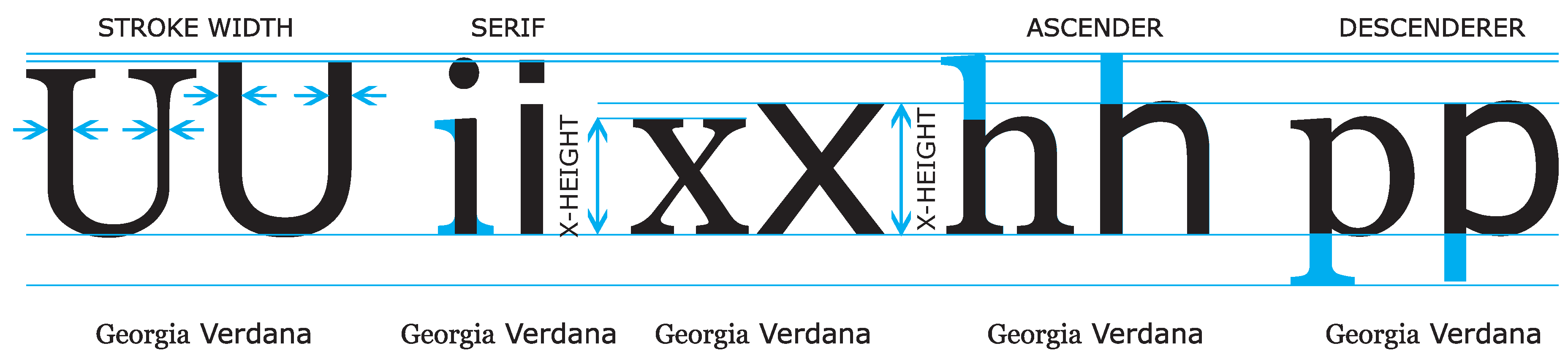
We need to read increasing quantities of text from various types of screens. To make reading as efficient and effortless as possible, certain conditions must be established that allow the text to be legible. It is therefore important to study how specific characteristics of the characters and the screen on which they are displayed influence legibility. Two factors strongly influence legibility: the size of the font and its shape (typeface). The properties of the typographical elements which influence the legibility of the displayed text are the following (
Rayner et al., 2001;
Možina, 2001;
Bix, 2002): the shape of the characters and their counter-shape, the size of the extensions into ascenders and descenders, the presence and shape of serifs, the type style and the x-height. Sans-serif fonts consist of only main thick strokes and have a simpler shape (
Figure 1).
The first studies of reading speed in which the role of the typeface and font size has been explored, were carried out on printed samples (
Tinker, 1963;
Tracy, 2003). Later research on reading speed from screens was conducted on CRT screens with poor resolution (Creed, Dennis & Newstead, 1987;
Dyson & Haselgrove, 2001), without making use of eye-tracking technology (
Gould & Grischowsky, 1984; Boyarski, Neuwirth, Forlizzi & Regli, 1998). The results of the latter paper have shown that Georgia is easier to read than Verdana in an indirect comparison, but in a direct comparison based on participants' subjective judgment, a slight preference was found for Verdana. The study by Humar, Gradišar & Turk (2008) was also performed on CRT screens and explored the effect of different color combinations, but by using one typeface only and, again, without resorting to eyetracking. Studies of reading speed from LCD screens without eye-tracking also exist: Banerjee, Majumdar, Pal & Majumdar (2001) analyzed the legibility of three serif and three sans-serif fonts (among them also Georgia and Verdana) at 10, 12 and 14 pt, and found that, in general, sans-serif fonts were read slower than serif fonts. Similarly, Bernard, Lida, Riley, Hackler & Janzen (2002) analyzed four serif and four sans-serif fonts (also including Georgia and Verdana), reporting best legibility at 12 pt; Verdana was read faster than Georgia.
There are several studies focusing on reading from LCD screen that have exploited eye-tracking technology. In some studies (Siegenthaler, Bochud, Bergamin & Wurtz, 2012; Siegenthaler, Schmid, Wyss & Wurtz, 2012) only one font size was tested for each typeface. In Sheedy’s (2008) study only a single typeface with two font sizes was tested. Beymer, Russell & Orton (2008) have used two typefaces (Georgia and Helvetica) at 10, 12 and 14 pt. These papers, as well as
Bix’s (
2002) study, report different results regarding good or poor legibility by focusing on typefaces with or without serifs. So far no LCD screen-based study has been performed that would exploit eye-tracking technology in assessing the influence of the interaction of the font size and the typeface in reading speed.
Methods
Preliminary measurements
Prior to the main study, in which the reading speed of two typefaces at various sizes was examined, we conducted a set of preliminary measurements in which the texts suitable for the main study were selected. In these preliminary evaluations 50 participants took part, 25 of whom were female and 25 male, aged 17 to 46, with an average of 24.4 years (SD = 7.37). All participants had normal or corrected-to-normal vision. The study was performed in accordance with the latest declaration of Helsinki. The measurements were performed in a quiet room with walls painted in neutral matte gray, according to the ISO 3664 standard (ISO 3664, 2009). We used 50 different texts in the Slovene language (the mother tongue of all participants) with similar subject-matter. For sentences to remain semantically complete, the texts contained different numbers of words, ranging between 104 and 155 (SD = 8.92), and a similar number of lines (M = 8.69, SD = 0.48). To avoid the bias on readers’ preexisting knowledge of a certain subject-matter that might have influenced the reading speed, simple literary texts of similar content were used. We did not use any standard texts of foreign origin in order to avoid the effects of differences inparticipants’ knowledge of foreign languages. The participants were divided into 5 groups of 10 people. Each group read the texts in a different sequence. In this manner we eliminated the factors of fatigue and lack of concentration that might have affected the final part of the reading. The texts in Verdana typeface at 12 pt (16 px) were displayed on a 24-inch LCD screen with a resolution of 1900 × 1200 pixels (pixel size 0.27 mm) at a 60 Hz refresh rate in dark characters on light backgrounds, as recommended by the ISO 12646 standard (ISO 12646, 2008). The tested individuals were positioned (60 +/– 1) cm from the screen according to the recommendations of the ISO 9241 standard (ISO 9241, 2012). This appears to be the standard distance used in related studies (Siegenthaler, Wurtz, Bergamin & Groner, 2011; Sharmin, Špakov, & Räihä, 2012; Siegenthaler, Schmid, Wyss & Wurtz, 2012). The texts were set in a CSS style sheet and displayed as a HTML document. In this way we ensured a precise display of the texts in the chosen size. The texts were displayed in the middle of the screen. Consecutive texts were invoked by successive mouse clicks.
Apparatus
To track the eye movement we used the Tobii X120 eye-tracking device and the Tobii Studio 3.1.3 software. The eye tracker tracks the movement of the eye by following the reflection of the image from the cornea. This reflection is generated when the infrared illuminators at the front side of the eye tracker create patterns of light reflecting from the cornea. Eye tracker contains an infrared-sensitive camera that tracks the individual’s eye movements and fixations. Prior to the measurement, each individual adapted to the lighting conditions of the room for 5 minutes and then underwent a 9-point screen-based calibration. We measured the total reading time of each text by each individual. The texts were ranked according to the average reading speed. We selected 16 texts from the middle of the ranking list (with ranks 18 to 33) to be used in the main study.
Main measurements
The average text from the preliminary selection contained 118.8 (SD = 3.6) words, 565.9 (SD = 23.3) characters (excluding spaces), 63.36 (SD = 1.8) characters per line and 8.9 (SD = 0.4) lines. The length of these texts was comparable to the lengths of the texts used in the study by T. Klosinski, K. Dietz and the IReST Study Group (2012), but our texts contained more syllables.
Each typeface (Georgia and Verdana) was displayed in the size typically used for the main body text (from 12, 13, 14, 15 to 16 pt) and for highlighted text or titles (18, 20 and 24 pt), which corresponds to 16, 17, 19, 20, 21, 24, 26 and 32 px, respectively. Therefore the 2 (type style) × 8 (type size) within-participant design was used. The x-height was between 0.21 to 0.46°. Due to different character-per-line counts, the texts of different lengths had equal numbers of lines and varying line widths. The differences in line widths were dictated by the typeface and the font size. The line spacing was 140% of the font size in all cases.
The main study was conducted in the same standardized conditions as the preliminary measurements. It involved 48 participants (24 female and 24 male) with normal or corrected eyesight, aged 17 to 47, with an average age of 24.6 years (SD = 8.38). They were divided into 16 groups of 3. Both typefaces and all 8 sizes were shown to each of the 48 participants. The participants within a single group read the displayed texts in the same sequence for both typefaces and in all font sizes. Among different groups, the display sequence was varied using the Latin square design, which was used for counterbalancing the order of the texts, i.e. to randomize the measurement process and to eliminate possible effects of fatigue. Each group received the texts in a different order. For each tested individual we measured the reading time and the number of fixations, as well as the saccades for each text.
To put the results on an equal footing, we recomputed the reading speed and the fixation duration for each text by taking into account the first 500 characters. Since the average length of words varies significantly among different languages, characters per second were used as the measurement unit instead of words per second in order to facilitate the generalization of our results (T. Klosinski et al., 2012). We then performed a two-factor repeated measures analysis of variance. Where the sphericity assumption was violated, a Greenhouse-Geisser correction of the degrees of freedom was used. The hypotheses were tested at the level of alpha = 0.05.
Results
In presenting the results we focus on reading speed, total fixation time, number of fixations, fixation duration and saccade length.
Reading speed. The number of characters read per second increased with the font size (
Figure 2). The results of ANOVA showed that the interaction between the typeface and the font size was not statistically significant,
F(5.37, 252.55) = 0.59,
p = 0.718, MSE = 2.25, partial ŋ
2 = 0.012 , 1–β = 0.22. The number of read characters per second depended on the font size,
F(5.49, 258.16) = 4.52,
p < 0.001, MSE = 17.97, partial ŋ
2 = 0.09, 1–β = 0.979, namely, the number of read characters increased with increasing the font size. The average number of read characters was smaller for Georgia (M = 18.13 characters per second, SD = 4.16) than for Verdana (M = 19.61 s0.001, MSE = 366.99, partial ŋ
2 = 0.31, 1–β = 0.995.
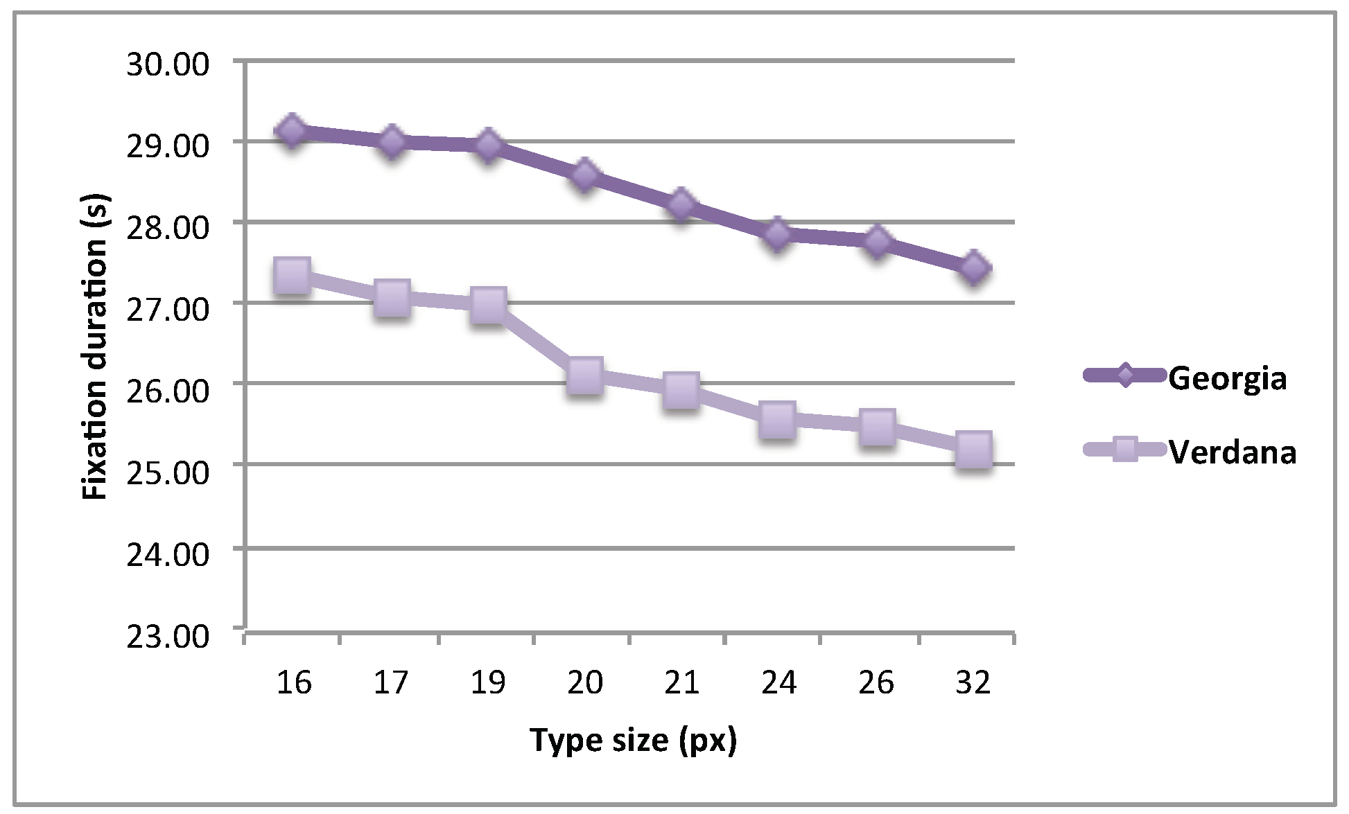
Total fixation time. The total duration of fixation in seconds decreased with the increase of the font size (
Figure 3). The results of ANOVA showed that the interaction between the typeface and the font size was not statistically significant,
F(4.68, 219.64) = 0.22,
p = .981, MSE = 2.03, partial ŋ
2 = 0.006, 1–β = 0.113. The duration of fixation decreased with increasing the font size,
F(4.64, 217.97) = 8.08,
p < 0.001, MSE = 75.088, partial ŋ
2 = 0.147, 1–β = 0.999. The average duration of fixation was longer for Georgia (M = 28.38 seconds for the whole text, SD = 0.82) than for Verdana (M = 26.25 seconds for the whole text, SD = 0.72),
F(1, 47) = 22.95,
p < 0.001, MSE = 870.89, partial ŋ
2 = 0.328, 1–β = 0.997.
To better understand the effects of the typeface and the font size on the total fixation time, we also examined the number of fixations, average duration of a single fixation, and average saccade length and tried to tease apart the effects on these two composite parts of the total fixation time.
Number of fixations. The results of ANOVA showed that the interaction between the typeface and the font size was statistically significant, F(5.297, 248.973) = 10.732, p < 0.001, MSE = 680.315, partial ŋ2 = .186, 1–β = 1.000. The number of fixations depended on the font size F(4.416, 207.563) = 103.381, p < 0.001, MSE = 9459.083, partial ŋ2 = 0.687, 1–β = 1.000, namely, the number of fixation increased with increasing font size. The average number of fixation was smaller for Georgia (M = 87.711, SD = 1.577) than for Verdana (M = 91.789, SD = 1.707). The number of fixation depended on the typeface F(1, 47) = 31.337, p < 0.001, MSE = 3193.805, partial ŋ2 = 0.400, 1–β = 1.000.
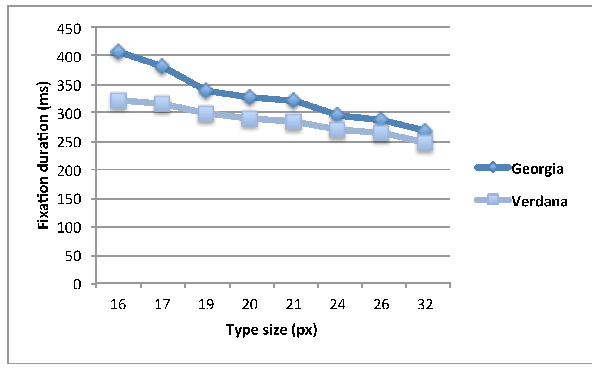
Fixation duration. The results of ANOVA showed a statistically significant interaction between the typeface and the font size,
F(2.23, 104.77) = 11.89,
p < 0.001, MSE = 37633.26, partial ŋ
2 = 0.202, 1–β = 0.99. The difference of the fixation duration between the two typefaces was relatively large for small type sizes, but it decreased with the increase in type size (
Figure 4). On average, the duration of fixation decreased with increasing the font size (and the number of fixations increased, respectively),
F(2.18, 102.56) = 109.049,
p < 0.001, MSE = 401981.60, partial ŋ
2 = 0.69, 1–β = 1.000. The average duration of fixation was longer for Georgia (M = 328.24 ms, SD = 6.63) than for Verdana (M = 286.66 ms, SD = 4.71),
F(1, 47) = 83.42,
p < 0.001, MSE = 331876.56, partial ŋ
2 = 0.64, 1–β = 1.00.
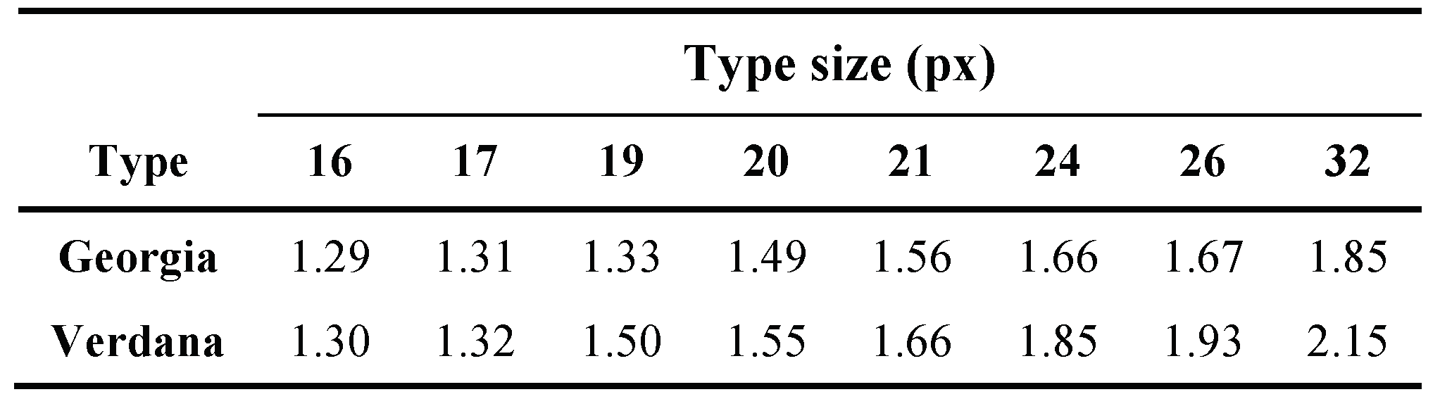
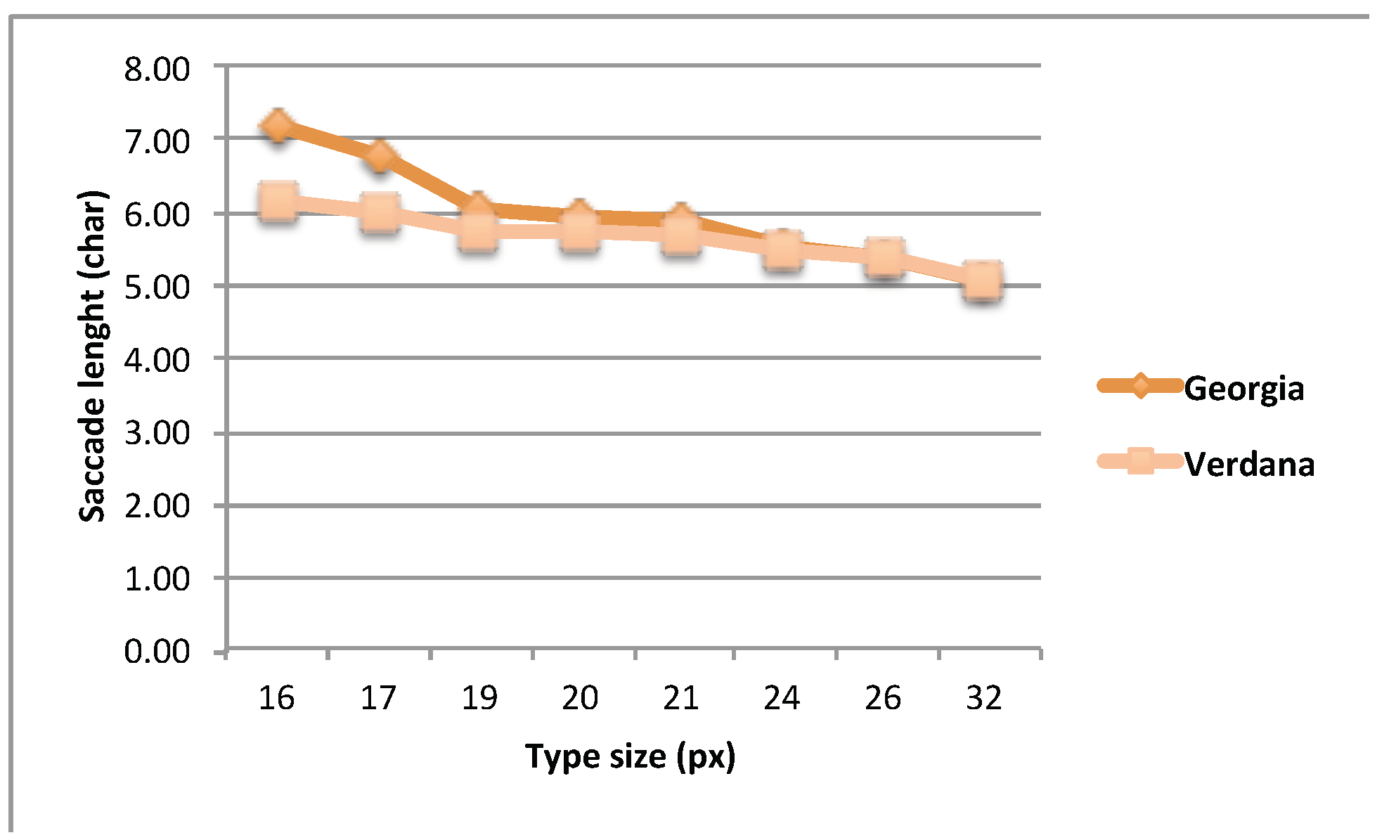
Saccade length. The saccade lengths in degrees of visual angle for individual typefaces and sizes were measured (Tab. 1). At smaller type sizes, the visual angle was almost the same for both typefaces, while the number of characters depends on the type designs and its width. As can be seen from
Figure 5, more characters were processed when the text was set in Georgia. At larger type sizes, the visual angle characterizing the average saccade length increased. The saccade spans for Verdana and Georgia diverged; however, the number of characters processed in a single saccade was similar for both typefaces.
When predicting saccade length in characters, there was a statistically significant interaction between the typeface and the font size,
F(4.10, 192.89) = 16.64,
p < 0.001, partial ŋ
2 = 0.26, 1–β = 1.00. The difference between the two typefaces was relatively large for small type sizes, but it decreased with the increase in type size (
Figure 5). The length of saccades decreased with increasing the font size,
F(3.43, 161.26) = 100.07,
p < 0.001, MSE = 54.09, partial ŋ
2 = 0.68, 1–β = 1.00. The average length of the saccade in characters was longer for Georgia (M = 5.96 characters, SD = 0.11) than for Verdana (M = 5.64 characters, SD = 0.10),
F(1, 47) = 36.61,
p < 0.001, MSE = 19.918, partial ŋ
2 = 0.44, 1
–β = 1.00. A possible reason for this difference is that Georgia has a narrower characters shape than Verdana which means that more characters can be acquired and processed within a single fixation.
Discussion
Our results show that with an increase in the font size the reading speed and the number of fixations increases, whereas the total fixation time, the duration of a single fixation and saccade length decrease. This suggests that the legibility of a text presented on an LCD display increases with the font size. Similarly, our results show that the legibility of Verdana was better than the legibility of Georgia.
According to our findings, larger font sizes, e.g. 20 and 24 pt (26 and 32 px), do not slow down the reading from the LCD screen. This is different from the findings presented by
Burr & Ross (
1983) who found that larger font sizes slow down the speed of reading printed matter, although their reading distance was somewhat smaller, typically between 30 and 40 cm.
Our results are in a remarkable agreement with the findings by Siegenthaler, Schmid, Wyss & Wurtz (2012) who studied reading behavior in e-reading devices such as the iPad. Thus for instance, our mean reading speeds (1088 characters per minute for Georgia and 1176 for Verdana, average 1132) is practically identical with their average value of the iPad measurements (1133 characters per minute). This similarity might be due to the fact that this particular e-book reader is the only one examined in their study that possesses an LCD screen. The x-height of their typeface was equal to the average x-height of the fonts used in our study.
Similarly, our general conclusion that larger font sizes imply higher reading speeds is consistent with the conclusion of Banerjee at al. (2011), who found that the reading speed was higher for Verdana, as well as the fonts of the largest sizes. But in their study the serif typefaces (Times New Roman, Georgia and Courier New) enabled greater reading speeds as opposed to sans-serif typefaces. However, since the differences in reading speeds between different typefaces tend to be small or even marginal, a very precise measurement of the speed is required: while Banerjee at al. (2011) relied on timing the reading sessions by using stopwatches, our eye-tracker based method offered much better precision and should therefore be more reliable.
For faster reading and, consequently, better legibility, the choice of the typeface is important. Both typefaces used in our study have a larger x-height, and this is even more pronounced in Verdana than in Georgia. At the same time, Verdana has minimal variations in stroke widths and therefore better visibility.
Conclusions
The results of our study show that the reading speed and, consequently, the legibility of the text displayed on an LCD screen are influenced by the typeface and the font size. The texts set in Verdana, regardless of the font size, were read faster than the texts set in Georgia. Verdana has no variations in stroke width, while Georgia does. At the same time Verdana has a slightly larger xheight and wider characters, which increases its legibility in reading from screens; this contributes to faster information processing.
Our study also showed that in LCD screens the reading speed varies with the font size. Reading speed and the number of fixations increases with the size of the fonts, while at the same time the duration of fixations decreased. The information processing time increases with increasing the font size. The larger the font size, the more fixations occur and the fewer characters are processed in a single fixation. For reading from LCD screens at standard distances, reading speed does not decrease at larger font sizes (20 and 24 pt); rather, it increases. This conclusion applies to both typefaces. The fonts of such sizes are not used to set longer texts, but they are useful for titles, which results in faster and better information acquisition.
Ecological design guidelines are aimed at reducing the consumption of paper and ink and at promoting the reading from screens instead of reading printed matter. In order to process the information presented on screens as quickly as possible, the choice of a suitable typeface and size is very important. Further studies should also investigate the influence of typeface style and size in reading under different lighting conditions, as well as in readers with impaired eye-sight.

