


Abstract
Disruptions in urban supply chains increase the risk of reduced access to medicines whose continuous availability is important for public health. This article develops an open-data decision support system (DSS) framework for assessing medicine availability under shortage and node-failure scenarios. The empirical application combines redeemed e-prescription data from the Ukrainian reimbursement program for 2022–2025 with the registry of dispensing points under National Health Service of Ukraine contracts and applies a unified scenario design to Kyiv and Lviv. The results show that demand is more concentrated in Lviv: the top 10 dispensing nodes account for 29.7% of redeemed e-prescriptions, compared with 14.2% in Kyiv. The proposed DSS supports the redistribution of limited available volume across spatial zones; it does not generate additional supply. Its value lies in identifying where lower-tail coverage, service coverage gaps, and redistribution-distance constraints should be monitored under explicitly defined stress-test assumptions. The framework is therefore positioned as a scenario-based planning tool rather than as a real-time inventory-management system.
1. Introduction
1.1. Urban Supply Chains and the Public-Health Imperative of Critical Medicines Availability
Urban supply chains can be understood as service systems in which freight movement, mobility conditions, and access to essential urban functions interact. Medicines represent a particularly sensitive category within this system because disruption affects not only logistical efficiency but also continuity of public-health service. For this reason, the article focuses on medicine availability as a service-coverage problem under shortage and node-failure scenarios, rather than on the broader design of urban logistics systems [1,2].
The increasing frequency and diversity of disruptions (production, logistical, informational, and institutional) heighten the risk of medicine shortages and transform accessibility into an applied service metric of resilience alongside traditional performance indicators. In response, healthcare supply chain management increasingly relies on digital technologies. At the same time, these do not eliminate disruptions; they enhance the system’s ability to detect breaches, coordinate responses, and restore functionality by enabling flow transparency and rapid decision-making in dynamic environments. Disruptions may be internal (supplier failures, planning errors) or external (pandemic shocks and other disruptive events), leading to temporary or persistent unavailability of parts of the product range and driving demand for formalized decision-support models for prioritization and distribution. At the EU level, institutional coordination of shortages is carried out, including through the SPOC WP. In 2024, a significant number of critical shortages were recorded within this framework, highlighting the urgency of distribution tools during disruptions [3,4,5,6,7,8].
1.2. Evidence on Medicine Shortages and Current Policy Instruments for ‘Critical’ Supply
Following the overview of urban supply chains and the public-health imperative of medicine availability in Section 1.1, the next step is to provide empirical evidence of the shortage problem and identify the policy frameworks that define the criticality within which the decision support system (DSS) must operate. Data from public shortage registries confirm the scale and unevenness of the problem while also revealing methodological limitations regarding comparability: a quantitative analysis of comparable registries in Finland, Sweden, Norway, Spain, and the USA for January–September 2020 recorded 5132 shortage reports; however, shortage profiles vary significantly by ATC (Anatomical Therapeutic Chemical) groups and dosage forms, complicating transnational generalizations without the standardization of definitions and registry fields [9]. At the national level, France provides a detailed example: the number of reports of shortage risks or actual shortages for medicinal products of “major therapeutic interest” rose from 404 in 2013 to 3761 in 2022, with dominant causes including production capacity constraints and supply-demand imbalances, including shortages of raw and packaging materials [10]. The product life cycle is a significant explanatory factor: shortages are more common during transition phases (specifically at the end of exclusivity, during shifts in reimbursement, or with competition) and in the final phase of the life cycle, providing a basis for risk-oriented monitoring of vulnerable items [11]. The consequences of shortages have both clinical and economic dimensions (treatment delays, forced substitutions, increased administrative burden, and costs), underscoring the need to shift from descriptive reporting of shortages toward formalized response mechanisms [12]. Policy instruments in response to shortages vary significantly across countries; a synthesis of measures in 38 countries shows a prevalence of combining registries/reporting obligations, inventory requirements, centralized coordination mechanisms, and export restrictions for items in short supply [6]. In parallel, predictive analytics tools for shortages based on pharmacy data and machine learning are being developed to support early warning and preparedness [13]. At the EU level in 2024, the work of the SPOC WP and MSSG focused on specific critical situations (notably Visudyne and GLP-1 receptor agonists), seasonal supply resilience for antibiotics, and the application of interstate solidarity mechanisms for oncology medicines; additionally, analytical materials within the EMA/HMA network refer to the monitoring of 34 critical medicine shortages or therapeutic classes in 2024 [7,8].
The policy framework for critical medicines in the EU is formalized through the Union List of Critical Medicines, published by the European Commission in December 2023, which lists over 200 active substances and therapeutic groups whose supply continuity is of priority importance to healthcare systems [14]. The EMA supports the annual review and technical updates to the list (methodological updates, terminology interoperability), which are essential for consistent monitoring and action across the regulatory network [15]. Simultaneously, the approach is evolving toward risk-oriented management of supply chain vulnerabilities: the European Commission conducted vulnerability analyses for selected items on the list. It published findings for the first tranche of critical medicinal products [15]. The Strategic Report of the Critical Medicines Alliance (HERA) and the European Court of Auditors Special Report 19/2025 point to structural drivers of shortages (production concentration, limited supplier diversification, market fragmentation) and the need for enhanced coordination, incentives, and early warning tools [16,17]. At the global level, the WHO Model List of Essential Medicines remains the primary reference framework, updated biennially and used as a benchmark for national essential medicine lists [18,19,20]. For the purposes of this article, these frameworks are utilized not to duplicate lists, but to operationalize criticality within the model (combining health significance with limited substitutability) and to construct shortage risk scenarios at the urban scale [14,15,18,19,20].
For the decision-support task developed in this article, these policy and ethical considerations are translated into a narrower operational rule: minimum service coverage should be protected first, while redistribution distance is treated as a secondary constraint. The model therefore prioritizes accessibility and equity under shortage conditions and uses the distance budget only to limit the intensity of the logistical response. Entropy is introduced later in the methodology as an additional diagnostic of spatial concentration, not as a separate allocation objective.
1.3. Research Gap, Contribution and Paper Structure
Section 1.1 and Section 1.2 outlined the urban context of integrated supply chains as a shared infrastructure for freight and mobility flows, alongside the empirical prevalence of shortages and the policy frameworks for critical/essential medicines. Against this background, the research gap addressed in this article is operational. Existing studies and policy documents discuss medicine shortages, accessibility, and allocation principles, but fewer approaches show how open administrative data can be converted into a reproducible urban stress test of dispensing networks. The article therefore focuses on three linked tasks: identifying spatial vulnerability in medicine access, testing shortage and node-failure scenarios, and evaluating a transparent redistribution rule under equity and distance-budget constraints.
The contribution is primarily methodological: the article specifies a reproducible DSS workflow that converts open administrative data into a scenario-based assessment of medicine availability under supply shortages and node failures. The Kyiv–Lviv comparison is used as an empirical case-study application of this workflow, not as an external validation of a universal operational system. Within this structure, entropy has a supporting role: it helps describe spatial concentration in coverage after redistribution, while the core DSS logic remains based on coverage, equity thresholds, shortage/donor-zone classification, and a redistribution-distance constraint.
2. Materials and Methods
2.1. Research Design and Data Sources
The methodological framework is first specified as a general DSS workflow for assessing medicine availability under shortage and node-failure scenarios. It is then applied empirically to two Ukrainian metropolitan areas—Kyiv and Lviv—chosen as contrasting cases in terms of scale and the spatial configuration of urban services. The case study is used to demonstrate the workflow under a unified scenario design rather than to provide external validation against observed emergency redistribution operations. The temporal horizon of the analysis covers the years 2022–2025; data from 2026 are used solely to update the network node list and verify parameter stability and are not included in the baseline scenario evaluation.
Disruptions are defined not by their specific causes, but by their operational consequences for the urban supply chain: transport constraints (increased travel time and/or partial deactivation of network edges), capacity degradation, or the temporary unavailability of nodes (notably due to power outages or digital process failures), and supply shocks in the form of volume shortages for critical medicines; a regulatory example of such episodes is the monitoring and preparation of measures to ensure the supply of antibiotics for respiratory infections [7]. From a methodological perspective, this operationalization aligns with health supply chain resilience approaches, in which digital technologies enhance flow visibility and response coordination, and planning for disruptions relies on demand/lead-time change scenarios and service metric impact assessments [3,4,5]. Specifically, a hybrid simulation–optimization–ML modeling framework has shown that responsive planning enables the maintenance of high service levels (approximately 98–99% in the cited experiments) while simultaneously reducing total costs compared to unresponsive policies [5]. Policy instruments for mitigating shortages, synthesized across 38 countries, include registries, reporting obligations, and, in specific regimes, export restrictions for medicines in short supply [6].
Data sources include redeemed e-prescriptions under the Ukrainian reimbursement program, the registry of dispensing locations under National Health Service of Ukraine contracts, and OpenStreetMap as a reference source for possible network-based extensions [21,22,23]. Redeemed e-prescriptions are used as an administrative demand proxy and are aggregated by city, time period, dispensing node, and grid zone. The registry of dispensing locations provides the network-node list and coordinate information used for geocoding and proximity assessment. In the present empirical application, accessibility is assessed through a coordinate-based proxy rather than through full road-network routing.
2.2. Representation of the Urban Medicine Supply Network
The urban supply/dispensing network is modeled as a demand–node–transport linkage: nodes represent dispensing points (pharmacies/reimbursement points) and, where necessary, hospital nodes or temporary redistribution hubs; edges represent movement through the street network. Node capacity constraints and availability regimes are explicitly specified (binary availability/unavailability in the baseline formulation; temporal windows are permitted if data are available). In this article, medicine access deserts are defined as grid cells in which the coverage ratio falls below the predefined equity floor τ. The term is used as a scenario metric rather than as a broader epidemiological classification of permanently underserved neighborhoods. A desert cell is therefore counted when the available volume assigned to a cell is insufficient to meet the minimum acceptable coverage threshold. This definition is used later in the scenario indicators reported in Section 3. Proxy accessibility metrics were empirically employed: the geodesic distance to the nearest node for a regular grid of points and zonal coverage, with the evaluation of quantiles and coverage inequality between cells (specifically, Gini and p10). The empirical accessibility assessment uses proximity-based open-data indicators: geodesic distance to the nearest dispensing node, regular-grid coverage ratios, and inequality measures across cells. FCA/2SFCA studies are used as a reference point within the broader spatial-accessibility literature because they indicate how the framework can later be extended toward network travel-time catchments and explicit demand–supply ratios when the required data become available.
2.3. Demand Proxy and Operationalization of Critical Medicinal Products
The demand proxy is generated from redeemed e-prescription data by aggregating by time (month/week), territory (districts/communities), and/or dispensing nodes for each metropolitan area separately [21]. The network nodes (dispensing points) are sourced from the list of dispensing locations under NHSU contracts and serve as the reference points for accessibility calculations and for formulating the distribution task in the DSS model [22].
The study distinguishes three related but non-identical categories. Reimbursed medicines define the empirical scope of the dataset, because redeemed e-prescriptions are observed within the Ukrainian reimbursement program. Essential medicines refer to the WHO normative framework for medicines that should be available in functioning health systems. Critical medicines refer to EU/WHO-informed prioritization categories used to interpret shortage relevance and define high-priority scenario logic. Thus, the empirical data describe the reimbursed segment, whereas the critical and essential medicine frameworks are used for classification and interpretation rather than as direct stock or inventory records.
The critical medicines classification is operationalized by mapping demand categories (at the level of ATC groups available in the data/reference books) to EU and WHO frameworks. In the EU, the Union List of Critical Medicines identifies over 200 active substances/groups whose supply continuity is of priority importance; the second version of the list covers approximately 75% of all authorized medicinal products in the EU/EEA, and the European Commission performs supply chain vulnerability analyses for selected items (the first tranche of 11 critical medicinal products) [14,15]. At the global level, the WHO Model Lists of Essential Medicines serve as the reference basis for identifying basic preparations that must be available in functioning healthcare systems [18,19,20]. Within this article, these frameworks are operationalized as criticality classification rules (therapeutic importance + limited substitutability) to construct shortage scenarios and establish prioritization in the DSS model [14,15,16,17,18,19,20].
Criticality weights and social service thresholds are defined as prioritization rules (criticality tiers) and service-level targets: minimizing unmet demand, controlling upper access-time quantiles, and meeting minimum coverage quotas for vulnerable districts. Service coverage gaps are formalized as violations of accessibility/coverage thresholds, thereby allowing equity constraints to be directly introduced into the redistribution allocation rule. The ethical logic of scarce medical resource allocation dictates the dominance of utility and access equity metrics in crisis conditions, aligning with the “efficiency + equity” multi-criteria formulations used in resource allocation models [24,25].
2.4. Disruption Scenarios and Network Failures
Disruption scenarios are formulated in the same way for both metropolitan areas. They include four disruption classes: supply shortages, selective node outages or capacity degradation, transport constraints, and informational or digital failures. In the empirical section, these broad classes are operationalized through the Def20, Hub10, Hub20, and combined Def20 + Hub scenarios. The general logic of stress testing and resilient allocation under disrupted supply conditions follows a transparent scenario-based approach. The scenario parameters (20% supply deficit, failure of the top 10 or top 20 nodes) are used as transparent stress-test assumptions rather than as a reconstruction of a single observed emergency episode. Def20 represents a moderate proportional supply shock that is sufficiently large to affect coverage indicators while remaining comparable across cities. Hub10 and Hub20 represent structural node-failure scenarios focused on the upper tail of demand concentration. Hub10 captures the disruption of the most heavily used core nodes, whereas Hub20 represents a more severe concentration-risk scenario. The same parameter values are applied to Kyiv and Lviv to preserve comparability between the two metropolitan cases. A parameterized example of a universal demand-logistics disturbance is a scenario involving a 75% increase in demand pressure with a simultaneous one-week extension of lead time over a fixed interval (in [5], between weeks 16 and 36), which demonstrates stock depletion and a decrease in service indicators in downstream links without the need to attribute disruptions to a specific cause [5]. For regulatory validation of disruption classes within the context of medicinal product accessibility, EU-level regulatory coordination is undertaken, focusing on specific critical groups (notably GLP-1 receptor agonists and antibiotics) and using early warning and solidarity tools [7].
Scenario parameters are selected through a reproducible stress-test logic and checked against baseline demand concentration and network structure in each city. The scenarios are therefore interpreted as illustrative planning assumptions. In operational use, the same parameter set could be calibrated with health authorities, pharmacy networks, and logistics operators, especially for shortage duration, shortage magnitude, and the share of temporarily unavailable nodes.
2.5. DSS Framework and Redistribution Rules
The DSS framework treats limited medicine availability as a priority-based accessibility task. It builds on the network representation, demand proxy, and disruption classes defined in Section 2.1, Section 2.2, Section 2.3 and Section 2.4. The primary criterion is to maximize the coverage of critical demand and/or minimize unmet demand under conditions of shortages and partial network failures, utilizing explicit recipient prioritization (criticality tiers) and service thresholds. In practice, this is implemented through a resource allocation rule across spatial zones that accounts for a minimum acceptable coverage level in each zone (equity floor) and includes an additional penalty for cells at risk of violating accessibility/coverage service thresholds [24,25].
The environmental component is defined as a secondary constraint that does not compete with the primary accessibility goal but rather limits the intensity of the logistical response. In this study, this is implemented as an ε-budget for redistribution distance intensity, which allows the trade-off between accessibility equalization and additional resource movement between zones to be assessed. The distance budget is used as a proxy measure of transport intensity and is not converted into CO2e emissions in the present empirical application [26,27,28].
The equity component is specified through constraints and thresholds that prevent the concentration of shortages in specific zones: by controlling the lower tail of the coverage distribution, establishing minimum quotas/thresholds for risk zones, and limiting the maximum access distance in the proxy metric. Such rules align with the ethical principles of scarce medical resource allocation, where utility and equity in access criteria dominate, while economic and environmental criteria serve as subordinate constraints [24,29,30].
Entropy is used only as a supplementary concentration diagnostic. It describes whether coverage is distributed evenly or concentrated in a small number of zones after the primary coverage and equity metrics have been calculated. It is not used as the objective function of the DSS and does not replace unmet-demand, coverage, or desert-cell indicators.
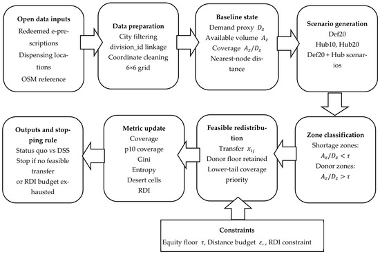
The DSS procedure is implemented in seven steps. First, redeemed e-prescriptions are aggregated by spatial zone and linked to functioning dispensing nodes. Second, for each disruption scenario, the available volume and baseline coverage ratio are calculated for every zone. Third, zones with coverage below the equity floor τ are classified as shortage zones, while zones above τ are treated as potential donor zones. Fourth, feasible redistribution pairs are generated between donor and shortage zones under the condition that donor-zone coverage cannot fall below τ after transfer. Fifth, feasible transfers are ranked by their expected contribution to lower-tail coverage improvement and by their distance-budget cost. Sixth, the selected transfer is applied, and coverage, desert-cell count, entropy, and cumulative distance budget are updated. Seventh, the procedure stops when no feasible transfer can improve shortage-zone coverage without violating the donor constraint or when the ε-distance budget is exhausted.
The redistribution logic can be represented as a constrained allocation problem. Let denote the set of spatial zones and let denote a disruption scenario. For each zone , is the demand proxy measured by redeemed e-prescriptions, is the available volume under scenario , and is the equity floor. Let denote the geodesic distance between donor zone and shortage zone , and let denote the maximum admissible redistribution distance budget under scenario . Zones with form the shortage-zone set , whereas zones with form the potential donor-zone set . Redistribution variables are defined only for feasible donor-shortage pairs .
The decision variable denotes the volume transferred from donor zone to shortage zone under scenario . The post-transfer available volume in zone is defined as follows:
The desert-cell indicator equals 1 if zone remains below the equity floor after redistribution. The priority objective is to reduce the number of desert cells and lower-tail coverage shortfalls:
where is the remaining uncovered demand in zone , and is a non-negative penalty parameter. In the empirical application, is treated as a small positive tie-breaking parameter: the primary objective remains the reduction of desert cells, while is used to prefer redistribution options with lower residual uncovered demand when the desert-cell count is equal. The main constraints are as follows:
where is a sufficiently large constant used to activate the desert-cell condition. The implemented DSS does not solve this formulation as an exact mixed-integer optimization model; instead, it uses a deterministic heuristic that follows the same feasibility logic: donor zones cannot fall below the equity floor, shortage zones are prioritized by lower-tail coverage improvement, and redistribution stops when no feasible transfer remains, or the distance budget is exhausted.
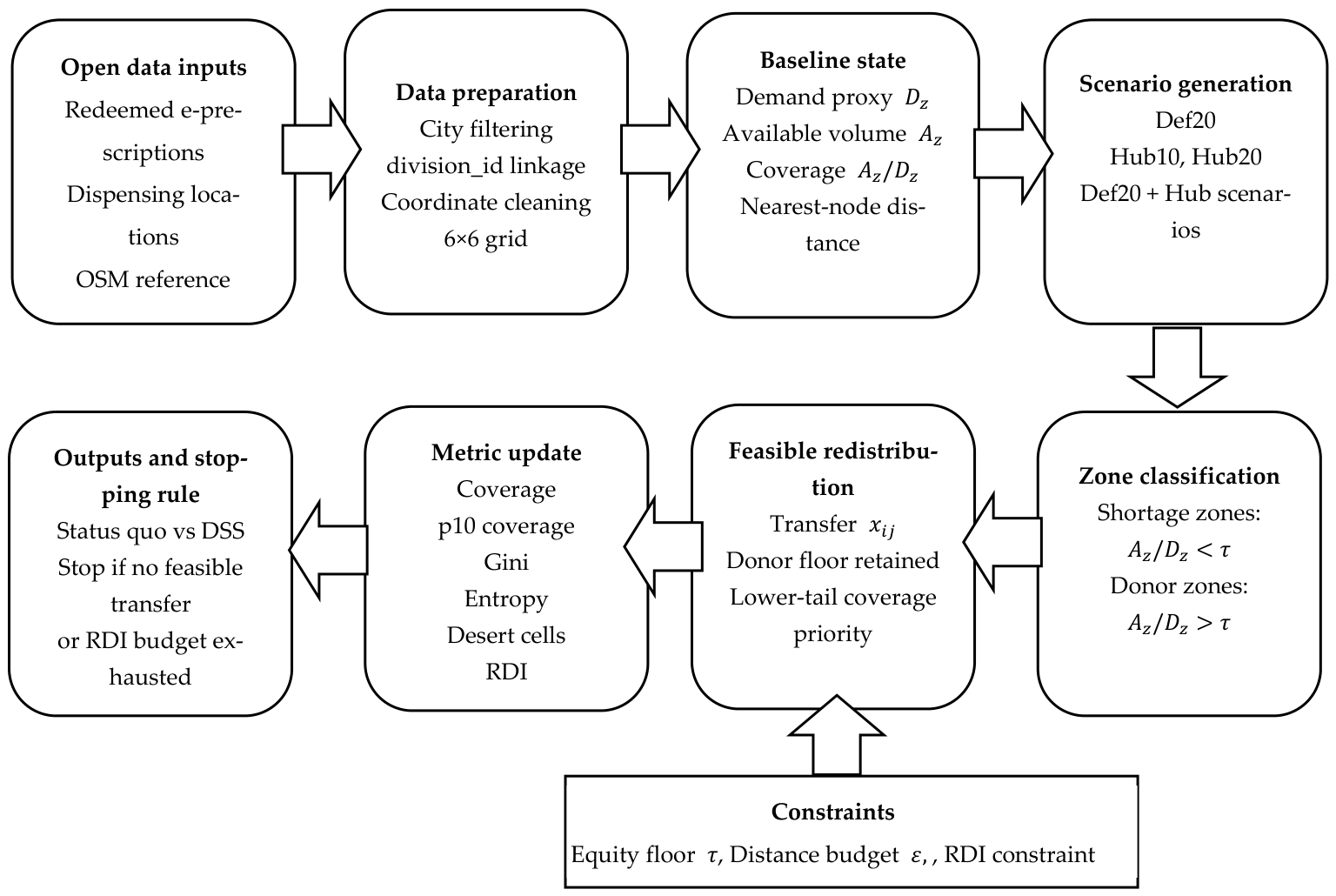
The seven-step procedure is summarized schematically in Figure 1, which separates inputs, scenario generation, shortage/donor-zone classification, redistribution constraints, and output metrics. This presentation is intended to distinguish the general DSS workflow from the Kyiv–Lviv empirical application reported in Section 3.
Figure 1.
DSS workflow for scenario-based medicine availability assessment.
2.6. Computational Protocol and Experimental Design
The computational protocol is constructed as a reproducible pipeline: demand and node data preparation, baseline-state construction, scenario generation, and comparison between the status quo and DSS policies. To support reproducibility, the same aggregation rules, zoning structure, scenario definitions, equity threshold logic, and deterministic redistribution procedure are applied to Kyiv and Lviv. The main protocol settings are fixed before scenario evaluation rather than adjusted separately for each city.
Table 1 summarizes the reproducibility protocol and parameter settings for the DSS scenario analysis.
Table 1.
Reproducibility protocol and parameter settings for the DSS scenario analysis.
Redistribution intensity is reported as the Redistribution Distance Index (RDI), defined as follows:
where is the transferred demand volume expressed in redeemed-prescription-equivalent units, is the geodesic distance between donor and shortage zones, and is the total number of redeemed e-prescriptions in the city baseline. The denominator normalizes the indicator per 1000 redeemed e-prescriptions, allowing Kyiv and Lviv to be compared despite different total demand volumes. RDI is therefore a normalized demand-distance proxy, not a vehicle-kilometer or CO2e estimate.
The experimental design is symmetric for Kyiv and Lviv: a baseline regime and a set of disruption scenarios. For each scenario, the following indicators are evaluated: unmet demand, coverage indicators, coverage inequality between zones, spatial coverage entropy, the number/share of service coverage gaps, and redistribution intensity expressed as a normalized distance-budget proxy. Spatial accessibility indicators are calculated using a coordinate-based proximity metric and interpreted as open-data proxy measures rather than as full network travel-time accessibility estimates.
2.7. Environmental Constraint and Proxy-Based Assessment of Transport Intensity
The environmental component is integrated as a secondary ε-constraint. Distance reductions are considered only after the primary accessibility thresholds—coverage, equity floor, and service coverage gap monitoring—are satisfied [24,29,30]. To operationalize this constraint using open data, the study uses a redistribution distance budget as a proxy measure of transport intensity. This indicator supports comparison between scenarios and policies without requiring assumptions about vehicle type, load factor, empty running, traffic conditions, or temperature-controlled transport.
The article does not calculate CO2e emissions. EMEP/EEA and COPERT are cited as methodological references for future conversion of distance-budget outputs into emissions estimates if fleet composition, load factors, empty running, traffic regimes, and refrigeration requirements become available. Since emission intensity depends significantly on operational efficiency (empty running, load factor) and temperature-controlled transportation requirements, it is appropriate to fix these parameters as scenario assumptions within the sensitivity analysis, consistent with current approaches for assessing the carbon footprint of pharmaceutical logistics [26].
3. Results
3.1. Baseline Network and Demand Portrait
The baseline network and demand portrait were established by merging redeemed e-prescription data from the reimbursement program (2022–2025) with the registry of dispensing locations under NHSU contracts, using the division_id as the primary key. This approach provides both a measurable demand proxy (the number of redeemed e-prescriptions) and the geocoded node addresses required for subsequent accessibility calculations [21,22].
Between 2022 and 2025, 3,060,522 e-prescriptions were redeemed in Kyiv and 1,147,424 in Lviv. The network of dispensing nodes in Kyiv was larger (1826 unique division_id entries compared to 492 in Lviv), consistent with the higher number of participating legal entities (178 vs. 62). Compared to 2022, the annual volume of redemptions in 2025 increased by 75.4% in Kyiv and 32.6% in Lviv, confirming an upward demand trend in both metropolitan areas [21].
The distribution of demand among nodes is asymmetric in both cities. Using a standardized measurement approach (total redemptions per division_id), the share of the top 10 nodes in total demand is 14.2% in Kyiv and 29.7% in Lviv. In comparison, the top 50 nodes account for 35.0% and 61.4%, respectively, indicating a higher concentration of flow in Lviv. The median flow per node is also higher in Lviv (708 vs. 451), as is the mean (2332.2 vs. 1676.1), consistent with the observed concentration profile. Based on the Gini coefficient of flow distribution among nodes, both networks are highly concentrated (Kyiv: 0.750; Lviv: 0.737) [21].
In terms of network structure, pharmacies (where division_type is “Pharmacy”) dominate, accounting for the majority of redemption volumes, while pharmacy points represent a smaller share. For spatial analysis, it is important to note that the registry [22] does not contain coordinates for all nodes present in the time series [21] (likely due to contract changes or closures). In Kyiv, coordinates are available for 79.0% of nodes, covering 94.9% of demand; in Lviv, coordinates are available for 89.2% of nodes, covering 94.5% of demand [21,22].
As shown in Table 2, although the Kyiv network has more nodes, Lviv exhibits a higher concentration of demand across fewer dispensing points. This indicates that in Lviv, the failure of a small group of core network nodes could result in disproportionately large coverage losses, even without any change in total demand.
Table 2.
Summary statistics for Kyiv and Lviv: network size, demand proxy, concentration, and geo-coverage (2022–2025) [21,22].
Table 2 summarizes the baseline network size, demand concentration, and geocoding coverage for Kyiv and Lviv.
Table 3 reports the demand composition by program groups for the two metropolitan areas.
Table 3.
Demand composition by program groups (innms_group), top 8 by combined volume (2022–2025) [21].
The demand structure by program groups is similar across both metropolitan areas and is primarily driven by chronic nosology. This reinforces the argument for prioritizing continuity of access as a key metric of resilience. At the same time, differences in the proportions of specific groups signal varying levels of sensitivity in each city to shortages of categories of medicinal products.
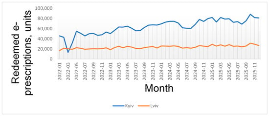
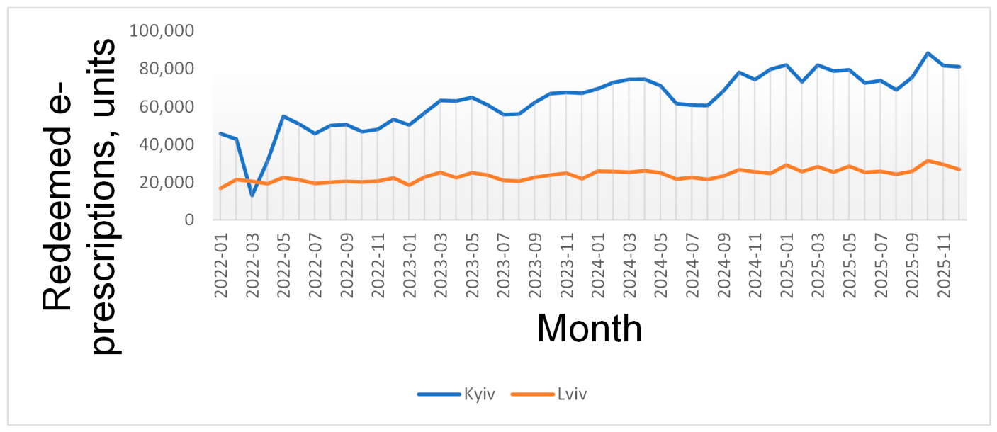
Figure 2 presents monthly redeemed e-prescription dynamics in Kyiv and Lviv for 2022–2025.
Figure 2.
Monthly redeemed e-prescriptions, Kyiv vs. Lviv (2022–2025) [21].
Redemption dynamics show an upward trend between 2022 and 2025 in both cities, with distinct seasonal fluctuations. This observation is critical for subsequent scenario analysis: a fixed percentage shortage applied across different months can yield significantly different absolute impacts on unmet demand.
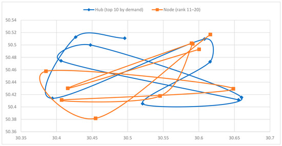
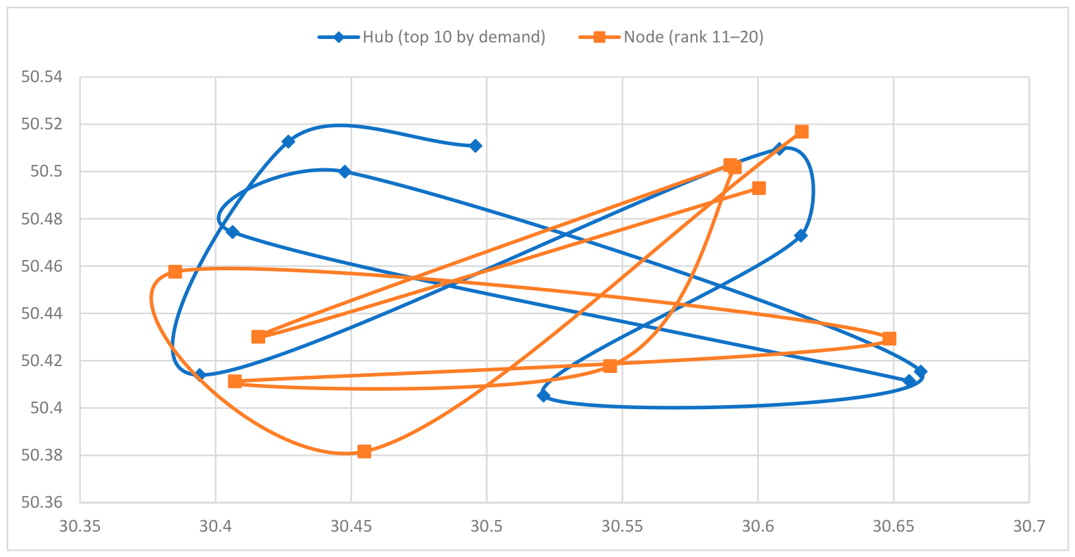
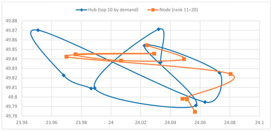
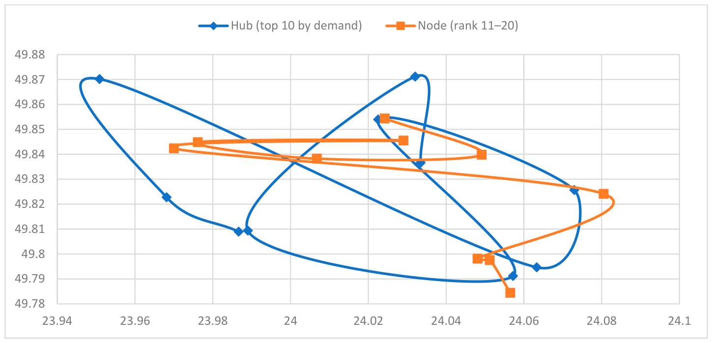
Figure 3 and Figure 4 identify potential demand concentration hubs as the top-performing nodes by dispensing volume. For subsequent failure scenarios, these nodes represent natural points of risk; conversely, for response policies, they serve as natural points of intervention (flow redirection, inventory reinforcement, and prioritized service restoration).
Figure 3.
Top 20 dispensing nodes and candidate hubs in Kyiv (hub = top 10 by demand, 2022–2025) [21,22].
Figure 4.
Top 20 dispensing nodes and candidate hubs in Lviv (hub = top 10 by demand, 2022–2025) [21,22]. Note for Figure 3 and Figure 4: Coordinates (latitude/longitude) are sourced from the registry of dispensing locations [22]; nodes that are absent from the current registry remain in the time series [21] and are included in the demand aggregates. Figures show geographic coordinates in decimal degrees (WGS84). The approximate east–west span of the Kyiv coverage area is ~0.30° longitude (≈21 km) and the north–south span is ~0.24° latitude (≈27 km); for Lviv the respective spans are ~0.14° (≈10 km) and ~0.11° (≈12 km). City administrative boundary outlines are not shown because they are not part of the open dataset used; the spatial extent of the figures corresponds to the coordinate bounding box of geocoded dispensing nodes.
To evaluate spatial accessibility within a coordinate-based proxy metric, the geodesic distance to the nearest node was calculated for a regular grid of points within the urban coordinate coverage. Based on this proxy, the mean distance to the nearest node is 2.265 km in Kyiv and 0.994 km in Lviv; the 95th percentile is 6.625 km and 2.804 km, respectively. The difference between the cities is primarily evident in the tails of the distribution: for Kyiv, the 95th percentile distance is 2.36 times higher than for Lviv (6.625 km vs. 2.804 km). This indicates significantly greater peripheral fragmentation of the baseline spatial coverage, which is vital for interpreting DSS effects: even with similar flow concentration among nodes (flow Gini of 0.750 and 0.737), the spatial accessibility profiles may respond differently. This metric is considered an indicative measure of accessibility. It should be interpreted as a proximity-based open-data proxy rather than as a full FCA/2SFCA accessibility score. FCA/2SFCA studies are used here as a reference point for future extensions based on network travel-time catchments and explicit demand–supply ratios [31,32,33].
Table 4 reports the resulting coordinate-based proxy accessibility indicators.
Table 4.
Proxy accessibility (geodesic distance to nearest node) on a 6 × 6 grid within city coverage (baseline, before travel-time modeling) [21,22].
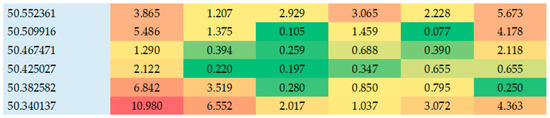
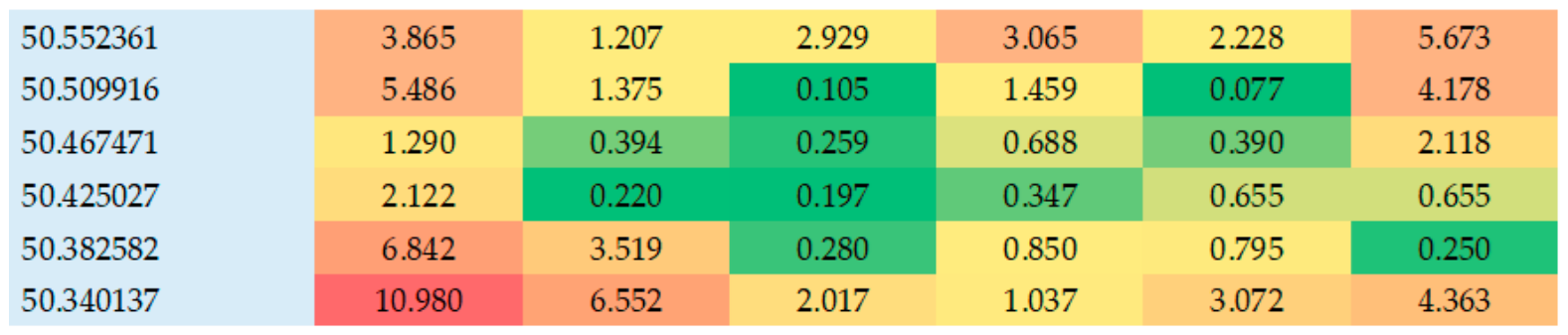
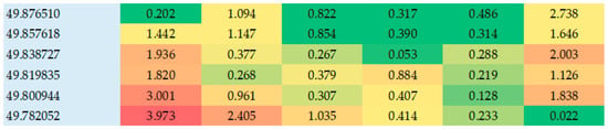
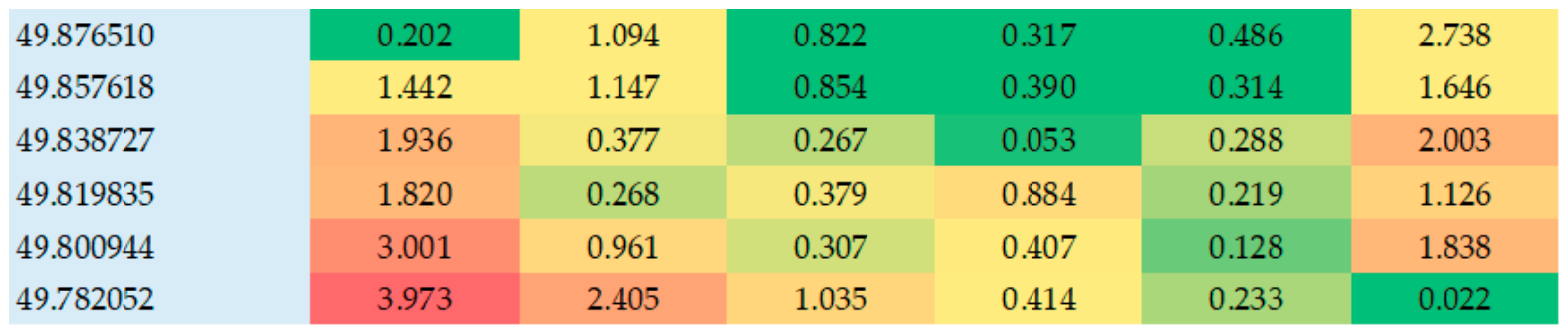
The proxy assessment of accessibility (geodesic distance to the nearest node) does not replace network travel-time analysis; however, it allows for a baseline comparison of coverage geometry and the localization of potential service coverage gaps. For Lviv, given the concentration of demand in a small number of nodes, the failure or restoration of the network core has a disproportionate impact on the spatial distribution of coverage, even despite the relatively dense node geometry. Figure 5 and Figure 6 visualize the 6 × 6 nearest-node distance grids for Kyiv and Lviv.
Figure 5.
Heatmap: Kyiv grid (6 × 6) with nearest-node distance (km, geodesic proxy) [21,22]. Note for Figure 5 and Figure 6. Values represent geodesic nearest-node distances in kilometers calculated on a regular 6 × 6 coordinate grid. Columns run from west to east, and rows run from north to south. The grid is used as a spatial proxy and does not correspond to administrative district boundaries. The same distance scale is used for Kyiv and Lviv: 0–1 km indicates dense local coverage; >1–3 km indicates moderate proximity; >3–6 km indicates peripheral gap risk; >6 km indicates high peripheral gap risk.
Figure 6.
Lviv grid (6 × 6) with nearest-node distance (km, geodesic proxy) [21,22].
The Kyiv grid shows a strongly uneven proximity profile. The lowest nearest-node distances are concentrated in the inner and central-eastern part of the coordinate grid, where values fall below 1 km in several cells. This indicates a dense dispensing-node geometry and a lower baseline risk of spatial access gaps. By contrast, the western, south-western and north-eastern edge cells show substantially higher nearest-node distances, including values above 5 km and one extreme value above 10 km. These cells should not be interpreted as specific administrative districts, because the grid is coordinate-based; however, they indicate peripheral sectors where the dispensing-node network is spatially thinner and where node failures or supply shocks may translate into larger service-coverage gaps. For Kyiv, the heatmap therefore explains why the DSS effect is not only a function of demand concentration but also of peripheral coverage geometry.
The Lviv grid shows a more compact proximity structure. Most cells are located within approximately 0–2 km of the nearest dispensing node, and the minimum values are concentrated around the central part of the coordinate grid. Higher values appear mainly at the western, north-western and south-eastern edges, but their absolute level remains lower than the most peripheral Kyiv cells. This means that Lviv’s baseline spatial geometry is comparatively denser, while its vulnerability arises primarily from demand concentration in a smaller number of high-load nodes rather than from long nearest-node distances. The heatmap therefore complements the node-concentration results: Lviv is less fragmented spatially, but more sensitive to the failure of core dispensing points.
3.2. Disruption Impact Without Optimization (Status Quo Policy)
The impact of disruptions without optimization is presented as the status quo policy, which performs no adaptive redistribution between nodes and introduces no additional hubs. In this formulation, capacity losses or supply deficits are translated into unmet demand in proportion to the scale of the shock, establishing a baseline benchmark for comparison with the DSS policy discussed in Section 3.3. The node-failure component is calculated from redeemed e-prescription volumes [21], while the broader scenario logic is consistent with disrupted-supply and resilient-inventory studies [34,35,36].
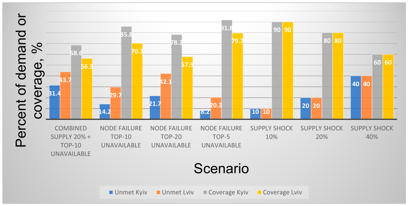
A structural test was employed to assess node failures: the removal of the top-k nodes ranked by redemption volume (2022–2025). In this case, unmet demand equals the share of demand associated with the failed nodes. The results reveal a significant disparity between the metropolitan areas: the loss of the top 10 nodes corresponds to a 14.2% increase in demand at risk in Kyiv and a 29.7% increase in demand at risk in Lviv. In comparison, the top 20 nodes correspond to 21.7% and 42.1%, respectively. This aligns with the higher flow concentration in Lviv and signifies greater sensitivity to local failures of high-load nodes [21].
For a supply shock in the status quo regime, a proportional limitation of the available volume is assumed: under a 20% supply deficit, unmet demand is 20% in each city. In the combined scenario (20% deficit + loss of the top 10 nodes), unmet demand increases to 31.4% in Kyiv and 43.7% in Lviv, highlighting the asymmetry in risk across the same class of disruptions [21,34,35].
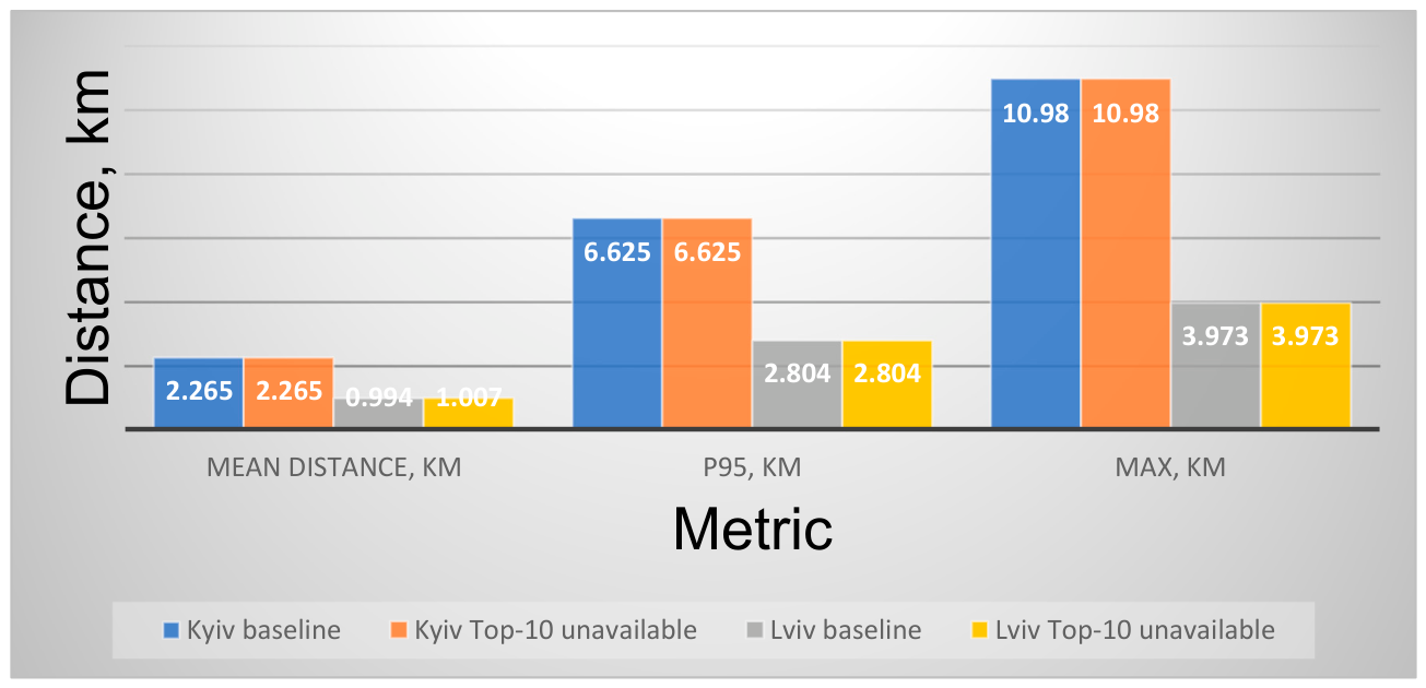
The coordinate proxy metric (geodesic distance to the nearest node) indicates that removing the top 10 demand-concentration nodes (hub nodes) barely alters the coverage geometry for Kyiv and has a limited effect on Lviv. This reflects the distinction between nodes with high flow and those that define the network’s spatial density. Given that the metric does not account for the road network or traffic regimes, this conclusion should be treated as indicative [31,32,33].
Table 5 demonstrates that vulnerability in node-failure scenarios is determined not by the absolute number of nodes, but rather by the concentration of demand within the network core. This structural parameter explains why the Hub10/Hub20 scenarios are significantly more severe for Lviv than for Kyiv.
Table 5.
Structural vulnerability proxy under node failures (share of demand associated with top-k nodes, 2022–2025) [21].
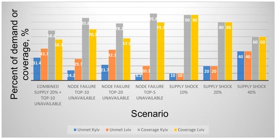
Figure 7 summarizes unmet demand and coverage under the status quo disruption scenarios.
Figure 7.
Unmet demand and coverage under disruption scenarios (status quo), Kyiv vs. Lviv [21,34,35]. Note: For the supply shock, unmet demand reflects a proportional reduction in available volume; for node failure, it reflects the share of demand associated with the failed nodes; for the combined scenario, it represents the deficit remaining after node removal.
In the status quo regime, a supply deficit results in a proportional decline in coverage. Conversely, node failure creates a disproportionate effect in cities with high concentrations. This motivates DSS policies: even without increasing total resources, it is possible to reduce losses in the lower tail of the coverage distribution through controlled redistribution.
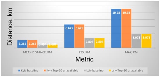
Figure 8 shows the proxy spatial effect of top-10 hub removal on nearest-node distance.
Figure 8.
Proxy spatial effect of node failures: change in nearest-node distance (geodesic proxy) after top 10 hub removal, Kyiv vs. Lviv [21,22]. Note: The coordinate proxy assessment does not account for network travel-time costs; it is utilized as a baseline indicator of coverage geometry and the spatial risk of service coverage gaps. This interpretation is consistent with the broader spatial-accessibility literature, while the present assessment remains a coordinate-based proximity proxy rather than a full FCA/2SFCA implementation [31,32,33].
Proxy spatial diagnostics following the removal of top hubs demonstrate that coverage geometry shifts unevenly: while some zones remain proximal to alternative nodes, they become potential service coverage gaps. The equity parameter within the DSS policy subsequently manages this nonuniformity.
3.3. Decision-Support Outcomes (Accessibility-First DSS with Equity Constraints)
The effects of the DSS policy were evaluated within a zonal, accessibility-first framework, and a regular 6 × 6 grid within each city’s dispensing nodes’ coverage area served as the spatial unit of analysis. Demand within each zone was defined as the aggregate of redeemed e-prescriptions from nodes located within that zone [21]. At the same time, the network geometry was derived from node coordinates in the NHSU registry [22]. The DSS policy applies to the redistribution rules defined in Section 2.5: resources are iteratively reallocated from donor zones to deficit zones to raise the lower tail of coverage and reduce the number of areas falling below the service threshold (deserts), while adhering to the equity floor and the ε-budget for transport intensity.
Two policy regimes were compared: the status quo (absence of adaptive redistribution between zones) and DSS (redistribution constrained by the requirement that donor zones not fall below a specified minimum coverage level). The scenarios correspond to Section 2.4: Def20 (a proportional 20% deficit in available volume); Hub10/Hub20 (failure of the top 10/20 nodes by redemption volume); and combined scenarios (Def20 + Hub). The scenario metrics are calculated consistently across all scenarios. Unmet demand is the share of the demand proxy not covered by the available volume. Coverage is the ratio between available volume and demand within a zone. p10 coverage captures the lower tail of the zonal coverage distribution. The Gini coefficient measures inequality in coverage across grid cells. Entropy describes the evenness of spatial coverage distribution. Desert cells are grid cells whose coverage falls below the equity floor τ. Redistribution intensity is reported as a normalized distance-budget proxy and is not interpreted as a direct estimate of CO2e emissions.
Table 6 compares the status quo and DSS outcomes under the disruption scenarios.
Table 6.
DSS vs. status quo under disruption scenarios (zone-based proxy; Kyiv vs. Lviv) [21,22].
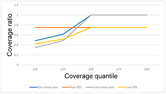
The results in Table 6 demonstrate that under a uniform deficit (Def20), the DSS does not change the 10th percentile (p10) of coverage (0.800 → 0.800) or the number of risk zones (3 → 3), which is consistent with a fixed total resource pool. Conversely, in structural node-failure scenarios, the DSS significantly improves the lower tail of the distribution: in Kyiv, under Hub20, the p10 coverage increases from 0.487 to 0.750, coverage inequality (Gini) drops from 0.142 to 0.012, and the number of deserts is reduced from 9 to 3. For Lviv, under Hub10, the p10 increases from 0.450 to 0.579, and the number of deserts decreases from 8 to 6. Notably, the total share of unmet demand does not change significantly, as the redistribution policy affects the geography of the deficit rather than the total resource volume. Entropy also increases under the DSS policy in several structural failure scenarios, indicating a more even distribution of coverage across zones. This result should be read as a concentration diagnostic that complements the Gini, p10 coverage, and desert-cell indicators. It does not by itself validate systemic resilience, but it helps identify whether redistribution reduces dependence on a small number of high-demand zones.
These results should be interpreted as spatial redistribution effects rather than as supply-generation effects. The DSS does not increase the total available volume of medicines. Its contribution is to reallocate the shortage burden across zones, improve lower-tail coverage, and reduce the number of cells below the equity threshold where feasible. Therefore, a scenario may show unchanged total unmet demand while still improving the spatial distribution of service coverage.
Table 7 reports an iteration-level zonal redistribution trace for the Kyiv Hub20 scenario. The trace is reconstructed at the same spatial level as the DSS itself: transfers are reported between 6 × 6 grid zones rather than between individual pharmacies. Each iteration reports the donor zone, shortage zone, transferred redeemed-prescription-equivalent volume, centroid distance, cumulative Redistribution Distance Index (RDI), and post-transfer coverage of the shortage zone. The example is not a vehicle-routing plan; it is a calculation trace of the zonal redistribution heuristic used to obtain the DSS scenario indicators.
Table 7.
Iteration-level zonal redistribution trace for the Kyiv Hub20 scenario [21,22].
The coverage distributions for the Hub20 scenario are presented in Figure 9.
Figure 9.
Distribution of zone coverage under the Hub20 scenario (p10–p90), status quo vs. DSS [21,22].
The distance-budget values should be interpreted as a secondary constraint on the intensity of redistribution rather than as a separate efficiency ranking of the two cities. They show that similar DSS rules may require different redistribution burdens depending on the spatial configuration of demand and available nodes.
3.4. Sustainability Outcomes Under Service-Level Constraints
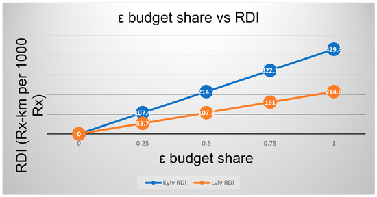
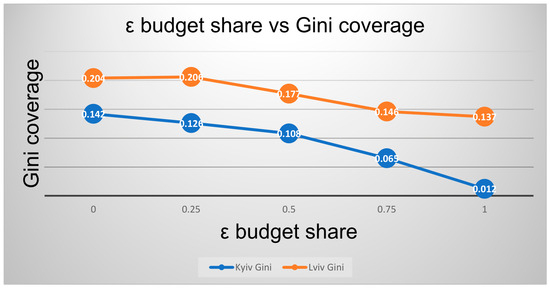
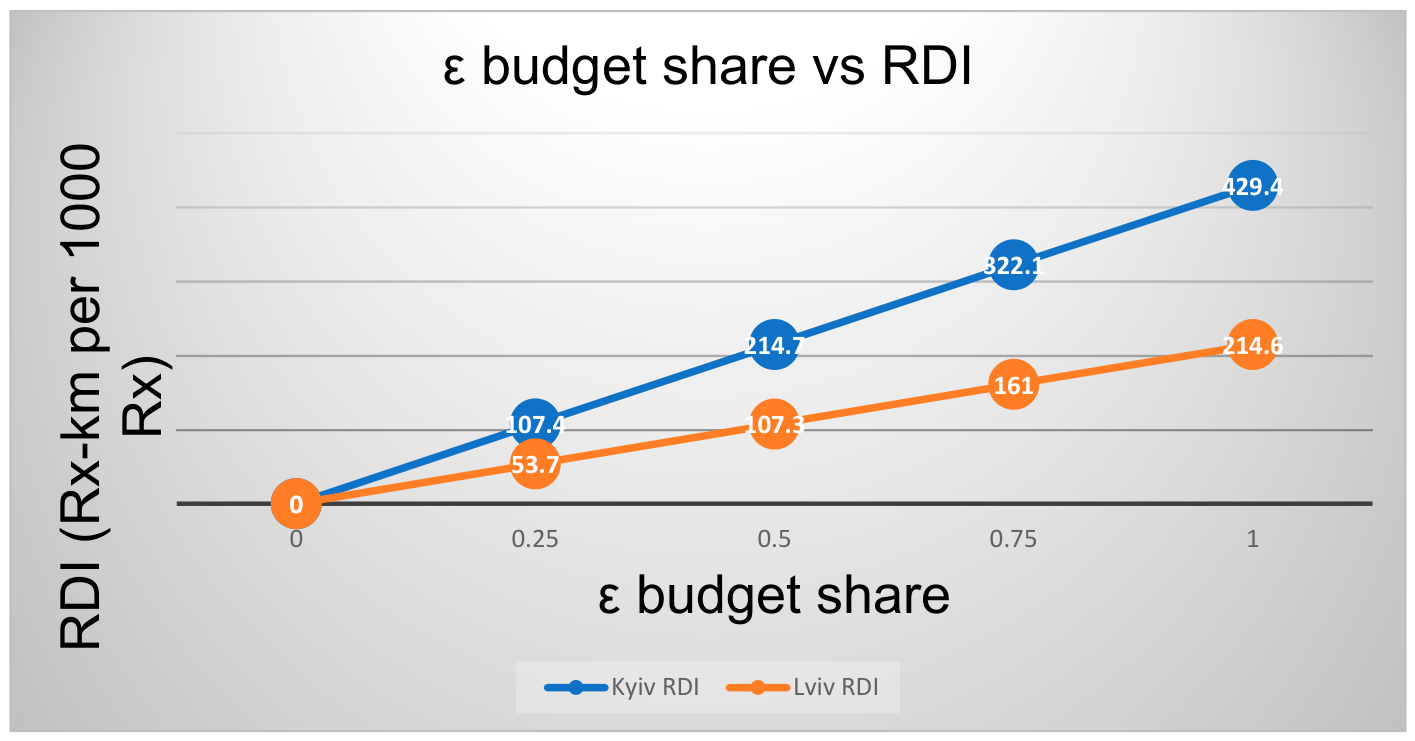
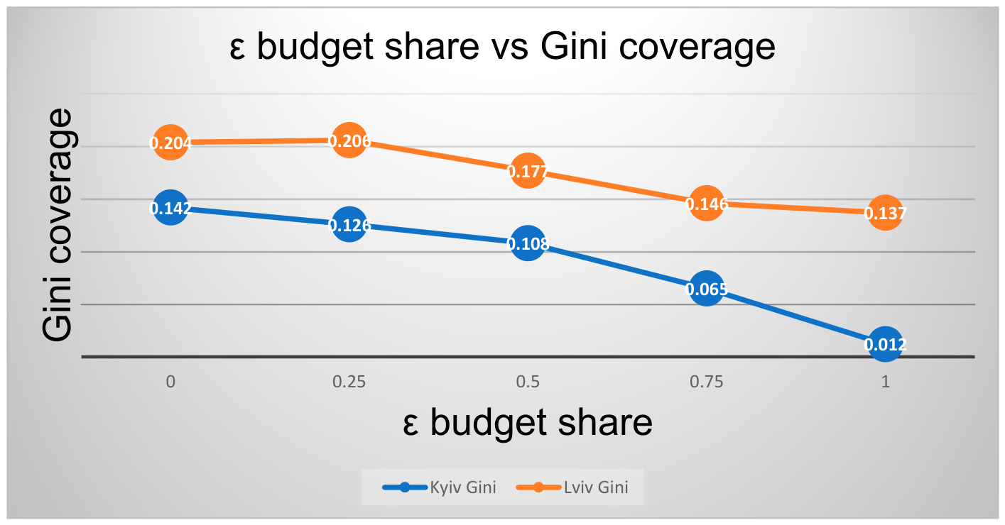
The environmental component of the analysis is operationalized as an ε-constraint on the Redistribution Distance Index (RDI). RDI measures the normalized demand-distance burden of redistribution in Rx-km per 1000 redeemed e-prescriptions and is used to compare the accessibility–distance trade-off across scenarios. It is not an emissions estimate. In this formulation, ε ∈ [0; 1] scales the admissible share of the maximum RDI observed under the full DSS redistribution: ε = 0 corresponds to no redistribution, while ε = 1 represents the full DSS redistribution distance budget. Intermediate values define the partial utilization of the distance budget. For the Hub20 scenario, the accessibility–distance trade-off was evaluated by varying the admissible share of the RDI budget and observing the corresponding changes in coverage inequality and desert cells.
Table 8 and Figure 10 illustrate the trade-off between reducing coverage inequality and the magnitude of the ε-budget.
Table 8.
Sustainability proxy under ε-constraint: redistribution distance budget and equity outcomes (Hub20) [21,22].
Figure 10.
ε budget share vs. redistribution intensity and Gini coverage (Hub20) [21,22].
Table 8 demonstrates the varied sensitivity of each city to the ε-constraint. For Kyiv, increasing ε is accompanied by a substantial decrease in coverage inequality (Gini: 0.142 → 0.012) and a stepwise reduction in desert cells (9 → 7 → 7 → 5 → 3). This indicates the presence of threshold effects, in which achieving lower levels of inequality requires crossing specific budget thresholds. For Lviv, under the same Hub20 scenario, the number of desert cells remains unchanged (12 across all ε values), and the reduction in the Gini coefficient is modest (0.204 → 0.137). This points to a structural limitation of the zonal framework for this metropolitan area and underscores the need for more rigorous, targeted interventions at specific demand concentration nodes.
3.5. Sensitivity and Robustness Checks
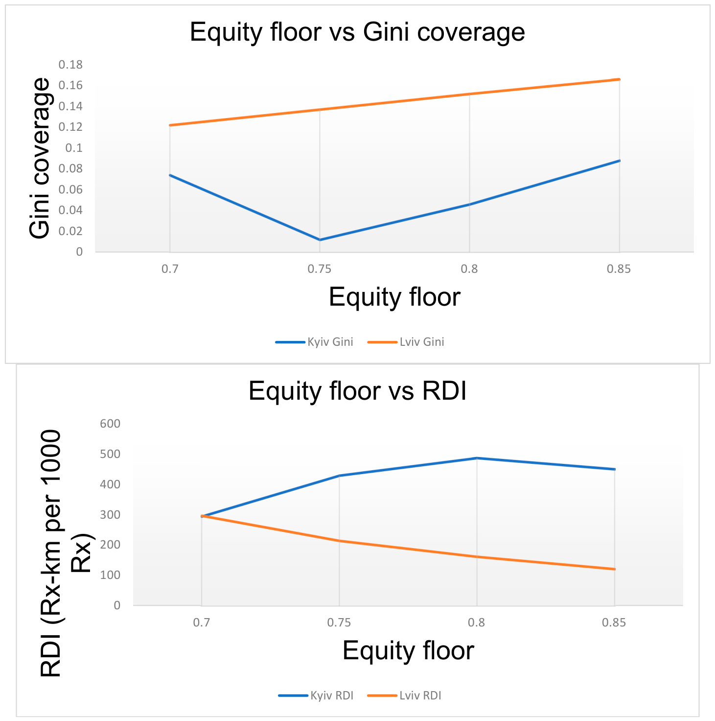
The robustness of the DSS with respect to parameter selection was evaluated against a key equity parameter—the equity floor (minimum coverage level).
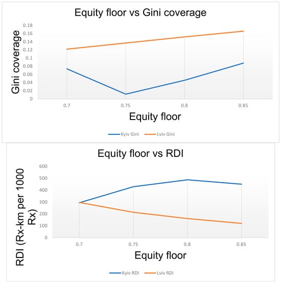
This parameter constrains the volume of resources that can be redistributed from zones with higher baseline coverage to deficit zones. Table 9 and Figure 11 show that more stringent thresholds (0.80–0.85) reduce redistribution capacity, resulting in higher coverage inequality and a greater number of risk zones under hub-failure scenarios. Conversely, less stringent thresholds (0.70–0.75) increase the potential for coverage equalization at the cost of higher transport intensity. This trade-off has direct managerial relevance and may serve as a decision rule for calibrating response policies.
Table 9.
Sensitivity of DSS equity setting: effect of equity floor on inequality and redistribution intensity (Hub20) [21,22].
Figure 11.
Equity floor vs. Gini coverage and redistribution intensity (Hub20) [21,22].
4. Discussion
The results have three implications for urban medicine-access planning. First, vulnerability under disruption is not determined only by the number of dispensing nodes. Demand concentration matters: a city with fewer high-load nodes may be more exposed to structural failures even when the spatial density of points appears acceptable. Second, the DSS should be interpreted as a redistribution and prioritization mechanism. Its main role is to improve the spatial distribution of service coverage under fixed supply, especially in node-failure scenarios, rather than to reduce total shortage volume. Third, the distance-budget constraint provides a transparent way to keep the logistical burden of redistribution visible while preserving the priority of minimum coverage and equity thresholds. These implications are derived from the Kyiv–Lviv case study and should be tested further with network travel-time and stock-level data before operational deployment.
The Kyiv–Lviv comparison should be understood as a reproducible scenario-based application rather than as a full operational validation of a real-time inventory-management system. The framework supports planning, prioritization, and stress testing, but it does not replace stock monitoring, replenishment planning, or route optimization based on actual vehicle and traffic data.
The main limitation concerns the level of spatial and operational detail available in open data. The regular grid and geodesic-distance proxy make the analysis reproducible, but they do not capture road-network travel time, congestion, pharmacy stock levels, replenishment schedules, or actual delivery routes. The results should therefore be interpreted as a transparent stress-test of coverage redistribution under stated assumptions, not as a reconstruction of operational logistics. In addition, the findings are specific to the reimbursement segment and require separate validation before generalization to the broader pharmaceutical market. Future research may extend the framework in three directions: replacing the proximity-based accessibility proxy with network travel-time catchments and demand–supply ratios, converting the distance-budget proxy into emissions estimates when fleet and routing data become available, and testing the redistribution rule against formal optimization formulations under more complex constraints.
5. Conclusions
Based on open data on redeemed e-prescriptions from the reimbursement program and the dispensing location registry (2022–2025), annual redemption volume increased by 75.4% in Kyiv and by 32.6% in Lviv between 2022 and 2025. A pronounced asymmetry in demand concentration across nodes was identified: the top 10 nodes account for 14.2% of total redemptions in Kyiv and 29.7% in Lviv (top 20: 21.7% and 42.1%, respectively). This concentration profile renders Lviv more sensitive to the failure of a limited number of high-demand nodes under node-failure scenarios. A DSS policy prioritizing accessibility and equity thresholds reduces spatial coverage inequality and mitigates the risk of service coverage gaps during structural failures by redistributing deficits across space. Furthermore, the increase in entropy of the spatial coverage distribution under the DSS policy indicates reduced inter-zonal concentration and complements the p10, Gini and desert-cell indicators. The environmental component is incorporated as a secondary ε-constraint through a transport-intensity budget, enabling logistical load containment without compromising minimum service thresholds. The proposed framework is reproducible using open data and can support scenario-based planning discussions on medicine access under disruptions. Its operational use requires additional validation with stock-level, travel-time, and replenishment data. The main contribution of the DSS is therefore not the elimination of shortages, but the transparent identification of where limited available volume can be reallocated to reduce spatial inequity in coverage under explicitly stated assumptions.
Author Contributions
Conceptualization, O.Z. and O.M.; methodology, O.Z. and O.M.; software, O.M.; validation, O.M. and M.P.; formal analysis, O.Z. and O.M.; investigation, O.M. and M.P.; resources, M.P.; data curation, O.M. and M.P.; writing—original draft preparation, O.Z. and O.M.; writing—review and editing, O.M. and M.P.; visualization, M.P.; supervision, O.M.; project administration, O.M. All authors have read and agreed to the published version of the manuscript.
Funding
This research received no external funding.
Institutional Review Board Statement
Not applicable.
Informed Consent Statement
Not applicable.
Data Availability Statement
The raw open data used in this study are publicly available from the Ukrainian open-data portal. Redeemed e-prescriptions under the reimbursement program “Affordable Medicines” are available at https://data.gov.ua/dataset/5334586c-5bd1-4e24-9c14-9ba826cc9fa1 (accessed on 21 February 2026). The registry of dispensing locations under NHSU reimbursement contracts is available at https://data.gov.ua/dataset/3503ea5a-456d-4780-905b-b74e7d8f09cf (accessed on 21 February 2026). OpenStreetMap data are available at https://www.openstreetmap.org (accessed on 21 February 2026).
Acknowledgments
The authors thank the reviewers and editors for their generous and constructive comments that have improved this paper. During the preparation of this manuscript, the authors used ChatGPT (GPT-5.5) for English-language translation and editing support. The authors reviewed and edited the output and take full responsibility for the content of this publication.
Conflicts of Interest
The authors declare no conflicts of interest.
References
- Ribeiro, L.D.S.; Orrico, R.; Oliveira, C.M.D. BRT in the Middle Mile: A Potential Urban Logistics Platform. Urban Sci. 2025, 9, 438. [Google Scholar] [CrossRef] [Scilit]
- Elorduy, J.L.; Pino, Y. A Hybrid AHP–MCDM Model for Prioritising Accessibility Interventions in Urban Mobility Nodes: Application to Segovia (Spain). Urban Sci. 2026, 10, 53. [Google Scholar] [CrossRef] [Scilit]
- Furstenau, L.B.; Zani, C.; Terra, S.X.; Sott, M.K.; Choo, K.-K.R.; Saurin, T.A. Resilience capabilities of healthcare supply chain and supportive digital technologies. Technol. Soc. 2022, 71, 102095. [Google Scholar] [CrossRef] [Scilit]
- Tiwari, M.; Bryde, D.J.; Stavropoulou, F.; Dubey, R.; Kumari, S.; Foropon, C. Modelling supply chain visibility, digital technologies, environmental dynamism and healthcare supply chain resilience: An organisation information processing theory perspective. Transp. Res. Part E Logist. Transp. Rev. 2024, 188, 103613. [Google Scholar] [CrossRef] [Scilit]
- Badakhshan, E.; Ball, P. Deploying hybrid modelling to support the development of a digital twin for supply chain master planning under disruptions. Int. J. Prod. Res. 2024, 62, 3606–3637. [Google Scholar] [CrossRef] [Scilit]
- Vogler, S. Tackling medicine shortages during and after the COVID-19 pandemic: Compilation of governmental policy measures and developments in 38 countries. Health Policy 2024, 143, 105030. [Google Scholar] [CrossRef] [Scilit]
- European Medicines Agency. Medicine Shortages: Annual Report 2024. Available online: https://www.ema.europa.eu/assets/en/annual-report/2024/medicine-shortages/index.html (accessed on 21 February 2026).
- Abed, I.; Bennett, V.; Cuddy, B.; Dang, S.; García Burgos, J.; Di Giorgio, D.; Lamas, M.; Radulovic, M.; Simões, N.; Santos Ivo, R.; et al. The impact of the European Medicines Agency (EMA) and the Heads of Medicines Agencies (HMA) to address shortages of human and veterinary medicines across Europe. Front. Public Health 2025, 13, 1673681. [Google Scholar] [CrossRef] [Scilit]
- Ravela, R.; Lyles, A.; Airaksinen, M. National and transnational drug shortages: A quantitative descriptive study of public registers in Europe and the USA. BMC Health Serv. Res. 2022, 22, 940. [Google Scholar] [CrossRef] [Scilit]
- Belgodère, L.; Emmerich, J.; Albin, N.; Bacon, T.; Daynes, P.; Vignot, S.; Vial, T.; Renaud, G.; Le Saulnier, C.; Maillard-Couvreur, C.; et al. Prevention and management of health products shortages by the French national agency (ANSM), 10 years of experience. Front. Public Health 2023, 11, 1293110. [Google Scholar] [CrossRef] [Scilit]
- Sarnola, K.; Kari, H.; Koskinen, H. Medicine shortages: Product life cycle phases and characteristics of medicines in short supply—A register study. Front. Pharmacol. 2022, 13, 943249. [Google Scholar] [CrossRef] [Scilit]
- Postma, D.J.; Notenboom, K.; De Smet, P.A.G.M.; Leufkens, H.G.M.; Mantel-Teeuwisse, A.K. Medicine shortages: Impact behind numbers. J. Pharm. Policy Pract. 2023, 16, 44. [Google Scholar] [CrossRef] [Scilit] [PubMed]
- Pall, R.; Gauthier, Y.; Auer, S.; Mowaswes, W. Predicting drug shortages using pharmacy data and machine learning. Health Care Manag. Sci. 2023, 26, 395–411. [Google Scholar] [CrossRef] [Scilit]
- European Commission. Commission Publishes First Union Critical Medicines List to Tackle Shortages. 2023. Available online: https://ec.europa.eu/commission/presscorner/detail/en/ip_23_6377 (accessed on 21 February 2026).
- European Medicines Agency. Union List of Critical Medicines. Available online: https://www.ema.europa.eu/en/human-regulatory-overview/post-authorisation/medicine-shortages-availability-issues/availability-medicines-during-crises/union-list-critical-medicines (accessed on 21 February 2026).
- European Commission; Health Emergency Preparedness and Response Authority (HERA). Strategic Report of the Critical Medicines Alliance. 2025. Available online: https://health.ec.europa.eu/document/download/3da9dfc0-c5e0-4583-a0f1-1652c7c18c3c_en?filename=hera_cma_strat-report_en.pdf (accessed on 21 February 2026).
- European Court of Auditors. Special Report 19/2025: Critical Shortages of Medicines–EU Measures Were of Added Value, But Structural Problems Remain. Available online: https://www.eca.europa.eu/en/publications?ref=SR-2025-19 (accessed on 21 February 2026).
- World Health Organization. WHO Model Lists of Essential Medicines. Available online: https://www.who.int/groups/expert-committee-on-selection-and-use-of-essential-medicines/essential-medicines-lists (accessed on 21 February 2026).
- World Health Organization. The Selection and Use of Essential Medicines, 2023: WHO Model List of Essential Medicines, 23rd List. Available online: https://www.who.int/publications/i/item/WHO-MHP-HPS-EML-2023.02 (accessed on 21 February 2026).
- World Health Organization. The Selection and Use of Essential Medicines, 2025: WHO Model List of Essential Medicines, 24th list. Available online: https://www.who.int/publications/i/item/B09474 (accessed on 21 February 2026).
- Ministry of Health of Ukraine; National Health Service of Ukraine. Information on Redeemed Electronic Prescriptions Under the Reimbursement Programme “Affordable Medicines”. Available online: https://data.gov.ua/dataset/5334586c-5bd1-4e24-9c14-9ba826cc9fa1 (accessed on 21 February 2026).
- National Health Service of Ukraine. Information on the List of Dispensing Locations Under NHSU Reimbursement Contracts for Medicines and Medical Devices. Available online: https://data.gov.ua/dataset/3503ea5a-456d-4780-905b-b74e7d8f09cf (accessed on 21 February 2026).
- OpenStreetMap Contributors. OpenStreetMap. Available online: https://www.openstreetmap.org (accessed on 21 February 2026).
- Emanuel, E.J.; Persad, G. The shared ethical framework to allocate scarce medical resources: A lesson from COVID-19. Lancet 2023, 401, 1892–1902. [Google Scholar] [CrossRef] [Scilit]
- Li, J.; Peng, K.; Deng, X.; Wang, J.; Liu, A. Model and algorithm for pharmaceutical distribution routing problem considering customer priority and carbon emissions. Data-Centric Eng. 2024, 5, e16. [Google Scholar] [CrossRef] [Scilit]
- Ashworth, B.; Badenhorst, A.; Kruger, K. The Carbon Footprint of Pharmaceutical Logistics: Calculating Distribution Emissions. Sustainability 2025, 17, 760. [Google Scholar] [CrossRef] [Scilit]
- European Environment Agency. EMEP/EEA Air Pollutant Emission Inventory Guidebook 2023: Technical Guidance to Prepare National Emission Inventories; Publications Office of the European Union: Luxembourg, 2023. [CrossRef]
- EMISIA. COPERT: Calculations of Emissions from Road Transport. Available online: https://copert.emisia.com/ (accessed on 21 February 2026).
- Wang, Y. A multi-period optimal distribution model of emergency resources for responding to COVID-19 under uncertain conditions. Heliyon 2024, 10, e31758. [Google Scholar] [CrossRef] [Scilit] [PubMed]
- Liu, H.; Sun, Y.; Pan, N.; Li, Y.; An, Y.; Pan, D. Study on the optimization of urban emergency supplies distribution paths for epidemic outbreaks. Comput. Oper. Res. 2022, 146, 105912. [Google Scholar] [CrossRef] [Scilit]
- Clark, S.D.; Newing, A. Assessing spatial accessibility of community pharmacies in England and Wales using floating catchment area techniques. J. Pharm. Policy Pract. 2025, 18, 2466203. [Google Scholar] [CrossRef] [Scilit]
- Roubin, S.; Holler, J.; Kedron, P. Urban-rural disparities in spatiotemporal accessibility of pharmacy care: A case study of Vermont, USA. BMC Health Serv. Res. 2025, 25, 1484. [Google Scholar] [CrossRef] [Scilit]
- Sun, S.; Sun, Q.; Zhang, F.; Ma, J. A spatial accessibility study of public hospitals: A multi-mode gravity-based two-step floating catchment area method. Appl. Sci. 2024, 14, 7713. [Google Scholar] [CrossRef] [Scilit]
- Maheshwari, P.; Kamble, S.S.; Belhadi, A.; Gupta, S.; Mangla, S.K. Resilient healthcare network for simultaneous product allocations during supply chain disruptions. Supply Chain Forum Int. J. 2024, 25, 407–427. [Google Scholar] [CrossRef] [Scilit]
- Pathy, S.R.; Rahimian, H. A Resilient Inventory Management of Pharmaceutical Supply Chains Under Demand Disruption. Comput. Ind. Eng. 2023, 180, 109243. [Google Scholar] [CrossRef] [Scilit]
- Rodríguez-Espíndola, O.; Ahmadi, H.; Gastélum-Chavira, D.; Ahumada-Valenzuela, O.; Chowdhury, S.; Dey, P.K.; Albores, P. Humanitarian logistics optimization models: An investigation of decision-maker involvement and directions to promote implementation. Socio-Econ. Plan. Sci. 2023, 89, 101669. [Google Scholar] [CrossRef] [Scilit]

Disclaimer/Publisher’s Note: The statements, opinions and data contained in all publications are solely those of the individual author(s) and contributor(s) and not of MDPI and/or the editor(s). MDPI and/or the editor(s) disclaim responsibility for any injury to people or property resulting from any ideas, methods, instructions or products referred to in the content. |
© 2026 by the authors. Licensee MDPI, Basel, Switzerland. This article is an open access article distributed under the terms and conditions of the Creative Commons Attribution (CC BY) license.