Thermal Interaction for Improving Tactile Artwork Depth and Color-Depth Appreciation for Visually Impaired People


Abstract
1. Introduction
1.1. Introduction to Our Work
1.2. Background and Related Work
1.2.1. Thermal Perception and Thermal Interaction
1.2.2. Thermal Interaction for Assistive Devices
1.2.3. Thermal Interaction for Artwork Exploration
1.2.4. Assistive Devices for Communicating Depth
1.2.5. Temperature-Depth Cross-Modality
2. Materials and Methods
2.1. Temperature-Depth Correlation
2.1.1. Temperature Range Used
2.1.2. Temperature-Depth Correlation Test
- Step 1
- Step 2
- Step 3
- Step 4
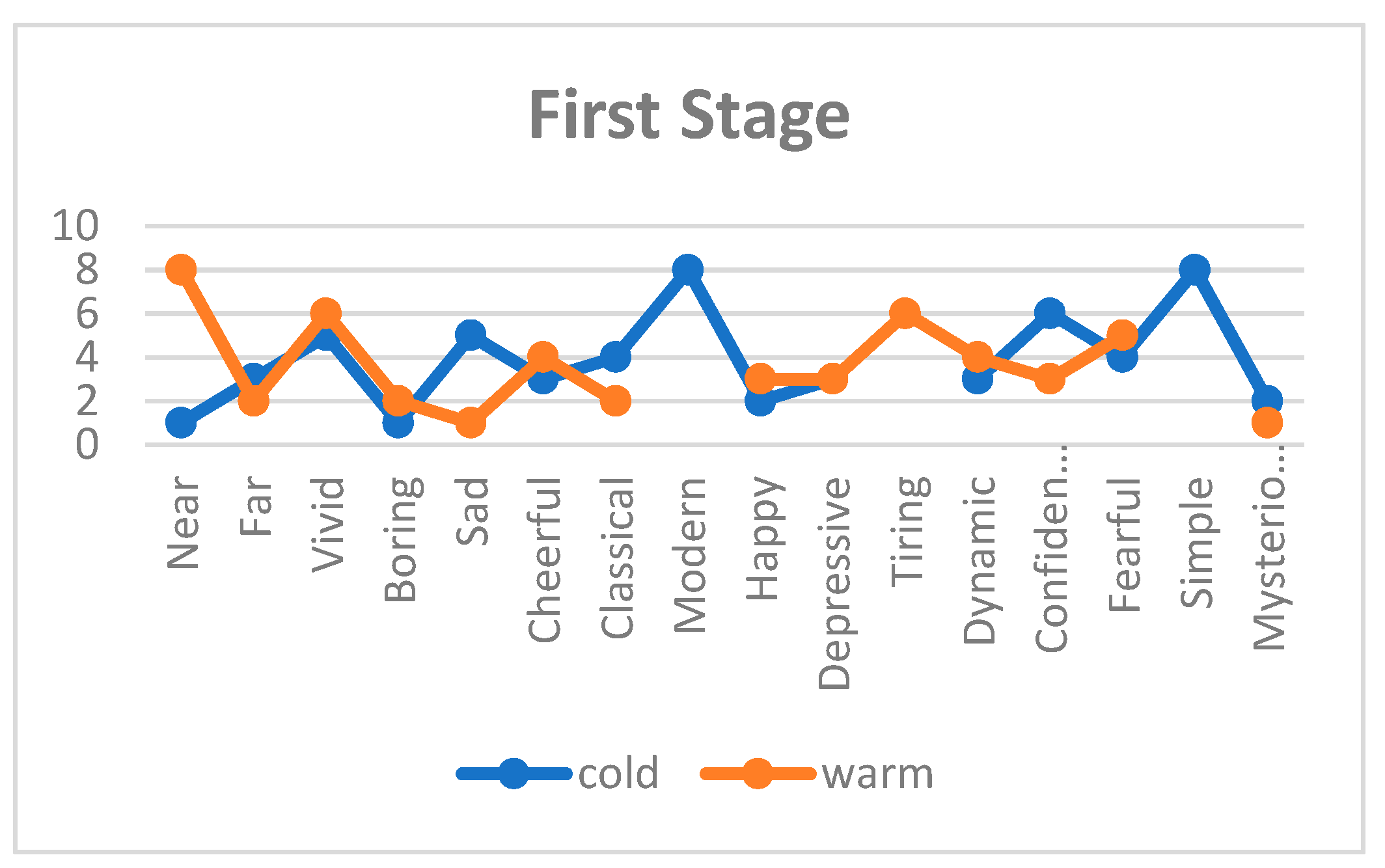
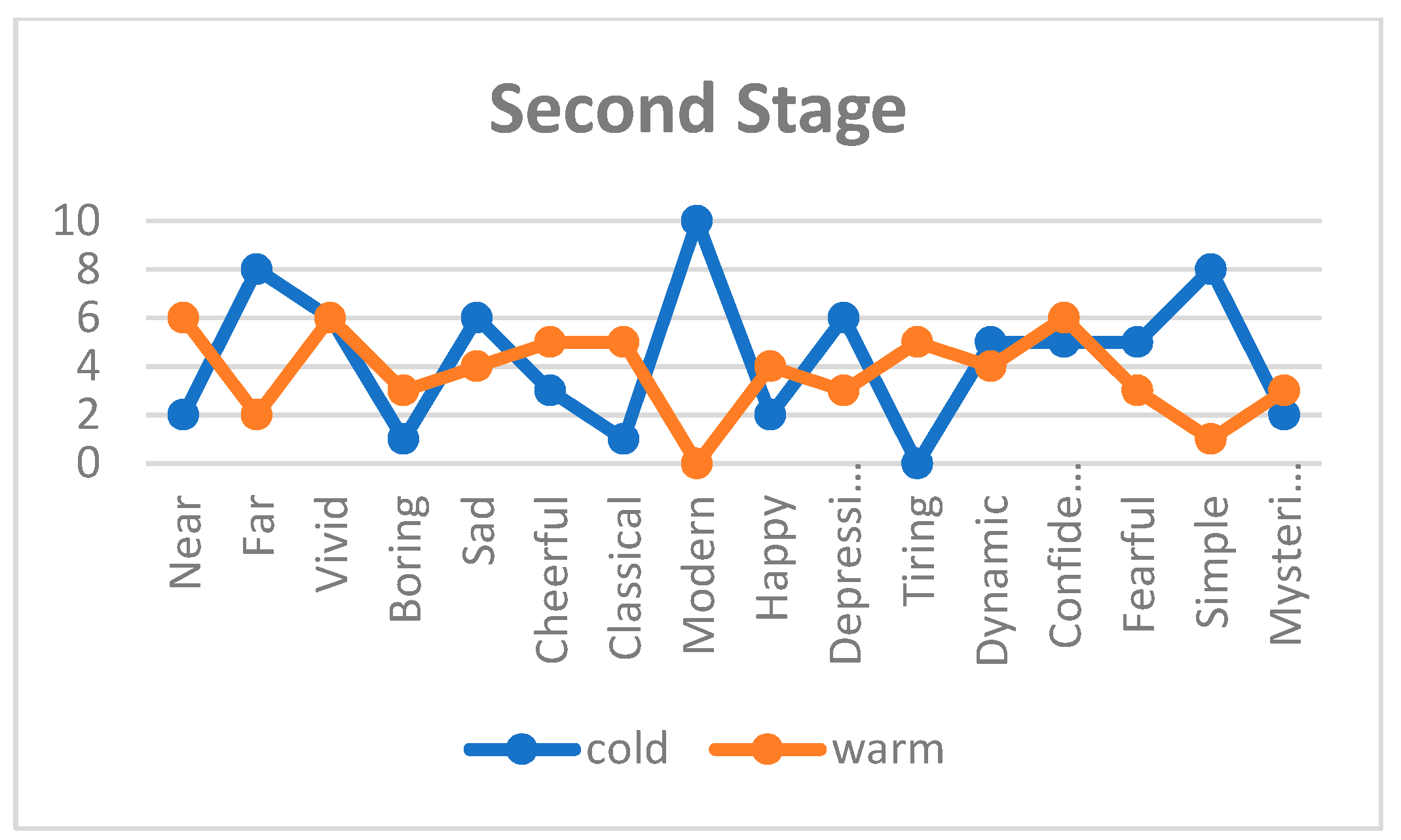
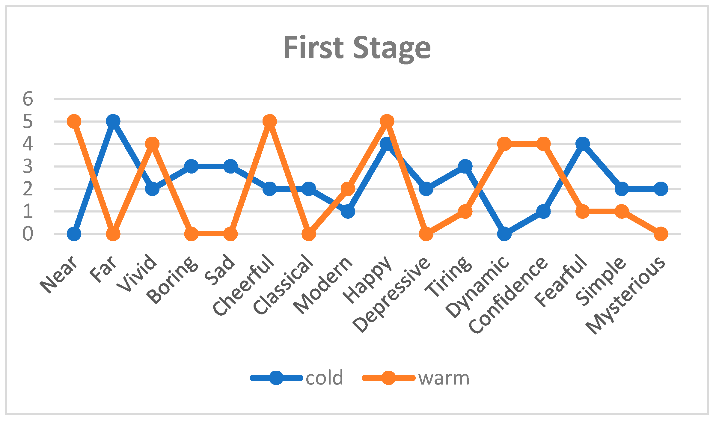
2.1.3. Results from Temperature-Depth Correlation Test with the Sighted Users
2.1.4. Results from Temperature-Depth Correlation Test with the Visually Impaired Users
2.1.5. Temperature-Depth Correlation Test Results
2.1.6. Temperature-Depth Correlation Test Interviews
“I chose near because I remembered how I feel warm and nice when I am close to people”.
“I chose near because I felt a warm feeling like in a warm atmosphere with people coming towards me”.
“I chose far for the warm temperature because I felt a warm hazy feeling like that of smoke, like distant far away memories”.
“The cold temperature reminded me of winter and of feeling lonely, away from everything”
“The cold temperature made me feel sad and dead, so I felt far away from others and life”
“The cold temperature was felt fast, immediately, like a knife. So it reminded me of something that is really near and true, something that I can easily feel”.
2.2. Temperature-Depth Mapping
- First step
- Second step
- Third step
- Fourth step
2.2.1. Application 1: Artwork Depth
- -
- Overlapping and layering
- -
- Size and placement and perspective
- -
- Shading
- -
- Texture and detail
- -
- Color, hue, and value
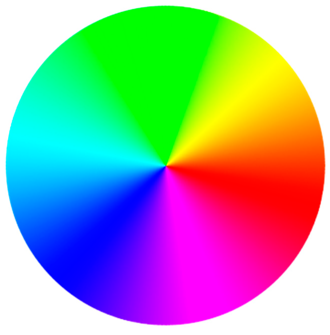
2.2.2. Application 2: Chromostereopsis
- First step
- Second step
- Third step
- Fourth step
- (1)
- For each color (except background) => find saturation and luminance level
- (2)
- For each color (except background) => (saturation + luminance)/2
- (3)
- Order colors by its luminance-saturation value from highest to lowest into a vector V
- (4)
- If white background: reverse V.
- (5)
- Select temperature range and divide it by number of colors.
- (6)
- For each color in V, assign the temperatures in order from highest to lowest.
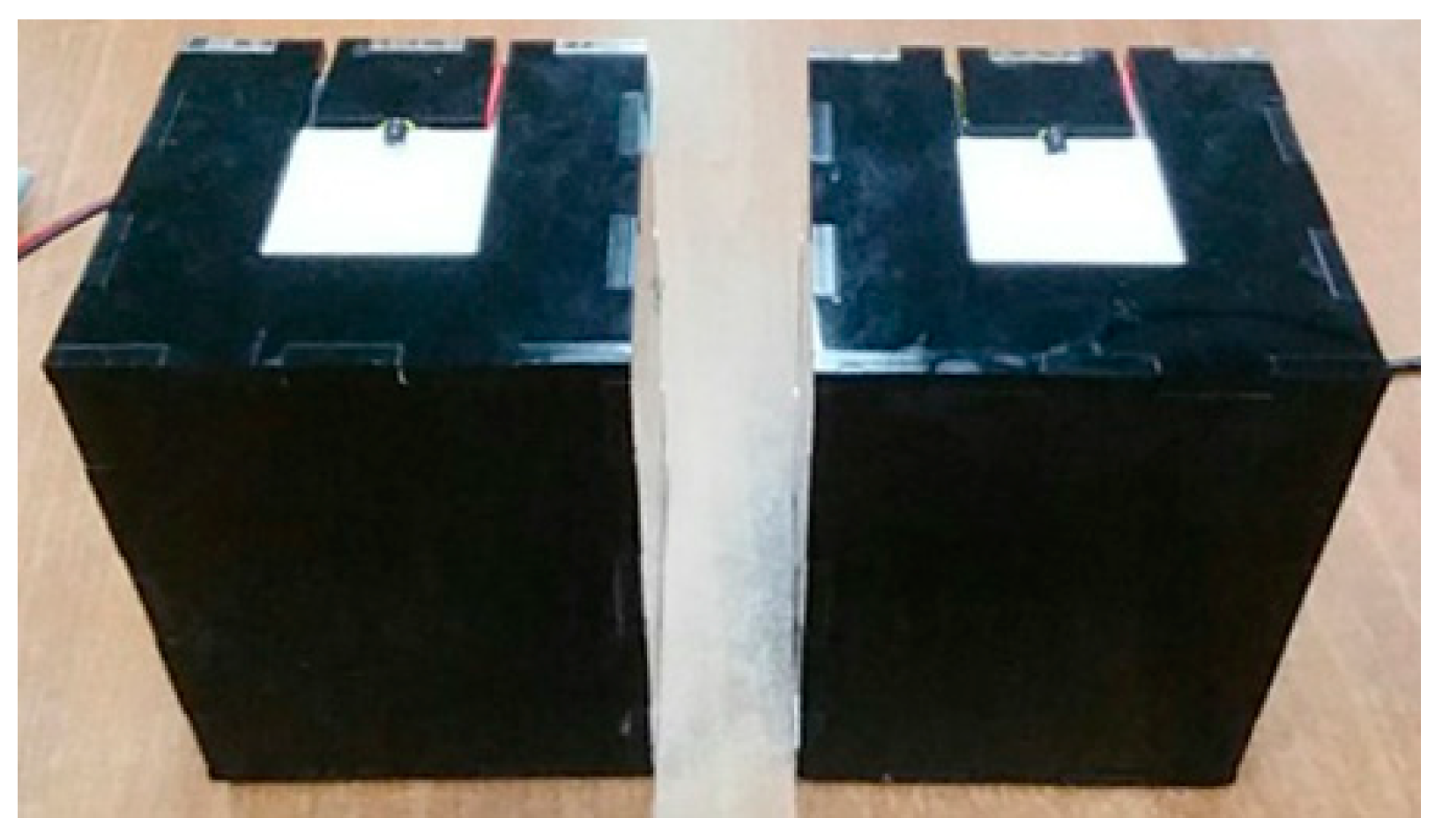
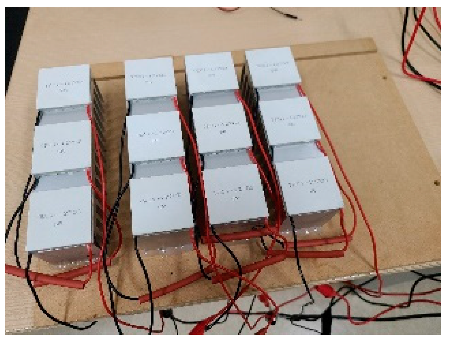
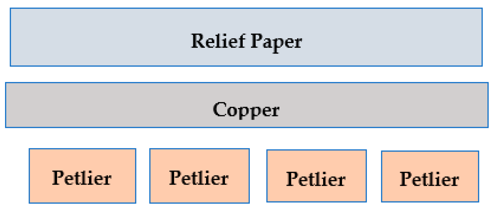
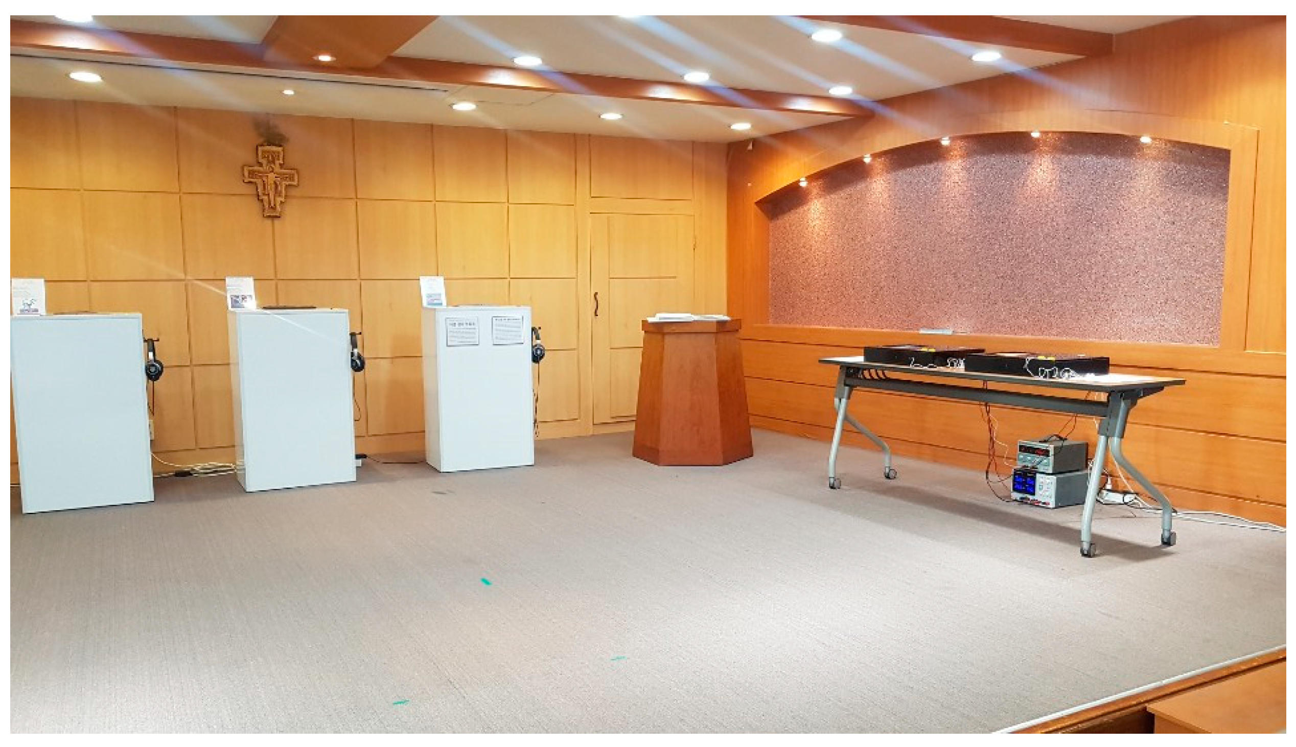
2.3. Thermal Display System Prototype
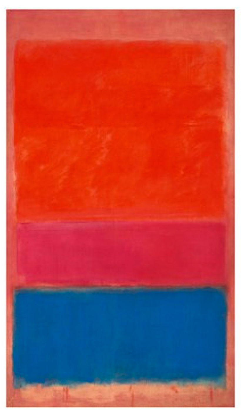
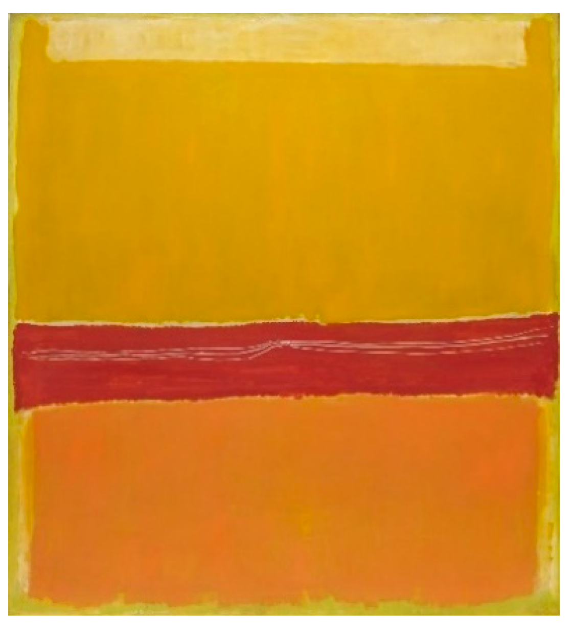
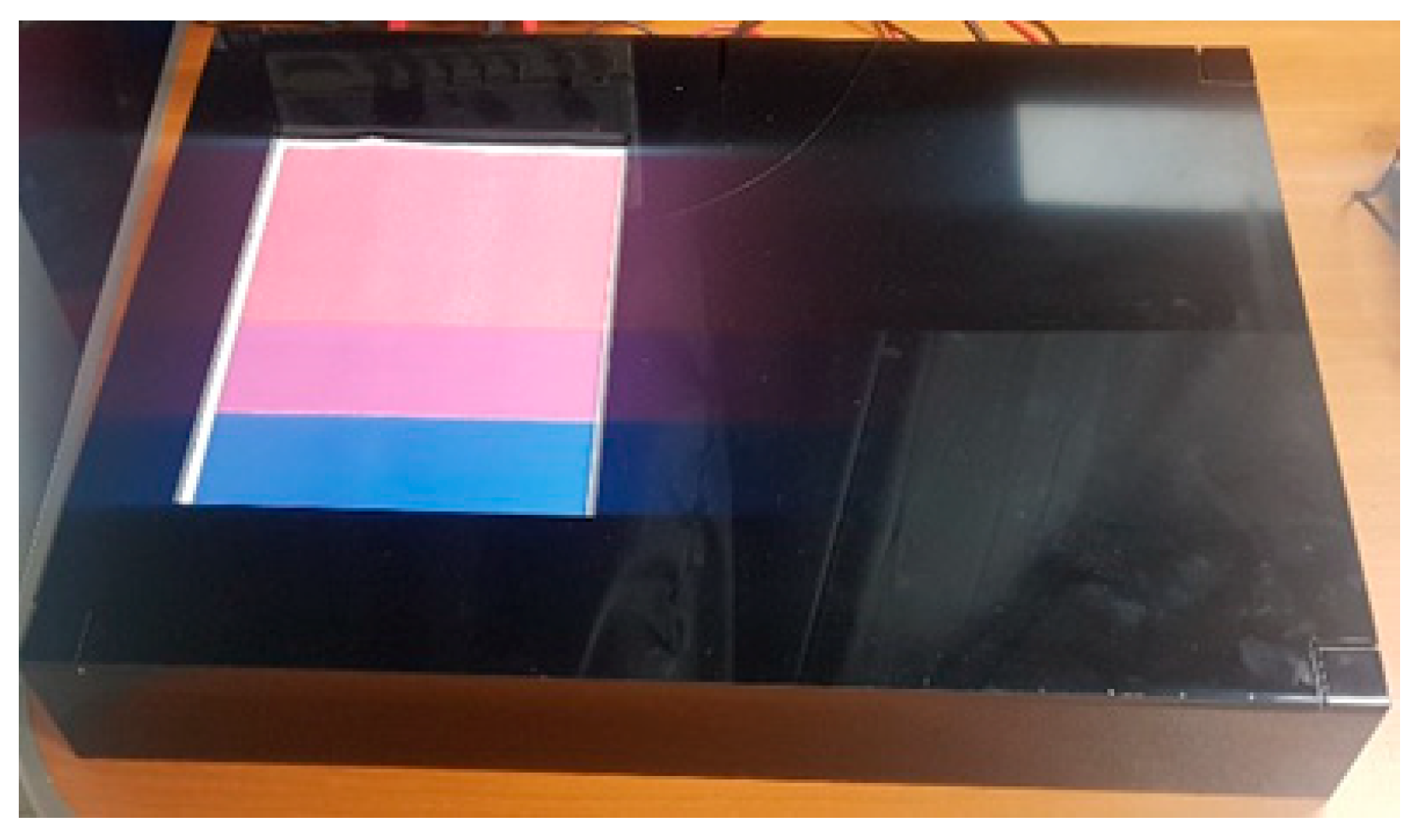
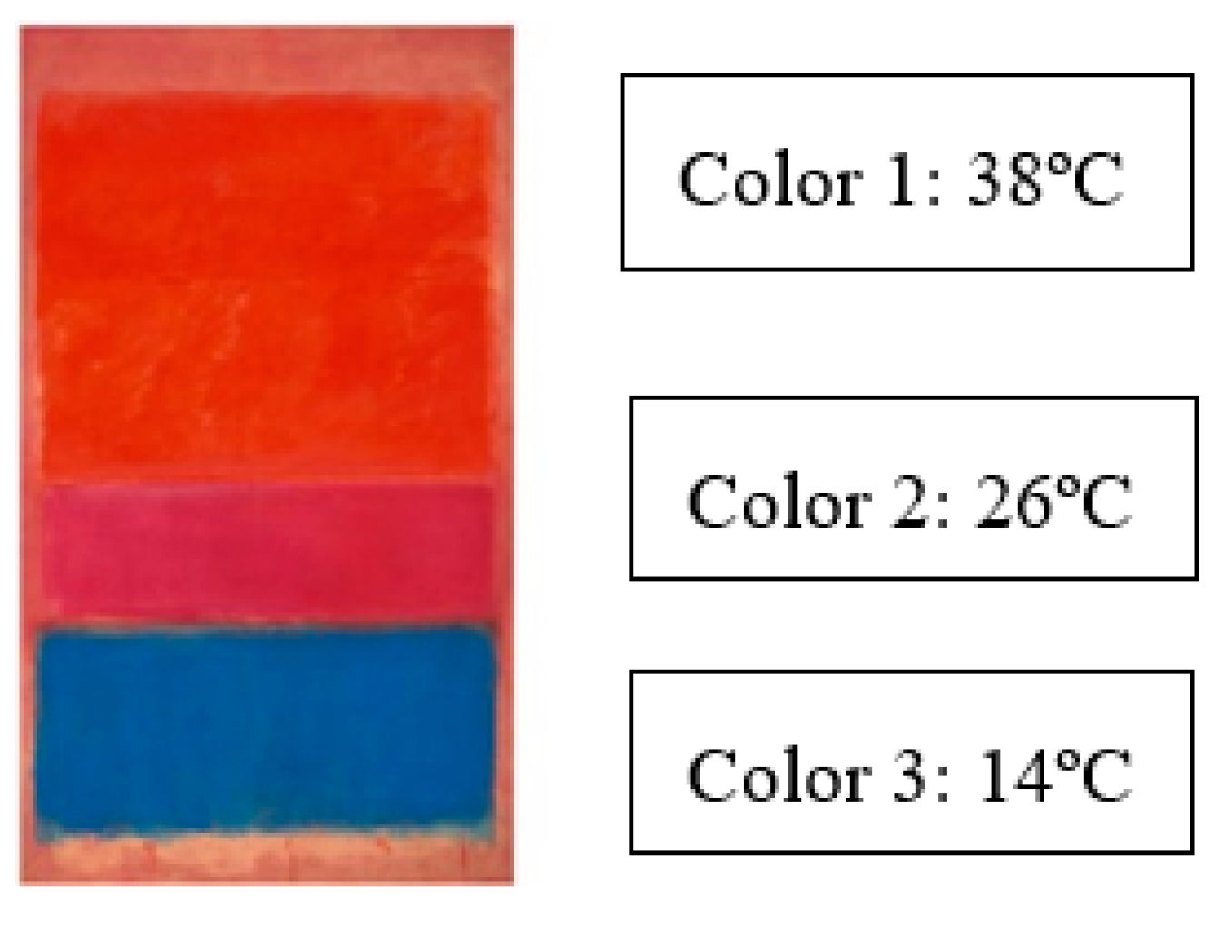
2.4. Mark Rothko’s Artwork Experiment
3. Results
4. Conclusions
- Increasing the number of petliers adding the possibility of creating more complex temperature regions on the artwork;
- Finding a way to make the system smaller and more portable;
- Changing the use of temperature cues from depth representation to an artwork feature semantic mapping, such as making the water feel cold.
- A necessary addition for this semantic mapping would be to be able to make the prototype work with 2.5D relief artworks, which present depth by extruding the features in the z direction, and not only with tactile paper artworks. In that way the visually impaired people could be aware of depth through tactile exploration while also feeling the temperature of the different artwork features while exploring. For that, a method to make the petlier temperature reach all the way to the surface of the 2.5D relief model should be found.
Author Contributions
Funding
Conflicts of Interest
References
- Bhowmick, A.; Hazarika, S.M. An insight into assistive technology for the visually impaired and blind people: State-of-the-art and future trends. J. Multimodal User Interfaces 2017, 11, 149–172. [Google Scholar] [CrossRef]
- Kitaoka, A. Chromostereopsis. In Encyclopedia of Color Science and Technology; Luo, M.R., Ed.; Springer: New York, NY, USA, 2016. [Google Scholar]
- Quero, L.C.; Bartolomé, J.I.; Lee, S.; Han, E.; Kim, S.; Cho, J. An Interactive Multimodal Guide to Improve Art Accessibility for Blind People. In Proceedings of the 20th International ACM SIGACCESS Conference on Computers and Accessibility, Galway, Ireland, 22–24 October 2018; pp. 346–348. [Google Scholar] [CrossRef]
- Bartolome, J.I.; Quero, L.C.; Kim, S.; Um, M.-Y.; Cho, J. Exploring Art with a Voice Controlled Multimodal Guide for Blind People. In Proceedings of the Thirteenth International Conference on Tangible, Embedded, and Embodied Interaction, Tempe, AZ, USA, 17–20 March 2019; pp. 383–390. [Google Scholar] [CrossRef]
- Bartolome, J.D.I.; Quero, L.C.; Cho, J.; Jo, S. Exploring Thermal Interaction for Visual Art Color Appreciation for the Visually Impaired People, In Proceedings of the International Conference on Electronics, Information, and Communication (ICEIC). Barcelona, Spain, 19–22 January 2020; pp. 1–5. [Google Scholar] [CrossRef]
- Eliav, E.; Gracely, R.H. Chapter 3—Measuring and Assessing Pain. In Orofacial Pain and Headache; Sharav, Y., Benoliel, R., Eds.; Mosby: Maryland Heights, MO, USA, 2008; pp. 45–56. ISBN 9780723434122. [Google Scholar]
- Wilson, G.; Brewster, S.; Halvey, M.; Hughes, S. Thermal Icons: Evaluating Structured Thermal Feedback for Mobile Interaction. In Proceedings of the 14th International Conference on Human-Computer Interaction with Mobile Devices and Services, San Francisco, CA, USA, 29 September 2012; pp. 309–312. [Google Scholar] [CrossRef]
- Di Campli, S.V.P.; Brewster, S.; Pollick, F.; White, S. Thermal in-car interaction for navigation. In Proceedings of the 19th ACM International Conference on Multimodal Interaction, Glasgow, Scotland, 13–17 November 2017; pp. 510–511. [Google Scholar] [CrossRef]
- Graham, W.; Martin, H.; Stephen, B.; Stephen, H. Some Like It Hot: Thermal Feedback for Mobile Devices. In Proceedings of the SIGCHI Conference on Human Factors in Computing Systems, Vancouver, BC, Canada, 7–12 May 2011; pp. 2555–2564. [Google Scholar] [CrossRef]
- Lécuyer, A.; Mobuchon, P.; Mégard, C.; Perret, J.; Andriot, C.; Colinot, J.P. HOMERE: A Multimodal System for Visually Impaired People to Explore Virtual Environments. In Proceedings of the IEEE Virtual Reality Conference 2003 (VR 2003), Los Angeles, CA, USA, 22–26 March 2003; pp. 251–258. [Google Scholar] [CrossRef]
- Bousbia-Salah, M.; Redjati, A.; Fezari, M.; Bettayeb, M. An Ultrasonic Navigation System for Blind People. In Proceedings of the 2007 IEEE International Conference on Signal Processing and Communications, Dubai, UAE, 24–27 November 2007; pp. 1003–1006. [Google Scholar] [CrossRef]
- Andreas, R.; Werner, P.; Helena, G.C.; Joanna, W.; Svenja, S.; Christian, L.; Laura, L.; Maria, S.; Anton, F.; Stefan, F. Pictures in your mind: Using interactive gesture-controlled reliefs to explore Art. ACM Trans. Access. Comput. 2018, 11, 1–39. [Google Scholar] [CrossRef]
- Banu, M. Color-emotion associations and color preferences: A case study for residences. Color Res. Appl. 2007, 32, 144–150. [Google Scholar] [CrossRef]
- Lee, W.; Lim, Y.K. Explorative Research on the heat as an expression medium: Focused on interpersonal communication. Pers. Ubiquitous Comput. 2012, 16, 1039–1049. [Google Scholar] [CrossRef]
- Wilson, G.; Dobrev, D.; Brewster, S.A. Hot Under the Collar: Mapping Thermal Feedback to Dimensional Models of Emotion. In CHI ’16: Proceedings of the 2016 CHI Conference on Human Factors in Computing Systems; Association for Computing Machinery: New York, NY, USA, 2016; pp. 4838–4849. [Google Scholar] [CrossRef]
- Graham, W.; Gavin, D.; Stephen, B. In the Heat of the Moment: Subjective Interpretations of Thermal Feedback During Interaction. In Proceedings of the 33rd Annual ACM Conference on Human Factors in Computing Systems, Seoul, Korea, 18–23 April 2015. [Google Scholar] [CrossRef]
- Stevens, J.C. Thermal Sensibility. In The Psychology of Touch; Heller, M.A., Schiff, W., Eds.; Erlbaum: Mahwah, NJ, USA, 1991; pp. 61–90. [Google Scholar]
- FriedeWie/CC0. Available online: https://commons.wikimedia.org/wiki/File:Grafik_nach_Josef_Albers.jpg (accessed on 20 October 2020).
- Vos, J.J. Depth in colour, a history of a chapter in physiologie optique amusante. Clin. Exp. Optom. 2008, 91, 139–147. [Google Scholar] [CrossRef] [PubMed]
- Peter, T.; Keith, M.; Robert, S. Chromostereopsis: A multicomponent depth effect? Displays 1993, 14, 227–234. [Google Scholar] [CrossRef]
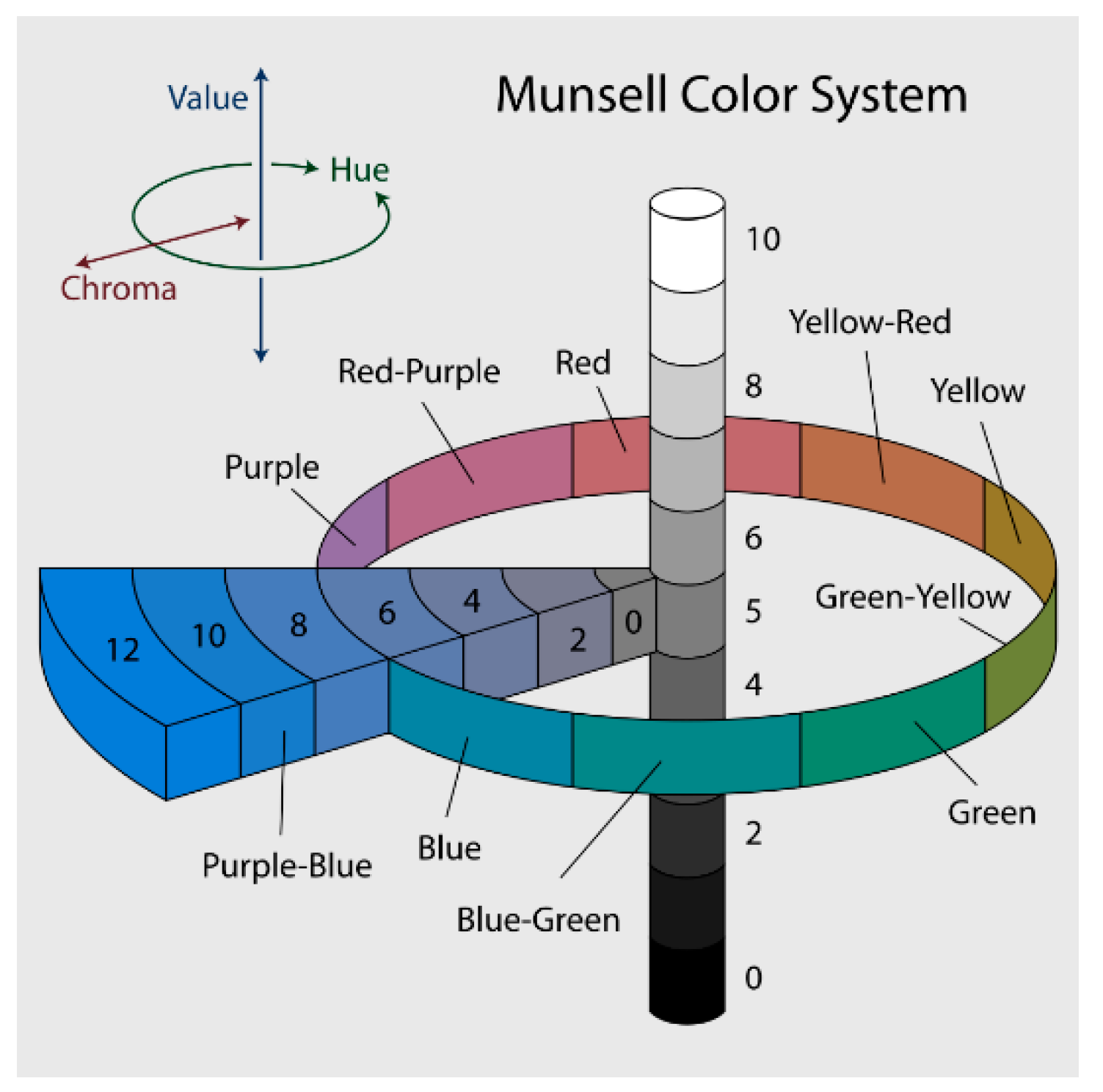
- Noor, I.; Mokhtar, H.; Zaman, K.R.; Pramod, M. Understanding Color Models: A Review. ARPN J. Sci. Technol. 2012, 2, 265–275. [Google Scholar]
- Available online: https://commons.wikimedia.org/wiki/File:Munsell-system.svg (accessed on 15 September 2020).
- Available online: https://commons.wikimedia.org/wiki/File:HLSColorSpace.png (accessed on 8 November 2020).
- Kishto, N.B. The colour stereoscopic effect. Vis. Res. 1965, 5, 313–329. [Google Scholar] [CrossRef]
- Available online: https://www.wikiart.org/en/mark-rothko/no-1-royal-red-and-blue-1954 (accessed on 2 July 2020).
- Available online: https://www.wikiart.org/en/mark-rothko/no-5-no-22 (accessed on 20 June 2020).


| Vivid | Modern |
| Mysterious | Near |
| Classical | Sad |
| Happy | Confidence |
| Tiring | Dynamic |
| Depressive | Fearful |
| Cheerful | Far |
| Simple | Boring |
| Vivid | Boring | Not applicable |
| Sad | Cheerful | Not applicable |
| Classical | Modern | Not applicable |
| Happy | Depressive | Not applicable |
| Tiring | Dynamic | Not applicable |
| Confidence | Fearful | Not applicable |
| Near | Far | Not applicable |
| Simple | Mysterious | Not applicable |
| First Stage | Near | Far |
|---|---|---|
| Warm | 8 (80%) | 2 (20%) |
| Cold | 1 (10%) | 3 (30%) |
| Second Stage | Near | Far |
|---|---|---|
| Warm | 6 (60%) | 2 (20%) |
| Cold | 2 (20%) | 8 (80%) |
| First Stage | Near | Far |
|---|---|---|
| Warm | 5 (83.3%) | 0 |
| Cold | 0 | 5 (83.3%) |
| Second Stage | Near | Far |
|---|---|---|
| Warm | 5 (83.3%) | 0 |
| Cold | 0 | 5 (83.3%) |
| Color | Layer | Depth Temp. (°C) |
|---|---|---|
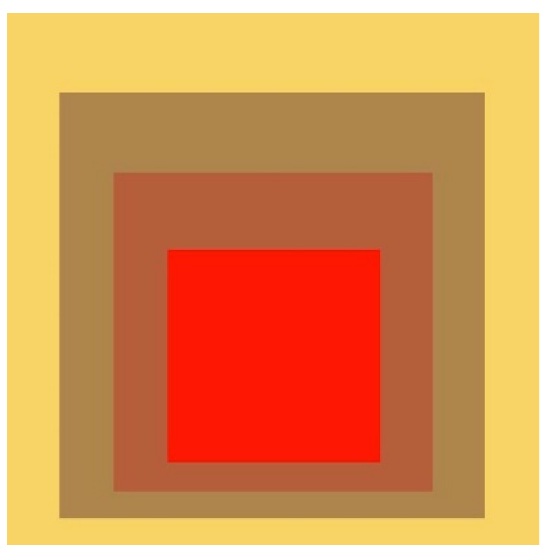
| Central Square | 1 | 38 |
| Background | 2 | 14 |
| Color | Layer | Depth Temp. (°C) |
|---|---|---|
| Central Square | 2 | 14 |
| Background | 1 | 38 |
| Color | Layer | Depth Temp. (°C) |
|---|---|---|
| Saturated yellow | 1 | 38 |
| Dull yellow | 2 | 34 |
| Dull red | 3 | 30 |
| Saturated red | 4 | 26 |
| Element | Layer | Depth Temp. (°C) |
|---|---|---|
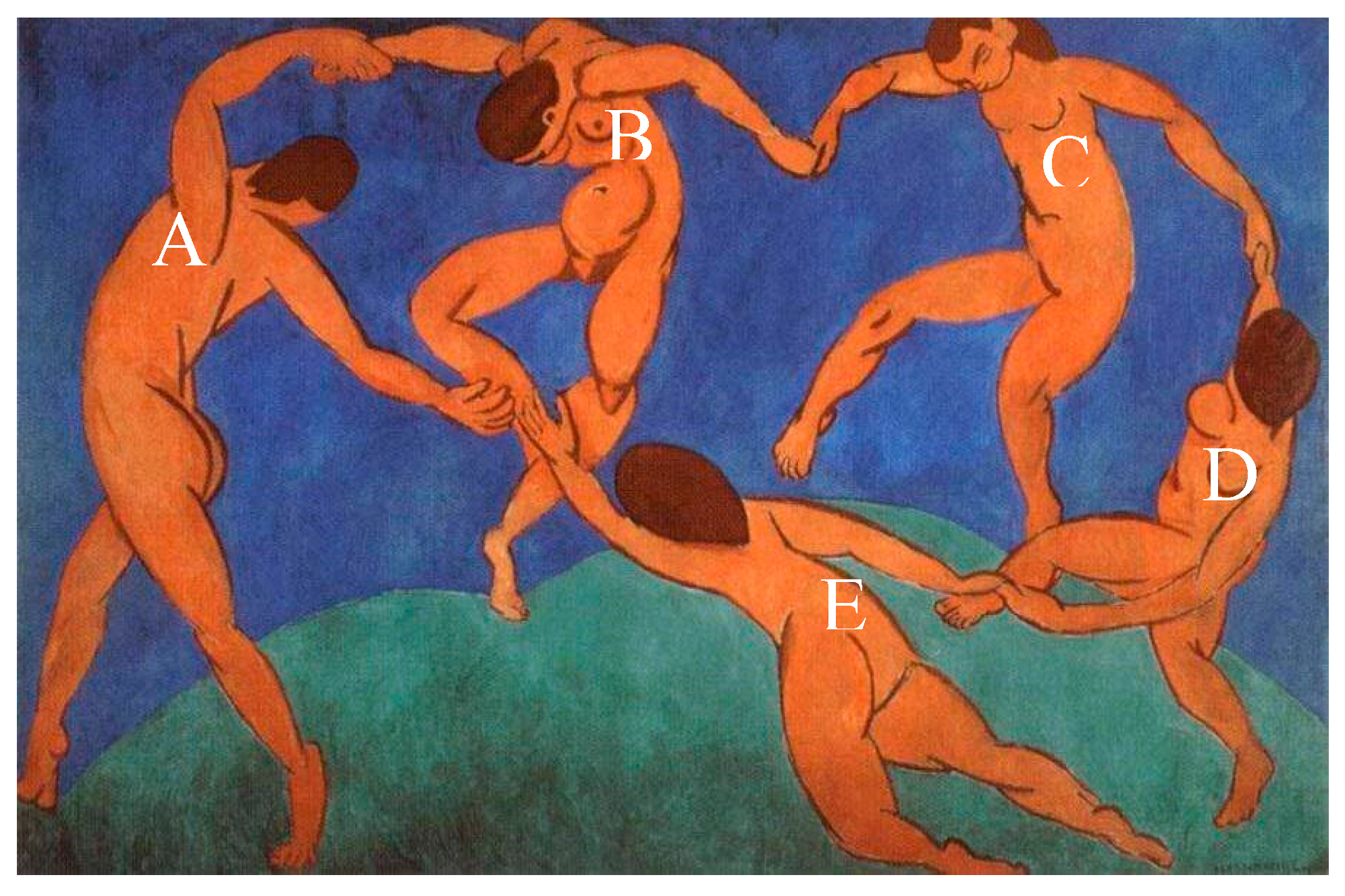
| Dancer A | 2 | 32 |
| Dancer B | 3 | 26 |
| Dancer C | 3 | 26 |
| Dancer D | 2 | 33 |
| Dancer E | 1 | 38 |
| Soil | 4 | 20 |
| Sky | 5 | 14 |
| Element | Layer | Depth Temp. (°C) |
|---|---|---|
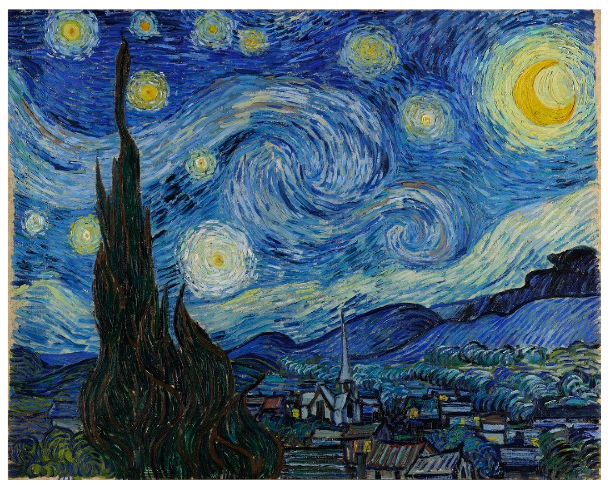
| Tree | 1 | 38 |
| Village | 2 | 32 |
| Forest | 3 | 26 |
| Mountains | 3 | 26 |
| Stars | 4 | 20 |
| Moon | 4 | 20 |
| Sky | 5 | 14 |
| Color | Layer | Depth Temp. (°C) |
|---|---|---|
| Light red | 1 | 38 |
| Dark red | 2 | 14 |
| Color | Layer | Depth Temp. (°C) |
|---|---|---|
| Dark blue | 2 | 14 |
| Light blue | 1 | 38 |
| Color | Layer | Depth Temp. (°C) |
|---|---|---|
| Saturated red | 2 | 38 |
| Muted red | 1 | 14 |
| Color | Layer | Depth Temp. (°C) |
|---|---|---|
| Saturated blue | 2 | 38 |
| Muted blue | 1 | 14 |
| Color | Layer | Depth Temp. (°C) |
|---|---|---|
| Saturated red (S = 92, L = 92)  #EB3812 | 1 | 38 °C |
| Cool red (S = 80, L = 87)  #DC2B51 | 2 | 26 °C |
| Saturated blue (S = 82, L = 76)  #2373C3 | 3 | 14 °C |
| Color | Layer | Depth Temp. (°C) |
|---|---|---|
| Saturated yellow (S = 95, L = 79)  #CA9C09 | 1 | 38 °C |
| Saturated red (S = 73, L = 61)  #9E332A | 3 | 14 °C |
| Saturate orange (S = 81, L = 76)  #C47C24 | 2 | 26 °C |
| User | V(1 ⇒ 2) | V(3 ⇒ 2) | T(1 ⇒ 2) | T(3 ⇒ 2) | V(1 ⇒2)–T(1 ⇒ 2) | V(3 ⇒ 2)–T(3 ⇒ 2) |
|---|---|---|---|---|---|---|
| P1 | −3 | +3 | −2 | +2 | −1 | +1 |
| P2 | +2 | +3 | −3 | +2 | +5 | +1 |
| P3 | −3 | +3 | −2 | +2 | −1 | +1 |
| P4 | −3 | +2 | −3 | +2 | 0 | 0 |
| P5 | −3 | −3 | −2 | +1 | −1 | −4 |
| P6 | +1 | +2 | −2 | +2 | +3 | 0 |
| P7 | +3 | +3 | −4 | +3 | +7 | 0 |
| P8 | −2 | +2 | −3 | +2 | +1 | 0 |
| Avg. | −1 | 1.9 | −2.6 | 2 | 1.63 | −0.13 |
Publisher’s Note: MDPI stays neutral with regard to jurisdictional claims in published maps and institutional affiliations. |
© 2020 by the authors. Licensee MDPI, Basel, Switzerland. This article is an open access article distributed under the terms and conditions of the Creative Commons Attribution (CC BY) license (http://creativecommons.org/licenses/by/4.0/).
Share and Cite
Iranzo Bartolomé, J.; Cho, J.D.; Cavazos Quero, L.; Jo, S.; Cho, G. Thermal Interaction for Improving Tactile Artwork Depth and Color-Depth Appreciation for Visually Impaired People. Electronics 2020, 9, 1939. https://doi.org/10.3390/electronics9111939
Iranzo Bartolomé J, Cho JD, Cavazos Quero L, Jo S, Cho G. Thermal Interaction for Improving Tactile Artwork Depth and Color-Depth Appreciation for Visually Impaired People. Electronics. 2020; 9(11):1939. https://doi.org/10.3390/electronics9111939
Chicago/Turabian StyleIranzo Bartolomé, Jorge, Jun Dong Cho, Luis Cavazos Quero, Sunggi Jo, and Gilsang Cho. 2020. "Thermal Interaction for Improving Tactile Artwork Depth and Color-Depth Appreciation for Visually Impaired People" Electronics 9, no. 11: 1939. https://doi.org/10.3390/electronics9111939
APA StyleIranzo Bartolomé, J., Cho, J. D., Cavazos Quero, L., Jo, S., & Cho, G. (2020). Thermal Interaction for Improving Tactile Artwork Depth and Color-Depth Appreciation for Visually Impaired People. Electronics, 9(11), 1939. https://doi.org/10.3390/electronics9111939