Article

ColorPoetry: Multi-Sensory Experience of Color with Poetry in Visual Arts Appreciation of Persons with Visual Impairment

Department of Electronic and Electrical Engineering, Sungkyunkwan University, Suwon, Gyeonggi-do 16419, Korea
*
Author to whom correspondence should be addressed.
Electronics 2021, 10(9), 1064; https://doi.org/10.3390/electronics10091064
Submission received: 2 March 2021 / Revised: 9 April 2021 / Accepted: 25 April 2021 / Published: 30 April 2021
(This article belongs to the Special Issue Multi-Sensory Interaction for Blind and Visually Impaired People)

Abstract

:
Visually impaired visitors experience many limitations when visiting museum exhibits, such as a lack of cognitive and sensory access to exhibits or replicas. Contemporary art is evolving in the direction of appreciation beyond simply looking at works, and the development of various sensory technologies has had a great influence on culture and art. Thus, opportunities for people with visual impairments to appreciate visual artworks through various senses such as hearing, touch, and smell are expanding. However, it is uncommon to provide a multi-sensory interactive interface for color recognition, such as integrating patterns, sounds, temperature, and scents. This paper attempts to convey a color cognition to the visually impaired, taking advantage of multisensory coding color. In our previous works, musical melodies with different combinations of pitch, timbre, velocity, and tempo were used to distinguish vivid (i.e., saturated), light, and dark colors. However, it was rather difficult to distinguish among warm/cool/light/dark colors with using sound cues only. Therefore, in this paper, we aim to build a multisensory color-coding system with combining sound and poem such that poem leads to represent more color dimensions, such as including warm and cool colors for red, orange, yellow, green, blue, and purple. To do this, we first performed an implicit association test to identify the most suitable poem among the candidate poems to represent colors in artwork by finding the common semantic directivity between the given candidate poem with voice modulation and the artwork in terms of light/dark/warm/color dimensions. Finally, we conducted a system usability test on the proposed color-coding system, confirming that poem will be an effective supplement for distinguishing between vivid, light, and dark colors with different color appearance dimensions, such as warm and cold colors. The user experience score of 15 college students was 75.1%, that was comparable with the color-music coding system that received a user experience rating of 74.1%. with proven usability.

1. Introduction

Multimodal (or multisensory) integration refers to the neural integration or combination of information from different sensory modalities (the classic five senses of vision, hearing, touch, taste, and smell, and, perhaps less obviously, proprioception, kinesthesis, pain, and the vestibular senses), which gives rise to changes in behavior associated with the perception of and reaction to those stimuli. Information is typically integrated across sensory modalities when the sensory inputs share certain common features [1].
Cross-modality refers to the interaction between two different sensory channels. Cross-modal correspondence is defined as the surprising associations that people experience between seemingly unrelated features, attributes, or dimensions of experience in different sensory modalities.
The intuitive strategies based on cross-modal analogy, association, and symbolism are suitable for creating a design that provides connections between the senses, which directly appear appropriate and easy to interpret [2].
Although many studies have been conducted on the cross-sensation between the sight and other senses, there are not many studies on the cross-modality between the non-visual senses. Through the investigation of weak synesthesia that is perceived at the same time by intersecting various senses such as audio, touch, smell, etc., other sensory information can be connected to a specific form of color information. In this task, so far, efforts have been made to create different single-mode sensory perceptions for color, for example, color–sound, color–tactile pattern, color–odor, etc.
In our previous studies, colors were expressed as embossed tactile patterns for recognition by finger touches, temperature, sound, and smell to provide a rich art experience to person with visual impairments. The Black Book of Colors by Cottin [3] described the experience of a fictional blind child named Thomas, who describes color through association with certain elements in his environment. This book highlights the fact that blind people can gain experience through multisensory interactions: “Thomas loves all colors because he can hear, touch, and taste them.”
An accompanying audio explanation provides a complementary way to explore the overall color composition of an artwork. When tactile patterns are used for color transmission, the image can be comprehensively grasped by delivering graphic patterns, painted image patterns, and color patterns simultaneously [4].
This suggests to us the possibility and the justification for developing a new way of appreciating works in which the colors used in works are subjectively explored through the non-visual senses. In other words, it can be inferred that certain senses will be perceived as being correlated with certain colors and concepts through unconscious associations constructed with the concepts. However, while this helps visually impaired users perceive and understand colors in completely different ways, it becomes necessary to integrate all perceptual sensations into a single multi-sensory system, where all the senses are perfectly connected and interchanged. This concept is in line with the theory of emotional intelligence, which defends the organic functioning of people, as a whole, in interaction between the emotional, the sensory, and the cognitive [5,6]. According to Damásio [5], feelings are basically the mind’s interpretation of the state of the body, and in order for reason to be truly rational, it must be based on emotional cues from the body. Emotional memories are not easily erased from memory and remain the longest. Tacit memories that did not easily emerge above consciousness can suddenly come to mind through the opportunity of contact with any part of one’s body [5].
Audio description does provide a useful service for those with low or no visual acuity [7,8]. Schifferstein [9] observed that vivid images occur in all sensory modalities. The quality of some types of sensory images tends to be better (e.g., vision, audition) than of others (e.g., smell and taste) for sighted people. The quality of visual and auditory images did not differ significantly. Therefore, training these multi-sensory experiences introduced in this paper may lead to more vivid visual imageries or seeing with the mind’s eye. However, such descriptions are often monolithic accounts, missing the opportunity for alternative messages to be delivered and received. Making art accessible to the visually impaired requires the ability to convey explicit and implicit visual images through non-visual forms. It argues that a multi-sensory system is needed to successfully convey artistic images. It also designed a poetic text audio guideline that blends sounds and effects to translate the work into an ambiguous artistic sound text [9].
Audio or verbal description on an artwork generally attempts to explain the painting without expressing the individual subjectivity. When making visual art accessible to the visually impaired, it is not enough to describe the colors and situations portrayed because that objective information does not attach to anything in their experience. Using expressions that contain the sensibility of poems, color, and situation can be matched with the parts of each painting.
Poem is a piece of writing that has features of both speech and song, whereas poetry is the art of creating these poems. Throughout the poem, seeing and hearing are used to understand color. Imagery is a literary device that refers to the use of figurative language to evoke a sensory experience or create a picture with words for a reader. By utilizing effective descriptive language and figures of speech, writers appeal to a reader’s senses of sight, taste, smell, touch, and sound, as well as internal emotion and feelings. Poetic imagery provides sensory details to create clear and vivid descriptions. This appeals to a reader’s imagination and emotions as well as their senses [10].
The connection between color and poem has not been studied through existing research. In this paper, we explore how color can be explained by poetry so that visually impaired people feel or perceive color through poetry. However, the connection between color and poetry should be clearly matched. When appreciating color in artworks using poetry, we need to explore whether color concept and poem interfere with each other, causing confusion in color perception, or synergizing with each other to positively affect color perception. A system usability test is performed to evaluate whether it helps to easily recognize the color.

2. Background

2.1. Review on Ekphrasis

In poetry, synesthesia refers specifically to figurative language that includes a mixing of senses. For example, saying “He wore a loud yellow shirt” is an example of synesthesia, as it mixes visual imagery (yellow) with auditory imagery (loud) [11]. Here is another example “The Loudness of Color” by Jennifer Betts [12]:
The music of white dances softly around
The soft silence and blue are bound
Purple is calm, the sound soft and sweet
The color lightness of a rainbow is a hypnotic beat
In yellow, the silence is loud
While red is a yell, robust and proud
Red does not actually yell, but many would describe it as loud. Using sound to describe color makes it fun and interesting for the reader. The art of writing poetry about paintings is known as ekphrasis [13,14,15]. Ekphrasis’ technology was used to convey description, imagination, and emotion (vibrance) to direct visual artworks and played a role in enhancing the value of art. Edward Hirsch (1994) said, “works of art initiate and provoke other works of art” [16].
Color theory is associated with the Bauhaus artists Johannes Itten, Josef Albers, and Paul Klee. Itten wrote “The Art of Color”, The Elements of Color and Albers’ Interaction of Color, and Paul Klee notably produced picture poems, concerned with colors and words.
The work of many contemporary poets has also been influenced by the visual arts: Rainer Maria Rilke, W.B. Yeats, W.H. Auden, and William Carlos Williams [17], Jane Flanders, Anne Sexton, X. J. Kennedy, and Gershon Hepner (Table 1), are a few. The examples of ekphrases are shown in Table 1.
Koch [18] and Routman [19] made common observations on the practice of teaching poetry, specifically in regard to the importance of utilizing a range of quality poetry written by children and adults. Koch prefers to read poetry examples and then allow students to be influenced and imitate other poets. It makes them feel more open to understanding what others have written. Previous works mainly focus on generating poetry given keywords or other text information, while visual inspirations for poetry have been rarely explored.
Table 1. Examples of ekphrasis (a): artworks, (b): poems.
(a) Artworks
Vincent van Gogh
Arles, 1888
Van Gogh Museum Electronics 10 01064 i001
Vincent van Gogh
The Starry Night, 1889
Modern Museum of Art Electronics 10 01064 i002
Marcel Duchamp
Nude Descending a Staircase No.2, 1912
Philadelphia Museum of Art Electronics 10 01064 i003
Mark Rothko
No. 13 (White, Red on Yellow), 1958
Museum of Modern Art Electronics 10 01064 i004
(b) Poems
Van Gogh’s Bed
Jane Flanders, 2015 [20]
The Starry Night
Anne Sexton, 1961 [21]
Nude Descending a Staircase
X. J. Kennedy, 1961 [22]
White, Red on Yellow
Gershon Hepner,
2008 [23]
is orange,
like Cinderella’s coach, like
the sun when he looked it
straight in the eye.
is narrow, he sleeps alone,
tossing between two pillows,
while it carried him
bumpily to the ball.
is clumsy,
but friendly. A peasant
built the frame; and old wife beat
the mattress till it rose like meringue.
is empty,
morning light pours in
like wine, melody, fragrance,
the memory of happiness.
The town does not exist
except where one black-haired tree slips
up like a drowned woman into the hot sky.
The town is silent. The night boils with eleven stars.
Oh starry night! This is how
I want to die. It moves. They are all alive.
Even the moon bulges in its orange irons
to push children, like a god, from its eye.
The old unseen serpent swallows up the stars.
Oh starry night! This is how
I want to die:
into that rushing beast of the night,
sucked up by that great dragon, to split
from my life with no flag,
no belly,
no cry.
Toe upon toe, a snowing flesh,
A gold of lemon, root and rind,
She sifts in sunlight down the stairs
With nothing on. Nor on her mind.
We spy beneath the banister
A constant thresh of thigh on thigh--
Her lips imprint the swinging air
That parts to let her parts go by.
One-woman waterfall, she wears
Her slow descent like a long cape
And pausing, on the final stair
Collects her motions into shape.
White and red and yellow Rothko thought more mellow
than mountains that are grandiose,
or portraits. Figures can be gross
and mountains overwhelm the view,
but colors, when they’re few and pure,
achieve a balance of pure reason
in every place, in every season.
Good poems produce sensational images in compressed and refined language. When you read a poem, the scene it describes seems to unfold before your eyes. Association is a phenomenon in which one idea evokes another. Five images found in poetry, for example, are as follows.
  • Visual: the light blue sky
  • Sound: the wind attenuating the acoustic image
  • Olfactory: The smell of grass flowers
  • Taste: sweet chocolate
  • Tactile: warm stars
  • Synesthesia: blue whistling sound

2.2. Review on Review on Color Association with Sound

Recently, the following works were devised to materialize multi-sensory appreciation for the color of artworks for the visually impaired [24]. An experiment comparing the cognitive capacity for color codes found that users could intuitively recognize 24 chromatic and 5 achromatic colors with tactile pictogram codes [25] and 18 chromatic and 5 achromatic colors with sound codes [26].
Cho et al. [25] presented a tactile color pictogram system to communicate the color information of visual artworks. The tactile color pictogram uses the shape of sky, earth, and human derived from the oriental philosophy of heaven, earth, and human as a metaphor. The tactile color pictogram used a slightly larger cell size compared to most tactile patterns currently used to indicate color, but code for more colors due to its simple structure. With user experience and identification tests, conducted with 23 visually impaired adults, the effectiveness of the tactile color pictogram suggested that they were helpful for the participants. Colors can thus be recognized easily and intuitively by touching the different patterns.
What the art teacher wanted to do most with her blind students was to have them imagine colors using a variety of senses—touch, scent, music, poetry, or literature. A comprehensive survey of associations between color and sound can be found in [24], including how different color properties such as value and hue are mapped onto acoustic properties such as pitch and loudness. Cho et al. [26] developed a sound coding color (Table 2) to express red, orange, yellow, green, blue, and purple using a melody (length: about 10 s) excerpted from a Classic music video with different musical instruments, intensity, and pitch of sound to express vivid, light, and dark colors. In Reference [26], musical instruments were classified for each color to ensure that they would be easily distinguished from one another. Red, a representative warm color, is expressed by a violin that plays a passionate and strong melody. A trumpet plays a high-pitched melody with energy, as if a bright light were expanding, to simulate yellow bursts. Orange is expressed by a viola playing a warm yet energetic melody. Green, which makes the eyes feel comfortable and psychologically stable, is expressed by a fresh oboe that plays a soft melody. Blue, a representative cold color, is expressed by a cello that plays a low, calm melody. Violet, where warm red and cold blue coexist, is expressed by a pipe organ that plays a magnificent yet solemn melody.
Vivid colors and bright and dark colors were distinguished through a combination of pitch, instrument tone, intensity, and tempo. High color lightness used a small, light, particle-like melody and high-pitch sounds, and a bright feeling was emphasized by using a melody of relatively fast and high notes. For low color lightness, a slow, dull melody with a relatively low range was used to create a sense of separation and movement away from the user.
In Reference [26], the overall color composition of Van Gogh’s “The Starry Night” was expressed as a single piece of music that accounted for color using the tone, key, tempo, and pitch of the instruments. To express the highly saturated (vivid) blue of the night sky, which dominates the overall hue of the picture, a strong, clear melody in the mid-range was excerpted from the Bach unaccompanied cello suite No. 1 to form the base of the whole song, and it is played repeatedly without interruption. To express the twinkling bright yellow of the stars, a light particle-like melody was extracted from Haydn’s Trumpet Concerto and played as a strong, clear melody in the mid-range. The painting was divided into four lines, and worked with 16 bars per line, producing a total of 68 bars played in 3 min and 29 s. The user experience evaluation rate from nine blind people was 84%, and the user experience scores from eight sighted participants were 79% and 80% for the Classical and Vivaldi schemes, respectively. After one hour of practice, the cognitive success rate for three blind people was 100% for both the Classical and Vivaldi schemes. Here, we show another example of composing a single music piece representing colors in Van Gogh’s “The starry night”, as shown in Table 3.
The painting was divided into three rows and four columns, and played in 2 min and 10 s. The color sounds in each entry in the color map table were joined to form a single music piece. Therefore, while listening to music, the user can recall the color corresponding to each sound and the location of the color in the painting. These sound cues were prepared for the comparison purpose (as we shall explain in the system usability score test section).
Bartolome et al. [27] expressed color and depth (advancing and retreating) as temperature and demonstrated the temperature-sensitive replica of Marc Rosco’s work using a thermoelectric Peltier element and a control board. For the sighted people, at some point of the test, eight of the ten users agreed that the conceptual dichotomies warm-near and cold-far were correlated. This fact was proven during the test with persons with visual impairment, where 83% of the users (a total of five out of six) linked in both stages the warm temperature to the concept of being near something, and the cold temperature to the concept of being far [27].
Using an implicit associations test, Anikin et al. [28] confirmed the following cross-modal correspondences between visual and acoustic features. Pitch was associated with color lightness, whereas loudness mapped onto greater visual saliency. The hue of colors with the same luminance and saturation was not associated with any of the tested acoustic features, except for a weak preference to match higher pitch with blue (vs. yellow).
In the Doppler effect, the response of sound waves to moving bodies is illustrated in the example of the sounding of the locomotive whistle of a moving train. When the train blows its whistle while it is at rest in the station, stationary listeners who are either ahead of the engine or behind it will hear the same pitch made by the whistle, but as the train advances, those who are ahead will hear the sound of the whistle at a higher pitch. Listeners behind the train, as it pulls further away from them, hear the pitch of the whistle begin to fall [29]. Using such a principle, depth information of a color object located close to the viewer’s gaze can be expressed by voice. In other words, if you increase the intensity of the voice, the color will feel close and intense. However, if you weaken the sound intensity, the color will feel pale and distant.
Jonas et al. [30] and Cogan et al. [31] found that a higher value in lightness is associated with higher pitch. Another way to match color and sound is to associate an instrument’s tone with color, as in Kandinsky [32]. A low-pitched cello has a low-brightness dark blue color, a violin or trumpet-like instrument with a sharp tone feels red or yellow, and a high-pitched flute feels like a bright and saturated sky blue. As shown in Table 1, it is possible to compare the sensibility felt in each instrument tone with the sensibility felt in color. Chroma has a relationship with sound intensity [33,34]. This color encoding problem is the same as finding the entropy introduced in Claude Shannon’s Theory of Information. Entropy is the average (estimated) minimum resources required to provide information in an event.
Marks et al. [35] found that children of all ages and adults matched pitch to value and loudness to chroma. The value (i.e., lightness) is high and heavy, dependent on the light and dark levels of the color. Using the same concept in music, sound is divided into light and heavy feelings according to the high and low octaves of a scale. When the intensity of the sound is strong, the color sensed is close and sharp, whereas when the intensity of the sound is weak, the color becomes distant and muted [35]. Wilms and Oberfeld [36] observed that the increase of the arousal ratings from low to medium to high brightness is only present at the two higher saturation levels (among three levels). For the arousal dimension, it ranges from a relaxed, sleepy figure to an excited, wide-eyed figure. By Rowe [37], warm sound has a tilt towards the bass frequencies. The bass and vocals are more prominent, “bright” is the opposite of warm. Bright gear is better at reproducing high-pitched sounds.
Synesthete prevalence among fine-art students was estimated to be 23% [38]. Among various synesthesia due to color (N = 365), colored graphemes are the most common form occurring in two-thirds (66.8%) of a group of 365 synesthetes, and colored time units 19.2%, colored musical sounds 14.5%, and colored general sounds 12.1% [39]. Chromesthesia or sound-to-color synesthesia is a type of synesthesia in which sound involuntarily evokes an experience of color, shape, and movement [40]. Synesthetes that perceive color while listening to music experience the colors in addition to the normal auditory sensations. In Reference [41], synesthetes and non-synesthetes alike associate high-pitched sounds with lighter or brighter colors and low-pitched sounds with darker colors. For some individuals, chromesthesia is only triggered by speech sounds, while others’ chromesthesia can be triggered by any auditory stimuli [42]. In a study investigating variability within categories of synesthesia, 40% of subjects with chromesthesia for spoken words reported that voice pitch, accent, and prosody influenced the synesthetic color [43].

2.3. Review on Color Association with Other Senses

Areas that are relatively high in chroma and lightness can seem to “come forward” in the sense of being visually more insistent than other areas, and orange-red, orange, and yellow paints attain higher chroma-lightness combinations than paints of other hues [44]. We can see through experience, that lighter, cooler colors seem to recede, thus making a room feel larger (giving it more “room”), while warmer, more saturated, and darker colors seem to advance, and take up more space in a room, thus making it appear smaller [45].
Ludwig and Simner [46] found that smooth, soft, and round stimuli tended to induce brighter colors, compared to rough, hard, and spiky stimuli.
In Slobodenyuk et al. [47], participants were asked to use colors to describe vibrotactile stimuli of varying frequencies and intensities, simulating variations in roughness–smoothness, heaviness–lightness, elasticity–inelasticity, and adhesiveness–non-adhesiveness. Analysis of the hue, chroma, and brightness of the chosen colors showed a bias towards the red, violet, and blue spectra of hue for the highest intensity haptic stimuli, and toward yellow and green for the lowest intensity, for which green colors were chosen the least. The least intense stimuli also had the lowest level of chroma and highest level of brightness, whereas the opposite was true for the most intense stimuli [47].
There are also indications of hedonic scores mediating cross-modal interactions of odors and colors. Namely, bright colors tend to be rated as pleasant, while darker colors tend to be found more unpleasant (Maric and Jacquot [48]). Strong fragrances are associated with dark colors (Kemp and Gilbert [49]), and there are research results that state that floral fragrances are associated with bright colors (Fiore [50]).
Kim [47] found that the floral and woody families showed more distinguishable opposite patterns in both hue and tone parameters: the floral family with brighter warm colors and the woody family with darker (or stronger) cool colors. The warm colors strongly evoked the floral family, while the cool colors the fresh family. The brighter (darker) their lightness values become, the more the floral (woody) scents are associated. Smoothness, softness, and roundness of stimuli positively correlated with luminance of the chosen color, and smoothness and softness also positively correlated with chroma [51]. These survey results are summarized in Table 4 and Table 5.

3. Proposed ColorPoetry System

This section describes ‘ColorPoetry’, a systematic approach to color expression aids using poetry. The proposed system can explicitly model the color directivity of poems and effectively matches the color appearance dimension (vivid/light/dark/cool) of artwork and poem. Using a user study, we demonstrate that our color-coding scheme can effectively match colors in artwork with poems and provide a significantly higher user experience. We envision that this color-coding system utilizing poems will enable many useful applications in appreciating visual arts for the sighted people as well as people with visual impairment.

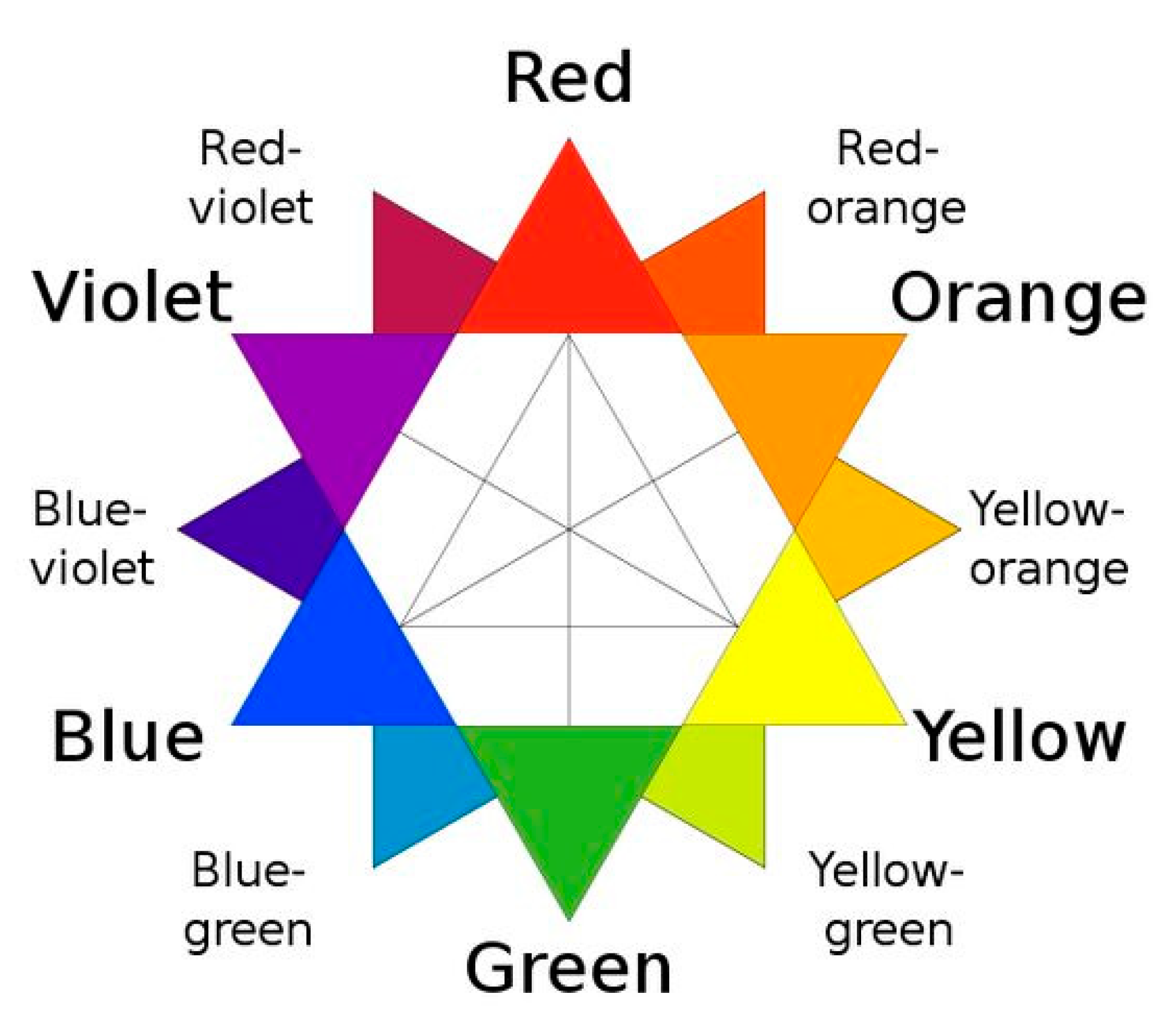
3.1. Color Selection

The perception of color is often described by referring to three dimensions of the color experiences: hue, intensity, and value. There are four visual perceptive terms that are used to describe color appearance, as defined below [44].
Hue: Hue could also be called “root” or “source” color. The hue is always one of the 12 key color places on the basic color wheel (Figure 1).
Value: The value of a color is always going to be compared against a basic palette of white, grey, or black. A color’s value refers to the quality that distinguishes a light color from a dark one. In other words, it refers to the lightness or darkness of a hue.
Intensity: Intensity is more commonly called “saturation”. To measure a brightness of any given color, it is first necessary to identify the root hue/color it is most closely related to. This is usually one of the two neighboring colors that sit next to it on the color wheel. Then, the new color’s intensity can be characterized in terms of “brightness” or “dullness” as related to the predominant root hue.
Temperature: Temperature is perhaps the most subjective of the four basic color qualities outlined by Itten. It is also in this quality where it is easiest to see the emotional relationship Itten himself had with color. Temperature is expressed in terms of warm or cool.
Cho et al. [26] investigated that melodies with different pitch, tone, velocity, and tempo can be used as color sound codes to easily express the color lightness level. However, the number of colors that can be represented by sound was limited to 18 (three levels of brightness for each of six hues). In this paper, using poems, we extend the number of colors to be expressed up to 30, including warmer and cooler colors of each hue. In this way, the visually impaired can improve their color literacy to enjoy the colorful world in the painting. In this perspective, the extension can be done by using sounds to represent six color hues (red, orange, yellow, green, blue, violet) and poems to represent light/dark and warm/cool colors, simultaneously. In other words, the six color hues like red, orange, yellow, green, blue, and violet on the 12 RYB color wheel, Figure 1, are represented by sound codes. The six tertiary colors are warm and cool colors of red, yellow, and blue, such as red-orange (the warm color of R), red-violet (the cool color of R), yellow-orange (the warm color of Y), yellow-green (the cool color of Y), blue-green (the warm color of B), and blue-violet (the cool color of B), and are represented by sound code and poem (to represent the warmer or cooler colors of the color hue) together. Also, 12 lighter and darker colors from 6 color hues are also represented by sound (color hue) and poem (to represent the lighter or darker colors of the color hue) together. Also, there are five achromatic colors: white (WH), black (BK), and three levels of grays (dark gray, middle gray, light gray). In this system, the higher the lightness value, the closer the color is to white, and the lower the lightness, the closer it is to black. As shown in Figure 2, the light color (L) has a value of 7 and chroma of 8. The dark color (D) has a value of 3 and a chroma of 8. A saturated color (S) has high chroma (level 15) and colors with the lowest chroma (level 0) are achromatic.

3.2. Algorithm of Poetry Coding Colors

In this section, we explore the poem coding colors representing five color appearance dimensions. First, we need to identify the poems that feels “good” for the color appearance dimension used in the visual artwork. Next, we express such color appearance dimension using three levels of voice pitches respectively, while reciting a poem. Therefore, combining voice sounds and poems in this way makes it simpler and easier to identify color, including light, dark, warm, and cool colors, compared to the conventional way of using a single modality such as sound, tactile pattern, or temperature alone. Given an artwork image A and a set of poems DP, as illustrated in Table 6, the goal is to find the set of poems P ∈ DP that are mostly relevant to the color appearance dimension directivity of the image. Let S(A) (respectively S(P)) be denoted as a measure of the overall color appearance dimensions observed in artwork A (respectively P). We are now ready to describe the ColorPoetry Algorithm 1 as follows. The purpose of the algorithm is to find the set of “good” poems P with the maximum significance of Art–Poem similarity score denoted by sigmax S(A, P):
Algorithm1 ColorPoetry (i.e., Poetry Coding Colors).
Input: a color C in an artwork A, a poem database DP.
Output: a set of poems P ∈ DP.
1: For every color in C
Identify the set of poems P, finding sigmax S (A, P), for all P ∈ DP.
2: Return P.

3.3. Overall Solution Strategy

There are three main steps to solving the problem.
(1) Determine poem database. Color poems are about a single color, using descriptions, nouns, and other key elements to express feelings about that color. An easy format for this type of poem is describing the color using the five senses: looks, sounds, tastes, feels, and smells. From Wikipedia, lyric poetry is a form of poetry that does not attempt to tell a story, as do epic poetry and dramatic poetry, but is of a more personal nature instead. Rather than portraying characters and actions, the lyric poet addresses the reader directly, portraying his or her own feelings, states of mind, and perceptions. In the poems, colors are used as a metaphor or to express the context in the poem, and we mainly collected them extensively through browsing relevant websites like “poemhunter.com” [48], and literature. The color database we built consists of 12–15 poems with different moods for each of the 6 hues: red, orange, yellow, green, blue, purple, including white, grey, and black. These poems are selectively analyzed and selected according to the appearance dimensions of the color in a given artwork.
(2) Determine color perceptual adjectives. The perceptual semantic difference method is used to establish a rigorous sensory analysis process to evaluate algorithms to find phrases in poetry that match the color of a given artwork. To reflect the user’s perception of color perception, it is necessary to use a set of color-related perceptual adjectives that have been validated in psychological research. The amount and fidelity of the collection of perceptual adjectives affects the quality of the research data. Adjectives that describe colors have been extensively collected through the existing literature.
(3) Data analysis and user experience test. The results of the evaluation of the correlation between the perceptual meanings of the colors that appeared in artwork and poetry were analyzed with statistical tools. The user experience test of the proposed color-coding system will be performed through user interviews.

3.4. Voice Modulation

Four color properties such as light/dark/warm/cool can be expressed by voice, so the brightness of the color is modulated according to the pitch of the sound, and the degree of warmth and coolness of the color can be expressed by the strength and reverberation of the voice. A voice was produced using adobe audition. To express the lighter color in voice, the pitch was raised by 2.5 semitones from the original voice. To express darker color in voice, the pitch was lowered by 5 semitones from the original voice. To express vivid (i.e., highly intense) color in voice, the speed was stretched to 75% from the original voice and made it faster. To express warmer color in voice, a stereo-reflection plate was set among presets at full reverb and amplified +2.5 dB from the original voice. Finally, to express cool color in voice, “deserted room” was set among presets in full reverb. Two experimental artworks are illustrated to evaluate the usability of the appreciation method for the colors of artworks for the visually impaired that have been confirmed through such a test. Two versions of voice modulation were made and used according to preference: (1) the first version (called “word”) with the corresponding voice modulation applied for each color word, and (2) the second version (called “phrase”) in which the words contained in the same line related to the color are applied with the same voice modulation corresponding to the color.

3.5. Use Cases

Here, Vincent van Gogh’s 1889 work ‘The Starry Night’ (Modern museum of art, NY) and Henri Matisse’s 1910 work ‘Dance’ (Hermitage Museum, Saint Petersburg) are illustrated as use cases. ‘Starry Night’ conceptually and dynamically expresses the fluctuating air of an invisible night sky. Matisse used only four colors: blue, green, orange, and red. These vivid hues create an intense contrast. Both of these works well match the conceptual elements of color, so they are suitable for testing the usefulness of how to appreciate works of art using multiple senses. One of two poems per color were selected from about 2000 color poems in the “poem hunter website” [52], as shown in Table 6 and Table 7. The table also shows the vocal narration for coding each color in words and tones.
Table 6. Poetry for representing colors in Van Gogh’s “The starry night” (the sound files developed in this research are provided separately as a Supplemental Material).
ColorPoetPart of Poem Excerptfrom the Original PoemModulated Voice
WordPhrase
Cool dark blue sky
and night
P1: Dark Blue Sky
Peter S. Quinn [53]
Dark blue sky’s out there,
Before daybreak is in;
Falling stars here and there,
Night and distant moon,
Sleepless is my night;
Electronics 10 01064 i024 Electronics 10 01064 i025
P2: Blue on Blue
Sandra Feldman [54]
The skies so blue,
The Sky, the Ocean, sadly Blue.
Upon a blue-lit tingling Star,
That Love can travel to the moon,
And much that’s Blue is a Mirage.
Electronics 10 01064 i026 Electronics 10 01064 i027
Light warm
yellow star
White star
P3: Yellow Star
Vijay Sai [55]
A yellow star
In a sky
Twinkling white ones
It’s a yellow bird
My beautiful little yellow bird!
Electronics 10 01064 i028 Electronics 10 01064 i029
Light Cool
blue wind
P4: The wind has a blue tail
Arjen Duinker [56]
The wind has a blue
 
tail The wind also has a white tail
Electronics 10 01064 i030 Electronics 10 01064 i031
P5: Blue, Blue and Blue
Karun Aker [57]
Blue smells like my mother’s perfume
On a windy day
Electronics 10 01064 i032 Electronics 10 01064 i033
Warm
orange moon
P6: Crushed Orange Moon
Robert Murray Smith [58]
Crushed orange moon,
Hold your color for the delight
of night.
When you crush orange light for
our sight.
Electronics 10 01064 i034 Electronics 10 01064 i035
Cool dark Green
(or Cool brown)
tree
P7: Beneath the Dark Green Grove
Megan Cooper [59]
I think of us beneath the trees,
Beneath the dark green grove.
Electronics 10 01064 i036 Electronics 10 01064 i037
P8: Color Poems; Brown
Alex Safford [60]
Brown in the color of nature itself.
Brown is the color of an oakwood shelf. Brown is the trunks of the trees
Electronics 10 01064 i038 Electronics 10 01064 i039
Cool green
town
P9: Green: The Color
Bri Edwards [61]
My favorite colors are green and brown.
Green-leafed trees polka-dot our town.
Electronics 10 01064 i040 Electronics 10 01064 i041

3.6. Implicit Association Test to Find a Solution to the Problem of ColorPoetry

The purpose of this test is to find a solution to the algorithm described in Section 3.2 for the instance of Table 6. To do so, an implicit association test was performed to identify the intimacy of the color stimulus in the poems (Table 6) and the one in the artwork (“The starry night” by Van Gogh) through the intervention of a semantic differential adjective antonym in Table 4 and Table 5. Fifteen students were recruited as participants of the experiment. The gender of the participants was 5 males and 10 females, and the average age was 22.3 years (minimum 20 years old, maximum 27 years old). The number of participants with music and literature experience is 9 and 5, and the average number of years they have experienced is 5.5 years and 3.5 years (Figure 3). While participating in the experiment, repeated auditory stimulation may cause side effects such as headaches, and if physical or mental discomfort is felt, participants are informed in advance that they can request to stop the experiment at any time.
The participants first completed a training session that lasted approximately an hour, followed by an hour of evaluation. During the training session, the participants familiarized themselves with the concept behind the sound (modulated voices) and poem to be used to express various color appearance dimensions through tutorial materials, Table 1, Table 2, Table 3, Table 4, Table 5, Table 6 and Table 7, and Figure 1 and Figure 2. The sound source and user testimonial questions to be used in the experiment were distributed just before the experiment began. After orientation, participants were presented with sound and voice clips shown in Table 2, Table 3, Table 6 and Table 7. After that, the participants evaluated the implicit association and user experience.
Osgood [66] simplified the semantic space of relative adjectives into three aspects: evaluation, efficacy, and activity. The pair of semantic derivatives that were adopted in this experiment, including some adjectives in [66], are the pair of adjectives (Table 4 and Table 5) people are familiar with for the light, dark, warm, and cold color of each hue collected through literature research [24]. In our experiments, participants are asked to experience multiple imagery sensations (see the definition of imagery in Section 2.1) like not only sight, but also, sound, touch, and smell from the artwork (Van Gogh’s “The starry night”) and poems in Table 6, respectively. Imagery with those four sensations is used for participants to appreciate the colors in artwork and poems. The sound is produced by means of voice narration of poems adjusting the intensity, pitch, and reverberation to distinguish warm/cool/vivid/light/dark dimensions of colors (see Section 3.4) so that the sound is matched with the characteristics of colors in artwork.
Test participants experienced two poem stimuli in Table 6 expressing each color stimulus in the artwork and the colors described in the poems they thought were associated with that stimulus. For each artwork or poem stimulus, there were provided to the participants a total of 14 concept adjectives pairs in Table 4 and Table 5.
Table 8 illustrates an implicit association test questionnaire for the case of color stimuli “Blue sky and night” in artwork associated with Poem 1 and Poem 2. The following test guideline is given to the participants:
“Based on your experience on each color in the artwork and two poems expressing the color today, check the box that reflects your immediate response to each adjective pair in the given table. Do not think too long to select a score among (2, 1, 0, −1, −2), and write it in each empty box. Make sure you respond to every adjective pair. Each of these 14 pairs of semantic differential adjectives, a visual feeling that is in context with the various sensations conveyed by the colors of art works or poem 1 and poem 2 is given 2 points for the closest one to the former, 1 point for the closer one to the former, −1 point for the closer to the latter, −2 points for the closest to the latter. Otherwise, if you don’t know how to respond, simply score 0.”
In this way, the similarity of Art–Poem Association with respect to colors denoted as S (A, P) for each of the two stimuli A and P is measured. Test results are shown in Figure 4. Then, the set of poems P having sigmax S (A, P) (as defined in Section 3.2) is selected to represent the color C in the artwork.
We measured cosine similarity between two vectors (like artwork A and poem P). The values of two vectors should be positive. Thus, the score range of (2, 1, 0, −1, −2) was replaced with (4, 3, 2, 1, 0). Since the similarity is measured by the cosine value of the angle formed by two vectors, the cosine similarity gets closer to 1 as the angle is smaller, and closer to 0 as the angle is larger. We obtained the similarity for Blue sky: S (A, P1) = 0.978 and S (A, P2) = 0.901, for Blue wind: S (A, P4) = 0.871 and S (A, P5) = 0.203, and for Green cypress: S (A, P7) = 0.501 and S (A, P8) = 0.569, respectively. According to the analysis based on cosine similarity, the three poems P1, P4, and P8 showed the most consistent dark blue, light blue, and dark green directivity respectively, among the poems used in the experiment settings. The poem depicting Van Gogh’s Starry Night, created through the artwork–poetry matching process presented in this paper, is shown in Table 9.
Moreover, we performed a t-test with paired two sample for means. The average of adjective pairs was calculated for each experiment participant, and the difference between P1 and A and the difference between P2 and A was calculated, and the absolute value was taken. Respondents whose value is closer to 0 means that the difference between P and A is smaller. The differences between P1 and A and between P2 and A, which is the average of the larger one, were verified through a paired t-test. As a result of the verification, the verification statistics were t (14) = −1.46, p = 0.17 (two-tail verification), which could not be said to be statistically significant. The differences between P4 and A and between P5 and A, which is the average of the larger one, were verified through a paired t-test.
As a result of the verification, the verification statistics were t (14) = −2.06, p = 0.03 (two-tail verification), and there was a significant difference within the significance level of 5%. That is, P4 is statistically significant compared to P5 and is similar to A. The differences between P7 and A and between P8 and A, which was larger on average, were verified through a paired t-test. As a result of the verification, the verification statistics were t (14) = −0.09, p = 0.46 (two-tail verification), which could not be said to be statistically significant. According to these analyses, we reject P5 that showed the significant difference from P4. Therefore, finally, we could confirm that the set of poems (P1, P2, P4, P7, P8) are determined to be the set of “good” poems with the maximum significance of the Art–Poem similarity score with respect to each corresponding color stimulus.
As a result of the experiment conducted to find out the color directivity of each poem, the poem that showed the most consistent color directivity was P1. For P1, the adjectives chosen by the participants as they feel most suitable are cool (vision), calm (vision), far (vision), dark (vision), low (sound), strong (vision), rough (haptic), heavy (sound), woody (scent), round (haptic), and weak (scent), in the order of their preferences. Among them, the adjectives of the same directivity (positive or negative) in both artwork and P1 with having an intensity of 0.7 or more appear as cool (vision), calm (vision), far (vision), and dark (vision). It can be seen that the four adjectives matched well with the color characteristic of “blue sky at night”. Therefore, we see that the poem P1 exhibits a wider variety of color appearance dimensions, including color temperature, color depth, and color emotion, as well as color lightness.
On the other hand, pleasant–unpleasant (scent) and soft–hard (haptic) were not such a case. Participants reacted “pleasantly” for artwork and unpleasantly for p1, showing the opposite directivity. In addition, participants responded with “hard” for artwork and “soft” for P1. However, their intensity of directivity was too weak, around 0.1~0.4. In addition, “weak–strong (scent)” was shown as “0” (random) in both artwork and P1.

4. Usability Test and Result

In the usability evaluation experiment, the SUS (System Usability Score) test was executed. During the SUS test, our proposed method “ColorPoetry” in this paper was compared with “ColorSound” [26]. Fifteen participants who also attended the implicit association test described in Section 3 were asked the following question: “Based on your experience on two color codes: ColorSound [26] and ColorPoetry today, score each of 10 items of SUS test set that reflects your immediate response to each statement. Don’t think too long about each statement. Make sure you respond to every statement. If you strongly disagree then score 1, and if you strongly agree then score 5. Otherwise, if you don’t know how to respond, simply score 3.”
As a result of the analysis as shown in Figure 5, the ColorPoetry received good scores (74.5%), comparable to ColorSound (74.1%) in the user experience test (Figure 5). ColorSound was produced similarly to [17] for comparison purposes and was not discussed in detail during the training session, so it received a lower score than the score received in the previous study [26].
Table 10 and Table 11 list the participants’ positive and negative feedback after reviewing the two color-coding systems, respectively. Most participants gave both positive and negative feedback. Two participants, C and L, who have more than 10 years of experience in playing musical instruments and 5 years of experiences in writing poems and literature, responded that “The system looks very efficient and very good to handle.” On the contrary, in the negative evaluations other than the positive user feedback in Table 10, participants E and M, who do not have any experience in both music and literature, said, “It will be a little difficult if you don’t understand the proper manual,” and “If there is a simple explanation at first, it seems to be easy to use.” The participant who provided negative feedback gave a low score on SUS statements 4 and 10 since they thought this system will need the support of a technical person and should learn while using this system.
Musical sound coding color is suitable for practical use because there are positive evaluations as a result of existing tests [26] when trying to convey colors by using instruments with characteristics that match the colors used in artworks with classical melodies. Representing the various color dimensions (e.g., distinguishing between warm, cool, light, and dark colors) itself into sound is a much more difficult and complex process than just using color names (with poetry, for example). The feeling that comes from a color is very subjective, so deciding which image to express with some effective sound or musical notes only is very difficult. Therefore, the current method of linking the characteristics of a musical instrument to the characteristics of color is objective and easy to access. Just as sighted people learn color names, blind people need to learn not only color names, but also musical codes that correspond to colors [26]. Table 12 shows conflicting user feedback and future works to resolve the conflict.

5. Discussion and Conclusions

Despite the availability of tactile graphics and audio guides, the visually impaired still face challenges in experiencing and understanding visual artworks. In previous works (as described in Section 2), musical melodies with different combinations of pitch, timbre, velocity, and tempo were used to distinguish vivid (i.e., saturated), light, and dark colors. However, it was rather difficult to distinguish among warm/cool/light/dark colors with using sound cues only. The way to use poems together when appreciating works has the advantage of enhancing the expressiveness of one work. These motivated us to develop a systematic algorithm to automate the generation of poetry that can be applied consistently to artworks, especially to help visually impaired users to perceive colors in the artworks. Therefore, in this paper, we presented a methodology to create poetry that matched well with a given artwork to ascertain whether a person with a visual impairment can interact with color through sound and poetry together without a complex learning process. Although several researchers have previously performed art–poetry matching, to the best of our knowledge, there is no art–poetry matching for the purpose of conveying different color dimensions such as warmth, coolness, lightness, and darkness. Moreover, there is no previous works that suggest a method of providing poems suitable for the various senses (sight, touch, hearing, smell) of the artwork.
In our experiments, an implicit association test was performed to identify the most suitable poem among the candidate poems to represent colors in artwork by finding the common semantic directivity between the given candidate poem with voice modulation and the artwork in terms of light/dark/warm/color dimensions. From the test, we found that the poem P1, for example, exhibited a wider variety of color appearance dimensions, including color temperature, color depth, and color emotion, as well as color lightness that matched well with “Blue sky and night” in Van Gogh’s “The starry night”.
Xu et al. [67] propose a memory-based neural model which exploits images to generate poems. Zhang et al. [68] presented a new image-driven poetry recommender system that takes a traveler’s photo as input and recommends classical poems that can enrich the photo with aesthetically pleasing quotes from the poems. They developed a heterogeneous information network and neural embedding techniques. However, they did not take color matters with extensive implicit association tests into account. In this paper, a system usability test was also performed and user experience scores from 15 college student participants were 75.1%, which was comparable with the color–music coding system that received a user experience rating of 74.1%. After training three congenitally blind adults for about one hour, the recognition rate of 18 colors (6 hues and their 3 levels of lightness) using the color–music coding system [17] was 100%.
Even though the magic number 5 rule (Nielsen and Landauer, 1993) is vastly known and used for usability testing, the sample size is a long-running debate. Lamontagne et al. [69] investigated how many users are needed in usability testing to identify negative phenomena caused by a combination of the user interface and the usage context. They focused on identifying psychophysiological pain points (i.e., emotionally irritant experienced by the users) during a human–computer interaction. Fifteen subjects were tested in a new user training context and results show that out of the total psychophysiological pain points experienced by fifteen participants, 82% of them were experienced with nine participants.
Eye tracking studies take time. For qualitative eye tracking tests where recordings are manually reviewed, 5 users will suffice, but it is necessary to recruit at least 39 participants for meaningful heatmaps and other visualization that aggregate the actions of many users [70]. In the implicit association test done by Greenwald et al. [71], 32 (13 male and 19 female) students from introductory psychology courses at the University of Washington participated in exchange for an optional course credit.
Therefore, as a future work, we will further perform scaled experiments on people with visual impairment as a future work, along with experiments to find significant differences in perception of the various levels of the visually impaired for the proposed solution.
These studies can enhance the mental imagery experience of color using one or more modalities, such as sounds and poetry, presented in this paper. For practical application, we can identify a set of phrases in poems in a larger sized database (poemhunter.com) that best fit the color dimensions of a given piece of artwork using the same method presented in this paper. In addition, due to the nature of the auditory code, the usability of hearing is higher than the sense of touch and smell, so it can be used in art textbooks for the visually impaired, and it is easy to carry and distribute. When using the mobile phone’s touch screen, colors (hue) can be expressed as sounds, and at the same time, other color dimensions like color temperature and lightness can be expressed by poems, vibrations, or odor, as described in the literature survey [24]. In other words, an integrated multi-sensory platform can convey color images effectively, taking advantage of temperature, vibration, and scent, as well as sound and poetry.

Supplementary Materials

Author Contributions

Conceptualization, J.-D.C.; methodology, J.-D.C.; validation, J.-D.C.; formal analysis, J.-D.C.; investigation, J.-D.C.; resources, J.-D.C.; data curation, J.-D.C. and Y.L.; writing—original draft preparation, J.-D.C.; writing—review and editing, J.-D.C.; visualization, J.-D.C.; supervision, J.-D.C.; project administration and funding acquisition, J.-D.C. All authors have read and agreed to the published version of the manuscript.

Funding

This research was funded by the Science Technology and Humanity Converging Research Program of the National Research Foundation of Korea, grant number 2018M3C1B6061353.

Institutional Review Board Statement

The study was conducted according to the guidelines of the Declaration of Helsinki and approved by the Institutional Review Board of Sungkyunkwan University (protocol code: 2020-11-005-001, 22 February 2021).

Informed Consent Statement

Informed consent was obtained from all subjects involved in the study.

Acknowledgments

The authors are grateful to Young Jun Sah, who helped in statistical analysis.

Conflicts of Interest

The authors declare that they have no conflicts of interest.

References

  1. Calvert, G.A.; Spence, C.; Stein, B.E. The Handbook of Multisensory Processes; MIT Press: London, UK, 2004. [Google Scholar]
  2. Haverkamp, M. Synesthetic Design: Handbook for a Multi-Sensory Approach; Walter de Gruyter: Berlin, Germany, 2012; p. 139. [Google Scholar]
  3. Cottin, M.; Faria, R.; Amado, E. The Black Book of Colors; Groundwood Books Ltd.: Toronto, ON, Canada, 2008. [Google Scholar]
  4. Vinter, A.; Orlandi, O.; Morgan, P. Identification of Textured Tactile Pictures in Visually Impaired and Blindfolded Sighted Children. Front. Psychol. 2020, 11, 345. [Google Scholar] [CrossRef] [PubMed] [Green Version]
  5. Damásio, A. O Erro De Descartes: Emoção, Razão E O Cérebro Humano; Editora Companhia das Letras: São Paulo, Brazil, 2012. [Google Scholar]
  6. Damasio, A. Feeling & knowing: Making minds conscious. Cogn. Neurosci. 2020, 12, 1–2. [Google Scholar]
  7. Neves, J. Multi-sensory approaches to (audio) describing the visual arts. MonTI. Monogr. Traducción Interpret. 2012, 4, 277–293. [Google Scholar] [CrossRef] [Green Version]
  8. Rector, K.; Salmon, K.; Thornton, D.; Joshi, N.; Morris, M.R. Eyes-free art: Exploring proxemic audio interfaces for blind and low vision art engagement. Proc. Acm Interact. Mob. Wearable Ubiquitous Technol. 2017, 1, 1–21. [Google Scholar] [CrossRef]
  9. Schifferstein, H.N.J. Comparing Mental Imagery across the Sensory Modalities. Imagin. Cogn. Pers. 2009, 28, 371–388. [Google Scholar] [CrossRef]
  10. Literary Devices. Imagery. 2021. Available online: https://literarydevices.net/imagery/ (accessed on 29 March 2021).
  11. Trent, A. What Is Synesthesia in Poetry? Available online: https://penandthepad.com/synesthesia-poetry-1824.html (accessed on 29 March 2021).
  12. Betts, J. Synesthesia Examples in Literature and Poetry. Available online: https://examples.yourdictionary.com/synesthesia-examples-in-literature-and-poetry.html (accessed on 29 March 2021).
  13. Jansson, M. Ekphrasis and digital media. Poet. Today 2018, 39, 299–318. [Google Scholar] [CrossRef]
  14. Wagner, P. Introduction: Ekphrasis, Iconotexts, and Intermediality–the State (s) of the Art (s). In Icons-Texts-Iconotexts; de Gruyter: Berlin, Germany, 2012; pp. 1–40. [Google Scholar]
  15. De Armas, F.A. Visual Culture: Art and Ekphrasis in Early Modern Spain. In A Companion to the Spanish Renaissance; Brill: Leiden, The Netherlands, 2018; pp. 450–470. [Google Scholar]
  16. Hirsch, E. Transforming Vision: Writers on Art; Little Brown and the Art Institute of Chicago: New York, NY, USA, 1994. [Google Scholar]
  17. Yu, W.; Xiaojie, L. On the Expressions in Color in the Poems of William Carlos on the Expressions in Color in the Poems of William Carlos Williams. Foreign Lit. Stud. 2011, 33, 113–120. [Google Scholar]
  18. Koch, K. Rose, Where Did You Get That Red? Random House: New York, NY, USA, 1973. [Google Scholar]
  19. Routman, R. Kids’ Poems: Teaching Third and Fourth Graders to Love Writing Poetry; Scholastic: New York, NY, USA, 2000. [Google Scholar]
  20. Flanders, J. Van Gogh’s Bed. 2015. Available online: https://www.poemhunter.com/poem/van-gogh-s-bed/ (accessed on 4 March 2021).
  21. Sexton, A. “The Starry Night” from the Complete Poems of Anne Sexton; Houghton Mifflin: Boston, MA, USA, 1981; pp. 53–54. [Google Scholar]
  22. Kennedy, X.J. Nude Descending a Staircase; Doubleday, Incorporated: New York, NY, USA, 1961. [Google Scholar]
  23. Hepner, G. White, Red on Yellow. 2008. Available online: https://www.poemhunter.com/poem/white-red-on-yellow/ (accessed on 3 March 2021).
  24. Cho, J.D. A Study of Multi-Sensory Experience and Color Recognition in Visual Arts Appreciation of People with Visual Impairment. Electronics 2021, 10, 470. [Google Scholar] [CrossRef]
  25. Cho, J.D.; Quero, L.C.; Bartolomé, J.I.; Lee, D.W.; Oh, U.; Lee, I. Tactile colour pictogram to improve artwork appreciation of people with visual impairments. Color Res. Appl. 2021, 46, 103–116. [Google Scholar] [CrossRef]
  26. Cho, J.D.; Jeong, J.; Kim, J.H.; Lee, H. Sound Coding Color to Improve Artwork Appreciation by People with Visual Im-pairments. Electronics 2020, 9, 1981. [Google Scholar] [CrossRef]
  27. Iranzo Bartolomé, J.; Cho, J.D.; Cavazos Quero, L.; Jo, S.; Cho, G. Thermal Interaction for Improving Tactile Artwork Depth and Color-Depth Appreciation for Visually Impaired People. Electronics 2020, 9, 1939. [Google Scholar] [CrossRef]
  28. Anikin, A.; Johansson, N. Implicit associations between individual properties of color and sound. Atten. Percept. Psychophys. 2019, 81, 764–777. [Google Scholar] [CrossRef] [PubMed]
  29. Doppler Effect. Available online: https://science.jrank.org/pages/2147/Doppler-Effect-Doppler-effect-in-sound-waves.html#ixzz6qHpjElX0 (accessed on 29 March 2021).
  30. Jonas, C.; Spiller, M.J.; Hibbard, P. Summation of visual attributes in auditory–visual crossmodal correspondences. Psychon. Bull. Rev. 2017, 24, 1104–1112. [Google Scholar] [CrossRef] [PubMed]
  31. Cogan, R.D. Sonic Design: The Nature of Sound and Music; Prentice Hall: Upper Saddle River, NJ, USA, 1976. [Google Scholar]
  32. Kandinsky, V. Concerning the Spiritual in Art; Dover Publications: Mineola, NY, USA, 1977. [Google Scholar]
  33. Hamilton-Fletcher, G.; Witzel, C.; Reby, D.; Ward, J. Sound properties associated with equiluminant colors. Multisens. Res. 2017, 30, 337–362. [Google Scholar] [CrossRef]
  34. Giannakis, K. Sound Mosaics: A Graphical User Interface for Sound Synthesis Based on Audio-Visual Associations. Ph.D. Thesis, Middlesex University, London, UK, 2001. [Google Scholar]
  35. Marks, L.E.; Hammeal, R.J.; Bornstein, H.M. Perceiving similarity and comprehending metaphor. Monogr. Soc. Res. Child Dev. 1987, 52, 1–102. [Google Scholar] [CrossRef] [PubMed]
  36. Wilms, L.; Oberfeld, D. Color and emotion: Effects of hue, saturation, and brightness. Psychol. Res. 2018, 82, 896–914. [Google Scholar] [CrossRef]
  37. Rowe, A. Audio Dictionary: “Warm” vs. “Neutral” vs. “Bright”. Available online: https://xander51.medium.com/audio-dictionary-warm-vs-neutral-vs-bright-and-the-role-your-brain-plays-in-all-this-2ec761759f7b (accessed on 29 March 2021).
  38. Domino, G. Synesthesia and creativity in fine arts students: An empirical look. Creat. Res. J. 1989, 2, 17–29. [Google Scholar] [CrossRef]
  39. Cytowic, R.E. Synesthesia: A Union of the Senses; MIT Press: Cambridge, MA, USA, 2002. [Google Scholar]
  40. Cytowic, R.E. Synesthesia; MIT Press: Cambridge, MA, USA, 2018; ISBN 9780262535090. [Google Scholar]
  41. Maxwell, N.F. “Visualizing Sound: Effects of Pitch Height and Tonality on Luminance Matching. Inquiries J. Student Pulse 2013, 5(10). Available online: http://www.inquiriesjournal.com/a?id=767 (accessed on 28 April 2021).
  42. Goller, A.I.; Otten, L.J.; Ward, J. Seeing sounds and hearing colors: An event-related potential study of auditory-visual syn-esthesia. J. Cogn. Neurosci. 2009, 21, 1869–1881. [Google Scholar] [CrossRef] [PubMed]
  43. Niccolai, V.; Jennes, J.; Stoerig, P.; Van Leeuwen, T.M. Modality and variability of synesthetic experience. Am. J. Psychol. 2012, 125, 81–94. [Google Scholar] [CrossRef] [Green Version]
  44. Brigg, D. The Dimension of Color. Available online: http://www.huevaluechroma.com/index.php (accessed on 29 March 2021).
  45. Artfactory Studio. Two Steps Forward, One Step Back: Colors that Advance and Recede. 2021. Available online: https://artissima.wordpress.com/tag/temperature/ (accessed on 29 March 2021).
  46. Ludwig, V.U.; Simner, J. What colour does that feel? Tactile–visual mapping and the development of cross-modality. Cortex 2013, 49, 1089–1099. [Google Scholar] [CrossRef] [PubMed]
  47. Slobodenyuk, N.; Jraissati, Y.; Kanso, A.; Ghanem, L.; Elhajj, I. Cross-modal associations between color and haptics. Atten. Percept. Psychophys. 2015, 77, 1379–1395. [Google Scholar] [CrossRef] [PubMed] [Green Version]
  48. Maric, Y.; Jacquot, M. Contribution to understanding odour–colour associations. Food Qual. Prefer. 2013, 27, 191–195. [Google Scholar] [CrossRef]
  49. Kemp, S.E.; Gilbert, A.N. Odor intensity and color lightness are correlated sensory dimensions. Am. J. Psychol. 1997, 110, 35. [Google Scholar] [CrossRef] [PubMed]
  50. Fior, A.M. Multisensory integration of visual, tactile, and olfactory aesthetic cues of appearance. Cloth. Text. Res. J. 1993, 11, 45–52. [Google Scholar] [CrossRef]
  51. Kim, Y.J. Can eyes smell? Cross-modal correspondences between color hue-tone and fragrance family. Color Res. Appl. 2013, 38, 139–156. [Google Scholar] [CrossRef]
  52. Hunter, P. Available online: https://www.poemhunter.com/poems/purple/ (accessed on 29 March 2021).
  53. Quinn, P.S. Dark Blue Sky. 2007. Available online: https://www.poemhunter.com/poems/blue-sky/page-2/6741601/ (accessed on 3 March 2021).
  54. Feldman, S. Blue on Blue. 2013. Available online: https://www.poemhunter.com/poems/Blue/page-2/36448079/ (accessed on 4 March 2021).
  55. Vijay, S.R. Yellow Star 2010. Available online: https://www.poemhunter.com/poem/yellow-star/ (accessed on 4 March 2021).
  56. Duinker, A. The Wind Has a Blue Tail. 1998. Available online: https://www.poetryinternational.org/pi/poem/4137/auto/0/0/Arjen-Duinker/The-wind-has-a-blue-tail/en/tile (accessed on 4 March 2021).
  57. Aker, K. Blue, Blue and Blue. 2005. Available online: https://www.poemhunter.com/poem/blue-blue-and-blue/ (accessed on 4 March 2021).
  58. Smith, R.M. Crushed Orange Moon. 2020. Available online: https://www.poemhunter.com/poem/crushed-orange-moon-3/ (accessed on 4 March 2021).
  59. Cooper, M. Beneath the Dark Green Grove. 2008. Available online: https://www.poemhunter.com/poems/Green/page-2/10236520/ (accessed on 4 March 2021).
  60. Safford, A. Color Poems; Brown. 1980. Available online: https://www.csmonitor.com/1980/0310/031059.html (accessed on 4 March 2021).
  61. Edwards, B. Green: The Color 2013. Available online: https://www.poemhunter.com/poem/green-the-color-green-things/ (accessed on 4 March 2021).
  62. Patel, P. My Imagination of a Purple Sky. 2009. Available online: https://www.poemhunter.com/poem/my-imagination-of-a-purple-sky/ (accessed on 4 March 2021).
  63. Sagar, S.A. Green 2007. Available online: https://www.poemhunter.com/poem/green-21/ (accessed on 4 March 2021).
  64. Pd. Is Here, Orange (Color Poem). 2006. Available online: https://www.poemhunter.com/poem/orange-colour-poem/ (accessed on 4 March 2021).
  65. Song, S. Orange Is Blue. 2006. Available online: https://www.poemhunter.com/poems/Blue-7/page-7/4284787/ (accessed on 4 March 2021).
  66. Osgood, C.E.; Suci, G.J.; Tannenbaum, P.H. The Measurement of Meaning; University of Illinois Press: Champaign, IL, USA, 1957. [Google Scholar]
  67. Xu, L.; Jiang, L.; Qin, C.; Wang, Z.; Du, D. How images inspire poems: Generating classical Chinese poetry from images with memory networks. In Proceedings of the 32 AAAI Conference on Artificial Intelligence, New Orleans, LA, USA, 2–7 February 2018. [Google Scholar]
  68. Zhang, D.Y.; Ni, B.; Zhi, Q.; Plummer, T.; Li, Q.; Zheng, H.; Wang, D. Through the eyes of a poet: Classical poetry recom-mendation with visual input on social media. In 2019 IEEE/ACM International Conference on Advances in Social Networks Anal-ysis and Mining (ASONAM); IEEE: Vancouver, BC, Canada, 2019; pp. 333–340. [Google Scholar]
  69. Lamontagne, C.; Sénécal, S.; Fredette, M.; Chen, S.L.; Pourchon, R.; Gaumont, Y.; Léger, P.M. User Test: How Many Users Are Needed to Find the Psychophysiological Pain Points in a Journey Map. In International Conference on Human Interaction and Emerging Technologies; Springer: Cham, Switzerlands, 2019; pp. 136–142. [Google Scholar]
  70. Dawson, L. Eye Tracking: What Is It for and When to Use It. Available online: https://usabilitygeek.com/what-is-eye-tracking-when-to-use-it/ (accessed on 9 April 2021).
  71. Greenwald, A.G.; McGhee, D.E.; Schwartz, J.L. Measuring individual differences in implicit cognition: The implicit associa-tion test. J. Personal. Soc. Psychol. 1998, 74, 1464. [Google Scholar] [CrossRef]
Figure 1. 12 RYB color wheel. These images are used under GNU Free Documentation License.
Electronics 10 01064 g001
Figure 2. Saturated (S), light (L), and dark (D) for red.
Electronics 10 01064 g002
Figure 3. Demographic data on participants’ experience in music and literature.
Electronics 10 01064 g003
Figure 4. Comparison of response to semantic differential similarity between artwork and two poems with respect to various sensations (showing graphical representation to visualize the similarity between the artwork and two poems).
Electronics 10 01064 g004
Figure 5. System Usability Scale test results.
Electronics 10 01064 g005
Table 2. Sound coding color [26] (the sound files developed in this research are provided separately as a Supplemental Materials).
Instrument and Music L VD
R-Vn. High-frequency banded string instrument
Tchaikovsky: Violin Concerto in D
Electronics 10 01064 i005 Electronics 10 01064 i006 Electronics 10 01064 i007
O-Va. Medium-frequency banded string instrument
Stamitz: Viola Concerto in D
Electronics 10 01064 i008 Electronics 10 01064 i009 Electronics 10 01064 i010
Y-Trp. Brass instrument
Haydn: Trumpet Concerto in E flat
Electronics 10 01064 i011 Electronics 10 01064 i012 Electronics 10 01064 i013
G-Ob. Woodwind instrument with reed
Mozart: Oboe Concerto in C
Electronics 10 01064 i014 Electronics 10 01064 i015 Electronics 10 01064 i016
B-Vc. Low-frequency banded string instrument
Bach: Cello Suite No. 1 in G
Electronics 10 01064 i017 Electronics 10 01064 i018 Electronics 10 01064 i019
P-Org. Keyboard instrument with simultaneous expressions
Mozart: Eine Kleine Nachtmusik
Electronics 10 01064 i020 Electronics 10 01064 i021 Electronics 10 01064 i022
Table 3. Color map table and single music coding colors in Van Gogh’s “The starry night” (the sound files developed in this research are provided separately as a Supplemental Material).
Electronics 10 01064 i023
star (Y-L)
wind (B-L)
tree (G-D)
star (Y-L)
wind (B-L)
star (Y-L)
wind (B-L)
moon (O-S)a little dark
(Snare drum)
star (Y-L)
tree (G-D)
star (White)
wind (B-L)
wind (B-L)
stars (Y-L)
stars (Y-L)
trees (G-D)
a little dark
(Snare drum)
town (G-S)tree (G-D)town (G-S)town (G-S)dark
(Timpani)
Table 4. Semantic differential association between color warmness/coolness and various sensations.
The Semantic Differential Pair Relevant to Warmness and Coolness (Sensation)Source
Strong~Week (sound)Jonas et al. [30]
Marks et al. [35]
Near~Far (thermal-tactile)Bartolomé et al. [18]
Warm~Cool (vision)N/A
Table 5. Semantic differential association between color lightness and various sensations.
The Semantic Differential Pair Relevant to Lightness and Darkness (Sensation)Sources
Soft~Hard (haptic)Ludwig and Simner [45]
Slobodenyuk et al. [46]
Round (Bouba)~Pointed (Kiki)
(haptic)
Ludwig and Simner [45]
Smooth~Rough (haptic)Ludwig and Simner [45]
Slobodenyuk et al. [46]
Light~Heavy (haptic)Slobodenyuk et al. [46]
Light~Heavy (sound)Marks et al. [35]
High~low (sound)Ankins et al. [28]
Jonas et al. [30]
Cogan et al. [31]
Kandinsky [32]
Aroused~Calm (vision)Wilms and Oberfeld [36]
Pleasant~unpleasant (scent)Maric and Jacquot [46]
Weak~Strong (scent)Kemp and Gilbert [49]
Floral~Woody (scent)Fiore [50], Kim [51]
Table 7. Poetry for representing colors in Henry Matisse’s “Dance”.
Color PoetPart of Poem Excerpt from the Original PoemModulated Voice
Word Phrase
Blue skyP10: My Imagination of a
Purple Sky
Premila Patel [62]
Cool, deep, fathomless
a perfect shade of blue
the green of Sicilian olives,
sunsets orange dazzle,
Electronics 10 01064 i042 Electronics 10 01064 i043
Cool
Dark Green
Grass
P11: Green
Syed Ali Sagar [63]
Green the optimist and the eye opener
Green means clean and hope
Glory, Blossom and Life
Electronics 10 01064 i044 Electronics 10 01064 i045
Warm orange BodyP12: Orange
(Color Poem) [64]
Orange is the sunset
its fire, fire is orange
also the most vivid color
God dared to make.
Electronics 10 01064 i046 Electronics 10 01064 i047
P13: Orange is Blue
Summer Song [65]
The sky is green
and the grass is blue
the sky is green
and the grass is blue blue
is orange and orange is blue
Electronics 10 01064 i048 Electronics 10 01064 i049
Table 8. An implicit association test questions for the case of color stimuli “Blue sky and night” in artwork associated with Poem 1 and Poem 2.
(a) The Semantic Differential Pair Relevant to Warmer of Cooler Color of Each Hue
NoThe Semantic Differential Pair S(A)S(P1)S(P2)
1Strong~Weak (sound)---
2Near~Far (thermal-tactile)---
3Warm~Cool (vision)---
(b) The Semantic Differential Pair Relevant to Lighter/Darker Color of Each Hue
1Soft~Hard (haptic)---
2Round (Bouba)~Pointed (Kiki) (haptic)---
3Smooth~Rough (haptic)---
4Light~Heavy (haptic)---
5Light~Heavy (sound) ---
6High~low (sound)---
7Aroused~Calm (vision) ---
8Light~Dark (vision)---
9Pleasant~Unpleasant (scent)---
10Weak~Strong (scent)---
11Floral~Woody (scent)---
Table 9. Poetry for representing colors in Van Gogh’s “The Starry Night” (the sound files developed in this research are provided separately as a Supplemental Material).
The Starry Night
Jun Dong Cho,
2021
Electronics 10 01064 i050
Dark blue sky’s out there,
Before daybreak is in;
Falling stars here and there,
Night and distant moon,
Sleepless is my night; [53]
A yellow star
 In a sky
Twinkling white ones
It’s a yellow bird
My beautiful little yellow bird!
[55]
The wind has a blue tail
The wind also has a white tail [56]
Crushed orange moon,
Hold your color for the delight of night.
When you crush orange light for our sight [58]
Brown in the color of nature itself.
Brown is the color of an oakwood shelf.
Brown is the trunks of the trees [59]
My favorite colors are green and brown.
Green-leafed trees polka-dot our town [61]
Table 10. Positive user feedbacks from the System Usability Scale test.
AI felt the system’s approach was very creative. I think two systems are easy to use and have a simple interface.
BI think two systems are easy to use and have a simple interface. It does not require special technical knowledge, and I think it will be easy to use regardless of the individual characteristics of the user.
DI think that it is a system that relies on human senses and feelings rather than going through thinking.
EThere seems to be no particular difficulty to use the system. I think they are common in everyday life, such as voices, colors, and poetry.
-I think that it is a system that relies on human senses and feelings rather than going through thinking.
I don’t need any more knowledge to use the system, but I think that if you have background knowledge about music and poetry provided by the system, it will be of greater help in using the system.
FIt was easier to understand by making the sound different according to the color.
LThe system looks very efficient. This system was very good to handle.
MIt seemed simple to use because you can hear and feel it right away.
At first, it was a little awkward to see how it works, but I think it will be useful afterwards
Table 11. Negative user feedback from the System Usability Scale test.
AIt was my first time using it, so I didn’t feel confident about using the system because I was unfamiliar with it.
BIn the case of sound color, more diverse interpretations are possible depending on the user regardless of the matching between music and color. Therefore, it helps intuitive understanding that can be relative to each user. However, in the case of poetry, there may be various interpretations of the content for each user, and since the voice matched with poetry excludes such various possibilities, it is judged that it is difficult to feel intuitive from the user’s point of view.
CIt seems that you should be able to learn how to use it.
EIt will be a little difficult if you don’t understand the proper manual.
GPoetry is okay because it is directly connected to color, but the voice with word is unnatural when savoring poetry.
There is no big problem with both when it comes to integration.Poetry seems to be used a lot because the overall system is okay, but music is not. However, in the case of music, people who understand will use it a lot.
MIf there is a simple explanation at first, it seems to be easy to use.
OWhen I first listened without any explanation, it was a little difficult to evaluate or use.
Table 12. Critical and conflicted user feedback and future works.
Conflicted User FeedbacksConflict Resolution (Future Works)
D: The sudden change of voice within a single paragraph seems to be unfamiliar yet.
F: Having different voices with words could specifically indicate the meaning to be expressed.
N: The voice with word units seems to have a more sophisticated feel.
O: Applying the same voice to all words
in a phrase that contains words related to color is more enjoyable and comfortable
than applying a different voice to only words related to color.
These conflicted thoughts between participants can be mediated by using both methods of voice modulation, selectively considering the importance of delivering emotional and cognitive aspects of colors. Also, the voice delivery with modulation may be used limitedly, only for the key color words.
B: In the case of music provided in Color Sound, it provides a fairly structured service by varying the pitch and the instruments used, but I think the matching of poetry and color is quite random.
G: The connection between musical instruments and colors is completely arbitrary without inevitable reasons.
M: There was something I felt while listening to the song, but I don’t think I felt that much about poetry.
Sound will be used for expressing color hues and poetry for expressing various color dimensions like warm, cool, light, dark, etc.
Publisher’s Note: MDPI stays neutral with regard to jurisdictional claims in published maps and institutional affiliations.

