1. Introduction
Around 1.3 billion people worldwide live with some form of blindness, and their limited access to artwork cannot be ignored in a world of increasing inclusion. Museums are obligated to accommodate people with varying needs, including people with visual impairments [
1]. Art is arguably one of the most intriguing creations of humanity, and as such should be available to every person; accordingly, making visual art available to the visually impaired has become a priority. However, for the visually impaired, visiting a museum can feel alienating.
Therefore, it is necessary to expand research on universal exhibition art appreciation assistance, exhibition contents, and art exhibition environment for the visually impaired. In other words, the development of technology to interpret the context of artwork using non-visual sensory forms such as sound, color, texture, and temperature is positive, and through this, the visually impaired can open a new way to enjoy art and culture in social and psychological aspects. For this reason, many studies have been conducted.
However, the use of vision and sound for interaction has dominated the field of human–computer interaction for decades, even though humans have many more senses for perceiving and interacting with the world. Recently, researchers have started trying to capitalize on touch, taste, and smell when designing interactive tasks, especially in gaming, multimedia, and art environments. The concept of multimodality, or communicating information by means of several sensations, has been of vital importance in the field of human–computer interaction. More innovative approaches can be used, such as multisensory displays that appeal to sight, hearing, touch, and smell [
2]. The combination of the strengths of several interfaces allows for a more efficient user–machine communication, which cannot be accomplished by means of a single interaction mode alone. The combination of the strengths of various modes can make up for the lack of sense of vision for the visually impaired. One way to cultivate social, cognitive, and emotional empathy is to appreciate artworks through multiple senses (sight, hearing, touch, smell, etc.) [
3]. Based on such thoughts, multiple senses can work together to increase the experience of the visually impaired allowing indirect sensing of the colors and images of the exhibits through media such as sound, texture, temperature, and scent. These technologies not only help the visually impaired enjoy the museum experience, but also allow sighted people to view museum exhibits in a new way.
Museums are evolving to provide enjoyable experiences for everyone, moving beyond audio guides to tactile exhibitions [
4,
5]. A previous study [
6,
7] reviewed the extent and nature of participatory research and accessibility in the context of assistive technologies developed for use in museums by people with sensory impairments or learning disabilities. Some museums have successfully produced art replicas that can be tactilely experienced. For example, the Metropolitan Museum of Art in New York has displayed replicas of the artworks exhibited in the museum [
8,
9]. The American Foundation for the Blind offered guidelines and resources for the use of tactile graphics for the specific case of artworks [
10]. The Art Institute of Chicago also uses 3D-printed copies of its collection to support its curriculum for design students. Converting artworks into 2.5D or 3D allows the visually impaired to enjoy them using touch, with audio descriptions and sound effects provided to enhance the experience. In 2.5D printing, a relief model, a tactile diagram of a computer-edited drawing, is printed onto microcapsule paper called swell paper that enables the visually impaired to easily distinguish the texture and thickness of lines [
10]. Bas-relief tactile painting is a sculptural technique that produces specific shapes that protrude on a plane [
10]. The quality of the relief is measured using the perceived quality of the represented 3D shape. Three-dimensional (3D)-printed artworks are effective learning tools to allow people to experience objects from various perspectives, improving the accessibility of art appreciation and visual descriptive skills of the visually impaired by providing an interactive learning environment [
11]. Such 3D printing technology improves access to art by allowing the visually impaired to touch and imagine an artwork. For example, the Belvedere Museum in Vienna used 3D printing technology to create a 3D version of Gustav Klimt’s “The Kiss” [
12] and the Andy Warhol Museum [
13] released a comprehensive audio guide that allows visitors to touch 3D replicas of artwork during an audio tour.
Furthermore, colors should not be forgotten, because they retain a symbolic meaning, even for children without sight. Color is an absolute element that gives depth, form, and motion to a painting. Colors are expressed in such a way that different feelings can pop out of objects. Layers of color can provide an infinite variety of sensory feelings and show multi-layered diversity, liberating objects from ideas. According to the perception theorem, viewers give meaning to a work according to their experiences, and therefore, color is not an objective attribute, but a matter of perception that exists in the mind of the perceiver. Therefore, this review also attempts to convey color to the visually impaired through multiple sensory elements.
This review is organized as follows. In
Section 2, some examples of multisensory art reproduction in museums and the museum’s multi-sensory experiences of touch, smell, and hearing will be addressed. In
Section 3, we look at how to express colors through sound, pictograms, and temperature.
Section 4 will be dedicated to non-visual multi-sensory integration. Finally, conclusions will be drawn in
Section 5.
2. Multi-Sensory Experiences in Museums
Multi-sensory interaction aids learning, inclusion, and collaboration, because it accommodates the diverse cognitive and perceptual needs of the visually impaired. Multiple sensory systems are needed to successfully convey artistic images. However, few studies have analyzed the application of assistive technologies in multisensory exhibit designs and related them to visitors’ experiences. The museums of providing multiple senses that are possible in the method of delivering art works appreciation considering the visually impaired are Birmingham Museum of Art, Cummer Museum of Art and Garden, Finnish National Gallery, The Jewish Museum, Metropolitan Museum of Art, Omero Museum, Museum of Fine Art, Museum of Modern Art, Cooper Hewitt Smithsonian Design Museum, The National Gallery, Philadelphia Museum of Art, Queens Museum of Art, Tate Modern, Smithsonian American Art Museum, and van Abbe Museum. They operate a variety of tours and programs to allow the visually impaired to experience art. The monthly tour provides an opportunity to touch the exhibits by providing sensory explanations and tactile aids through audio. There are also braille printers, 3D printers, voice information technology, tactile image-to-speech technology, color change technology, etc. in the form of helping the audience to transform the work or appreciating the exhibition by carrying auxiliary tools.
The “Eyes of the Mind” series at the Guggenheim Museum in New York also offered a “sensory experience workshop” for museum visitors with visual impairment or low vision. In addition to describing the artworks, it used the senses of touch and smell. In the visually impaired, the sense of touch can stimulate neurons that are usually reserved for vision. Neuroscience suggests that, with the right tools, the visually impaired can appreciate the visual arts, because the essence of a picture is not vision but a meaningful connection between the artist and the audience.
2.1. Tactile Perception of the Visually Impaired
The sense of touch is an important source of information when sight is absent. According to many studies, tactile spatial acuity is enhanced in blindness. Already in 1964, scientists demonstrated that seven days of visual deprivation resulted in tactile acuity enhancement. There are two competing hypotheses on how blindness improves the sense of touch. According to the tactile experience hypothesis, reliance on the sense of touch drives tactile-acuity enhancement. The visual deprivation hypothesis, on the other hand, posits that the absence of vision itself drives tactile-acuity enhancement. Wong et al. [
14] tested the participants’ ability to discern the orientations of grooved surfaces applied to the distal pads of the stationary index, middle, and ring fingers of each hand, and then to the two sides of the lower lip. A study comparing those hypotheses demonstrated that proficient Braille readers—those who spend hours a day reading with their fingertips—have much more sensitive fingers than sighted people, confirming the tactile experience hypothesis. In contrast, blind and sighted participants performed equivalently on the lips. If the visual deprivation hypothesis were true, blind participants would outperform sighted people in all body areas [
14].
Heller [
15] reported two experiments on the contribution of visual experience to tactile perception. In the first experiment, sighted, congenitally blind, and late blind individuals made tactual matches to tangible embossed shapes. In the second experiment, the same subjects attempted tactile identification of raised-line drawings. The three groups did not differ in the accuracy of their shape matching, but both groups of blind subjects were much faster than the sighted. Late (acquired) blind observers were far better than the sighted or congenitally blind participants at tactile picture identification. Four of the twelve pictures were correctly identified by most of the late blind subjects. The sighted and congenitally blind participants performed at comparable levels in picture naming. There was no evidence that visual experience alone aided the sighted in the tactile task under investigation, because they performed no better than the early blind. The superiority of the late blind suggests that visual exposure to drawings and the rules of pictorial representation could help in tactile picture identification when combined with a history of tactual experience [
15].
2.2. Tactile Graphics and Overlays
Tactile graphics are made using raised lines and textures to convey drawings and images by touch. Advances in low-cost prototyping and 3D printing technologies aim to tackle the complexity of expressing complex images without exploration obstruction by adding interactivity to tactile graphics. Thus, the combination of tactile graphics, interactive interfaces, and audio descriptions can improve accessibility and understanding of visual art works for the visually impaired. Taylor et al. [
16] presented a gesture-controlled interactive audio guide based on low-cost depth cameras that can track hand gestures on relief surfaces during tactile exploration of artworks. Conductive filament was used to provide touchscreen overlays. LucentMaps developed by Götzelmann et al. [
17] uses 3D-printed tactile maps with embedded capacitive material that, when overlaid on a touchscreen device, can generate audio in response to touch. They also provided the results of a survey done with 19 visually impaired participants to identify their previous experiences, motivations, and accessibility challenges in museums. An interactive multimodal guide uses both touch and audio to take advantage of the strengths of each mode and provide localized verbal descriptions.
While mobile screen readers have improved access to touchscreen devices for people with visual impairments, graphical forms of information such as maps, charts, and images are still difficult to convey and understand. The Talking Tactile Tablet developed by Landau et al. [
18] allows users to place tactile sheets on top of a tablet that can then sense a user’s touches. The Talking Tactile Tablet holds tactile graphic sheets motionless against a high-resolution touch-sensitive surface. A user’s finger pressure is transmitted through a variety of flexible tactile graphic overlays to this surface, which is a standard hardened-glass touch screen, typically used in conjunction with a video monitor for ATMs and other applications. The computer interprets the user’s presses on the tactile graphic overlay sheet in the same way that it does when a mouse is clicked while the cursor is over a particular region, icon, or object on a video screen [
18].
Table 1 summarizes a list of these projects and their interaction technologies.
2.3. Interactive Tactile Graphics and 2.5D Models
In the last decades, researchers have explored the improvement of tactile graphics accessibility by adding interactivity through diverse technologies. Despite the availability of many research findings on tactile graphics and audio guides focused on map exploration and STEM education, as described earlier, visually impaired people still struggle to experience and understand visual art. Artists are still more concerned with accessibility of reasoning, interpretation, and experience than providing access to visual information. The visually impaired wish to be able to explore art by themselves at their own pace. With these in mind, artists and designers can change the creative process to make their work more inclusive. The San Diego Museum of Art Talking Tactile Exhibit Panel [
24] allows visitors to touch Juan Sánchez Cotán’s master still-life,
Quince, Cabbage, Melon, and Cucumber, painted in Toledo, Spain in 1602 [
25]. If you touch one of these panels with your bare hands or wearing light gloves, you can hear information about the touched part. This is like tapping on an iPad to make something happen; but instead of a smooth, flat touch screen, these exhibit panels can include textures, bas-relief, raised lines and other tactile surface treatments. As you poke, pinch or prod the surface, the location and pressure of your finger-touches are sensed, triggering audio description about the part that was touched [
25].
Volpe et al. [
26] explored semi-automatic generation of 3D models from digital images of paintings, and classified four classes of 2.5D models (tactile outline, textured tactile, flat-layered bas-relief, and bas-relief) for visual artwork representation. An evaluation with 14 blind participants indicated that audio guides are required to make the models understandable. Holloway et al. [
27] evaluated three techniques for visual artwork representation: tactile graphics, 3D printing (sculpture model), and laser cut. Among them 3D printing and laser cut were preferred by most participants to explore visual artworks. There are projects that add interactivity to visual artwork representations and museum objects. Anagnostakis et al. [
28] used proximity and touch sensors to provide voice guidance on museum exhibits through mobile devices. Reichinger et al. [
29,
30] introduced the concept of a gesture-controlled interactive audio guide for visual artworks that uses depth-sensing cameras to sense the location and gestures of the user’s hands during tactile exploration of a bas-relief artwork model. The guide provides location-dependent audio descriptions based on user hand positions and gestures. Vaz et al. [
31] developed an accessible geological sample exhibitor that reproduces audio descriptions of the samples when picked up. The on-site use evaluation revealed that blind and visually impaired people felt more motivated and improved their mental conceptualization. D’Agnano et al. [
32] developed a smart ring that allows to navigate any 3D surface with fingertips and get in return an audio content that is relevant in relation to the part of the surface while touching in that moment. The system is made of three elements: a high-tech ring, a tactile surface tagged with NFC sensors, and an app for tablet or smartphone. The ring detects and reads the NFC tags and communicates in wireless mode with the smart device. During the tactile navigation of the surface, when the finger reaches a hotspot, the ring identifies the NFC tag and activates, through the app, the audio track that is related to that specific hotspot. Thus, a relevant audio content relates to each hotspot.
Quero et al. [
33,
34,
35] designed and implemented an interactive multimodal guide prototype based on the needs found through our preliminary user study [
33] and inspired mainly in the related works Holloway et al. [
27] and Reichinger et al. [
30].
Table 2 compares the main technical differences among the related works and their approach. The prototype identifies tactile gestures that trigger audio descriptions and sounds during exploration of a 2.5D tactile representation of the artwork placed on top of the prototype. The body of work on interactive multimodal guide focused on artwork exploration is summarized in
Table 2.
2.4. An Example of Interactive Multimodal Guide for Appreciating Visual Artwork
Cavazos et al. [
33,
34,
35] developed an interactive multimodal guide that transformed an existing flat painting into a 2.5D (relief form) using 3D printing technology that used touch, audio description, and sound to provide a high level of user experience. Thus, the visually impaired can enjoy it freely, independently, and comfortably through touch to feel the artwork shapes and textures and to listen and explore the explanation of objects of their interest without the need for a professional curator. The interactive multimodal guide [
35] complies with the following processes: (1) Create a 2.5D (relief) model of a painting using image processing and 3D printing technologies (
Figure 1); (2) 3D-print the model. (3) use conductive paint (
Figure 1) applied to objects in the artwork to create the touch sensors such that a microcontroller can detect touch gestures that trigger audio responses with different layers of information about the painting; (4) add color layers to the model to the replicate original work; (5) place the interactive model into an exhibition stand; (6) connect the model to a control board (Arduino and capacitive sensor MPR121); (7) connect headphones to the control board; (8) touch to use; (9) engage in independent tactile exploration while listening to mood-setting background music; (10) tap anywhere on the artwork to listen to localized information, such as the name of an object, its color or shape, its meaning, and so on; (11) double tap anywhere on the artwork to listen to localized audio, such as the sound of leaves on a tree in autumn or the noise of a rural town at night; (12) touch a physical button to hear a recorded track containing use instructions and general information about the artwork, such as the painter’s historical and social context, which is an essential part of understanding any work.
In BlindTouch project [
35,
36], gamification [
37] is included to awaken other senses and maximize enjoyment of the artwork. Through vivid visual descriptions, including sound effects, viewers can maximize their sense of immersion in the space of the painting. Each artwork was reproduced using materials that can recognize the timing of tactile input, so that when a person taps part of the artwork with a fingertip once, they can hear audio description about that part; if they tap twice, they can hear a sound effect about that part. It directly informs the sound of objects expressed in the work of art and informs viewers of what is depicted in the work with natural sound at the same time, while the emotional side is transferred to the background music with feelings similar to the emotion of the work, taking into consideration the musical instrument’s timbre, minor/major, tempo, and pitch. Two-dimensional speaker placement provides more detailed information on key objects such as perspective and directionality so that the visually impaired can maintain the direction of sound through hearing to awaken the real sense of space and to recognize sensory information about their direction. Furthermore, the voice interactive multimodal guide prototype developed by Bartolome et al. [
34] identifies tactile gestures and voice commands that trigger audio descriptions and sounds while a person with visual impairment explores a 2.5D tactile representation of the artwork placed on the top surface of the prototype. The prototype is easy and intuitive, allowing users to access only the information they want, reducing user fatigue.
As a preliminary study, BlindTouch [
36] was intended to represent various visual elements in the work such as ambient sounds that reflect periodic, seasonal, temporal, and regional information about the work as realistically as possible. In that first study, the auditory interaction was applied to Vincent van Gogh’s 1889 work “The Starry Night”. When users touch the BlindTouch painting three times, they hear a sound representing the starlight and the sound of a tall cypress swaying in the wind. The sound of the wind was played through two speakers to express the swirling movement of the wind, and the moonlight and starlight in the sky at the top of the work were expressed as a twinkling ringtone. The sounds of shaking leaves and grass bugs on a summer night were added. To those sounds, background music was added with an atmosphere similar to the emotions inspired by “The Starry Night”. To express the warmth coming from the village, an oboe played a major scale, and a slightly fast, lyrical melody in the high pitch range of the piano provided a cold feeling of dawn. The completed exhibition environment used six-channel speakers arranged on flat plates, and the wind sounds were swirled between two speakers to arouse a sense of space and enhance appreciation of the artwork through a sense of three-dimensional sound. The blind user who experienced the exhibited work left the following words. “I’m so happy that I can now tell my friends that I understand Starry Night better through the blind touch. Thank you for making art more enjoyable. Especially when I’m older, it’s so interesting because I can remember it in a different way.”
BlindTouch works were exhibited for three weeks at St. Mary’s School (a special school for the visually impaired operated by a 65-year-old Catholic institution located in Cheongju, Korea) for three weeks from October 12 to 30, 2020 [
36]. A student, Geon Tak (
Figure 2), who especially liked “The Starry Night”, looks very satisfied.
Hye-ryeon Jeon, a school art teacher who participated in this exhibition, left the following word. “This BlindTouch study is amazing, especially by conducting research focused on multi-sensory color coding, this barren realm that no one cares about. It seems that visually impaired people will enjoy the richness of life with a very delicate study on appreciation of the artworks.” Participants in the experiment responded to the sound that expressed the wind in the work, “It feels like the wind is fighting with each other”; “The sound is played from side to side to express the feeling of wind blowing”; “There is a lot of wind and it feels cool and cold in the air.” They replied that the applied wind sound was similar to the actual wind blowing and helped to remind them of it. In addition, the use of two speakers to effectively express the swirling wind in the work received positive reviews from participants. Additionally, while listening to the ambient sound of the stars in the sky and the moon in the work, the participants of the experiment recalled the stars, saying, “I feel like a sparkling in a quiet place” and “There is a sound of something shining.” However, there was an opinion that “when I first heard it, I didn’t know what it was, but later I knew that it was the sound of a star,” and the sound was artificial and the expression was insufficient to be reminiscent of a starry night sky. The participant in the experiment who heard the sound of the cypress tree on the left side of the work replied, “The landscape of grass bugs are crying and the tree next to it is swaying in the wind,” and responded that it was a lonely atmosphere. He said that it helped to remind him of trees.
In addition, interviews were conducted with sighted people after appreciating the work through sight and hearing. There were four participants in the experiment, two males and two females in their 20s. The average age was 22.25 years (SD = 1.92). There was an opinion that the ambient sounds of various objects in the work were reproduced, and that they aroused interest, and the ability to appreciate the interaction through multiple senses rather than a single sense led to a positive evaluation. When the background and appropriate sound of the work were applied to a work of art, it helped both the visually impaired and sighted people to appreciate the work, and users said that it is possible to imagine the appearance, space, and situation of the work and induce a deeper atmosphere and sensibility in it. Participants believed that appreciating works of art using multiple senses can communicate deeply and provide a rich aesthetic experience. To understand how educators perceived tactile art books and/or 3D printed replicas as a new experience for children with visual impairments, their interactive experiences was evaluated with those children. In this study, a high level of participation was observed from both teachers and children. They admitted that they had not experienced any attempts to include multisensory interactions. The visually impaired students enjoyed the BlindTouch works displayed under the guidance of art teachers and returned to the art room to express their feelings without hesitation. When the teacher talked about the atmosphere of the paintings that the students completed by themselves, various reactions emerged.
Here are the works of three students who participated in the exhibition and art classes. The basic information for the students who participated in the art activities is shown in
Table 3. Drawings using paints can be difficult for visually impaired students, but teachers tried to induce pictorial expressions from visually impaired students by using wheat flour paste. Students created works with a similar arrangement and composition to the works they enjoyed, because their appreciation of the exhibition works was tactile, and detailed information on the objects in those works could thus be obtained. The students heard a story about Vincent van Gogh’s life and the characteristics of his paintings, which let them express their appreciation in flour paste and paints as vivid as Vincent van Gogh’s brushstrokes. The work below expresses the feeling of appreciation for “The Starry Night” in paints and clay. The artworks use various expressions of the material in “The Starry Night” to express the students’ experiences of touch and hearing with the BlindTouch exhibition. The visually impaired students touched the objects in the exhibits with their hands, and they received auditory information. Then they used their memories to express their feelings. The three students who participated in the BlindTouch exhibition were actively stimulated to express their emotions through the multi-sensory exhibition experience, and during the art class activity, their emotions and feelings toward the subject exhibition became abundant, giving them an opportunity to naturally express their feelings.
2.5. Immersive Interaction through Haptic Feedback
Tactile feedback can be classified into contact tactile and non-contact tactile. The sunburn, snow, wind, and sensation of heat and humidity can be contact or non-contact. Haptic experiences for improving immersive interaction through haptic feedback are diverse and complex, and humans can perceive a variety of tactile sensations, including the kinematic sensations of objects and skin feedback when users manipulate them.
Only few assistive technologies rely on tangible interaction (e.g., the use of physical objects to interact with digital information [
38]). For instance, McGookin et al. [
39] used tangible interaction for the construction of graphical diagrams: non-figurative tangibles were tracked to construct graphs on a grid, using audio cues. Manshad et al. [
40] proposed audio and haptic tangibles for the creation of line graphs. Pielot et al. [
41] used a toy duck to explore an auditory map.
As digital interaction tools for introducing museum exhibits, Petrelli et al. [
42] introduced “Museum Mobile App”, “Touchable Replicas”, and “NFC Smart Cards with Art Drawings”. Here, when the replica (tangible) is placed on the NFC reader on the exhibition table, an introduction to the work is played on the multimedia screen. The NFC smart card on which the artwork is drawn works likewise. As a result of surveying visitor preferences for these three, it was found that they most preferred the use of replicas and smart cards. Among the three modes, the proportion of participants who did not prefer to use mobile apps was the highest. It is very noteworthy that this is because it interferes with the enjoyment of participating in the exhibition (55%, N = 31) [
42].
Information is typically integrated across sensory modalities when the sensory inputs share certain common features. Cross-modality refers to the interaction between two different sensory channels. Although many studies have been conducted on cross sensation between sight and other senses, there are not many studies on cross sensation between non-visual senses [
43]. The Haptic Wave [
44] allows audio engineers with visual impairments to “feel” the amplitude of sound, gaining salient information that sighted engineers get through visual waveforms. If cross-modal mapping allows us to substitute one sensory modality for another, we could map the visual aspects of digital audio editing to another sensory modality. For example, if visual waveform displays allow sighted users to “see the sound”, we could build an alternative interface for visually impaired users to “feel the sound”. The demo will allow visitors, sighted or visually-impaired, to sweep backwards and forwards through audio recordings (snippets of pop songs and voice recordings), feeling sound amplitude through haptic feedback delivered by a motorized fader [
44]. Gardner et al. [
45] developed a waist belt with built-in sound, temperature, and vibration patterns to provide a multisensory experience of specific artworks.
Brule et al. [
19] created a raised-line overlaying multisensory interactive map on a capacitive projected touch screen for visually impaired children after a five-week field study in a specialized institute. Their map consists of several multisensory tangibles that can be explored in a tactile way but can also be smelled or tasted, allowing users to interact with them using touch, taste, and smell together. A sliding gesture in the dedicated menu filters geographical information (e.g., cities, seas, etc.). Conductive tangibles with food and/or scents are used to follow an itinerary. Double tapping on an element of the map provides audio cues. Maps can be navigated in a tactile way, but consist of several different sensory types that can smell or taste, allowing users to interact with the system through three senses: tactile, taste, and smell. Multi-sensory interaction supports learning, inclusion, and collaboration, because it accommodates the diverse cognitive and perceptual needs of the blind. To analyze the data, the Grounded Theory [
46] method was followed with open-coded interviews transcriptions and observations. One observation of children using a kinesthetic approach for learning and feedback from the teachers led to multi-sensory tangible artefacts to increase the number of possible use cases and improve inclusivity. Mapsense [
19] consists of a touchscreen, a colored tactile map overlay, a loudspeaker, and conductive tangibles. These conductive tangibles are detected by the screen as the tangible’s touch events. Users could navigate between “points of interest”, “general directions”, and “cities”. Once one of this type of information is selected (e.g., cities for example), MapSense gives the city name through text-to-speech when it detects a double tap on a point of interest. Children could also choose “audio discovery”, which triggered ludic sounds (e.g., the sound of a sword battles in the castle, of flowing waters where they were going to take a boat, of religious songs for the abbey, etc.). Finally, when users activate the guiding function, vocal indications (“left/right/top/bottom”) help the users move the tangibles to their target. 3D printer PLA filament was used as material, and aluminum was added around tangibles, as it is conductive, and could be detected when it touches a point of interest in tactile map overlay [
19].
Empathy is a communication skill by which one person can share another person’s personal perceptions and experiences. A similar concept is rapport, which refers to understanding other people’s feelings and situations and forming a consensus (or trust) with them. Empathy is an essential virtue in segmented modern society. Ambi,
Figure 3, created by Daniel Cho, RISD, Province, RI, USA, 2015, is a nonverbal (visual, tactile, or sound) telepresence and communication tool used for promoting empathy and rapport between family members and couples. Sensors recognize intuitive and non-verbal (visual, tactile, or sound) signals and exchange empathetic emotions. Ambi’s proximity sensor recognizes a person’s presence and emotional state and communicates it to another person. One way to express affection is to wrap your hand around the Ambi’s waist. In addition, through the non-visual sense of touch or sound, the visually impaired can share empathetic emotions with the others. The constant and immediate tactile feedback of another’s presence and nudges allows the visually impaired to have more intimate connection and non-verbal communication with others that the video chat applications alone cannot provide.
2.6. Smell
A tactile interaction created in 3D can be communicated through the touch of a brush and an olfactory stimulus that matches the space in the work, allowing the visually impaired to experience works of art through several senses [
47]. Although many people have considered the effects of adding scent to art and museum exhibits, the addition of this normally unstimulated sense will not necessarily enhance the multisensory experience of those who are exposed to it [
48]. Nina Levent and Alvaro Pascual-Leone in their book “The Multi-Sense Museum” [
49] emphasized the use of forms such as smell, sound, and touch, providing visual and other impaired customers with a more immersive experience and a variety of sensory engagement. Although the use of congruent scents has been shown to enhance people’s self-reported willingness to return to a museum [
50], the appropriate distribution of scent in/through a space faces significant challenges [
49]. More than any other sensory modality, olfaction contributes a positive (appetitive) or negative (aversive) valence to an environment. Certain odors reproducibly induce emotional states [
51]. Odor-evoked memories carry more emotional and evocative recollections than memories triggered by any other cue [
52].
Dobbelstein et al. [
53] introduced a mobile scent operated device that connects to a 3.5 mm audio jack and contains only one scent. Scent actuators that trigger mobile notifications by touch screen input or incoming text message. The scent was less reliable than the traditional vibrations or sound, but it was also perceived as less disruptive and more pleasant. Individual scents can add anticipation and emotion to the moment of being notified and entail a very personal meaning. For this reason, scent should not replace other output modalities, but rather complement them to convey additional meaning (e.g., amplifying notifications). Scent can also be used to express a unique identity.
For Sound Perfume [
54], a personal sound and perfume are emitted during interpersonal face-to-face interactions, whereas for light perfume [
55], the idea was to stimulate two users with the same visual and olfactory output to strengthen their empathic connection.
Additionally, picture books are also considered beneficial to children because they provide a rich experience [
56,
57]. Some picture books offer multisensory experiences to enrich learning and gratitude. For example, the Dorling Kindersley publishing house (
https://www.dk.com/uk/ accessed on 30 November 2020) has introduced a variety of books that children can touch, feel, scratch, and smell. These books have tactile textures in the pictures and contain a variety of smells [
56,
57,
58]. The MIT Media Lab has developed an interactive pop-up book that combines material experimentation, artistic design, and engineering [
59]. To improve the expression of movement, a study introduced continuous acoustic interaction to augmented pop-up books to provide a different experience of storytelling. The mental image of a blind person is a product of touch, taste, smell, and sound.
Edirisinghe et al. [
60] introduced a picture book with multisensory interactions for children with visual impairments and it was found to provide an exciting and novel experience. It emits a specific odor through the olfactory device, which uses a commercially available Scentee (
https://scentee.com/ accessed on 30 November 2020) device to respond to sounds. Children with visual impairments can smell and imagine broken objects. The olfactory device is contained inside the page, and the fragrance is emitted from a small hole in the center of the panel [
60].
At the Cooper Hewitt Smithsonian Museum, chemist and artist Sissel Tolaas designed a touch-activated map with fragrant paint. After analyzing the scent molecules of different elements from within Central Park, Tolaas reproduced them as closely as possible, using a “microencapsulation” process, containing them inside tiny capsules. She then mixed them with a latex-based binder, creating a special paint that was applied to the wall of the Cooper Hewitt, which can be activated by touch. When visitors go to the wall that has been painted with the special paint, just by touching the wall they are able to break the capsules open and release the scent: a scientifically advanced scratch-and-sniff sticker [
61]. Using powdered scents, incense, and spices, Ezgi Ucar stamped fragrances on different photos that form part of a painting. She took inspiration from scratch-and-sniff stickers and used the same method, allowing visitors to scratch and sniff some of the photographed parts of the painting. The human sense of smell has been called the “poet of sensory systems”, because it is deeply connected to structures in our brain that relate to our emotions, memories, and awareness of the environment, which can be exploited to enhance user experiences.
Given the ability of smell to influence human experiences, multimodal interfaces are increasingly integrating olfactory signals to create emotionally engaging experiences [
62]. Sense of Agency [
63] can be defined as “the sense that I am the one who is causing or generating an action”. The sense of agency is of utmost importance when a person is controlling an external device, because it influences their affect toward the technology and thus their commitment to the task and its performance. Research into human–computer interactions has recently studied agency with visual, auditory, haptic, and olfactory interfaces [
64]. Jacobs et al. [
65] showed that humans can define an arbitrary location in space as a coordinate location on an odor grid.
2.7. Hearing (Sound)
Hopkin [
66] confirmed that congenital blind or who lost their sight during the first two years of life do indeed recognize changes in pitch more precisely than sighted people. However, there were no significant differences in performance between sighted people and people who had lost their sight after their first two years of life. These findings reveal the brain’s capacity to reorganize itself early in life. At birth, the brain’s centers for vision, hearing, and other senses are all connected. Those connections are gradually eliminated during normal development, but they might be preserved and used in the early blind to process sounds.
The Metropolitan Museum of Art in New York introduced the reproductions of sound-sensitive art objects by attaching sound switches [
67]. The switch plates were cut into shapes based on the form of the major elements of the painting. When someone touches a particular element, an ambient sound related to that element of the painting is produced.
The sense of immersion is improved for the viewer when an artwork is experienced using more than one sense [
68,
69]. Visual images affect the sensibility of the viewer, conveying meaning, and sound affects the sensibility of the listener. Thus, the effect of a visual image can be maximized by harmonizing the sensibility of the visual image with the ambient sounds. Research has shown that pairing music and visual art enhances the emotional experience of the participant [
70]. In the “Feeling Vincent Van Gogh” exhibition [
71], a variety of interactive elements were used to communicate artworks to viewers, who could see, hear, and touch Van Gogh’s works and thus appreciate them through multiple senses. Visitors could feel Van Gogh’s brush strokes on 3D reproductions of Sunflowers and listen to a fragment of background sound through an audio guide [
71]. The experience was intended to stimulate a deep understanding of the work and provide a rich imaginative experience. “Carrières de Lumières” in Levod Provence, France, and “Bunker de Lumières” in Jeju, Korea [
72], are immersive media art exhibitions that allow visitors to appreciate works through light and music, providing an experience of immersing in art beyond sight.
Every moment of seeing, hearing, and feeling an object or environment generates emotions, which appear intuitively and immediately upon receiving sensory stimulation. Sensibility is thus closely related to the five senses, of which the visual and auditory are most important. Among sighted, hearing people, information from the outside is accepted in the proportions of 60% visual; 20% auditory; and 20% touch, taste, and smell together [
73].
Sound can work together with sight to create emotion, allowing viewers to immerse themselves in a space. Therefore, Jeong et al. [
74] designed a soundscape of visual and auditory interactions using music that matches paintings to induce interest and imagination in visitors who are appreciating the artwork. That study connected painting and music using a deep-learning matching solution to improve the accessibility of art appreciation and construct a soundscape of auditory interactions that promote appreciation of a painting. The multimodal evaluation provided an evaluation index to measure new user experiences when designing other multisensory artworks. The evaluation results showed that the background music previously used in the exhibit and the music selected by the deep-learning algorithm were somewhat equal. Using deep-learning technology to match paintings and music offers direction and guidelines for soundscape design, and it provides a new, rich aesthetic experience beyond vision. In addition, the technical results of that study were applied to a 3D-printed tactile picture, and then 10 visually impaired test participants were evaluated in their appreciation of the artworks [
74].
3. Coding Colors through Sound, Pictograms, Temperature, and Vibration
According to Merleau-Ponty (1945/2002), color was not originally used to show the properties of known objects, but to express different feelings suddenly emerging from objects. According to Jean-Paul Sartre’s aesthetics of absence, art is to lead to the world of imagination through self-realization and de-realization of the world. Aesthetic pleasure is caused by hidden impractical objects. What is real is the result of brushing, the thick layer of paint on the canvas, the roughness of the surface, and the varnish rubbed over the paint, which is not subject to aesthetic evaluation. The reason for feeling beauty is not mimesis, color, or form. What is real is never beautiful, and beauty is a value that can only be applied to the imaginary. Absence is a subject that transcends the world toward the imaginary. When reading the artist’s work, the viewer feels superior freedom and subjectivity. According to the theory of perception, viewers give meaning to the work according to their experiences. Color is not an objective attribute, but a matter of perception that exists in the mind of the perceiver. It is also known that emotions related to color are highly dependent on individual preferences for the color and past experiences. Therefore, color has historically and socially formed images, and these symbols are imprinted in our minds, and when we see a color, we naturally associate the image and symbol of that color. For example, we can look at such embodied images [
75] of color in Vincent van Gogh’s work. Vincent Van Gogh went to Arles in February 1888 in search of sunlight. There he gradually fell in love with the yellow color. His signature yellow color is evident in his vase with fourteen sunflowers. Gogh was drawn to the yellow color of the sunflower, which represents warmth, friendship, and sunlight. He said to himself, “I try to draw myself by using various colors at will, rather than trying to draw exactly what I see with my eyes.” On the other hand, according to Goethe’s Color theory, yellow has a bright nature from purity, giving a pleasant, cheerful, colorful, and soft feeling.
Synesthesia is a transition between senses in which one sense triggers another. When one sensation is lost, the other sensations not only compensate for the loss, but the two sensations are synergistic by adding another sensation to one [
76]. For example, sight and sound intermingle. Music causes a brilliant vision of shapes, numbers and letters appear as colors. Weak synesthesia refers to the recognition of similarities or correspondences across different domains of sensory, affective, or cognitive experience–for example, the similarity between increasingly high-pitched sounds and increasingly bright lights (auditory pitch-visual color lightness). Strong synesthesia, in contrast, refers to the actual arousal of experiences in another domain, as when musical notes evoke colors [
76]. Synesthesia artists paint their multi-sensory experiences. Vincent van Gogh’s work is known for being full of lively and expressive movements, but his unique style must have a reason. Many art historians believe that Vincent van Gogh has a form of synesthesia, the sense of color. This is a sensational experience in which a person associates sound with color. This is evident in the various letters Van Gogh wrote to his brother. He said, “Some artists have tense hands in their paintings, which makes them sound peculiar to violins”, he said. Van Gogh also started playing the piano in 1885, but he had a hard time holding the instrument. He declared that the playing experience was overwhelming, as each note evokes a different color.
The core of an artwork is its spirit, but grasping that spirit requires a medium that can be perceived not only by the one sense intended, but also through various senses. In other words, the human brain creates an image by integrating multiple nonvisual senses and using a matching process with previously stored images to find and store new things through association. So-called intuition thus appears mostly in synesthesia. To understand as much reality as possible, it is necessary to experience reality in as many forms as possible, so synesthesia offers a richer reality experience than the separate senses, and that can generate unusually strong memories. For example, a method for expressing colors through multiple senses could be developed.
The painter Wassily Kandinsky was also ruled by synesthesia throughout his life. Kandinsky literally saw colors when he heard music, and heard music when he painted. Kandinsky said that when observing colors, all the senses (taste, sound, touch, and smell) are experienced together. Kandinsky believed abstract painting was the best way to replicate the melodic, spiritual, and poetic power found in music. He spent his career applying the symphonic principles of music to the arrangement of color notes and chords [
77].
The art philosopher Nikolai Hartmann, in his book
Aesthetics (1953), considered auditory–visual–touch synesthesia in art. Taggart et al. [
78] found thar synesthesia is seven times more common among artists, novelists, poets, and creative people. Artists often connect unconnected realms and blend the power of metaphors with reality. Synesthetic metaphors are linguistic expressions in which a term belonging to a sensory domain is extended to name a state or event belonging to a different perceptual domain. The origin of synesthetic experience can be found in painting, poetry, and music (visual, literary, musical). Synesthesia appears in all forms of art and provides a multisensory form of knowledge and communication. It is not subordinated but can expand the aesthetic through science and technology. Science and technology could thus function as a true multidisciplinary fusion project that expands the practical possibilities of theory through art. Synesthesia is divided into strong synesthesia and weak synesthesia [
78].
Martino et al. [
79] reviewed the effects of synesthesia and differentiated between strong and weak synesthesia. Strong synesthesia is characterized by a vivid image in one sensory modality in response to the stimulation of another sense. Weak synesthesia, on the other hand, is characterized by cross-sensory correspondences expressed through language or by perceptual similarities or interactions. Weak synesthesia is common, easily identified, remembered, and can be manifested by learning. Therefore, weak synesthesia could be a new educational method using multisensory techniques. Since synesthetic experience is the result of unified sense of mind, all experiences are synesthetic to some extent. The most prevalent form of synesthesia is the conversion of sound into color. In art, synesthesia and metaphor are combined [
79].
To some extent, all forms of art are co-sensory. Through art, the co-sensory experience becomes communicative. The origin of co-sensory experience can be found in painting, poetry, and music (visual, literary, musical) [
80].
Today, the ultimate synesthetic art form is cinema. Regarding the senses, Marks [
81] wrote: In a movie, sight (or tactile vision) can be tactile. It is “like touching a movie with the eye”, and further, “the eye itself functions like a tactile organ”.
Colors can be expressed as embossed tactile patterns for recognition by finger touches, and incorporated temperature, texture, and smell to provide a rich art experience to person with visual impairments.
The Black Book of Colors by Cottin [
82] describes the experience of a fictional blind child named Thomas, who describes color through association with certain elements in his environment. This book highlights the fact that blind people can gain experience through multisensory interactions: “Thomas loves all colors because he can hear, touch, and taste them.” An accompanying audio explanation provides a complementary way to explore the overall color composition of an artwork. When tactile patterns are used for color transmission, the image can be comprehensively grasped by delivering graphic patterns, painted image patterns, and color patterns simultaneously [
83,
84,
85].
This suggests to us the possibility and the justification for developing a new way of appreciating works in which the colors used in works are subjectively explored through the non-visual senses. In other words, it can be inferred that certain senses will be perceived as being correlated with certain colors and concepts through unconscious associations constructed with the concepts. The following works were designed to prove this assumption and to materialize it as a system for multisensory appreciation of artworks for the visually impaired.
An experiment comparing the cognitive capacity for color codes named ColorPictogram, ColorSound, ColorTemp, ColorScent, and ColorVibrotactile found that users could intuitively recognize 24 chromatic and five achromatic colors with tactile pictogram codes [
86], 18 chromatic and five achromatic colors with sound codes [
87], six colors with temperature codes [
88], five chromatic and two achromatic colors with scent codes [
89], and 10 chromatic and three achromatic colors with vibration codes [
90].
For example, Cho et al. [
86] presented a tactile color pictogram system to communicate the color information of visual artworks. The tactile color pictogram [
86] uses the shape of sky, earth, and people derived from thoughts of heaven, earth, and people as a metaphor. Colors can thus be recognized easily and intuitively by touching the different patterns. What the art teacher wanted to do most with her blind students was to have them imagine colors using a variety of senses—touch, scent, music, poetry, or literature.
Cho et al. [
87] expresses color using part of Vivaldi’s
Four Seasons with different musical instruments, intensity, and pitch of sound to express hue, color lightness, and saturation. The overall color composition of Van Gogh’s “The Starry Night” was expressed as a single piece of music that accounted for color using the tone, key, tempo, and pitch of the instruments. Bartolome et al. [
88] expresses color and depth (advancing and retreating) as temperature in Marc Rosco’s work using a thermoelectric Peltier element and a control board. It also incorporates sound. For example, tapping on yellow twice produces a yellow-like sound expressed by a trumpet. Lee et al. [
89] applied orange, menthol, and pine to recognize orange, blue, and green as fragrances.
3.1. ColorPictogram
With tactile sense, visually impaired people can access their works more independently, and have better tactile perception than non-visually impaired people. Baumgartner et al. [
91] found that visual experience is not necessary to shape the haptic perceptual representation of materials. Color patterns are easy to understand and can be used even among people who do not share a language and culture. Braille-type color codes have been created for use on Braille devices [
85]. Another method of expressing colors uses an embossed tactile pattern that is recognized by touching it with a finger [
86,
92,
93,
94,
95].
Using that method, it is possible to express the shape of an object through the color pattern without deliberately creating the outline of a shape. The tactile color pictogram, which is a protruding geometric pattern, is an ideogram designed to help person with visual impairment to identify colors and interpret information through touch. Tactile sensations, together with or as an alternative to auditory sensations, enable users to approach artworks in a self-directed and attractive way that is difficult to achieve with auditory stimulation alone.
Raised geometric patterns called tactile color pictograms are ideographic characters designed to enable the visually impaired to interpret visual information through touch. Cho et al. [
86] developed three tactile color pictograms to code colors in the Munsell color system; each color pattern consists of a basic cell size of 10 mm × 10 mm. In each tactile color pictogram, these basic geometric patterns are repeated and combined to create primary, secondary, and tertiary color pictograms of shapes indicating color hue, intensity, and color lightness. Each tactile color pictogram represents 29 colors including six hues, and these can be further expanded to represent 53 colors. For each of six colors (red, orange, yellow, green, blue, and purple), vivid, light, muted, and dark colors can also be expressed, along with five levels of achromatic color. These tactile color pictograms have a slightly larger cell size compared to most currently used tactile patterns but have the advantage of coding for more colors. Application tests conducted with 23 visually impaired adult volunteers confirm the effectiveness of these tactile color pictograms.
As shown in
Figure 4, the graphic of colors floating into the colorless paper with two kinds of tactile color pictograms [
86] represents the fact that although the artwork with the patterns looks “colorless” to a visually unimpaired person, a person with visual imparity can experience the full range and diversity of colors in the artworks.
3.2. ColorSound
When using sound to depict color, touching a relief-shaped embossed outline area transforms the color of that area into the sound of an orchestra instrument [
96]. Palmer et al. [
97] explored the relationship between color and music as a cross-modal correlation based on emotion. In “Barbiere et al. (2007), The color of music”, college students listened to four song clips. Following each clip, the students indicated which color(s) corresponded with the clip by distributing five points among eleven basic color names. Each song had previously been identified as either a happy or sad song. Each participant listened to two happy and two sad songs in random order. There was more agreement in color choice for the songs eliciting the same emotions than for songs eliciting different emotions. Brighter colors such as yellow, red, green, and blue were usually assigned to the happy songs, and gray was usually assigned to the sad songs. It was concluded that music–color correspondences occur via the underlying emotion common to the two stimuli.
Color sound synthesis [
98] starts with a single (monotonous) sine wave for gray, changing in pitch according to color lightness. With red, a tremolo is created adding a second sine wave, just a few Hertz apart. A beat of two very close frequencies (diff. < 5 Hz) creates a tremolo effect. The more reds the color turns, the smaller the gap is tuned between both frequencies, increasing in speed of the perceived tremolo. To simulate the visual perception of warmth with yellow, the volume of bass is increased as well as the number of additional sine waves (tuned to the frequencies of only the even harmonics of the fundamental sine wave). The bass as well as the even harmonics are acoustically perceived to be warm. The result sounds like an organ. The coldness of blue was originally planned to be sonified, adding the odd harmonics, which would lead to a square wave, creating a cold and mechanical sound. However, the sound so produced is too annoying to be used, so we applied one of the Synthesis Toolkit’s pre-defined instrument models that can synthesize a sound of a rough flute or wind. An increase in blue is represented by an increase of the wind instrument’s loudness. Finally, to create an opponent sound characteristic to vibrant red, we represent green, as a calm motion of sound in time using an additional sine wave tuned to a classical third to the fundamental sine wave, forming a third chord, as well as two further sine waves, one tuned almost like the fundamental sine, the other like the second sine, far enough apart to create not the vibrant tremolo effect but a smooth pattern of beats, moving slowly through time [
98].
Cavaco et al. [
99] mapped the hue value into the fundamental frequency, f0, of the synthesized sound (which gives the perception of pitch). There is an inverse correspondence between the sound’s pitch and color frequencies: when the color’s frequency decreases from violet to red, the sound’s pitch increases (by increasing the f0) [
100,
101]. The synthesized waveform starts off as a sinusoidal wave (i.e., a pure tone), but the final waveform can be different from a pure tone, because the signal’s spectral envelope can be modified by the other attributes (saturation and value). The signal’s spectral envelope (which is related to the perception of timbre) is controlled by the attribute saturation. The shape of the waveform can vary from a sinusoid (for the lowest saturation value) to a square wave with energy only in the odd frequency partials (for the highest saturation value). Finally, the attribute value (ranging from 0 to 1) is used to determine the intensity of the signal (which gives the perception of loudness). All frequency partials are affected in the same way, as the signal is multiplied by value [
99].
Cho et al. [
87] developed two sound codes (
Table 4) to express vivid, bright, and dark colors for red, orange, yellow, green, blue, and purple. Fast notes in a major key are yellow or orange, and slow notes in a major key are blue and gray. Codes expressing vivid, bright, and dark colors for each color (red, orange, yellow, green, blue, and purple) were used in [
86]. In this system, the shape of the work can only be distinguished by touching it with a hand, but the overall color composition is conveyed as a single piece of music, thereby reducing the effort required to recognize color from that needed to touch each pattern one by one. Vivid colors and bright and dark colors were distinguished through a combination of pitch, instrument tone, intensity, and tempo. High color lightness used a small, light, particle-like melody and high-pitch sounds, and a bright feeling was emphasized by using a melody of relatively fast and high notes. For low color lightness, a slow, dull melody with a relatively low range was used to create a sense of separation and movement away from the user. Beginning with Vivaldi’s
Four Seasons, a melody that matches the color lightness/saturation characteristics of each color was extracted from the theme melody of each season. In the excerpts, the composition was changed, and the speed and semblance were adjusted to clarify the distinction between saturation and color lightness. From the classical music, a melody that fits the characteristics of each color (length: about 10 to 15 s) has been excerpted [
87].
3.2.1. Sound Color Code: Vivaldi Four Seasons
Each hue in [
87] has its own unique tone using brass, woodwind, string, and keyboard instruments, so it is classified by designating groups of instruments that are easy to distinguish from one another. The characteristics of each instrument group’s unique tone matched the color characteristics as much as possible. Red, a representative warm color, is a string instrument group with a passionate tone (violin + cello). A group of brass instruments with energy, as if bright light were expanding, is used to simulate yellow bursts (trumpet + trombone). Orange is an acoustic guitar with a warm yet energetic tone. Green is a woodwind instrument with a soft and stable tone to produce a comfortable and psychologically stable feeling (clarinet + bassoon). Blue, a representative cold color, is a piano, which has a dense and solid tone while feeling refreshing. Purple, which contains both warm red and cold blue, is a pipe organ using brass tones.
3.2.2. Color Sound Code: Classical
In [
87], musical instruments were classified for each color to ensure that they would be easily distinguished from one another. Red, a representative warm color, is a violin that plays a passionate and strong melody. A trumpet plays a high-pitched melody with energy, as if a bright light were expanding, to simulate yellow bursts. Orange is a viola playing a warm yet energetic melody. Green, which makes the eyes feel comfortable and psychologically stable, is a fresh oboe that plays a soft melody. Blue, a representative cold color, is a cello that plays a low, calm melody. Violet, where warm red and cold blue coexist, is a pipe organ that plays a magnificent yet solemn melody. Each color of Marc Roscoe’s works, Orange and Yellow (1956) and No. 6 Violet Green and Red (1951), is expressed with these sound codes. Vivid, bright, and dark colors were distinguished using a combination of pitch, instrument tone, intensity, and tempo.
3.2.3. ColorSound: The Starry Night
In [
87], Vincent Van Gogh’s work “The Starry Night” was transformed into a single song using the classical sound code just described. To express the highly saturated blue of the night sky, which dominates the overall hue of the picture, a strong, clear melody in the mid-range was excerpted from the Bach unaccompanied cello suite No. 1 to form the base of the whole song; it is played repeatedly without interruption. To express the twinkling bright yellow of the stars, a light particle-like melody was extracted from Haydn’s Trumpet Concerto and played as a strong, clear melody in the midrange.
The painting was divided into four lines and worked with 16 bars per line, producing a total of 68 bars played in 3 min and 29 s. The user experience evaluation rate from nine blind people was 84%, and the user experience scores from eight sighted participants were 79% and 80% for the classical and Vivaldi schemes, respectively. After about 1 h of practice, the cognitive success rate for three blind people was 100% for both the classical and Vivaldi schemes.
3.3. ColorTemp
Recently, visual artworks have been reconstructed using 3D printers and various 3D transformation technologies to help the visually impaired rely on their sense of touch to appreciate works of art. However, while there is work in HCI on multimodality and cross-modal association based on haptic interfaces, such as vibrotactile actuators, thermal cues have not been researched to that extent. In that context [
88,
102], explored a way to use temperature sensation to enhance the appreciation of artwork.
Bartolome et al. [
88] designed, developed, and implemented a color-temperature mapping algorithm to allow the visually impaired to experience colors through a different sense. The algorithm was implemented in a tactile artwork system that allowed users to touch the artwork. Temperature stimulation has some influence on image appreciation and recognition. An image presented along with an appropriate temperature is perceived as an augmented image by the viewer [
103]. One VR device uses a small Peltier device to provide a temperature stimulus to maximize the sense of the field [
104]. Lee et al. [
105] explored the modal relationship between temperature and color focused on the spectrum of warm and cold colors. Bartolome et al. [
102] expresses color and depth (advancing and retreating) as temperature in Marc Rosco’s work using a thermoelectric Peltier element and a control board. An obvious way of conveying the warm or cold feeling of color to the visually impaired is to have a finger touch the temperature generating device (e.g., Peltier devices that are used in dehumidifiers and coolers) to identify the color. Temperature stimulation has some influence on image appreciation and recognition. An image presented along with an appropriate temperature is perceived as an augmented image by the viewer. Like sound, temperature is a modality that the visually impaired can use to enhance their appreciation of visual artwork. The modal relationship between temperature and color focused on the spectrum of warm and cold colors, including 3D printing techniques, interactive narration, tactile graphic patterns, and color-sensibility delivery through temperature. A temperature generator using Peltier element allows the visually impaired to perceive the color and depth in an artwork. The control unit, which controls the Peltier element, used an Arduino mega board, and a motor driver controlled the forward and reverse currents to manage the endothermic and heat dissipation of the Peltier element. Because constant voltage and current are important in maintaining the temperature of a Peltier device, a multi-power supply was used for stability. Twelve Peltier elements were densely placed in a 4 × 3 array, on top of which a thick paper coated with conductive ink was coated inside each cell except for the boundary of each cell. On top of that, relief-shaped artwork using swell paper was placed. The artwork is divided into 4 × 3 cells, providing the matched temperature for the color. The visually impaired feel a sense of temperature by touching the cell with their fingers, and they can obtain color and depth information corresponding to the temperature. Russian-born painter Marc Rothko is known for his color field works,
Figure 5. If you touch a part of the artwork twice, the color of that part can be recognized more clearly through temperature and sound coding colors [
36,
88].
Chromostereopsis [
106] is a visual illusion whereby the impression of depth is conveyed in two-dimensional color images. In this system, red and yellow are conveyed with warmth, and blue and green are conveyed with cold. Warm colors feel close, and cold colors feel far away, so music can be used to reinforce the cross-modal correlation between color and temperature. The thermoelectric element produced temperatures from 38 to 15 °C in 4° intervals, enabling six different colors or depths to be distinguished [
102]. It is difficult to distinguish between bright and dark colors with temperature, so musical notes with different combinations of pitch, timbre, velocity, and tempo can be used to distinguish vivid, light, and dark colors. Mapping the depth of field and color-depth to temperature can help the visually impaired comprehend the depth dimension of an artwork through touch. Iranzo et al. [
102] developed an algorithm to map color-depth to temperature in two different contexts: (1) artwork depth and (2) color-depth.
First, the temperature range was selected within a comfortable range. In general, the visual perceived distance between the extreme depth levels in a piece will be assessed, and the extreme temperatures will then be selected accordingly (higher temperature difference for larger distances). However, to simplify the algorithm, the extreme depth levels can consistently be linked to the extreme temperatures of 14 and 38 °C, regardless of their perceived relative distances. Second, the total number of perceived depth levels is counted. For example, an image with two people, one in front of the other, contains two depth levels, front and back. Third, the temperature is equally divided into as many segments as needed to assign a temperature to each depth level. The highest and lowest temperatures are always assigned to the nearest and farthest depth levels, respectively.
Fourth, if the difference between the temperatures of two consecutive depth levels is less than 3 °C, some of the levels can be clustered to make the temperature distinctions between levels easier to feel. The prototype was designed, developed, and implemented using an array of Peltier devices with relief-printed artwork on top. Tests with 18 sighted users and six visually impaired users revealed an existing correlation between depth and temperature and indicated that mapping based on that correlation is an appropriate way to convey depth during tactile exploration of an artwork [
102].
3.4. ColorScent
As seen in previous studies, the amount of color that can be expressed is very limited, because the intensity of fragrance perception is poor. Scent acts as a good trigger for memory and emotion, because it can mediate the exploration of works of art in terms of general memory or emotion. Because smells and memories are connected in the brain, memories can be recalled by smells, and smells can sometimes be evoked by memories.
De Valk et al. [
107] conducted a study of odor–color associations in three distinct cultures: the Maniq, Thai, and Dutch. These groups represent a spectrum in terms of how important olfaction is in the culture and language. For example, the Maniq and Thai have elaborate vocabularies of abstract smell terms, whereas the Dutch have a relatively impoverished language for olfaction that often refers to the source of an odor instead of the scent itself (e.g., it smells like banana). Participants were tested with a range of odors and asked to associate each with a color. They also found that across cultures, when participants used source-based terms (i.e., words naming odor objects, such as “banana”), their color choices reflected the color of the source more often than when they used abstract smell terms such as “musty”. This suggests that language plays an important mediating role in odor–color associations [
107].
Gilbert et al. [
108] confirmed that humans have a mechanism that unconsciously associates specific scents with specific colors. For example, aldehyde C-16 and methyl anthranilate are pink; bergamot oil is yellow; caramel lactone and star anise oil are brown; cinnamic aldehyde is red; and civet artificial, 2-ethyl fenchol, galbanum oil, lavender oil, neroli oil, olibanum oil, and pine oil are reminiscent of green. Repeated experiments that produced similar results demonstrated that those results were not random. Also, of the 13 scents, civet was rated as the darkest, and bergamot oil, aldehyde c-16, and cinnamic aldehyde were rated as the lightest [
108].
Kemp et al. [
109] found that the color lightness of a color was perceived to correlate with the density of a fragrance and that strong scents are associated with dark colors.
Li et al. [
110] developed the ColorOdor, an interactive device that helps the visually impaired identify colors. In this method, the camera attached to the glasses worn by the user recognizes the color, and the Arduino controls the piezoelectric transducer system through Bluetooth to vaporize the liquid scent associated with the color. Although culture plays a role in color–odor connection, user research showed color–odor mappings are (white, lily), (black, ink), (red, rose), (yellow, lemon), (green, camphor leaves), (blue, blueberry), and (purple, lavender). When a blind person touches the “white” part of the picture with a finger, it sends a signal to the fragrance generator so that “lily” is emitted. The visually impaired who knows that white and lily scent are related can know that the part is white through lily scent. However, this study was not intended to allow the visually impaired to appreciate works of art, and there is a limitation that the association of used fragrance and color was not based on scientific experiments and results, but mostly due to subjective selection of researchers. Nevertheless, the attempts of those who used scent to convey color to the visually impaired offers us many implications [
110].
Lee et al. [
89] assumed that each scent has its own unconscious relationship with color and concept, which the researchers called color directivity and concept directivity, respectively. Through experiments, they found specific scents with color directivity and concept directivity and then used those scents to successfully deliver information about the colors used in artworks to the visually impaired. Another study on the transmission of color information using scent found a scent with consistent color and concept orientation and applied it to tactile paper, allowing the visually impaired to actively explore and be immersed in the form and color of an artwork. Instead of understanding art appreciation as an educational technique that unilaterally conveys the authority and interpretation of third parties, such projects invite the visually impaired to directly experience artwork through their own senses. In this case, a special ink scent was applied to the surface of swell paper. After visually impaired students were exposed to the work, their degree of comprehension was measured in terms of the accuracy of their scent–color recognition, a usability evaluation, and an impression interview. In [
89], scent is released when a user rubs their finger over the area where the scent was applied to the painting in Tactile Color Book. Unlike people with congenital blindness, people with an acquired visual impairment retain the concept of color. When they smell something, they naturally associate it with color through the memories associated with it. Sight and hearing do not have the same powerful recall ability as smell. For the prototype, the scents of menthol, orange, and pine were chosen to express blue, orange, and green, and the scents of rose, lemon, grape, and chocolate were chosen to express red, yellow, purple and brown, respectively. When smelling a particular scent, sensitivity decreases by 2.5% every second, with 70% disappearing within one minute. However, even under adaptive fatigue conditions, other odors can be identified. On the paintings, the scents were arranged at intervals of 3 cm or more to prevent mixing. The paintings in Tactile Color Book use the same perfumes used in aromatherapy. In their experiments, color-concept directivities were found for the scent of oranges (orange color), chocolate (dark brown), mint (blue), and pine (green). Orange scent shows high saturation orange color directivity, and it shows concept directivity of bright, extroverted, and strong stimulus. Chocolate scent showed brownish color directivity with low color lightness, and showed concept directivity of roundness, lowness, warmth, and introversion. Pine scent and menthol scent appeared in turquoise color in terms of color directivity, but concept directivity menthol was found to have a greater association with the concept of coolness. The rest of the scents used in the experiment did not show distinctly significant and consistent characteristics in color directivity and concept directivity. Based on the results of the experiment, the scent of orange is associated with orange, menthol is blue, pine is green, and chocolate is brown colors, respectively, as shown in
Table 5. Orange has been shown to be bright, extroverted, and associated with strong stimuli (angled form, high notes). This property is also generally applicable when describing the characteristics of yellow and red. Considering that orange is a blend of these two colors, one can give orange a universality that encompasses all three colors. Menthol and pine were similar in color directivity; the concept of coolness was considered to be about 22% higher in menthol than pine. Therefore, menthol was designated as blue, the color associated with coolness, and pine was designated as green, respectively. Using this scent–color association, the scent coding color is used in tactile textbooks for the visually impaired to appreciate artworks. The test result showed a high color recognition rate, and a positive result was obtained that induces subjective immersion in the artwork appreciation experience of the visually impaired. Among visually impaired students, the color recognition accuracy was 94.3%, and the usability evaluation score averaged 70 points. In the interviews, students said that the system was intuitive and easy to learn. In addition, the students said that the scents allowed them to better understand the content of the artwork. In the other scents, except for the above four scents, rose, phoenix, apricot, strawberry, lemon, and apple, as a result of the experiment, no significant color orientation or conceptual orientation could be observed visually or numerically [
89].
Nehmé et al. [
111] investigated odor–color associations and based on the three tested populations like French–Lebanese–Taiwanese, odor–color associations could be affected by the function of odors in different countries. Culture induced experiences influence the perception of odors familiarity, which will affect the prevalence of either perceptive (intensity, irritancy, and hedonics) or semantic processing of these associations. According to Stevenson et al. [
112], color brightness correlates with perceptual attributes of odors (odors that are more irritating, intense, and unpleasant are associated with brighter colors) and semantic attributes (more familiar and identifiable odors are associated with more saturated colors).
Maric et al. [
113] presented their French participants with 16 odorants including caramel, cucumber, lavender, lemon, lime, mint chlorophyll, mirabelle plum (at low and high intensity), orange blossom, peppermint, rose, pineapple, shallot, smoked, violet, and wild strawberry. Two pairs of similar odorants (namely lemon/lime and peppermint/mint chlorophyll) were included in the hope of teasing out the finer nuances of odor–color matching. The participants had to pick one of 24 color patches varying in terms of their hue, saturation, and brightness for each odor. They also rated the odorants on 11-point scales in terms of their intensity, pleasantness, familiarity, and edibility. Significantly non-random color matches (with two to six of the colors) were reported for all of the odorants. Of interest, subsequent data analysis highlighted a significant positive relationship between the rated pleasantness of the odorants and both the lightness and saturation (chroma) of the color chosen, with more pleasant odors matched to colors with higher lightness and saturation. They [
113] were chosen to cover of the four basic groups: flower (floral odors), sweet (fruits and candies odors), bad (smoked odors), and nature (plant odors). Fifteen food and floral natural aromas were selected as olfactory stimuli: lavender, orange blossom, rose, and violet as floral odors; caramel, mirabelle plum, pineapple, and wild strawberry as sweet odors; smoked as bad odor; cucumber, lemon, lime, mint chlorophyll, peppermint, and shallot as nature odors. Fourteen odors had the same aromatic intensity (fixed by our supplier). The same odor of mirabelle plum (a small yellow plum, specialty of the French region of Lorraine) was presented twice; that is to say with two different aromatic intensities (at low and high intensity). Sixteen olfactory stimuli were thus prepared by injecting 1 mL of each odorant into a small piece of carded cotton that was previously placed into a small opaque glass bottle. No salient visual cues were therefore available to participants [
113].
Kim [
114] showed that compared with the oriental and fresh families, the floral and woody families showed more distinguishable opposite patterns in both hue and tone parameters: the floral family with brighter warm colors, and the woody family with darker (or stronger) cool colors. The warm colors strongly evoked the floral family, while the cool colors did the fresh family. The brighter (darker) their lightness values become, the more the floral (woody) scents are associated.
Adams [
115] showed that the odorants were assigned significantly different values on these line scales. Therefore, for example, the brightest and lightest odorants were lemon, apple, and peach, whereas the dimmest and darkest odorants were coffee, cinnamon, and chocolate (making one wonder whether these mappings may have been driven by the color of the source objects). As has been documented previously, robust shape associations were also documented in response to the odorants.
Russian composer Scriabin talked about fragrances synchronized with the lighting score that he had designed for his tone poem Prometheus: Poem of Fire [
116].
3.5. ColorVibrotactile
Research on diversifying cognitive patterns is being actively conducted to deliver meaningful information using vibrational tactile sensation [
117,
118]. Among the vibrational and tactile studies, Cappelletti et al. [
90] compared two solutions. A firstly devised solution consisted in the most similar setting to the one of color: the superposition of three signals (vibrations) at different frequencies. Single frequencies—well in the 50 to 300 Hz range of skin sensibility—were not distinguished. It turned out that amplitude could be much better discriminated than frequency. The second solution was for all to have the same frequency, but each can independently be modulated in amplitude. Just three levels of amplitude are admitted at the present stage of the research: Low (L), Medium (M), and High (H), corresponding to signals of 0 v, 0 mA; 0.7 v, 30 mA; and 1.4 v, 60 mA, respectively, all at 75 Hz. The RGB color model is an additive color model in which red, green, and blue light are added together in various ways to reproduce a broad array of colors. Thus, with the RGB color model, color is encoded as a triple of vibrations. The corresponding color codes are black (L, L, L); dark red (M, L, L); red (H, L, L); orange (H, M, L); yellow (H, H, L), dark green (L, M, L); green (L, H, H); sky-blue (L, H, H); blue (L, L, H); dark-blue (L, L, M); violet (H, L, H); grey (M, M, M); white (H, H, H). The choice was made in order to have a palette of well-distinguishable colors with definite names. The experiments, performed on subjects with different sight histories, are satisfying [
90].
Brewster’s Tacton [
119] links specific tactile signal patterns and specific meanings to deliver specific information to users by playing the corresponding tactile pattern during interaction. The more the recognition rate of feeling, the change of vibration is getting better. In the range of 100–160 Hz, the change of vibration was most sensitively recognized, and in the range of 160–315 Hz, it was found that the perception of change gradually became dull. However, simply distinguishing colors by varying the intensity of vibrations is likely to prevent users from finding a correlation between colors and vibrations. All of the subjects answered that it was difficult to semantically connect color and vibration. If instead of converting colors into emotions, they were converted in other ways to create vibrating tactile sensations, it could be possible to realize more clear tactile sensations of colors [
119].
Maclean and Enriquez [
120] studied semantic tactile messages, called haptic icons, created by changing signals in the dimensions of frequency, amplitude, and waveform (sine, square, and triangle). Subjects were able to consistently distinguish between the two dimensions of the data: frequency and waveform. The frequency range of 10–20 Hz was optimal for the user to recognize the signal. The initial experiment used 36 stimuli, combining three wave shapes (sine, square, and sawtooth), four frequencies (0.5, 5, 20, and 100 Hz) and three amplitudes (12.3, 19.6, and 29.4 mNm), each with duration of 2 s. All force magnitudes are scaled as torque values in peak-to-peak mNm. Effect of shape–smooth vs. jerky: there is a clear separation between the sine and the square/sawtooth wave shapes. This is likely due to the discontinuity of the square and sawtooth waves relative to the smooth derivatives of the sine wave. However, separations between smooth and discontinuous shapes diminish with frequency; experience with the stimuli confirms that these shape differences were indeed less perceptible at higher frequencies. While still most important, frequency does not dominate other parameters to the same extent [
120].
Another potential issue is the extent to which this kind of coding is intuitive, given the perceptual tendency to link vibrotactile frequency to luminance rather than hue in sighted individuals [
121].
Saket et al. [
122] conducted an experiment to understand how mobile phone users perceive the urgency of ten simple vibration alerts that were created from four basic signals: short on, short off, long on, and long off. The short and long signals correspond to 200 and 600 ms, respectively. To convey the level of urgency of notifications and help users prioritize them, the design of mobile phone vibration alerts should consider that the gap length preceding or succeeding a signal, the number of gaps in the vibration pattern, and the vibration’s duration affect an alert’s perceived level of urgency. Their study specifically shows that shorter gap lengths between vibrations (200 vs. 600 ms), a vibration pattern with one gap instead of two, and shorter vibration all contribute to making the user perceive the alert as more urgent. A vibration pattern is defined as an arrangement of the simplest repeatable alternating sequence of an actuator’s on and off state, with specific lengths (short and long) assigned to each state. They limited the variable of short to 200 ms and long to 600 ms, without any median values due to its susceptibility to detection errors. Participants could differentiate vibrotactile signals with extreme values well but were less able to do so with median values. We used four basic types of signal to form distinguishable vibration patterns: short on, short off, long on, and long off. In order to produce unique repeatable sequences, an equal number of on and off signals must be alternated in arrangements that do not replicate any other sequence. Two pairs of such signals form additional 16 patterns. An initial test confirmed that the ten patterns were distinguishable, while those that were comprised of three pairs of on–off signals were hard to distinguish. Thus, they did not consider patterns consisting of three or more pairs of on–off signals in the study. Three underlying factors contribute to users’ perceived urgency of vibration alerts: gap length is the strongest factor, followed by number of gaps, and finally vibration length. Experiment results and qualitative analysis reveal that the short on signal is highly susceptible to varying perceptions of its level of urgency, depending on the length of the gaps that precede and succeed it. A gap length of 200 ms between short on signals heightens perceived urgency, because the short and sharp pulse is delivered in a stronger manner. On the other hand, a 600 ms gap length preceding or succeeding a short on signal diminishes its strength, making the pulse feel weaker [
122].
3.6. ColorPoetry
In poetry, synesthesia refers specifically to figurative language that includes a mixing of senses. For example, saying “he wore a loud yellow shirt” is an example of synesthesia, as it mixes visual imagery (yellow) with auditory imagery (loud). Here is another example “The Loudness of Color by Jennifer Betts”:
The music of white dances softly around
The soft silence and blue are bound
Purple is calm, the sound soft and sweet
The color lightness of a rainbow is a hypnotic beat
In yellow, the silence is loud
While red is a yell, robust and proud
A poem is a piece of writing that has features of both speech and song, whereas the poetry is the art of creating these poems. Throughout the poem, seeing and hearing are used to understand color. Red does not actually yell, but many would describe it as loud. Using sound to describe color makes it fun and interesting for the reader. The art of writing poetry about paintings is known as ekphrasis, which means a verbal description of a visual art. Cho [
123] introduced a style of painting incorporating the meaning of poetry motivated by “poetry-based paintings”. Poems can be created from paintings by applying the same techniques in the opposite direction. Poets have been inspired by works of art. Korean artist Lee Jing (1581–1674 or after) had an outstanding capacity to make “poetry-based paintings”, demonstrating the patterns and trends of paintings in the period [
124]. The characteristics of Lee’s poetry-based paintings can be summarized as follows. At first, it is clear that the main objects of his poetry-based paintings were the poems of the scholars. Secondly, the poems portrayed the social aspect as well as describing the romantic expressions of individual emotions. Thirdly, the poetry-based paintings were mainly ordered by the royal family and power elites of the society. Fourth, many paintings are divisional in the composition of picture and poem. Last, the main themes of the poetry-based painting are landscape and four honorable plants.
Audio or verbal description on an artwork generally attempts to explain the painting without expressing the individual subjectivity. When making visual art accessible to the visually impaired, it is not enough to describe the colors and situations portrayed, because that objective information does not attach to anything in their experience. Using expressions that contain the sensibility of poems, color, and situation can be matched with the parts of each painting.
4. Multisensory Integration
Multisensory (or multimodal) integration is an essential part of information processing by which various forms of sensory information, such as sight, hearing, touch, and proprioception (also called kinesthesia, the sense of self-movement and body position), are combined into a single experience [
125,
126].
Information is typically integrated across sensory modalities when the sensory inputs share certain common features. Cross-modality refers to the interaction between two different sensory channels. Cross-modal correspondence is defined as the surprising associations that people experience between seemingly unrelated features, attributes, or dimensions of experience in different sensory modalities. Although many studies have been conducted on the cross sensation between the sight and other senses, there are not many studies on the cross sensation between the non-visual senses.
Through the investigation of weak synesthesia that is perceived at the same time by intersecting various senses such as hearing, touch, smell, etc., it explores other sensory information that can be connected with specific form and color information in sight. In this task so far, efforts have been made to create different single-mode sensory perceptions for color. A mapping technology that can be easily recognized by expressing colors as temperature, sound, and scent was designed and tested. However, while this helps visually impaired users perceive and understand colors in completely different ways, it becomes necessary to integrate all perceptual sensations into a single multi-sensory system, where all the senses are perfectly connected and interchanged.
Making art accessible to the visually impaired requires the ability to convey explicit and implicit visual images through non-visual forms. It argues that a multi-sensory system is needed to successfully convey artistic images. It also designed a poetic text audio guideline that blends sounds and effects called “sound painting” to translate the work into an ambiguous artistic sound text [
127].
Testing was conducted to extend the results from previous work into a complete multi-sensory color experience system. The relationships between color–temperature/color–sound have been studied through existing research, and through this, visually impaired people feel or perceive color through temperature or sound. However, the connection between temperature and sound is unclear. When appreciating works using both temperature and sound, we need to explore whether temperature and sound interfere with each other, causing confusion in color perception, or synergize with each other to positively affect color perception.
4.1. Temperature and Sound
Wang et al. [
128] explored the putative existence of cross-modal correspondences between sound attributes and beverage temperature. An online pre-study was conducted first to determine whether people would associate the auditory parameters of pitch and tempo with different imagined beverage temperatures. The same melody was manipulated to create a matrix of 25 variants with five different levels of both pitch and tempo. The participants were instructed to imagine consuming hot, room-temperature, or cold water and then to choose the melody that best matched their imagined drinking experience. The results revealed that imagining drinking cold water was associated with significantly higher pitches than drinking both room-temperature and hot water and with a significantly faster tempo than drinking room-temperature water. Next, the online study was replicated with participants in a lab tasting samples of hot, room-temperature, and cold water while choosing a melody that best matched their actual drinking experience. Those results confirmed that, compared with room-temperature and hot water, the experience of drinking cold water was associated with significantly higher pitches and a faster tempo [
128]. One potential explanation for those results is emotional associations [
129]. Evidence already exists for cross-modal correspondences between sound and smell [
130] and between sound and taste [
131] that are mediated by emotion, and both fast tempo and high pitch [
132] are associated with increased arousal. The experience of drinking cold water might therefore be associated with a fast tempo and high pitches because it is deemed arousing and refreshing. Hot water, on the other hand, could be associated with soothing, calming warm beverages such as tea. This was especially true in the main study, where the hot water was served at 45 °C, a comfortable drinking temperature. It would be interesting to ask participants in an online study to associate pitch and tempo with both extremely hot water (around boiling, at 100 °C) and a comfortable 45 °C. One might expect the very hot (hence arousing) water to be associated with a faster tempo and higher pitches than the comfortably warm water. Of course, to truly verify the emotional association hypothesis, a future study would need gather information about the emotions that participants associate with each beverage sample [
128].
Brunstrom et al. [
133] explored oral temperature (e.g., of a beverage), a multi-sensory structure that includes odor and sound in addition to tactile and oral sensations. Successful mappings between temperature and color and then sound and color have been designed and tested. However, although such mapping does help the visually impaired to appreciate and understand colors in a new way, it is important to integrate those perceptual mappings into single multisensory system in which all those perceptual sensations can be perfectly linked and interchanged. In other words, a system is needed to enable the interactions of color, temperature, and sound to work together and give both sighted and visually impaired users the chance to experience “colors” through different perceptual sensations, thereby expanding their experience of colors and what they involve [
133].
Cho et al. [
87] investigated what color-directed sound have. Melodies with different pitch, tone, velocity, and tempo can be used as color sound codes to easily express the color lightness level. It is necessary to explore the cross-mode relationship between sound and temperature in order to express the color more concisely and perceptibly by integrating sound and temperature simultaneously. Two different coding color schemes with combining temperature and sound are suggested, for example:
(1) Celsius temperature represents six colors (e.g., 38—red, 34—orange, 30—yellow, 26—purple, 22—green, 14—blue), and three sound codes with different pitch and tempo (
Table 4) represent three levels of color lightness.
(2) Isaac Newton’s RYB color model consists of red, orange, yellow, green, blue, violet, red-orange (warmer red), red-violet (cooler red), yellow-orange (warmer yellow), yellow-green (cooler yellow), blue-violet (warmer blue), and blue-green (cooler blue). The color hue is expressed as sound (like in
Table 4) and the warm and cold colors as two temperatures (e.g., 34 and 22 degrees Celsius). High color lightness (light), medium color lightness (muted) and low color lightness (dark) can be coded with temperatures like 14, 30, and 38 degrees Celsius, respectively. Combining temperature and sound in this way makes it simpler and easier to identify more colors, including warm/cool colors.
4.2. Temperature and Scent
Wnuk et al. [
134] investigated the bases of those cross-modal associations, suggesting several possibilities, including universal forces (e.g., perception), and culture-specific forces (e.g., language and cultural beliefs). They examined odor–temperature associations in three cultures—Maniq, Thai, and Dutch—that differ with respect to their cultural preoccupation with odors, their odor lexicons, and their beliefs about the relationship between odors (and odor objects) and temperature. Their analysis revealed cross-modal associations that could not be explained by language but could be the result of cultural beliefs. Another possibility is that odor–temperature associations do not depend on cultural beliefs but are universal, perhaps due to shared physiology. It is often assumed that odors are associated with hot and cold temperatures because odor processing can trigger thermal sensations, such as the connection between coolness and mint. They found that menthol (peppermint) and cineole (eucalyptus) were consistently matched with the temperature term “cool”. Laska et al. [
135] also found that menthol (peppermint) and cineol (eucalyptus) consistently match the temperature conditions (cooling) [
134].
Madzharov et al. [
136] pretested six essential oils, three of which we expected to be perceived as warm scents (warm vanilla sugar, cinnamon pumpkin, and spice) and three as cool scents (eucalyptus–spearmint, peppermint, and winter wonderland). Following an established procedure (see Krishna, Elder, and Caldara 2010), 33 participants evaluated each scent on perceived temperature and liking (“smells like a cool/warm scent”, seven-point scales). Of the six scents, cinnamon and vanilla were rated as the warmest, and peppermint was rated as the coolest. Cinnamon and peppermint were significantly different on the temperature dimension, as were vanilla and peppermint. According to Mackenzie [
137], cinnamon and vanilla not only taste good to many people, but the scent of cinnamon or vanilla can invoke a warm, comforting feeling [
136].
As shown in
Table 5, orange and chocolate were used to easily express the color lightness level, and chocolate and menthol to express the temperature “warm/cool”, respectively. It is necessary to explore the cross-mode relationships between scent and temperature, and scent and color lightness to express the color in terms of warm/cool and light/muted/dark. The following color-coding scheme with integrating temperature and scent is suggested.
Celsius (°C) temperature represents six colors (e.g., 38—red, 34—orange, 30—yellow, 26—purple, 22—green, 14—blue), and scents like orange and pine can convey two levels of color lightness (light/dark) (
Table 5). Finally, warm and cold colors can be expressed by scents like chocolate and menthol.
Note that the six color hues cannot be expressed as scent since only four colors are associated with scent, as shown in
Table 5. Combining temperature and scent in this way makes it simpler and easier to convey more colors, including warm/cool colors.
4.3. Scent and Sound
Researchers have started to document the existence of cross-modal correspondences between olfactory and auditory stimuli. For instance, Belkin [
138] and Piesse [
139] showed that people matched a series of different odors with sounds that differed in pitch. Piesse [
139] introduces the idea that Olfaction can be described in ways that correlate to the musical notes on a diatonic scale. Those results were extended by [
140,
141], who found that people tended to match certain odors with the timbres of musical instruments.
Crisinel et al. [
141] found that odors were preferentially matched to musical features: for example, the odors of candied orange and iris flower were matched to significantly higher pitches than the odors of musk and roasted coffee. Meanwhile, the odor of crème brûlée was associated with a more rounded shape than the musk odor. Moreover, by simultaneously testing cross-modal correspondences between olfactory stimuli and matches in two other modalities, they were able to compare the ratings associated with each correspondence. Stimuli judged as happier, more pleasant, and sweeter tended to be associated to both higher pitch and a more rounded shape, whereas other ratings seemed to be more specifically correlated with the choice of either pitch or shape. Odors rated as more arousing tended to be associated with the angular shape, but not with a particular pitch; odors judged as brighter were associated with higher pitch and, to a lesser extent, rounder shapes [
141]. The emotional (hedonic) similarity between olfactory and auditory information could be crucial to both cross-modal correspondences and multisensory information processing [
142].
Currently, Touch the Sound [
143] and Perfumery Organ [
144] are cross-sensory media works, but research on color expression is extremely rare. In Perfumery Organ [
144], the fragrance is scented when played on the piano using the “incense” that connects the fragrance and sound devised by the perfumer Septimus Piesse [
139], who matches “do (C4)” with rose, “le (C4)” with violet, and “mi (C4)” with acacia.
In
Table 5, orange and chocolate can be used to easily express the color lightness level, and chocolate and menthol to express the temperature “warm/cool”, respectively. It is necessary to explore the cross-modal relationships between scent and sound, and between scent and color lightness to express the color in terms of “warm/cool” and “light/muted/dark” and make it more easily perceptible. For example, the following color-coding scheme with integrating scent and sound is suggested.
Six colors can be expressed with sounds (
Table 4). Scents of orange and pine convey two levels of brightness (brightness/darkness) (
Table 5). Finally, scents like chocolate and menthol convey warm and cold colors (
Table 5). Combining scent and sound in this way can make it simpler and easier to convey more colors, including warm/cool colors.
4.4. Scent and Shape
Odors rated as more arousing tended to be associated with the angular shape, but not with a particular pitch; odors judged as brighter were associated with higher pitch and, to a lesser extent, rounder shapes [
140].
Humans do not arbitrarily attach sounds to shapes, as can be seen in the Kiki/Bouba effect [
145,
146]. Köhler [
145] found that 95–98% assigned the name “bouba” to the rounded shape and “kiki” to the jagged shape,
Figure 6.
Adeli et al. [
147] investigated the cross-modal correspondences between musical timbre and shapes. One hundred and nineteen subjects (31 females and 88 males) participated in the online experiment. Subjects included 36 claimed professional musicians, 47 claimed amateur musicians, and 36 claimed non-musicians. Thirty-one subjects have also claimed to have synesthesia-like experiences. Subjects have strongly associated soft timbres with blue, green or light gray rounded shapes, harsh timbres with red, yellow or dark gray sharp angular shapes. This is consistent with Kiki–Bouba experiment where subjects mostly chose a jagged shape for Kiki and a rounded shape for Bouba [
145,
146,
147,
148]. It is also consistent with Parise’s findings [
148] where subjects associated sine waves (soft sounds) with a rounded shape and square waves with a sharp angular shape [
147].
Hanson-Vaux et al. [
149] investigated how children relate emotions to smells and 3D shapes. Fourteen participants (ages 10–17 years) performed a cross-modal association task that gave emotional character to the transformation of the “kiki”/“bouba” stimulus presented as a 3D type model with lemon and vanilla flavors. The results of the study confirmed the association between the combination of the angular shape (“kiki”) and the stimulating lemon scent, the round shape (“bouba”) and the soothing vanilla scent. This expands the new results for the cross-mode response in terms of stimuli (3D rather than 2D shapes), samples (children), and delivered content compared to previous studies. We explored how these findings could contribute to the design of more comprehensive interactive multi-sensory technology.
Metatla et al. [
150] investigated cross-modal associations between 20 odors (a selection of those commonly found in wine) and visual shape stimuli in a sample of 25 participants (mean age of 21 years). Two of the odors were found to be significantly associated with an angular shape (lemon and pepper) and two others with a rounded shape (raspberry and vanilla). Principal component analysis indicated that the hedonic value and intensity of odors are important in this cross-modality association, with more unpleasant and intense smells associated with more angular forms.
Lee et al. [
89] investigated cross-modal associations between scents and visual shape stimuli like “kiki” and “bouba”. The participants of the experiment were visually presented at the same time a paper with an angular shape and a rounded shape that corresponds to the words “kiki” and “bouba”, respectively. The results of the study (
Table 5) confirmed the association of the angular shape (“kiki”) with the stimulating menthol, pine, and orange scents (associated with blue, green, and orange colors), and the round shape (“bouba”) with the soothing chocolate scent (associated with brown). There was no significant difference in sharpness between menthol, pine and orange.
In summary, red and yellow are associated with “kiki” and blue and green with “bouba” [
149]. Lemon is associated with an angular shape and vanilla with a rounded shape [
149,
150]. From [
147,
148,
149,
150], we can conjecture red and yellow are associated with lemon scent, and blue and green are associated with vanilla. From [
89], orange, menthol, and pine scents correspond to orange, blue, and green that are associated with an angular shape. Additionally, chocolate scent corresponds to brown, which is associated with a rounded shape. Therefore, the results of research on the relationship between fragrance and shape might differ according to the cultural background of the participants.


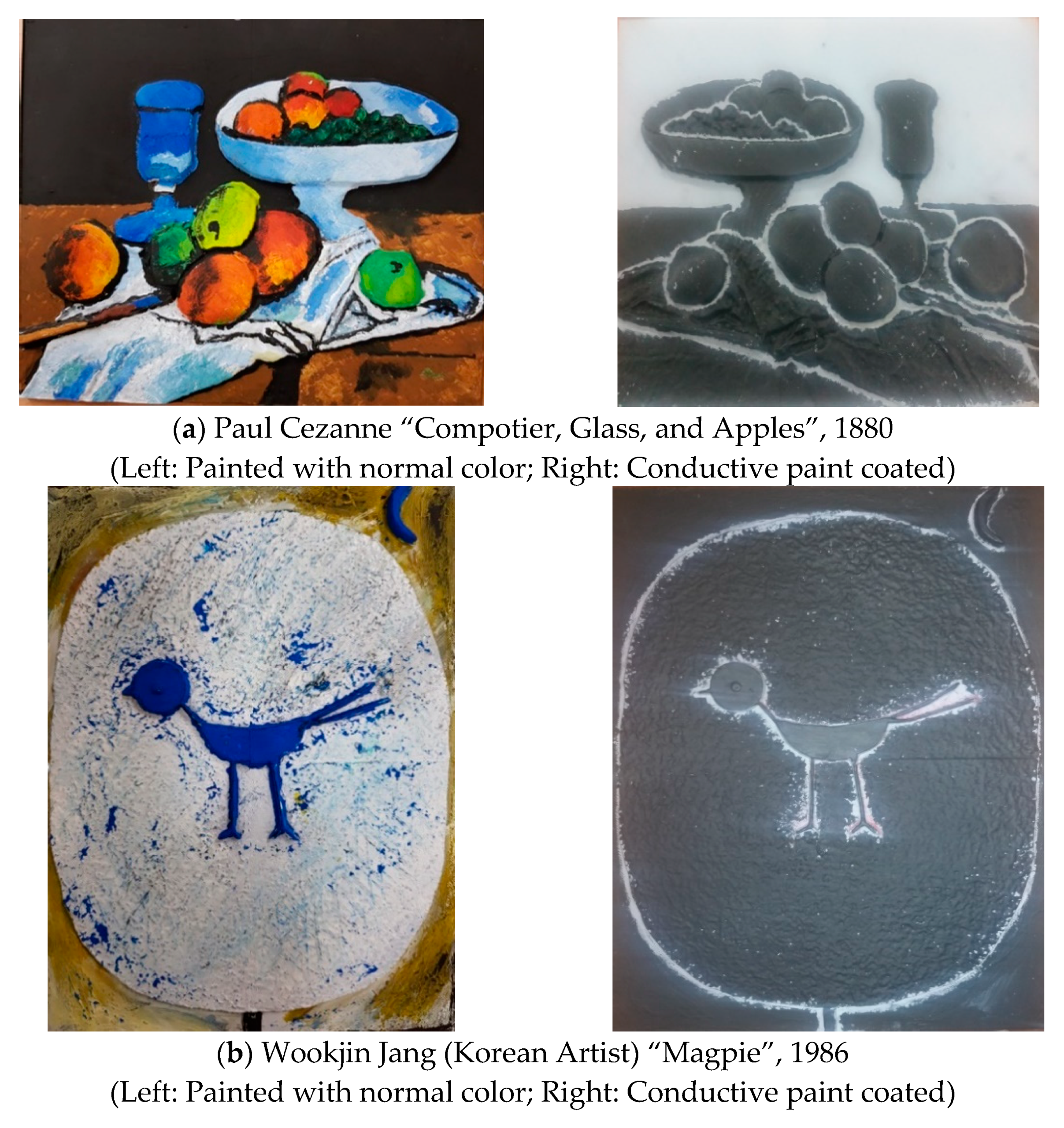
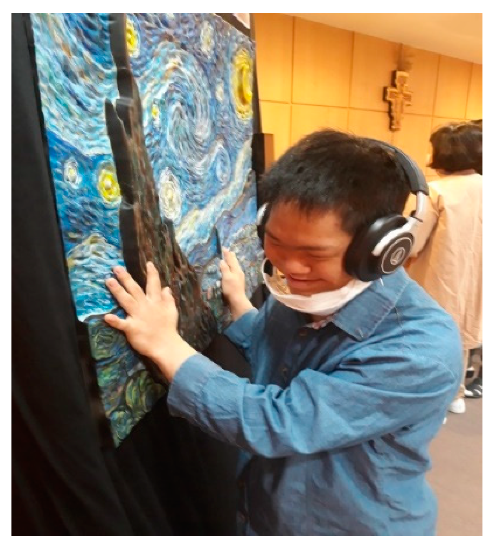
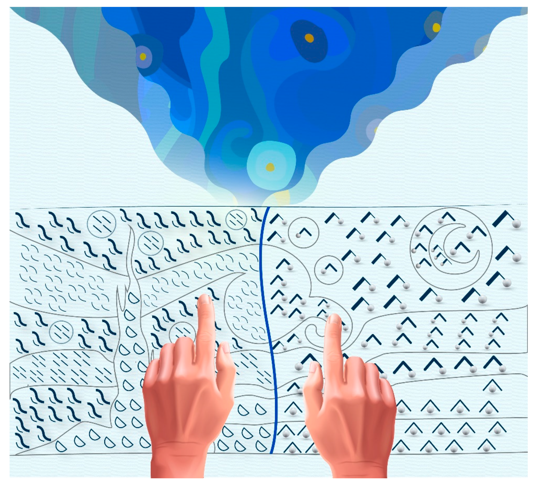
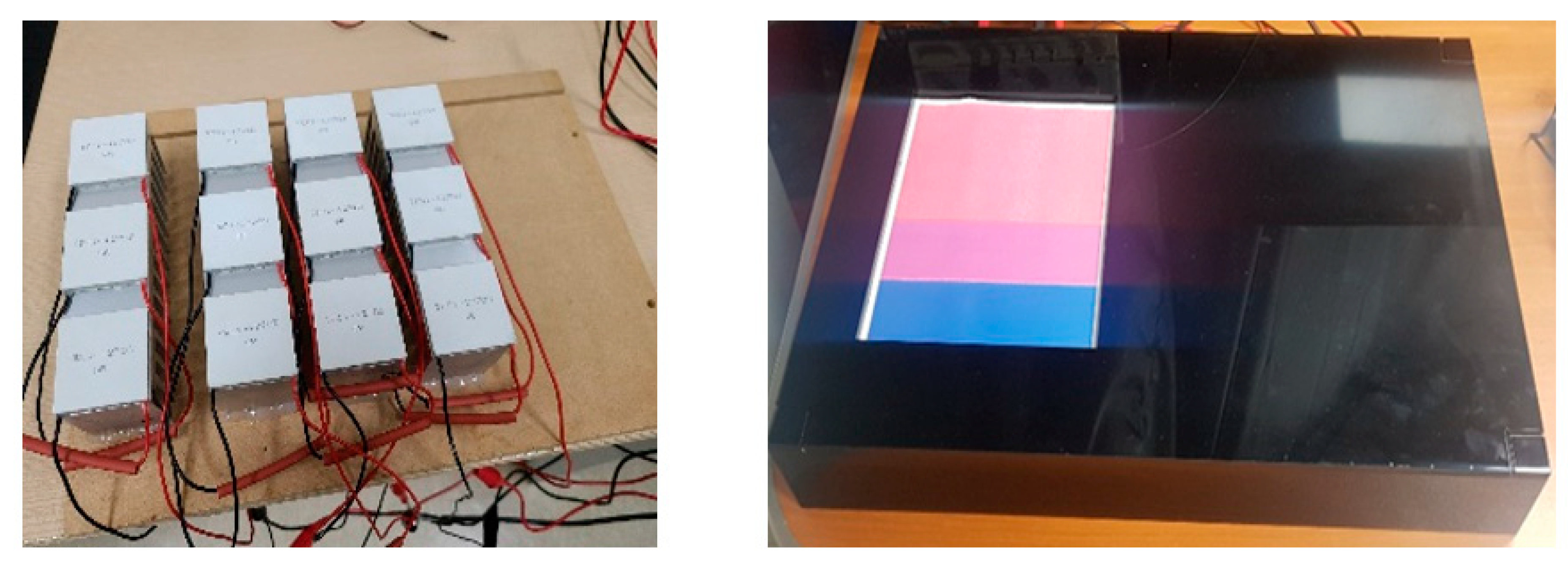


