Article

Multi-Sensory Color Expression with Sound and Temperature in Visual Arts Appreciation for People with Visual Impairment

1
Department of Electrical and Computer Engineering, Sungkyunkwan University, Suwon 16419, Korea
2
Department of Human ICT Convergence, Sungkyunkwan University, Suwon 16419, Korea
*
Author to whom correspondence should be addressed.
Electronics 2021, 10(11), 1336; https://doi.org/10.3390/electronics10111336
Submission received: 3 March 2021 / Revised: 23 May 2021 / Accepted: 28 May 2021 / Published: 2 June 2021
(This article belongs to the Special Issue Multi-Sensory Interaction for Blind and Visually Impaired People)

Abstract

:
For years the HCI community’s research has been focused on the hearing and sight senses. However, in recent times, there has been an increased interest in using other types of senses, such as smell or touch. Moreover, this has been accompanied with growing research related to sensory substitution techniques and multi-sensory systems. Similarly, contemporary art has also been influenced by this trend and the number of artists interested in creating novel multi-sensory works of art has increased substantially. As a result, the opportunities for visually impaired people to experience artworks in different ways are also expanding. In spite of all this, the research focusing on multimodal systems for experiencing visual arts is not large and user tests comparing different modalities and senses, particularly in the field of art, are insufficient. This paper attempts to design a multi-sensory mapping to convey color to visually impaired people employing musical sounds and temperature cues. Through user tests and surveys with a total of 18 participants, we show that this multi-sensory system is properly designed to allow the user to distinguish and experience a total of 24 colors. The tests consist of several semantic correlational adjective-based surveys for comparing the different modalities to find out the best way to express colors through musical sounds and temperature cues based on previously well-established sound-color and temperature-color coding algorithms. In addition, the resulting final algorithm is also tested with 12 more users.

1. Introduction

Multi-sensory systems, or systems that combine several modes of interaction through different senses, have been gaining popularity in recent times in the field of HCI (Human–Computer Interaction). Each one of the five senses gives humans unique ways of experiencing the world around and, as a result, researchers have seen the potential of applying those natural ways of interacting with the world into different ways of interacting with computers. In addition, multi-sensory systems can also be useful to convey complex or abstract information since each sense can congruently aid the others. Moreover, recent research has shown that humans are used to interacting with the world in a multi-sensory way and that multi-sensory experiences tend to be more engaging and easier to remember when compared to unisensory ones [1].
One of the possible applications for multi-sensory systems is the creation of novel art which creates a novel experience for the spectator by means of its multi-sensory interfaces. Because of that, artists have been showing a growing interest in multi-sensory art exhibitions. This increase of multi-sensory experiences, which makes interaction drift from the common visual and auditory types to other types of interaction, can be really convenient for minority groups that lack one of those senses, such as the visually impaired people. People with visual impairments are interested not only in performing with ease the necessary activities of everyday life but also in visiting museums and enjoying visual arts, which is why many museums have been making some of their exhibitions and artworks accessible to visually impaired people by hosting specialized tours with access to tactile representations of the artworks [2,3,4]. Nevertheless, most of those tours and exhibitions are based solely on tactile and audio systems which do not make use of any other sensory modality for interacting with the artworks. Since visually impaired people lack only the sense of vision, we believe they could benefit greatly from multi-sensory experiences as they provide them not only with the possibility of experiencing the artwork without relying on single sense that they cannot have access to, but also with the increased engagement, gamification and artwork comprehension which multi-sensory experiences can facilitate.
In this work, we design a novel sound-temperature multi-sensory system that helps visually impaired people experience a total of 24 colors. Additionally, during the process, a throughout investigation about the relationship of the different sounds and temperatures with the warm/cold and bright/dark dimensions of colors was performed. This investigation included extensive surveys and tests with a total of 18 participants, and an additional 12 participants for the final multimodal test. The work is the continuation of a series of works whose aim is to develop a multi-modal system and algorithms that aid visually impaired people in experiencing pieces of art. In previous works, both a color-temperature mapping algorithm and a sound-color coding system were designed, implemented into physical prototypes, and tested [5,6,7]. This work introduces a method for finding the best way to turn those unisensory systems into an improved sound-temperature multi-sensory system for conveying colors. Both works will be explained in more detail in the following sections.

2. Background and Related Works

2.1. Multi-Sensory Systems

In recent times, multi-sensory systems have gained popularity among researchers thanks to strong evidence that multi-sensory experiences have some benefits over unisensory ones, especially when it pertains to experiences related to education and learning. Shams et al. [1] state that multi-sensory experiences aid in memorization by helping the brain retain the information faster and for longer times. Moreover, the authors argue that the human brain evolved to develop, adapt, learn and function optimally in multi-sensory environments. However, they also maintain that congruence between the multi-sensory cues seems to be a condition for the benefits to be optimum.
Sensory-substitution is the technique of representing the characteristics of one sensory modality into another sensory modality. The technique is strongly related to assistive multi-sensory systems for the visually impaired people since the main goal of those systems is to communicate through a different sense the information that cannot be acquired by the visually impaired user because of the lack of sight. The authors of [8] provide a tutorial guide on how to research sensory substitution techniques and multi-sensory systems in order to successfully design inclusive cross-modal displays. They state the three main guiding principles necessary for a multi-sensory process to occur are spatial coincidence, temporal coincidence, and inverse effectiveness. Our work takes care of following all those principles. Spatial and temporal coincidence is assured as long as the sound and the temperature are communicated to the user at the same time or in immediate succession. The inverse effectiveness guideline states that for multi-sensory information to be effective, none of the sensory modalities needs to overpower the other. Since both the musical sounds and the temperature cue are semantically congruent to what they represent (as will be proved during the tests in later sections) and offer the user different information about the color, there is no weak/strong bias towards any of them and both sensory modalities work united as one.

2.2. Multi-Sensory Art

The recent growing interest in multi-sensory experiences within the scientific and HCI community has also been accompanied by a growing interest in those technologies by artists and museums. For example, in [9], a prototype called SensArt, which uses music, vibration patterns, and temperature to translate descriptive and emotive qualities of the artwork to the user, is designed and tested. The tests with 12 participants showed that most participants preferred the multi-sensory experience over the normal one and commented that they would visit museums more often if those types of experiences were more available.
Tate Sensorium [10] is a multi-sensory display that was exhibited at the Tate Britain art gallery of London. Its authors set themselves to explore new ways of experiencing art while researching and gaining design insights related to multi-sensory systems. One of the most interesting results after real on-field testing with users was the conclusion that multi-sensory experiences, in general, do make art more engaging and stimulating.
It can be observed that in most multi-sensory art applications some type of sound of musical feedback is included. Research has shown that mixing music with visual art increases the emotional experience of the user [11]. Additionally, as can be inferred from previous works’ results, multi-sensory systems seem to increase the engagement of the spectator and enhance the art exploration experience. Similarly, one of the goals of our sound-temperature multimodal system for conveying color is to enhance the artistic experience for visually impaired users. Particularly, we expect the art engagement to be raised and the experience and memorization of colors to be improved. This manuscript is the first iteration towards that goal: the definition and design of the multi-sensory color coding.

2.3. Multi-Sensory Assistive Devices

Multi-sensory systems have also been implemented as assistive devices for the visually impaired people. In [12] a multi-sensory picture book for children with visual impairment was presented. The work provided visually impaired children with a multi-sensory experience consisting of touch, sounds and smell, which was integrated with the storytelling. User tests with a total of 25 children showed the potential of multi-sensory experiences for increasing engagement and enhancing the learning and artistic experience of children. The use of smell as a sensory modality is particularly interesting because of its implementation and how uncommon smell interfaces are. The olfactory device is contained inside the book’s page and the fragrance can be smelled as it is emitted from a small hole in the center of the device panel. Similarly, our work also investigates a less common interaction modality by implementing temperature cues.
Mapsense [13] is a multi-sensory interactive map for visually impaired children. The map consists of a colored tactile map overlay on top of a touchscreen, speakers, and conductive tangibles. The tactile map overlay has some point of interest which can detect the conductive tangibles when placed on top. Additionally, the system provides the user with audio feedback communicating the name of a city when a point of interest is tapped twice with the finger. Based on that premise, there are several modes available: guiding function, audio discovery, and navigation. The guiding function consists of vocal indications guiding the user to the destination (one of the points of interest). On audio discovery, sound effects (such as the song of water when sailing or religious chants when reaching a church) were trigger while navigating the map. Lastly, the navigation mode allows the user to navigate between “points of interest”, “general directions” and “cities”.
There are also multi-sensory art exhibitions that are designed specifically for visually impaired people, so they can be considered multi-sensory assistive art exhibitions. The “Feeling Vincent Van Gogh” exhibition is one of those types of exhibitions aimed at the visually impaired [14]. The artwork is communicated to the users through a large variety of interactive elements such as sounds, smells, and 3D versions of Van Gogh’s most famous artworks. The highly detailed 3D reproductions allow the visually impaired spectator to appreciate the brush strokes of Van Gogh. In addition, the visual part of the exhibition is carefully taken care of so sighted people (either by themselves or accompanying a visually impaired person) are also able to enjoy the multi-sensory experience.

2.4. Sound-Color Cross-Modality

Color is a continuous spectrum for which there have been several representation models [15]. Munsell’s color model is one of the earliest ones. In it, the color is organized into three dimensions: hue, chroma (or saturation), and value (or brightness). Hue refers to the color itself. Brightness is an indication of the amount of white or black of the color. The brighter the color, the closer it is to white, and vice versa. Saturation is an indicator of the vividness (clearness) of a color. Another common dimension is the warm-cold spectrum of colors. The closer a color is to the red end of the visible spectrum, the warmer it is. On the contrary, the closer a color is to the blue end of the spectrum, the colder it is [16].
Wang et al. [17] explored the putative existence of cross-modal correspondences between sound attributes and beverage temperature. The results, after an online pre-study and the main study itself, confirmed that the experience of drinking cold water is associated with significantly higher pitches and faster tempo. One possible explanation for this kind of effect is the formation of emotional associations [18].
Hamilton-Fletcher et al. [19] presented a color-sound sensory substitution device which consisted on a color image explored by the user on a tablet device. The color was then turned into sound, which the user was able to listen to while moving the stylus over the image. In addition, the device, together with other two sensory-substitution devices, was given to ten blind users which, among other things, addressed the importance of the sounds to be not only understandable but also aesthetically engaging.
Regarding aesthetics in sounds for color substitution, Cho et al. [6] investigated possibilities for creating beautiful sounds for representing colors by replicating the three main characteristics of color: hue, chroma, and value, by matching them to three features of sound: timbre, intensity, and pitch. Then, two sets of musical sounds for expressing colors were designed and tested: VIVALDI and CLASSIC. User tests were conducted with eight sighted adults and 12 visually impaired users. The results showed that both sound-color mappings were useful and engaging for the participants and that users were able to identify with high accuracy the different colors by hearing the musical sounds of both sets of audios. The present work is a continuation of that work. Here, those two sound-color mappings are implemented into a complete sound-temperature-color coding. In addition, the relative usefulness of each set (VIVALDI or CLASSIC) for the multi-sensory system is also investigated, in order to choose the best one among the two for the multi-sensory system.

2.5. Temperature-Color Cross-Modality

Regarding cross-modality between temperature and color, works like [5,20] showed that there is a color-temperature association with the color warm–cold spectrum. In [20], the authors designed and performed a method for conveying color information both through thermal intensity and thermal change rate. The method was tested with ten users and showed successful results. In [5], a method for discerning up to 50 colors by feeling three different temperatures was designed. It included extensive interviews and user tests with visually impaired users. Both works proved that temperature cues as a way of expressing color can be a successful interaction method and that visually impaired users can differentiate temperatures quite comfortably as long as there is, at least, a difference of 3 °C between them. This fact will be applied in our multi-sensory method for expressing colors.

3. Method

3.1. Previous Method

As we stated above, this paper addresses and aims to improve previous works in which unisensory color-coding was performed and tested. While in [5] a sound-color mapping algorithm was designed, in [6] the developed algorithm and system was a temperature–color one. It is our goal to mix both these methods for increasing the number of colors the user can experience and for making the sensory experience more stimulating and engaging. However, for developing a multi-sensory system mixing both of them, it is necessary to find the best way of implementing both methods in a multi-sensory way in order to increase the easiness of color recognition and the comfortability of the sensory experience.
The sound–color code designed in [6] for each of the colors and their saturated, bright, and dark variants can be seen in Table 1. There, each of the 18 colors is represented by a musical excerpt either from a sound set consisting of variations on a Vivaldi piece or from a more ample classical repertoire sound set. Each one of these sound sets received a name: VIVALDI, and CLASSIC. The melody, rhythm, harmony, instrument, and tessitura of the sound files of both sound sets were selected in order to make a comprehensible representation of the hue and quality of each color. While more information about the musical selection and processing method can be seen in [6], it is important to notice that, regardless of the method, each sound file was created so its musical excerpt represents both the hue of the color and the quality of the color. Therefore, all sounds belonging to the dark colors have differences, which allows the user to distinguish the hue, but also have similarities that represent the dark dimension of the color. It is important to remember that this set of sounds come in two different versions, CLASSIC and VIVALDI, since one of the research’s goals will be finding out which one of those set of sounds is more convenient for being implemented in the multi-sensory system.
Similarly, a temperature–color mapping was designed based on the previous work from [5], where it was proved that users were able to discern with high accuracy temperatures with intervals larger than 3 °C. As a result, any division of the comfortable temperature range with more than 3 °C between temperatures can be used for discerning several colors or the other dimensions of the colors. Consequently, the following temperature-color codes were designed, one for expressing hues (Table 2) and the other for expressing other color dimensions (Table 3). The original main method, based on [5], would be to have the user feel two temperatures, one expressing hue and the second one expressing the color dimensions of that same hue.

3.2. Multi-Sensory Improved Method

It was possible to mix both those methods to create a multi-sensory experience of colors if both sound–color and temperature–color mappings were simplified and mixed, dividing the roles each one had. For example, hue could be expressed only through sound while the color quality could be expressed only by means of the temperature cues, or vice versa. This created a multi-sensory experience of the colors more engaging and convenient than the original unisensory experiences. In addition, the separation of hue and the other color dimensions into different sensory modalities may make memorization of the mapping easier and faster for the user. Both novel multi-sensory sound-temperature-color systems can be seen in Table 4 and Table 5. In Table 4, a coding where color hue is expressed as sound, and the other color dimensions are expressed as temperature, is presented. On the contrary, in Table 5 the color hue is expressed through temperature and the other dimensions are expressed by means of sound cues. We created a naming convention for these two possible mappings by following the order of the sensory experience: sound-temperature-color coding and temperature-sound-color coding, respectively.
For the satisfactory development of a multi-sensory color-coding system based on these methods, three are the elements that needed to be figured out:
  • Finding out whether it was better to represent color hue with sounds and the color dimensions with temperature, or vice versa.
  • Knowing which one was those warmest and coldest colors (that appear in Table 5) from the sound set and the temperature set. In other words, setting the dark dimension as an example, with many sounds representing the quality of “dark” such as “dark green” or “dark red”, it was important to figure out which one of all those dark color-sounds expressed the dark quality of color the best.
  • Finding out which sound set from the two options (VIVALDI and CLASSIC) is in general terms more suitable to express the different dimensions of color.
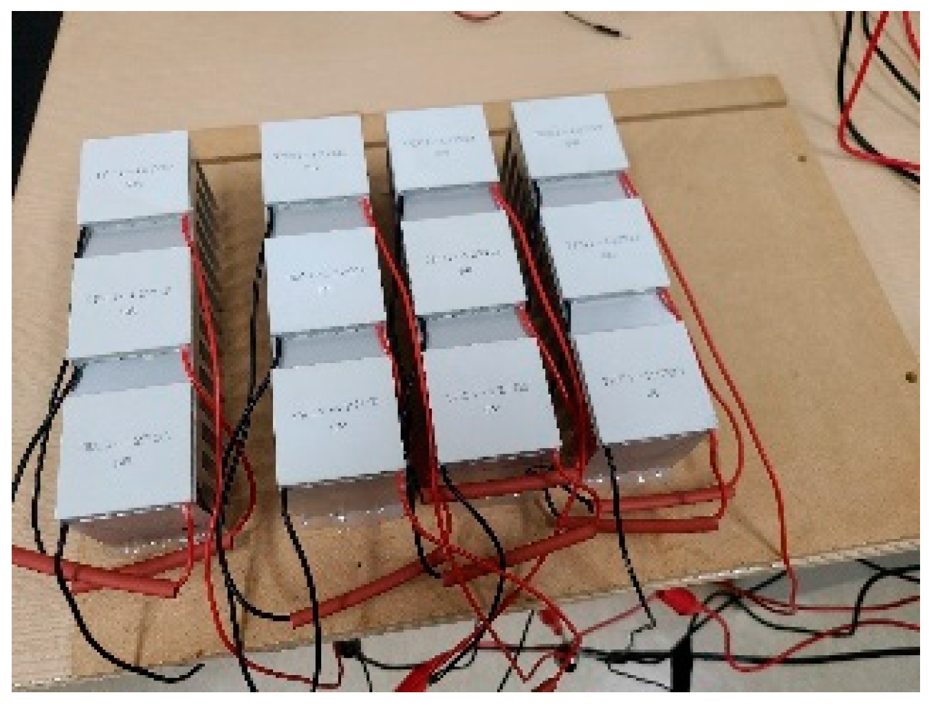
Tests were performed for answering these questions. These tests and their analysis and results will be explored in the following sections.

3.3. Hardware

For the temperature system, a thermal display that was developed for prior research was used [7]. The system consisted of an array of Petliers, which is a device that releases heat on one side and absorbs it through the other one when electric current passes through it. All the Petliers are driven by a dual H-bridge board controlled through an Arduino Mega microcontroller. Figure 1 shows the array of Petliers that was used during testing. An array of petliers was used in order to be able to set each petlier at a different temperature from the beginning, so the test could be perform faster. The temperature range of each petlier was from 10 °C to 40 °C.

4. Experimentation

Inspired by the research related to music and color association [21], we chose to use a common semantic and emotive link to compare the different modalities. We used as a link a list of adjectives and the emotional-semantic space they created. Osgood [22] simplified the semantic space of adjectives into three aspects, which are (1) evaluation (like–dislike), (2) potency (strong–weak), and (3) activity (fast–slow). The adjectives we decided to adopt in this research are the pairs of adjectives that people are familiar with; emotion, shape, location, activity, texture, contrast, temperature, sound characteristics, and so on.
As a result, 18 pairs of adjectives, each set of six representing one of the three different Osgood semantic spaces, were chosen. In other words, there was a set of adjectives representative of the whole semantic space with which to create a comparison between modalities. That modified list of adjectives from Osgood [22] can be seen in Table 6, where the column indicates the Osgood adjective list.
The main idea for the test was the following: classifying the adjectives into warm/cold and dark/bright dimensions, correlating the different adjectives to the different sound and temperature cues, and, as a result, giving to each sound and temperature a warm/cold and dark/bright score to find out which cues expressed the warm, cold, dark or bright dimensions the best. Additionally, those scores would help us find out whether VIVALDI or CLASSIC was a better option for representing the color dimensions and whether it was better to express color hue with temperature and color dimension through sounds or vice versa.
In total, three different types of tests were performed: one for classifying the different adjectives into the warm/cold and dark/bright main dimensions, a second one for finding out the weights of each particular pair of adjectives with the dimensions they were classified into, and one last test which had the users selecting adjectives for each one of the temperatures and sound cues. The three test were analyzed and the results presented in the analysis section.
The number of participants was 18. They were college students who had normal eyesight and an average age of 21.5 years old. Since tests were performed on different days, not all of them were able to participate in all tests. 15 users participated in the first two tests and a total of 12 users in the third one. All the test sessions included an explanation of the test and its procedure before starting the surveys. Test duration varied, with the first and second one lasting together for about 25 min per person and the last test lasting for around 45 min per person. The testing procedure was the following:
(1)
Introducing the context of the research, explaining about visually impaired people and art exploration, color, and multi-sensory systems.
(2)
Introduction of the Petlier thermal display prototype (only during the third test).
(3)
Lastly, the tester interacted with the different audio or temperature cues and was given the survey questions. Each audio cue was heard as many times as the user needed (the user was given the playback control for repeating it until he/she was ready to answer the survey question related to that cue). Similarly, the user was able to feel the different temperatures as many times as desired before answering to the survey question related to that temperature cue.

4.1. First Test: Classifying Pair of Adjectives

Users were asked to select which color dimension was related to each pair of adjectives the most: the bright/dark dimensions, the warm/cold dimensions, both of them or none. As an example, the answer of one of the users for the adjective pair “noisy–quiet” can be seen in Table 7. There, the user stated that the dimensions that is more correlated to the “noisy–quiet” adjective pair was the bright/dark dimension of the colors. Table 8 presents the results after summing up all the answers. The number indicates the total of users that ticked an option. Since some users selected the option “both”, it is possible that the sum of the bright/dark and warm/cold counts results in a number higher than that of the total number of users.

4.2. Second Test: Calculating Weights of Each Pair of Adjectives for Each Dimension

In this test, the users were asked to rate the correlation of each pair of adjectives with each individual dimension: warm, cold, bright, and dark. The scale used was from −2 to 2. Table 9 shows the answer of one of the users for the adjective pair “noisy-quiet” in relation to the color dimension “bright”.
Once all the users rated all the adjective pairs in all the dimensions, four tables with the weights for each dimension and pair of adjectives, graded from −2 to +2, were made. Negative numbers indicate that the dimension is directly correlated with the adjective from the left column, while positive numbers indicate that it is directly correlated with the adjective from the right column. The number indicates how strongly the correlation is, with −2 and +2 being the strongest correlation and a zero meaning there is no correlation at all. As an example, in Table 10, the weights for the dimension of bright can be seen. Similar tables for warm, cold, and dark dimensions were also made but omitted here for brevity.

4.3. Final Test: Linking Adjectives to Each Modality Cue

During the final test, all modalities and all cues (VIVALDI sound, CLASSIC sound, and temperatures) were given a score for each one of the pairs of adjectives stated above. For example, in the case of temperature modality, the process was the following.
First, the user would feel one of the temperatures seen in Table 2, and, for each one of those temperatures, a form sheet like the one shown in Table 11 would be filled up. As an example, Table 11 has been filled up with all the answers of one of the users after having felt the 38 °C temperature Peltier. This same process was performed not only with the rest of the temperatures but also after listening to each one of the sounds from the VIVALDI and CLASSIC sounds. As a result, there was an adjective-graded sheet for each one of the cues (each one of the temperatures and sounds) of the three different modalities contemplated.
From all the testers’ answers, an average score on the scale of [−2, 2] was calculated. The value of −2 would be the equivalent to all testers giving a score of 1 to the adjective during the survey. A score of +2 would be the result of all participants giving a score of 5. As an example, the results for the saturated red of the VIVALDI set of sounds can be seen in Table 12.

5. Analysis and Results

5.1. Analysis

Analysis of the results was performed for finding out the best design of the multi-sensory color-mapping system. The analysis process was the following.
First, by means of the results presented during the second test, we created a weight table indicating all the pairs of adjectives and their relative weights to each one of the four dimensions: bright, warm, cold, and dark (Table 13). However, only the adjectives that were selected during the first test as related to that particular dimension were taken into account when filling up the table. Therefore, empty weights are the set of adjectives that were uncorrelated to that particular dimension on the first test’s results. Both the weight table and the adjective score (like the one shown in Table 12) for each one of the sounds and temperature cues were used to calculate a bright score, dark score, warm score, and cold score for each cue. The basic formula for each of those four scores was the following.
S c d = i ( W d i + S c i )
where S c d is the total score of the dimension “ d ” for the cue “ c ”, W d i is the weight of the dimension “ d ” for the adjective pair “ i ”, and S c i is the score of the adjective pair “ i ” for the cue “ c ”.
After applying the formula for all dimensions and each sound and temperature cue, three color dimension score tables were created, one for VIVALDI and all its sounds, other one for CLASSIC and all its sounds, and the last one for all the temperatures. An example of all the scores for the VIVALDI set can be seen in Table 14. Only the positive results are relevant, since it indicates cues that are directly correlated to the different dimensions. In Figure 2, Figure 3, Figure 4 and Figure 5, bar plots graph indicating all the positive scores of all sets for each dimension can be seen. In Figure 6, the highest store per dimension for each set is presented. Lastly, in Figure 7, Figure 8 and Figure 9, all the scores of all the cues (negative values included) are presented in a boxplot graph for each one of the methods and dimensions.

5.2. Results

These final scores can aid us in finding out which VIVALDI, CLASSIC and temperature cues are the ones that express the bright, dark, warm, and cold dimensions of colors the best. For finding that out, it is necessary to select the sound and temperature cues that scored the highest for each dimension. Table 15 presents the cues that score the highest for each dimension and method and the name of that cue.
Several interesting points can be observed from these results:
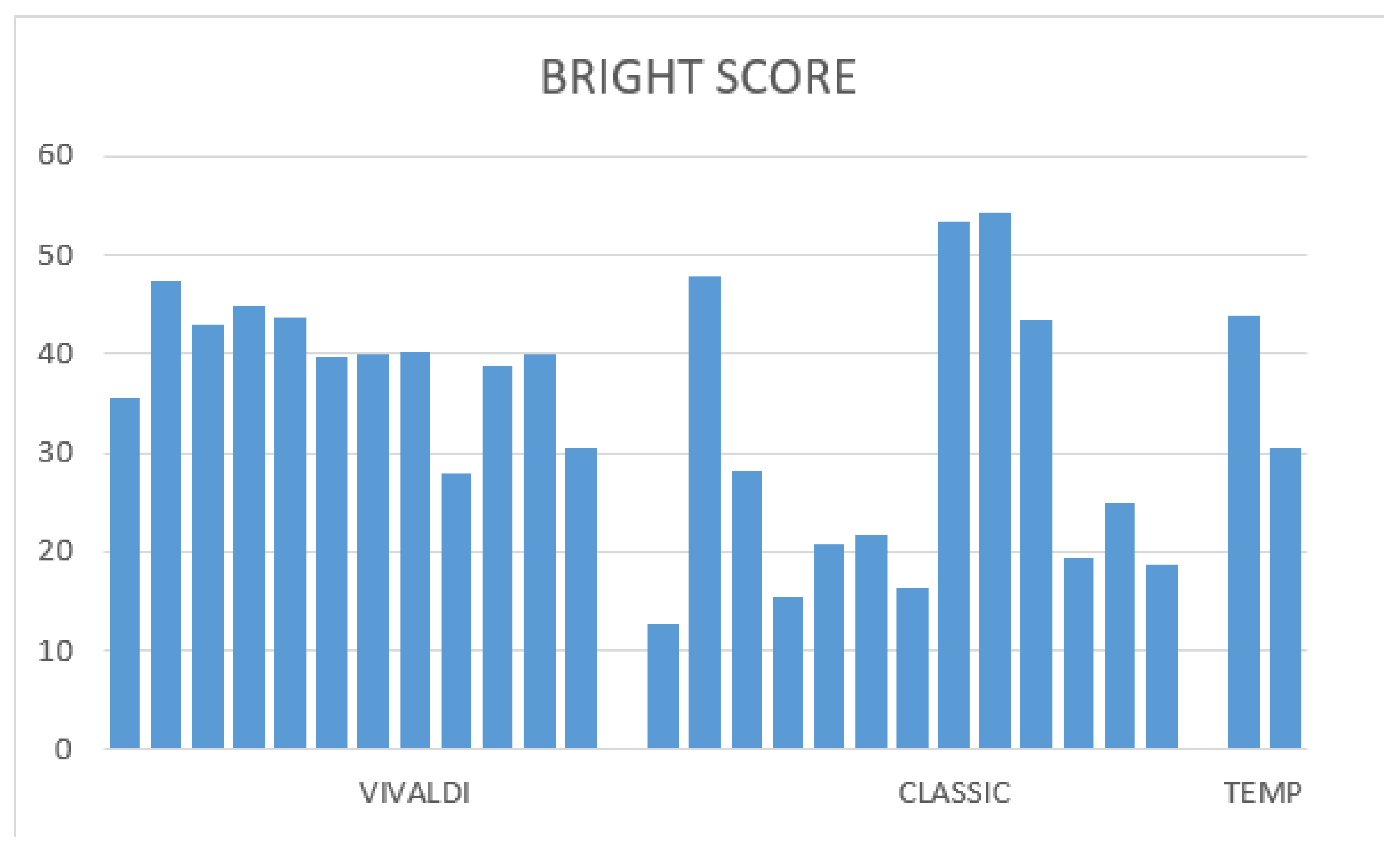
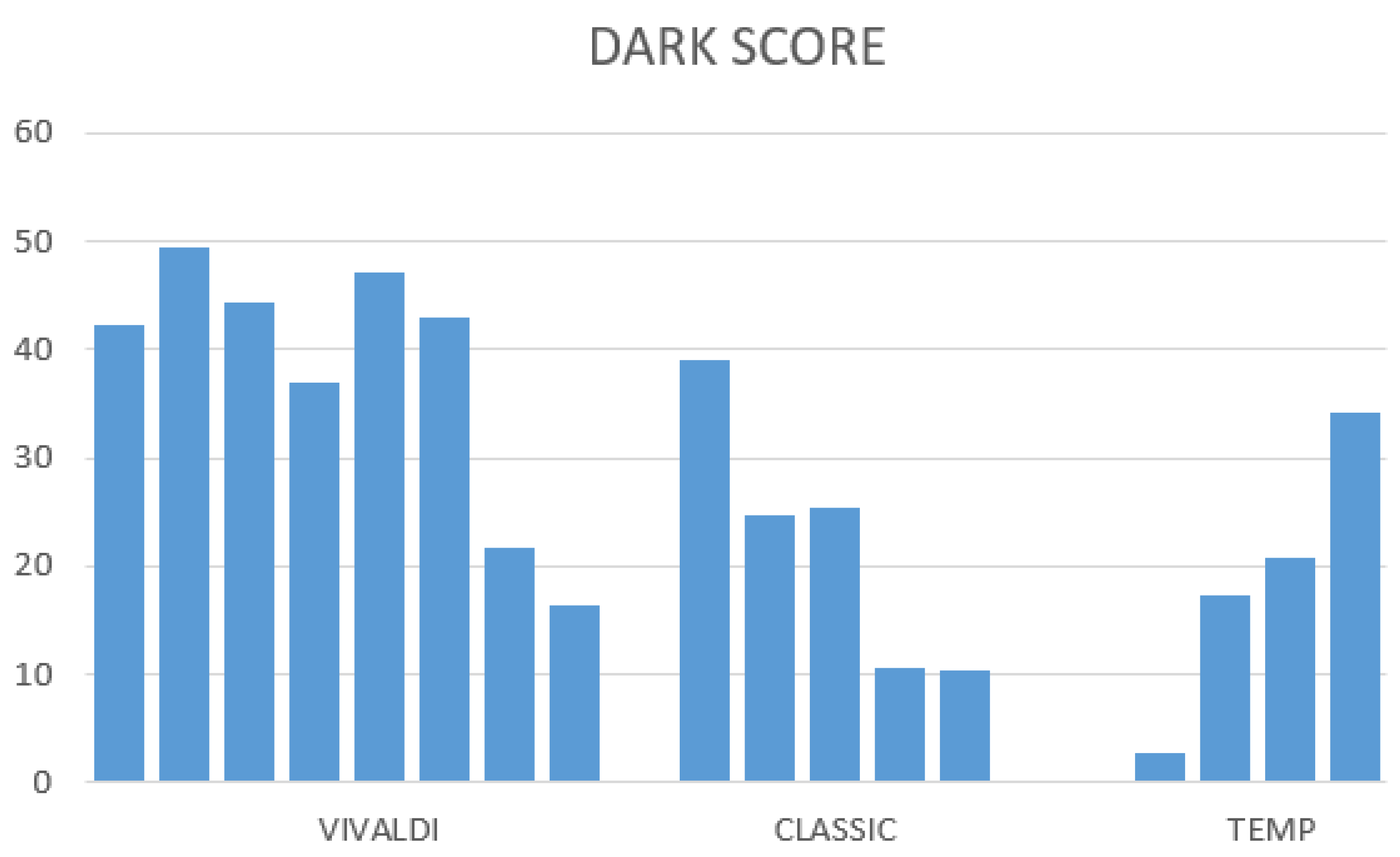
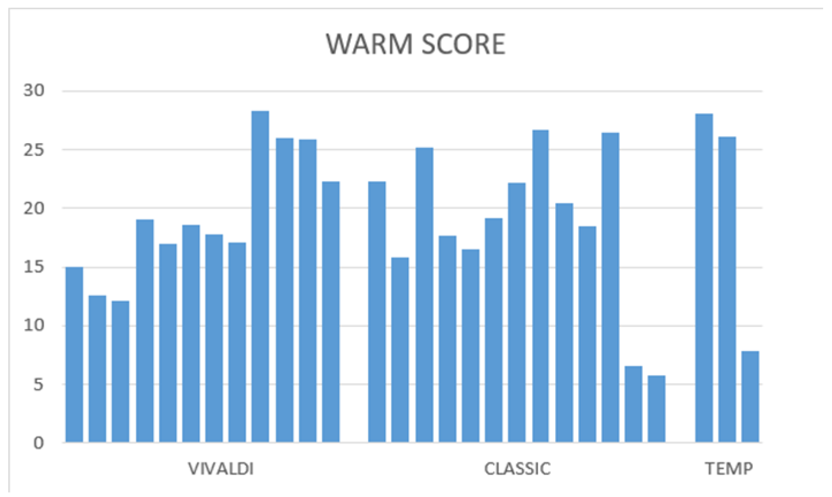
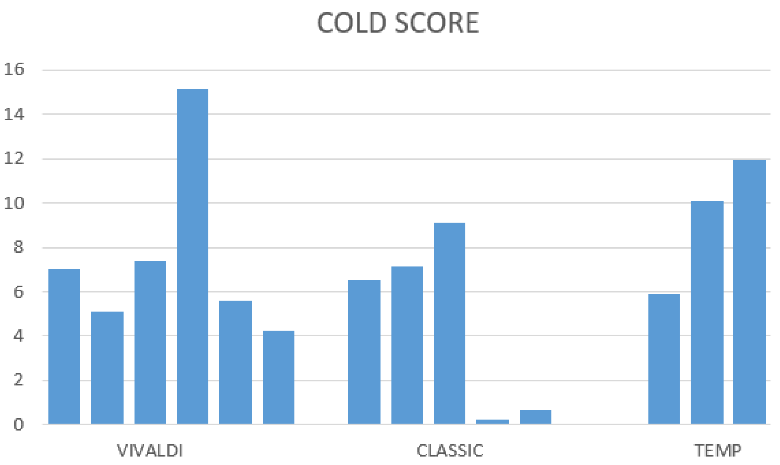
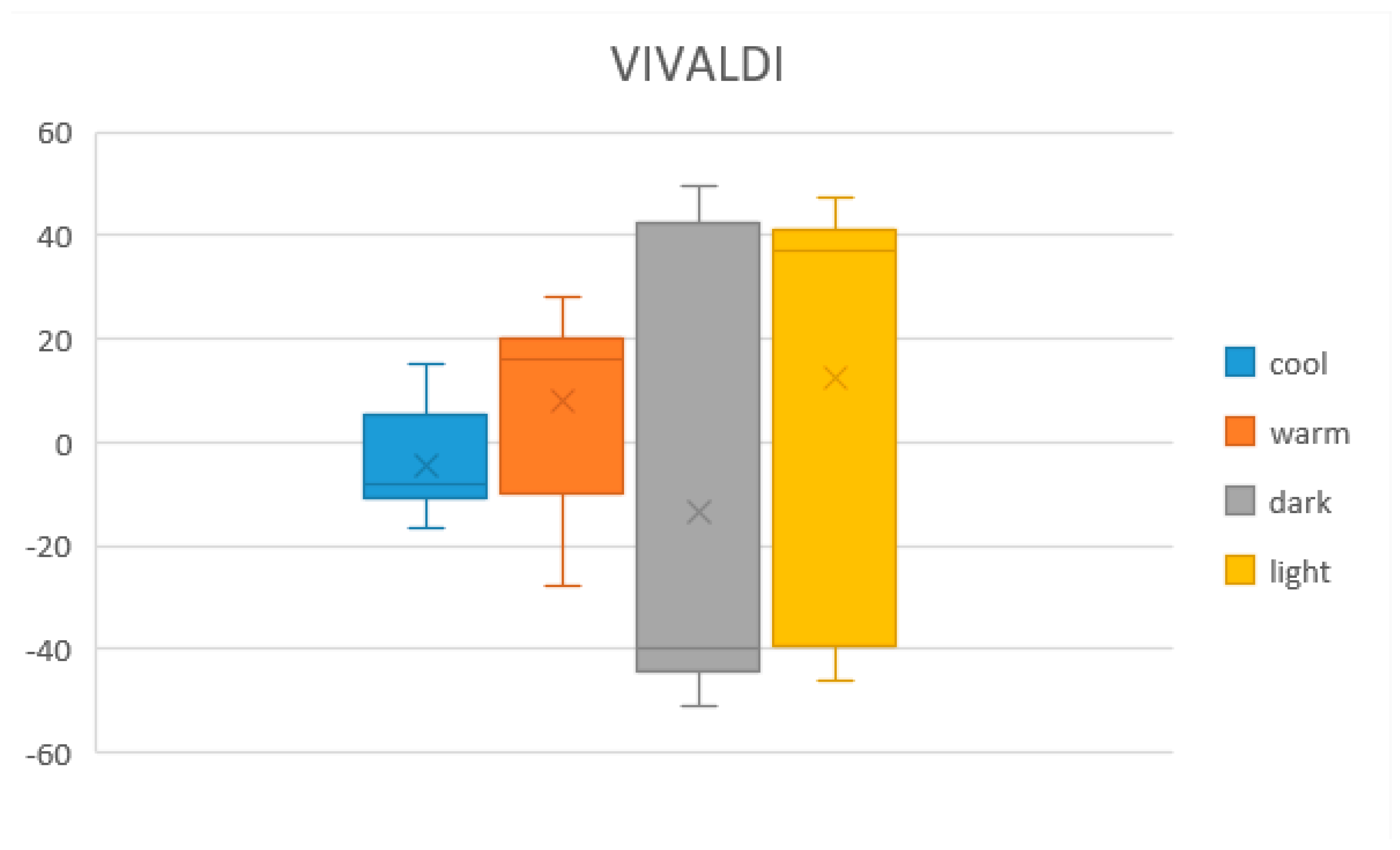
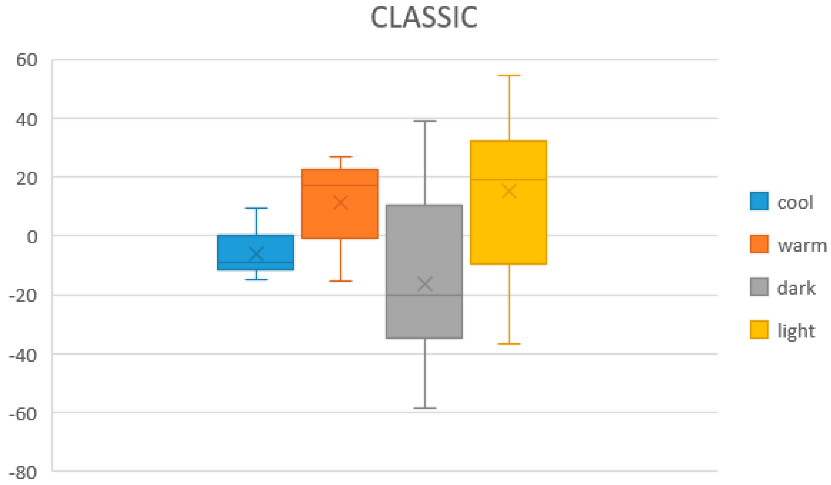
  • The CLASSIC sound set’s cue which best expressed the bright and warm dimensions of color was the same sound. This was not convenient since users would not be able to discern whether the sound was expressing brightness or warmness. The cues for representing each dimension had be all different from each other so the user could relate each particular cue to a particular dimension.
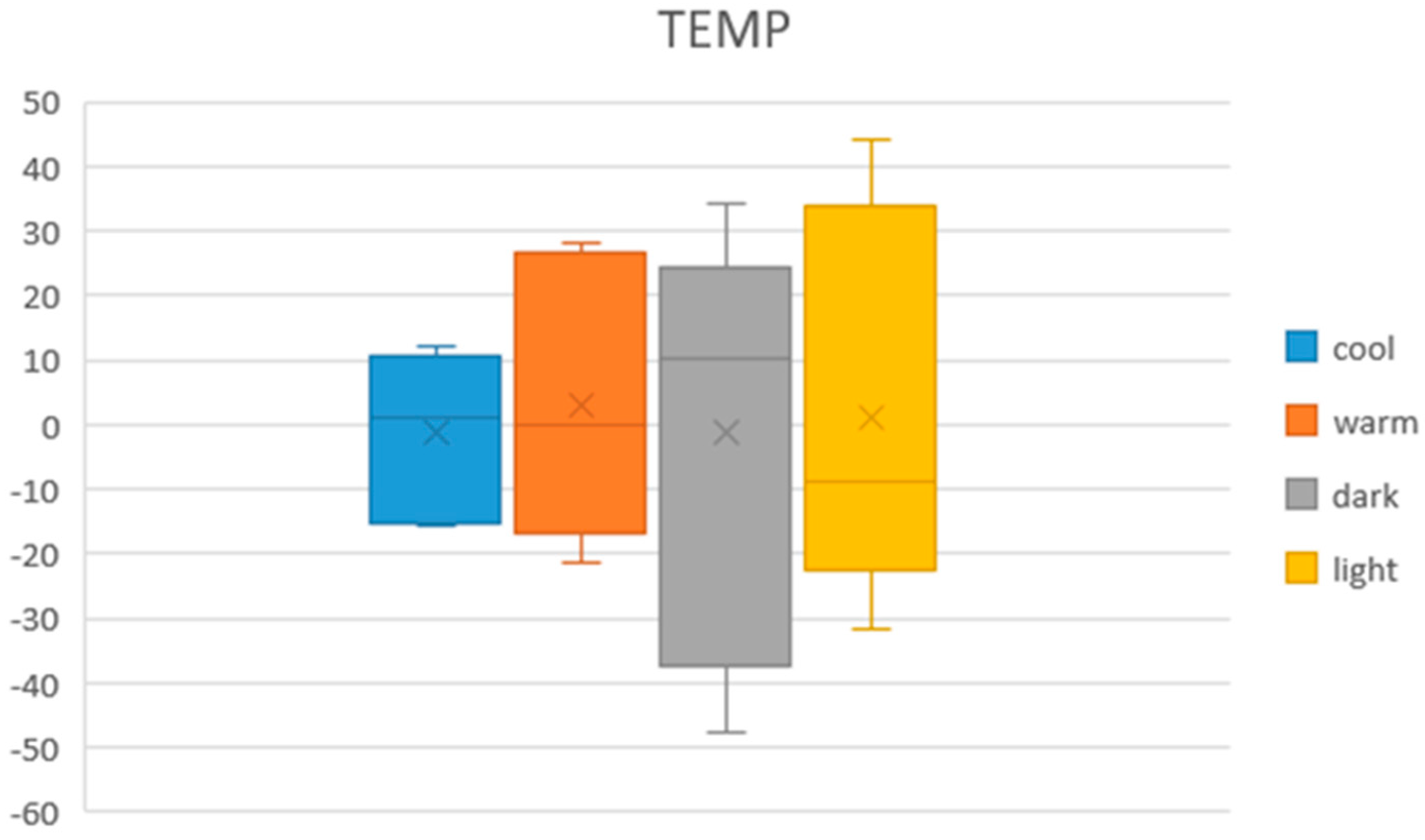
  • Similarly, the highest temperature of 38 °C is the best one for representing both the warmness and brightness of the color. Additionally, the coldest temperature of 14 °C was the best temperature cue for conveying darkness and coldness. Like with the CLASSIC sound set, this reiteration of cues made temperature modality not suitable for representing the color dimensions.
  • On the contrary, none of the VIVALDI sounds is repeated. Each dimension is conveyed best by a different musical sound cue.
  • Except for conveying brightness, in which CLASSIC sound reached a higher score, VIVALDI sound reached higher scores for all the other three dimensions when compared to both the CLASSIC and temperature sets.
Taking into consideration these observations, it was possible to reach several conclusions. First of all, all the cues that expressed most accurately the different dimensions of color were clearly defined. Additionally, it is clear that, for expressing color dimensions, VIVALDI sounds were better than CLASSIC sounds since, except for one dimension, the scores reached by VIVALDI sound cues were higher. In addition, it was better to use temperatures as a way of expressing color hues and sounds to express color dimensions, since, as observed above, the warmest and the coldest temperature conveyed the best two dimensions each, but it was convenient for the user that each dimension was represented by one and only one cue. Therefore, temperature was not a good modality for representing color dimensions.
It can be concluded that the best multi-sensory algorithm was one where the temperature cues expressed color hue and VIVALDI sounds expressed the other color dimensions. In other words, the best multi-sensory method was the temperature–sound–color coding method presented in Table 4, which is shown now in its final complete state in Table 16. The algorithm of Table 16 is the temperature–sound–color designed through the tests and results that were observed.

5.3. Final Temperature–Sound Coding Multimodal Test and Results

For assessing the final temperature–sound multimodal coding that was designed (Table 16, a final multimodal test with the final system was performed. The number of participants was 12. They were college students who had normal eyesight and an average age of 22 years. The test sessions included an explanation of the test and the method, a short training time so the user could familiarize himself/herself with the different temperatures and sounds, and a final test in which the user had to guess which color the multimodal system was representing through its sound and temperature. Test duration lasted around 25 min per person. The testing procedure was the following:
(1)
Introducing the context of the research, the system and the method (5 min).
(2)
Explanation of the 10 different cues and training time for both the six temperature cues and the four sound cues (10 min)
(3)
After that the users were tested on 10 colors. The users were given the multimodal feedback related to each color and were asked to find out which color it represented. In other words, after feeling both the temperature cue and hearing sound at the same time, they were asked about the color. The users were given a printed page similar to Table 16 so they did not need to memorize what each temperature represented. All the users were given the same questions in the same order.
The accuracy during the test can be seen in Table 17, and a list with all the wrong and correct answers, divided into hue (represented through temperature) and dimension (represented through sound) during the test can be seen in Table 18. Additionally, in Table 19 and Table 20, confusion matrices for both the hue and the dimension of the color (each one presented to the user as a temperature cue and as a sound, respectively) are presented. The total accuracy was 67.5%. Considering only the hue of the colors, the accuracy went up a little bit to 71.6%. On the other hand, the accuracy of guessing the dimension of the color through sound reached up to 92.5%. While 67.5% might not seem too high, it is important to consider the limited training time the users were given with. With a longer training time, the accuracy would likely increase. In addition, previous work [5] seems to suggest that the capacity for visually impaired people to discern temperatures might be higher than the one reflected here (with sighted users). On the other hand, the confusion matrices show clearly that the main recognition problem is caused by the colors yellow and orange, whose temperature cues (30 °C and 34 °C) are not easily discernible. Therefore, the temperatures cues for orange and yellow, and that particular temperature range of (30 °C, 34 °C) are things that will have to be modified and improved in the future in order to improve the system. Overall, the results are promising and the system seems to have the potential to be developed and improved on future iterations.

6. Discussion

Throughout this work, three types of tests were performed to assess a multi-sensory method to convey color information by using temperature and musical sound cues. The results showed the intrinsic relationship of several sounds and temperature-based cues to the warm, cold, dark, and bright dimensions of colors. Based on these results, a promising multi-sensory system for expressing color through sound and temperature was designed. It was shown that, from both sound codes designed in [6], VIVALDI color coding was better for the task than the CLASSIC color coding. Similarly, different temperatures were also assessed and the best temperature cues to apply for each dimension were also found. Lastly, the most appropriate temperature–sound–color coding method was defined by defining the method and all its temperature and sound cues. In addition, this last coding method was tested with 12 different users. The final results show that the system is a promising solution for expressing color to users in a multimodal way.
The addition of a multi-sensory sound–temperature interaction as a way of communicating color can open the door to many new ways of experiencing art for the VIP. In addition, the extensive adjective survey for each one of the sounds and temperature cues can be handy for other investigations in the future. Finally, we expect this research to serve encouragement for many more multi-sensory application research and systems that could improve the way in which visually impaired people experience art.

7. Future Work

There are many ways in which this work could be continued or improved on such as:
  • The problem for differentiating the colors yellow and orange need to be addressed, since it is the main bottleneck for reaching high accuracy on the system.
  • Installing the multi-sensory system and using its method for performing complete on-field user tests with different artworks and on different exhibitions for the visually impaired people. This could be the beginning of research about the effect of multi-sensory systems on art engagement and artwork memorization by the visually impaired people.
  • Finding a way to increase the number of colors that can be expressed by the system, without increasing its complexity or making it less engaging.
  • Finding other applications based on the same sound-temperature concept or expressing other features of the artworks.

8. Conclusions

In this work, a multi-sensory sound-temperature cross-modal mapping method for conveying a total of 24 colors (six hues and four different color dimensions of dark, bright, warm and cold) was designed. The mapping was based on previous unisensory temperature-color and sound-color codes. They were adapted and tests were performed for finding out the best way to mix them for reaching a satisfactory multi-sensory cross-modal code. In addition, a semantic study of the musical sound cues and temperatures from those methods were acquired. The results showed that the musical sounds and temperatures can be used as a substitute for color hues and color dimensions. Additionally, the data from the results guided us into designing the optimum multi-sensory temperature-sound method based on those musical sounds and temperatures. We hope this work can encourage researchers to consider thermal and sound multi-sensory interaction both as a substitute for color and as a way to improve accessibility for the visually impaired people in visual artworks and color experience.

Supplementary Materials

The sound wav files on CLASSIC and VIVALDI sound color codes in Table 1 are available online at https://www.mdpi.com/article/10.3390/electronics10111336/s1.

Author Contributions

Conceptualization, J.-D.C.; methodology, J.-D.C.; software, G.C.; validation, J.-D.C. and G.C.; formal analysis, J.-D.C. and J.I.B.; investigation, J.-D.C., J.I.B. and G.C.; resources, J.-D.C.; data curation, G.C.; writing—original draft preparation, J.-D.C.; writing—review and editing, J.-D.C. and J.I.B.; supervision, J.-D.C.; project administration & funding acquisition, J.-D.C. All authors have read and agreed to the published version of the manuscript.

Funding

This research was funded by the Science Technology and Humanity Converging Research Program of the National Research Foundation of Korea, grant number 2018M3C1B6061353.

Institutional Review Board Statement

The study was conducted according to the guidelines of the Declaration of Helsinki, and approved by the Institutional Review Board of Sungkyunkwan University (protocol code: 2020-11-005-001, 22 February 2021).

Informed Consent Statement

Informed consent was obtained from all subjects involved in the study.

Conflicts of Interest

The author declares that they have no conflicts of interest.

References

  1. Shams, L.; Seitz, A.R. Benefits of multisensory learning. Trends Cogn. Sci. 2008, 12, 411–417. [Google Scholar] [CrossRef] [PubMed]
  2. The Guggenheim Museums and Foundation. Mind’s Eye Programs. Available online: https://www.guggenheim.org/event/event_series/minds-eye (accessed on 28 February 2021).
  3. The Metropolitan Museum of Art. For Visitors Who Are Blind or Partially Sighted. Available online: https://www.metmuseum.org/events/programs/access/visitors-who-are-blind-or-partially-sighted (accessed on 28 February 2021).
  4. Museum of Moden Art. Accessibility. Available online: https://www.moma.org/visit/accessibility/index#individuals-who-are-blind-or-have-low-vision (accessed on 28 February 2021).
  5. Bartolome, J.D.I.; Quero, L.C.; Cho, J.; Jo, S. Exploring Thermal Interaction for Visual Art Color Appreciation for the Visually Impaired People. In Proceedings of the 2020 International Conference on Electronics, Information, and Communication (ICEIC), Barcelona, Spain, 19–22 January 2020; pp. 1–5. [Google Scholar]
  6. Cho, J.D.; Jeong, J.; Kim, J.H.; Lee, H. Sound Coding Color to Improve Artwork Appreciation by People with Visual Impairments. Electronics 2020, 9, 1981. [Google Scholar] [CrossRef]
  7. Bartolomé, J.I.; Cho, J.D.; Quero, L.C.; Jo, S.; Cho, G. Thermal Interaction for Improving Tactile Artwork Depth and Color-Depth Appreciation for Visually Impaired People. Electronics 2020, 9, 1939. [Google Scholar] [CrossRef]
  8. Lloyd-Esenkaya, T.; Lloyd-Esenkaya, V.; O’Neill, E.; Proulx, M.J. Multisensory inclusive design with sensory substitution. Cogn. Res. Princ. Implic. 2020, 5, 1–15. [Google Scholar] [CrossRef]
  9. Faustino, D.B.; Gabriele, S.; Ibrahim, R.; Theus, A.-L.; Girouard, A. SensArt Demo: A Multi-sensory Prototype for Engaging with Visual Art. In Proceedings of the 2017 ACM International Conference on Interactive Surfaces and Spaces, New York, NY, USA, 17 October 2017; pp. 462–465. [Google Scholar] [CrossRef]
  10. Pursey, T.; Lomas, D. Tate Sensorium: An experiment in multisensory immersive design. Senses Soc. 2018, 13, 354–366. [Google Scholar] [CrossRef]
  11. Baumgartner, T.; Lutz, K.; Schmidt, C.F.; Jäncke, L. The emotional power of music: How music enhances the feeling of affective pictures. Brain Res. 2006, 1075, 151–164. [Google Scholar] [CrossRef] [PubMed]
  12. Edirisinghe, C.; Podari, N.; Cheok, A.D. A multi-sensory interactive reading experience for visually impaired children; a user evaluation. Pers. Ubiquitous Comput. 2018, 1–13. [Google Scholar] [CrossRef]
  13. Brule, E.; Bailly, G.; Brock, A.; Valentin, F.; Denis, G.; Jouffrais, C. MapSense: Multi-Sensory Interactive Maps for Children Living with Visual Impairments. In Proceedings of the 2016 CHI Conference on Human Factors in Computing Systems, San Jose, CA, USA, 7–12 May 2016; pp. 445–457. [Google Scholar]
  14. Feeling Van Gogh, Van Gogh Museum, Amsterdam. Feel, Smell and Listen to the Sunflowers. Available online: https://www.vangoghmuseum.nl/en/visit/whats-on/feeling-van-gogh (accessed on 28 February 2021).
  15. Ibraheem, N.A.; Hasan, M.A.; Khan, R.Z.; Mishra, P.K. Understanding color models: A review. ARPN J. Sci. Technol. 2012, 2, 265–275. [Google Scholar]
  16. Bailey, R.J.; Grimm, C.M.; Davoli, C. The Real Effect of Warm-Cool Colors. Report Number: WUCSE-2006-17. All Computer Science and Engineering Research. 2006. Available online: https://openscholarship.wustl.edu/cse_research/166 (accessed on 31 May 2021).
  17. Wang, Q.; Spence, C. The Role of Pitch and Tempo in Sound-Temperature Crossmodal Correspondences. Multisens. Res. 2017, 30, 307–320. [Google Scholar] [CrossRef] [Green Version]
  18. Levitan, C.A.; Charney, S.; Schloss, K.B.; Palmer, S.E. The Smell of Jazz: Crossmodal Correspondences Between Music, Odor, and Emotion. In Proceedings of the CogSci, Pasadena, CA, USA, 22–25 July 2015; pp. 1326–1331. [Google Scholar]
  19. Hamilton-Fletcher, G.; Obrist, M.; Watten, P.; Mengucci, M.; Ward, J. I Always Wanted to See the Night Sky. In Proceedings of the 2016 CHI Conference on Human Factors in Computing Systems; Association for Computing Machinery (ACM), San Jose, CA, USA, 7–12 May 2016; pp. 2162–2174. [Google Scholar]
  20. Jia, Z.; Li, J.; Chen, C. Design and Evaluation of a Thermal Tactile Display for Colour Rendering. Int. J. Adv. Robot. Syst. 2015, 12, 162. [Google Scholar] [CrossRef] [Green Version]
  21. Palmer, S.E.; Schloss, K.B.; Xu, Z.; Prado-Leon, L.R. Music-color associations are mediated by emotion. Proc. Natl. Acad. Sci. USA 2013, 110, 8836–8841. [Google Scholar] [CrossRef] [PubMed] [Green Version]
  22. Osgood, C.E.; Suci, G.; Tannenbaum, P.H. The Measurement of Meaning; University of Illinois Press: Urbana, IL, USA, 1957. [Google Scholar]
Figure 1. Peltier array temperature device and controller (Adapted from ref. [7]).
Electronics 10 01336 g001
Figure 2. Positive scored cues in all sets for the bright dimension.
Electronics 10 01336 g002
Figure 3. Positive scored cues in all sets for the dark dimension.
Electronics 10 01336 g003
Figure 4. Positive scored cues in all sets for the warm dimension.
Electronics 10 01336 g004
Figure 5. Positive scored cues in all sets for the cold dimension.
Electronics 10 01336 g005
Figure 6. Highest score graph of the three methods for each of the four dimensions.
Electronics 10 01336 g006
Figure 7. Boxplot of the four dimensions for all points for VIVALDI. The average, max., and min. values, together with the different percentiles, can be seen.
Electronics 10 01336 g007
Figure 8. Boxplot of the four dimensions for all points for CLASSIC. The average, max., and min. values, together with the different percentiles, can be seen.
Electronics 10 01336 g008
Figure 9. Boxplot of the four dimensions for all points for TEMPERATURE. The average, max., and min. value, together with the different percentiles, can be seen.
Electronics 10 01336 g009
Table 1. Sound coding colors with saturated/bright/dark colors (Adapted from ref. [6]). The sound wav files are provided separately as a supplementary materials.
Color HuesSaturated ColorsBright ColorsDark Colors
RedSCC-RSCC-Red-LSCC-Red-D
OrangeSCC-OSCC-Orange-LSCC-Orange-D
YellowSCC-YSCC-Yellow-LSCC-Yellow-D
GreenSCC-GSCC-Green-LSCC-Green-D
BlueSCC-BSCC-Blue-LSCC-Blue-D
VioletSCC-VSCC-Violet-LSCC-Violet-D
Table 2. Temperature-Color coding for color hue.
Color HueTemperature (°C)
Red38
Orange34
Yellow30
Purple26
Green22
Blue14
Table 3. Temperature-Color coding for color warm/bright/dark and cold dimensions.
Color DimensionTemperature (°C)
Warm38
Bright30
Dark22
Cold14
Table 4. Designed sound–temperature–color coding.
Color HuesSaturated Color SoundBright/Dark
(°C)
Warm/Cold
(°C)
RedSCC-R sound(Temperature)
30/22
(Temperature)
38/14
OrangeSCC-O sound
YellowSCC-Y sound
GreenSCC-G sound
BlueSCC-B sound
VioletSCC-V sound
Table 5. Designed temperature–sound–color coding.
Color HuesSaturated Color Temp (°C)Bright/Dark
Sound
Warm/Cold
Sound
Red38Warmest/Coldest
Color
From
VIVALDI or CLASSIC
set
Darkest/Brightest
Color
From
VIVALDI or CLASSIC
set
Orange34
Yellow30
Purple26
Green22
Blue14
Table 6. Selected semantic adjectives (modified from Osgood [22]) to be used as a common link between sound coding colors and color dimensions like warm/cold and bright/dark.
Evaluation PotencyActivity
Bright~DarkStrong~WeakFast/Agile~Slow/Dull
Clear~CloudyHard~Soft (Pressure)Noisy~Quiet
Joyful~DepressedRough~Smooth
(Touch vibration)
Extroverted~introverted
Calm~TensePointed (Kiki)~Round (Bouba)
Sharp~Dull (Touch)
Centrifugal~Centritorial
Dilated~Constricted
Comfortable~AnxiousFar~NearPassionate~Depressed
Warm~ColdHigh~Low (e.g., high-pitch~low-pitch)Active~Inactive
Table 7. Example of the dimension survey for the adjective pair “noisy-quiet”.
Adjective
Pair
Bright/DarkWarm/ColdBothNone
Noisy-Quite×
Table 8. Total count of answers for all adjectives after surveying 15 participants. L/D is the bright/dark dimension and W/C is the warm/cold dimension.
Adjective PairsL/DW/C
NoisyQuiet151
CloudyClear108
JoyDepressed133
RoundPointed16
HighLow85
SlowAgile43
RoughSmooth36
HardSoft49
StrongWeak64
ActiveInactive136
CalmTense47
NearFar84
IntrovertedExtroverted117
PassionateDepressed138
CentritorialCentrifugal75
Table 9. Example of the weight score survey answered by one participant for the dimension bright and the adjective pair “noisy–quiet”. Participants were asked to give a weight score of each pair of adjectives for each one of each color dimension.
Bright
−2−1012
Noisy × Quite
Table 10. All weight scores for each adjective pair or the “bright” dimension. Similar weight tables were acquired for the warm, cold and dark dimensions. The standard deviation is indicated next to the value in parenthesis.
LIGHT
Noisy−1.13 (0,264)Quiet
Cloudy1.66 (0,261)Clear
Joyful1.86 (0,087)Depressed
Round0.06 (0,239)Pointed
High−0.73 (0,220)Low
Slow0.60 (0,157)Agile
Rough0.33 (0,203)Smooth
Hard0.80 (0,252)Soft
Strong−0.53 (0,247)Wear
Active−1.66 (0,121)Inactive
Calm−0.13 (0,228)Tense
Near−0.66 (0,203)Far
Introverted1.53 (0,185)Extroverted
Passionate−1.2 (0,285)Apathetic
Centrifugal0.93 (0,199)Centritorial
Table 11. Adjective score table of the 38 °C temperature cue filled up with the answers of one of the participants. The users answered similar score tables after hearing to each musical sound and feeling each temperature.
38 °C
12345
Noisy× Quiet
Clear ×Cloudy
Joy × Depressed
Pointed × Round
High× Low
Agile ×Slow
Rough × Smooth
Soft × Hard
Strong× Weak
Active× Inactive
Tense × Calm
Near× Far
Extroverted ×Introverted
Passionate× Apathetic
Centrifugal ×Centritorial
Table 12. Adjective score results for VIVALDI red saturated color. Similar adjective scores were acquired for all colors and temperatures from the third test.
RED-S
Adjective PairScore
Noisy – Quiet −0.750
Cloudy – Clear 1.083
Joy – Depressed −1.333
Round – Pointed 0.667
High – Low −1.167
Slow – Agile 0.917
Rough – Smooth −0.083
Hard – Soft 0.417
Strong – Weak −0.917
Active – Inactive −1.333
Calm – Tense 0.167
Near – Far −0.750
Introverted – Extroverted 0.833
Passionate – Apathetic −1.167
Centritorial – Centrifugal 0.333
Table 13. Weight score summary of each adjective pair for each one of the four dimensions.
Adjective PairsL/W/C/D Weights
+LightDarkWarmCool
NoisyQuite−1,1331,467
CloudyClear1,667−1,8671,800−1,200
JoyfulDepressed−1,8671,800
RoundPointed −0,6670,733
HighLow−0,7330,800
AgileSlow
RoughSmooth 1,067−0,533
HardSoft 1,533−0,867
StrongWeak
ActiveInactive−1,6671,533−0,9330,200
CalmTense −0,600−0,067
NearFar−0,6670,867
IntrovertedExtroverted1,533−1,4670,533−0,333
PassionateApathetic−1,2001,600−1,0000,600
CentrifugalCentritorial
Table 14. Color dimension scores for VIVALDI. The scores are within the range [−100,100].
VIVALDI
ColorS/L/DLightDarkWarmCool
RedS35,635−38,24715,035−7,448
L47,361−51,16312,587−6,354
D−39,14942,274−15,3827,014
OrangeS42,882−46,07612,170−6,337
L44,878−48,62819,028−10,295
D−45,92049,479−9,3925,104
YellowS43,750−47,04917,014−9,149
L39,792−41,91018,542−10,486
D−41,21544,427−14,1327,413
PurpleS39,931−43,09017,795−9,583
L40,278−43,76717,118−9,670
D−35,29536,892−27,67415,139
GreenS28,021−29,75728,247−16,528
L38,733−41,58026,024−14,097
D−44,25347,222−10,7295,590
BlueS39,913−42,98625,868−14,045
L30,503−32,43122,326−11,146
D−39,54942,899−8,7854,271
Table 15. Highest scores attained by each method for each color dimension. The name of the cue which attained that highest score can be seen inside the parenthesis.
MethodBrightDarkWarmCold
VIVALDI47.361 (RED-L)49.479 (Orange-D)28.247 (Green-S)15.139 (Purple-D)
CLASSIC54.323 (PURPLE-L)39.063 (Red-D)26.701 (Purple-L)9.097 (Orange-D)
TEMP43.935 (38 °C)34.190 (14 °C)28.056 (38 °C)11.698 (14 °C)
Table 16. Final temperature–sound–color coding.
Color HuesSaturated Color Temp (°C)BrightDarkWarmCold
Red38VIVALDI
RED-L
VIVALDI
ORANGE-D
VIVALDI
GREEN-S
VIVALDI
PURPLE-D
Orange34
Yellow30
Purple26
Green22
Blue14
Table 17. Accuracy when discerning a color correctly (both hue and dimension) and same value when only taking hue or dimension into account.
Percentage of Correct Answers
TotalOnly HueOnly Dimension
67.5%71.6%92.5%
Table 18. Final multimodal system test results for 12 users. “H” means the answer related to hue, “D” the one related to the dimension. As a result, if for the case of Dark Red a user answered Dark Blue, the “H” answer would be wrong while the “D” answer would be correct. “Tot_D” gives the total number of correct answers per user per dimension. “Tot” gives the total correct answers per user considering both hue and dimension together.
ColU1U2U3U4U5U6U7U8U9U10U11U12
HDHDHDHDHDHDHDHDHDHDHDHD
Dark
Red
Electronics 10 01336 i001 Electronics 10 01336 i001 Electronics 10 01336 i002 Electronics 10 01336 i002 Electronics 10 01336 i001 Electronics 10 01336 i002 Electronics 10 01336 i001 Electronics 10 01336 i001 Electronics 10 01336 i002 Electronics 10 01336 i002 Electronics 10 01336 i002 Electronics 10 01336 i002 Electronics 10 01336 i002 Electronics 10 01336 i002 Electronics 10 01336 i002 Electronics 10 01336 i002 Electronics 10 01336 i001 Electronics 10 01336 i002 Electronics 10 01336 i002 Electronics 10 01336 i002 Electronics 10 01336 i002 Electronics 10 01336 i002 Electronics 10 01336 i002 Electronics 10 01336 i002
Light
Yellow
Electronics 10 01336 i002 Electronics 10 01336 i002 Electronics 10 01336 i001 Electronics 10 01336 i002 Electronics 10 01336 i002 Electronics 10 01336 i002 Electronics 10 01336 i002 Electronics 10 01336 i002 Electronics 10 01336 i002 Electronics 10 01336 i002 Electronics 10 01336 i001 Electronics 10 01336 i002 Electronics 10 01336 i002 Electronics 10 01336 i002 Electronics 10 01336 i002 Electronics 10 01336 i002 Electronics 10 01336 i002 Electronics 10 01336 i002 Electronics 10 01336 i001 Electronics 10 01336 i002 Electronics 10 01336 i001 Electronics 10 01336 i002 Electronics 10 01336 i001 Electronics 10 01336 i002
Cool
Green
Electronics 10 01336 i001 Electronics 10 01336 i002 Electronics 10 01336 i002 Electronics 10 01336 i002 Electronics 10 01336 i002 Electronics 10 01336 i002 Electronics 10 01336 i001 Electronics 10 01336 i002 Electronics 10 01336 i001 Electronics 10 01336 i002 Electronics 10 01336 i002 Electronics 10 01336 i002 Electronics 10 01336 i002 Electronics 10 01336 i002 Electronics 10 01336 i002 Electronics 10 01336 i002 Electronics 10 01336 i002 Electronics 10 01336 i002 Electronics 10 01336 i001 Electronics 10 01336 i001 Electronics 10 01336 i002 Electronics 10 01336 i002 Electronics 10 01336 i002 Electronics 10 01336 i002
Warm
Orange
Electronics 10 01336 i002 Electronics 10 01336 i002 Electronics 10 01336 i001 Electronics 10 01336 i002 Electronics 10 01336 i001 Electronics 10 01336 i002 Electronics 10 01336 i002 Electronics 10 01336 i002 Electronics 10 01336 i002 Electronics 10 01336 i002 Electronics 10 01336 i001 Electronics 10 01336 i002 Electronics 10 01336 i002 Electronics 10 01336 i002 Electronics 10 01336 i001 Electronics 10 01336 i002 Electronics 10 01336 i001 Electronics 10 01336 i002 Electronics 10 01336 i002 Electronics 10 01336 i002 Electronics 10 01336 i002 Electronics 10 01336 i002 Electronics 10 01336 i001 Electronics 10 01336 i002
Dark
Purple
Electronics 10 01336 i002 Electronics 10 01336 i002 Electronics 10 01336 i002 Electronics 10 01336 i001 Electronics 10 01336 i002 Electronics 10 01336 i002 Electronics 10 01336 i002 Electronics 10 01336 i002 Electronics 10 01336 i002 Electronics 10 01336 i002 Electronics 10 01336 i002 Electronics 10 01336 i001 Electronics 10 01336 i002 Electronics 10 01336 i002 Electronics 10 01336 i002 Electronics 10 01336 i002 Electronics 10 01336 i002 Electronics 10 01336 i002 Electronics 10 01336 i001 Electronics 10 01336 i001 Electronics 10 01336 i002 Electronics 10 01336 i002 Electronics 10 01336 i002 Electronics 10 01336 i002
Warm
Blue
Electronics 10 01336 i002 Electronics 10 01336 i002 Electronics 10 01336 i002 Electronics 10 01336 i002 Electronics 10 01336 i002 Electronics 10 01336 i002 Electronics 10 01336 i002 Electronics 10 01336 i002 Electronics 10 01336 i002 Electronics 10 01336 i002 Electronics 10 01336 i002 Electronics 10 01336 i002 Electronics 10 01336 i002 Electronics 10 01336 i002 Electronics 10 01336 i002 Electronics 10 01336 i002 Electronics 10 01336 i002 Electronics 10 01336 i002 Electronics 10 01336 i002 Electronics 10 01336 i002 Electronics 10 01336 i002 Electronics 10 01336 i002 Electronics 10 01336 i002 Electronics 10 01336 i002
Cool
Red
Electronics 10 01336 i002 Electronics 10 01336 i001 Electronics 10 01336 i002 Electronics 10 01336 i002 Electronics 10 01336 i002 Electronics 10 01336 i002 Electronics 10 01336 i002 Electronics 10 01336 i002 Electronics 10 01336 i002 Electronics 10 01336 i002 Electronics 10 01336 i001 Electronics 10 01336 i002 Electronics 10 01336 i002 Electronics 10 01336 i002 Electronics 10 01336 i002 Electronics 10 01336 i002 Electronics 10 01336 i002 Electronics 10 01336 i002 Electronics 10 01336 i002 Electronics 10 01336 i002 Electronics 10 01336 i001 Electronics 10 01336 i002 Electronics 10 01336 i001 Electronics 10 01336 i002
Light Yellow Electronics 10 01336 i002 Electronics 10 01336 i002 Electronics 10 01336 i002 Electronics 10 01336 i002 Electronics 10 01336 i001 Electronics 10 01336 i002 Electronics 10 01336 i002 Electronics 10 01336 i002 Electronics 10 01336 i002 Electronics 10 01336 i002 Electronics 10 01336 i001 Electronics 10 01336 i002 Electronics 10 01336 i002 Electronics 10 01336 i002 Electronics 10 01336 i002 Electronics 10 01336 i002 Electronics 10 01336 i002 Electronics 10 01336 i002 Electronics 10 01336 i001 Electronics 10 01336 i002 Electronics 10 01336 i001 Electronics 10 01336 i002 Electronics 10 01336 i001 Electronics 10 01336 i002
Cool
Green
Electronics 10 01336 i002 Electronics 10 01336 i002 Electronics 10 01336 i002 Electronics 10 01336 i002 Electronics 10 01336 i002 Electronics 10 01336 i001 Electronics 10 01336 i002 Electronics 10 01336 i002 Electronics 10 01336 i002 Electronics 10 01336 i002 Electronics 10 01336 i002 Electronics 10 01336 i002 Electronics 10 01336 i002 Electronics 10 01336 i002 Electronics 10 01336 i002 Electronics 10 01336 i002 Electronics 10 01336 i002 Electronics 10 01336 i002 Electronics 10 01336 i002 Electronics 10 01336 i001 Electronics 10 01336 i002 Electronics 10 01336 i002 Electronics 10 01336 i002 Electronics 10 01336 i002
Dark Orange Electronics 10 01336 i001 Electronics 10 01336 i002 Electronics 10 01336 i001 Electronics 10 01336 i002 Electronics 10 01336 i002 Electronics 10 01336 i002 Electronics 10 01336 i001 Electronics 10 01336 i002 Electronics 10 01336 i002 Electronics 10 01336 i002 Electronics 10 01336 i002 Electronics 10 01336 i002 Electronics 10 01336 i001 Electronics 10 01336 i002 Electronics 10 01336 i001 Electronics 10 01336 i002 Electronics 10 01336 i001 Electronics 10 01336 i002 Electronics 10 01336 i002 Electronics 10 01336 i002 Electronics 10 01336 i002 Electronics 10 01336 i002 Electronics 10 01336 i002 Electronics 10 01336 i002
Tot_D787979799106991081071067710610
Tot.666795987576
Table 19. Confusion matrix for the six color hues (presented through temperature cues). The main recognition problem is caused by the colors yellow and orange, whose temperature cues (30 °C and 34 °C) are not easily discernible.
RedOrangeYellowPurpleGreenBlue
Red1700000
Orange71110000
Yellow01314100
Purple0001100
Green0000200
Blue0000412
Table 20. Confusion matrix for the four dimensions of the colors (presented through sounds).
BrightDarkWarmCool
Bright24000
Dark03105
Warm02240
Cool03031
Publisher’s Note: MDPI stays neutral with regard to jurisdictional claims in published maps and institutional affiliations.

