Article

Multi-Sensory Color Code Based on Sound and Scent for Visual Art Appreciation

Department of Electrical and Computer Engineering, Sungkyunkwan University, Suwon 16419, Korea
*
Author to whom correspondence should be addressed.
Electronics 2021, 10(14), 1696; https://doi.org/10.3390/electronics10141696
Submission received: 11 March 2021 / Revised: 9 July 2021 / Accepted: 12 July 2021 / Published: 15 July 2021
(This article belongs to the Special Issue Multi-Sensory Interaction for Blind and Visually Impaired People)

Abstract

:
The development of assistive technologies is improving the independent access of blind and visually impaired people to visual artworks through non-visual channels. Current single modality tactile and auditory approaches to communicate color contents must compromise between conveying a broad color palette, ease of learning, and suffer from limited expressiveness. In this work, we propose a multi-sensory color code system that uses sound and scent to represent colors. Melodies express each color’s hue and scents the saturated, light, and dark color dimensions for each hue. In collaboration with eighteen participants, we evaluated the color identification rate achieved when using the multi-sensory approach. Seven (39%) of the participants improved their identification rate, five (28%) remained the same, and six (33%) performed worse when compared to an audio-only color code alternative. The participants then evaluated and compared a color content exploration prototype that uses the proposed color code with a tactile graphic equivalent using the System Usability Scale. For a visual artwork color exploration task, the multi-sensory color code integrated prototype received a score of 78.61, while the tactile graphics equivalent received 61.53. User feedback indicates that the multi-sensory color code system improved the convenience and confidence of the participants.

1. Introduction

In 2010, the World Health Organization estimated that at least 285 million people worldwide have a form of visual impairment, 39 million of whom are blind. Moreover, the number will likely increase due to several factors, including an aging population. Driven by advances in technology and the need to improve the quality of life in visually impaired and blind people, the research community has recently experienced a growing interest in developing assistive technology [1]. Most of the focus has been on mobility, navigation, object recognition, and, today, in improving access to printed media and social interaction [2]. Although access to artistic culture prevents the isolation and fosters the proper functioning of visually impaired and blind people in society and communication [3], there is a limited amount of research regarding the development of assistive technology to access visual artworks contents. Traditionally, access to visual artworks by blind and visually impaired people has been made possible through accessible tours and workshops [4,5], audio guides [6], Braille leaflets with embossed tactile diagrams [7], tactile 3D models [8], and, more recently, by interactive interfaces that provide rich and location-based information through multiple sensory channels [9,10,11,12,13]. However, these methods fail to facilitate experiencing the artwork’s color contents. Color is a fundamental artwork element that expresses depth, form, and movement. In addition, it strongly affects the mood, harmony, importance, and emotions expressed. Therefore, perceiving it is essential for a complete artwork experience.
In this work, we propose a multi-sensory color code for visual artworks that uses melodies and scents. We selected the audio and olfactory components following a cross-modal correspondence approach since there is evidence that it can facilitate learning [14,15,16,17]. Most of the literature has traditionally expressed the color in a uni-sensory way, but, as the number of encoded colors increases, the mental effort involved to learn and use the code also increases. We presume that using a hybrid approach eases the effort to recognize the encoded colors and improves the color identification success rate compared to the uni-sensory method. Additionally, the multi-sensory approach could be potentially more expressive as the different modalities could complement each other. In this work, we also explore using the proposed color code system and implement a sensory substitution device prototype for visual art color content exploration. Participants were requested to explore a visual artwork through the prototype and compare it with a tactile graphics alternative to elicit feedback and identify the advantages and challenges of the multi-sensory approach. The main contributions of this work are:
  • A formative study with five blind, one visually impaired, and one art professor participants to understand the importance and challenges of exploring and experiencing color in visual artworks.
  • A sound and scent-based multi-sensory color code system that can represent different colors across six different hues and the lightness (light-dark) color dimensions. We further extend the color dimensions to include the temperature (warm-cool) color dimensions.
  • A study with eighteen participants comparing the identification success rate achieved using a uni-sensory audio color code system and our multi-sensory approach.
  • A visual sensory substitution device prototype for visual artwork exploration that uses the proposed multi-sensory color code system.
  • A System Usability Scale survey with eighteen participants to compare the usability of the prototype and a tactile graphics alternative.

2. Related Work

2.1. Auditory Representation of Color

Visual Sensory Substitution Devices (SSDs) are systems that convey visual information through non-visual modalities. Typically, they translate visual features (vertical position, horizontal position, luminance, and color) into tactile or auditory stimuli (texture, shape, pitch, frequency, time, intensity) [18]. The translation often is based on the principle of cross modal correspondence. This principle refers to a compatibility effect between attributes or dimensions of a stimulus in different sensory modalities. For this work, the compatibility effect studied is between the visual stimulus and the sound and smell sensory modalities. The specific case of compatibility between color and audio is known as color sonification, and the set of associations or mappings made between sound and color is known as Sound Color Code (SCC).
Examples of SSDs that use color sonification are:
Soundview [19] represents the color of a point from an image selected with a stylus using a tablet. Color sonification maps the color hue, saturation, and brightness to a white noise sound. This sound is then modified using a low-pass filter. The color’s brightness determines the filter’s cutoff frequency. The color’s hue determines which filter, out of 12 pitch-filters, modulates the signal. The color saturation affects the extent to which the pitch filter modifies the signal. Soundview has been evaluated for 2D geometric shape identification of black and white shapes with success [20].
Eyeborg [21] uses a head-mounted webcam. A single color is picked from in the center of the image using a weighted distribution of the pixel colors. The color’s hue and saturation are used for color sonification. The color’s hue is classified into 360 tones spanning an octave. The saturation modulates the volume of the sound.
See ColOr [22] horizontally samples 25 pixels from a video feed and simultaneously sonifies each pixel color based on its hue, saturation, and brightness. The color’s hue is classified into seven colors. Each color is represented by the timbre of a musical instrument as follows: red (oboe), orange (viola), yellow (pizzicato), green (flute), cyan (trumpet), blue (piano), and purple (saxophone). Mixed color hues can be expressed by modulating the volume between them. Saturation is expressed by the pitch of the note of the hue’s instrument in 4 steps. Zero to twenty-four percent is represented by a C note, 25–49% by a G note, 50–74% by a B lat note, and 75–100% by an E note. Luminance is mapped as follows: for values less than 50% a double bass sound is added, for values larger than 50% a signing voice is added. High luminance uses high-pitched notes, while low luminance uses low-pitched notes. See ColOr has been evaluated for color recognition [23], navigation, and object localization [24].
Kromophone [25] represents a specific color as the sum of focal colors and luminance. The focal colors are red, green, blue, and yellow. The luminance is divided into white, grey, and black. Each focal color is represented by a characteristic sound composed of pitch, timbre, and panning. A color representation is made by mixing the sound of the different focal colors and luminance. The contribution of each of the focal colors is expressed by its volume in the mix. Kromophone was evaluated for color identification, object discrimination, and navigation tasks.
ColEnViSon [26] converts the Red, Green, and Blue (RGB) space of an image into the CIELch color space, which characterizes colors into 267 centroids. The colors in the image are simplified into the color of the nearest centroid into ten color categories selected from hue and chroma. Each of the ten color categories is given a unique timbre for representation, and the luminance is represented using musical notes. Experiments show that users were able to interpret sequences of colored patterns and identify the number of colors in an image.
EyeMusic [14] conveys color information using a musical instrument’s timbre for each of the white (choir), blue (brass), red (Reggae organ), green (Rapman’s reed), and yellow (string) colors. Black is represented by silence.
EyeMusic resizes and clusters the colors in the image to produce a six-color 40 × 24-pixel image. Then, the image is divided into columns, which are processed from left to right to construct a soundscape. The musical note played in the instrument is determined by the y-axis coordinate of the pixel. The luminance determines the note’s volume. All the sounds of each of the pixels in the column are combined. The combined audio is reproduced for each of the columns. Eye Music was evaluated for shape and color recognition achieving 91.5% and 85.6%, respectively.
Creole [27] is similar to Soundview in that it uses a tablet and stylus to explore two-dimensional colored images. The stylus is used to select a pixel in the image to translate its color information into sound. The pixel’s RGB value is transformed into the CIE LUV color space, and the proportions of white, grey, black, red, green, yellow, and blue colors are calculated. Each of the colors is mapped to sound in the following way: white = 3520 Hz pure tone, grey = 100–3200 Hz noise, black = 110 Hz pure tone, red = ’u’ vowel sound, green = ’i’ vowel sound, blue = 262, 311, and 392 Hz tones, and yellow = 1047, 1319, and 1568 Hz tones. Creole was evaluated through color-sound associative memory tasks and object recognition. It was found that the Creole coding was easier to memorize and more effective to correctly identify the colors after less than 15 min of training.
Colorphone [28] is a wearable device that represents color by associating each RGB color component with a sine frequency. Specifically, red is associated with a 1600 Hz sine wave sound, green with 550 Hz, and blue with 150 Hz. The mixed signal is filtered with a low-pass white noise to represent the whiteness. This color system was evaluated for color recognition and navigation.
Most of the previous studies involving SSDs were made only for research purposes [17]. Like most assistive technologies, they mainly focus on functionality without any emphasis on aesthetics [27]. As shown in Table 1, in this paper, we explore a dual modality-based color code that utilizes the characteristics of hearing and smell to provide an improved user experience beyond the existing color codes that use single sensory modalities, such as touch, hearing, and smell.
Two recent works that propose color coding schemes designed for visual artwork color exploration with an emphasis on aesthetics are described in ColorPoetry [37] and Bartolome et al. [36]. ColorPoetry [37] proposes a color scheme that uses poem narrations with voice modulation to represent colors and their different shades. Bartolome et al. [36], instead, propose a multi-sensory approach involving the auditory and tactile channels that uses musical sounds and temperature cues to convey color. Compared to our work, ColorPoetry uses a uni-sensory approach for color representation, and was not evaluated for color identification performance. The approach followed by Bartolome et al. [36] describes a multi-sensory approach that uses sound and tact. Our work, in contrast, uses sound and smell. We use these sensory channels based on the results of the preliminary study were participants proposed the of use music and scent over other sensory channels. In addition, the temperature actuator proposed by Bartolome et al. [36] is limited in the number of colors it can represent spatially at the same time for tactile exploration. We compare the performance evaluations of the different methods in Table 2.
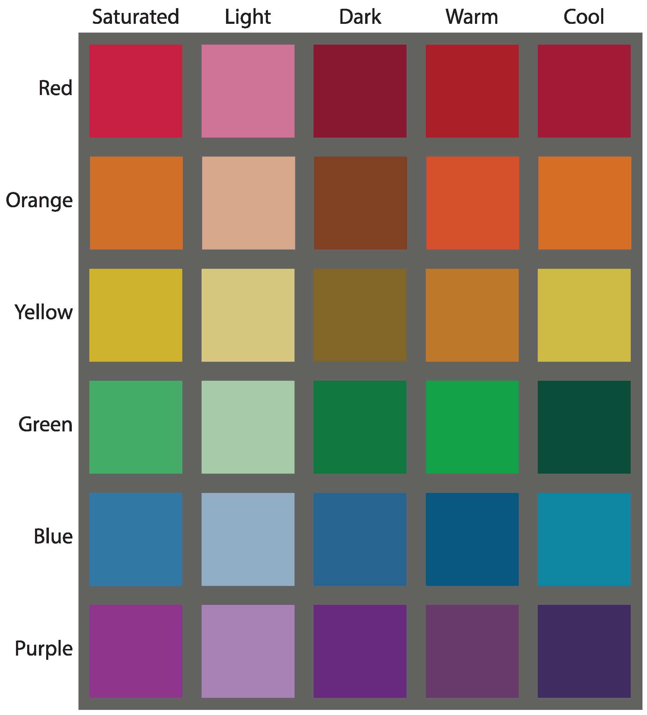
The sound color code study in Reference [33] confirmed that distinguishing light and dark colors using a sound (classical music melodies) approach is easier for most participants. However, when extending the palette to include warm and cool color variants, they started to experience difficulties. In this work, we propose to use scent in addition to sound to design a color code to serve two purposes. One is to easily differentiate the light-dark, warm-cool color variants from each other. The second one is to take advantage of using the additional sensory mode to convey the several sensorial properties of color. The proposed code decomposes a specific color into a hue and a set of color dimensions (saturated, light, and dark) for each hue. It uses the correspondence between musical instruments’ timbre and color to facilitate hue identification. In addition, it employs pitch modulation and selected melodies for aesthetic color dimension representation. Besides sound, the proposed multi-sensory color code simultaneously integrates smell to represent each hue’s saturated, light, and dark color dimensions. The advantages of this approach are several: most users seem to improve the correct identification of the hue’s color dimensions and also report improved expressivity of the color and their artwork experience.

2.2. Olfactory Representation of Color

The correspondence between color, scent, and taste has been explored for the food and consumer industries by Frieling [38], who proposed the scent-hue mappings in Table 3. Li et al. [39] developed ColorOdor, a sensory substitution device that uses scents to help blind and visually impaired people identify colors. The device uses a camera to recognize the color of objects. Using a piezoelectric transducer, it vaporizes scents following the scent-hue mapping in Table 3. The scent-color mappings were designed through a survey with two visually impaired participants. ColorOdor intended use is for the color identification of everyday objects and as a learning tool for children with congenital blindness. The use of ColorOdor for visual artwork appreciation was not explored in the study. Lee and Cho [40] explored the implicit associations between color and concepts and described two relationships: color orientation and concept orientation. They use these two relationships to map the association between scent and color. They found that the orange scent represents a highly saturated orange color directionality, bright, extroverted, and the directionality of a strong stimulus. This property could also be applied when describing the characteristics of yellow and red. Considering that orange is a mixture of these two colors, orange has a universality that includes all three colors. The chocolate scent showed a brown color directionality with low brightness, and the concept directionality of round, low, warm, and introverted. Menthol and pine had similar turquoise color directivity, and the concept of coolness was considered to be about 22% higher in menthol than pine. Therefore, menthol was assigned a color associated with coolness, blue, and pine green, respectively. Using these mappings, they produce a Tactile Color Book [41] that conveys the color information of visual artworks to provide immersive and active exploration for blind and visually impaired people. The book is printed using a special ink impregnated with scent, that can be smelled when rubbed. Using this approach, blind and visually impaired students obtained a color identification accuracy of 94.3%. They expressed that the scent-color mapping was intuitive, easy to learn, and that it helps to understand the visual artwork content.
The olfactory system is connected directly to the limbic system which is the section of the brain that processes emotions. When the olfactory receptors are stimulated by a scent, it often produces emotive responses on the subject which often trigger associated memories [43]. Thus, scents can be used to mediate the exploration of artworks through emotion [44]. Besides emotion, olfactory stimuli can trigger light or dark sensations [45]. Gilbert et al. [42] described that people tend to associate particular scents (Table 3) to a specific color in a non-random way. In addition, they associated the scents with the concepts of darkness and lightness. Civet was rated as the darkest, and Bergamot Oil, Aldehyde C-16, and Cinnamic aldehyde were rated as the lightest. Kemp et al. [46] described a correspondence between the strength-intensity of the scent with the lightness of a color. For example, strong scents were matched with darker colors. On the contrary, Fiore [47] described a correlation between floral scents and bright colors.
Olfactory stimuli can also trigger thermal sensations, like the feeling of coolness or warmness. Laska et al. [48] found that menthol (peppermint) and cineol (eucalyptus) consistently match the temperature conditions (cooling). Madzharov [49] pretested six essential oils, three of which we expected to be perceived as warm scents (warm vanilla sugar, cinnamon, pumpkin, and spice) and three as cool scents (eucalyptus- spearmint, peppermint, and winter wonderland). Thirty-three undergraduate students participated and evaluated each scent on perceived temperature and liking. Of the six scents, cinnamon and warm vanilla sugar were rated as the warmest, and peppermint was rated as the coolest. Cinnamon and peppermint were significantly different on the temperature dimension, as were warm vanilla sugar and peppermint. Adams et al. [50] identified lemon, apple, and peach scents as the brightest and lightest, whereas coffee, cinnamon, and chocolate scents as the dimmest and darkest odorants. Stevenson et al. [51] argued that the stronger cross-correspondence between scent and color occurs when the scent evokes a specific object (or context) producing a semantic match with a specific color. A summary of the correspondences between scent and color dimension described in previous works is shown in Table 4.

2.3. Multi-Sensory Representation of Color Based on Sound and Scent

While there are more developments to improve the access of blind and visually impaired to visual artworks that make use of the several human perception senses, it is still uncommon to provide access to color content through the use of multiple senses simultaneously. This work attempts to follow this multi-sensory approach which has also been explored in Reference [52]. Previous research has explored the relationship between scent and sound. Piesse [53] described correspondences between scent and sounds by using the musical notes in the diatonic scale. The match could also be made using variations on the sound pitch. Crisinel et al. [54] studied the correspondence between scent and musical features and found that the scent of orange and the iris flower could be mapped to higher-pitched sounds compared to the scent of musk and roasted coffee. They expand the correspondence study to include shapes and emotions. Scents judged as joyful, pleasant, and sweet were more frequently associated with a higher pitch and round-curved shapes. Scents judged as arousing were more frequently associated with the angular shapes, but no correlation was found with sound’s pitch. Scents judged as brighter were associated with higher-pitch and round shapes. In Reference [55], Velasco et al. describe the emotional similarity between the olfactory and auditory information, which is potentially crucial for cross-modal correspondences and multi-sensory processing. Olfactory and sound multi-sensory representation are more frequently explored in media artworks. A couple of examples are the Tate Sensorium [56] and Perfumery Organ [57]. In the latter, a fragrance is scented when a piano is played using an “incense” that connects the fragrance and sound devised by Piesse [53]. Piesse matches the musical notes Do with rose, Re with violet, and Mi with acacia scents. Inspired by strong correspondences between color, sound, and scent, in this paper, we attempt to identify the correspondence between scent and four color dimensions warm-cool and light-dark using a semantic match mediation. Once the correspondence has been established, we will use them in conjunction with a timbre-hue auditory correspondence to create a multi-sensory color code.

2.4. Tactile Representation of Color

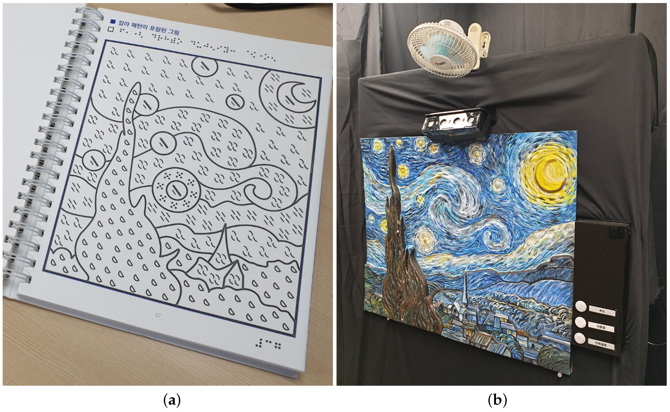
Tactile graphics refer to the use of raised lines and textures to convey images by touch. They serve as the basis for Tactile Color Patterns (TCPs), which are among the most common forms of accessible color representation for blind and visually impaired people. TCPs are a series of tactile pattern symbols that can be embossed along tactile reproductions of visual artworks to help identify the color of a specific object or area in the artwork. They follow a series of logical patterns to ease memorization and recollection. They are common on printed media as they can be embossed along with Braille and tactile graphics. Compared to other color representation methods, they have several advantages. The immediacy of feedback is one of them. A trained user can identify the color as soon as the pattern is touched. Additionally, it can also communicate other characteristics of color through the shape, size, and position of the pattern [32]. To ease the understanding and learning of the pattern, the designers base the tactile patterns of their color symbols on different properties or motifs. For example, Taras et al. [29] designed a TCP inspired for display on Braille display devices. It uses two dots in a Braille cell to represent the symbols for primary colors red, blue, and yellow. Secondary and tertiary color symbols are represented using a combination of the former color patterns. Ramsamy-Iranah et al. [30] based their tactile patterns on the children’s knowledge of basic shapes and their surroundings. For example, the color red is represented by a circle which the children associate with the red ’bindi’ dot used by Hindu women on their forehead. Blue is represented by the outline of a square as an analogy of the blue rectangular-shaped soap used in the laundry. The color yellow is represented by small dots reminiscent of the pollen in flowers. Shin et al. [31] developed a line pattern texture by decomposing color into three components: hue, saturation, and value (brightness). These components map into the line pattern texture following the convention: The hue affects the orientation of the lines, the saturation determines the width of the lines, and the value (brightness) dictates the interval (density) of the lines. Stonehouse [58] proposed a TCP based on common geometric shapes. Cho et al. [32] proposed three different TCPs: CHUNJIIN, CELESTIAL, and TRIANGLE. CHUNJIIN is inspired by the three basic components of the Korean alphabet. CELESTIAL is based on curved and straight lines, and the TRIANGLE TCP by Goethe’s color triangle. TCPs are well suited for printed media and color learning. However, when embossed into the tactile graphic representation of an artwork, they obstruct exploration, making it hard to discern what is part of the visual artwork and what is part of the color pattern. A solution to this problem is producing two or three tactile graphic versions of the artwork, one without the TCP for easy shape recognition, and one with the TCP for color identification. The third one is a combined version of the first two [59]. This approach has the disadvantage that forces the reader to explore the different versions to build the complete mental image of the artwork [60]. More importantly, as the number of colors increases, so does the difficulty for correct identification and training required to be proficient. Multi-sensory color coding using sounds and scents, which we explore in this work, can be used to alleviate the complexity of using tactile graphics with tactile color patterns.

2.5. Visual Art Appreciation

Art appreciation is performed on the basic principles for exploration, technique examination, information analysis, and interpretation that enable the viewer to experience and understand an artwork. The community has long used art appreciation frameworks as a tool to establish a common ground and a defined process to appreciate visual artworks. Feldman [61] proposes a framework composed by the study of the artwork’s information, analysis of its techniques, interpretation of the artwork’s meaning, and value judgment. With the advent of modern art, the perception of art has moved from what was traditionally considered aesthetic or ‘high art’ into cognitive experiences such that viewing the artwork produces affective and self-rewarding aesthetic experiences. This has led to the development of new frameworks, such as the information-processing stage model of aesthetic processing (Leder et al. [62]), which considers art appreciation through both aesthetic experiences and judgments in a five-stage process that includes the perception of the artwork, explicit classification, implicit classification, cognitive mastering, and evaluation. Each stage exerts influence on each other, and, while the process follows an order, it also has feedback loops and can repeat its cycle. However, most of the frameworks include a perception phase in the early stage of the process. This stage involves acquiring different perceptual variables, such as complexity, contrast, symmetry, order, etc. This stage is particularly challenging for blind and visually impaired people since their vision might hinder their ability to assess the perceptual variables. The following stages will be influenced and produce distressed aesthetic judgment and emotional responses. This work focuses on improving the perception of the color contents of the visual artworks through non-visual channels. Facilitating the perceptual analysis of the color information will positively influence the following stages in the aesthetic processing model helping blind and visually impaired people reach better aesthetic judgment and experience richer aesthetic emotions.

3. Materials and Methods

3.1. Formative Study

We conducted a formative study with four blind, one visually impaired, and a school for the blind art teacher as participants to get a better understanding of the needs of blind and visually impaired people when exploring color in visual artworks.

3.1.1. Experiencing Colors in Visual Artwork by Blind and Visually Impaired People

The main focus of the study was on the current opportunities, tools available, and challenges faced by the participants to explore color information in visual artworks. The average age of the participants was 24.2 years (standard deviation of 1.6). Of the five participants in the study, three are women (60%), and two are men (40%). All of the participants are university students. More information on their characteristics is available in Table 5. All the participants gave signed informed consent for the study based on the procedures approved by the Sungkyunkwan University Institutional Review Board.
The formative study involved a semi-structured interview. We began by inquiring about the participant’s experience when exploring color from visual artworks. All the participants expressed the limited methods available at museums, art galleries, and even schools.
They commented that at museums and galleries, most color explanations are provided verbally by the staff. Some of them expressed being uncomfortable when receiving the information that way since they fear appearing “dumb or being judged (FP2)” if they repeatedly ask for further explanations. Participants without prior color experiences were very vocal about the challenges of receiving color properties verbally since “without prior experience, learning such abstract concepts is very tough”. After further inquiries, it seemed much of the interest in an artwork’s color information stemmed from peaking surrounding conversations of other people where they actively discussed or made expressions of wonder about the color contents. About the participants’ experience when exploring a visual artwork color contents using tactile means, only two of the participants expressed having explored an artwork through a tactile graphic at a museum-gallery setting. However, all five participants stated having experience tactually exploring colors during their early education years. Those participants that expressed having explored visual artwork color content by touch expressed their experience as challenging. “(FP4) When you explore a paint or picture colors by touch, the first thing you need to do is find the key or legend to learn which texture patterns correspond to each color. If there are few uniform colors in the painting, this is not such a big problem, but, as soon as the number of colors grows, it becomes hard to remember all of them”. The participants added that this approach does not work very well in paintings where colors transition gradually from one color to another as these transitions are difficult to pick up by tact. Another participant added that if the tactile graphic of the artwork and color textures are used together in one tactile graphic, it is challenging to identify which tactile features correspond to the painting shapes and which to color.
After inquiring about their current state, we proceeded to ask about their color experiences through sensory substitution. While none of the participants expressed having experienced color through a different channel (except for audio descriptions and tactile graphic experiences mentioned earlier) in a museum gallery setting, all the participants stated having experienced color through sensory substitution during their life. For example, one of the participants described his experience using color markers with fruit and flavor scents as a kid. The participant stated that using those markers was a pleasant experience that helped make common associations between colors and scents similar to sighted people. Other participants recollected their experience learning about color through temperature and brightness. When asked about their opinion about using musical sounds and scents for artwork color exploration, most users expressed their concern about the technical feasibility. Nevertheless, they showed interest in the experience as they believe that a proper mapping between color, music, and scent could help experience color in an enjoyable way other than just matching abstract semantic concepts that do not produce any reaction. “(FP3) Even if I could touch the textures (tactile color representation) and immediately recognize the specific shades of many colors, what would be the artistic value of that? I want to touch or feel something (either by audio, smell, or other means) and feel awed by that just like a sighted person feels when they see the colors on the painting”. Besides the time spent with the participants, we had the opportunity to interview an art teacher from a school for the blind. This participant emphasized the importance of a multi-sensory approach for color education by stating that color education is more memorable using the multi-sensory approach. In addition, the abstract concepts of color are easier to grasp through analogies with other sensory experiences. The art teacher also emphasized the importance of color education from an artistic and aesthetic perspective.

3.1.2. Design Requirements

Stemmed from the feedback received from the formative study and our objective, we list the following design requirements for a multi-sensory color code. Our priority is the communication of a richer visual artwork color exploration experience through multiple senses.
  • The multi-sensory code should be simple to learn and use while offering an expanded palette of colors.
  • The color code system should not only focus on expanding the color palette but also improve the aesthetic exploration of the artwork.
  • Because previous tactile approaches require extensive training and are obtrusive for tactile artwork exploration, it should focus on using music and scent to provide an extended palette. We also choose to focus on music and scent because of two additional reasons. The first is that music can be aesthetic and expressive, while smell can evoke emotions and memories, contributing to enhancing appreciation of works of art. The second reason is that we have the future goal to integrate the multi-sensory color code system to an interactive interface for artwork appreciation previously described in References [13,63], which already uses the tactile channel for artwork spatial exploration and auditory (verbal) channel for general information.

3.2. Color

For our color palette, we selected six unique hues (red, green, yellow, blue, orange, and purple), based on the color system described by Munsell [64], in which color is composed of hue, value, and chroma. Our proposed palette for this work expresses each of the six hues across five dimensions, saturated, light, dark, warm, and cool. The light and dark dimensions are obtained by adjusting the value in the Munsell color system. A light color has a value of 7 and a chroma of 8, while a dark color has a value of 3 and a chroma of 8. Warm and cool colors follow an approach derived from the RYB color wheel proposed by Issac Newton in Opticks [65]. Warm colors result from the combination of red-orange, yellow-orange, and blue-green hues. Cool colors result from the combination of red-violet, yellow-green, and blue-violet hues. Following this scheme, our proposed palette can express 30 colors across 6 hues and 5 dimensions and is shown in Figure 1.

3.3. Multi-Sensory Color Code

Our proposed multi-sensory color code system is composed of two components. A sound color code component (Section 3.3.1) that maps the auditory channel in the form of melodies to the six different hues shown in Figure 1. In addition, a scent color code component (Section 3.3.2) maps the olfactory channel through different scents to the five dimensions shown in Figure 1. To determine a specific color of the palette, the user must listen to the melodies to identify the hue while matching a scent to identify the saturated, light, dark, warm, or cool dimension of the color. In the following sections, we elaborate on each of the components.

3.3.1. Sound Color Code Component

The first component in the design of our multi-sensory color code is the sound color code component. While there are many different sound color codes based on several properties of sound, such as pitch and tempo, we use the VIVALDI sound color code previously developed by Cho et al. [33] as the sound color component of our multi-sensory color code. The VIVALDI color code was also designed by decomposing a color into hue and the saturated, light, and dark color dimensions. VIVALDI expresses six different color hues: red, orange, yellow, green, blue, and purple using several musical instruments. Red and orange are represented by string instruments (violin + cello and guitar); yellow and green by brass instruments (trumpet + trombone and clarinet + bassoon); blue and purple by percussion instruments (piano and organ). The pairing between the color and musical instruments was made following the correspondence between the instruments’ timbre and the color hue. To express the saturated, light, and dark color dimensions, VIVALDI uses a different set of pitches for each dimension and fragments of Vivaldi’s Four Seasons Spring, Autumn, and Summer, respectively. Regarding the pitch, the saturated dimension is represented using an A major chord (medium pitch), the light dimension using F major (high-pitch), and Dark using E minor (low-pitch). The marked difference in pitch helps the listener to identify the color dimension variations more easily. The complete sound color code is resumed in Table 6.

3.3.2. Scent Color Code Component

In this work, we propose that using a sound and scent-based multi-sensory approach to design a color code will ease the effort to learn the code and improve the identification of the encoded colors. The previous section centered on the definition of the sound component; this section focuses on the scent component. Scent can be used to either identify the hue or the color dimension that compose a specific color. We decided to use scent only to identify the color dimension because it is already simple to identify the hue using sound (it is just necessary to identify the type of instrument, as seen in Table 6. In addition, it reduces the number of scents required to represent the complete palette. The color palette for the multi-sensory color code has five color dimensions: saturated, light, dark, warm, and cool. Since the saturated color dimension is the neutral shade of the color, we determined that we could represent the saturated dimension by either not using any smell or using a distinctive neutral one, like coffee. For the remaining light-dark and warm-cool color dimension pairs, the next step is to find a scent for each dimension. Instead of pairing each one to an arbitrary scent, we decided to select the scents based on their correspondence to the color dimensions. This can improve and establish the user’s mental association between scents and colors.
For the color dimension-scent pair matching, instead of making an arbitrary match, we performed a semantic differential survey based on adjectives to exclude the participants’ biases as much as possible. This kind of survey is valid for visually impaired and non-visually impaired people. For example, the latter tend to match scents to hue as follows: lemon-yellow, apple-red, and cinnamon-brown. Even though blind people have never seen colors, they also similarly match colors because of their education and social interaction with non-visually impaired people. During the survey, the participants smell different scents and choose which semantic adjectives relate most to that particular scent. Using those adjectives, we match them with the color dimension. Making the color dimension-scent pairs based on the survey results provides a more empathic solution for blind people than simply connecting colors and scents directly.
We use the semantic differential survey proposed by Reference [67] to determine the scent-color dimension correspondence. We establish the association between the semantic adjectives in Table 7 and each of the candidate scents in Table 8 through the survey. The selection of semantic adjective in Table 7 and their association with the light-dark and warm-cool pairs was made through a literature survey. The candidate scents in Table 8 were selected from the scent-color correspondence literature discussed in Section 2.2. Therefore, using the results of the survey, we determine the association between scents and color dimension through the semantic adjectives. The survey was performed following the next steps:
  • Each test participant is presented with one of the scent candidates from Table 8.
  • After the participant receives the olfactory stimuli, for each of the semantic adjective pairs, he evaluates the closeness (or directivity) between the stimuli and either of the adjectives using a scale from −2 to +2 in increments of 1. A value of 0 indicates no closeness (or directivity) to either of the adjectives. The evaluation is recorded in a document similar to Table 9.
  • Steps 1 and 2 are performed for each of the scents in Table 8, and the results are aggregated by each scent.
  • Once all the participants have evaluated all the scents across all the semantic adjectives pairs, it is possible to establish the closeness (or directivity) magnitude of each scent. All the evaluation scores for a specific scent are aggregated into two groups, the lightdark dimensions group, and the warm-cool dimensions group. The magnitude sign indicates the directivity between the two dimensions in the group.
  • Obtaining the overall directivity of the scent is done by identifying the maximum value among the directivity magnitudes of the light-dark and warm-cool dimensions obtained in step 4.
  • Once the overall directivity of each of the scents is obtained, the scent with the maximum directivity magnitude is selected as the match for each dimension. If a dimension does not have a maximum value, then the scent with the minimum directivity value of the opposite dimension can be selected as the maximum value. For the case where a specific scent is the top candidate for several dimensions, the match is done between the scent and the dimension where the scent has the maximum magnitude. The second to top candidate is then matched to the remaining dimension.
Following the implicit test procedure described before, we performed a test with the help of eighteen participants (average of 24.7 years with a standard deviation of 2.9, eight are women (44%), and ten are men (56%)) to identify the best four scents to pair to the light, dark, warm, and cool dimensions. The final candidate list after processing the test results is shown in Table 10. The final scent-color dimension pair is as follows, apple is matched with the light dimension, chocolate with the dark dimension, lemon to the warm dimension, and caramel to the cool dimension.

3.4. Multi-Sensory Color Code Based Visual Sensory Substitution Prototype

To study the feasibility of our proposed multi-sensory color code to experience color contents, we decided to integrate it into a sensory substitution device prototype. The prototype is based on and extends our integrated multimodal guide platform described in Reference [13]. It uses a combination of tactile, audio, and olfactory modalities to communicate the color contents of an artwork. For artwork tactile exploration, the prototype presents the user with a 2.5D relief model of the artwork. The relief model is 3D printed and embedded with touch capacitive sensors on the model surface using conductive ink spread over the main features in the artwork to create interactive areas. A colored paint coat is then applied. The surface of the model can be explored by touch to determine the features of the artwork. The embedded sensors are connected to a control board composed of an Arduino Uno microcontroller (Arduino, Somerville, MA, USA), a WAV Trigger polyphonic audio player board (SparkFun Electronics, Boulder, CO, USA), an MPR121 proximity capacitive touch sensor controller (Adafruit Industries, New York, NY, USA), and four water atomization modules(Seeed, Shenzhen, China). Touch-capacitive data sensed during the user’s tactile exploration is handled through the MPR121 controller, which communicates touch and releases events to the microcontroller through an I2C interface. The microcontroller processes the events to determine the user’s touch gesture (touch, tap, and double-tap). Depending on the gesture, the microcontroller can send commands through its UART port to the audio board to play audio tracks. The microcontroller can also send digital signals through its general purpose IO ports to the atomization modules to produce fine water mist. The four atomization modules are installed in small bottles containing a dilution of scent and water. The modules are housed in an enclosure and placed above the relief model installed on a vertical exhibitor, as shown in Figure 2b.
Interaction with the prototype is simple. The user only needs to approach the prototype, wear a pair of headphones located at the side, and touch the surface to start an exploration session. While the original platform described in Reference [13] had several functions, like audio explanations and sound effects of the artwork features, these were disabled to avoid bias during the evaluation. For this prototype, the user can freely explore the artwork by touch to identify the features and double-tap in any of them to trigger the audio and olfactory stimuli. The audio and olfactory stimuli are based on the proposed multi-sensory color code. The audio files reproduced correspond to the audio tracks in Table 6 and the olfactory stimuli to the scents in Table 10. The user can then hear and smell the stimuli to determine the color of the double-tapped feature.

4. Evaluation

The following sections describe two evaluations of the multi-sensory color code. The first evaluation compares the effectiveness in terms of color identification success rate of the multi-sensory color code and a uni-sensory color code. The second evaluation examines the usability of the multi-sensory color code when used to experience the color contents in a painting. The evaluation involves using a visual sensory substitution device prototype that uses the proposed multi-sensory color code and a tactile graphic version of the artwork.

4.1. Participants

The eighteen participants from the implicit association test also took part in the evaluations. The participants’ age ranged from 22 to 35 years, with an average of 24.7 years (standard deviation of 2.9). Of the eighteen participants recruited, eight are female (44%), and ten are men (56%). All of the participants had previous experience with accessible visual artworks and expressed interest in the visual arts. None of the participants took part in the formative study. All the participants or their legal guardians gave signed informed consent. The study was conducted according to the guidelines of the Declaration of Helsinki and approved by the Institutional Review Board of Sungkyunkwan University (protocol code: 2020-11-005-001, 22 February 2021).

4.2. Multi-Sensory Color Code Effectiveness

In this section, we investigate the effectiveness of our multi-sensory approach and a uni-sensory alternative color codes by comparing the color identification success rate achieved by the participants when using them. We performed this evaluation to determine if the proposed method improves the color identification success rate and explore its causes.

4.2.1. Materials

The effectiveness evaluation was performed using two sets of color codes. We used the VIVALDI color code described in Section 3.3.1 as the baseline for our experiments. The VIVALDI color code is entirely based on sound. It uses different musical instrument timbres to express the red, orange, yellow, green, blue, and purple hues shown in Table 6. The second set is our proposed multi-sensory color code described in Section 3.3. The multi-sensory color code extends the VIVALDI color code by adding different scents to facilitate the identification of the saturated, light, and dark dimensions. The scent selection was performed following the cross-modal correspondence approach through a semantic differential scale survey performed with the help of the participants. The selection method is described in detail in Section 3.3.2. The scents of coffee, apple, and chocolate were selected to represent the saturated, light, and dark color dimensions, respectively. The sound color code component of the color codes was provided by reproducing pre-recorded audio tracks on a set of high-fidelity speakers at a comfortable volume level. The audio files are provided separately in the supplement materials of this work. The scent color code component was provided in bottled scent samples made available during the evaluation.

4.2.2. Methodology

The evaluation was performed at our usability laboratory located within Sungkyunkwan University. Participants were invited into an isolated room and sat in front of a desk. The materials were provided to the participants by the test facilitator. A set of speakers was set at a comfortable volume and placed facing the participants. Capped bottles containing the scents were placed on one side of the table. When necessary, the test facilitator opened the scent bottles and provided them for a couple of seconds to the test participant for olfactory stimuli. The facilitator, observer, and test participants used sanitary face masks during the session. The participants could temporarily remove their masks to facilitate the olfactory stimuli. Between each participant evaluation, the area and scent bottles were sanitized.
The evaluation consisted of two parts. The first was a training session that lasted for 25 min. In this session, the facilitator introduced the purpose and methodology of the evaluation. Then, he explained the theory of color, its dimensions, and the terminology used. He emphasized the relationship between the hue, light, dark, warm, and cool color dimensions for the composition of a determined color. Participants were encouraged to ask any questions regarding the contents and explanations they received to ensure proper understanding. The second part of the evaluation lasted for about 50 min. There, the facilitator introduced and evaluated the VIVALDI and multi-sensory color codes. The color codes introduction and evaluation order followed a 2 × 2 Latin Square test design to counterbalance practice, fatigue, or order effects. For the VIVALDI color code, the facilitator explained the relationship between the color hue and the different musical instruments’ timbre. He also described the relationship between the spring, autumn, and summer melodies selected from Vivaldi’s Four Seasons and the saturated, light, and dark color dimensions. During the explanation, the facilitator reproduced the audio files of the VIVALDI color code and highlighted their characteristic features. Then, the facilitator played some of the audio files and asked the participant to identify some of the colors as a warming-up exercise and to verify the participant’s understanding of the evaluation procedure. The participant was given ten min to review any of the colors of the VIVALDI color code in preparation for the color identification evaluation. For the multi-sensory color code explanation, the facilitator provided a similar explanation to that of the VIVALDI color code. In addition, he introduced the scents from the multi-sensory color code selected in this work and their relationship with the saturated, light, and dark color dimensions. The participant experienced the audio and scents stimuli during the introduction. A color identification warm-up exercise was also performed. After which, the participant had ten min to review any of the colors in the multi-sensory color code. After each of the color code explanations and reviews, the participant performed a color identification test. The test consisted of eighteen identification tasks. The tasks consisted of experiencing audio or audio and scent stimuli depending on the color code being evaluated and identifying the color it represents. Each task corresponded to a random color from the color code palette. Results were recorded for further analysis, and a short questionnaire was performed after the participant evaluated both color code systems to identify perceived preferences, learnability, and memorability. The results of this evaluation are described in detail in Section 5.1.

4.3. Visual Artwork Color Content Exploration Using a Visual Sensory Substitution Prototype

This section describes the second evaluation where participants use the visual sensory substitution prototype described in Section 3.4 to explore the color contents of a visual artwork. The participants also explored a tactile graphic equivalent using tactile color patterns. A System Usability Survey was performed for each exploration method to investigate their feasibility, usability, and elicit feedback of the systems.

4.3.1. Materials

The visual artwork exploration evaluation was performed after the multi-sensory color code effectiveness evaluation. The evaluation consisted of two visual artwork color content exploration tasks. Two different methods were used for the exploration tasks. One of them consisted in exploring a tactile graphic version of Van Gogh’s Starry Night shown in Figure 2a. This tactile graphic was designed to highlight the contours of the features of the artwork and uses a series of different tactile color patterns to express the simplified color contents. A legend with the tactile color patterns and the corresponding name of the color written in Braille was also available for the participants to review the tactile pattern-color pairs. The second method involved the use of the sensory substitution device for visual art color content exploration described in Section 3.4. This prototype makes use of the multi-sensory color code proposed in this work. The prototype was inside the usability laboratory where the other evaluations took place but located in a semi-isolated exhibition area set up as a small art gallery. The prototype has a touch interactive 2.5D surface that also depicts Van Gogh’s Starry Night, as shown in Figure 2b. To prevent bias and inconsistency between the exploration methods, both provide feedback with the same color representations at similar regions. For example, the moon’s color is represented by a yellow-saturated (color composed of yellow hue and saturated dimension). Thus, the tactile pattern in the tactile graphics method corresponds to the yellow-saturated pattern. Similarly, in the sensory substitution device prototype, the audio feedback is Vivaldi’s Four Seasons spring melody executed with a trumpet and trombone. In addition, the olfactory feedback is the scent of coffee. Together, audio and scent, also represent the yellow-saturated color. We assigned the following colors to the following features: the tree and mountains are green-dark, the wind and church blue-light, and the shine from the moon and haze above the mountains are blue-light.

4.3.2. Methodology

The second evaluation was performed in a semi-isolated temporal gallery that we set up within our usability laboratory. The sensory substitution device for visual art color content exploration (Section 3.4) was placed in the gallery. Participants had a ten-minute break between the two evaluations. The test facilitator guided the participants to the gallery. There, following a 2 × 2 Latin Square test design, presented one of the two artwork exploration methods. No color identification tasks were assigned, instead, the participants had ten min to freely explore the visual artwork color contents. Before the exploration task started, the test facilitator provided a short explanation of the exploration method. For the tactile graphic, he also presented a tactile legend with the color-tactile pattern pairs and explained their design. For the sensory substitution prototype, the facilitator explained its function, use, and revised that the participants could trigger the audio and olfactory stimuli using touch gestures. Then, he pointed out the location of the headphones and let the participant explore the artwork independently. When the exploration time was over, the test facilitator conducted a System Usability Survey with the participant. Upon completion, the participant was presented with the other exploration method and performed a similar procedure. Once the participant completed exploration with the two methods, a short unstructured interview was conducted to expand on the information gathered from the survey and obtain feedback for improvements and any personal thoughts or remarks about their exploration experience. The results of this evaluation are described in detail in Section 5.2.

5. Results & Discussion

5.1. Multi-Sensory Color Code Effectiveness

We define the effectiveness of a color code as the color identification success rate achieved by the participants. The color identification success rate is simply the ratio between the number of color identification tasks completed correctly and the total number of identification tasks (eighteen). We computed the rates for both color codes to determine whether the users performed better in color identification tasks using the uni-sensory or multi-sensory approach. We also aggregated the results in different granularities to understand the effect of the several sensory stimuli on the participants’ performance. The aggregated results are shown in Figure 3a. Participants were able to identify the color (hue and color dimensions) with a success rate of 69.8% and 71.0% when using the VIVALDI and multi-sensory color codes. In addition, the standard deviation increased from 0.23 to 0.29, which indicates that the multi-sensory color code improved some of the participants’ performance, while it hurt others. Thus, from a group perspective, the multi-sensory approach did not perform better in terms of color identification. However, the results for the color identification tasks in Figure 3b show that twelve of the participants (67%) performed equal or better when using the multi-sensory color code. This result is relevant since it suggests that the majority of the participants benefited from the multi-sensory approach. Yet, it also emphasizes the possibility that it might not be an effective solution for everyone. We also calculated the identification success rate for the hue and color dimensions separately. For the hue, the VIVALDI color code had better performance at 82.4% compared to 75.6% of the multi-sensory. Half of the participants experienced a decreased performance when using the multi-sensory approach. Upon further inquiry, we found that some participants reported having experienced cognitive overload during the hue identification task. For example, one of the participants stated that “it is important to note that there are some parts where it is difficult to concentrate on music while focusing on scent”. Another participant also revealed an interesting point that we did not consider during the training session, “it was difficult to understand the connection between scent and sound”. Our training session covered the relationship between color-sound and color-scent. However, it did not cover the relationship between sound-scent. After the interview with the participants, we found that they mainly followed two strategies to identify the color during the multi-sensory evaluation. Some of them used a separate approach where they focused on one sensory stimulus at a time and processed the hue and color dimensions identification separately, while others processed the sensory stimuli and identification simultaneously.
For the color dimension identification, the multi-sensory color code performed better with an 89.2% success rate compared to 82.1% achieved with the VIVALDI code. Nine of the participants improved their color dimension performance. Based on the participants’ performance, the combined audio and olfactory stimuli of the multi-sensory approach helped some of the participants recognize the color dimensions more easily. One of the participants reported that “as scent was added to the sound, I (the participant) could feel in more detail and understand more deeply in the process of imagining the color. In addition, it is possible to describe the atmosphere and environment that the music tries to represent in more detail by using the music and scent together”. Most participants reported that the difference between the color dimensions based on the audio was more subtle than those based on scent. The pronounced difference helped them to identify more easily the color dimension. Regarding the identification success rate for each of the saturated, light, and dark color dimensions, the performance of the multi-sensory approach was higher than that of the VIVALDI code for the first two cases and similar for the last one. For the saturated color dimension, the VIVALDI color code performance was 79.6%, while the multi-sensory achieved 86.1%. In the case of the light dimension, the VIVALDI performance was 74.1%, while the multi-sensory maintained 86.1%. Nevertheless, there was no evidence of statistical difference. However, revising the color identification task performance for the saturated and light color dimensions in Figure 3b reveals that most of the participants improved or maintained their performance using the multi-sensory color code. The participants achieved a 95.4% success rate for the dark dimension for both color codes. Upon hearing the participants’ feedback, we found that the high performance achieved when identifying the dark color dimension was because the participants strongly associated the olfactory stimuli of the chocolate scent. While the associations between apple-light and coffee-saturated were not as “strong” or “close” as reported by the participants. For the VIVALDI color code, the participants stated that both the slow pace of the melody and the low pitch of the notes used also were easy to link to the dark dimensions, while the differences between the pace of the melodies and pitch selected for the saturated and light dimensions where more “ambiguous”.
We conducted a short questionnaire to learn how the participants’ perceived the color codes’ learnability, memorability, and their preference. Ten (55.6%) of the participants expressed that the multi-sensory color code was simpler to learn compared to the VIVALDI color code. Since the multi-sensory color code builds on top of the VIVALDI code, we expected it to be perceived as more complicated to learn. However, the participants expressed that the simple and few associations between the scents and the color dimensions are simple enough. For the memorability of the color codes, eleven participants (61.2%) stated that it was easier to recognize the color from the olfactory stimuli compared to the audio-only stimuli from Vivaldi. One participant considered that “the relationship (with color) will be remembered longer with the scented one (color code)” because the scent triggers fond memories. Another participant expressed that it was also the synergy between the audio, smell, and color that allowed her to more easily recognize the color. The last question was about the preference between the two color codes. Thirteen participants (72.2%) preferred the multi-sensory color code over VIVALDI. Among the reasons, one was that they felt the difference between the color dimensions was clearer, and another was that the scents evoked feelings beyond the color space. For example, one of the participants described feeling “fresh, springy, and like summer” during the evaluation. Another participant described the experience as feeling the “lightness and heaviness” of the colors. In general, the questionnaire results suggest that the memorability and the experience created by the olfactory stimuli tilted the preference towards the multi-sensory color code.

5.2. Visual Artwork Color Content Exploration Using a Visual Sensory Substitution Prototype

The results of the System Usability Survey for the tactile graphic and visual sensory substitution prototype are described in Table 11. In general, most participants (fifteen) gave a better usability score to the multi-sensory-based visual sensory substitution prototype. According to the participants’ survey results, the visual sensory substitution prototype scored 78.61, while the tactile graphic method received a 61.53 out of 100. These scores can be interpreted as “acceptable” and “marginal-low” based on the acceptability ranges scores proposed by Bangor et al. [81]. It is important to note that two participants gave a lower overall score to the multi-sensory-based prototype. One of them felt overloaded by the multi-sensory approach. Influenced by this, he obtained the lowest color identification success rate among the group (17% compared to the group average of 71%). Despite the low performance, the user stated preferring the multi-sensory approach because it considered it more “aesthetic and supportive to encourage artwork exploration”. On the other hand, the other participant that gave a lower score had a 100% identification success rate on both exploration methods. This participant’s evaluation only focused on the ease of color identification. In her opinion, using the tactile pattern was better “Since it’s more immediate, you don’t need to wait for the audio or the smell and as soon as you touch the tactile graphic, you can identify the pattern”. Thus, there is evidence of the different motivations to explore a visual artwork and how a single approach might be insufficient to cover diverse user needs. Nevertheless, most participants considered that the multi-sensory prototype facilitated the exploration of color contents in visual artworks mainly through its convenient interface, which improved their confidence in identifying the colors and stimulated their imagination experience through its expressive audio and scents.
Participants expressed their inclination to use both methods frequently. Several stated that it would be better if both were available. They could use the visual sensory substitution prototype to explore thoroughly those artworks in which they have an interest and use the tactile graphic to skim through those artworks they do not. Participants did not consider either of the methods to be complex. They said that both were easy to approach, start using, and operate. They deemed the tactile graphics method slightly more complicated because the pairing between the tactile patterns and color is not intuitive without previous training. The audio and scents were perceived more intuitive, “(Using the multi-sensory approach) I think even if the color is not evident, I can still feel and experience some sensations from the music like brightness and darkness, or freshness from the smell”. This characteristic also led the participants to express that they could explore the color contents more independently with the multi-sensory prototype. The opinion was divided in the case of the tactile graphic. Those participants with high tactile proficiency reported a high level of independence were those with low stated the contrary.
Regarding the function integration, the participants gave high scores to both methods. In particular, the multi-sensory prototype was considered well-integrated because of the combined localized audio and olfactory stimuli triggered by touch gestures. Most participants expressed surprise for being able to experience each of the features in the artwork separately through different audio and smell in a similar way as to how visual exploration occurs. However, some touch gesture sensing implementation challenges prevented some of the participants’ gestures to trigger the correct stimuli, which lead them to rate the system with some inconsistency. On the other hand, the participants rated the tactile graphic approach as very consistent due to its simplicity. However, we identified that many participants assume responsibility for any problems during the exploration. For example, one of the participants that experienced confusion when touching the patterns said: “I guess I should practice more (touching) the patterns, I keep forgetting what they mean and the little differences between them”. The participants described both methods as very easy and straightforward to learn, principally due to the method’s simple interface.
The two main advantages of the multi-sensory prototype compared to the tactile graphics concerning usability were its convenience and the confidence felt by the participants. In terms of convenience, the participants’ opinion was divided for the tactile graphic approach. Participants that gave a high rating expressed the immediacy of the touch stimuli, the convenience of not having to wear any device. The participants that gave a low rating described the effort to distinguish between the features contour lines from the color patterns and constantly having to review the color pattern legend as very cumbersome. They also pointed out that, while the mental effort to identify the color from the patterns might be the same as for the multi-sensory method, it feels less “pleasant and artistic and more mechanic”. The other advantage reported by the participants was the confidence they felt using the multi-sensory prototype in comparison to the tactile graphics. When using the tactile approach, the participants felt difficulty identifying the colors correctly as this approach does not provide other means to confirm the correct identification. The participants felt that the multi-sensory prototype presented them with two alternatives (sound and scent) to perceive the color, making them feel more confident in the identification.
Beyond the identification of color and the usability of the system, the participants communicated that the multi-sensory prototype was better suited to explore and experience visual artworks as the combination of sound and olfactory stimuli encourage exploration and reflection of the artwork. They could not confirm whether their reactions towards the art piece are the same as those intended by the artist, but, in general, they agreed that they had a stronger reaction compared to that experienced when using the tactile graphic.

5.3. Limitations

We identified several limitations in our study. The proposed color code is based on the results of a semantic differential survey which should be extended by including more participants with diverse characteristics to make it more robust. For example, colors have different meanings and symbolize different concepts across cultures. Therefore, instead of proposing a fixed set of color-sound-scent pairs, we believe a selection should be tailor-made for the audience. Similarly, if fixed, some color-sound-scent pairs can cause incoherence when used for different artworks. Another limitation is the different needs of the audience. Some people can find the audio and scent stimuli bothersome if used over extended periods.
Regarding the number of test participants required for usability testing, problem-discovery studies typically require between three and twenty participants. For comparative studies, such as the A/B test that compares two designs against each other to determine which one is better, group sizes from eight to 25 participants typically provide valid results [82]. For psychophysiological pain tests, a problem-discovery test, Lamontagne et al. [83] found that 82% of the total paint points experienced by 15 participants were experienced by 9 participants. Therefore, the number of usability test participants in this paper of 18 is considered sufficient. Greenwald et al. [84] performed an implicit association test on 32 psychology course students (13 males and 19 females). Therefore, in future work, we will further investigate scaled implicit association tests with more participants.

6. Conclusions and Future Work

In this work, we presented a multi-sensory color code system that can represent up to 30 colors. It uses melodies to express each color’s hue and scents to express the saturated, lightness (light-dark), and temperature (warm-cool) color dimensions. The scent selection and pairing were made through a semantic correspondence survey in collaboration with eighteen participants. We evaluated the color code system to determine if using a multi-sensory approach eases the effort to recognize the encoded colors and help improve the color identification compared to the commonly used uni-sensory method. The results from the evaluation suggest that the multi-sensory approach does improve color identification, however not for everyone. The cause of this seems to be the extra cognitive effort and sensory overload experienced by some. In addition, we integrated the color code into a sensory substitution device prototype to determine if the color code could be more suitable and expressive when exploring visual art color content compared to a tactile graphics alternative. The results from this evaluation indicate that the multi-sensory-based prototype is more convenient and improves the confidence for visual artwork color content exploration. Moreover, the results also suggest suitability for artwork exploration since the multi-sensory stimuli improve the experience and reaction to the artwork. In the future, we would like to expand the color code to include more color-audio-scent pairs to study the applicability across different styles of visual artworks. In this work, two non-visual sensory reproductions of artworks were used to evaluate the proposed color code system. As future work, experiments can be are carried out using more diverse styles of non-visual sensory reproductions to further support the results proposed in this paper. In addition, we believe it is relevant to explore the effect of the semantic incoherence that could happen from the color code usage and its influence on the artwork experience and the interpretation. While experiencing color is just a fraction of the art appreciation process, we believe our work contributes towards designing and studying accessible art appreciation frameworks for all.

Supplementary Materials

Author Contributions

Conceptualization, methodology, J.-D.C.; formal analysis, data curation, L.C.Q., C.-H.L.; writing–original draft preparation, visualization, L.C.Q.; project administration, J.-D.C.; Investigation, L.C.Q., J.-D.C., C.-H.L.; Resources, writing–review and editing, supervision, funding acquisition, J.-D.C. All authors have read and agreed to the published version of the manuscript.

Funding

This research was funded by the 2018 Science Technology and Humanity Converging Research Program of the National Research Foundation of Korea (2018M3C1B6061353).

Institutional Review Board Statement

The study was conducted according to the guidelines of the Declaration of Helsinki, and approved by the Institutional Review Board (or Ethics Committee) of Sungkyunkwan University (protocol code: 2020-11-005-001, 22 February 2021).

Informed Consent Statement

Informed consent was obtained from all subjects involved in the study.

Data Availability Statement

The data presented in this study are available within the article.

Acknowledgments

We would like to thank all volunteers for their participation and the reviewers for their insights and suggestions.

Conflicts of Interest

The authors declare no conflict of interest.

Abbreviations

The following abbreviations are used in this manuscript:
TCPTactile Color Pattern
SSDSensory Substitution Device
RGBRed Green, and Blue
SCCSound Color Code

References

  1. Bhowmick, A.; Hazarika, S.M. An insight into assistive technology for the visually impaired and blind people: State-of-the-art and future trends. J. Multimodal User Interfaces 2017, 11, 149–172. [Google Scholar] [CrossRef]
  2. Terven, J.R.; Salas, J.; Raducanu, B. New Opportunities for Computer Vision-Based Assistive Technology Systems for the Visually Impaired. Computer 2014, 47, 52–58. [Google Scholar] [CrossRef]
  3. Pawłowska, A.; Wendorff, A. Extra-visual perception of works of art in the context of the audio description of the Neoplastic Room at the Museum of Art in Łódź. Quart 2018, 47, 18–27. [Google Scholar]
  4. Hoyt, B. Emphasizing Observation in a Gallery Program for Blind and Low-Vision Visitors: Art beyond Sight at the Museum of Fine Arts, Houston. Disabil. Stud. Q. 2013, 33. [Google Scholar] [CrossRef]
  5. Krantz, G. Leveling the Participatory Field: The Mind’s Eye Program at the Guggenheim Museum. Disabil. Stud. Q. 2013, 33. [Google Scholar] [CrossRef]
  6. Neves, J. Multi-sensory approaches to (audio) describing the visual arts. In MonTI. Monografías de Traducción e Interpretación; Redalyc: Alicante, Spain, 2012; pp. 277–293. [Google Scholar]
  7. Hinton, R. Use of tactile pictures to communicate the work of visual artists to blind people. J. Vis. Impair. Blind. 1991, 85, 174–175. [Google Scholar] [CrossRef]
  8. Holloway, L.; Marriott, K.; Butler, M.; Borning, A. Making sense of art: Access for gallery visitors with vision impairments. In Proceedings of the 2019 CHI Conference on Human Factors in Computing Systems, Glasgow, UK, 4–9 May 2019; pp. 1–12. [Google Scholar]
  9. Reichinger, A.; Carrizosa, H.G.; Wood, J.; Schröder, S.; Löw, C.; Luidolt, L.R.; Schimkowitsch, M.; Fuhrmann, A.; Maierhofer, S.; Purgathofer, W. Pictures in Your Mind: Using Interactive Gesture-Controlled Reliefs to Explore Art. ACM Trans. Access. Comput. 2018, 11. [Google Scholar] [CrossRef] [Green Version]
  10. Leporini, B.; Rossetti, V.; Furfari, F.; Pelagatti, S.; Quarta, A. Design Guidelines for an Interactive 3D Model as a Supporting Tool for Exploring a Cultural Site by Visually Impaired and Sighted People. ACM Trans. Access. Comput. TACCESS 2020, 13, 1–39. [Google Scholar] [CrossRef]
  11. D’Agnano, F.; Balletti, C.; Guerra, F.; Vernier, P. Tooteko: A case study of augmented reality for an accessible cultural heritage. Digitization, 3D printing and sensors for an audio-tactile experience. ISPRS-Int. Arch. Photogramm. Remote Sens. Spat. Inf. Sci. 2020, 40, 207. [Google Scholar] [CrossRef] [Green Version]
  12. Iranzo Bartolome, J.; Cavazos Quero, L.; Kim, S.; Um, M.Y.; Cho, J. Exploring art with a voice controlled multimodal guide for blind people. In Proceedings of the Thirteenth International Conference on Tangible, Embedded, and Embodied Interaction, Tempe, Arizona, 17–20 March 2019; pp. 383–390. [Google Scholar]
  13. Cavazos Quero, L.; Iranzo Bartolomé, J.; Cho, J. Accessible Visual Artworks for Blind and Visually Impaired People: Comparing a Multimodal Approach with Tactile Graphics. Electronics 2021, 10, 297. [Google Scholar] [CrossRef]
  14. Abboud, S.; Hanassy, S.; Levy-Tzedek, S.; Maidenbaum, S.; Amedi, A. EyeMusic: Introducing a visual colorful experience for the blind using auditory sensory substitution. Restor. Neurol. Neurosci. 2014, 32, 247–257. [Google Scholar] [CrossRef] [PubMed] [Green Version]
  15. Stiles, N.R.; Shimojo, S. Auditory sensory substitution is intuitive and automatic with texture stimuli. Sci. Rep. 2015, 5, 1–14. [Google Scholar] [CrossRef] [PubMed]
  16. Hamilton-Fletcher, G.; Wright, T.D.; Ward, J. Cross-modal correspondences enhance performance on a colour-to-sound sensory substitution device. Multisensory Res. 2016, 29, 337–363. [Google Scholar] [CrossRef]
  17. Buchs, G.; Haimler, B.; Kerem, M.; Maidenbaum, S.; Braun, L.; Amedi, A. A self-training program for sensory substitution devices. PLoS ONE 2021, 16, e0250281. [Google Scholar] [CrossRef]
  18. Hamilton-Fletcher, G.; Ward, J. Representing colour through hearing and touch in sensory substitution devices. Multisensory Res. 2013, 26, 503–532. [Google Scholar] [CrossRef]
  19. van de Doel, K. Soundview: Sensing Color Images by Kinesthetic Audio; Georgia Institute of Technology: Atlanta, GA, USA, 2003. [Google Scholar]
  20. van den Doel, K.; Smilek, D.; Bodnar, A.; Chita, C.; Corbett, R.; Nekrasovski, D.; McGrenere, J. Geometric Shape Detection with Soundview; Georgia Institute of Technology: Atlanta, GA, USA, 2004. [Google Scholar]
  21. Else, L. A cyborg makes art using seventh sense. New Sci. 2012, 215, 50. [Google Scholar] [CrossRef]
  22. Bologna, G.; Deville, B.; Pun, T.; Vinckenbosch, M. Transforming 3D coloured pixels into musical instrument notes for vision substitution applications. EURASIP J. Image Video Process. 2007, 2007, 76204. [Google Scholar] [CrossRef] [Green Version]
  23. Bologna, G.; Deville, B.; Vinckenbosch, M.; Pun, T. A perceptual interface for vision substitution in a color matching experiment. In Proceedings of the 2008 IEEE International Joint Conference on Neural Networks (IEEE World Congress on Computational Intelligence), Hong Kong, China, 1–6 June 2008; pp. 1621–1628. [Google Scholar]
  24. Bologna, G.; Deville, B.; Pun, T. Blind navigation along a sinuous path by means of the See ColOr interface. In Proceedings of the International Work-Conference on the Interplay Between Natural and Artificial Computation, Santiago de Compostela, Spain, 22–26 June 2009; pp. 235–243. [Google Scholar]
  25. Capalbo, Z.; Glenney, B. Hearing color: Radical pluralistic realism and SSDs. In Proceedings of the AP-CAP, Tokyo, Japan, 1–2 October 2009; pp. 135–140. [Google Scholar]
  26. Ancuti, C.O.; Ancuti, C.; Bekaert, P. ColEnViSon: Color Enhanced Visual Sonifier-A Polyphonic Audio Texture and Salient Scene Analysis. In Proceedings of the International Conference on Computer Vision Theory and Applications, Lisboa, Portugal, 5–8 February 2009; Volume 1, pp. 566–572. [Google Scholar]
  27. Hamilton-Fletcher, G.; Obrist, M.; Watten, P.; Mengucci, M.; Ward, J. “I Always Wanted to See the Night Sky” Blind User Preferences for Sensory Substitution Devices. In Proceedings of the 2016 CHI Conference on Human Factors in Computing Systems, San Jose, CA, USA, 7–12 May 2016; pp. 2162–2174. [Google Scholar]
  28. Osiński, D.; Bizoń, P.; Midtfjord, H.; Wierzchoń, M.; Hjelme, D.R. Designing auditory color space for color sonification systems. In Proceedings of the International Conference on Auditory Display, Newcastle upon Tyne, UK, 23 June 2019; pp. 331–334. [Google Scholar]
  29. Taras, C.; Ertl, T. Interaction with Colored Graphical Representations on Braille Devices. In Proceedings of the International Conference on Universal Access in Human-Computer Interaction, San Diego, CA, USA, 19–24 July 2009; Springer: Berlin, Germany, 2009; pp. 164–173. [Google Scholar]
  30. Ramsamy-Iranah, S.; Rosunee, S.; Kistamah, N. Application of assistive tactile symbols in a ’tactile’ book on colour and shapes for children with visual impairments. Int. J. Arts Sci. 2017, 10, 575–590. [Google Scholar]
  31. Shin, J.; Cho, J.; Lee, S. Please Touch Color: Tactile-Color Texture Design for The Visually Impaired. In Proceedings of the Extended Abstracts of the 2020 CHI Conference on Human Factors in Computing Systems, Honolulu, HI, USA, 25–30 April 2020; Association for Computing Machinery: New York, NY, USA, 2020; pp. 1–7. [Google Scholar]
  32. Cho, J.D.; Quero, L.C.; Bartolomé, J.I.; Lee, D.W.; Oh, U.; Lee, I. Tactile colour pictogram to improve artwork appreciation of people with visual impairments. Color Res. Appl. 2021, 46, 103–116. [Google Scholar] [CrossRef]
  33. Cho, J.D.; Jeong, J.; Kim, J.H.; Lee, H. Sound Coding Color to Improve Artwork Appreciation by People with Visual Impairments. Electronics 2020, 9, 1981. [Google Scholar] [CrossRef]
  34. Jabbar, M.S.; Lee, C.H.; Cho, J.D. ColorWatch: Color Perceptual Spatial Tactile Interface for People with Visual Impairments. Electronics 2021, 10, 596. [Google Scholar] [CrossRef]
  35. Lee, Y.; Lee, C.H.; Cho, J.D. 3D Sound Coding Color for the Visually Impaired. Electronics 2021, 10, 1037. [Google Scholar] [CrossRef]
  36. Bartolome, J.I.; Cho, G.; Cho, J.D. Multi-Sensory Color Expression with Sound and Temperature in Visual Arts Appreciation for People with Visual Impairment. Electronics 2021, 10, 1336. [Google Scholar] [CrossRef]
  37. Cho, J.D.; Lee, Y. ColorPoetry: Multi-Sensory Experience of Color with Poetry in Visual Arts Appreciation of Persons with Visual Impairment. Electronics 2021, 10, 1064. [Google Scholar] [CrossRef]
  38. Frieling, H. Farbe Hilft Verkaufen; Musterschmidt-Verlag: Gottingen, Germany, 1967. [Google Scholar]
  39. Li, S.; Chen, J.; Li, M.; Lin, J.; Wang, G. ColorOdor: Odor Broadens The Color Identification of The Blind. In Proceedings of the 2017 CHI Conference Extended Abstracts on Human Factors in Computing Systems, Denver, CO, USA, 6–11 May 2017; pp. 2746–2751. [Google Scholar]
  40. Lee, H.; Cho, J. A Research on Using of Color-Concept Directed Scent for Visually Impaired Individuals to Appreciate Paintings. Sci. Emot. Sensib 2020, 23, 73–92. [Google Scholar] [CrossRef]
  41. Cho, J.D. Tactile Color Book; Book Publishing Braille: Seoul, Korea, 2020. [Google Scholar]
  42. Gilbert, A.N.; Martin, R.; Kemp, S.E. Cross-modal correspondence between vision and olfaction: The color of smells. Am. J. Psychol. 1996, 109, 335–351. [Google Scholar] [CrossRef] [PubMed]
  43. Delplanque, S.; Coppin, G.; Sander, D. Odor and Emotion. In Handbook of Odor; Springer: Cham, Switzerland, 2017; pp. 101–102. [Google Scholar]
  44. Vi, C.T.; Ablart, D.; Gatti, E.; Velasco, C.; Obrist, M. Not just seeing, but also feeling art: Mid-air haptic experiences integrated in a multisensory art exhibition. Int. J. Hum. Comput. Stud. 2017, 108, 1–14. [Google Scholar] [CrossRef]
  45. Spence, C. Olfactory-colour crossmodal correspondences in art, science, and design. Cogn. Res. Princ. Implic. 2020, 5, 1–21. [Google Scholar] [CrossRef] [PubMed]
  46. Kemp, S.E.; Gilbert, A.N. Odor intensity and color lightness are correlated sensory dimensions. Am. J. Psychol. 1997, 110, 35. [Google Scholar] [CrossRef]
  47. Fiore, A.M. Multisensory integration of visual, tactile, and olfactory aesthetic cues of appearance. Cloth. Text. Res. J. 1993, 11, 45–52. [Google Scholar] [CrossRef]
  48. Laska, M. Perception of trigeminal chemosensory qualities in the elderly. Chem. Senses 2001, 26, 681–689. [Google Scholar] [CrossRef] [Green Version]
  49. Madzharov, A.V.; Block, L.G.; Morrin, M. The cool scent of power: Effects of ambient scent on consumer preferences and choice behavior. J. Mark. 2015, 79, 83–96. [Google Scholar] [CrossRef] [Green Version]
  50. Adams, C.; Doucé, L. What’s in a scent? Meaning, shape, and sensorial concepts elicited by scents. J. Sens. Stud. 2017, 32, e12256. [Google Scholar] [CrossRef]
  51. Stevenson, R.J.; Rich, A.; Russell, A. The nature and origin of cross-modal associations to odours. Perception 2012, 41, 606–619. [Google Scholar] [CrossRef]
  52. Cho, J.D. A Study of Multi-Sensory Experience and Color Recognition in Visual Arts Appreciation of People with Visual Impairment. Electronics 2021, 10, 470. [Google Scholar] [CrossRef]
  53. Piesse, G.W.S. The Art of Perfumery and the Methods of Obtaining the Odours of Plants; Longmans: London, UK, 1879. [Google Scholar]
  54. Crisinel, A.S.; Jacquier, C.; Deroy, O.; Spence, C. Composing with cross-modal correspondences: Music and odors in concert. Chemosens. Percept. 2013, 6, 45–52. [Google Scholar] [CrossRef]
  55. Velasco, C.; Balboa, D.; Marmolejo-Ramos, F.; Spence, C. Crossmodal effect of music and odor pleasantness on olfactory quality perception. Front. Psychol. 2014, 5, 1352. [Google Scholar] [CrossRef] [PubMed] [Green Version]
  56. Ablart, D.; Velasco, C.; Vi, C.T.; Gatti, E.; Obrist, M. The how and why behind a multisensory art display. Interactions 2017, 24, 38–43. [Google Scholar] [CrossRef]
  57. Inc., T. Perfumery Organ. Available online: https://www.ntticc.or.jp/en/archive/works/perfumery-organ/ (accessed on 1 May 2021).
  58. Stonehouse, P. Tactile Colours. Available online: http://cpwstonehouse.com/tactile-colours/ (accessed on 1 May 2021).
  59. Kardoulias, T. Guidelines for making tactile diagrams and accompanying narratives. In Art Beyond Sight. A resource on Art Creativity and Visual Impairment; American Foundation for the Blind: Arlington, VA, USA, 2003; pp. 267–296. [Google Scholar]
  60. JunDong, C.; Jeon, H.R.; Jeong, J.; Jo, S.; Lee, D.; Cho, K.S.; Lee, H.; hye Kim, J.; Sah, Y.J. Multi-sensory Visual Art Experience Exhibition for People with Visual Impairment. J. Korean Soc. Exhib. Des. 2020, 34, 1–13. [Google Scholar]
  61. Feldman, E.B. Varieties of Visual Experience; Harry N. Abrams. Inc.: New York, NY, USA, 1992. [Google Scholar]
  62. Leder, H.; Belke, B.; Oeberst, A.; Augustin, D. A model of aesthetic appreciation and aesthetic judgments. Br. J. Psychol. 2004, 95, 489–508. [Google Scholar] [CrossRef] [PubMed]
  63. Cavazos Quero, L.; Iranzo Bartolomé, J.; Lee, S.; Han, E.; Kim, S.; Cho, J. An Interactive Multimodal Guide to Improve Art Accessibility for Blind People. In Proceedings of the 20th International ACM SIGACCESS Conference on Computers and Accessibility, ASSETS ’18, Galway, Ireland, 22–24 October 2018; Association for Computing Machinery: New York, NY, USA, 2018; pp. 346–348. [Google Scholar] [CrossRef]
  64. Nickerson, D. History of the Munsell color system and its scientific application. JOSA 1940, 30, 575–586. [Google Scholar] [CrossRef]
  65. Newton, I. Opticks; Prabhat Prakashan: New Delhi, India, 1730. [Google Scholar]
  66. Palmer, S.E.; Schloss, K.B. An ecological valence theory of human color preference. Proc. Natl. Acad. Sci. USA 2010, 107, 8877–8882. [Google Scholar] [CrossRef] [Green Version]
  67. Osgood, C.E.; Suci, G.J.; Tannenbaum, P.H. The Measurement of Meaning; Number 47; University of Illinois Press: Champaign, IL, USA, 1957. [Google Scholar]
  68. Taft, C. Color meaning and context: Comparisons of semantic ratings of colors on samples and objects. Color Res. Appl. 1997, 22, 40–50. [Google Scholar] [CrossRef]
  69. Jonas, C.; Spiller, M.J.; Hibbard, P. Summation of visual attributes in auditory–visual crossmodal correspondences. Psychon. Bull. Rev. 2017, 24, 1104–1112. [Google Scholar] [CrossRef] [PubMed]
  70. Marks, L.E.; Hammeal, R.J.; Bornstein, M.H.; Smith, L.B. Perceiving similarity and comprehending metaphor. Monogr. Soc. Res. Child Dev. 1987, 52, i-100. [Google Scholar] [CrossRef]
  71. Maric, Y.; Jacquot, M. Contribution to understanding odour–colour associations. Food Qual. Prefer. 2013, 27, 191–195. [Google Scholar] [CrossRef]
  72. Kandinsky, W.; Rebay, H. Point and Line to Plane; Courier Corporation: North Chelmsford, MA, USA, 1979. [Google Scholar]
  73. Ludwig, V.U.; Simner, J. What colour does that feel? Tactile–visual mapping and the development of cross-modality. Cortex 2013, 49, 1089–1099. [Google Scholar] [CrossRef]
  74. Levy, B.I. Research into the psychological meaning of color. Am. J. Art Ther. 1984, 23, 58–62. [Google Scholar]
  75. Anikin, A.; Johansson, N. Implicit associations between individual properties of color and sound. Atten. Percept. Psychophys 2019, 81, 764–777. [Google Scholar] [CrossRef]
  76. Torres, A.; Serra, J.; Llopis, J.; Delcampo, A. Color preference cool versus warm in nursing homes depends on the expected activity for interior spaces. Front. Archit. Res. 2020, 9, 739–750. [Google Scholar] [CrossRef]
  77. Slobodenyuk, N.; Jraissati, Y.; Kanso, A.; Ghanem, L.; Elhajj, I. Cross-modal associations between color and haptics. Atten. Percept. Psychophys. 2015, 77, 1379–1395. [Google Scholar] [CrossRef] [Green Version]
  78. Jraissati, Y.; Slobodenyuk, N.; Kanso, A.; Ghanem, L.; Elhajj, I. Haptic and tactile adjectives are consistently mapped onto color space. Multisensory Res. 2016, 29, 253–278. [Google Scholar] [CrossRef] [PubMed]
  79. Iranzo Bartolomé, J.; Cho, J.D.; Cavazos Quero, L.; Jo, S.; Cho, G. Thermal Interaction for Improving Tactile Artwork Depth and Color-Depth Appreciation for Visually Impaired People. Electronics 2020, 9, 1939. [Google Scholar] [CrossRef]
  80. Kandinsky, W. Concerning the Spiritual in Art; Courier Corporation: Chelmsford, MA, USA, 2012. [Google Scholar]
  81. Bangor, A.; Kortum, P.T.; Miller, J.T. An empirical evaluation of the system usability scale. Intl. J. Hum. Interact. 2008, 24, 574–594. [Google Scholar] [CrossRef]
  82. Six, J.M.; Macefield, R. How to determine the right number of participants for usability studies. San Francisco (CA): UXmatters. 2016. Available online: https://www.uxmatters.com/mt/archives/2016/01/how-to-determine-the-right-number-of-participants-for-usability-studies.php (accessed on 1 May 2021).
  83. Lamontagne, C.; Sénécal, S.; Fredette, M.; Chen, S.L.; Pourchon, R.; Gaumont, Y.; De Grandpré, D.; Léger, P.M. User Test: How Many Users Are Needed to Find the Psychophysiological Pain Points in a Journey Map? In Proceedings of the International Conference on Human Interaction and Emerging Technologies, Strasbourg, France, 28–30 April 2021; Springer: Berlin/Heidelberg, Germany, 2019; pp. 136–142. [Google Scholar]
  84. Greenwald, A.G.; McGhee, D.E.; Schwartz, J.L. Measuring individual differences in implicit cognition: The implicit association test. J. Personal. Soc. Psychol. 1998, 74, 1464. [Google Scholar] [CrossRef]
Figure 1. The 30-color palette used for the multi-sensory color code experimentation. The six hues on the left of the figure are described through the saturated, light, dark, warm, and cool dimensions. The saturated, light, and dark dimension are based on the BCP-37 [66].
Electronics 10 01696 g001
Figure 2. (a) Tactile graphic version of Van Gogh’s Starry Night featuring the tactile color patterns described in Reference [32] used during the evaluation. (b) Visual sensory substitution prototype that expresses color contents through sound and scent.
Electronics 10 01696 g002
Figure 3. (a) Success rate for the different color and color dimensions identification tasks during the VIVALDI and multi-sensory color codes evaluation. (b) Comparison of the participants performance achieved during the evaluation of the VIVALDI and multi-sensory color codes.
Electronics 10 01696 g003
Table 1. Comparison of existing color codes in terms of coding method and the number of colors coded.
Author (Modality)Basic Pattern (Method)No. of Colors
Taras et al. [29] (Touch)Dots (Braille)23 (6 hues + 2 levels of lightness for each hue + 5 levels of achromatic colors)
Ramsamy-Iranah et al. [30] (Touch)Polygons (Children’s Knowledge)14 (6 hues + 5 other colors + 3 levels of achromatic colors)
Shin et al. [31] (Touch)Lines (Orientation, Grating) The first eight colors are expressed in eight different angles of directionality by dividing a rainbow-shaped semicircle at intervals of 20 degrees90 (8 hues + 4 levels of lightness, and 5 levels of saturation for each hue + 10 levels of brown and achromatic colors)
Cho et al. [32] (Touch)Dots, lines, and curves (pictograms)Simplified: 29 (6 hues + 2 levels of lightness, and 2 levels of saturation for each hue + 5 levels of achromatic colors) Extended: 53 (12 hues + 2 levels of lightness, and 2 levels of saturation for each hue + 5 levels of achromatic colors)
Cho et al. [33] (Hear)Classical music melodies played on different instruments23 (6 hues + 2 levels of lightness for each hue + 5 levels of achromatic colors)
Jabbar et al. [34] (Touch)Embossed surface pattern by color wheelSimplified: 24 (6 hues + 3 levels of lightness for each hue + 6 levels of achromatic colors) Extended: 32 (8 hues + 3 levels of lightness for each hue + 8 levels of achromatic colors)
Lee et al. [35] (Hear)Spatial sound representation using binaural recoding in virtual environment27 (8 hues + 3 levels of lightness for each hue + 3 levels of achromatic colors)
Bartolome et al. [36] (Hear & Touch)Classical music melodies played on different instruments to code warmer/cooler/lighter/darker colors of each color hue and temperature to code color hue30 (6 hues + 24 warmer/cooler/lighter/darker colors of each color hue)
Cho et al. [37] (Hear)Classical music melodies played on different instruments to code 23 colors and Poetry to code colors with warm/cool/light/dark tones as supplements35 (6 hues + 24 warmer/cooler/lighter/darker colors of each color hue + 5 levels of achromatic colors)
This work (Hear & Smell)Classical music melodies played on different instruments to code color hues and scent to code warmer/cooler/lighter/darker colors of each color hue30 (6 hues + 24 warmer/cooler/lighter/darker colors of each color hue)
Table 2. Comparison of an existing multi-modal color codes in terms of user evaluation.
ReferencesColor Substitution ModalitiesRecognition Rate EvaluationUsability Evaluation
Cho et al. [37]Poetry-74.5
Bartolome et al. [36]Sound & Temperature67.5% (hue: 71.6%)
(color dimensions: 92.5%)
-
Cavazos et al. [This work]Sound & Scent71.0% (hue: 75.6%)
(color dimensions: 89.2%)
78.6
Table 3. Odor-hue color codes for olfactory representation of color.
HueFrieling et al. [38] Gilbert et al. [42] Li et al. [39]Lee and Cho [40]
PinkSweet, mildAldehyde C-16, Methyl anthranile--
LavenderSweet, unerotic---
Purple--Lavender-
MagentaHeavy, narcotic, charmingly, sweet---
IndigoScentless---
BlueScentless-BlueberryMenthol
MintJuicy, fresh, salty---
GreenFresh, green fragranceCivet, 2-ethyl fenchol, galbanum, lavender, neroli, olibanum, pineCamphor leavesPine
OliveMusty---
Lime GreenSour, dry, fresh, bitter---
YellowPerfume, flowerBergamot oil- Lemon-
OrangeHearty--Orange
RedSweet, hefty, hotCinnamic aldehyde- Rose-
GoldSweet, good, stunning---
OcherSourly, neutral---
BrownAroma, mustyCaramel lactone, anise-Chocolate
WhiteScentless-Lily-
GreyBad---
Black--Ink-
Table 4. Correspondence between scent and color dimensions described in previous literature.
LightDarkWarmCool
Bergamot [42]Civet [42]Cinnamon [49]Menthol [48,49]
Strawberry [42]Coffee [50]Vanilla [49]Eucalyptus [49]
Cinnamic aldehyde [42]Cinnamon [50]Chocolate [40]Pine [40]
Lemon [50]Chocolate [40]--
Apple [50]---
Peach [50]---
Orange [40]---
Rose [47]---
Cherry blossom [47]---
Acacia [47]---
Table 5. Characteristics of blind and visually impaired participants in our formative study.
ParticipantSexAgeOccupationSight
FP1Female23University studentTotal vision loss
FP2Female23University studentTotal vision loss
FP3Female24University studentTotal vision loss
FP4Male24University studentTotal vision loss
FP5Male27University studentProfound vision loss
Table 6. VIVALDI Sound Color Code.
HueInstrumentSaturatedLightDark
RedViolin & CelloVivaldi’s Four Seasons Spring [A major]Vivaldi’s Four Seasons Autumn [F major]Vivaldi’s Four Seasons Summer [E minor]
OrangeGuitarVivaldi’s Four Seasons Spring [A major]Vivaldi’s Four Seasons Autumn [F major]Vivaldi’s Four Seasons Summer [E minor]
YellowTrumpet & TromboneVivaldi’s Four Seasons Spring [A major]Vivaldi’s Four Seasons Autumn [F major]Vivaldi’s Four Seasons Summer [E minor]
GreenClarinet & BassoonVivaldi’s Four Seasons Spring [A major]Vivaldi’s Four Seasons Autumn [F major]Vivaldi’s Four Seasons Summer [E minor]
BluePianoVivaldi’s Four Seasons Spring [A major]Vivaldi’s Four Seasons Autumn [F major]Vivaldi’s Four Seasons Summer [E minor]
PurpleOrganVivaldi’s Four Seasons Spring [A major]Vivaldi’s Four Seasons Autumn [F major]Vivaldi’s Four Seasons Summer [E minor]
Sound files are provided in the Supplementary Material.
Table 7. Semantic adjectives for scent and color dimensions (light-dark and warm-cool) mediation.
Light-DarkWarm-Cool
Noisy-Quiet [68]Strong-Weak [69,70]
Joyful-Depressed [71]Pointed-Round [72]
Sharp-Dull [73]Active-Inactive [74]
High-Low [75]Tense-Calm [76]
Rough-Smooth [73,77,78]Near-Far [79]
Soft-Hard [73,77,78]Expand-Contract [80]
Table 8. Olfactory stimuli used during our implicit association test.
CaramelLemon
CinnamonChocolate
EucalyptusVanilla
AppleCivet
Cool mintPine
Table 9. Semantic adjectives association test example.
Participant: 1, Olfactory stimuli: Apple
−2−10+1+2
Light-Dark
NoisyX Quiet
Joyful X Depressed
Warm-Cool
Strong X Weak
Pointed X Round
Participant: 2, Olfactory stimuli: Apple
−2−10+1+2
Light-Dark
Noisy X Quiet
Joyful XDepressed
Warm-Cool
Strong X Weak
Pointed X Round
Directivity of Apple
Directivity (Light-Dark): P1{−2 −1} + P2{ −1 + 2} = −2 = Light [2]
Directivity (Warm-Cool): P1{ 0 + 1} + P2{−1 + 1}= 1 = Cool [1]
Apple directivity: max(Light-Dark, Warm-Cool) = Light [2]
The directivity of a scent is calculated by aggregating the evaluations for each of the semantic adjectives of the test users grouped by dimension and choosing the dimension with the largest magnitude.
Table 10. Scent candidates for scent—color dimension correspondence.
LightDarkWarmCool
Lemon [89]* Chocolate [49]* Lemon [105]* Caramel [45]
* Apple [67]Caramel [39]Eucalyptus [73]Vanilla [26]
Eucalyptus [49]Vanilla [17]Apple [64]Chocolate [9]
* Selected candidate to represent the corresponding color dimension. Each cell describes the scent candidate and directivity magnitude.
Table 11. Tactile Graphics and Visual Sensory Substitution Prototype System Usability Survey report.
1 *2345MSD
S1. I think that I would like to use this system frequently.
34833.610.98
1 1884.221.00
S2. I found the system unnecessarily complex.
3861 2.280.83
8613 1.941.11
S3. I thought the system was easy to use.
27723.500.86
2 974.170.92
S4. I think that I would need the support of a technical person to be able to use this system.
242643.331.37
2111222.501.20
S5. I found the various functions in this system were well integrated.
52833.501.10
24124.560.70
S6. I thought there was too much inconsistency in this system.
153 1.170.38
9522 1.831.04
S7. I would imagine that most people would learn to use this system very quickly.
41853.781.11
1174.390.50
S8. I found the system very cumbersome to use.
16110 3.111.08
7812 1.890.96
S9. I felt very confident using the system.
2736 2.721.07
116104.390.85
S10. I needed to learn a lot of things before I could get going with this system.
11025 2.610.98
5913 2.111.02
Tactile Graphics
Visual Sensory Substitution Prototype
* SUS score ranges from 1 (“Strongly disagree”) to 5 (“Strongly agree”).
Publisher’s Note: MDPI stays neutral with regard to jurisdictional claims in published maps and institutional affiliations.

