Article

Having a Smarter City through Digital Urban Interfaces: An Evaluation Method

by
Luis C. Aceves Gutierrez
1,2,
Jorge Martin Gutierrez
2,* and
Marta Sylvia Del-Rio-Guerra
1,2
1
Department of Computer Science, Universidad de Monterrey, Nuevo Leon 66238, Mexico
2
Department of Technics and Projects in Engineering and Architecture, Universidad La Laguna, 38071 Tenerife, Spain
*
Author to whom correspondence should be addressed.
Appl. Sci. 2019, 9(17), 3498; https://doi.org/10.3390/app9173498
Submission received: 1 July 2019 / Revised: 13 August 2019 / Accepted: 20 August 2019 / Published: 24 August 2019
(This article belongs to the Special Issue Smart Urban Lighting Systems)

Abstract

:

Featured Application

This work provides the key to designing and evaluating urban interfaces in accordance with User Experience considerations. The authors provide the research and tool required to do so.

Abstract

This paper appraises a tool developed to evaluate user experiences of urban digital interfaces. The authors propose an evaluation method that uses 14 guidelines to analyze questions pertaining to efficiency, assistance and instructions, content structure, resemblance to reality, feedback interface, visual design, cognitive processes, internationalization, and perceptive access. The proposed tool serves to identify obstacles that once identified can then be tackled and resolved in the design phase. Addressing obstacles in the design phase serves to prevent the creation of inefficient interfaces that would lead to poor user experiences, or, likewise, the rejection of these interfaces by users. To verify the effectiveness of the proposed guidelines in a real-world environment a field study has been conducted in which eight urban interfaces located in different cities and countries were observed. The study reveals the issues typically encountered by users that prevent them from having satisfactory or enjoyable experiences when using digital urban interfaces. The paper concludes by identifying and discussing areas of opportunity for further research and improvements to the proposed guidelines.

1. Introduction

The Greek philosopher Heraclitus is quoted as saying, “The only thing that is constant is change.” This has never been truer of a society than it is in today’s modern era. As a result of modern technological advances, this change is being witnessed in a growing number of people having access to information technology [1]. Given this evolution, the context in which technological devices and channels are used has also shifted. Initially a person needed to wield expert knowledge and have access to expensive computing equipment in order to use information technology and new devices and channels. Nowadays however, given market saturation, all an individual requires is a rudimentary understanding of new technologies and a minor capital outlay [2] to benefit from the latest advances.
Everyday activities are becoming more and more automated, and the use of computational tools and systems designed to improve people’s lifestyles has become a common denominator in the lives of many people. Far from occurring in isolation, the increasing automation of personal activities has gone hand in hand with the growth of cities; more often than not it has occurred in line with government initiatives aimed at improving the technological infrastructure that has a direct impact on the lives of citizens. As such, there has been a conscious move away from the ‘conventional’ city towards the intelligent or ‘smart city’ [3].

2. Smart Cities and Urban Interfaces

2.1. Smart Cities

In general, a smart city is characterized by different government entities, companies and organizations offering people digital ecosystems containing interactive products and services [4,5]. According to García [6] an environment conducive to sustainable and intelligent growth will be produced through design and intervention efforts focused on improving a city, and he deems it necessary to incorporate technology both for the benefit of a city’s visitors and residents alike.
Albino [7] states that different definitions exist for the concept ‘smart city’. He also argues that, from a technological standpoint at least, a smart city is one in which information and communication technologies are widespread. He sees technological infrastructure permeating commercial applications, which paves the way for intelligent products and services that use artificial intelligence and machine thinking.

2.2. Urban Interfaces

Since the 1990s, with the commercial growth of the Internet, different public and private organizations have increased the range of their digital offerings to the general public [8]. At first, websites offered the only digital channel through which an individual could interact with a given entity. Later, with the boom in mobile devices, organizations began creating a more ubiquitous and personalized digital presence, mainly through responsive web design or mobile apps, which, as mentioned by Desouza [9], facilitated the resolution of certain complex problems specific to how a city needs to go about interacting with its residents.
Roblek, Mesko and Krapez [10] explain that this growth has continued unabated, and it is common to encounter complete digital ecosystems [11] and omnichannel experiences in which a person can consult information, perform transactions and interact with a company or government agency via different channels, be they online or face-to-face. Furthermore, as stated by Lim, Kim and Maglio [12], more recently many organizations are now not only offering users information and digital tools, but they are also gathering data on user behavior using various Big Data mechanisms. This process helps them to offer more targeted products and services that are of greater value to the individual.
Some elements in these digital ecosystems operate in the public sphere, e.g., kiosks, sensors, ATMs, or vending machines [13]. As a result of being located in public streets or public spaces they become an integral feature of urban design [14]. Abbas [15] explains that an important characteristic of such devices is that they need to have a digital interface that is simple and easy to use so that people can be more efficient and go about their business as fast as possible. In doing so, the machines and devices that are located in the urban setting become natural facilitators in a smart city.
In accordance with professor Nanna Verhoeff [16] from the University of Utrecht, digital urban interfaces include a wide range of technologies, screen types, formats, installations, sensory interfaces and architecture. Said interfaces can be found in public spaces, they are interactive, and they work to connect the individual with their immediate surroundings. What is more, they are important given they are open, shared, intelligent, and play an important role in the overall social well-being of a city.

3. Objectives and Hypothesis

The underlying design of a user interface for any piece of information technology is a determining factor in making any system efficient. Benouaret [17] explains that significant costs are incurred as a result of future revisions and redesign when the initial design of an interface proves inadequate. He also argues that it proves costly in terms of technological use. Urban interfaces are no exception.
In many instances, when urban interfaces are developed only budget constraints, investment requirements, and functional and technical challenges are taken into consideration. In other words, efforts are limited to ensuring they automate the entire process or part of the process whilst overlooking other essential elements that end up affecting the user experience. Questions that could and should be asked include: Where should a device with a digital interface be physically placed? Does the timetable in which it will be used affect the user experience? What should the surrounding setting/context be like? Is the interface only a screen, or are there other physical elements that influence the experience, i.e., a keyboard, a cash dispenser? Is the interactive menu intuitive? Does it work in the same manner for the local residents as it does for visitors? How long should it take to perform an action on an urban machine? Is it accessible for people living with disabilities? Are there any cultural factors, such as language, that might affect the user experience? What role does age play when people use technology? What should happen when someone uses an interface for the first time? Are other digital channels available that could complement the experience, e.g., a website or mobile app?
Clearly, many questions exist concerning urban interfaces. Within in the context of User Experience (UX), if such questions are not properly addressed or evaluated during the design phase then poor user experience will result. Consequently, this will have to be compensated for later through extra efforts [14]. Furthermore, a poorly designed interface will generate negative perceptions, frustrations and complaints against the organization responsible for its creation, as explained by Wak [18].
Different heuristics and guidelines already exist to evaluate the usability of an interactive system, however these proposals do not specialize in urban interfaces. Although it is possible to adapt them to evaluate interfaces of this type, authors such as Othman [19] or Law [20] espouse tailor-made heuristics for testing specialized interfaces and explain why it is important to avoid using ‘generic’ heuristics. The purpose of this, as explained by Bader [21], is to ensure a more effective process is available. The aforementioned process should make the gathering of more valuable information possible, in other words, information pertinent to the context of the interface being studied.
Thus, the guiding purpose of this work is to analyze the importance of having a clearly defined methodology and tool for evaluating user experience as it relates to the domain of urban interfaces.

3.1. Hypothesis

Urban digital interfaces present a research opportunity within user-centered design (UCD). Findings from such research could lead to improved user experience and interactions with urban machines. Thus, the following hypothesis has been defined for testing: “Using a user experience assessment tool for urban interfaces reveals that many of these technologies are not designed, evaluated or purchased with a focus on those individuals who will ultimately be the end user”.

3.2. Objectives

The main objective of this work is to present an assessment tool with ad hoc guidelines and heuristics for the domain of urban interfaces. The tool was tested in a field study of urban interfaces owned by public and private organizations located in four cities.
The predicted result is a suitable validation protocol that can be used to test urban interface design and evaluate user experience in this kind of context.
The following specific objectives have been proposed:
-
Develop specific guidelines to evaluate user experience in the urban interface domain;
-
Create an open web application that helps to evaluate the user experience criteria for an urban interface;
-
Plan and perform a field study that covers different types of urban interfaces using qualitative research methods with users from four cities in two countries;
-
Document the results obtained in the field study, revising shared problems and challenges that support the general objective and hypothesis;
-
Discuss the application of the proposed guidelines and identify areas of opportunity for future research and improvements.

4. Literature Review

In order to define the guidelines described herein, the authors performed a review of existing literature that pertained to user heuristics, industrial design, accessibility and inclusion, information architecture, and visual design, amongst others. Following this literature review, a total of 14 guidelines were established that focus solely on urban interfaces.

4.1. Guidelines and Usability Heuristics

In the 1990s, Jakob Nielsen proposed a series of usability heuristics to evaluate user experience in digital interfaces [22]. These heuristics are probably the most well-known and most widely applied when it comes to evaluating user experience.
In addition to Nielsen, other works have presented proposals for evaluating the usability of interfaces. Bruce Tognazzini [23] offers 21 interaction principles that should be observed for any interface. Jill Gerhardt-Powals [24] developed 9 cognitive principles to improve a person’s performance when using a computer. Iain Connell [25] formulated 30 principles for designing usable interactive systems that are grouped under seven broad sets.
Within the reviewed literature there are also principles and guidelines that have a more specialized focus or perspective. There are also those that center on a particular plane of the user experience. The psychological heuristics offered by Weinschenk [26], or the principles of Jeff Johnson [27], consider performing evaluation from the perspective of a user’s senses and reasoning when using an interface. The Web Accessibility Initiative, which calls on version 2.0 of the Web Content Accessibility Guidelines (WCAG 2.0) [28], establishes rules for creating web content that is more accessible for people living with some form of temporary or permanent impairment (visual, auditory, motor, speech, language, learning, neurological or cognitive function). They also consider certain steps to improve content for elderly people. The Biomechanical Institute of Valencia [29] has developed a list of 12 parameters to check how well ATMs perform in terms of accessibility. Regarding the internationalization and adaptation of interfaces to people from different cultures, Russo and Boor propose 7 elements for designing an interface aimed at international users [30].
A summary of the literature review is presented in Table 1 together with some additional characteristics. The table also includes a description of the limitations that would make these reviewed proposals unsuitable for use with urban interfaces.
Although all these heuristics, guidelines and principles are useful for designing user-centered interfaces, they are not tailored to many of the situations affecting an urban interface, as detailed in the objectives and hypothesis of this article. Authors such as Law [33], Hvannberg [20] and, more recently, Othman [19] have explained that the use of heuristics and guidelines specifically tailored to certain contexts helps to evaluate interfaces that have a set of unique characteristics, as in the case of urban interfaces. This being said, the literature review has revealed that the referenced authors fail to contemplate certain angles that must be considered in the case of urban interfaces. Equally, this also means that different sources may need to be consulted in order to gain a clearer overview and more thorough understanding of the matter.

4.2. User Research and Evaluation of Urban Interface Usability

The reviewed heuristics assume that the interface designer/developer will make efforts to try to think as the end user would in some sort of display of empathy [34]. Although this is indeed useful in terms of improving the interface design, it is not useful for identifying the user’s real perspectives when using an interactive system. Different authors, such as Sharon [35] or Marsh [36], propose performing task-oriented exercises to gather real-world requirements or validate the working and performance of a digital product or service. These task-oriented exercises can be performed using different techniques that employ qualitative or quantitative research methods. Rohrer [37] has prepared a compilation of around 20 research methods that can be used to identify these requirements or develop validations.
Since the emergence of digital channels, and in particular websites, user research has become an essential aspect of the underlying design & development process for these channels [38]. As proof of this, companies like Google have recently created research frameworks with users such as HEART [39] as a means to implement and facilitate these activities. Likewise, the evolution of initiatives like Agile or Lean UX have led to other frameworks such as R.I.T.E. [40,41] that seek to streamline research activities.
Although the amount of time and number of resources dedicated to this activity has increased, some recent reports such as that by the consultancy firm McKinsey [42] entitled “The Business Value of Design” indicates that many organizations have still not made this type of research standard practice. The same report explains that many of these initiatives rarely reach the desks of decision-making executives and are still on the path to being considered strategic actions.
Many authors, such as Persson [43] or MacDonald [44], provide examples illustrating how a significant number of organizations only run research activities involving users during the initial or final stages of the development process. They also state that it is rare for this research to be an iterative, flexible and standardized activity performed at regular intervals.
Ruud [45] explains that creating a user-centric view is one of the many challenges faced by a city as it strives for digital transformation. In particular, he states that as public institutions think about omnichannel experiences and one of the challenges is “to integrate user-centric services across the silos”. Berman [46] explains that one way to achieve this user-centric vision and omnichannel experiences is to implement research activities involving users that reduce the risks implicit in the design & development stage of products and services.
In the case of urban interfaces, as they serve an enabling element within the digital transformation [19,47] of a city, it is possible to infer that the design or acquisition of these should be focused on people, more than on business or market trends [48]. As such, there should be a set of specialized guidelines in place for urban interfaces that permits user experience testing involving actual users.

5. Methodology

This section describes the process that was followed to create the assessment tool with heuristics and guidelines for urban interfaces. It also provides details of the field study that was conducted in order to see the proposed guidelines ‘in action’ and explains how the field study for evaluating different urban interfaces was planned and conducted, how field study data was gathered, and how data was then analyzed.
  • Defining usability guidelines exclusively for urban interfaces. In this step a series of 14 specific guidelines were defined that are based on the literature review mentioned above. The specific features of urban interfaces were also taken into account, including physical location, use schedule, and type of person or citizen using them, amongst others.
  • Selecting the urban interfaces that will be evaluated. A total of eight interfaces were selected—from government and private organizations—each serving different purposes and situated in different physical locations. The interfaces are located in the following cities: Mexico City and Monterrey in Mexico, and Cali and Bogotá in Colombia.
  • Field study planning. For this, the assessors performed an initial cognitive walkthrough [49] for each of the interfaces selected. Following this, research materials such as screeners, observation guidelines and note-taking methods were designed for the researcher [50].
  • Performing a field study of each interface. To be able to revise the guidelines in action, a field study was conducted with users that involved qualitative research based on observations [24,36] of different types of users. This qualitative research involved observing individuals, as shown in Figure 1, as they used the eight interfaces selected. During each observation researchers formally documented how each of the 14 guidelines influenced the experience of each user.
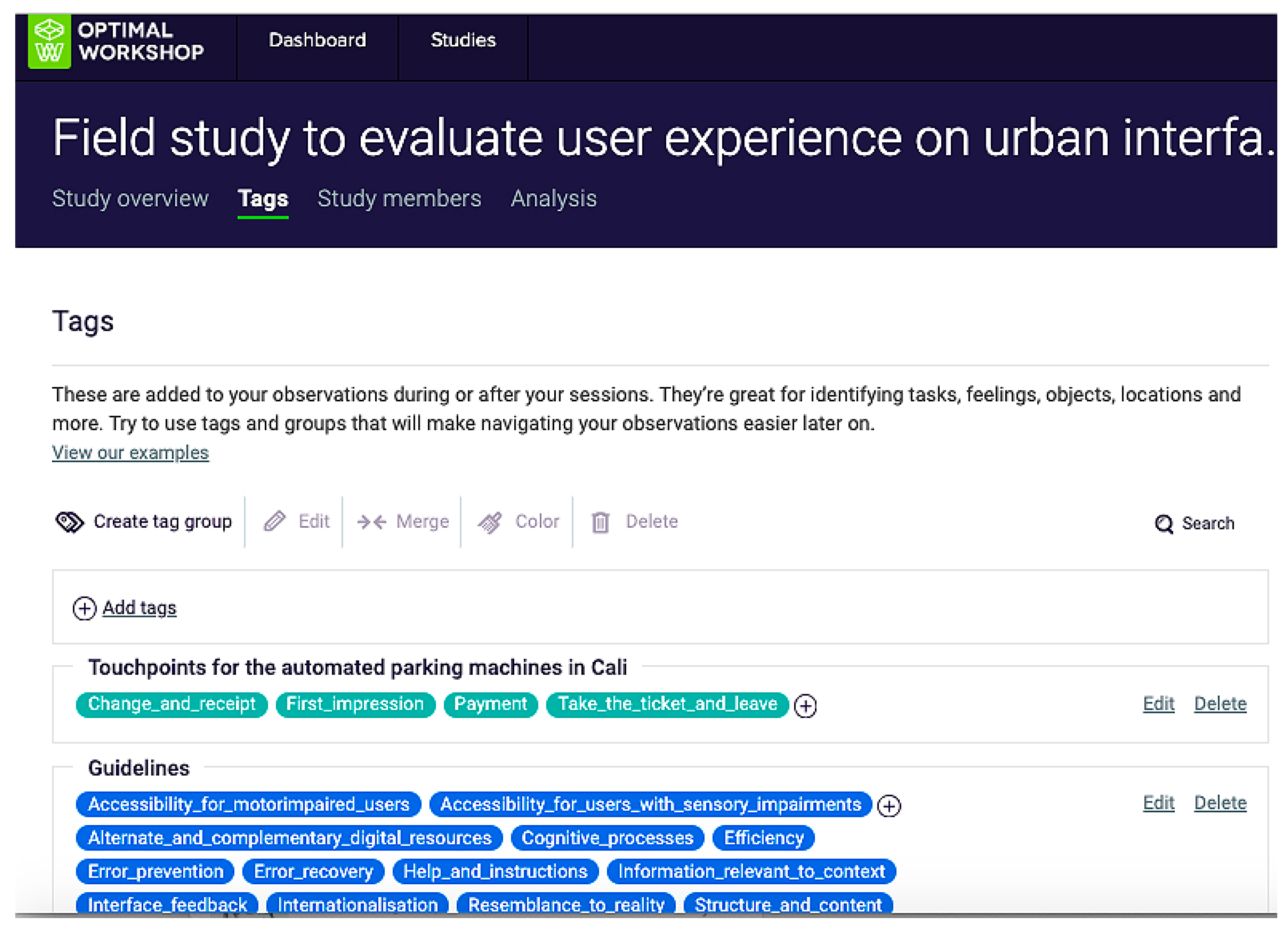
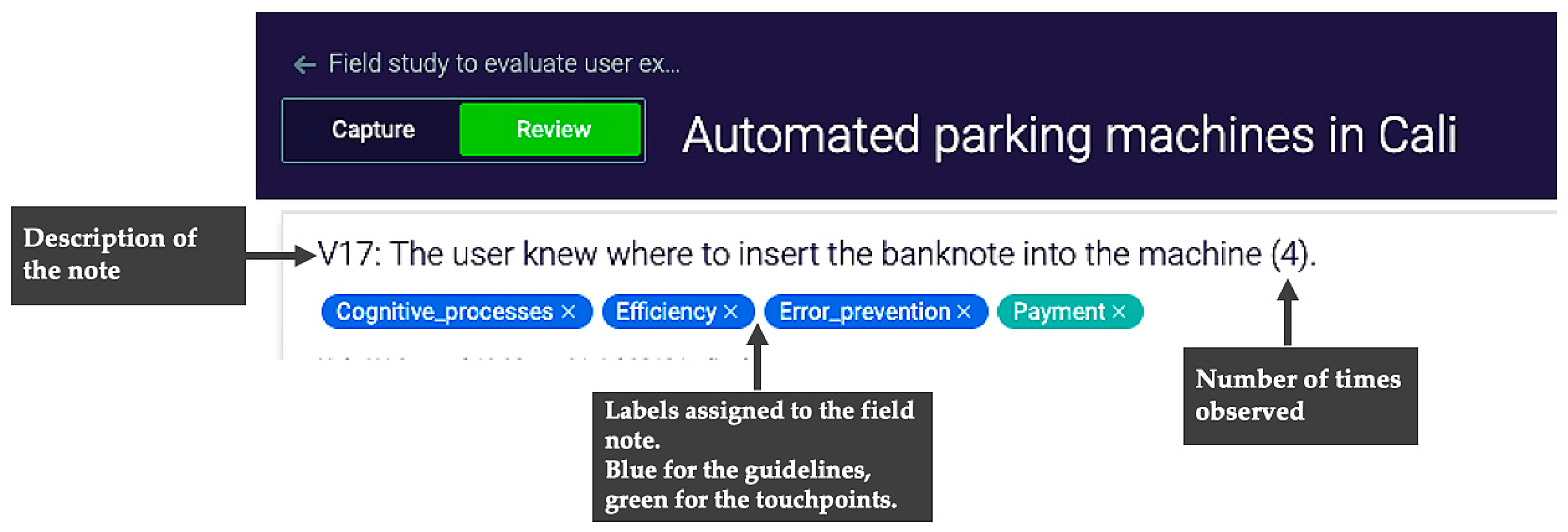
  • Gathering and analyzing results on the use of each interface. To evaluate user experiences both qualitative and quantitative data were collected. Regarding the qualitative data that was collected, researchers documented the following: the aspects of the urban interface that had a negative impact, those that had a positive impact or rating, and any comments offered by the users themselves. Next, the data were recorded in Reframer, a specialized cloud-based tool for logging field study notes and observations. Once notes are logged, the tool then allows users to analyze their notes to detect patterns and reoccurring themes (https://www.optimalworkshop.com/reframer) [51]. In addition, a customer experience map [52], as shown in Figure 2, was used in order to map the emotional journey of the user experience in each touchpoint or moment that a person has contact with an interface. This visual map helps to better understand where the experience was better or worse and to understand which guidelines were followed and which were not.
Regarding the quantitative data, researchers also documented the time taken to complete tasks; at a later stage, this information could be used to determine the cognitive load [53] for each of the interfaces.
All the information gathered both quantitatively and qualitatively following the application of the guidelines in this field study are analyzed to determine the effectiveness of the proposed guidelines to discover problems common to the user experience of the interfaces evaluated.

6. User Experience Guidelines for Designing Urban Interfaces

6.1. Process for Defining Guidelines

As mentioned previously, a review of existing literature was performed in order to develop the guidelines used in this study. This literature review, which is summarized in Table 1, includes details of the authors [22,23,24,26,28,29,30] who propose guidelines, usability principles and heuristics, user-centered design, and ergonomics, amongst others.
Having reviewed each of the proposals put forth by the authors, an analysis was performed to identify any similarities that might exist before grouping accordingly. Furthermore, these were supplemented with points related to urban interfaces that were not covered by any of the revised proposals. For analysis purposes, a review was performed of usability studies that have been conducted in the domain of some urban interfaces. More specifically, this review covered the works of the following authors, amongst others: Abbas [15], relating to the efficiency of a ticket vending machine; Sandnes [54], relating to the usability of kiosks; and Verhoeff [16], relating to perceptions of the screens of interfaces located in the street. A benchmark was established based on this literature review, revealing that the planes evaluated by these studies include digital interface design (GUI), the efficiency of the individual as they perform a task, orientation and assistance provided to a user through the interface, the ergonomics of the machine, inclusion and accessibility. However, cultural factors and internationalization, cognitive aspects and technical know-how, or omnichannel experiences were almost never, or never, taken into account.
The next step involved creating the evaluation guidelines themselves. Each guideline was labelled with a name, a description, and the associated set of situations in which it would be included. The 14 guidelines that were established are detailed in Table 2.

6.2. Description of Guidelines for Evaluating Urban Interfaces

A description of each of the guidelines developed to evaluate user experience of urban interfaces is provided below. Each guideline contains a description and criteria for defining what is evaluated in each instance:
Guideline 1. Efficiency. This guideline evaluates the extent to which a task is completed without deviations or delays. The goal is to determine whether the interface is flexible enough to adapt to different individuals’ requirements. At the same time, the interface was checked to establish whether it provides a range of options for performing any given task depending on the device used to perform the task.
To assess this guideline user behavior must be observed in the following situations:
-
Does a person have the opportunity to skip a step to complete the task?
-
Is he/she able to complete the task without making a mistake?
-
Is he/she able to go one step backwards or all the way back to the beginning?
-
Does a person obtain all the information from only one place?
-
Does a person capture the minimum amount of data?
Guideline 2. Help & instructions. This guideline reviews the way in which the urban interface provides rapid access to the information that solves all the possible doubts that an individual may have.
To assess this guideline user behavior must be observed in the following situations:
-
Does a person have to find information on how to perform a specific step?
-
Is there a way to contact someone in case a mistake is made?
-
Does he/she know exactly what to do to reach his/her goal?
Guideline 3. Structure & content. This guideline measures whether the information is well organized in the interface. It also determines whether browsing allows people to find what they are searching for.
The following situations are useful to determine the extent to which this guideline is complied with:
-
Once a person has completed the task, can he/she remember the steps required to complete it?
-
Does he/she make mistakes when he/she captures the information?
-
Does he/she understand what he/she will find based on the labelling?
-
Can a person access the content in a simple and easy manner?
-
Is there a search engine tool?
-
Are any of the instructions ambiguous?
-
Is the information grouped in such a way that anybody can comprehend how to complete the format and interpret the results?
-
Are there other ways to find the same information?
Guideline 4. Resemblance to reality. To assess this guideline, the use metaphors that allow a person to identify familiar situations in a simple and natural way should be used.
The following situation is useful for evaluating this guideline:
-
Did the individual have previous knowledge of the elements included in the interface before he/she interacted with them?
Guideline 5. Information relevant to context. It shows the necessary information for interaction. However, it is possible to present more data if required.
This guideline is fulfilled by answering the following questions:
-
Does the interface show relevant information?
-
Does the interface constrain the user into having to memorize the previous steps?
-
Is the information clear and concise?
Guideline 6. Error prevention. This guideline determines whether the interface is designed to anticipate a person’s needs.
To define the extent in which this guideline is fulfilled, some questions must be analyzed:
-
Does the interface allow users to choose options that are not valid?
-
Did a person have to consult the same information more than once?
Guideline 7. Error recovery. This guideline analyzes if the interface allows you to correct mistakes and learn from them.
The following conditions must be reviewed:
-
Yes, there was a mistake. Was the person able to recognize what caused it?
-
Do error messages allow a person to identify what went wrong?
-
Do error messages allow him/her to discern how to retrieve and correct the error?
Guideline 8. Interface feedback. In this case, it is important to know whether a person identifies what is taking place while the interface performs a specific action.
The following questions must be studied for the evaluation of this guideline:
-
Did he/she perform an action more than once or did he/she use an element of the interface that wasn’t required?
-
Does he/she know the percentage of progress made regarding task completion?
-
Was it possible to find the desired option without making a mistake?
-
Is a person familiar with the unresolved steps needed to complete the task?
-
Does the interface inform a person whether he/she is performing an action? For example: recording, consulting, information processing
Guideline 9. Cognitive processes. This guideline determines whether the interface was designed for human mental processes. It considers the required workflow and the steps that a person must follow.
The following questions must be revised to evaluate this guideline:
-
Does the interface give the impression of being user friendly? This includes not only the screen but also the hardware’s appearance;
-
Is the information difficult to remember? Does a person need to obtain these data from other sources?
-
Does a user find distractors that hinder the process to complete the task?
-
Does he/she feel safe when using the interface?
-
Does the user feel satisfied after completing the task?
Guideline 10. Internationalization. This guideline determines whether the information in the interface corresponds to the country’s cultural background and whether the information is available in different languages.
The following situations must be reviewed to determine internationalization:
-
Is the content available in relevant languages?
-
Is the text translated properly?
-
Are there available options in the original language to change it to a foreign language?
-
Is it possible to choose the desired alphabet?
-
Are special characters (accents, ñ, etc.) properly used in the text?
-
Are the formats adapted to the country? (date, currency, measure units, names, addresses, etc.);
-
Does the interface use colors that correspond to the country´s cultural background and dismisses those that do not correspond?
-
Are the images and symbols that have been selected appropriate for the local cultural context?
Guideline 11. Visual design. This guideline reviews the initial visual impact of the interface. In other words, it analyzes whether the design is appealing, coherent and minimalist, contrasted, uses visual hierarchy-design and adequate spacing.
The following information must be analyzed to determine whether the interface includes this guideline:
-
Is the same visual processing used in all elements throughout the entire interface?
-
When a large number of elements are used: Are they similar to each other? Can they be mentally grouped together?
-
Is the same structural grid used throughout the interface and across different devices?
-
Does it use a suitable color palette with contrasting colors?
-
Is suitable symbology used to help identify the size relationship between objects?
Guideline 12. Accessibility for motor-impaired users. This guideline determines whether the design took into consideration all possible users, including those with physical or motor impairments.
To evaluate it, the following questions must be taken into consideration:
-
Is it possible to activate and use the keyboard or screen only with a light touch?
-
Are the shapes, texture and spacing between the keys adequate, so that fingers do not accidently slip off keys or accidently press two or more at the same time?
-
Is it easy to access from a wheelchair?
-
Is the height of the machine suitable, according to the country’s standards?
-
Is it possible to access elements using only one hand without adopting awkward or uncomfortable postures?
Guideline 13. Accessibility for users with sensory impairments. This guideline complements guideline number 12 above. All possible users, with their abilities and sensorial limitations were considered as references during the design process.
The following questions must be analyzed to review and validate this guideline:
-
Is there an option of listening to audio using a clearly marked headphone jack?
-
Does the interface work for everyone and every task that they attempt to perform?
-
Does the interface present information in formats that people living with disabilities can recognize?
-
Is there a way to tailor preferences to the individual user?
Guideline 14. Alternate and complementary digital resources. This final guideline shows whether other digital channels exist that complement the main channel, e.g., a mobile phone to accompany the use of a kiosk so that a person may use different communication channels to interact with the interface.
The following questions must be studied to ensure the accomplishment of this guideline:
-
Can a user select one or multiple information output channels to complement the interface process? (e.g., receiving an email or SMS containing ticket details, or topping up a card via a mobile);
-
Can a user select one or multiple information input channels? (e.g., using a printed ticket, using a card with a bar code, scanning a code);
-
Is it possible to interact using a digital mobile device or other type of digital device?
-
When necessary, is it possible to make payment using different payment methods other than cash? (Debit or credit cards, electronic money transfers, etc.).

7. Field Study to Evaluate User Experience of Urban Interfaces

As mentioned previously, a field study was performed using a qualitative approach in order to evaluate user experience and test the hypothesis. According to Hernández Sampieri [55], Marsh [36] and Farkas [50], a qualitative approach should be used when attempting to examine the manner in which individuals perceive and experience the phenomena that surround them, and thus make it possible to delve into their points of view, interpretations and the significance they attribute to things.

7.1. Selected Urban Interfaces

The field study was performed in the cities of Monterrey and Mexico City in Mexico, and in Bogotá and Cali in Colombia.
In each city researchers selected between two to four interfaces belonging to different public and private institutions. Table 3 details the interfaces evaluated.
More detailed descriptions of each urban interface are provided below:
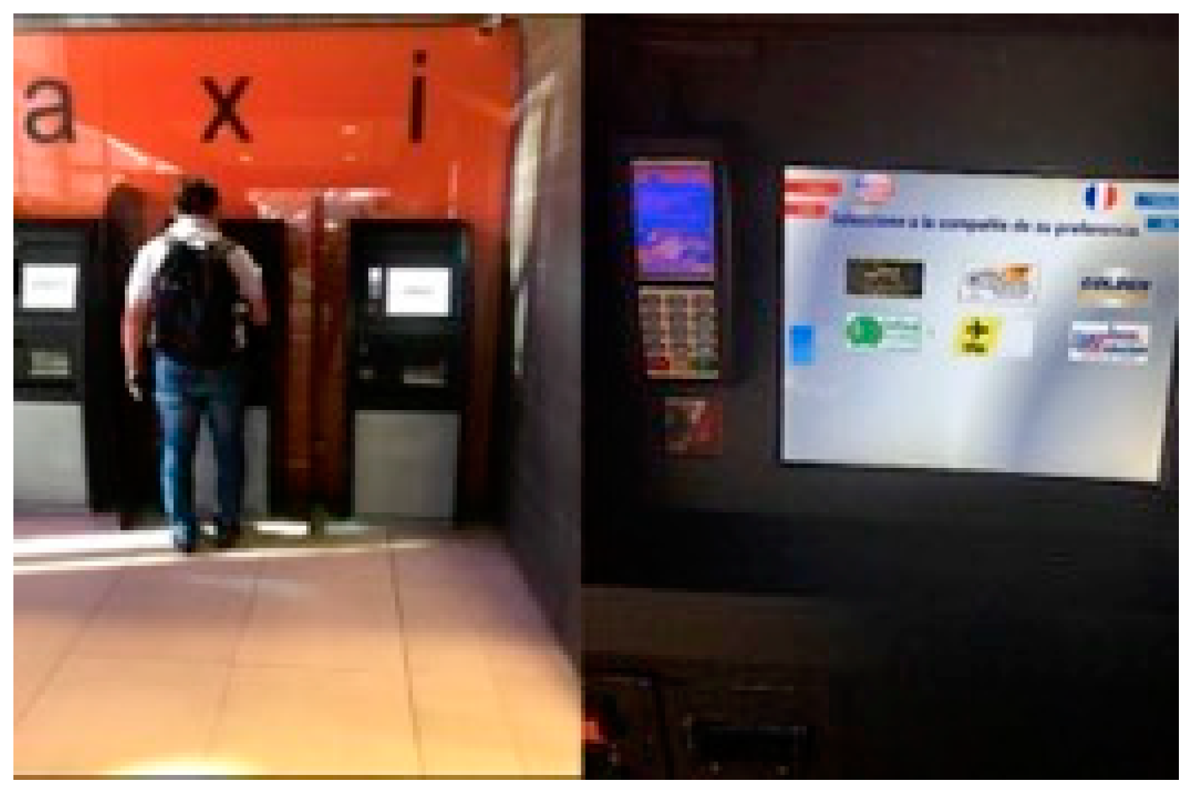
  • Taxi ticketing kiosk in the Monterrey International Airport for purchasing airport transfer. This interface is located inside the airport building and is the only official means of buying a taxi ticket for an airport transfer service to the city. The kiosk is managed by a private company. It accepts different payment methods: Bank cards and local currency in the form of bank notes and coins. Its target audience includes national and international citizens. Figure 3 provides a general and more detailed overview of the interface.
  • ATM CFE-Mático for paying electricity bills. This interface is one of the official means for paying electricity bills. It is aimed at the entire population of Mexico and can generally be found inside the offices of the Comisión Federal de Electricidad, which belongs to the Government of Mexico. The only accepted payment method is banknotes and coins. See Figure 4 for details.
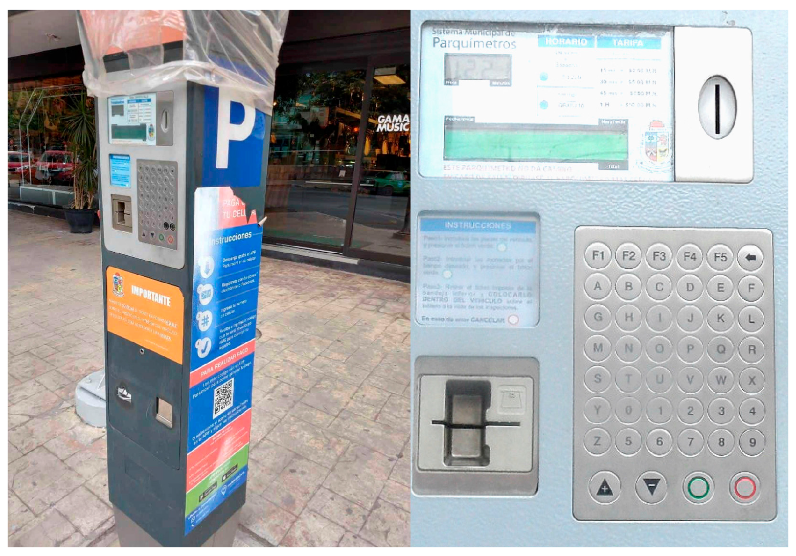
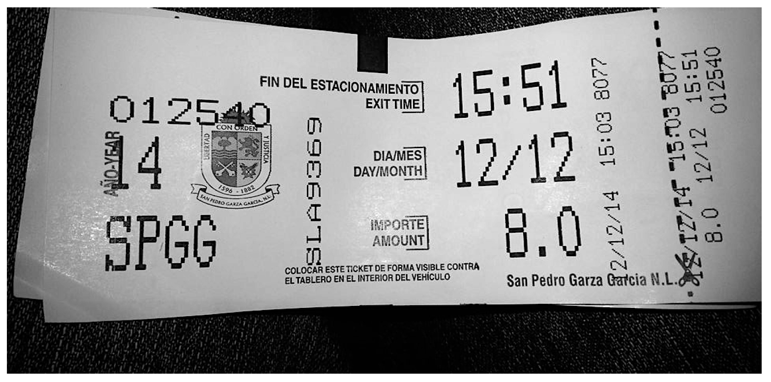
  • Parking Meter of San Pedro Garza García Town Hall. This device is used to collect payment for outdoor parking in the city’s streets. The interface belongs to the Town Hall of San Pedro Garza García, which is located in Monterrey, Mexico. The target audience is any individual who parks their vehicle on a public road Accepted payment method include local currency, bank cards and a mobile app. See Figure 5 for details.
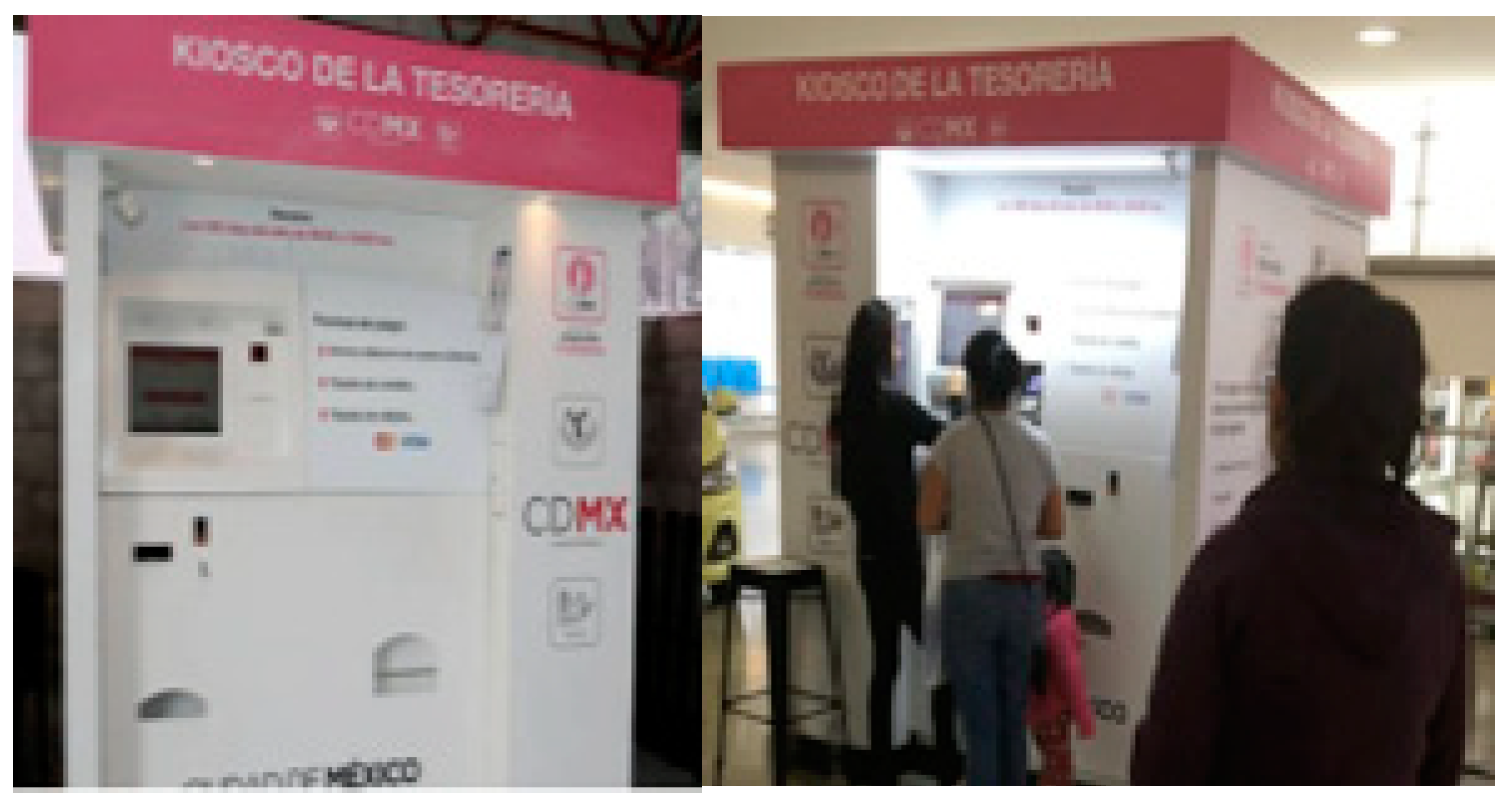
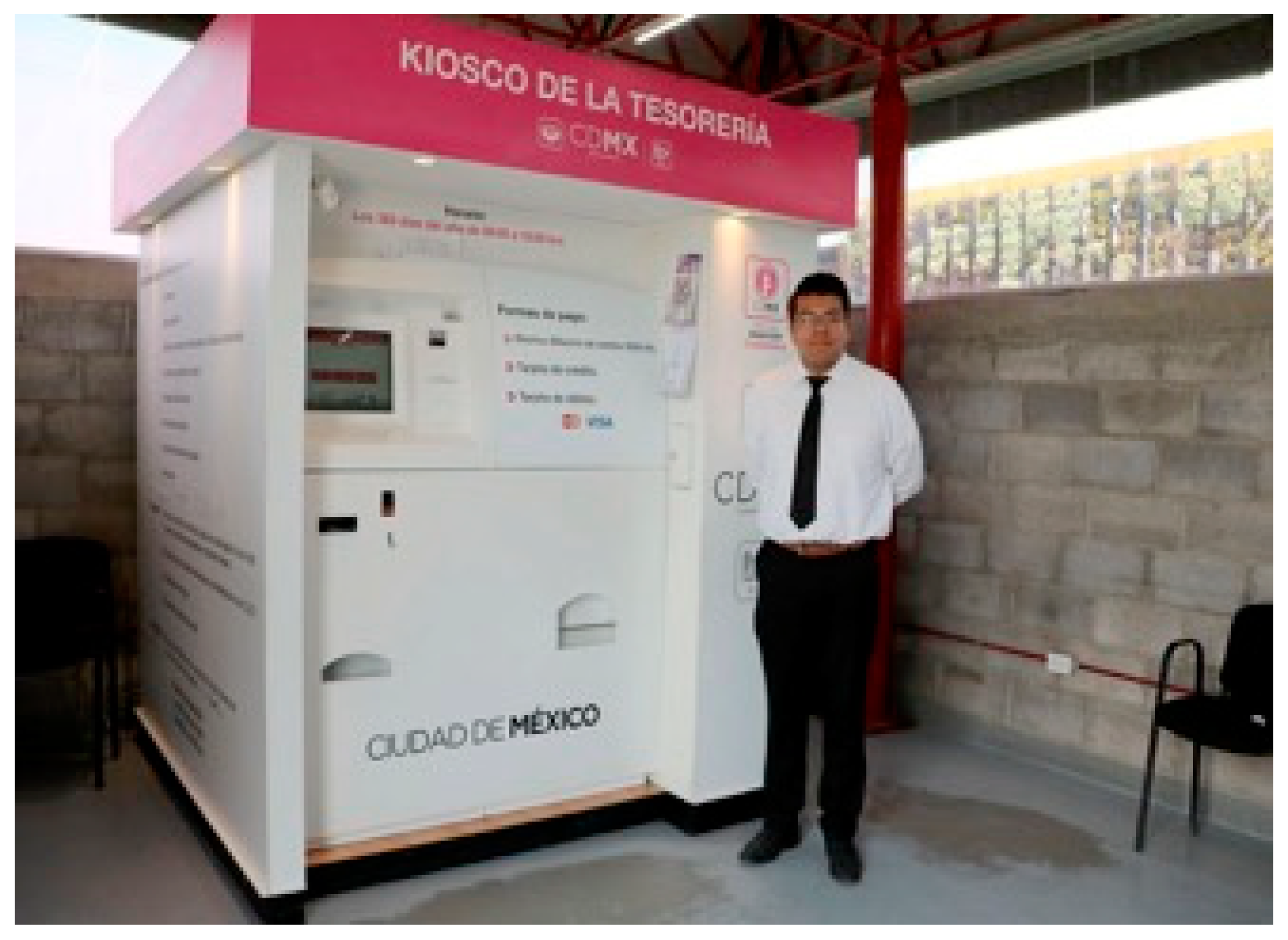
  • Mexico City Government Treasury Kiosk. This kiosk is used by the entire population of Mexico City to perform official bureaucratic processes, such as obtaining birth certificates or paying local taxes. It only accepts bank notes and coins. See Figure 6 for details.
  • Metrobús ticket vending machine for public transport in Mexico City. This machine is can be found at different sites across Mexico City, such as the airport, local bus stations, and in the underground station. It is aimed at local residents and tourists alike. The machine is owned by the Metrobús government consortium. Accepted methods of payment include bank notes and coins, and bank cards. See Figure 7 for details.
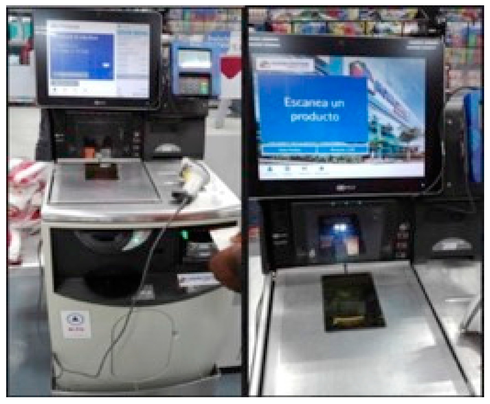
  • Home Center Self-Checkout Machine in Bogotá. This interface is located inside the shop called Home Center, which sells construction and DIY materials. The self-service checkout provides clients with an alternative way in which to pay for the goods they wish to purchase. See Figure 8 for details.
  • Automated parking machines in commercial shopping centers in the city of Cali. This machine is located in malls and shopping centers in Cali. It is used to charge a parking fee for parking a vehicle inside the premises. See Figure 9 for details.
  • Cine Colombia Ticketing Kiosk in Bogotá. This machine is located inside the cinema building and can be used to buy tickets for any performance any day of the week. The process involves selecting a film and performance time, using a rewards card, and making payment. See Figure 10 for details.
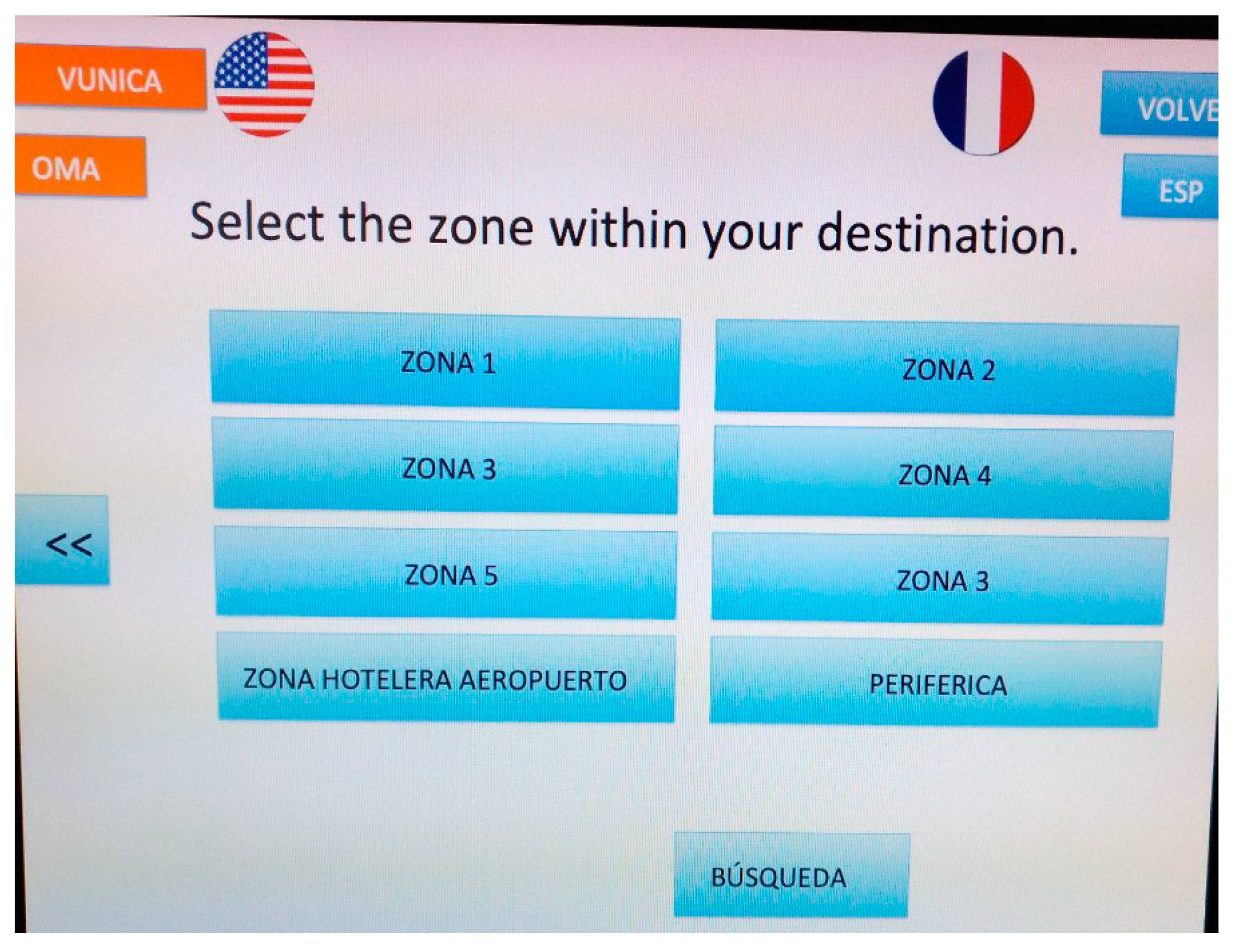
  • Mío top-up terminal for public transport in Cali. This machine is aimed at local residents and foreign visitors who wish to use public transport in Cali. It is used to top up a travel card with funds and can be used in any station. See Figure 11 for details.

7.2. Description of Observed End Users

It is evident that each of the interfaces studied has an intended audience and the different audiences display different demographic characteristics, socioeconomic backgrounds and levels of technological know-how. To determine the number of individuals observed in this study, it was recognized that in qualitative research the sample size is not established prior to gathering data, but instead a unit of analysis is determined and from this an approximate number of cases is obtained. However, the final sample is not known until the point of saturation is reached, which is the point at which new data does not provide new or different findings [56,57].
To establish the attributes shared amongst the individuals to be observed, researchers used the user-centered design technique [58,59]. For each interface archetypes were defined that represent the different audiences that would typically use each interface. Table 4 show the details the groups were observed using each urban interface.
Details are provided below on how each of the observed groups was organized:
  • Taxi ticketing kiosk in the Monterrey International Airport for purchasing airport transfers. Three groups of potential users of this kiosk were identified: foreign visitors on business trips, parents who are holidaymakers, and foreign students attending a local educational institution for study purposes. In each case, these individuals require a taxi service, and are unfamiliar with the interface. It is important to mention the presence of an additional variable: An individual’s native language. The kiosk offers information in Spanish, English and French, but in each group, there are individuals who may need to use the kiosk in different languages. The rest of the characteristics are displayed in Table 4;
  • ATM of CFE-Mático for paying electricity bills. Three groups were established: female homemakers dedicated to housework, parents with a stable job, and elderly people who have retired and collect a pension. In each case, these people use the machine to pay the electricity bill corresponding to their permanent address. In this instance, individuals’ familiarity with making payments via this digital channel was also taken into consideration, as some individuals will have used this method before whilst others may not. Table 4 displays the full set of characteristics of this group;
  • Parking Meter of San Pedro Garza García Town Hall. Three groups were formed consisting of individuals who need to pay for parking using an urban interface. Firstly, those visiting a local bank or business near the car park when time is a factor; secondly, those visiting a local restaurant when time is not a factor; and thirdly women who going shopping who are not sure how long they will take. It is important to mention that one criterion that was taken into consideration was that the individual using the car park must be the owner of the vehicle in question. Additionally, researchers also checked that the people did not work in any of the nearby businesses. Table 4 displays the full set of characteristics of this group;
  • Mexico City Government Treasury Kiosk. Three groups were observed: Business owners or managers needing to perform business activities, and pensioners or parents needing to perform personal bureaucratic procedures. In each of these groups all individuals lived in Mexico City. Table 4 displays the full set of characteristics of this group;
  • Metrobús ticket vending machine for public transport in Mexico City. Three groups were formed: individuals living in the city who have stable employment and who need to move about locally, tourists who are in the city and need to use public transport for a short period of time, and students who live in the city and need to get to one of the local academic institutions on a regular basis. As in the case of the airport taxi kiosk, the native language of users was taken into account, as tourists may need to use the machine in another language. Table 4 displays the full set of characteristics of this group;
  • Home Center Self-Checkout Machine in Bogotá. Three groups were observed: self-employed professionals dedicated to construction and maintenance, maintenance employees, and individuals doing DIY and remodeling their homes. In each case the individuals observed lived in Bogotá. Table 4 displays the full set of characteristics of this group;
  • Automated parking machines in commercial shopping centers in the city of Cali. Three groups were considered: individuals going to the commercial shopping center to go shopping, students taking a stroll and window shopping or hanging out with friends and pursuing leisure activities, and elderly people attending a specific activity in the shopping center at a specific time of day who limit their visit solely to said activity. In the case of the first two groups it was understood that they do not go the shopping center on a specific schedule or for a limited amount of time. As in the case of the San Pedro Garza García Town Hall parking meter, everyone using the machine had to be the owner of the vehicle in question and they could not be workers from nearby businesses. Table 4 displays the full set of characteristics of this group;
  • Cine Colombia Ticketing Kiosk in Bogotá. Three groups were formed: parents going to the cinema with their partner or children at the weekend or on a specific date, students going to the cinema in groups, and individuals who are cinema fans. Also taken into consideration was whether individuals held a cinema rewards card or not. Table 4 displays the full set of characteristics of this group;
  • Mío top-up terminal for public transport in Cali. Four groups were formed: Local residents with stable work who need to get around the local area, tourists who are in the city and need to use public transportation for a short period of time, people living in rural communities or nearby areas who need to go into the city to complete bureaucratic processes, and students living in the city who need to get to local academic institutions on a regular basis. As in the case of the airport taxi kiosk, the native language of users was taken into account, as tourists may need to use the terminal in another language. Table 4 displays the full set of characteristics of this group.

7.3. Planning of Field Study

Several planning activities were run prior to the execution of the field study, which included: Defining the work method for evaluating the interfaces described and designing a series of materials that would be used by the research team.

7.3.1. Research Method

Different research techniques were reviewed prior to performing the field study [60], predominantly those focused on discovering problems using a qualitative approach, rather than a quantitative approach. As several different research techniques exist, a literature review that includes Farkas & Nunnally [50], Marsh [36], Rohrer [37], and Murthy [60] was performed in order to select the most suitable approach for this study. When deciding on the approach that should be used, the following criteria were taken into consideration: (1) Analyze people’s behavior, not only their attitudes, when they use interfaces, (2) conduct research in the actually physical setting and context of the urban interface, and not in a simulated context, and (3) minimize researcher intervention whilst people perform tasks.
In accordance with these criteria, and in line with that stated Reeves [61], it was determined that the use of an observation technique would prove the most suitable approach for this study. Even, Reeves states that this technique “enables researchers to “immerse” themselves in a setting, thereby generating a rich understanding of social action and its subtleties in different contexts. Observation also gives researchers opportunities to gather empirical insights into social practices”.
Subsequently, the number of real users the study could be conducted on was established. The purpose of this was to apply the guidelines to real-world cases with the intention of reviewing whether it was possible to identify user experience problems on the urban interfaces selected. With regards to this, Spool [62] and Faulkner [63] have stated that usability tests should include as many participants as possible, and attempt to encompass heterogeneous groups, as this can help identify more problems in each round of testing. Other authors, such as Romano [64] have said that the evaluation and validation exercises must be repetitive and iterative, once again for the purpose of identifying as many problems as possible. On the other hand, authors such as Virzi [65] and Nielsen [56,57], have proposed using smaller sample groups in each round of testing as a way to deliver faster results and reduce costs.
Limited time and resources were available to perform the field study. Researchers were only able to perform one round of testing of the proposed guidelines on the interfaces described herein. The main objective of the study was to see the guidelines in action and review whether they cover all facets of the user experience on an urban interface, rather than attempting to identify all usability issues. Based on this, a decision was made to use approximation based on Discount Usability, as proposed by Nielsen [66]. According to Nielsen [56,57], it is estimated that research must include at least five users of similar characteristics in order to obtain results in a piece of qualitative research with users. Although questions have been raised regarding this effectiveness of this type of approximation [62,67] it did prove useful when applying the 14 proposed guidelines.
In this study, there were at least six users in each of the groups described above. The field study involved the observation of 168 individuals as they used the aforementioned interfaces.

7.3.2. Materials

Recruitment screeners [68] were designed in order to streamline research and evaluation activities. This material consisted of a brief questionnaire that served to identify the profile of each individual being observed. Additionally, observation guidelines were also produced [36,68] that indicated the touchpoints that the researcher had to observe when a person performs a task or activity on an urban interface. Real-time note taking for each observation made during the field study [68] was made possible using a commercial web-based tool called Reframer by Optimal Workshop [51]. This tool not only allows users to log their notes but classify them so they can be analyzed later using sets of criteria. In the case of this study, each note was classified as corresponding to one of the 14 proposed guidelines. This can be seen in Figure 12.
Lastly, an interactive web-based system was used to ‘rate’ the extent to which each of the 14 guidelines was followed, or not. This web-based system also proved useful in documenting the time taken to complete tasks [53] associated with each interface. The web-based system can be accessed using the following link: http://app1.usaria.mx/urbix/index.html. It can be freely used to evaluate any urban interface. Figure 13 shows this web system.

7.3.3. Field Study Logistics

Research groups were established in each city in order to perform the field study. These groups were managed and supervised by the authors. The study was conducted on the following dates in each city:
-
Monterrey: November 2017 to February 2018,
-
Mexico City: February to April 2018,
-
Cali: July to October 2018,
-
Bogotá: September to December 2018.
The procedure used for observing each interface is detailed in Table 5 below. This group of activities was repeated for each of the individuals observed.

8. Debriefing & Analysis of Results

Once observations were completed the data collected was analyzed to identify common trends relating to user experience on the selected urban interfaces. In addition, researchers analyzed how the guidelines helped contextualize and understand the problems encountered and most common research opportunities that emerged from the field study.

8.1. Classifying Field Notes

As previously explained, the field notes were taken down by different research teams based in each city. One of the challenges encountered in this process was ensuring that the information being gathered by the researchers during observation sessions was standardized [69]. Once again, the Reframer tool was used in order to achieve consistency in data gathering. The process used was as follows:
Defining tags. Reframer allows users to define tags that serve as metadata for grouping and classifying field notes. The following tags were established for each of the urban interfaces being assessed: one tag of each guideline, and one tag for each interaction touchpoint identified in the observation guidelines. Figure 14 shows an example of this definition for the urban interface of the automated parking machines in Cali. The 14 tags in blue contain the names of the 14 guidelines, and the tags in green contain the four touchpoints that a user will have to interact with on the interface. This activity was performed for each of the urban interfaces evaluated.
Debriefing: field notes and classification based on tags. Researchers held debriefing meetings once observation sessions had been concluded in order to review the field notes collected. The objective of these meetings was to avoid the duplication of similar notes, and at the same time, to revise the frequency with which commonplace issues arose at each touchpoint. Each field note was logged once using Reframer, together with a short description of what had been observed. If the observation occurred more than once, researchers noted the frequency with which it occurred in brackets. Finally, tags were assigned: A minimum of one tag was used per guideline and per touchpoint. By way of example, Figure 15 shows a field note that has been logged in Reframer. This particular log pertains to the automated parking machines in Cali.

8.2. Analysis of Information

Once the classification of all field notes was completed, an analysis of observed data was performed. The objective of this was to obtain a synthesis of the user experience problems encountered on each urban interface studied. To do so, researchers followed the proposal by Watkins [70] who said that a ‘reduction of data’ should be performed in order to obtain concise information. In particular, the following activities were performed:
Analysis of frequency and repetition. Reframer was also used for this step as it allowed field notes to be clustered based on the tags and classifications previously applied. Once this had been done, researchers could analyze the following: The guidelines in which there were more problems and areas of opportunity according to the experience of individuals, and the touchpoints where this occurs with the highest frequency. Figure 16 shows this analysis using the automated parking machines in Cali as an example.
Analysis by relationship. In Reframer existing relationships were reviewed according to the field notes recorded. This allowed researchers to cross reference data and answer questions such as: Which touchpoints demonstrated more problems for a given guideline? Were more problems encountered for a given guideline? Which guidelines have a greater impact on a particular interaction with the interface? In the next case, in Figure 17, it is possible to observe by way of example the relationship between the efficiency guideline and the interface touchpoints of the interface for the automated parking machines in Cali. It is possible to observe that there is a strong relationship between efficiency and the payment touchpoint, and also the moment in which users receive change and obtain a receipt. In addition, it is possible to observe that it has an impact to a lesser extent on the touchpoint Get ticket and Leave.
To complement this analysis of the relationships, researchers developed customer experience maps [52] to display the emotional journey for each of the interfaces observed. Researchers used the same touchpoints that had been defined for each interface. A customer experience map was created for each audience or group observed to compare whether differences or relationships exist between these. This was also useful for understanding how the information recorded for each field note related to the user experience of each group of individuals observed. In addition, the time individuals spent completing each touchpoint was recorded in the web-based tool developed for this study. The purpose of this was to obtain information that would help understand the efficiency from a qualitative standpoint. Figure 18 displays the emotional journey of the customer experience map for Group 3: Pensioners on the interface for the automated parking machines in Cali.
Identify problems and findings. In Reframer, researchers organized the list of guidelines once again, this time based on the quantity of field notes that were recorded. This was performed for all the interfaces. Once done, researchers reviewed the texts described in all the field notes that had be logged and classified previously. In particular, they analyzed the concept and ideas mentioned most often. As the field notes had already been tagged, it was possible to identify reoccurring problems in all interfaces that affected user experience, and also the guidelines and touchpoints that these problems relate to. This activity was complemented with the customer experience maps to identify touchpoints where there are future research opportunities; a total of eight important problems were identified as a result. These problems are outlined in the Table 6.

9. Results and Findings

The main findings from this field study are presented below. Throughout they demonstrate that a lack of attention has been paid to user-centered design in each of the interfaces/hardware analyzed.

9.1. The Majority of Interfaces Are Not Designed for Users with Disabilities

Urban interfaces must be inclusive. In other words, individuals with or without visual, physical, motor or cognitive impairments should be able to use them without discrimination [28]. Unfortunately, the following issues were identified in all of the interfaces in this field study:

9.1.1. Interfaces Do Not Consider Issues Pertaining to Visual Impairments

Visual impairments were not taken into consideration. In some cases, the use of color proved ineffective for people with color vision defect, thus making the task of identifying certain actions using color too complicated for this type of user. This issue can be seen in Figure 19 below; a user who perceives color is able to easily identify which button should be pressed, whereas those individuals with color vision defect find the task of differentiating buttons virtually impossible.
This problem translates into longer decision-making and interaction times. A person without any form of visual impairment takes under one second to respond, whilst a person with color vision defect takes on average four seconds to respond. In addition, 40% of these users also fail to choose the correct option.

9.1.2. The Ergonomics and Hardware Design Are Deficient

It has been assumed that everyone is of ‘average’ height, thus anyone who falls outside this range is not considered or catered for [29]. Figure 20 shows two people standing next to machines and it is possible to see that everything is within their reach. However, wheelchair users would find it impossible to access the controls and interact with either of these interfaces.
Furthermore, most interfaces do not have braille or support audio-based navigation for the blind, which is despite much of the hardware containing the technology that would be required to do so. Any audio technology that was encountered served only to request assistance for resolving a problem with payment or a technical glitch with the interface itself. See Figure 21 for details.

9.2. Poor Attention Paid to Internationalisation and Foreign Visitors

9.2.1. Cultural Differences Fail to Be Taken into Consideration

In most of the urban interfaces studied researchers identified that no consideration was paid to cultural differences, meaning individuals from different geographic regions would struggle when using the interfaces from a particular city or region.
In particular, one of the main problems that consistently arose was the lack of foreign language options for tourists of foreign business visitors who do not speak the local language. This type of situation means that foreigners cannot use the interface or misunderstand instructions and as a result make more mistakes. This is shown in Figure 22.
In other instances, when the interface does offer multiple languages, it was found that translations were incomplete or terminology was poorly translated (see Figure 23).

9.2.2. Use of Uncommon or Unknown Words, Information and Data

Certain challenges exist for people who have changed address and moved to a city with urban interfaces. In many instances these challenges have been overlooked during interface design. At certain moments users are asked to fill out information or data that they are unfamiliar with, or the interface presents them with concepts they are unfamiliar with as a result of being new to the city. This issue translates into the problem of the user either not knowing how to continue or not being allowed to continue. This is shown in Figure 24.

9.3. Digital Urban Interface Design Limited to the Digital Context

The greatest scope of opportunity lies in two areas: Hardware design and the physical positioning of urban interfaces. In the analyzed interfaces it was observed that design efforts focused mainly on digital elements, in other words on the screen, whilst ignoring important aspects that influence user experience.

9.3.1. Hardware Location and Weather Conditions

Hardware is frequently placed in locations where weather conditions and extreme temperatures affect users, either making users physically uncomfortable or making it near impossible to read the screen. The number of mistakes made by users increases when they are unable to read the screen due to intense light sources. Rain, cold weather or extreme heat can also interfere with the hardware causing damage and technical glitches. Examples of these situations have been captured in Figure 25.

9.3.2. Context and Physical Location

Given their ‘urban’ nature, the machines studied are placed in spaces where physical, social or cultural variables will affect, and may complicate, their use. For example, in areas where crime rates are higher modifications are introduced to protect hardware. These features may affect the interface and lead to a poor user experience or difficulty completing objectives. This issue is demonstrated in Figure 26.

9.3.3. Improvised Directions and Instructions

The hardware design of the digital interface sometimes does not guarantee intuitive or useful instructions in order to be more efficient and avoid inconveniences when offering instructions. To resolve such shortcomings, researchers observed that on occasion improvised signage containing instructions on how to use the interface was placed on the hardware itself, or on nearby walls and surfaces. This is shown in Figure 27.

9.4. Urban Interface Processes Have a Larger Cognitive Load than Personal Interface Processes

One of the main issues observed was that urban interfaces, unlike ‘conventional’ interfaces that use a computer or mobile device, demand a larger cognitive load; this is despite the fact that the processes involved are simple and repetitive [53]. The main reasons for this are listed below:
-
Unlike other systems, urban interfaces are not used as frequently, or may even only be used once. This is most evident when a person performs a transaction for the very first time and is completely unfamiliar with the interface. It was observed that for some interfaces individuals spent up to 30 s trying to understand where to start, and another 15 s going from one step to another. A psychological factor that has a negative impact on individuals and makes them take longer to perform actions is a perception of pressure from others waiting in line;
-
Another issue that increases the cognitive load and response times is related to bad emotional design [27]. Psychological factors that influence decision-making are not taken into account when actions are executed in the interface. In Figure 28, the keyboard is laid out in alphabetical order despite the majority of people being familiar with the QWERTY keyboard layout;
-
Different characteristics and limitations unique to different demographic and psychographic audiences have been overlooked. These limitations can make an action more difficult for some groups to perform. These types of situations are extremely evident in government interfaces, such as those shown in Figure 29.

9.5. Poorly Designed Service, Isolated Processes, and Lack of Omnichanneling

Many urban interfaces were not designed with a holistic experience in mind, despite the fact that many urban interfaces work as an extension of other digital channels, e.g., websites or mobile apps, or require additional technology in order to function, e.g., swipe cards.
Many of the interfaces observed perform limited processes that cannot be completed using other digital channels, i.e., the sale of public transport tickets. In this example, users are forced to use the urban interface and cannot use a mobile app, or similar, to achieve their goal.
It is also common for a digital interface to have a different number, or different sequence, of steps compared to the same process using other channels. In addition, the information received may be different despite the process being unchanged. In other situations, such as that shown in Figure 30, you could receive a ticket or other physical element that does not contain any instructions regarding what the user should do with it. In Figure 30 it is possible to see an image of a parking ticket that should be displayed on the dashboard of the vehicle as proof of payment, however it does not contain this vital instruction and thus the individual has no idea what to do with the physical ticket itself.

9.6. The Interface Requires ‘Independent’ Add-Ons in Order to Offer Omnichannel Processes

Although smart cities seek to foster omnichannel processes, all too often these processes are not contemplated in the design of many urban interfaces. This can be seen in interfaces that need to be complemented by another interface, where a physical and digital connection is clearly required.
Ideally, the omnichannel processes should be contemplated from the get-go so that it is possible to identify all the channels people want to interact with via user research. Given that this is usually contemplated at the end of the design process, there are some cases, such as that shown in Figure 31, in which several interfaces are needed for a single process.

9.7. Greater Focus on Efficiency than on Learning Process

A common feature shared by all the urban interfaces observed is that the design focuses on speed and making users spend the least amount of time possible performing an operation. This is a valid approach given these interfaces are used by the general public for very specific uses. However, the interface design does not include elements that allow the user to learn the process, e.g., simple hints & tips, visual cues, and emotional elements that make the experience more memorable and that make it easier to remember the steps that are required to complete a task.
As a result of the situation described above, users are forced to learn the process from scratch when they have to use the interface again in the future. This creates an unsatisfactory experience, and paradoxically makes people less efficient. This is particularly evident in cognitive load and time invested, as explained earlier.

9.8. Face-to-Face Human ‘Support Staff’ Become Indispensable

The main consequence of poor urban interface design is reflected in need for support staff to provide institutional support. This support could be provided in the form of improvised handwritten notes, remote support, or even onsite personnel to answer questions or to perform the task on behalf of the user. The latter proves extremely expensive in terms of personnel costs and is quite unnecessary when interfaces are well designed. This type of support is shown in Figure 32.
In addition, the human factor may cause delays, as staff will need to ask questions and offer advice on other matters relating to the process being completed on the interface. In the end, this translates into more time being invested.

10. Discussion

The evaluation of user experience on urban interfaces must not be overlooked and is an essential part of any ‘smart city’. An evaluation tool that forms part of the design & development cycle or acquisition cycle of an urban interface is of vital importance if user-centered design is to be guaranteed.
Using an evaluation tool such as the guidelines proposed in this study will add value if applied to the design and development stage or acquisition stage of urban interfaces. This was not possible in the case of this study as the tool was tested on urban interfaces already in use. Had the eight interfaces been evaluated using the proposed tool prior to their launch some costs associated with poor design could have been avoided, i.e., expenses covering additional support staff to help users use the interface, or additional plugins or hardware to complement the interface functions, amongst others.
Although the proposed guidelines were tested in different cities in two different countries, there are more social and cultural contexts in which they should be tested and evaluated. In particular, the tool should be tested on interfaces in rural areas to establish whether people’s technical know-how and the infrastructure itself might influence results differently to an urban area [71]. This could lead to the creation of a new guideline or supplements for existing guidelines.
Likewise, some communities contain different ethnic groups, thus different customs are practiced within the same community. The internationalization guideline may need to take facets like this into account.
The technological trends inherent in a ‘smart city’ [72] that relate to virtual reality, augmented reality or biometric recognition need to be reviewed in order to verify whether they have an impact on any of the guidelines, especially those relating to alternate and complementary digital resources.
The amount of data and personal data being collected within a ‘smart city’ is constantly growing [12]. The actions related to the acquisition and use of these data in an urban interface can influence people’s perceptions of these interfaces and user experience. Such situations must be evaluated, because a better quality of life for users depends on it and cannot be considered as an isolated element. Interfaces with a user-centered design improve the quality of life as a citizen.
For all eight interfaces evaluated, a recurrent issue that was observed was that manufacturers or organizations failed to address accessibility and inclusion. Of the heuristics that were reviewed in the literature, only WAI [28] contemplated the topic of accessibility, and mainly in relation to websites. The remaining heuristics that were reviewed, however, ignore more specific accessibility issues, such as: Accessibility for the elderly; accessibility for individuals living with some form of physical or intellectual impairment, e.g., color vision deficiency; or some form of temporary disability, e.g., a fractured bone. The guidelines proposed in this study do take these issues into consideration.
The proposed guidelines raise questions examining internationalization, which in the reviewed literature are only expressly contemplated in the proposal by Russo & Boor [30]. During the field study tourists and individuals who had recently moved to the city were frequently observed struggling to complete tasks.
As mentioned previously, when addressing the question of efficiency researchers identify an increase in completion times [53]. For each of the eight interfaces this primarily occurs upon first contact with the interface and when waiting for a transaction receipt or refund from the interface. Even though other guidelines, methods and heuristics already exist for measuring efficiency [73,74], the guidelines proposed in this study seek to review additional questions that influence this point, i.e., social pressure whilst waiting in a queue, age, and technological know-how, amongst others.
From the results, it was evident that the physical location of an interface proves important. The weather conditions, nearby surroundings and safety considerations can all influence a user’s experience. This is not defined as a specific guideline; thus, it could be studied in greater detail for inclusion at a later date.
As previously described, the field study was conducted using Nielsen’s Discount Usability model [66]. Even though this approximation is not the most suitable for a piece of scientific research, in this case it allowed researches to see the guidelines ‘in action’ with real users and interfaces. According to Spool [62], Faulkner [63], and more recently Cazañas [67] a formal piece of research requires more users, iterative processes and more heterogeneous groups to be able to make more validations. In a real-world context—one in which an organization has the resources to run a study on a larger scale with sample groups containing a wider range of participant profiles—steps could be taken to address this problem [75], and in doing so more precise data could be gathered.
The field study revealed the need for guidelines specific to the domain of urban interfaces, rather than generic guidelines and heuristics. As previously explained, the use of generic proposals requires steps be taken to try to bend and adapt the existing proposals identified in the literature review to problems and situations that are exclusive to the realm of urban interfaces. Additionally, as mentioned by Othman [19], González-Holland [76] and Bader [21], many of the proposals reviewed in the literature were developed prior to the invention of different technologies that exist today.

11. Conclusions, Challenges and Future Research

Urban interfaces lack user-centered design. In the majority of cases this serves to complicate the main objective for which they were originally designed and developed. This fact strengthens the hypothesis presented at the start of this paper. The proposed guidelines that were designed to evaluate user experiences of urban interfaces and tested in this study can also be used to evaluate any urban interface in the public or private sphere. However, other factors must be taken into account in order to consolidate the design of user-centered urban interfaces, and thus ensure the transition towards ever-smarter smart cities. Joshi [4] proposed six pillars for developing a framework for smart city development: Social, Management, Economic, Legal, Technology, and Sustainability (SMELTS). Using these pillars, it is possible to list a number of challenges regarding the evaluation of user experience on urban interfaces:
Challenge 1. Economic and legal variables. On numerous occasions, the decision to purchase an urban interface revolves around whether or not there are available funds. However, the absence of a comprehensive assessment of an urban interface that includes guidelines such as those that have been described may incur hidden costs, including training, support staff, limited operating hours, and, in a worst case scenario, a shorter interface lifecycle. It is vital that evaluation instruments be included in the rules for public procurement and tender processes pertaining to urban interfaces to ensure that the design of said interfaces is suited to the target audience;
Challenge 2. Digital transformation of organizations. Digital transformation involves changing several variables within an organization, one being the maturity of the user-centered design approach that is adopted. For innovation to be possible, validation mechanisms must be in place that are capable of ensuring that the digital products and services being offered meet the specific needs of the end user, thus allowing the user to complete any given task as efficiently and effectively as possible. Urban interfaces are no exception to the rule;
Challenge 3. Cultural, geographical and demographic variables. As seen before, when implementing an urban interface, it is important to keep in mind the wide range of variables that exist in a community that influence how an urban interface may be used. This means that organizations should use similar instruments to those presented in this article to observe the behavior of people from different cultures, age groups, places of residence, etc. before deciding which interface to implement;
Challenge 4. Technology and technological innovation variables. Innovative technology purchasing is not synonymous with alignment to user needs. In the case of urban interfaces, it is important to ensure that the technology complies with the user requirements, thus allowing them to complete their objectives as easily as possible.
For the research team, the main challenges of this work have lain in the dissemination of said guidelines, and also in proposing a method that allows other organizations to evaluate urban interfaces.
Given that the guidelines are designed and validated for the purpose of evaluating urban interfaces in a diverse range of settings, the guidelines and methodology can be replicated in other cities and applied to different urban interfaces.
With the information contained herein, it is possible to make comparisons and reach conclusions regarding other possible scenarios. It is also possible to generate an evaluation index for urban interfaces across the globe to complement other indexes that assess the degree to which a city is transforming into a “smart city”.

Author Contributions

The contributions to this paper are as follows: L.C.A.G., conceptualization, methodology design, website development, testing organization, writing—original draft; J.M.G., project supervisor, methodology, writing final paper; M.S.D.-R.-G., writing—original draft, website development, and collecting participant data.

Funding

This research is funded by the research program of the Universidad de Monterrey and the research program of Universidad de La Laguna.

Acknowledgments

The authors would like to thank the following individuals who participated in data collection during the field study conducted in Mexico and Colombia: Andrea Flores Cantú, Edgar Iván Ramírez López, Alma Cecilia Velázquez Reyna, Kelly Gómez Sánchez, José Luis Olivar and Camilo Andrés Echeverri Arias.

Conflicts of Interest

The authors declare no conflict of interest.

Information and Data Availability

The information used to support the findings of the study is available from the corresponding authors upon request.

References

  1. We Are Social Ltd. Global Digital Report 2019. Available online: https://wearesocial.com/global-digital-report-2019 (accessed on 30 March 2019).
  2. Çalışkan, H.K. Technological Change and Economic Growth. Procedia Soc. Behav. Sci. 2015, 195, 649–654. [Google Scholar] [CrossRef] [Green Version]
  3. Andrea Vesco Ferrero, F. Handbook of Research on Social, Economic, and Environmental Sustainability in the Development of Smart Cities. Available online: https://searchworks.stanford.edu/view/11474955 (accessed on 12 June 2019).
  4. Joshi, S.; Saxena, S.; Godbole, T. Developing Smart Cities: An Integrated Framework. Procedia Comput. Sci. 2016, 93, 902–909. [Google Scholar] [CrossRef] [Green Version]
  5. Schipper, R.; Silvius, A. Characteristics of Smart Sustainable City Development: Implications for Project Management. Smart Cities 2018, 1, 75–97. [Google Scholar] [CrossRef] [Green Version]
  6. Garcia, R.; Dacko, S. Design Thinking for Sustainability. In Design Thinking; John Wiley & Sons, Inc.: Hoboken, NJ, USA, 2015; pp. 381–400. [Google Scholar] [CrossRef]
  7. Albino, V.; Berardi, U.; Dangelico, R.M. Smart Cities: Definitions, Dimensions, Performance, and Initiatives. J. Urban Technol. 2015, 22, 3–21. [Google Scholar] [CrossRef]
  8. Verhoef, P.C.; Kannan, P.K.; Inman, J.J. From Multi-Channel Retailing to Omni-Channel Retailing: Introduction to the Special Issue on Multi-Channel Retailing. J. Retail. 2015, 91, 174–181. [Google Scholar] [CrossRef]
  9. DeSouza, K.C. Citizen Apps to Solve Complex Urban Problems. J. Urban Technol. 2012, 19, 107–136. [Google Scholar] [CrossRef]
  10. Roblek, V.; Meško, M.; Krapež, A. A Complex View of Industry 4.0. SAGE Open 2016, 1–11. [Google Scholar] [CrossRef]
  11. Caprotti, F. Spaces of visibility in the smart city: Flagship urban spaces and the smart urban imaginary. Urban Stud. 2018. [Google Scholar] [CrossRef]
  12. Lim, C.; Kim, K.J.; Maglio, P.P. Smart cities with big data: Reference models, challenges, and considerations. Cities 2018, 82, 86–99. [Google Scholar] [CrossRef]
  13. Gutiérrez, V.; Galache, J.A.; Santana, J.; Sotres, P.; Sánchez, L.; Muñoz, L. The Smart City Innovation Ecosystem: A Practical Approach. IEEE COMSOC MMTC E-Lett. 2014, 9, 35–39. [Google Scholar]
  14. Ballesteros, L.G.M.; Alvarez, O.; Markendahl, J. Quality of Experience (QoE) in the smart cities context: An initial analysis. In Proceedings of the 2015 IEEE First International Smart Cities Conference (ISC2), Guadalajara, Mexico, 25–28 Octorber 2015; pp. 1–7. [Google Scholar] [CrossRef]
  15. Abbas, M. Challenges in Implementation of TVM (Ticket Vending Machine) in Developing Countries for Mass Transport System: A Study of Human Behavior while Interacting with Ticket Vending Machine-TVM; Springer: Cham, Switzerland, 2014; pp. 245–254. [Google Scholar] [CrossRef]
  16. Verhoeff, N. Urban Interfaces: The Cartographies of Screen-Based Installations. Telev. New Media 2017, 18, 305–319. [Google Scholar] [CrossRef]
  17. Benouaret, K.; Valliyur-Ramalingam, R.; Charoy, F. CrowdSC: Building Smart Cities with Large-Scale Citizen Participation. IEEE Internet Comput. 2013, 17, 57–63. [Google Scholar] [CrossRef]
  18. Wac, K.; Ickin, S.; Hong, J.H.; Janowski, L.; Fiedler, M. Studying the experience of mobile applications used in different contexts of daily life. In Proceedings of the First ACM SIGCOMM Workshop on Measurements Up the stack, Toronto, ON, Canada, 19 August 2011; pp. 7–12. [Google Scholar]
  19. Othman, M.K.; Sulaiman, M.N.; Aman, S. Heuristic Evaluation: Comparing Generic and Specific Usability Heuristics for Identification of Usability Problems in a Living Museum Mobile Guide App. Adv. Hum. Comput. Interact. 2018, 1–13. [Google Scholar] [CrossRef]
  20. Hvannberg, E.T.; Law, E.L.C.; Lérusdóttir, M.K. Heuristic evaluation: Comparing ways of finding and reporting usability problems. Interact. Comput. 2007, 19, 225–240. [Google Scholar] [CrossRef] [Green Version]
  21. Bader, F.; Schön, E.M.; Thomaschewski, J. Heuristics Considering UX and Quality Criteria for Heuristics. Int. J. Interact. Multimed. Artif. Intell. 2017, 4, 48–53. [Google Scholar] [CrossRef]
  22. Nielsen, J.; Molich, R. Heuristic evaluation of user interfaces. In Proceedings of the SIGCHI Conference on Human Factors in Computing Systems Empowering People—CHI ’90, Seattle, WA, USA, 1–5 April 1990; pp. 249–256. [Google Scholar] [CrossRef]
  23. Bruce, T. Bruce Tognazzini s Tog on Interface—Developing User Interfaces for Microsoft Windows. Available online: http://flylib.com/books/en/2.847.1.19/1/ (accessed on 12 June 2019).
  24. Gerhardt-Powals, J. Cognitive engineering principles for enhancing human-computer performance. Int. J. Hum. Comput. Interact. 1996, 8, 189–211. [Google Scholar] [CrossRef]
  25. Connell, I. Full Principles Set. Available online: http://www0.cs.ucl.ac.uk/staff/i.connell/DocsPDF/PrinciplesSet.pdf (accessed on 12 June 2019).
  26. Sanchez, J. Psychological Usability Heuristics|UX Magazine. Available online: http://uxmag.com/articles/psychological-usability-heuristics (accessed on 12 June 2019).
  27. Johnson, J. Designing with the Mind in Mind: Simple Guide to Understanding User Interface Design Guidelines; Elsevier: Waltham, MA, USA, 2014. [Google Scholar]
  28. Web Accesibility Initiative. WAI Guidelines and Techniques|Web Accessibility Initiative (WAI)|W3C. Available online: https://www.w3.org/WAI/standards-guidelines/ (accessed on 1 March 2019).
  29. Insitituto de Biomecanica de Valencia. Guía de Recomendaciones Para el Diseño de Mobiliario Ergonómico. Available online: http://www.ibv.org/publicaciones/catalogo-de-publicaciones/ergonomia-y-mueble-guia-de-recomendaciones-para-el-diseno-de-mobiliario-ergonomico (accessed on 12 June 2019).
  30. Russo, P.; Boor, S. How fluent is your interface?: Designing for international users. In Proceedings of the INTERCHI ’93 Conference on Human Factors in Computing Systems, Amsterdam, The Netherlands, 24–29 April 1993; pp. 342–347. [Google Scholar] [CrossRef]
  31. Weinschenk, S. The Psychologist’s View of UX Design|UX Magazine. Available online: https://uxmag.com/articles/the-psychologists-view-of-ux-design (accessed on 12 June 2019).
  32. Weinschenk, S. 100 MORE Things Every Designer Needs to Know About People; New Riders: Berkeley, CA, USA, 2015. [Google Scholar]
  33. Law, E.L.C.; Hvannberg, E.T. Analysis of Strategies for Improving and Estimating the Effectiveness of Heuristic Evaluation. In Proceedings of the Third Nordic Conference on Human-computer Interaction (NordiCHI ’04), Tampere, Finland, 23–27 October 2004; pp. 241–250. [Google Scholar] [CrossRef]
  34. Martins, A.I.; Queirós, A.; Rocha, N.P. Validation of a usability assessment instrument according to the evaluators’ perspective about the users’ performance. Univers. Access Inf. Soc. 2019, 1–11. [Google Scholar] [CrossRef]
  35. Sharon, T. Validating Product Ideas; Rosenfeld Media: New York, NY, USA, 2016. [Google Scholar]
  36. Marsh, S. User Research: A Practical Guide to Designing Better Products and Services; Kogan Page: London, UK, 2018. [Google Scholar]
  37. Rohrer, C. When to Use Which User-Experience Research Methods. Available online: https://www.nngroup.com/articles/which-ux-research-methods/ (accessed on 16 June 2019).
  38. Laufer, D.; Burnette, A.; Costa, T.; Hogan, A. The Digital Customer Experience Improvement Playbook for 2019. Available online: https://www.forrester.com/playbook/The+Digital+Customer+Experience+Improvement+Playbook+For+2019/-/E-PLA130 (accessed on 12 June 2019).
  39. Rodden, K.; Hutchinson, H.; Fu, X. Measuring the User Experience on a Large Scale: User-centered Metrics for Web Applications. In Proceedings of the SIGCHI Conference on Human Factors in Computing Systems (CHI ’10), Atlanta, GA, USA, 10–15 April 2010; pp. 2395–2398. [Google Scholar] [CrossRef]
  40. McGinn, J.; Chang, A.R. RITE+Krug: A Combination of Usability Test Methods for Agile Design. J. Usability Stud. 2013, 8, 61–68. [Google Scholar]
  41. Sy, D. Adapting Usability Investigations for Agile User-centered Design. J. Usability Stud. 2007, 2, 112–132. [Google Scholar]
  42. Sheppard, B.; Sarrazin, H.; Kouyoumjian, G.; Dore, F. The Business Value of Design. Available online: https://www.mckinsey.com/business-functions/mckinsey-design/our-insights/the-business-value-of-design (accessed on 12 June 2019).
  43. Persson, M.; Grundstrom, C.; Väyrynen, K. A case for participatory practices in the digital transformation of insurance. In Proceedings of the 31st Bled Econference: Digital Transformation: Meeting the Challenges, Bled, Slovenia, 17–20 June 2018; pp. 429–440. [Google Scholar] [CrossRef]
  44. MacDonald, C.M. User Experience (UX) Capacity-Building: A Conceptual Model and Research Agenda. In Proceedings of the 2019 on Designing Interactive Systems Conference (DIS ’19), San Diego, CA, USA, 23–28 June 2019; pp. 187–200. [Google Scholar] [CrossRef]
  45. Ruud, O. Successful digital transformation projects in public sector with focus on municipalities (research in progress). In Proceedings of the Central and Eastern European e|Dem and e|Gov Days 2017, Budapest, Hungary, 4–5 May 2017. [Google Scholar]
  46. Berman, S.J.; Korsten, P.J.; Marshall, A. A four-step blueprint for digital reinvention. Strategy Leadersh. 2016, 44, 18–25. [Google Scholar] [CrossRef]
  47. Bennett, D.; Pérez-Bustamante, D.; Medrano, M.L. Challenges for Smart Cities in the UK. In Sustainable Smart Cities: Creating Spaces for Technological, Social and Business Development; Springer: Cham, Switzerland, 2017; pp. 1–14. [Google Scholar] [CrossRef]
  48. Oliveira, A.; Campolargo, M. From Smart Cities to Human Smart Cities. In Proceedings of the 48th Hawaii International Conference on System Sciences, Kauai, HI, USA, 5–8 January 2015; pp. 2336–2344. [Google Scholar] [CrossRef]
  49. Polson, P.G.; Lewis, C.; Rieman, J.; Wharton, C. Cognitive Walkthroughs: A Method for Theory-based Evaluation of User Interfaces. Int. J. Man Mach. Stud. 1992, 36, 741–773. [Google Scholar] [CrossRef]
  50. Farkas, D.; Nunnally, B. UX Research; O’Reilly Media: Sebastopol, CA, USA, 2016. [Google Scholar]
  51. Optimal Workshop. Reframer. Available online: https://www.optimalworkshop.com/reframer (accessed on 30 June 2019).
  52. Micheaux, A. Customer Journey Mapping as a New Way to Teach Data-Driven Marketing as a Service. J. Mark. Educ. 2018. [Google Scholar] [CrossRef]
  53. Barrouillet, P.; Bernardin, S.; Portrat, S.; Vergauwe, E. Time and Cognitive Load in Working Memory. J. Exp. Psychol. Learn. Mem. Cogn. 2007, 33, 570–585. [Google Scholar] [CrossRef]
  54. Sandnes, F. User Interface Design for Public Kiosks: An Evaluation of the Taiwan High Speed Rail Ticket Vending Machine. J. Inf. Sci. Eng. 2010, 307–321. Available online: https://www.researchgate.net/publication/220587882_User_Interface_Design_for_Public_Kiosks_An_Evaluation_of_the_Taiwan_High_Speed_Rail_Ticket_Vending_Machine (accessed on 12 July 2017).
  55. Hernández Sampieri, R.; Fernández Collado, C.; Baptista Lucio, P. Metodología de la Investigación. Quinta Edicion; McGraw-Hill: Mexico DF, Mexico, 2014. [Google Scholar]
  56. Nielsen, J. Why You Only Need to Test with 5 Users. Available online: https://www.nngroup.com/articles/why-you-only-need-to-test-with-5-users/ (accessed on 3 December 2018).
  57. Turner, C.W.; Lewis, J.R.; Nielsen, J. Determining Usability Test Sample Size. In International Encyclopedia of Ergonomics and Human Factors; CRC Press: Boca Raton, FL, USA, 2006; pp. 3084–3088. [Google Scholar]
  58. Miaskiewicz, T.; Kozar, K.A. Personas and user-centered design: How can personas benefit product design processes? Des. Stud. 2011, 32, 417–430. [Google Scholar] [CrossRef]
  59. Nielsen, L. Personas—User Focused Design (Human–Computer Interaction Series); Springer International Publishing: London, UK, 2019. [Google Scholar]
  60. Murthy, D. Ethnographic Research 2.0. J. Organ. Ethnogr. 2013, 2, 23–36. [Google Scholar] [CrossRef]
  61. Reeves, S.; Kuper, A.; Hodges, B.D. Qualitative research methodologies: Ethnography. BMJ 2008, 337. [Google Scholar] [CrossRef]
  62. Spool, J.M.; Schroeder, W. Testing web sites: Five users is nowhere near enough. In Proceedings of the CHI ’01 Extended Abstracts on Human Factors in Computing Systems, Seattle, WA, USA, 31 March–5 April 2001. [Google Scholar]
  63. Faulkner, L. Beyond the five-user assumption: Benefits of increased sample sizes in usability testing. Behav. Res. Methods Instrum. Comput. 2003, 35, 379–383. [Google Scholar] [CrossRef]
  64. Romano Bergstrom, J.C.; Olmsted-Hawala, E.L.; Chen, J.M.; Murphy, E.D. Conducting Iterative Usability Testing on a Web Site: Challenges and Benefits. J. Usability Stud. 2011, 7, 9–13. Available online: http://uxpajournal.org/conducting-iterative-usability-testing-on-a-web-site-challenges-and-benefits/ (accessed on 12 June 2019).
  65. Virzi, R.A. Refining the Test Phase of Usability Evaluation: How Many Subjects Is Enough? Hum. Factors 1992, 34, 457–468. [Google Scholar] [CrossRef]
  66. Nielsen, J. Guerrilla HCI: Using Discount Usability Engineering to Penetrate the Intimidation Barrier. Available online: https://www.nngroup.com/articles/guerrilla-hci/ (accessed on 15 June 2019).
  67. Cazañas, A.; de San Miguel, A.; Parra, E. Estimating Sample Size for Usability Testing. Enfoque UTE 2017, 8, 172–185. [Google Scholar] [CrossRef]
  68. Guest, G.S.; Namey, E.M.; Mitchell, M.L. Collecting Qualitative Data: A Field Manual for Applied Research; SAGE Publications, Inc.: Thousand Oaks, CA, USA, 2012. [Google Scholar]
  69. Henry, D.; Dymnicki, A.B.; Mohatt, N.; Allen, J.; Kelly, J.G. Clustering Methods with Qualitative Data: A Mixed Methods Approach for Prevention Research with Small Samples. Prev. Sci. 2015, 16, 1007–1016. [Google Scholar] [CrossRef]
  70. Watkins, D.C. Rapid and Rigorous Qualitative Data Analysis: The “RADaR” Technique for Applied Research. Int. J. Qual. Methods 2017, 16. [Google Scholar] [CrossRef]
  71. Haenssgen, M.J. The struggle for digital inclusion: Phones, healthcare, and marginalisation in rural India. World Dev. 2018, 104, 358–374. [Google Scholar] [CrossRef] [Green Version]
  72. Ghosal, A.; Halder, S. Building Intelligent Systems for Smart Cities: Issues, Challenges and Approaches. In Smart Cities; Springer: Cham, Switzerland, 2018; pp. 107–125. [Google Scholar] [CrossRef]
  73. Card, S.K.; Moran, T.P.; Newell, A. The Keystroke-Level Model for User Performance Time with Interactive Systems. Commun. ACM 1980, 23, 396–410. [Google Scholar] [CrossRef]
  74. Card, S.K.; Moran, T.P.; Newell, A. The Psychology of Human-Computer Interaction; Lawrence Erlbaum Associates: Mahwah, NJ, USA, 1986. [Google Scholar]
  75. Fox, J.E. The Science of Usability Testing. In Proceedings of the 2015 Federal Committee on Statistical Methodology (FCSM) Research Conference, Washington, DC, USA, 1–3 December 2015. [Google Scholar]
  76. Gonzalez-Holland, E.; Whitmer, D.; Moralez, L.; Mouloua, M. Examination of the Use of Nielsen’s 10 Usability Heuristics & Outlooks for the Future. Proc. Hum. Factors Ergon. Soc. Annu. Meet. 2017, 61, 1472–1475. [Google Scholar] [CrossRef]
Figure 1. Observations and note-taking performed in a shopping center in Cali, Colombia.
Applsci 09 03498 g001
Figure 2. Customer Experience Map reflecting user experience during different touchpoints of interaction with interface.
Applsci 09 03498 g002
Figure 3. General overview and detailed closeup of the taxi ticketing kiosk interface in Monterrey airport, Mexico.
Applsci 09 03498 g003
Figure 4. Overview and closeup of the CFE-Mático ATM interface located in Monterrey and Mexico City, Mexico.
Applsci 09 03498 g004
Figure 5. General overview and detailed closeup of San Pedro Garza García Town Hall parking meter, Mexico.
Applsci 09 03498 g005
Figure 6. General overview and detailed closeup of Mexico City Government Treasury Kiosk, Mexico.
Applsci 09 03498 g006
Figure 7. General overview and detailed closeup of Metrobús ticket vending machine in Mexico City bus terminal, Mexico.
Applsci 09 03498 g007
Figure 8. General overview and detailed closeup of interface on self-service checkout in Home Center in Bogotá, Colombia.
Applsci 09 03498 g008
Figure 9. General overview and detailed closeup of parking machine in commercial shopping center in Cali.
Applsci 09 03498 g009
Figure 10. General overview and detailed closeup of cinema ticketing kiosk in Bogotá, Columbia.
Applsci 09 03498 g010
Figure 11. General overview and detailed closeup of Mío top-up terminal for public transport in Cali.
Applsci 09 03498 g011
Figure 12. Screenshot of Reframer by Optimal Workshop, a web-based tool used to capture the field notes of each observation.
Applsci 09 03498 g012
Figure 13. Screenshot of the web-based system used to capture quantitative data and evaluate the 14 guidelines for an urban interface.
Applsci 09 03498 g013
Figure 14. Screenshot of Reframer showing the definition and configuration of tags used for the urban interface of automated parking machines in Cali.
Applsci 09 03498 g014
Figure 15. Screenshot of a field note logged in Reframer that corresponds to observations made of the automated parking machines in Cali. Guideline tags (in blue) and touchpoint tags (in green). Observations frequency is made is logged in brackets.
Applsci 09 03498 g015
Figure 16. Screenshot of analysis of the automated parking machines in Cali performed in Reframer showing the frequency of field notes for each guideline (in blue) and touchpoint (in green).
Applsci 09 03498 g016
Figure 17. Screenshot of a chord diagram showing the relationship between efficiency guideline and the touchpoints of the automated parking machines in Cali.
Applsci 09 03498 g017
Figure 18. Customer experience map on automated parking machines in Cali. Touchpoints (in green) and the emotional journey can be observed.
Applsci 09 03498 g018
Figure 19. San Pedro Garza García’s parking meter interface. On the left side (a), the buttons’ colors are obvious for a person with color vision; on the right (b) a person with color vision defect cannot identify actions.
Applsci 09 03498 g019
Figure 20. Left image (a) kiosk vending machine for the Metrobús in Mexico City. Right image (b) taxi tickets at the Monterrey airport. Both have only been designed for people of average height.
Applsci 09 03498 g020
Figure 21. Interface of automated parking meter in commercial shopping center in Cali. The audio speaker is only useful for requesting assistance but does not work as a screen reader for the visually impaired.
Applsci 09 03498 g021
Figure 22. Interface of the Metrobús ticket vending machine in Mexico City. The screen displays instructions in English, but instructions on the machine itself are only available in Spanish.
Applsci 09 03498 g022
Figure 23. Kiosk vending machine and interface for taxi tickets at the Monterrey airport. The screen shows some texts in English and some in Spanish.
Applsci 09 03498 g023
Figure 24. Interface of Home Center self-service checkout in Bogotá. Onscreen instructions requesting data from personal identity card. Foreigners don’t have this card.
Applsci 09 03498 g024
Figure 25. Left image (a) Mio, a public bus transportation machine in Cali. Bad placed, weather conditions can affect machine performance. Right image (b) a CFE-Matic ATM in Mexico City used for paying electricity bills. Too much direct sunlight makes using the interface very complicated.
Applsci 09 03498 g025
Figure 26. Interface of parking meter in Tlaxcala, Mexico. The hardware is inside a wooden box with steel bars partially covering the screen.
Applsci 09 03498 g026
Figure 27. Interface of Mio top-up terminal for public transport in Cali. Instructions manually fixed to hardware with masking tape.
Applsci 09 03498 g027
Figure 28. Interface of parking meter in San Pedro Garza García. The keyboard is in alphabetical order. Users expect a QWERTY keyboard layout.
Applsci 09 03498 g028
Figure 29. Interface of CFE-Matic ATM used for paying electricity bills. Confused elderly person does not know how to pay bill.
Applsci 09 03498 g029
Figure 30. Ticket from San Pedro Garza García. It does not contain instructions informing the user what to do with the ticket. It is confusing to read.
Applsci 09 03498 g030
Figure 31. Interface of Cinema Colombia ticketing kiosk in Bogotá. A separate credit card terminal for taking card payments.
Applsci 09 03498 g031
Figure 32. Interface of Mexico City Government Treasury kiosk. Government staff member needs to help citizens.
Applsci 09 03498 g032
Table 1. Summary of Revised Usability Heuristics and Guidelines.
AuthorNumber of Guidelines, Principles or HeuristicsMain ObjectiveLimitations in the Context of Urban Interfaces
Nielsen [22]10Provide criteria for designing and evaluating interface design.Does not consider evaluating the physical setting in which the interface will operate.
Tognazzini [23]21Evaluate user interactions with the interface.Focuses primarily on the design aspect of the interaction.
Gerhardt-Powals [24]9Improve the performance and efficiency of a person when using an interface.Mainly steered towards the efficiency of executed tasks.
Connell [25]30Provide principles for interactive system design.Focuses on digital aspects, does not take setting or physical space into account.
Weinschenk [31,32]10Analyze user experience from a psychological approach.Primarily considers learning and cognitive aspects.
Johnson [27]12Provide design principles based on cognition and reasoning.Primarily considers learning and cognitive aspects.
WAI [28]61Evaluate the accessibility of a website for people with motor, cognitive, auditory and visual impairments.Focuses on web, predominantly on HTML & CSS standards.
Biomechanical Institute of Valencia [29]12Assess ATM accessibility.Only useful for ATMs that do not have touchscreen technology.
Russo & Boor [30]7Provide design recommendations for interface design used by an international audience.Only mentions visual and communication elements.
Table 2. Guidelines for Evaluating User Experience in Urban Interfaces.
GuidelineMain Objective
1. EfficiencyEvaluate the degree to which a task is completed without delays or deviation.
2. Help & instructionsEvaluate whether the interface provides contextual information to orientate and guide the user in the event of doubts.
3. Structure & contentEvaluate the interface’s information architecture: organization, navigation, signage, and findability.
4. Resemblance to realityEvaluate the manner in which the interface displays elements that allow associations to be easily made with day-to-day objects.
5. Information relevant to contextEvaluate whether only the bare minimum of information needed for decision-making is being presented.
6. Error preventionEvaluate how situations that may prevent task completion are predicted.
7. Error recoveryEvaluate which elements are provided so that a task or process is completed in the event of an error.
8. Interface feedbackEvaluate whether users are provided status updates regarding actions and processes.
9. Cognitive processesEvaluate whether a task can be performed in accordance with an individual’s cognitive abilities and technological know-how.
10. InternationalizationEvaluate whether the interface is designed for different cultures.
11.Visual designEvaluate whether there is a consistently applied visual system design.
12. Accessibility for motor-impaired usersEvaluate performance when used by individuals with permanent or temporary motor impairments.
13. Accessibility for users with sensory impairmentsEvaluate performance when used by individuals with temporary or permanent visual or auditory impairments.
14. Alternate and complementary digital resourcesEvaluate whether omnichannel or multi-channel options are available for achieving an objective.
Table 3. List of Urban Digital Interfaces Evaluated.
InterfaceGeographical LocationOwnershipObjective of Interface
Taxi ticketing kioskMonterrey Mexico.PrivatePurchase tickets for different taxi companies for airport transfer service.
ATM of CFE-MáticoMexico City & Monterrey Mexico.GovernmentPay electricity bill.
Parking meter of San Pedro Garza García Town HallMonterrey Mexico.GovernmentPay fixed rate for parking in the street.
Mexico City Government Treasury Kiosk.Mexico City, MexicoGovernmentObtain official paperwork and pay for bureaucratic procedures managed by the Mexico City Government.
Metrobús ticket vending machine.Mexico City, MexicoGovernmentPurchase public transport tickets for use in Mexico City.
Automated parking machine in Cali parking lot.Cali, ColombiaPrivatePay for parking in private lots and commercial centers.
Home Center self-checkout machineBogotá & Cali, Colombia.PrivatePay for items selected whilst shopping.
Cine Colombia ticketing kioskBogotá & Cali, Colombia.PrivateBuy cinema tickets.
Mío top-up terminalCali, ColombiaGovernmentTop up a travel card with funds for use on public transport in Cali.
Table 4. Characteristics of Groups Observed using each Interface.
Urban InterfaceDescription of Each Group
Taxi ticketing kioskGroup 1: Foreign business travellers. High socioeconomic status. High technological know-how. Age range 35–50 years old.
Group 2: Family holidaymakers. Medium or Medium-high socioeconomic status. High technological know-how. Age range 30–40 years old.
Group 3: Students on study visits. Medium or High socioeconomic status. High technological know-how. Age range 18–25 years old.
ATM CFE-MáticoGroup 1: Female homemakers. Medium or Medium-high socioeconomic status. Medium technological know-how. Age range 35–50 years old.
Group 2: Pensioners. Medium socioeconomic status. Low technological know-how. Age range 60–80 years old.
Group 3: Working parents. Medium or Medium-high socioeconomic status. High technological know-how. Age range 40–50 years old.
Parking Machine – San Pedro Garza García Town HallGroup 1: Individuals visiting banks or local businesses. Medium or Medium-high socioeconomic status. High technological know-how. Age range 30–50 years old.
Group 2: Individuals visiting restaurants, cafes or leisure activity. Medium or Medium-high socioeconomic status. High technological know-how. Age range 20–45 years old.
Group 3: Women shopping. High socioeconomic status. Low technological know-how. Age range 40–70 years old.
Mexico City Government Treasury KioskGroup 1: Business owners or managers. Medium or High socioeconomic status. Medium technological know-how. Age range 30–50 years old.
Group 2: Parents. Medium or Medium-high socioeconomic status. High technological know-how. Age range 30–40 years old.
Group 3: Pensioners. Low or Medium socioeconomic status. Low technological know-how. Age range 60–80 years old.
Metrobús ticket vending machine in Mexico CityGroup 1: Employees who are local residents. Medium or Medium-high socioeconomic status. High technological know-how. Age range 25–40 years old.
Group 2: Tourists. Medium-high or High socioeconomic status. High technological know-how. Age range 25–50 years old.
Group 3: Students who are local residents. Medium-low or Medium status. High technological know-how. Age range 15–25 years old.
Self-service Checkout in Home CenterGroup 1: Independent professionals working in construction and maintenance. Medium socioeconomic status. Medium technological know-how. Age range 25–50 years old.
Group 2: Maintenance employees. Medium or Medium-high socioeconomic status. Medium technological know-how. Age range 30–55 years old.
Group 3: Individuals remodeling and performing DIY in their homes. Medium-high socioeconomic status. High technological know-how. Age range 25–40 years old.
Parking Machine in commercial shopping centersGroup 1: Individuals going shopping in the shopping center. Medium-high or High socioeconomic status. High technological know-how. Age range 25–50 years old.
Group 2: Students going to shopping center for leisure & entertainment activities or socializing. Medium or Medium-high socioeconomic status. High technological know-how. Age range 18–25 years old.
Group 3: Pensioners. Medium-high or High socioeconomic status. Low technological know-how. Age range 60–80 years old.
Cine Colombia ticketing kioskGroup 1: Parents. Medium or Medium-high socioeconomic status. High technological know-how. Age range 25–40 years old.
Group 2: Students going to the cinema in groups. Medium or Medium-high socioeconomic status. High technological know-how. Age range 15–25 years old.
Group 3: Young cinema fans. Medium-high or High socioeconomic status. High technological know-how. Age range 25–35 years old.
Mío top-up terminal for public transport in CaliGroup 1: Employees who are local residents. Medium or High socioeconomic status. High technological know-how. Age range 25–40 years old.
Group 2: Tourists. Medium-high or High socioeconomic status. High technological know-how. Age range 25–50 years old.
Group 3: People living in rural communities visiting the city to perform bureaucratic processes. Medium-low socioeconomic status. Low technological know-how. Age 18–40 years old.
Group 4: Students who are local residents. Medium-low or Medium socioeconomic status. High technological know-how. Age range 15–25 years old.
Table 5. Procedure and activities performed for each observation.
ActivityDescription
User Observation RecruitmentResearchers went to the physical location of the urban interface that was to be studied. The previously designed screener was applied to confirm whether the individual corresponded with one of the previously defined profiles.
Warm-up & BriefingResearchers briefly explained the purpose of the study. Brief instructions were given and the user was asked to perform activities as naturally as possible.
Observation SessionIn accordance with the previously designed guidelines, researchers observed and recorded the actions performed by each person when completing a task. Researchers did not intervene. Part of the session was either recorded or photographed. During the session notes were taken using the observation guidelines previously established. The execution time of each task was also logged. It is important to mention that there were two researchers, one to make observations and the other to record data.
Debriefing & Analysis of ResultsUpon completing the sessions for each group of users with shared characteristics, researchers met to establish where there is common ground with regards to each guideline. Using Reframer, researchers recorded and group the field notes obtained during observation sessions. In the same tool, researchers tagged the notes to indicate which of the 14 guidelines the notes corresponded to. By tagging the notes in this manner it was possible to identify those guidelines that were repeated more frequently, and which problems were more commonplace. Timings were also logged in the website mentioned above in order to establish the efficiency involved in completing a task. Following this, researchers meet to draw up the customer experience map that best represents the journey observed for each group of individuals.
Table 6. Summary of problems and findings obtained and related guidelines.
Problems & FindingsRelated Guidelines
1. The majority of interfaces are not designed for users with disabilities- Accessibility for motor-impaired users
- Accessibility for users with sensory impairments
- Efficiency
- Visual design
- Cognitive processes
2. Poor attention paid to internationalization and foreign visitors- Internationalization
- Cognitive processes
- Help & instructions
- Information relevant to context
- Efficiency
- Interface feedback
- Structure & content
- Error recovery
- Error prevention
3. Urban digital interface design limited to the digital context- Help & instructions
- Information relevant to context
- Visual design
- Resemblance to reality
- Alternate and complementary digital resources
- Structure & content
4. Urban interface processes have a larger cognitive load than personal interface processes- Cognitive processes
- Help & instructions
- Efficiency
- Interface feedback
- Error recovery
- Error prevention
5. Poorly designed service, isolated processes, and lack of omnichanneling.- Alternate and complementary digital resources
- Information relevant to context
- Error prevention
- Efficiency
6. The interface requires ‘independent’ add-ons in order to offer omnichannel processes- Alternate and complementary digital resources
- Help & instructions
- Efficiency
- Cognitive processes
- Interface feedback
- Error recovery
- Error prevention
7. Greater focus on efficiency than on learning process- Efficiency
- Cognitive processes
- Error recovery
- Error prevention
- Interface feedback
8. Face-to-face human ‘support staff’ become indispensable- Cognitive processes
- Error recovery
- Error prevention
- Interface feedback
- Help & instructions

