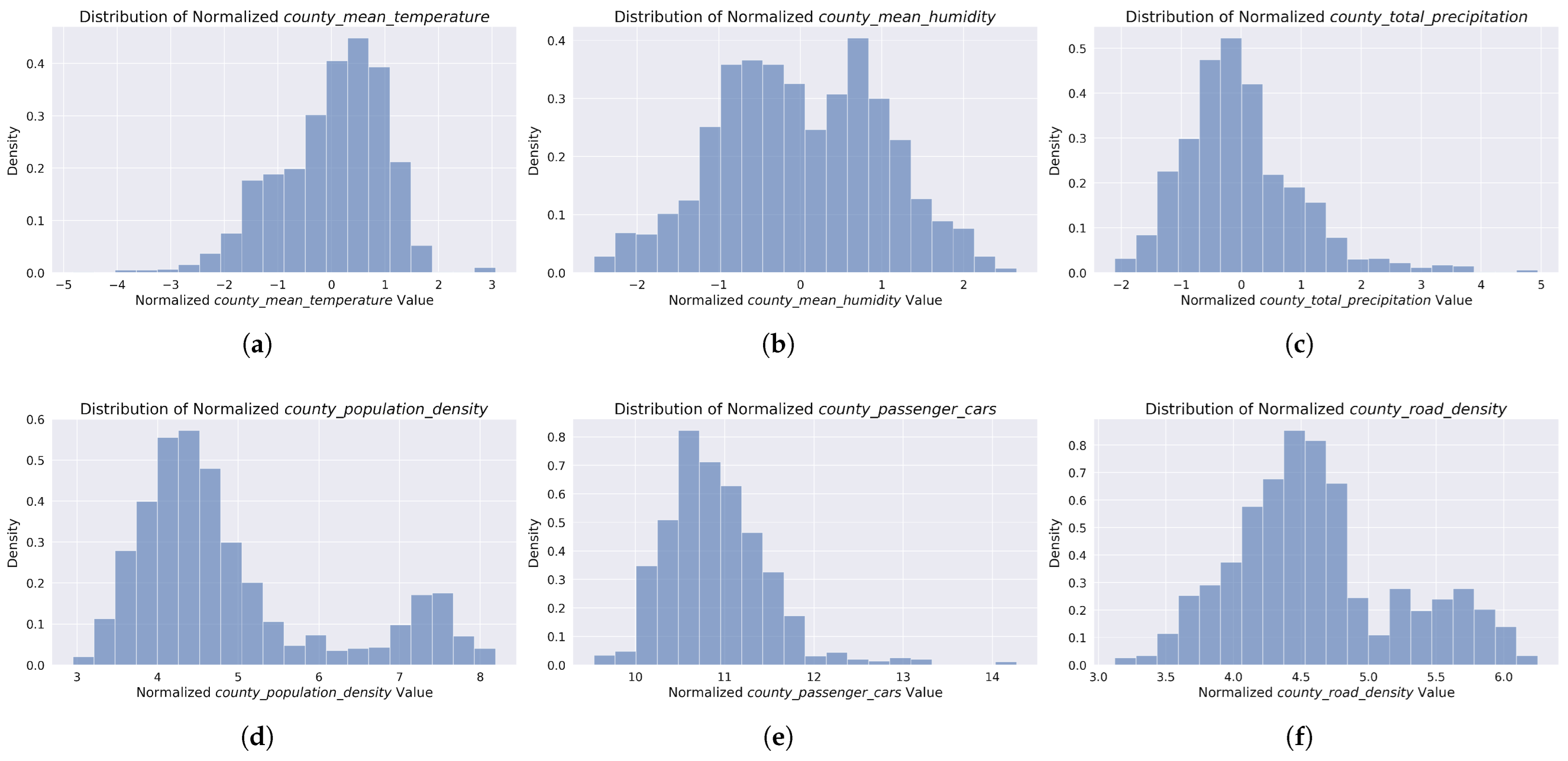
Figure 1.
Normalized distributions of predictors used in county-level yearly accident modeling. Top row: Weather factors including (a) mean temperature (z-score normalized), (b) mean humidity (z-score normalized), and (c) total precipitation (log1p normalized). Bottom row: Socioeconomic factors including (d) population density, (e) passenger car count, and (f) road density, all log1p normalized. The distributions illustrate the variability of these factors across Polish counties during the 2020–2023 study period.
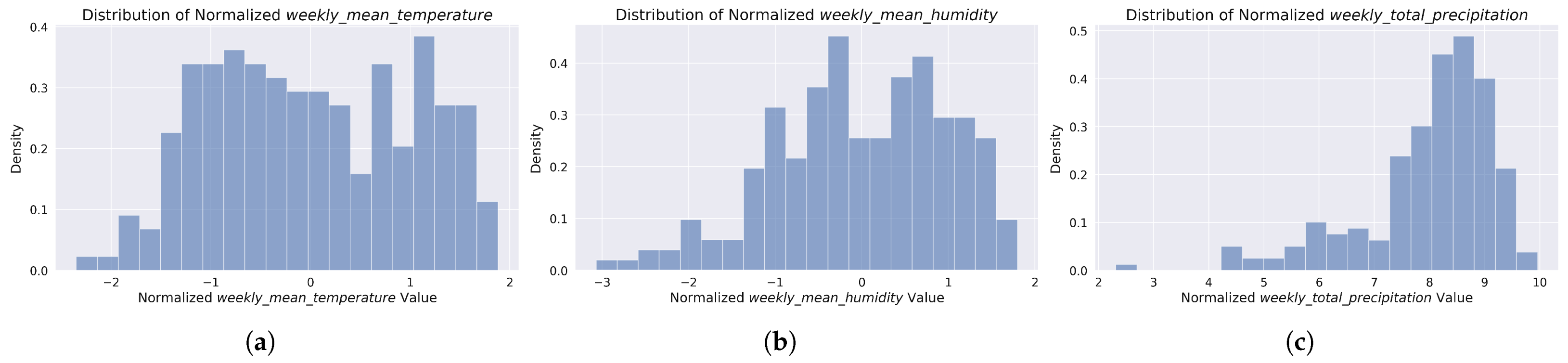
Figure 2.
Normalized distributions of weather factors used in nationwide weekly accident modeling. The histograms show (a) mean temperature (z-score normalized), (b) mean humidity (z-score normalized), and (c) total precipitation (log1p normalized). These distributions represent the aggregated weekly weather conditions across Poland during the 2020–2023 study period. Distributions of yearly variables were excluded from the figure as they offered little additional insight for the analysis.
Figure 3.
Directed Acyclic Graph (DAG) of the model structure; —, —, —, t—, h—, p—.
Figure 3.
Directed Acyclic Graph (DAG) of the model structure; —, —, —, t—, h—, p—.
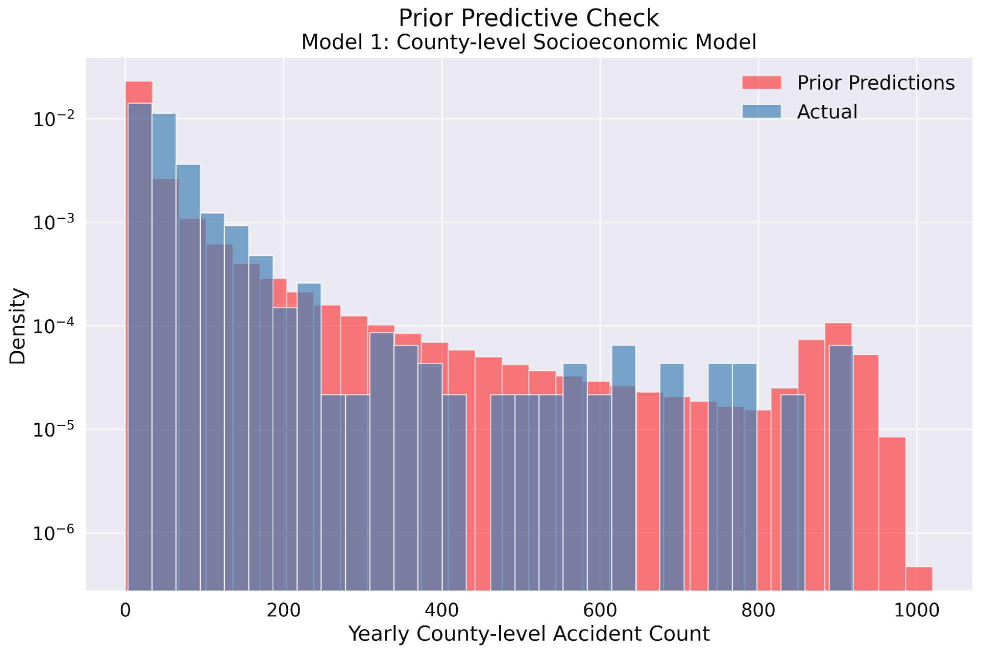
Figure 4.
Prior predictive check for Model 1 in the yearly county-level traffic accident analysis. The histogram compares the prior predictive distribution (red) against the actual observed accident counts (blue) on a logarithmic density scale. The prior distribution adequately covers the range of observed values, confirming that our model’s parameter space is sufficiently broad to encompass the actual data. This indicates appropriate prior specification for the Bayesian modeling of yearly traffic accidents across Polish counties.
Figure 5.
Prior predictive distributions for Model 1 in the yearly county-level accident count analysis. The top row presents the overall histogram of prior samples for socioeconomic predictors: (a) population density, (b) number of passenger cars, and (c) road density. The bottom row displays the prior distribution for (d) the model intercept.
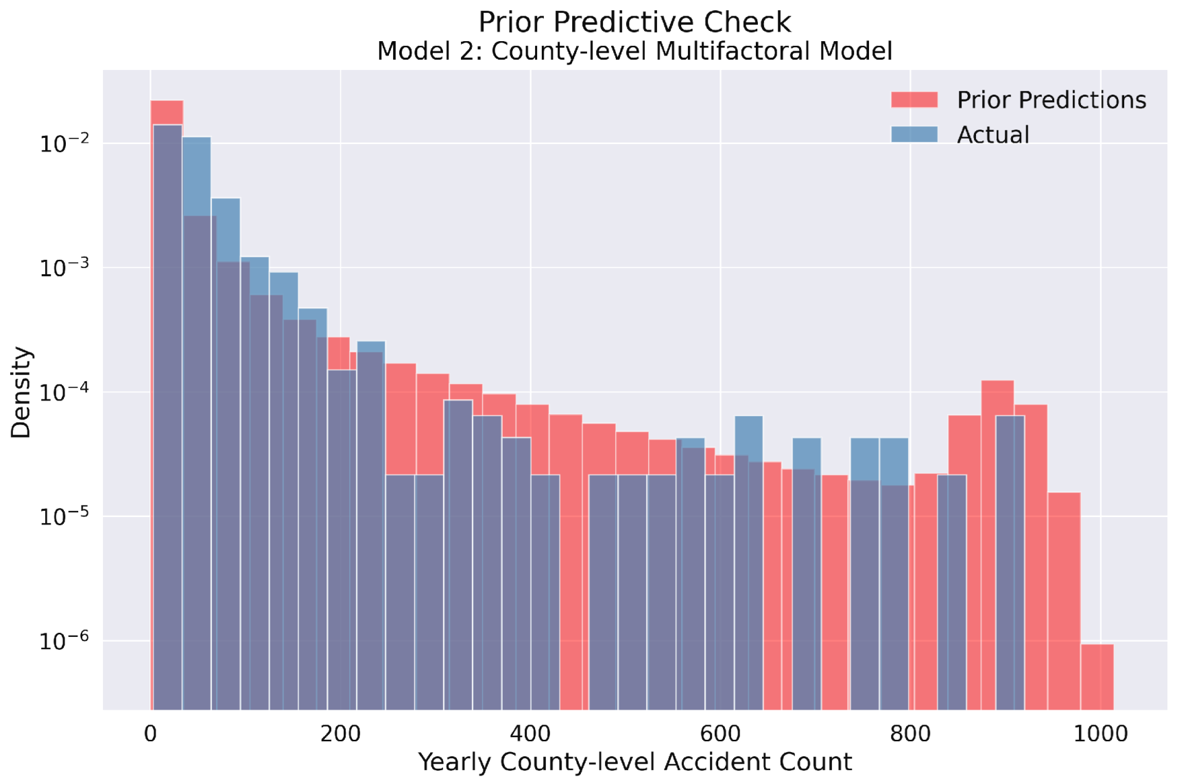
Figure 6.
Prior predictive check for Model 2 in the yearly county-level traffic accident analysis. Similar to Model 1, this histogram illustrates the comparison between prior predictions (red) and observed data (blue) using logarithmic density scaling. The chosen prior specifications successfully span the entire range of empirical accident counts, demonstrating that Model 2’s parameter space appropriately accommodates the observed data patterns across Polish counties. This confirms the suitability of both prior distributions for subsequent Bayesian inference.
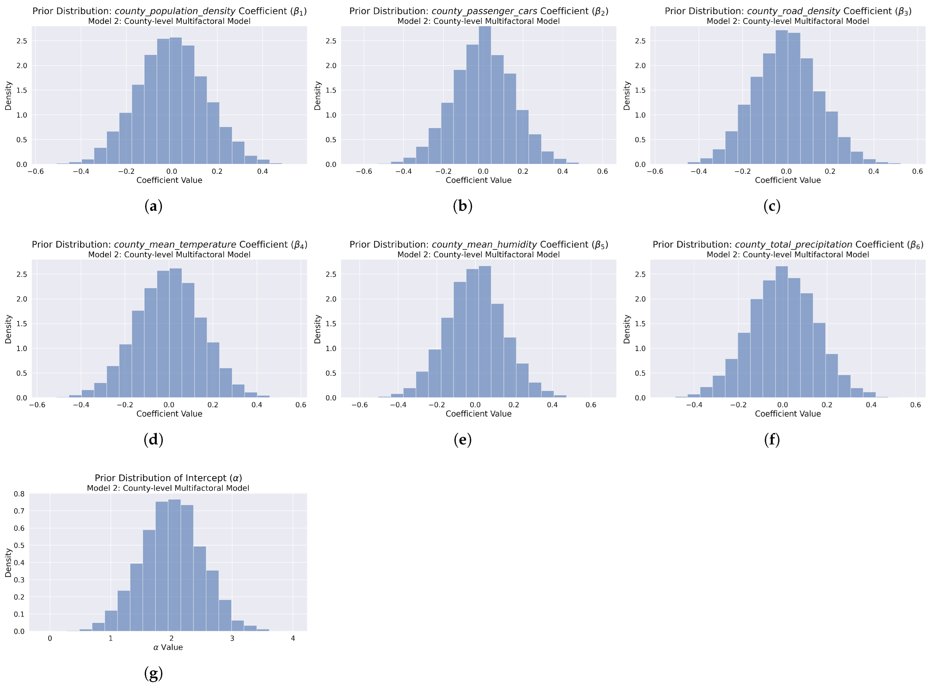
Figure 7.
Prior predictive distributions for Model 2 in the yearly county-level accident count analysis. The first row presents the overall histogram of prior samples for primary socioeconomic predictors: (a) population density, (b) number of passenger cars, and (c) road density. The middle row displays prior distributions for weather factors: (d) temperature, (e) humidity, and (f) precipitation. The last row shows the prior distribution for (g) the model intercept.
Figure 8.
Prior predictive distributions for Model 3 in the weekly nationwide accident count analysis. The top row presents the overall histogram of prior samples for weather predictors: (a) mean temperature, (b) mean humidity, and (c) total precipitation. The bottom row displays the prior distribution for (d) the model intercept.
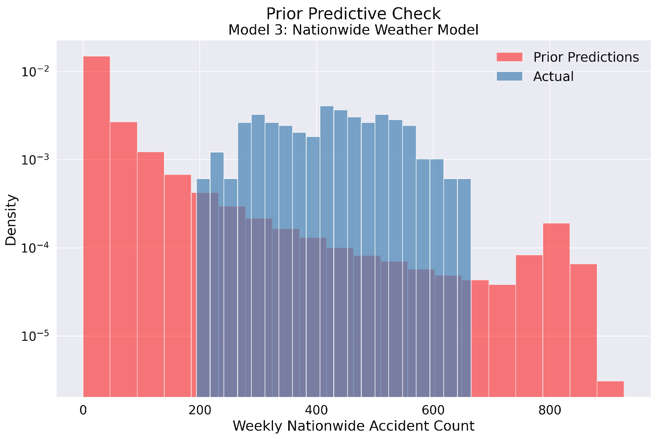
Figure 9.
Prior predictive check for Model 3 in the weekly nationwide traffic accident analysis. The histogram compares the prior predictive distribution (red) against the actual observed accident counts (blue) on a logarithmic density scale. The prior distribution adequately covers the range of observed values, confirming that our model’s parameter space is sufficiently broad to encompass the actual data. This indicates appropriate prior specification for the Bayesian modeling of weekly traffic accidents across Poland.
Figure 10.
Prior predictive check for Model 4 in the weekly nationwide traffic accident analysis. Similar to Model 3, this histogram illustrates the comparison between prior predictions (red) and observed data (blue) using logarithmic density scaling. The chosen prior specifications successfully span the entire range of empirical accident counts, demonstrating that Model 4’s parameter space appropriately accommodates the observed data patterns across Polish voivodeships. This confirms the suitability of both prior distributions for subsequent Bayesian inference.
Figure 11.
Prior predictive distributions for Model 4 in the weekly nationwide accident count analysis. The first row presents the overall histogram of prior samples for weather predictors: (a) mean temperature, (b) mean humidity, and (c) total precipitation. The second row displays prior distributions for socioeconomic predictors: (d) population density, (e) number of passenger cars, and (f) road density. The bottom row shows the prior distribution for (g) the model intercept.
Figure 12.
Model 1 posterior predictive checks: (a) Comparison of observed accident frequency distribution (blue) versus model-predicted distribution (red), showing the model capturing the central tendency with some discrepancies in the higher accident ranges. (b) Scatter plot of observed versus predicted yearly accident counts with the identity line (red dashed). Points clustering around this line indicate accurate predictions, with increasing variance at higher accident counts. The coefficient of determination () indicates good model fit.
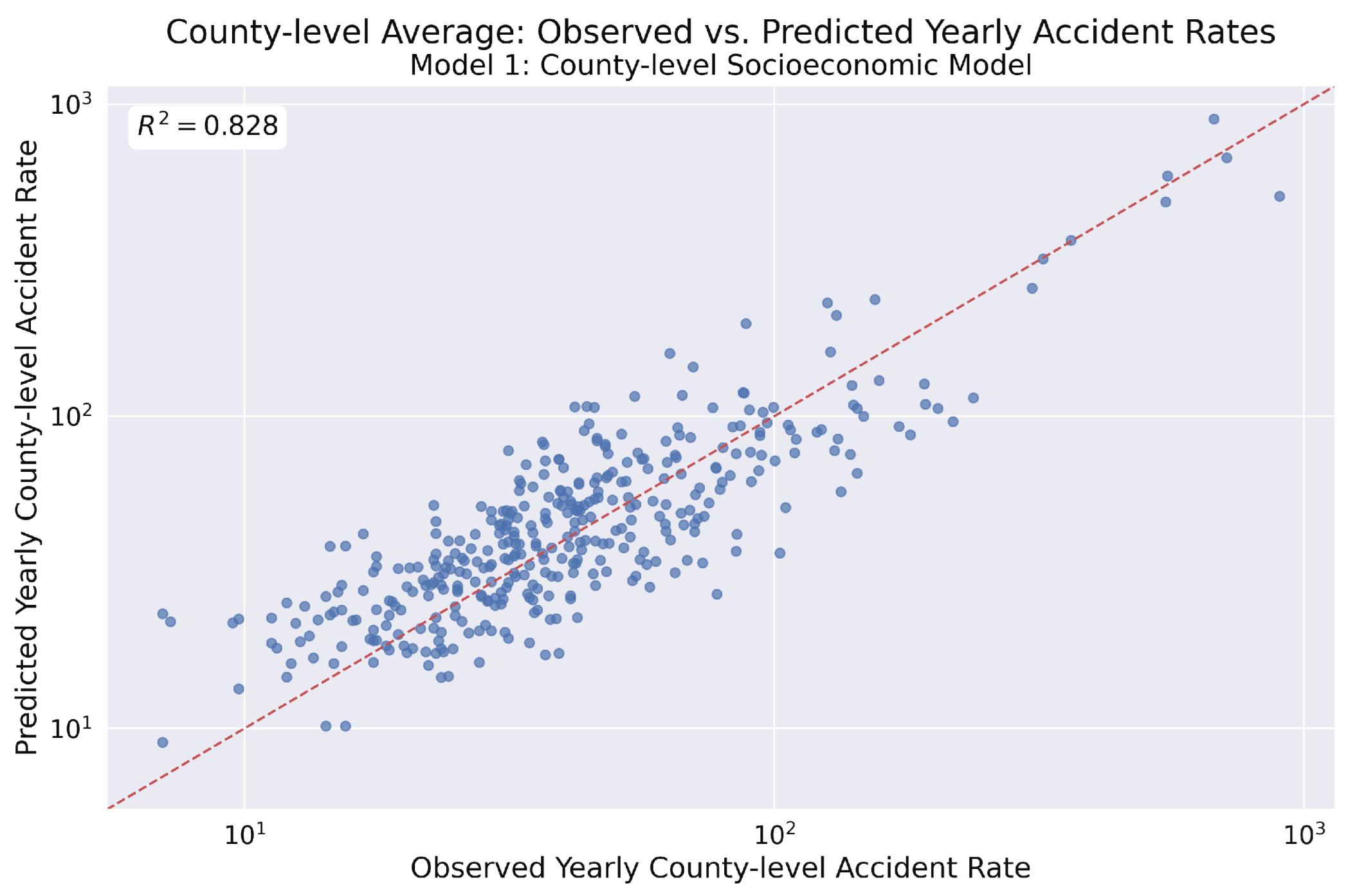
Figure 13.
Observed vs. predicted yearly county-level accident rates from Model 1. This scatter plot displays the model’s predicted rates against the observed rates on a log–log scale. The coefficient of determination () indicates that the socioeconomic factors in the model account for approximately 82.8% of the variance in the observed accident rates, signifying a good model fit.
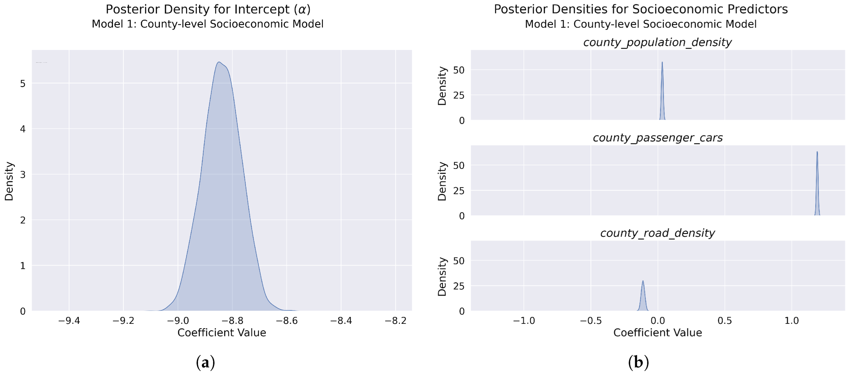
Figure 14.
Posterior distributions for model parameters: (a) Posterior density for the model intercept (), showing a narrow, approximately normal distribution with a high-precision estimate of yearly accident counts across Polish counties (median: −8.839 [95% CI: −8.974, −8.705]). (b) Posterior densities for the three socioeconomic predictors: population density (median: 0.032 [95% CI: 0.020, 0.046]) (top), passenger car ownership (median: 1.190 [95% CI: 1.178, 1.202]) (middle), and road density (median: −0.112 [95% CI: −0.137, −0.087]) (bottom). Population density shows a slight positive effect, passenger car ownership demonstrates a strong positive effect, while road density has a negative effect.
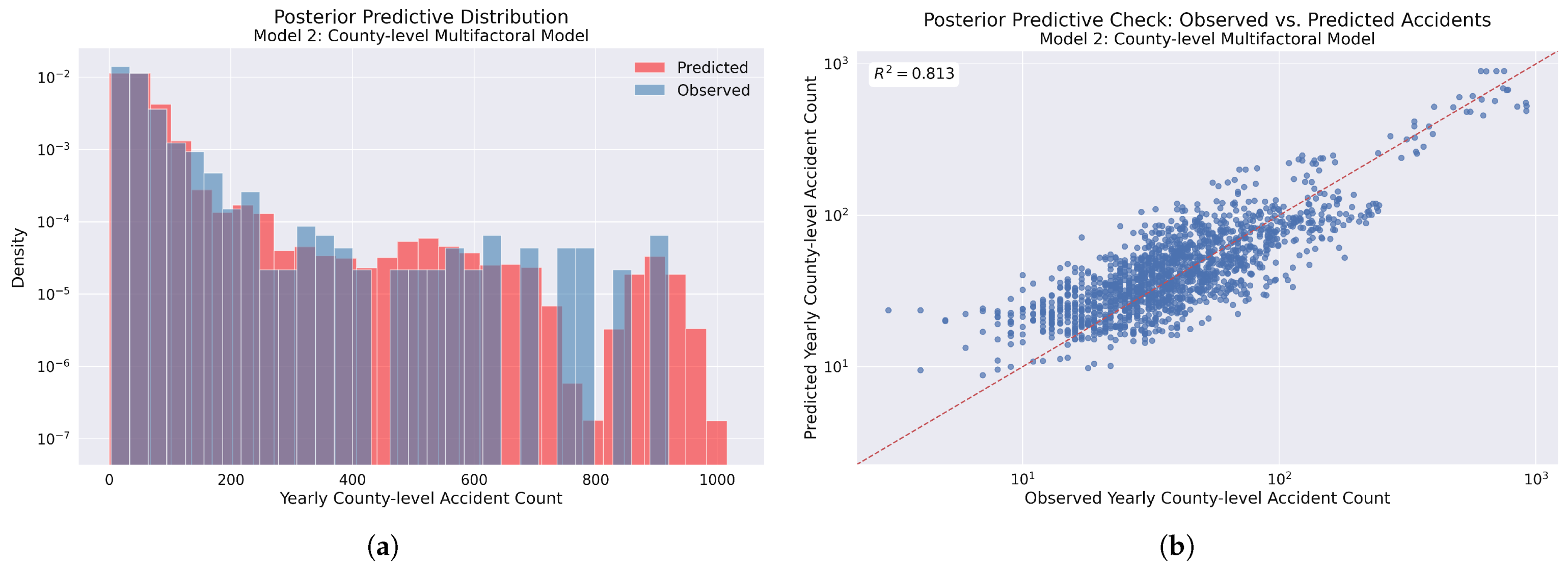
Figure 15.
Model 2 posterior predictive checks: (a) Comparison of observed accident frequency distribution (blue) versus model-predicted distribution (red), showing similar alignment compared to Model 1. (b) Scatter plot of observed versus predicted yearly accident counts with the identity line (red dashed). The coefficient of determination () indicates a slightly higher model fit compared to Model 1.
Figure 16.
Observed vs. predicted yearly county-level accident rates for Model 2. The log–log scatter plot demonstrates a strong positive correlation, with points clustering around the identity line (red dashed). The coefficient of determination () indicates a very good model fit and a slight improvement in predictive performance compared to Model 1.
Figure 17.
Posterior distributions for Model 2 parameters: (a) Intercept posterior density showing a well-defined, narrow distribution with high estimate precision. (b) Socioeconomic predictors, including population density—positive effect (top), passenger car ownership—strong positive effect (middle), and road density—negative effect (bottom). (c) Weather predictors showing mean temperature—negative effect (top), mean humidity—positive effect (middle), and total precipitation—negative effect (bottom) on accident counts across counties.
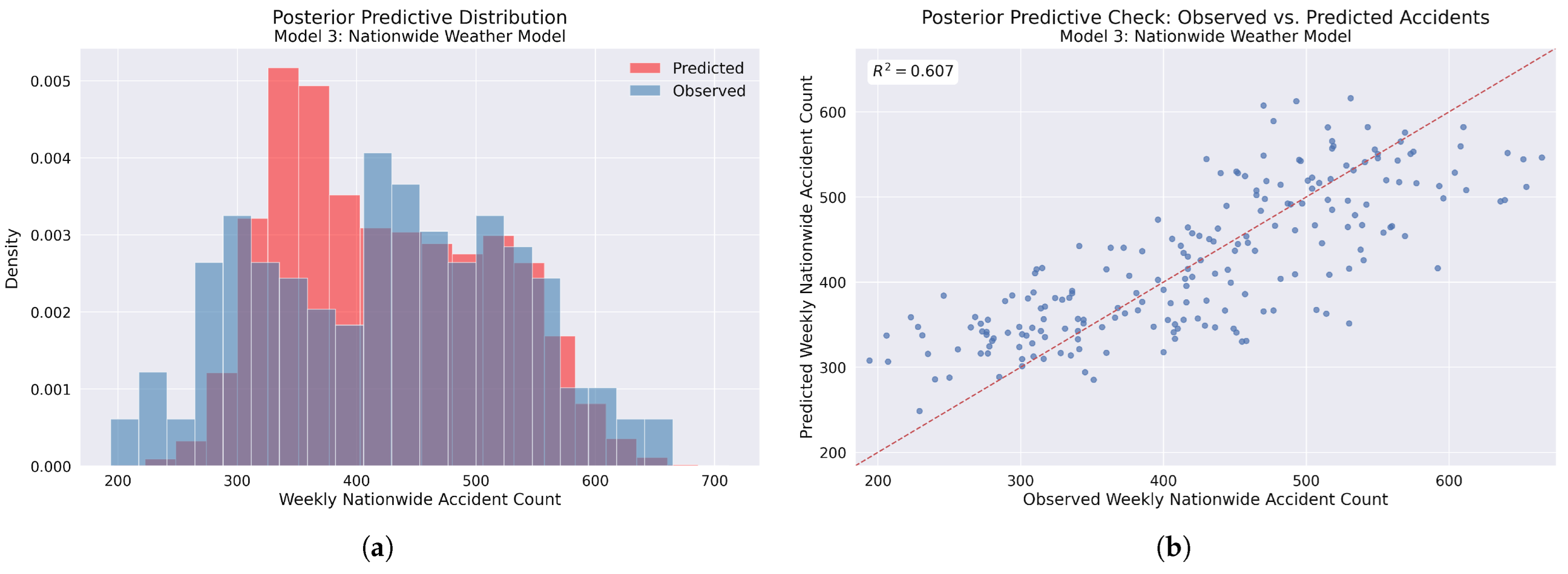
Figure 18.
Model 3 posterior predictive checks: (a) Comparison of observed accident frequency distribution (blue) versus model-predicted distribution (red), showing the model capturing the central tendency with notable discrepancies in the 300–400 accident range, where the model predicts higher frequencies than observed. (b) Scatter plot of observed versus predicted weekly accident counts with the identity line (red dashed). Points clustering around this line indicate accurate predictions, with increasing variance at both lower and higher accident counts, suggesting areas for potential model improvement. The coefficient of determination () indicates moderate model fit.
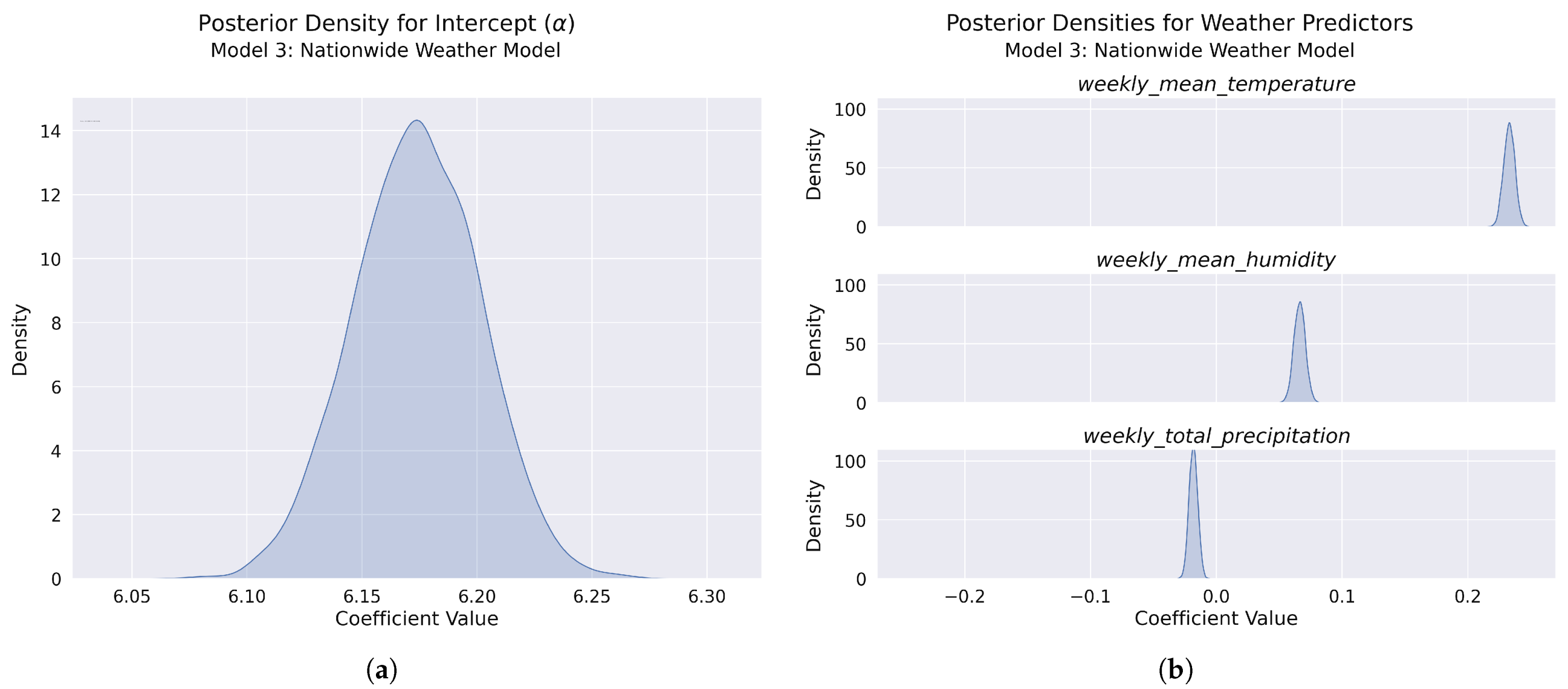
Figure 19.
Posterior distributions for model parameters: (a) Posterior density for the model intercept (), showing a narrow, approximately normal distribution with a high-precision estimate of weekly accident counts across Poland. (b) Posterior densities for the three weather predictors: mean temperature (top), mean humidity (middle), and total precipitation (bottom). Temperature shows a strong positive effect, humidity demonstrates a moderate positive effect, while precipitation has a slight negative effect.
Figure 20.
Model 4 posterior predictive checks: (a) Comparison of observed accident frequency distribution (blue) versus model-predicted distribution (red), showing improved alignment, particularly in the 350–450 accident range compared to Model 1. (b) Scatter plot of observed versus predicted weekly accident counts with the identity line (red dashed). The reduced scatter around the line indicates improved predictive performance across most of the data range, particularly in the 300–500 accident range. The coefficient of determination () indicates improved model fit compared to Model 3.
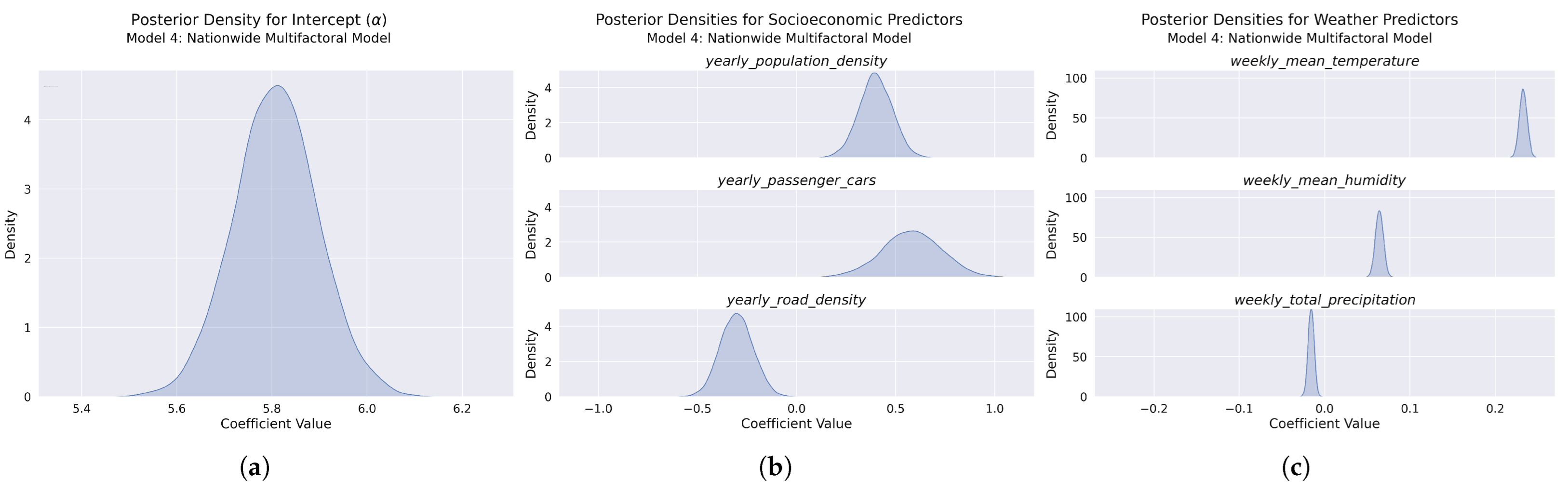
Figure 21.
Posterior distributions for Model 4 parameters: (a) Intercept posterior density showing a well-defined, narrow distribution with high estimate precision. (b) Socioeconomic predictors including population density—positive effect (top), passenger car ownership—strong positive effect (middle), and road density—negative effect (bottom). (c) Weather predictors showing consistent effects with Model 3: temperature—positive effect (top), humidity—positive effect (middle), and precipitation—slight negative effect (bottom).
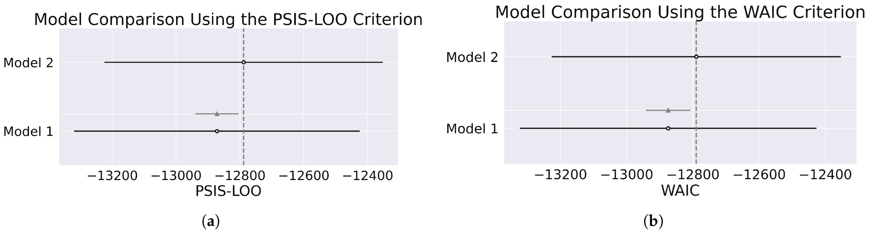
Figure 22.
Comparison of yearly county-level models using the (a) PSIS-LOO and (b) WAIC criteria. The dashed vertical line indicates the reference point for model comparison based on the expected log pointwise predictive density (ELPD-LOO or ELPD-WAIC). The dashed vertical line indicates the reference point for the best-performing model (Model 2). Both model comparison metrics yield consistent results.
Figure 23.
Comparison of weekly nationwide models using the (a) PSIS-LOO and (b) WAIC criteria. The dashed vertical line indicates the reference point for model comparison based on the expected log pointwise predictive density (ELPD-LOO or ELPD-WAIC). Both model comparison metrics yield consistent results.
Table 1.
Variables used in the yearly county-level accident count modeling.
Table 1.
Variables used in the yearly county-level accident count modeling.
| Variable | Description |
|---|
| county_mean_temperature | Annual average of daily mean temperatures per county (°C) |
| county_mean_humidity | Annual average of daily mean relative humidity per county (%) |
| county_total_precipitation | Annual accumulated precipitation per county (mm) |
| county_population_density | Population per square kilometer |
| county_passenger_cars | Number of registered passenger vehicles per county |
| county_road_density | Length of paved municipal and county roads per 100 km2 |
Table 2.
Variables used in the weekly nationwide accident count modeling.
Table 2.
Variables used in the weekly nationwide accident count modeling.
| Variable Name | Description |
|---|
| weekly_mean_temperature | Weekly average of daily mean temperatures across all counties (°C) |
| weekly_mean_humidity | Weekly average of daily mean relative humidity across all counties (%) |
| weekly_total_precipitation | Total weekly precipitation across all counties (mm) |
| yearly_population_density | National population density for the corresponding year (inhabitants/km2) |
| yearly_passenger_cars | Total number of registered passenger vehicles nationwide |
| yearly_road_density | National average of municipal and county paved roads per 100 km2 |
Table 3.
Prior distribution parameters for the Bayesian models.
Table 3.
Prior distribution parameters for the Bayesian models.
| Parameter | Yearly County-Level Models | Weekly Nationwide Models |
|---|
| 3.0 | 2.0 |
| 0.3 | 0.5 |
| 0.2 | 0.15 |
| 6.7 | 6.8 |
Table 4.
Comparison of county-level models based on PSIS-LOO criterion for accident count prediction.
Table 4.
Comparison of county-level models based on PSIS-LOO criterion for accident count prediction.
| Model | Rank | ELPD-LOO | p-LOO | ELPD Diff | Weight | SE | dSE |
|---|
| Model 2 | 0 | −12,788.50 | 152.42 | 0.00 | 0.54 | 436.22 | 0.00 |
| Model 1 | 1 | −12,872.12 | 92.02 | 83.61 | 0.46 | 447.29 | 67.57 |
Table 5.
Comparison of county-level models based on WAIC criterion for accident count prediction.
Table 5.
Comparison of county-level models based on WAIC criterion for accident count prediction.
| Model | Rank | ELPD-WAIC | p-WAIC | ELPD Diff | Weight | SE | dSE |
|---|
| Model 2 | 0 | −12,789.84 | 153.76 | 0.00 | 0.54 | 436.54 | 0.00 |
| Model 1 | 1 | −12,874.76 | 94.67 | 84.93 | 0.46 | 448.08 | 67.63 |
Table 6.
Comparison of weekly nationwide models based on PSIS-LOO criterion for accident count prediction.
Table 6.
Comparison of weekly nationwide models based on PSIS-LOO criterion for accident count prediction.
| Model | Rank | ELPD-LOO | p-LOO | ELPD Diff | Weight | SE | dSE |
|---|
| Model 4 | 0 | −1940.79 | 70.39 | 0.00 | 0.64 | 115.07 | 0.00 |
| Model 3 | 1 | −2019.78 | 51.86 | 78.99 | 0.36 | 105.23 | 43.17 |
Table 7.
Comparison of nationwide models based on WAIC criterion for accident count prediction.
Table 7.
Comparison of nationwide models based on WAIC criterion for accident count prediction.
| Model | Rank | ELPD-WAIC | p-WAIC | ELPD Diff | Weight | SE | dSE |
|---|
| Model 4 | 0 | −1941.50 | 72.26 | 0.00 | 0.64 | 115.10 | 0.00 |
| Model 3 | 1 | −2019.21 | 51.29 | 77.70 | 0.36 | 105.12 | 43.28 |


