Visualizations of Uncertainties in Precision Agriculture: Lessons Learned from Farm Machinery

 ,
,  , , ,
, , ,
Abstract

1. Introduction
- Propose a method of uncertainty expression of measured yield data;
- Apply means of cartographic visualization of uncertainties to measured point Big Data based on existing cartographic recommendations and empirical studies.
1.1. Data Quality and Uncertainty
1.2. Uncertainty Visualization
2. Materials and Methods
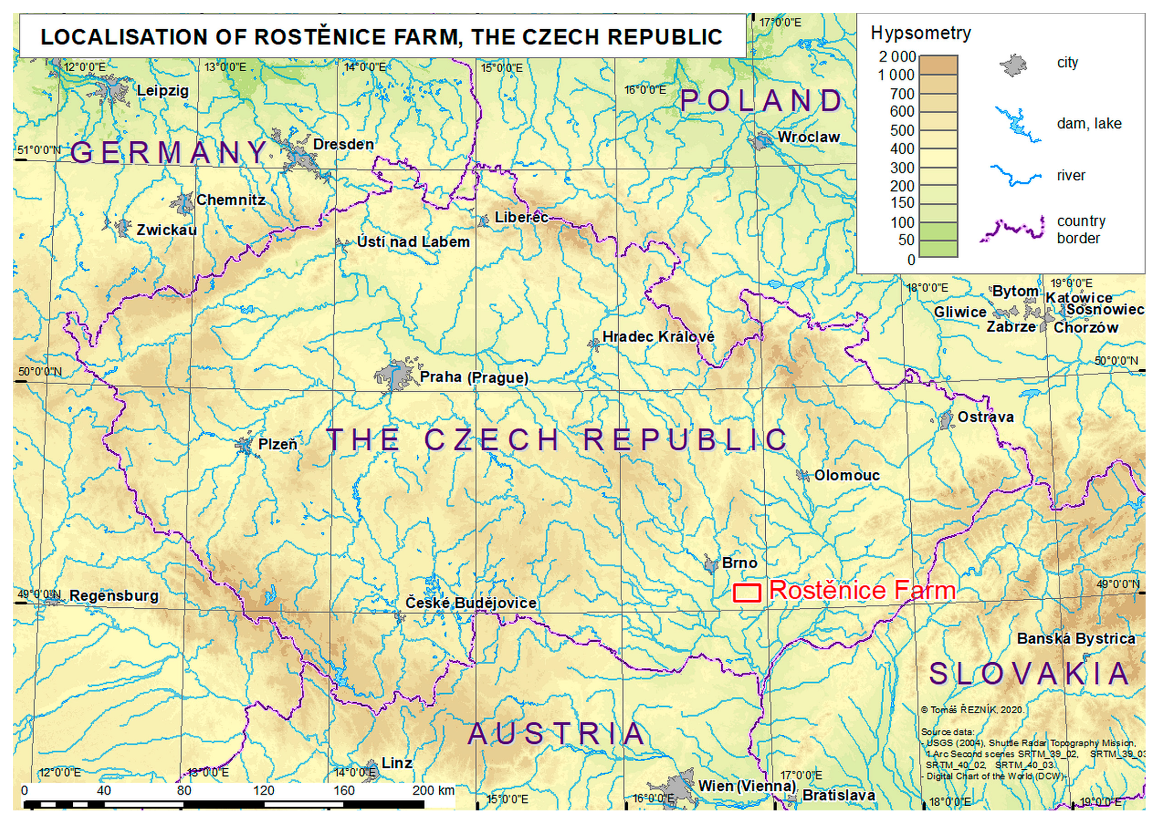
2.1. Study Site
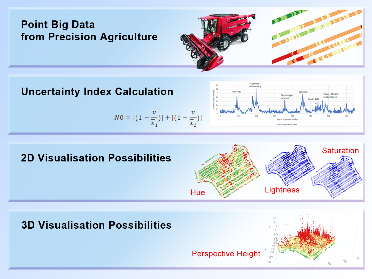
2.2. Uncertainty Expression
- harvesting dynamics:
- lag time;
- filling time and emptying time of the combine harvester;
- measurement errors:
- related directly to yield;
- related to moisture observations;
- accuracy of the positioning system:
- collocated observations;
- outliers;
- harvesting strategy (decisions and actions of the harvester operator):
- higher than the recommended harvesting speed;
- sudden changes of speed;
- harvest turns and headlands;
- overlapping (crossings) and partially overlapping trajectories;
- raising the cutting bar due to obstacles or unevenness of terrain.
- N0:
- index of uncertainty variation in a given point;
- v:
- value of yield production in a given point;
- x1:
- mean value of yield production of predeceasing n points (field measurements);
- x2:
- mean value of yield production of following n points (field measurements);
- n:
- defined as 1/20 of relative density of measurements per hectare (see the more detailed explanation below).
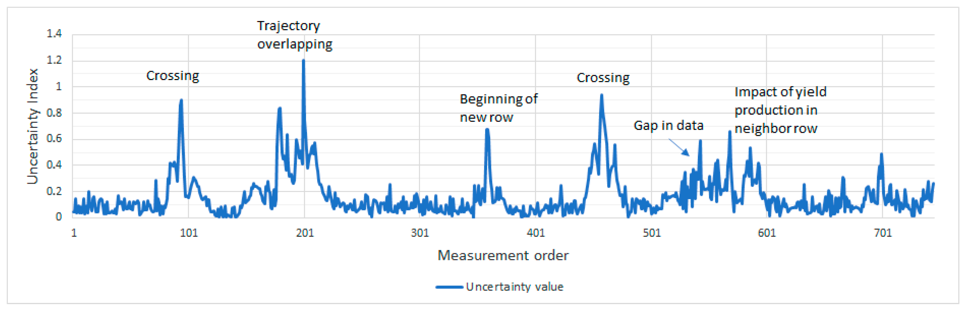
- This analysis is preconditioned on the fact that the variation of yield production is a continuous process that follows environmental and soil characteristics; therefore, sudden and small coverage area differences in yield production compared with the surrounding areas are not probable/expected, that is, are considered an uncertainty.
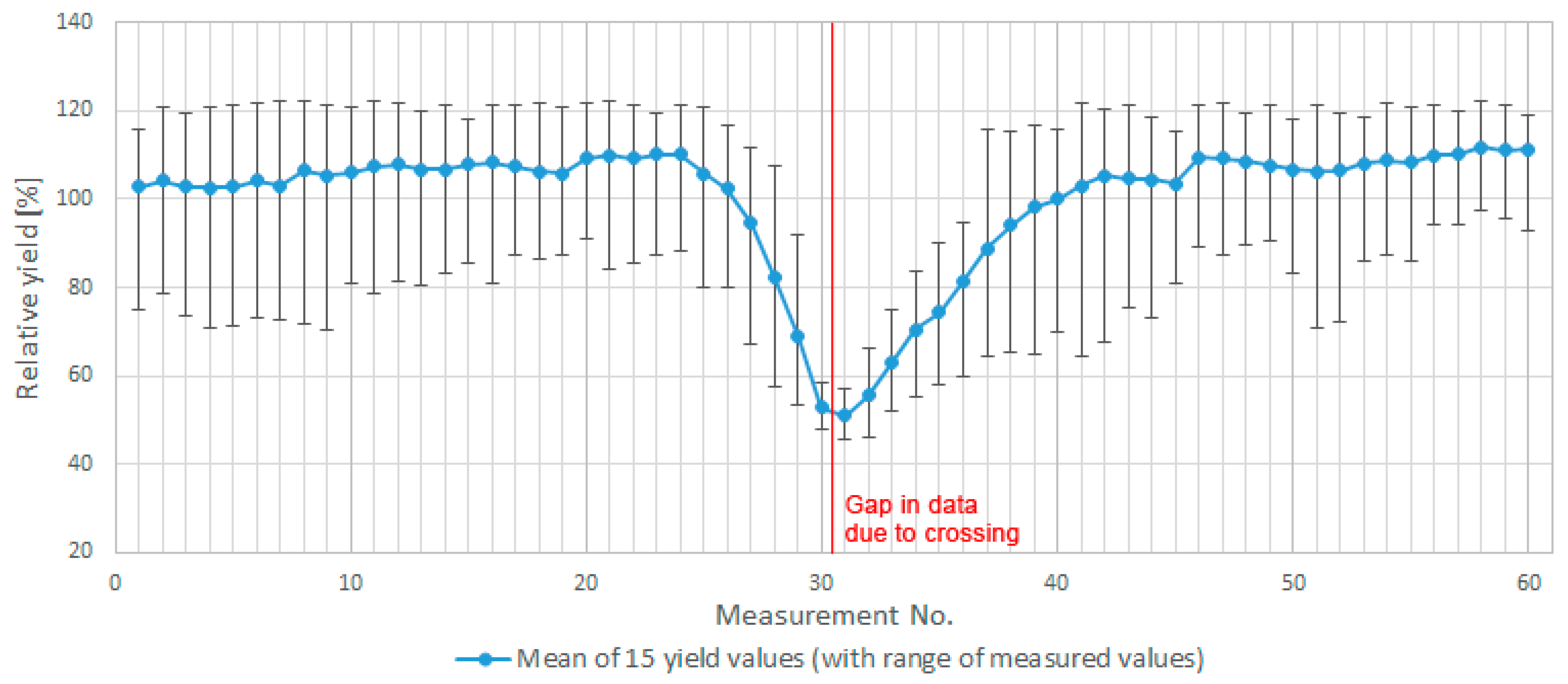
- An analysis of yield variations for 15 crossings of farm machinery trajectory when taking into account variable rates of preceding and following points (see Figure 3). Crossings were used as a model owing to the known uncertainty in those areas.
- On the basis of the analysis, it was discovered that the suitable area for calculating uncertainty is mainly dependent on the frequency of measurements and distance. Both of these variables are included in the density of measurements per hectare. The value of 1/10 of the density (i.e., half of that on each side of the point) was taken into account as representative surroundings. Other environmental aspects (relief, water distribution, soil conditions, and so on) of the plot might be taken into account as well.
- Values of preceding and following points are calculated separately owing to different possible behaviour on each side. For example, in Figure 3, points at the beginning and at the end of the “U” shape are affected by uncertain values only from one side, while the other is balancing the final uncertainty towards a lower value. On the other hand, a point in the middle of the “U” shape is different from the neighbours on both sides and, additionally, emphasizes the final value of uncertainty.
- Absolute values are taken into account owing to possibly overestimated uncertain values (above the mean value of surroundings).
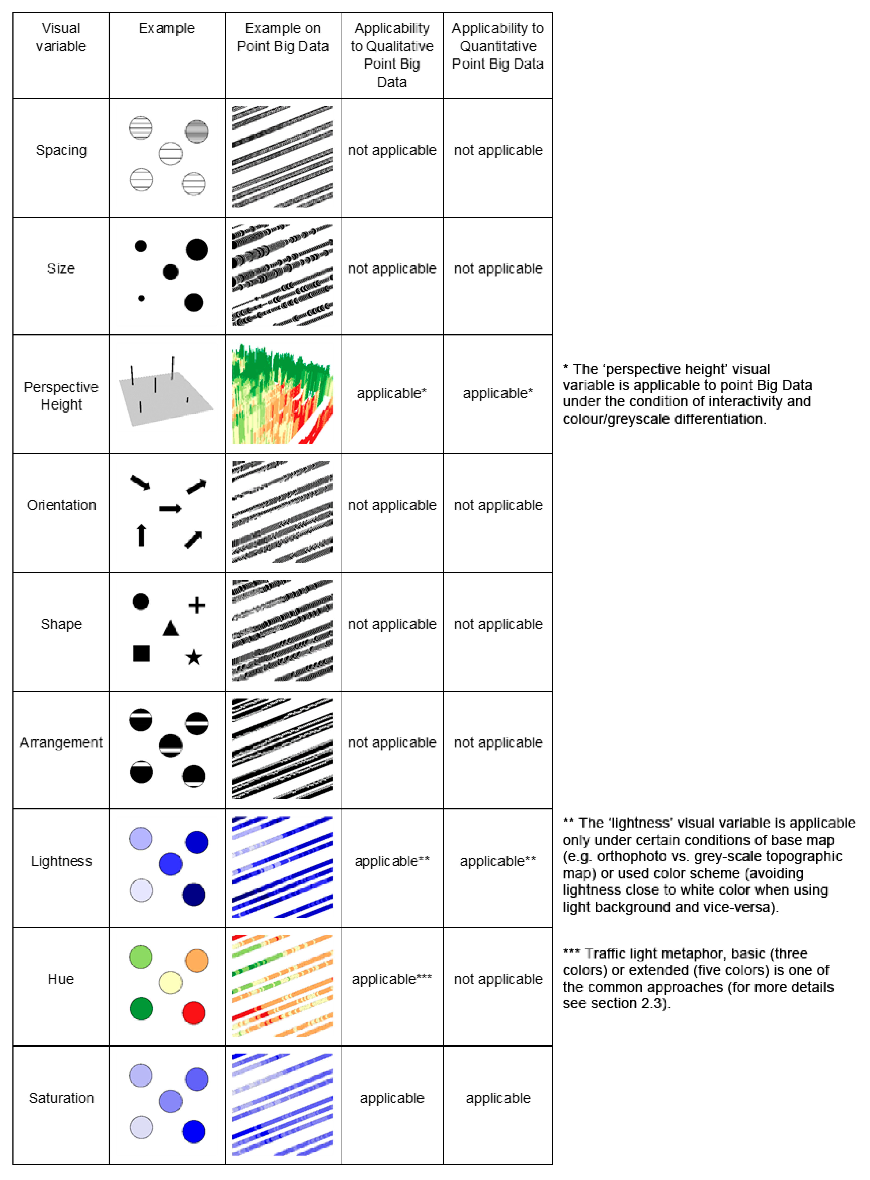
2.3. Uncertainty Visualizations
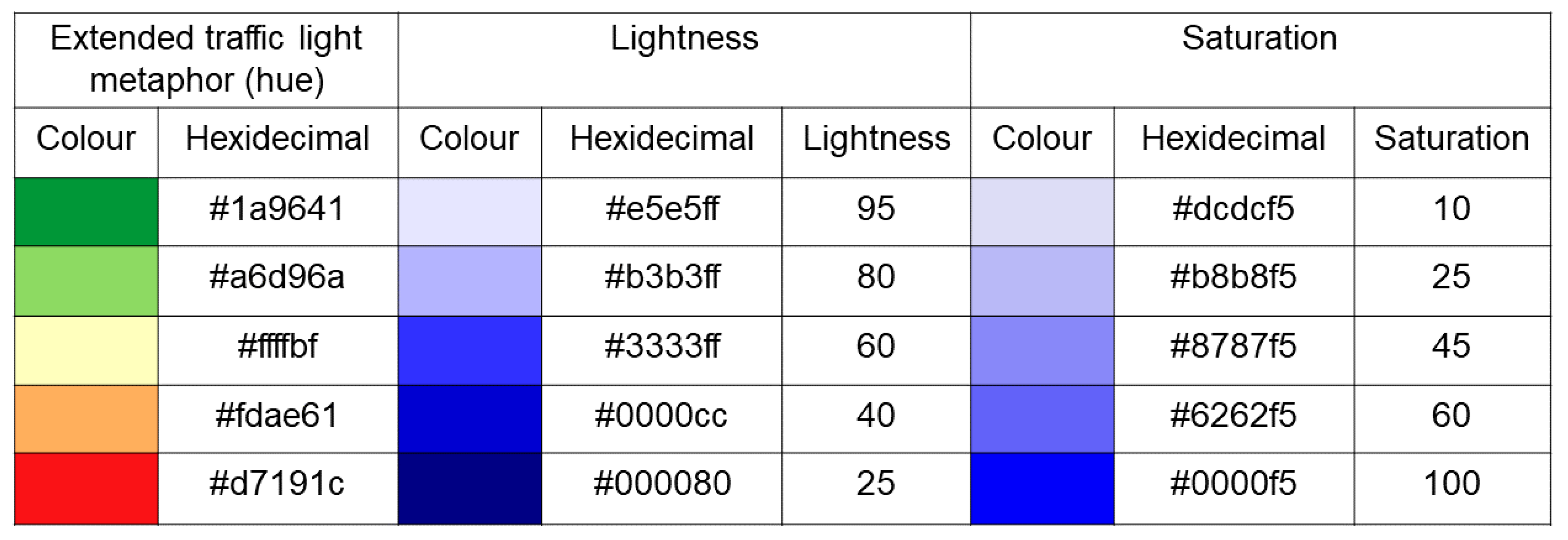
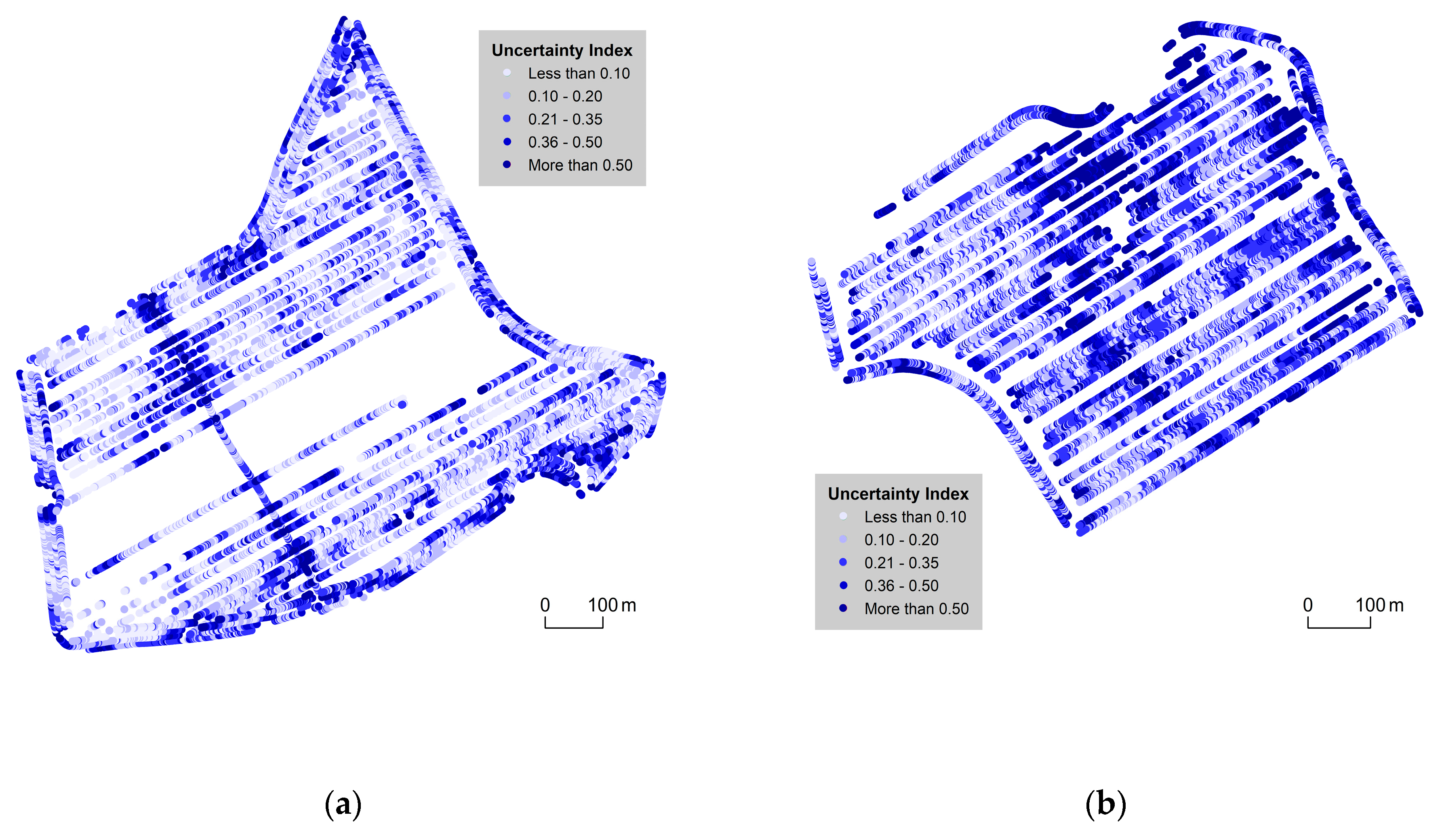
- colour hue in the form of an extended traffic lights metaphor;
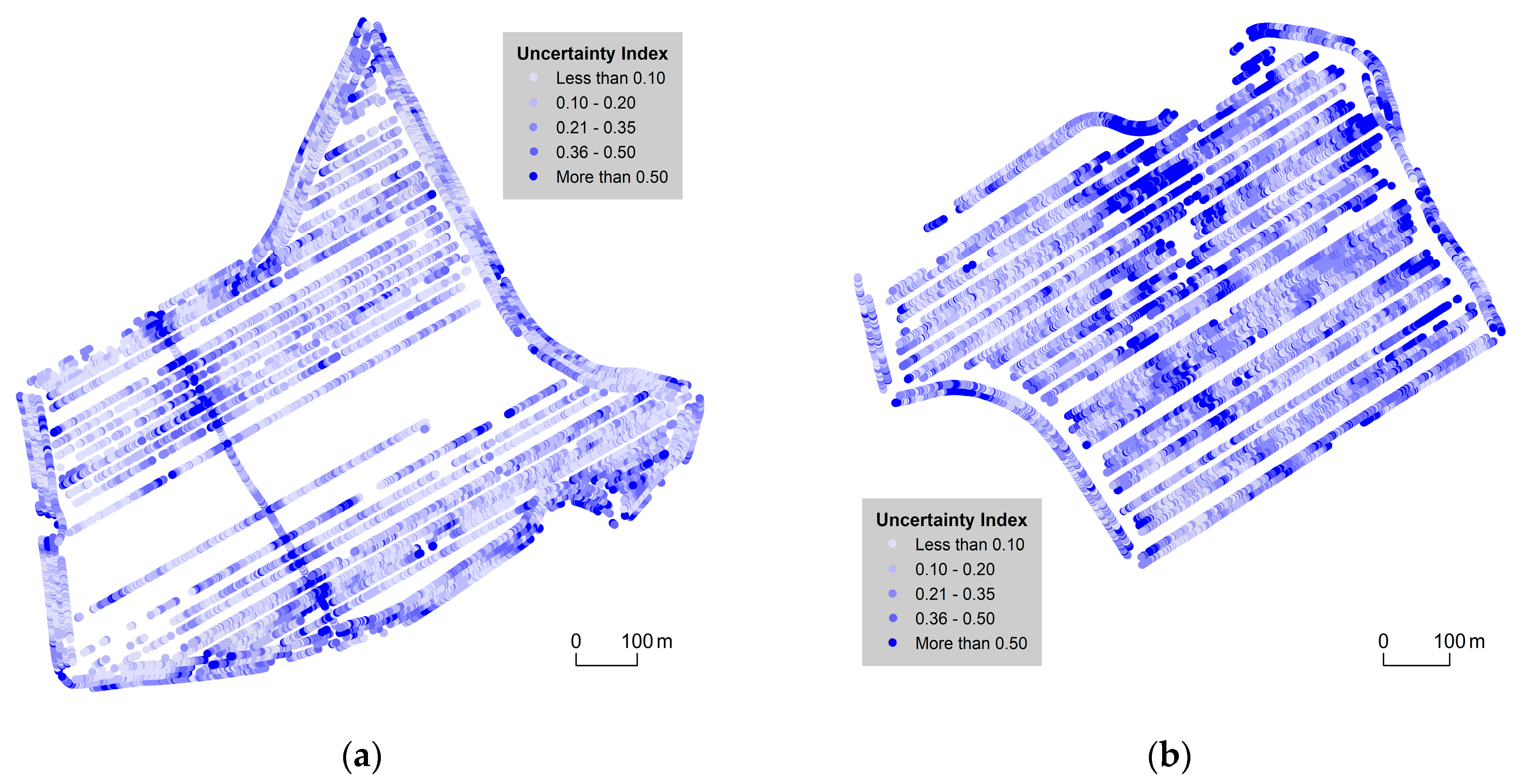
- lightness;
- saturation;
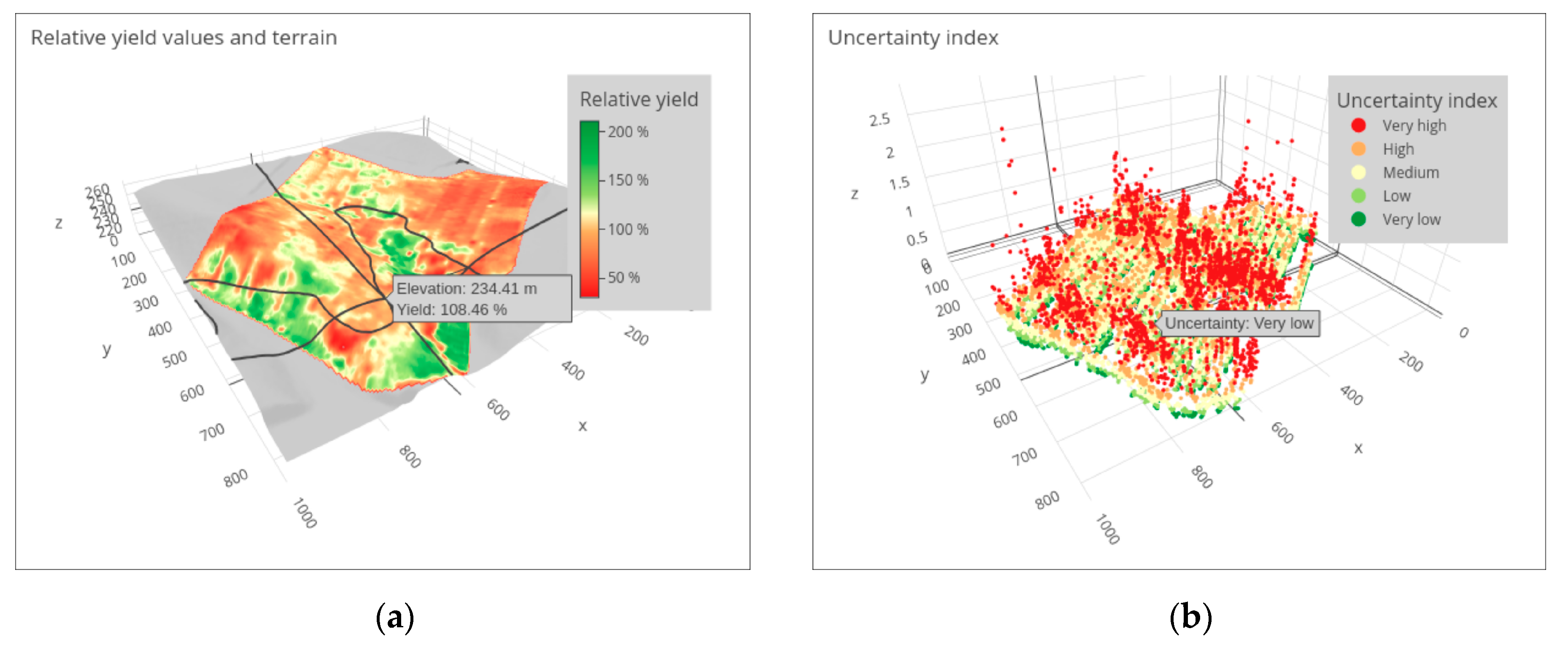
- perspective height.

3. Results
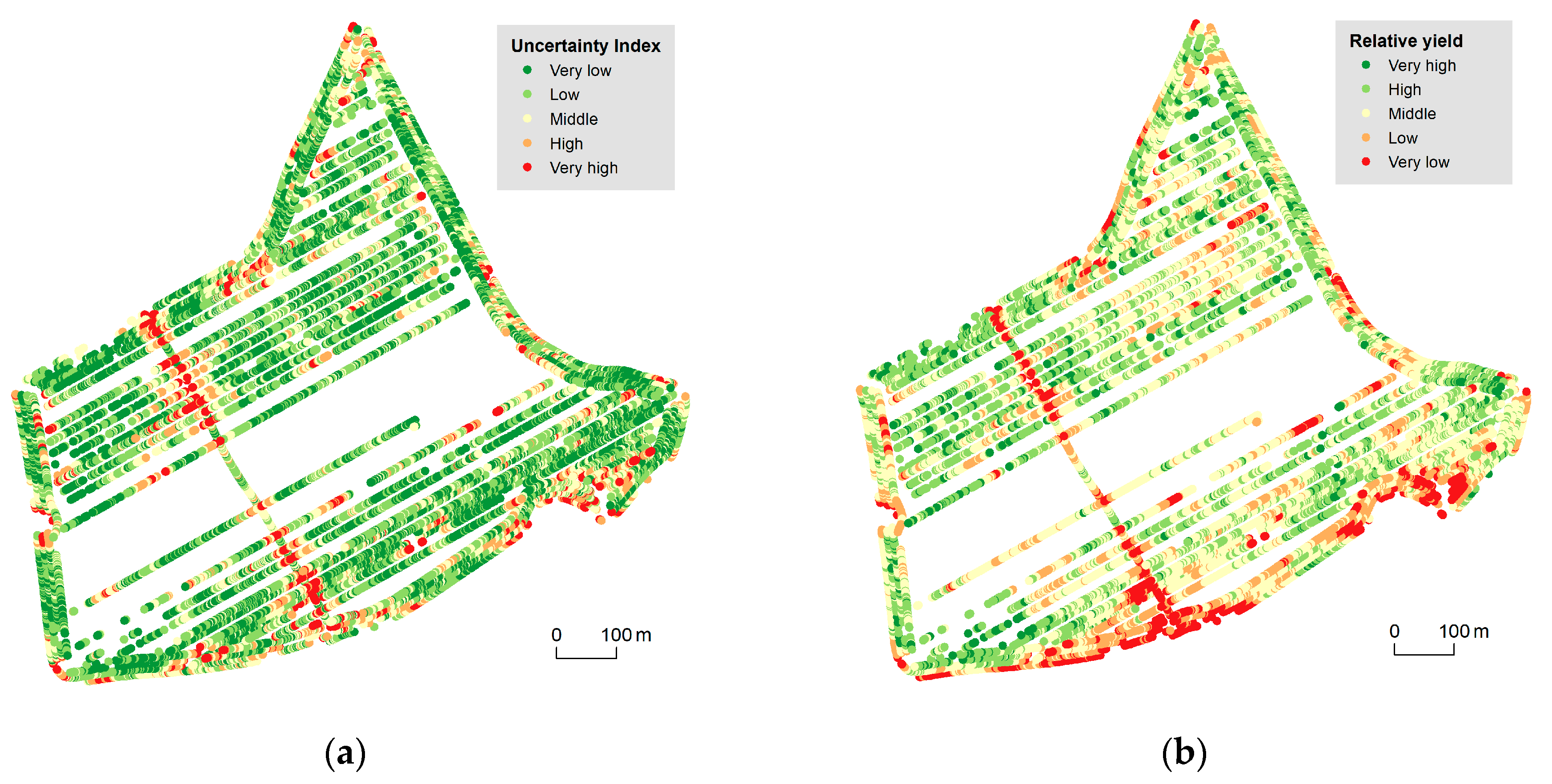
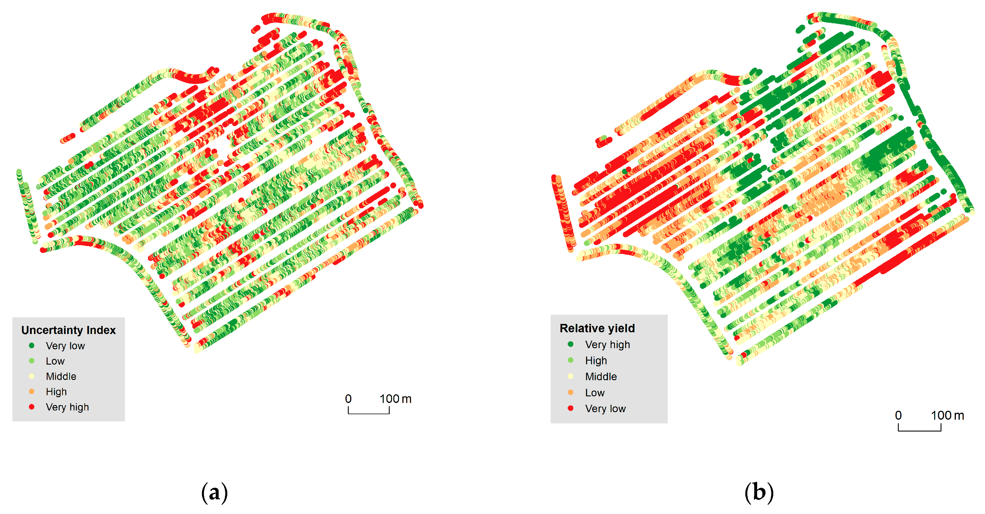
3.1. 2D Cartographic Methods
3.2. 3D Cartographic Method
4. Discussion
- (un)feasibility of uncertainty expression according to ISO 19157;
- applicability of the cartographic methods used in general;
- a confrontation of the achieved results with similar studies.
4.1. Uncertainty Expressions and ISO 19157
- If an aspect(s) of uncertainty other than the one used in this study is to be presented (a sudden change of measured yield).
- If the objective is to express, relativize, and combine partial uncertainties.
- If the objective is to present point Big Data of a different nature than the data measured by field harvesters.
4.2. Applicability of Used Cartographic Methods
- uncertainty of input information intended for a cartographic visualization;
- processing of input data through (cartographic) methods of aggregation, generalization, and interpolation, as well as interpretations thereof.
- Point size: remains the same, no matter whether qualitative or quantitative data are being visualized.
- Spatial pattern: overall picture is clear to a user when the values are not affected by any other characteristics and/or dimensions.
- Point density: conflicts of points tend to be common as each application needs to strike a balance between the following contradicting requirements:
- the need to maintain readability of a symbol, which pushes for larger symbols, as opposed to the following:
- the need to provide an overview that enables to clearly see spatial patterns in the whole dataset, which pushes for smaller symbols;
- both contradicting requirements above are tightly connected to a scale that is being used for a cartographic presentation.
- perspective height as an additional graphic variable brings a possibility to combine the presented value(s) (i.e., yield, in our study) and uncertainty value in one cartographic visualization [85].
4.3. Comparison with Similar Studies
- The extended/modified traffic light metaphor uses six colour hues for five classification classes (note that the ‘marginally useful’ class is presented by two distinct colour hues). Moreover, only the hues on both ends of the spectrum (red and green) are compliant with traffic lights. The remaining four hues (yellow, light brown, cyan) lie outside the traditional traffic light scheme and are also perceptually demanding. Potential users must use the legend to define the order of hues and their corresponding meanings (perfect—dangerously useless). Strictly sticking to the traffic lights hues (green, orange, and red and their lightness) as used in our study helps users make more intuitive decisions.
- Frías et al. [71] employed size and transparency to express uncertainty in a regular grid that avoided overlaps. Such a method was not feasible within our study as a consequence of spatial closeness of the measured data. However, the use of transparency for uncertainty visualization is considered highly intuitive [57]. On the other hand, only three transparency levels have been empirically tested and using more categories could complicate map reading.
5. Conclusions
- A comparison of the level of individual visual variables (hue, saturation, lightness, perspective height) in particular contexts;
- a comparison of user performance when working with 3D versus 2D visualizations;
- usability of interactive visualizations versus non-interactive (static) visualizations;
- the effect of user expertise on user performance when working with the proposed visualizations.
Supplementary Materials
Author Contributions
Funding
Acknowledgments
Conflicts of Interest
References
- Zimmerman, C. ISPA Definition for Precision Agriculture. 2019. Available online: http://agwired.com/2019/07/11/ispa-definition-for-precision-agriculture (accessed on 10 July 2020).
- Sáiz-Rubio, V.; Rovira-Más, F. From Smart Farming towards Agriculture 5.0: A Review on Crop Data Management. Agronomy 2020, 10, 207. [Google Scholar] [CrossRef]
- Reznik, T.; Lukas, V.; Charvat, K.; Charvat, K., Jr.; Horakova, S.; Krivanek, Z.; Herman, L. Monitoring of In-Field Variability for Site Specific Crop Management through Open Geospatial Information. In ISPRS Archives of the Photogrammetry, Remote Sensing and Spatial Information Sciences; Halounova, L., Ed.; Copernicus GmbH: Gottingen, Germany, 2016; Volume XLI-B8, pp. 1023–1028. [Google Scholar] [CrossRef]
- Mouzakitis, S.; Tsapelas, G.; Pelekis, S.; Ntanopoulos, S.; Askounis, D.; Osinga, S.; Athanasiadis, I.N. Investigation of Common Big Data Analytics and Decision-Making Requirements Across Diverse Precision Agriculture and Livestock Farming Use Cases. In Environmental Software Systems. Data Science in Action, IFIP Advances in Information and Communication Technology, ISESS 2020, Wageningen, Netherlands; Athanasiadis, I., Frysinger, S., Schimak, G., Knibbe, W., Eds.; Springer: Cham, Switzerland, 2020; Volume 554, pp. 139–150. [Google Scholar] [CrossRef]
- Auernhammer, H. Precision farming—The environmental challenge. Comput. Electron. Agric. 2001, 30, 31–43. [Google Scholar] [CrossRef]
- Blackmore, S. Remedial Correction of Yield Map Data. Precis. Agric. 1999, 1, 53–66. [Google Scholar] [CrossRef]
- Arslan, S.; Colvin, T.S. Grain Yield Mapping: Yield Sensing, Yield Reconstruction, and Errors. Precis. Agric. 2002, 3, 135–154. [Google Scholar] [CrossRef]
- Lyle, G.; Bryan, B.A.; Ostendorf, B. Post-processing methods to eliminate erroneous grain yield measurements: Review and directions for future development. Precis. Agric. 2014, 15, 377–402. [Google Scholar] [CrossRef]
- Řezník, T.; Pavelka, T.; Herman, L.; Leitgeb, S.; Lukas, V.; Širůček, P. Deployment and Verifications of the Spatial Filtering of Data Measured by Field Harvesters and Methods of Their Interpolation: Czech Cereal Fields between 2014 and 2018. Sensors 2019, 19, 4879. [Google Scholar] [CrossRef]
- Vega, A.; Córdoba, M.A.; Castro-Franco, M.; Balzarini, M. Protocol for automating error removal from yield maps. Precis. Agric. 2019, 20, 1030–1044. [Google Scholar] [CrossRef]
- Řezník, T.; Pavelka, T.; Herman, L.; Lukas, V.; Širůček, P.; Leitgeb, S.; Leitner, F. Prediction of Yield Productivity Zones from Landsat 8 and Sentinel-2A/B and Their Evaluation Using Farm Machinery Measurements. Remote Sens. 2020, 12, 1917. [Google Scholar] [CrossRef]
- Mayer-Schonberger, V.; Cukier, K. Big Data: A Revolution That Will Transform How We Live, Work and Think, 1st ed.; Houghton Mifflin Harcourt: Boston, MA, USA, 2013; 242p, ISBN 978-1848547926. [Google Scholar]
- Lokers, R.; Knapen, R.; Janssen, S.; Van Randen, Y.; Jansen, J. Analysis of Big Data technologies for use in agro-environmental science. Environ. Model. Softw. 2016, 84, 494–504. [Google Scholar] [CrossRef]
- Ježek, J.J.; Jedlička, K.; Mildorf, T.; Kellar, J.; Beran, D. Design and Evaluation of WebGL-Based Heat Map Visualization for Big Point Data. In The Rise of Big Spatial Data; Springer: Heidelberg, Germany, 2017; pp. 13–26. [Google Scholar] [CrossRef]
- Charvat, K.; Reznik, T.; Lukas, V.; Charvat, K., Jr.; Jedlicka, K.; Palma, R.; Berzins, R. Advanced Visualisation of Big Data for Agriculture as Part of DataBio Development. In Proceedings of the IGARSS 2018—2018 IEEE International Geoscience and Remote Sensing Symposium, Valencia, Spain, 22–27 July 2018; pp. 415–418. [Google Scholar] [CrossRef]
- Mezera, J.; Lukas, V.; Elbl, J.; Smutny, V. Spatial Analysis of Crop Yields Maps in Precision Agriculture. In Proceedings of the MendelNet Conference, Brno, Czech Republic, 7–8 November 2018; pp. 60–65. [Google Scholar]
- Nétek, R.; Pour, T.; Slezakova, R. Implementation of Heat Maps in Geographical Information System—Exploratory Study on Traffic Accident Data. Open Geosci. 2018, 10, 367–384. [Google Scholar] [CrossRef]
- Reznik, T.; Herman, L.; Trojanova, K.; Pavelka, T.; Leitgeb, S. Interpolation of Data Measured by Field Harvesters: Deployment, Comparison and Verification. In Environmental Software Systems. Data Science in Action, IFIP Advances in Information and Communication Technology, ISESS 2020, Wageningen, Netherlands; Athanasiadis, I., Frysinger, S., Schimak, G., Knibbe, W., Eds.; Springer: Cham, Switzerland, 2020; Volume 554, pp. 258–270. [Google Scholar] [CrossRef]
- Shi, W.; Zhang, A.; Zhou, X.; Zhang, M. Challenges and Prospects of Uncertainties in Spatial Big Data Analytics. Ann. Am. Assoc. Geogr. 2018, 108, 1513–1520. [Google Scholar] [CrossRef]
- Goodchild, M.F. Geographical information science. Int. J. Geogr. Inf. Syst. 1992, 6, 31–45. [Google Scholar] [CrossRef]
- Hoskova-Mayerova, S.; Talhofer, V.; Hofmann, A.; Kubíček, P. Spatial Database Quality and the Potential Uncertainty Sources. In Studies in Computational Intelligence; Springer: Berlin, Germany, 2013; pp. 127–142. [Google Scholar] [CrossRef]
- Longley, P.A.; Goodchild, M.F.; Maguire, D.J.; Rhind, D.W. Geographic Information Systems and Science, 2nd ed.; John Wiley & Sons: Chichester, NH, USA, 2005; 536p, ISBN 978-0470870013. [Google Scholar]
- ISO. ISO 9000:2005. Quality Management Systems—Fundamentals and Vocabulary (Revised by ISO 9000:2015); ISO: Geneva, Switzerland, 2005. [Google Scholar]
- ISO. ISO 19101-1:2002. Geographic Information (Revised by ISO 19101:2014); ISO: Geneva, Switzerland, 2014. [Google Scholar]
- ISO. ISO 19157:2013. Geographic Information—Data Quality; ISO: Geneva, Switzerland, 2013. [Google Scholar]
- ISO. ISO/TS 19158:2012. Geographic Information—Quality as Assurance; ISO: Geneva, Switzerland, 2012. [Google Scholar]
- NCGIA. Visualization of Spatial Data Quality. Scientific Report for the Specialist Meeting 8–12 June 1991 Castine, Maine. 1991. Available online: https://escholarship.org/uc/item/6w1695bs (accessed on 13 June 2020).
- NCGIA. Visualization of the Quality of Spatial Information—NCGIA Research Initiative 7, Closing Report. 1994. Available online: https://escholarship.org/uc/item/1z75z5b6 (accessed on 11 June 2020).
- Veregin, H. Data Quality Parameters. In Geographical Information Systems, 1st ed.; Principles and Technical Issues; Longley, P.A., Goodchild, M.F., Maguire, D.J., Rhind, D.W., Eds.; John Wiley & Sons, Inc.: Chichester, NH, USA, 1999; pp. 177–189. [Google Scholar]
- Moellering, H.; Fritz, L.; Franklin, D.; Marx, R.V.; Dobson, J.E.; Edson, D.; Dangermond, J. The Proposed Standard for Digital Cartographic Data. Am. Cartogr. 1988, 15, 9–140. [Google Scholar] [CrossRef]
- Wang, R.Y.; Strong, D.M. Beyond Accuracy: What Data Quality Means to Data Consumers. J. Manag. Inf. Syst. 1996, 12, 5–33. [Google Scholar] [CrossRef]
- Ballou, D.; Wang, R.; Pazer, H.; Tayi, G.K. Modeling Information Manufacturing Systems to Determine Information Product Quality. Manag. Sci. 1998, 44, 462–484. [Google Scholar] [CrossRef]
- Blake, R.; Mangiameli, P. The Effects and Interactions of Data Quality and Problem Complexity on Classification. J. Data Inf. Qual. 2011, 2, 1–28. [Google Scholar] [CrossRef]
- OGC. Data Quality Specification Engineering Report. 2018. Available online: http://docs.opengeospatial.org/per/17-018.pdf (accessed on 16 June 2020).
- W3C. Data on the Web Best Practices: Data Quality Vocabulary. 2016. Available online: https://www.w3.org/TR/vocab-dqv/ (accessed on 16 June 2020).
- Feiden, K.; Kruse, F.; Řezník, T.; Kubíček, P.; Schentz, H.; Eberhardt, E.; Baritz, R. Best Practice Network GS SOIL Promoting Access to European, Interoperable and INSPIRE Compliant Soil Information. In Environmental Software Systems, Proceedings of the Frameworks of eEnvironment, IFIP Advances in Information and Communication Technology, ISESS 2011, Brno, Czech Republic, 27–29 June 2011; Hrebicek, J., Schimak, G., Denzer, R., Eds.; Springer: Heidelberg, Germany, 2011; Volume 359, pp. 226–234. [Google Scholar] [CrossRef]
- FAO. Land Quality Indicators and Their Use in Sustainable Agriculture and Rural Development, FAO Land and Water Bulletin. 1997. Available online: http://www.fao.org/3/W4745E/w4745e00.htm (accessed on 15 June 2020).
- FAO. Food and Agriculture Organization of the United Nations. 2020. Available online: http://www.fao.org/ (accessed on 10 June 2020).
- FAO. CountrySTAT. 2020. Available online: www.fao.org/countrystat (accessed on 12 June 2020).
- Ouma, F.K.; Zake, E.S.K.M.; Mayinza, S. In the Construction of an International Agricultural Data Quality Assessment Framework (ADQAF). In Proceedings of the 5th International Conference on Agricultural Statistics (ICAS V), Kampala, Uganda, 12–15 October 2010. [Google Scholar]
- Malaverri, J.E.G.; Medeiros, C. Data quality in agriculture applications. In Proceedings of the XIII GEOINFO, Campos do Jordao, Brazil, 25–27 November 2012; pp. 128–139. [Google Scholar]
- Mason, J.S.; Retchless, D.; Klippel, A. Domains of uncertainty visualization research: A visual summary approach. Cartogr. Geogr. Inf. Sci. 2017, 44, 296–309. [Google Scholar] [CrossRef]
- MacEachren, A.M.; Robinson, A.C.; Hopper, S.; Gardner, S.; Murray, R.; Gahegan, M.; Hetzler, E. Visualizing Geospatial Information Uncertainty: What We Know and What We Need to Know. Cartogr. Geogr. Inf. Sci. 2005, 32, 139–160. [Google Scholar] [CrossRef]
- Pang, A.T.; Wittenbrink, C.M.; Lodha, S.K. Approaches to uncertainty visualization. Vis. Comput. 1997, 13, 370–390. [Google Scholar] [CrossRef]
- Hengl, T.; Heuvelink, G.B.; Stein, A. A generic framework for spatial prediction of soil variables based on regression-kriging. Geoderma 2004, 120, 75–93. [Google Scholar] [CrossRef]
- Heuvelink, G.B.; Brown, J.D.; Van Loon, E.E. A probabilistic framework for representing and simulating uncertain environmental variables. Int. J. Geogr. Inf. Sci. 2006, 21, 497–513. [Google Scholar] [CrossRef]
- Pang, A. Visualizing Uncertainty in Geo-spatial Data. In Proceedings of the Workshop on the Intersections between Geospatial Information and Information Technology, Washington, DC, USA, 20 September 2001; National Academies Committee of the Computer Science and Telecommunications Board: Arlington, VA, USA, 2001; pp. 1–14. [Google Scholar]
- Thomson, J.; Hetzler, E.; MacEachren, A.; Gahegan, M.; Pavel, M. A typology for visualizing uncertainty. In Proceedings of the SPIE, Visualization and Data Analysis, San Jose, CA, USA, 17 January 2005; SPIE: Bellingham, DC, USA, 2005; Volume 5669, pp. 146–157. [Google Scholar] [CrossRef]
- Zhang, J.; Goodchild, M.F. Uncertainty in Geographical Information, 1st ed.; CRC Press: New York, USA, 2002; 288p, ISBN 9780367455026. [Google Scholar]
- MacEachren, A.M. Visualizing Uncertain Information. Cartogr. Perspect. 1992, 13, 10–19. [Google Scholar] [CrossRef]
- Evans, B.J. Dynamic display of spatial data-reliability: Does it benefit the map user? Comput. Geosci. 1997, 23, 409–422. [Google Scholar] [CrossRef]
- Leitner, M.; Buttenfield, B.P. Guidelines for the Display of Attribute Certainty. Cartogr. Geogr. Inf. Sci. 2000, 27, 3–14. [Google Scholar] [CrossRef]
- Drecki, I. Visualisation of Uncertainty in Geographical Data. In Spatial Data Quality; Shi, W., Fisher, P., Goodchild, M.F., Eds.; Taylor & Francis: London, UK, 2002; pp. 140–159. [Google Scholar]
- Devillers, R.; Bédard, Y.; Jeansoulin, R. Multidimensional Management of Geospatial Data Quality Information for its Dynamic Use within GIS. Photogramm. Eng. Remote Sens. 2005, 71, 205–215. [Google Scholar] [CrossRef]
- Drecki, I. Representing Geographical Information Uncertainty: Cartographic Solutions and Challenges. In Proceedings of the 23rd International Cartographic Conference, Moscow, Russia, 4–10 August 2007. [Google Scholar]
- Boukhelifa, N.; Duke, D.J. Uncertainty visualization—Why might it fail? In Proceedings of the 27th International Conference, Extended Abstracts on Human Factors in Computing Systems, Boston, MA, USA, 4–9 April 2009; ACM: New York, NY, USA, 2009; pp. 4051–4056. [Google Scholar] [CrossRef]
- MacEachren, A.M.; Roth, R.E.; O’Brien, J.; Li, B.; Swingley, D.; Gahegan, M. Visual Semiotics & Uncertainty Visualization: An Empirical Study. IEEE Trans. Vis. Comput. Graph. 2012, 18, 2496–2505. [Google Scholar] [CrossRef]
- Kinkeldey, C.; MacEachren, A.M.; Schiewe, J. How to Assess Visual Communication of Uncertainty? A Systematic Review of Geospatial Uncertainty Visualisation User Studies. Cartogr. J. 2014, 51, 372–386. [Google Scholar] [CrossRef]
- Sacha, D.; Senaratne, H.; Kwon, B.C.; Ellis, G.; Keim, D.A. The Role of Uncertainty, Awareness, and Trust in Visual Analytics. IEEE Trans. Vis. Comput. Graph. 2016, 22, 240–249. [Google Scholar] [CrossRef]
- Dübel, S.; Röhlig, M.; Tominski, C.; Schumann, H. Visualizing 3D Terrain, Geo-Spatial Data, and Uncertainty. Informatics 2017, 4, 6. [Google Scholar] [CrossRef]
- Kinkeldey, C. Representing Uncertainty. In The Geographic Information Science & Technology Body of Knowledge, 2nd ed.; UCGIS: Ithaca, NY, USA, 2018. [Google Scholar] [CrossRef]
- Agumya, A.; Hunter, G.J. Responding to the consequences of uncertainty in geographical data. Int. J. Geogr. Inf. Sci. 2002, 16, 405–417. [Google Scholar] [CrossRef]
- Kubicek, P.; Sasinka, C.; Stachon, Z. Uncertainty Visualization Testing. In Proceedings of the 4th conference on Cartography and GIS, Albena, Bulgaria, 18–22 June 2012; Bandrova, T., Konecny, M., Zhelezov, G., Eds.; Bulgarian Cartographic Association: Sofia, Bulgaria, 2012; pp. 247–256. [Google Scholar]
- Senaratne, H.; Gerharz, L.; Pebesma, E.; Schwering, A. Usability of Spatio-Temporal Uncertainty Visualisation Methods. In Bridging the Geographic Information Sciences. Lecture Notes in Geoinformation and Cartography; Springer: Heidelberg, Germany, 2012; pp. 3–23. [Google Scholar] [CrossRef]
- Kubicek, P.; Sasinka, C.; Stachon, Z. Vybrané kognitivní aspekty vizualizace polohové nejistoty v geografických datech [Selected Cognitive Issues of Positional Uncertainty in Geographical Data]. Geografie 2014, 119, 67–90. [Google Scholar] [CrossRef][Green Version]
- Kinkeldey, C.; MacEachren, A.M.; Riveiro, M.; Schiewe, J. Evaluating the effect of visually represented geodata uncertainty on decision-making: Systematic review, lessons learned, and recommendations. Cartogr. Geogr. Inf. Sci. 2015, 44, 1–21. [Google Scholar] [CrossRef]
- Brus, J.; Kučera, M.; Popelka, S. Intuitiveness of geospatial uncertainty visualizations: A user study on point symbols. Geografie 2019, 124, 163–185. [Google Scholar] [CrossRef]
- Šašinka, C.; Stachoň, Z.; Kubíček, P.; Tamm, S.; Matas, A.; Kukaňová, M. The Impact of Global/Local Bias on Task-Solving in Map-Related Tasks Employing Extrinsic and Intrinsic Visualization of Risk Uncertainty Maps. Cartogr. J. 2019, 56, 175–191. [Google Scholar] [CrossRef]
- O’Brien, R. Visualising Uncertainty in Spatial Decision Support. In Proceedings of the 8th International Symposium on Spatial Accuracy Assessment in Natural Resources and Environmental Sciences, Shanghai, China, 25–27 June 2008. [Google Scholar]
- Devitt, S.K.; Perez, T.; Polson, D.; Pearce, T.R.; Quagliata, R.; Taylor, W.; Thornby, D.; Beekhuyzen, J. A Cognitive Decision Tool to Optimise Integrated Weed Management. In Proceedings of the 7th Asian-Australasian Conference on Precision Agriculture, Hamilton, New Zealand, 16–18 October 2017; Nelson, W., Ed.; Precision Agriculture Association of New Zealand (PAANZ): Hamilton, New Zealand, 2017; pp. 1–8. [Google Scholar]
- Frias, M.D.; Iturbide, M.; Manzanas, R.; Bedia, J.; Fernández, J.; Herrera, S.; Cofiño, A.S.; Gutiérrez, J. An R package to visualize and communicate uncertainty in seasonal climate prediction. Environ. Model. Softw. 2018, 99, 101–110. [Google Scholar] [CrossRef]
- Machwitz, M.; Hass, E.; Junk, J.; Udelhoven, T.; Schlerf, M. CropGIS—A web application for the spatial and temporal visualization of past, present and future crop biomass development. Comput. Electron. Agric. 2019, 161, 185–193. [Google Scholar] [CrossRef]
- Drecki, I.; Maciejewska, I. Dealing with Uncertainty in Large-scale Spatial Databases. In Proceedings of the 22nd International Cartographic Conference, La Coruña, Spain, 9–16 July 2005. [Google Scholar]
- Pang, A. Visualizing Uncertainty in Natural Hazards. In Risk Assessment, Modeling and Decision Support; Bostrom, A., French, S., Gottlieb, S., Eds.; Springer: Heidelberg, Germany, 2008; Volume 14, pp. 261–294. [Google Scholar] [CrossRef]
- Kunz, M.; Hurni, L. How to Enhance Cartographic Visualisations of Natural Hazards Assessment Results. Cartogr. J. 2011, 48, 60–71. [Google Scholar] [CrossRef]
- Gutiérrez, F.; Htun, N.N.; Schlenz, F.; Kasimati, A.; Verbert, K. A review of visualisations in agricultural decision support systems: An HCI perspective. Comput. Electron. Agric. 2019, 163, 104844. [Google Scholar] [CrossRef]
- Munro, H.; Novins, K.; Benwell, G.; Mowat, A. Interactive visualisation tools for analysing NIR data. In Proceedings of the Sixth Australian Conference on Computer-Human Interaction, Hamilton, New Zealand, 24–27 November 1996; pp. 19–24. [Google Scholar] [CrossRef]
- Falcão, A.O.; Dos Santos, M.P.; Borges, J.G. A real-time visualization tool for forest ecosystem management decision support. Comput. Electron. Agric. 2006, 53, 3–12. [Google Scholar] [CrossRef]
- Tan, L.; Haley, R.; Wortman, R.; Zhang, Q. An extensible and integrated software architecture for data analysis and visualization in precision agriculture. In Proceedings of the 13th International Conference on Information Reuse Integration (IRI), Las Vegas, NV, USA, 8–10 August 2012; pp. 271–278. [Google Scholar] [CrossRef]
- Stojanovic, V.; Falconer, R.E.; Isaacs, J.P.; Blackwood, D.J.; Gilmour, D.; Kiezebrink, D.; Wilson, J. Streaming and 3D mapping of AGRI-data on mobile devices. Comput. Electron. Agric. 2017, 138, 188–199. [Google Scholar] [CrossRef]
- Thierry, H.; Vialatte, A.; Choisis, J.; Gaudou, B.; Parry, H.; Monteil, C. Simulating spatially-explicit crop dynamics of agricultural landscapes: The ATLAS simulator. Ecol. Inform. 2017, 40, 62–80. [Google Scholar] [CrossRef]
- Slocum, T.A.; McMaster, R.B.; Kessler, F.C.; Howard, H.H. Thematic Cartography and Geovisualization, 2nd ed.; Prentice Hall: New York, NY, USA, 2004; 528p, ISBN 978-0130351234. [Google Scholar]
- Pettit, C.; Bishop, I.; Cartwright, W.; Park, G.; Kemp, O. Enhancing Web based Farm Management Software through the Use of Visualisation Technologies. In Proceedings of the MODSIM 2007 International Congress on Modeling and Simulation. Modeling and Simulation Society of Australia and New Zealand, Christchurch, New Zealand, 10–13 December 2007; pp. 1280–1286. [Google Scholar]
- Ware, C.; Plumlee, M. 3D Geovisualization and the Structure of Visual Space. In Exploring Geovisualization, 1st ed.; Dykes, J., MacEachren, A.M., Kraak, M.-J., Eds.; Elsevier: Amsterdam, The Netherlands, 2005; pp. 567–576. [Google Scholar]
- Wood, J.; Kirschenbauer, S.; Dőllner, J.; Lopes, A.; Bodum, L. Using 3D in Visualization. In Exploring Geovisualization, 1st ed.; Dykes, J., MacEachren, A.M., Kraak, M.-J., Eds.; Elsevier: Amsterdam, The Netherlands, 2005; pp. 295–312. [Google Scholar]
- Jobst, M.; Kyprianidis, J.E.; Döllner, J. Mechanisms on Graphical Core Variables in the Design of Cartographic 3D City Presentations. In Geospatial Vision. Lecture Notes in Geoinformation and Cartography; Moore, A., Drecki, I., Eds.; Springer: Heidelberg, Germany, 2012; pp. 45–59. [Google Scholar] [CrossRef]
- Shepherd, I. Travails in the Third Dimension: A Critical Evaluation of Three Dimensional Geographical Visualization. In Geographic Visualization: Concepts, Tools and Applications, 1st ed.; Dodge, M., McDerby, M., Turner, M., Eds.; John Wiley & Sons, Ltd.: Chichester, UK, 2008; pp. 199–222. ISBN 978-0-470-51511-2. [Google Scholar]
- Herman, L.; Juřík, V.; Stachoň, Z.; Vrbík, D.; Russnák, J.; Řezník, T. Evaluation of User Performance in Interactive and Static 3D Maps. ISPRS Int. J. Geo-Inf. 2018, 7, 415. [Google Scholar] [CrossRef]
- Kubíček, P.; Šašinka, C.; Stachoň, Z.; Herman, L.; Juřík, V.; Urbánek, T.; Chmelík, J. Identification of altitude profiles in 3D geovisualizations: The role of interaction and spatial abilities. Int. J. Digit. Earth 2019, 12, 156–172. [Google Scholar] [CrossRef]
- Bertin, J. Graphische Semiologie: Diagramme, Netze, Karten; Translated from the 2nd French Edition (1973); Walter de Gruyter: Berlin, Germany, 1974; ISBN 3-11-003660-6. [Google Scholar]
- MacEachren, A.M. Some Truth with Maps: A Primer on Symbolization and Design, 1st ed.; Association of American Geographers: Washington, DC, USA, 1994; 129p, ISBN 9780892912148. [Google Scholar]
- Jenks, G.F. The Data Model Concept in Statistical Mapping. Int. Yearb. Cartogr. 1967, 7, 186–190. [Google Scholar]
- White, T. Symbolization and the Visual Variables. In The Geographic Information Science & Technology Body of Knowledge, 2nd ed.; UCGIS: Ithaca, NY, USA, 2017. [Google Scholar] [CrossRef]
- Brewer, C.A. Color Use Guidelines for Mapping and Visualization. In Visualization in Modern Cartography; MacEachren, A.M., Taylor, D.R.F., Eds.; Elsevier Science: Tarrytown, NY, USA, 1994; pp. 123–147. [Google Scholar]
- ColorBrever 2.0. Color Advice for Cartography. 2013. Available online: https://colorbrewer2.org (accessed on 1 July 2020).
- Plotly. Plotly JavaScript Open Source Graphing Library. 2020. Available online: https://plotly.com/javascript/ (accessed on 14 July 2020).
- EPSG. Geodetic Parameter Registry. Version: 9.8.15. 2020. Available online: http://www.epsg-registry.org/ (accessed on 24 August 2020).


| Value | Přední Prostřední [%] | Pivovárka [%] |
|---|---|---|
| less than 0.10 | 36.2 | 16.8 |
| 0.10–0.20 | 30.8 | 27.1 |
| 0.21–0.35 | 21.1 | 29.2 |
| 0.36–0.5 | 7.8 | 13.4 |
| more than 0.5 | 4.1 | 13.5 |
© 2020 by the authors. Licensee MDPI, Basel, Switzerland. This article is an open access article distributed under the terms and conditions of the Creative Commons Attribution (CC BY) license (http://creativecommons.org/licenses/by/4.0/).
Share and Cite
Řezník, T.; Kubíček, P.; Herman, L.; Pavelka, T.; Leitgeb, Š.; Klocová, M.; Leitner, F. Visualizations of Uncertainties in Precision Agriculture: Lessons Learned from Farm Machinery. Appl. Sci. 2020, 10, 6132. https://doi.org/10.3390/app10176132
Řezník T, Kubíček P, Herman L, Pavelka T, Leitgeb Š, Klocová M, Leitner F. Visualizations of Uncertainties in Precision Agriculture: Lessons Learned from Farm Machinery. Applied Sciences. 2020; 10(17):6132. https://doi.org/10.3390/app10176132
Chicago/Turabian StyleŘezník, Tomáš, Petr Kubíček, Lukáš Herman, Tomáš Pavelka, Šimon Leitgeb, Martina Klocová, and Filip Leitner. 2020. "Visualizations of Uncertainties in Precision Agriculture: Lessons Learned from Farm Machinery" Applied Sciences 10, no. 17: 6132. https://doi.org/10.3390/app10176132
APA StyleŘezník, T., Kubíček, P., Herman, L., Pavelka, T., Leitgeb, Š., Klocová, M., & Leitner, F. (2020). Visualizations of Uncertainties in Precision Agriculture: Lessons Learned from Farm Machinery. Applied Sciences, 10(17), 6132. https://doi.org/10.3390/app10176132