1. Introduction
Urban resilience has gained prominence not because the term itself offers novel rhetoric, but because contemporary cities are increasingly governed and operated under shock conditions. The core causal effect estimated in this research is the influence of institutional exposure to PFTZs on cities’ shock deviation and recovery trajectories, particularly under the COVID-19 pandemic. Specifically, we aim to quantify how cities exposed to PFTZ policies deviate from normal urban activity (measured by NTL) and how they recover over time, especially focusing on differences in recovery speed and trajectories. Systemic vulnerabilities are exposed as multiple risk sources compound and interact: extreme climate events, public-health emergencies, and trade–supply chain disruptions rarely unfold in isolation. Instead, they propagate through infrastructure systems, interregional specialization networks, and factor-flow corridors, generating cascading effects that reshape how critical urban functions are maintained and restored [
1,
2]. Against this backdrop, “resilience” has shifted from aspirational discourse to an actionable objective embedded in international governance frameworks. Sustainable Development Goal (SDG) 11 explicitly calls for cities and human settlements that are “inclusive, safe, resilient and sustainable” [
3]. The Sendai Framework for Disaster Risk Reduction (2015–2030) centers on risk understanding, risk governance, and “Build Back Better” as core priorities for action [
4]. The Paris Agreement, through its adaptation agenda, emphasizes enhancing adaptive capacity, strengthening resilience, and reducing vulnerability [
5]. These global agendas have also reoriented China’s national urban-development narrative in a convergent direction: resilience is now incorporated into top-level planning and directly coupled to modernization goals. The Outline of the 14th Five-Year Plan and the 2035 Long-Range Objectives proposes building cities that are “livable, innovative, smart, green, human-centered, and resilient” [
6], while the State Council’s Five-Year Action Plan for implementing the people-centered new-type urbanization strategy underscores urban renewal and “subsurface” infrastructure upgrading, explicitly calling for closing gaps in urban safety and resilience and developing livable, resilient, and smart cities [
5]. Collectively, these policy commitments point to a more operational research imperative: resilience must be anchored in observable and comparable evidence rather than remaining at the level of conceptual advocacy.
As a process-oriented construct, resilience requires empirical evidence capable of tracing the dynamic trajectory of “shock–deviation–recovery,” while remaining comparable across cities and over time. Conventional statistics are authoritative, yet they are often constrained by inconsistent regional definitions and limited temporal continuity. By contrast, Earth observation offers a scalable evidentiary base: it provides traceable, reproducible time-series signals under a unified measurement framework. Nighttime lights (NTL), a widely used remote-sensing proxy for urban activity, respond to changes in nighttime production and services, mobility, and consumption, making them well suited for capturing cross-year deviations and rebounds under shared shocks. A growing literature has established robust applications of NTL in characterizing macroeconomic activity and monitoring shock responses [
7,
8]. However, NTL are not “naturally” comparable across time: moonlight and atmospheric conditions, viewing geometry, stray light, and non-target light sources can introduce systematic distortions in interannual differences. Accordingly, when NTL are used as resilience evidence, harmonized preprocessing, stringent quality control, and explicit interpretive boundaries are indispensable components of the inferential chain. A more defensible stance is to treat NTL primarily as an “activity-change signal,” rather than a one-to-one substitute for economic scale or governance capacity [
6,
9].
Mechanistically, resilience heterogeneity should not be attributed solely to internal city characteristics. Cities are embedded in networks of industrial collaboration, supply-chain complementarities, and transport–logistics linkages; shocks and recoveries can therefore diffuse along regional connections. Institutional arrangements that reconfigure connectivity and alter a city’s network position may shape heterogeneous outcomes under a common shock, potentially generating spatial spillovers. China’s Pilot Free Trade Zones (FTZs) provide a staged institutional setting to evaluate this logic. As a key platform for institutional opening-up, FTZs aim to reduce barriers to trade and investment and promote trade liberalization and economic integration in support of high-quality development [
10]. At the same time, national policy documents explicitly emphasize “coordinating development and security,” arguing that a steady expansion of rules-, regulations-, management-, and standards-based opening-up can strengthen risk prevention and control capacity [
11]. This positioning implies that FTZ effects need not follow a unidirectional “growth promotion” narrative. Under a shared shock, institutional opening-up may enhance functional continuity and improve the efficiency of resource reallocation during recovery by reorganizing rules and procedures, strengthening cross-departmental coordination, and adjusting factor-allocation mechanisms. Any spillover effects are likely to be mediated by the intercity network structure, and bounded by the availability and throughput of key corridors.
Against this background, the present research advances two sequential tests. First, under the common shock of COVID-19, do cities covered by FTZs established in different batches exhibit systematic differences in the magnitude of shock-year deviations and the extent of subsequent recovery? Second, do such differences diffuse along intercity linkage structures, and can a discernible distance-decay boundary be identified? To address these questions, we structure the analysis as a coherent inferential sequence—beginning with observation, moving to causal identification, advancing to mechanism interpretation, and culminating in spillover estimation and scale delineation. We use annual NTL time series to provide intertemporally comparable evidence of activity change and employ a staggered difference-in-differences design to characterize shock and recovery trajectories. Intercity linkage structures are captured through accessibility and network embeddedness measures. Within a spatial econometric framework, we distinguish local from spillover effects and identify the distance-decay profile of spillovers by implementing multi-scale spatial weights.
This research contributes in three respects. First, it proposes a reproducible, process-consistent approach to measuring resilience from annual NTL in a manner aligned with the “shock–deviation–recovery” logic. Second, it conceptualizes FTZs as staggered institutional exposures with explicit spatial coverage, enabling identification of resilience differences across FTZ batch under a shared shock. Third, it quantifies institutional spillovers and their decay scales within a framework that integrates spatial dependence and network embeddedness, providing testable remote-sensing evidence and spatial interpretation for urban resilience governance under institutional opening-up.
3. Research Area and Institutional Context: China’s Pilot Free Trade Zones at the Prefecture Level
3.1. Defining the Research Area and Spatial Unit
The research area is defined by institutional coverage rather than by a fixed geographic boundary. The sample includes all prefecture-level cities that are covered by the spatial layout and implementation of China’s Pilot Free Trade Zones (PFTZs). A city is included when any functional area, port area, or designated carrier area of a PFTZ falls within its administrative jurisdiction. The selected PFTZ cities vary significantly in terms of their economic status, population size, and functional typology, which can influence urban resilience. For example, Shanghai, as one of the earliest PFTZ cities, is a global financial center with high GDP and population, while cities like Zhengzhou and Wuhan, which are located in the central and western regions, still rely heavily on manufacturing industries and have lower levels of economic development compared to their coastal counterparts. These differences are important to understanding how each city’s inherent characteristics may shape its resilience under different policy frameworks. The timing of entry into the Pilot Free Trade Zones (PFTZs) is not random, and there may be endogeneity concerns. Cities that are selected for PFTZ status may differ systematically from other cities in terms of economic development, governance quality, and pre-existing resilience characteristics. This could create biases in estimating the impact of PFTZ exposure on resilience. To address this, we employ a staggered difference-in-differences design that accounts for the temporal variation in PFTZ exposure across cities. However, we acknowledge that further research could explore instrumental variable approaches or matching techniques to mitigate potential endogeneity issues, particularly with respect to the selection process of cities into the PFTZ program.
Under this definition, PFTZ cities are not limited to the nominal host cities of the zones. The research assumes that the input batch for PFTZs captures institutional exposure. However, we acknowledge that the timing of PFTZ entry may not fully reflect the depth or intensity of institutional reforms in these zones. The PFTZs’ impact may evolve over time as policies are implemented and refined, and cities that entered later may not have fully experienced the same institutional changes as cities in earlier batches. Therefore, the assumption that the batch-based classification captures institutional exposure may limit the generalizability of the findings. Future research could use subzone-level data or more granular policy measures to better capture the actual institutional changes within each PFTZ, rather than relying solely on entry timing as a proxy for institutional exposure.
The aim is to operationalize institutional exposure as a checkable and reproducible list of cities, so that later comparisons of spatial pattern, network embeddedness, and spillover range rest on a stable research population.
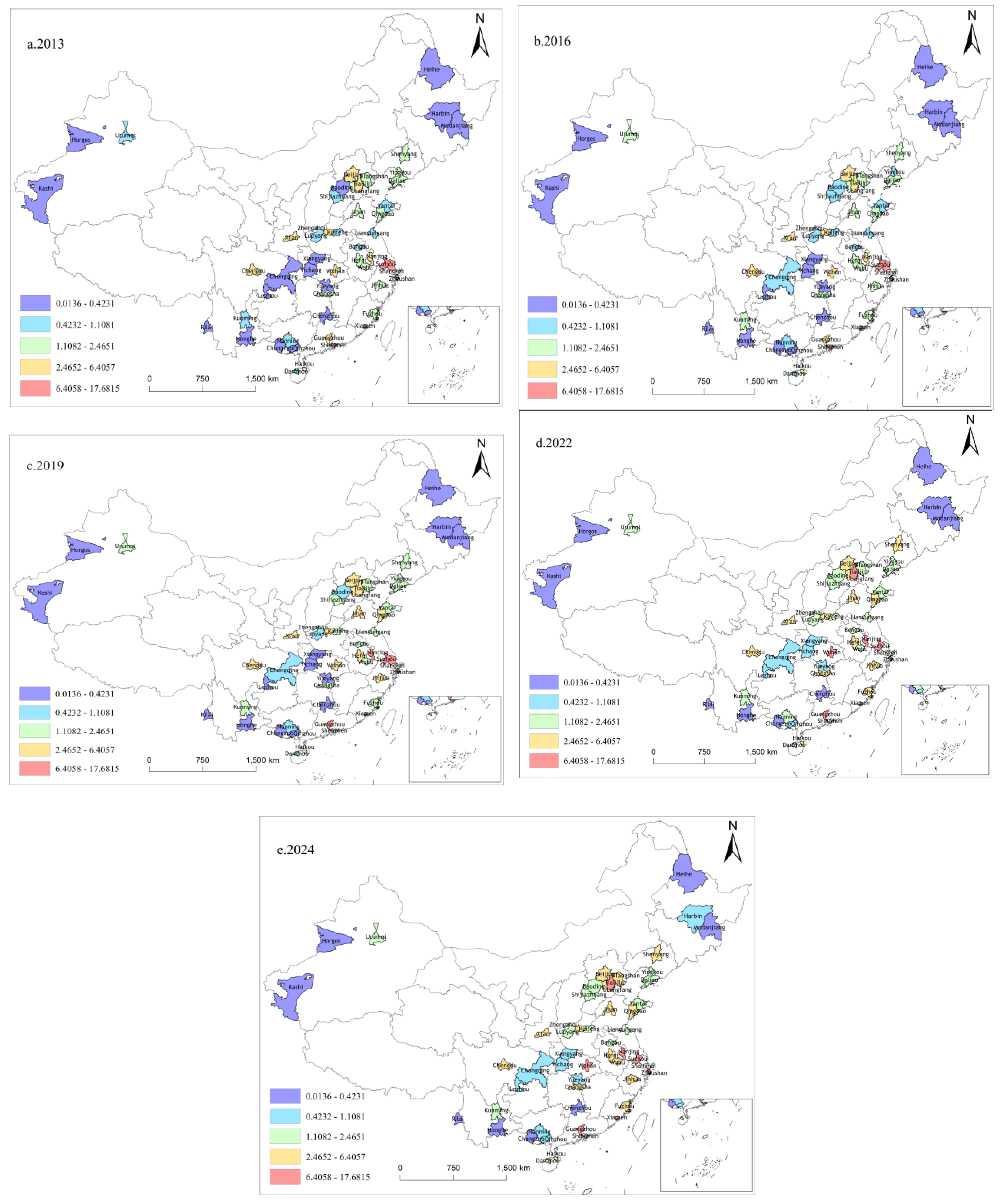
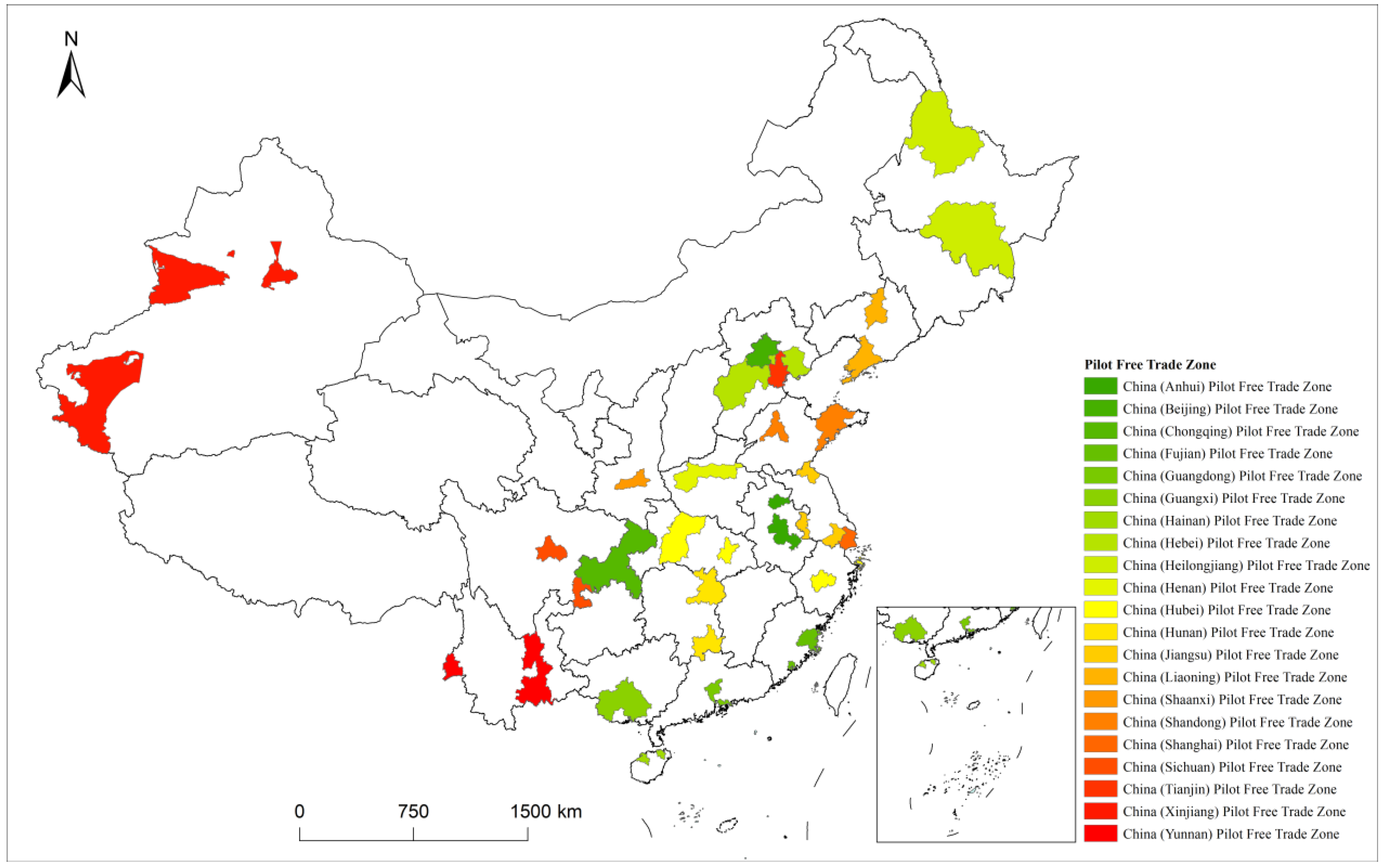
Prefecture-level cities are used as the basic spatial unit for both data and institutional reasons. Prefecture boundaries are relatively stable and allow annual nighttime lights (NTL) and other remote-sensing observations to be aggregated on a consistent spatial support for interannual comparison and replication. In practice, PFTZs consist of multiple functional areas, and cross-city configurations are common. Using only the host city would understate actual coverage, weaken spatial interpretation, and bias spillover identification at the outset. The spatial distribution of the involved prefecture-level cities is shown in
Figure 1 [
33,
34,
35,
36,
37,
38,
39,
40,
41,
42,
43].
3.2. Phased Rollout and Batch Definition
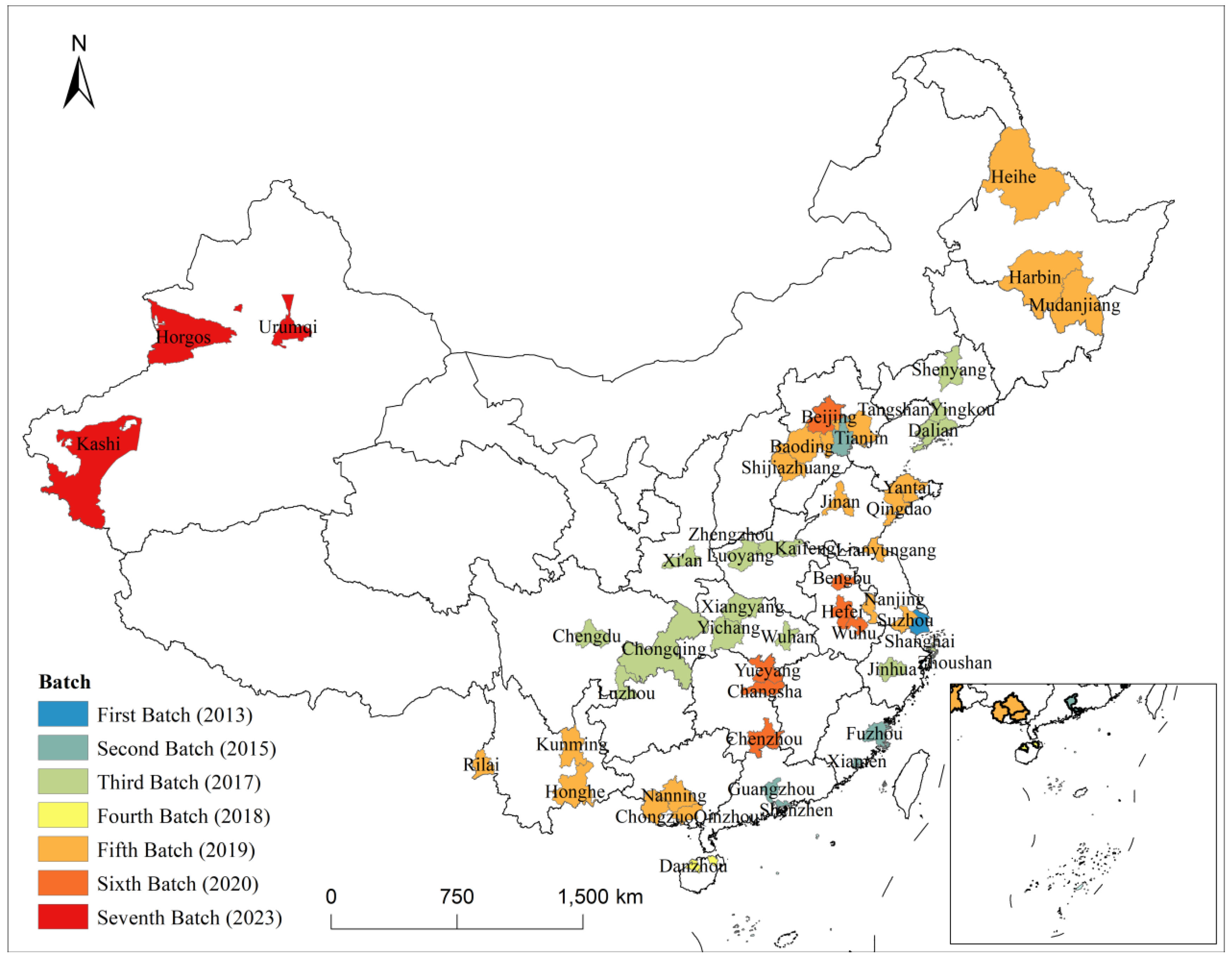
PFTZs expanded through a phased rollout. This creates a traceable batch structure for empirical analysis. Entry is dated by official approval and inauguration, or the contemporaneous activation milestone when applicable. On this basis, PFTZs are grouped into seven batches, and each involved prefecture-level city is assigned a batch label (
Table 1) [
33,
34,
35,
36,
37,
38,
39,
40,
41,
42,
43]. Approval and inauguration dates provide a consistent reference point. They have clear administrative force and typically mark the point at which the institutional framework becomes operational. They are also readily retrievable from public records, supporting reproducibility across studies. Using policy release dates or the timing of supporting measures can introduce cross-city inconsistency in the definition of entry. It is important to acknowledge that the timing of cities’ entry into the PFTZ program was not random. Cities that entered early were likely to differ in key characteristics (such as economic development level, institutional capacity, or pre-existing resilience) from those that entered later. Therefore, in this research, we employ a staggered difference-in-differences approach to account for differences in pre-treatment trends and to mitigate biases related to non-random entry. To address potential biases from the non-random timing of PFTZ entry, we explicitly discuss the selection mechanisms that may have influenced entry. These mechanisms could include regional economic strategies, political factors, and cities’ economic conditions, which may have influenced both the timing of PFTZ designation and the cities’ resilience before entering the program. To the extent possible, we control for observable pre-shock characteristics to reduce selection bias.
The batch classification is as shown in
Figure 2. Batch 1: Shanghai Free Trade Pilot Zone (2013). Batch 2: Guangdong, Tianjin, Fujian Free Trade Pilot Zone (2015). Batch 3: Liaoning, Zhejiang, Henan, Hubei, Chongqing, Sichuan, Shaanxi Free Trade Pilot Zone (2017). Batch 4: Hainan Free Trade Pilot Zone (2018). Batch 5: Shandong, Jiangsu, Guangxi, Hebei, Yunnan, Heilongjiang Free Trade Pilot Zone (2019). Batch 6: Hunan, Anhui, Beijing Free Trade Pilot Zone (2020). Batch 7: Xinjiang Free Trade Pilot Zone (2023). In the empirical analysis, the batch label is treated as an entry time stamp into the institutional regime. It captures differences in exposure windows rather than ranking policy strength [
33,
34,
35,
36,
37,
38,
39,
40,
41,
42,
43]. While this research aggregates NTL at the prefecture-level city scale, it is important to recognize that the functional areas of the PFTZs are only a small portion of these cities. For instance, Shanghai’s Free Trade Zone occupies only a fraction of the total area of Shanghai, and similar spatial imbalances exist in other cities like Ruili in Yunnan. Aggregating NTL data at the city level may dilute the activity signals from these specific functional areas and may not adequately capture the resilience characteristics of the core PFTZ areas. Future studies could consider using more granular spatial units or examining individual PFTZ subzones to better reflect the resilience dynamics within these functional areas.
Batch labels are used to align exposure windows, not to pre-assign the direction of effects. Earlier batches imply longer operating periods, while batches also differ in macro conditions, regional competition, and external connectivity. Whether batch differences translate into different deviation and recovery patterns is assessed with the remote-sensing evidence and the spatial identification strategy. Some cities are covered more than once due to later expansions or cross-zone layouts. The sample adopts a first-entry rule. A city’s batch label is defined by the first time it enters the PFTZ system. Exposure is treated as accumulating from first entry onward. This avoids inconsistent batch assignment under repeated coverage and provides a stable basis for aligning the shock window with exposure duration. Estimated effects should be interpreted as cumulative exposure effects of institutional entry rather than marginal effects of each subsequent expansion.
3.3. Sample Mapping and Reproducible Presentation
Institutional coverage is mapped explicitly to the prefecture level and kept consistent across figures, tables, and analysis. The mapping starts from functional-area information. Each functional area is matched to its host prefecture-level city. Functional areas are then aggregated within each PFTZ to form the set of involved prefecture-level cities for that zone. The construction follows a full-coverage rule. Any prefecture-level city appearing in the mapping is included in the corresponding batch’s PFTZ city set. Batch assignment follows a single rule [
44,
45]. If a prefecture-level city appears repeatedly because of different PFTZs or later expansions, it is counted once and labeled by first entry. The resulting city list and batch labels are reported in a later table and matched to the city locations and batch coloring in
Figure 1. The figure summarizes spatial configuration and expansion pathways. The table provides a checkable definition of the research population and its batch structure. A shared mapping source is used for both. This provides a unified basis for annual NTL aggregation and the construction of spatial weights.
3.4. Implications of the Spatial Pattern
Under the involved-prefecture definition, PFTZ coverage is a batch-expanding set of cities rather than a small number of isolated points. Early batches concentrate in coastal areas with strong outward connectivity. Later batches extend inland and toward border regions, with differentiated placement across urban agglomerations and transport corridors. Cross-city combinations of functional areas mean that batch differences and spatial structure are often intertwined [
46,
47]. A binary PFTZ indicator compresses entry timing. Simple adjacency or Euclidean distance may not reflect linkages shaped by geographic frictions and system position.
The empirical analysis therefore treats phased institutional entry and spatial structure jointly. Annual NTL is aggregated at the prefecture level to derive an activity-based resilience signal. Staged differencing is used to trace deviation and recovery under a common shock window and to compare batches. Accessibility measures and network-embeddedness indicators are then introduced to characterize intercity linkage structure. Spatial econometric models separate local from spillover effects. Distance-decay diagnostics are used to express the spatial extent of spillovers [
48]. The next chapter describes the construction of the remote-sensing evidence, including preprocessing of annual NTL, intertemporal comparability control, and change detection procedures.
4. Data and Methods
Building on the sample defined in
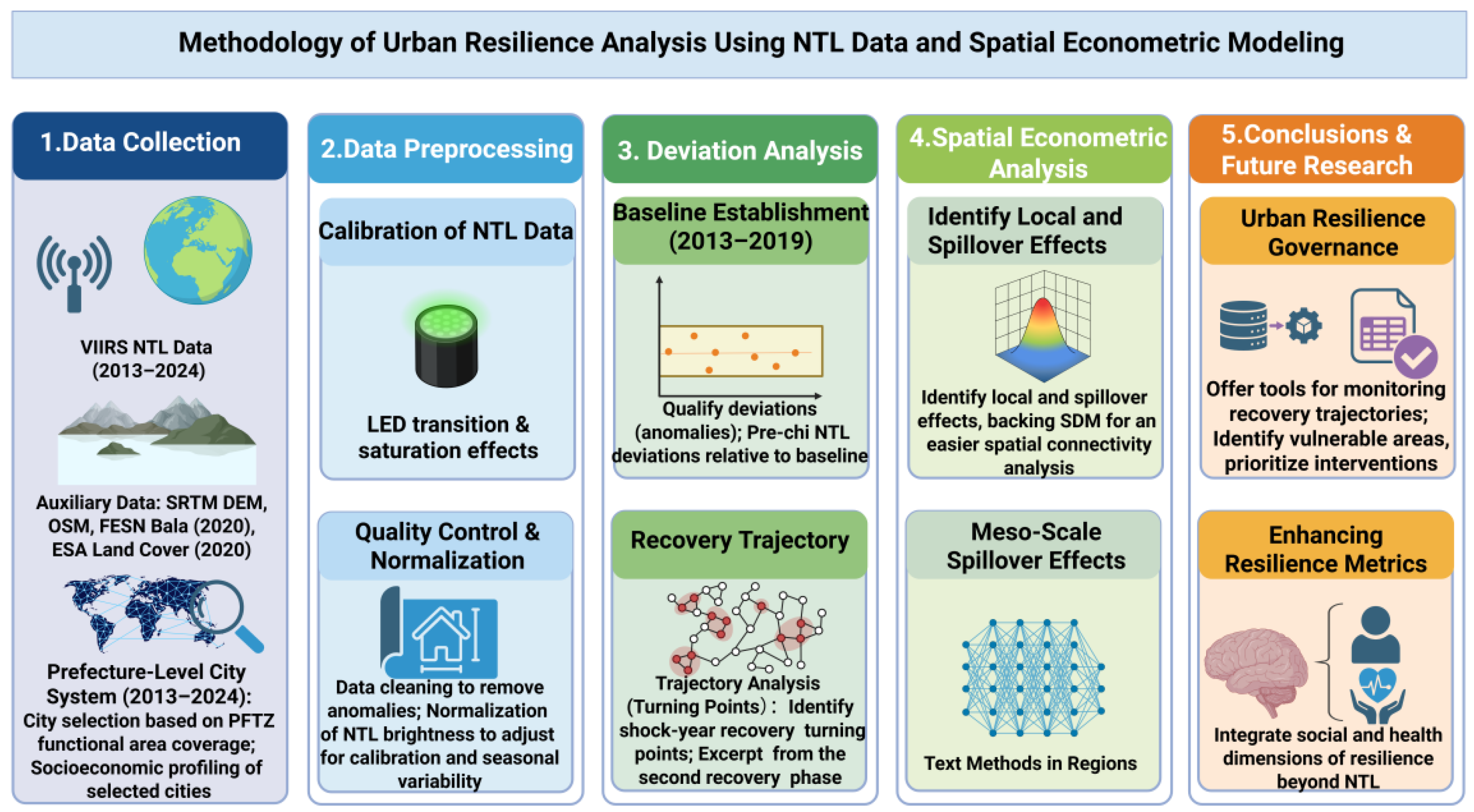
Section 3, namely the set of prefecture-level cities covered by the functional areas of China’s Pilot Free Trade Zones (PFTZs), this section describes the remote-sensing data, variable construction, and the spatial econometric identification strategy. The methodological workflow follows a single logic from data to inference, moving from product definition to process signals, then to spatial structure, effect decomposition, and scale diagnostics.
Figure 3 summarizes the full workflow from sample construction and NTL preprocessing to resilience signal extraction and spatial econometric identification. The analysis treats NTL as an observable signal of urban activity change under a common shock and expresses resilience as replicable deviation and recovery evidence. Spatial dependence is modeled explicitly to separate local effects from spillover transmission, and distance-based diagnostics are used to delineate the empirical boundary of spillovers.
4.1. Data Sources and Spatial Support
Annual city-level activity series are constructed from VIIRS nighttime lights for 2013 to 2024. It is important to note that the core functional areas of the PFTZs, such as industrial manufacturing, port logistics, and cross-border trade, maintain basic industrial/port lighting even during partial shutdowns or closed-loop production, which do not accurately reflect fluctuations in actual production and workforce activity. As a result, NTL may underestimate the impact of the COVID-19 pandemic on the activities within PFTZs, leading to a potential bias in the ‘impact deviation’ indicator used for resilience assessment. The NTL data come from monthly composites of the VIIRS Day/Night Band (DNB, roughly 500 to 900 nm). Radiance statistics are extracted from the EOG VNL V2 product. NTL is used as a signal of changes in nighttime urban activity to trace deviation and recovery dynamics under a common shock. It is not treated as a direct substitute for output levels [
11,
49].
The spatial unit of analysis is the prefecture-level city. The research area follows the definition in
Section 3 and includes all prefecture-level cities covered by PFTZ functional areas, along with comparison cities. Administrative boundaries are obtained from the National Geomatics Center of China and are harmonized to a consistent boundary definition over 2013 to 2024 to avoid spurious interannual differences caused by boundary adjustments. Administrative boundaries are obtained from the National Geomatics Center of China and are harmonized to a consistent boundary definition over 2013 to 2024 to avoid spurious interannual differences caused by boundary adjustments. The auxiliary datasets used in this research include the SRTM DEM, Open Street Map rail data, and ESA World Cover. The SRTM DEM, version 2019, provides digital elevation models that are critical for calculating least-cost path distances (LCPD) across various terrain types, which are essential for assessing accessibility. The Open Street Map rail data, from the 2020 version, was used to derive rail connectivity, which plays a key role in constructing the cost surface for effective accessibility measures. Additionally, the ESA World Cover dataset, also from 2020, was employed for land cover classification, specifically to exclude water pixels from the NTL aggregation and ensure consistent coverage across the entire research period from 2013 to 2024.
The emphasis on the “set of involved prefecture-level cities” operationalizes institutional exposure as a verifiable city list and keeps subsequent comparisons of spatial pattern, network embeddedness, and spillover range on a consistent population.
City aggregation uses mean radiance as the primary statistic. For each prefecture boundary, monthly mean radiance is calculated as a spatial average within the boundary. The annual NTL series NTL
i,t is then obtained by averaging the monthly values within year ttt. Using a mean statistic helps reduce mechanical differences driven by city area and boundary shape and is suitable for cross-city, intertemporal comparisons of relative change [
50].
4.2. Annual NTL Preprocessing and Intertemporal Comparability
Intertemporal comparison requires stable product definition and processing. The analysis starts from the EOG VNL V2 monthly product and uses radiance statistics after the product-level screening of abnormal lights and short-term disturbances [
18]. In recent years, especially from 2013 onwards, Chinese cities have undergone a large-scale transition to LED lighting, which has significantly reduced energy consumption and increased efficiency. This transition can lead to saturation in light intensity, particularly in major urban cores, where lighting infrastructure is more developed. These changes could distort the observed trends in NTL data, especially towards the latter part of the 2013–2024 period. To account for this, we implemented a series of quality control measures. We detected and excluded anomalous light intensities that could be caused by LED lighting transitions or energy-saving policies. Additionally, we conducted sensitivity analyses to examine the potential impact of these factors on the observed trends, particularly in the cities with the most significant lighting transitions. City-level monthly series are constructed first, then aggregated to annual series under the same boundary and aggregation procedures so that the timing aligns with the shock window in the empirical design. The time ranges of the variables are selected to align with the policy entry periods for the PFTZs, as well as the timeline of the COVID-19 shock. The pre-shock period is defined as the three years prior to 2020, with an average of 2017–2019, to establish baseline conditions. The shock year is 2020, which captures the immediate impact of the pandemic, and the recovery period spans from 2021 to 2024. This methodology allows us to track deviations from pre-shock trends and assess recovery dynamics over time. We also recognize that the choice of these time windows might influence the results, particularly in cities that entered PFTZs later. Future research could explore the sensitivity of the findings to different time windows or consider the use of shorter periods for a more granular assessment. To reduce contamination from non-target surfaces, water pixels within city boundaries are excluded during aggregation. Water masks are taken from the JRC Global Surface Water dataset. Coverage and quality information provided by the product are used to assess potential observation differences across space and time, such as persistent cloud cover and high-latitude conditions. In spatial processing, raster data and vector boundaries are brought into a consistent coordinate reference system and the same projection is used for pixel overlay and zonal statistics across all years [
51,
52]. The purpose is not to re-calibrate NTL radiance but to prevent coordinate handling differences from introducing systematic bias into mean or sum statistics, thereby providing a defensible measurement basis for interannual differencing and process-signal construction.
4.3. Staged Differencing and Resilience Process Signals
Annual change detection is implemented through staged differencing and used to construct process-based resilience signals. At the pixel level, interannual differencing is
where L
t(s) is the annual radiance of pixel sss in year ttt. At the city level, annual total lights are obtained by summing pixels within city i to form NTL
i,t. Interannual change used for mapping and descriptive comparison is
Staged differencing is used to construct a replicable factual panel that answers whether changes occur, where they occur, and how their magnitudes are distributed. This step does not impose any directional conclusion for the institutional variables. Institutional interpretation and spillover tests are carried out in the spatial econometric framework [
53,
54].
In the common-shock setting, resilience is expressed through two complementary process signals, shock deviation and subsequent recovery. Let the common shock year be t
0 = 2020. Shock deviation measures the contraction in the shock year relative to a pre-shock baseline. To reduce sensitivity to a single baseline year, the pre-shock level is defined as the mean over the three years prior to the shock:
Shock deviation is then
Recovery measures the rebound in post-shock years relative to the shock year:
These definitions follow common practice in NTL-based shock monitoring and recovery assessment, where NTL is most informative about the shape of decline and rebound trajectories at broad spatial scales [
19,
55]. Descriptive results report both mean paths and distributional comparisons. Mean paths summarize overall evolution. Distributional statistics highlight heterogeneity across cities and present deviation and recovery features in a checkable way.
4.4. Spatial Weights: Accessibility, Network Linkage, and Economic–Geographic Nesting
Urban activity change is spatially correlated in regional systems. The spatial weight matrix therefore defines the meaning of “linkage structure” in the model. The design uses two weight matrices and a set of scale diagnostics. The baseline weights are used for main estimation and effect decomposition. An economic–geographic nested weight matrix is used for robustness checks. Ring-band weights are used to diagnose distance decay [
56].
The baseline weight matrix W captures potential linkage intensity and combines size and distance in a gravity form:
The distance term D
ij is measured by least-cost path distance (LCPD) rather than Euclidean distance to better reflect effective accessibility under terrain and transport constraints (Adriaensen et al., 2003 [
57]). LCPD is computed on a cost surface constructed from slope, rail features, and land-cover types. Inputs are taken from SRTM DEM, Open Street Map rail data, and ESA World Cover, processed under a consistent coordinate system and matched resolution. Cost assignment follows monotonic and interpretable rules. Higher slope implies higher impedance. Proximity to rail implies lower impedance. Land-cover types receive relative impedance levels. City size M is measured by baseline-period NTL scale to keep weights consistent with the NTL observation system. The matrix is row-standardized after construction [
58,
59,
60].
An economic–geographic nested matrix W
EG is constructed to reflect the possibility that propagation is shaped not only by geographic friction but also by economic linkage. The matrix uses a distance-decay backbone and applies an economic coupling modifier to each city pair, followed by row standardization [
61]. The scale interpretation matches the baseline weights, while the structural meaning is closer to cross-city economic linkage. The matrix is used to assess sensitivity to weight specification rather than to replace the main identifying structure.
To move from the existence of spillovers to their spatial reach, ring-band weight matrices W
(k) are constructed for scale diagnostics. Distance bands are defined in 50 km intervals. Band k corresponds to [50(k − 1), 50k) km. If D
ij falls within the band, set
, otherwise set
. Each W
(k) is then row-standardized [
27,
62]. Indirect effects computed under W
(k) have a clear interpretation as the average spillover influence originating from neighbors in that distance range, supporting an empirical distance-decay profile.
4.5. Spatial Econometric Identification: SDM as the Main Model, SAR and SEM as Benchmarks
With spatial dependence, ignoring spatial structure can blend local changes with neighbor feedback and distort interpretation of institutional and structural effects. The main specification uses the Spatial Durbin Model (SDM), allowing spatial lags of both the dependent and explanatory variables to identify local effects and spatial transmission within a single framework:
where y
it is the outcome variable, X
it includes the institutional exposure and control variables, μ
i and τ
t denote city and year fixed effects. For interpretability, results are reported through LeSage and Pace effect decomposition into direct, indirect, and total effects so that spillovers are quantified rather than inferred from coefficients alone [
63].
The control vector X
it follows recent PFTZ policy evaluation and spillover studies and absorbs systematic differences in city scale, openness, development fundamentals, financial conditions, fiscal capacity, industrial structure, and human capital. The control variables include GDP, openness (OPEN), population size (POP), economic development level (Economic), financial development level (Finance), fiscal investment intensity (Fiscal), industrial structure (INS), and human capital level (Human capital) [
64,
65,
66]. Control variables are compiled from authoritative national statistical sources and yearbooks at the city level under consistent administrative boundary definitions, including the China City Statistical Yearbook, provincial and municipal statistical yearbooks, and official statistical bulletins, with openness and finance components taken from the corresponding official statistical sources where available.
Network position is also controlled using closeness centrality to capture cross-city accessibility in the linkage network and reduce confounding from “system position” in identifying institutional effects and spillovers. Closeness centrality is computed on the weighted network implied by W Edge distance is defined as the inverse of linkage strength, and weighted shortest paths are computed using Dijkstra’s algorithm. For city i, let d(i,j) denote the weighted shortest-path distance to city j [
67,
68]. The sum of shortest-path distances is
, and closeness centrality is defined as
Benchmark specifications assess the dependence of results on spatial modeling choices. Three benchmark settings are estimated under the same control system. The first replaces W with WEG in the SDM to test sensitivity to an economically nested linkage structure. The second estimates a SAR model to assess stability when spatial dependence is captured mainly through the spatial lag of the dependent variable. The third estimates a SEM model to assess stability when spatial dependence is absorbed primarily by a spatial error process. The purpose of these benchmarks is to evaluate structural stability of the core relationships rather than to compare coefficient magnitudes across models, since SAR and SEM absorb spatial dependence through different channels. Interpretation focuses on relationships that remain stable across settings and on spillover structures supported jointly by effect decomposition and distance-decay diagnostics.
5. Results
5.1. Overall Changes in Urban Activity Under a Common Shock
Before proceeding to the identification of local spatial structure and the decomposition of spatial effects, it is necessary to establish a descriptive baseline within the sample city system: whether the nighttime lights indicator exhibits a stable pattern of spatial nonuniformity, and whether this pattern undergoes a structural shift around 2020. As shown in
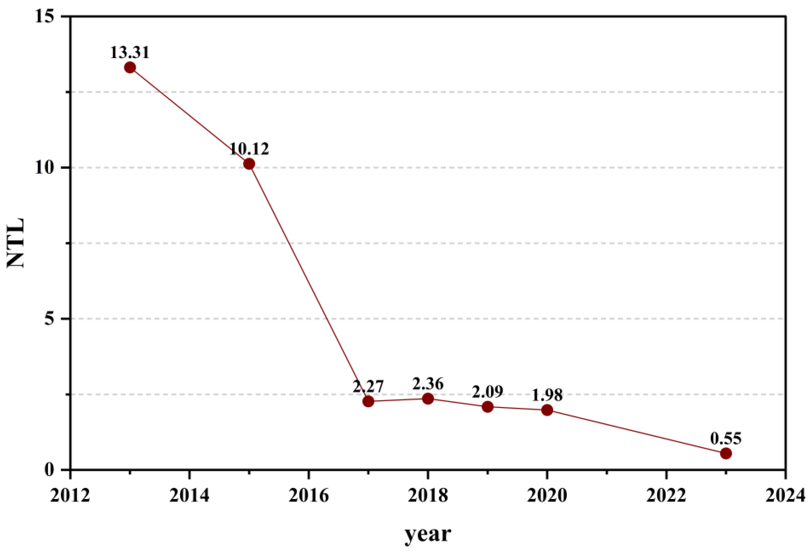
Figure 4, the annual mean trajectory of lnNTL exhibits a clear phase pattern at the system level: the mean declines steadily over 2013–2016, and thereafter (from 2017 onward) fluctuations narrow and remain at a relatively low level. This temporal profile indicates that variation in lnNTL is not driven by a single-year shock alone, but reflects the superposition of a longer-run trend and a structural downward shift. Accordingly, this figure is best interpreted as a contextual benchmark for overall dynamics, motivating the need to characterize “deviation–recovery” around the 2020 shock window. In turn, resilience should be assessed primarily through pre-shock baselines and post-shock relative changes, rather than inferred from mean levels alone.
In the spatial snapshots in
Figure 4, the lnNTL distribution across prefecture-level cities covered by FTZ functional zones indicates where high and low values are located and whether the configuration is persistent. Dynamic responses to a common shock require temporal aggregation and a pre-/post-shock comparison. Two forms of evidence are used: the annual mean trajectory for the FTZ-related city system (
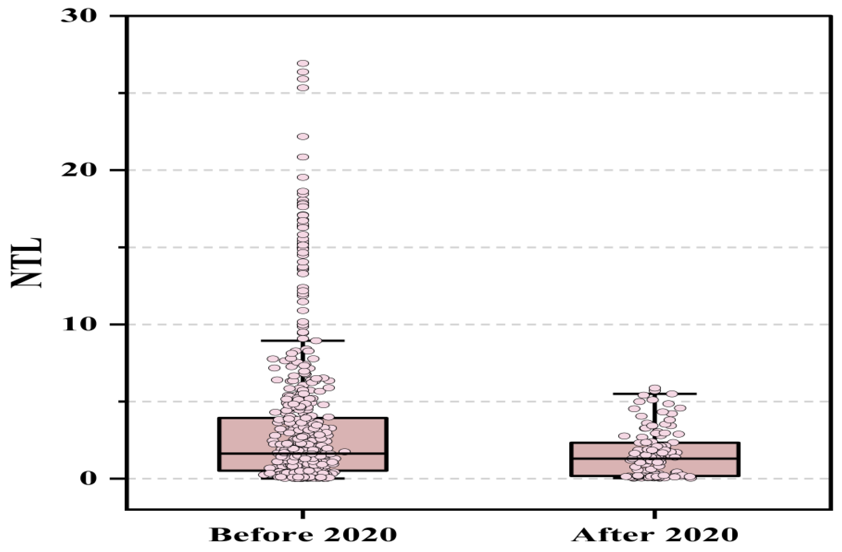
Figure 5) and the distributional reshaping before versus after the 2020 common shock (
Figure 6).
Figure 4 shows a clear phase structure in the annual mean of lnNTL. The mean declines rapidly over 2013–2016. A low-level plateau follows from 2017 onward, with relatively muted fluctuations. This profile is consistent with the superposition of longer-run trends and a stepwise structural shift, rather than a pattern driven solely by a single-year shock.
Figure 4 therefore serves as a contextual benchmark. Resilience is better evaluated through relative movements around the 2020 shock window than through comparisons of mean levels that may be confounded by underlying trends.
Figure 6 focuses on the cross-city distribution of lnNTL. After 2020, the distribution shifts downward, reflected in a lower median. Dispersion narrows. The upper tail contracts markedly, with far fewer extreme high values. The 2020 shock is associated with an overall contraction in activity and a compression of the right-tail advantage previously held by high-activity cities. The evidence points to changes in heterogeneity and tail behavior rather than a uniform proportional shift.
Figure 5 and
Figure 6 jointly indicate a phased downward movement in lnNTL over time and a distinct pre-/post-2020 redistribution characterized by a lower center and a shorter upper tail. The pattern is compatible with a reordering of spatial disparities in addition to a change in overall levels. The next section evaluates whether this reordering takes the form of spatially contiguous clustering and whether neighborhood effects reinforce high and low values, using the Getis–Ord Gi* statistic to identify hot and cold spots within the sample system.
5.2. Annual Hot–Cold Spot Clustering
Interpretation of
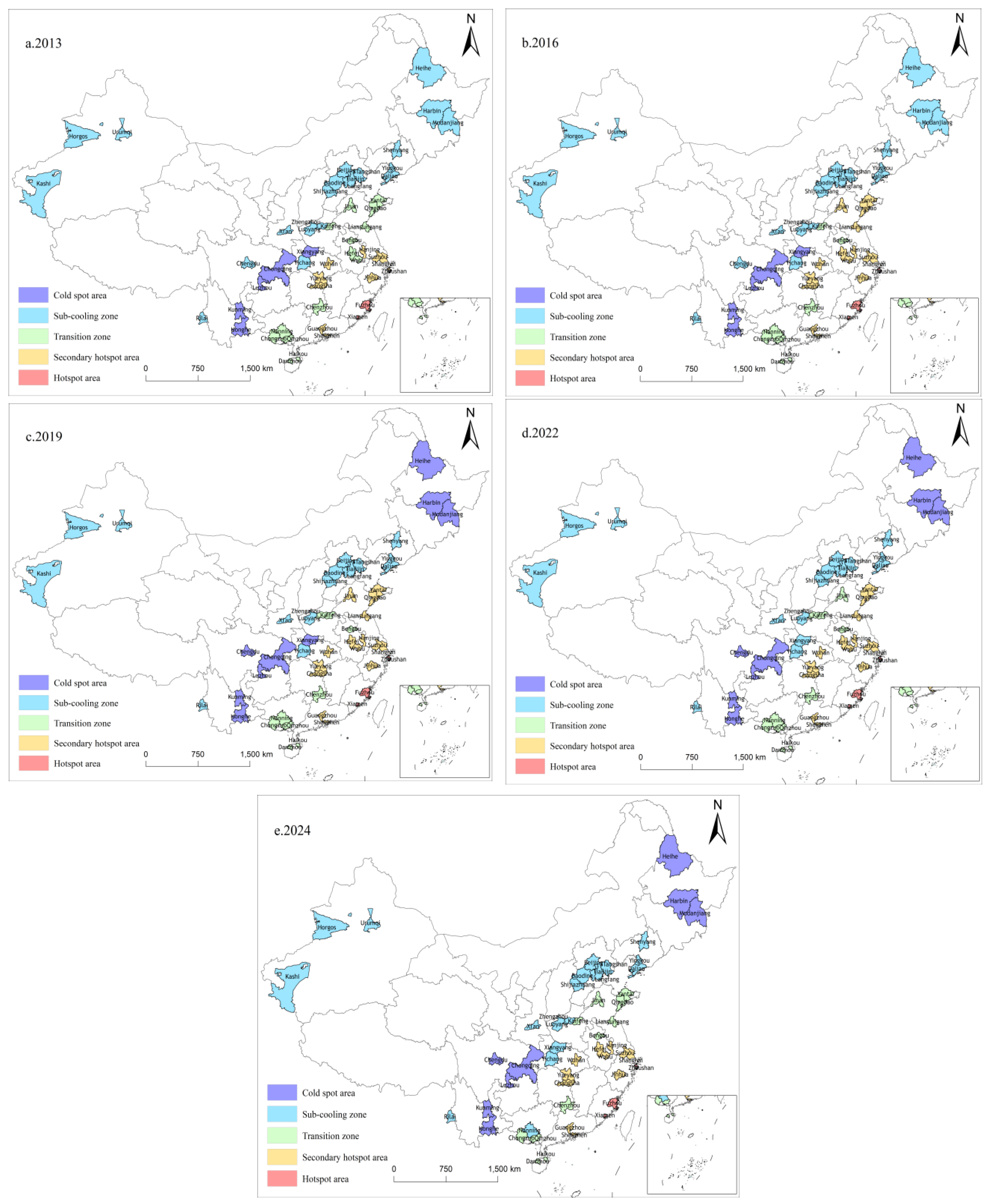
Figure 7 must be anchored in the sample definition. The Gi* statistic is not used to identify hot spots and cold spots across all prefecture-level cities nationwide. It is applied within the institutionally defined urban system, namely the set of prefecture-level administrative units covered by PFTZ functional areas. Hot and cold spots therefore indicate relative clustering within this sub-system. They should not be read as nationwide patterns.
The spatial pattern is clear. High-value clustering concentrates along the eastern coast and adjacent areas, consistent with earlier batches and denser institutional layouts. High values rarely appear as isolated “spikes” in single cities. They more often form continuous or semi-continuous hot belts or hot patches, with secondary hot spots and transition zones around the periphery. Within the PFTZ-related urban system, high values exhibit pronounced neighborhood reinforcement. The spatial organization is closer to a “zone or corridor” pattern than to point-like advantage.
Low values are more common toward the interior and border regions. They display similar adjacency. In the northwest and southwest, low values tend to occur in contiguous areas rather than as scattered pockets. This suggests that cold spots are not driven by a few anomalous cities. They are more consistent with stable clusters formed under shared regional constraints and intercity linkages. This matters for interpretation. Explanations that remain at the single-city level are incomplete. Regional constraints and linkage structure need to be part of the account.
The time dimension highlights the northeast. Some cities begin the research period as secondary cold areas or transition zones, then shift into cold spots after 2019 and remain there. This does not overturn the broader contrast between coastal hot spots and interior or border cold spots. It does sharpen the boundary of low-value clustering in the northeast and reinforces spatial differentiation within the system.
Two conclusions are supported by the evidence. First, within the set of PFTZ-involved prefecture-level units, local clustering is identifiable and relatively stable, and both high and low values show neighborhood reinforcement. Second, the structure is not static. At least in parts of the system, especially on the low-value side, it adjusts over stages. This combination of persistence and change provides the spatial setting in which staged comparisons around the shock window and the identification of spillovers and their scale become methodologically necessary.
5.3. Spatial Evidence from Interannual Differencing
After establishing local clustering in
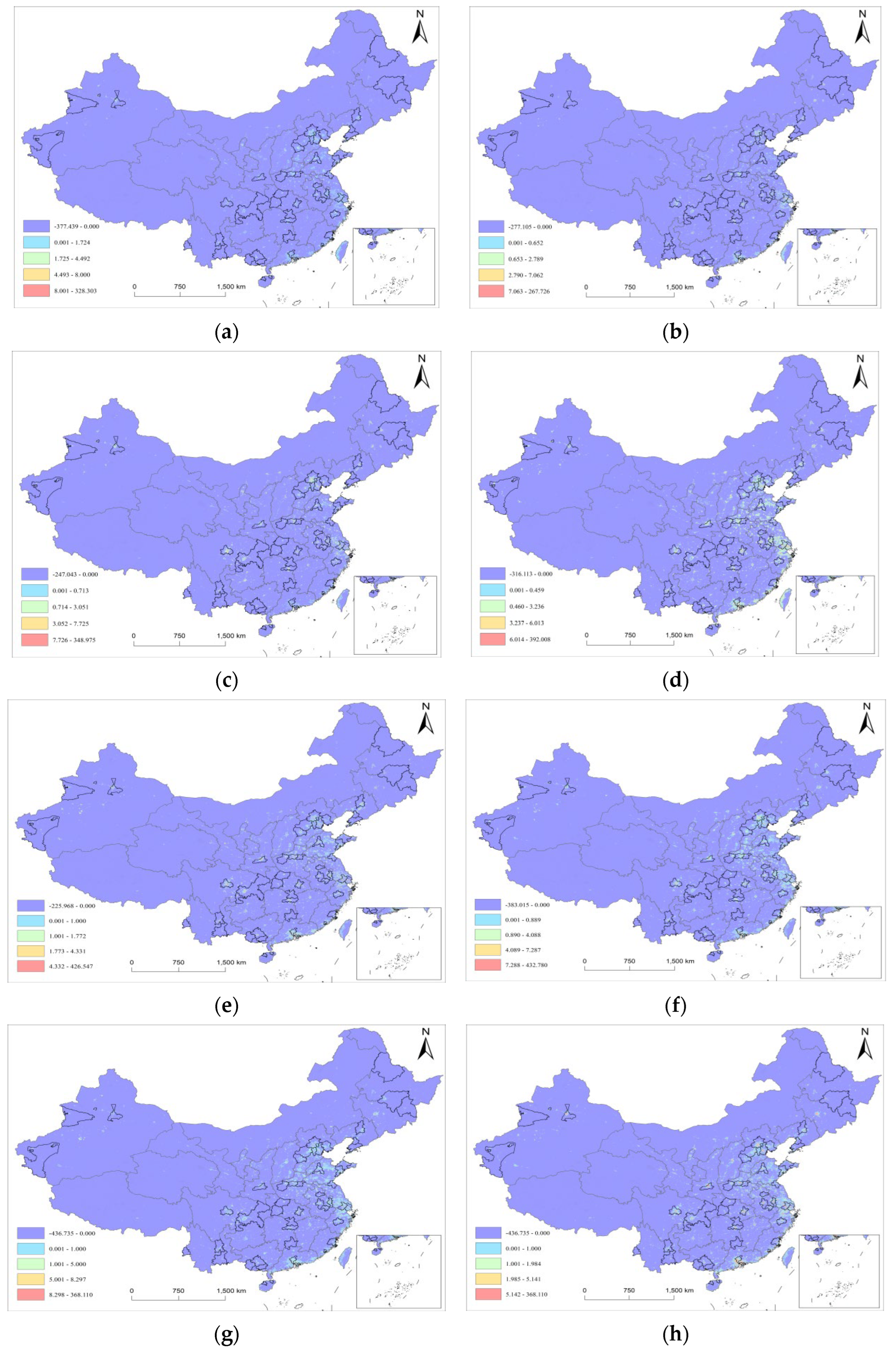
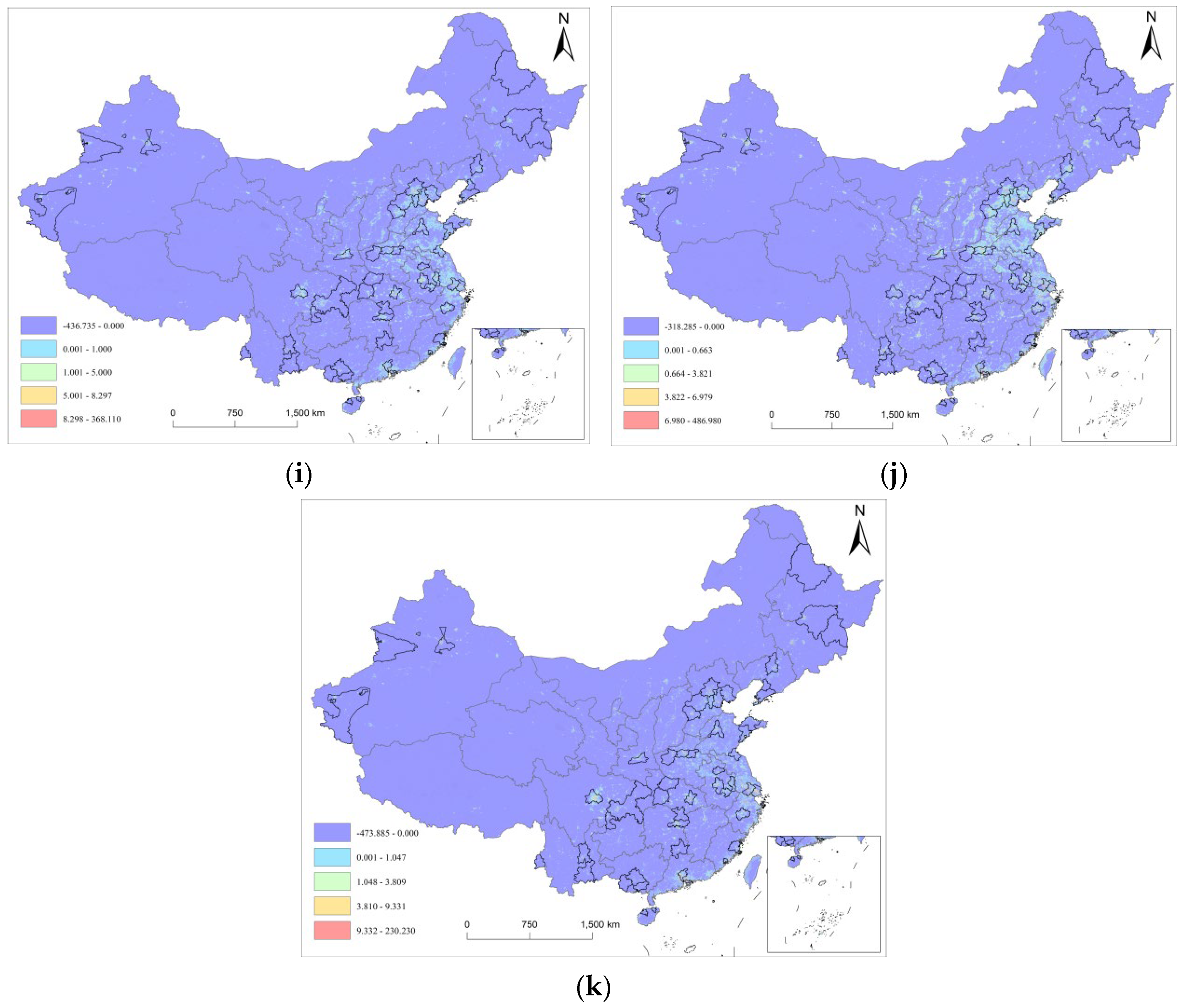
Section 5.2, the interannual differencing maps place the deviation–recovery framework under a common shock onto an explicit spatial canvas. They show whether increases and declines occur within the interior of existing light structures or along their margins. They also allow inspection of corridor-aligned diffusion and ring-like contrasts. Many pixels exhibit non-positive or near-zero changes in annual differencing. This reflects the prevalence of low-radiance background in the research region and the common empirical feature that annual-scale variation is concentrated in core urban areas and their immediate edges. For that reason, the differencing maps are not used to infer a domain-wide average change. They are used to characterize spatial organization and its consistency and turning points across the annual sequence. The conclusions are presented in
Figure 6.
From the
Figure 8a through the
Figure 8e sequence, positive changes in the normal period tend to appear as point-like patches or fine-grained strips attached to the existing urban light skeleton. This is especially visible along the coast and around major urban agglomerations. The pattern resembles outward extension of established structures rather than the emergence of new centers in low-radiance space. Within urban agglomerations and at their margins, many brightening patches align with metropolitan edges and directions of stronger intercity linkage. Normal-period change therefore looks incremental and corridor-oriented. Node–corridor structure strengthens, while the overall spatial configuration remains broadly intact.
The
Figure 8g map marks a clear turning point. Against the earlier pattern of outward brightening, the shock window is dominated by widespread non-positive change. Positive brightening becomes smaller in extent and more fragmented. Within high-radiance and highly connected coastal belts and urban agglomerations, corridors more often appear as discontinuous segments in the differencing map. The underlying spatial structure is not overturned, yet the evidence supports a sharper statement. Compression in high-density activity areas is more likely to register in NTL as weakened connectivity and localized breaks.
In
Figure 8h,i, positive patches reappear, but recovery is not spatially uniform. The maps are more consistent with a sequence in which brightening concentrates first in established cores and around key nodes, followed by partial re-connection along selected intercity corridors. Large background areas remain weak-change or near-zero. The recovery phase therefore combines local repair with structural reconfiguration. Core intensity rebounds in a patch-like manner, while the pace of rebound differs across space and the spatial gradient remains visible. By
Figure 8j map, brightening becomes more evident within several major urban agglomerations and shows more coherent chaining along some directions. The overall pattern still resembles hierarchical outward diffusion. Change is stronger in cores and high-linkage areas and weaker in peripheral, low-density space.
Figure 8k map continues the non-uniform recovery pattern while showing a stronger tendency toward stabilization. Positive changes remain embedded in existing clusters and within metropolitan areas, with higher density along the eastern coast and around major agglomerations. Compared with the previous year, strong brightening is more restrained. More pixels fall into low-to-moderate positive change bands, appearing as fine patches or short segments near cores and their edges. In spatial terms, the evidence is consistent with a phase of marginal adjustment. The overall configuration is not substantially rewritten. Incremental change reinforces existing structure rather than producing large-scale outward expansion.
The differencing sequence supports a coherent spatial narrative. During normal years, change is dominated by incremental expansion along the existing light skeleton. In the shock year, connectivity is compressed; brightening is reduced and fragmented. Recovery follows a layered pattern: repair concentrates in core areas, corridor links re-emerge later, peripheral areas change more weakly. By 2024, the pattern stabilizes and is dominated by structural reinforcement. This spatial panel sets constraints on subsequent group comparisons. Systematic differences in deviation magnitude or recovery strength across PFTZ batches should appear within a node–corridor–ring structure as contrasts in intensity and diffusion limits, rather than as differences in city-level summary statistics alone.
5.4. Spatial Paths Under Accessibility Constraints: Cost-Surface Structure and Geometric Deviation in LCPD
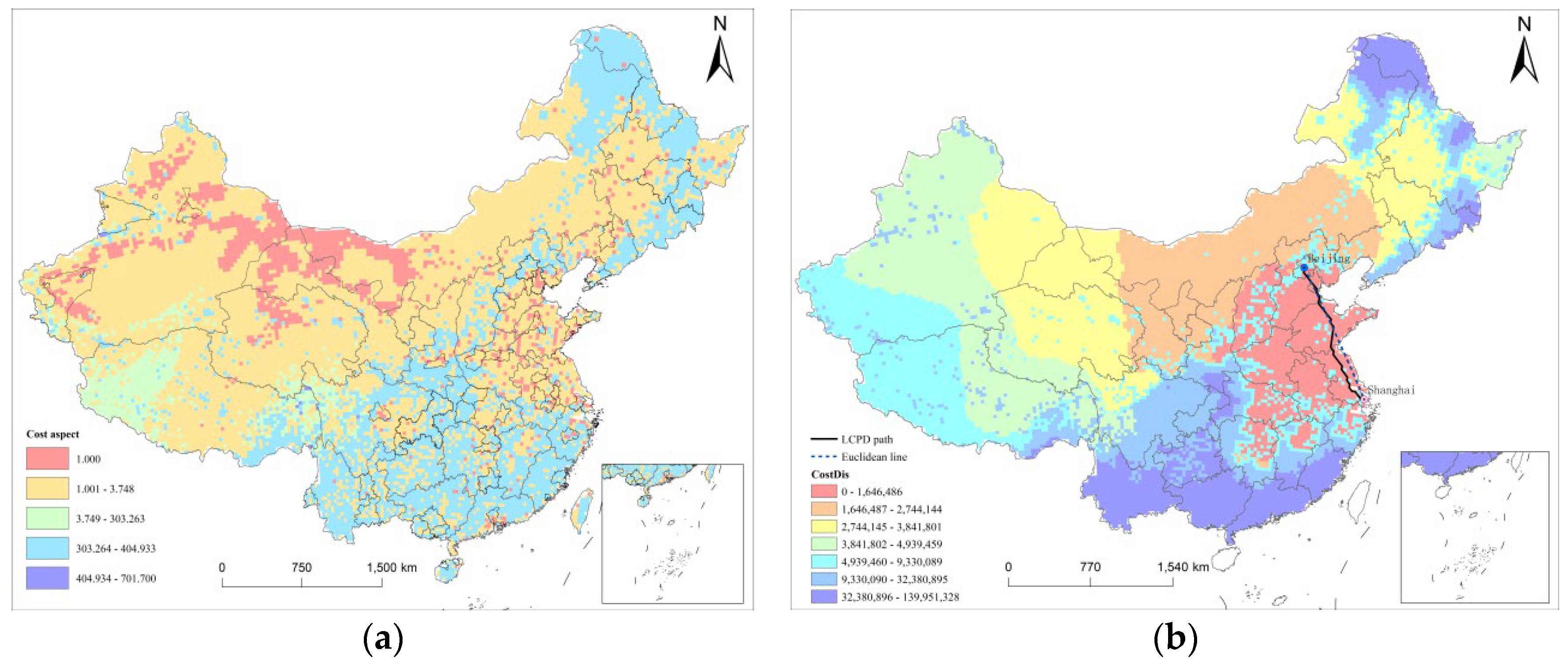
Before distance can be used to represent potential intercity linkage, geometric distance needs to be separated from effective friction in accessibility. The cost surface constructed from terrain, transport corridors, and land cover provides the spatial basis for that friction (
Figure 9a). Its heterogeneity is structured rather than random. Low-cost pixels concentrate in flatter plains and coastal areas where transport accessibility is higher. High-cost areas align more closely with mountain and plateau belts where traversal conditions are constrained. The result is a spatial configuration in which low-friction corridors coexist with high-friction barriers. This makes it appropriate to treat effective distance as a path outcome rather than as a straight line.
Two features of the cost surface are particularly relevant for accessibility. Low-cost areas often show both patch-like connectivity and band-like extension. In the eastern plains and around several urban agglomerations, they form continuous corridors, implying that intercity linkage can more plausibly be realized through low-friction chaining along established channels. High-cost areas influence accessibility primarily through reduced connectivity. When high-cost pixels form continuous belts, they raise traversal costs and change the geometry of optimal paths, inducing detours in cross-regional linkage. The cost surface therefore does more than apply a linear correction to Euclidean distance. It reshapes which directions are easier to connect and which become bottlenecks.
The illustrative path map makes this visible (
Figure 9b). For the Beijing to Shanghai example, the Euclidean line is only a geometric baseline. The LCPD-based least-cost path tends to follow low-friction corridors and avoid high-friction areas. The deviation reflects the trade-off of a longer geometric route for lower cumulative resistance and more stable accessibility under the given cost structure. Identical Euclidean distances can correspond to markedly different effective distances once the cost surface is imposed. This helps explain why reliance on Euclidean distance can systematically understate or overstate accessibility constraints in some parts of the regional system. With this accessibility representation in place, the analysis turns to network embeddedness and examines how positions in the linkage structure relate to resilience differences.
5.5. Network Embeddedness Before and After the Shock
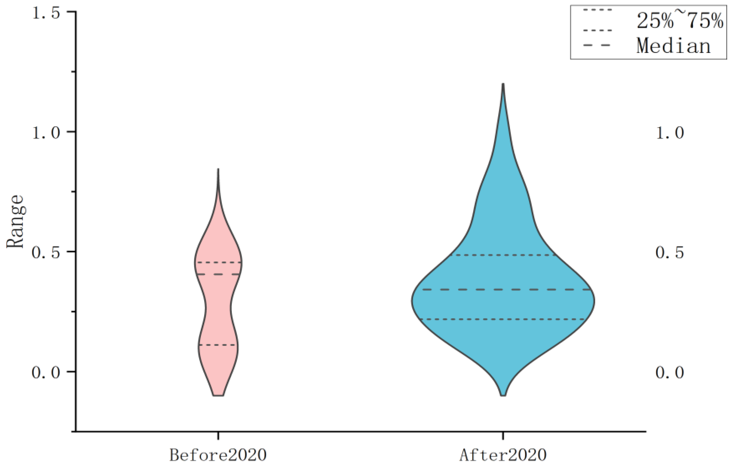
Figure 10 shows that the distribution of closeness centrality does not shift by a uniform translation from the pre-shock to the post-shock period. The distribution itself changes. Before 2020, the distribution is more compact. The violin shape is relatively narrow, with density bulges around mid-low and mid-high ranges. The interquartile range is smaller, and the median is around 0.4. In this period, differences in network accessibility across sample cities appear limited, with concentration around a few typical levels.
After 2020, the most salient change is greater dispersion. The violin becomes wider. Density shifts away from a more discrete, bimodal appearance toward a thicker, more continuous shape around the median. The upper tail extends further, and extreme high values become more visible. The median shifts slightly downward to around 0.33, while the interquartile range widens to roughly 0.22–0.50. The implication is that relative ranking becomes easier to spread out. Even without a large jump in the center of the distribution, accessibility gaps become more pronounced.
The change is not only a variance expansion. Tail structure becomes more asymmetric. The longer upper tail after 2020 indicates that a small number of cities achieve high closeness centrality, producing a visible long tail on the high end. The lower tail expands less. Right-skewness strengthens. Post-shock network embeddedness therefore resembles a configuration in which cities remain clustered around the middle, while a small set of high-accessibility cities becomes more prominent. This provides a useful empirical backdrop for relating network position to resilience differences. Systematic divergence in deviation–recovery trajectories is more likely to be embedded in a linkage structure with stronger heterogeneity and clearer hierarchy, rather than in a relatively homogeneous network environment.
5.6. Spatial Effect Decomposition: From Spatial Dependence to Transmission Pathways
Before turning to effect decomposition, scale and sample structure need to be made explicit to prevent misinterpretation of coefficient magnitudes. AS is shown in
Table 2, the panel contains 624 observations. The core outcome lnNTL has a mean of 0.240 and a standard deviation of 1.500, ranging from −4.370 to 3.290. This indicates substantial fluctuation and heterogeneity in annual NTL changes within the PFTZ-involved prefecture-level city sample. lnGDP, POP, industrial structure (INS), financial development (Finance), fiscal investment intensity (fiscal), closeness centrality (center), and human capital also vary across cities. The center variable has a mean of 0.260 and ranges from 0.010 to 0.690.
As reported in
Table 3 that the openness variable (Open) has a distinctive scale. Its mean and standard deviation are close to zero, and the maximum is 0.0200. Since open is defined as the ratio of total imports and exports to GDP, its variation is concentrated within a narrow interval. Interpretation should therefore be tied to the size of realistic changes within the observed range, rather than based on coefficient magnitudes across variables with different units and dispersion.
Results in
Table 4 indicate that multicollinearity is within an acceptable range. VIF values fall between 1.18 and 8.84, with an average VIF of 3.36. lnGDP has the highest VIF (8.84), followed by POP (5.26). Other variables are lower, including center (1.34) and human capital (1.68). This is consistent with expected correlation between economic scale and population, without indicating a severe collinearity structure. The substantive question then becomes how the inclusion of spatial terms affects marginal contributions, and which factors operate primarily through spatial transmission rather than local channels.
The estimates in
Table 5 suggest that the SDM estimates address the preliminary issue of spatial dependence within the PFTZ-related urban system. Across two specifications, the spatial autoregressive parameter ρ is 0.3754 (
p < 0.01) and 0.2349 (
p < 0.05). lnNTL changes are spatially correlated rather than isolated. Coefficients are therefore not interpretable as marginal effects without decomposition, making the LeSage–Pace decomposition necessary. Local and spatially lagged terms display clear asymmetries. lnGDP is positive in the main equation in specification (2), with a coefficient of 0.1157 (
p < 0.05), while its spatial lag is not significant in the same specification (0.3951). INS shows the opposite pattern. Its local coefficient is negative (−0.1664,
p < 0.05), while its spatial lag is significantly positive (4.7778,
p < 0.01). This suggests that the relevant structure is more consistent with externalities from neighboring or linked cities than with purely local gains. The network embeddedness variable center is not significant locally (0.0352), while its spatial lag is positive at the 10 percent level (1.1534), pointing in the same direction. Network position behaves more like a system attribute captured through spatial transmission.
Effect decomposition translates these coefficient patterns into direct, indirect, and total effects. For lnGDP, the direct effect is 0.0509 and not significant, while the indirect effect is 0.3633 (p < 0.05) and the total effect is 0.4143 (p < 0.05). The influence of economic scale is more prominent through cumulative external effects mediated by spatial interaction than through a linear within-city channel. INS shows a similar spillover structure. The direct effect is −0.1166 and not significant. The indirect effect is 6.0872 (p < 0.01), and the total effect is 5.9706 (p < 0.01), reinforcing the prominence of spillovers.
Population and human capital show more consistently negative associations, with spillovers that are not negligible. POP has a direct effect of −0.2132 (p < 0.01), an indirect effect of −0.8052 (p < 0.05), and a total effect of −1.0184 (p < 0.01). Human capital has a direct effect of −0.9044 (p < 0.01), an indirect effect of −11.3079 (p < 0.05), and a total effect of −12.2123 (p < 0.05), with the indirect component larger in absolute value. The center variable again exhibits a structure in which the local effect is not significant, while the spillover component is more visible. The direct effect is 0.0461 and not significant. The indirect effect is 1.4171 (p < 0.1), and the total effect is 1.4632 (p < 0.1). This aligns with an interpretation in which network position conditions the accessibility environment of spillover transmission.
Results in
Table 6 indicate that benchmarking against SAR and SEM provides additional context. Under SEM, the spatial error parameter is positive and significant (λ = 0.6170,
p < 0.01). Under SAR, ρ is not significant. This pattern suggests that spatial dependence in the sample is more consistent with an error-structure process or omitted spatial processes than with dependence driven purely by the spatial lag of the dependent variable. At the same time, the direction and significance of most controls do not exhibit structural reversals, lending empirical support to the stability of the SDM-based conclusions. The distance-decay diagnostics therefore serve as a necessary complement. They address whether spillovers display an interpretable spatial scale boundary.
5.7. Spillover Intensity and Distance-Decay Boundaries
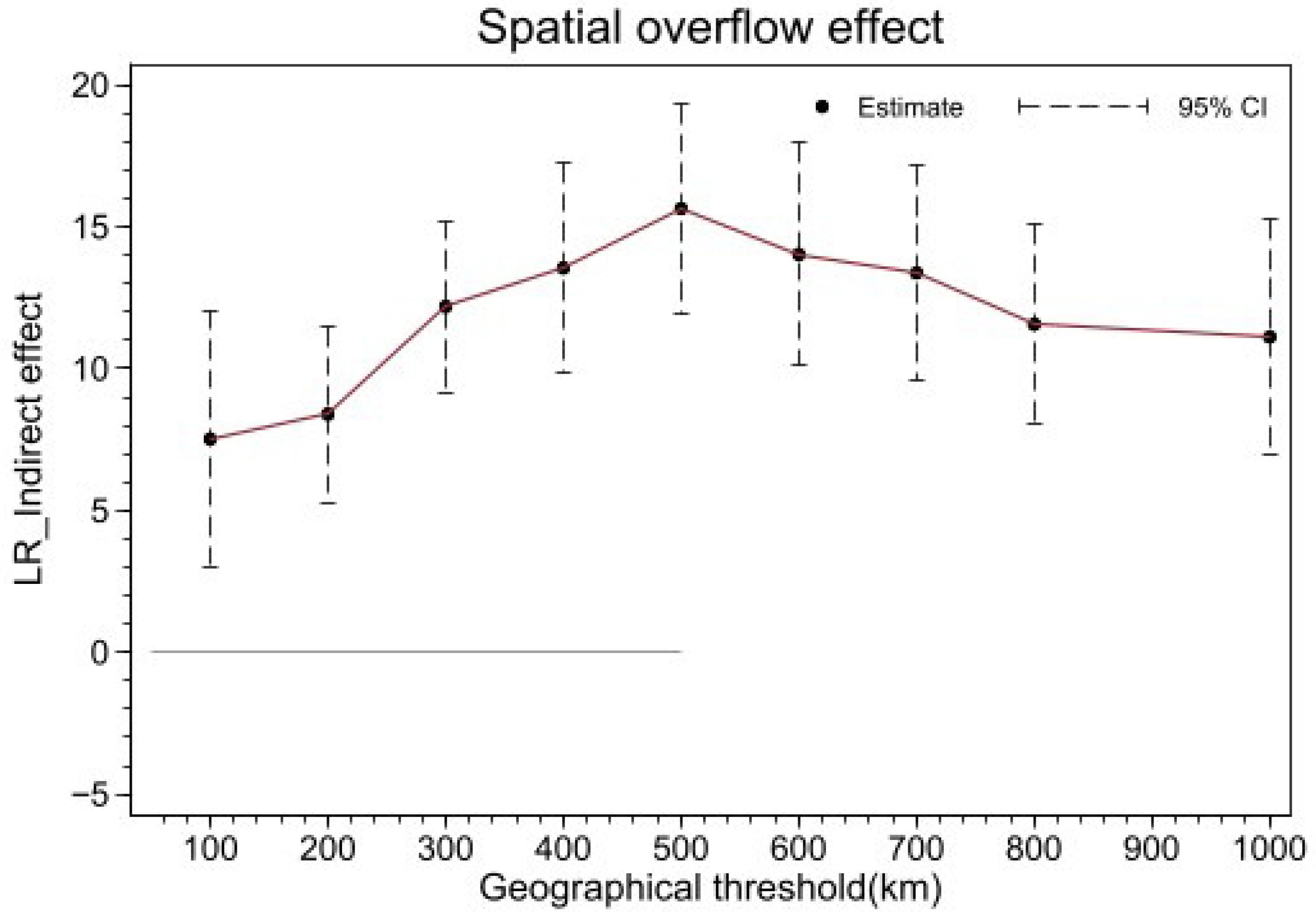
After the LeSage Pace decomposition confirms an identifiable indirect effect, the focus shifts to spatial scale. The question is where the indirect effect concentrates and whether its strength follows an interpretable distance decay profile. To avoid repetitive multi-ring regression tables while retaining readability,
Figure 11 presents a spillover profile that plots indirect-effect point estimates and 95 percent confidence intervals against geographic distance thresholds. This turns the question of “how far spillovers reach” into testable scale information.
The overall profile is positive and not monotonic. It is closer to a pattern of initial strengthening followed by flattening. At small thresholds around 100 to 200 km, indirect effects are already positive, but estimates are lower and confidence intervals are wider, consistent with a detectable near-neighbor signal with greater uncertainty. As thresholds expand to roughly 300 to 500 km, point estimates rise sharply and peak around 500 km. For most thresholds in this range, the 95 percent confidence intervals remain above zero, indicating a systematic spillover pattern at these distances.
Beyond roughly 600 to 1000 km, the spillover estimate does not collapse toward zero. It declines gradually from a high level and then becomes flatter. Point estimates remain positive, and confidence intervals for most thresholds do not cross zero. This suggests that institution-related influences, or structural factors correlated with institutional exposure, are not confined to immediate neighbors. They appear to be embedded in regional linkage networks that connect urban agglomerations and corridors, making spillovers more detectable at a meso-scale. At larger thresholds, more long-distance city pairs enter the weighting structure. This calls for caution about mixing heterogeneous structures, so interpretation should remain tied to the scale profile rather than treating any threshold as a physical diffusion limit.
In terms of boundary statements,
Figure 10 does not show a sharp cutoff. The evidence supports a more restrained claim. Spillovers are concentrated at a meso-scale of roughly 300 to 600 km, with the strongest signal near 500 km. Positive effects remain visible at larger scales, while marginal gains diminish. This avoids conflating threshold choices with a hard spatial limit and leaves room for mechanism narratives in which spillovers accumulate through urban-agglomeration linkages and cross-regional corridors rather than terminating at administrative adjacency.
7. Conclusions and Future Research
This research develops a reproducible system based on prefecture-level cities in China’s Pilot Free Trade Zones (PFTZs) and constructs an annual VIIRS NTL (2013–2024) panel to assess urban resilience through deviation–recovery trajectories around the 2020 common shock. The findings reveal clear patterns of resilience clustering in urban centers, with faster recovery in coastal and more developed regions. Cities in inland and border areas show slower recovery, initially concentrated in core urban areas, and gradually expanding outward to connected corridors. Spillover effects are more detectable at meso-scale distances.
The implications for urban resilience governance are significant. This methodology helps policymakers track and evaluate recovery patterns, identifying vulnerable areas for intervention during future shocks. By using NTL data combined with spatial econometric models like the Spatial Durbin Model (SDM), the research offers valuable insights into how both local and spillover effects shape urban resilience.
This research highlights the importance of spatially explicit frameworks for understanding resilience, especially for large-scale urban systems like China’s. The inclusion of institutional exposure, particularly in PFTZs, shows how institutional arrangements influence resilience outcomes through direct and indirect mechanisms. Accessibility measures and network effects further clarify the role of intercity connections in the transmission of shocks and recovery.
However, while NTL data is useful for tracking industrial recovery, it does not capture all aspects of urban resilience. A rapid return to pre-pandemic light intensity mainly reflects industrial recovery but misses key factors such as social, health, and environmental resilience. Future research should integrate more comprehensive indicators that reflect the interconnectedness of urban systems and the well-being of their populations, providing a fuller picture of resilience.
Despite the valuable insights provided, the research has several limitations. First, the use of NTL as the sole indicator limits the scope of resilience measurement. NTL provides information on economic and logistical recovery but does not account for other dimensions such as institutional resilience (policy adjustments, governance), social resilience (employment security, workforce mobility), or infrastructure resilience (logistics and transport recovery). Future research could integrate other data sources, such as labor market data and infrastructure performance, to provide a more holistic view of resilience.
Second, aggregating NTL at the prefecture level may dilute the resilience signals from core PFTZ areas. Future studies could use finer spatial units, like PFTZ subzones, or multi-resolution data to better capture resilience dynamics within these functional areas.
Finally, while this research mainly focuses on the economic aspects of resilience, future work should explore broader social, health, and environmental factors that contribute to resilience in the context of PFTZs. These factors are essential for understanding how cities can withstand and recover from shocks, particularly as global challenges like pandemics and climate change continue to evolve.
In addition to these limitations, it is important to recognize that NTL is an indirect measure of human activity. While it provides useful insights into recovery trends in economic and logistical activity, it does not capture institutional resilience, such as policy innovation, governance, or social resilience (e.g., employment security, public health responses). As such, the research’s reliance on NTL may underestimate the full scope of resilience in PFTZs. Future studies could integrate additional resilience indicators, such as labor market data, infrastructure performance, and policy flexibility, to complement NTL and provide a more comprehensive measure of resilience.