Article

Modelling the Temperature of a Data Centre Cooling System Using Machine Learning Methods

1
Joint Doctorate School, Department of Industrial Informatics, Faculty of Materials Engineering, Silesian University of Technology, Krasińskiego 8, 40-019 Katowice, Poland
2
Department of Industrial Informatics, Faculty of Materials Engineering, Silesian University of Technology, Krasińskiego 8, 40-019 Katowice, Poland
3
KAMSOFT S.A., 1 Maja 133, 40-235 Katowice, Poland
*
Author to whom correspondence should be addressed.
Energies 2025, 18(10), 2581; https://doi.org/10.3390/en18102581
Submission received: 17 March 2025 / Revised: 1 May 2025 / Accepted: 8 May 2025 / Published: 16 May 2025

Abstract

:
Reducing the energy consumption of a data centre while maintaining the requirements of the compute resources is a challenging problem that requires intelligent system design. It even becomes more challenging when dealing with an operating data centre. To achieve that goal without compromising the working conditions of the compute resources, a temperature model is needed that estimates the temperature within the hot corridor of the cooling system based on the properties of the external weather conditions and internal conditions such as server energy consumption, and cooling system state. In this paper, we discuss the dataset creation process as well as the process of evaluating a model for forecasting the temperature in the warm corridor of the data centre. The proposed solution compares two new neural network architectures, namely Time-Series Dense Encoder (TiDE) and Time-Series Mixer (TSMixer) with classical methods such as Random Forest and XGBoost and AutoARIMA. The obtained results indicate that the lowest prediction error was achieved by the TiDE model allowing to achieve 0.1270 of N-RMSE followed by the XGBoost model with 0.1275 of N-RMSE. The additional analysis indicates a limitation of the use of the XGBoost model which tends to underestimate temperature as it approaches higher values, which is particularly important in avoiding safety conditions violations of the compute units.

1. Introduction

In 2021, the operation of buildings accounted for 30% of global final energy consumption and 27% of total emissions from the energy sector, of which 8% were direct emissions in buildings and 19% were indirect emissions from the production of electricity and heat used in buildings [1]. This applies to both residential and non-residential buildings (Figure 1). Therefore, in recent years, there has been an increasing number of publications on the use of more efficient renewable energy technologies in buildings and the use of artificial intelligence to control automation in intelligent buildings. Some of these publications focus on data centre facilities [2,3,4]. However, it is more difficult to find information about public utilities or office buildings equipped with a data centre.
Between 2015 and 2021 the most frequent solutions reducing energy consumption in building were energy management systems and building modernization. Although using new technologies for predicting building systems controls or investments in energy storage were less popular (Figure 2).
In recent years, there has been significant progress in the field of energy modelling for buildings. Such modelling has been applied to various areas, including energy-saving initiatives [7], operational optimization [8], and building modernization projects [9]. The development of building modelling initially focused on the application of Computational Fluid Dynamics (CFD), which enables the simulation of airflow, temperature distribution, and heat transfer within buildings and data centres. Notable early approaches are presented in [10,11], while extensions to more complex building geometries are discussed in [12]. CFD has also been effectively applied to the thermal modelling of data centres, as demonstrated in [13].
In general, advancements in data aggregation and visualization technologies have brought substantial benefits to research on building energy efficiency [14]. However, a major challenge remains in the integration of these complex systems [15]. A promising solution lies in the adoption of artificial intelligence techniques, which enable self-learning, autonomous decision making, and continuous model adaptation [16].
The concept of artificial intelligence buildings (AIB) appeared several years ago [17,18,19]. They enable optimal energy management using technologies leveraging artificial intelligence (AI) algorithms, big data (BD), the Internet of Things (IOT), and other related facilities [20,21]. The most popular AIB solutions are data-driven methods. Examples of energy management systems supported by big data, such as outdoor temperature, solar radiation, neighbourhood surrounding conditions, and other historical climate data, can be found in the literature [22,23]. These systems aim to predict heating energy demand while minimizing the operating time of heating, ventilation, and air conditioning (HVAC) systems within a building. Another significant challenge is predicting the energy generation from renewable sources [24] which facilitates more efficient management of the generated energy, for instance, by storing surplus energy through additional building heating.
It should be noted that the buildings described in these studies are not equipped with data centre systems. Furthermore, the literature presents a range of machine learning methods that can be applied to the modelling of the building energy systems [25]. Among the most popular are as follows:
  • Artificial Neural Network (ANN) including various architectures;
  • Tree-based ensemble methods like Random Forest or Gradient Boosted Trees;
  • Support Vector Machine (SVM);
  • Distance-based methods (kNN);
  • Multivariate Linear Regression (MLR).
The objective of this study is to address the problem of minimizing energy consumption in an office building that houses a data centre. As will be demonstrated, one of the primary contributors to energy usage within this facility is the cooling system dedicated to the data centre. Consequently, the most promising opportunity for energy savings lies in reducing the energy consumed by the cooling and air conditioning systems, while maintaining the operational safety conditions required for servers and storage units. Energy efficiency can be improved by increasing the temperature setpoints of the air conditioning system, thereby lowering energy consumption. However, this approach introduces the risk of exceeding the thermal safety thresholds of computing units, which is unacceptable in an operational data centre environment. To address this challenge, a reliable temperature forecasting model for the warm aisle is required. Such a model can support the safe adjustment of air conditioning parameters, ensuring that temperature limits are not breached, and the integrity of the compute infrastructure is preserved.
To achieve the goal of energy efficiency the initial step is the development of the temperature forecasting model. In our research, we evaluate and identify the most suitable model for estimating temperature conditions. In this study, we compared five different machine learning models, including two modern neural network architectures—Time-Series Dense Encoder (TiDE) and Time-Series Mixer (TSMixer)—in comparison to widely used multivariate forecasting approaches such as Random Forest and XGBoost, as well as a baseline statistical model, AutoARIMA.
The novelty of our research includes the following:
  • The introduction of a machine learning-based approach for assessing safety limits in operational data centres, aimed at reducing the energy consumption of the air conditioning system.
  • The evaluation and comparison of machine learning models for temperature forecasting in the warm aisle of the data centre, including modern neural network architectures (TiDE and TSMixer).
  • An in-depth analysis of the practical applicability of model predictions for the prevention of violations of safety conditions.
The article is structured as follows: First, the design concept of the office building with the co-located data centre is discussed, including an analysis of the power consumption of various building components and measured signals. Next, Section 3 presents a detailed description of the constructed dataset, along with an overview of the time series forecasting methods and the experimental setup. Section 4 presents the obtained results, including an in-depth analysis and a comparison of the models. Finally, Section 5 summarizes the study and the key findings.

2. Design Concept

One of the significant challenges of the green transformation is to reduce the energy demand of buildings, with particular emphasis on electricity consumption. Electricity is particularly important in this respect, as many building owners are undertaking the electrification of energy demand, including heat demand. The above is particularly important in the case of office buildings, where heat demand is regulated by the work schedule, i.e., in the range of 8:00 a.m. to 4:00 p.m. Standard heating systems based on a heating medium such as water have much more limited properties compared to heating systems using air conditioning devices, which allow rooms to be heated to a specific temperature in a much shorter time, thus reducing energy demand. A good example is an office building located in Katowice with a usable area of 5500 m2, for which the characteristics of electricity consumption in 2018–2023 are shown in Figure 3. The graph shows two points with clear decreases in energy consumption. The first occurred in 2020, which is the result of the COVID-19 pandemic and remote work of employees. The second was in 2023, when additional electricity savings were achieved resulting from the analysis of the operation of electrical devices in the building—especially those installed in the data centre server room. In the summer, there is also increased consumption resulting from the intensified operation of chillers and air conditioning units supplying office parts of buildings.
A more detailed analysis of electricity demand is presented in Figure 4, which illustrates active power consumption over a period of 1 year from April 2022 to April 2023 for the office part of the building and the data centre.
The analysis of the dependencies presented in Figure 4 shows that in the case of the data centre (Figure 4b) this relationship is constant, while in the case of the office part there are significant fluctuations in energy demand. Fluctuations are particularly significant in the summer (Figure 4a), which results from the additional load resulting from the operation of chillers of the air conditioning system of the office part of the building.
The aggregate percentage of energy demand by the office part and the data centre part is shown in Figure 5a. The analysis of the obtained values shows an almost equal share of both components of the office building, i.e., from 48% to 52%. A more detailed analysis is provided in Figure 5b, which visualizes the two main components of the data centre’s energy demand, i.e., the share of the cooling system and the share of the server system energy demand.
Referring to the level of energy demand in relation to the usable area of each segment, i.e., the office part and the data centre part, it is possible to obtain an indicator such as the relative density of energy demand, which takes the value of 0.76 kW/m2 for the office part and 36 kW/m2 for the data centre part (the unit m2 was adopted as the density because the height of rooms in the building is constant).
The above highlights the importance of data centre in the process of reducing energy demand. However, among both components, i.e., the power demand of the computing part and the part of the cooling system, modifications to the cooling system are important and relatively easy to introduce. This is due to the relationship between the cost of changing the server part and the cooling system. The above defines the purpose of the research, which aims to reduce the energy demand of the cooling system of the server part. However, the process of reducing the energy demand requires the prior creation of a numerical model that allows for the analysis and minimization of the risk associated with changes in the cooling system of server units. This is because server units require a precise temperature regime to be maintained, and exceeding the permitted values can have serious consequences for the services provided within the data centre. In order to meet the challenges outlined in this study, the issue of building a temperature prediction model in the hot aisle of the server room cooling system was undertaken.

Description of the Server Room

The server room where the measurements are carried out is located in the existing Data Processing Centre in an office building in Katowice. Its area is 110 m2. The server room is equipped with the following installations:
  • Access Control System;
  • Permanent Gas Fire Extinguishing Device;
  • Air humidifiers;
  • Air conditioning;
  • Technical floor;
  • Databox.
In the centre of the server room is a Data Box that contains 10 standard 19 inch rack cabinets, enumerated S1 to S10, each occupying a space of 800 × 1200 mm, and height of 47U as illustrated in Figure 6. To maintain the set temperature, four Mitsubishi Heavy Industries K1–K4 duct air conditioning units with a cooling capacity of 25 kW each are used. In practice, they operate in pairs K1–K3 and K2–K4, alternating every 10 h.
Figure 7 shows the arrangement of cabinets and air-conditioning units in a horizontal projection (a), and in a vertical projection (b). The vertical projection also shows the flow of cold and warm air in a vertical projection depicted with blue and red arrows indicating, respectively, cool and warm flows. In the presented system, the air from the cold corridor is drawn in by server devices placed in S1–S10 rack cabinets and flows through them, cooling the devices while warming the air, which is then expelled from the back to the warm corridor. From there, it is drawn into the operating indoor units of the air conditioning, where the air is cooled again and then blown out through ducts from beneath the floor to the cold corridor between the server racks. The air circulation cycle is then repeated. The outdoor temperature sensor is located on the northern wall of the building at a height of 2 m from the ground level.
Figure 8 shows the arrangement (density) of server devices in S1–S10 rack cabinets. Different colours are used to mark individual groups of devices as follows:
  • Blue—Servers,
  • Green and cream colour—Disc Arrays,
  • Purple and navy blue—Networked devices active,
  • White—Passive Network Devices.
Additional measurement systems are located on rack cabinets. Their location is marked in red, and these measurements were not used in the experiments.

3. Methods

3.1. Dataset Description

During the building’s operation, sensor data streams were continuously collected and recorded in a database between 13 September 2022 and 22 June 2023. Since the sensors began operating at different times—with some being added during the data centre’s operation and after its restructuring with new compute servers—the analysis was limited to the period from 9 March 2023 to 21 June 2023, when all of sensors were active.
The collected data required extensive preprocessing to form a coherent dataset. Given that the data were sampled at different frequencies, and some values represented derivatives of the original signals, the first step was to reconstruct the true signal values. The differences in sampling frequency were addressed by using the lowest frequency as the reference and resampling the other variables accordingly. When necessary, linear interpolation of the nearest samples was used to obtain actual values. A complete list of variables used in the experiments is provided in Table 1.
Subsequently, the base period for system operation was determined. Based on expert knowledge, a 15 min interval was selected as the operating period, as this duration captures temperature variations caused by changes in weather conditions or shifts in the electrical energy consumption of the servers. Accordingly, the base signals were integrated or resampled; for instance, energy consumption was integrated over the 15 min period, while temperature readings were averaged. The resulting dataset formed the basis for the final analysis.
As already mentioned, the data were collected from 13 September 2022 to 22 June 2023, yielding 27,013 samples at a 15 min resolution. This period is divided into two phases:
  • Installation Phase: Involving the mounting of new compute servers, adjustment of sensor locations, and coordination of air conditioning devices (up to 6 March 2023).
  • Stable Operation Phase: Covering regular operation under stable conditions (from 7 March 2023 to 22 June 2023).
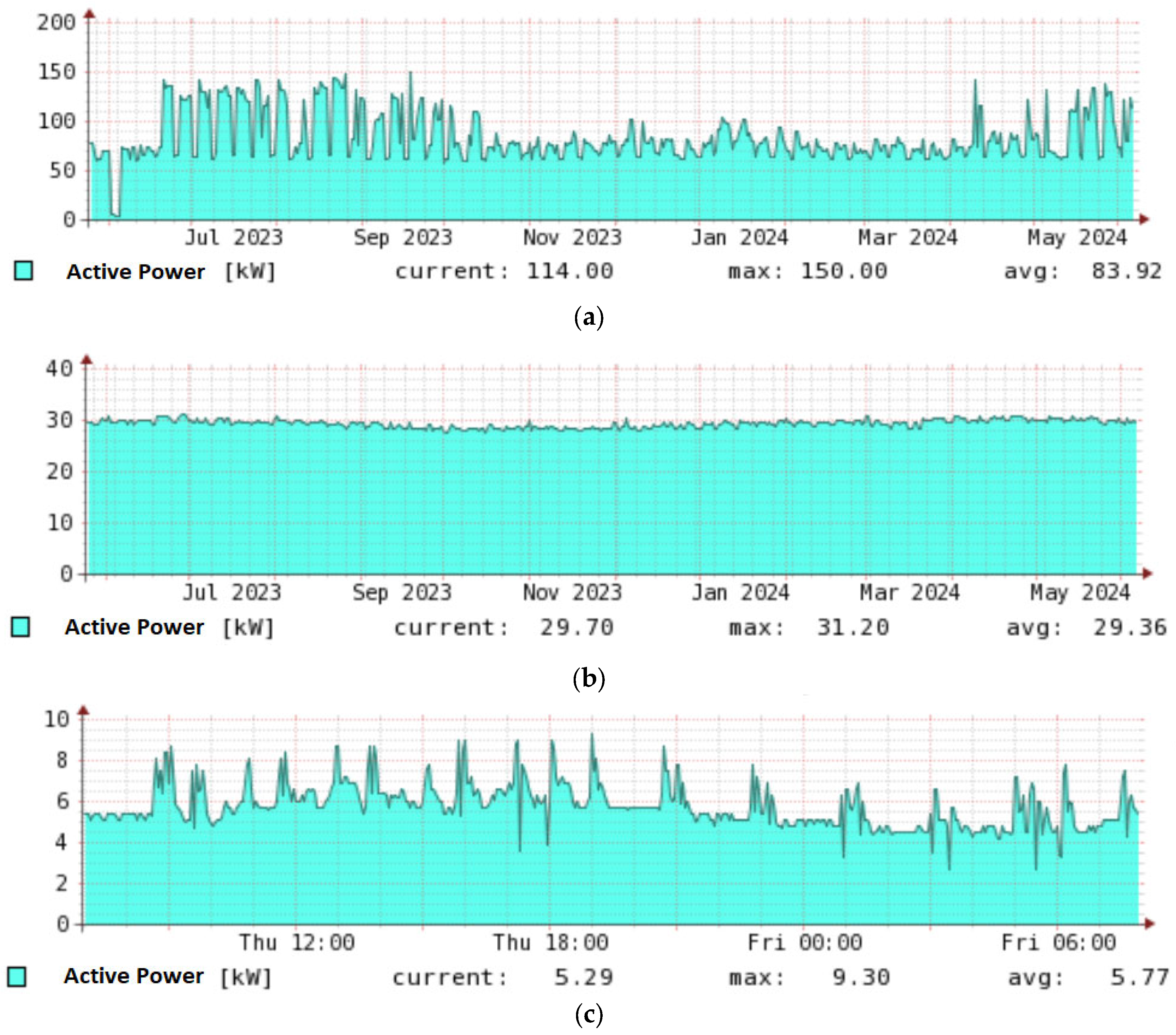
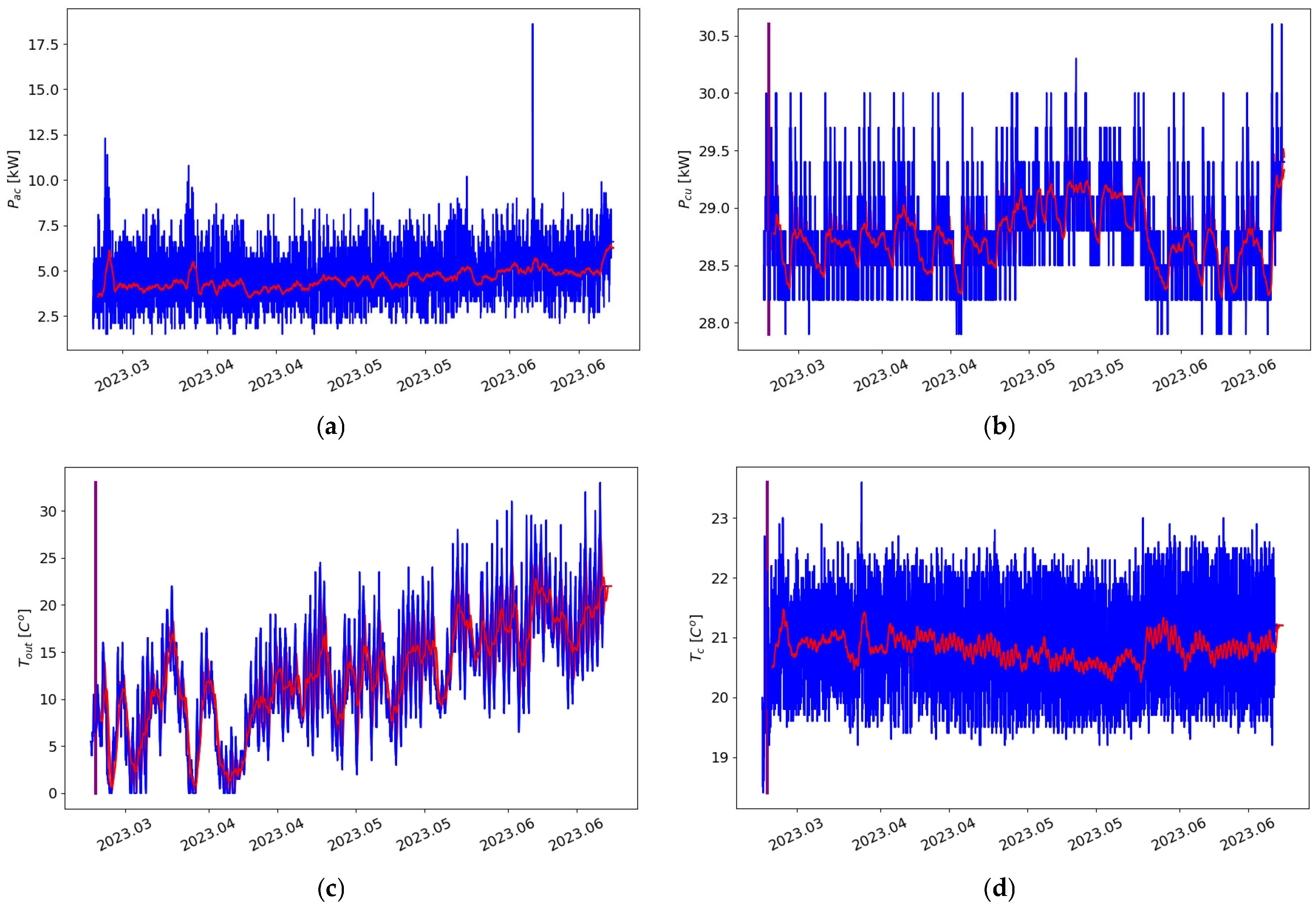
Due to the instability observed during the installation phase, our experiments focus exclusively on the stable operation phase beginning on 7 March 2023. The recorded signals are illustrated in 
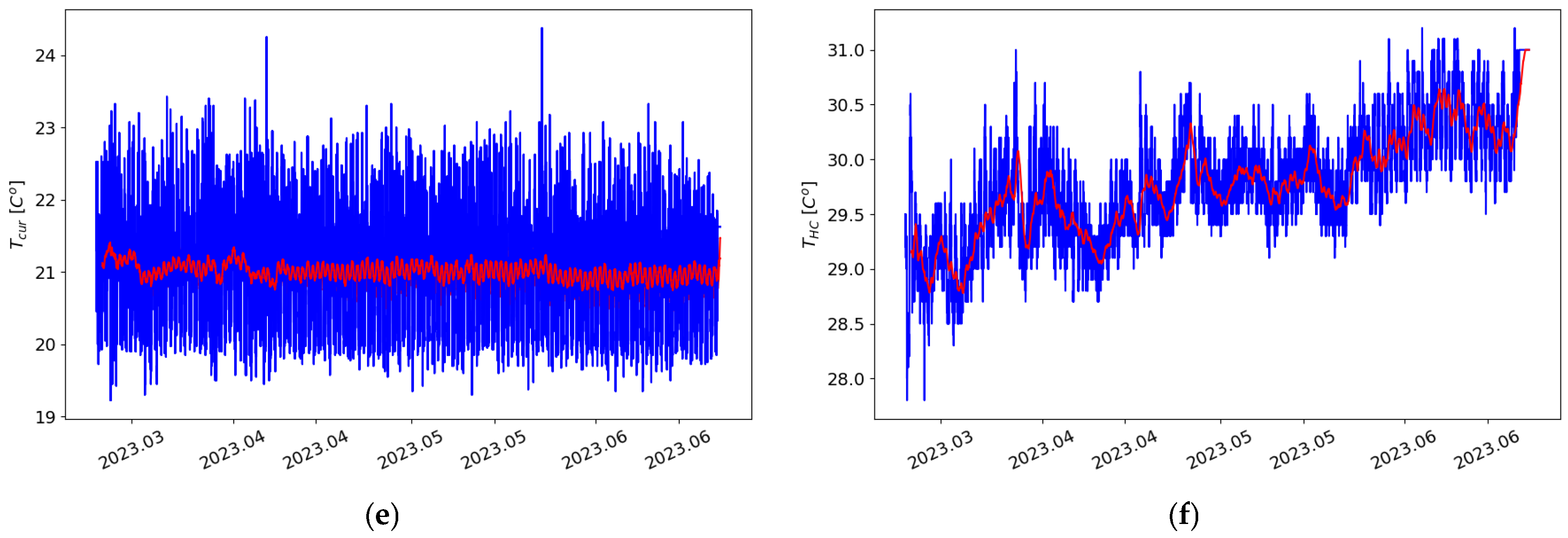
Figure 9. Specifically, Figure 9a depicts the power consumption of the air conditioning system, which ranges from 2.5 to 7.5 kW, with notable peaks in early March, early April (reaching 10 kW), and a single peak in early June (with three samples exceeding 17 kW). The outlier recorded in June was caused by maintenance activities. Figure 9b shows the aggregated power consumption of the compute servers, with an observed increase in May due to the replacement of computing units. Consequently, a higher PCU was recorded during that month.
Figure 9c displays outdoor temperature variations that reflect natural weather fluctuations. Figure 9d presents the ceiling temperature of the Databox (TC), which is critical as it often represents the highest temperature in the cold corridor. Finally, Figure 9e and Figure 9f illustrate, respectively, the temperature recorded by the air conditioning systems controller and the temperature in the warm corridor—the variable targeted for prediction.

3.1.1. Dataset Adaptation for Machine Learning Task

The forecasting problem was defined as predicting the temperature in the warm corridor 24 h in advance with a 15 min resolution. It was assumed that cross-variate information would be available during the forecast. All of the recorded during system operation variables are presented in Table 1, and visualized in Figure 9. The subfigures of Figure 9 show the recorded values marked in blue, and the red line represents the average.
The following additional variables have been employed: DoW, which stands for day of the week; WoH, which is employed to differentiate between days of work and weekends or holidays and QoD—quarter-hour of the day. Since the DoW and QoD are cyclic variables, they were represented using sin/cos transformation using Formula (1), where T is the period here T = 6 for DoW, and T = 95 for QoD, and t are the values of DoW in range D o W 0,1 , 2,3 , 4,5 , 6 or values of QoD in range Q o D 0,1 , . . . , 95 .
y s i n t = sin 2 π t T y c o s t = c o s 2 π t T
The use of cyclic representation has two advantages first it avoids the problem of dissimilarity between the end and the beginning of the cycle, so that there is a smooth transition between the following days. Secondly, the dataset has smaller number of variables when compared to the one hot encoding therefore it is easier to construct the model.
In summary, the constructed dataset used in the experiments consisted of 10,849 samples, five basic variables directly measured from the air conditioning system, and five additional features including DoWsin, DoWcos, WoH, QoDsin, and QoDcos.

3.1.2. Preliminary Dataset Analysis

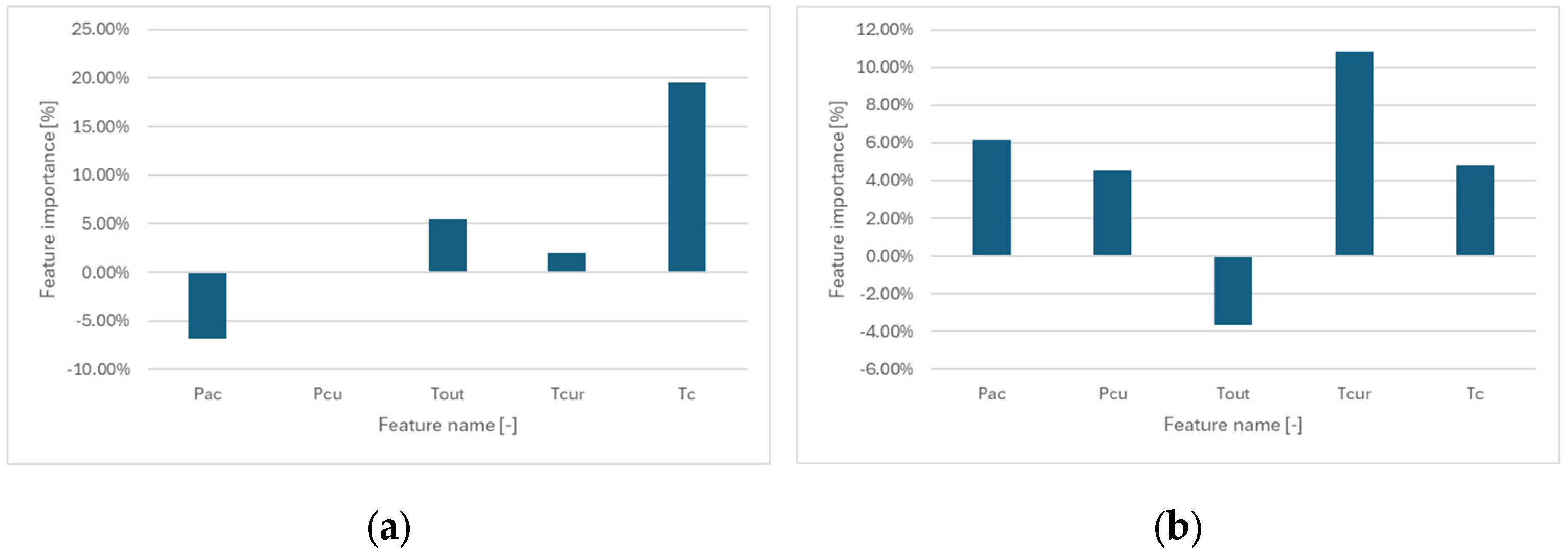
A fundamental step in constructing complex predictive models is the preliminary analysis of the available data. This process involves identifying interdependencies among input features and examining relationships between individual features and the target variable. The primary tool used for this purpose is the Pearson correlation coefficient, which captures linear relationships between variables. It is commonly complemented by the Spearman correlation coefficient, which enables the detection of nonlinear—though monotonic—dependencies.
The results of the correlation analysis are summarized in Table 2 and Table 3, which report the Pearson and Spearman correlation coefficients, respectively. The results indicate a generally weak correlation among the examined variables. The highest observed correlation appears between Tcur and TC, reaching 0.62 for Pearson and 0.59 for Spearman, suggesting a moderate dependency. This is expected, as both Tcur and TC, refer to temperature measurements at different points within the cooling system.
Another notable correlation is found between PAC (power consumption of the air conditioner) and TOUT (outdoor temperature), with values of 0.26 and 0.32, respectively. This relationship is intuitive, as energy consumption of the air conditioning system is influenced by the outdoor temperature.
In the analysis of the relationship between the output variable THC (temperature in the hot corridor) and the input features, presented in Table 4, the highest correlation was observed with the output temperature TOUT, reaching 0.54. This was followed by a weaker correlation with PAC, amounting to 0.23 in terms of Spearman correlation. However, the corresponding Pearson correlation was only 0.08, indicating a nonlinear but monotonic relationship between PAC and THC.

3.2. Methods Used in the Experiments

To develop the prediction model, we compared several well-established machine learning algorithms such as Random Forest and XGBoost with state-of-the-art techniques, including Time-Series Dense Encoder (TiDE) [26] and Time-Series Mixer (TSMixer)—two of the most recent approaches for time series forecasting. The TiDE model was selected due to its design for long-term forecasting tasks, which aligns with our objective of forecasting across a full cycle of daily seasonality while incorporating external features, such as the day of the week. In contrast, TSMixer is a general-purpose forecasting model that is significantly more lightweight than typical transformer-based architectures, enabling more efficient training while maintaining competitive performance. On the other hand, tree-based models are feature-scale independent and are popular for their high scalability and simplicity in parameter tuning. Below is a short description of each of the models is provided.
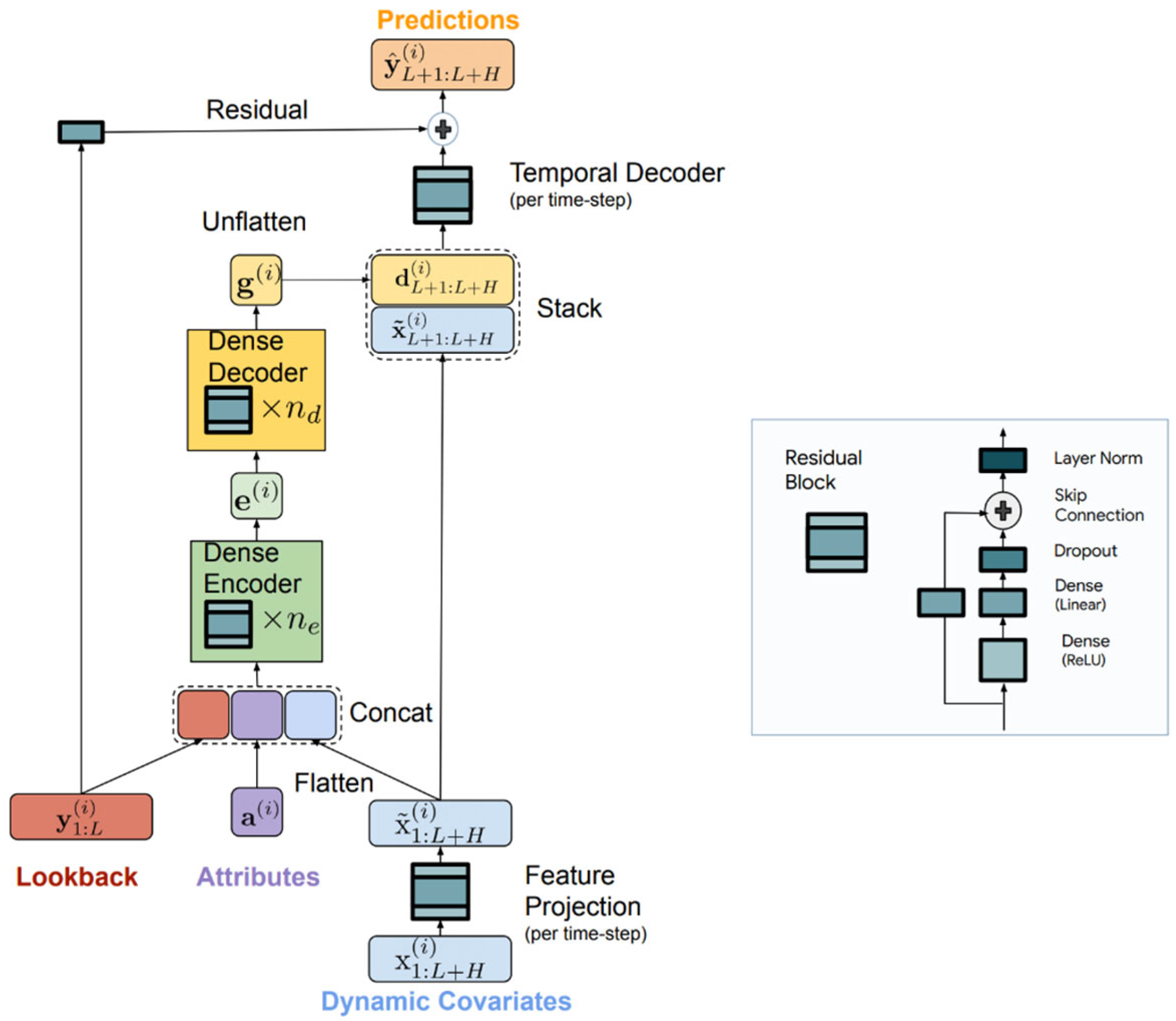
Time-Series Dense Encoder. TiDE is a novel MLP-based architecture developed in Google Research for long-term time series forecasting that efficiently incorporates both historical data and covariates. Its structure is shown in Figure 10. The model first encodes the past observations y 1 : L ( i ) , and associated covariates X 1 : L + H ( i ) including fixed object properties a : L ( i ) into a dense representation using residual MLP blocks and a feature projection step to reduce dimensionality and extract the most important properties of the signal. This encoded representation is then decoded through a two-stage process—a dense decoder followed by a temporal decoder—which combines the learned features with future covariate information to generate accurate predictions. By operating in a channel-independent manner and training globally across the dataset, TiDE effectively captures both linear and nonlinear dependencies, providing robust forecasting performance. Additionally, as shown in [26] it outperforms other popular models such as N-HiTS [27], DLinear [28], LongTrans [29], and others.
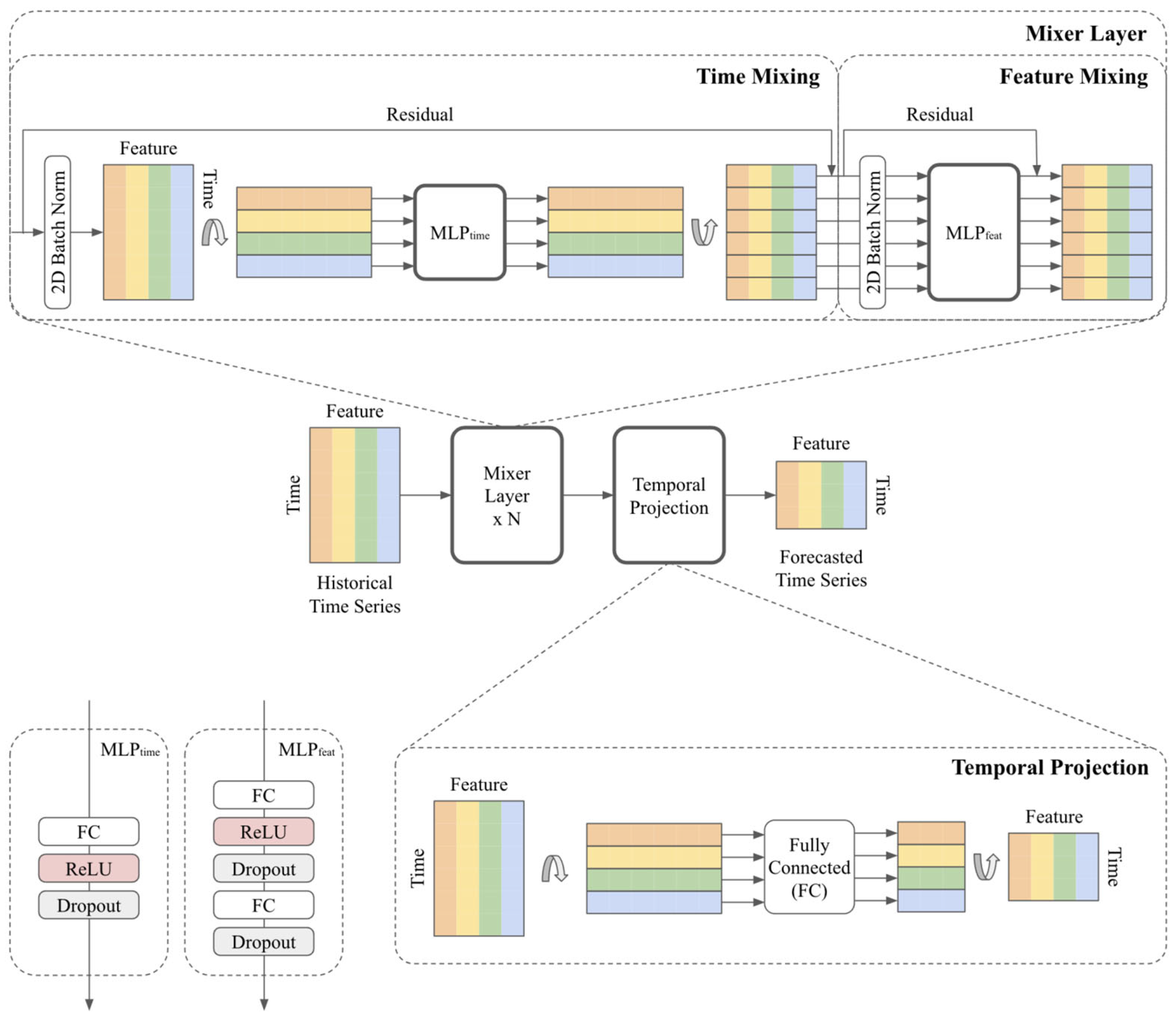
Time-Series Mixer. TSMixer is another state-of-the-art time series forecasting model developed by Google Research [30] (Figure 11). It was designed for time series forecasting that applies MLP-Mixer architectures to sequential data. It is based purely on fully connected layers and constitutes an alternative to Transformer-based models, offering a simple yet effective approach to handling time series. The TSMixer consists of two blocks. The first block applies time mixing using fully connected layers (MLP layers) across time stamps. This allows the model to capture temporal dependencies in the input data. The second block is a channel mixer that is also based on fully connected layers that mix across different feature dimensions at each time step. This helps the model understand the dependencies between different input variables. TSMixer also applies a normalization layer and skip connection across blocks to support the better flow of the gradients.
The research initially considered transformer architecture, but the computational process became over-complicated due to the self-attention mechanism, and as reported in [26,30] both TSMixer and TiDE overcome models based on self-attention making the computational process much more tractable.
Random forest (RF) and XGBoost (XGB). Random forest is a very popular classification and regression algorithm. It is based on an ensemble of decision trees. Here, instead of a single tree, a set of trees is trained in parallel where the diversity of the trees is achieved by randomly selecting a subset of features that are used to build a single tree. A huge advantage of this method is easy parallelization, which significantly shortens the training time. On the other hand, the XGB is a version of gradient-boosted trees that applies a boosting mechanism. To overcome the limitation of a single tree model in gradient boosting the trees are sequentially constructed, that is they are added one by one considering a cost function determining training sample weights. These weights ensure that the following tree is constructed to minimize the overall error of the entire model. Additionally, XBG applies L1 and L2 regularization preventing overfitting and improving generalization. Due to the sequential construction of the decision trees in the XGB, its training time is usually longer than RF.
AutoARIMA. AutoARIMA (Auto-Regressive Integrated Moving Average) is an automated version of the standard ARIMA model used for time series forecasting. It simplifies the process of model selection by automatically identifying the best parameters (p, d, q—autoregressive, differencing and moving average terms) for the ARIMA model through a search process. The model also handles seasonal patterns and can integrate them using a seasonal version, known as SARIMA, as well as utilizing additional input variables. They were used as an indicator of the existence of a complex nonlinear relation between input and output variables.

3.3. Experimental Setup

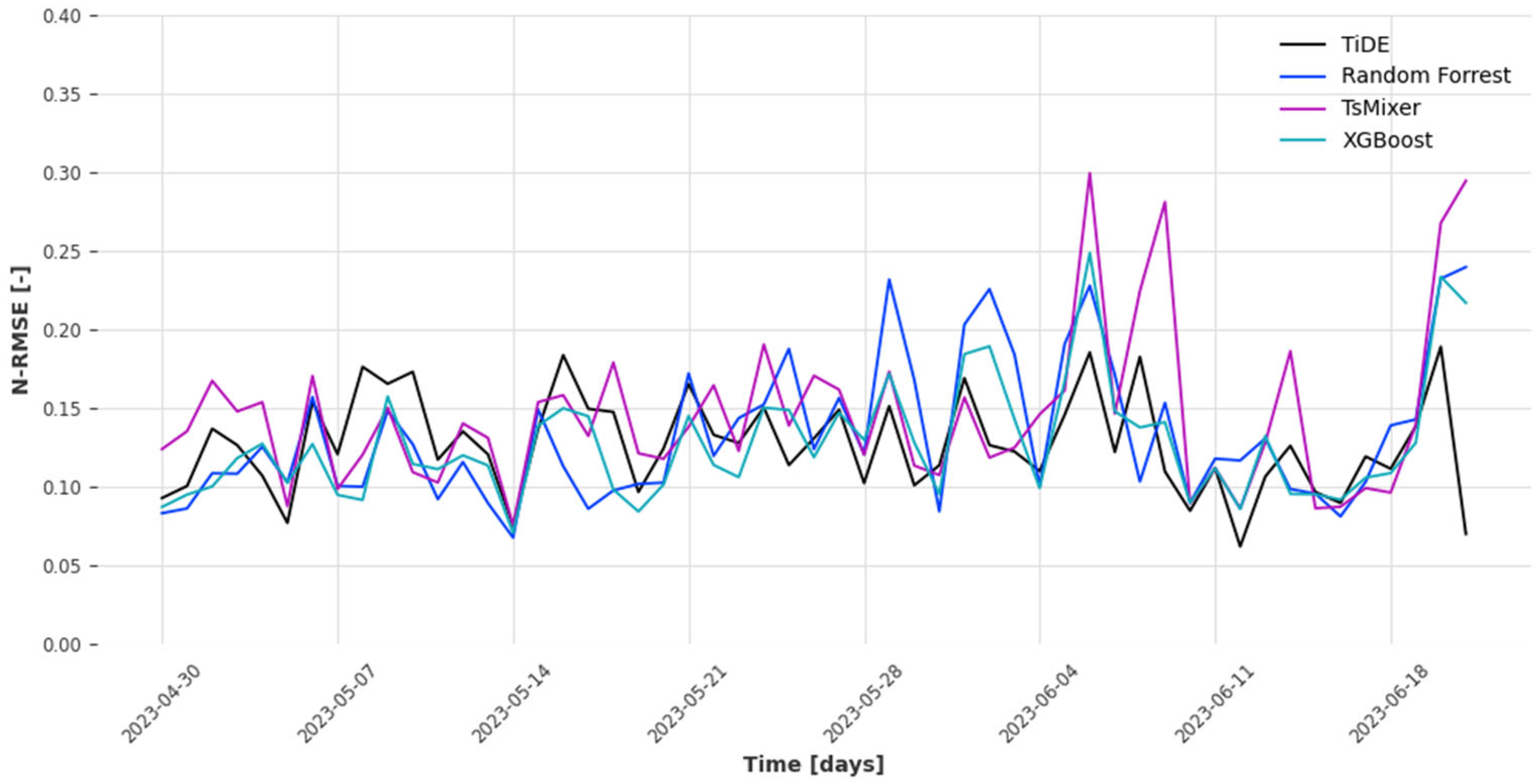
The experiments were designed to predict the temperature in the hot corridor THC from 30 April 2023 to 22 June 2023 and the remaining data starting from 7 March 2023 were used for training the model. In particular, the model was retrained for each new day using all past samples; therefore, the input data size was increased during the model evaluation. The experiments consisted of evaluating TiDE, TSMixer, XGB, RF, and AutoARIMA models, and were divided into two stages.
Stage one. The first stage was designed to find the best model parameters. That stage is particularly important for neural network models that are very sensitive to the hyperparameters setup.
For the TiDE model the learning rate (LR = {0.0001, 0.001, 0.01}), number of epochs (epochs = {20, 40, 60, 80, 100}), number of residual blocks in encoder (num. encoder = {4, 5}), the dimensionality of the decoder (decoder size = {1, 5, 8, 16, 32, 64, 128}), the width of the layers in the residual blocks of the encoder and decoder (hidden size = {16, 32, 64, 128, 256, 512}), and the dropout = {0, 0.1, 0.05, 0.1, 0.2} probability were optimized. Since the number of parameters was large the parameters were optimized sequentially tunning a particular part of the network. Initially, the number of epochs and the learning rate were tuned. Next, the decoder and encoder sizes were tunned, followed by hidden size tunning and finally setting the dropout parameter.
For the TSMixer, a similar set of parameters was optimized. That included learning rate LR = {0.0001, 0.001, 0.01}, the number of training epochs (epochs = {20, 40, 60, 80, 100}), dropout probability to avoid network overfitting dropout = {0, 0.05, 0.1, 0.2}, the number of neural network blocks number of blocks = {1, 2, 3, 4}, the size of the first feed-forward layer in the feature mixing MLP feedforward size = {1, 5, 8, 16, 32, 64, 96}, the hidden state size or the size of the second feed-forward layer in the feature mixing MLP hidden size = {16, 32, 64, 128, 256, 512}.
The tree-based models are relatively simpler to optimize and require a significantly smaller set of parameters to be tuned. For each of the tree-based families, only two parameters were optimized. For the Random Forest classifier only the tree depth and the number of trees were tuned, namely #trees = {50, 100, 200, 300} and tree_depth = {5, 10, 15}. For the XGBoost also the tree depth was tuned but smaller values were considered tree_depth = {4, 6, 8} and for the learning rate three values were evaluated LR = {0.01, 0.1, 0.3}.
The first stage of the experiment was performed for the first week of the evaluation data, which is between 30 April 2025–6 May 2025. In this stage, the AutoARIMA was excluded.
Stage two. The second stage of the research was focused on model evaluation for the entire test set. In this stage, only the model with the highest prediction accuracy was evaluated in three scenarios for each model’s family. These scenarios are presented in Table 5. The scenarios differ in the set of variables used for evaluation and the length of the input history window. The goal of the first two scenarios was to evaluate the models with a 7-day history window and check whether the additional variables such as DoW, WoH, and QoD are useful for predicting the output. The assumption was that the 7-day history period covers one week of seasonality; therefore, the additional variables are useless.
The third scenario involved a comparison of the model’s family when the history window was set to one day, therefore it covered 96 historical samples (96 quarters within a day). In this scenario, it was assumed the use of the extended set of variables since that is the only way to represent weekly seasonality.
In all scenarios, the model forecasted the entire next day with a 15 min time resolution (a quarter of an hour resolution) that was a prediction of 96 samples at once.
For the performance evaluation, the main criteria were set to N-RMSE (Normalized Root Mean Squared Error). The N-RMSE was naturally obtained by normalizing the output variable to have 0 mean and standard deviation equal to 1. Such a measure simplifies model interpretability because performances close to 1 indicate the performance of the default regression model predicting the average value of the output (bad results). Values close to 0 signify a perfect match between predicted values and true values. N-RMSE was used for both stages of the experiments. For the second stage, two additional measures were used namely the mean absolute error (MAE) and mean absolute percentage error (MAPE) to give a full picture of the model’s performance.
The experiments were conducted using Darts Python library (version 0.32.0) for time series forecasting additionally using Scikit-Learn library (version 1.5.2) for conventional models implementation and MatPlotLib (version 3.7.1) for data visualization. All the calculations were computed on a server equipped with 2 AMD EPYC 7282 processors and 512 GB of RAM and NVIDIA RTX A4000 with 16GB VRAM.

4. Results

4.1. Parameter Optimization

The first set of experiments focused on optimizing model parameters. This process involved tuning all evaluated models, including TiDE, TSMixer, RF, and XGB. As introduced in Section 3.3, the optimization began with the default parameter settings, followed by systematic tuning of specific parameters. If certain parameters were found to be interdependent, they were tuned simultaneously using a grid search procedure.
For all evaluated parameters, the best-performing configuration was identified as the one with the lowest RMSE error (these results are highlighted in bold). Subsequently, the configuration with the lowest error was statistically compared to all other configurations using a two-sample t-test with a significance level of α = 0.1. Statistically significant differences are denoted with (+), while non-significant differences are marked with (−).
TiDE model. For the TiDE model, the results of the parameter optimization are presented in Table 6. The findings indicate that the best performance was achieved with a learning rate of 0.001, 80 training epochs, six encoder layers, a decoder size of five, and a hidden layer size of 128. The dropout rate was set to 0.
TSMixer model. The obtained results are presented in Table 7. Similarly to TiDE, six parameters were optimized, including the number of epochs, learning rate, size of the feedforward layer, hidden size, and dropout ratio. The optimal set of parameters includes epochs = 60, learning rate = 0.001, number of blocks = 2, feedforward layer size = 64, hidden size = 256, and dropout = 0.1.
Random Forest model. The obtained results of the parameter optimization procedure are shown in Table 8. The results indicate that the best performance was achieved for shallow trees of depth 5 and 200 estimators. However, a comparison with the remaining set of parameters does not show any statistically significant differences.
XGBoost model. Table 9 shows the obtained results for XGBoost parameter optimization. Similarly to RF, the best results were obtained for shallow trees of depth 5. Along with the tree depth, the learning rate was also tuned. The best results were obtained for a very small learning rate LR = 0.01. Again, there were no statistically significant performance differences between all evaluated parameters.

4.2. Models Performance Comparison

After selecting the best model within each model’s family in the second stage of the experiments, the models were evaluated during the full test period. These models were evaluated using three scenarios shown in Table 5. The obtained results are presented in Table 10, where the green colour represents the best results for each performance measure. Additionally, the red colour represents results that are significantly different from the best one for α = 0.1. The statistics were evaluated using the two-sample t-test. For each row of the table a bold font can be observed. It indicates the best results within a row.
These results indicate that the lowest error rate was achieved by the TiDE model except for the MAPE rate, where the best solution was achieved by the XGBoost. Additionally, for the results where TiDE wins the difference between the best model and XGBoost is statistically insignificant. Surprisingly good results were also achieved by Random Forest. These results are worse than the best in all cases but they are not statistically significantly worse in terms of RMSE and MAPE. In all cases, the worst results were obtained by AutoARIMA model, which indicates that the relation between the input and the output variable is complex, necessitating the use of much more advanced models.
Much deeper insides of the obtained results give a visualization of Table 10 shown in Figure 12. It shows that the XGBoost leads in almost all cases except scenario 3 where TiDE achieved insignificantly better results. That indicates that the model is much more stable and can extract significant knowledge irrespective of the size of the window history and the feature space.
When comparing scenario 1 and scenario 2, it can be observed that the extended set of variables reduces model performance except for XGBoost, where the performance remains the same. That confirms the initial assumptions that the one-week window history is enough to capture all of the changes and that additional variables are useless, only introducing unnecessary variance.
An interesting result was obtained for TSMixer, which achieved the best results in scenario 1 and in the following scenarios the results worsened.
A visual comparison between the error rates of the particular models in one-day resolution is shown in Figure 13, where the black line represents TiDE, the blue line represents Random Forest, the purple line represents TSMixer and the green line represents XGBoost. It shows that at the beginning of the period in particular around 7 May 2023 TiDE model is the worst, while all of the remaining models perform similarly well. The benefits of TiDE appear in June where it wins and the remaining models achieve very large error rates. Especially TSMixer is unstable in that period achieving very high error rates.
An additional perspective on the results is provided in Figure 14, which illustrates the relationship between true values and predictions for TiDE and XGBoost. These plots are particularly significant from the standpoint of predicting temperature in the warm corridor of the data centre. In this use case, accurately forecasting high-temperature values is crucial, as these critical values must be avoided to ensure safe data centre operation.
For the TiDE model (Figure 14a), the error distribution is evenly spread along the diagonal, represented by the red line. In contrast, XGBoost predictions (Figure 14b) exhibit systematic bias—underestimating high temperatures and overestimating low temperatures. Specifically, when the temperature approaches 31 °C, XGBoost tends to predict lower values, whereas for temperatures near 28 °C, it predicts higher values. This is a significant limitation of the XGBoost model, as extreme temperature values are particularly important for data centre operations.
The analysis of the tree-based model properties indicates that this issue arises from the tree training procedure, where the model returns the average of the samples within a node. As a result, it cannot extrapolate beyond the observed values, leading to the underestimation of extreme values. This limitation does not affect neural network models, as they are not restricted to the values present in the input data.

4.3. Models Execution Time Evaluation

One of the important factors influencing the practical usability of the evaluated methods is training and execution time. The obtained results are presented in Table 11.
The obtained results indicate that the model with the longest training time was XGBoost. This is primarily due to the computational cost associated with the sequential construction of decision trees, particularly in scenarios 1 and 2, where the input feature space was expanded by a wide sliding window. Neural networks demonstrated the second-longest training times, followed by the Random Forest classifier. The most efficient model in terms of training time was AutoARIMA, with the exception of scenario 3, in which Random Forest training was slightly faster.
It is important to note that AutoARIMA performs on-the-fly model selection and parameter tuning, which increases its training time relative to a standard ARIMA model with predefined parameters.
Regarding prediction time, AutoARIMA again proved to be the fastest, followed by tree-based models. Neural networks exhibited the slowest prediction times, with the TIDE model performing significantly slower than all other approaches.
Despite the variation in computational efficiency, all models are deemed suitable for real-world applications, particularly in scenario 3, which not only yielded the best predictive performance but also featured the shortest training and prediction times. Nonetheless, the TIDE model remains the most computationally intensive, requiring approximately six minutes for training and several tenths of a second to generate a full-day forecast.

4.4. Feature Importance Analysis

The previously conducted experiments identified the TiDE model as a favourable choice, offering acceptable training and execution times while demonstrating superior performance over XGBoost, particularly by exhibiting lower bias for temperature values near operational limits. This aspect of the study was discussed in detail in Section 4.2. To further evaluate the TiDE model, a feature importance analysis was conducted to assess the knowledge captured by the model.
A permutation-based approach was employed for the feature importance analysis. This method offers several advantages over traditional feature selection techniques. Rather than removing a feature entirely, it preserves the input space and feature distribution by shuffling the values of a specific feature, effectively transforming it into noise. This degradation allows for measuring the impact of the feature on the model’s performance without altering the underlying data structure. The shuffling procedure was repeated multiple times using different random permutations to ensure robustness, and the results were averaged to obtain stable importance estimates.
It is important to note that this method enables the evaluation of only the covariate (input) features, as the target variable (THC) cannot be permuted. Thus, the analysis focuses exclusively on the input features. To quantify the impact of each feature on model performance, the following formula was applied as follows:
i m p i = R M S E R M S E i R M S E
where
  • R M S E —performance obtained using all features;
  • R M S E i —performance obtained without covariant feature i.
It is important to note that the reported feature importances reflect relative contributions, indicating the percentage by which each feature influences the overall model performance on a specific day of execution.
To investigate the temporal patterns of feature importance, the permutation-based technique was applied separately to two representative days: Monday, as a typical working day, and Saturday, representing a non-working or holiday period. The results of this analysis are presented in Figure 15.
The two subplots illustrate how feature importances vary across the two analyzed days. For instance, on working days, features such as PAC and PCU exhibit high importance, whereas during weekends, the inclusion of PAC may even degrade prediction performance. Similarly, the outdoor temperature (Tout) shows a positive contribution on Saturdays but negatively impacts performance on Mondays. Both internal temperature features, Tcur and TC, consistently influence model performance, although their relative importance varies depending on the type of day.

5. Conclusions

In the article, we have demonstrated that one of the key challenges in an office building including the built-in data centre is energy consumption associated with the data centre. As pointed out, the energy density needed by the data centre is several orders of magnitude higher compared to the office area. It was found that most straightforward method for energy demand reduction is to decrease the energy consumed by the cooling system of the data centre. To achieve this, we presented the process of constructing a predictive model to forecast the temperature in the warm corridor of the cooling system in a data centre. Accurate prediction of the temperature in the warm corridor is extremely important from the point of view of the possibility of regulating the temperature in the air conditioning system, including a potential increase in the inbound temperature entering the rack cabinets that reduces the energy demand. As a result of the research, a dataset was collected and prepared, which is available at Kaggle (https://www.kaggle.com/datasets/mbjunior/data-centre-hot-corridor-temperature-prediction (accessed on 7 May 2025)).
This research evaluates four machine learning-based time series forecasting methods, including two novel neural network architectures—TiDE and TSMixer—and two tree-based models, XGBoost and Random Forest. The models were assessed in three experimental scenarios, varying the set of input variables and window history sizes. The results indicate that the TiDE model achieved the best performance for a one-day window history using both the basic and extended sets of variables, with an N-RMSE of 0.1270. The second-best performance was obtained by XGBoost, with an N-RMSE of 0.1275, only marginally worse than TiDE. However, a deeper analysis of XGBoost’s predictions revealed that the model consistently underestimates and overestimates values near high and low temperature extremes, respectively. This limitation is particularly critical, as accurate prediction of extreme values is essential for preventing data centre overheating.

Author Contributions

Conceptualization, A.K. and A.S.; methodology, A.K. and M.B.; software, D.D., M.B. and M.S.; validation, A.K., D.D. and M.B.; formal analysis, A.S.; investigation, D.D. and A.K.; resources, Z.K.; data curation, M.S.; writing—original draft preparation, A.K.; writing—review and editing, M.B. and A.S.; visualization, D.D. and A.K.; supervision, M.B.; project administration, A.K.; funding acquisition, Z.K. All authors have read and agreed to the published version of the manuscript.

Funding

This research was supported by the Silesian University of Technology, grants No. BK-227/RM4/2025.

Data Availability Statement

The data that support the findings of this study are available from the corresponding author upon reasonable request.

Acknowledgments

The authors gratefully acknowledge the research funding provided by the programme of Polish Ministry of Science and Higher Education “Doktorat wdrożeniowy”.

Conflicts of Interest

Author Zygmunt Kamiński was employed as chairman of the supervisory board by the KAMSOFT S.A. Author Adam Kula was also employed at the KAMSOFT S.A. The remaining authors declare that the research was conducted in the absence of any commercial or financial relationships that could be construed as a potential conflict of interest. Kamsoft S.A. provided data and required documentation for the research purposes.

References

  1. IEA. Buildings 2022. Available online: https://www.iea.org/reports/buildings (accessed on 1 March 2024).
  2. Rahaman, A.; Noor, K.; Abir, T.; Rana, S.; Ali, M. Design and Analysis of Sustainable Green Data Center with Hybrid Energy Sources. J. Power Energy Eng. 2021, 9, 76–88. [Google Scholar] [CrossRef]
  3. Harun, H. Analysis of Barriers to Green Data Centers Implementation in Malaysia, using Interpretive Structural Modelling (ISM). Inf. Manag. Bus. Rev. 2023, 15, 411–419. [Google Scholar] [CrossRef]
  4. Ramli, S.; Jambari, D.I.; Mokhtar, U.A. A framework design for sustainability of green data center. In Proceedings of the 6th International Conference on Electrical Engineering and Informatics (ICEEI), Langkawi, Malaysia, 25–27 November 2017. [Google Scholar] [CrossRef]
  5. IEA. Global Energy and Process Emissions from Buildings, Including Embodied Emissions from New Construction, 2021; IEA: Paris, France, 2022; Available online: https://www.iea.org/data-and-statistics/charts/global-energy-and-process-emissions-from-buildings-including-embodied-emissions-from-new-construction-2021 (accessed on 1 March 2024).
  6. IEA. Late-Stage Investment in Clean Energy Start-Ups for Buildings by Technology Area, 2015–2021; IEA: Paris, France, 2022; Available online: https://www.iea.org/data-and-statistics/charts/late-stage-investment-in-clean-energy-start-ups-for-buildings-by-technology-area-2015-2021 (accessed on 1 March 2024).
  7. Harish, V.S.K.V.; Kumar, A. A review on modelling and simulation of building energy systems. Renew. Sustain. Energy Rev. 2016, 56, 1272–1292. [Google Scholar] [CrossRef]
  8. Negendahl, K. Building performance simulation in the early design stage: An introduction to integrated dynamic models. Autom. Constr. 2015, 54, 39–53. [Google Scholar] [CrossRef]
  9. Østergård, T.; Jensen, R.L.; Maagaard, S.E. Building simulations supporting decision making in early design—A review. Renew. Sustain. Energy Rev. 2016, 61, 187–201. [Google Scholar] [CrossRef]
  10. Stamou, A.; Katsiris, I. Verification of a CFD model for indoor airflow and heat transfer. Build. Environ. 2006, 41, 1171–1181. [Google Scholar] [CrossRef]
  11. Defraeye, T.; Blocken, B.; Carmeliet, J. Convective heat transfer coefficients for exterior building surfaces: Existing correlations and CFD modelling. Energy Convers. Manag. 2011, 52, 512–522. [Google Scholar] [CrossRef]
  12. Yamamoto, T.; Ozaki, A.; Kaoru, S.; Taniguchi, K. Analysis method based on coupled heat transfer and CFD simulations for buildings with thermally complex building envelopes. Build. Environ. 2021, 191, 107521. [Google Scholar] [CrossRef]
  13. Pogorelskiy, S.; Kocsis, I. BIM and Computational Fluid Dynamics Analysis for Thermal Management Improvement in Data Centres. Buildings 2023, 13, 2636. [Google Scholar] [CrossRef]
  14. Bass, B.; New, J.; Clinton, N.; Adams, M.; Copeland, B.; Amoo, C. How close are urban scale building simulations to measured data? Examining bias derived from building metadata in urban building energy modeling. Appl. Energy 2022, 327, 120049. [Google Scholar] [CrossRef]
  15. Huang, S.; Lin, Y.; Chinde, V.; Ma, X.; Lian, J. Simulation-based performance evaluation of model predictive control for building energy systems. Appl. Energy 2021, 281, 116027. [Google Scholar] [CrossRef]
  16. Coakley, D.; Raftery, P.; Keane, M. A review of methods to match building energy simulation models to measured data. Renew. Sustain. Energy Rev. 2014, 37, 123–141. [Google Scholar] [CrossRef]
  17. Nguyen, T.A.; Aiello, M. Energy intelligent buildings based on user activity: A survey. Energy Build. 2013, 56, 244–257. [Google Scholar] [CrossRef]
  18. Farzaneh, H.; Malehmirchegini, L.; Bejan, A.; Afolabi, T.; Mulumba, A.; Daka, P.P. Artificial Intelligence Evolution in Smart Buildings for Energy Efficiency. Appl. Sci. 2021, 11, 763. [Google Scholar] [CrossRef]
  19. Du, M. Research on AI-Smart Building. J. Inf. Technol. Civ. Eng. Archit. 2018, 10, 10230. [Google Scholar]
  20. Xu, X.; Wu, Z.; Fu, B. Key Technologies for Driving Innovative Application of Intelligent Building. Build. Electr. 2019, 10, 57–61. [Google Scholar]
  21. Minoli, D.; Sohraby, K.; Occhiogrosso, B. IoT Considerations, Requirements, and Architectures for Smart Buildings—Energy Optimization and Next-Generation Building Management Systems. IEEE Int. Things J. 2017, 4, 269–283. [Google Scholar] [CrossRef]
  22. Shaikh, P.H.; Nor, N.B.M.; Nallagownden, P.; Elamvazuthi, I.; Ibrahim, T. A review on optimized control systems for building energy and comfort management of smart sustainable buildings. Renew. Sustain. Energy Rev. 2014, 34, 409–429. [Google Scholar] [CrossRef]
  23. Valinejadshoubi, M.; Moselhi, O.; Bagchi, A.; Salem, A. Development of an IoT and BIM-based automated alert system for thermal comfort monitoring in buildings. Sustain. Cities Soc. 2020, 66, 102602. [Google Scholar] [CrossRef]
  24. Blachnik, M.; Walkowiak, S.; Kula, A. Large scale, mid term wind farms power generation prediction. Energies 2023, 16, 2359. [Google Scholar] [CrossRef]
  25. Zeng, A.; Liu, S.; Yu, Y. Comparative study of data driven methods in building electricity use prediction. Energy Build. 2019, 194, 289–300. [Google Scholar] [CrossRef]
  26. Das, A.; Kong, W.; Leach, A.; Mathur, S.; Sen, R.; Yu, R. Long-term forecasting with tide: Time-series dense encoder. arXiv 2024, arXiv:2304.08424. [Google Scholar]
  27. Challu, C.; Olivares, K.G.; Oreshkin, B.N.; Garza, F.; Mergenthaler, M.; Dubrawski, A. NHITS: Neural Hierarchical Interpolation for Time Series forecasting. In Proceedings of the Association for the Advancement of Artificial Intelligence Conference 2023 (AAAI 2023), Washington, DC, USA, 7–14 February 2023. [Google Scholar]
  28. Zeng, A.; Chen, M.; Zhang, L.; Xu, Q. Are transformers effective for time series forecasting? In Proceedings of the AAAI Conference on Artificial Intelligence, Washington, DC, USA, 7–14 February 2023. [Google Scholar]
  29. Li, S.; Jin, X.; Xuan, Y.; Zhou, X.; Chen, W.; Wang, Y.-X.; Yan, X. Enhancing the locality and breaking the memory bottleneck of transformer on time series forecasting. Adv. Neural Inf. Process. Syst. 2019, 32, 1–14. [Google Scholar]
  30. Chen, S.A.; Li, C.L.; Yoder, N.; Arik, S.O.; Pfister, T. Tsmixer: An all-MLP architecture for time series forecasting. arXiv 2023, arXiv:2303.06053. [Google Scholar]
Figure 1. Global energy and process emissions from buildings, including embodied emissions from new construction in 2021 [5].
Energies 18 02581 g001
Figure 2. Late-stage investment in clean energy start-ups for buildings by technology area, 2015–2021 [6].
Energies 18 02581 g002
Figure 3. Electricity consumption in an office building of the KAMSOFT S.A. between September 2019–June 2024.
Energies 18 02581 g003
Figure 4. Active power consumption [kW] of the KAMSOFT office building (a) for the office part of the building, (b) for the data centre, and (c) for the data centre’s air conditioning.
Energies 18 02581 g004
Figure 5. (a) Percentage share in electricity consumption by the data centre in an office building. (b) Percentage share in electricity consumption by the data centre’s air conditioning in total energy costs of the data centre.
Energies 18 02581 g005
Figure 6. (a) Arrangement of server racks S1 to S10 in the Databox. (b) Databox cold corridor.
Energies 18 02581 g006
Figure 7. Arrangement of cabinets and air conditioning units in (a) horizontal projection and (b) vertical projection. The red arrows in (b) represent the hot air flow, and the blue arrows represent the cold air flow. Boxes denoted with letter K1–K4 represent air conditioning systems, and boxes S1–S10 represent rack cabinets.
Energies 18 02581 g007
Figure 8. Arrangement of equipment in cabinets S1 to S10. The colors represent: blue, khaki, and light orange—storages, green—servers, purple, and red network switches (including a few red).
Energies 18 02581 g008
Figure 9. The course of selected parameters recorded during the operation of the server room. (a) Power of air conditioning; (b) power of computing units; (c) temperature outside the building; (d) temperature at the ceiling of the Databox; (e) temperature measured by air conditioning; and (f) temperature in the hot corridor. The blue lines represent the raw signal, and the red lines represent the filtered signal after a moving average.
Energies 18 02581 g009aEnergies 18 02581 g009b
Figure 10. Overview of the TiDE architecture. First, the dynamic covariates X 1 : L + H ( i ) is projected into lower dimensional space using feature projection into X ~ 1 : L + H ( i ) . Next, the encoder maps all input data that is the historical values y 1 : L ( i ) , fixed attributes a ( i ) and projected features into hidden representation e ( i ) . The decoder converts e ( i ) to a vector per time-step in the horizon g ( i ) . Then, a temporal decoder combines t g ( i ) with X ~ 1 : L + H ( i ) to form the final predictions. Finally, a global linear residual connection is added to the output of the temporal decoder (Source: [26]).
Energies 18 02581 g010
Figure 11. Overview of the TSMixer architecture. The model first applies time mixing block followed by the feature mixing block and ends with the temporal projection block performing the final forecasting. (Source: [30]).
Energies 18 02581 g011
Figure 12. Error rates obtained by the models for different scenarios. The results represent: error estimated using three different metrics (MAE, MAPE, and RMSE) and for three evaluation scenarios. (a) MAE, (b) MAPE, and (c) RMSE.
Energies 18 02581 g012
Figure 13. N-RMSE error rates obtained by the models within each day.
Energies 18 02581 g013
Figure 14. Relation between true values and predictions of the two best models namely TiDE and XGBoost. (a) TiDE and (b) XGBoost. The black dots represent true (X-axis) and predicted values (Y-axis), and the red line represents the diagonal—theoretical perfect match between true and predicted values.
Energies 18 02581 g014
Figure 15. Feature importances were obtained using the permutation-based method for two types of days, in particular for Saturdays and Mondays. (a) Saturdays (weekend) and (b) Mondays (working day).
Energies 18 02581 g015
Table 1. Variables recorded for analysis.
UnitDescriptionVariable
kWPower of computing unitsPCU
kWPower of air conditioningPAC
°CTemperature of the hot corridorTHC
°CTemperature under ceiling of cold corridorTC
°CTemperature outside the buildingTout
°CTemperature measured by air conditioningTcur
Table 2. Pearson correlation between input variables.
PACPCUToutTcurTc
PAC1.000.110.26−0.07−0.03
PCU0.111.000.190.05−0.09
Tout0.260.191.000.00−0.05
Tcur−0.070.050.001.000.62
Tc−0.03−0.09−0.050.621.00
Table 3. Spearman correlation between input variables.
PACPCUToutTcurTc
PAC1.000.110.32−0.07−0.08
PCU0.111.000.190.05−0.10
Tout0.320.191.000.02−0.06
Tcur−0.070.050.021.000.59
Tc−0.08−0.10−0.060.591.00
Table 4. Pearson (CC) and Spearman correlations between input variables and THC.
CCSpear
PAC0.080.23
PCU0.120.13
Tout0.540.58
Tcur0.140.17
Tc0.180.13
Table 5. Model configuration scenarios that were used in the second stage of the experiments.
Variables SetWindow History
Scenario 1Basic7-day (672 quarters)
Scenario 2Basic + extended7-day (672 quarters)
Scenario 3Basic + extended1-day (96 quarters)
Table 6. The N-RMSE obtained for TiDE parameter optimization procedure. Best results are marked bold, and (+) indicates a statistically significant difference between the best model and the given model, while non-significant differences are marked with (−).
Learning rate
0.00010.0010.01
Epochs200.1548 (−)0.1685 (+)0.2131 (+) N-RMSE
400.1568 (−)0.1591 (+)0.2101 (+)Dropout00.1418
600.1615 (+)0.1552 (−)0.2536 (+)0.050.1486 (−)
800.1585 (−)0.1375381.6519 (+)0.10.1454 (−)
1000.1651 (+)0.1454 (−)42.7705 (+)0.20.1498 (−)
num. encoder
34 N-RMSE
decoder size10.1456 (−)0.1503 (−)hidden size160.1652 (+)
50.1563 (−)0.1446320.1587 (+)
80.1436 (−)0.1474 (−)640.1459 (−)
160.1478 (−)0.1455 (−)1280.1427
320.1544 (−)0.1513 (−)2560.1454 (−)
640.1450 (−)0.1445 (−)5120.1666 (+)
Table 7. The N-RMSE obtained for the TSMixer parameter optimization procedure. Best results are marked bold, and (+) indicates a statistically significant difference between the best model and the given model, while non-significant differences are marked with (−).
Learning rate
0.00010.0010.01
Epochs200.1183 (−)0.1269 (−)0.1294 (−) N-RMSE
400.1188 (−)0.1283 (−)0.1481 (+) Dropout00.1485 (−)
600.11690.1344 (−)0.1339 (−) 0.050.1429 (−)
800.1243 (−)0.1349 (−)0.1378 (−) 0.10.1379
1000.125 (−)0.1379 (−)0.1436 (+) 0.20.1383 (−)
Number of blocks
1234 N-RMSE
Feed-forward size10.1402 (−)0.158 (+)0.1484 (+)0.1384 (−)Hidden size160.1346 (−)
50.1339 (−)0.139 (−)0.1419 (−)0.1305 (−)320.1312 (−)
80.1433 (+)0.1585 (+)0.1424 (+)0.1322 (−)640.1388 (−)
160.1379 (−)0.1364 (−)0.1372 (−)0.1405 (+)1280.1379 (−)
320.1397 (−)0.128 (−)0.1288 (−)0.136 (−)2560.1265
640.1342 (−)0.12730.1295 (−)0.1201 (−)5120.1482 (−)
960.1329 (−)0.1362 (−)0.1304 (−)0.1328 (−)
Table 8. The N-RMSE obtained for the Random Forest parameter optimization procedure. Best results are marked bold, and non-significant differences are marked with (−).
Tree Depth
51015
# trees500.1098 (−)0.1115 (−)0.1104 (−)
1000.1101 (−)0.1122 (−)0.1114 (−)
2000.10950.1115 (−)0.1098 (−)
3000.1097 (−)0.1115 (−)0.1102 (−)
Table 9. The N-RMSE obtained for the XGBoost parameter optimization procedure. Best results are marked bold, and non-significant differences are marked with (−).
Tree Depth
468
Learning
Rate
0.010.10700.1081 (−)0.1083 (−)
0.10.1085 (−)0.1090 (−)0.1103 (−)
0.30.1144 (−)0.1142 (−)0.1127 (−)
Table 10. Summary of the results. The results are computed using three different metrics and for three scenarios. The best results for each error metric are marked green, in red are results significantly different than the best-obtained results, and in bold are the best results for each row.
TiDERandom ForrestTSMixerXGBoostAutoARIMA
ScenarioHistoryVariablesMeanStdMeanStdMeanStdMeanStdMeanStd
MAE17Basic0.1240.0240.1130.0400.1130.0380.1080.0350.1270.046
27Basic + Ext0.1230.0290.1160.0400.1190.0400.1090.0340.1300.052
31Basic + Ext0.1030.0270.1120.0390.1220.0480.1050.0330.1300.052
MAPE17Basic9.4751.9038.3952.1968.5092.5498.0961.92110.514.041
27Basic + Ext9.3822.1638.6812.2979.0592.9058.1431.90610.784.391
31Basic + Ext7.9552.3188.2822.3059.2002.9467.8441.96110.784.391
RMSE17Basic0.1530.0280.1350.0460.1360.0400.1320.0410.1500.052
27Basic + Ext0.1540.0340.1380.0450.1420.0430.1320.0400.1540.056
31Basic + Ext0.1270.0310.1330.0450.1450.0510.1270.0370.1540.056
Table 11. Summary of the execution time. The results represent the mean and standard deviation of the training and prediction time obtained for each of the evaluated models in each scenario.
TiDE Random
Forrest
TSMixer XGBoost AutoARIMA
Scenario History Variables Mean Std Mean Std Mean Std Mean Std Mean Std
Training1 7 Basic 269.4576.44186.2313.34203.255.44728.59182.44113.4831.76
2 7 Basic + Ext 362.1560.91246.0627.80206.468.82828.78244.16173.9863.72
3 1 Basic + Ext 360.0164.4750.434.76199.427.49168.7225.24165.0058.84
Prediction1 7 Basic 0.13780.07680.04560.00930.08420.01160.0320.01570.01020.0069
2 7 Basic + Ext 0.18680.06060.03770.00840.07750.0260.02330.00510.00970.0079
3 1 Basic + Ext 0.19190.05030.03490.00860.08410.03190.01510.00880.00940.0074
Disclaimer/Publisher’s Note: The statements, opinions and data contained in all publications are solely those of the individual author(s) and contributor(s) and not of MDPI and/or the editor(s). MDPI and/or the editor(s) disclaim responsibility for any injury to people or property resulting from any ideas, methods, instructions or products referred to in the content.

