5.1. An In-Depth Investigation of Causality
We follow the same method as [
50] to evaluate causality by selecting
M = 10 for lag truncation, utilizing the Bartlett kernel, and using a rolling subsample size of
S = 100 for the rolling Hong tests. However, we differ from [
50] in that we do not consider contemporaneous causality. Ref. [
50] defended this exclusion by mentioning differences in trading timing, but we do not agree with this reasoning since the indexes’ prices we are examining are from US-based exchanges and can be considered synchronous. Therefore, we exclude the contemporaneous causality of [
47] for that reason.
Table 2.
The rejection rate of the null hypothesis of no tail causality for the DCC-MGARCH Hong tests according to the normal critical value (first column) and the simulated critical value (second column).
Table 2.
The rejection rate of the null hypothesis of no tail causality for the DCC-MGARCH Hong tests according to the normal critical value (first column) and the simulated critical value (second column).
| | Normal | Simulated |
|---|
| Panel A: GWI vs. GSE |
| GSE ← GWI | 100.00% | 0.49% |
| GSE → GWI | 8.24% | 0.35% |
| GSE ↔ GWI | 100.00% | 0.76% |
| Panel B: GWI vs. GWE |
| GWE← GWI | 82.89% | 57.41% |
| GWE → GWI | 11.86% | 0.66% |
| GWE ↔ GWI | 80.18% | 48.75% |
Table 2 displays the rejection rates of the null hypothesis of no tail causality using the DCC-MGARCH Hong test with both normal and simulated critical values. The findings show that the rejection rate for the normal quantile critical value is substantially greater than that of the simulated quantile critical value. Even in this case, the rejection rate of the null hypothesis with the 99% normal quantile critical value is considerably higher than that of the simulated critical values for both
GWI (Rows 1–3) and
GWE (Rows 4–6). For instance, in the case of
GWI →
GSE (
GWE), the rejection rate is 100% (82.89%) using the normal quantile critical value and only 0.49% (57.41%) using the simulated quantile. This discrepancy in the rejection rates leads to inconsistent conclusions regarding the rejection of the null hypothesis. Similarly, for
GWI ←
GSE (
GWE) and
GWI ↔
GSE (
GWE), the rejection rates using the normal quantile critical values are 8.24% (11.86%) and 100.00% (80.18%), respectively, while those using the simulated quantile critical values are 0.35% (0.66%) and 0.76% (48.75%).
The simulated quantile critical value detects several statistically significant causality episodes that align with those obtained using the rolling Hong test, albeit with slightly different timings due to the selected rolling sub-sample size. Notably, the simulated quantile critical value identifies many additional significant causality episodes for GWI → GSE, GSE → GWI, and GSE ↔ GWI that were not detected in the rolling Hong test. These episodes are attributed to various factors, such as changes in government policies, technological advancements, and environmental concerns. It is important for investors to understand these causality episodes and the factors that influence them in order to make informed investment decisions in the solar energy and water markets.
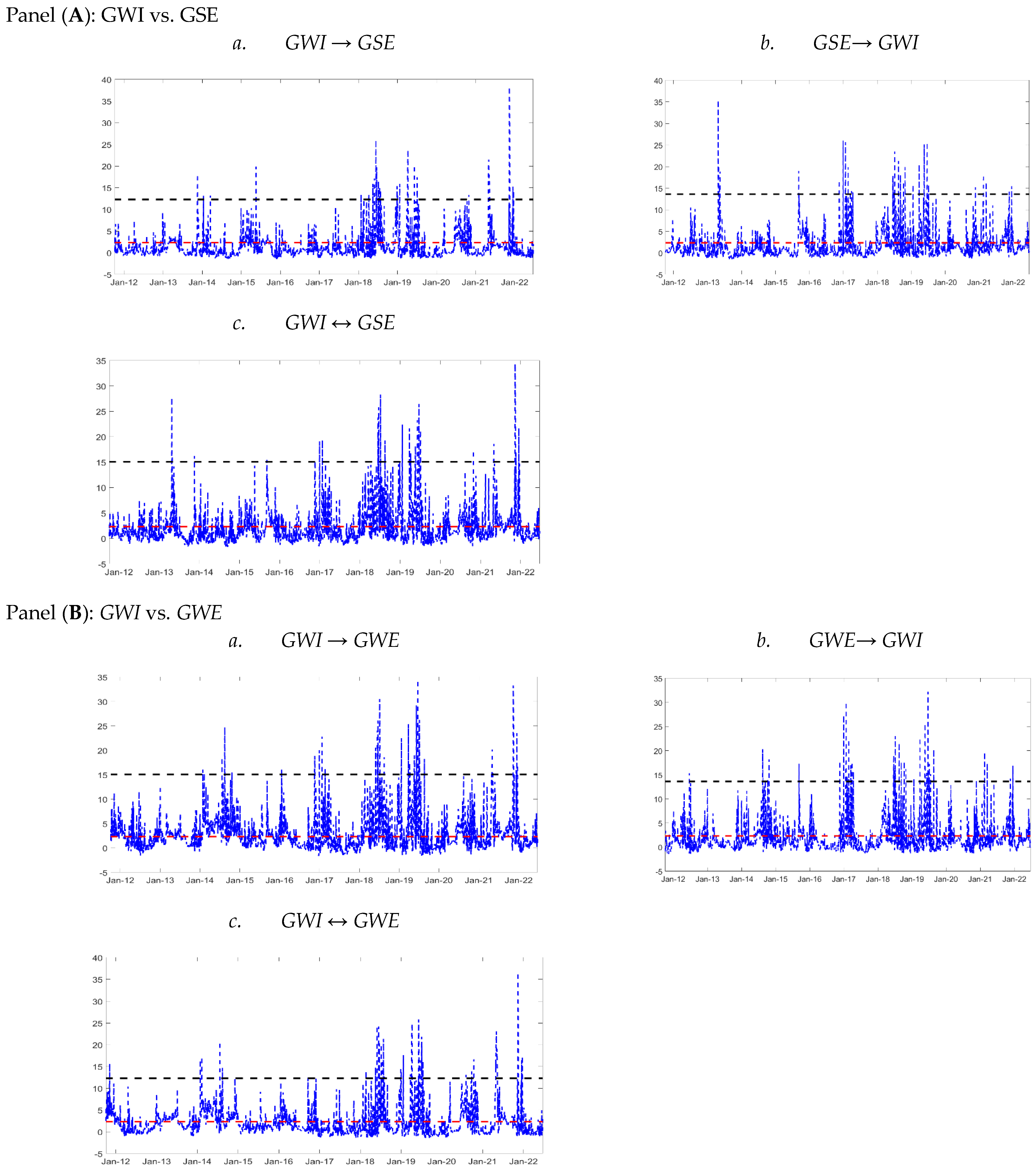
Furthermore, the findings of unidirectional and bidirectional rolling Hong tests are plotted in
Figure 2. In panel A, the tests were performed from
GWI to
GSE (
GSE ←
GWI), from
GSE to
GWI (
GSE →
GWI), and bidirectional between
GSE and
GWI (
GSE ↔
GWI). Panel B presents the rolling Hong test for
GWI and
GWE, aiming to identify tail predictability between the water and wind energy prices. The null hypothesis (no tail causality) was assessed using a 99% normal quantile critical value depicted by the dashed red line. Moreover, the black dashed line in the chart represents the simulated critical values at the 99% level, which were determined in the Methodology section. It is worth mentioning that the simulated critical value is considerably higher than the one calculated using the normal distribution, as shown by the black dashed line located well above the red dashed line.
The unidirectional GSE ← GWI test identified six significant causality episodes from GWI to GSE, namely in the beginning of 2014, April 2015, June 2018, first quarter of 2019, March 2021 and February 2022. Possible reasons for these causality episodes between solar energy and water from 2010 to 2022 include the increased use of solar energy for water pumping, solar thermal desalination, climate change, water conservation measures, climate change policy, the Paris Agreement, technological advancements, and environmental concerns for policy and regulatory changes. The causality episodes can be complex and multifaceted, and may be influenced by a range of factors.
Meanwhile, the unidirectional
GSE →
GWI test revealed seven significant causality episodes from solar energy to water. Additionally, the bidirectional
GSE ↔
GWI test confirmed the significant causality episodes identified in the unidirectional tests. Ref. [
17] has demonstrated these causal effects using classic statistical methods such as linear regression and correlation analyses. Our findings contribute to this by demonstrating that solar energy and water have a complex relationship, as seen in the span of 2011-2021. Water scarcity in California in 2014 led to an amplified request for solar energy. Solar power growth accelerated in 2013, and solar-powered desalination emerged in 2015. In 2017, concerns were raised about the water usage in solar panel manufacturing. Solar-powered irrigation initiatives were launched in 2018. Australia’s severe drought in 2019 increased the demand for solar energy. The pandemic in 2020 saw continued solar power growth, and in 2021, concerns arose about the environmental impact of water usage in concentrated solar power plants. The test statistic values were higher than those reported by [
50] due to the inclusion of contemporaneous correlation in the rolling Hong tests. The study found that co-movements played a significant role, which is further explained in the DCC-MGARCH analysis.
Figure 2.
Rolling Hong tests between water stocks and solar and wind energy. Notes: In each panel, the unidirectional rolling Hong test from water stocks to solar and wind energy (a), the unidirectional rolling Hong test from solar and wind energy to water stocks (b), and the bidirectional rolling Hong test are denoted (c). The dashed black (red) line indicates the 99% simulated (normal quantile) critical value. The rolling sample size is equal to 100.
At the same time, strong unidirectional causality is observed in panel B. Here, unidirectional causality from
GWI to
GWE (GWI → GWE), from
GWE to
GWI (
GWE →
GWI), and bidirectional between
GWE and
GWI (
GSE ↔
GWI) experience many causality incidents. Highlighted is that causality was so pronounced from 2018 to 2020. Additionally, during 2022, high spikes of unidirectional causality from
GWI to GWE and bidirectional causality between (
GSE ↔
GWI) were observed. Refs. [
18,
21] all obtained similar results for the bidirectional causality or the causality effects of water on the RWE sources. However, when compared to their data, our analysis indicates that the link between wind energy and water stocks is complex and was influenced by several events and trends from 2014 to 2022. The European Union’s adoption of a RWE target in 2013, coupled with the rise of wind energy as the second-largest source of RWE in 2014, played significant roles in shaping the market. The extension of the Production Tax Credit (PTC) by the US government in 2014, along with the severe drought in California, boosted wind and water stocks, respectively. The Paris Climate Agreement in 2015 and the increasing global impetus towards RWE precipitated a shift towards wind stocks, while the prolonged drought in California drove water stocks. By 2018, wind energy had become the cheapest form of electricity, further boosting wind stocks, while competitive pressures continued to stimulate the industry in 2016. The proposed cuts to the PTC and the US withdrawal from the climate change agreement in 2017 had a negative impact on wind stocks, while hurricanes and floods in Texas and Florida adversely affected water stocks. The worldwide demand for RWE spurred wind stocks in 2018, while droughts and wildfires impacted water stocks. The global momentum towards decarbonization and RWE drove wind stocks in 2019, while water stocks were influenced by water scarcity and the California drought. The COVID-19 pandemic had also an impact on wind energy projects in 2020, while the US government set a target to achieve 30 GW of offshore wind capacity by 2030 in 2021. Correspondingly, the escalating global commitments to net-zero emissions drove wind stocks, while continuing droughts and wildfires in the western US affected water stocks. It is substantial to note that the causality between wind and water stocks in 2022 is subject to the influence of various factors, including government policies, market conditions, and global events (e.g., the 2022 Russian–Ukrainian War).
The preceding results in
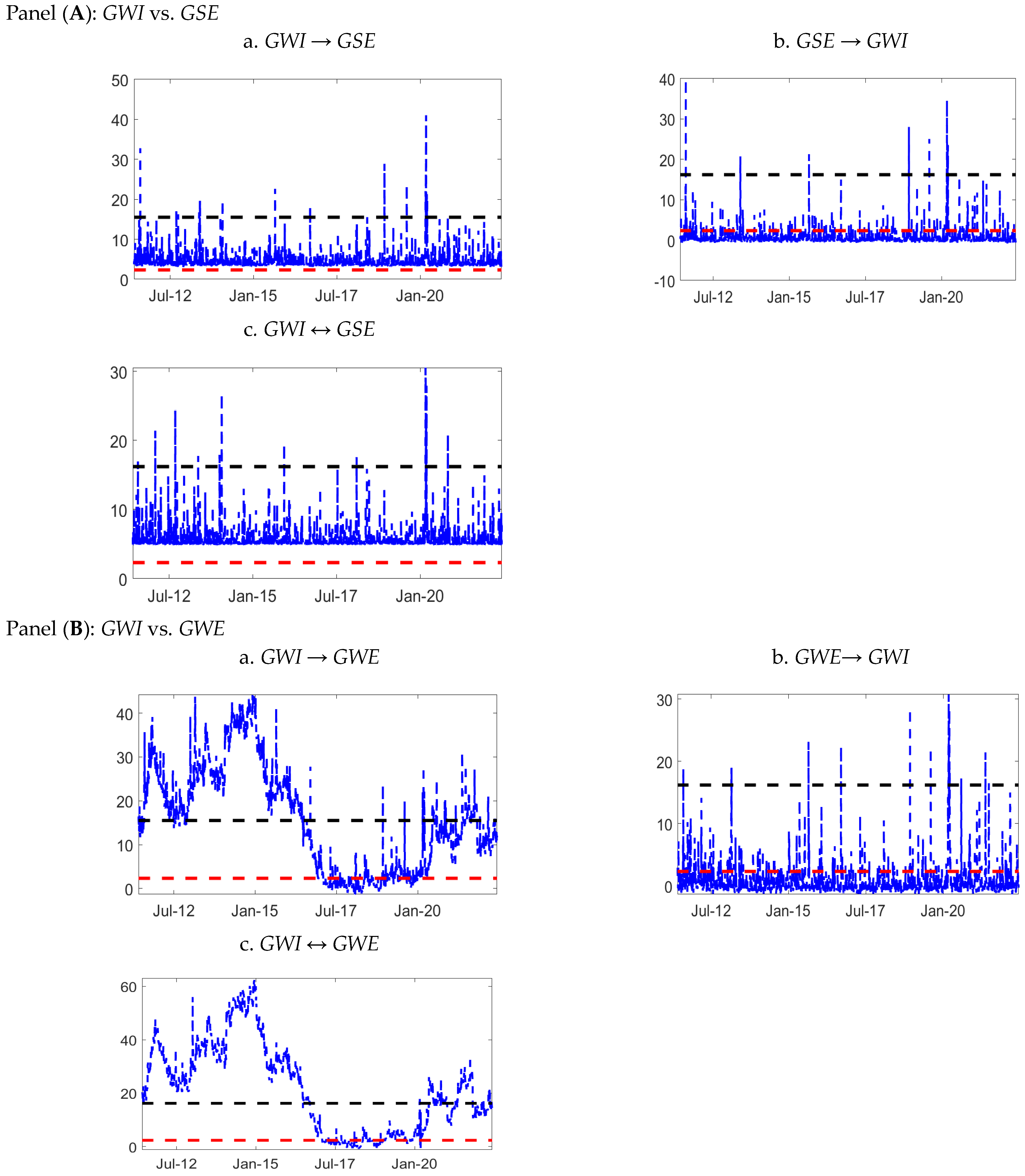
Figure 2 do not use all of the sample information because they focus just on tail quantiles. For this purpose, the DCC-MGARCH Hong tests are suggested. The outcomes of the Hong tests using DCC-MGARCH technique between GWI (water) and the solar/wind index are displayed in
Figure 3. To do so, ARMA-GARCH models are utilized to generate standardized residuals from the returns, which are then used to construct rolling Hong tests. The findings acquired using the simulated critical value (black dashed line) are significantly distinct from those obtained using the normal quantile (red dashed line). Broadly, here again, we can discover many causality events but few causality movements are different from the rolling Hong test (refer to
Figure 2). These events can be identified during 2011, 2012, and 2013. Between 2011 and 2013, wind and water stocks may have had a strong causality due to various factors. Favorable regulatory conditions for RWE, as well as prevailing market trends, could have influenced both types of stocks. Additionally, weather patterns and mergers and acquisitions in the RWE sector may have contributed to this trend. Similarly, during the same period, solar and water stocks have also been observed to have a high amount of causality due to several factors. Governments were focused on promoting RWE and water conservation, leading to an increase in demand for both types of stocks. Concerns about climate change also boosted the demand for RWE. Drought conditions in certain regions increased the demand for water stocks, especially in areas that relied heavily on agriculture and irrigation. Technological advancements in the solar and water sectors further contributed to the strong correlation between the two sectors. Lastly, socially responsible investors often favored both solar and water stocks due to their similar market characteristics, which also played a role in the correlation between the two sectors during this period.
Figure 3.
DCC-MGARCH Hong tests between water stocks and solar and wind energy using [
50] approach Notes: In each panel, the unidirectional rolling Hong test from water stocks to solar and wind energy (
a), the unidirectional rolling Hong test from solar and wind energy to water stocks (
b), and the bidirectional rolling Hong test are denoted (
c). The dashed black (red) line indicates the 99% simulated (normal quantile) critical value.
In this part, we show rolling window wavelet correlation (RWWC) outcomes for each pair for the whole sample period. The results of CWT-based Granger causality technique applied to the daily returns of the
GWI and
GSE/
GWE indexes are displayed in
Figure 4 and
Figure 5. Since contour charts contain three dimensions—frequency, time, and amplitude—they are used to show causal relationships. The frequency and time axes are located vertically and horizontally, respectively. Time encompasses the entire sample period, whereas frequency is shown in days and ranges from a maximum of 2 days (top of the plot) to a minimum of 1024 days (bottom of the plot). Time is represented as the total sample period. A color code that spans from dark blue (no causal effects) to dark yellow (high causal effects) indicates the intensity of the causal links between water and RWE daily returns. Red and white contours, respectively, reflect the statistically significant Granger causality correlations at the 10% and 5% levels. Based on 1000 Markov bootstrapped series, the significance levels are calculated. The region not impacted by edge effects is indicated by the green bold line, which represents the cone of influence.
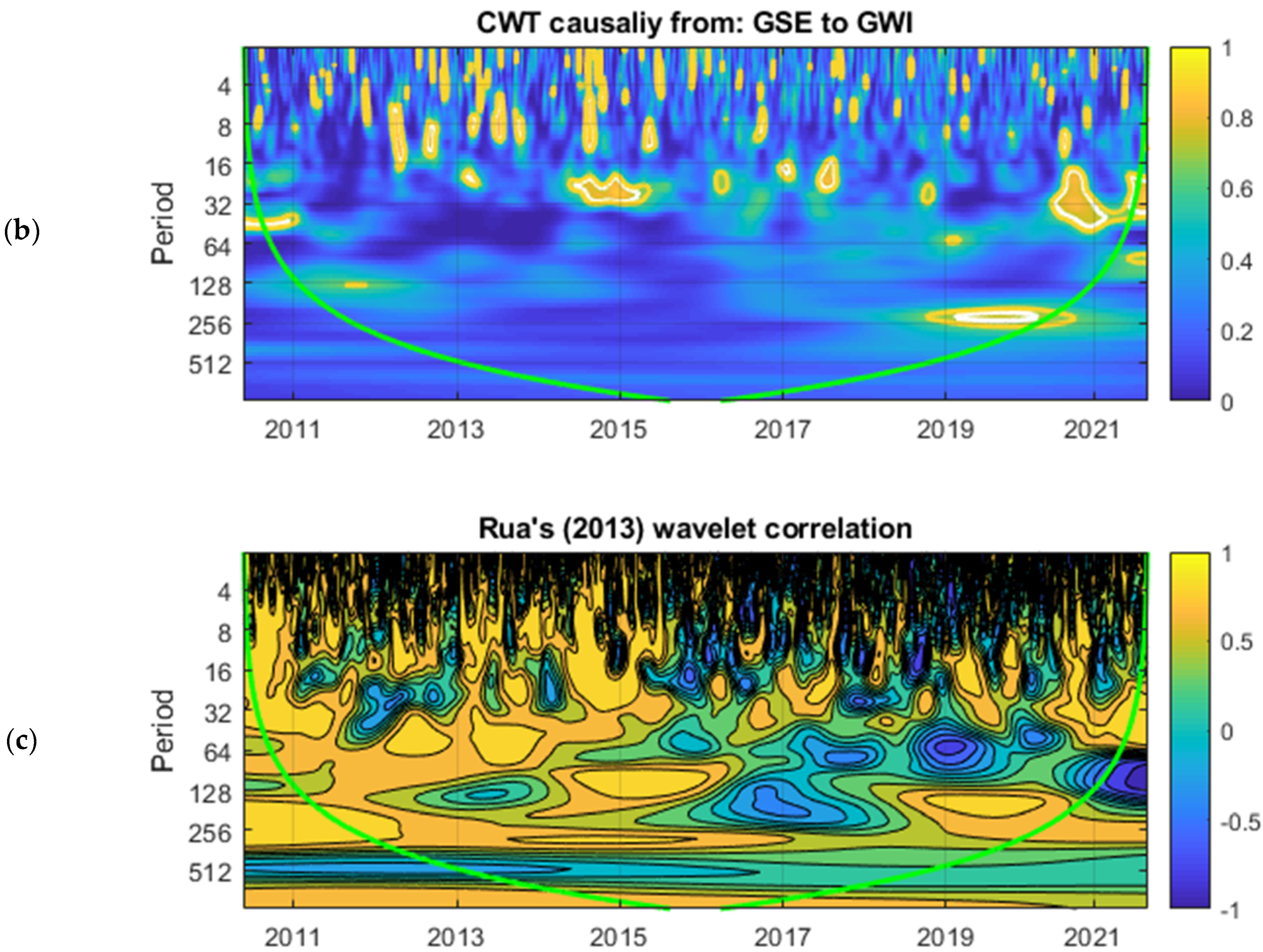
In
Figure 4, there are three panels (a, b, and c); panels a and b represent the continuous wavelet transform causality from
GWI to
GSE and from
GSE to
GWI. Meanwhile, panel c represents the wavelet-based correlation of [
49]. In the scalogram of panel a, we observe a high strength of the casual effect between 2010 and 2012 on the 128~256-day frequency, between 2012 and 2014 on the 32~64-day frequency, and during 2015–2016 on the frequency of 64~128 days. After 2016, we did not observe very strong causal effect from
GWI to
GSE. This is consistent with the findings of [
24], who used a time-varying technique to discover significant causality between water resources and RWE markets, with water resources having a large impact on RWE markets. In the scalogram of panel b, we found no strong causal influence from
GSE to
GWI. This is not the case for [
13], who conducted a wavelet-based causation and correlation analysis to inspect the link between water stocks and RWE markets and discovered that RWE markets had a considerable impact on water stocks. However, panel c displays that there is a strong negative correlation between the two variables throughout the sample time. More precisely,
Figure 4, panel c depicts the degree of synchronization between
GWI and
GWE. Because there are three dimensions involved, the findings are shown as a contour map. The horizontal axis represents time, and the vertical axis represents frequency. The frequency is converted to time units (days) to facilitate comprehension. The color scale represents the wavelet-based metric and corresponds to the height in a surface plot. As a result, by analyzing the contour map, one may identify both frequency bands (in the vertical axis) and time intervals (in the horizontal axis) with higher synchronization and whether it has changed over time and between frequencies. The findings are consistent with those shown in panels a and b. The synchronizations occur at various frequencies and at different times, which reflects the time-varying correlations between
GWI and
GSE.
Figure 4.
Continuous wavelet transform plot of causality between GWI and GSE. Notes: The white (red) contour indicates the 5% (10%) significance level. The significance levels are based on 3000 draws from Monte Carlo simulations estimated on an ARMA (1, 1) null of no statistical significance. The green line is the cone of influence (COI) earmarking the areas affected by the edge effects or phase. (a) CWT causality from GWI to GSE, (b) CWT causality from GSE to GWI, and (c) Rua’s wavelet correlation. (Color figure online).
Figure 5.
Continuous wavelet transform plot of causality between GWI and GWE. Notes: The white (red) contour indicates the 5% (10%) significance level. The significance levels are based on 3000 draws from Monte Carlo simulations estimated on an ARMA (1, 1) null of no statistical significance. The green line is the cone of influence (COI) earmarking the areas affected by the edge effects or phase. (a) CWT causality from GWI to GWE, (b) CWT causality from MSGLAE to GWE, and (c) Rua’s wavelet correlation. (Color figure online).
In
Figure 5, again, the causality in the continuous wavelet transform (CWT) and Rua’s wavelet-based correlation between
GWI and
GWE are reported. Here, panels a and b represent the continuous wavelet transform causality from
GWI to
GWE and from
GWE to
GWI, while panel c describes Rua’s wavelet-based correlation. Panels identify a high strength of the causal effect between 2010 and 2011 on the 4~64 day frequency. Furthermore, the strength of the CWT causal effect has grown between 2013 and 2017 on the 128–256-day frequency. Other than a small causality during 2019 on the 128~256-day frequency, we did not observe very strong causal effect from
GWI to
GWE. At the same time, in scalogram 2, we observe only a high strength of the casual effect between 2010 and 2012 on the 128~256-day frequency and between 2013 and 2015 on the 32~128-day frequency. From 2015 to 2019, no strong causality is observed, but from 2019 onwards, a strong causal effect can be seen over a 256-day frequency from
GSE to
GWI. Furthermore, panel c suggests Rua’s wavelet-based correlation (2013), where a strong negative correlation can be observed between these two variables over time on the 128~256-day frequency, implying a long-term independence and diversification opportunities between both markets.
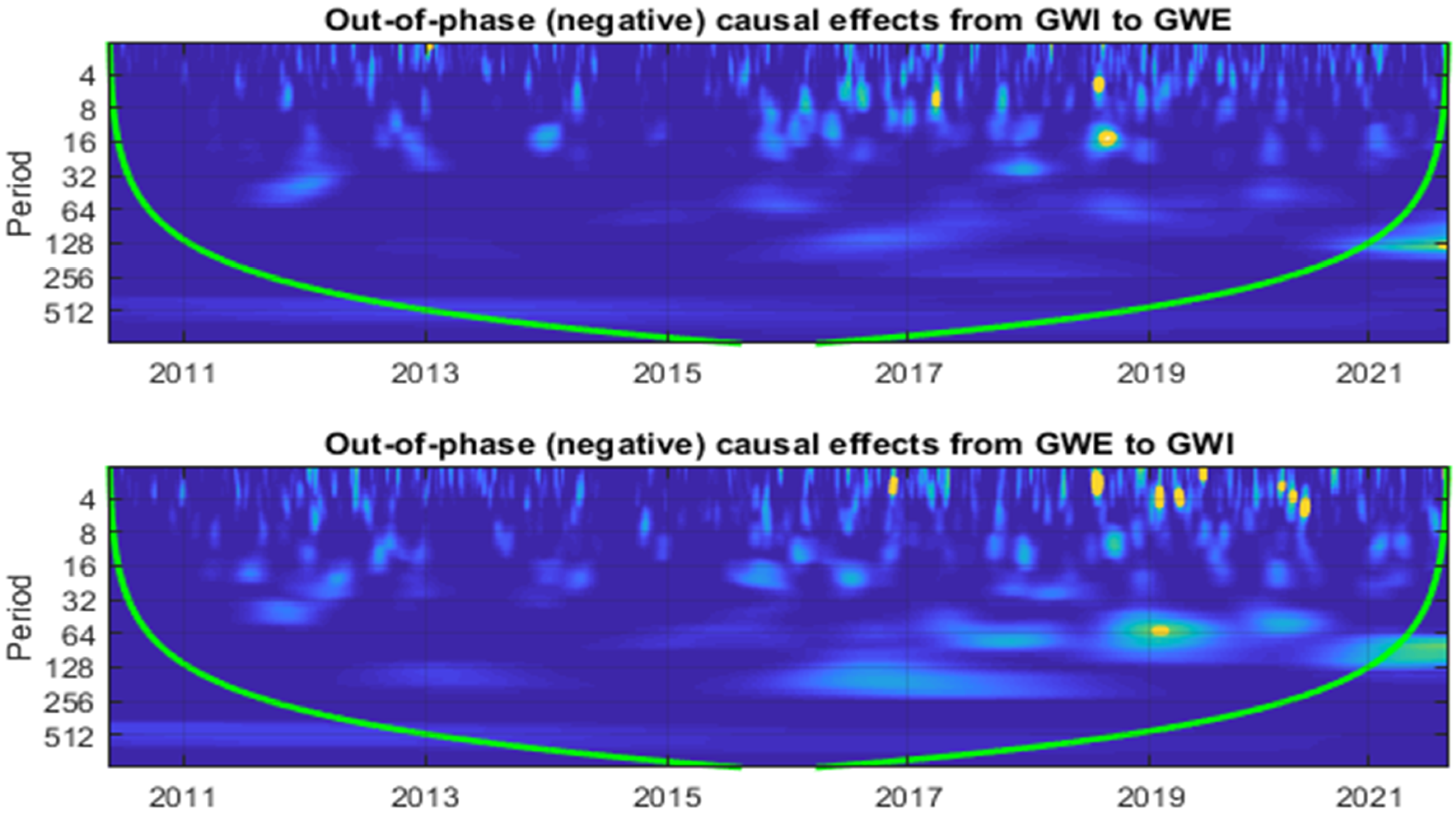
Figure 6.
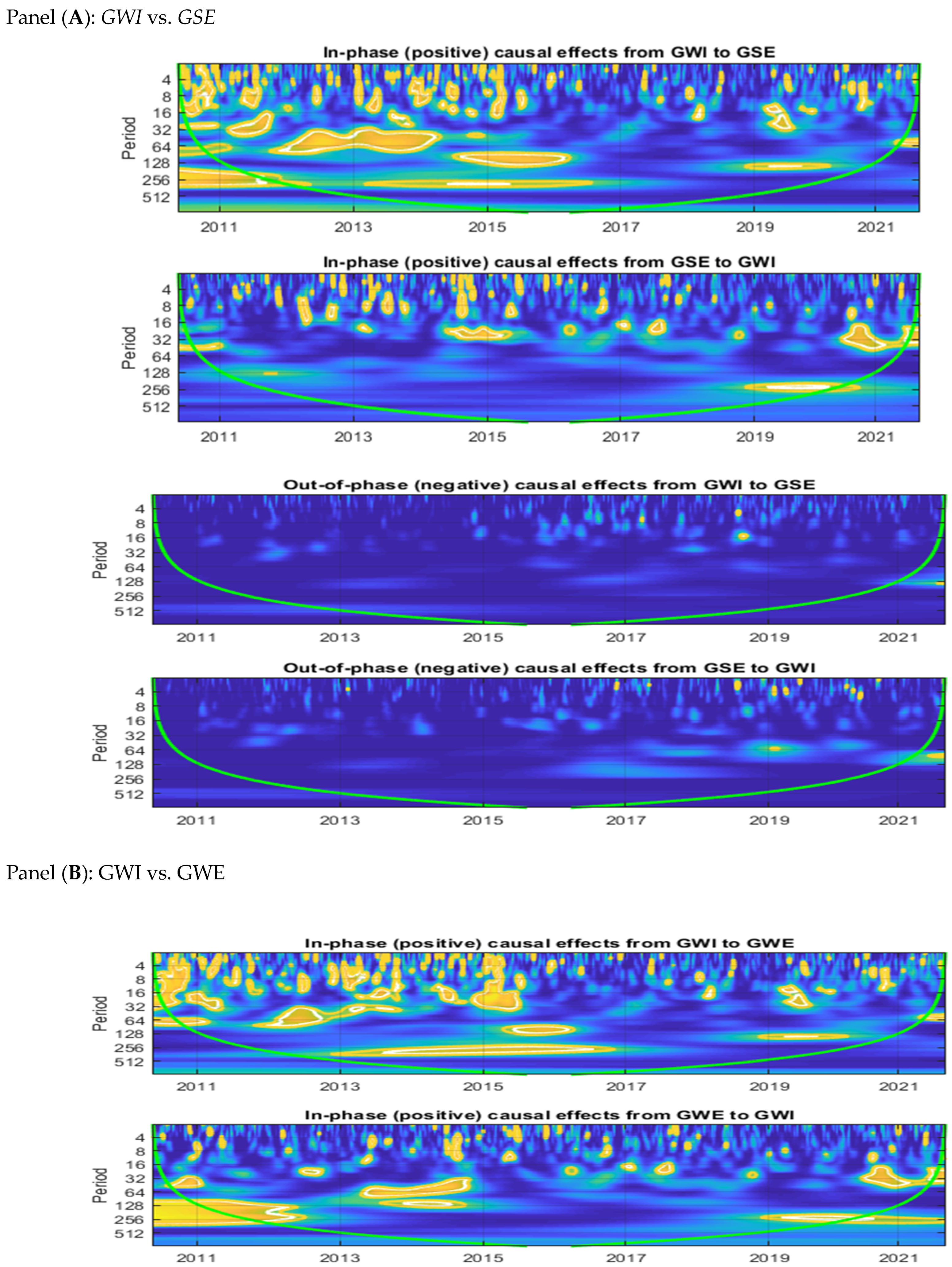
In-phase and out-of-phase plots of causality between GWI and GSE and GWE. Notes: The white (red) contour indicates the 5% (10%) significance level. Significance levels are based on 3000 plots from Monte Carlo simulations estimated over an ARMA (1, 1) null of no statistical significance. The green line is the cone of influence (COI) marking areas affected by edge effects or phase.
In
Figure 6, further in-phase (positive), and out-of-phase (negative) causal effects are tested. The results are demonstrated in two panels, and both panels are indicating in-phase (positive) causal effects and out-of-phase (negative) causal effects between sample variables. In both panels, we have four scalograms that help us to understand the causal effects of the two variables in a robust manner. In panels a and b, we report the in-phase (positive) and out-of-phase (negative) causal effects between
GWI and
GSE/
GWE. The white (red) contour denotes a level of significance of 5% (10%). The significance levels were calculated using 3000 Monte Carlo simulation draws with an ARMA (1, 1) null of no statistical significance. The green line represents the cone of influence, which denotes the areas influenced by edge effects or phase. From scalogram 1, we observed that there was a strong positive (in-phase) causal effect between 2010 and 2016 from
GWI to
GSE. Meanwhile, scalogram 2 suggests a weak causal effect from
GSE to
GWI. Next, in scalograms 3 and 4, out-of-phase causal effects are presented from
GWI to
GSE and from
GSE to
GWI, respectively. Very weak causal effects are seen amongst the variables. Furthermore, panel b also depicts in-phase (positive) and out-of-phase (negative) causal effects from
GWI to GWE and vice versa. The first scalogram of panel b presents the in-phase (positive) causal effects from
GWI to
GWE, where a significant positive causal effect from
GWI to
GWE between 2010 and 2017 is prevalent. Specifically, from 2013 to 2016, a very strong positive causal effect from
GWI to
GWE can be seen. On the other hand, the second scalogram depicts in-phase (positive) causal effects from
GWE to
GWI, and here we found that the positive causal effects were very strong between 2010 to 2015, after that no significant positive causal effects were observed until 2019. Meanwhile, the third/fourth scalograms offer the out-of-phase(negative) causal effects from
GWI/
GWE to
GWE/
GWI. In these two scalograms, we do not observe any strong negative causal effects between sample variables, with the exception of a few tiny causal regions in the short term, namely, during the COVID-19 incident. These findings support our prior findings, which show the causative effects of
GWI and
GSE/
GWE indexes.
5.2. An In-Depth Investigation of Correlation
A rolling window wavelet correlation (RWWC) was used to gain more insights into the behavior of the solar/wind and water relationships. Research outcomes are displayed in
Figure 7 for each pair of energy markets. The strength of bilateral developments between each energy market pair is highlighted as the spectrum on the right side of its overall scalogram. This power spectrum ranges from low dispersion values (lower part of the scale) to high developmental changes (upper part of the scale) for each developmental scalogram. The strength of the color corresponding to the respective rolling window is shown across different color schemes, for example, blue (highly negative), green (medium to low negative), white (very low to zero), yellow (medium to low positive), and red (very high positive).
Figure 7 consists three panels: panel a (
GWI vs.
GSE), panel b (
GWI vs.
GWE), and panel c (
GSE vs.
GWE). The rolling window wavelet results are based on different fragmentation levels from D1 to D5.
Figure 7.
Rolling window wavelet correlations between water stocks and solar and wind energy markets (a 240 day window is used).
Figure 7.
Rolling window wavelet correlations between water stocks and solar and wind energy markets (a 240 day window is used).
Panel a witnesses a moderate correlation pattern over the entire period at all decomposition levels, except the D5 decomposition level, where the highest to lowest variation in the correlation pattern can be detected. The correlation value varies from most negative (blue) to most positive (red). Panel b witnesses a high level of the correlation pattern until 2016 in all decomposition levels, except D5; in 2016, the correlation level decreased to moderate level. At decomposition level D5, we found a high level of the correlation pattern for the maximum time but during the times of 2012 to 2020, and this correlation behavior often declined and sometimes reached strongly negative. Panel c displays a totally different picture, where a moderate level of the correlation pattern is observed until 2016 at D1, and until 2014 at the D2, D3, and D4 decomposition levels. Here again, till 2015, the D5 level shows a variation in the correlation from high to moderate (negative). Interestingly, since 2015, a very high correlation is visible between solar and wind markets at all decomposition levels. These findings demonstrate once again that the complex linkages between the water and RWE markets make it impossible to combine them to establish a diversified portfolio.
Instead of trying to approximate the conditional mean, we will instead investigate the relationship between these two markets at different quantiles.
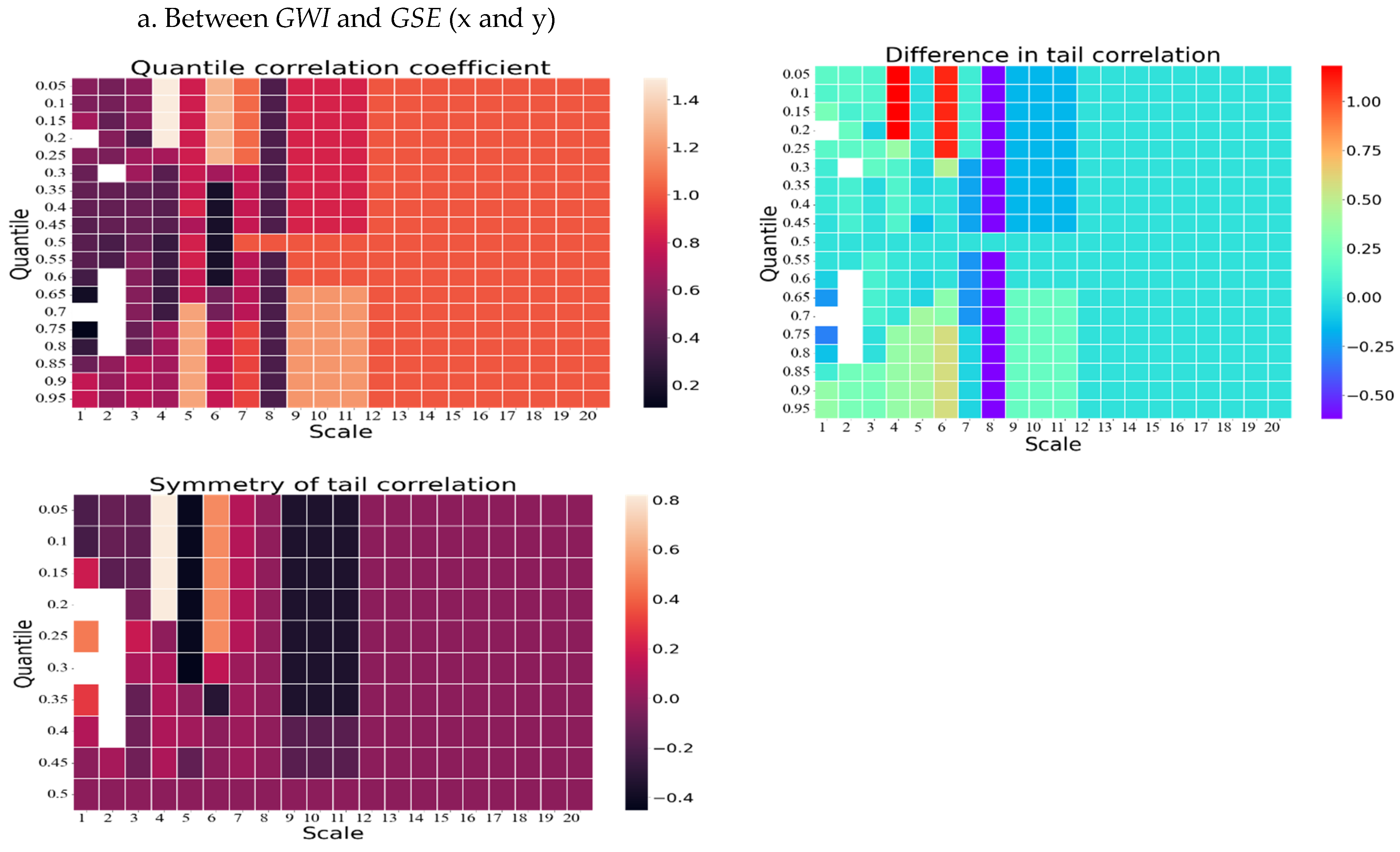
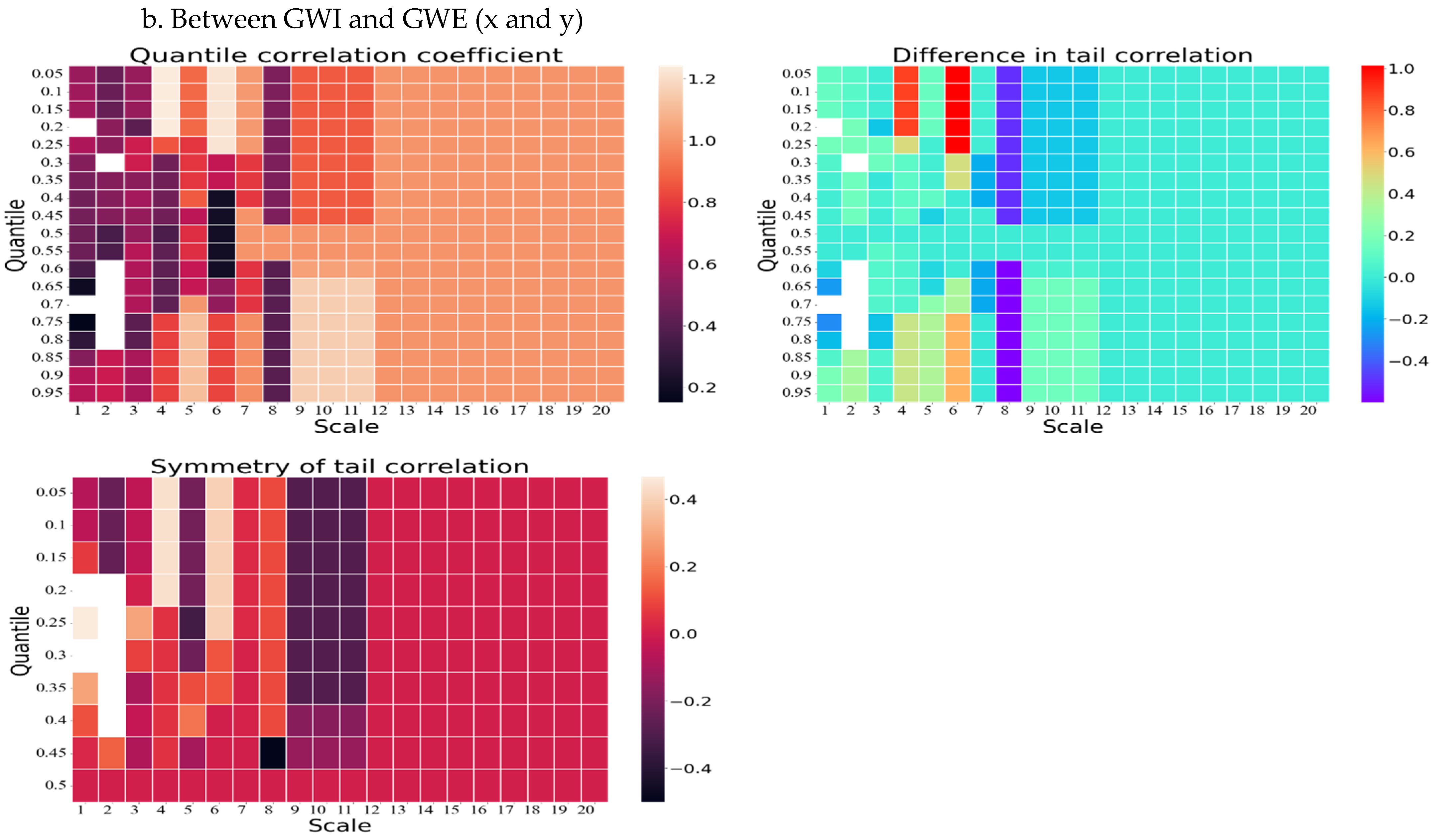
Figure 8 provides the information about the quantile correlation coefficient (QCC), difference in tail correlation (DTC), and symmetry of tail correlation (STC) of the GWI and GSE pair using the wavelet quantile correlation (WQC) approach. This figure also has two panels (panels a and b); panel a provides the information about the QCC, DTC, and STC of the
GWI and
GSE pair. Similarly, panel b consists of three scalogram (i.e., QCC, DTC, and STC) between GWI and
GWE.
Initially, the QCC outcomes in panels a and b (GWI and GSE/GWE) reveal a weak to moderate correlation in comparison to all quantiles up to the eighth scale. However, the correlation steadily increases from moderate to high thereafter. Notably, the highest quantile correlation can be observed from the 0.60 quantile to the 0.95 quantile, from the ninth scale to the twelfth scale. Secondly, the DTC results of both panels present a similar scenario. With the exception of some initial quantiles for the fourth and sixth scales, where the highest correlations are observed, a low to moderate (positive and negative) correlation is evident throughout. Significantly, the eighth scale emphasizes a very low negative correlation. Thirdly, the tail correlation symmetry metric of GWI and GSE/GWE indicates the presence of asymmetry in the tail correlation. In the first four scales, the correlation level varies from negative low to highly positive. However, in the fifth scale, the correlation turns highly negative for the initial quantiles. Interestingly, at the sixth scale, this correlation reaches a moderately positive level. Lastly, except for the ninth to twelfth scales, where a moderately negative correlation is experienced, a low to zero correlation is prevalent throughout.
Figure 8.
Results based on the wavelet quantile correlation between water stocks and solar and wind energy.
Figure 8.
Results based on the wavelet quantile correlation between water stocks and solar and wind energy.
