Author Contributions
Conceptualization, T.S. and Y.Y.; methodology, T.S., Y.Y. and T.H.; formal analysis, T.S.; investigation, Y.Y. and M.K.; resources, S.M.; data curation, T.S. and Y.Y.; writing—original draft preparation, T.S.; writing—review and editing, Y.Y. and T.H.; visualization, T.S.; supervision, Y.Y., T.H. and Y.H.; project administration, Y.Y.; funding acquisition, Y.Y. All authors have read and agreed to the published version of the manuscript.
Acknowledgments
The authors thank Hao Wang (formerly Department of Neurosurgery, Graduate School of Medicine, Chiba University) for his important contribution in isolating the autoantibody markers used in this study. The authors would like to express their deepest gratitude to the late Toshio Machida (Department of Neurosurgery, East Chiba Medical Center), whose guidance, encouragement, and early contributions were instrumental to the initiation of this study. Although he passed away before the completion of the work, his scientific insight and dedication remain profoundly appreciated. The authors also thank Eiryo Kawakami (Department of Artificial Intelligence in Medicine, Graduate School of Medicine, Chiba University) for his valuable advice on the application of machine-learning methods and the interpretation of analytical results, which substantially improved the quality of this research. The authors used a generative-AI language model (ChatGPT, OpenAI, GPT-5) to assist in initial manuscript drafting and language polishing. The authors take full responsibility for the final content, including accuracy, integrity and originality.
Figure 1.
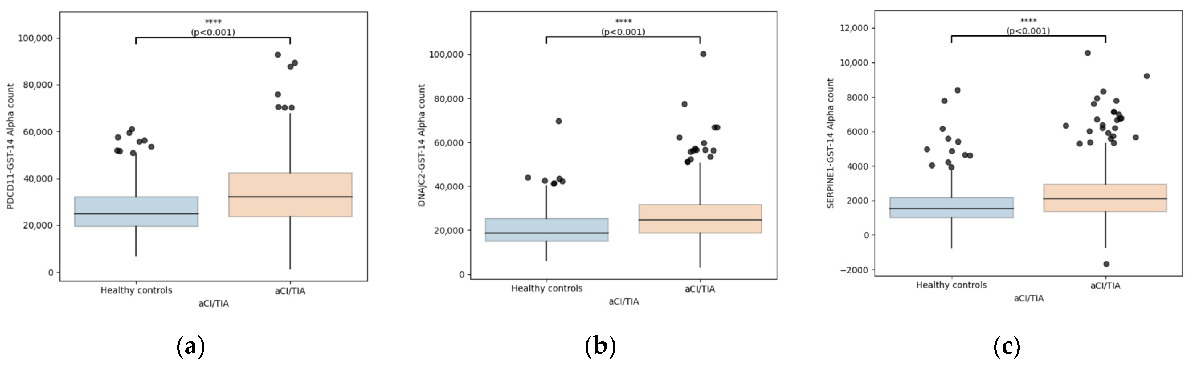
Distribution of serum autoantibody levels in patients with ischemic stroke and healthy controls. Boxplots illustrate GST-corrected AlphaLISA signal intensities for PDCD11-Ab (a), DNAJC2-Ab (b), and SERPINE1-Ab (c) in healthy controls and patients with acute ischemic stroke or transient ischemic attack (AIS/TIA). Boxes represent the interquartile range (IQR), horizontal lines indicate medians, whiskers extend to 1.5 × IQR, and dots represent individual data points. Comparisons between groups were performed using the Mann–Whitney U test. **** p < 0.001.
Figure 1.
Distribution of serum autoantibody levels in patients with ischemic stroke and healthy controls. Boxplots illustrate GST-corrected AlphaLISA signal intensities for PDCD11-Ab (a), DNAJC2-Ab (b), and SERPINE1-Ab (c) in healthy controls and patients with acute ischemic stroke or transient ischemic attack (AIS/TIA). Boxes represent the interquartile range (IQR), horizontal lines indicate medians, whiskers extend to 1.5 × IQR, and dots represent individual data points. Comparisons between groups were performed using the Mann–Whitney U test. **** p < 0.001.
Figure 2.
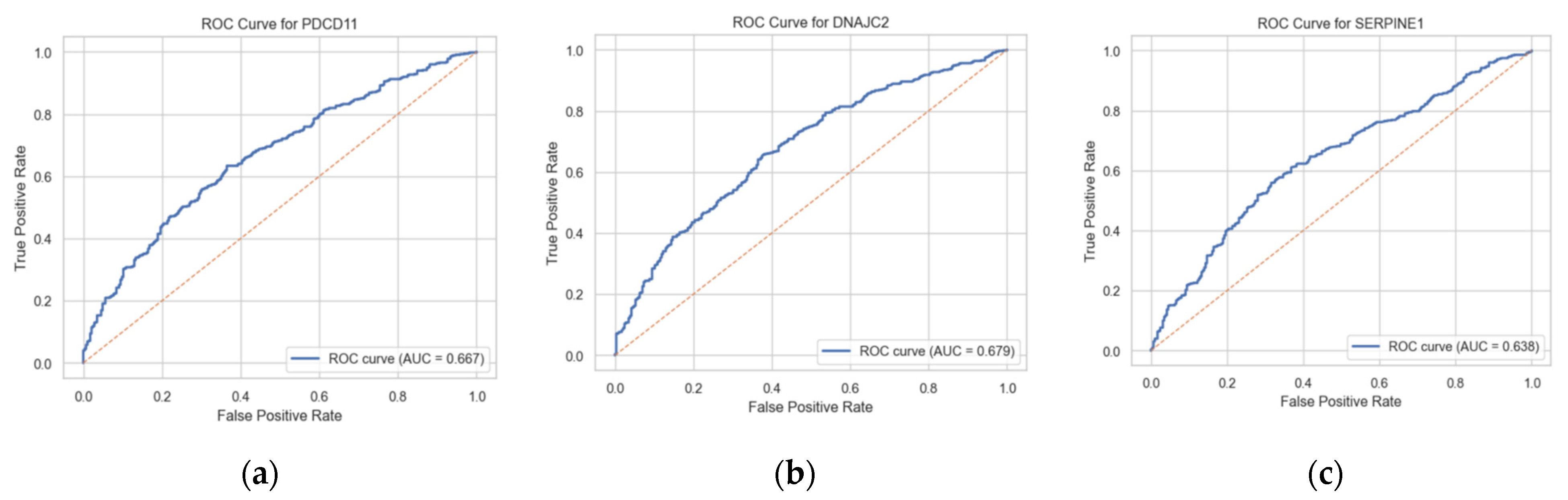
Receiver operating characteristic (ROC) curves for individual serum autoantibody markers in the identification of ischemic stroke. ROC curves are shown for PDCD11-Ab (a), DNAJC2-Ab (b), and SERPINE1-Ab (c). The area under the curve (AUC) values were 0.667 (95% CI 0.629–0.704) for PDCD11, 0.679 (95% CI 0.641–0.715) for DNAJC2, and 0.638 (95% CI 0.600–0.679) for SERPINE1. The dashed diagonal line represents the line of no discrimination (AUC = 0.5). These findings indicate modest discriminative performance of individual antibody markers for ischemic stroke.
Figure 2.
Receiver operating characteristic (ROC) curves for individual serum autoantibody markers in the identification of ischemic stroke. ROC curves are shown for PDCD11-Ab (a), DNAJC2-Ab (b), and SERPINE1-Ab (c). The area under the curve (AUC) values were 0.667 (95% CI 0.629–0.704) for PDCD11, 0.679 (95% CI 0.641–0.715) for DNAJC2, and 0.638 (95% CI 0.600–0.679) for SERPINE1. The dashed diagonal line represents the line of no discrimination (AUC = 0.5). These findings indicate modest discriminative performance of individual antibody markers for ischemic stroke.
Figure 3.
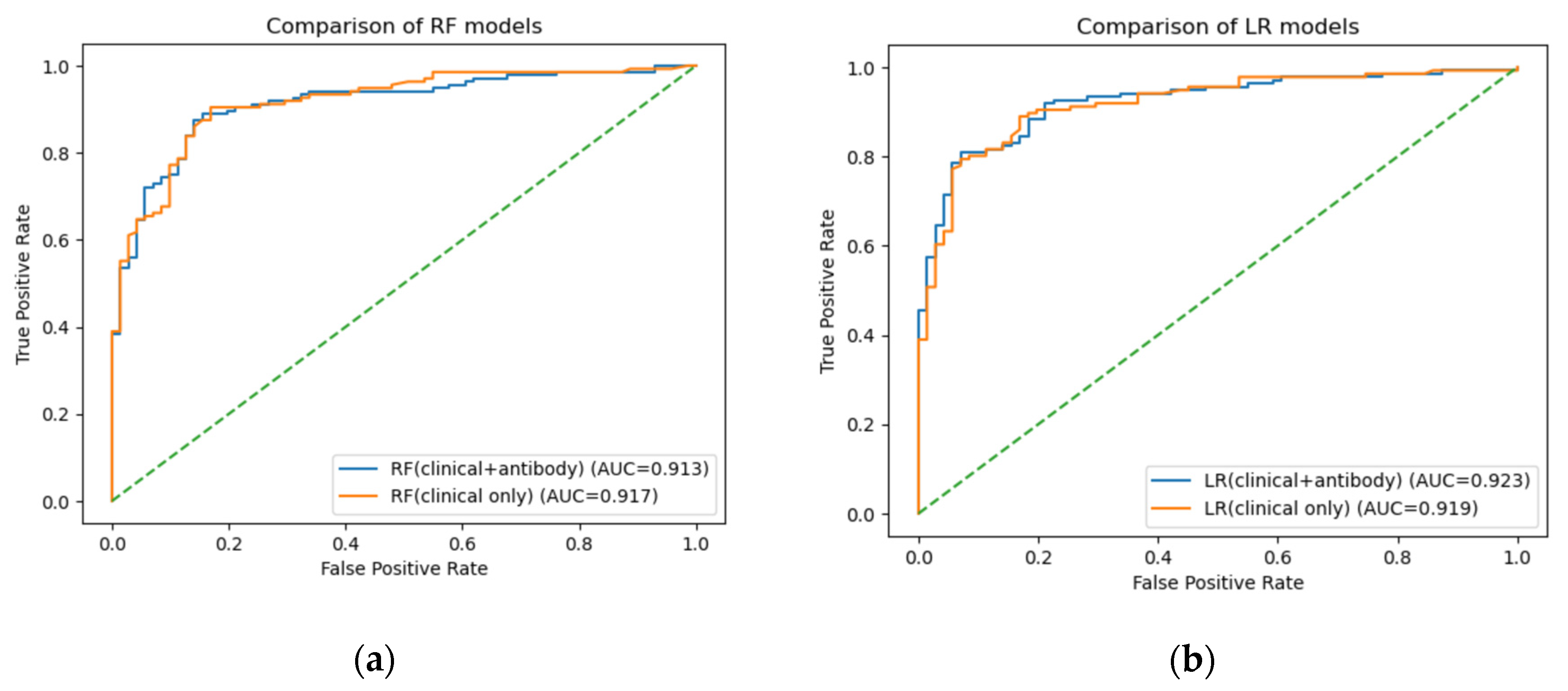
Receiver operating characteristic (ROC) curves comparing machine-learning models with and without antibody markers for the prediction of ischemic stroke. (a) Random Forest (RF) models. (b) Logistic Regression (LR) models. Blue curves represent models including clinical variables and antibody markers, whereas orange curves represent models using clinical variables only. The area under the curve (AUC) values for the test dataset were 0.913 (RF with antibodies) and 0.917 (RF clinical only), and 0.923 (LR with antibodies) and 0.919 (LR clinical only), respectively. The dashed diagonal line indicates no discrimination (AUC = 0.5). These findings demonstrate that the addition of antibody markers did not materially improve overall discriminative performance.
Figure 3.
Receiver operating characteristic (ROC) curves comparing machine-learning models with and without antibody markers for the prediction of ischemic stroke. (a) Random Forest (RF) models. (b) Logistic Regression (LR) models. Blue curves represent models including clinical variables and antibody markers, whereas orange curves represent models using clinical variables only. The area under the curve (AUC) values for the test dataset were 0.913 (RF with antibodies) and 0.917 (RF clinical only), and 0.923 (LR with antibodies) and 0.919 (LR clinical only), respectively. The dashed diagonal line indicates no discrimination (AUC = 0.5). These findings demonstrate that the addition of antibody markers did not materially improve overall discriminative performance.
Figure 4.
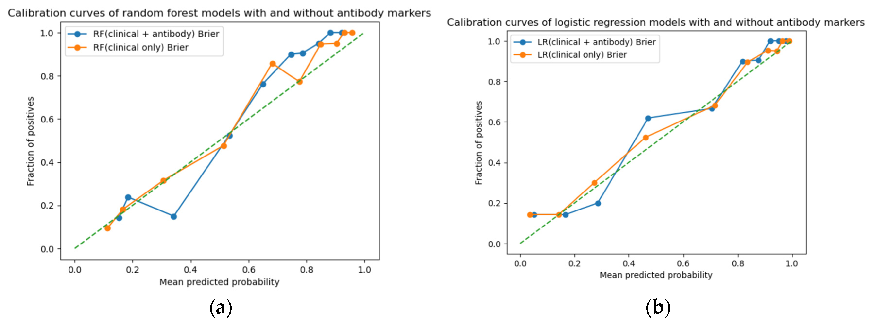
Calibration plots of machine-learning models with and without antibody markers for the prediction of ischemic stroke. (a) Random Forest (RF) models. (b) Logistic Regression (LR) models. Blue curves represent models including clinical variables and antibody markers, and orange curves represent clinical-only models. Points indicate observed event fractions within grouped predicted-probability bins, and the dashed diagonal line represents perfect calibration. Brier scores were 0.119 (clinical + antibody) and 0.112 (clinical only) for the Random Forest model, and 0.106 and 0.107, respectively, for logistic regression. These findings indicate preserved calibration and no material improvement in overall calibration performance with the addition of antibody markers.
Figure 4.
Calibration plots of machine-learning models with and without antibody markers for the prediction of ischemic stroke. (a) Random Forest (RF) models. (b) Logistic Regression (LR) models. Blue curves represent models including clinical variables and antibody markers, and orange curves represent clinical-only models. Points indicate observed event fractions within grouped predicted-probability bins, and the dashed diagonal line represents perfect calibration. Brier scores were 0.119 (clinical + antibody) and 0.112 (clinical only) for the Random Forest model, and 0.106 and 0.107, respectively, for logistic regression. These findings indicate preserved calibration and no material improvement in overall calibration performance with the addition of antibody markers.
Figure 5.
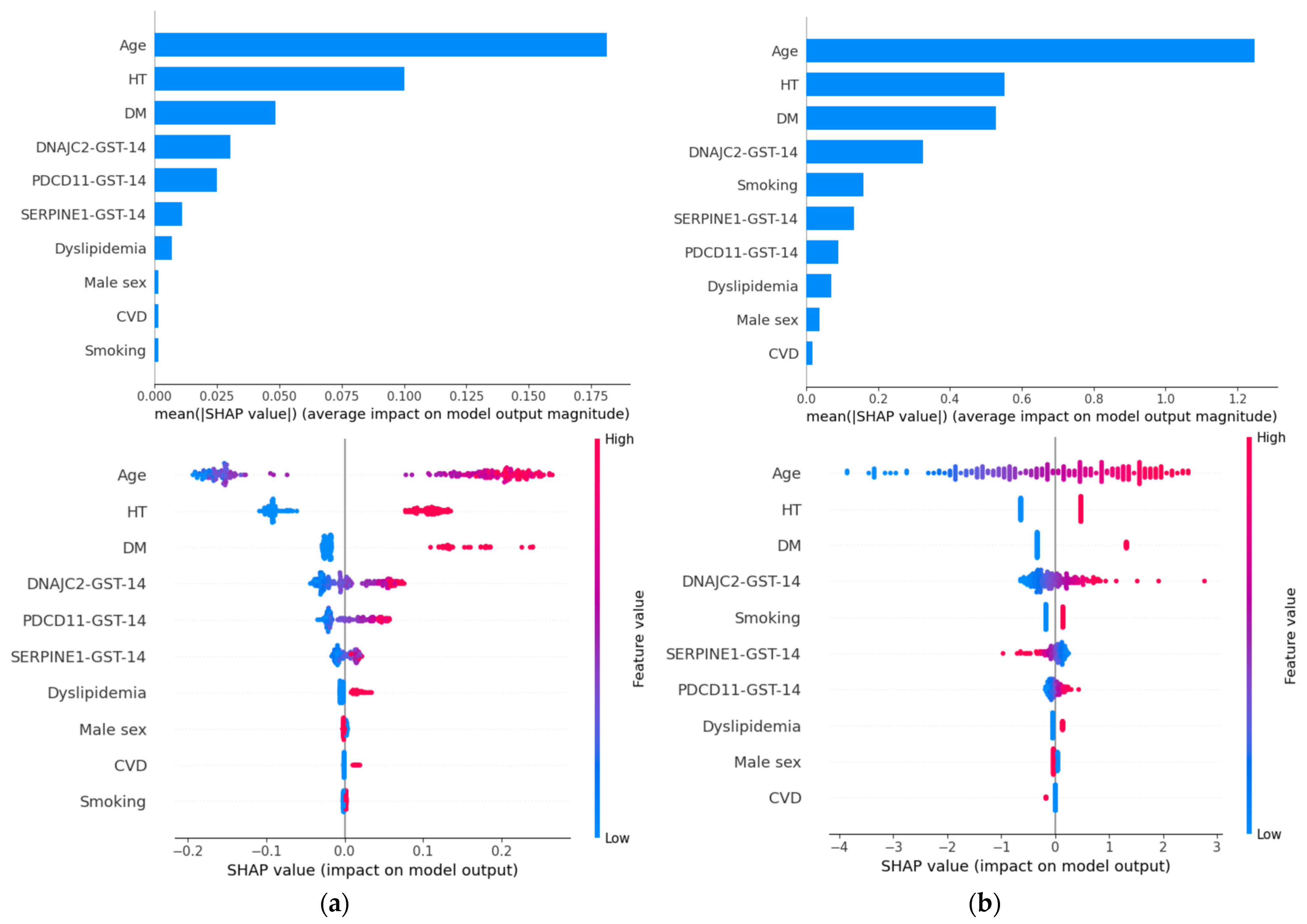
SHAP-based feature importance and summary plots for the (a) Random Forest and (b) Logistic Regression models. The upper panels display the mean absolute SHAP values, representing the average impact of each variable on model output magnitude. Age, hypertension (HT), and diabetes mellitus (DM) were the most influential predictors in both models. The three antibody markers (DNAJC2-Ab, PDCD11-Ab, and SERPINE1-Ab) ranked immediately after these established clinical risk factors. The lower panels show SHAP summary plots, where each point represents an individual sample. The horizontal axis indicates the SHAP value (impact on model output), and color represents the feature value (red: high; blue: low). Antibody markers demonstrated heterogeneous contributions across individuals, supporting their context-dependent effects within the prediction models.
Figure 5.
SHAP-based feature importance and summary plots for the (a) Random Forest and (b) Logistic Regression models. The upper panels display the mean absolute SHAP values, representing the average impact of each variable on model output magnitude. Age, hypertension (HT), and diabetes mellitus (DM) were the most influential predictors in both models. The three antibody markers (DNAJC2-Ab, PDCD11-Ab, and SERPINE1-Ab) ranked immediately after these established clinical risk factors. The lower panels show SHAP summary plots, where each point represents an individual sample. The horizontal axis indicates the SHAP value (impact on model output), and color represents the feature value (red: high; blue: low). Antibody markers demonstrated heterogeneous contributions across individuals, supporting their context-dependent effects within the prediction models.
Figure 6.
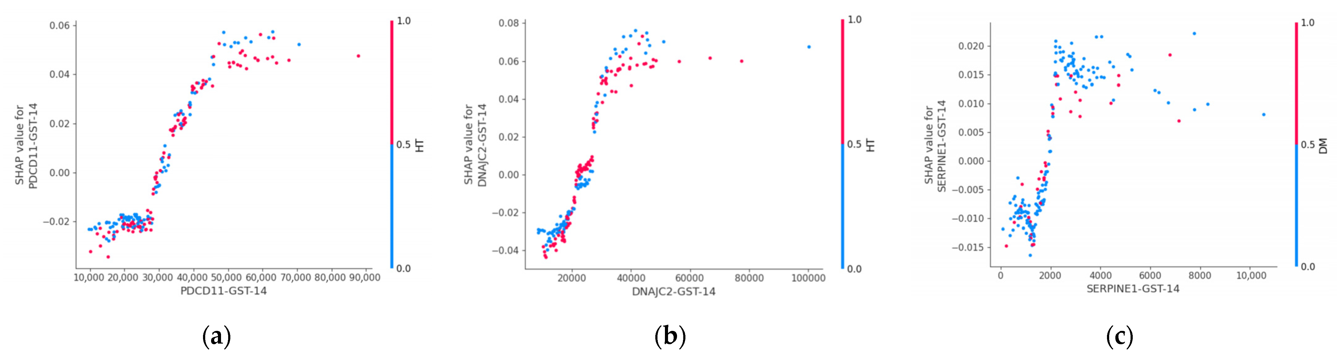
SHAP dependence plots illustrating nonlinear effects of antibody markers in the Random Forest model. The plots display the relationship between antibody levels (x-axis) and their corresponding SHAP values (y-axis), representing the contribution of each marker to stroke prediction. (a) Dependence plot for PDCD11-Ab, showing a nonlinear increase in SHAP values with increasing antibody levels, suggesting a threshold-like effect on predicted stroke risk. (b) Dependence plot for DNAJC2-Ab, demonstrating a similar nonlinear relationship between antibody levels and model output. (c) Dependence plot for SERPINE1-Ab, showing heterogeneous contributions across individuals, with evidence of interaction effects. In each panel, the x-axis represents antibody levels and the y-axis represents SHAP values, indicating the contribution of each marker to stroke prediction. Point color indicates interacting clinical variables (hypertension for PDCD11-Ab and DNAJC2-Ab; diabetes mellitus for SERPINE1-Ab), highlighting context-dependent effects of antibody levels on model predictions.
Figure 6.
SHAP dependence plots illustrating nonlinear effects of antibody markers in the Random Forest model. The plots display the relationship between antibody levels (x-axis) and their corresponding SHAP values (y-axis), representing the contribution of each marker to stroke prediction. (a) Dependence plot for PDCD11-Ab, showing a nonlinear increase in SHAP values with increasing antibody levels, suggesting a threshold-like effect on predicted stroke risk. (b) Dependence plot for DNAJC2-Ab, demonstrating a similar nonlinear relationship between antibody levels and model output. (c) Dependence plot for SERPINE1-Ab, showing heterogeneous contributions across individuals, with evidence of interaction effects. In each panel, the x-axis represents antibody levels and the y-axis represents SHAP values, indicating the contribution of each marker to stroke prediction. Point color indicates interacting clinical variables (hypertension for PDCD11-Ab and DNAJC2-Ab; diabetes mellitus for SERPINE1-Ab), highlighting context-dependent effects of antibody levels on model predictions.

Figure 7.
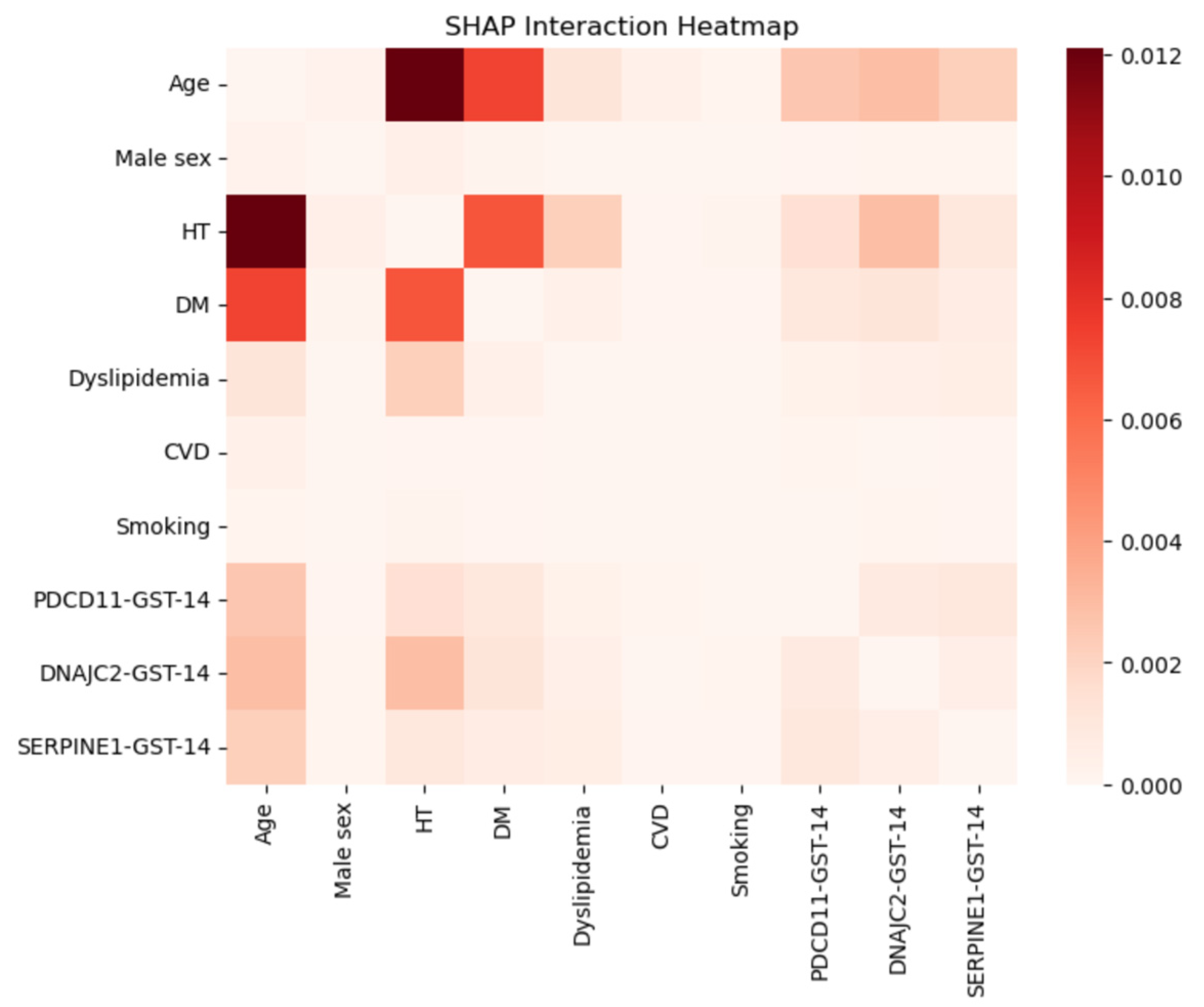
SHAP interaction heatmap derived from the Random Forest model. The heatmap illustrates pairwise interaction strengths between variables based on SHAP interaction values, where darker colors indicate stronger interactions contributing to model predictions. Age showed the strongest interaction with hypertension and diabetes mellitus, highlighting the dominant role of traditional vascular risk factors. Notably, antibody markers demonstrated measurable interactions with clinical variables, particularly with age and hypertension, suggesting that their effects on ischemic stroke risk may be context-dependent rather than purely additive. These findings further support the presence of nonlinear relationships captured by the Random Forest model.
Figure 7.
SHAP interaction heatmap derived from the Random Forest model. The heatmap illustrates pairwise interaction strengths between variables based on SHAP interaction values, where darker colors indicate stronger interactions contributing to model predictions. Age showed the strongest interaction with hypertension and diabetes mellitus, highlighting the dominant role of traditional vascular risk factors. Notably, antibody markers demonstrated measurable interactions with clinical variables, particularly with age and hypertension, suggesting that their effects on ischemic stroke risk may be context-dependent rather than purely additive. These findings further support the presence of nonlinear relationships captured by the Random Forest model.
Figure 8.
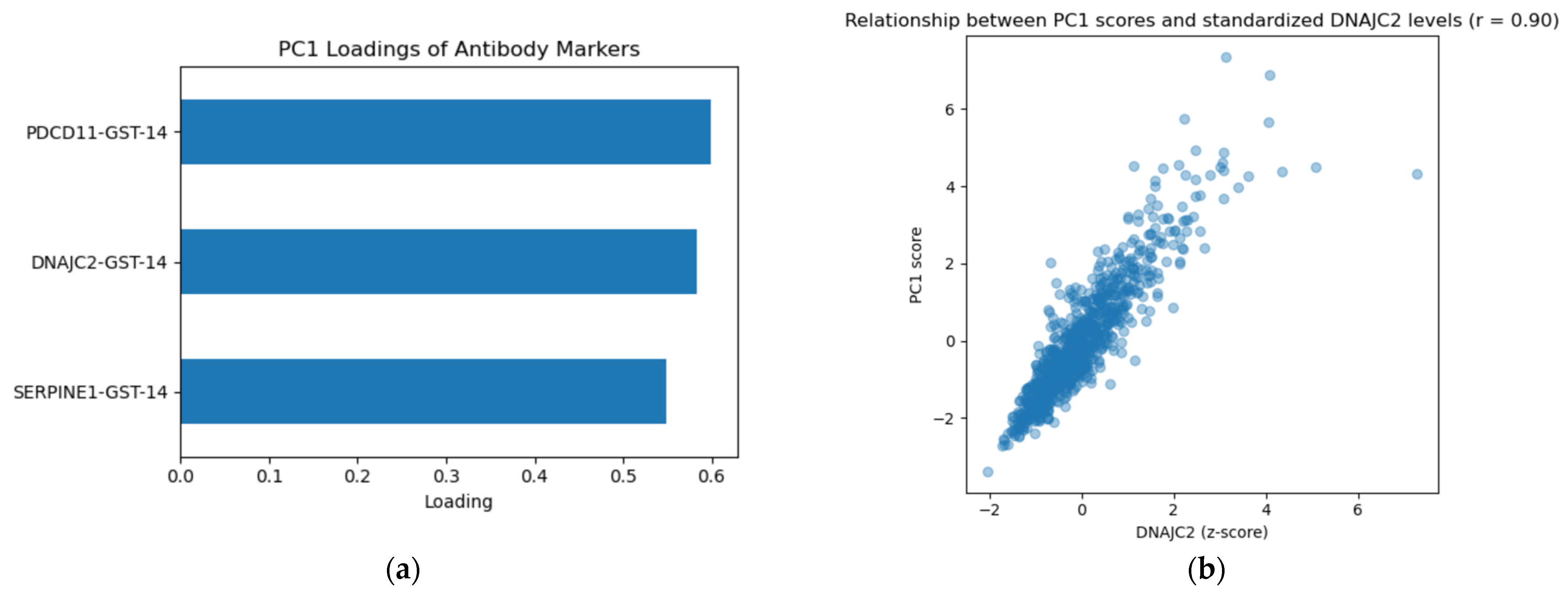
Principal component structure and clustering of antibody markers. (a) Loadings of individual antibody markers on the first principal component (PC1), demonstrating comparable contributions from PDCD11-Ab, DNAJC2-Ab, and SERPINE1-Ab. PC1 explained 79.3% of the total variance, indicating a strong shared antibody signal. (b) Relationship between PC1 scores and standardized DNAJC2-Ab levels (r = 0.899), supporting the interpretation that PC1 reflects overall antibody burden rather than a single-marker effect.
Figure 8.
Principal component structure and clustering of antibody markers. (a) Loadings of individual antibody markers on the first principal component (PC1), demonstrating comparable contributions from PDCD11-Ab, DNAJC2-Ab, and SERPINE1-Ab. PC1 explained 79.3% of the total variance, indicating a strong shared antibody signal. (b) Relationship between PC1 scores and standardized DNAJC2-Ab levels (r = 0.899), supporting the interpretation that PC1 reflects overall antibody burden rather than a single-marker effect.
Figure 9.
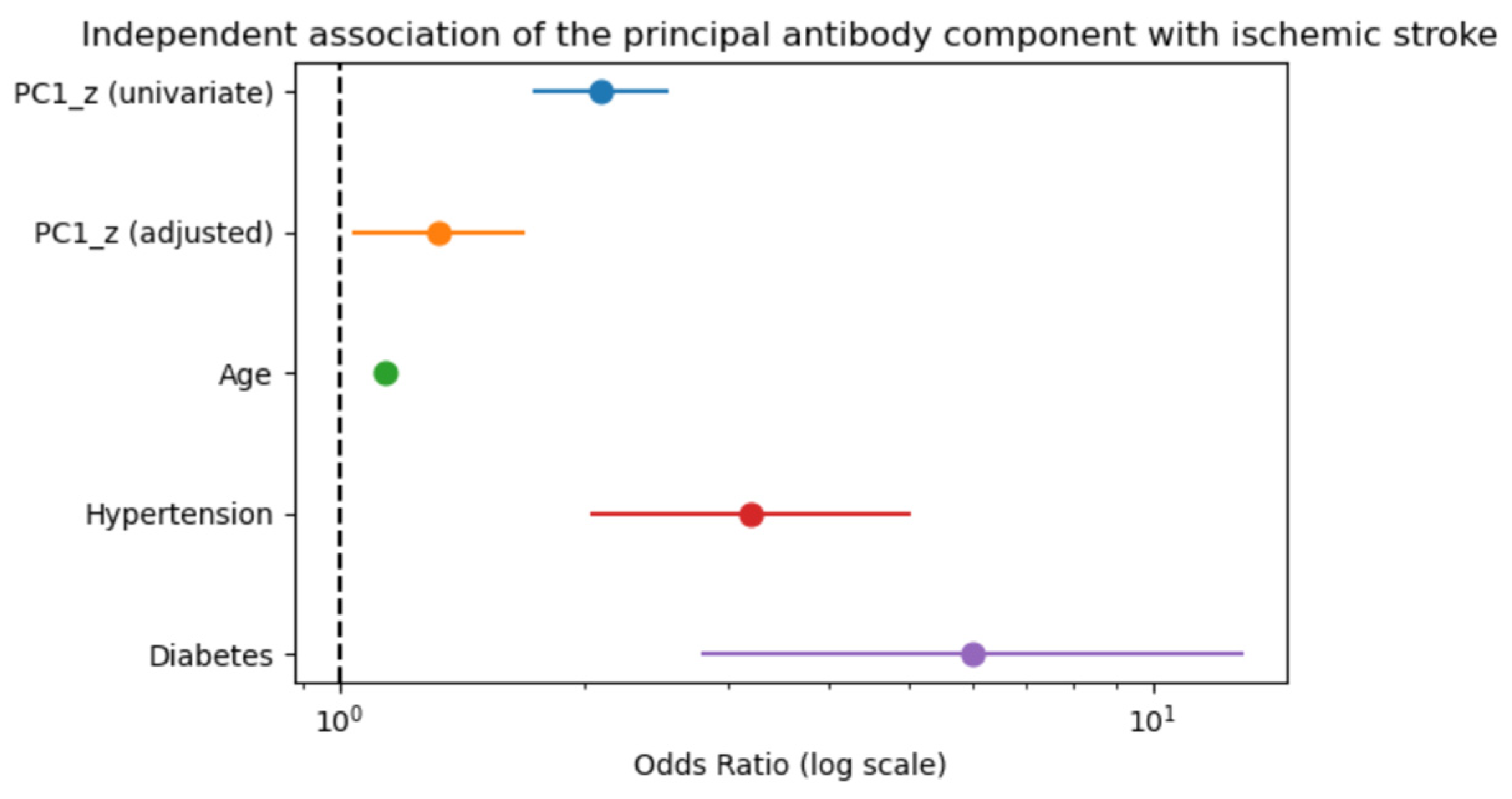
Independent association between the principal antibody component (PC1) and ischemic stroke. Forest plot showing odds ratios (ORs) with 95% confidence intervals derived from univariate and multivariable logistic regression analyses. PC1 was significantly associated with ischemic stroke in univariate analysis and remained independently associated after adjustment for age, hypertension, and diabetes mellitus.
Figure 9.
Independent association between the principal antibody component (PC1) and ischemic stroke. Forest plot showing odds ratios (ORs) with 95% confidence intervals derived from univariate and multivariable logistic regression analyses. PC1 was significantly associated with ischemic stroke in univariate analysis and remained independently associated after adjustment for age, hypertension, and diabetes mellitus.
Figure 10.
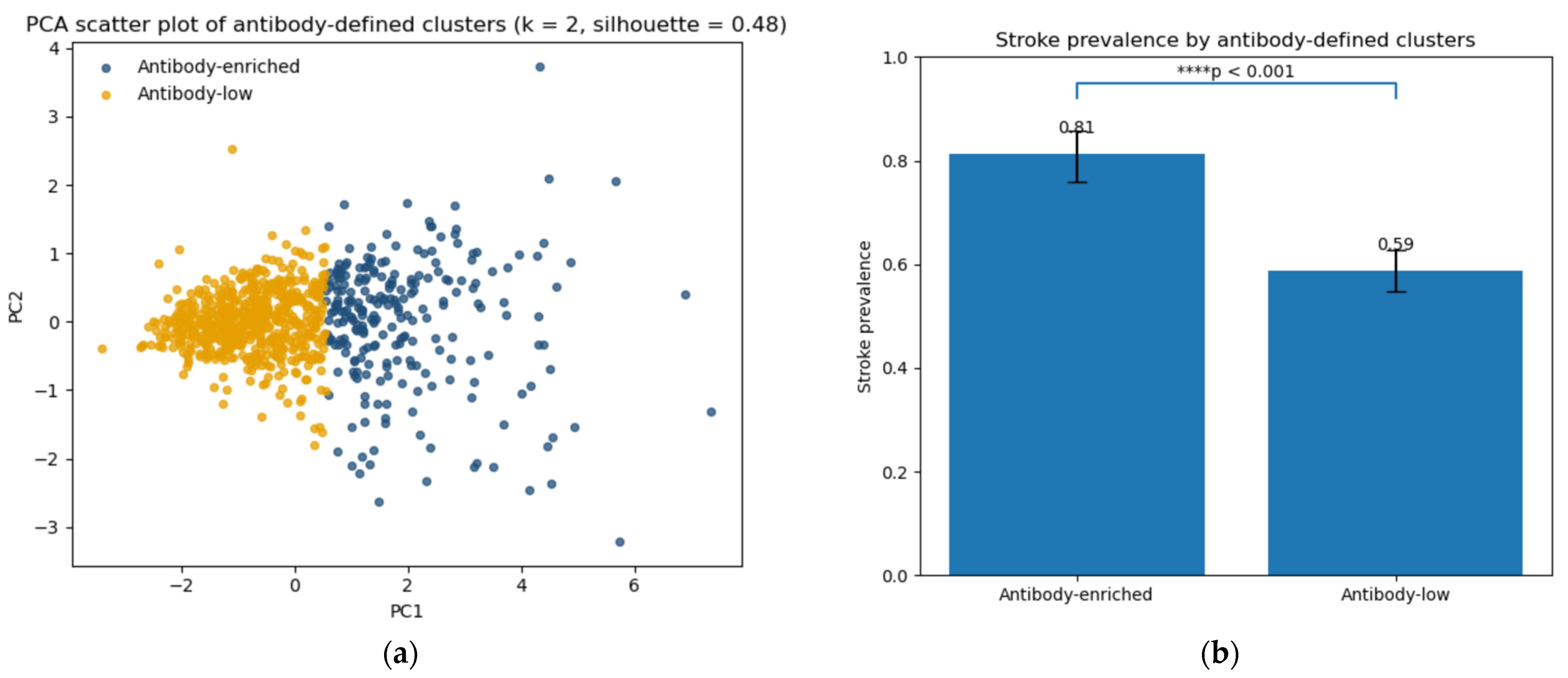
Antibody-defined risk phenotypes identified by unsupervised clustering. (a) Principal component analysis (PCA) scatter plot showing participant distribution based on antibody profiles. Colors indicate k-means clusters (k = 2; silhouette score = 0.48). (b) Stroke prevalence by cluster. The antibody-enriched cluster demonstrated significantly higher stroke prevalence compared with the antibody-low cluster (82% vs. 59%, χ2 p < 0.001). Statistical significance is indicated as follows: **** p < 0.001.
Figure 10.
Antibody-defined risk phenotypes identified by unsupervised clustering. (a) Principal component analysis (PCA) scatter plot showing participant distribution based on antibody profiles. Colors indicate k-means clusters (k = 2; silhouette score = 0.48). (b) Stroke prevalence by cluster. The antibody-enriched cluster demonstrated significantly higher stroke prevalence compared with the antibody-low cluster (82% vs. 59%, χ2 p < 0.001). Statistical significance is indicated as follows: **** p < 0.001.
Table 1.
Comparison of clinical characteristics between stroke patients and controls.
Table 1.
Comparison of clinical characteristics between stroke patients and controls.
| | Patient (n = 543) | Healthy (n = 284) |
|---|
| Age | 77.0 (68.0–84.0) * | 54.0 (43.8–60.0) |
| Male sex | 316 (58.2%) | 186 (65.5%) |
| Hypertension | 387 (71.3%) * | 57 (20.1%) |
| Diabetes mellitus | 148 (27.3%) * | 11 (3.9%) |
| Dyslipidemia | 154 (28.4%) * | 40 (14.1%) |
| Cardiovascular disease | 44 (8.1%) * | 2 (0.7%) |
Table 2.
Multivariable logistic regression analysis identifying factors associated with ischemic stroke.
Table 2.
Multivariable logistic regression analysis identifying factors associated with ischemic stroke.
| | Odds Ratio | 95% CI | p-Value |
|---|
| Age | 1.14 | 1.12–1.16 | <0.001 * |
| Male sex | 1.15 | 0.67–1.97 | 0.604 |
| Hypertension | 3.17 | 2.00–5.02 | <0.001 * |
| Diabetes mellitus | 6.47 | 2.90–14.45 | <0.001 * |
| Dyslipidemia | 1.00 | 0.58–1.73 | 0.998 |
| Cardiovascular disease | 0.95 | 0.20–4.40 | 0.944 |
| Smoking | 1.14 | 0.68–1.89 | 0.624 |
| PDCD11-Ab | 0.94 | 0.61–1.46 | 0.791 |
| DNAJC2-Ab | 1.83 | 1.18–2.83 | 0.007 * |
| SERPINE1-Ab | 0.77 | 0.56–1.07 | 0.125 |
Table 3.
Reclassification metrics for machine-learning models with the addition of antibody markers.
Table 3.
Reclassification metrics for machine-learning models with the addition of antibody markers.
| Model | Metric | Estimate | 95% CI |
|---|
| Random Forest | NRI (overall) | −0.81 | −1.06 to −0.54 |
| Random Forest | NRI (events) | −0.46 | −0.61 to −0.31 |
| Random Forest | NRI (nonevents) | −0.35 | −0.56 to −0.13 |
| Random Forest | IDI | −0.058 | −0.080 to −0.037 |
| Logistic Regression | NRI (overall) | −0.74 | −1.00 to −0.48 |
| Logistic Regression | NRI (events) | −0.53 | −0.66 to −0.38 |
| Logistic Regression | NRI (nonevents) | −0.21 | −0.43 to 0.02 |
| Logistic Regression | IDI | −0.023 | −0.040 to −0.005 |