Abstract
In an era where an increasing number of people find it challenging to grasp scientifically accurate environmental data, the need for more engaging museum exhibits to convey this information has never been more crucial. This article discusses Daptec Flat Holm which is a data physicalisation technology project on Flat Holm Island, Wales. Flat Holm Island is designated as a site of special scientific interest and is a local nature reserve. This project aims to understand how we might improve people’s engagement with environmental data through a multi-sensory museum exhibit. To achieve this, the project team applied a new creative approach to make the presentation of environmental data more engaging to a diverse science museum audience. Employing a user-centered methodology, this study reveals insights derived from three distinct user experience investigations conducted during the summer of 2022. The main contribution lies in how the researchers have extracted the nuances from the audience reactions and then identified potential audience types, their points of engagement, as well as their challenges. In detail, the findings illustrate how the application of a vignette data analysis technique revealed distinct audience types, including passive observers, active users, engaged ambassadors, disinterested participants, critical friends, and enthusiastic collaborators. In summary, the paper offers recommendations into how we might further engage a broader audience in technology mediated environmental museum exhibitions.
1. Introduction
For the sustainability of our world, we have reached a stage where we need to engage people in environment education and climate action. Data are key here to know what solutions and actions will drive impact on climate change. As Crowley et al. highlight ‘understanding how to engage with and empower people to achieve shared biodiversity conservation goals is crucial’ ([1], (p. 2)). However, as Grainger et al. point out, ‘scientists are yet to fully harness the potential of visualisation when interacting with non-scientists’ ([2], (p. 1)). In fact, there is still little regard for people’s technical ability and understanding (or lack thereof), whilst ‘consumers are obliged to accept and live with the data experience’ ([3], (p. 1)). The authors of this paper feel that interactive multi-sensory museum exhibits can play a key role in actively involving the public in contemporary environmental issues. Therefore, the aim of this project is to explore if and how we can enhance public engagement with environmental data through the development of a multi-sensory museum exhibit. By probing the diverse ways individuals interact with the exhibit, the objective of the research is to gather insights that will further inform the design of the exhibit to afford that heightened engagement. In essence, the research aims to discern the intricacies of visitor interactions to guide the design process and in doing so, to create an exhibit that effectively captivates and involves the audience in environmental data.
The following sections document the Daptec Flat Holm project, which investigates a data physicalisation technology that aims to explore a new creative way to engage people with the environmental data of the rich biodiverse Flat Holm Island in Wales (UK). The discussion specifically delves into the development of a multi-sensory exhibit aimed at aesthetically engaging visitors with environmental data at the Techniquest Science Museum in Cardiff, UK. In detail, a multidisciplinary design team of researchers made up of data scientists, creative technologists, and computer scientists have come together to design, prototype, user test, and implement an environmentally driven science museum exhibit that is both meaningful and engaging. Applying user experience data collection methods and a vignette data analysis technique, we reflected on and evaluated the artefact created and how it was perceived and experienced. Through the lens of an environmental science museum exhibit, the following sections offer fresh insights and recommendations into multi-sensory design strategies and how we might design for a wider audience to engage with and appreciate their natural environment.
2. Background
The Daptec Flat Holm project (2020–2022) was an 18-month project funded by the European regional development fund through the Welsh Government, UK. It explored new creative way of engaging people with environmental data and produced a permanent exhibit which is currently running at the Techniquest Science Museum, Cardiff, Wales (UK). For this project a multidisciplinary team applied cutting-edge data science techniques to creative technology to present creative data impressions of Flat Holm Island’s ecosystem. The interesting element here is how the team crafted new opportunities for enhanced ‘environmental data’ meaning through more aesthetic and tangible interactions. In detail, as the weather changes on Flat Holm Island, the weather data are pushed to the weather automata artefact at the science museum in Cardiff where it turns the prism-shaped descriptor panels on the artefact. The aim is that this will create novel weather patterns and in doing so, give an impression of how sunny, cloudy, or rainy the weather is on the island at any point in time. Moreover, the weather automata artefact has been designed with geometric shapes and reflective surfaces to create a new aesthetic that, in turn, aims to attract and engage the general public at Techniquest.
In addition, the Daptec team created a data collection tool which the Flat Holm Island’s warden now uses to count the flora and fauna on the island. These data again power another aspect of the exhibit, an interactive map, which in turn drives another more tactile and visual aesthetic. At the press of a button (there are series of buttons for the flora and fauna), an array of colours and movement is presented on the map. For example, if there are lots of seagulls counted on the island that day, the movement of light and colours is fast and busy. Instead of visualising an exact quantity of seagulls, the aim is to create the impression of seagull busyness on the island; to afford feelings amongst the audience of how frantic it can get with lots of seagulls.
In summary, the Daptec exhibit (data physicalisation) uses environmental data to drive a creative data experience (and what we have coined the data impression). In doing so, it aims to enable people to get that little bit closer (through the senses) to understanding more about the environmental story of the island. By translating the measurement of wind, water, sunshine, and wildlife into tangible and engaging data impressions, the goal is to break down the complex environmental data and make the experience more ‘sensory’ and more ‘physical’ for the audience.
3. Technology-Mediated Sensory Exhibition Design
Technology-mediated sensory exhibition design can be described as the use of technology to enhance and enrich the sensory experience of visitors in exhibitions. As researchers [4] affirm, the visual and auditory cues are a very powerful multi-sensory cue combination in enhancing a holistic visitor experience at a museum. Interestingly, in their work, they found that emotional state and sense of presence mediate the relations between the multi-sensory cues and visitors’ digital museum experiences [4]. In her book, Roppola [5] discussed the concept of broadening and how the content affords meanings that visitors derive through engaging with the exhibits. She discusses the ‘opportunity to see something one would not otherwise see as an example of experiential broadening; to grasp a theoretical principle as an instance of conceptual broadening; to be provoked to assess one’s feelings or to feel differently, as affective broadening; or to appreciate a contrasting point of view, as discursive broadening’ ([5], (p. 216)). Indeed, a technology-mediated sensory approach goes beyond traditional forms of exhibition design that often rely on static displays. Instead, it integrates various technologies to engage multiple senses, creating a more immersive and interactive environment for visitors. The goal is more about leveraging technology in such a way that it enhances the overall exhibition experience, making it more dynamic, participatory, and memorable.
In the last few years, ‘several museums and exhibits have adopted new kinds of interactive installations that present artworks in more attractive ways’ ([6], (p. 1)). Moreover, the re-emergence of virtual reality (VR) has led to more VR-based exhibits [7]. In their studies, Parker et al. [7] explore the impact VR is having on the spatial and social experience of art museums. Sacchettin [8], in their work, describes the concept of the immersive exhibition as an intense experience in a multi-sensory environment that fully involves the visitor. Meanwhile, Lancel et al. [9] question whether we need the human anymore: ‘Is human hosting essential to social touch in the public space of merging realities (e.g., robotics, virtual reality and telematic environments)’? Undoubtedly, technology possesses immense potential to enhance and extend the multi-sensory museum experience. Peressini et al. [10] are even seeing a change in the framework, moving from the idea of exhibition to that of environment (seen as an immersive space, built to reinforce the audience’s experience of perception). However, saying that, for environments like heritage sites, Claisse et al. [11] still feel that the current use of this technology is limited to the pre- and post-visit experience and that it needs to be extended further. In another vein, Albu et al. [12] are using interactive technology to create prototype garments based on material obtained from old or unused textiles. Moreover, Marcu et al. [13] show how the digitization and online accessibility process can bring to life an element belonging to their valuable Romanian cultural heritage. Indeed, the integration of technology in museums is diversifying and enriching the visitor experience, making it more interactive, educational, and enjoyable.
Enhanced Audience Engagement
Museums, today, are striving to create meaningful and engaging experiences for all visitors. However, despite several efforts to make museums accessible to a visually impaired public, their participation in these institutions is still limited, frustrating their desired inclusion [14]. The authors of this paper feel that interactive museum exhibits incorporating multiple senses might offer a solution. This new blend of multi-sensory artefacts with cutting-edge technology can be seen as the means to ensuring that museums remain inclusive and appealing for a diverse audience. As Tayfun et al. ([15], (p. 1)) state, ‘a greater focus on developing inclusive mainstream applications could lead to innovative technologies that could be enjoyed by every person’. Haywood et al. [16] take this further by exploring how children engage with an interactive exhibit at the Science Museum. They found engagement (participation, narration, and co-presence of others) arose from specific aspects of the interactive design of the exhibit [16]. Marto et al. [17] feel that the use of multi-sensory applications in cultural heritage is a powerful tool to enrich users’ visits [17]. They note that ‘humans perceive the world with different senses and in real-time, to evoke more than one or two senses at a time can bring benefits for the user perception’ ([17], (p. 1)). In terms of understanding and measuring the experience of technology-mediated sensory exhibition design, Andelkovic et al. [18] tested a well-established scale for assessing tour guide performance in the museum context. Their results indicated the existence of five museum guide types: Classic Professional, Agile Empath, Operational Erudite, Trustworthy Caretaker, and Passionate Socializer. Moreover, Mcleod et al. [19] used vignettes of children’s spontaneous responses to illustrate and analyse their engagement. These methods allowed for a detailed examination of the ways in which individuals engage/interact with and respond to the technology and technology-mediated exhibitions (including sensory aspects).
4. What Is Data Physicalisation Technology?
Data physicalisation is the encoding of data into an engaging physical form [20]. Depending on its form, physicalized data can be touched, heard, seen, tasted or smelled in its final state. As [21] point out research in physicalisation have expanded data representation techniques to include senses beyond the visual. Indeed, they afford people the ability to directly interact with data using their hands, potentially achieving a more comprehensive understanding of a dataset [22]. It is a physical artefact whose material properties encode data in new ways to derive insight and meaning. Data physicalisations can be everyday objects that range from household devices to street furniture, wearable devices, educational materials, and interactive exhibits [23].
In terms of the user interaction, the physical engagement with data can influence the reflective process [24]. In their research, [3] uses a practice-based approach to identify how knowledge and experience of physical materials can offer novel processes and value to progress communications regarding digital use. Interestingly, the role of interactivity and narration are often overlooked when designing and analyzing personal data physicalisations [24]. In their research, [25] found a tension between a scientific understanding of energy and the experience of various forms of human energy. This includes both the physical and metaphysical understandings of energy and the importance of translating energy data from the quantitative into an emotional context in which people can be encouraged to stop and take note [25]. The next section will introduce the concept of the ‘data impression’ as a means to more immediately engage the senses and emotions in environment education through data physicalisation technology.
Creativity and the Data Impression
Data impressionism is seen here to be about making data more perceptible and thus easier to interpret. It can also be about strategically designing an experience (e.g., environmental exhibit) to influence the behaviour of those viewing it. In our view, a data impression should only depict accurate data, but unlike traditional charts and figures, it is designed to make people reflect on how the data make them feel. It is about impacting the human audience by way of a kind of imprint or impression left on their understanding of something by the data. A data impression is not so much about portraying minute detail as it is about loose, bold, and fluent snapshots of the data [26]. It is about tackling the challenge of making sense of complex datasets through new presentations that trigger feelings, thoughts, and new more affective understandings of the data.
The environmental exhibit (Daptec Flat Holm project) that is discussed in this paper has been designed to create an impression of Flat Holm Island’s environmental data. By presenting the data in fleeting yet dynamic aesthetics, the aim is to make the data feel important, relevant, and noticeable for the individual/audience. In creative terms, the approach of data impressionism mirrors the work of impressionist painters of the 1800s, where design elements such as light and colour were used to depict an impression of a scene. The approaches that have been taken for the physicalisation of data from Flat Holm Island have involved combinations of certain coloured lighting and moving materials and reflective surfaces to portray the narrative of a shifting biodiversity. The following sections talk about the creation of the Daptec Flat Holm environmental exhibit.
5. Daptec Flat Holm Exhibit
5.1. Weather Automation Implementation
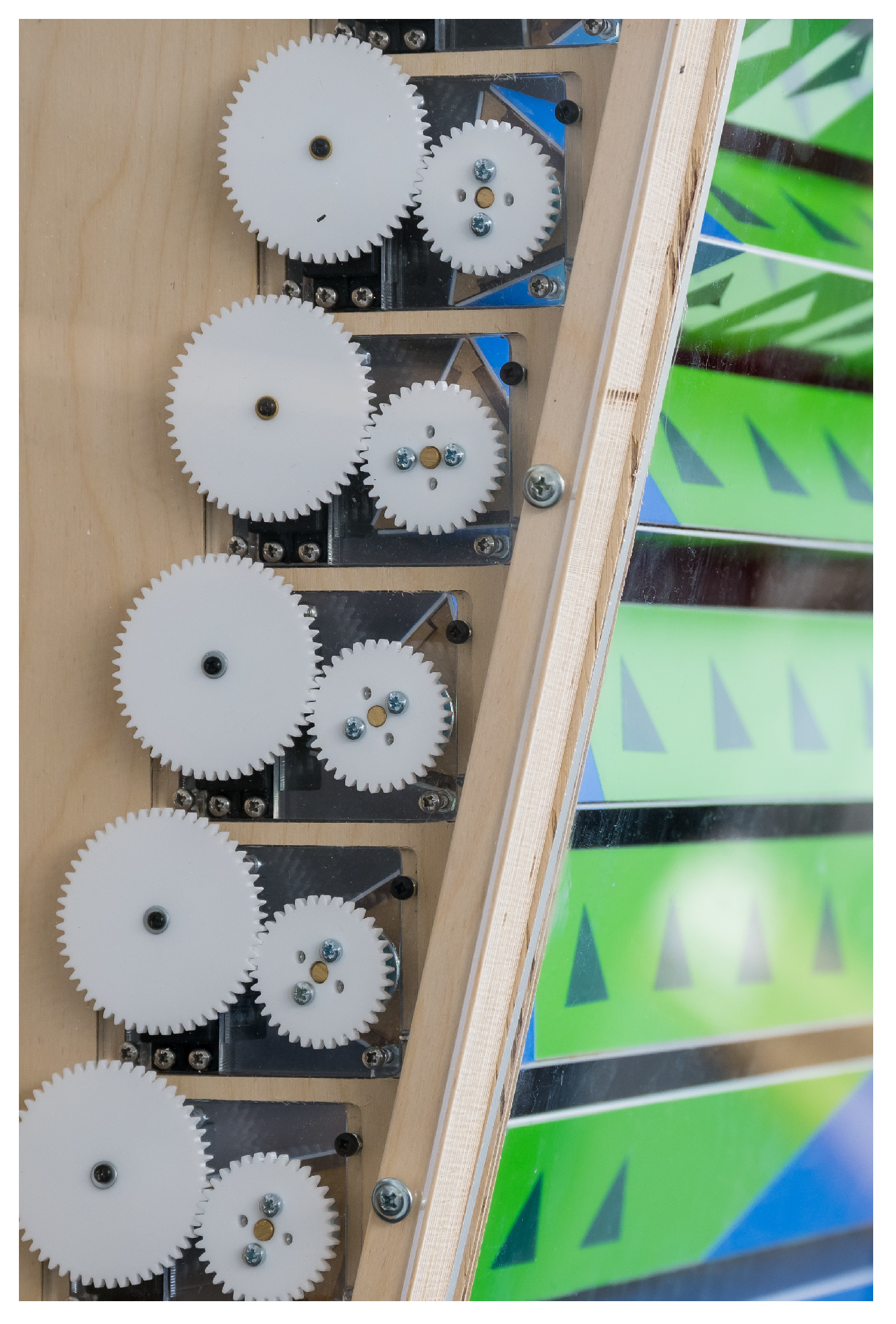
The weather automata is an important part of the Daptec data physicalisation artefact. It is essentially a series of rotating prisms (see Figure 1). It consists of three elements, one for rain, sun, and wind data. Each of these allows for the immediate physical compiling, manipulation, and animation of surface shapes and textures in response to actual weather data streams from Flat Holm Island. The aim is to portray a ‘fleeting moment’ in the weather data so that the audience can get an impression of what the weather is like on the island at that moment. To achieve this, rotating cogs with reflective and also coloured materials have been used on the faces of the rotating prisms (see Figure 2). The weather automata affords patterns and optical rhythms that then generates hypnotising data impressions of the weather patterns. It is very much about tapping into the senses to create a more affective understanding of what the weather is like. In addition to this, a narrative sceneography of Flat Holm was presented to ensure that the audience can make the connection between the weather and life on the island (see Figure 3).
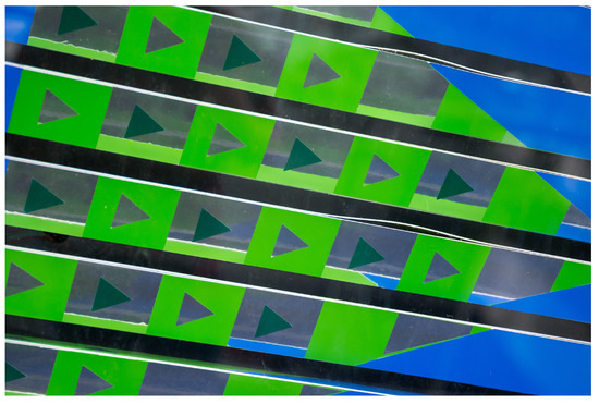
Figure 1.
Weather automata: reflective surfaces.

Figure 2.
Weather automata: rotating prisms.
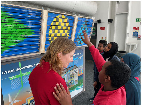
Figure 3.
Weather automata final exhibit.
5.2. Interactive Maps Implementation
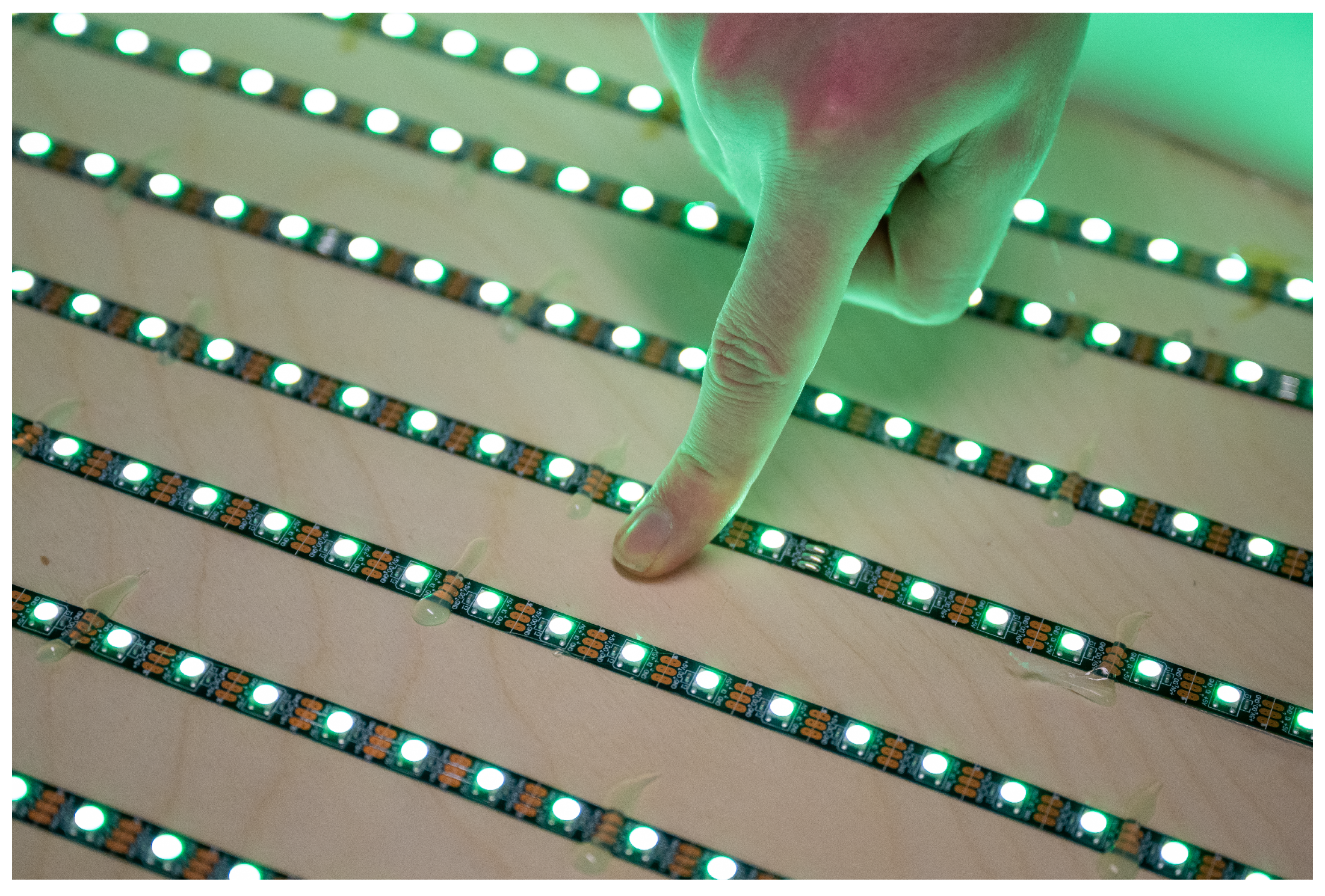
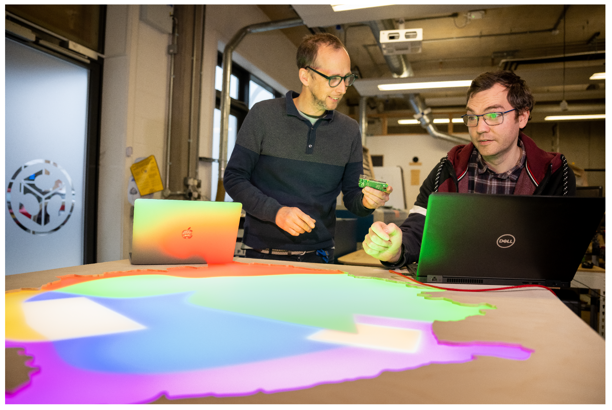
There are a number of rare flora and fauna species on Flat Holm Island. These are generally found and counted in particular areas of the island. The back-lit map (see Figure 4) of the island has been carefully designed to represent the data of these species. In a manner similiar to pointillism, the coloured LEDs blend the coloured dots into a fuller range of tones. In detail, the map is divided into these areas by using light-blocking paper material between otherwise diffuse back lighting (see Figure 5). This gives an engaging visual effect combining both highly diffuse colour fields and ‘hard edge’ borders behind a frosted acrylic map. Moreover, the surface of this map has been etched with key cartographic elements of the island (paths, outhouses, lighthouse, etc.). In addition, a top layer of clear acrylic cut-out icons of the various species gives a heightened impression of the island and its species. A touch-interactive panel (see Figure 6) also allows for the audience to dial up a species and see their representation on the map, where the brightness, dynamic movement, and density of light represent the species count data.

Figure 4.
Interactive map: LED light arrangements.

Figure 5.
Interactive map: lighted sections.
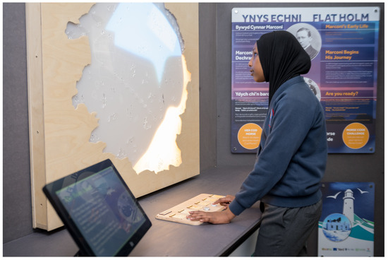
Figure 6.
Interactive map final exhibit.
6. Study
6.1. Introduction
To investigate people’s experiences of the Daptec Flat Holm exhibit, qualitative research methods were applied. Three user studies were undertaken in conjunction with a vignette data analysis method to explore participant’s interactions, impressions, and attitudes towards the Daptec Flat Holm Island experience. In detail, six vignettes were generated from the data collected. The findings of these studies highlight important qualities that characterize participant’s experiences and provide valuable information regarding potential future interactions with the exhibit. As Henry et al. ([27], (p. 18)) note, ‘it is about achieving an ‘insider’ position on participant’s feelings, impressions and attitudes’. Indeed, vignettes can been used in a variety of ways to contribute to studies with both a quantitative and a qualitative orientation [28]. In their paper, Skilling and Stylianides ([29], (p. 1)) propose that ‘carefully formulated vignettes aligned with the phenomena being investigated can help capture participants’ beliefs leading to a more nuanced understanding of the phenomena’. In detail, the vignette data analysis technique was applied to the data collected from the three user studies. This enabled the Daptec team to consider the different types of interactions emerging from the Daptec Flat Holm experience. It also provided a means to identify and evaluate what aspects of the exhibit needed further evolution and iteration to ensure that it continues to meet the needs of a diverse audience. The experimental procedure was approved by the ethics board of Cardiff Met University and participants provided consent for study participation and the academic use of de-identified data.
6.2. Methodology
In this project, a user-centered methodology is applied, incorporating a multifaceted approach that encompasses observational techniques, surveys, and postcard probes for comprehensive data collection and a vignette approach for data analysis. This holistic methodology (see Figure 7) ensures a rich and nuanced understanding of user interactions, preferences, and feedback, contributing to a more thorough analysis and meaningful insights for the project’s objectives. The following sections detail the observation, structured surveys, and the innovative use of postcard probes to capture a diverse range of user experiences and perspectives.
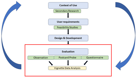
Figure 7.
User-centred methodology (red area highlights what is documented in this paper).
6.2.1. Observational Study
The aim of this observational study was to investigate from a distance if and how people were engaging and interacting with the Daptec exhibit. The focus was particularly on people’s intentions and behaviours as they engaged and interacted with the Daptec exhibit. It was a two-fold study that took place at the Techniquest Science Museum, Cardiff, on 27 May 2022 between 10 a.m.–1:30 p.m. and on 19 June 2022 between 10:30–12:30 p.m. The researcher observed (from the background) and took notes on how people experienced and interacted with the data physicalisation technology exhibit.
6.2.2. Postcard Probe Study
This study was centred on the use of a postcard probe to further explore and probe what exactly the younger visitors to the museum were attracted to and engaging with in the exhibit. The focus was on studying what stood out for them, what made an impact on them during their experience of the Daptec exhibit. The study involved seventeen school pupils from a range of local schools. The researchers were interested in the take-home messages of the exhibit (e.g., what aspects of the exhibit that were important enough for them to put into a postcard for their parents, grandparents at home, friends, etc. to see). The study took place on 12 May 2022 (between 11:30 am–2:30 p.m.), 27 May 2022 (between 10 a.m.–1:30 p.m.), and 19 June 2022 (between 11–12:30 p.m.) at the Techniquest Science Museum, Cardiff. As participants approached the exhibit, they were asked if they would be happy to take part in the study. On 12 May 2022, the study took place during a school summer trip session which saw three hundred children pass through the museum. On 27 May 2022, it was during a parent and toddler session at the museum. On 19 June 2022 it was a regular, non-event day at the museum. For the study, participants were asked to walk around and engage with the exhibit. The study facilitator then explained the main aim of the study and answered any questions that the participants had. They were then handed a blank postcard, a pen, and colours and asked to create a postcard (draw and write a message) to describe the highlights of the exhibit for a parent, grandparent, and/or friend at home.
6.2.3. Questionnaire Study
This study was, firstly, focused on understanding adults’ attitudes toward the Daptec exhibit. Secondly, we were interested in probing younger visitors’ experience of the Daptec exhibit. The study took place across several days over the month of May 2022 at Techniquest Science Museum, Cardiff. These sessions were open to the general public, which consisted of mainly families and children. The researcher approached the test participants whilst they engaged with the exhibit. If they agreed to take part in the study, they were informed that the questionnaire would only take ten minutes maximum to complete. They were informed that they could withdraw at any stage throughout the process. Two questionnaires were designed, one for adults and one for the younger participants. The questionnaires were designed to collect both quantitative and qualitative data. Specifically, the answers were obtained through a range of closed-ended and open-ended questions.
6.3. Participants
The main test participants for the observational study on 27 May 2022 were young toddlers, parents, and grandparents who were visiting the museum on a parent and toddler day. The main audience on 19 June 2022 were families. These groups ranged in ages from 2 years to 70+ years of age. For the Postcard probe study, seventeen participants (four boys and thirteen girls) took part in the study. They were between the ages of five to thirteen years old from a range of local schools. Finally, for the questionnaire study, seven adults and fifteen children took part in the study. The adults were three males between the ages of 26–45 years old, one male between the ages of 17–25 years, and three females between the ages of 17–25 years, 26–35 years, and 46–55 years, respectively. The children consisted of five males with ages of between seven and seventeen years old and ten females with ages of between six to seventeen years old.
6.4. Results
A range of data were collected during the three studies. From the onset, it is important to note that a culture of transient interactions was mainly observed in the museum across all the exhibits. This was evidenced during the observational study on 27 May 2022, as it was a parent and toddler session so parents and grandparent’s main priority was to run after and mind their toddler/toddlers. Therefore, there was little time for them to stop and fully interact with the exhibit. Saying that, it is clear from the observation that both adults and children were drawn to the interactive map section of the exhibit and in particular to the buttons. The words buttons, pressing, and map feature quite dominantly in the data collected during this study (see Figure 8). They seemed to like to press the buttons that triggered the display of data on the various species/areas of the map. However, it was observed on many occasions, that the participants wanted instant feedback from the pressing of the buttons. As it is currently designed, the buttons light up an area on the map that represents a flora or fauna and then it plays a short animation of moving lights and colours to present the high, medium, or low count numbers for that choice. The participants being observed seemed to press one button after another expecting it to change instantly. In hindsight, audio cues here might have been effective to further support the participant in understanding the state of the animation/button press.
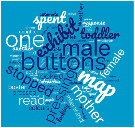
Figure 8.
Frequency count of words collected from the observation of the exhibit.
On the other side of the exhibit, the older participant’s took time to read the literature/information presented about the island. The rotating prisms attracted the attention of many participants, but it seems that less time was spent understanding what was going on when compared to the interactive map. It seems that the ‘interactiveness’ of the map attracted more attention. Saying that, it was found that during the observational study on 19 June 2022, parents with older kids were spending more time reading and engaging with this side of the exhibit. Generally, from the observations, it was noted that people were behaving in a positive manner towards the exhibit. They were attracted to and motivated to engage with the exhibit. However, it was also noted that the next iteration of the interactive map would need to explore how to retain and engage them for longer. Similarly, we wondered, how we might impress the impact of the changing environmental data on them more? For example, as mentioned, the use of sound here could act as a means to support the interaction and the understanding behind the interaction. Also, despite the participant’s being attracted to the rotating prisms, more could be done to maintain their interest and further enlighten them on the experience (e.g., emphasise how the environment is determining the aesthetic and why the data are being presented in this way). Table 1 shows a snapshot of the observations captured.

Table 1.
A snapshot from the observations on 27 May 2022 between 10 am–1:30 p.m.
In terms of the impressions being formed, the results from the post card probe clearly show that Flat Holm Island’s flora and fauna as well as the weather were the features/aspects of the exhibit that participants were noticing. Quite a few of the participants in this study could not write or could only write a few words so the emphasis was mainly on the postcard drawings. It was clear that they were more engaged with the interactive map side of the exhibit and particularly, from the drawings, there was a focus on the butterflies and seagulls, which are quite prominent on the map. Indeed, it could be the age demographic of the participants that resulted in them gravitating towards the flora and fauna aspects of the exhibit as opposed to the weather aspects. Like most of the participants we observed, they were also drawn to the buttons. Similarly, they pressed the buttons very quickly one after the other. Often, the facilitator had to intervene to explain to them what was happening. In their haste to press the buttons, some seemed to miss the fact that the flora or fauna area lit up to give them impression of the count. Interestingly, despite spending more time pressing the buttons on the interactive map side of the exhibit, many of the postcards did have elements of the weather automata represented too. During this study, we were able to see what the younger visitors to the museum were aware of whilst interacting with the exhibit; it was interesting to note what caught the attention of this young audience.
For example, seagulls, butterflies, and the sun stood out for all the participants. In detail, the butterflies appeared in seven postcards, spiders appeared in two postcards; five postcards had drawings of seagulls; six postcards captured drawings of the sun; seven had green grass represented; one had a slow worm; two had the butterfly path; three had rain clouds; two had the wind triangle; one postcard had the lighthouse and the sea; one postcard had flowers; and finally, two participants had portrayed blue skies on their postcards. Moreover, two participants had drawn maps of the island, one had the lighthouse, farmhouse, and boat on the map whilst the other had a seagull, flowers, farmhouse, and lighthouse portrayed on the postcard. The following shows some of the textual messages written on postcards; it is important to be aware that there were different ages and writing abilities present:
- ‘To Mummy, Flat Holms exhibit is amazing. The lights catch your eyes and it stands out. Love Matilda’.
- ‘I like the butterflies’.
- ‘I do like the island’.
- ‘The thing that changes patterns’.
- ‘It was really cool, there was an interactive part where you could learn about Flat Holm. I learnt that there is seagulls, slow worms and butterflies. Also there is a light up screen of a map of Flat Holm’.
The postcard probe enabled us to have insight into what was of interest to the participants. Again, through their interactions, we also learned that more work will be needed to improve the intuitiveness of the map experience. Moreover, more work will be needed to engage participants for longer on the weather automata and most importantly, to effectively communicate the impact of the changing weather patterns to them.
Along with what was catching the participant’s attentions, we were also interested in people’s attitudes towards the Daptec exhibit. The questionnaire study gave us a deeper glimpse into not only what people were noticing, but also into what they were engaging with and what they wanted more of. In detail, the data from the questionnaires highlighted that more could be done to demonstrate how the exhibit generates the visuals/aesthetic from the weather data (e.g., how the weather determines the aesthetic and then what this means). Similar to the findings from the observational study, the young participants alluded to the need for further iterations. For example, they said that they would improve the exhibit in the following ways: ‘I really like the exhibit yet if I were to change something I would make the buttons more clear on what they are showing on the map’ (P4) and ‘Something to show what the front bit on the map does’ (P5). Despite the majority of participants rating the exhibit highly (see Figure 9), it is clear that some aspects of the exhibit were working effectively but that other areas still needed more iterations, particularly for the younger audiences. Interestingly, the five words used to describe the Daptec Flat Holm exhibit ranged from interesting to fun to good:
- ‘It was fun and it was exciting. There was loads of animals. It was beautiful. There was loads of science’ (P1);
- ‘Cool, big, good, tech, people’ (P2);
- ‘Bright, interesting, interactive, exciting’ (P3);
- ‘Interactive, engaging fun’ (P4);
- ‘Interesting, well-made, interactive’ (P5);
- ‘Good, enjoyed the lights’ (P6);
- ‘OK, buttons, eco, fun, good’ (P11);
- ‘Informative, birds, learning, knowledge, ideas’ (P12);
- ‘Good idea learning about stuff’ (P14);
- ‘Marconi, morse code, gulls, learning, exhibition’ (P15).
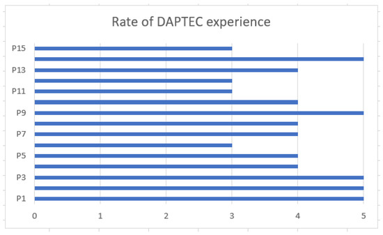
Figure 9.
How would you describe your experience of the Daptec–Flat Holm exhibit, where 1 is poor and 5 is excellent (Children’s questionnaire).
Figure 9.
How would you describe your experience of the Daptec–Flat Holm exhibit, where 1 is poor and 5 is excellent (Children’s questionnaire).

Similarly, the findings from the adult’s questionnaire highlighted that the majority of the participants felt the Daptec Flat Holm exhibit was effective at engaging people with the island’s data. In detail, when asked to rate the two main parts of the Daptec Flat Holm exhibit, we can see that overall the interactive map part of the exhibit was rated higher than the weather automata (see Figure 10). Moreover, four participants ranked the overall exhibit above 60% effective (see Figure 11).

Figure 10.
Adult ratings of the exhibit.
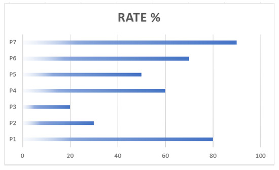
Figure 11.
In your opinion, how effective is this Daptec Flat Holm exhibit at engaging people in the island data? (Adult’s questionnaire).
In addition, when asked what three words they would use to describe the Daptec Flat Holm exhibit, the following answers were shared:
- ‘Amazing and Innovative’ (P1);
- ‘Colourful, Confusing, Intriguing’(P2);
- ‘Interesting and Confusing’ (P3);
- ‘Interactive, colourful and informational’(P5);
- ‘Informative, enjoy-ful, insightful’(P5);
- ‘Informative, educational, unique’ (P6);
- ‘Interesting, informative, engaging’ (P7).
The words interesting and informative feature most frequently. Furthermore, when asked what would they add/change to improve this Daptec Flat Holm exhibit, the following comments were recorded:
- ‘I think they done a great job. They should create more publicity to bring their work to more people’ (P1).
- ‘It would be nice to know more about how the exhibit generates the visuals from the data (although the lady did explain it more, it would be good if this were included more in the exhibit design itself)... (P2).
- ‘The buttons on the interactive map did not always seem to do anything. Maybe they could make a noise or something? Didn’t always find the weather thing very intuitive (what does 50% mean?). (P3) [P3 also mentioned it would be nice to see where the island is on the map of Wales].
- ‘I would add easier to understand information for children or younger years as I often get asked what this is’ (P4).
- ‘ I am not sure what the target audience is but from observing, children tend not to engage with the exhibit as it contains a lot of information. Potentially add more detail on the map to bring more children to the exhibit’ (P5).
- ‘Less delay in the interactive map’ (P7).
The following are participant impressions of Flat Holm Island from the exhibit:
- ‘It’s a worthwhile project but I feel like it needs a few tweaks to more clearly show what its doing. I get that its meant to be impressionistic but impressionism was a reaction to the precision of the camera and I am not sure data visualisation generally has reached the point where we can be impressionistic with it yet’ (P2).
- ‘The island seems quite remote and forgotten. It also seems quite exposed’ (P3).
- ‘Its good to have exhibits about Cardiff and be fully factual. The colours add more interest into the exhibit as well’. (P4)
- ‘It is a great exhibit that fits into Techniquest. This centre needs more exhibits that targets the older population such as this one’ (P5).
- ‘Sounds/looks like an interesting place. Seems there is more to it than I thought’ (P6).
- ‘Somewhere I’d like to visit’ (P7).
6.5. Vignette Analysis
To further gain insight into people’s impressions of the Daptec exhibit and a deeper understanding into the audience’s preferences and needs, a vignette data analysis was implemented on the data collected from the three user experience studies (see Table 2). This provided the means for thinking about how people were interacting with the Daptec exhibit, in particular about the different types of participant groups and how we might more effectively design for them. In detail, the aim was to identify their diverse characteristics, interests, and requirements. As designers, we need to think carefully about the audience, the creative impressions that the exhibit has on them, and then, ultimately, the experiences afforded. The challenge lies in understanding the potential of the impressions created through the interactions (and anchored on the aesthetic), and then how these might evolve and enhance the overall exhibit experience. To achieve this it was important to understand the different modes of interaction and experiences. Table 2 highlights six different vignettes (roles) that participants fell into whilst experiencing the exhibit. Table 3, Table 4, Table 5, Table 6, Table 7 and Table 8 show the individual groupings of data that were used to develop these different vignettes.

Table 2.
Six vignettes formed from the data collected in the three user studies.

Table 3.
Sample of data groupings for Passive Observer.

Table 4.
Sample of data groupings for Active User.

Table 5.
Sample of data groupings for Engaged Ambassador.

Table 6.
Sample of data groupings for Disinterested Participant.

Table 7.
Sample of data groupings for Critical Friend.

Table 8.
Sample of data groupings for Enthusiastic Collaborator.
The Passive Observer was generally forty or more years of age and passively engaged—watching and reading—with the weather automata section of the exhibit and the posters for between twenty seconds and two minutes (see Table 3). The Active User (aged between two and seventy years old) was seen to have spent roughly a similar time span at the exhibit, but more time was spent at the interactive map actively pressing buttons and interacting with the touchscreen (see Table 4). The Engaged Ambassador (between ten and fifty years old) generally spent around 30 s (or more) predominately at the interactive map section and absorbing the overall feel and worth of the exhibit (see Table 5). In contrast, the Disinterested Participant (aged between six and seventy years old) was seen to observe the exhibit (mainly the weather automata section and posters) from a distance or whilst passing by for ten seconds or less (see Table 6). Table 7 highlights the Critical Friend (aged between eighteen and fifty-five years old), who engaged with all sections of the exhibit (for twenty seconds or more) and was keen to understand the data being presented. Finally, the Enthusiastic collaborator (aged between two-forty years old) took on the role of explaining and interacting simultaneously, spending between ten and sixty seconds at the interactive map section (see Table 8).
6.6. Discussion
Overall, it can be noted from the vignettes that people (all ages) were drawn to and engaged with the exhibit, particularly the interactive map. However, looking at the ‘time engaged’, it can also be said that more can be done to maintain the engagements for longer. It can be argued that this is the culture in a busy and exciting science museum with often very young audiences. However, at the same time, the researchers feel that more can be done to increase the interest/engagement of the ‘disinterested participant’. Also, they feel that it is important to learn from the ‘passive users’ and what they were drawn to. In detail, the team could spend more time to explore how to elevate the fact that the environment itself is creating the aesthetic formations of shapes and reflective surfaces on the weather automata as a means to engage more users. Moreover, in studying the interactions of the ‘active user’ and ‘enthusiastic collaborator’, it is also key to understand how the count data for the specific flora and fauna can more meaningfully drive (perhaps with sound) the speed and drama of the visual presentation on the interactive map. Indeed, the feedback from the ‘critical friend’ highlights the need for a further ‘heightened awareness’ of the environmental data source. Without a doubt, it is mastering the ‘data impression’ and generating the aesthetic to engage a wider range of people (for longer) in the important environment and climate change narratives that is essential here. It is about being inspired by the comments of ‘engaged ambassadors’ and understanding the value of the work to create a more tailored and effective engagement strategy with different segments of the population.
Limitations
Despite efforts to ensure diversity, certain groups were inadvertently excluded from the sample of people studied due to the times and events (parent and toddler events, etc.) at the museum. This exclusion has resulted in a lack of representation from particular demographics, including their behavioural characteristics. Also, the actual design of the exhibit faced limitations attributed to the specific characteristics and constraints inherent in a museum setting. For example, the museum had a predefined spatial layout that needed to be aligned with. Consequently, other exhibits posed as distractions, leading participants to transition between them. Moreover, the creative freedom of the exhibit designers was curtailed by health and safety considerations, and resulted in the incorporation of protective layers over the rotating cogs of the weather automata to ensure no injuries. These limitations highlight the complexity of designing exhibits that not only attract attention but also sustain engagement across diverse audience types. Addressing these limitations requires a nuanced understanding of visitor behaviours and preferences, as well as continual refinement of the exhibit design to optimize the overall museum experience.
7. Conclusions
Society as a whole is now experiencing the significant impacts of climate and environmental changes, which include changing weather patterns, rising sea levels, and lessening of biodiversity to name a few. Without a doubt, we desperately need to reach out to more people and seek new ways to interact with and motivate them to take action and be more aware and educated. Drawing on the expertise of a multidisciplinary team, the aim of the Daptec Flat Holm project was to understand the intricacies of visitor interaction to guide the design process to create an exhibit that effectively captivates and involves a wider audience in environmental data. As we have seen from the findings of this study, the exhibit has the potential to engage the interest of the general public but evidently in many different ways. By undertaking a vignette analysis, we were able to gain valuable insights into the perceptions and behaviours of the audience. This qualitative research method allowed us to create vignettes that resonated with different individuals within the sample studied. This enabled us to shed light on their unique viewpoints and interactions. This insight, in turn, can support us in refining our multi-sensory approach to more effectively engage and connect with diverse users in a meaningful way. In terms of the actual exhibit, the researchers can also see that more work is needed to make the narrative more transparent for the audience, especially around how exactly the environment is driving the experience and telling its own story. For the Daptec team, we intend to continue to reflect on the different participant experiences and how we might more meaningfully design for them in the next iteration of the work. As we delve deeper into the possibilities presented by the Flat Holm project, we aim to further explore the creative avenues that can elevate the overall multi-sensory science museum experience.
Recommendations for Engagement with Environmental Data
To design a technology-mediated, multi-sensory environmental exhibit to engage diverse audience types, the authors suggest three key recommendations. The first recommendation highlights the importance of delivering data/content clearly and concisely to ensure that they are meaningful for all audience types. A case in point is the weather automata, which, despite capturing attention, posed challenges for some participants due to its abstract nature. Looking ahead, there is an acknowledgment of the necessity to render the data in a way that is more directly correlated to the subject matter, still attaining an engaging impression but avoiding unclear abstractions.
The second recommendation recognises the need for exhibits to embrace inclusivity and respect for all audience types, including diverse factors such as age groups, genders, and backgrounds. Take, for instance, the interactive map, which generally engaged its wide audience through its interactive features. However, to elevate the sensory allure and keep the audience engaged with the data for longer, additional efforts are required to improve the outcomes and creativity of the interactive elements. Significantly, the research suggests a promising avenue for enhancing the overall experience of the interactive map by strategically incorporating sound elements. Indeed, the team has learned that the calculated yet complimentary integration of various sensory elements has the potential to greatly elevate inclusiveness and engagement with the museum exhibit and the environmental data.
The final recommendation revolves around encouraging hands-on exploration and active participation to heighten the overall experience. By incorporating opportunities for hands-on engagement with the data, the exhibit can foster a more immersive and memorable encounter, allowing all audience types to interact directly with the subject matter. In this project, the flora and fauna component could have been developed further to encourage a sense of discovery and personal connection with the exhibit (e.g., visitors actively recording the count data for each species), contributing to a more impactful and enjoyable experience.
In summary, these recommendations offer insights for designers of technology-mediated, multi-sensory science museum experiences, guiding them to design for engagement with environmental data and to leave a lasting impression on diverse audiences.
Author Contributions
Conceptualization, F.C., J.P. (Jon Pigott), A.T. and S.T; methodology, F.C and J.P. (Jon Pigott); software, S.T.; validation, F.C., J.P. (Jon Pigott) and J.P. (Joel Pinney); formal analysis, F.C.; investigation, F.C.; resources, A.T.; data curation, S.T.; writing—original draft preparation, F.C.; writing—review and editing, all authors; visualization, J.P. (Jon Pigott); supervision, F.C.; project administration, F.C.; funding acquisition, F.C, J.P. (Jon Pigott), S.T. All authors have read and agreed to the published version of the manuscript.
Funding
This research was funded by the Welsh Government Smart Expertise Fund (from the European Regional Development Fund).
Data Availability Statement
Data is contained within the article.
Acknowledgments
We are very grateful to our industrial partners Yard Ltd., Cardiff Council, and Natural Resource Wales. Also, Andrzej Bak who developed the data collection tool for the project and Fab Lab Cardiff who helped with the project fabrication. Finally, Techniquest Science Museum, Cardiff, who are hosting the exhibit.
Conflicts of Interest
The authors declare no conflicts of interest.
References
- Crowley, C.; Flood, K.; Caffrey, B.; Dunford, B.; Fitzpatrick, U.; Hamilton, J.; O’Gorman, M. Engaging and empowering people in biodiversity conservation: Lessons from practice. Biol. Environ. 2020, 120B, 175–185. [Google Scholar] [CrossRef]
- Grainger, S.; Mao, F.; Buytaert, W. Environmental data visualisation for non-scientific contexts: Literature review and design framework. Environ. Model. Softw. 2016, 85, 299–318. [Google Scholar] [CrossRef]
- Lean, M.H.A. Materialising Data Experience Through Textile Thinking. Ph.D Thesis, Royal College of Art, London, UK, 2020. Available online: https://researchonline.rca.ac.uk/id/eprint/4443 (accessed on 12 December 2023).
- Guo, K.; Fan, A.; Lehto, X.; Day, J. Immersive Digital Tourism: The Role of Multisensory Cues in Digital Museum Experiences. J. Hosp. Tour. Res. 2023, 47, 6. [Google Scholar] [CrossRef]
- Xanthoudaki, M. Roppola, T. Designing for the Museum Visitor Experience; Routledge: New York, NY, USA, 2012 321 pp., £92 GBP (hardback), ISBN 978-0-415-89184-4. Int. J. Herit. Stud. 2019, 25, 8372. [Google Scholar] [CrossRef]
- Cantoni, V.; Dondi, P.; Lombardi, L.; Nugrahaningsih, N.; Porta, M.; Setti, A. A Multi-Sensory Approach to Cultural Heritage: The Battle of Pavia Exhibition. IOP Conf. Ser. Mater. Sci. Eng. 2018, 364, 0120392018. [Google Scholar] [CrossRef]
- Parker, E.; Saker, M. Art museums and the incorporation of virtual reality: Examining the impact of VR on spatial and social norms. Convergence 2020, 26, 7251. [Google Scholar] [CrossRef]
- Sacchettin, P. Back to plato’s cave: Notes on immersive exhibitions. Ars 2021, 19, 5248. [Google Scholar] [CrossRef]
- Lancel, K.; Maat, H.; Brazier, F. Hosting social touch in public space of merging realities. In Proceedings of the International Conference on ArtsIT, Interactivity and Game Creation, Aalbourg, Denmark, 10–11 December 2020; Volume 328. [Google Scholar] [CrossRef]
- Peressini, G. Displaying performing arts. The dumb type case at centre pompidou-metz. In Proceedings of the International and Interdisciplinary Conference on Digital Environments for Education, Arts and Heritage, Florence, Italy, 27–28 June 2019; Volume 919. [Google Scholar] [CrossRef]
- Claisse, C.; Petrelli, D.; Dulake, N.; Marshall, M.T.; Ciolfi, L. Multisensory interactive storytelling to augment the visit of a historical house museum. In Proceedings of the 2018 3rd Digital Heritage International Congress (DigitalHERITAGE) held jointly with 2018 24th International Conference on Virtual Systems & Multimedia (VSMM 2018), San Francisco, CA, USA, 26–30 October 2018. [Google Scholar] [CrossRef]
- Albu, A.V.; Caciora, T.; Berdenov, Z.; Ilies, D.C.; Sturzu, B.; Sopota, D.; Herman, G.V.; Ilies, A.; Kecse, G.; Ghergheles, C.G. Digitalization of garment in the context of circular economy. Ind. Textila 2021, 72, 1842. [Google Scholar] [CrossRef]
- Marcu, M.; Ilies, D.; Wendt, J.; Indrie, L.; Alexandru, I.; Burta, L.; Ciaciora, T.; Herman, G.; Tordoran, A.; Baias, S.; et al. Investigations regarding the biodegradation of the cultural heritage. Case study of traditional embroidered peasant shirt (Maramures, Romania). Rom. Biotechnol. Lett. 2020, 25, 1362–1368. [Google Scholar] [CrossRef]
- Vaz, R.; Freitas, D.; Coelho, A. Enhancing the Blind and Partially Sighted Visitors’ Experience in Museums Through Integrating Assistive Technologies, Multisensory and Interactive Approaches. In Proceedings of the International Conference on Human-Computer Interaction, Teruel, Spain, 7–9 September 2022; Volume 13309. [Google Scholar] [CrossRef]
- Lloyd-Esenkaya, T.; Lloyd-Esenkaya, V.; O’Neill, E.; Proulx, M.J. Multisensory inclusive design with sensory substitution. Cogn. Res. Princ. Implic. 2020, 5, 37. [Google Scholar] [CrossRef] [PubMed]
- Haywood, N.; Cairns, P. Engagement with an interactive museum exhibit. In People and Computers XIX—The Bigger Picture, Proceedings of HCI 2005; Springer: Berlin/Heidelberg, Germany, 2006. [Google Scholar] [CrossRef]
- Marto, A.; Gonçalves, A.; Melo, M.; Bessa, M. A survey of multisensory VR and AR applications for cultural heritage. Comput. Graph. 2022, 102, 426–440. [Google Scholar] [CrossRef]
- Anđelković, Ž.; Kovačić, S.; Bratić, M.; Vujičić, M.D.; Stankov, U.; Pavluković, V.; Dragin, A.; Pivac, T.; Džigurski, A.I.; Bibić, L.I.; et al. Museum Tour Guide Performance: A Visitor Perspective. Sustainability 2022, 14, 269. [Google Scholar] [CrossRef]
- McLeod, N.; Wright, D.; McCall, K.; Fujii, M. Visual rhythms: Facilitating young children’s creative engagement at Tate Liverpool. Eur. Early Child. Educ. Res. J. 2017, 25, 888. [Google Scholar] [CrossRef]
- Jansen, Y.; Dragicevic, P. An Interaction Model for Visualizations Beyond The Desktop. IEEE Trans. Vis. Comput. Graph. 2013, 19, 2396–2405. [Google Scholar] [CrossRef] [PubMed]
- Hogan, T.; Hinrichs, U.; Hornecker, E. The visual and beyond: Characterizing experiences with auditory, haptic and visual data representations. In Proceedings of the 2017 Conference on Designing Interactive Systems, Edinburgh, UK, 10–14 June 2017. [Google Scholar] [CrossRef]
- Drogemuller, A.; Cunningham, A.; Walsh, J.A.; Baumeister, J.; Smith, R.T.; Thomas, B.H. Haptic and Visual Comprehension of a 2D Graph Layout Through Physicalisation. In Proceedings of the 2021 CHI Conference on Human Factors in Computing Systems, Yokohama, Japan, 8–13 May 2021. [Google Scholar] [CrossRef]
- Sosa, R.; Gerrard, V.; Esparza, A.; Torres, R.; Napper, R. Data objects: Design principles for data physicalisation. In Proceedings of the DESIGN 2018 15th International Design Conference, Dubrovnik, Croatia, 21 May 2018; pp. 1685–1696. [Google Scholar] [CrossRef]
- Karyda, M.; Wilde, D.; Kjaersgaard, M.G. Narrative Physicalization: Supporting Interactive Engagement with Personal Data. IEEE Comput. Graph. Appl. 2021, 41, 74–86. [Google Scholar] [CrossRef] [PubMed]
- Gwilt, I.; Davis, A. Revealing the hidden: Using a co-design approach to explore on campus energy use through the representation of consumption data. In Proceedings of the 6th International Conference on Design Creativity, ICDC 2020, Virtual, 26–28 August 2020. [Google Scholar] [CrossRef]
- Pigott, J.; Carroll, F.; Taylor, A.; Hornby, J.; Thorne, S.; Gardner, E. Data impressions for a smart city: Exploring new ways to present and engage citizens in environmental data. J. Smart Cities Soc. 2022, 1, 149–162. [Google Scholar] [CrossRef]
- Henry, M.; Carroll, F.; Cunliffe, D.; Kop, R. Learning a minority language through authentic conversation using an online social learning method. Comput. Assist. Lang. Learn. 2018, 31, 5348. [Google Scholar] [CrossRef]
- Sampson, H.; Johannessen, I.A. Turning on the tap: The benefits of using ‘real-life’ vignettes in qualitative research interviews. Qual. Res. 2020, 20, 6618. [Google Scholar] [CrossRef]
- Skilling, K.; Stylianides, G.J. Using vignettes in educational research: A framework for vignette construction. Int. J. Res. Method Educ. 2020, 43, 4243. [Google Scholar] [CrossRef]
Disclaimer/Publisher’s Note: The statements, opinions and data contained in all publications are solely those of the individual author(s) and contributor(s) and not of MDPI and/or the editor(s). MDPI and/or the editor(s) disclaim responsibility for any injury to people or property resulting from any ideas, methods, instructions or products referred to in the content. |
© 2023 by the authors. Licensee MDPI, Basel, Switzerland. This article is an open access article distributed under the terms and conditions of the Creative Commons Attribution (CC BY) license (https://creativecommons.org/licenses/by/4.0/).


