1. Introduction
Phenology is the recurring seasonal activity of plants and animals, i.e., mating, birth, and death in animals; and germination, leaf bud burst, flowering, and fruit production in plants [
1,
2]. The timing of phenological stages (
phenophases) varies by species, age within an individual species, local climate, and many biotic and abiotic conditions [
1,
2,
3]. Phenology studies are numerous, most involving temporal analyses of remotely sensed images, documenting advancing start of season on broad regional or continental scales—an effect possibly related to climate change [
3,
4]. Monitoring and documenting phenological changes across the world is important for evaluating climatological impacts on ecological functioning and potential complications for the world’s future food supply [
3,
5,
6].
Urban areas are warmer than their rural surroundings. A plethora of studies document urban heat island (UHI) effects that originate from differences in land cover and land use between rural and urban landscapes [
7]. More specifically, areas with larger areas of impervious surfaces and lower vegetative cover tend to have warmer daytime temperatures. Urban heat island studies also analyze remotely sensed images for phenological comparisons between urban and rural areas and along the urban-rural gradient (e.g., [
8,
9,
10,
11]). These studies have documented an earlier start of season within urban areas as compared to surroundings rural areas.
Within an urban area, distinct landscape combinations in the built environment create unique microclimates (internal heat islands) generated by differences in surface materials’ thermal properties, by absence of vegetative cover, and by alteration of the hydrologic cycle [
12]. Because landscape differences create microclimatic variations, plant phenophases—start of season, growing season length, and end of season—may also vary within an urban area. Thus, intra-urban phenological evaluations should accompany microclimate evaluations, because such analyses assist in identifying intra-urban heat islands. We note that urban phenology presents special challenges not encountered in a rural phenological context. Such challenges include a wide variety of species with different phenological cycles planted in close proximity, mixtures of contrasting backgrounds (e.g., individual trees or small clusters, in a background of open parkland), impervious surfaces, and shadowing.
Since more than 50% of the world’s population now live in urban areas [
13], intra-urban studies are as important as regional and continental-scale evaluations for many reasons: to aid in urban sustainability initiatives, to assist in creating healthy environments where people live, and to plan for changes related to increasing urbanization and climate change [
4,
5]. Yet, few evaluations of phenological differences within the urban landscape exist [
4].
Our study evaluates differences in start of season within an urban area—the City of Roanoke, Virginia—but we go beyond methods used in other intra-urban studies. Within this paper, we first review these studies and then introduce our study area. We describe our methods in detail and our use of MODIS NDVI imagery within the TIMESAT software package [
14] to identify start of season over a five-year interval (2010–2014). We then compare the 2013 TIMESAT results to an in-situ temperature data collection campaign using both mobile mesonets and a network of fixed weather stations, processed with landscape metrics, to predict temperatures across the entire city. Finally, we compare 2014 TIMESAT results to an in-situ phenological data collection conducted by citizen scientists that same year. As such, this study represents an application of
landscape phenology [
15], which analyzes remotely sensed imagery to derive phenological information on an aerial basis and “…has the ability to connect conventional plant phenology studies back to their intricate ecological context” [
15]. Whereas conventional phenology focuses upon observations of individual plants, landscape phenology examines the behavior of vegetated areas as aerial units observed from an overhead perspective.
Literature Review
Studies documenting phenological differences between urban and rural areas and along the urban-rural gradient are numerous [
8,
9,
10,
11]. We found only a few studies examining intra-urban phenological variations with methods that include use of historical records, analysis of remotely sensed imagery, and comparison of satellite imagery to in-situ temperature observations.
In the first study, Luo et al. [
5], analyzed 43 years of existing phenological and meteorological data for Beijing, China, for temporal analysis of differences for start of season. This study found that temperatures within the city had increased and start of season had advanced.
Two studies completed in-situ analyses to determine if start of season varied within cities. Mimet et al. [
16] studied intra-urban phenological differences for start of season at six sites from Rennes’ (France) inner city to the peri-urban zone. Researchers set up 17 weather stations to track temperature variations during their study period and found that the inner city site had earliest bud burst, but noted other sites were inconsistent in bud burst variations. However, their weather stations were positioned uniformly (open to the south and west), so they did not capture microclimate variations within the landscape. Jochner et al. [
17] studied phenological differences within three German cities using in-situ phenological sites. They attempted to address landscape variations by using a two-km buffer around each phenological station to establish an urban index (extent of built up land use). They tracked start of season, 1980–2009, finding a progressive earlier start of season related to an increasing urban index, but they noted that altitude and higher temperatures could have also been a factor.
A fourth study included remotely sensed imagery in the analysis. Dhami et al. [
18] completed a two-year study (2007 and 2008) of the London Plane tree for New York City (high density urban) and Ithaca, New York (lower density urban). They collected in-situ data, and land surface temperature (LST) and fractional vegetation indices derived from Landsat imagery, to compare differences in date of budburst between the two cities. They found that leaf budburst occurred earlier in New York City. They did, however, note that leaf bud burst in Ithaca had occurred earlier in 2007 than 2008, but did not discuss whether this could have been attributable to warmer spring temperatures.
The goals of the final study [
19] compare to the goals of our study. Zipper et al. [
16] used two methods to establish start of season, end of season, and growing season length for Dane County, Wisconsin—including the City of Madison and its metropolitan area. First, they collected temperatures from over 100 in-situ sensors to calculate heating degree and cooling degree days in 2012 and 2013. They categorized each sensor as urban, rural, parks (parks within urban areas), lakes, or wetlands to describe the landscape within a 500-m buffer around each sensor. This method showed urban and rural differences: that urban parks mitigated the urban heat island effect, and that wetlands had the shortest growing season. Second, they calculated the same variables using time-stacked Landsat satellite imagery for the years 2003–2013. They averaged phenological variables using several different vegetation indices over all ten years with similar varying results. Third, they compared the two methods to each other, finding comparable spatial patterns but no 1:1 statistical comparison (the authors repeatedly stated they did not expect to find a 1:1 statistical comparison because of inter-annual variability in temperature patterns).
2. Materials and Methods
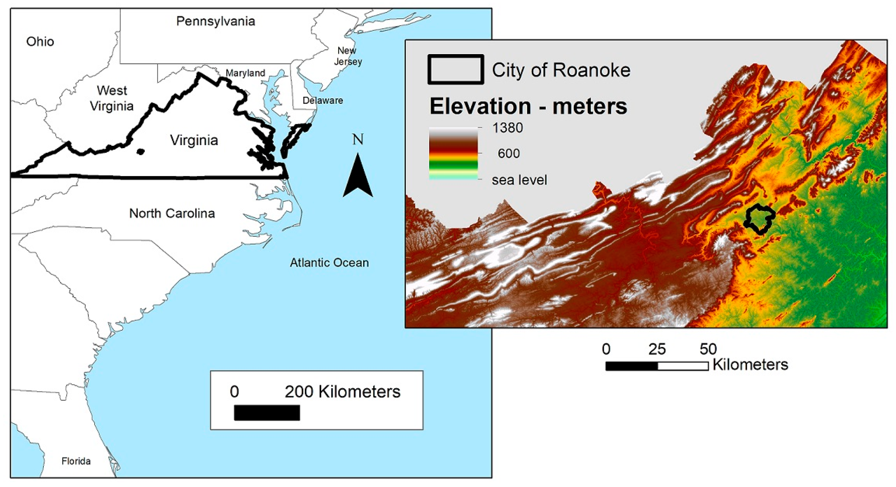
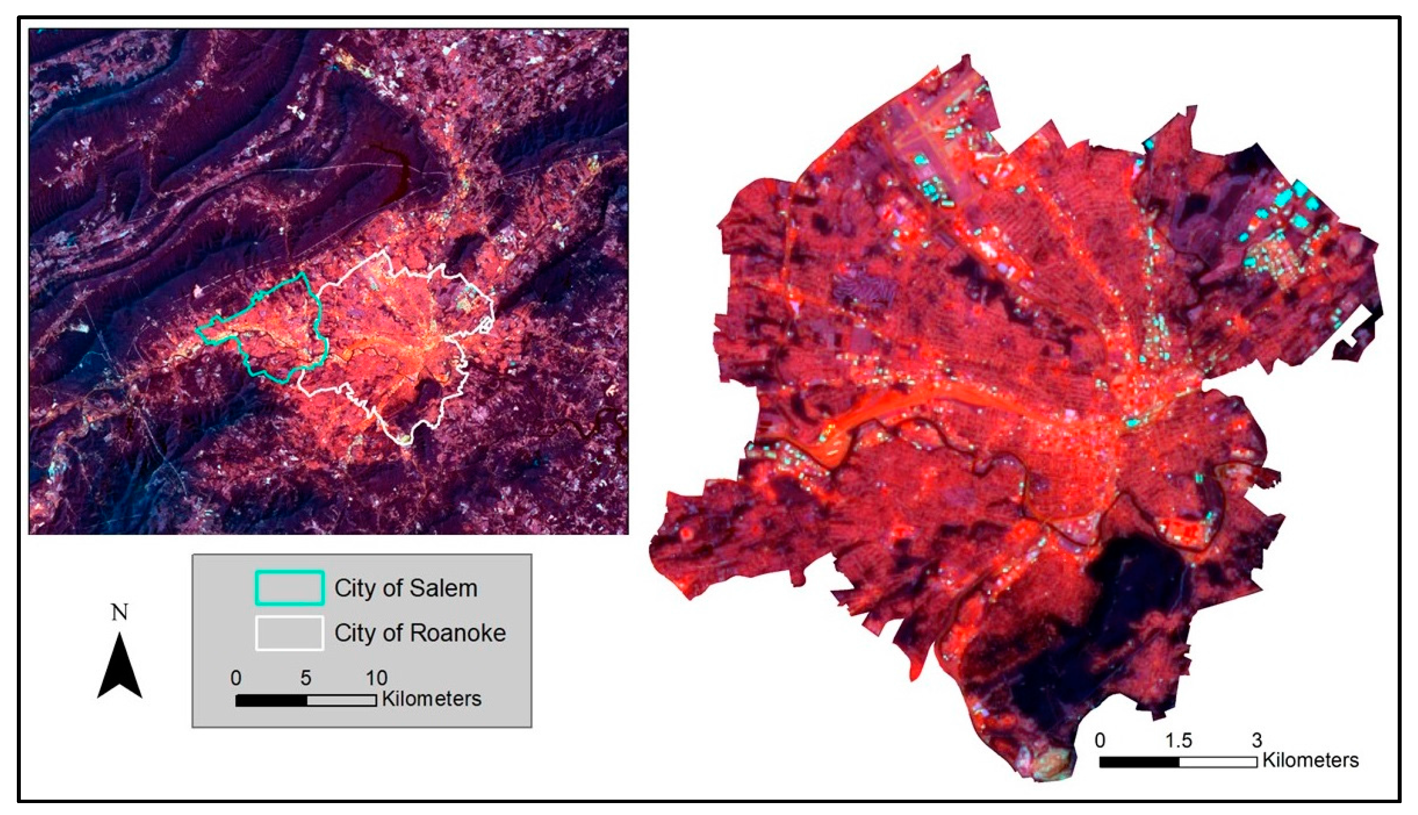
Our study site, the City of Roanoke, Virginia, is located in the valley between the Blue Ridge and Alleghany mountains and is the largest city in southwest Virginia (110 km
2 and almost 100,000 residents) (
Figure 1). The city is characterized by two major land covers—tree canopy cover (47.8%) [
20] and impervious surface cover (31.9%, as calculated by first author). The city’s land uses include industrial, commercial, a major railway hub and healthcare industry, and low to very high density residential neighborhoods. The city also exhibits spatial patterns related to both types of urban heat islands—warmer as compared to the surrounding rural areas, and warmer islands within the city because of its varied land cover and uses (
Figure 2).
2.1. Satellite Imagery—MODIS
MODIS (Moderate Resolution Imaging Spectroradiometer) vegetation indices are frequently used when tracking phenological changes at the regional or continental scale and involve a time-series analysis of satellite imagery [
21]. MODIS is an instrument aboard the
Terra and
Aqua satellites.
Terra’s sun-synchronous orbit passes from north to south across the equator in the morning and captures images of the entire Earth’s surface every 1 to 2 days (
Aqua has a similar orbit, but passing south to north across the equator in the afternoon) [
22]. MODIS images are available over many spectral bands and resolutions; we downloaded the data from NASA’s Reverb website (this site was retired in late 2017 and replaced by NASA’s EarthData site).
For phenology, MODIS offers the ability to revisit on a daily basis, providing (weather permitting) frequent coverage but using coarse 250-m pixels. In contrast, the well-known Landsat system provides the advantage of finer detail, using 30-m pixels, but at much longer revisit intervals, especially if effects of cloud cover are considered. Any phenological study must weigh the balance between fine spatial detail (e.g., Landsat) and shorter revisit interval (e.g., MODIS). Here, we report results of an early application of MODIS imagery to explore its value for urban phenology, a topic of increasing significance. (Later paragraphs further discuss these differing imaging systems.)
More specifically, for this study, we used MODIS/
Terra Vegetation Indices 16-Day L3 Global 250 m SIN Grid V005. While MODIS imagery is acquired almost daily, this product extracts the best data acquired over a 16-day window (23 images cover an entire calendar year) and is released processed for several different vegetation indices [
22].
Of the numerous vegetation indices available, we used the Normalized Difference Vegetation Index (NDVI) for this analysis. The NDVI formula is:
The near-infrared (NIR) and visible red wavelengths of the electromagnetic spectrum are more sensitive to photosynthetic activity than are other wavelengths, e.g., plant leaves strongly absorb visible red wavelengths and reflect NIR [
23]. Each pixel’s NDVI values represent a stage of growth and/or health of vegetation within that pixel (the closer to +1, the more healthy or mature). NDVI values can also be used to examine differences over a series of images acquired during the course of a year, to determine start of the growing season, growing season length, and end of the growing season (hereinafter referred to as phenological variables) [
24,
25].
2.2. TIMESAT Software Package
We downloaded images covering the city for 2001 through 2014. To process images for phenological variables, we used TIMESAT [
26]. TIMESAT, as an add-on to MATLAB software (The Mathworks, Inc. Natlick, MA, USA), graphs NDVI values over an entire time series. The time series can be a single year or multiple years, as defined by the user.
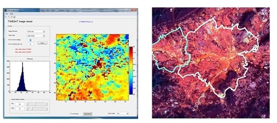
Figure 3 provides an example of NDVI graphing (blue line) for one pixel, for the City of Roanoke, over the 14-year period. Each individual wavelength cycle represents one growing season (the city has one growing season per calendar year). The peak of the wavelength is the highest NDVI value, representing maturity, or peak of the growing season. The valley within each cycle is the lowest NDVI value, the period when most vegetation is dormant.
The black line within
Figure 3 represents a smooth line fitted to the plotted NDVI values, using a specific algorithm chosen by the user. Three different algorithms are available within the TIMESAT software package—Logistic, Savitzky-Golay, and asymmetric Gaussian. For this example in
Figure 3, we have set this parameter to asymmetric Gaussian. The specifics of each algorithm can be found within the
TIMESAT Software Manual [
14], and the effectiveness for tracking phenological phases has been extensively validated (e.g., [
25,
26,
27,
28]). The algorithms have been evaluated for large regions, at much broader scales than that of an individual city. In order to determine which algorithm best fits the City of Roanoke, we evaluated each algorithm’s results for five separate years (2010–2014).
Once the specific algorithm is chosen, TIMESAT then calculates phenological variables using
Class-specific settings (bottom in
Figure 3). For this example, start of season is calculated as
along the slope of the fitted line. TIMESAT identifies which image for each year corresponds to this value using a real number. The input images are numbered sequentially; therefore, for 23 images per year, year one images are numbers 1, 2, …, 23; year two images are numbered 24, 25, …, 46; year three images are numbered 47, 48, …, 69, etc. (within the Supplementary tables, we have included a table converting image numbers to calendar dates). Values found within the text box in the lower right of
Figure 3 (
Seasonality data) designate the image (number) for each parameter (e.g., start of season, end of season, growing season length, etc.) by each year (listed in the first column of this box, on the left—year 1, 2, 3, etc.). For example, using year 3—start of season is identified as image number 54.04 (23 April), end of season as image number 64.35 (5 October), length of season 10.31 images (165 days), lowest NDVI value as 0.4645, and highest NDVI value as 0.775.
TIMESAT can evaluate images over a series of many years (as in
Figure 3, for 14 years), or for an individual year. However, to evaluate one individual year, TIMESAT requires three consecutive years of images—year before, year of interest, and year after. TIMESAT then defines the start of season for the year of interest (which would equate to images numbered 24 through 46). As such, our 2013 and 2014 analyses required images from 2012 through 2015.
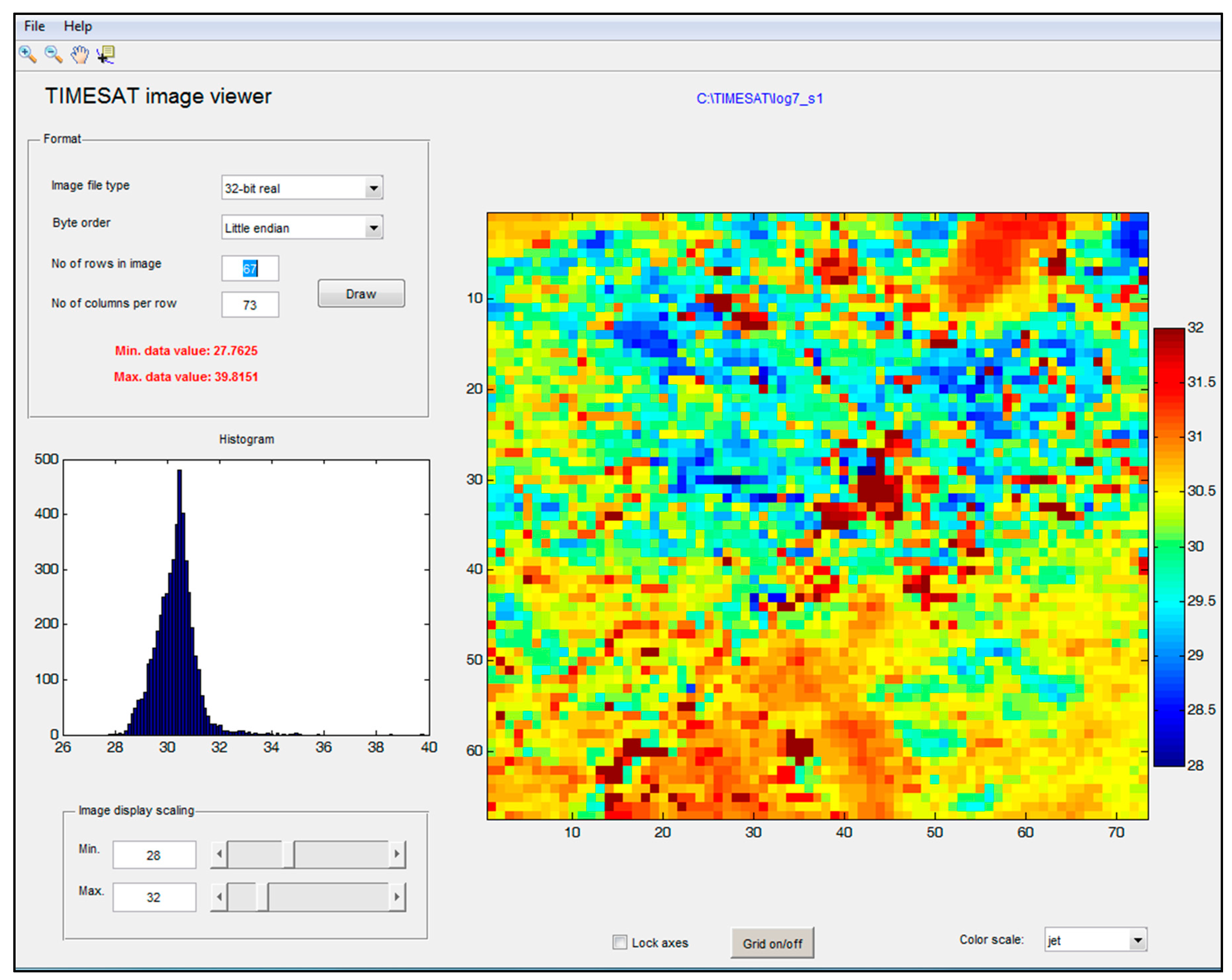
In addition to an individual pixel evaluation, TIMESAT calculates phenological variables for all pixels within an entire image (or subset of an image), producing a thematic image for the specific chosen variable (
Figure 4). TIMESAT’s
image viewer includes a histogram for the range of values, and values for the minimum (27.7625) and maximum image number (39.8151). As noted above, these values represent the number of the image (in sequential order), so these values equate to a specific date. In
Figure 4, (red text within the upper left corner box) 27 equates to the 4th image for that specific year (18 February) and .7625 adds 12 days (2 March); 39 is the 16th image (29 August), and 8151 adds 13 days (11 September) (a table for complete conversion of decimals to number of days is found in Supplementary tables). Pixels in this image, therefore, display the range of start of season for 2007, from earliest (blue) to latest (red), as shown by the color scale at the right of
Figure 4. (Later discussion will address relationships between these dates and the underlying urban landscape).
2.3. In-Situ Data Collection—Temperature
Our microclimate analysis is outlined extensively in Parece et al. [
29], and we briefly summarize our methods here. During 2013 and 2014, we collected temperature data across the city for multiple days in the following ways:
Our 2013 mobile temperature campaign collected temperatures across all four seasons—well over 100,000 temperature readings. Our mobile 2014 collection campaign did not begin until late June, concluded in early August, and collected well over 50,000 temperature readings. We downloaded all fixed station temperatures for the same time periods in which the mobile units were used. We then compared the fixed station temperature data to the mobile temperature data, using data obtained within the same five-minute time period when a mobile sensor was within 500 m of a fixed station (n = 96). We found a 99% correlation.
To extrapolate temperatures for the entire city, we identified landscape variables for all temperature collection points within a 30-m area around each point (e.g., percent impervious surface, percent tree canopy cover, slope, aspect, and elevation). We then identified the same landscape metrics for the entire city at the same 30-m resolution (123,461 grid cells in total). For each date, and for no more than a one-hour time period, we used 90% of mobile temperatures and the related landscape metrics as training data for Random Forests [
30], reserving the final 10% for validation. Random Forests used these values to predict air temperatures for the entire city based on the unique combination of landscape metrics present within each 30-m grid cell.
2.4. In-Situ Data Collection—Vegetative Start of Season
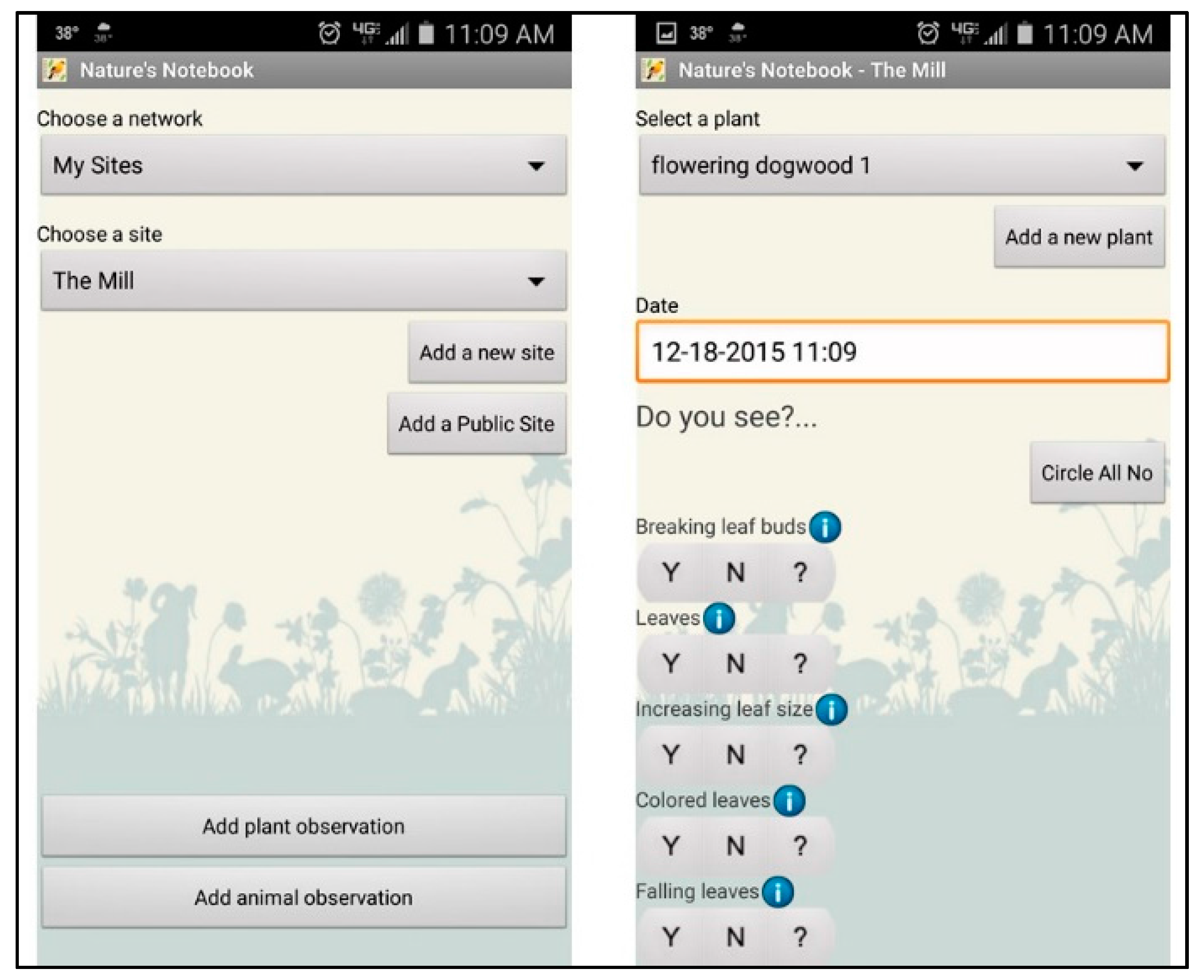
Because a field component is highly recommended for phenological studies [
31], we enlisted citizen scientists, including Master Naturalists, Tree Stewards, Master Gardeners, K-12 public school teachers, and local community college faculty and research assistants, to assist with in-situ monitoring of trees during the spring of 2014. We trained volunteers in February 2014 using the National Phenology Network (NPN) protocol (
www.usanpn.org). Reporting to NPN is accomplished either on the web or via a downloadable mobile application. The NPN protocol includes identification of latitude and longitude using Google Maps™ for the specific tree(s) monitored, and reporting for status of leaves, flowering, and fruiting, and for each feature, the extent of growth, e.g., breaking leaf buds, leaves, etc. (
Figure 5). All reported data is downloadable directly from NPN website via a spreadsheet file.
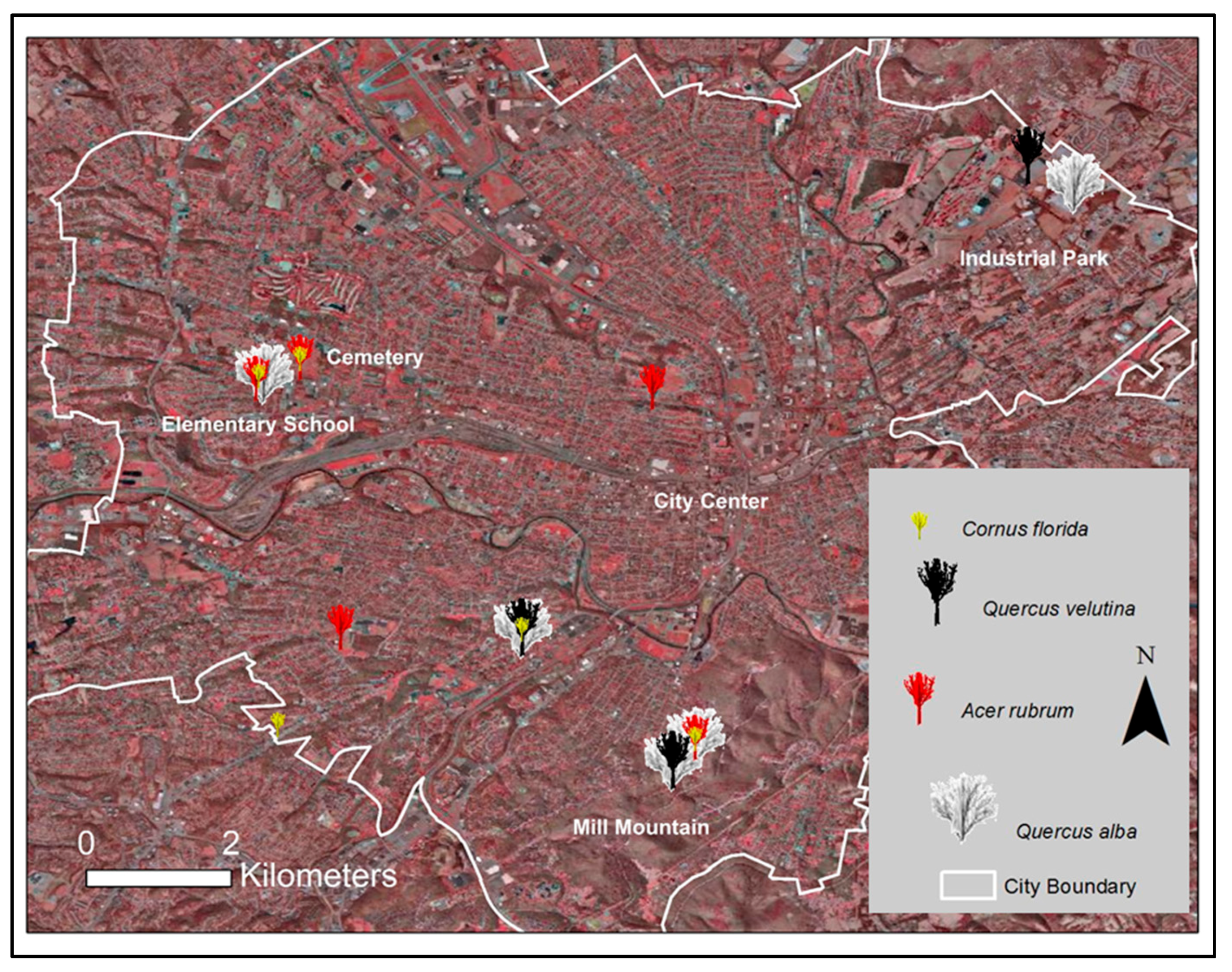
Our citizen scientists monitored 62 individual trees during the spring 2014 (from late February through mid-May) for leaf bud burst, first open flowers, and full tree canopy, although the trees were not monitored consistently by all observers. In addition, monitoring sometimes occurred on only an individual tree for some species, on only one observation date; some only observed leaf bud burst but did not monitor flowering, some noted flowering but not leaf buds, and most failed to report when the leaf canopy reached 95% or greater. Cornus florida (flowering dogwood), Acer rubrum (red maple), Quercus velutina (black oak), and Quercus alba (white oak) are the species with the greatest number of individual trees and most consistent monitoring, and thus are the trees we used for this portion of our analysis. For three species—C. florida, A. rubrum, and Q. alba—multiple trees were monitored at each location.
The trees are distributed across the city: five each for
C. florida,
A. rubrum,
Q. alba, and three
Q. velutina—a total of 18 trees. These trees are located in distinctive landscapes—in a large industrial park (Blue Hills), on Mill Mountain (southeast), in a cemetery, near three schools (one near the city’s center), in a park, and in residential neighborhoods (
Figure 6).
Table 1 provides more specific details on each tree’s setting, including landuse category, and a description of the landscape surrounding the tree. For this last description, we consider the entire landscape covered by each individual MODIS pixel, in which the tree is located, as the entire landscape within each pixel could impact NDVI values.
2.5. Data Analysis
We compared start of season values for each of the different TIMESAT algorithms, image date, and statistical metrics (mean, range, and standard deviation) for five years (2010–2014). Since urban areas are highly heterogeneous, especially with intra-urban heat islands, we expected variation in start of season across the city. As such, to best capture intra-urban variation, we explored basic statistical metrics that sought the algorithm with the greatest variation in start of season values.
We next compared TIMESAT patterns for start of season values and our temperature patterns by looking for those TIMESAT patterns that reflected earlier start of season (lower image values) compared to those higher temperature patterns and those TIMESAT patterns that showed a later start of season (higher image values) compared to cooler temperature patterns.
For each tree from our in-situ analysis, we first compared differences for in-situ observations. We only compared the same tree species to each other, e.g.,
Acer rubrum to
Acer rubrum,
Quercus velutina to
Quercus velutina, etc. We eliminated any tree species that were only monitored at one location or any tree species represented only by a single tree. Next, we added data downloaded from NPN to ArcGIS™ and used latitudes and longitudes to plot tree locations on our TIMESAT and MODIS NDVI images. If the same species was found multiple times within the same pixel, we verified that in-situ values were the same and only used one tree for the comparison. We extracted TIMESAT and MODIS NDVI values from each image for each tree’s location. We then compared in-situ reporting with those values extracted from the satellite images for similarities and differences. Since leaf bud burst is the primary phenophase that is indicative of start of season [
31], we compared the leaf bud burst date of each individual tree species to the TIMESAT start of season value.
3. Results
3.1. Timesat Results
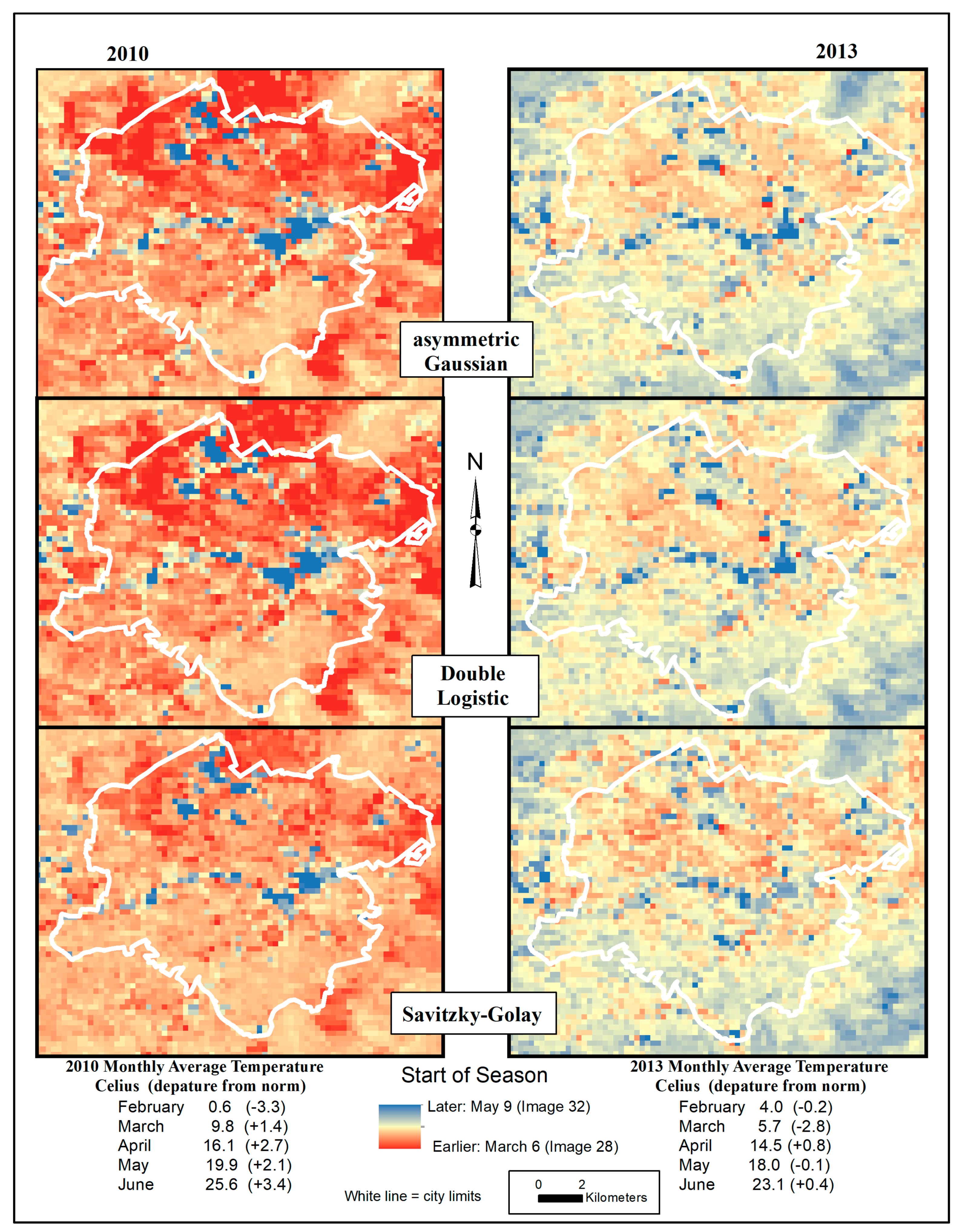
Figure 7 shows results for two years—2010 (on left) and 2013 (on right)—along with the monthly average spring temperatures (as noted above—from the National Weather Service) for each year at the bottom of the image. We present these two years for comparison as spring temperatures differed significantly, so
Figure 7 helps illustrate yearly phenological variation within the city. Although 2010 had below normal temperatures in February, spring months were warmer than normal, facilitating an increase in vegetative growth earlier in the season. For 2010, TIMESAT identified an earlier start of season across the entire image as compared to 2013 (when temperatures were closer to normal averages).
Furthermore, distinct patterns are also present within city boundaries. The southern half of the city demonstrates a later start of season (higher TIMESAT value), while most of the northern part of the city demonstrates an earlier start of season (lower TIMESAT value), with the exception of the far northeast. The northern area of the city is more densely built, with less vegetation. The northeast corner consists of a large industrial complex—large buildings, and parking areas, situated on large park-like parcels of land—and is located near a large urban farm and golf course. (For reference images, please see
Figure 2 and
Figure 6).
Of specific note are areas at the middle of the city—in all images they show as the darkest blue, which would indicate the latest start of season. The actual TIMESAT values for these areas are images numbered between 33 and 39 (equates to 25 May and 29 August, respectively). These are areas of extensive impervious surfaces and minimal vegetation cover. For example, the large railway complex in the middle of the image demonstrates very late start of season, as do airport runways in the northwest. For such areas, TIMESAT had difficulty designating appropriate start of season. Furthermore, in every year, two algorithms—asymmetric Gaussian and Double Logistic—identified an image numbered 22 (December of the previous year) for start of season for a few pixels (appearing very dark red in the images in
Figure 7)—these are also areas of extensive impervious surfaces, and thus would produce very small or no NDVI value. Such landscapes interfere with the functioning of TIMESAT algorithms, a common situation encountered in urban remote sensing analyses.
Which algorithm shows the greatest variation, and thus is most appropriate for examing an urban area? As noted above in
Methods, we also examined summary statistics for five years (2010–2014) (
Table 2). For the pixels only within the city boundaries (n = 2342), Gaussian showed the highest standard deviations, and Double Logistic had higher standard deviations than Savitzky-Golay, for all years. But, the range of values for both Gaussian and Double Logistic, from 22 (for all years) to 39.21 (2011) (equating to dates December of the previous year and 29 August), clearly reports dates that are not reasonable for start of season for the city. After confirming that these image numbers were all related to areas of extensive impervious surfaces (overlaying these images on an impervious surface shapefile), we eliminated them from our statistical analysis. The number of deleted values varied by algorithm and by year—comprising fewer than 10 for all algorithms in 2012 and between 100 and 200 in 2011. Across all years, the Savitzky-Golay algorithm reported the smallest number of such values. Furthermore, in no year did the Savitzky-Golay algorithm identify a pixel image number that corresponded to a date in the prior year.
When we eliminated pixels with these higher image numbers (corresponding to impervious surface locations), the latest image number for all algorithms was 32 (9 May; 8 May for 2012—a leap year). In four of five years (2010, 2011, 2013 & 2014), Double Logistic had the earliest date for start of season. For four of five years, Double Logistic had the highest standard deviation (2010, 2011, 2012, and 2014). For three years (2011, 2012, and 2013), means were the same for all algorithms; in 2010, the Double Logistic mean was the same as the asymmetric Gaussian, and both were 4 days earlier than Savitsky-Golay. For 2014, only 1 day separated all three means.
3.2. Temperature Patterns (2013)
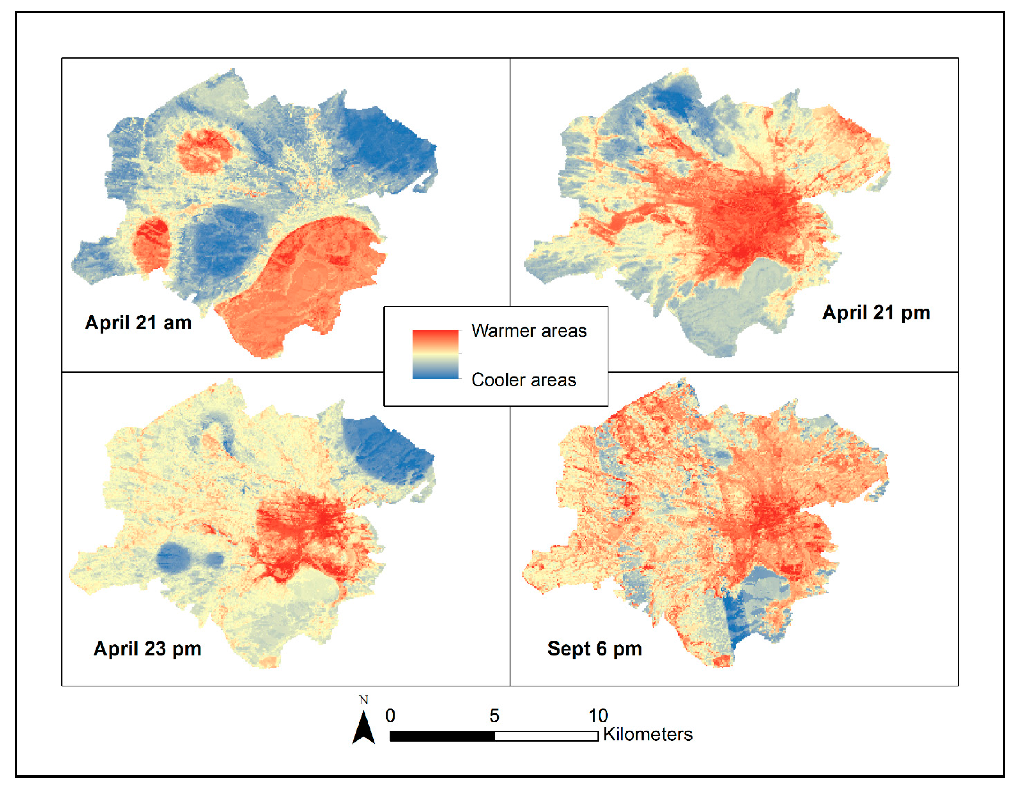
Our temperature collection campaign included collecting consecutive days of temperature on 21–23 April 2013, recording both morning and afternoon temperatures. Start of season cannot be attributed to temperatures from a particular day but rather to an accumulation of temperatures, warming the Earth over a long period of time and initiating leaf bud burst and flowering. Thus, comparing phenological events to air temperature observed on a single date is not informative—temperature patterns change over the course of a day and over months, as temperatures either maintain warmth or continue to warm. For example,
Figure 8 shows estimated temperature patterns for the morning of 21 April, afternoon of 21 April, and the afternoon of 23 April—the city experienced increasing temperatures over the course of a single day (21 April), three consecutive days (21–23 April), and meteorological data showed continued warming thereafter (through 6 September). In
Figure 8, we have included estimated temperatures for 6 September (towards the end of the city’s growing season), demonstrating how patterns changed over the growing season, ultimately reflecting the same patterns depicted in the Landsat thermal image (
Figure 2). For any date on which we collected temperatures both in the morning and in the afternoon, southern areas of the city initially appeared warmer, and then patterns changed as temperatures increased and the day progressed. The specific explanations for the spatial patterns seen for each day of our temperatures in
Figure 8 can be found in [
26].
3.3. In-Situ Tree Observation Comparison to TIMESAT Derived Start of Season
To compare the TIMESAT results to the in-situ observations, we used dates of breaking leaf buds to equate to TIMESAT-derived start of season dates for all three algorithms.
Table 3, categorized by tree species, provides results for date of in-situ-observed breaking leaf buds, with location and the date ranges identified as start of season by TIMESAT’s algorithms. No algorithm performed the same for all sites, nor for all trees of a single species. Three locations’ field observations fell within the range of dates identified by the three algorithms—the
Q. velutina in Fern Park, the
A. rubrum and
C. florida at Fairview Cemetery, and the
C. florida on Robin Hood (for visual reference of the landscapes around the trees, please refer back to
Figure 6). Another four locations fell within one or two days of the range—both trees in the two Black Hills’ locations, the
Q. alba in Fern Park, the
A. rubrum on Robin Hood, and the
Q. alba at Fairview Elementary School.
The greatest divergence was the Oakwood location—all field observations deviated from TIMESAT by 13 days to one month. The Oakwood location had the lowest elevation, so higher elevation was not a factor for the later date of bud burst, i.e., higher elevations are cooler and thus start of season begins later. An examination of historical imagery in Google Earth™ for Oakwood reveals that the area is predominantly conifers, which is likely the cause of the higher NDVI value, and thus earlier start of season identified by TIMESAT.
The A. rubrum at Addison Middle School and Patrick Henry High School also deviated significantly—1 month and 13 days, respectively. Addison Middle School only provided one observation at their location—if more observations had been submitted, this result may have been different. For Patrick Henry High School, the field observation identified breaking leaf buds as early as 14 March, and two of the algorithms did identify March start of season dates; trees at this school are widely spaced and located in open grassy areas, and the school is typified by large expanses of impervious surfaces. Such landscape settings have an effect on NDVI values, with the predominate vegetation providing the greatest influence on start of season extraction (in this specific case—grassy lawn).
For the Fairview Elementary School site, all three TIMESAT algorithms identified the same date for start of season—12 April. However, field observations of the trees did not agree with this date for the trees C. florida (4 April), A. rubrum (31 March), and Q. alba (14 April). We acknowledge that different tree species will break buds on different dates. The same citizen scientist also observed trees at Fairview Cemetery (across the street from the school but within a different MODIS pixel). For the cemetery, the three algorithms produced different dates (two identified 2 April and one identified 9 April), and the field observations showed breaking leaf buds for the two trees within this range: C. florida (4 April), A. rubrum (2 April). The landscape differences between the two locations, albeit across the street from each other, are significant—the cemetery has large expanses of grass with trees, and the elementary school has large expanses of impervious surfaces with playgrounds, some grassy areas, and some trees.
4. Discussion
From the TIMESAT analysis of the MODIS images, start of season clearly varies over the entire city (
Figure 7—city boundaries are white). Spatial patterns for start of season dates vary depending on the algorithm but also depending on whether temperatures for a specific year were above average, average, or below average (we symbolized the start of season image number for all images using the same scale). Although the different TIMESAT algorithms produce slightly different patterns, the patterns show similar variations across all images—the city and surrounding urban areas demonstrate an earlier start of season than surrounding rural areas. (We refer the reader back to the Landsat image in
Figure 2 as a reference for variations in the area’s physical layout.) Even the two mountains within the image show a different start of season—Read Mountain in the northeast corner (just outside the city boundaries) shows a slightly later start of season as compared to Mill Mountain within the city (southeast).
Figure 9 shows the TIMESAT results for 2013 start of season (asymmetric Gaussian algorithm) as compared to spring temperatures from 21 April through 23 April. As the legend in
Figure 9 shows, we used the same color ramp symbology for both images, but we reversed the colors to demonstrate that higher values for start of season will correspond with cooler temperatures (lower values), e.g., when cooler weather prevails, start of season is later. The patterns show spatial similarities—locales with later start of season correspond to areas in which our estimated temperatures were cooler. Specifically, Mill Mountain (outlined by the fuchsia oval in
Figure 9) shows cooler temperatures and a later start of season. The northeast corner of the city (black oval) shows cooler temperatures and later start of season but progressing into warmer temperatures and earlier start of season as one moves southwest farther into the city’s urban core, and then to lower elevations—the cooler area (black oval) is the industrial park discussed earlier and the warmer areas are an older industrial park with smaller, closely-spaced, buildings. The western part of the city (gray oval) reveals a mixture of both warmer and cooler temperatures and varying start of season dates—areas represented by mixtures of single family residential and supporting commercial areas. The center of the city (the region just above the railway complex in the middle of the image) is characterized by very warm temperatures and early start of season but also by extensive impervious surfaces for the railway complex and associated infrastructure (as previously noted, TIMESAT cannot calculate start of season for such surfaces because of the very small to non-existent NDVI value, so the start of season for these pixels is identified as very late). We do note that resolutions of these two images differ—MODIS phenology data have a resolution of 250 m, and the temperatures are predicted at 30-m resolution.
Although we did not discuss any statistical analysis beyond summary statistics in our methods section, we did complete a scatter plot of the temperature values and the start of season TIMESAT derived MODIS values. We did not find any correlation, but we did not expect to find a correlation. Firstly, such a comparison tries to relate 30-m resolution derived values (the temperatures) to 250 m resolution derived values (MODIS) when the spatial area covered by each pixel varies. We did complete a random points generation, but as we noted above, one single day of warm temperatures does not equate to start of season; start of season occurs only after multiple days of warming and sustained warming temperatures. Our results are consistent with the study of [
16], who also noted that they did not have a 1:1 correlation, which is a finding that they also did not expect.
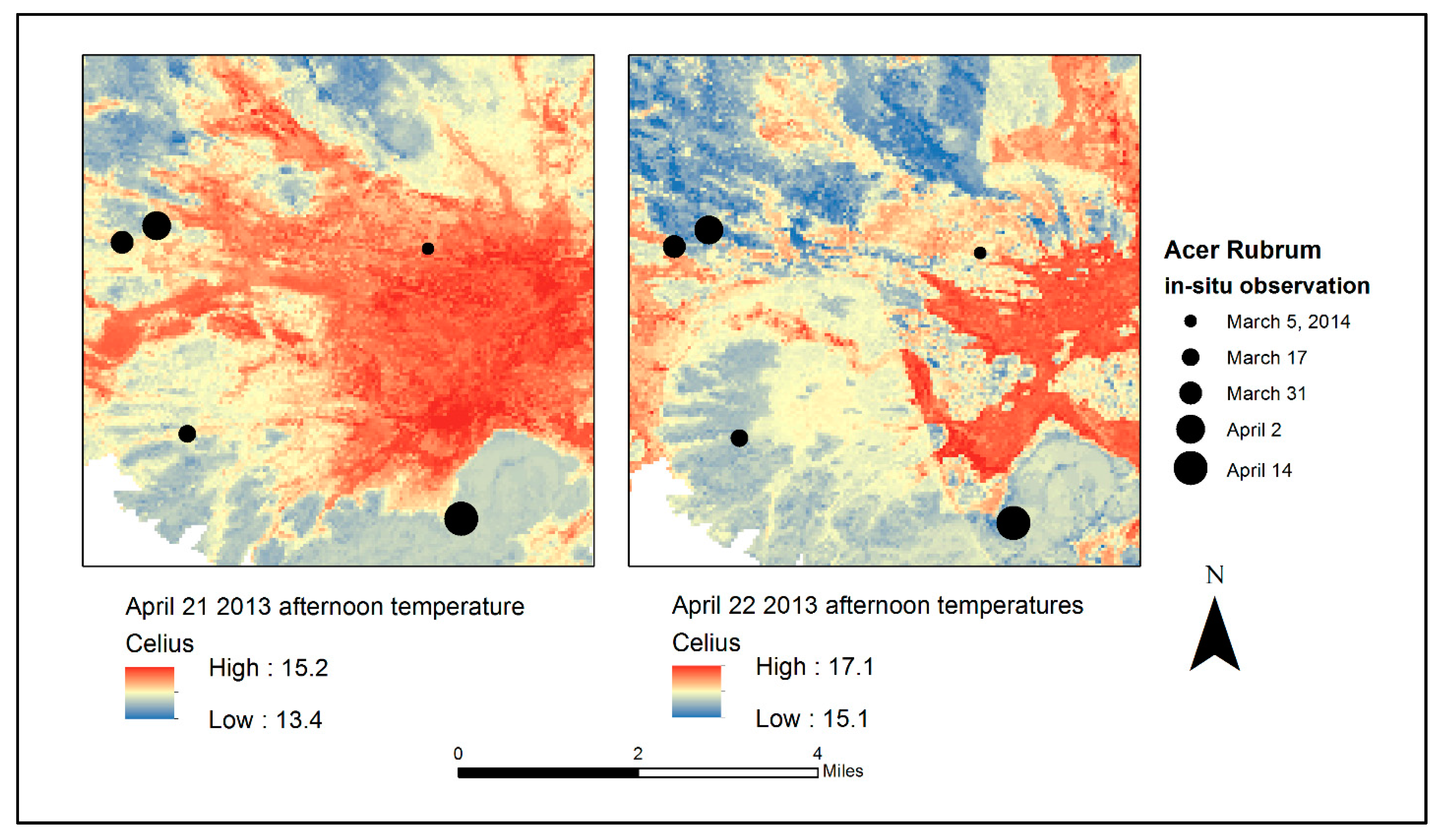
Figure 10 shows an overlay of an individual tree species (
A. rubrum) on our derived temperatures for 21 and 22 April 2013—sizes of point symbols vary according to the first observation of breaking leaf buds by our monitors. While the years are different (2013 for derived temperatures and 2014 for in-situ tree monitoring), the patterns, again, show spatial similarity. The smaller point for the
A. rubrum in the city center represents the earliest leaf bud burst, and temperatures are warmer in this location. The largest
A. rubrum symbol, which represents the latest date for leaf bud burst, is on Mill Mountain in the southern part of the city and its coolest area. Of specific note are the two points near each other on the western side of the city—Fairview Elementary School (smaller of the two points) and Fairview Cemetery (larger of the two points). The elementary school’s
A. rubrum is situated on areas designated as warmer, and the field observation showed an earlier leaf bud burst than the
A. rubrum in Fairview Cemetery (again, we note that the same person monitored both sites).
Results of this exploratory investigation demonstrate that sequential MODIS imagery of an urban landscape, processed by TIMESAT software, can identify the coarse structure of urban phenological changes that track with intra-urban phenological variations. We do note, however, that areas of extensive impervious surfaces (a high percentage of the pixel is represented by such land cover) interfere with TIMESAT’s calculations. TIMESAT does allow for the addition of a landcover layer in the analysis, but the fine heterogeneity of our study site precluded the practical use of this option in the software. Year-to-year variations in start of season are consistent with differing intra-urban microclimates and our in-situ start of season observations. MODIS data can capture gross spatial and temporal patterns of seasonal phenology.
Although variations in air temperature, as recorded by our fixed stations and mobile mesonet observations, do not directly relate to local phenology, they do reveal overall spatial and temperature patterns that occur within an urban region, especially within relationships with principal topographic and land use features. Although, within any urban region, independent temperature records supplement governmental weather observations, and those of broadcast media, the overall pattern of temperatures is very coarse relative to the overall variability of urban landscape.
Therefore, phenological records, even at the coarse spatial detail of MODIS, provide a practical outline of phenological patterns within urban landscapes. Although our study covered a brief interval, both future and retrospective phenological examinations of urban landscapes can provide a more comprehensive perspective of the urban scene. Results from such analyses can aid planning for urban forestry to mitigate heat island effects by providing a framework for relating thermal variations to landscape features.
Furthermore, our analysis provides some support for type of plant selection for different locales within the city. However, additional analyses should be completed with TIMESAT to document end of season and thus growing season length. With such analyses, appropriate plants could be identified as suitable for such locations—i.e., plants with a longer or shorter growing season. Such identification would be especially useful for evaluating locations for specific crops for urban agriculture—a longer growing season would accommodate food production for a longer period of time or for those species that require a longer time to attain maturity. Better understanding of urban phenology can contribute to the improvement of the siting of the planning of urban tree canopies, green spaces, and locations for urban agriculture—i.e., warmer areas with a longer growing season could accommodate warmer weather trees and crops.
5. Conclusions
Generally, start of season varies from year to year—even at the pixel level. As found in our research and noted by other researchers (e.g., [
13,
16]), variations depend on whether the city experienced consistently warmer temperatures or cooler temperatures during the spring. Our 2013 in-situ temperature data collection and resultant derived temperatures that used Random Forest [
26] demonstrated spatial similarity (visually) with our TIMESAT start of season results—areas of warmer temperatures showed an earlier start of season, and areas with cooler temperatures showed a later start of season.
Our 2014 in-situ vegetative phenophase observations also demonstrated spatial similarity with both TIMESAT results and the derived temperatures across the city. Observed earlier start of season corresponded with TIMESAT-derived start of season, with one exception—our Oakwood location. However, upon examining aerial photos, we determined that this location was predominantly characterized by conifers, which have higher NDVI values and likely were recorded as an earlier green-up than those observed from in-situ monitoring of specific deciduous trees.
Urban phenology, by its nature, addresses vegetated surfaces of varied structures and compositions, together with structures and impervious surfaces, which are typically composed of complex spatial mixtures, which require the observation of rather broad areal units rather than individual plants. Because landscape phenology considers the phenological behavior of such areal units, it is matched well to the observation of this complexity. Our study observed, over time, the consistency of varied urban landscape units to assess their phenological behavior, revealing specifics of inter-urban ecology and climate. These results form the basis for further investigation of the role of MODIS imagery for urban phenology.
More specifically, our study demonstrates that using TIMESAT to evaluate MODIS NDVI is an effective evaluative technique for start of season variations within the City of Roanoke, Virginia. When evaluating each TIMESAT algorithm to determine which algorithm shows the greatest variation in documenting start of season, no one algorithm proved consistent across the five years that were assessed (2010–2014). This result is not surprising, because, as with many other urban analyses, landscape variations within urban areas create a need for multiple methods of analysis.
We do urge caution for future analyses, for two reasons. Firstly, when attempting to match temperatures for a specific date to phenology—as we have previously noted, direct correlation between one day’s temperature and phenologic status cannot be accomplished, since the initiation of leaf bud burst and first flowering occur only after multiple days of sustained warming temperatures (consistent with the findings of [
16]). Secondly, MODIS provides the best image over a 16-day period, so the date of the MODIS image (or the image value identified by TIMESAT for start of season) could actually vary from those dates identified. This effect actually may result in closer correlation for in-situ monitoring.
Landsat imagery would likely be more appropriate satellite imagery for investigating urban phenology and would be consistent with the researchers [
16] who used Landsat imagery in their urban phenological analysis. Landsat’s 30-m resolution provides finer detail, rather than the 250-m coarser detail provided by MODIS; this finer resolution is a definite benefit, as noted by [
33]. However, Landsat’s less frequent revisit interval, combined with loss of coverage due to cloud cover, limits the utility of Landsat for urban phenological analysis. If sufficient numbers of cloud-free Landsat images could be identified (within at least one year), an additional evaluation could compare TIMESAT-derived start of season for Landsat to MODIS. Furthermore, the recent availability of the European Space Agency’s Sentinel-2A imagery (10-m pixels) may present opportunities for extending revisits beyond those offered by Landsat image sequences. In the future, with the possibility of Landsat 7 & 8 and Sentinel-2A and -2B in operation simultaneously, phenological studies might be supported by 3- to 4-day repeat coverage of the Earth’s land masses, with more frequent coverage available at higher latitudes. (Although, we note that the current status of Landsat 7’s sensor system will likely be problematic for systematic urban analysis.) Such finer-scale analyses may be required to accurately document start of season using satellite imagery of urban areas with a higher density of multi-family residential areas such as New York City, London, or Philadelphia. Further, multiscale analyses based upon Landsat, Sentinel, and MODIS may provide the basis for developing a fuller understanding of urban phenology.


