3.1. Visual Navigable Landscape (Empirical)
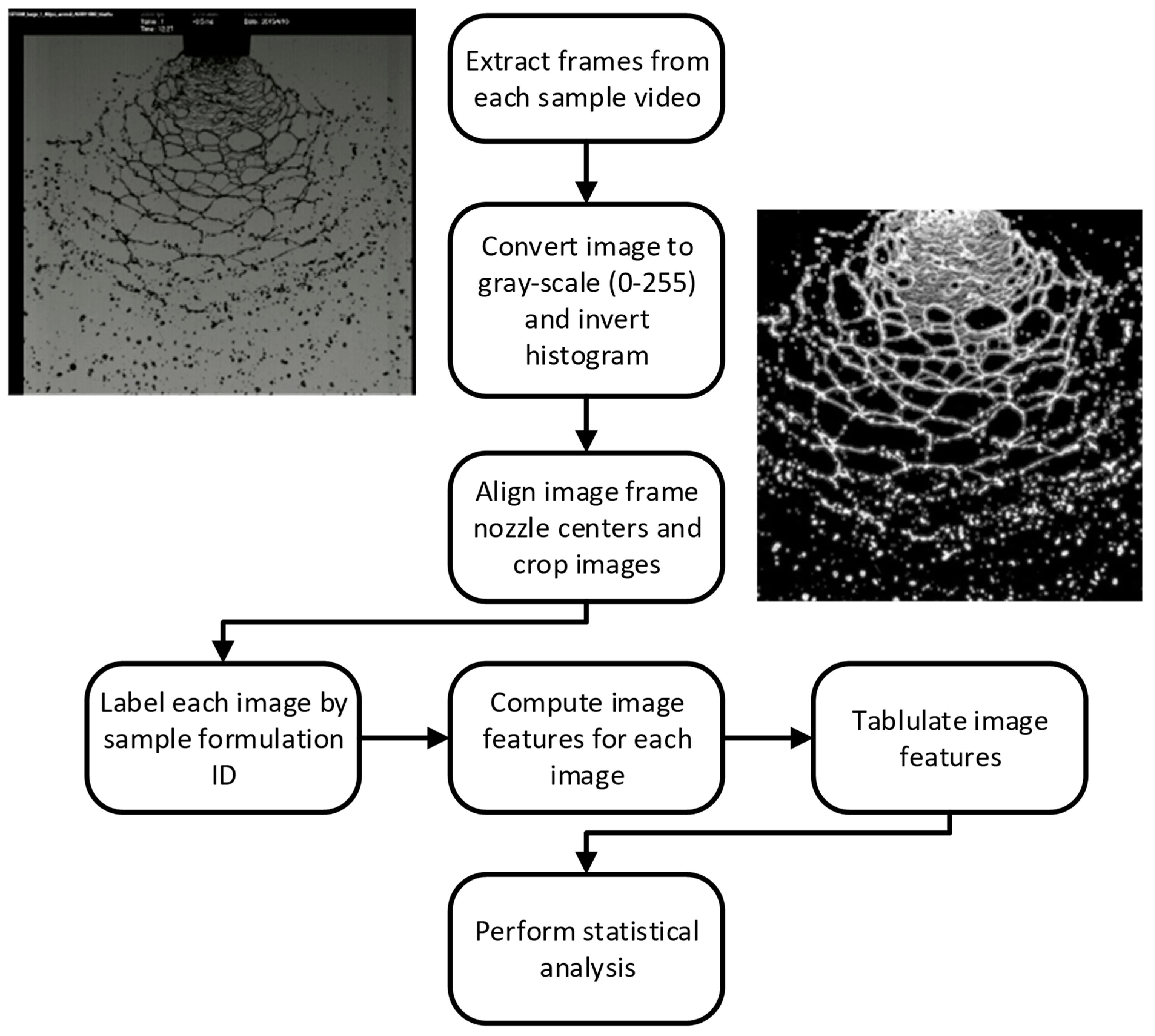
For each image, dozens of numerical image features were extracted ([
21,
24,
26,
27]. Using the class labels (e.g., formulation type), the image features were subjected to a feature selection algorithm that selects a small subset of features that are most correlated with the class label structure [
28,
29]. The 10 most correlated features were linearly combined (i.e., weighted and summed; principal components) and then used to classify each sample image. This was performed so that three distinct linear combinations were computed that best separate the classes into three dimensions [
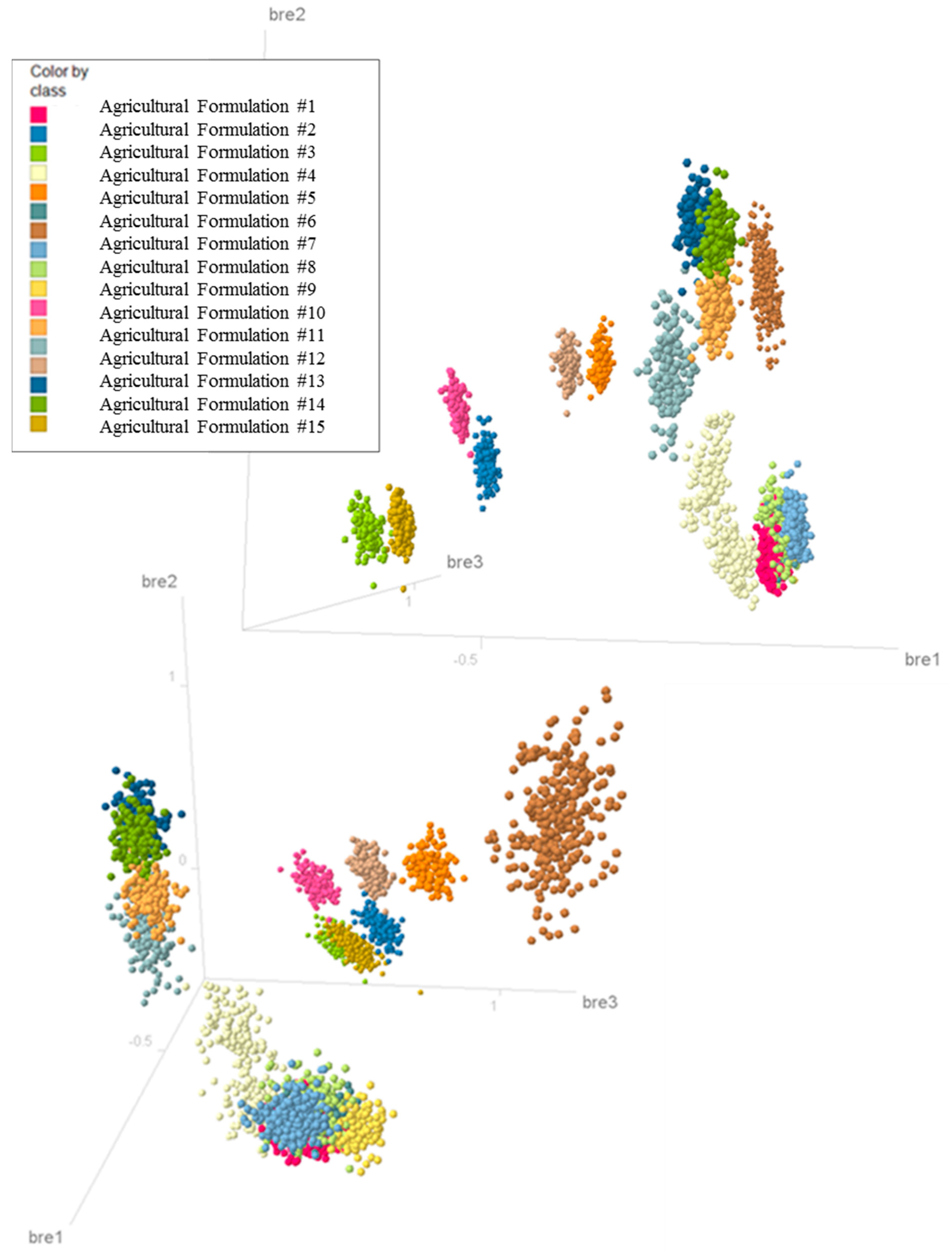
30], thus allowing the images to be “projected” into a 3D graphical visualization. The resulting projection for the 21-video subset using different formulations is depicted in
Figure 5, with bre1, bre2, and bre3 representing the three principal components used. Separation between the class label structures (e.g., different formulation types) indicates that image analysis (IA) metrics could distinguish between atomization (breakup) patterns for all the formulations investigated in the navigable landscape exercise. Thus, metrics generated from images of spray patterns can be used as dependent parameters in data mining and statistical techniques and in offering insight/quantification for mechanistic modeling of sheet atomization.
3.2. Physical Image Analysis (IA) Metrics
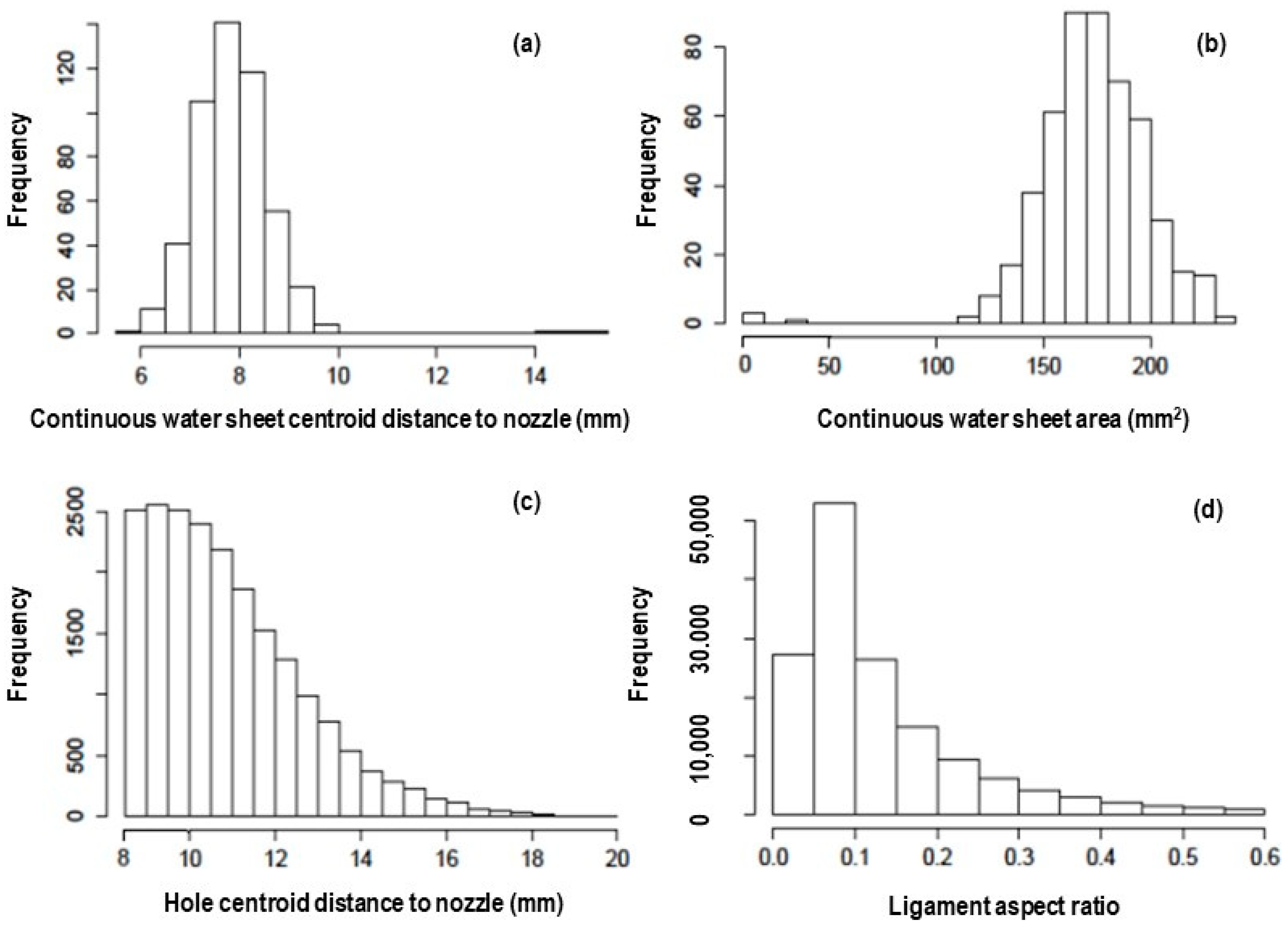
Histograms for metric measurements for a single atomization video for a two-phase system (1% oil) using an AIXR 110° nozzle are provided in
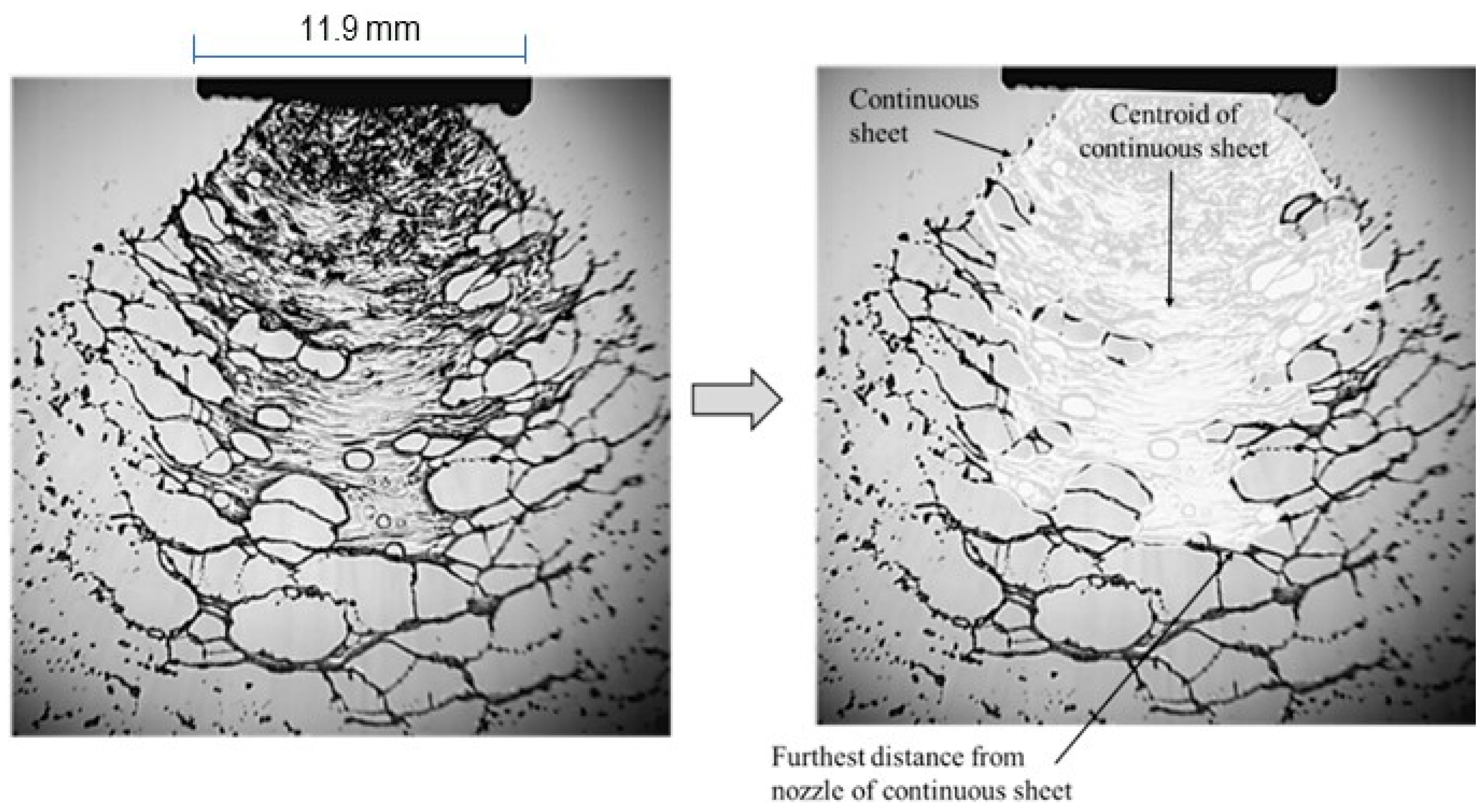
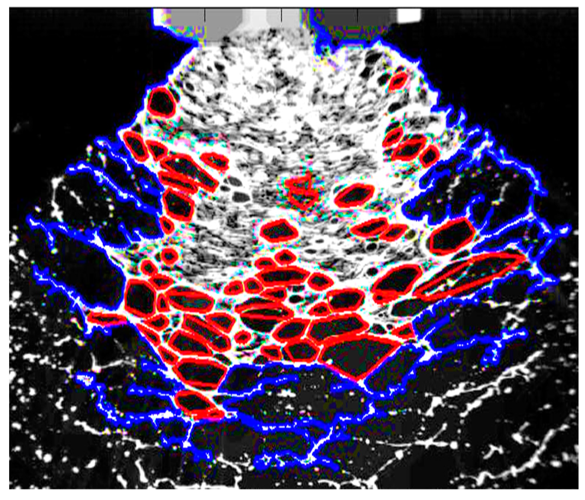
Figure 6. The metrics included the centroid of the drops following atomization, liquid ligaments, and holes within each video frame, along with the area and the centroid of the continuous sheet of liquid before succumbing to the instability responsible for sheet breakup. Lastly, the aspect ratio (R/L) for each of the many ligaments found in an image was measured and tabulated as a histogram (bottom right in
Figure 6).
The breakup of a cylinder ligament is not instantaneous. In Altieri, Cryer, and Acharya [
10], it was assumed mathematically that the Plateau–Rayleigh instability immediately destroyed the liquid ligaments that were formed. The presence of fluid webs seen in the images is evidence that this did not happen and can be attributed to two factors: (1) the rate of growth of the cylinder instability and (2) ligament stabilization by “pinning” cylinder ends. Constraining the ends of the ligament (approximated as a cylinder) to have fixed contact lines stabilizes the ligament (based on the linear stability theory [
11]) when contrasted against a liquid cylinder with “natural” endpoints (
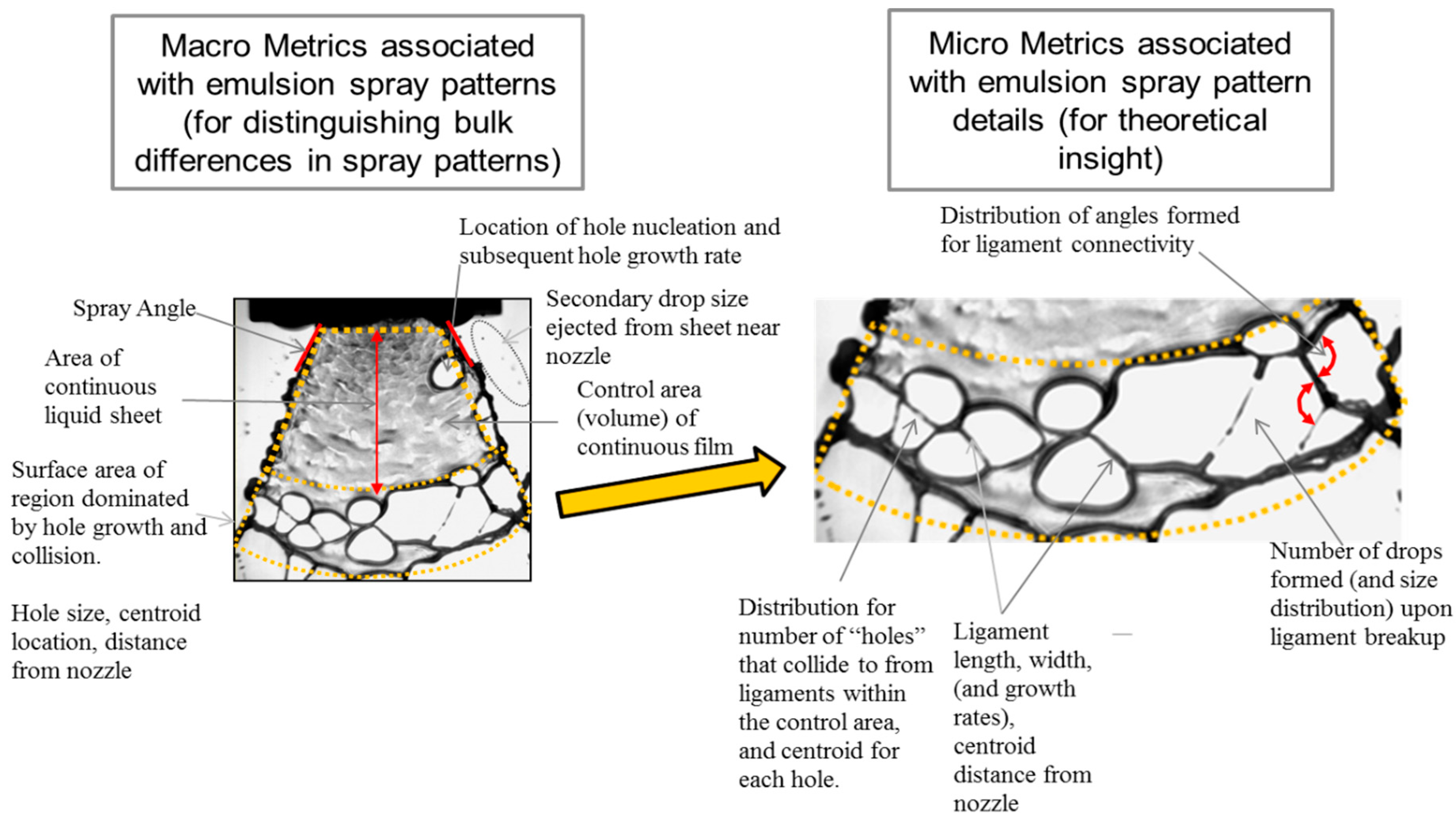
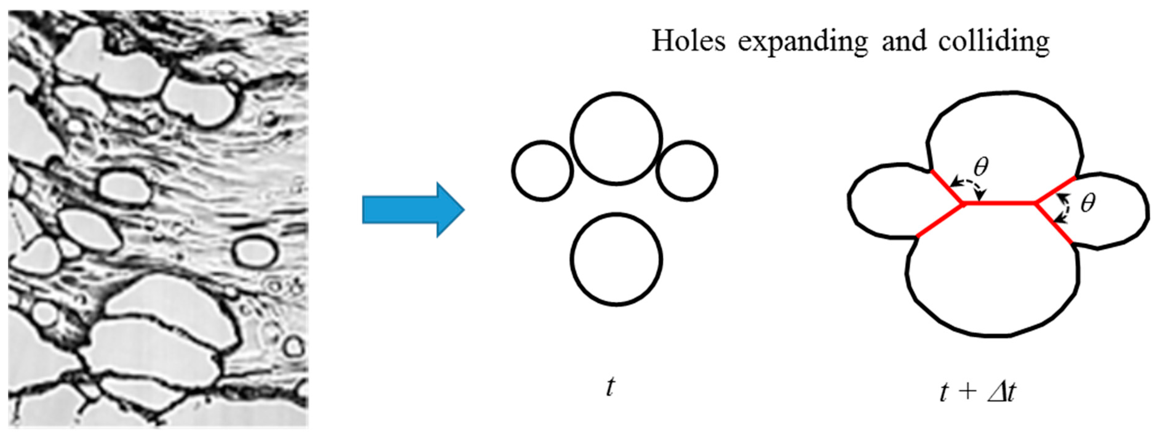
Figure 7). Not only does the pinned growth rate decrease from the corresponding free case but the R/L value for the maximum growth rate also shifts. Thus, cylinders of fluid can grow longer before becoming unstable, and it takes longer for the disturbance to grow along the cylinder interface, which ultimately leads to cylinder breakup and drop formation.
Holes that formed within the continuous liquid sheet were approximated as polygons with up to 12 edges. The angles that formed between the polygon edges were interpreted as representing the number of distinct holes that collided (
Figure 7). The angle between the polygon edges decreased as more holes collided. Thus, the representative histogram describing polygon angles for a hole is related to the number of colliding holes.
3.4. Principal Component Analysis (PCA)
The newly transformed data for both the predictors and response variables (e.g., D10) followed an approximately normal distribution. The next step was to eliminate the linear correlation between predictors using the classical method of principal component analysis (PCA) because PCA creates a new set of orthogonal linear combinations of the original predictors. The advantages of PCA include the following:
Orthogonal linear combinations compose a new feature space such that each feature is linearly uncorrelated with others.
Principal components (PC) are listed in order. The order describes the variance in the data that each component can explain.
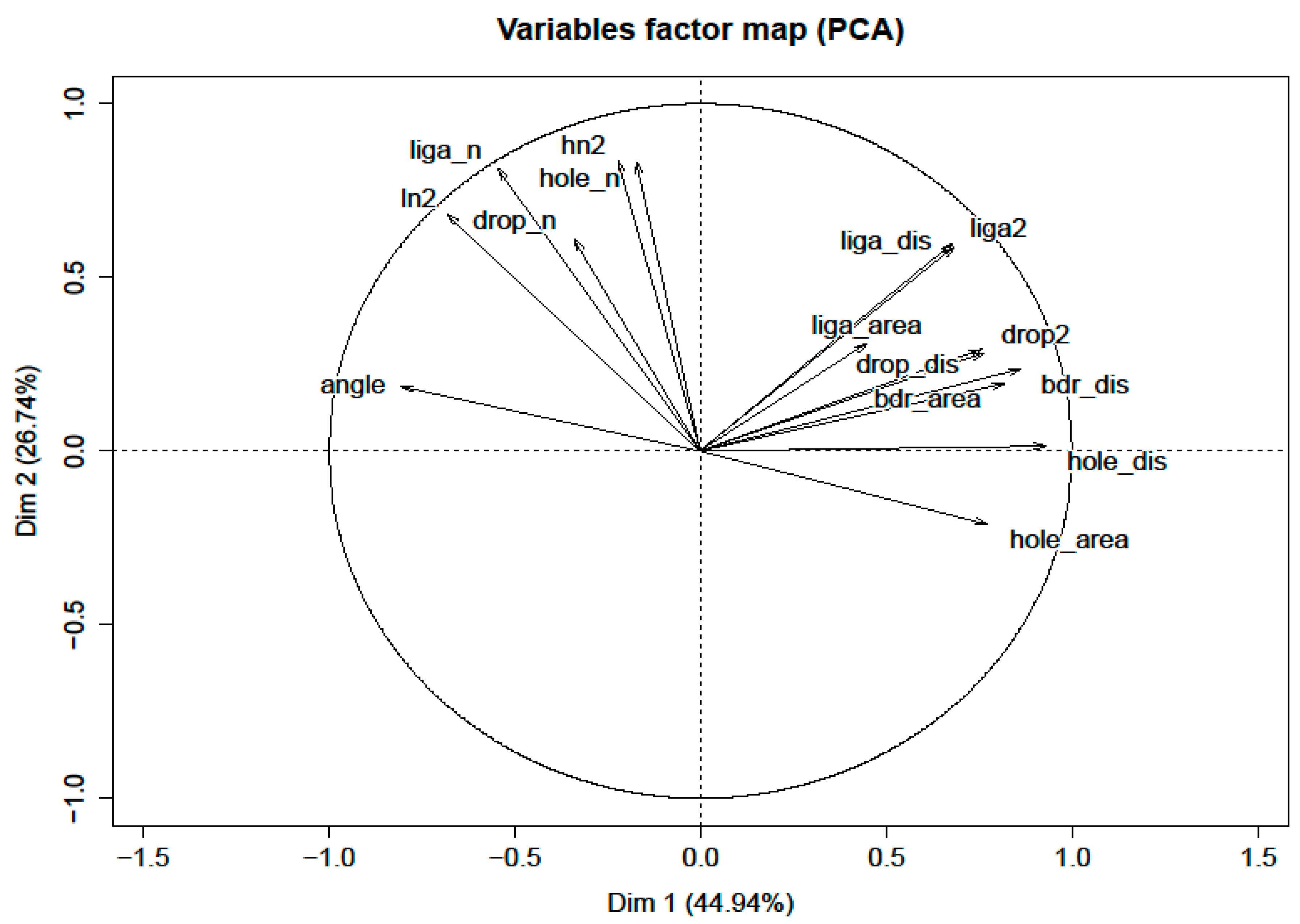
A transforming matrix was obtained while running PCA to deliver information on how the new features are composed (and these new features are easily transformed back to the original feature set). A score plot is a representative example for the first two principal components (PC), as shown in
Figure 9, where the x-axis (Dim 1) and y-axis (Dim 2) represent principal components 1 and 2, respectively. PCs are orthogonal and linearly independent of each other.
Figure 9 is useful to visualize the original predictor variable representation on different principal components. For example, if one takes PC1 and PC2 as the graphical axes, then one can find that the hole distance (variable) is almost horizontal (PC1) but is not related to PC2. In addition, the vector representing the variable of ligament distance (liga_dis) in
Figure 9 has a length of 0.9 and forms a
angle with both the x and y axes. This implies both PC1 and PC2 contain
of liga_dis in their final representations.
Group clusters indicate the projection of each sample observation on the plane formed by PC1 and PC2. All the principal components form an orthogonal space, and each sample observation represents a point in this space. PC1 and PC2 will form a plane. After performing PCA, 15 new variables (PCs) were generated. It was found that 10 of the new PC variables could explain more than 99% of the variance in the predictors. Therefore, the first 10 PCs were kept in the analysis (e.g., PC1, PC2, …, PC10).
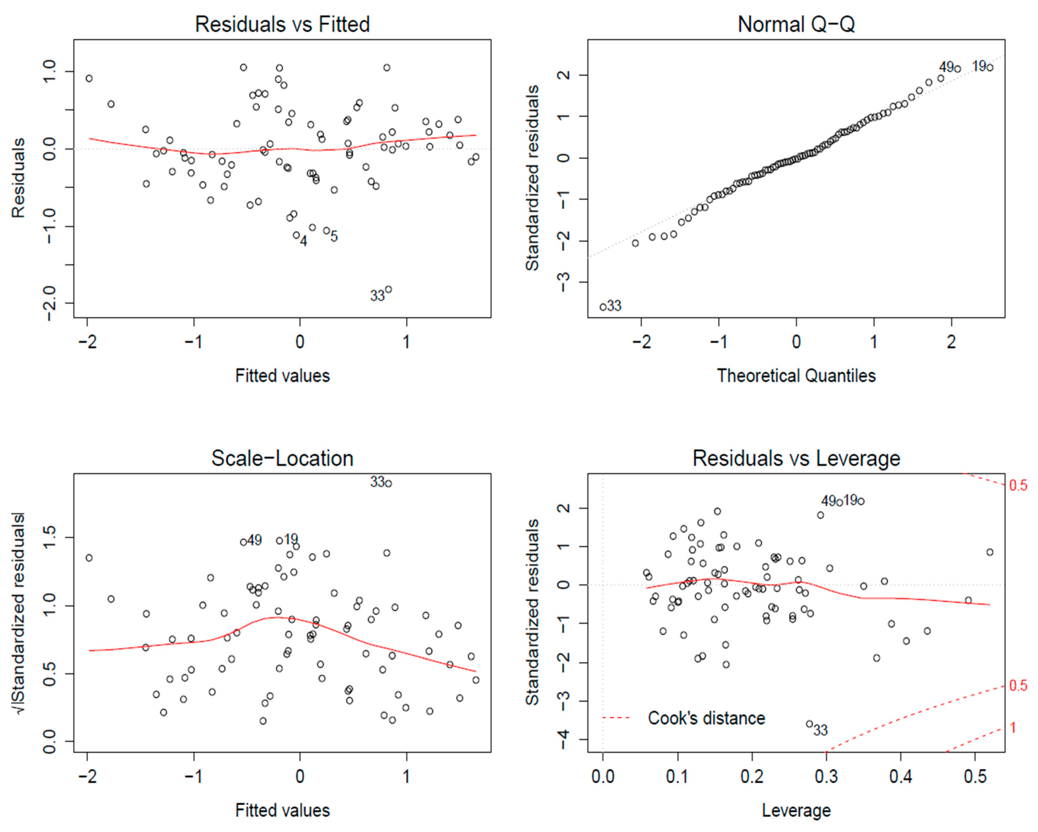
First, a full linear regression model was fitted to the data set to check whether linear regression requirements were satisfied.
Figure 10 is the diagnostic plot for the full linear regression model. The diagnostic plot consisted of four parts: residual versus fitted plot, scale–location plot, normal Q–Q plot, and residual versus leverage plot and is used to evaluate whether the data and model assumptions of linear regression are satisfied. The residual versus fitted plot was relatively flat and had a magnitude of approximately absolute zero (meaning the data had an average value of 0, which implies the data followed a linear model). The normal Q–Q plot was almost a straight line, meaning that the normality condition (the error term in the linear regression model should follow a normal distribution) was true for our data set (an important assumption for building linear regression models). The scale–location plot shows the square root of the standardized residuals as a function of the fitted values. No obvious trend in this plot means the linearity of the data was satisfied. Finally, the fourth plot, the residuals versus leverage plot, shows outliers in the sample set. Outliers are defined by Cook’s distance, and usually one chooses 0.5 or 1 as the threshold. All points were located inside the (−0.5, 0.5) region, which means there were no outliers in the sample data set. The results summarized in
Figure 10 imply that a linear regression model is reasonable.
A metric to balance accuracy and complexity is called AIC. Suppose there exists a full model that includes all predictors and a null model that includes no predictors. Between these two models, one can pick a set of predictors to build a linear regression model and obtain a corresponding AIC value. The model with the best AIC value is the final model that is used. A threefold cross-validation approach was used to test the robustness of this new AIC model, and the regression lines for each fold were similar, which implies that the model had similar performance on all three randomly picked subsets. Thus, one can conclude the final linear regression model is robust because it passed the cross-validation test (the finalized model is the one that used PCs), as shown in
Table 5. Using the rotation matrix between the PCs and original features, we could translate the PC model back into original features (
Table 6).
3.5. Individual Factor Analysis
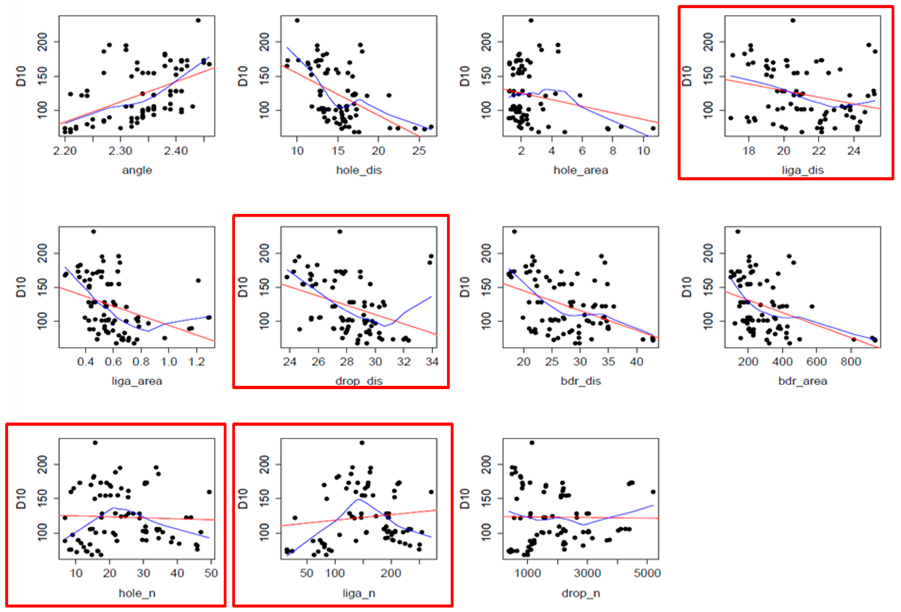
The slope of the factor plots is indicative of the relative sensitivity of the IA metric, and a positive slope indicates the response variable (e.g., log(D10)) increases as the parameter increases and vice versa (
Table 7). A short synopsis of the response variable is provided, with the drop angle of the holes that were formed being the most sensitive. As the angles formed within a hole increase, driftable fines decrease (this is related to the number of colliding holes). As more holes collide, more sides of a polygon will be needed to characterize the hole (and thus the polygon angles will decrease). Also, as the distance between the hole centroids and the nozzle increases, the driftable fines also decrease. Therefore, it is reasonable that a larger hole distance leads to a smaller response variable log(D10) (thus, we want holes to form near the nozzle, which corroborates well with the two-hole model results [
11]). The angle used to approximate a hole is important and has been found to be the most sensitive parameter correlating to the prediction of driftable fines.
The current experimental observations for driftable fine reductions indicate that an upper limit for atomization drop sizes is achieved when air induction nozzles are used. This is likely attributed to the fact that the control of hole formation is lost or masked by the air being entrained into the sheet (which is an alternative way to control the number of holes that are colliding). There are several cross terms in this screening model that are sensitive, and all have an angle in the cross term. The average distance from the nozzle to the centroid of the continuous liquid sheet (Bdr_dis) analysis suggests that as this distance increases, driftable fines increase slightly. However, when one multiplies the coefficient for Bdr_dis with a scalar, then this parameter is not sensitive for DT10. Also, the number of holes in the continuous fluid sheet (Hole_n) decreases the driftable fines as this parameter increases. This is because more holes imply completeness of breakup, and smaller droplets occur; thus, the driftable fine fraction decreases. Analogous findings occur for the number of ligaments (Liga_n).
As the number of drops the sheet breaks up into increases, the number of driftable fines likewise decreases. More drops in this case means a higher fraction of smaller drops; thus, we want to keep the drop numbers to a minimum (e.g., the bigger drops). The more drops we have, the more completely the liquid sheet breaks up. The completeness of the breakup implies smaller droplet sizes.
Parameters that were found to be positively correlated were hole area, ligament distance, ligament area, and the biggest blog area. Thus, as the parameters increase in magnitude, so does the driftable fine fraction. A larger hole area is indicative of the incompleteness of the breakup procedure, so it leads to larger driftable fines. It is not intuitively clear, but the ligament distance indicates that only the short and chubby ligaments are seen a long way from the nozzle, and if this is the case, then the driftable fine fraction should decrease. An increase in ligament distance shows that ligament formation occurs, which means the breakup procedure is not complete, so an increase in drop size can be expected. A larger driftable fine fraction is implied as the ligament area increases because drops are formed when ligaments break up.
The average area of the continuous water sheet (biggest blob) is given by Bdr_area, which indicates a positive correlation to driftable fines. However, by looking at the scale and coefficient of the variable in the final model, this is not a sensitive parameter. Also, the square of the variables for ligament number and hole number should lead to a decrease in driftable fines, but the results suggest a slight increase in driftable fines. R/L, drop distance from the nozzle, and (ligament distance)2 and (droplet distance)2 are not sensitive parameters.
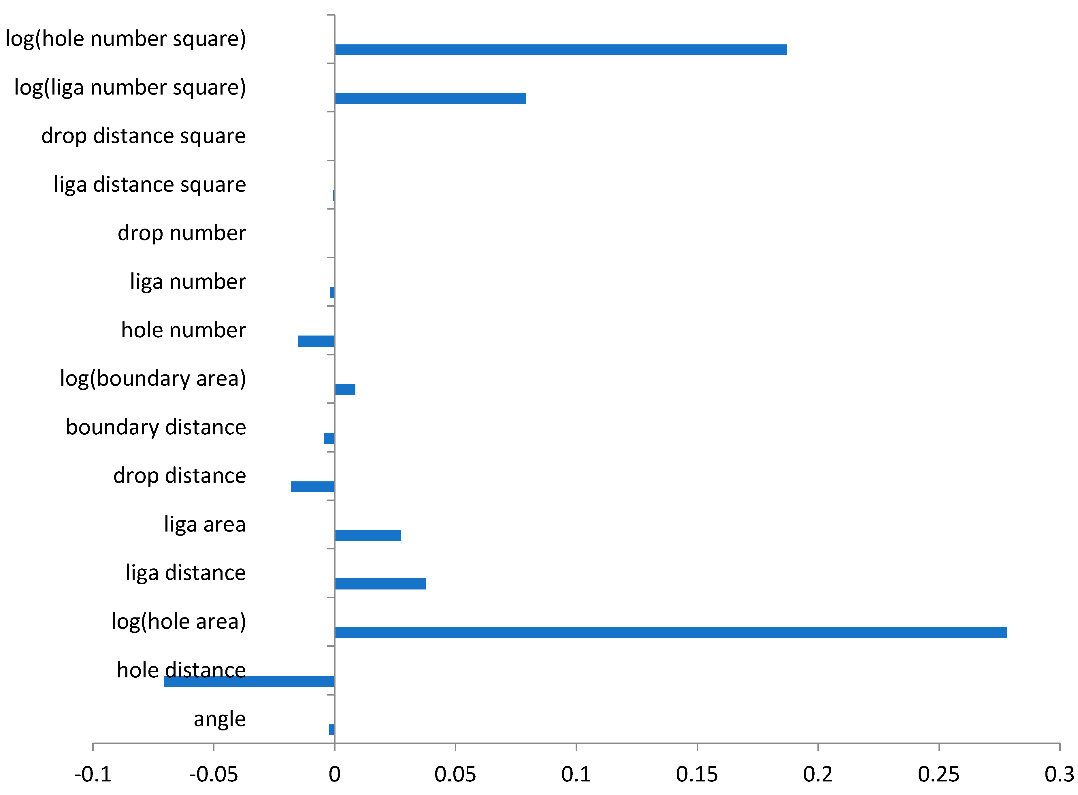
A comparison of the coefficients of each predictor in the linear regression model is given in
Figure 11. The magnitude of each correlation is related to parameter sensitivity. A positive coefficient indicates that increasing the parameter increases D10 (with the converse also being true). The IA metrics found to be the most sensitive in predicting D10 were log(hole number
2) and log(hole area). Details of deep learning and other software approaches are discussed in other articles [
12,
13].
