1. Introduction
Interactive dashboards are widely used for data exploration and decision support because they allow users to inspect key indicators, distributions, and patterns through compact visual interfaces. In classification-oriented settings, however, the usefulness of a dashboard depends not only on visual design, but also on whether the displayed attributes are analytically relevant to the target variable and whether their visual representation supports interpretable inspection of class-related patterns. When many variables are shown simultaneously, visual clutter may increase and the analytical focus of the dashboard may be reduced.
A central challenge in this context is how to translate attribute relevance into dashboard composition. In many practical settings, dashboards display multiple variables without a formal criterion for deciding which attributes should receive priority in the primary analytical view. In parallel, feature selection methods such as Information Gain (IG) are well established in classification analysis as a means of estimating the discriminative relevance of attributes with respect to a decision variable. However, such methods are typically used in predictive modeling pipelines rather than as an explicit basis for dashboard-oriented visual analytics.
A related challenge concerns the interpretation of numerical attribute distributions. Histograms provide an intuitive view of spread, concentration, and overlap, but in many dashboard implementations, they remain descriptive rather than class oriented. For classification-related analysis, their value increases when specific value intervals can be examined in relation to class behavior. Histogram segmentation provides such an interval-level perspective, while the Precise Piecewise Correlation (PPC) method can serve as a complementary mechanism for localized interpretation within segmented ranges. In the present study, PPC is not treated as the primary contribution of the framework, but as an auxiliary analytical layer that supports interpretation after attribute prioritization and segmentation have been established.
The research question addressed in this paper is the following: how can Information Gain-based attribute ranking be translated into a dashboard-oriented visual analytics workflow for classification-related exploratory analysis across different application domains? To address this question, the paper proposes a structured workflow in which IG is used to prioritize attributes for the primary dashboard view, histogram segmentation is used to examine class behavior within localized intervals, and PPC is used as a complementary interpretive method for localized inspection. The aim is not to introduce a new standalone feature selection algorithm, but to formalize a reproducible dashboard-oriented workflow that connects attribute relevance, interval-based visualization, and interactive class-oriented exploration. In addition to the domain-specific case studies, the study also includes a compact quantitative evaluation designed to examine whether IG-prioritized attribute subsets retain meaningful class-discriminative information under standard classification settings.
The proposed workflow is examined using three datasets from different application domains: the Iris dataset, a student performance dataset, and an Oil and Gas wells dataset. These case studies are used to assess whether IG-prioritized attributes provide meaningful support for dashboard-based inspection of class-related patterns and whether segmented histograms offer clearer interval-level interpretation than undifferentiated full-range views.
The main contributions of this study are as follows:
A dashboard-oriented visual analytics workflow is proposed for classification-related exploratory analysis based on Information Gain-driven attribute prioritization.
Histogram segmentation is incorporated as an interval-level mechanism for inspecting class behavior within prioritized numerical attributes.
The PPC method is used as a complementary interpretive layer for localized analysis within segmented histogram ranges.
The workflow is examined across three datasets from different application domains and complemented by a compact quantitative evaluation of IG-ranked feature subsets.
The study clarifies how attribute ranking can be operationalized in dashboard construction through the prioritization of primary views, segmented histograms, and class-oriented filtering.
The remainder of the paper is organized as follows.
Section 2 reviews related work on dashboard-based visual analytics, feature selection, and histogram-based interpretation.
Section 3 presents the proposed workflow, including Information Gain, histogram segmentation, PPC, and dashboard construction logic.
Section 4 reports the results obtained on the three case study datasets.
Section 5 discusses the implications and limitations of the approach.
Section 6 concludes the paper.
3. Materials and Methods
3.1. Analytical Framework for Dashboard-Based Classification Support
The proposed framework is intended for the interactive exploration of labeled multivariate datasets in classification-oriented settings. Each dataset contains numerical conditional attributes and one decision attribute representing the target class. The analytical objective is to support dashboard-based inspection of class-related patterns by prioritizing attributes that provide the clearest one-dimensional view of class separation.
The framework consists of three connected analytical steps. First, Information Gain (IG) is calculated for all conditional attributes with respect to the decision attribute [
16,
17]. Second, histogram segmentation is applied to the prioritized attributes to examine class behavior within localized value intervals [
18,
20]. Third, the Precise Piecewise Correlation (PPC) method is used as a complementary interpretive mechanism for localized analysis within segmented ranges [
20]. In this way, the proposed method links attribute relevance estimation with interval-level visual interpretation in a dashboard environment.
Because the visual layer of the framework is attribute-wise, the method is primarily intended for univariate inspection of class-related distributions. Its role is therefore to support transparent exploratory analysis and decision-oriented visual prioritization, rather than to replace multivariate modeling or detect all higher-dimensional class boundaries.
The main characteristics of the datasets used in this study are summarized in
Table 2.
As shown in
Table 2, the three datasets differ in domain context, number of attributes, and decision-variable structure, which supports the use of cross-domain case studies in evaluating the proposed workflow. At the same time, all three datasets are suitable for classification-oriented analysis and provide a basis for examining how IG-based attribute prioritization can be translated into dashboard construction logic.
3.2. Attribute Prioritization in Dashboard Design
Attribute prioritization is used in the proposed framework to define the primary dashboard view. Instead of displaying all available variables simultaneously, the method gives visual priority to attributes with stronger relevance to the decision attribute. This is intended to improve interpretability and reduce the visual burden of exploratory analysis in the initial dashboard view.
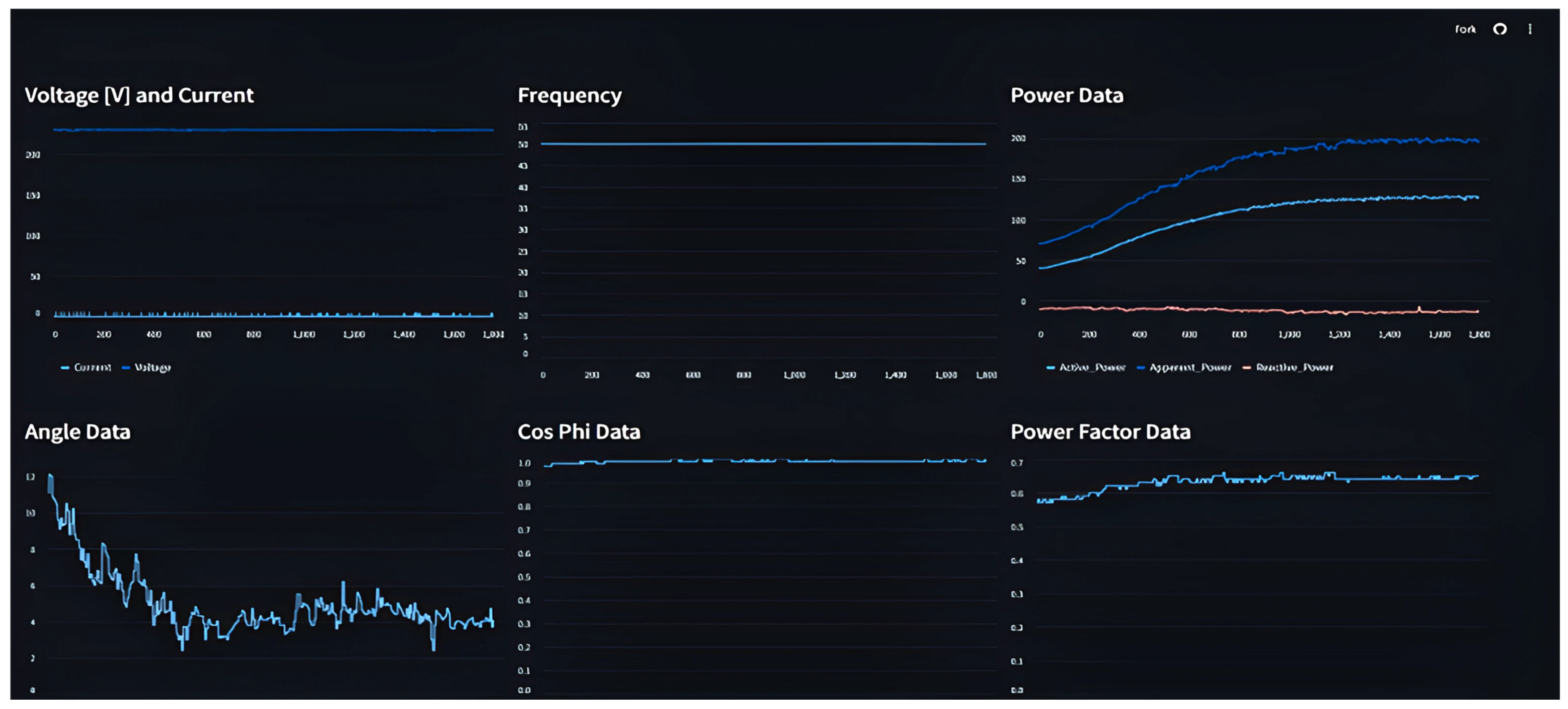
An earlier implementation example that motivated this design logic is shown in
Figure 1. The figure presents a dashboard for real-time visualization in which ranked variables were emphasized in the interface. Although this example was not based on the present IG-guided workflow, it illustrated the practical value of feature-oriented dashboard organization and motivated the development of the current framework.
In the proposed method, prioritization does not imply absolute exclusion of lower-ranked variables. Attributes with higher relevance scores are selected for the primary analytical view, while lower-ranked attributes remain secondary candidates for additional inspection when required. This distinction is important because a lower rank indicates reduced priority in the initial dashboard view, rather than a complete absence of analytical value [
12,
13,
16].
3.3. Information Gain for Attribute Prioritization
Information Gain (IG) is used in the proposed framework as the primary measure for estimating the relevance of each conditional attribute with respect to the decision attribute [
14,
15]. In classification-oriented analysis, IG quantifies how much uncertainty about the target variable is reduced when the dataset is partitioned according to a given attribute. For this reason, it provides a transparent basis for ranking attributes before their visual presentation in the dashboard.
Let
denote a labeled dataset with classes
. The entropy of the decision attribute is defined as
where
denotes the relative frequency of class
. The Information Gain of attribute
is then calculated as
where
denotes the subset of instances associated with a value or interval
of attribute
.
Within the proposed workflow, IG is not used as a final predictive criterion, but as a ranking mechanism for dashboard composition. Attributes with higher IG values are prioritized for the primary analytical view because they provide stronger class-discriminative information [
14,
15]. This choice is motivated by the fact that IG is directly aligned with the decision variable, computationally simple, and readily interpretable in exploratory visual analytics settings.
In the present study, IG was selected in preference to more complex wrapper, embedded, or uncertainty-oriented feature-selection methods because the aim of the workflow is not to optimize a predictive model, but to support transparent attribute prioritization for dashboard construction. In this context, IG provides a direct and interpretable measure of relevance with respect to the decision attribute, while remaining computationally simple and easy to communicate in a visual analytics setting. Similarly, histogram segmentation was chosen because it supports interval-level inspection of numerical distributions in a form that is directly compatible with dashboard views. More sophisticated selection or discretization strategies may be useful in other analytical settings but would introduce additional methodological complexity beyond the intended scope of the present workflow.
3.4. Histogram Segmentation and Precise Piecewise Correlation Method (PPC) Interpretation
After attribute ranking, histogram segmentation is applied to the prioritized numerical attributes to identify value intervals that support clearer inspection of class composition [
18,
20]. Instead of treating the full attribute range as a single distribution, the segmented histogram enables interval-level analysis, making it possible to observe whether class overlap decreases or class concentration increases within specific subranges.
In the present study, segmentation thresholds are determined using the fixed-point procedure adopted from prior work on histogram-based cut selection [
18]. The resulting segments are then examined in relation to the decision attribute through dashboard filtering and visual inspection. In this way, segmentation serves as the link between global attribute ranking and local class-related interpretation.
In the dashboard-oriented part of the workflow, segmentation thresholds are determined using the fixed-point procedure adopted from prior histogram-based cut-selection work [
18]. This procedure is used to define visually interpretable interval boundaries for the prioritized numerical attributes. In the compact quantitative evaluation, segment-based entropy is calculated using three interval partitions in order to maintain comparability across attributes and datasets. Accordingly, the segmentation logic serves two related but distinct purposes in the study: interval generation for dashboard inspection and interval-based uncertainty estimation for quantitative support. PPC is then used only after segmentation has been established, as a complementary interpretive layer for examining whether localized relationships within the resulting intervals are more informative than the corresponding global relationship.
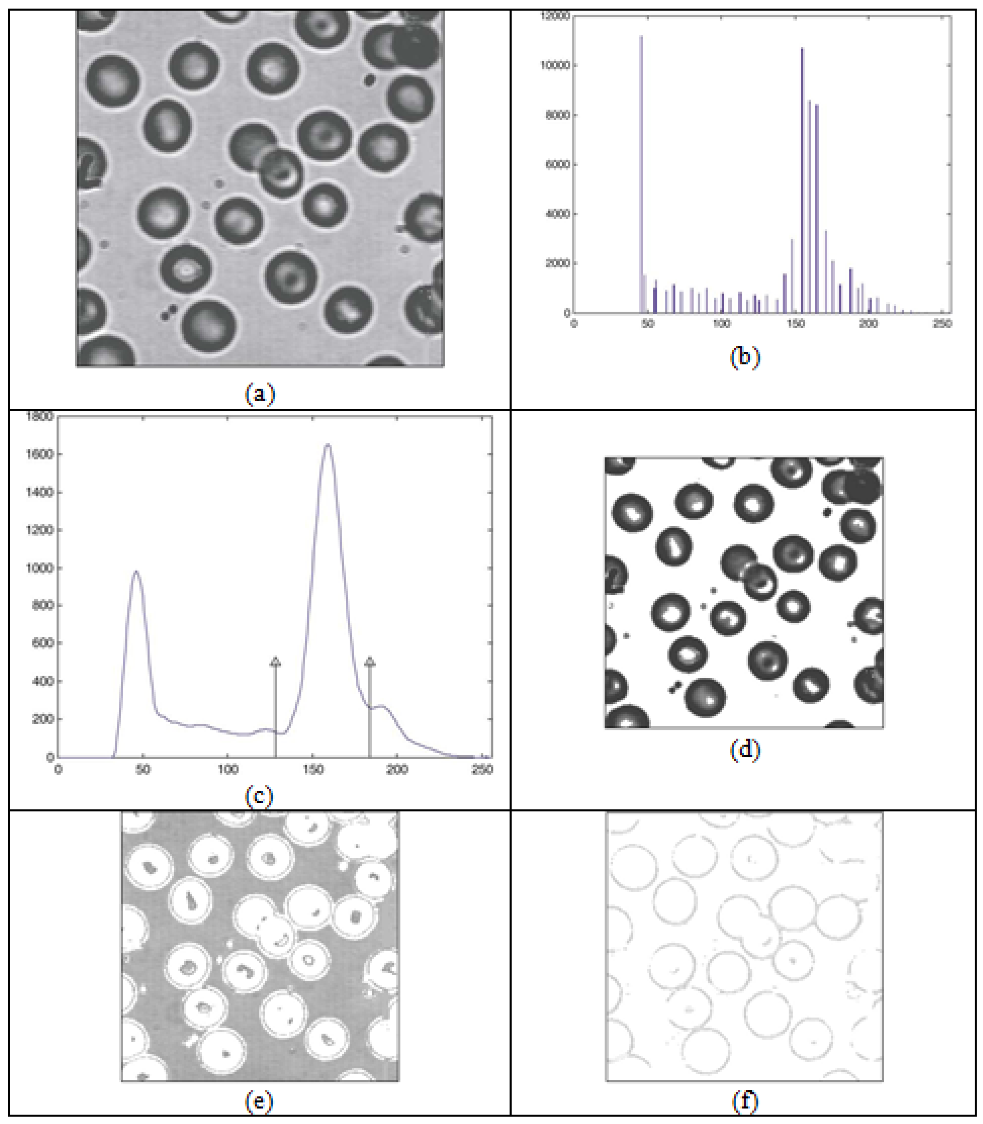
The general principle of interval-based partitioning is conceptually illustrated in
Figure 2, which shows how histogram segmentation can reveal meaningful subranges for subsequent analysis [
20]. In the present framework, this example is used only to clarify the logic of segmentation and not as a direct application setting of the proposed dashboard model.
The PPC method is used in this context as a complementary analytical layer for examining whether localized relationships within segmented ranges are more informative than the global relationship observed over the full attribute range [
20]. Accordingly, PPC is not employed as the primary attribute selection mechanism, but as an auxiliary method for localized interpretation after the ranking and segmentation steps have already been established.
In the present study, this complementary PPC-oriented role is illustrated through localized class concentration patterns observed within segmented histogram intervals. In particular, the Iris case demonstrates that the prioritized Petal Length attribute becomes more informative after segmentation, because individual intervals reveal clearer class-centered structure than the corresponding undifferentiated full-range view. In this sense, PPC is used to support localized interpretive refinement after attribute prioritization and segmentation rather than as a standalone ranking mechanism.
This interpretation is additionally illustrated in
Table 3, which shows the relationship between higher Gain Ratio values and reduced class overlap in attribute distributions. In the present study, this relationship is used to support the rationale for segment-based visual inspection of prioritized attributes.
If relevant to the interpretive context, a proportionally related view can also be expressed through Gain Ratio, which normalizes Information Gain with respect to the intrinsic information of the attribute [
17,
20]. However, the main analytical criterion adopted in this study remains Information Gain.
3.5. Proposed Visual Analytics for Dashboard Workflow
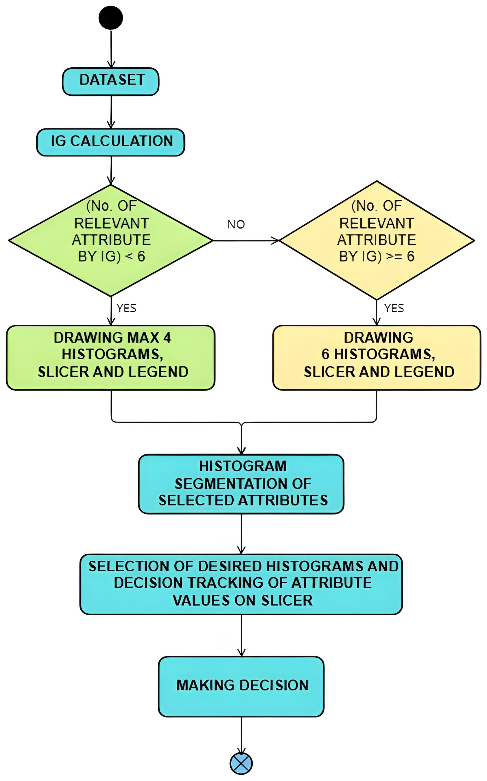
The overall workflow of the proposed method is shown in
Figure 3. The process begins with a labeled classification dataset containing numerical conditional attributes and a decision attribute. In the first step, Information Gain values are calculated for all conditional attributes with respect to the target variable [
14,
15]. The attributes are then ranked in descending order according to their relevance scores.
In the second step, the highest-ranked attributes are prioritized for the primary dashboard view. This prioritization is intended to improve interpretability and reduce visual clutter in the initial analytical view, while preserving the possibility of examining lower-ranked attributes in secondary analysis. Histogram segmentation is then performed on the prioritized attributes using threshold values determined by the fixed-point procedure [
18,
20]. The resulting segments are associated with the class distribution and explored through interactive filtering.
In the present workflow, the value of
k is not treated as a universal constant, but as a dataset-dependent parameter constrained by the intended readability of the primary dashboard view. In practical terms,
k is selected so that the number of prioritized attributes remains compatible with the proposed dashboard layouts and with the goal of preserving a manageable initial analytical layer. For this reason, the study focuses on small top-ranked subsets, and the quantitative evaluation examines the top two and top three IG-based configurations as representative cases. Lower-ranked attributes are not excluded from analysis but remain available for secondary inspection when needed. The main steps of the proposed IG-guided dashboard construction procedure are summarized in Algorithm 1.
| Algorithm 1. IG-guided dashboard construction workflow |
Input: labeled dataset with numerical conditional attributes and decision attribute
Output: dashboard with prioritized histograms, segmented intervals, slicer-based filtering, and tabular class summaries |
| 1. | Compute for each conditional attribute with respect to . |
| 2. | Rank all conditional attributes in descending order according to their IG values. |
| 3. | Select the top-k attributes for the primary dashboard view, where k is chosen according to dashboard readability and the intended size of the primary analytical layer. |
| 4. | For each selected attribute, construct a histogram over the observed numerical range. |
| 5. | Determine segmentation thresholds using the fixed-point segmentation procedure [18,20]. |
| 6. | Partition each prioritized histogram into segments defined by the computed thresholds. |
| 7. | For each segment, compute class frequencies with respect to the decision attribute . |
| 8. | Use PPC as a complementary interpretive step to inspect localized relationships within segmented ranges [20]. |
| 9. | Map prioritized histograms, segment ranges, and class summaries to dashboard components, including slicers and frequency views. |
| 10. | Enable interactive exploration of class-oriented patterns through filtering and interval-level inspection. |
3.5.1. Complexity Note
From a computational perspective, the workflow is dominated by two main steps: attribute relevance estimation and histogram segmentation. The calculation of Information Gain is performed for all conditional attributes in the dataset, after which segmentation is applied only to the prioritized subset selected for the primary dashboard view [
16,
17,
18]. Because segmentation and localized interpretation are not applied to all available variables, but only to the top-ranked attributes, the computational burden remains compatible with moderate-sized dashboard-oriented datasets. The dashboard construction stage itself is primarily based on mapping ranked attributes and segment summaries to visual components and therefore does not introduce substantial additional computational cost.
In the final step, the dashboard supports class-oriented visual inspection by linking segmented histograms, slicers, and frequency-based summaries. In this way, the workflow integrates global attribute ranking, interval-level segmentation, and localized visual interpretation into a single analytical process. The role of the dashboard is therefore not limited to presenting data but extends to supporting structured exploratory reasoning about class-related attribute behavior.
3.5.2. Implementation and Reproducibility Note
In the present implementation, the analytical workflow is divided into two layers. The computation of attribute relevance, ranking, and segmentation thresholds is performed outside the visualization layer, while the resulting prioritized attributes, histogram segments, and class-frequency summaries are transferred to the dashboard environment for interactive exploration. The dashboard is then used to support filtering, interval inspection, and comparative visual analysis of class-related patterns. This separation between analytical preprocessing and visual presentation improves the transparency of the workflow and facilitates reproducibility across datasets and application domains.
3.6. Dashboard Layout and Output Representation
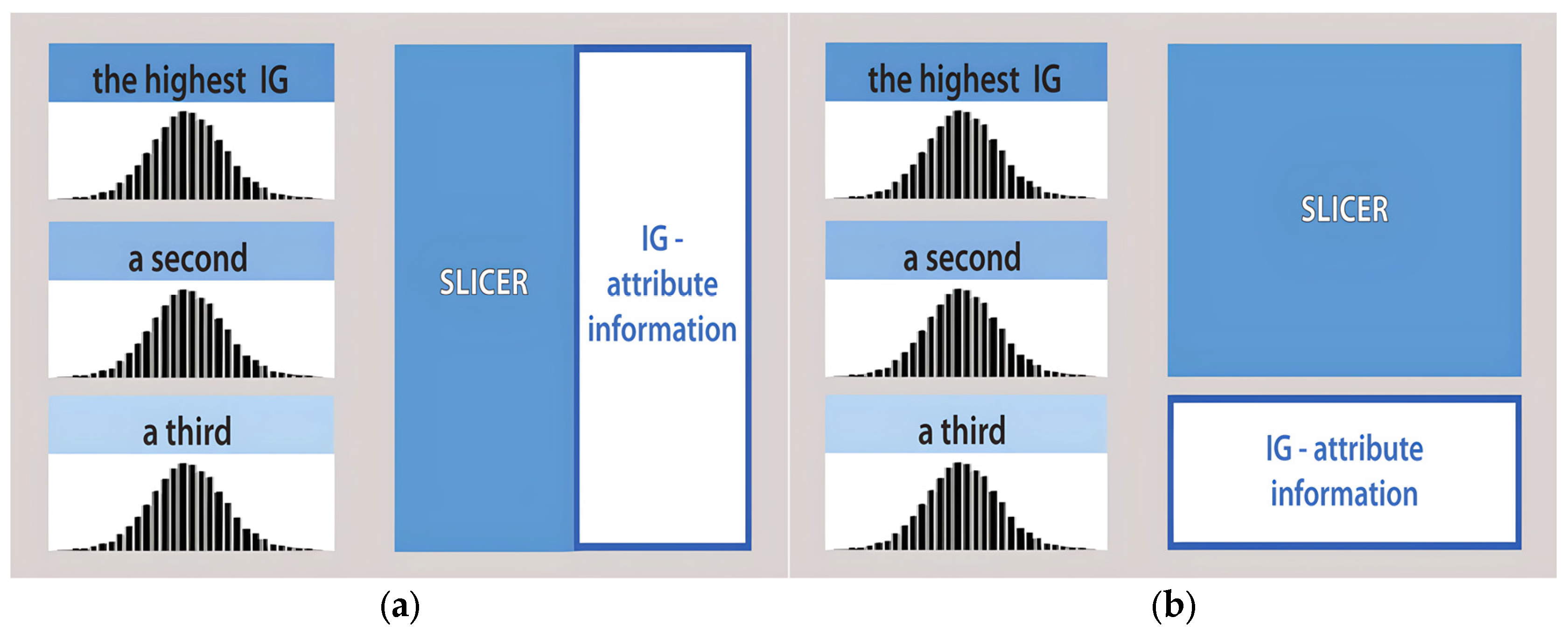
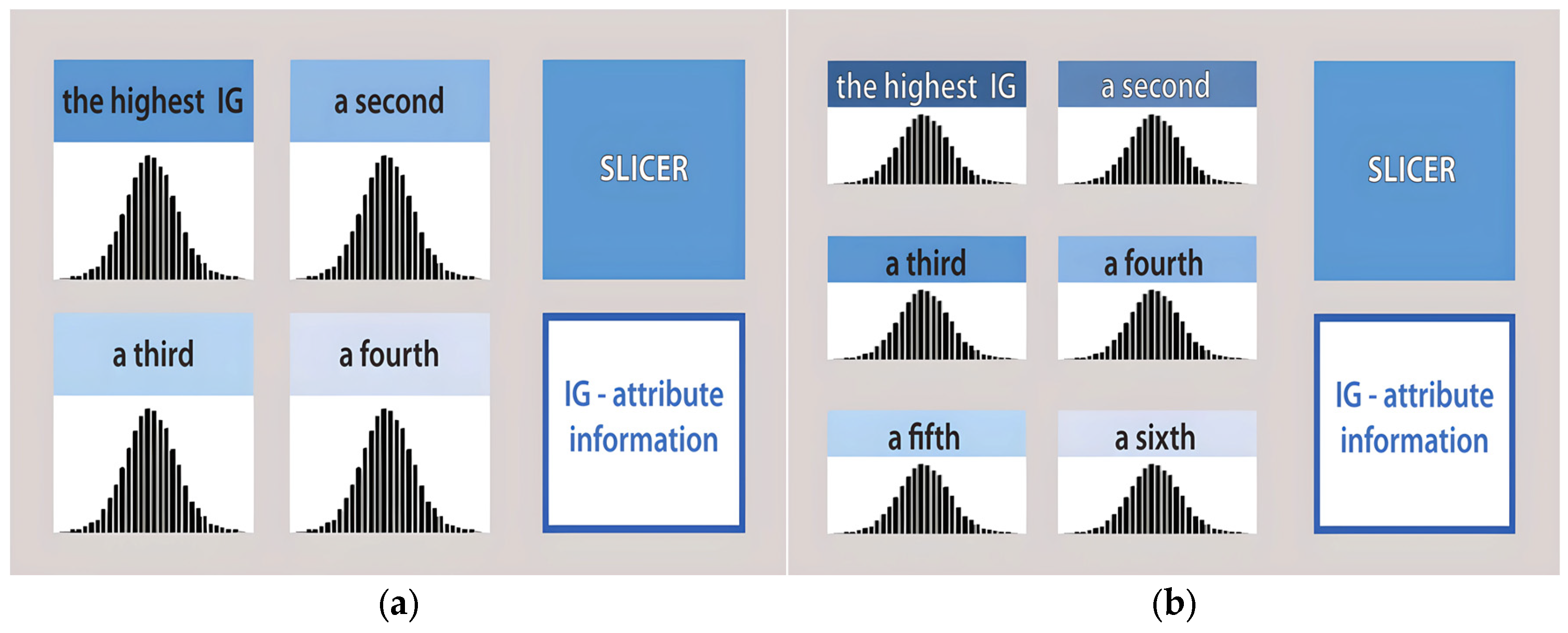
After the primary attributes have been prioritized, the dashboard can be organized using different visual arrangements depending on the number of histograms displayed. In the present implementation, the proposed layouts support views with three, four, or six prioritized attributes. These configurations are illustrated in
Figure 4 and
Figure 5. Their role in this study is practical rather than methodological: they represent implementation-oriented display options for presenting multiple segmented histograms within a single interface.
The use of multiple layout variants is intended to preserve readability while allowing the dashboard to accommodate different numbers of prioritized attributes. In this sense, the layout does not constitute a separate analytical contribution but serves as a visualization strategy supporting the proposed workflow. The primary analytical logic remains unchanged across these arrangements, since the dashboard continues to rely on IG-based prioritization, histogram segmentation, and class-oriented filtering.
In addition to graphical views, the filtered dashboard output may also be summarized in tabular form when needed. In the present study, however, the main emphasis remains on histogram-based inspection, class-oriented filtering, and comparative visual interpretation within the dashboard environment.
3.7. Quantitative Evaluation Protocol
To complement the descriptive case studies, an additional quantitative evaluation was conducted to examine whether the attributes prioritized by Information Gain retain meaningful class-discriminative information across the analyzed datasets. The evaluation was performed on the same three datasets used throughout the study: the Iris dataset, the educational dataset, and the Oil and Gas dataset.
For each dataset, the conditional attributes were ranked in descending order according to their IG values with respect to the selected decision attribute. Based on this ranking, several feature subsets were defined for comparison. These included the full attribute set, the top-ranked subsets used for the primary dashboard view, and a lower-ranked subset used as a contrast condition. In the present study, the comparison was performed using all available attributes, Top-2 by IG, Top-3 by IG, and Bottom-2 by IG, with minor adjustments when the total number of attributes was limited.
The predictive evaluation was carried out using two standard classification models: Logistic Regression and Random Forest. To reduce dependence on a single train-test split, model performance was estimated using stratified 5-fold cross-validation. For each configuration, the results were summarized using Accuracy and Macro F1-score, reported as mean values across folds.
In addition to predictive performance, a segment-based interpretability measure was introduced to examine the relationship between attribute ranking and class uncertainty within segmented histograms. For each prioritized attribute, class entropy was calculated within each histogram segment, and the resulting values were averaged across segments to obtain an estimate of average segment entropy. For this entropy-based analysis, each selected attribute was partitioned into three segments in order to preserve a comparable interval structure across datasets and to support interpretable segment-level comparison. Lower entropy values indicate more concentrated class distributions within segmented intervals and therefore support clearer class-oriented visual interpretation.
This quantitative evaluation was not intended to replace the dashboard-oriented focus of the study, but to provide an additional analytical check on the relevance of IG-prioritized attributes. In this way, it complements the visual case studies by examining whether the attributes selected for the primary dashboard view also retain useful discriminative information under standard classification settings.
3.8. Small User Study Protocol
To obtain preliminary user-centered feedback on the proposed workflow, a small task-based user study was conducted using the dashboard implementations developed in this study. The purpose of this evaluation was not to provide a full usability validation, but to examine whether participants were able to identify prioritized attributes, interpret segmented histogram intervals, and complete classification-oriented exploratory tasks using the proposed dashboard structure.
The study involved 10 participants, all of whom were master’s students. Their prior experience with dashboards, data analysis, and classification-oriented analytical tasks was assessed through a short background questionnaire. Most participants reported limited prior experience with dashboards and only basic familiarity with data analysis, which makes the study suitable as an initial test of the interpretability of the proposed workflow for non-expert users.
The task-based part of the study was organized around the core analytical functions of the proposed workflow. Participants were asked to complete four dashboard-based tasks involving the identification of the most informative attribute in the primary dashboard view, interpretation of histogram segments in relation to class behavior, comparison of displayed attributes with respect to class-oriented clarity, and use of filtering to determine class concentration within selected intervals.
The recorded measures included task completion time, number of attempts, and post-task subjective evaluation. After completing the tasks, participants filled in a study-specific 5-point Likert questionnaire focused on dashboard clarity, usefulness of the prioritized attribute view, usefulness of segmented histograms, effectiveness of filtering, and the overall perceived analytical value of the dashboard. Because the study was intended as a small exploratory evaluation focused on interpretability and analytical usefulness, a study-specific questionnaire was used instead of a standardized SUS or UEQ instrument. In addition, task success and error rates were calculated based on the proportion of correct and incorrect responses. For open-ended tasks, accepted response criteria were applied in order to account for differences in response wording and level of detail.
The results of this user study are interpreted as preliminary user-centered evidence supporting the practical interpretability of the workflow. Given the modest scale of the study, the findings are not presented as definitive usability validation, but as an additional evaluation layer complementing the case studies and compact quantitative analysis.
4. Results
This section reports the results of applying the proposed workflow to three datasets from different application domains. For each case, the analysis focuses on attribute ranking by Information Gain, the behavior of class distributions within segmented histograms, and the extent to which prioritized attributes support clearer dashboard-based inspection of class-related patterns.
4.1. Iris Dataset
The Iris dataset was used as the first case study because it represents a well-known multiclass classification problem with a clear and interpretable structure. It contains 150 instances equally distributed across three species, with four numerical conditional attributes: sepal length, sepal width, petal length, and petal width [
21]. In this analysis, the decision attribute is the species label.
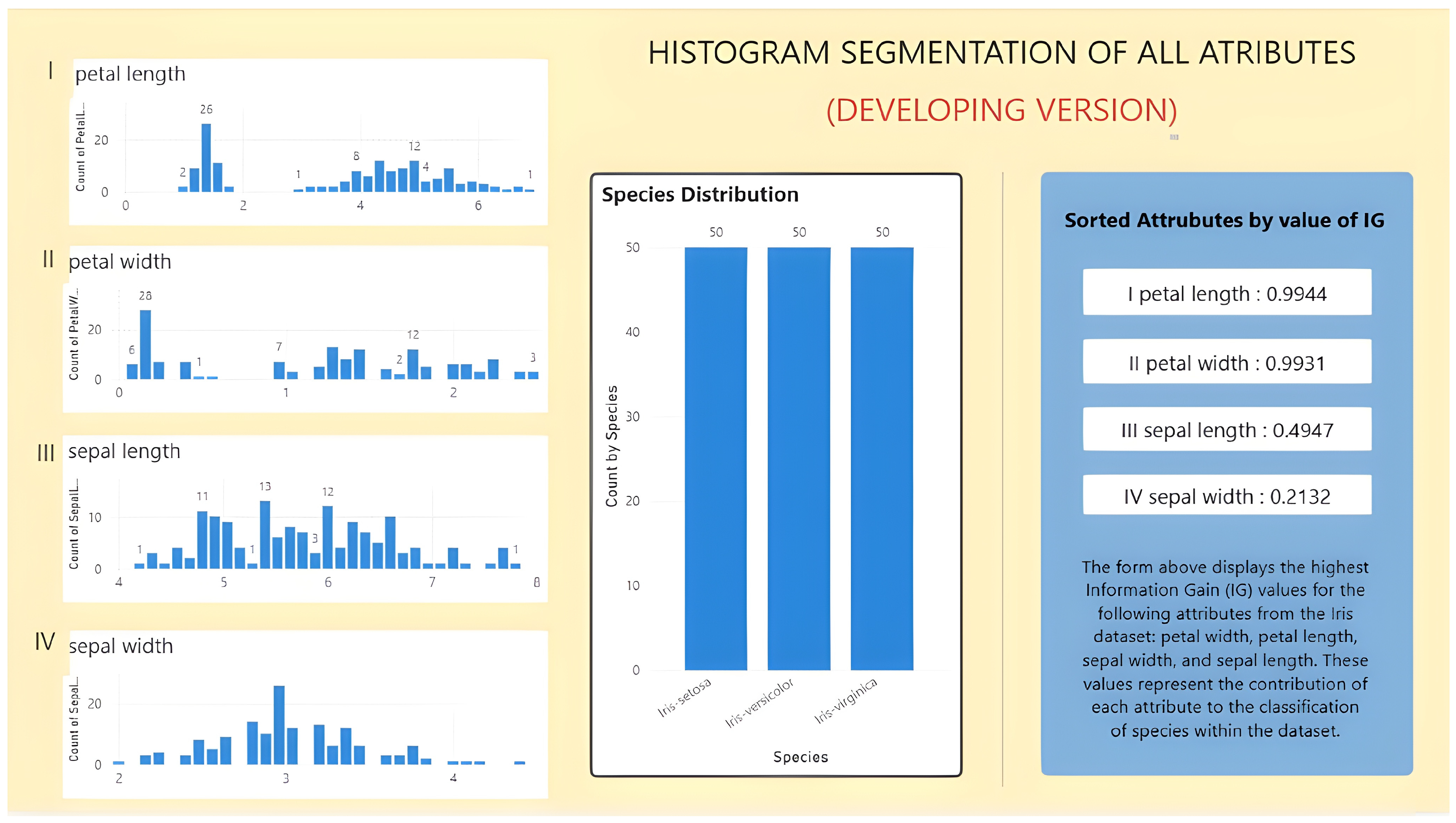
An overview of the corresponding dashboard is shown in
Figure 6. In the initial view, the four numerical attributes are displayed together with the class-frequency distribution and the Information Gain (IG) ranking. Since the classes are balanced, the ranking can be interpreted without additional adjustment for class imbalance. The results indicate that petal length has the highest IG value, followed by petal width, while sepal length and especially sepal width contribute less to class differentiation in the primary dashboard view.
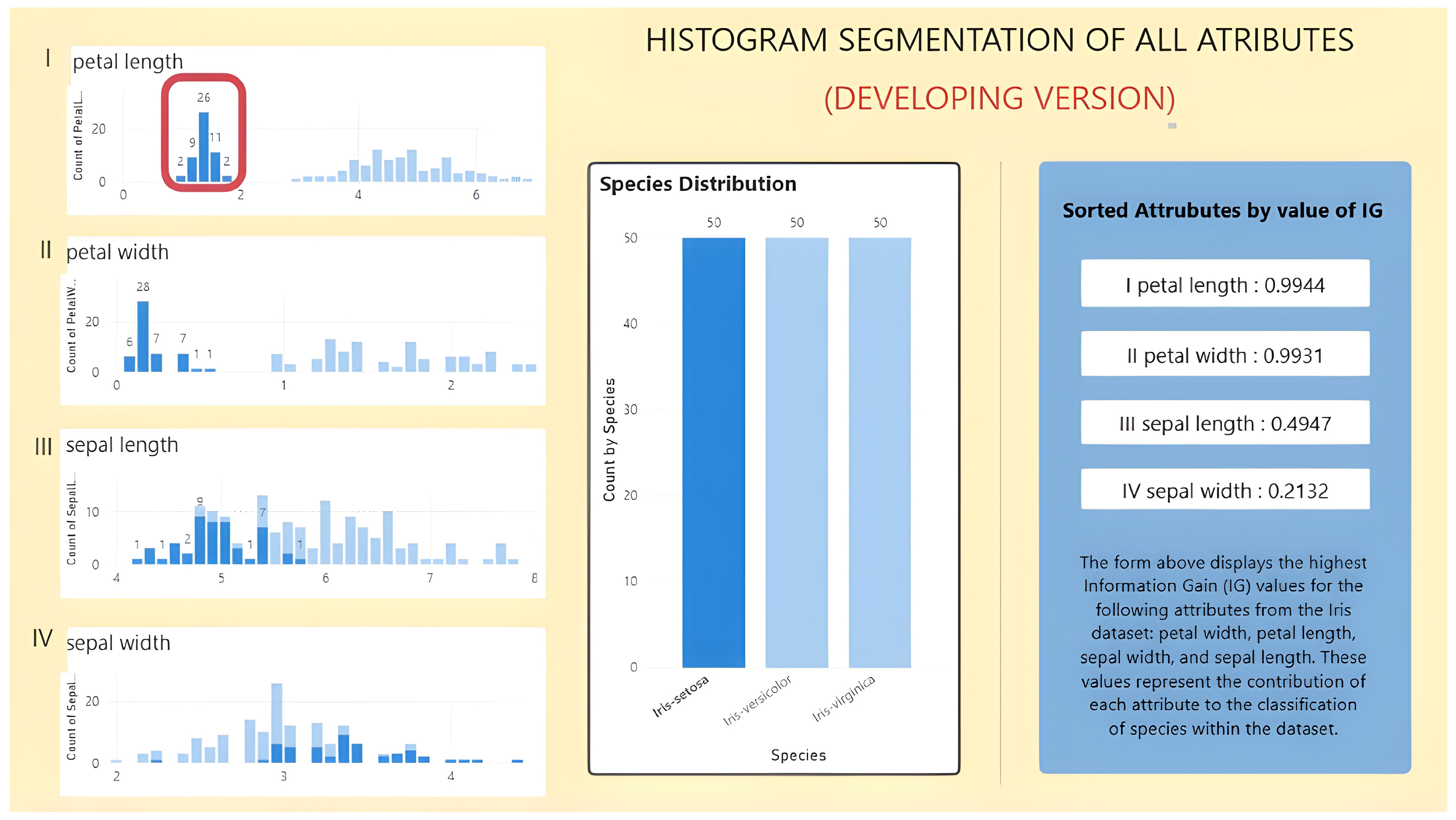
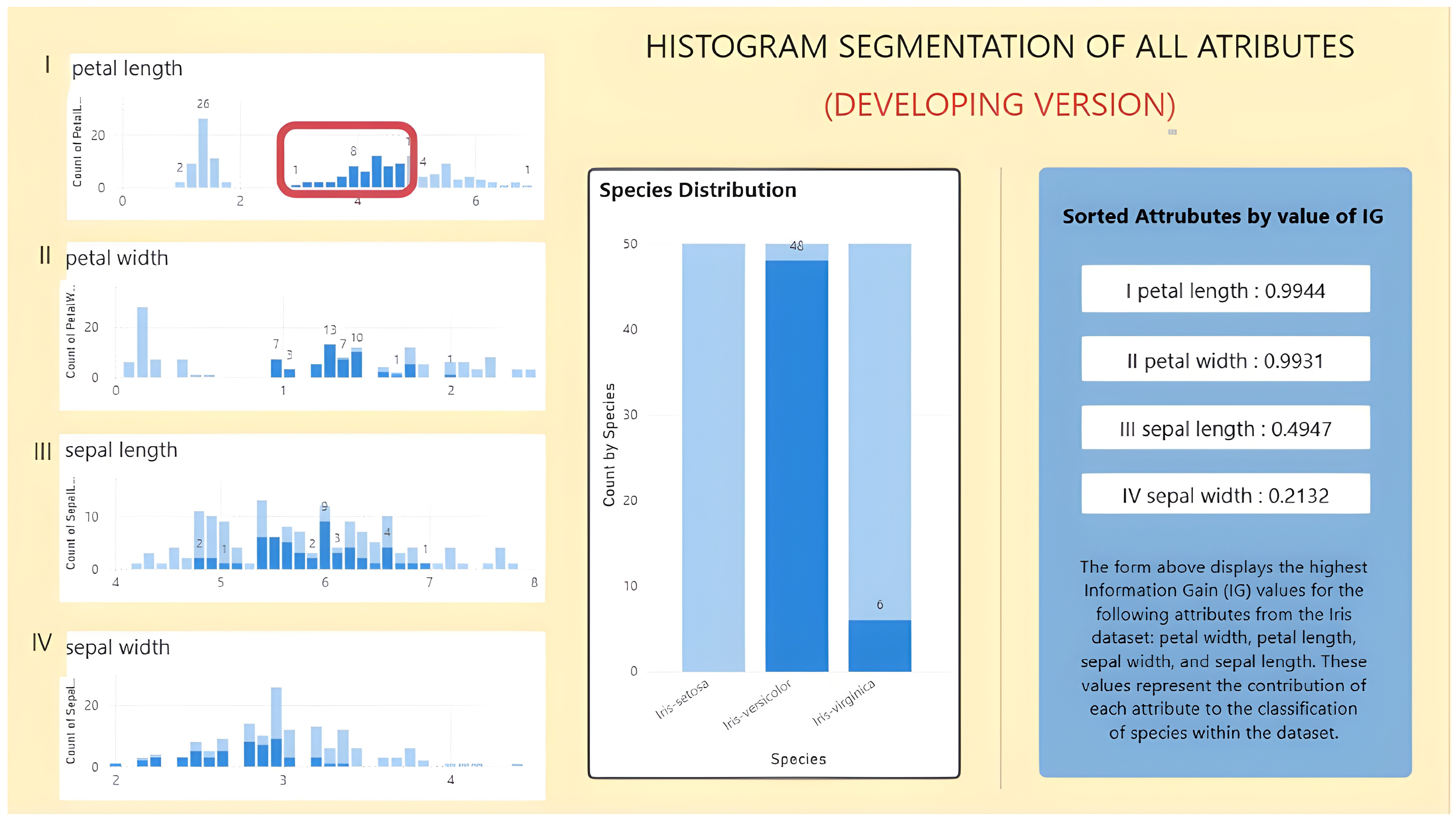
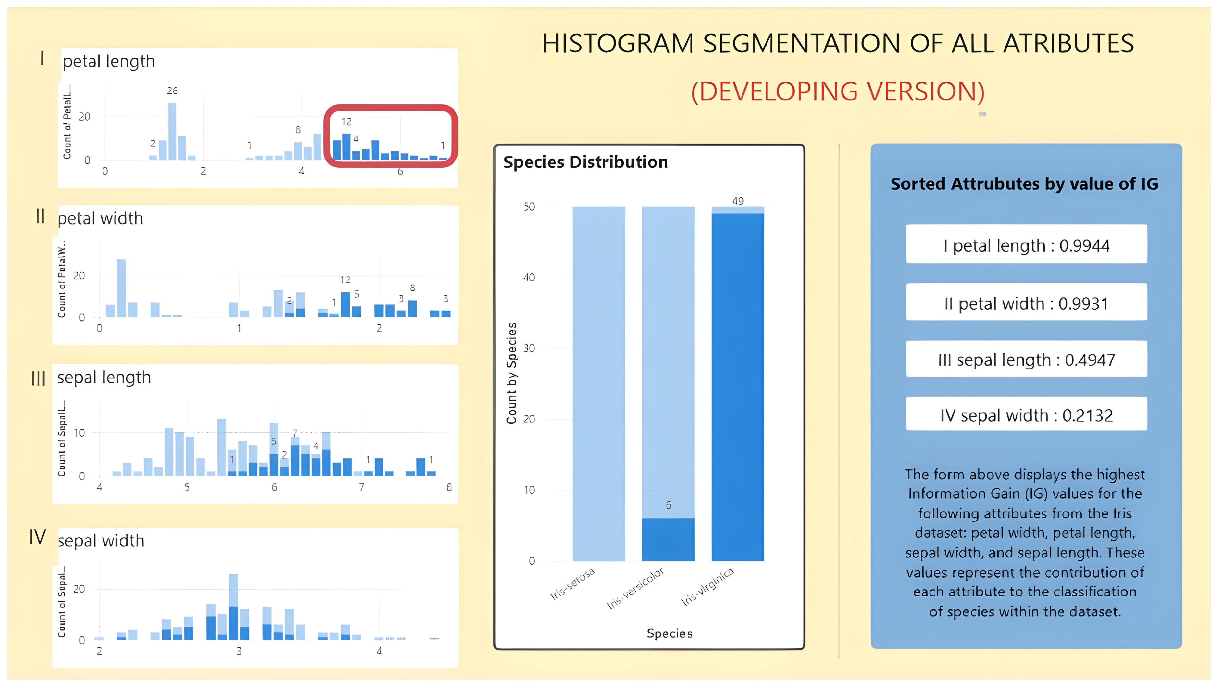
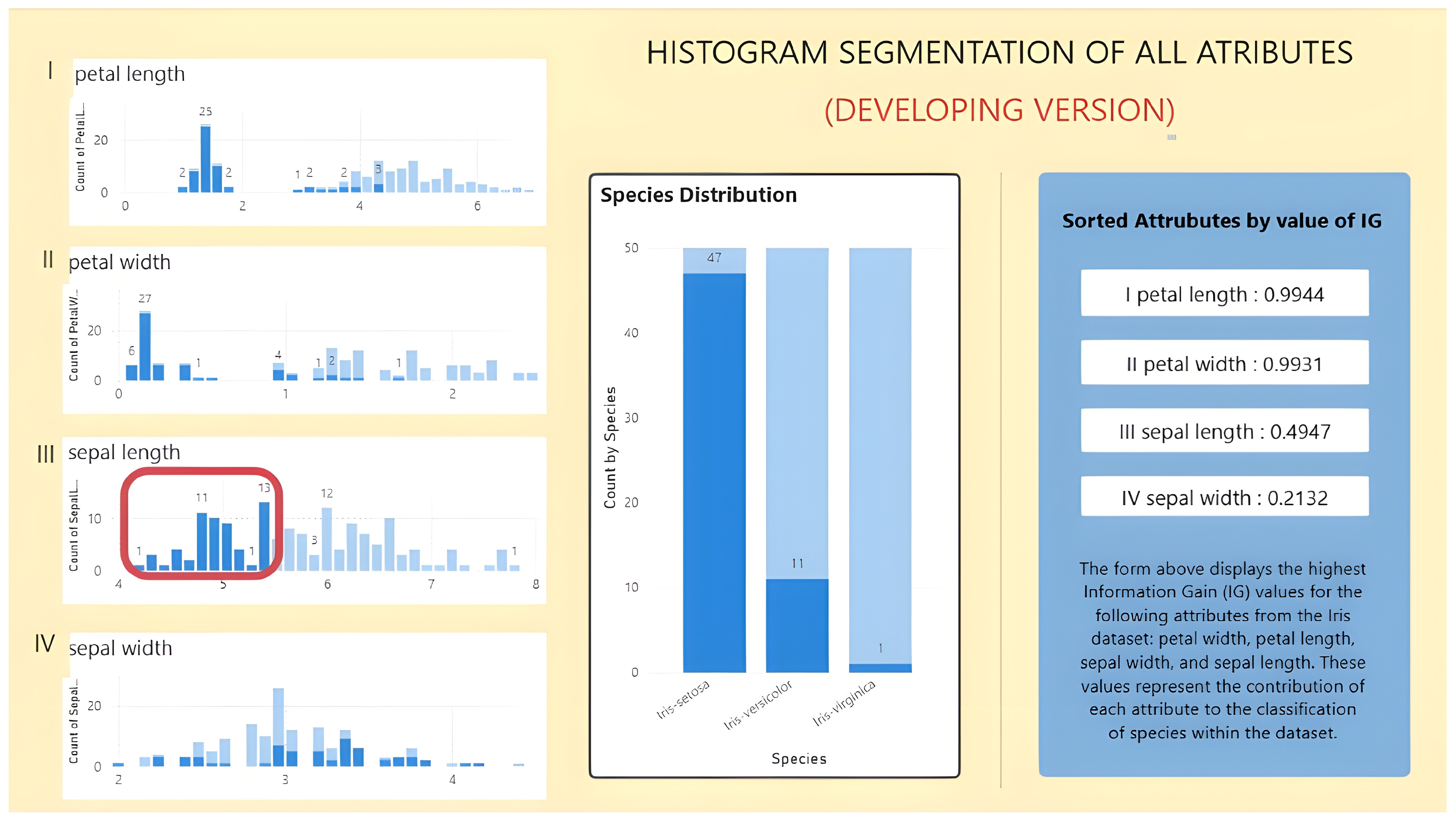
This ranking becomes clearer once the prioritized attributes are examined through segmented histograms. For petal length, the lower, middle, and upper value ranges correspond predominantly to
Iris setosa,
Iris versicolor, and
Iris virginica, respectively (
Figure 7,
Figure 8 and
Figure 9). Although some overlap remains in the middle and upper intervals, the separation is still markedly clearer than in the corresponding sepal-based views. Petal width shows a similar pattern, which further supports the interpretation that petal-related attributes are more suitable for the initial class-oriented dashboard inspection.
In interpretive terms, this interval-level separation also supports the complementary role of PPC, since the localized class behavior observed within petal-based segments is more informative than the corresponding aggregated full-range distribution. As a concrete PPC-oriented example, the Petal Length attribute illustrates how localized interpretation becomes clearer after segmentation. When the full Petal Length range is considered globally, the attribute indicates strong discriminative relevance, but the class structure remains aggregated. After segmentation, however, the interval 1.0–2.0 is associated almost exclusively with Iris setosa, whereas the middle and upper intervals are dominated by Iris versicolor and Iris virginica, respectively, with only limited overlap. This segmented representation therefore provides a more precise localized interpretive pattern than the aggregated full-range distribution. In the present workflow, this is the specific complementary role assigned to PPC: not to replace attribute ranking, but to support more precise local interpretation once the attribute has already been prioritized and segmented.
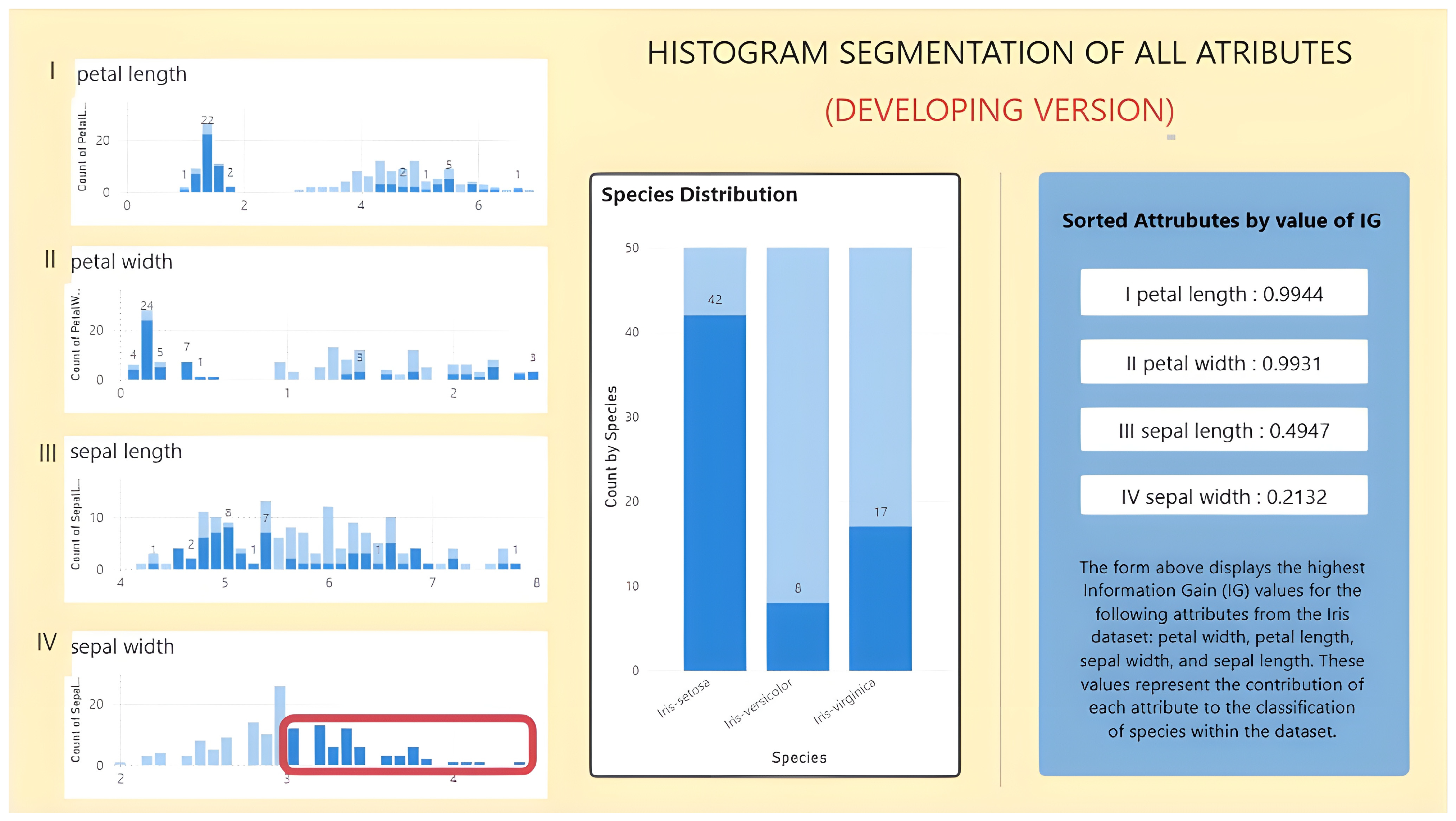
The contrast becomes evident when the lower-ranked sepal attributes are examined. As shown in
Figure 10 and
Figure 11, their segmented intervals contain broader overlap across species and less distinct class concentration. In practical terms, these attributes still provide descriptive information, but they are less effective for the primary analytical layer of the dashboard. This difference between petal- and sepal-based variables is also reflected in
Table 4, where petal-related attributes show more concentrated class frequencies within the segmented ranges.
This contrast is also reflected in
Table 4, which summarizes the segmented intervals and corresponding class frequencies for the four attributes. The table shows that petal-related attributes are associated with more concentrated class distributions, while sepal-related attributes exhibit broader overlaps.
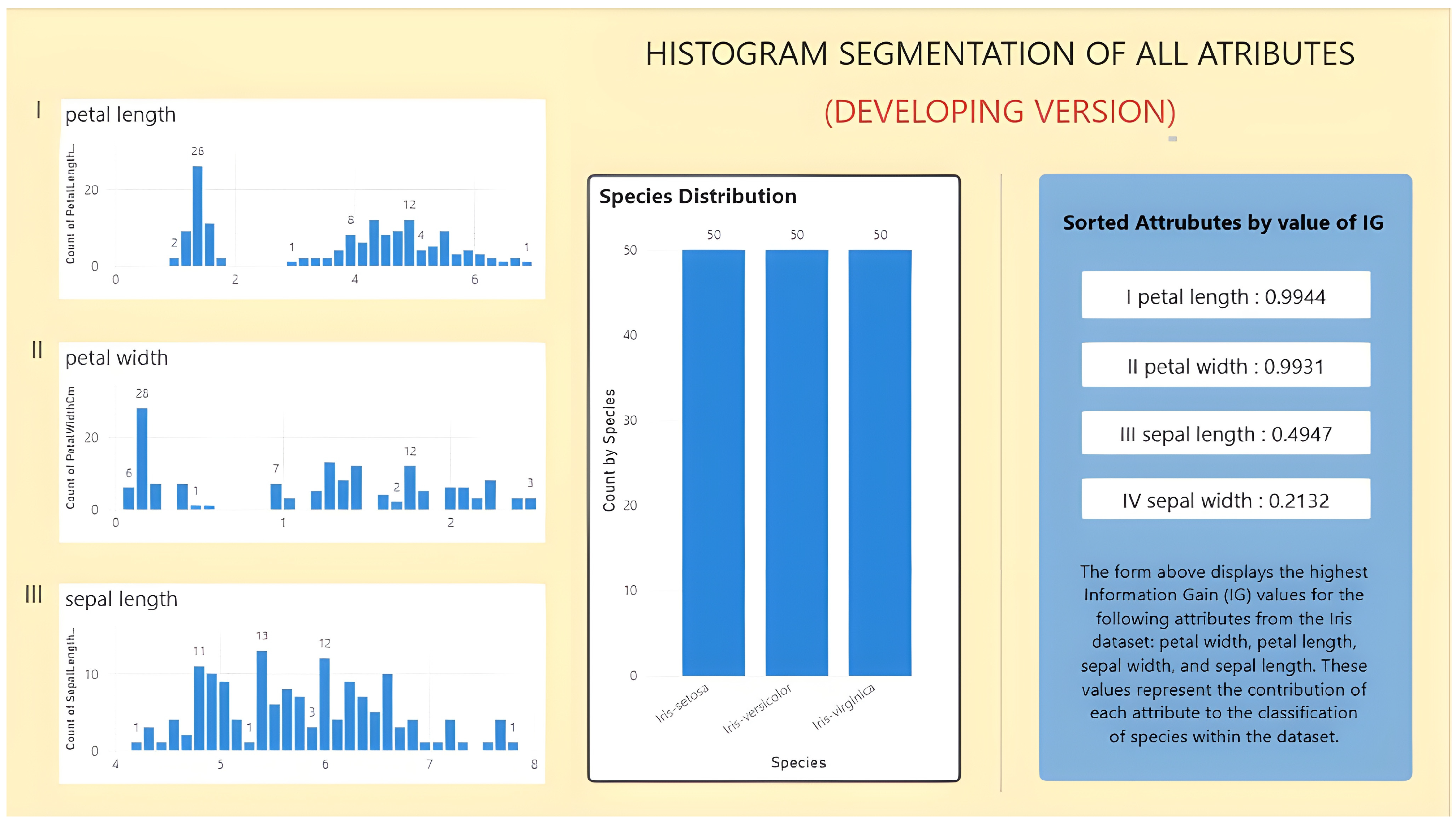
Figure 12 illustrates the resulting reduced dashboard view, in which lower-priority attributes are removed from the primary display to support a clearer initial inspection of class-related patterns.
4.2. Educational Dataset
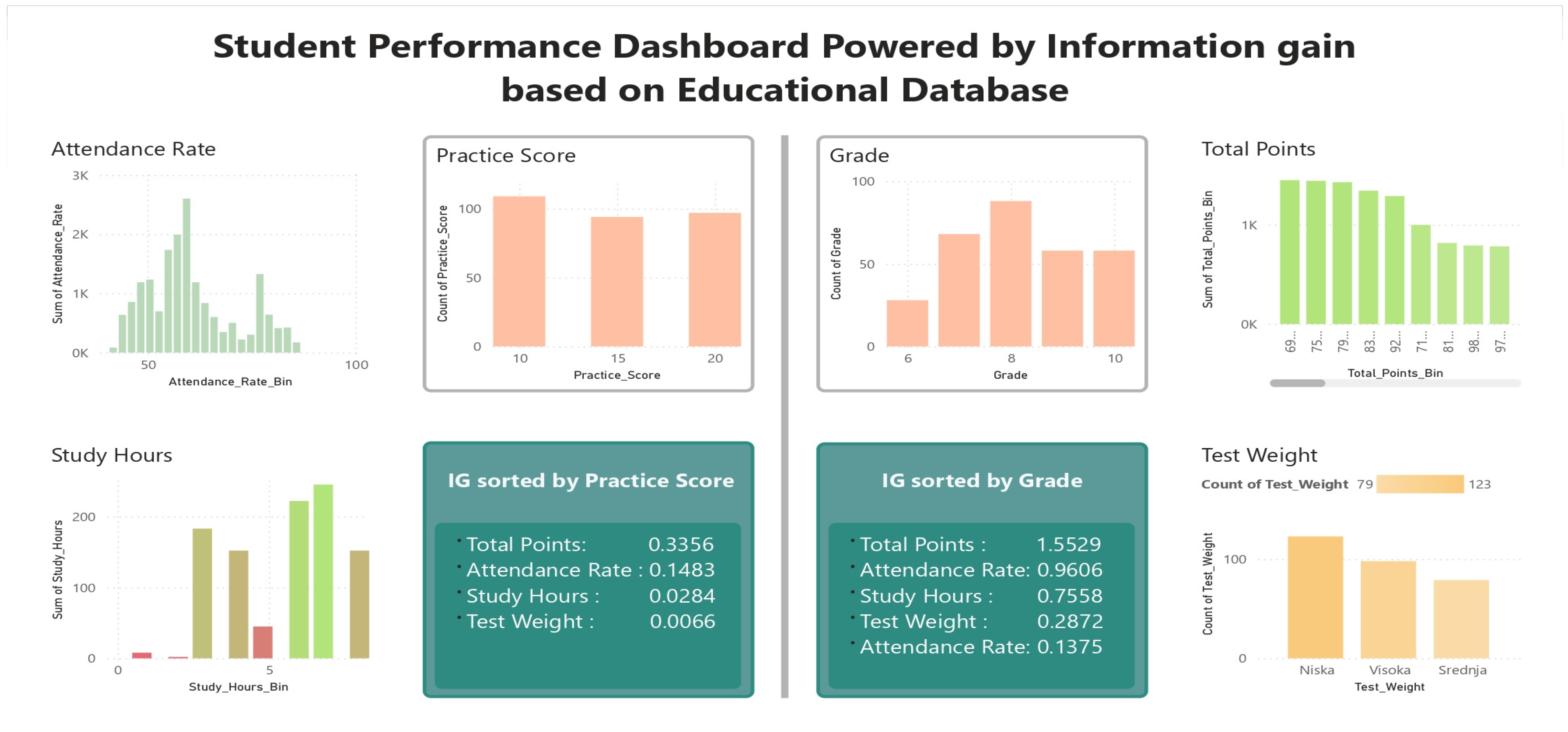
The second case study was conducted on an educational dataset to examine how the proposed workflow behaves when the same dataset is interpreted with respect to different decision attributes. The dataset includes several indicators related to student performance, such as total points, attendance rate, study hours, test weight, and practice score. In this setting, two target variables were considered: Grade, representing the overall academic outcome, and Practice Score, representing performance in practical tasks.
The results already show that attribute relevance in this dataset is not fixed but depends on the analytical objective.
Table 5 summarizes the segmented intervals, class frequencies, and IG values obtained with respect to Practice Score. In that configuration, Total Points emerges as the most informative attribute, followed by Attendance Rate, while Study Hours exhibits considerably lower discriminative relevance. This suggests that not all variables contribute equally to the primary dashboard view when the target is practical performance.
The broader dashboard view is shown in
Figure 13, where the same conditional attributes are examined under two decision-variable contexts. On one side, the dashboard is configured with respect to Practice Score; on the other, it is configured with respect to Grade. This comparison reveals one of the most important findings in the paper: the relative importance of the attributes changes when the target variable changes. While Total Points remains highly informative in both cases, Study Hours and Attendance Rate become more relevant for Grade than for Practice Score.
This result is important because it shows that the proposed workflow does not simply identify a universally dominant set of attributes. Instead, it adapts the primary dashboard view to the selected classification objective. In the educational context, this means that the same dataset can yield different analytical priorities depending on whether the focus is overall academic achievement or practical-task performance. The workflow therefore supports a more context-sensitive form of visual prioritization than a fixed ranking applied uniformly across all targets.
At the same time, Test Weight remains comparatively weak across both target settings, suggesting that it contributes less to the primary class-oriented interpretation than the other educational variables. Taken together, these results show that the educational dataset provides more than a simple demonstration case: it highlights that the usefulness of an attribute is partly determined by the target variable chosen for the analysis. This strengthens the rationale for IG-guided dashboard construction in settings where multiple decision perspectives may coexist.
4.3. Oil and Gas Dataset
The third case study was conducted on an Oil and Gas dataset in order to examine whether the proposed workflow can also be applied in an industrial setting. The dataset includes several numerical attributes related to reservoir and well conditions, such as water saturation, porosity, permeability, pressure at depth, reservoir depth, and formation temperature. The target variable is Production Level, defined through three classes: Low, Medium, and High.
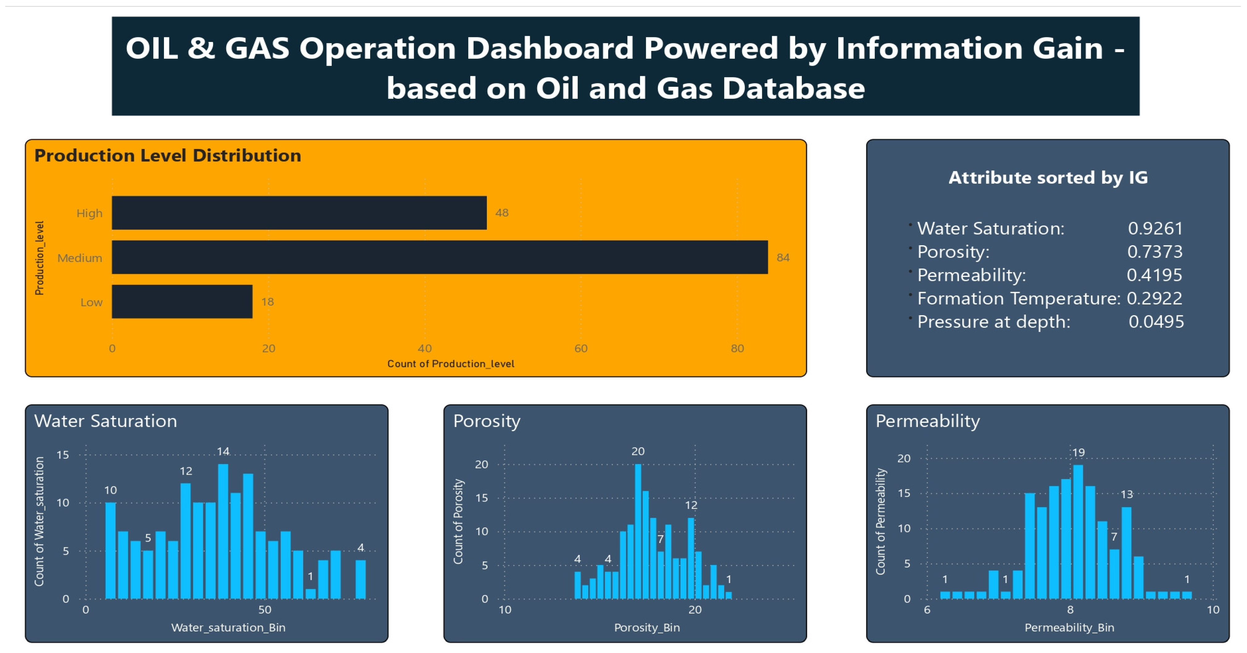
The ranking obtained by Information Gain indicates that not all geological variables contribute equally to the differentiation of production categories. As shown in
Table 6, Water Saturation has the highest relevance with respect to the target variable, followed by Porosity, while Permeability has a lower IG value. This result suggests that the most informative dashboard view in this case should be centered on the attributes that provide clearer separation between production levels.
The corresponding dashboard is presented in
Figure 14. In this view, the IG ranking panel is combined with segmented histograms of the selected attributes, allowing the production classes to be examined across different value ranges. The segmented distributions of Water Saturation and Porosity show more concentrated class patterns than the lower-ranked variables, which is consistent with their stronger relevance scores. In practical terms, this means that these attributes offer a clearer starting point for dashboard-based inspection of production-related structure.
Compared with the previous two case studies, the Oil and Gas dataset introduces a substantially different domain context. Nevertheless, the same analytical procedure remains applicable. The attributes are first ranked with respect to the decision variable, then inspected through segmented histograms, and finally interpreted through the dashboard as a primary visual layer for class-oriented exploration. This supports the view that the proposed workflow is not restricted to a single type of dataset but can be transferred to application domains with different semantics and measurement structures.
Taken together, the results from this case study show that the proposed workflow can also be used to organize dashboard inspection in an industrial classification context. In this example, the IG-guided selection of primary attributes and their segmented visual analysis provide a more structured way of examining how geological variables relate to production-level categories.
4.4. Quantitative Evaluation
To complement the descriptive case studies, a quantitative evaluation was conducted to examine whether the attributes prioritized by Information Gain retain meaningful class-discriminative information under standard classification settings. For each dataset, predictive performance was compared across the full feature set, top-ranked subsets, and lower-ranked subsets. In addition, segment-based class entropy was used as an interpretive measure of class concentration within histogram intervals.
The predictive results are summarized in
Table 7. Across the examined datasets, the top-ranked subsets retained a substantial portion of the discriminative information contained in the full attribute set, while the lower-ranked subsets generally produced weaker results. In the Iris dataset, the Top-2 by IG subset achieved the same performance as the full feature set for both Logistic Regression and Random Forest, whereas the Bottom-2 by IG subset led to a marked reduction in both Accuracy and Macro F1. This supports the selection of petal-related attributes for the primary dashboard view.
A similar pattern was observed in the educational dataset. When Grade was used as the target, the Top-2 by IG subset slightly outperformed the full feature set for both models, while the Bottom-2 by IG subset yielded substantially weaker results. This finding is particularly important because it suggests that the attributes prioritized for the primary dashboard view are not only visually informative but also retain strong predictive discrimination in a standard classification setting.
The Oil and Gas dataset showed the same overall tendency. The Top-2 by IG and Top-3 by IG subsets achieved performance comparable to, or slightly stronger than, the full feature set, whereas the Bottom-2 by IG subset performed considerably worse. This result indicates that the proposed prioritization logic remains meaningful even when transferred to a domain-specific industrial dataset.
Table 8 complements the predictive evaluation by examining class uncertainty within segmented histograms. In general, attributes with higher IG ranks tended to exhibit lower average segment entropy, indicating more concentrated class distributions within the selected intervals. This was particularly evident in the Iris dataset, where petal-related attributes showed substantially lower entropy than sepal-based attributes, and in the Oil and Gas dataset, where Water Saturation and Porosity exhibited lower segment entropy than lower-ranked geological variables.
Taken together, the quantitative results support the main analytical logic of the proposed workflow. The attributes prioritized for the primary dashboard view retain meaningful predictive information, while their segmented histograms also exhibit lower local class uncertainty. In this sense, quantitative evaluation does not replace the visual case studies but strengthens the argument that IG-based prioritization provides a coherent basis for dashboard-oriented classification analysis.
4.5. Comparative Summary Across Datasets
Taken together, the three case studies and the quantitative evaluation show that the proposed workflow consistently identifies attributes that are more suitable for the primary dashboard view in classification-oriented analysis. Across all examined datasets, Information Gain distinguished between variables that retained strong class-discriminative information and those whose contribution was substantially weaker in both predictive and segment-based terms. This pattern was evident not only in the visual case studies, but also in the quantitative evaluation, where top-ranked IG subsets preserved performance close to, or in some cases better than, the full feature set, while lower-ranked subsets performed considerably worse. The entropy-based analysis of segmented histograms further supported this result by showing that higher-ranked attributes tend to exhibit lower local class uncertainty within the selected intervals.
Overall, the results indicate that the combination of IG-based attribute ranking and segmented histogram inspection provides a coherent basis for dashboard-oriented exploration of class-related patterns. Rather than claiming universal superiority of any single attribute subset, the findings support the use of prioritized primary views that can be adapted to dataset-specific and target-specific structure while preserving the possibility of secondary inspection of lower-ranked variables.
4.6. Small User Study Results
To complement the analytical and quantitative evaluation, a small user study was conducted to obtain preliminary user-centered feedback on the interpretability and practical usability of the proposed dashboard workflow.
In
Table 9, SD refers to the standard deviation and is reported to show the degree of variation in task completion time and number of attempts across participants. Success and error rates were calculated from the proportion of correct and incorrect responses for each task; for open-ended responses, accepted response criteria were used.
The task-based results are summarized in
Table 9. Participants were generally able to complete the dashboard-based analytical tasks with a relatively small number of attempts and a satisfactory level of response accuracy. The most demanding task was Task 1, which required identification of the most informative attribute in the primary dashboard view. This task had the highest mean completion time (
99.5 s) and the highest mean number of attempts (1.8), while also achieving a success rate of 80%. Task 2 and Task 3 required interval-level and comparative interpretation and showed intermediate completion times of 72.0 s and 63.3 s, respectively, with success rates of 70% and 80%. By contrast, Task 4 was completed most efficiently, with a mean completion time of 29.4 s, a mean attempt count of 1.0, and a success rate of 100%, indicating that participants were generally able to use filtering and interval-based class identification with comparatively little difficulty.
For Tasks 2 and 4, accepted response criteria were used because the answers were open-ended and varied in their degree of specificity, even when they reflected the same underlying analytical interpretation.
The response patterns were also consistent with the analytical logic of the proposed workflow. In the tasks involving identification of the most informative attribute and comparison of class-oriented attribute views, most participants selected petal length, which is aligned with the Information Gain ranking and segmented histogram analysis in the Iris case study. The filtering-based task also produced largely consistent answers, suggesting that participants were generally able to connect selected intervals with dominant class behavior.
In
Table 10, SD denotes the standard deviation and is reported to indicate the variability of participant responses across the post-task questionnaire items.
The questionnaire results reported below are based on a study-specific 5-point Likert instrument designed for this preliminary task-based evaluation. The post-task questionnaire results indicate that participants evaluated the dashboard very positively. The highest ratings were obtained for the usefulness of segmented histograms in identifying class-related differences, the analytical usefulness of the dashboard for research-oriented work, and the support it provided for data-based reasoning, all of which received a mean score of 5.0. The usefulness of interactive filtering and the ease of associating selected intervals with the corresponding class also received very high scores (4.9 each). The lowest mean score was recorded for general ease of understanding (4.1), although this value remained clearly positive. This pattern suggests that participants regarded the dashboard as analytically useful and structurally supportive, even though a small degree of initial interpretive effort was still present.
At the same time, the scope of this study remains limited. Because the evaluation was conducted on a small participant group and under a task-based exploratory design, the results should be interpreted as preliminary user-centered evidence rather than as definitive proof of usability or decision-support effectiveness.
The open-ended responses were broadly consistent with the quantitative questionnaire results. Participants most often emphasized the clarity of the visual presentation, the usefulness of filtering, and the value of histogram segmentation for understanding class-related patterns. The most common suggestions for improvement concerned easier navigation, additional filtering options, and clearer visual guidance for interval-level inspection. These comments indicate that the general workflow was well accepted, while also pointing to practical directions for interface refinement in future implementations.
5. Discussion
The results across the three case studies provide a basis for discussing both the analytical value and the limitations of the proposed workflow. Rather than treating the dashboards only as visualization outputs, the discussion focuses on what the observed attribute rankings and segmented histograms imply for classification-oriented dashboard analysis, how these findings vary across domains, and which methodological constraints remain.
5.1. Interpretation of the Main Findings
The results obtained across the three datasets indicate that the proposed workflow can support a structured primary dashboard view for classification-oriented analysis. In all cases, Information Gain made it possible to distinguish between attributes that offered clearer class-related structure and those whose distributions were less informative in the initial analytical layer. This supports the use of attribute prioritization as a practical mechanism for reducing visual clutter while preserving the variables most relevant to the selected decision attribute.
The visual case studies and the quantitative evaluation point in the same direction. In the Iris dataset, petal-related attributes emerged as clearly more informative than sepal-based variables, both in segmented histogram inspection and in predictive comparison of IG-ranked subsets. In the educational dataset, the relevance of attributes varied with the selected target, showing that the most suitable primary dashboard view depends not only on dataset structure, but also on the analytical objective. In the Oil and Gas dataset, the same workflow remained applicable despite the domain shift, suggesting that the proposed approach can be transferred across datasets with substantially different semantics and measurement structures. This interval-level perspective also supports the complementary interpretive role assigned to PPC in the proposed workflow, because the segmented view reveals localized class-centered patterns that are less clearly visible in the corresponding aggregated full-range distributions.
The additional quantitative evaluation strengthened these observations by showing that top-ranked IG subsets retained a substantial share of the discriminative information contained in the full feature sets, whereas lower-ranked subsets generally performed less favorably. The small user study complemented this analytical evidence by indicating that participants were generally able to interpret prioritized attributes, segmented intervals, and filtering-based class patterns with positive subjective evaluations of dashboard clarity and usefulness. This tendency was visible across all three datasets and was further supported by the entropy-based segment analysis, where higher-ranked attributes tended to exhibit lower local class uncertainty. Taken together, these findings suggest that the main value of the proposed workflow lies in connecting attribute relevance estimation, segmented distribution analysis, and dashboard construction logic within a single classification-oriented visual analytics process.
5.2. Methodological Implications and Limitations
From a methodological perspective, the proposed workflow shows that attribute ranking can be used not only as a preprocessing step for predictive modeling, but also as a practical basis for organizing the primary dashboard view. By linking Information Gain with histogram segmentation and localized inspection, the workflow provides a structured way of selecting which attributes should receive visual priority in classification-oriented dashboard analysis. The compact quantitative evaluation further supports this logic by showing that IG-prioritized subsets can retain meaningful predictive information while also exhibiting lower local class uncertainty in segmented views. In addition, the small user study provided preliminary user-centered support for the interpretability of the dashboard structure, particularly with respect to the usefulness of prioritized attributes, segmented histograms, and interactive filtering.
At the same time, several limitations should be acknowledged. First, the visual layer of the proposed workflow remains primarily univariate. Each prioritized attribute is inspected through its own segmented histogram, which supports interval-level analysis but does not explicitly capture class boundaries that emerge only through combinations of multiple variables. For this reason, the workflow should not be interpreted as a substitute for multivariate modeling or higher-dimensional decision analysis.
Second, attribute prioritization in the proposed framework should not be understood as absolute exclusion of lower-ranked variables. A lower IG value indicates reduced priority in the primary dashboard view, but not complete analytical irrelevance. Lower-ranked attributes may still provide contextual or domain-specific information and can remain available for secondary inspection. This distinction is particularly important in datasets where useful information is distributed across several variables rather than concentrated in a small top-ranked subset.
Third, although the study now includes both a compact quantitative evaluation and a small user study, the scope of validation remains limited. The quantitative evaluation was designed to support the analytical rationale of the workflow rather than to establish universal superiority over alternative feature-selection, visualization, or classification strategies. Similarly, the user study was conducted on a relatively small participant group and should therefore be interpreted as preliminary user-centered evidence rather than as a definitive usability evaluation. Accordingly, the study does not claim that the proposed workflow universally improves user performance, but rather that it provides an analytically grounded and preliminarily supported basis for structuring the initial dashboard view.
Finally, the practical implementation presented in this study separates the analytical preprocessing layer from the dashboard visualization layer. This improves transparency and reproducibility but also means that some configuration steps remain dependent on implementation choices, including the number of attributes shown in the primary view and the final arrangement of dashboard elements. The proposed workflow should therefore be understood as a structured analytical framework for dashboard construction, rather than as a fully automated end-to-end system.
5.3. Future Work
Several directions for future research follow from the present study, even though the current version already combines cross-domain case studies, compact quantitative evaluation, and preliminary user-centered feedback. A priority is the extension of the evaluation framework beyond the current scope. Future work should include broader comparison with alternative feature-selection strategies, more extensive classification benchmarks, and larger user-centered studies examining interpretability, usability, and decision-support performance in dashboard-based analytical tasks. In addition, future larger-scale user-centered evaluations may incorporate standardized usability instruments such as SUS to complement the preliminary study-specific questionnaire used in the present work. Such an evaluation would make it possible to assess the practical effects of attribute prioritization and segmented histogram inspection more systematically across datasets and user groups.
A second direction concerns methodological extension beyond the current univariate visual layer. While the present workflow focuses on attribute-wise histogram inspection, future studies may investigate how pairwise or multivariate views can be incorporated without undermining interpretability. This would be particularly relevant for datasets in which class-related structure is not clearly visible in one-dimensional attribute distributions but becomes more apparent when variables are considered jointly.
A further direction is the development of more adaptive dashboard configurations. In the current study, the primary dashboard view is organized through Information Gain-based prioritization and fixed segmentation procedures. Future work may investigate whether this process can be made more responsive to context, target selection, or user interaction, thereby enabling dashboard views that adapt more flexibly to analytical needs while preserving methodological transparency.
In this context, a promising research direction is the integration of agent-based support for adaptive visual analytics. Rather than treating the dashboard as a static endpoint of the workflow, future systems may incorporate agent-based mechanisms for tasks such as dynamic attribute prioritization, context-aware dashboard configuration, and user-guided interpretive assistance. Such an extension would preserve the analytical core of the present approach while embedding it in a broader decision-support framework capable of more adaptive and interactive behavior across application domains.
6. Conclusions
This study presented a dashboard-oriented visual analytics workflow for classification-related exploratory analysis based on Information Gain-driven attribute prioritization, histogram segmentation, and complementary localized interpretation through the PPC method. The workflow was examined on three datasets from different domains to assess whether the same analytical logic can support dashboard-based inspection across distinct application contexts.
The results indicate that Information Gain can provide a useful basis for organizing the primary dashboard view by distinguishing between attributes that offer clearer class-related structure and those that are less informative in the initial analytical layer. Segmented histogram inspection further supported this prioritization by revealing interval-level differences in class concentration and overlap. The quantitative evaluation complemented these findings by showing that top-ranked IG subsets retained a substantial share of the discriminative information contained in the full feature sets, whereas lower-ranked subsets generally performed less favorably. The entropy-based analysis additionally showed that higher-ranked attributes tend to produce lower local class uncertainty within segmented intervals.
The small user study provided preliminary user-centered support for the interpretability of the proposed workflow. Participants generally evaluated the dashboard positively, particularly with respect to the usefulness of prioritized attributes, segmented histograms, filtering, and the overall support for analytical reasoning. These findings do not constitute full usability validation, but they do strengthen the practical relevance of the workflow beyond purely descriptive case study analysis.
The main contribution of this study lies not in proposing a new standalone metric but in formalizing how established analytical components can be combined into a coherent dashboard workflow. At the same time, the approach remains limited by its primarily univariate visual layer, modest evaluation scope, and the preliminary nature of the user-centered evidence. Future work should therefore focus on broader comparative evaluation, larger user studies, multivariate extensions, and more adaptive forms of dashboard support.



 ,
,