1. Introduction
Flooding is the most common and costly natural hazard affecting Canadians today [
1]. Floods occur throughout the country, but most of the worst flooding events have happened in southern regions, affecting hundreds of thousands of people and costing billions of dollars in damage [
2]. In addition, scientists expect an increase of flooding events and damage costs in riparian, coastal, and urban areas of the country [
3]. Flooding poses a serious risk to households and communities across Canada. In the spring of 2019, for instance, flooding in eastern Canada cost more than CAD 200 million in insured losses and damage to nearly 20,000 properties [
4]. Despite such impacts, Canadians are largely unaware of the flood risk they face. According to a survey published in 2016 based on 2300 households by the Interdisciplinary Center on Climate Change by Partners for Action at the University of Waterloo [
4], only 6% of Canadians living in a designated flood risk area are aware of the risk, and only 21% believe that the risk of flooding will increase over the next 25 years. Furthermore, Canadians need and want more information on how to be actively engaged in flood management and how to improve their resilience. In this context, efforts are being made to reduce the impacts of flooding events by increasing public awareness through communication of flood hazards and popularization of flood risk reduction measures.
Communication plays an important role in flood risk management since it has the power to raise risk awareness on potential flood hazards, educate and motivate the population at risk to take preventive actions, and to be prepared in the case of an emergency. Information tools in flood risk communication aim to inform the people about risks in their residential zone. Various research projects have been conducted to better understand the mechanisms of effective flood hazard communication [
5,
6,
7,
8]. Mees et al. [
9], for example, have demonstrated the need for accessible communication tools to raise awareness of flood and climate change impacts. The use of flood risk maps to show the potential severity of floods and locations at risk has been shown to improve citizen response to floods in the United Kingdom [
10]. Flood maps can be used to different ends, such as hazard and risk identification and land use planning. They can be used for many aims and by various users, such as identifying which properties should adopt flood-proofing measures and educating the public about local flood risks. Different forms of flood maps exist and it is important to distinguish flood hazard maps from flood risk maps. Flood hazard maps [
11] show flood depth and water extent for given events, whereas flood risk maps [
12] indicate the potential consequences of floods on properties and social, economic, environmental, and cultural assets, along with the global risk faced by a community to certain flood scenarios. De Moel et al. [
13] highlighted that flood hazard maps are the most common type of flood maps, followed by flood risk maps.
The use of online interactive communication tools such as story maps to dispense information is becoming increasingly popular. Such web applications facilitate communication by illustrating complex scientific data in an accessible format to specific target groups. Besides being informative for target users, story maps should also be easy to understand and use. Web-based story maps can be static or dynamic. While static webmaps are based on fixed images, dynamic webmaps can be adjusted according to the user’s preferences, which can select different scenarios or zoom over a desired location, for example. Both map types offer the possibility of choosing the information displayed on the map (e.g., flood hazard, flood risk maps, etc.). Recent advances in internet accessibility and speed have led to an increased interest in favour of using webmaps as a mode of visual communication.
Story mapping represents a novel mixed media approach that combines different functionalities such maps, videos, images, graphs, and text into a simple online interface. New and innovative GIS tools such as ArcGIS Online and ArcGIS StoryMaps (Esri) are much more than thematic maps; they are a complete and promising means of communication. A major advantage is that story maps can be used by non-GIS users to showcase and popularize the results of scientific research and that is partly why they represent a good option in flood hazard and risk communication. Individuals can be informed of their flood risk level while actually visualizing their houses [
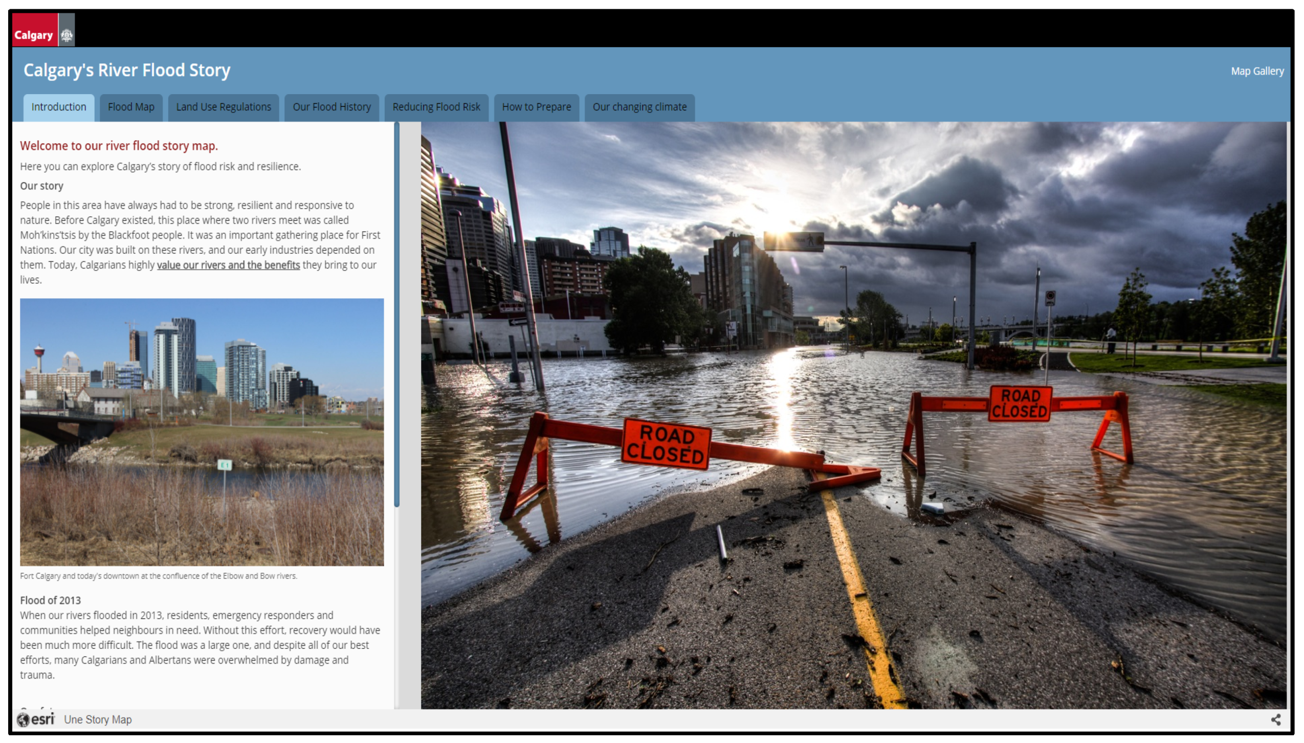
14]. They allow the combination of mapped flood hazard and risk data with other information to enhance both the map’s content and the quality of flood hazard and risk communication. The tools available within ArcGIS StoryMaps help create interactions with flood risk information that goes beyond what can be achieved by flood risk maps alone. Story maps can illustrate the spatiality of flood risks supplemented with critical information, informing users on numerous flooding-related topics. In Canada, the city of Calgary has created a story map for flood risk and resilience:
https://maps.calgary.ca/RiverFlooding/ (accessed on 1 September 2021), which contains images, text, flood maps, and testimonies from flood victims. This application allows users to look up their individual address and see if they are within the floodway zone. Furthermore, story maps can be used in climate change studies to communicate potential flooding impacts [
15,
16,
17].
Flood risk maps are one of the visual components of a story map and should be developed with an easy-to-understand content, a user-friendly interface, and links to further information [
18]. Story map design plays a crucial role in the interpretation, so elements such as legends, colours, embedded pop-ups, and technical terminology should be used to enhance user experience. For example, flood risk map legends should draw the user’s attention by being clear, clearly displayed, simple to understand (low−medium−high risk levels, shades of blue for flood extents, and avoiding return period terminology, rather frequent−medium−extreme events) and contain a conservative amount of information [
19]. The category classes also have to be comprehensible and readable at first sight. Furthermore, the contrast of the map’s background containing informative elements should be optimized to prevent information overload [
19].
Given the benefits of story maps to crisis managers and the public, in risk communication, it was decided to develop one as a case study for the Petite-Nation River. The main elements of this interactive story map included the flood risk of previously flooded areas, the buildings and streets affected during different flooding events, climate projection maps, and information about past flooding events in the Petite-Nation River watershed. This initiative was aimed at assessing the potential of story mapping to disseminate scientific data and relevant information to the general public, with regard to flooding management. For this case study, ArcGIS software by Esri was used alongside ArcGIS Online and the ArcGIS StoryMaps story builder.
2. Materials, Methods, and Application Case
2.1. Study Area
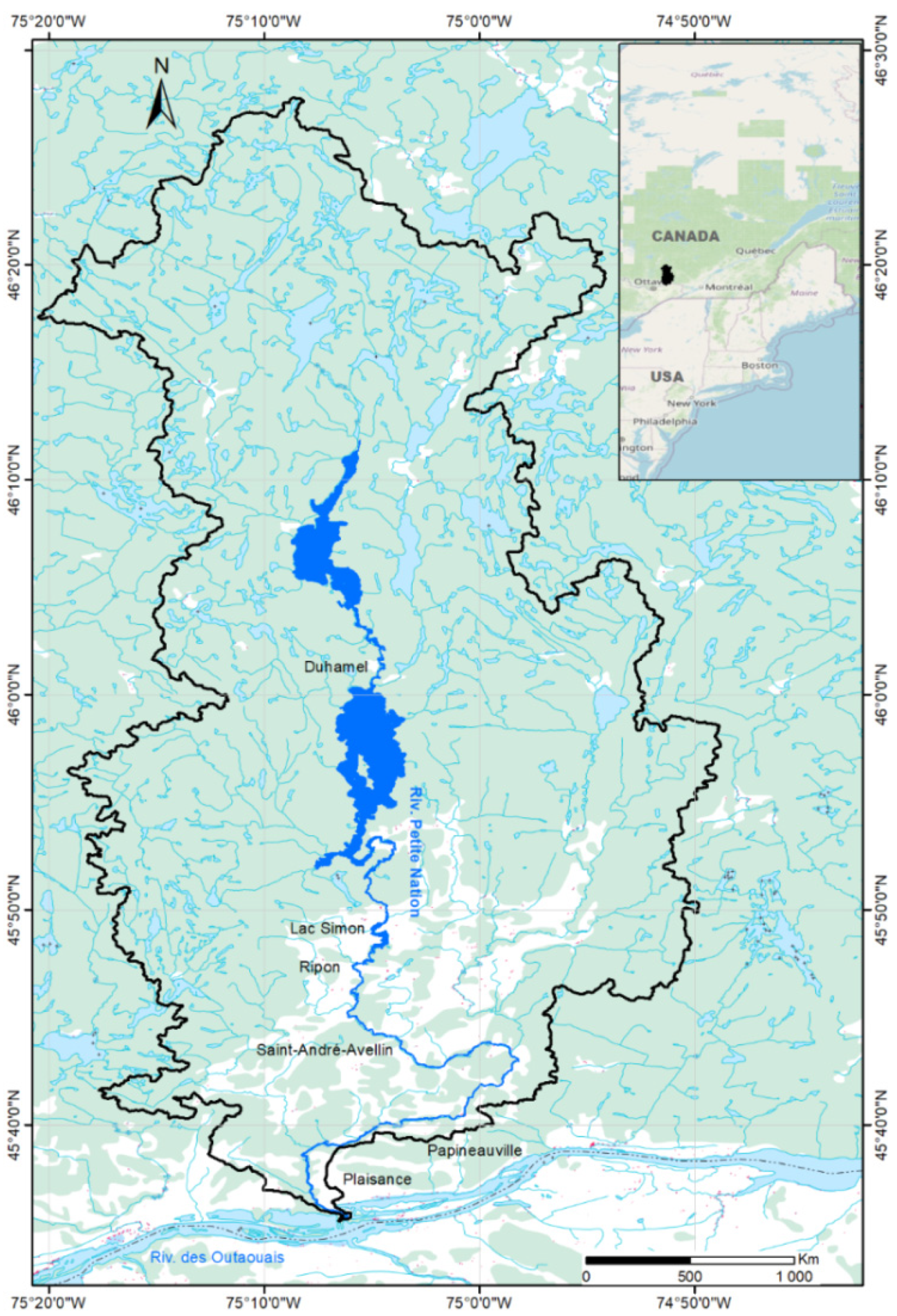
The study area is located in the Petite-Nation River watershed in Quebec, Canada (
Figure 1). The watershed covers an area of 2248 km
2. This sector has been regularly experiencing flood events due to its location on the Petite-Nation River floodplain. The most recent event occurred in 2019 and affected the municipalities of St-Andre-Avellin and Duhamel. Many roads were flooded. The municipality of St-Andre-Avellin declared afterwards a state of emergency resulting in the evacuation of approximately 100 people.
This study is part of a larger project named FRAPNR (flood risk assessment on the Petite-Nation River watershed), which is carried out by the National Institute of Scientific Research (INRS), in partnership with the local watershed organization (Organisme de bassins versants des rivières Rouge, Petite-Nation et Saumon; OBVRPNS) and six municipalities located within the watershed (Duhamel, Ripon, St-Andre-Avellin, Lac-Simon, Papineauvillle, and Plaisance). This project aims at improving community response to flooding by increasing the understanding of the impacts of climate change, promoting upstream−downstream solidarity among municipalities, and helping vulnerable communities to be better equipped to deal with climate change-related flooding [
20]. For this case-study, we designed a story map in collaboration with the partners to address flooding and climate change. To effectively do this, we also produced and included a series of flood maps for the watershed of the Petite-Nation River.
Meetings with different stakeholders of the Petite-Nation River watershed were held to better identify user needs and to address the best ways in which they could utilize the developed story maps as part of their regular responsibilities. The consulted stakeholders included municipal representatives such as the town manager, community planners, public works manager, emergency planning team, officers of the environment department, and citizens. The aim of these meetings was to take stock of their opinions on current flooding-related issues, assess suitable communication methods, gather their views in regard to the use of story maps, and to assess their potential as flood hazard and risk communication resources.
2.2. The GARI Tool
In order to visualize the extent of flooding events under different climate change scenarios, we developed a series of flood risk maps using GARI [
21,
22]. The GARI tool contains three modules described as follows:
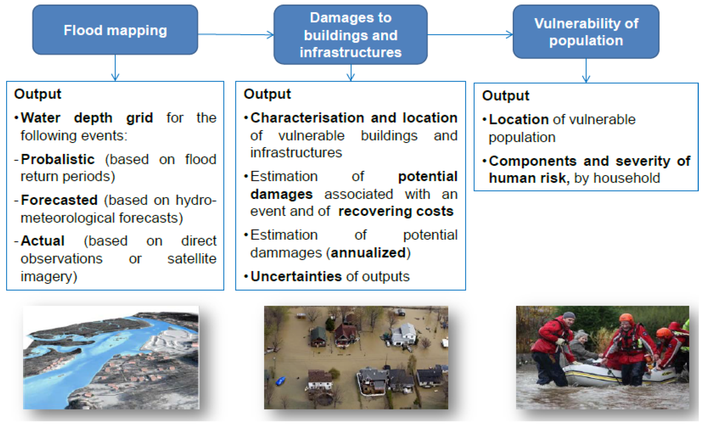
Flood mapping: shows the flooding extent and depth delineation on a basemap. The flood hazard maps used in this case study were produced using the HAND method (height above nearest drainage). The HAND technique is a low-complexity, field-based approach for inundation mapping using elevation data, discharge–height relationships, and stream discharge flows. Producing a HAND map requires a digital elevation model (DEM) and a spatial representation of a region’s river network. The HAND technique computes the elevation difference between each land surface cell and the stream bed cell to which it drains. The resulting HAND map contains the vertical distance between a location and its nearest stream [
23].
Vulnerability of the population: indicates the vulnerability and potential adverse consequences resulting from flooding events including social and environmental aspects. Three different shapefiles can be produced using this module: the first one presents the level of risk to the population per building (flood exposure), the second contains the flooded and nonflooded critical infrastructure, and the third illustrates the flooded road sections. The vulnerability of the population is estimated and mapped for every building. This module also includes water height at flooded critical infrastructures and flooded road portions. The first layer, which is the exposure of the population to a flood hazard can be determined by using the characteristics of the buildings in which the citizens are located at the time of the flood. The second layer, which contains information on the building, includes the following information: registration number, civic address, state of the building, maximum water level at building level, socio-economic vulnerability of the residents, exposure to flood hazard, and the estimated final risk level for the residents (low, serious, severe, and very severe). The attributes of the third layer are the road number, name, condition with regard to water level (nonflooded, passable (< 25cm), emergency vehicles only (25 to 50 cm), impassable), and the maximum water level on each flooded road section.
Damage to buildings and infrastructure: this module generates a map of the estimated damage to each building during a given flood event. This damage is estimated and mapped for each building and expressed in absolute (CAD) or relative (%) terms of the building value. For this purpose, four damage curves (A damage curve indicates the level of damage to a residence as a function of the water height at the main floor level. There is a specific curve for each type of residence) covering an area encompassing one thousand buildings (appx.) was used. A damage curve indicates the level of damage to a residence as a function of the water height at the main floor level. For each residential building, the software estimates the damage based on the water height in the building, by using the curve adapted to its structural characteristics. The total damage to the study area is the sum of each residential building’s damage value.
The outputs of each module of the GARI tool are summarized in
Figure 2. The GARI modelling outputs were used to develop the story map presented in this case study. These outputs were imported into GIS layers using ArcMap, then uploaded as an image service into ArcGIS Online, and finally implemented as story maps.
2.3. Available Data
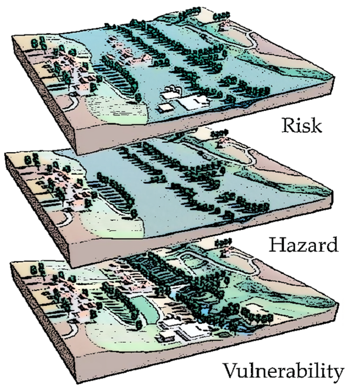
Different types of datasets were selected to set up the flood and climate risk story map of the Petite-Nation River watershed (
Table 1). The data falls under two main components of flood risk: hazard and vulnerability (
Figure 3). Flood risk is defined as a function of flood hazard and the vulnerability of communities to a flood with a particular return period.
The field values (attributes) and the corresponding variable format of the vector data used to map the flood risk and climate change are shown in
Table 2. The raster data corresponds to the depth of water in the pixel.
2.4. Generation of Flood Risk and Climate Change Maps
2.4.1. Flood Risk Maps
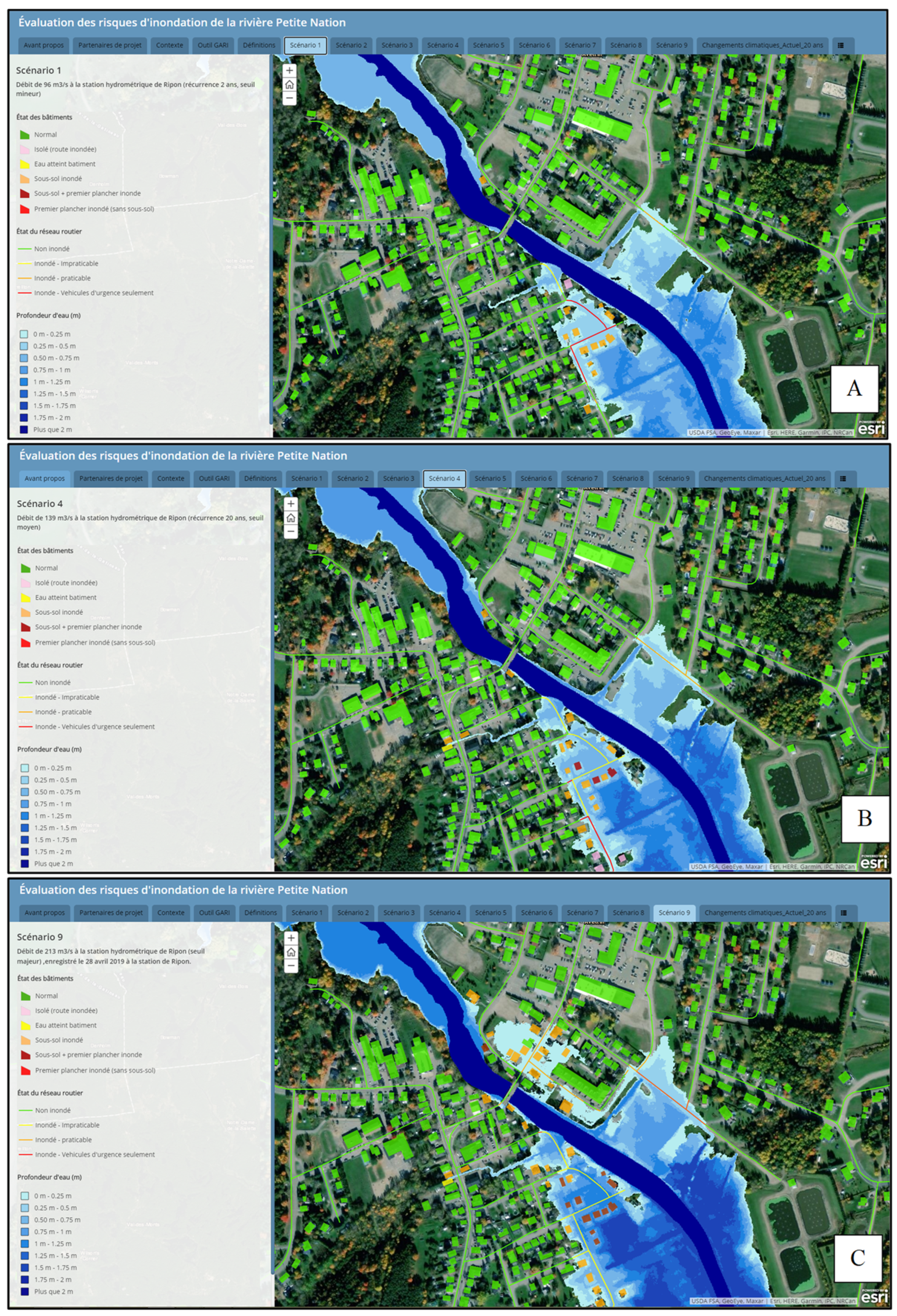
Nine flood risk maps were developed based on the scenarios shown in
Table 3. These maps were generated by combining the flood hazard maps with population vulnerability maps. The flood hazard was obtained through the HAND method and composed of the raster files (water depth grids) associated with different discharges. The estimated discharge values for the Petite-Nation River watershed correspond to the discharge flow at the hydrometric station located in Ripon. Threshold discharge values are defined by Quebec’s Ministère de la Sécurité Publique (department of public security). The flood hazard maps are mainly composed of the raster files (water depth grids). These files were gradually transformed into a format suitable for ArcGIS Online (feature or image service) and included in the story map. The population vulnerability was based on the vector of the flood exposure and the flooded road network, generated by the module vulnerability of population of GARI tool. The combination of the hazard and vulnerability allowed a complete and relevant estimate of the flood risk to be obtained. The flood risk maps were estimated and mapped for each residential building present in the study.
2.4.2. Flood Risk Maps
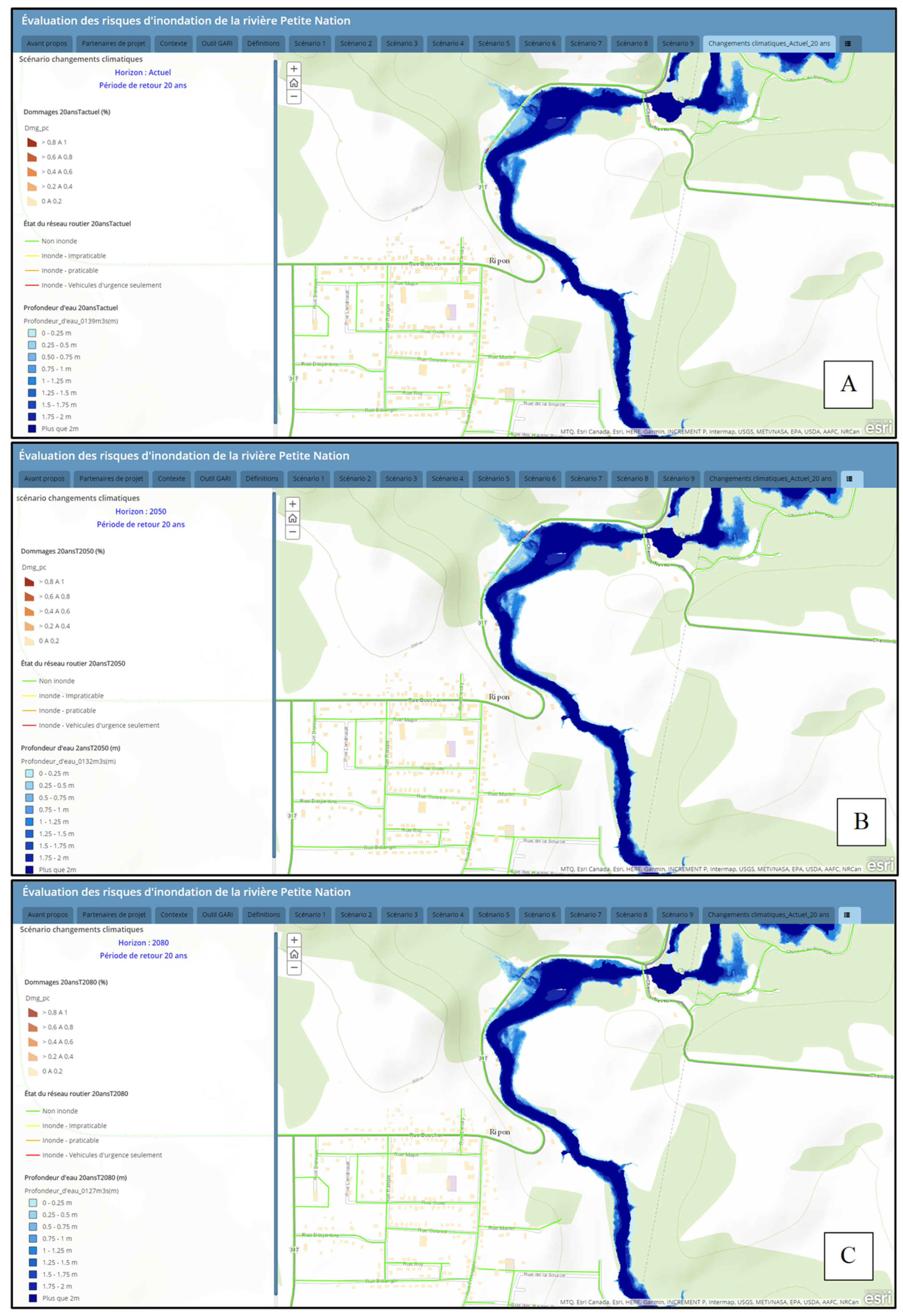
In addition to the flood risk maps, three maps based on climate change projections were also created. Climate change projections were derived from the Hydro-Climatic Atlas of Southern Quebec issued by the Coupled Model Intercomparison Project phase 5 (CMIP 5) [
24] following the pessimistic Representative Concentration Pathways (RCPs) scenarios RCP 8.5. This scenario was selected because it is the one most commonly employed for impact assessments. The details of these climate projections are summarized in
Table 4. The projections are based on the estimated development for 2050 and 2080. Present and future flood hazard and vulnerability will help stakeholders better understand the potential impact of climate change on flood risk in the Petite-Nation River watershed. These climate change maps were created for the two most populated municipalities of the Petite-Nation River watershed (Ripon and St-Andre-Avellin) and included projected flood hazard and monetary damage layers for the baseline, 2050 and 2080 horizons. The monetary damage was estimated using the GARI software (damage to buildings and infrastructure module).
2.5. Story Map Template
The geospatial web technology selected in this study is the ArcGIS StoryMaps application. This application can be created using several designs that need no coding, or creators can develop their own StoryMap designs [
25]. A story map slide for each location in the story: the location can be inserted by performing a text search for the name, address, etc. When viewing the story map slides, the side bar on the left helps to follow the narrative, and the majority of the screen is taken up by a map, which may be panned and zoomed. There are several story mapping templates included in the ArcGIS StoryMaps application, namely Story Map Tour, Journal, Cascade, Shortlist, Swipe, Basic, and Series [
26]. The template used in this study is from the StoryMap Series (
Figure 4).
The StoryMap Series allows the assembling of a series of maps via tabs, numbered bullets, or an expandable side accordion using an interactive builder. The pages of the story (called map sheets) can be designed by using a template in which each page shows a particular map. In addition to maps, images, and videos, web content can also be added to create a narrative and engage your audience. For the Petite-Nation River case study, we selected the tabs template (
https://arcg.is/OvP98, accessed on 1 September 2021).
2.6. Story Map Construction
The first step of the story map construction process was to proceed to geospatial data structuration and their spatial and descriptive analyses. The ArcGIS platform was used to collect, analyze, and visualize data. The vector data are mainly shapefiles of flood risk exposure (polygon), damage to buildings (polygon), damage to the road network (polyline), and the raster data is the water depth. A geodatabase was created in ArcMAP 10.7.1 (Esri) to stock the information layers that would also appear on the online story map. Each information layer hosts one type of spatial information along with the necessary fields for the descriptive information (
Table 5). Then, the collected files were uploaded (vector and raster) to ArcGIS Online platform in order to construct the online map (webmap). These files were gradually transformed into a format suitable for online use (feature or image services) and uploaded directly to the online platform. Vector data were zipped and directly imported into ArcGIS Online, and the raster data were converted into image service and then imported into ArcGIS Online. Images were converted to the Flickr format in order to be compatible with the accepted template formats. Layer parameters (e.g., symbol, transparency, class, tag display, and pop-up menus) were then created. Specific legends and symbols were also created for every data type. The legend used for flood risk mapping includes three components: water depth, risk exposure of buildings, and risk exposure of the road network. For the water depth, a blue-color palette was used. For the building and roads risk data, different colors were used to differentiate building status (from green for normal buildings, to red for buildings with a basement and first floor flooded). The categorization and symbolization of roads (from green for nonflooded segments to red for flooded roads authorizing only emergency vehicles) was added.
The transparency of raster data was set at 50%. The narrative text combined with the maps was kept as brief as possible, especially for map slides. For each webmap, we included a short text explaining the concepts of discharge flow value, return period, and thresholds set up by the public security department. Only the most important information and attributes (
Table 2) are displayed to the user to avoid clutter and information overload (from ESRI’s basic gallery maps). Finally, two basemaps available from ArcGIS Online were assigned as the background: Google Earth Webmaps were used for the flood risk scenarios and topographic webmaps were used for the climate change scenarios. Thematic maps were created in ArcGIS Online based on the collected data.
The story map presented in this paper is composed of 17 slides (or tabs) through which the users can browse. Each slide is divided in two: the left part contains the narrative text, photos, and tables, and the right part which is the main frame, displays the webmaps, scenes, or multimedia content. The first four slides provide a general description of the project and the study area, the following nine slides contain the flood risk maps, and the next three slides present the climate change projections (
Table 5). Layout and content variations were minimal between slides.
Table 5 illustrates the content and design of the seventeen story map slides.
4. Discussion
In this work, we have developed a story map application for the Petite Nation Watershed based on flood risk and climate maps combined with informative texts. The study has been instructive in quantifying the potential of this web technology, its limitations and the critical influence.
The decision to use the StoryMaps application for this work was based on the numerous advantages compared to traditional methods:
The developed story map represents a flexible and interactive application to better understand the flooding in the Petite Nation River watershed.
This story map has made the flood risk approach a lot more transparent and dynamic, allowing the user to map flood risk under a range of scenarios. In addition, it demonstrates how narratives, specifically experiential stories from those in vulnerable areas can be combined with flood risk and climate projection maps to create an interactive, visual tool that gives more context to the risk.
It provides fast and inexpensive estimates of flood risk for specific return periods that complement results from hydrodynamic simulations.
The majority of the members of the municipalities of the Petite Nation watershed do not have any experience in manipulating geospatial datasets. Thus, the template-based approach of this story map was used in order to disseminate and make scientific findings easy-to-access and understand to broader nontechnical audiences. No GIS background or previous experience with coding or web development is needed.
The developed story map allows the combination of multiple different data (maps, images, narrative text, etc.) for better communication of information. This characteristic allows professional and nonprofessional users from various domains to easily understand the story maps.
The story map contains interactive, digital, and easy to use web maps that replace classical maps or analog maps printed on paper. The user can navigate easily through the content, by pop-ups, interact with and zoom around the maps, swipe up and down and through slides and scroll through the tabs in this story map to explore the impacts and consequences of flood and climate change on the Petite Nation watershed.
Story maps could be utilized as an education resource in schools, teaching children about flood risk in their community.
The flood risk web maps presented in this story map could also be used for: screening hotspots and elements at risk (e.g., buildings, critical infrastructures, etc.), confirming flood-prone locations with point information (e.g, flood depth), providing opportunities for individuals to further investigate their local area’s flood risk, and understanding their own flood risk situation.
Beyond these technical considerations, the story map can also be used for educational purposes in schools in order to present concrete cases of GIS technique use to future generations of students.
However, the present state of this story map is affected by some limitations. This application at present is a simple mapping with reduced interactivity and little functionality, but with good readability and adequate explanations for the citizen. In general, the information communicated to the citizen by flood related authorities has to be adapted to the needs and requirements of the users to be as effective as possible. The currently existing flood risk maps still lack a good balance between simplicity and complexity. The best way for flood risk communication with the public is the use of real-time information such as gauge levels to inform about flood risks. Gauge levels are easier to understand than the return periods and allow the population at risk to compare these flood situations in the past event. Real flood events have a much stronger influence on building an awareness of flood risk perception than the flood events only derived from hydraulic modelling. In addition, the information communicated via these maps includes water depth with different returns periods, and lack information about floodplain extents. In the majority of cases of webmapping tools around the world, the extent of floods or a floodplain map is used as the basis and the most widely used information. Moreover, risk communication has to be easily comprehensible to the people at risk. This means avoiding technical terminology and statistical terms such as return periods.
5. Conclusions
In this study, a story map is proposed as a new method for communicating current flood risks and flood risk projections based on climate change scenarios. This proposition stems from the need to better popularize and communicate flood-related information to citizens. The method was applied to the Petite-Nation River watershed, which is regularly flooded. Geospatial data (vector and raster) were used and thematic maps were created depicting the flood risk under current conditions and climate change projections. These maps were the foundation of the story mapping process. The final story map was composed of slides addressing the study area, background information on flooding, interactive risk maps, and some context on the project and the development team.
New enhancements could further improve the StoryMap application developed in this study. For example, the addition of new dynamic functions such as formulating queries, search buttons or data selection would improve the user experience. Adding information about the extension of floodplains, and up-to-date water levels and forecasts (gauges levels or web cameras), and pictures of past events. Displaying the uncertainties related to the values displayed and the projections used would increase transparency, allowing the user to better interpret the data. Statistics such as the number of flooded areas and the affected streets and buildings could also be relevant information to include. Finally, the story map could be enriched by imbedding hyperlinks to interesting articles and websites that would support and provide opportunities for people to investigate and learn of their own flood risk situation.
If story maps were to be optimized for decision makers, such users could benefit from the addition of more indicators, such as socio-economic vulnerability. The quality of the information displayed in the story map could be enhanced by allowing dynamic flood forecasting using real hydrometric time data from the hydrometric station. A warning system could even be added leading to faster response delays. The webmap showing flood forecasts are similar in form to the present web maps, but their emphasis is on the future and they also need to explain the analysis on which the predictions are made. The combination of flood hazard maps with real time information on gauge levels is made possible by directly linking gauge stations with the flood forecast center.
Since the objective of this case study was to test the potential of story maps as a means of communication to citizens and decision makers residing in flood-prone areas, this story map focused on illustrating flood risk and future projections, while providing the information necessary to understand and interpret the maps. The use of specialized software developed by Esri, namely ArcMap, ArcGIS Online and ArcGIS story maps, has proven to be an efficient and effective way to develop the flood-related story map.


