Article

Uncertainty Visualization of Transport Variance in a Time-Varying Ensemble Vector Field

1
School of Information Science and Technology, Northeast Normal University, Changchun 130000, China
2
Library, Northeast Normal University, Changchun 130000, China
3
Key Laboratory of Intelligent Information Processing of Jilin Universities, Changchun 130000, China
*
Author to whom correspondence should be addressed.
These authors contributed equally to this work.
ISPRS Int. J. Geo-Inf. 2020, 9(1), 19; https://doi.org/10.3390/ijgi9010019
Submission received: 23 November 2019 / Revised: 11 December 2019 / Accepted: 18 December 2019 / Published: 1 January 2020
(This article belongs to the Special Issue Uncertainty Modeling in Spatial Data Analysis)

Abstract

:
Uncertainty analysis of a time-varying ensemble vector field is a challenging topic in geoscience. Due to the complex data structure, the uncertainty of a time-varying ensemble vector field is hard to quantify and analyze. Measuring the differences between pathlines is an effective way to compute the uncertainty. However, existing metrics are not accurate enough or are sensitive to outliers; thus, a comprehensive tool for the further analysis of the uncertainty of transport patterns is required. In this paper, we propose a novel framework for quantifying and analyzing the uncertainty of an ensemble vector field. Based on the classical edit distance on real sequence (EDR) method, a robust and accurate metric was proposed to measure the pathline uncertainty. Considering the spatial continuity, we computed the transport variance of the neighborhood of a location, and evaluated the uncertainty correlation between each location and its neighborhood by using the local Moran’s I. Based on the proposed uncertainty measurements, a visual analysis system called UP-Vis (uncertainty pathline visualization) was developed to interactively explore the uncertainty. It provides an overview of the uncertainty and supports detailed exploration of transport patterns at a selected location, and allows for the comparison of transport patterns between a location and its neighborhood. Through pathline clustering, the major trends of the ensemble pathline at a location were extracted. Moreover, a glyph was designed to intuitively display the transport direction and diverging degree of each cluster. For the uncertainty analysis of the neighborhood, a comparison view was designed to compare the transport patterns between a location and its neighborhood in detail. A synthetic data set and weather simulation data set were used in our experiments. The evaluation and case studies demonstrated that the proposed framework can measure the uncertainty effectively and help users to comprehensively explore uncertainty transport patterns.

Graphical Abstract

1. Introduction

Uncertainty is inevitable in various geoscience-related domains, such as meteorology and computational fluid dynamics. Taking advantage of the ever-increasing computational power available, it has become common to generate ensemble data which contain a collection of outputs generated from computer simulation models [1]. This makes it possible to intuitively analyze the uncertainty in simulations.
Vector field data, such as wind flow or ocean current data, are commonly collected or simulated in geographic space. The uncertainty in a time-varying ensemble vector field is difficult to quantify, due to the complex data structures involved—typically featuring multiple dimensions, multiple time steps, and multiple ensemble members. Understanding the uncertainty in a spatial vector field is very significant for domain experts to be able to draw reliable conclusions and make informed decisions. Visualization and visual analysis play an important role in characterizing and understanding such uncertainty [2,3] by transforming data and information into interactive visual representations [4]. Using multi-view linkage techniques and interactions, domain experts can analyze uncertain behaviors and comprehensively explore the internal patterns of physical phenomena [5,6].
In an ensemble vector field, an ensemble pathline is a set of pathlines traced from the same spatiotemporal location in different ensemble members. Each of these pathlines—namely, each is a pathline member—means a possible motion behavior from this location. Domain experts are highly interested in the regions where the shapes of the pathline members are either similar or have large variation, which means that the motion behavior is predictable or unstable, respectively. For example, scientists need to understand the uncertainty when predicting the transport trend of a hurricane. The key to revealing this uncertainty is accurately measuring the similarity among an ensemble pathline.
The similarity measurements of ensemble pathlines can be divided into two categories: One is to compute the deformation of the Lagrangian neighborhood, by the use of such methods as principal component analysis (PCA) [7] and finite-time Lyapunov exponent (FTLE) [8]. The variance of the ensemble vector field is measured by analyzing the divergence of neighborhood particles after a finite time. As only the start and end locations of the pathline members are recorded during the time range, domain scientists have to trace the particles repeatedly when exploring the variances at different time scales.
The second kind of method is calculating the distance between each pair of pathline members and averaging them as the final uncertainty value. The accuracies of these methods mainly depend on the selection or definition of a distance metric. Euclidean distance [9], dynamic time warping (DTW), and longest common subsequences (LCSS) [10] have been applied to measure the uncertainty in ensemble vector fields. Euclidean distance [9] is simple and efficient, computing the pointwise distance along with two pathline members directly; however, it requires the pathline members to be of equal length, which is not the general case in a vector field. As a more elastic method, dynamic time warping (DTW) [11,12] can match the similar shapes of two trajectories with different lengths effectively. However, DTW and Euclidean distance are both sensitive to the outliers that inevitably exist in simulations, due to the occasional failures in data generation and collection. In order to remedy this problem, longest common subsequences (LCSS) [10] was introduced, which is the current state-of-the-art method. Its main idea is quantifying the similarity of two points on different pathline members (by 0 and 1) based on a distance threshold, following which the longest common distance between two pathline members can be computed. Thus, the influences caused by outliers can be largely decreased. Nevertheless, LCSS is not accurate enough, because it neglects the variations in the number of unmatched locations [13] and depend on the setting of a threshold.
Due to the above shortcomings, a comprehensive measurement method which is accurate, robust to outliers, and capable of comparing pathlines with different lengths is needed. Edit distance with real penalty (ERP) [14] and edit distance on real sequence (EDR) [13] are two advanced measurement methods which have been commonly used for comparing mobile object trajectories. However, ERP is also sensitive to outliers. Similarly to LCSS, EDR examines the similarity of two points (by 0 and 1) based on a distance threshold. Thus, it is robust to outliers and can handle sequences with different lengths. Moreover, it can remedy the accuracy drawback of LCSS, as it computes the edit distance rather than only recording the matched positions. Based on the advantages of EDR, we propose an improved metric called AEDR (adaptive EDR) to measure the similarity among pathline members, through further computing the distance adaptively when two points are matched. AEDR can not only solve the above problems of traditional measurement methods but improve the accuracy and reduce the dependence on the threshold, in contrast to the the neighborhood-reliant measurements, such as LCSS and classical EDR. In this paper, we quantify the local uncertainty (LU) of each grid using AEDR. Moreover, we also compute the spatial neighborhood uncertainty (NU) [15], as the neighborhood correlation structure is an essential property of the vector field. On this basis, the uncertainty correlation (CU) between a location and its neighborhood can be further evaluated using the local Moran’s I [16].
Furthermore, using the proposed uncertainty measurements, we developed an interactive visual analysis system called UP-Vis (uncertainty pathline visualization) based on the design principle of overview-plus-detail [17]. Globally, our system provides an overall uncertainty rendering view, presenting the specific uncertainty result of all locations and a classification view which guides the conjoint analysis of all kinds of uncertainty. When users select a location of interest from the global view, the detailed transport pattern of the ensemble pathline can be explored in the pathline view and projection view. In order to reduce visual clutter in the visualization of an ensemble pathline, we designed a glyph (called shuttlecock) to reveal the major transport trends and the corresponding divergence degrees distinctly. As for the analysis of neighborhood uncertainty, the comparison view demonstrates the difference between a location and its neighborhood.
Overall, in this paper, we propose a comprehensive framework for quantifying and analyzing the uncertainty of time-varying ensemble vector fields. Our main contributions in this work are:
  • A robust and effective method for measuring the uncertainty in an ensemble vector field. We propose an improved uncertainty measurement method, AEDR, based on EDR. It was verified to be robust to outliers and more effective than the traditional measurement methods and other alternative measurement methods, including classical EDR, LCSS, ERP, DTW, and Euclidean distance. Based on AEDR, we computed the local uncertainty and neighborhood uncertainty, and the correlation between them, to satisfy the requirements of uncertainty analysis.
  • A comprehensive visual analysis system for exploring the uncertainty in a time-varying ensemble vector field. We designed and developed multiple co-ordinated views and an intuitive glyph based on the principle of overview-plus-detail. Using the visual analysis system, users can discover the locations of interest, inspect the transport patterns in detail, and compare the difference between a location and its neighborhood.

2. Related Work

2.1. Uncertainty Analysis in Vector Field

For the analysis of vector field simulations, scientists have paid more and more attention to the uncertainty in scientific phenomena, which has a very important influence on real-world decision-making processes. As an uncertain vector field is commonly time-varying and multidimensional, it is very difficult to quantize, analyze, and visualize the uncertainty. Generally, the uncertainty can be modeled by a probability distribution function. The Gaussian distribution was commonly used in early works, due to its simplicity and efficiency. However, as the uncertainty in the complex vector field typically does not follow a Gaussian distribution, Hazarika et al. [3] and Hollister et al. [18] focused on characterizing the uncertainty in vector fields more accurately. To this end, PCA-based methods have been proposed to effectively measure the uncertainty of an ensemble vector field. This kind of method evaluates the linearized deformation or shape change by measuring the geometric or statistical properties in a Lagrangian neighborhood after a period of time. Hummel et al. [7] constructed a PCA-based framework to compare different ensemble members of uncertain flow fields. They also defined a classification space for ensemble visualization by evaluating the individual and joint transport variances. FTLE [8] is another approach which has been proposed for the analysis of the topological structure of uncertain vector fields. It requires performing linearization of the deformation. Finite-time variance analysis (FTVA) [19] is a variance-based, FTLE-like metric that has been proposed to analyze unsteady flow fields. Guo et al. [20] introduced three new concepts, including the FTLE of distributions (FTLE-D), the distribution of the FTLE (D-FTLE), and uncertain LCS (U-LCS), which extend the deterministic FTLE and LCS extraction to better understand the transport behaviors in time-varying ensemble vector fields. However, FTLE can have reduced accuracy when strong nonlinear mapping exists. Furthermore, these approaches are based on neighborhood deformation and cannot fully describe the uncertainty in vector fields.

2.2. Pathline Similarity

In order to reveal the uncertainty of an ensemble vector field, one of the most fundamental approaches is computing the similarities between different ensemble members. Traditional methods used for measuring the similarity between time-series curves include Euclidean distance [9], DTW distance [11,21], and LCSS-based approaches [10]. Recently, Liu et al. [22] proposed block-based LCSS, which computes the similarity between pathline members through measuring the number of common blocks that they pass through. Compared with Euclidean distance and DTW, block-based LCSS is robust to outliers, but the block size must be assigned in advance. Extracting the features of the pathlines and computing the differences between different features have also been effective in comparing different pathlines [23]. On this basis, Mcloughlin et al. [24] introduced a novel idea by using a set of curve-based attributes to compute line signatures and measure the similarity between streamlines. They applied the focus-plus-context technique and a streamline filter to visualize the streamlines better. Whitaker et al. [25] proposed contour boxplots, which generate boxplots for visualizing and exploring the ensembles of contours. Moreover, they presented a novel nonparametric method [26] to analyze ensembles of 2D and 3D curves, which is a more direct method for the statistical analysis of curves. Furthermore, clustering is very efficient for detecting major trends and outliers in ensemble behaviors or presenting the uncertainty [27]. Ferstl et al. [28] adopted PCA to convert sets of streamlines into a low-dimensional Euclidean space and cluster them into major trends in this space.

2.3. Vector Field Visualization

Vector field visualization is one of the most challenging topics in scientific visualization. The present methods used for visualizing vector fields can be generally classified into three categories [29]: texture-based, feature-based, and geometry-based visualization methods. Botchen et al. [30] introduced texture-based flow visualization techniques to analyze the uncertainty of a 2D vector field using cylinder simulation data sets. In order to consider the coherency of the features along with different timestamps, Muelder et al. [31] proposed a prediction-correction method that can accurately infer the feature regions in time-series. Sauer et al. [32] defined a feature in a vector field as a voxel set of volume data. Thus, the problem of feature tracking can be converted to a particle tracing problem by constructing correspondences between particle data and volume data. Clustering [28,33,34] is a commonly used method to extract the spatial or temporal features of vector fields. Ferstl et al. [28] applied hierarchical clustering to extract the major trends of ensemble streamlines. Lee et al. [35] suggested a trajectory clustering method that performed clustering on segments of trajectories, instead of over entire trajectories. Vector glyphs [36] can be extended to describe the geometric features of vector fields directly, due to their ability to display multiple attributes at the same time. Hlawatsch et al. [37] adopted the metaphor of radar to represent the directions of the flow by angles, where the information of time steps was encoded by the radius in spherical co-ordinates. A fiber orientation distribution function (ODF) glyph [38] has been proposed as an accurate expression for uncertainty. Jarema et al. [39] proposed a lobular glyph, in which the vector probability density functions are mapped into the shape and orientation of the lobular.

3. Overview

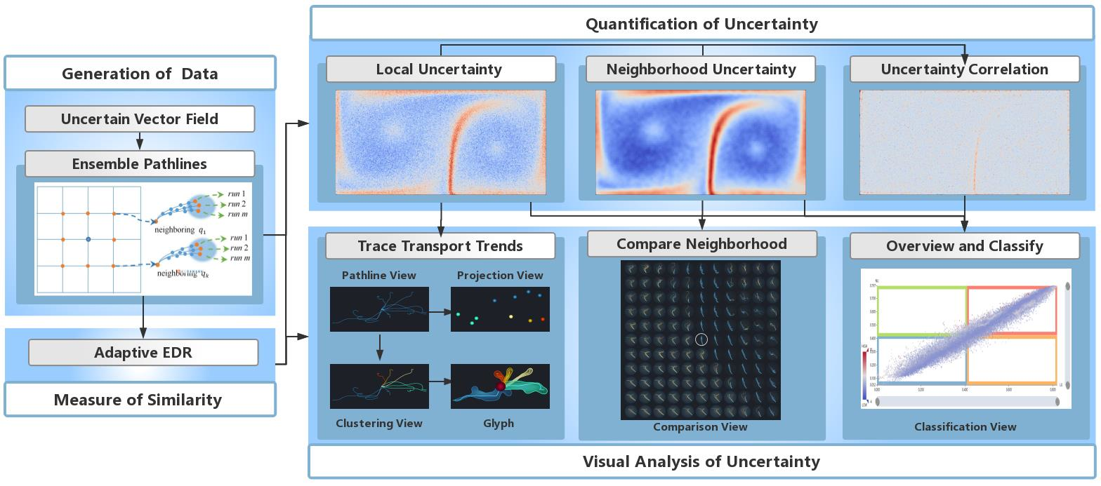
Our overall framework consists of four parts: generation of data, the measure of similarity, quantification of uncertainty, and visual analysis of uncertainty, as demonstrated in the workflow of this paper (Figure 1). The data used in the experiements consist of a synthesized data set and a real-world weather data set. For the initial ensemble vector data, the ensemble pathline of each grid point is traced by numerical integration (Runge–Kutta method). An improved metric, AEDR, is proposed to measure the similarity between two pathline members. It is more effective and robust to outliers than traditional methods. According to the divergence degree of the corresponding ensemble pathlines, AEDR is utilized to quantify the local uncertainty (LU) and neighborhood uncertainty (NU) of each grid point. On this basis, the uncertainty correlation (CU) between the location and its neighborhood is computed, to gain more significant results.
Further, in order to assist in understanding the uncertainty, we developed a system using visual analysis techniques. Multiple linked views were designed and integrated to demonstrate the overview of the uncertainty conditions, the transport patterns of ensemble pathlines, and detailed information of the neighborhood. Based on the conjoint analysis of all types of uncertainty, the classification view gives a classification for all locations and reveals their different characteristics. Furthermore, to assist the understanding of the LU at a selected location in detail, we provide a pathline view which displays each pathline member, while the projection view shows the relationships among them. However, intricately crossed pathlines may prevent the observer from discovering transport trends. In order to solve this problem, we apply the DBSCAN clustering method based on AEDR to the pathline members and assign them to several significant trends. Then, through an intuitive glyph design, the transport trend and the divergence degree of each cluster can be present without clutter. Additionally, based on the small multiples technique, the difference between a location and its neighborhood are demonstrated in the comparison view, which facilitates the user’s understanding of the NU and CU.

4. Uncertainty Computation for Ensemble Vector Field

In this section, we introduce and evaluate the improved metric, AEDR, for computing the difference between pathlines and demonstrate the computation of LU, NU, and CU.
Given an ensemble time-varying vector field, let P denote an ensemble pathline traced from a grid point q along a period of time. It consists of m pathline members and can be written as P = P 1 n 1 , P 2 n 2 , , P m n m . Each pathline member P i n i = { ( x 1 i , t 1 ) , ( x 2 i , t 2 ) , , ( x n i i , t n i ) } is a sequence with n i consecutive points. Here, n i is the number of the sample time steps in the pathline member P i n i and x r i ( 1 r n i ) is a d-dimensional vector (where d is usually 2 or 3).

4.1. Adaptive EDR and Local Uncertainty

Edit distance (ED) [40], which has been widely used in speech recognition, aims to measure the similarity between two strings. For two strings A and B, E D ( A , B ) represents the minimum number of edit operations needed to convert A into B, where the edit operations include inserting, deleting, and replacing. Generally, the smaller the edit distance between two strings, the more similar they are. To apply this idea to the comparison of trajectories, edit distance on real sequence (EDR) [13] has been proposed based on ED, which can handle sequences of real values. It has been verified to be robust to outliers and more accurate than LCSS when measuring the similarity between moving object trajectories. Thus, it was determined to be a good fit for the comparison of pathlines.
For two pathline members P i n i and P j n j with n i and n j points, respectively, a distance threshold δ must be set to determine whether the two points on different pathline members can be matched. Then, according to the definition in [13], the EDR distance E ( P i n i , P j n j ) between P i n i and P j n j can be computed by
E ( P i n i , P j n j ) = { n i , n j = 0 , n j , n i = 0 , m i n ( E ( P i n i 1 , P j n j 1 ) + f l a g , E ( P i n i 1 , P j n j ) + 1 , E ( P i n i , P j n j 1 ) + 1 ) , o t h e r w i s e ,
where P i n i 1 and P j n j 1 are obtained by deleting the last point from P i n i and P j n j , respectively, and f l a g can be 0 or 1. If | x n i i x n j j | δ , f l a g = 0 , meaning that the last point on P i n i is matched with the last point on P j n j ; otherwise, f l a g = 1 . However, the matching degree between the two points is ignored when they are matched by EDR, which can result in inaccurate results. Furthermore, the value of the distance threshold δ will affect the result greatly, and thus, is hard to set appropriately. To illustrate the shortcomings, we take the example of two one-dimensional trajectories: Q = [ ( 1 , t 1 ) , ( 2 , t 2 ) , ( 3 , t 3 ) , ( 4 , t 4 ) ] and R = [ ( 1.9 , t 1 ) , ( 1.1 , t 2 ) , ( 2.1 , t 3 ) , ( 4.9 , t 4 ) ] . If we let δ = 1 , the result computed by EDR will be 0. However, the obvious differences between the trajectories should not be neglected. If δ = 0.8 , the result will be 4. This means that a small change of the threshold may cause a large variation in the result. Thus, the traditional EDR method is not effective or accurate enough for measuring the difference between pathlines. In order to solve these problems, we compute the value of f l a g adaptively (as shown below) when | x n i i x n j j | δ , where the improved measurement is called adaptive EDR (AEDR).
f l a g = | x n i i x n j j | δ .
Therefore, f l a g can be a real number in the range [0,1]. In this way, the distance between two matched points can be measured as a small value (less than 1) and the distance between two unmatched points is measured as 1. This means AER is still robust to outliers, but the dependence on the threshold is reduced.
Then, the similarity between two pathline members P i n i and P j n j can be calculated by
s i m ( P i n i , P j n j ) = E ( P i n i , P j n j ) m a x ( n i , n j ) .
Based on the similarity between any two pathline members of a grid point q, the uncertainty of q can be computed by
L U ( q ) = 2 m ( m 1 ) ( i = 1 m 1 j = i + 1 m s i m ( P i n i , P j n j ) ) ,
where m is the number of pathline members in an ensemble pathline.

4.2. Evaluation

4.2.1. Ability to Reveal Features

As the uncertainty in ensemble data does not have ground truth, different measurement methods evaluate the uncertainty according to their characteristics. According to different analysis tasks, there are many perspectives to evaluate the accuracy of uncertainty measurement.
In this paper, inspired by the work of Liu et al. [22], we evaluate the effectiveness of AEDR through comparing its ability to reveal uncertainty features with classical EDR, DTW, ERP, and LCSS. If the measurement can present the inherent uncertainty features more clearly, it can be regarded as more effective. We used the Double-Gyre (DG) synthetic data set [41] to carry out the evaluation experiments, which is a commonly-used synthetic data set of a 2D vector field. It is defined on the domain [ 0 , 2 ] × [ 0 , 1 ] , as:
v ( x , y , t ) = ( 0.1 π sin ( f ( x , t ) π ) cos ( y π ) 0.1 π cos ( f ( x , t ) π ) sin ( y π ) d d x f ( x , t ) )
f ( x , t ) = a ( t ) x 2 + b ( t ) x
a ( t ) = 0.25 sin ( t · π / 5 )
b ( t ) = 1 0.5 sin ( t · π / 5 ) ,
where x and y represent the co-ordinates of the positions in the domain, t represents the time steps, and the vector v consists of two velocity components. The synthetic DG data set describes a time-dependent field, where the gyres expand and contract periodically in the horizontal direction. From Equations (7) and (8), it can be found that the period for t is 10. In our experiment, we generated original data on a 401 × 201 Cartesian grid from t = 0 to t = 30 . Then, ensemble data with 20 members were formed by adding Gaussian noise ( N ( 0 , 0.1 2 ) ) to the original synthetic data.
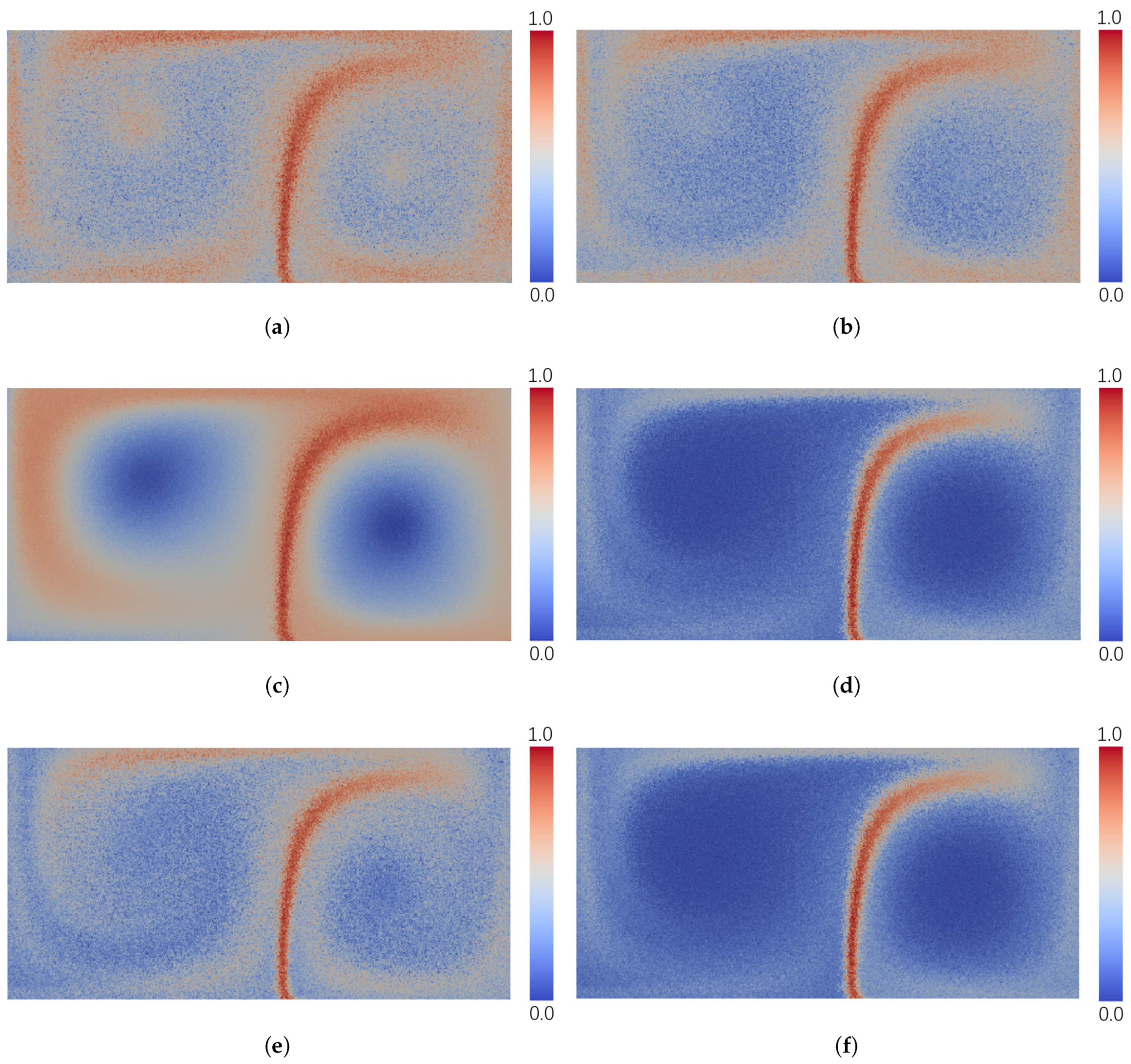
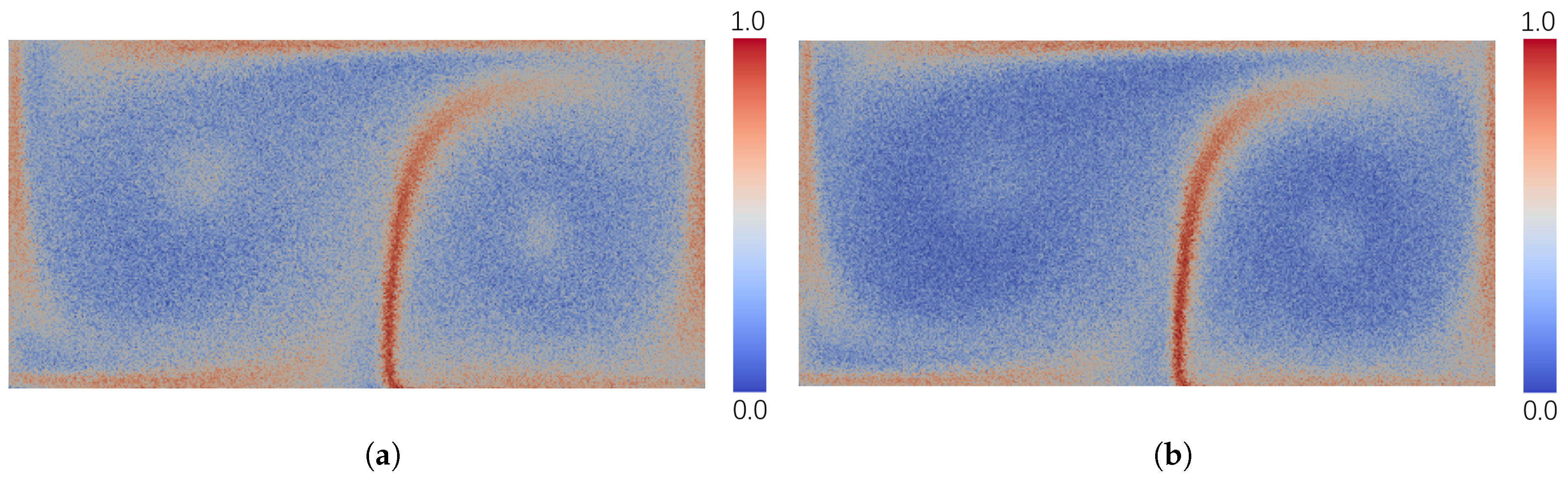
We computed the uncertainty for each grid point of the DG ensemble data using the above measurement methods. Figure 2 displays the rendering of the computed results. To facilitate comparison, each result was normalized into the range of [0,1]. It can be observed that all rendering results revealed a distinct pattern with high uncertainty, which can be seen as the separatrix of the two gyres. This region is composed of the heteroclinic trajectories (Figure 6) which can turn in the converse direction under the effect of very little noise. Furthemore, high velocities exist at the boundaries of the gyres, causing the advected particles to diverge quickly there. Therefore, the boundaries of the gyres have relatively high uncertainty, which was presented by most of the test measurements. For the results of AEDR, classical EDR, LCSS, and Euclidean distance, this pattern can be recognized clearly, while the boundary pattern is not clear in the results of DTW and ERP.
Lower velocities and higher vorticity existed in the regions around the centers of the gyres, as compared to the outer regions. This means that the absolute variances between the pathline members traced around the center were low, compared with the outer regions. On the other hand, the pathlines traced from these regions around the gyre centers were very chaotic, from a local perspective, due to the high vorticity. This should also be regarded as high uncertainty, as the variances between the pathline members were high enough, compared with themselves. Distinctively, in the result of AEDR, the regions around the centers of gyres also presented relatively high uncertainty. However, the other measurement methods failed to capture this feature. For Euclidean distance, DTW, and ERP, this feature was ignored (Figure 2c,d,f), because the computed uncertainty at the gyre center was too low to be rendered distinctly. As for LCSS and classical EDR, they did not consider the differences between the matched points; thus, the feature was not clear (Figure 2b,e). AEDR could solve this problem and reveal the feature clearly (Figure 2a), as it also computed the difference between two matched points.

4.2.2. Sensitivity to Outliers

Similar to the work of Liu et al. [22], we evaluated the sensitivity to outliers of AEDR and the other existing approaches by performing two groups of experiments on the original DG synthetic data set. Firstly, we added Gaussian noise ( N ( 0 , 0.05 2 ) ) to the original data to obtain a new data set DG (note that DG is not ensemble data).
Through computing the differences between the pathlines in DG and those in DG at the same locations, the difference d for each grid point could be obtained. Then, on the basis of DG , we made 1% of all the grid points outliers by adding much stronger noise or by setting the velocity component to 0. We called this data set DG . Then, the differences between the pathlines in DG and DG for each grid point were also computed as d . Thus, the change rate of the two different values d and d for each grid point q was used to reveal the influence of outliers, which was computed by
d i f f ( q ) = | d ( q ) d ( q ) | d ( q ) .
A higher value of d i f f ( q ) indicates that outliers had more influence at the grid point q. To present the sensitivity to outliers among all the grid points, we counted the numbers of grid points with change rates of more than 1%, 5%, 10%, and 15%, respectively. We compared the ability of five measurement methods (DTW, LCSS, ERP, EDR, and AEDR) to handle outliers, and the results are shown in 
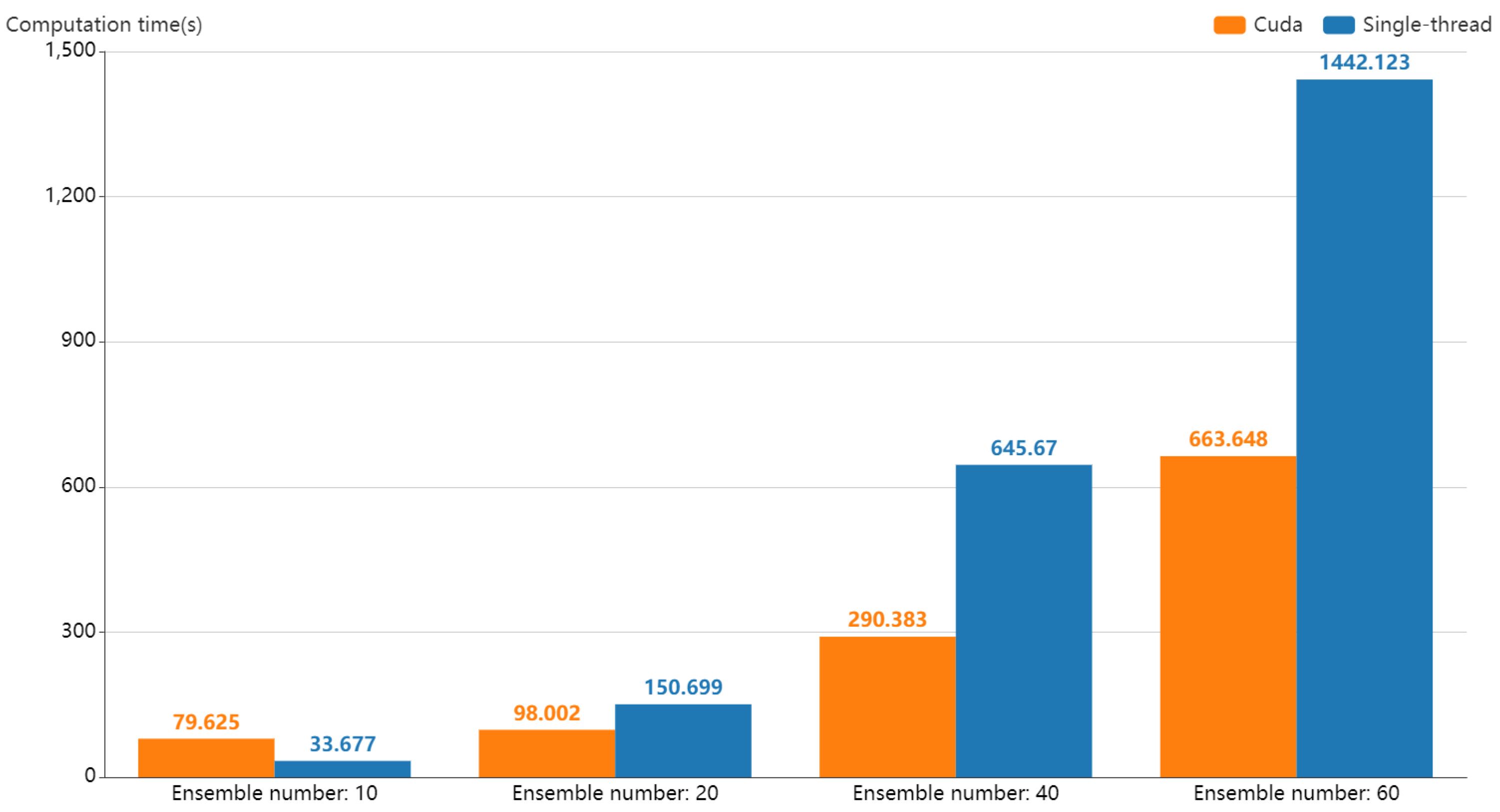
Table 1. It can be observed that DTW and ERP were more sensitive to outliers: under the influence of outliers, more than 16% of all points had pathline distance change rates over 1%, and more than 2% of points had change rates over 15%. The results are not surprising, as both DTW and ERP are based on Euclidean distance, which is sensitive to outliers. At the same time, the difference caused by outliers will be accumulated along with the transport process. It is not hard to see that LCSS and classical EDR were much more robust to outliers than ERP and DTW, with a lower number of points changing significantly. As for the proposed AEDR, it showed a much better ability to handle outliers. This was a result beyond our expectation, since we thought that the distance computation of the matched points would potentially be influenced by outliers. However, when the outliers cause two unmatched points to be close enough, AEDR will measure the matching degree rather than directly ignoring the distance, as is the case in LCSS and classical EDR. Thus, for this case, the result of AEDR was closer to the real condition without outliers. This can make AEDR even less sensitive to outliers than LCSS and classical EDR. This case was a general case in our evaluation experiments.

4.3. Neighborhood Uncertainty and Correlation

The neighborhood correlation structure is an essential property of a vector field. Analyzing the uncertainty of a single location together with its neighborhood can facilitate the exploration of significant features or anomalies. In view of this, we computed the uncertainty between pathline members in the neighborhood of a grid point and used it as an important indicator for the uncertainty judgment.
For a grid point q, we sample a set of neighbor points q 1 , q 2 , , q h around q uniformly at the initial time, as illustrated in Figure 3b, and track the trajectories for all ensemble members in the time-series. For the neighborhood of q, the uncertainty can be computed by
N U ( q ) = k = 1 h ω k L U ( q k ) ,
where the weight ω k is computed as:
ω k = 1 d k z = 1 h 1 d z ,
where d k is the distance between grid points q and q k . It is a more fuzzy result, which indicates the general condition of transport uncertainty.
Generally, the uncertainty values of nearby spatial grid points are similar. However, there usually exist anomalies in which the location and its neighborhood are dissimilar. For detecting the potential anomalies, we introduce the local Moran’s I [16] to identify the local spatial autocorrelation, as
C U ( q ) = h ( L U ( q ) L U ¯ ) k = 1 h ω k ( L U ( q k ) L U ¯ ) k = 1 h ( L U ( q k ) L U ¯ ) 2 ,
where L U ¯ is the mean of LU over all grids. Then, we normalize C U ( q ) by the Z-Score [42]. Thus, positive C U ( q ) indicates local positive spatial autocorrelation, which means that nearby grids have similar uncertainty values. On the contrary, negative C U ( q ) indicates local negative spatial autocorrelation, which means that nearby grids have dissimilar uncertainty values.

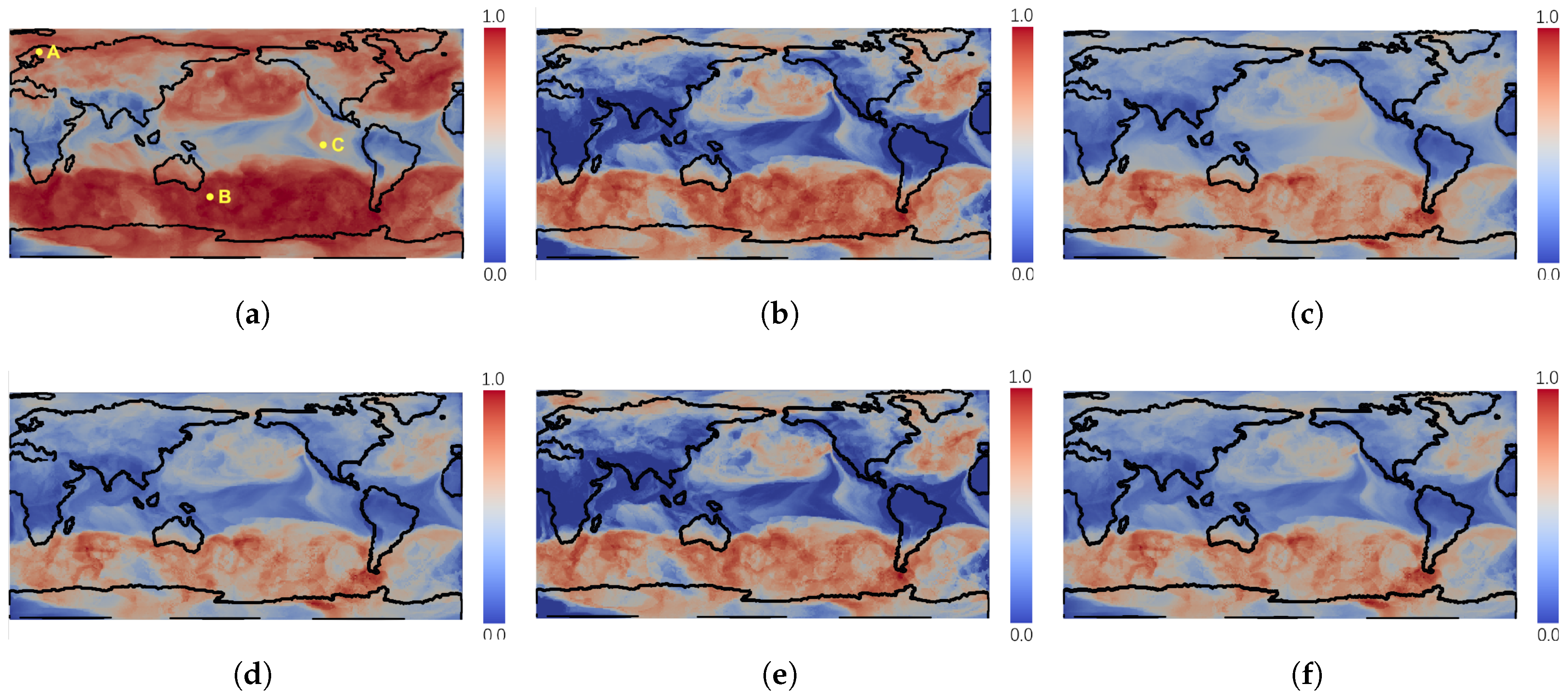
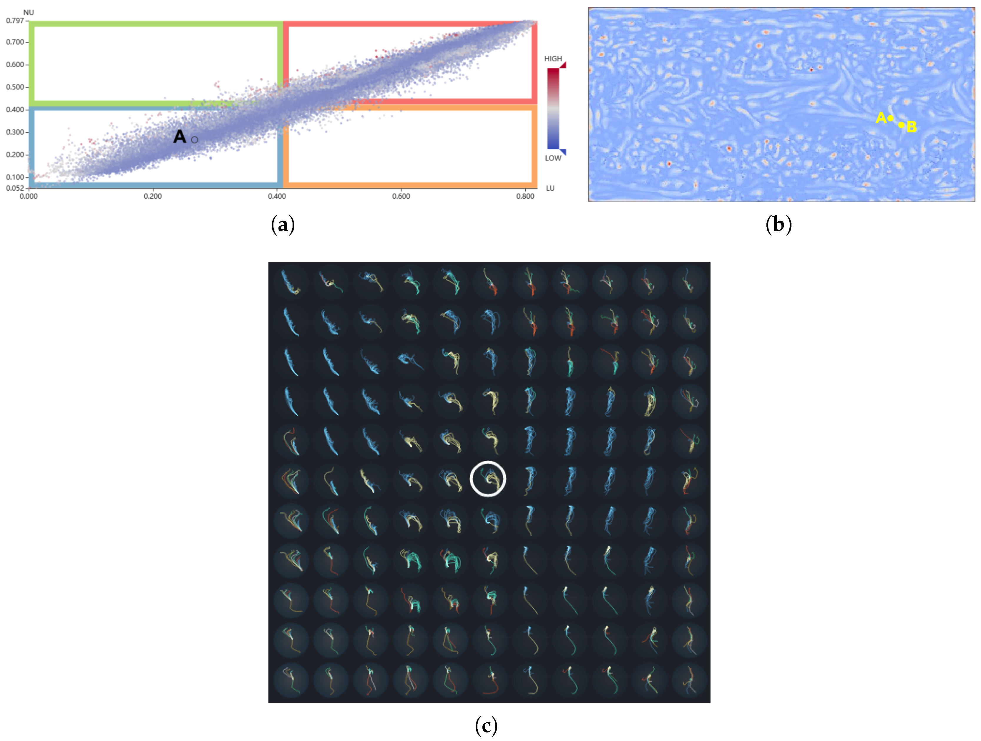
4.4. Classification Space

In order to comprehensively analyze the variances of a grid point, we construct a classification space where the horizontal axis represents the value of LU and the vertical axis denotes the NU value. Each grid point q can be mapped to a 2D co-ordinate ( L U ( q ) , N U ( q ) ) in this space. Therefore, the variance information of all the grid points in the vector field can be visualized in a scatter plot, which helps users to clearly identify the general variances of the uncertain vector field. As exemplified in Figure 4a, the whole area is divided into four parts (a–d), as follows:
  • a. Low LU and low NU (blue region): The grid points mapped into this region have stable transport for different ensemble runs and the trajectories of their neighbor points are very similar. From this region, the predictable transport behaviors in an uncertain vector field can be found.
  • b. Low LU and high NU (green region): The transport behaviors of the grid points mapped into this region are very similar, while the trajectories of their neighboring points are dissimilar. This may be because the velocity field around these grid points is unstable, leading to the trajectories of the neighboring particles to differ.
  • c. High LU and low NU (orange region): It is difficult to draw a reliable conclusion as to whether the transport behaviors of the grid points mapped in this region are stable. All the trajectories of their neighboring points are very similar, but the variances of the grid points are dissimilar. The reason for this phenomenon may be that the grid points are outliers in a certain ensemble member, or that the velocity field around the grid points is stable.
  • d. High LU and high NU (red region): This region shows great uncertainty. It means that the variance is conspicuous, either considering the variation of themselves or their neighbors. Therefore, it can be concluded that the grid points mapped into this region have great uncertainty.
Figure 4 illustrates these four regions using the DG data set (as detailed in Section 6.1). From the classification view (Figure 4a), it is obvious that a majority of the grid points are located in the blue region, which presents low LU and low NU values. Other than the points in the blue region, a small number of points can be found in the green and orange regions. The reason for this can be seen in Figure 4b, where the neighborhood particles of the points in green regions are sampled in blue and red regions, and the LU values of these regions are opposite. From Figure 4b, we can observe that the red points are surrounded by green points, such that the points in the green region can be viewed as a transition from the unstable state to the stable state.
To further analyze the classified subspaces, we encode the point colors by the corresponding CU values. In general, when the LU and NU of a grid point have similar values, it is normal for its CU value to be high. This means that the points of the blue and red regions have darker red colors. On the contrary, when LU and NU are dissimilar, the corresponding CU is small. This means the points of the green and orange regions have darker blue colors. However, as the neighborhood can have complex conditions, some points and their neighborhoods may present non-obvious correlations or even negative correlations in the blue and red regions. For example, as marked in Figure 4a, the point A has a low LU and a low NU value but a low CU value. This can be explained by observing that most of the points in the neighborhood of A have high LU values, but several neighboring points have extremely low LU values. Thus, the NU and CU of point A are both relatively low values. In this way, some hidden anomalies can be further diagnosed.

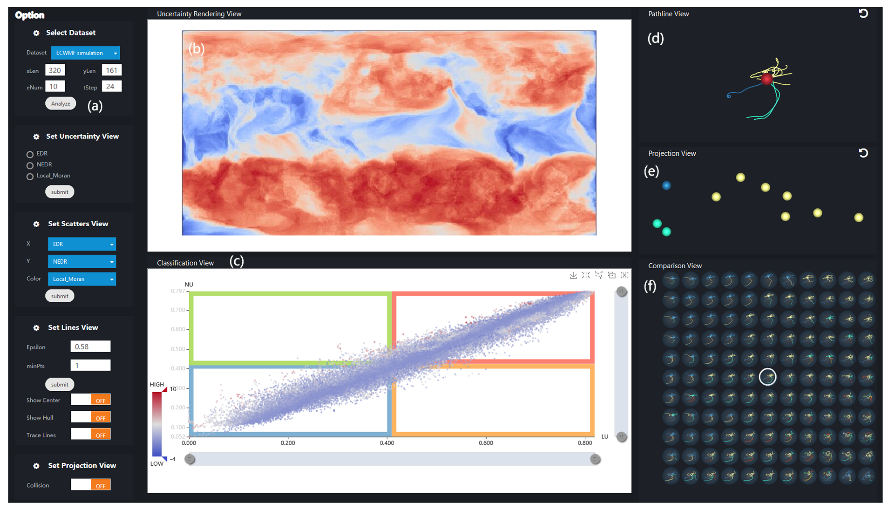
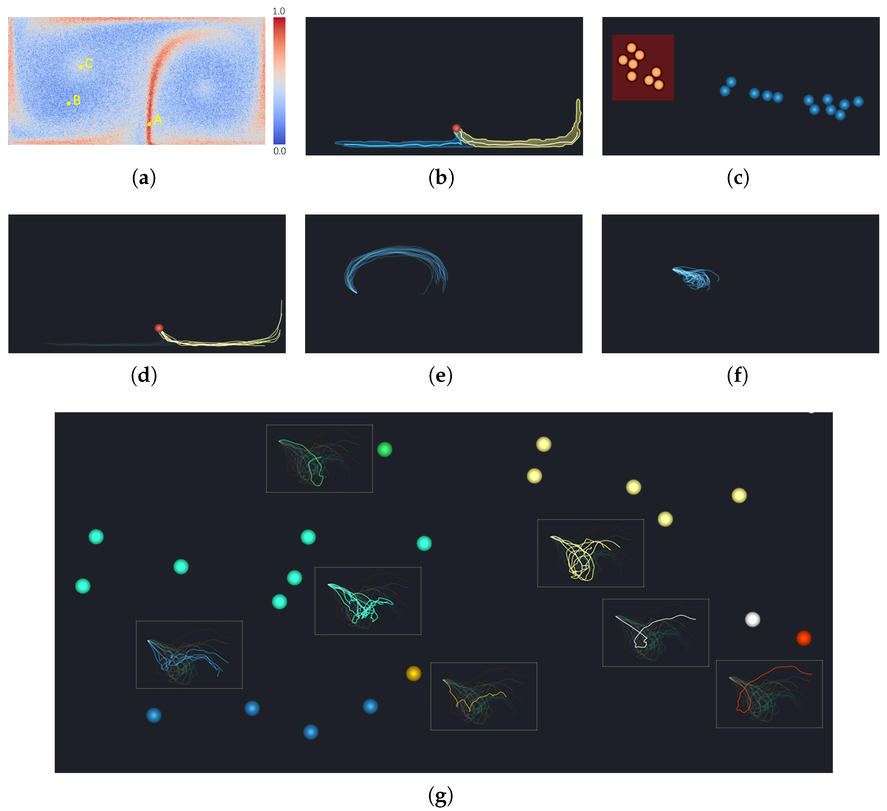
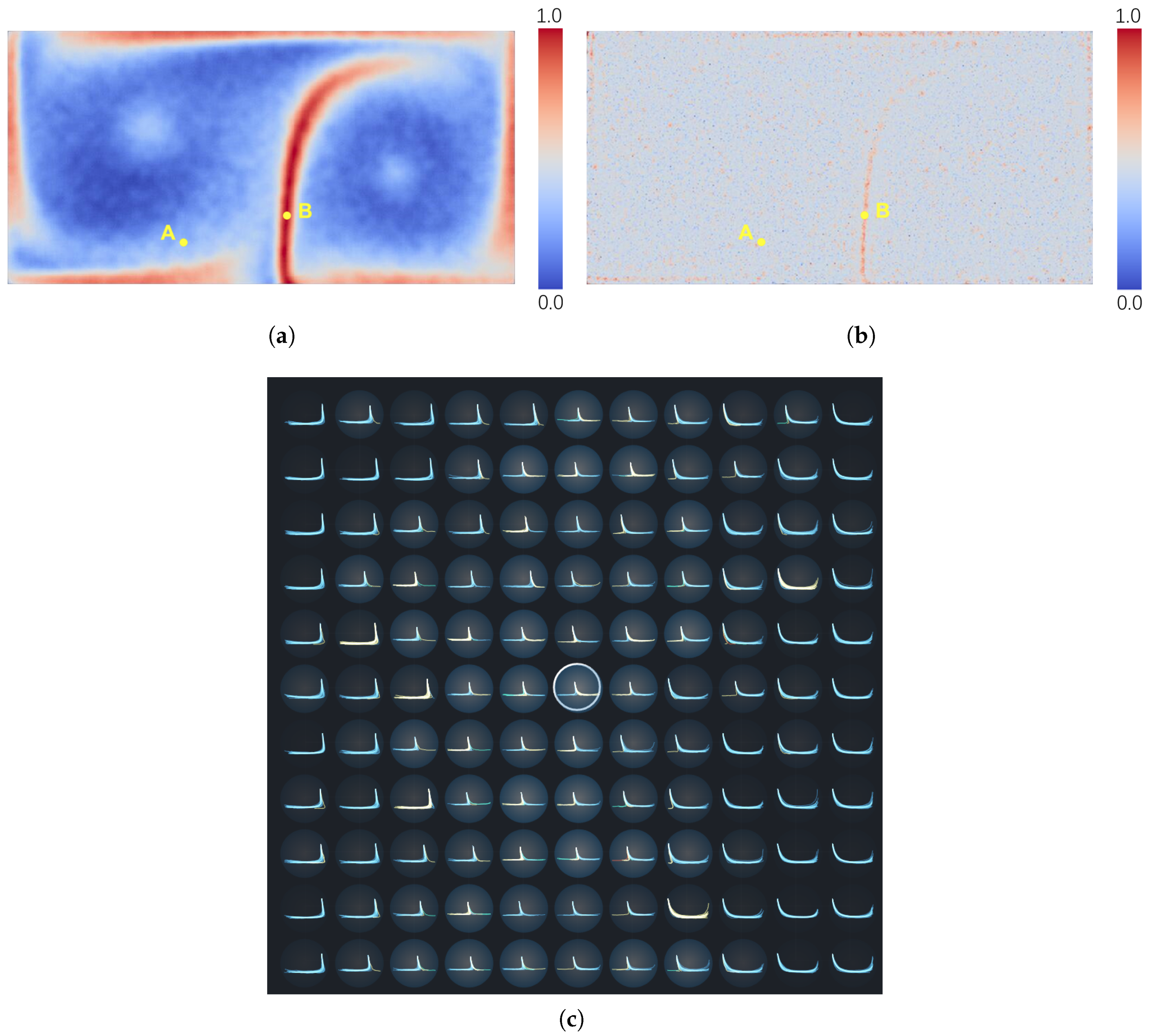
5. Visual Analysis of Uncertainty

In this section, we give insight into how all the pathline members of a grid point are transported in the time-series. We propose an interactive visual analysis system called UP-Vis (uncertainty pathline visualization), whose interfaces are shown in Figure 5. It consists of four views: uncertainty rendering view, classification view, pathline view, and projection view. There is also a parameter panel which supports the management of data loading, parameter settings, and visualization element switching.

5.1. Extraction of Transport Pattern

Pathlines usually have different lengths, as some particles may escape from the valid boundary in the early time steps. To analyze their differences in movement, Ferstl et al. and Jarema et al. set all the pathlines to have the same length by repeating the last point of the pathline in the domain to fill the missing positions [28,43]. However, this method may increase the errors, due to the additional points. Using our method, the similarity between any two pathline members can be obtained even when they have different lengths. Moreover, the pathline members are clustered to recognize the major transport trends directly and are projected into 2D space to provide insight into the pathlines belonging to the same cluster.
We apply the tSNE algorithm to convert each pathline member into a scatter point in 2-dimensional space. One advantage of tSNE is that its input only requires a distance matrix between the members, which can be effectively combined with AEDR measurement. From the projection view, the relationship between pathlines can be inspected by using the distance between the scatter points. In addition, visual clutter is a common issue in scatter plots. Overlapping points can prevent users from observing the aggregated features shown in the view. A common approach is to add a new visual channel, which adds transparency to each scatter point. However, the superposition of transparency hides the number of scatter points. In this paper, we introduce a collision detection strategy which can separate the overlapping points and preserve the original layout as much as possible. Therefore, the projection view enables a visual representation that intuitively reveals the relationships between pathline members.
In order to extract the different trends of an ensemble pathline, the DBSCAN algorithm [44] is utilized to cluster the pathline members in each ensemble pathline. DBSCAN is a density-based algorithm, which can mine arbitrary shape clusters without specifying the number of clusters in advance. Moreover, it has a strong ability to resist noise interference and can be utilized for detecting outlier pathlines. It also requires less computation, according to [44]. DBSCAN has been widely used in the visual analysis field to extract patterns and detect abnormalities, such as movement data [45] and streamlines [46].
The clustering results can be changed by adjusting the parameters E p s and M i n P t s . A large E p s value may lead to all pathlines being grouped into one cluster. Meanwhile, if M i n P t s is too large, many pathlines will be treated as noise. Taking an ensemble pathline in weather simulation data (as described in Section 6.2) as an example, the green pathlines shown in Figure 6a are the original pathline members that are not clustered. When different parameters are used, the corresponding clustering results can be obtained. As shown in Figure 6b, the pathline members were clustered into two clusters (colored by blue and yellow) when E p s is set as 0.8 and M i n P t s is set to 1. As shown in Figure 6c, after reducing E p s from 0.8 to 0.75, the pathline members were clustered into three clusters, where the pathline members marked by yellow in Figure 6b were further divided into two clusters. Furthermore, when we increased M i n P T S , from 1 to 2, the outlier pathlines were separated, as shown in Figure 6d.
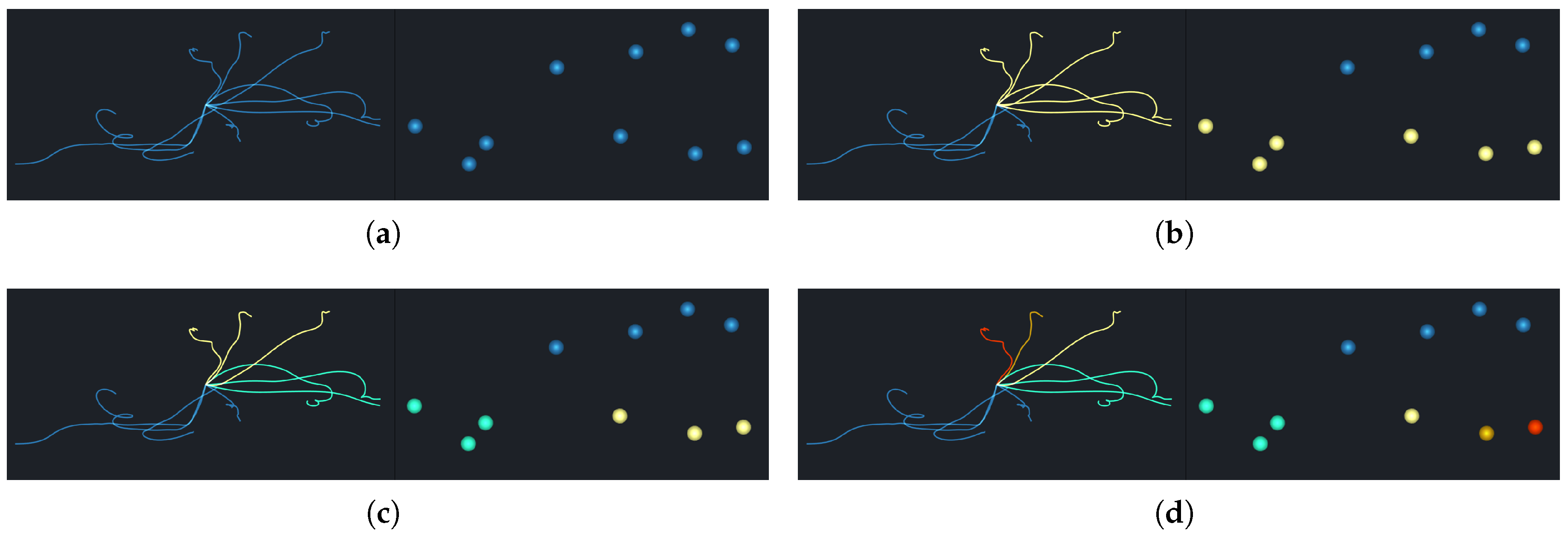
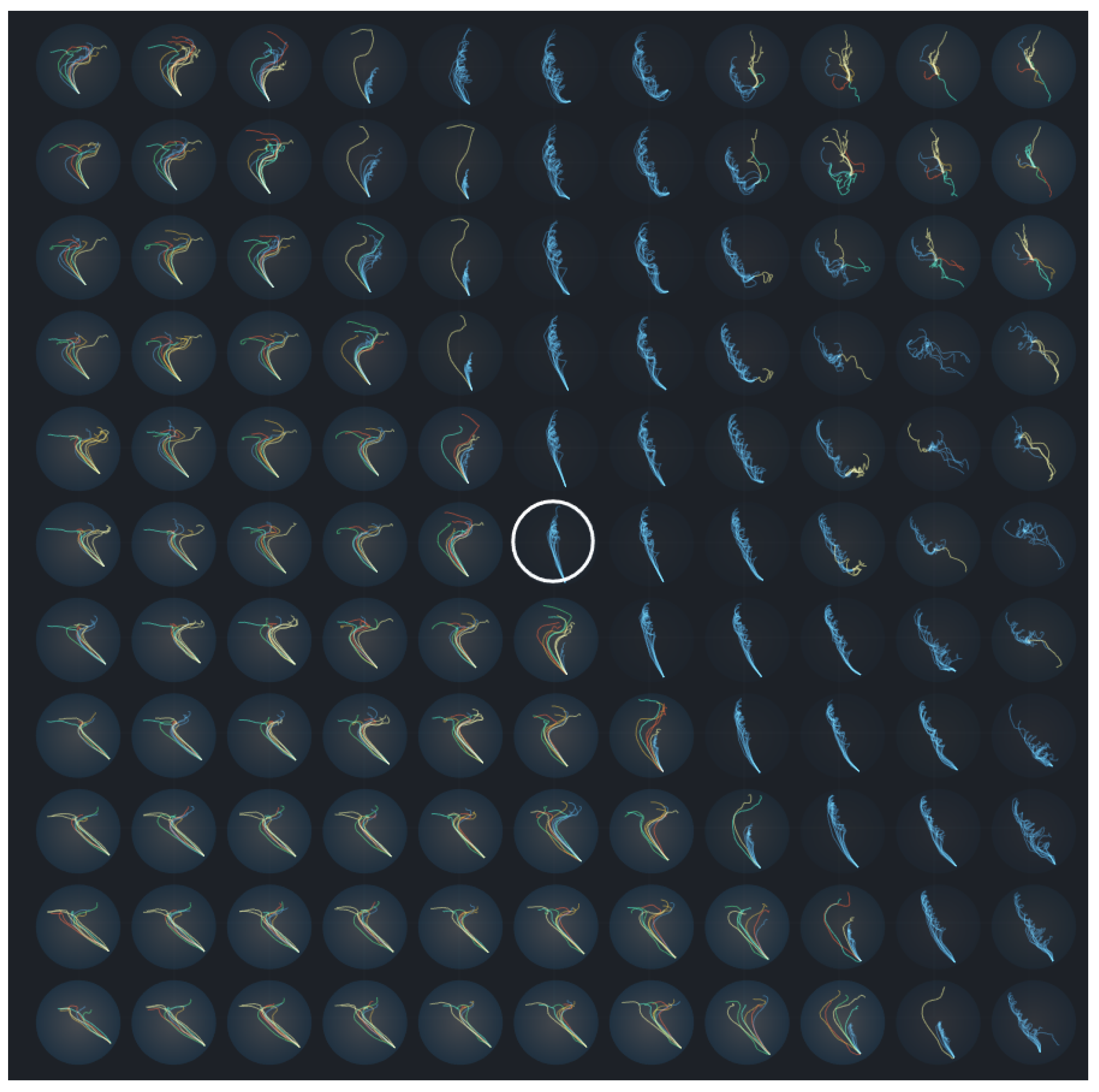
In order to globally compare the uncertainties of different grids, we set the same E p s and M i n P T S for all grid points. In this way, the variance degree of pathlines could be distinguished by observing the number of clusters that were assigned. This means that the more clusters that pathlines were divided into, the greater the uncertainty of the initial grid was. Compared with other clustering algorithms, which require specification of the number of clusters, DBSCAN is more friendly and intuitive, as it does not need to compare the divergence of every cluster of different grids in order to explore the uncertainty. In addition, clustering and dimensionality reduction algorithms are uniformly integrated into our visualization system, which demonstrates the relationships between pathlines in global and local levels. Moreover, the easy-to-use brush operation can help users to explore the transport patterns and the details of pathline members.

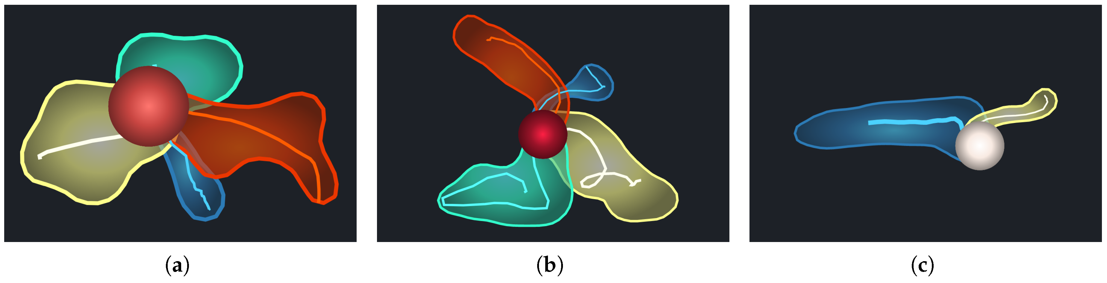
5.2. Shuttlecock Visualization

From the pathline view described in Section 5.1, we can preliminarily recognize the trends of the pathlines. However, the pathlines in real world data, with a lot of overlap and intersections, are too complicated to distinguish different patterns from. To comprehensively and intuitively display the uncertainty of a grid point in an uncertain vector field, we designed a glyph, called Shuttlecock, which consists of a circle and several “feathers.” The number of features is equal to the number of clusters. The circle represents a grid point in the uncertain vector field, and its color encodes the LU value. The color bar is coincident with the uncertainty rendering view. The deeper red the color is, the higher the LU value is.
The feathers are designed to display the major transport patterns from a grid point. Each feather is drawn as an outer contour encasing all the members of each cluster, together with the central pathline of the trend. This can intuitively describe the divergence of each pattern. In detail, for each cluster, we select equidistant sample points along each pathline and estimate the density contours for the given sample points. Then, the contour line with the lowest density is filled with a translucent color and a convex-like representation is formed. In this way, we draw the outer contour for each transport pattern. Furthermore, the pathline with the minimum AEDR distance, compared to the others in the cluster, is chosen as the central pathline. It is drawn as the stalk of the corresponding feather to approximately represent the transport trend of each cluster, where its width describes the number of pathline members in the cluster.
Thus, the shuttlecock glyph not only avoids the visual clutter caused by drawing all the pathline members but also presents the major patterns clearly, even when there are a large number of pathline members in an ensemble pathline. Through observing the different shapes of the glyph for different points, we can effectively compare the vector field uncertainty at different locations. Figure 7 presents the glyphs of the clustering results in Figure 6b–d. For example, the pathlines in Figure 6b were assigned into two clusters, and Figure 7a displays the outline and centerline of all pathlines in both of these clusters. The yellow cluster shows a more chaotic transport trend than the blue cluster. In Figure 7b,c, the yellow cluster is further subdivided and the area of each cluster is smaller.
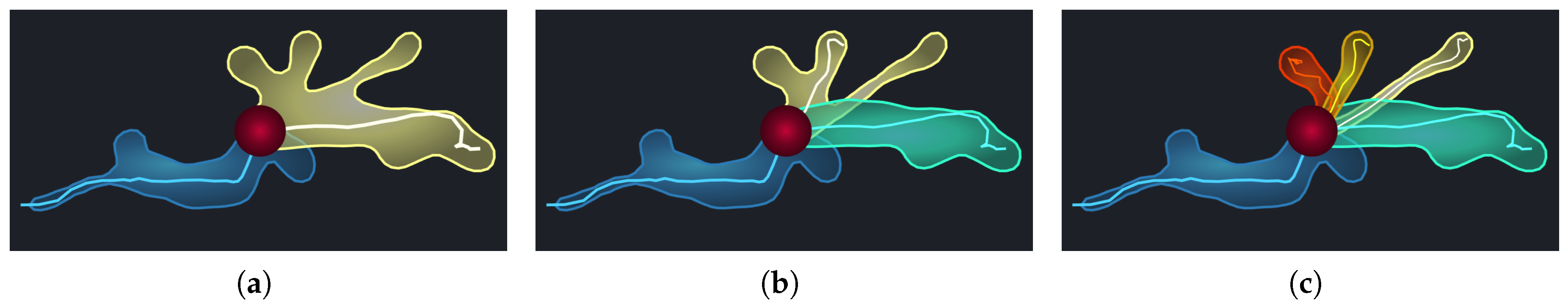
During the process of glyph design, we also considered several alternatives. One option was to display the track points of all timestamps inside the contour (Figure 8a). In this way, the divergence details of the patterns can be well-preserved, but the overlap of points limits the identification of the major trends. As shown in Figure 8b, another design was to display both the track points and the central pathlines, failing to distinguish the features when pathline clusters were close. We also tried to combine track points, central pathlines, and outer contours together (Figure 8c); however, this design could not show the central pathlines and details clearly, due to serious visual clutter.
Compared with some commonly used uncertainty visualization designs, such as Noodles [47], the contour boxplot [25], and so on, our method focuses on presenting the transport patterns for a single location in detail, rather than presenting the overall uncertainty of the whole data field. In particular, Shuttlecock has been designed to help users to perceive the major trends clearly, rather than directly encode the uncertainty values in the glyph.

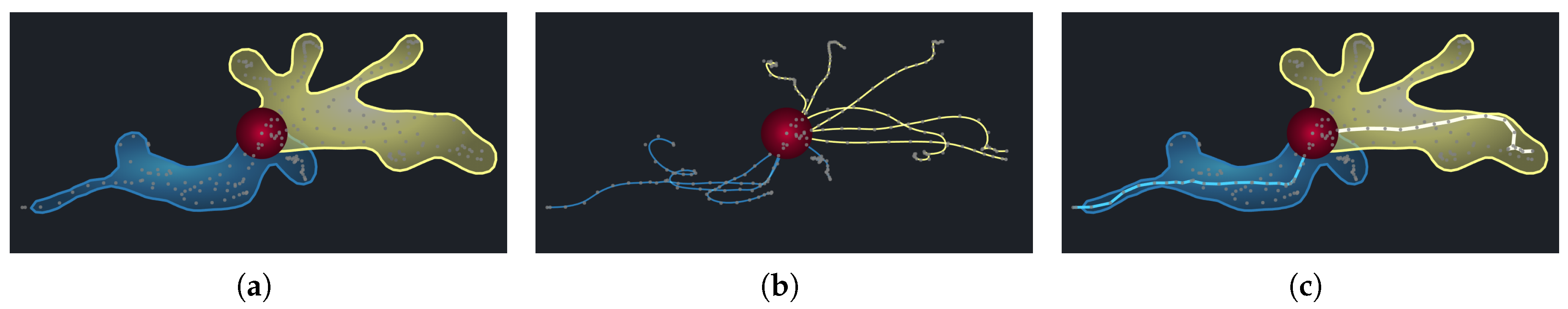
5.3. Comparison with Neighborhood Patterns

As discussed in Section 4.3, we use NU to estimate the uncertainty of a location’s neighborhood and compute CU to depict the correlation between the location and its neighborhood. Different correlation patterns can be observed in the classification view (Figure 4a). In particular, some points show a low CU, as the uncertainties of the point itself and of its neighborhood points are very different. It is useful to explore the specific differences between the grid point itself and its neighborhood, which can be solved by comparing the transport patterns of different grids in the neighborhood.
Thus, we designed a comparison view which is similar to tile stitching. It plots the pathlines of the chosen location and its neighbor locations, simultaneously, in adjacent tiles. Figure 9 presents a case of the weather data set (as described in Section 6.2). Each gray circular tile is affixed to a location whose opacity encodes the corresponding LU. We highlight the chosen location by adding a black border to the tile. In the interior of each tile, the pathlines traced from the location are downscaled and drawn without blurring the trend and variability. To enhance the contrast between different tiles, we cluster the pathlines in each tile with the same E p s and M i n P t s values. Thus, users can identify and compare the transport trends at the chosen location and its neighborhood, by observing the extracted patterns marked by different colors. For example, the pathline members traced from the chosen location in Figure 9 follow similar trends and are classified into one cluster. Similarly, some tiles in the upper part and the lower right part of the view depict the major transport trends. However, the pathlines in the other tiles diverge in different directions and show high uncertainty.

6. Case Study

In order to demonstrate the effectiveness of our method, we performed case studies using two data sets: the DG synthetic data set and the ECMWF weather simulation data set. For the DG data set, we give additional results of uncertainty transport patterns and neighborhood correlations. For the ECMWF data set, we performed comparisons of our proposed measurement method to other methods and described the observations in visual analysis.

6.1. Double-Gyre Synthetic Data Set

6.1.1. Transport Pattern Exploration

For further exploration, we selected the location “A” (Figure 10a) with very high uncertainty and inspected the detailed transport pattern in the separatrix of the two gyres. As shown in Figure 10b, two opposite transport trends can be observed, which reveals the highly unstable transport behaviors in this region. When we select the points of one cluster in the projection view (Figure 10c), the corresponding trend is highlighted, as shown in Figure 10d. This helps domain experts to associate the transport trends of the corresponding ensemble members with specific input parameters.
When we selected the location “B” (Figure 10a) with low uncertainty, a consistent trend was presented, as shown in Figure 10e. As for location ‘C’ in the gyre center, the pathlines had serious clutter, as shown in Figure 10f, and no distinct features could be observed. By performing dimension reduction and clustering to the pathline members based on AEDR, multiple hidden features could be further extracted by brushing specific points, as shown in Figure 10g.

6.1.2. Neighborhood Correlation Analysis

For neighborhood correlation analysis, the rendering of NU and CU, classification view, and comparison view are combined to facilitate the user’s understanding. As all these views are linked, users can begin by observing the result of NU (Figure 11a) or CU (Figure 11b), and by following the guidance of classification view (Figure 4a) and selecting a point of interest. The highlighted point “B” in the classification view (Figure 4a) indicates a high positive correlation between the location and its neighborhood, and corresponds to the marked location “B” in the rendering of CU (Figure 11b). This means that the region between the two gyres had a positive CU, while the correlations in other regions were not obvious.
Furthermore, Figure 11c shows a comparison of transport patterns between the marked location “B” in Figure 11a,b and its neighborhood. It can be seen that the transport patterns of the inner neighborhood were generally consistent with the location, while the outer particles were slightly different. This conforms to our inference, as the inner neighborhood had a higher weight than the outer one when the correlation was computed.

6.2. ECMWF Ensemble Simulation Data Set

The ECMWF ensemble simulation data set is comprised of large-scale meteorological simulations of weather on a global scale. The data of wind speed at 10 m above sea level were used in our experiment, where the spatial resolution was 320 × 161 . The output data were generated every three hours, and thus, there were eight time steps per day. We analyzed the transport variances over three days, for a total of 24 time steps. Each time step had 10 ensemble members.

6.2.1. Comparison and Transport Pattern Analysis

Figure 12 shows the local uncertainty of the wind velocity field, as computed by AEDR, classical EDR, Euclidean distance, DTW, LCSS, and ERP. According to a domain expert, the stability of transport behaviors in the wind field is largely relevant to geographical factors. As shown in Figure 12, from a global perspective, similar patterns were present in all the results, where the regions with high uncertainty were mainly located in the Southern Hemisphere. Besides, the marine areas generally have higher uncertainty. As for the continents, they generally feature lower uncertainty, while some areas near the sea also display a modest degree of uncertainty. These are because the wind formation and transportation are more complex in the marine areas and are more sensitive to the parameters in the weather simulation. This generally agreed with the domain expert’s expectations. Some regions with relatively high uncertainty in the Northern Hemisphere were only displayed obviously by AEDR (Figure 12a). For example, the point “A” in Figure 12a was located in an area near the sea in Northern Europe where the terrain is low and flat (the altitude is about 135 m). This location is influenced by both the polar maritime air mass and by the continental air mass. Thus, the point “A” has relatively high uncertainty (Figure 12a), and the corresponding transport pattern is shown in Figure 13a. It should be regarded as a chaotic pattern on a small scale. However, other measurements failed to reveal the real case. The low velocity magnitude at location “A” led to the low values of Euclidean distance, DTW, and ERP. As for LCSS and classical EDR, the difference was largely ignored, since they neglected the distance between the matched points. At point “B” (Figure 12a), located in the Southern Pacific, wind velocities are commonly high and continually changing. For this case, the high uncertainty (Figure 12) and the chaotic transport pattern (Figure 13b) could be truly presented by all the measurement methods. As for the point “C,” located in the Pacific near the equator and near a continent, its region was influenced by both trade winds from the northeast and southeast; thus, the main trend of the wind was from east to west. However, small adverse flows may also occur at point “C.” As shown in Figure 13c, the transport pattern of point “C” is composed of two opposite trends. One is transporting far and the other is moving near the location, which indicates that uncertain behaviors exist. This is a significant case which domain experts want to find, because the appearance of the special trends and their corresponding ensemble members are important for adjusting the parameters of the simulation model. The results of AEDR can reveal this uncertainty and better conform to the real case, which helps domain experts to discover such significant transport patterns; other measurement methods failed to present the uncertainty accurately.

6.2.2. Neighborhood Correlation Analysis

In order to analyze the neighborhood correlation, we first focused on the classification view (Figure 14a). It can be observed that most of the points appeared in the blue and red regions. This illustrates that their LU and NU were generally consistent. However, the point colors indicate that the neighborhood correlation was negative in many locations. In order to inspect these abnormal cases, we selected the point “A” in Figure 14a, which had a low CU value. Its location is highlighted in Figure 14b, and its neighborhood detail can be inspected in the comparison view (Figure 14c). It can be seen that the neighborhood mostly had very different transport patterns and different degrees of uncertainty. This explains why this location had a negative correlation with its neighborhood.

7. Discussion

7.1. Implementation and Performance

The implementation of our visual analysis framework consists of several computation tasks. Computation of the LU field is parallelizable in nature, as the computation is independent for each location. Thus, we performed it in parallel using CUDA on an NVIDIA GT 730 GPU with ( 32 × 32 × 16 × 16 ) threads. Figure 15 shows the computation time of the DG data set with different ensemble numbers using CUDA versus single-thread implementation. It can be observed that the implementation of CUDA provided higher efficiency than the single-thread implementation and that the advantage became larger as the ensemble number increased. However, when the ensemble number was 10, the single-thread implementation was more efficient than the CUDA implementation. This was because the CUDA implementation included several preprocessing steps, such as dividing the data into several batches, loading the data into the GPU, and allocating the threads. Thus, if the data size is small, it is better to use the single-thread implementation. For the general case of large data size, the CUDA implementation can improve the efficiency of LU computation. The computations of NU and CU are based on the results of LU and can be completed instantly.
Moreover, when users explore the visual analysis system, all the computation and interactions respond in real-time, including the online computation of clustering and projection. Given that DBSCAN and tSNE both generate results based on differences between data, for the pathlines of a grid, we save the intermediate results in preprocessing as a difference matrix. In this way, the clustering and projection algorithms can both use the matrices as input and avoid computing differences repeatedly, which improves the running speed. With rich components in the control panel of our system, it is very efficient and convenient for users to adjust the algorithm parameters and inspect the corresponding results.

7.2. Parameters

The computation of AEDR is relatively robust to the neighborhood threshold δ . Figure 16 shows the results of AEDR for the DG data set using δ = 20 and δ = 30 . The general features presented in these results are consistent. Robustness to the threshold δ was also benefited by computing the distance between the matched points. If we set δ to an especially small value, the most stable locations will be found and most of the areas will show variations, in varying degrees. Similarly, if we use a large value of δ to compute AEDR, the region with the largest uncertainty will be found. In our experiments, we set δ to 10–20% of the length of the shorter spatial dimension.
As for the parameters of the DBSCAN algorithm, we allow users to change them in the parameter panel (Figure 5a), in order to explore different clustering results and the corresponding features.

8. Conclusions and Future Work

In this paper, we have presented a novel method to analyze the uncertainty in an ensemble vector field. In order to measure the difference between pathline members effectively, we proposed a measurement method, AEDR, based on classical EDR. It is a more effective measurement method, with high robustness to outliers, support for comparison between pathline members with different lengths, and higher accuracy. On this basis, we considered the neighborhood uncertainty and computed the correlation between a location and its neighborhood. Using these measurements, we designed and developed a visual analysis system, UP-Vis, to help users to deeply and comprehensively analyze the transport patterns and the neighborhood uncertainty. We clustered the pathline members into transport trends using a novel glyph, called Shuttlecock, designed to intuitively show the trends and their diverging degrees. The classification view and comparison view can help users to understand the neighborhood correlation more deeply. Experimental results using synthetic and real data sets have demonstrated the effectiveness of our method.
In the future, we plan to explore and analyze data with multi-resolution and trace particles under different spatial scales. We also plan to use ensemble clustering to obtain more robust results for pathline clustering. Furthermore, more views for satisfying different requirements and supporting 3D analysis will be added to the visual analysis system.

Author Contributions

Conceptualization, Ke Ren; methodology, Huijie Zhang and Liang Tai; software, Shaobin Xu and Xufeng Jiao; and writing—original draft preparation, Dezhan Qu. All authors have read and agreed to the published version of the manuscript.

Funding

This research was funded by National Natural Science Foundation of China under grant number 41671379.

Conflicts of Interest

The authors declare no conflict of interest.

References

  1. Wang, J.; Hazarika, S.; Li, C.; Shen, H.W. Visualization and Visual Analysis of Ensemble Data: A Survey. IEEE Trans. Vis. Comput. Graph. 2018, 25, 2853–2872. [Google Scholar] [CrossRef]
  2. Zhang, H.; Qu, D.; Liu, Q.; Shang, Q.; Hou, Y.; Shen, H.W. Uncertainty visualization for variable associations analysis. Vis. Comput. 2018, 34, 531–549. [Google Scholar] [CrossRef]
  3. Hazarika, S.; Biswas, A.; Shen, H.W. Uncertainty visualization using copula-based analysis in mixed distribution models. IEEE Trans. Vis. Comput. Graph. 2018, 24, 934–943. [Google Scholar] [CrossRef] [PubMed]
  4. Liu, S.; Cui, W.; Wu, Y.; Liu, M. A survey on information visualization: Recent advances and challenges. Vis. Comput. 2014, 30, 1373–1393. [Google Scholar] [CrossRef]
  5. Biswas, A.; Lin, G.; Liu, X.; Shen, H.W. Visualization of time-varying weather ensembles across multiple resolutions. IEEE Trans. Vis. Comput. Graph. 2017, 23, 841–850. [Google Scholar] [CrossRef] [PubMed]
  6. Bonneau, G.P.; Hege, H.C.; Johnson, C.R.; Oliveira, M.M.; Potter, K.; Rheingans, P.; Schultz, T. Overview and state-of-the-art of uncertainty visualization. In Scientific Visualization; Springer: Berlin/Heidelberg, Germany, 2014; pp. 3–27. [Google Scholar]
  7. Hummel, M.; Obermaier, H.; Garth, C.; Joy, K.I. Comparative visual analysis of Lagrangian transport in CFD ensembles. IEEE Trans. Vis. Comput. Graph. 2013, 19, 2743–2752. [Google Scholar] [CrossRef] [PubMed] [Green Version]
  8. Haller, G. Distinguished material surfaces and coherent structures in three-dimensional fluid flows. Phys. D Nonlinear Phenom. 2001, 149, 248–277. [Google Scholar] [CrossRef] [Green Version]
  9. Guo, H.; Yuan, X.; Huang, J.; Zhu, X. Coupled ensemble flow line advection and analysis. IEEE Trans. Vis. Comput. Graph. 2013, 19, 2733–2742. [Google Scholar]
  10. Vlachos, M.; Kollios, G.; Gunopulos, D. Discovering similar multidimensional trajectories. In Proceedings of the 18th International Conference on Data Engineering, San Jose, CA, USA, 26 February–1 March 2002; pp. 673–684. [Google Scholar]
  11. Keogh, E.; Ratanamahatana, C.A. Exact indexing of dynamic time warping. Knowl. Inf. Syst. 2005, 7, 358–386. [Google Scholar] [CrossRef]
  12. Salvador, S.; Chan, P. Toward accurate dynamic time warping in linear time and space. Intell. Data Anal. 2007, 11, 561–580. [Google Scholar] [CrossRef] [Green Version]
  13. Chen, L.; Özsu, M.T.; Oria, V. Robust and fast similarity search for moving object trajectories. In Proceedings of the 2005 ACM SIGMOD International Conference on Management of Data, Baltimore, MD, USA, 14–16 June 2005; pp. 491–502. [Google Scholar]
  14. Chen, L.; Ng, R. On the marriage of lp-norms and edit distance. In Proceedings of the Thirtieth International Conference on Very Large Data Bases-Volume 30, Toronto, ON, Canada, 31 August–3 September 2004; pp. 792–803. [Google Scholar]
  15. Pöthkow, K.; Weber, B.; Hege, H.C. Probabilistic marching cubes. In Computer Graphics Forum; Wiley Online Library: Hoboken, NJ, USA, 2011; Volume 30, pp. 931–940. [Google Scholar]
  16. Anselin, L. Local indicators of spatial association—LISA. Geogr. Anal. 1995, 27, 93–115. [Google Scholar] [CrossRef]
  17. Zhu, B.; Chen, H. Information visualization. Annu. Rev. Inf. Sci. Technol. 2005, 39, 139–177. [Google Scholar] [CrossRef]
  18. Hollister, B.E.; Pang, A. Bivariate Quantile Interpolation for Ensemble Derived Probability Density Estimates. Int. J. Uncertain. Quantif. 2015, 5. [Google Scholar] [CrossRef]
  19. Schneider, D.; Fuhrmann, J.; Reich, W.; Scheuermann, G. A variance based FTLE-like method for unsteady uncertain vector fields. In Topological Methods in Data Analysis and Visualization II; Springer: Berlin/Heidelberg, Germany, 2012; pp. 255–268. [Google Scholar]
  20. Guo, H.; He, W.; Peterka, T.; Shen, H.W.; Collis, S.M.; Helmus, J.J. Finite-time lyapunov exponents and lagrangian coherent structures in uncertain unsteady flows. IEEE Trans. Vis. Comput. Graph. 2016, 22, 1672–1682. [Google Scholar] [CrossRef] [PubMed]
  21. Yi, B.K.; Jagadish, H.; Faloutsos, C. Efficient retrieval of similar time sequences under time warping. In Proceedings of the 14th International Conference on Data Engineering, Orlando, FL, USA, 23–27 February 1998; pp. 201–208. [Google Scholar]
  22. Liu, R.; Guo, H.; Zhang, J.; Yuan, X. Comparative visualization of vector field ensembles based on longest common subsequence. In Proceedings of the 2016 IEEE Pacific Visualization Symposium (PacificVis), Taipei, Taiwan, 19–22 April 2016; pp. 96–103. [Google Scholar]
  23. Hong, F.; Bi, C.; Guo, H.; Ono, K.; Yuan, X. Compression-based integral curve data reuse framework for flow visualization. J. Vis. 2017, 20, 859–874. [Google Scholar] [CrossRef]
  24. McLoughlin, T.; Jones, M.W.; Laramee, R.S.; Malki, R.; Masters, I.; Hansen, C.D. Similarity measures for enhancing interactive streamline seeding. IEEE Trans. Vis. Comput. Graph. 2013, 19, 1342–1353. [Google Scholar] [CrossRef] [Green Version]
  25. Whitaker, R.T.; Mirzargar, M.; Kirby, R.M. Contour boxplots: A method for characterizing uncertainty in feature sets from simulation ensembles. IEEE Trans. Vis. Comput. Graph. 2013, 19, 2713–2722. [Google Scholar] [CrossRef] [Green Version]
  26. Mirzargar, M.; Whitaker, R.T.; Kirby, R.M. Curve boxplot: Generalization of boxplot for ensembles of curves. IEEE Trans. Vis. Comput. Graph. 2014, 20, 2654–2663. [Google Scholar] [CrossRef]
  27. Demir, I.; Dick, C.; Westermann, R. Multi-charts for comparative 3d ensemble visualization. IEEE Trans. Vis. Comput. Graph. 2014, 20, 2694–2703. [Google Scholar] [CrossRef]
  28. Ferstl, F.; Bürger, K.; Westermann, R. Streamline variability plots for characterizing the uncertainty in vector field ensembles. IEEE Trans. Vis. Comput. Graph. 2016, 22, 767–776. [Google Scholar] [CrossRef]
  29. Post, F.H.; Vrolijk, B.; Hauser, H.; Laramee, R.S.; Doleisch, H. The state of the art in flow visualisation: Feature extraction and tracking. In Computer Graphics Forum; Wiley Online Library: Hoboken, NJ, USA, 2003; Volume 22, pp. 775–792. [Google Scholar]
  30. Botchen, R.P.; Weiskopf, D.; Ertl, T. Interactive visualization of uncertainty in flow fields using texture-based techniques. In Proceedings of the 12th Iternational Symposium on Flow Visualisation, Göttingen, Germany, 10–14 September 2006; pp. 4051–4056. [Google Scholar]
  31. Muelder, C.; Ma, K.L. Interactive feature extraction and tracking by utilizing region coherency. In Proceedings of the 2009 IEEE Pacific Visualization Symposium, Beijing, China, 20–23 April 2009; pp. 17–24. [Google Scholar]
  32. Sauer, F.; Yu, H.; Ma, K.L. Trajectory-based flow feature tracking in joint particle/volume datasets. IEEE Trans. Vis. Comput. Graph. 2014, 20, 2565–2574. [Google Scholar] [CrossRef] [PubMed]
  33. Huang, D.; Lai, J.H.; Wang, C.D. Robust ensemble clustering using probability trajectories. IEEE Trans. Knowl. Data Eng. 2015, 28, 1312–1326. [Google Scholar] [CrossRef] [Green Version]
  34. Huang, D.; Wang, C.D.; Lai, J.H. Locally weighted ensemble clustering. IEEE Trans. Cybern. 2017, 48, 1460–1473. [Google Scholar] [CrossRef] [PubMed] [Green Version]
  35. Lee, J.G.; Han, J.; Whang, K.Y. Trajectory clustering: A partition-and-group framework. In Proceedings of the 2007 ACM SIGMOD International Conference on Management of Data, Beijing, China, 11–14 June 2007; pp. 593–604. [Google Scholar]
  36. Wittenbrink, C.M.; Pang, A.T.; Lodha, S.K. Glyphs for visualizing uncertainty in vector fields. IEEE Trans. Vis. Comput. Graph. 1996, 2, 266–279. [Google Scholar] [CrossRef]
  37. Hlawatsch, M.; Leube, P.; Nowak, W.; Weiskopf, D. Flow radar glyphs—static visualization of unsteady flow with uncertainty. IEEE Trans. Vis. Comput. Graph. 2011, 17, 1949–1958. [Google Scholar] [CrossRef]
  38. Jiao, F.; Phillips, J.M.; Gur, Y.; Johnson, C.R. Uncertainty visualization in HARDI based on ensembles of ODFs. In Proceedings of the 2012 IEEE Pacific Visualization Symposium, Songdo, Korea, 28 February–2 March 2012; pp. 193–200. [Google Scholar]
  39. Jarema, M.; Demir, I.; Kehrer, J.; Westermann, R. Comparative visual analysis of vector field ensembles. In Proceedings of the 2015 IEEE Conference on Visual Analytics Science and Technology (VAST), Chicago, IL, USA, 25–30 October 2015; pp. 81–88. [Google Scholar]
  40. Levenshtein, V.I. Binary codes capable of correcting deletions, insertions, and reversals. Sov. Phys. Dokl. 1966, 10, 707–710. [Google Scholar]
  41. Shadden, S.C.; Lekien, F.; Marsden, J.E. Definition and properties of Lagrangian coherent structures from finite-time Lyapunov exponents in two-dimensional aperiodic flows. Phys. D Nonlinear Phenom. 2005, 212, 271–304. [Google Scholar] [CrossRef]
  42. Kreyszig, E.; Stroud, K.; Stephenson, G. Advanced Engineering Mathematics; John Wiley Sons: Hoboken, NJ, USA, 1979. [Google Scholar]
  43. Jarema, M.; Kehrer, J.; Westermann, R. Comparative visual analysis of transport variability in flow ensembles. J. WSCG 2016, 24, 25–34. [Google Scholar]
  44. Ester, M.; Kriegel, H.P.; Sander, J.; Xu, X. A density-based algorithm for discovering clusters in large spatial databases with noise. In Proceedings of the KDD’96 Second International Conference on Knowledge Discovery and Data Mining, Portland, OR, USA, 2–4 August 1996; pp. 226–231. [Google Scholar]
  45. Landesberger, T.V.; Brodkorb, F.; Roskosch, P.; Andrienko, N.; Andrienko, G.; Kerren, A. MobilityGraphs: Visual Analysis of Mass Mobility Dynamics via Spatio-Temporal Graphs and Clustering. IEEE Trans. Vis. Comput. Graph. 2015, 22, 11–20. [Google Scholar] [CrossRef] [Green Version]
  46. Han, J.; Tao, J.; Wang, C. FlowNet: A Deep Learning Framework for Clustering and Selection of Streamlines and Stream Surfaces. IEEE Trans. Vis. Comput. Graph. 2018. [Google Scholar] [CrossRef]
  47. Sanyal, J.; Zhang, S.; Dyer, J.; Mercer, A.; Amburn, P.; Moorhead, R. Noodles: A tool for visualization of numerical weather model ensemble uncertainty. IEEE Trans. Vis. Comput. Graph. 2010, 16, 1421–1430. [Google Scholar] [CrossRef] [PubMed]
Figure 1. Workflow of analyzing uncertainty in a time-varying ensemble vector field.
Ijgi 09 00019 g001
Figure 2. Results of different metrics: (a) Result of AEDR, (b) result of classical EDR, (c) result of Euclidean distance, (d) result of DTW, (e) result of LCSS, and (f) result of ERP.
Ijgi 09 00019 g002
Figure 3. Pathline tracing of single location and neighborhood: (a) Pathline tracing of single location and (b) pathline tracing of neighborhood.
Ijgi 09 00019 g003
Figure 4. Classification view: (a) four regions of the classification space and mapped grid points and (b) a rendering of the original vector field with the colors used in (a).
Ijgi 09 00019 g004
Figure 5. Interfaces of UP-Vis: (a) Parameter panel, (b) uncertainty rendering view, (c) classification view, (d) pathline view, (e) projection view, and (f) comparison view.
Ijgi 09 00019 g005
Figure 6. Clustering results with different parameters: (a) pathline view and projection view of pathline members before clustering; (b) pathline view and projection view of clustered pathline members with E p s = 0.8 and M i n P t s = 1; (c) pathline view and projection view of clustered pathline members with E p s = 0.75 and M i n P t s = 1; and (d) pathline view and projection view of clustered pathline members with E p s = 0.75 and M i n P t s = 2.
Ijgi 09 00019 g006
Figure 7. Shuttlecock for ensemble pathline: (a) displaying the clustered pathline members with E p s = 0.8 and M i n P t s = 1; (b) displaying the clustered pathline members with E p s = 0.75 and M i n P t s = 1; and (c) displaying the clustered pathline members with E p s = 0.75 and M i n P t s = 2.
Ijgi 09 00019 g007
Figure 8. Alternative designs: (a) displaying the track points of all timestamps inside the contour; (b) displaying both the track points and the central pathlines; and (c) combining track points, central pathlines, and outer contours.
Ijgi 09 00019 g008
Figure 9. Comparison view of marked location “B” in Figure 14b.
Ijgi 09 00019 g009
Figure 10. Transport patterns in the DG data set: (a) Rendering of local uncertainty (LU), (b) Transport pattern of location “A”, (c) Projection view of location “A” with selected points, (d) Selected trend, (e) Transport pattern of location “B”, (f) Transport pattern of location “C”, and (g) Hidden transport trends of location “C” revealed by brushing specific points.
Ijgi 09 00019 g010
Figure 11. Transport patterns in the Double-Gyre (DG) data set: (a) rendering of neighborhood uncertainty (NU), (b) rendering of uncertainty correlation (CU), and (c) comparison view of location “B” in subfigures (a,b).
Ijgi 09 00019 g011
Figure 12. LU results of ECMWF data set: (a) result of AEDR, (b) result of classical EDR, (c) result of Euclidean distance, (d) result of DTW, (e) result of LCSS, and (f) result of ERP.
Ijgi 09 00019 g012
Figure 13. Transport patterns of marked locations in Figure 12a: (a) transport pattern at location “A”, (b) transport pattern at location “B”, and (c) transport pattern of location “C”.
Ijgi 09 00019 g013
Figure 14. Neighborhood correlation analysis of ECMWF data: (a) classification view, (b) rendering of CU, and (c) comparison view of location “A”.
Ijgi 09 00019 g014
Figure 15. Computation time of DG synthetic data set with different ensemble numbers using CUDA implementation and single-thread implementation.
Ijgi 09 00019 g015
Figure 16. AEDR results for DG data set using different thresholds: (a) AEDR result with δ = 20 , and (b) AEDR result with δ = 30 .
Ijgi 09 00019 g016
Table 1. Sensitivity to outliers for different measurement methods.
MetricSensitivity to Outliers
1%5%10%15%
ERP16.892%7.755%4.292%2.681%
DTW16.908%7.76%4.306%2.712%
LCSS8.713%7.262%2.87%1.557%
EDR6.035%3.855%1.557%0.813%
AEDR4.15%0.577%0.092%0.012%

