

Article

Visualisation Methodology for Informed Decision-Making Applied to Smart City and Digital Twin Contexts


KU Leuven Public Governance Institute, 3000 Leuven, Belgium
*
Author to whom correspondence should be addressed.
ISPRS Int. J. Geo-Inf. 2026, 15(6), 231; https://doi.org/10.3390/ijgi15060231
Submission received: 24 March 2026 / Revised: 9 May 2026 / Accepted: 18 May 2026 / Published: 23 May 2026
(This article belongs to the Topic Spatial Decision Support Systems for Urban Sustainability)

Abstract

The expansion of accessible, fine-grained city data has significantly increased opportunities for evidence-based and informed policy-making. Despite this evolution, extracting actionable insights from heterogeneous data sources and effectively communicating findings remain persistent challenges. Most existing visualisation approaches and research prioritise technical implementation by focusing on how to visualise, often neglecting the importance of policy-driven visualisation questions and data contexts. This led to flawed analyses, particularly in complex domains such as smart cities and urban policy-making using digital twins. This article presents a novel, practical, step-by-step policy visualisation methodology grounded in empirical smart city research, shifting the emphasis toward policy-element-based questions informed by data-informed evidence. The methodology was successfully applied, tested, and adapted, resulting in an implementable, structured, and integrative approach that aligns with policymakers’ established policy design, implementation, and evaluation cycles. Through this approach, 20 user-driven smart city policy visualisations were operationalised and implemented in strategic policy decision-making contexts across smart city domains, including mobility, spatial planning, and environment. The results demonstrate how dashboards, algorithmic simulations, and digital twins visualisations can be systematically deployed to support evidence-informed decision-making.

1. Introduction

Recent trends in open data, big data, and data analytics have renewed both the possibility and interest in transforming government activity, particularly in policy development [1,2]. However, in the era of smart cities, the availability of more big data for evidence-based decision-making is not obvious. A smart city is a complex concept that can be understood as an ontology that encapsulates combinatorial relationships among concepts from Urban Design, Information Technology, Public Policy, and the Social Sciences [3]. The United Nations UNECE, e.g., uses a policy goal related definition by describing a smart sustainable city as “an innovative city that uses ICTs and other means to improve quality of life, efficiency of urban operation and services, and competitiveness, while ensuring that it meets the needs of present and future generations with respect to economic, social, environmental as well as cultural aspects” [4]. Smart and sustainable cities-related concepts, such as the urban quality space-place framework, also emphasise the importance of spatial thinking to better understand the complexity of human–environmental interactions in the city, to define spaces and places as part of an evolving urban process, and to ultimately improve the quality of living [5].
In this more and more complex society, decision-making and policy-making are characterised by a growing number of (a) different policy targets and instruments that (b) are often interdependent and (c) reformed in an uncontrolled way [6].
However, also in complex environments, there remains a demand for evidence-based decision-making. Evidence-based practice originates in medical practice and was defined in the late 1990s as the “conscientious, explicit and judicious use of current best evidence in making decisions about the care of individuals [clients]” [7]. Nevo and Slonim-Nevo [8] note that evidence-based practice is also grounded in a positive conception of scientific rationality, namely, a conception of science as unilaterally grounded in empirical evidence. Rubin summarizes four disadvantages of evidence-based practices: (i) it is too mechanistic and ignores the unique characteristics of both clients and practitioners, (ii) it is not clear enough, ignores research flaws and makes exaggerated claims about the evidence at hand, (iii) it is hard to implement due to resource limitations such as time, training and supervision, and (iv) due to the nature of the scientific process, the empirical findings are outdated by the time they appear in print [9]. The idea of mere evidence-based reasoning was also rejected by influential philosophers and historians of science for its mechanistic approach [10,11,12]. Most of these authors support an alternative, evidence-informed practice, leaving ample room for experimentation and for constructive, imaginative judgments by practitioners and clients who are constantly in interaction and dialogue with one another. Evidence-informed practice encourages practitioners to be knowledgeable about findings from all types of data and studies and to use them in their work in an integrative manner, while taking into account experience and judgement, clients’ preferences and values, and the context of intervention [8,13,14].
In fast-moving smart city policy domains such as mobility, the environment, or spatial planning, evidence-based decision-making grounded in the best available information is often not feasible because local knowledge and experience cannot be, or have not been, empirically confirmed. Therefore, Head concluded that evidence-informed policy advice and management practice are often more realistic for public sector managers than evidence-based policy [15]. Apart from practical realism, policymakers have other reasons that inform their decisions, as emphasised by Capano & Lippi [16]. These reasons are typically connected to two main purposes: the search for effectiveness (instrumentality) and the construction of a shared sense of and common acceptance of a policy (legitimacy).
The conceptualisation of cities as complex data-rich environments can be traced back to the widespread adoption of the smart city paradigm more than a decade ago. Central distinguishing features of this paradigm include the extensive deployment of heterogeneous, often real-time, sensing technologies and the increasing reliance on algorithm-based urban models. In this context, Batty introduced the concept of urban informatics in 2013 to describe the transformation of cities through massive datasets generated by diverse sensor infrastructures, framing cities as information-intensive governance environments in which data play a central role in urban policy analysis and modelling [17]. Kitchin similarly argues that contemporary cities are becoming increasingly data-driven and are characterised by emerging forms of algorithmic governance. However, he critically emphasises that the growing reliance on data and algorithms in policy-making processes is neither objective nor neutral; rather, such systems are inherently political, imperfect, and partial [18]. Building on these perspectives, Kandt et al. developed a theoretical framework for urban analytics aimed at long-term urban policy and planning. Their work highlights both the value and the limitations of big data in urban contexts and underscores the importance of data visualisation as a means to reveal patterns, particularly in high-frequency urban datasets [19]. Garcia et al. discuss a comprehensive review of advances in information visualisation techniques that support decision-making in urban contexts. Despite the proliferation of visualisation technologies for urban data, they conclude that genuine user needs are often insufficiently addressed and argue for the adoption of user-centred design approaches in urban data visualisation [20]. An example of a more user-centred design is the science–policy interface presented by Ruppert et al., which proposes a visualisation-integrated framework to support collaboration between scientists and policymakers addressing a policy paradox [21]. This paradox acknowledges the importance of evidence in political decision-making and concludes that knowledge from the sciences is seldom considered in policy-making. Also, Nash et al. [22] examine a wide range of policy-oriented data visualisations across multiple societal domains, emphasising their interdisciplinary, collaborative, and dynamic nature. Nash and Lanza provide a nuanced account of how data practices can be adopted and adapted across different stages of the policy-making process [22,23]. Kitchin et al. further contend that urban data visualisations used in policy-support systems, such as city dashboards that translate urban complexity into structured knowledge, should be understood as socio-technical assemblages. From this perspective, enacted policies and governance outcomes are shaped by specific epistemological assumptions embedded within these systems [24]. The rapid increase in both the volume and heterogeneity of policy-relevant data, particularly within smart city environments, has intensified the demand for methodological approaches that render such data actionable for policy-making. Recent research outlines methods for evidence-based decision-making in contexts characterised by sparse, heterogeneous, and incomplete data series. Piras et al. [25] demonstrate how artificial intelligence (AI) and machine learning (ML) techniques can generate datasets with sufficient predictive stability to support policy decisions. Nonetheless, the effectiveness of these models in forecasting ultimately hinges on domain expertise to guide appropriate model selection and alignment, whereby the impact on reducing the policy paradox is likely limited.
Also, the emergence of advanced analytical and visualisation tools, including urban dashboards and digital twins, underscores the role of data-driven visualisation techniques in supporting evidence-informed and evidence-based decision-making and overcoming the policy paradox.
Data-driven visualisation can be seen as a range of techniques and technologies for informed public policy-making in a growingly complex and fast-changing landscape [26]. Mahoney described it as the art and science of graphically displaying large amounts of data in a visually attractive and simplified way, to facilitate understanding, decision and therefore action [27]. In particular, the use of location-based big data for smart cities (LocBigData), such as location tracking, sensing data, social media data, and crowdsourced geographic data, introduces new challenges and opportunities [28]. There is no doubt that visualisations are widely adopted [26] and can be very effective.
Data visualisation is a well-established domain with a tradition of publications, courses, and often software-related manuals that discuss data visualisation methods and techniques, providing valuable insights into the do’s and don’ts of creating visualisations [29,30,31]. The primary focus lies on the visualisation itself, rather than on the policy goals and policy-related questions to be substantiated.
The V-FRAMER is one of the few data visualisation frameworks that extends beyond the focus on visualisation itself. The framework contains guidelines that extend beyond grammatically correct visualisations, conveying values and relationships in the underlying data, which can still make audiences susceptible to reasoning misleaders [32].
A comparative analysis of relevant visualisation frameworks and evidence-informed approaches [33] indicates a clear divergence in focus. Visualisation manuals predominantly emphasise the practical and technical dimensions of data visualisation, while also directly addressing aspects of data management. In contrast, evidence-informed policy-making approaches prioritise decision support mechanisms but largely overlook visualisation practices. The V-Framer framework seeks to bridge this gap by integrating co-creative and ethical principles in data management and visualisation, with particular attention to preventing misleading representations. Although these frameworks and approaches acknowledge the role of data in supporting decision-making, they generally lack explicit strategies for systematic policy integration.
Policy instruments, applied in the broader context of digitalisation and urban informatics, can provide structured approaches to decision-making in complex environments like cities and regions. (i) Regulatory and legal instruments establish binding constraints on data use, privacy, cybersecurity, and algorithmic accountability, e.g., the General Data Protection Regulation (GDPR) [34]. (ii) Economic and financial instruments, including grants, tax incentives, public–private partnerships, and outcome-based financing, mobilise investments and reduce risks for experimentation and scaling. (iii) Public procurement and commissioning can act as market-shaping tools by specifying interoperability, open standards, and data-sharing requirements in contracts. (iv) Standards and technical frameworks, as indirect enabling policy instruments, often provide protocols and architectures facilitating system integration and portability across platforms.
These rules and resource-oriented instruments can be complemented by instruments that facilitate coordination, knowledge sharing, and societal uptake. These can include: (v) institutional and governance instruments such as dedicated data offices, cross-sector coordination units, and data platforms that structure decision-making and operational capacity within governments; (vi) informational and soft instruments (e.g., guidelines, benchmarks, capacity-building) to diffuse best practices and shape behaviour; and (vii) infrastructure and service provision instruments ensuring the availability of foundational assets like connectivity, sensor networks, and cloud/edge computing.
Across these policy instruments, visualisation instruments (e.g., digital dashboards and digital twins) can play a transversal role by translating complex urban data into interpretable formats that support evidence-based policy-making, facilitate stakeholder communication, and enhance public accountability.
Digital dashboards have become increasingly popular. Dashboards comprise a collection of individual visualisation techniques that provide specific, often partial views, and, thanks to design processes and patterns, can provide an overview of policy outcomes and the associated visualisation questions. [35]. A (digital) dashboard is defined as a visual display of the most important information needed to achieve one or more objectives [36,37]. Other terms used in the smart city domain are city dashboard, urban dashboard, and spatial dashboard. Jing et al. [38] use the generic term “geospatial dashboard” and extend Badard & Dubé’s [39] definition, describing it as a web-based, interactive interface supported by a platform that combines mapping, spatial analysis, and visualisation with proven business intelligence tools. These dashboards aim to visualise vast amounts of LocBigData.
The use of digital twins in a smart city context plays a similar role to digital dashboards by bringing data together to support evidence-informed and evidence-based decision-making, and also offers a versatile visualisation solution that is more oriented towards a lifelike representation of reality in a (browsable) 3D environment. Digital twins were introduced by Grieves in 2002 [40] as a term and discipline in the manufacturing industry as a simulation tool for testing industrial designs [41]. A digital twin was first presented as a rather static, digital representation of the physical world. The idea of using digital twins not only as a 3D representation of physical assets but also as an instrument to simulate city behaviour as part of the development of smart cities has been mentioned by several authors [42,43,44]. In this connection, various authors emphasise digital twins as a policy-support tool for the realisation of decision support systems [45,46,47] while others outline and demonstrate the visualisation potential of digital twins to improve decision-making and the role it can play for co-creation and solution design in today’s cities [48,49,50]. A digital twin of a city, according to Ruohomäki et al. [51], is a system of interconnected digital twins that represent aspects of the functioning and development of the urban environment. These digital twins support fine-tuning and synchronisation with the actual state of urban infrastructure through data from various sources. Yu et al. [52] see the integration of an urban digital twin with web-based visualisation of spatio-temporal big data as an important direction for future smart city decision-making, planning, and management. Syed et al. [53] conclude that the inclusion of digital terrain and 3D city models in urban decision-making processes for smart cities and digital twins offers numerous advantages, including facilitating communication among stakeholders, enabling environmental simulations, creating multipurpose city-based applications, and enhancing semantic enrichment. Geoparticipation platforms, as advocated by Babelon et al. [54], can fill the knowledge gap between policymakers and citizens, provide a spatial visualisation instrument for public engagement, transparency, and legitimacy in urban planning processes, and, at the same time, be used to collect valuable and varied local knowledge.
Smart cities and digital twins of a locality (city, region, neighbourhood) share several elements, including a focus on situational awareness and the (public) living environment. Nonetheless, both have a distinct methodological context.
A smart city can be conceptualised as a socio-technical system [55] in which urban functions are instrumented, interconnected, and optimised through digital technologies such as IoT, distributed sensing, and data-driven control architectures. A primary objective is to optimise operations [56] across multiple policy domains (e.g., mobility, energy, governance).
A digital twin of a locality (region, city, neighbourhood), often called an urban digital twin, and especially the EU-promoted Local Digital Twin [57], can be considered a dynamically updated virtual representation of a physical entity or system, using computational modelling that integrates empirical data with simulation models and machine learning to enable scenario-based analysis and forecasting [58,59].
Both concepts, smart cities and digital twins, differ ontologically, functionally, and in their level of abstraction. A smart city operates as a complex adaptive system [60,61], emphasising integration, interoperability, and real-time actuation across heterogeneous domains. According to Ning et al., it encompasses the entire urban system and focuses on improving quality of life [62]. However, the concept of digital twins of a locality, which emerged within the smart city framework, has shifted from an entirely data-driven approach to a model-driven one. A digital twin adds a model-based abstraction layer, allowing the simulation of the effects of (policy) measures across one or more policy domains.
In conclusion, a smart city constitutes an application domain, and a socio-technical paradigm centred on a system-wide implementation and integration of information and communication technologies (ICT). This includes a focus on sensors, Internet of Things (IoT) devices, and digital platforms in urban infrastructures to enhance the efficiency, responsiveness, and sustainability of services such as mobility, energy, and governance. A digital twin has a more computational focus based on (simulation) modelling and analytical methods, often defined as a dynamic, data-driven virtual representation of physical systems enabling simulation and predictive analysis mimicking future real-world conditions.
Despite advances in smart cities and the increasing availability and diversity of policy-relevant data, data management techniques, and visualisation technologies, existing visualisation frameworks and evidence-informed approaches remain fragmented. The current visualisation frameworks and evidence-informed practices lack a scientifically grounded, operational methodology that is easily applicable in the context of smart city and digital twin policy-making. According to Nash et al. and Lanza [22,23], such an operational methodology could integrate co-creative data visualisation and management practices with policy objectives, applicable at the various stages of the policy-making cycle to support decision-making. This gap limits the effective use of data visualisation for evidence-informed decision-making in complex and interdependent policy domains, particularly by providing insufficient methodological guidance for addressing the policy paradox.
In response to this research gap, this paper aims to conceptualise and operationalise a comprehensive, novel policy visualisation methodology that supports decision-making in the smart city domain, assess its applicability across the policy-making cycle, and contribute to the public administration discussion by explicitly linking data visualisation and policy practice.
Accordingly, this study is guided by the following central research question: How can a policy-oriented data visualisation methodology be designed and operationalised to support policymakers in evidence-informed decision-making across the policy cycle in smart city and digital twin contexts? To address this question, the paper proposes a step-by-step, comprehensive methodology for policy-oriented data visualisation that systematically links policy questions to visualisation objectives, techniques, and tools.
The presented methodology primarily focuses on supporting the visualisation of data-driven strategic policy elements in the context of smart cities and digital twins.
The methodology is designed to be agnostic to future visualisation techniques, policy instruments, and substantive domains. The methodology builds on established data visualisation and policy frameworks and is empirically evaluated through 20 smart city-related policy visualisation cases across different phases of the policy-making cycle.
By bridging the gap between data visualisation methods derived from specific policy questions and their integration within commonly used policy frameworks, such as the policy-making cycle, the proposed approach aims to enhance the practical manageability and applicability of data visualisation for policymakers.
In sum, by bridging the gap between data visualisation methods tailored to specific policy questions and their integration within established frameworks such as the policymaking cycle, the proposed approach enhances the practical usability and relevance of visual analytics for policymakers. The article advances a policy-oriented visualisation methodology that systematically aligns visual tools with key policy elements and phases, introduces the concept of policy-ready data, maps visualisation techniques to distinct stages of the policy cycle, and validates the framework through smart city policy visualisation (SCPVC) cases. It thereby demonstrates how dashboards, algorithmic simulations, and digital twin visualisations can be effectively operationalised to support evidence-informed decision-making.

2. Materials and Methods

The methodology section begins with the identification of smart city-related policy visualisation cases, an assessment of their representativeness, and a description of the empirical evaluation approach using a set of qualitative criteria. This is followed by a detailed presentation of the visualisation methodology and its application across the stages of the policy-making cycle.

2.1. Case Selection Process and Representativeness

All the cases in this research are derived from three European research projects, PoliVisu [63], DUET [64] and COMPAIR [65], each of which focuses on the use of big data for policy-making within the smart city domain. The projects were implemented in collaboration with organisations involved in at least one of these initiatives and active in the smart cities field. Each case was introduced by at least one business user. The final case selection was guided by the following qualitative criteria: (i) the pilot aimed to visualize and operationalise big data within an urban or regional policy context; (ii) the selected cases employed big data-driven policy visualisation in at least one smart city-related domain, including mobility, environment, spatial planning, energy, safety, or health [66,67]; (iii) policy experts, either at the managerial level or within at least one smart city-related domain, were engaged throughout the entire process to ensure appropriate governance; and (iv) the pilot outcomes were evaluated with respect to their applicability within the policy-making cycle.
The case selection process consisted of three sequential stages, beginning with the evaluation of each of the 31 candidate pilot cases (Appendix A). A first selection was made during the pilot definition, based on criteria 1 and 2. If these initial criteria were met, criterion 3 was then evaluated at the end of the pilot. Finally, if criterion 3 was fulfilled, criterion 4 was assessed after the pilot was concluded. A case was selected only when all four criteria were met. The selection process resulted in 20 cases (Table 1).
The representativeness of the selected cases within the smart city context was evaluated through a multi-criteria analytical framework grounded in the smart city literature [33]. The assessment criteria comprised: (i) the extent to which a multi-stakeholder perspective was adopted, including alignment with triple- and quadruple-helix governance models [68]; (ii) the presence of citizen participation and integration of citizen science approaches [69,70]; (iii) the range of smart city domains addressed [66,67]; (iv) the degree of involvement of local policy and decision-making actors; (v) the characteristics of the data employed, particularly with respect to volume, velocity, and variety, consistent with big data paradigms [71]; and (vi) the predictive orientation of the policy instruments, including the use of simulation and modelling techniques [69,72].
Each of the 20 selected cases was systematically assessed against the six criteria derived from the smart city literature. Collectively, these criteria capture the diversity of stakeholders involved, the substantive smart city domains addressed, the characteristics of the data utilised, and the extent of policy-oriented modelling. At least 20% of the cases satisfied each individual criterion. Overall, the cases achieved a mean score of 4.35 and a median score of 4.5 out of a maximum of six criteria. Although certain smart city domains (e.g., smart living) are not represented, the sample’s overall representativeness is supported by an average attainment of 72.5% across the six evaluation criteria.

2.2. Towards a Visualisation Methodology

Central to the development of visualisations and visualisation tools was the adoption of a methodology specifically designed to support policy-making processes. To this end, an empirical cycle-based model was developed, grounded in established theoretical principles of data visualisation as articulated in Designing Data Visualisations [73] and Visualisation of Urban Mobility Data from Intelligent Transportation Systems [74].
These principles informed the initial formulation of a theoretical methodology for evidence-informed and evidence-based decision support visualisations for policy-making. This theoretical model provided the foundation for subsequent empirical stakeholder testing conducted through a design thinking-driven iterative process. The process followed an Inspire–Ideate–Implement framework, as outlined by the Interaction Design Foundation [75] and IDEO.org [76]. Within this framework, the (i) Inspire phase focuses on identifying key policy elements; (ii) the Ideate phase centres on defining policy objectives, required data, and appropriate visualisation techniques; and the (iii) Implement phase is dedicated to developing and operationalising the visualisations. The visualisation methodology is further grounded in a qualitative approach that employs a generic policy mapping model, systematically aligning policy-making activities with the distinct stages and cycles of policy formulation [77]. Empirical testing and iterative refinement of the methodology were conducted through stakeholder workshops held between 2019 and 2024 in Pilsen, Ghent, Issy-les-Moulineaux, Samos, Sofia, and Berlin, involving participants from Belgium, Bulgaria, the Czech Republic, France, Germany, Greece, Italy, the Netherlands, and the United Kingdom within the framework of the PoliVisu, DUET, and COMPAIR projects.
These workshops brought together (i) local and regional data and policy experts, (ii) researchers specialised in government policies, planning, smart cities, and advanced visualisations, (iii) companies with expertise in data integration, geospatial data, transport planning and management, and Internet of Things (IoT) sensor development, and (iv) organisations with expertise in dissemination and communication, citizen science, environmental policies, data standardisation, privacy legislation and ethics. The outcomes of these workshops informed successive refinements of the methodology and contributed to the further development of the policy mapping model.
The main drivers for constructing the visualisation methodology were: (i) realising a process that aligns visualisation goals with policy objectives to ensure policy relevance; (ii) defining appropriate visualisations; (iii) deriving functional tool specifications; and (iv) identifying shared requirements and synergies across visualisation needs.
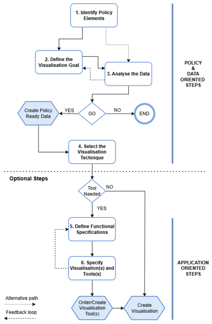
User validation was conducted at multiple levels. First, at the methodological level, validation was achieved through iterative feedback loops embedded within the empirical cycle (Figure 1). Second, at the case level, the methodology was evaluated through its stepwise application, including the assessment of decisions related to the effective realisation of the visualisation. Third, the visualisation solutions were tested and evaluated for their applicability in policy contexts. Structured feedback was systematically collected through consolidated reports from the previously mentioned user workshops. The objective of this feedback was to elicit user needs and preferences for policy-oriented visualisation solutions and to formalise business and functional requirements based on user stories. Structured feedback regarding the initial question, policy elements, visualisation objectives, data and visualisation techniques, and potential tools was collected on a case-by-case basis, using the process steps formulated in the visualisation methodology [33]. Business and functional requirements were subsequently synthesised across cases to inform the design and development of visualisation tools and solutions.

2.3. Stepwise Methodological Approach

The presented visualisation methodology is designed as a six-step approach (Figure 2). Steps one to three focus on defining policy and visualisation goals and on understanding the data involved. The fourth policy and data-oriented step centres on selecting an appropriate visualisation method, whereas the fifth and sixth application-oriented steps are optional and concentrate on integrating specific application components to enhance the visualisation’s functionality. A set of definitions and questions identified, discussed, and tested during the empirical cycles provides practical guidance for co-creation sessions.
Step 1 Identify Policy Elements: The initial step in policy visualisation is identifying and formulating “policy elements”. A policy element can be a policy-related problem, goal, objective, strategy, or action. According to Concilio and Pucci, a “problem” in this context refers to a policy-relevant problem, given that not all problems experienced require a policy intervention. Policy-relevant problems are those whose conditions call for interventions beyond routine management actions. The “goal” of a policy is the policy purpose towards which the policy endeavour is directed; it is what you want to accomplish in the end, and specifically depends on how a problem manifests itself in a context (e.g., reduce urban centre congestion, reduce traffic-related pollution). The “objective” of a policy identifies the extent to which policy goals are to be achieved. Any objective is specific, measurable, and has a defined completion date. It represents the targeted scenario for the policy initiatives (e.g., reduce road congestion by 25% in 10 years across the entire municipal territory). A policy “strategy” is the broad approach identified to achieve the objective and therefore the goal. It represents one possible pathway (e.g., public transport pricing measures) towards solving the problem and can be implemented through individual actions. A policy “action” is one measure to implement to achieve the policy goal in coherence with the identified strategy. It defines the operational change to be introduced in the context the policy is defined for (e.g., introduce a Low Emission Zone (LEZ) or reduce public parking in the city centre) [77].
Step 2 Define the Visualisation Goal: While policy elements are identified in the first step of the process, specific visualisation goals are established in the second step. It is critical to keep options open during this stage by refraining from mentioning specific implementation details or visualisation techniques. During this step, the primary focus is on determining the information the visualisation needs to convey and the knowledge that can be gleaned, rather than the method by which it will be presented. The goal of the visualisation should dictate what knowledge is conveyed rather than how it is organised.
The following questions, presented as guidelines, have been formulated to assist in establishing the visualisation goal. These questions are based on experiences during co-creation meetings and data visualisation publications [73].
  • What information needs to be conveyed through the visualisation?
  • What relationships between different elements should the visualisation communicate?
  • What data dimensions and values are pertinent to the context of the visualisation?
  • What actions will be taken based on the information conveyed by the visualisation?
  • Is the intent of the visualisation to inform or persuade?
  • Who is the intended audience of the visualisation (e.g., experts, policymakers, the general public)?
  • Is the visualisation language consistent with the subject matter and reference framework?
Step 3 Analyse the Data: Step three explores data, which may occur concurrently with and involve iterations of the second step. This step aims to determine the data and data dimensions required to achieve the visualisation objectives. Key questions include:
  • What data is necessary to achieve the visualisation objectives?
  • What data is available?
  • What is the data structure and format?
  • What are the indispensable data fields and dimensions to visualise?
  • How reliable and complete is the data source?
  • Is there sufficient data provenance (regularly updated versions, reliable metadata)?
  • Are there other relevant data sources that could be utilised?
  • Can the data be used legally and ethically?
In the data analysis phase, the data’s values, relationships, and structure are examined to determine the type of data required and available, such as time-series, hierarchical, ordinal, categorical, discrete or continuous. This analysis aims to furnish the essential information and knowledge to achieve the visualisation goal and support the defined policy element.
The data analysis step is the first, in which feasibility is evaluated through a critical review of available data. The main failure points lie in the availability of relevant and reliable data, in costs that do not reflect potential benefits, and in limitations on use arising from privacy and access laws (e.g., access to police data in Belgium). The format in which the data was provided can lead to additional work, but in practice, this rarely caused obstacles.
GO/NO GO Decision: The first three steps lead to a vital evaluation checkpoint, where the available information is used to determine whether a truthful, sound, and ethical response to the related policy element and visualisation objective is feasible. Continuing only makes sense if this question can be answered affirmatively.
The GO/NO-GO decision should be made through a joint review by relevant domain experts and local experts, in the first three steps, by systematically elaborating on the guiding questions formulated in each step and by designing, discussing and evaluating mitigation solutions. The final decision is ideally unanimous, with mitigating measures regarding data anonymisation being requested in several cases. This joint review approach is preferred over an individual self-assessment process by the pilot case responsible, e.g., via a decision tree. A decision tree, given a wide range of possible smart city-related policy issues, visualisation goals, and data-related elements, appears too generic to evaluate specific situations without input from domain and policy experts, data scientists, and ethical and privacy experts.
Moreover, a joint review enables individual experts to use established tools, such as a Privacy Impact Analysis (PIA) [79] for privacy evaluation, or domain-specific methodologies for air quality assessment based on norms and methods from the UN World Health Organisation [80] and the European Environmental Agency [81]. The use of specific tools and methodologies by experts can provide the necessary substantiation for mitigating measures or the argumentation of a NO-GO decision.
Step 4 Select the Visualisation Techniques: After gaining an understanding of the values, relationships, and structure of the data, as well as the potential implications of utilising it alongside policy elements and visualisation objectives, the next step becomes prominent. This next step is about evaluating which visualisation methods and techniques are optimal for displaying the policy-ready data.
The use of data visualisation methodologies grounded in existing principles [31,73,74], combined with insights from the three previous steps, provides a methodological framework for selecting an appropriate visualisation technique.
Tool Decision: After selecting eligible visualisation techniques in Step 4, decide whether to use existing tools or make a buy-or-develop decision to expand existing tools or develop a new one. The criteria below support making a choice:
  • Availability of tools that support the visualisation demand;
  • The time and scope (need for a quick one-time visualisation or recurring visualisation over a longer term);
  • If it concerns a strategic expansion of an existing toolset;
  • Relevance to multiple policy domains;
  • If it concerns the development of a strategic (visualisation/policy) tool with a broader scope (e.g., for external communication and participation);
  • The total and relative costs of alternative solutions.
The selection of visualisation techniques decisively influences both the semantic content communicated and its subsequent interpretation by users. Consequently, this step is regarded as a critical component of the visualisation methodology, particularly in conjunction with the goal-oriented Steps 1 and 2 and the content-oriented Step 3.
Step 5 Define Functional Specifications: When evaluating new system developments or software acquisitions, the required functional specifications for user interaction need to be defined. Steele and Iliinsky have categorised these functionalities into three groups: explorative, explanatory, and exploratory explanation requirements. Exploration is closely linked to the data analysis phase, during which tools are utilised to unravel and explore the data, and data visualisations are used to uncover the narrative within the data. Examples are dashboards depicting data relations (see the police zone Voorkempen trajectory speed limit enforcement dashboard (Case 3) and the Solva region regional traffic behaviour (Case 4) in Section 3) and simple intensity map visualisations (see the student displacements visualisation (Case 9) in Section 3). Explanatory functionalities are utilised during the presentation phase to communicate and convey information to others. They guide the viewer toward a specific insight or conclusion, rather than letting them freely explore data. The “functionalities” of explanatory visualisation are essentially the deliberate design choices that reduce ambiguity and highlight meaning. Examples include the use of target threshold lines (e.g., WHO CO2 standard) (see the dynamic exposure visualisation (Case 1) in Section 3), the intentional use of colours. (see the traffic model visualisations (Cases 12, 13, 15, 19) in Section 3) and highlighting one bar in a bar chart to draw attention to specific data (see the interactive road accident and safety map visualisations (Cases 8 and 10) in Section 3).
Exploratory explanation is a more hybrid approach of data visualisation that uses prepared data for which the story is largely known, but allows the reader (user) to interact with and explore the data to discover new insights. Interaction typically happens through some graphical user interface, allowing users to change certain parameters and filter and select data [73].
The evidence-informed and evidence-based decision visualisation methodology focuses on explanatory and exploratory explanations of data visualisation types to offer information and substantiation for the policy-making process. Requirements oriented towards exploration play a crucial role in both the data analysis and data science phases and are therefore significant in the problem-setting phase, as outlined in Section 2.4.
Step 6: Specify Visualisations and Tools: The final step involves establishing visualisations that meet predetermined visualisation objectives and provide the required information on policy elements. Depending on the complexity, additional functionalities, such as advanced selection or time simulation to interact with the data, may be necessary, with increased complexity usually associated with the number of variables (e.g., location, time, and content-related properties).
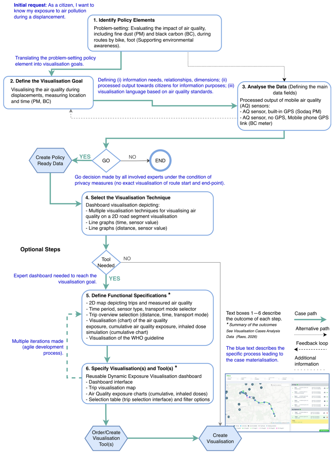
A practical implementation example of the visualisation methodology is depicted in Figure 3. The example illustrates (i) the path followed through the 6 steps, including the GO/NO GO decisions and iterations made; (ii) a summary of the outcome of each of the 6 steps; (iii) essential process elements (including translation steps, defining policy and visualisation needs, defining decision elements, tool selection and definition, iterative visualisation specification and design) to move from one step to another towards a policy visualisation. A similar approach was followed for all the other SCPVCs.

2.4. Application in a Policy-Making Context

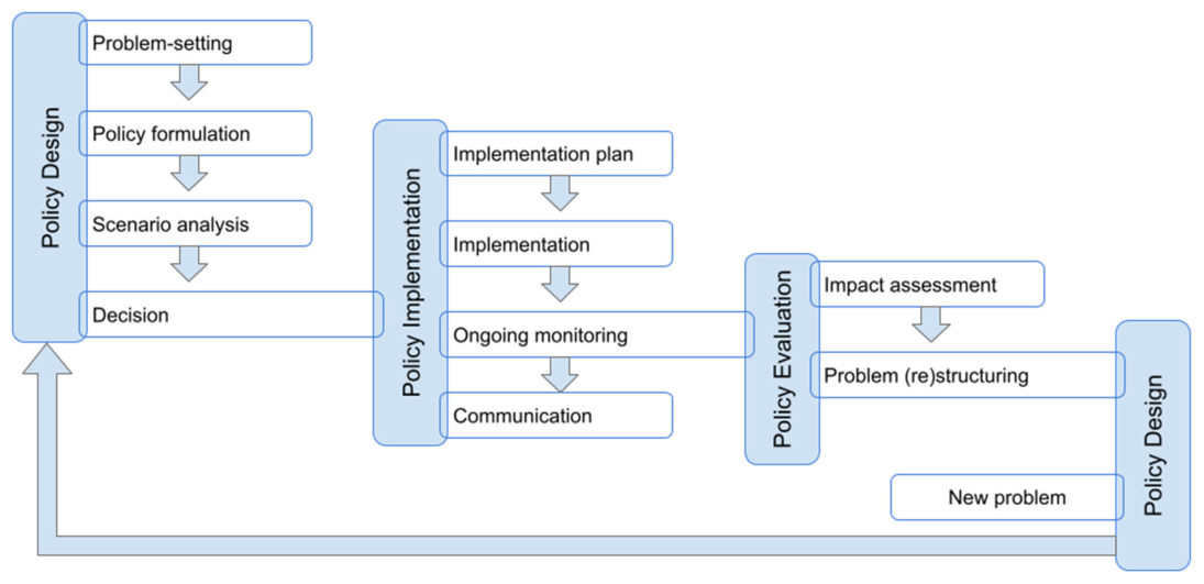
However, the Visualisation methodology for evidence-informed and evidence-based decision-making can be used independently; to enhance impact, it may best align with the policy context of policy professionals. One way to achieve alignment is to integrate it into the thinking frameworks and methodologies that policymakers are already familiar with. The classical policy design, implementation, and evaluation cycle [82] provides a widely accepted methodological framework. This three-phase policy-making cycle concept can be further elaborated into 10 subphases (Figure 4).
The policy design step commences with problem-setting, followed by problem formulation and scenario analysis, and eventually culminates in a policy decision.
A decision is translated into a concrete implementation plan during the policy implementation phase, followed by implementation and ongoing monitoring and communication. During the policy evaluation phase, an impact assessment, through a (re)structuring process, leads to new conclusions and a potential reiteration of the policy-making cycle [78].
The empirical analysis (Section 2.2) indicates that the visualisation methodology’s first policy identification step is strongly related to the problem-setting and problem formulation subphases of the policy cycle. The second step, defining the visualisation goal, and the third data analysis step appear to be related to scenario analysis, implementation (plan), ongoing monitoring, communication and impact assessment. The fourth visualisation selection step raises the question of whether different visualisation techniques can support policy-making relevant cycle subphases. The optional steps five and six seem to be less relevant to the policy cycle and focus on developing new visualisation types and tools.

3. Results

The visualisation methodology has been applied in 20 smart city-related policy visualisation cases (SCPVC) across three European projects [63,64,65], evaluating its applicability at each phase of the policy-making cycle. The outcomes of the pilot cases are systematically analysed by visualisation type, with attention to relevant policy elements, visualisation objectives, employed visualisation techniques, and, where applicable, newly integrated tools. The analysis further derives conclusions on the role and added value of these visualisation types within the policy-making cycle.

3.1. Pilot Cases

To find out, the following smart city-related visualisation cases have been scrutinised.
The SCPVCs overarch a broad spectrum of themes such as people movements and stay measurement of specific groups (1), measurement of car traffic movement patterns and traffic flows (2), measuring behavioural impact, including the effects of speed measures (3), the prediction of the route choice resulting from new traffic measures (4), the impact of mobility measures on air quality and noise distribution (5) and the effect of urban design measures (6).
Application of the visualisation methodology on the SCPVCs resulted in several cases using multiple visualisations in comprehensive dashboards and 3D digital twin visualisations. As a result, a range of visualisation techniques and methods were systematically defined, implemented, classified, and empirically evaluated with end users through multiple iterative cycles. These iterations progressed from internal validation to controlled testing with professional user groups, and ultimately to open evaluation phases involving businesses and citizens, tailored to the respective target audiences [83,84,85,86].

3.2. Smart City-Related Visualisation Techniques

The defined SCPVC categories combine specific techniques into a single visualisation and integrate multiple techniques into a visualisation dashboard. The formulated policy and visualisation goals (Table 2) are based on the processing of outcomes from co-creative workshops focused (Section 2.2) on using and refining the presented visualisation methodology and policy visualisations.
The classification of cases presented in Section 3.2.1 to Section 3.2.4 is based on a qualitative assessment and categorisation of the individual and integrated visualisation techniques and tools used in steps 1, 4, and 5 of the empirical process described in Section 2.2. During the assessment, several analytical criteria were considered: (i) the number of combined visualisation techniques, (ii) the degree to which policy objectives are integrated into the visualisation, (iii) the availability of dynamic selection and interaction options, (iv) the capability to simulate policy effects using predictive models, and (v) the presence of advanced digital twin visualisation environments in two- and three-dimensional contexts. Based on these criteria, the cases were classified into five distinct groups.
A Visualisation Dashboard (i) presents aggregated data without explicitly contextualising the results against policy expectations or normative targets. A Policy Dashboard (ii) is a subclass of visualisation dashboards and incorporates explicit reference values or targets, such as the projected number of bicycle trips in the school streets cases.
The Intensity Map Visualisation (iii) represents the first category of dynamic visualisation. It is characterised by interactive tools that enable users to explore and interpret spatial intensity patterns. Algorithm Visualisation (iv) encompasses visualisation tools designed to provide an expert-oriented interface for executing and displaying domain-specific simulations, and are designed for forecasting purposes. Finally, Digital Twin Visualisations (v) offer advanced two- and three-dimensional interfaces that support the integrated visualisation of policy scenarios and facilitate the exploration of visualisation questions within a broader spatial context.

3.2.1. Dashboard Visualisations

Within the context of dashboards associated with SCPVCs, a distinction is made between visualisation-oriented dashboards and policy-oriented dashboards, each characterised by distinct objectives and methodological approaches.
  • Visualisation Dashboard
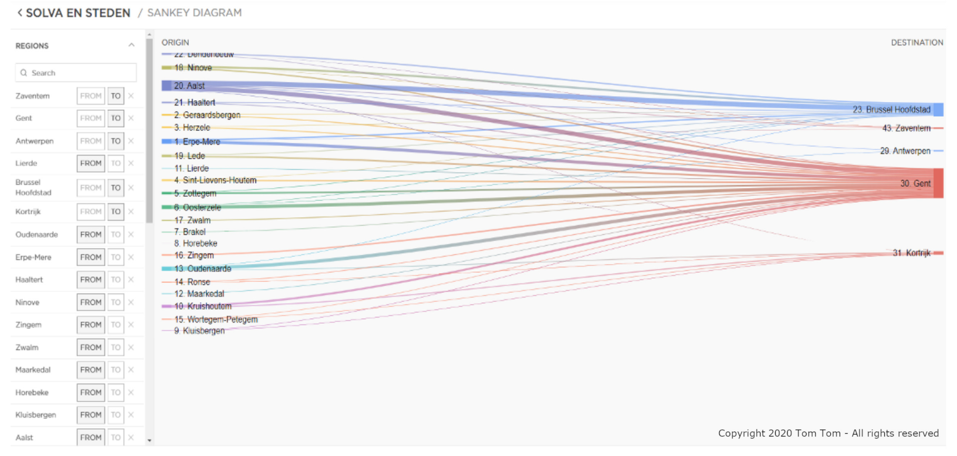
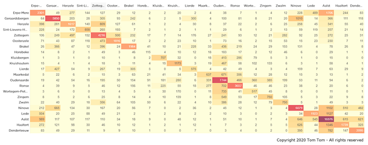
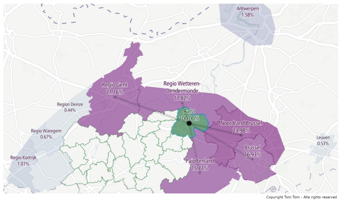
Visualisation dashboards are primarily considered a family of visualisation techniques for presenting related, often aggregated data, using multiple visualisation techniques primarily aimed at enhancing insights. An example of mutually reinforcing visualisations to gain insights is the accompanying monitoring of aggregated route data in the Solva region regional traffic behaviour case (Case 4), where Sankey distribution diagrams, trip distribution diagrams, and origin-destination matrices provide different views and varying levels of detail in a dashboard (Figure 5, Figure 6 and Figure 7). Specific colour patterns are used to show relationships in a diagram. For example, colour gradients are used in the Sankey distribution diagram (Figure 5) to make the relationship between origin and destination easy to read.
The common policy goal of the diagrams above is to gain better insights into the regional mobility streams in South-Eastern Flanders. The visualisation’s primary objective was to display the displacement patterns (by car), using geospatial analysis to facilitate comparisons between local communities. The trip distribution diagrams offer valuable insights for problem-setting and crafting new policy designs.
Other examples of visualisation dashboards include the dynamic exposure dashboard rolled out in Berlin and Flanders (Case 1), the Issy-les-Moulineaux traffic dashboard (Case 2), and the police zone Voorkempen trajectory speed-limit enforcement dashboard (Case 3). An example of a dashboard visualisation validation was the trajectory speed-limit enforcement dashboard, which used 76 million vehicle registrations across 30 trajectories. The measurements showed a similar behavioural pattern in speed reduction, yielding new policy insights to support the further rollout of trajectory controls in Belgium [88].
  • Policy Dashboard
Policy-oriented dashboards are similar to visualisation dashboards but also enable users to define policy goals and track progress toward them. In a smart city context, they often integrate time-series and location-related data.
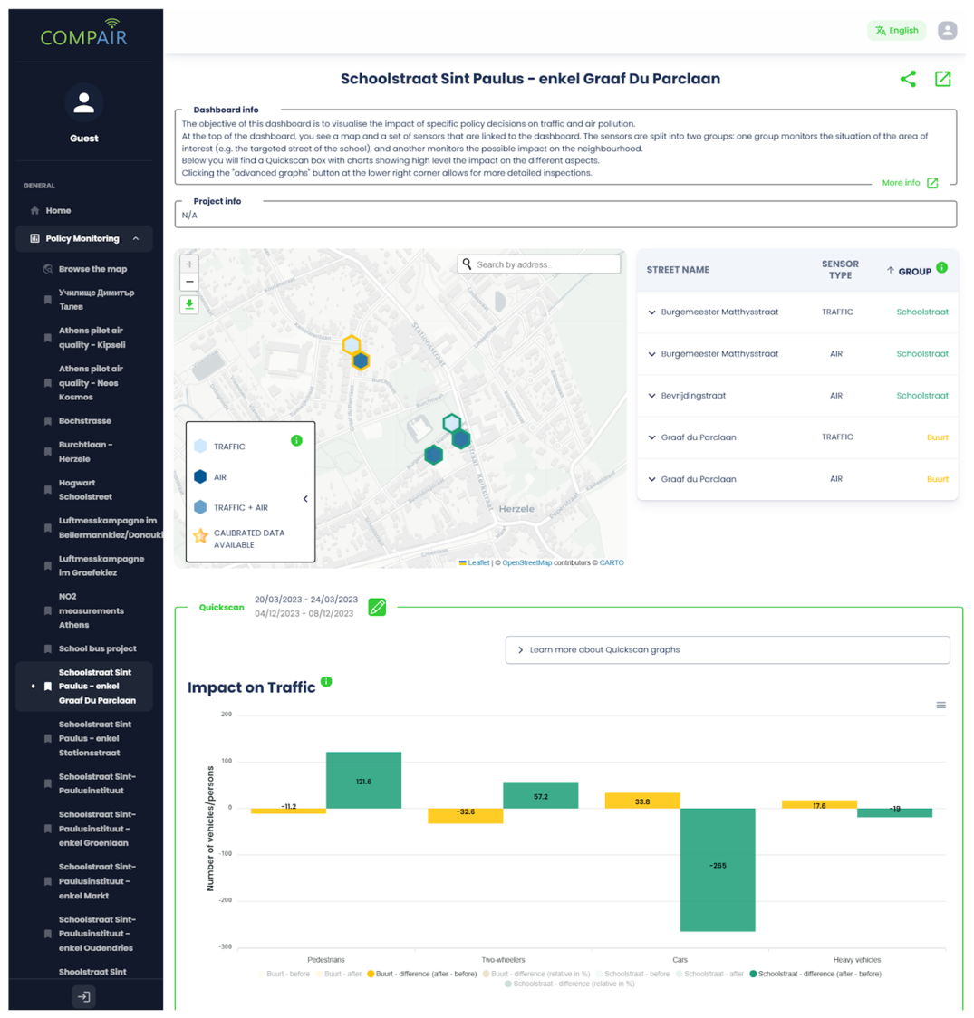
An example is the Herzele interactive school street dashboard (Case 5), which combines traffic and air quality measurement data into a single policy monitoring dashboard.
The policy objective is to assess the effects of implementing a school street on the liveability of the school environment during pupil arrival and departure periods, and to promote increased use of sustainable transport modes. The corresponding visualisation objective is to represent both historical and near real-time changes in modal split, traffic conditions, and air quality within and around the school area across multiple geospatial zones. To support impact assessment, the visualisation is designed to integrate and display historical and real-time mobility (modal split) and air quality data for the school street and its surrounding areas (Figure 8).
The versatility of the presented policy dashboard reflects its applicability to policy design, implementation, and evaluation. In the design phase, the evaluated dashboards add value to problem-setting and policy formulation, as well as to each subcategory of implementation and evaluation.
Other examples of policy dashboards are the school street dashboard in Mechelen (Case 6) and the Sint-Niklaas local mobility scheme/plan dashboard (Case 7).
The school streets dashboard in Herzele was evaluated by a wide range of stakeholders, including teachers, students, residents, local businesses, and local government representatives. The data and analytical tools were integrated into existing teaching courses, and a local “school streets café” was organised. During the café, results were discussed with users, allowing multiple user groups, including local policymakers and the deputy mayor, to test, explore, and interpret the results in an alternative setting [90].

3.2.2. Intensity Map Visualisations

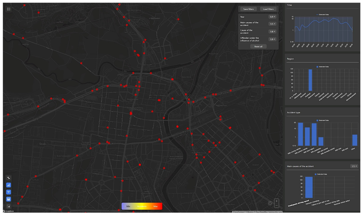
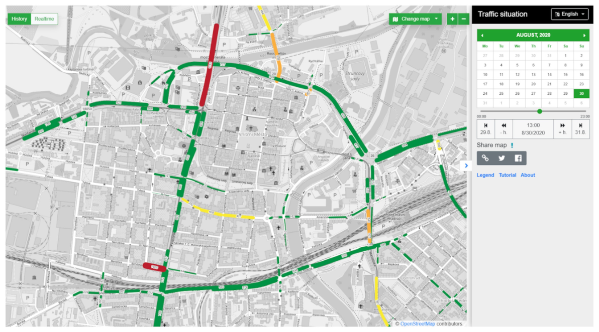
Intensity maps originated as a powerful visualisation method in cosmology, where different colours or hatches represent different intensities of observed radiation. In the smart city context, a heatmap is a data visualisation technique that shows the magnitude of a phenomenon as colour in two dimensions. Colour variation may be by hue or intensity, providing clear visual cues to the reader about how the phenomenon clusters or varies across space [91]. Intensity mapping is an effective visualisation method, e.g., for road accident intensities, as tested in Pilsen (Figure 9).
The policy objective focuses on identifying and shaping agenda-setting processes related to road accidents to enhance traffic safety. This objective informed the corresponding visualisation goal, which involved mapping high-risk accident locations (black spots) to improve analytical insight into spatial patterns and data relevant for categorising road accidents.
More broadly, intensity mapping constitutes a relevant visual-analytical instrument across all phases of the policy cycle, including problem identification, policy formulation, and policy communication.
Other examples of interactive maps in Czechia include the Pilsen interactive sensor-based live and historical traffic map (Case 11), the traffic measure impact modelling comparison (Case 12), and the traffic volume impact simulation modelling (Case 13). Interactive map examples tested in Flanders are the road safety map (Case 8) and the Ghent student displacements map (Case 9).
The Flanders Road Safety map is an example of a policy evaluation of an intensity map. It was positively evaluated by the Flemish Traffic Centre and used to identify locations for new average speed control zones, based on objective, accident-based criteria. These criteria included advanced data-based criteria, such as the frequency of accidents involving vulnerable road users in the vicinity of schools during the morning and evening peak periods, which were systematically identified through the heatmap tool’s interactive selection features.

3.2.3. Algorithm Visualisations

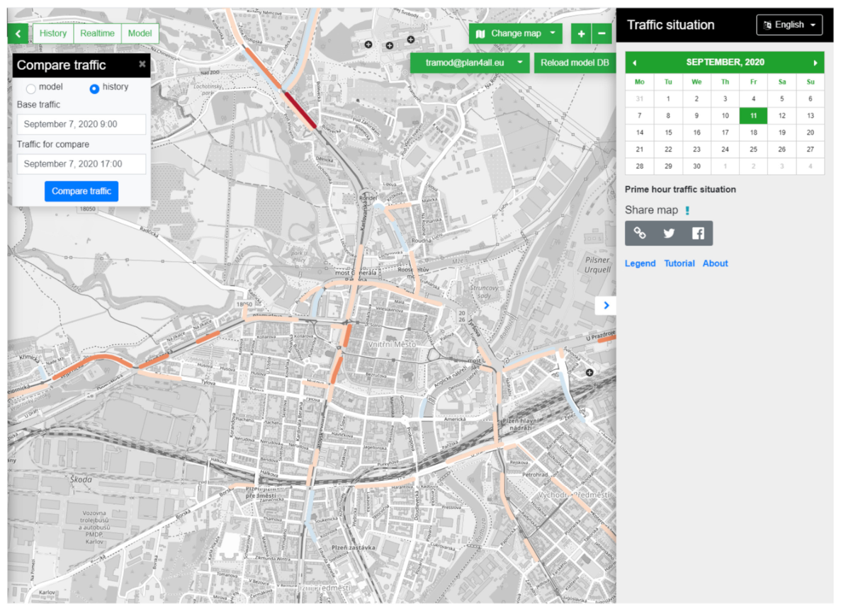
Simulation algorithms are used to efficiently model a wide variety of complex multifaceted systems. A simulation is essentially an imitation, a model that imitates a real-world process or system [93]. Traffic simulation models are used to calculate results for traffic measures in absolute intensities (Figure 10) and differences (Figure 11).
Predicting and evaluating the impact of traffic measures, including the impact of (planned) roadworks on traffic flows and volumes (intensities), is the primary policy goal of traffic simulation models (Cases 11–13 and 15). The visualisation aims to display traffic volumes and intensities at the road-segment level to gain deeper insights into how traffic measures affect intensity across the road network and in surrounding neighbourhoods. This will help to determine the impact of these measures more accurately. The traffic simulation models used are versatile and deliver added value across all phases of the policy cycle. Given their relative complexity, they provide value for scenario analysis during the policy design phase and can also be used as a communication tool when accompanied by context information. Another example of an algorithm visualisation is an optimal sustainable travel planning app tested in Issy-Les-Moulineaux and the southern border of the greater Paris area (Case 14).
Algorithm-based traffic models have been extensively evaluated and showed new potential for the use of traffic model algorithms through interactive open web-based interfaces, as demonstrated in cases 12 and 13, facilitating their adoption in additional policy contexts like monitoring (parallel) planned roadworks (case 15) and the integration into advanced digital twin solutions where they show potential when combined with other algorithms used for calculating air or noise impact (cases 16 and 18).

3.2.4. Digital Twin Visualisations

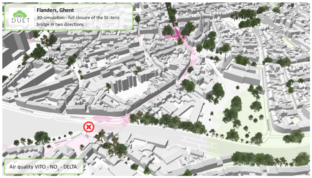
The five urban digital twin cases support a range of policy elements, visualisation goals, and visualisation options, showing their versatility. The urban digital twin cases are all characterised by 3D visualisations of the urban environment, including buildings and infrastructure. The most innovative digital twin cases also provide opportunities to demonstrate the impact of complex policy domain-overarching policy simulations, such as traffic, air quality, and noise modelling. Examples are the digital twins in Pilsen and Ghent (Case 18), where digital twins were tested to predict outcomes of traffic scenarios, including road closures, and to simulate effects on air pollution and noise distribution from traffic in the city (Figure 12). The policy goal of the case in Ghent and Pilsen was to gain insight into the effects of road-closure measures. The visualisation aimed to map the effects on traffic volume, air quality, and noise pollution.
Other smart city cases using digital twin visualisation technology are the construction of a ring road in Pilsen (Case 19), the best solar equipment locations evaluation (Case 20), the planning of green squares in Athens (Case 16) and the impact calculation on traffic and air quality of a pedestrian and cycling route in the Greek capital (Case 17).
In Pilsen, the DUET digital twin solution (Case 18) was employed to successfully model and predict the impacts of the closure of a major access road, the General Patton Bridge, to the city centre [85] and served as a decision support tool to evaluate one of the key measures in the Pilsen Sustainable Urban Mobility Plan [95]. The model achieved an overall accuracy of over 90% in predicting traffic volumes compared to measurements after implementing the bridge closure.

3.2.5. Visualisation, Data and Tool Assessment

The cases outlined above integrate visualisation techniques, diverse data inputs, and analytical methodologies to enable policy-focused applications. Although they share a common objective, the cases differ substantially in their design choices, data integration strategies, and analytical scope. These concrete outcomes lead to measurable differences resulting in varying levels of visualisation and policy application complexity, which are systematically compared and summarised in Table 3.
Table 3 provides a structured overview of the visualisation techniques employed, including both two-dimensional (2D) and three-dimensional (3D) approaches. It further details the data-handling methods applied for aggregation, anonymisation, and pseudonymisation, as well as the types of data utilised, encompassing historical time-series data (“yesterday”), real-time data (“today”), and predictive model outputs (“tomorrow”). Additionally, the tools and interaction methods are summarised to enable an assessment of visualisation complexity and policy applicability for each case.
The assessment of visualisation complexity considers the techniques applied, the use of 2D or 3D rendering, and the tools utilised, including the degree of interactivity they provide.
The policy applicability assessment is also based on the visualisation techniques, the employed tools and their interactivity, but is supplemented by the data types, data techniques, sensors, and scenario analysis techniques. The complexity of the visualisations is largely determined by the degree of interactivity, including selection mechanisms, bidirectional links between the dashboard and map interfaces, and navigation features, such as those found in 3D environments. In contrast, the complexity of policy application stems from integrating heterogeneous data types (historical, live, and predictive) and cross-domain policy interactions enabled by the collaboration of multiple domain models, such as traffic and air quality models (a more detailed description of the levels of complexity interpretation can be found in Table 3 [6,7].).
A comparative analysis of the 20 individual cases, incorporating an evaluation of the aforementioned complexities, yielded the following findings and takeaways.
Interpretations of “today” data (Cases 1, 4–7, 11, 14–15) tend to focus on real-time measurements; however, this perspective is incomplete. Simulation models are equally capable of producing temporally relevant, state-representative outputs that function as “today” data beyond purely live data streams.
The integration of intensity maps (Cases 8, 10–11), particularly through bidirectional coupling between heatmap visualisations and interactive selection interfaces, constitutes an innovative approach to explorative, explanatory, and explanation-based policy analysis. It enables dynamic exploration and feedback between spatial patterns and user-driven queries. Nonetheless, such interactivity introduces substantial visualisation complexity, requiring careful design to maintain interpretability and analytical rigour.
Within smart city ecosystems, sensor-based data acquisition (Cases 2–7, 9, 11, 14) inherently necessitates advanced processing techniques. Data aggregation is routinely employed to ensure computational efficiency and scalable visualisation, while anonymisation or pseudonymisation mechanisms are essential when preserving linkages between measurements is required. These measures are critical for compliance with ethical standards and privacy regulations, underscoring the non-trivial trade-offs between data utility and individual protection.
Furthermore, advanced simulation modelling (Cases 7, 12–20) significantly enhances the predictive capacity of policy frameworks by enabling scenario testing and forward-looking analyses. However, this capability imposes additional technical and cognitive demands, particularly in terms of model integration, uncertainty representation, and result communication. The complexity reaches its apex in digital twin environments, where multiple interdependent simulation models operate concurrently. In such contexts, the challenges of visualisation, interpretability, and policy translation are amplified, necessitating sophisticated analytical infrastructures and domain-specific expertise.

3.3. Use in the Policy-Making Cycle

The SCPVC categorisation serves as the basis for quantifying applicability across the different phases of the policy-making cycle, as depicted in Section 3.2. Table 4 provides an overview of the applicability of SCPVC cases in the policy-making process.
The quantitative analysis (Table 5) indicates a relatively even distribution of visualisation usability. Overall, 55% of the SCPVCs show a high probability of applicability during the Design phase, with 45% in the implementation phase, and 53% can contribute to policy evaluation. These results indicate that the visualisation techniques used are beneficial across all policy phases. At a more detailed level, each visualisation technique has its specific applicability potential within the policy-making cycle.
The four scrutinised visualisation dashboards are likely to be applicable to some extent during the problem-setting phase (3 out of 4) and the policy formulation phase (2 out of 4). They also play a role (with a high level of probability of applicability) in ongoing monitoring and communication during the policy implementation phase (2 out of 4) and for impact assessment (2 out of 4) as part of the policy evaluation process.
The three realised policy dashboards show a high potential of applicability in both the problem-setting phase (3 out of 3) and the decision-making phase (2 out of 3). Also, all dashboards show a high level of usefulness for ongoing monitoring and as communication tools. During the policy evaluation phase, all dashboards show a high probability of applicability for impact assessment, and two of the three are relevant for problem restructuring.
The intensity map visualisations comprise heterogeneous smart city visualisations. All visualisations have a high probability of supporting problem definition, while 4 of the 6 probable assist policy formulation. Four of the six visualisations are considered highly applicable as communication tools and for impact assessment.
Two algorithm visualisations were tested and found to be important in each sub-stage of the policy-making cycle. In particular, the simulation of the impact of roadworks proved useful at each phase of the policy cycle.
The five digital twin visualisations have a high probability of applicability in the problem-setting phase (5 out of 5), the scenario analysis phase (4 out of 5), the decision-making phase (5 out of 5) and for planning and communication (3 out of 5). Most digital twin cases were also considered to have a high probability of applicability for impact assessment, and two digital twin cases potentially support problem restructuring. The digital twin cases tested with a focus on policy forecasting are less probable to be applicable for ongoing monitoring. This functionality is closer to a digital twin solution in the context of command-and-control centres, such as urban, security, and mobility monitoring centres, which use multiple sensor types and CCTV camera networks.

4. Discussion

The conceptualisation and operationalisation of a visualisation methodology, and its evaluation of applicability in smart city contexts, particularly in relation to data-driven policy-making processes, raise several issues warranting further investigation. The SCPVCs provide insights into the levels of complexity related to making data ready for policy-making, integrating location and time factors, and addressing privacy and ethics. The discussion section concludes with an overview of limitations and replicability.

4.1. Applicability of the Visualisation Methodology in a Smart City Context

The visualisation methodology is applicable across a broad smart city context, as well as to applications such as smart city dashboards and urban digital twins. The use of policy elements (Step 1) ensures that the starting point is not only a problem definition, but also a policy goal or policy action. In practice, starting from a problem definition guides a visualisation towards providing evidence. Working from objectives or actions allows for a broader approach to the visualisation development.
Defining the visualisation goal (Step 2) adds context to the policy elements step. The open question about defining policy elements broadens the policy context beyond a problem-focused approach. Examples of broader contexts beyond policy problems include measuring during a trip, measuring long-term impact, or mapping the impact of traffic resulting from simultaneous roadworks. The visualisation objectives of the cases indicate the knowledge that needs to be transferred to the users.
The data analysis step (Step 3) requires business knowledge and specialised expertise regarding available and reliable information. In most pilot cases, anonymisation and pseudonymisation techniques were required during data processing. The Issy-Les-Moulineaux traffic dashboard (Case 2), the Solva region regional traffic behaviour (Case 4), and the Ghent student displacement case (Case 9) are based on partial datasets, which affect the conclusions that can be drawn. The policy objective in these cases is primarily to gain insights. The availability of standardised metadata (source) proved to be a significant aid in mapping the availability, reliability, data structure, and ethical questions regarding correct use.
Formulating solutions to the policy elements and visualisation goal generally involves trade-offs and necessitates conscientious deliberation. An aspect of this contemplation involves guiding the results regarding uncertainty or outlining the potential risks and opportunities associated with non-deductible conclusions.
The outcome of the interplay among the first three steps of the visualisation methodology is often a set of policy-ready data for the intended visualisations. Policy-ready data refers to the outcome of a data conversion process that provides the necessary context, relationships, and quality assurance, granting sufficient qualitative information to achieve the required knowledge to answer policy questions and realise related visualisations with adequate reliability [96]. Policy-ready data preparation can range from reasonably simple to very complex big data management processes, including techniques to safeguard privacy. In many of the Flanders cases, data integration was established using the Interoperable Europe-based OSLO open standards for linked organisations [97] to ensure semantic and technical interoperability, combined, if needed, with data anonymisation or pseudonimisation techniques to ensure privacy. For the digital twin-related cases, International open standards in the built environment sector, like CityGML [98,99], CityJSON [100] and IFC (Industry Foundation Classes) [101,102] by Worldwide standardisation bodies like ISO, W3C and OGC pave the way to improve 3D visualisations and provide standardised input for running predictive models. Examples include air quality, noise, and flooding models using 2D and 3D data that mimic the physical living environment. Creating a policy-ready data set was, in many cases, a necessary step towards effective visualisation. The complex creation process often required a peer-reviewed go/no-go decision-making process.
Selecting visualisation techniques (Step 4) in a smart city context is best done by reviewing and evaluating generic visualisation techniques from statistics, such as those in Microsoft Excel and other business intelligence tools, as well as domain-specific techniques used in smart city-related business domains, such as transportation, mobility, and environment. General visualisation techniques training programs underemphasise domain-specific visualisation methods and standards. A majority of the 20 smart city case studies, including smart city-related dashboards, utilise at least one domain-specific visualisation technique (Cases 2–4, 12, 13, and 15). Digital twins add 3D visualisation and navigation functionality, as well as visualisation techniques and methods from multiple domains (Cases 17 and 18). Next to dashboards, the multi-domain digital twin approach used in Cases 16–20 is versatile but also complex, requiring specific attention to its functionalities, data integration and tool development.
The decision to use existing tools or develop a new toolset is objective and organisation-specific. In practice, there is also an intermediate question: to what extent is it necessary or worthwhile to use or adapt existing frameworks or tools (Cases 8, 10, 11, and 15)?
Preparing a new toolset or adapting existing frameworks or tools involves defining functional specifications (Step 5) and designing visualisation applications (Step 6). Practical experience (Cases 1–3, 5, 6, 8, 10, 11, and 15) shows that an iterative approach involving feedback and adjustments from the domain expert, analyst, and technical expert is essential. The visualisation method for evidence-informed and evidence-based decision-making fosters a collaborative context among stakeholders and experts.
Steps 5 and 6 can also be repeated for multiple applications with similar objectives, policy-ready data, or visualisation needs. Examples include the road accident heatmaps in Flanders and Pilsen, where similarities were found between policy objectives and the need for policy-ready data (Cases 8 and 10). Another example, as demonstrated in Athens, Ghent, and Pilsen, is a domain-overarching digital twin visualisation that combines similar navigation and visualisation techniques (Cases 16–18 and 20). Both examples enable (1) the assimilation of visualisation tools in diverse applications and (2) the utilisation of comparable policy-ready data without or with limited programming or developer interventions.

4.2. Applicability of the Visualisation Methodology in the Policy-Making Cycle

Integrating the visualisation methodology into the policy-making cycle provided policymakers with a recognisable framework for incorporating the policy phase (design, implementation, or evaluation) into the visualisation design process, from identifying policy elements (step 1) to defining the visualisation goal (step 2).
The approach shifts from a problem focus (problem-setting) to a broader approach aimed at discovering and analysing (potential) effects and scenarios (scenario analysis and impact assessment), as in Cases 7, 12, 15, 18–20.
The approach also led to other new practices. For example, in Cases 1, 6 and 7, quantitative policy objectives and KPIs were included in the visualisation. The lack of clear KPIs and the need for their prominent integration are emphasised by Kameswari et al., Contreras et al. and Dameri [103,104,105].
By applying the visualisation methodology to the policy-making cycle, the value of each visualisation can be assessed at each phase and subphase of the cycle (Figure 4). This analysis, compared to a problem-setting-oriented focus, offers a wider scope for investment decisions related to data and software. The investments and developments in advanced visualisation and analysis solutions, including interactive data analysis tools (Cases 8, 10 and 11) and traffic model-based planning tools (Cases 15, 18 and 19), were based on a scope that encompassed their usefulness across multiple (sub) phases of the policy cycle.

4.3. Policy-Ready Data and Evidence-Informed Decision-Making

The availability of (big) data, the creation of policy-ready data, and the visualisation methodology that aligns well with the policy-making cycle may be considered logical, ready-to-implement steps for policymakers and data scientists. Using data for evidence-informed and evidence-based decision-making comes with costs and investments for public sector organisations and their employees. The question is whether today’s public sector organisations are capable and willing to adopt the policy-ready data creation process? Another question is whether the visualisation providers and various stakeholders are ready and able to participate by using, e.g., new policy-related data-processing and visualisation techniques and instruments such as smart city dashboards or digital twins.
Matheus et al. conclude that governments can use data-driven dashboards to support their evidence-based decision-making and policy processes. The authors also find that although dashboards are often used for policy evaluation, they can support the full policy-making cycle, including policy formulation, implementation, and evaluation [106].
Adade and De Vries [107] conclude, based on a literature synthesis, that in the smart city land-use planning (LUP) domain, digital twins provide virtual visualisation opportunities for identifying land-use problems and assessing the impacts of the proposed land uses. These offer an opportunity to improve stakeholder influence on and their collaboration in LUP, especially in the agenda-setting, objective, or problem-framing phase of LUP, which is crucial but currently has limited stakeholder participation and influence. The authors also conclude that this collaboration relies on local authorities’ willingness and ability to adopt new technologies, such as digital twins, and on stakeholders’ perceptions and willingness to use them for various land-use goals.
The availability of powerful visualisation tools and solutions creates the opportunity to focus more on the policy data creation process and the visualisation content itself. Also, the availability of new, more dynamic maps allows users to gain deeper insights into policy-related data by browsing across time and space, with accompanying data selection mechanisms. Nevertheless, visualising policy-related knowledge seems more straightforward than it actually is. The increased interest in data science and the availability of data science-related courses and specialists in this big data era create new opportunities but also pose new challenges, often related to handling complexity arising from factors such as uncertainty estimation and the use of cross-cutting tools (Section 4.5).

4.4. Visualising Complexity

The SCPVCs, offer opportunities to create evidence-informed and evidence-based visualisations for policy-making. The efficiency of many of today’s tools and solutions will make the visualisation creation process straightforward in cases of low complexity, usually characterised by a limited number of data dimensions.
Newer, vastly more complex instruments combining advanced data analytics with versatile visualisation methods, such as smart city dashboards and digital twins, can deliver a total experience by focusing on more complex visualisations of location and time.
Visualising complex, often multi-layered policy elements also pose challenges. When based on complex (multi-dimensional) data or used to describe complex, multifaceted policy elements, visualisations can become powerful communication tools. Yoghourdjian et al. conclude that there are limits on the data, the visual complexity, and the tools used for graphical visualisations [108].
When visualising complex scenarios, it can be challenging to convey the whole picture without oversimplifying or introducing bias. To address this issue, two techniques can be employed to create visualisations that are informative yet easier to comprehend than traditional data visualisation methods. These methods include visualising geographic time-series data (1) and utilising advanced filtering and selections (2).
Visualisations related to mobility and smart cities can go beyond the standard two-dimensional representation (X and Y axes) and incorporate a third data dimension (such as traffic intensity) that combines location- and time-related data. Geographic time-series allow observing the evolution over time of a phenomenon at a fixed location, i.e., the time-varying value of an observed property [109]. A digital Twin, as represented in Cases 16–20, can combine 3D visualisation (X, Y, Z) with time as a fourth dimension, adding new challenges to navigation and the display of insights.
One of the most straightforward techniques for creating informative visualisations is to incorporate a time simulation, such as a time scroll, into geo-time-series data. This allows, e.g., the user to quickly and easily observe the changes in traffic patterns throughout the day, as shown in Figure 10 and Figure 11.
An advanced approach involves integrating the time-scroll function with advanced selection capabilities, giving the user greater control over filtering data by time, location, or other attributes (as shown in Figure 9). Other visualisation technologies with the potential to improve decision-making efficiency include augmented and virtual reality techniques that create a metaverse to improve predictive accuracy and user immersion [110].
The techniques discussed above, together with multidisciplinary support during the structured policy visualisation process, help reduce some of the inherent complexity involved in communicating insights through complex policy visualisations. These techniques can be applied within the proposed visualisation methodology. McInerny et al., in their analysis, “Information Visualisation for Science and Policy”, argue that integrating multidisciplinary expertise spanning science, policy, design, and domain-specific policy sectors is essential to avoid overlooked findings, miscommunication, and bias [111]. Raineri and Molinari contend that, despite the associated risks of bias and misinterpretation, presenting policy-relevant data through engaging, comprehensible visualisations represents a crucial final stage in the accountability process. When executed effectively, such visualisations can yield positive outcomes, including emphasising relevant information, minimising distractions, supporting evidence-based decision-making, encouraging active stakeholder participation, and fostering effective communication [26].

4.5. Privacy and Ethics

The use of data and visualisations for evidence-informed and evidence-based policy-making is closely linked to privacy and ethical considerations. Where GDPR-based international and national legislation and jurisdiction define privacy-related aspects, ethical aspects go beyond law-making.
The majority of the 20 cases use anonymised or pseudonymised personal data that was processed during the policy-ready data creation process (Table 3). Policy-ready data can be created externally (e.g., by a mobility data provider) or by the data scientists themselves. Two aspects deserve further attention: avoiding re-identification and dealing with uncertain outcomes.
Two cases underscore the importance of successfully applying privacy protection and the ethical use of data in the context of re-identification. The Voorkempen policy zone case (Case 3) uses Automated Number Plate Recognition camera (ANPR) data to measure the effect of average speed control zones. This case raises several ethical considerations regarding the long-term use, processing, and storage of personal data, as well as its use for visualising traffic safety data for policy-making. The mobile phone data-based student displacement case in Ghent (Case 9) uses sensitive personal time-location data that requires careful selection, aggregation, and pseudonymisation of the target group. The challenge was to define a minimal granularity, with the minimum number of persons per geographic description and time unit, to prevent individual re-identification. Both cases raise ethical questions about the potential for individual traceability and concrete data-aggregation solutions as part of the policy-ready data creation process. They could be realised through a joint ethics evaluation involving the data protection officer, data scientists, and policy experts.
Estimating the uncertainty of data visualisation outcomes as part of evidence-informed and evidence-based decision-making is valuable metadata to share with users and has value as part of an ethical assessment framework. For example, the Voorkempen trajectory speed limit enforcement case provided indirect information about uncertainty by emphasising the sheer number of measurements over a long period. The Pilsen digital twin impact of road closures case study used a post-evaluation method to assess the traffic model’s predictive quality (Section 3.2.4). The use of confidence intervals, as a technique to assess and depict confidence levels proposed by Hespanhol et al. [112], and their application to traffic management and road accident analysis, as studied by Jayanthi [113], introduces statistical parameters that are often missing in policy contexts. Assessing uncertainty becomes even more important in, e.g., a cross-cutting digital twin context, where the predictive output of one model (e.g., a traffic model) serves as input to another (e.g., an air quality or noise model), resulting in outputs with higher uncertainty (Cases 17–19).
The visualisation methodology itself provides a set of handles for creating ethical, sound, objective, and non-manipulative visualisations. In particular, the methodology’s first four policy- and data-oriented steps and questions raised issues about the availability of sufficient (best possible) data and whether the data and methods meet legal and ethical standards. However, the visualisation methodology is largely instrument-agnostic by design; additional instruments, including the data protection impact assessment (DPIA) [114] and the data management plan (DMP) [115], are likely to be used as elements during the assessment process.

4.6. Limits and Replicability

The great variability in visualisation techniques, features, and complexity, along with their broad applicability in the policy cycle and across EU member states in the east, south, and west, suggests that the methodology is applicable in a broader international context. The domain-agnostic design also suggests its applicability in domains beyond smart cities. Although the methodology is policy domain-agnostic and has been tested across multiple smart city domains, broader application requires further investigation.
A specific limitation appears to be the methodology’s replicability in highly dynamic contexts characterised by rapidly changing policies, where operational and tactical decisions must be made within a limited timeframe, which is difficult to discern within the policy-making cycle. The application in such a dynamic context limits its potential accuracy, influenced by: (i) time constraints for creating policy-ready data, (ii) the limited number of customised and understandable visualisation options, (iii) limited opportunities for extensive specialised analyses, and (iv) limited opportunities for user testing.
The methodology does not include a detailed assessment framework for evaluating quality based on criteria such as complexity or usability. Due to their specificity and variability, evaluation methodologies were excluded from the visualisation methodology. Nevertheless, experience has been gained in evaluating user experience through various case studies [83,84,85].
The visualisation methodology requires minimal effort, time, and expertise during the visualisation process. Its replicability in a broad European context within the smart city domain has been demonstrated, and its generality imposes few limitations on its application outside Europe or in other domains. Limited testing of COVID-19 data visualisation in the Czech Republic shows potential applications beyond the smart city domain [116].

5. Conclusions

This publication aims to clarify how evidence-informed and evidence-based policy-related visualisations can be designed, starting from policy goals and challenges, by describing a comprehensive visualisation methodology that aligns with existing policy-making approaches to enhance practical usability.
Drawing on experiences and lessons from smart city policy-related visualisation cases, this paper explains how evidence-informed and evidence-based visualisations can be used in the policy-making process. A stepwise visualisation method was developed to support more qualitative, evidence-based policy visualisations that are likely to yield less biased, compelling, neutral, and ethically correct insights.
The visualisation methodology for evidence-informed and evidence-based policy-making is the result of this process. Unlike other methods that focus solely on how to create visualisations, this methodology starts by considering the policy elements that underpin the policy question at hand. By emphasising policy- and data-oriented steps before selecting visualisation techniques, the methodology promotes a more holistic approach that prioritises policy and data considerations over visualisation techniques. Furthermore, the methodology deliberately defers the choice of specific visualisation tools to later stages of the process, ensuring that visualisation concerns do not unduly influence the policy- and data-oriented aspects of the methodology.
The outcomes of 20 smart city-related policy visualisation cases (SCPVC) were tested for their use in the policy design, implementation, and evaluation cycle. The visualisation results from the methodology could be used and integrated effectively throughout the entire policy cycle. Depending on the visualisation type, it appears more usable for policy design, implementation, or evaluation. Some visualisation types are versatile and can be used across all three policy cycle phases (Table 4 and Table 5).
The methodology’s value is its capacity to guide policymakers, data scientists, and everyone involved in the step-by-step process towards a structured way of thinking. However, the methodology does have limitations. The methodology can be time-consuming when complex, policy-ready data is required but not readily available at the right time and in the desired format. Especially in dynamic policy contexts, where fast, often operational decisions have to be made, the methodology does not appear agile enough. The methodology steps raise several questions that require specialist knowledge to answer. The methodology provides a framework for a broad spectrum of experts, including policymakers, data scientists, visualisation and communication experts, and privacy and ethics experts. However, the methodology alone is insufficient to prevent ambiguous visualisations.
The presented visualisation methodology has data governance implications, particularly by structuring the transformation of raw data into “policy-ready data” through processes that encourage attention to data quality, interoperability, and contextualisation. This suggests the need for governance frameworks for metadata standardisation, data integration (often via open standards), and quality assurance, alongside clear accountability mechanisms such as peer-reviewed validation and joint go/no-go decisions. Privacy and ethical compliance emerge as core governance requirements, with widespread reliance on anonymisation and pseudonymisation, strict controls to prevent re-identification, and alignment with regulatory instruments such as the GDPR and DPIAs.
The need for cross-disciplinary collaboration and stakeholder involvement further underscores the importance of governance models that support shared responsibility, while the complexity of integrating multi-source, multi-dimensional data (e.g., in digital twins) underscores the importance of scalable, interoperable, and ethically grounded data infrastructures supporting evidence-based policy-making.
The discussion led to a plausible argument that organisational frameworks which systematically integrate multidisciplinary domain expertise with data science capabilities enable more rigorous and replicable analyses of complex policy questions, as well as more effective development of visualisation solutions. Such integration enhances the capacity to (i) address the inherent complexity of smart city systems, (ii) align outputs with existing policy processes, (iii) support the efficient generation of policy-ready data, (iv) manage the visualisation of multifaceted policy issues, and (v) account for privacy and ethical considerations in a structured manner.
However, all 20 SCPVCs relate to the broader smart city field; further research is needed on their applicability across other policy sectors and regions outside the EU. Because of its generalist approach, the methodology is likely to be adaptable to other policy contexts. Additional research is also desirable on the applicability of the visualisation methodology to new, complex instruments such as digital twins, which often address multi-policy-domain (road accident, ongoing, organisation-specific) issues and complex simulation modelling, supported by a navigable 3D environment of neighbourhoods, cities, or regions.

Author Contributions

The data were collected from the EU research projects PoliVisu, DUET and COMPAIR, for which Lieven Raes acted as consortium coordinator. Both authors conceptualised the article. Lieven Raes was responsible for the research methodology and the draft writing. The article was extensively reviewed, validated and supervised by Joep Crompvoets. All authors have read and agreed to the published version of the manuscript.

Funding

This research was funded by the following European Commission projects: Horizon 2020 PoliVisu “Policy Development based on Advanced Geospatial Data Analytics and Visualisation” (GA No 769608), DUET “Digital Urban European Twins” (GA No 870697) and COMPAIR “Community Observation Measurement & Participation in AIR Science” (GA No 101036563) projects and the KULeuven Public Governance Institute funded the APC.

Data Availability Statement

All research data and visualisation examples are published on the Zenodo open research platform and can be accessed via https://doi.org/10.5281/zenodo.18270928.

Conflicts of Interest

The authors declare no conflicts of interest. The founding sponsors had no role in the design of the study; in the collection, analyses, or interpretation of data; in the writing of the manuscript; or in the decision to publish the results.

Appendix A

Table A1. Selection criteria and method for case selection (candidate case level). Method: - Step 1: Selection before the pilot started (Criteria 1 and 2). - Step 2: If criteria 1 and 2 were met, criterion 3 was evaluated at the end of the pilot *. - Step 3: If criterion 3 was met, criterion 4 was evaluated after the pilot was ended *. - Step 3: If criterion 3 was met, criterion 4 was evaluated after the pilot was ended *. * Table: An empty dark grey box means no evaluation has been made; A light grey box means an evaluation has been made, but without a positive result.
Criterion 1
AIM: Visualisation of Big Data Within an Urban or Regional Policy Context (1)
Criterion 2
At Least One Smart-City Related Domain is Involved (2)
Criterion 3
Domain and Policy Experts Participated Throughout the Entire Process (3)
Criterion 4
Evaluation of the Applicability in the Policy Cycle (4)
Evaluation (in Case Some Criteria Aren’t Met)
Athens (GR)—Air Quality awareness creation amongst vulnerable people VV The citizen initiative was not translated into policy actions (no follow-up by experts during the EU project).
Athens (GR)—Digital Twin, Green squares planningVVVV
Athens (GR)—Digital Twin, Traffic load & creation of a pedestrian and cycling routeVVV-The applicability in a policy context couldn’t be tested because of the limited involvement of policy experts.
Berlin (DE)—Kiezblocks static air quality measuring campaignVVV-The citizen initiative was not translated into policy actions.
Berlin (DE), Flanders (BE)—Dynamic exposure visualisation dashboardVVVV
Czech Republic (CZ)—Covid-19 spread mapVV- The Covid map was a demo to show the applicability of the software for a non-smart city visualisation (no follow-up by experts during the EU project).
Flanders (BE)—Interactive road safety mapVVVV
Ghent (BE)—A data-driven approach towards the problem of illegal dumping of trash-V Focus on the creation and visualisation of a (limited) point-based dataset and surrounding communication (no follow-up by experts during the EU project).
Ghent (BE)—Student displacementsVVVV
Herzele (BE)—Interactive schoolstreet dashboardVVVV
Issy-Les-Moulinaux (FR)—Supporting Citizens for waste management-V Focus on the creation and visualisation of a limited point-based dataset and surrounding communication actions (no follow-up by experts during the EU project).
Issy-les-Moulineaux (FR)—Traffic dashboardVVVV
Issy-les-Moulineaux (FR)—Travel planning appVVVV
Kortrijk (BE)—Use big data to detect parking behaviourVV- The pilot was set on hold during the process, with a lack of participation throughout the duration (no follow-up by experts during the EU project).
Mechelen/Flanders (BE)—Impact of temporary road blocks (by road works)VVV-The nature of the case is operational rather than strategic, hindering the applicability in the more strategic policy cycle.
Mechelen/Flanders (BE—Schoolstreet dashboardVVVV
Pilsen (CZ)—Digital Twin, Ring road construction impactVVVV
Pilsen (CZ)—Digital Twin, Solar equipment locations in the city parkVVVV
Pilsen (CZ)—Impact of roadworks simulationVVVV
Pilsen (CZ)—Interactive road accident mapVVVV
Pilsen (CZ)—Interactive sensor based live and historic traffic mapVVVV
Pilsen (CZ)—Traffic measure impact modelling comparisonVVVV
Pilsen (CZ)—Traffic volume impact simulation modellingVVVV
Pilsen (CZ), Ghent (BE)—Digital Twin, Impact of road closuresVVVV
Police zone Voorkempen (BE)—Trajectory speed limit enforcement dashboardVVVV
Sint-Niklaas (BE)—Local mobility scheme/plan dashboardVVVV
Sofia (BG)—Public Awareness campaign (air quality)-V The case focuses on public media campaigns towards different target groups, with no big datasets or dashboards involved.
Sofia/Plovdiv—Implementing school bus services to kindergartens-- There is no big dataset and policy visualisation involved.
Sofia/Plovdiv/Athens (BG/GR)—CO2 calculatorVV- The CO2 calculator was used at the household level and wasn’t used by policy experts in any policy-making process.
Solva region (BE)—Regional traffic behaviourVVVV
The Netherlands (NL)—MoveSmarterVV- Was not part of the EU PoliVisu project itself, but used as a benchmark for the Ghent student displacements case (no follow-up by experts during the EU project).
(1) At least one visualisation was developed or tested during the project, or an existing visualisation was used based on (big) data collected during the project. (2) Smart-city domains, as mentioned by Giffinger et al. [117]. (3) Local domain and policy experts (with expertise in the particular smart-city field and directly working for the involved organisation) to ensure governance. (4) The applicability in the policy cycles was only tested when criteria 1, 2, and 3 are positive.

References

  1. Janssen, M.; Helbig, N. Innovating and Changing the Policy-Cycle: Policy-Makers Be Prepared! Gov. Inf. Q. 2018, 35, S99–S105. [Google Scholar] [CrossRef] [Scilit]
  2. Puron-Cid, G.; Gil-Garcia, J.; Luna-Reyes, L. Opportunities and Challenges of Policy Informatics. Int. J. Public Adm. Digit. Age 2016, 3, 66–85. [Google Scholar] [CrossRef] [Scilit]
  3. Ramaprasad, A.; Sánchez-Ortiz, A.; Syn, T. A Unified Definition of a Smart City. In Electronic Government; Lecture Notes in Computer Science; Springer: Cham, Switzerland, 2017; pp. 13–24. [Google Scholar]
  4. UNECE. Sustainable Smart Cities|UNECE. Available online: https://unece.org/housing/sustainable-smart-cities (accessed on 15 June 2025).
  5. Cabrera-Barona, P.F.; Merschdorf, H. A Conceptual Urban Quality Space-Place Framework: Linking Geo-Information and Quality of Life. Urban Sci. 2018, 2, 73. [Google Scholar] [CrossRef] [Scilit]
  6. Adam, C.; Steinebach, Y.; Knill, C. Neglected Challenges to Evidence-Based Policy-Making: The Problem of Policy Accumulation. Policy Sci. 2018, 51, 269–290. [Google Scholar] [CrossRef] [Scilit]
  7. Sackett, D.L.; Rosenberg, W.M.; Gray, J.M.; Haynes, R.B.; Richardson, W.S. Evidence Based Medicine: What It Is and What It Isn’t. BMJ 1996, 312, 71–72. [Google Scholar] [CrossRef] [Scilit] [PubMed]
  8. Nevo, I.; Slonim-Nevo, V. The Myth of Evidence-Based Practice: Towards Evidence-Informed Practice. Br. J. Soc. Work 2011, 41, 1176–1197. [Google Scholar] [CrossRef] [Scilit]
  9. Rubin, A. Improving the Teaching of Evidence-Based Practice: Introduction to the Special Issue. Res. Soc. Work Pract. 2007, 17, 541–547. [Google Scholar] [CrossRef] [Scilit]
  10. Kuhn, T.S.; Hacking, I. The Structure of Scientific Revolutions; University of Chicago Press: Chicago, IL, USA, 1970; Volume 2. [Google Scholar]
  11. Quine, W.V.O. Two Dogmas of Empiricism. In Perspectives in the Philosophy of Language; Broadview Press: Peterborough, ON, Canada, 2000; pp. 189–210. [Google Scholar]
  12. Sen, A. Rationality and Freedom; Harvard University Press: Cambridge, MA, USA, 2002. [Google Scholar]
  13. Chalmers, I. If Evidence-Informed Policy Works in Practice, Does It Matter If It Doesn’t Work in Theory? Evid. Policy 2005, 1, 227–242. [Google Scholar] [CrossRef] [Scilit]
  14. Epstein, I. Promoting Harmony Where There Is Commonly Conflict: Evidence-Informed Practice as an Integrative Strategy. Soc. Work Health Care 2009, 48, 216–231. [Google Scholar] [CrossRef] [Scilit]
  15. Head, B. Evidence-Based Policy-Making for Innovation. In Handbook of Innovation in Public Services; Edward Elgar Publishing: Cheltenham, UK, 2013; pp. 143–156. [Google Scholar] [CrossRef] [Scilit]
  16. Capano, G.; Lippi, A. How Policy Instruments Are Chosen: Patterns of Decision Makers’ Choices. Policy Sci. 2016, 50, 269–293. [Google Scholar] [CrossRef] [Scilit]
  17. Batty, M. Urban Informatics and Big Data. In Report ESRC Cities Expert Group; ESRC: Swindon, UK, 2013; pp. 1–36. [Google Scholar]
  18. Kitchin, R. Data-Driven Urbanism. In Data and the City; Routledge: London, UK, 2017; pp. 44–56. [Google Scholar]
  19. Kandt, J.; Batty, M. Smart Cities, Big Data and Urban Policy: Towards Urban Analytics for the Long Run. Cities 2021, 109, 102992. [Google Scholar] [CrossRef] [Scilit]
  20. Cepero Garcia, M.T.; Montane-Jimenez, L.G. Visualization to Support Decision-Making in Cities: Advances, Technology, Challenges, and Opportunities. In 2020 8th International Conference in Software Engineering Research and Innovation (CONISOFT); IEEE: Chetumal, Mexico, 2020; pp. 198–207. [Google Scholar] [CrossRef] [Scilit]
  21. Ruppert, T.; Dambruch, J.; Krämer, M.; Balke, T.; Gavanelli, M.; Bragaglia, S.; Chesani, F.; Milano, M.; Kohlhammer, J. Visual Decision Support for Policy Making: Advancing Policy Analysis with Visualization. In Policy Practice and Digital Science; Public Administration and Information Technology; Janssen, M., Wimmer, M.A., Deljoo, A., Eds.; Springer International Publishing: Cham, Switzerland, 2015; Volume 10, pp. 321–353. [Google Scholar] [CrossRef] [Scilit]
  22. Nash, K.; Trott, V.; Allen, W. The Politics of Data Visualisation and Policy Making. Converg. Int. J. Res. New Media Technol. 2022, 28, 3–12. [Google Scholar] [CrossRef] [Scilit]
  23. Lanza, G. Data-Related Ecosystems in Policy Making: The PoliVisu Contexts. In The Data Shake; SpringerBriefs in Applied Sciences and Technology; Concilio, G., Pucci, P., Raes, L., Mareels, G., Eds.; Springer International Publishing: Cham, Switzerland, 2021; pp. 91–104. [Google Scholar] [CrossRef] [Scilit]
  24. Kitchin, R.; Maalsen, S.; McArdle, G. The Praxis and Politics of Building Urban Dashboards. Geoforum 2016, 77, 93–101. [Google Scholar] [CrossRef] [Scilit]
  25. Piras, G.; Muzi, F.; Ziran, Z. Assessment of the Reliability of AI Models in Predicting Urban Energy Consumption Under Conditions of Small or Incomplete Data. Appl. Sci. 2026, 16, 1457. [Google Scholar] [CrossRef] [Scilit]
  26. Raineri, P.; Molinari, F. Innovation in Data Visualisation for Public Policy Making. In Data Shake; Springer International Publishin: Cham, Switzerland, 2021; pp. 47–59. [Google Scholar] [CrossRef] [Scilit]
  27. Mahoney, M. The Art and Science of Data Visualization. 2019. Available online: https://towardsdatascience.com/the-art-and-science-of-data-visualization-6f9d706d673e (accessed on 15 May 2026).
  28. Huang, H.; Yao, X.A.; Krisp, J.M.; Jiang, B. Analytics of Location-Based Big Data for Smart Cities: Opportunities, Challenges, and Future Directions. Comput. Environ. Urban Syst. 2021, 90, 101712. [Google Scholar] [CrossRef] [Scilit]
  29. European Environment Agency. Dos and Don’ts of Data Visualisation; European Environment Agency: Copenhagen, Denmark, 2021; Available online: https://www.eea.europa.eu/data-and-maps/daviz/learn-more/chart-dos-and-donts (accessed on 23 April 2024).
  30. Fritz, D. Auraria Library Research Guides Data Visualization. 2021. Available online: https://guides.auraria.edu/data_visualization/home (accessed on 23 April 2024).
  31. Klerkx, J.; Duval, E. Post-Academic Course Big Data—Module 3 Visualisation; KU Leuven, Gent University: Ghent, Belgium, 2015. [Google Scholar]
  32. Ge, L.W.; Easterday, M.; Kay, M.; Dimara, E.; Cheng, P.; Franconeri, S.L. V-FRAMER: Visualization Framework for Mitigating Reasoning Errors in Public Policy. In Proceedings of the CHI Conference on Human Factors in Computing Systems; ACM: Honolulu, HI, USA, 2024; pp. 1–15. [Google Scholar] [CrossRef] [Scilit]
  33. Raes, L. Informed Decision Making Visualisation Methodology Cases Research Data; Zenodo: Geneva, Switzerland, 2026. [Google Scholar] [CrossRef]
  34. European Parliament and Council. Regulation (EU) 2016/679 of the European Parliament and of the Council of 27 April 2016 on the Protection of Natural Persons with Regard to the Processing of Personal Data and on the Free Movement of Such Data, and Repealing Directive 95/46/EC (General Data Protection Regulation) (Text with EEA Relevance); European Parliament and Council: Brussels, Belgium, 2016; Available online: https://eur-lex.europa.eu/eli/reg/2016/679/oj (accessed on 3 March 2024).
  35. Bach, B.; Freeman, E.; Abdul-Rahman, A.; Turkay, C.; Khan, S.; Fan, Y.; Chen, M. Dashboard Design Patterns. IEEE Trans. Vis. Comput. Graph. 2022, 29, 342–352. [Google Scholar] [CrossRef] [Scilit] [PubMed]
  36. Yigitbasioglu, O.M.; Velcu, O. A Review of Dashboards in Performance Management: Implications for Design and Research. Int. J. Account. Inf. Syst. 2012, 13, 41–59. [Google Scholar] [CrossRef] [Scilit]
  37. Few, S. Information Dashboard Design: The Effective Visual Communication of Data, 1st ed.; O’Reilly Media: Santa Rosa, CA, USA, 2006. [Google Scholar]
  38. Jing, C.; Du, M.; Li, S.; Liu, S. Geospatial Dashboards for Monitoring Smart City Performance. Sustainability 2019, 11, 5648. [Google Scholar] [CrossRef] [Scilit]
  39. Badard, T.; Dubé, E. Enabling Geospatial Business Intelligence. Open Source Bus. Resour. 2009, 2009, 25–31. [Google Scholar]
  40. Grieves, M. SME Management Forum Completing the Cycle: Using PLM Information in the Sales and Service Functions. In SME Management Forum; SME Forum: South Orange, NJ, USA, 2002; Available online: https://www.researchgate.net/publication/356192963_SME_Management_Forum_Completing_the_Cycle_Using_PLM_Information_in_the_Sales_and_Service_Functions (accessed on 7 January 2026).
  41. Enders, M.R.; Hoßbach, N. Dimensions of Digital Twin Applications-a Literature Review. In AMCIS 2019 Proceedings; Organizational Transformation & Information Systems (SIGORSA): Atlanta, GA, USA, 2019. [Google Scholar]
  42. Mylonas, G.; Kalogeras, A.; Kalogeras, G.; Anagnostopoulos, C.; Alexakos, C.; Munoz, L. Digital Twins from Smart Manufacturing to Smart Cities: A Survey. IEEE Access 2021, 9, 143222–143249. [Google Scholar] [CrossRef] [Scilit]
  43. Deren, L.; Wenbo, Y.; Zhenfeng, S. Smart City Based on Digital Twins. Comput. Urban Sci. 2021, 1, 4. [Google Scholar] [CrossRef] [Scilit]
  44. Arcaute, E.; Barthelemy, M.; Batty, M. Future Cities: Why Digital Twins Need to Take Complexity Science on Board; University College LondonBartlett School of Environment Energy and Resources: London, UK, 2021. [Google Scholar]
  45. Shaofeng, L.; Zaraté, P.; Kamissoko, D.; Linden, I.; Papathanasiou, J. (Eds.) Decision Support Systems XIII. Decision Support Systems in An Uncertain World: The Contribution of Digital Twins. In 9th International Conference on Decision Support System Technology, ICDSST 2023, Albi, France, 30 May–1 June 2023; Lecture Notes in Business Information Processing; Springer: Cham, Switzerland, 2023; Volume 474. [Google Scholar] [CrossRef] [Scilit]
  46. Wang, B. The Seductive Smart City and the Benevolent Role of Transparency. Interact. Des. Archit. 2021, 48, 100–121. [Google Scholar] [CrossRef] [Scilit]
  47. Ricciardi, G.; Callegari, G. Digital Twins for Climate-Neutral and Resilient Cities. State of the Art and Future Development as Tools to Support Urban Decision-Making. In Urban Book Series; Springer: Cham, Switzerland, 2023; pp. 617–626. [Google Scholar] [CrossRef] [Scilit]
  48. Häkkilä, J.; Posti, M.; Koskenranta, O.; Ventä-Olkkonen, L. Co-Creating a Digital 3D City with Children. In Proceedings of the 12th International Conference on Mobile and Ubiquitous Multimedia; MUM’13; Association for Computing Machinery: New York, NY, USA, 2013. [Google Scholar] [CrossRef] [Scilit]
  49. Kim, J.; Kim, H.; Ham, Y. Mapping Local Vulnerabilities into a 3D City Model through Social Sensing and the CAVE System toward Digital Twin City; American Society of Civil Engineers: New York, NY, USA, 2019; pp. 451–458. [Google Scholar] [CrossRef] [Scilit]
  50. Riaz, K.; McAfee, M.; Gharbia, S.S. Management of Climate Resilience: Exploring the Potential of Digital Twin Technology, 3D City Modelling, and Early Warning Systems. Sensors 2023, 23, 2659. [Google Scholar] [CrossRef] [Scilit]
  51. Ruohomaki, T.; Airaksinen, E.; Huuska, P.; Kesaniemi, O.; Martikka, M.; Suomisto, J. Smart City Platform Enabling Digital Twin. In 2018 International Conference on Intelligent Systems (IS); IEEE: Funchal, Portugal, 2018; pp. 155–161. [Google Scholar] [CrossRef] [Scilit]
  52. Yu, Q.; Shang, W.-L.; Chen, J.; Zhang, H. Web-Based Spatio-Temporal Data Visualization Technology for Urban Digital Twin. In Handbook of Mobility Data Mining; Elsevier: Amsterdam, The Netherlands, 2023; pp. 185–201. [Google Scholar] [CrossRef] [Scilit]
  53. Syed Abdul Rahman, S.A.F.; Abdul Maulud, K.N.; Ujang, U.; Wan Mohd Jaafar, W.S.; Shaharuddin, S.; Ab Rahman, A.A. The Digital Landscape of Smart Cities and Digital Twins: A Systematic Literature Review of Digital Terrain and 3D City Models in Enhancing Decision-Making. Sage Open 2024, 14, 21582440231220768. [Google Scholar] [CrossRef] [Scilit]
  54. Babelon, I.; Pánek, J.; Falco, E.; Kleinhans, R.; Charlton, J. Between Consultation and Collaboration: Self-Reported Objectives for 25 Web-Based Geoparticipation Projects in Urban Planning. ISPRS Int. J. Geo-Inf. 2021, 10, 783. [Google Scholar] [CrossRef] [Scilit]
  55. Kopackova, H.; Libalova, P. Smart City Concept as Socio-Technical System. In 2017 International Conference on Information and Digital Technologies (IDT); IEEE: Zilina, Slovakia, 2017; pp. 198–205. [Google Scholar] [CrossRef] [Scilit]
  56. Hasija, S.; Shen, Z.-J.M.; Teo, C.-P. Smart City Operations: Modeling Challenges and Opportunities. Manuf. Serv. Oper. Manag. 2020, 22, 203–213. [Google Scholar] [CrossRef] [Scilit]
  57. Raes, L.; McAleer, S.R. Introduction: Defining Local Digital Twins. In Decide Better; Raes, L., Ruston McAleer, S., Croket, I., Kogut, P., Brynskov, M., Lefever, S., Eds.; Springer Nature Switzerland: Cham, Switzerland, 2025; pp. 1–5. [Google Scholar] [CrossRef] [Scilit]
  58. Batty, M. Digital Twins. Environ. Plan. B Urban Anal. City Sci. 2018, 45, 817–820. [Google Scholar] [CrossRef] [Scilit]
  59. Dihan, S.; Akash, A.I.; Tasneem, Z.; Das, P.; Das, S.K.; Islam, R.; Islam, M.; Badal, F.R.; Ali, F.; Ahamed, H.; et al. Digital Twin: Data Exploration, Architecture, Implementation and Future. Heliyon 2024, 10, e26503. [Google Scholar] [CrossRef] [Scilit] [PubMed]
  60. Ammara, U.; Rasheed, K.; Mansoor, A.; Al-Fuqaha, A.; Qadir, J. Smart Cities from the Perspective of Systems. Systems 2022, 10, 77. [Google Scholar] [CrossRef] [Scilit]
  61. Venumuddala, V.R.; Prakash, A.; Chaudhuri, B. Governing Smart City IoT Interventions: A Complex Adaptive Systems Perspective. Digit. Gov. Res. Pract. 2024, 5, 1–24. [Google Scholar] [CrossRef] [Scilit]
  62. Ning, Z.; Jia, M.; Li, J. From Smart Cities to Digital Twin Cities: A GIS-Driven Review of Urban Refined Governance Models and Paradigm Transformation. Geogr. Res. Bulletin 2026, 5, 3–35. [Google Scholar] [CrossRef]
  63. European Commission. Policy Development based on Advanced Geospatial Data Analytics and Visualisation (PoliVisu); CORDIS: Brussels, Belgium, 2017; Available online: https://cordis.europa.eu/project/id/769608 (accessed on 15 May 2026).
  64. European Commission. Digital Urban European Twins for Smarter Decision Making (DUET); CORDIS: Brussels, Belgium, 2019; Available online: https://cordis.europa.eu/project/id/870697 (accessed on 15 May 2026).
  65. European Commission. Community Observation Measurement & Participation in AIR Science (COMPAIR); CORDIS: Brussels, Belgium, 2021; Available online: https://cordis.europa.eu/project/id/101036563 (accessed on 15 May 2026).
  66. Bellini, P.; Nesi, P.; Pantaleo, G. IoT-Enabled Smart Cities: A Review of Concepts, Frameworks and Key Technologies. Appl. Sci. 2022, 12, 1607. [Google Scholar] [CrossRef] [Scilit]
  67. Tampère, C.; Ortmann, P.; Jedlička, K.; Lohman, W.; Janssen, S. Future Ready Local Digital Twins and the Use of Predictive Simulations: The Case of Traffic and Traffic Impact Modelling. In Decide Better; Raes, L., Ruston McAleer, S., Croket, I., Kogut, P., Brynskov, M., Lefever, S., Eds.; Springer Nature Switzerland: Cham, Switzerland, 2025; pp. 203–230. [Google Scholar] [CrossRef] [Scilit]
  68. Borghys, K.; Van Der Graaf, S.; Walravens, N.; Van Compernolle, M. Multi-Stakeholder Innovation in Smart City Discourse: Quadruple Helix Thinking in the Age of “Platforms”. Front. Sustain. Cities 2020, 2, 5. [Google Scholar] [CrossRef] [Scilit]
  69. Batty, M.; Axhausen, K.W.; Giannotti, F.; Pozdnoukhov, A.; Bazzani, A.; Wachowicz, M.; Ouzounis, G.; Portugali, Y. Smart Cities of the Future. Eur. Phys. J. Spec. Top. 2012, 214, 481–518. [Google Scholar] [CrossRef] [Scilit]
  70. Degbelo, A.; Granell, C.; Trilles, S.; Bhattacharya, D.; Casteleyn, S.; Kray, C. Opening up Smart Cities: Citizen-Centric Challenges and Opportunities from GIScience. ISPRS Int. J. Geo-Inf. 2016, 5, 16. [Google Scholar] [CrossRef] [Scilit]
  71. Diebold, F.X. On the Origin(s) and Development of the Term “Big Data.”. SSRN Electron. J. 2012, 2–4. [Google Scholar] [CrossRef] [Scilit]
  72. Lom, M.; Pribyl, O. Smart City Model Based on Systems Theory. Int. J. Inf. Manag. 2021, 56, 102092. [Google Scholar] [CrossRef] [Scilit]
  73. Steele, J.; Iliinsky, N. Designing Data Visualizations; Van Duuren Media: Culemborg, The Netherlands, 2011. [Google Scholar]
  74. Sobral, T.; Galvão, T.; Borges, J. Visualization of Urban Mobility Data from Intelligent Transportation Systems. Sensors 2019, 19, 332. [Google Scholar] [CrossRef] [Scilit]
  75. Interaction Design Foundation. What is Design Thinking (DT)? Design Thinking (DT). Available online: https://www.interaction-design.org/literature/topics/design-thinking#inspire,_ideate,_implement_by_ideo-14 (accessed on 24 October 2024).
  76. IDEO.org. Design Thinking Defined. IDEO Design Thinking. Available online: https://designthinking.ideo.com/ (accessed on 24 October 2024).
  77. PoliVisu Consortium. D3.5 the PoliVisu Policy Making Model; D3.5; Politecnico Di Milano (DATSU): Milano, Italy, 2018; Available online: https://cordis.europa.eu/project/id/769608/results (accessed on 24 October 2024).
  78. Concilio, G.; Pucci, P. The Data Shake: An Opportunity for Experiment-Driven Policy Making. In The Data Shake; Springer: Cham, Switzerland, 2021; pp. 3–18. [Google Scholar]
  79. Clarke, R. Privacy Impact Assessment: Its Origins and Development. Comput. Law Secur. Rev. 2009, 25, 123–135. [Google Scholar] [CrossRef] [Scilit]
  80. World Health Organisation. WHO Global Air Quality Guidelines: Particulate Matter (PM2.5 and PM10), Ozone, Nitrogen Dioxide, Sulfur Dioxide and Carbon Monoxide; World Health Organisation: Geneva, Switzerland, 2021; Available online: https://www.who.int/publications/i/item/9789240034228 (accessed on 4 February 2026).
  81. European Commission. Assessment of Ambient Air Quality. Environment. Available online: https://environment.ec.europa.eu/topics/air/air-quality/assessment_en (accessed on 4 February 2026).
  82. Lasswell, H.D. The Decision Process: Seven Categories of Functional Analysis; University of Maryland: College Park, MD, USA, 1956. [Google Scholar]
  83. PoliVisu Consortium. D7.7 Final Evaluation Report; PoliVisu Project Deliverables; D7.7; PoliVisu Consortium: Brussels, Belgium, 2020; p. 73. [Google Scholar] [CrossRef]
  84. DUET Consortium. D6.5 Pilot Testing Cycle Report 3; DUET Project Deliverables; D6.5; DUET Consortium: Brussels, Belgium, 2022; p. 57. [Google Scholar] [CrossRef]
  85. DUET Consortium. D6.6 Pilot Evaluation Report; DUET Project Deliverables; D6.6; DUET Consortium: Brussels, Belgium, 2022; p. 43. [Google Scholar]
  86. COMPAIR Consortium. D5.6 Public Round Report; COMPAIR Project Deliverables; D5.6; COMPAIR Consortium: Brussels, Belgium, 2024; p. 173. [Google Scholar] [CrossRef]
  87. Phineas. Sankey Diagram Says More than 1000 Pie Charts. 2007. Available online: https://www.sankey-diagrams.com/tag/transport/ (accessed on 23 October 2024).
  88. Smet, G.; Raes, L.; Versmissen, R. Trajectcontroles dringen snel heidsinbreuken terug en helpen bij uittekenen verkeersbeleid - Analyse op basis van gepseudonimiseerde ANPR-data van politiezone Voorkempen. Verkeersspecialist 2020, 26, 5. [Google Scholar]
  89. COMPAIR Consortium. COMPARE—Policy Monitoring Dashboard, School Street Sint Paulus. Available online: https://monitoring.wecompair.eu/dashboards/ (accessed on 30 November 2024).
  90. SCIVIL. COMPAIR: Innovation in Air Quality and Citizen Science; SCIVIL: Flanders, Belgium, 2025; Available online: https://www.scivil.be/en/success-story/compair-innovation-air-quality-and-citizen-science (accessed on 1 February 2026).
  91. Wilkinson, L.; Friendly, M. The History of the Cluster Heat Map. Am. Stat. 2009, 63, 179–184. [Google Scholar] [CrossRef] [Scilit]
  92. InnoConnect s.r.o. WebGLayer. 2021. Available online: http://webglayer.org/ (accessed on 9 December 2024).
  93. Macomber, J.H.; Turner, M.C. Simulation. Available online: https://www.referenceforbusiness.com/management/Sc-Str/Simulation.html (accessed on 23 October 2024).
  94. RoadTwin s.r.o. Traffic Modeller–Traffic Is Dynamic, Your Decision Making Should Be Too! 2021. Available online: https://trafficmodeller.com/ (accessed on 9 December 2024).
  95. Mobility Pilsen. Pilsen has a Mobility Plan Until 2035. The Planned Measures will Improve Movement Through the City. PUMP (Sustainable Mobility Plan for Pilsen). Available online: https://www.mobilita-plzen.cz/ (accessed on 1 February 2026).
  96. DUET Consortium. D1.7 Recommendations for European Cloud Infrastructure; D1.7; DUET Consortium: Brussels, Belgium, 2022; p. 30. [Google Scholar]
  97. Interoperable Europe. OSLO—Open Standards for Linked Organisations. European Commission Interoperable Europe. Available online: https://interoperable-europe.ec.europa.eu/collection/oslo-open-standards-linked-organisations (accessed on 2 February 2026).
  98. Kolbe, T.H.; Kutzner, T.; Smyth, C.S.; Nagel, C.; Roensdorf, C.; Heazel, C. OGC City Geography Markup Language (CityGML) Part 1: Conceptual Model Standard. 2021. Available online: https://docs.ogc.org/is/20-010/20-010.html (accessed on 2 February 2026).
  99. Heazel, C. OGC City Geography Markup Language (CityGML) Part 2: GML Encoding Standard; Open Geospatial Consortium: Arlington, VA, USA, 2021; Available online: https://docs.ogc.org/is/21-006r2/21-006r2.html (accessed on 3 February 2026).
  100. Ledoux, H.; Dukai, B. OGC CityJSON 2.0.0. Standard; Open Geospatial Consortium: Arlington, VA, USA, 2023; Available online: http://www.opengis.net/doc/CS/covjson/2.0 (accessed on 30 May 2023).
  101. Building Smart Interational. Industry Foundation Classes (IFC)–An Introduction. Available online: https://technical.buildingsmart.org/standards/ifc/ (accessed on 21 February 2024).
  102. ISO 16739-1; Industry Foundation Classes (IFC) for Data Sharing in the Construction and Facility Management Industries. n.d. ISO: Geneva, Switzerland, 2024. Available online: https://www.iso.org/standard/84123.html (accessed on 21 February 2024).
  103. Kameswari, Y.L.; Kumar, S.; Moram, V.; Kumar, M.; Shah, K.B. A Dashboard Framework for Decision Support in Smart Cities. In Digital Twins for Smart Cities and Villages; Elsevier: Amsterdam, The Netherlands, 2025; pp. 227–248. [Google Scholar] [CrossRef] [Scilit]
  104. Contreras, V.; Montané, L.; Cepero, T.; Benitez, E.; Mezura, C. Building Adaptable Dashboards for Smart Cities: Design and Evaluation. Program. Comput. Softw. 2022, 48, 534–551. [Google Scholar] [CrossRef] [Scilit]
  105. Dameri, R.P. Urban Smart Dashboard. Measuring Smart City Performance. In Smart City Implementation; Progress in IS.; Springer International Publishing: Cham, Switzerland, 2017; pp. 67–84. [Google Scholar] [CrossRef] [Scilit]
  106. Matheus, R.; Janssen, M.; Maheshwari, D. Data Science Empowering the Public: Data-Driven Dashboards for Transparent and Accountable Decision-Making in Smart Cities. Gov. Inf. Q. 2020, 37, 101284. [Google Scholar] [CrossRef] [Scilit]
  107. Adade, D.; De Vries, W. Digital Twin for Active Stakeholder Participation in Land-Use Planning. Land 2023, 12, 538. [Google Scholar] [CrossRef] [Scilit]
  108. Yoghourdjian, V.; Archambault, D.; Diehl, S.; Dwyer, T.; Klein, K.; Purchase, H.C.; Wu, H.-Y. Exploring the Limits of Complexity: A Survey of Empirical Studies on Graph Visualisation. Vis. Inform. 2018, 2, 264–282. [Google Scholar] [CrossRef] [Scilit]
  109. Oliver, D.; Shekhar, S.; Kang, J.M.; Laubscher, R.; Carlan, V.; Evans, M.R. Geo-Referenced Time-Series Summarization Using k-Full Trees: A Summary of Results. In Proceedings of the 2012 IEEE 12th International Conference on Data Mining Workshops, Brussels, Belgium, 10 December 2012. [Google Scholar] [CrossRef] [Scilit]
  110. Li, R.; Abdalla, H.B.; Gheisari, M.; Rabiei-Dastjerdi, H. Digital Twins and Big Data in the Metaverse: Addressing Privacy, Scalability, and Interoperability with AI and Blockchain. ISPRS Int. J. Geo-Inf. 2025, 14, 318. [Google Scholar] [CrossRef] [Scilit]
  111. McInerny, G.J.; Chen, M.; Freeman, R.; Gavaghan, D.; Meyer, M.; Rowland, F.; Spiegelhalter, D.J.; Stefaner, M.; Tessarolo, G.; Hortal, J. Information Visualisation for Science and Policy: Engaging Users and Avoiding Bias. Trends Ecol. Evol. 2014, 29, 148–157. [Google Scholar] [CrossRef] [Scilit]
  112. Hespanhol, L.; Vallio, C.S.; Costa, L.M.; Saragiotto, B.T. Understanding and Interpreting Confidence and Credible Intervals around Effect Estimates. Braz. J. Phys. Ther. 2019, 23, 290–301. [Google Scholar] [CrossRef] [Scilit]
  113. Jayanthi, P. Geographic Information Systems and Confidence Interval with Deep Learning Techniques for Traffic Management Systems in Smart Cities. In Sensor Data Analysis and Management; Suresh, A., Udendhran, R., Irfan Ahmed, M.S., Eds.; Wiley: Hoboken, NJ, USA, 2021; pp. 173–197. [Google Scholar] [CrossRef] [Scilit]
  114. European Data Protection Supervisor. Data Protection Impact Assessment (DPIA); European Data Protection Supervisor: Brussels, Belgium, 2025. Available online: https://www.edps.europa.eu/data-protection-impact-assessment-dpia_en (accessed on 4 November 2025).
  115. Burnette, M.; Williams, S.; Imker, H. From Plan to Action: Successful Data Management Plan Implementation in a Multidisciplinary Project. J. eScience Libr. 2016, 5, e1101. [Google Scholar] [CrossRef] [Scilit]
  116. PoliVisu Consortium. D8.9 Whitepaper: Visualisation Techniques for Policy-Making Whitepaper; PoliVisu Project Deliverables; D8.9; PoliVisu Consortium: Brussels, Belgium, 2020; p. 85. [Google Scholar]
  117. Giffinger, R.; Gudrun, H. Smart cities ranking: An effective instrument for the positioning of the cities? ACE Archit. City Environ. 2010, 4, 7–26. [Google Scholar] [CrossRef] [Scilit]
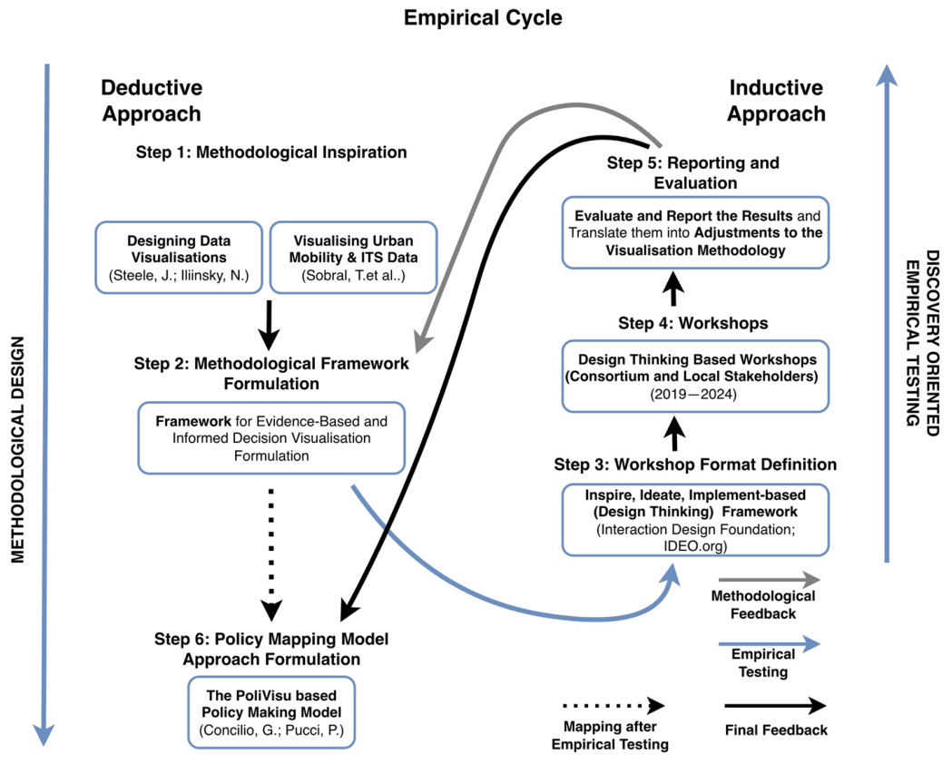
Figure 1. Empirical cycle towards a visualisation methodology combining a reiterating deductive approach and inductive approach [73,74,78].
Ijgi 15 00231 g001
Figure 2. Process diagram of the visualisation methodology depicting the policy and data-oriented steps, the application-oriented steps and decision moments.
Ijgi 15 00231 g002
Figure 3. The visualisation methodology process as applied to the dynamic exposure visualisation dashboard in Flanders and Berlin SCPVC (Case 1) [33].
Ijgi 15 00231 g003
Figure 4. Policy-making cycle process visualising the policy design, policy implementation and policy evaluation steps and substeps [78].
Ijgi 15 00231 g004
Figure 5. South-Eastern Flanders (BE)—Sankey route distribution diagram (Case 4) [87].
Ijgi 15 00231 g005
Figure 6. South-Eastern Flanders (BE)—origin–destination matrix diagram and heatmap (Case 4).
Ijgi 15 00231 g006
Figure 7. South-Eastern Flanders (BE)—Traffic flow line/trip distribution map (Case 4).
Ijgi 15 00231 g007
Figure 8. Policy monitoring dashboard (PMD)—interactive school street dashboard (Case 5) [89].
Ijgi 15 00231 g008
Figure 9. Interactive road accident heatmap dashboard in Pilsen (CZ), including smart selection (Case 10) [92].
Ijgi 15 00231 g009
Figure 10. Pilsen: traffic volume impact simulation modelling (Case 13) [94].
Ijgi 15 00231 g010
Figure 11. Pilsen: traffic model–traffic measure impact modelling comparison (Case 12) [94].
Ijgi 15 00231 g011
Figure 12. Ghent Digital Twin: The impact of mobility measures on air quality; NO2 distribution combining the Ghent & Flanders traffic model and the VITO air quality model delta map (Case 18).
Ijgi 15 00231 g012
Table 1. Overview of the 20 smart city-related policy visualisation cases’ (SCPVC) location, title and visualisation content (For screenshots of each case see the research data on Zenodo, 2_VisualisationCases_Visuals).
Case Nr.Smart City-Related Visualisation Cases (Location & Title)Visualisation Content
1Berlin (DE), Flanders (BE)—Dynamic exposure visualisation dashboardDashboard visualising the exposure to fine dust levels (PM2.5) during travel routes on a geospatial map and on graphs visualising levels related to travel distance and exposure time
2Issy-les-Moulineaux (FR)—Traffic dashboardTraffic dashboard visualising traffic delay, traffic blackspots and free flow speed for Issy-Les-Moulineaux and its surroundings
3Police zone Voorkempen (BE)—Trajectory speed limit enforcement dashboardDashboard visualising aggregated average speed control camera data, envisioning live and historical traffic volumes and average speeds
4Solva region (BE)—Regional traffic behaviourDashboard visualisation of origin–destination patterns of floating car data on a regional scale in South-Eastern Flanders and its surroundings
5Herzele (BE)—Interactive school street dashboardDashboard visualising results from multiple sensor types (traffic, air quality PM, NO2, BC) allowing the comparison of two groups of sensors before and after a moment in time (when the measure has been implemented)—applied on a school street implementation case
6Mechelen/Flanders (BE)—Interactive school street dashboardDashboard visualising traffic count data (cars, big vehicles, cyclists and pedestrians) in and around school streets before and after the implementation of a school street
7Sint-Niklaas (BE)—Local mobility scheme/plan dashboardDashboard visualising results from multiple sensor types (traffic, air quality PM, NO2, BC) allowing the comparison of two groups of sensors before and after a moment in time (when the measure has been implemented)—applied on a local mobility scheme/plan implementation case
8Flanders (BE)—Interactive road safety mapInteractive road safety heatmap for Flanders visualising heatmaps, line and point maps included advanced geo-time and content selection possibilities
9Ghent (BE)—Student displacementsChoropleth map visualising dorm higher education student displacements during a reference period in Ghent by using mobile telecommunication data as an alternative way to get relevant policy data about displacement patterns
10Pilsen (CZ)—Interactive road accident mapInteractive road accident heatmap for Pilsen visualising heatmaps and point maps included advanced geo-time and content selection possibilities
11Pilsen (CZ)—Interactive sensor based live and historic traffic mapInteractive map visualising live and historic traffic volumes in Pilsen, including advanced data geo-time and content selection possibilities
12Pilsen (CZ)—Traffic measure impact modelling comparisonTraffic volume and intensity line delta map of the results of a traffic calculation using the Pilsen traffic model
13Pilsen (CZ)—Traffic volume impact simulation modellingTraffic volume and intensity line map visualisation of a traffic calculation using the Pilsen traffic model
14Issy-les-Moulineaux (FR)—Travel planning appOptimal multimodal route calculation mobile visualisation app (My Anatol app) offering sustainable route suggestions
15Pilsen (CZ)—Impact of roadworks simulationTraffic volume and intensity line map visualisation of the impact of planned roadworks using the Pilsen traffic model
16Athens (GR) Digital Twin—Green squares planningVisualising the impact of 3D terrain assets (e.g., buildings, constructions, trees, water, street furniture) on the comfort of urban spaces related to liveability, e.g., by avoiding heat stress, using a Digital Twin
17Athens (GR) Digital Twin—Traffic load & creation of a pedestrian and cycling routeVisualising traffic volumes, air quality impact, noise pollution impact (absolute volumes and deltas) in a 3D Digital Twin environment-case transforming roads towards low traffic zones to promote walking and cycling
18Pilsen (CZ), Ghent (BE) Digital Twin—Impact of road closuresVisualising traffic volumes, air quality impact, and noise pollution impact (absolute volumes and deltas) in a 3D Digital Twin environment-case road closures on an existing network
19Pilsen (CZ) Digital Twin—Ring road construction impactVisualising traffic volumes, air quality impact, noise pollution impact (absolute volumes and deltas) in a 3D Digital Twin environment-case new road infrastructure
20Pilsen (CZ) Digital Twin—Solar equipment locations in the city parkVisualising the impact of 3D terrain assets (e.g., buildings, other constructions, e.g., bridges, trees) on the potential shadow impact on solar panels in a Digital Twin
Table 2. Overview of the 20 smart city-related policy visualisation cases’ (SCPVC) formulated policy elements and visualisation goals.
Case Nr.Policy Element
(Step 1)
Visualisation Goal
(Step 2)
1Problem-setting: Evaluating the impact of air quality, including fine dust (PM) and black carbon (BC), during routes by bike, footVisualising the air quality during displacements, measuring location and time (PM, BC)
2Policy goal: Getting better insights and reducing congestionVisualise how much time a traveller loses on road segments in Issy compared to the ideal situation (no traffic) for specific periods and timings. Show current/actual “Time lost” per road segment.
3Problem-setting: Evaluating the impact of average speed control enforcementVisualising the long-term impact of average speed control zones on speed, fines and even traffic safety (accidents)
4Policy goal: Getting insight into the regional mobility streamsDisplay the displacement patterns (by car) in the South-East Flanders region
5Policy goal: Getting insight into the effects of a school street (test) implementationVisualise the effects of the implementation of a measure on traffic and air quality before and after implementation at multiple geospatial areas
6Policy action: Pre- and post-measurement of a school street implementation measureVisualising the long-term impact of the implementation of a school street by measuring the period before the implementation and after the implementation in the school street itself and the surrounding neighbourhood
7Policy goal: Getting insight into the effects of a mobility scheme (test) implementationVisualise the effects of the implementation of a measure on traffic and air quality before and after implementation at multiple geospatial areas
8Problem-setting: Identify the road safety situationVisualising locations where accidents happened in Flanders in the last 5 years. Regarding the accidents, display information relevant to finding black spots due to the infrastructure
9Problem-setting: Getting insights into student displacementsDisplay on a map the areas with the highest number of students and impact in Ghent
10Problem-setting: Identification and agenda-setting via traffic data analysis and evaluation of past policy measuresVisualise traffic volume on road segments in time and space to explore and discover patterns, correlations and extremities using aggregated data
11Policy goal: Reduce congestionShowing actual, historical traffic volume for each road segment
12Policy goal: Impact evaluationDisplaying the differences in traffic volumes and intensities for these road segments influenced by the simulated measure
13Policy goal: Reduce congestionVisualising the increase/decrease in traffic volume to compare two moments in time by allowing an expert to select those moments using either measured data from the past or predicted data (model)
14Policy goal: Optimal multimodal route planning to enhance the use of sustainable transport modes and to ensure liveability of neighbourhoodsVisualise the optimal travel options, including the time and ecological costs of travel alternatives
15Policy goal: Reduce roadworks impact on increase in congestionInforming the citizens about the impact and time schedules for planned roadworks in the city
16Policy action: Simulating the shadow impact of adding greenery and public equipment like benchesDisplay in 3D the sunshine’s impact on leisure locations (e.g., trees and benches) for every date and time
17Policy goal: Evaluating the impact of the close-by traffic load of transforming Stadiou Street in the centre of Athens into a complete pedestrian and cycling routeDisplay on a 3D map the effect on traffic volume, air quality and noise pollution caused by traffic of changes in existing infrastructure
18Problem-setting: Getting insight into the effect of a road closure measureDisplay on a 3D map the effect on traffic volume, air quality and noise pollution caused by traffic of changes in existing infrastructure
19Problem-setting: Getting insight into the effect of a new ring roadDisplay on a 3D map the effect on traffic volume, air quality and noise pollution caused by traffic of new road infrastructure impacting the city
20Policy action: Simulating the shadow impact on solar equipment efficiencyDisplay in 3D the sunshine’s impact on locations for every date and time
Table 3. Overview of the smart city-related policy visualisation cases’ (SCPVC) visualisation techniques, data and sensor features, tools and interactivity elements and complexity evaluation.
CaseVisualisationData and SensorsTools and InteractivityComplexity
Nr.Smart City-Related Visualisation CasesVisualisation Techniques UsedVisualisation
(2D, 3D)
Data Types (YTT) [1]Data Techniques Aggregation/Anonymisation [2]Sensors UsedTools (Digital Twin, Dashboard, Interactive Graphs)Interactivity (Interactive Selection, Time Selection, Geospatial Navigation, Bi-Directional Dashboard-Map Integration) [5]Scenario Analysis (Nr of Models/Algorithms | Model Types)Visualisation
(L, M, H) [6]
Policy Application
(L, M, H) [7]
1Berlin (DE), Flanders (BE)—Dynamic exposure visualisation dashboard
-
Dynamic exposure dashboard interface
-
2D Trip visualisation map
-
Air Quality exposure line chart
-
Air Quality exposure cumulative line chart
-
Selection table (trip selection interface)
-
Selection and filter options
2DToday, Yesterday-Mobile Air QualityVisualisation DashboardIGS, ITS, GN-MM
2Issy-les-Moulineaux (FR)—Traffic dashboard
-
Floating car data mobility dashboard
-
Traffic speed and delay time distribution histogram
-
Line-based free flow map
-
Table (lost time)
-
Free-flow distribution heatmap matrix
-
Time period selector
2DYesterdayAggregationNavigation Device (In Car, Cellphone,...)Visualisation DashboardIGS, ITS, GN-MM
3Police zone Voorkempen (BE)—Trajectory speed limit enforcement dashboard
-
Average speed control dashboard
-
Heatmap
-
Flow rate diagram
-
Average speed control infraction histogram
2DYesterdayAggregation, Pseudonimi-
sation
ANPR [3]Visualisation Dashboard--LM
4Solva region (BE)—Regional traffic behaviour
-
Traffic distribution dashboard
-
Sankey route distribution diagram
-
Origin-destination matrix diagram and heatmap
-
Traffic flow line/trip distribution map
2DToday, YesterdayAggregationNavigation Device (In Car, Cellphone,...)Visualisation DashboardIGS-LM
5Herzele (BE)—Interactive school street dashboard
-
Policy Monitoring Dashboard for Traffic and Air Quality
-
2D Sensor location map
-
Bar chart (traffic mode changes, changes in pollutant exhaust)
2DToday, YesterdayAggregationTelraam Traffic [4], Static Air QualityPolicy DashboardIGS, ITS, GN-HH
6Mechelen/Flanders (BE)—Interactive school street dashboard
-
School street implementation dashboard
-
2D Map,
-
Bar chart (advanced)
-
Comparative trend analysis line chart
-
Pie chart (modal split)
2DToday, YesterdayAggregationTelraam TrafficPolicy DashboardIGS, ITS, GN-MM
7Sint-Niklaas (BE)—Local mobility scheme/plan dashboard
-
Traffic count data mobility dashboard
-
2D Sensor location Map
-
Stacked bar and line charts (detailed traffic volumes)
-
Histogram (driving speed)
-
Pie chart (modal split)
2DToday, YesterdayAggregationTelraam TrafficPolicy DashboardIGS, ITS, GN1 | Traffic ModelMM
8Flanders (BE)—Interactive road safety map
-
2D Interactive heatmap dashboard
-
Interactive charts
2DYesterday--Intensity MapIGS, ITS, GN, BDMI-HM
9Ghent (BE)—Student displacements
-
Polygon chloropleth map
-
Bar charts (histogram)
2DYesterdayAnonymisation, AggregationCellphone Intensity Map--LM
10Pilsen (CZ)—Interactive road accident map
-
2D Interactive heatmap dashboard
-
Interactive charts
2DYesterday--Intensity MapIGS, ITS, GN, BDMI-HM
11Pilsen (CZ)—Interactive sensor based live and historic traffic map
-
2D Interactive traffic line map
-
Interactive charts
2DToday, YesterdayAggregationTraffic Sensors (loops, traffic lights)Intensity MapIGS, ITS, GN, BDMI-HM
12Pilsen (CZ)—Traffic measure impact modelling comparison
-
2D Traffic volume delta map
2DTomorrow, YesterdayAggregation-Intensity Map, Algorithm VisualisationITS, GN1 | Traffic ModelMH
13Pilsen (CZ)—Traffic volume impact simulation modelling
-
2D Traffic model volume map
2DTomorrow, YesterdayAggregation-Intensity Map, Algorithm VisualisationITS, GN1 | Traffic ModelMM
14Issy-les-Moulineaux (FR)—Travel planning app
-
Travel planning algorithm mobile app
2DToday, YesterdayAggregationNavigation Device (In Car, Cellphone,...)Algorithm VisualisationGN1 | Multimodal Optimal Route PlanningML [8]
15Pilsen (CZ)—Impact of roadworks simulation
-
2D Traffic model scenario analysis map
-
Timeline chart of roadworks
2DTomorrow, Today, Yesterday--Algorithm VisualisationITS, GN1 | Traffic ModelMH
16Athens (GR) Digital Twin—Green squares planning
-
3D Digital terrain visualisation of landscape elements.
3DYesterday--Digital TwinITS, GN1 | Light ImpactMM
17Athens (GR) Digital Twin—Traffic load & creation of a pedestrian and cycling route
-
2D Traffic volume delta map
-
3D Air quality map
2D/3DTomorrow, Yesterday--Digital TwinITS, GN2 | Traffic Model + Air Quality ModelHH
18Pilsen (CZ), Ghent (BE) Digital Twin—Impact of road closures
-
2D Traffic volume delta map
-
3D Noise distribution point
-
3D Digital air quality delta map
2D/3DTomorrow, Yesterday--Digital TwinITS, GN3 | Traffic Model + Air Quality and Noise ModelHH
19Pilsen (CZ) Digital Twin—Ring road construction impact
-
2D Traffic volume delta map (inside a Digital Twin)
2DTomorrow--Digital TwinITS, GN1 | Traffic ModelMM
20Pilsen (CZ) Digital Twin—Solar equipment locations in the city park
-
3D Solar impact map
3DTomorrow--Digital TwinITS, GN1 | Light ImpactML
[1] (Yesterday = historical data, Today = live data, Tomorrow = predictive data). [2] Aggregation on a sensor level is not taken into account. [3] Automated Numberplate Recognition. [4] Citizen Science Traffic Counting Sensor (www.telraam.net). [5] Interactive Graph Selection (IGS), Interactive Time Selection (ITS), Geospatial Navigation (GN), Bi-Directional Dashboard-Map Integration (BDMI). [6] Low: The combination of a limited number of visualisation techniques in a 2D environment, where only one tool is used with limited interactivity; Medium: The combination of multiple visualisation techniques in a 2D environment or a limited number of visualisation techniques in a 3D environment with one or more elements of interactivity; High: The combination of multiple visualisation techniques in a 2D or 3D environment with multiple levels of interactivity, eventually combined with an interactive digital twin. [7] Low: Uses limited data techniques and sensors; has low policy relevance (e.g., a route planning tool or a 3D sun impact visualisation); Medium: Combines several visualisation and data techniques with little interactivity, or uses a few techniques with high interactivity; High: Combines multiple data types, techniques, and sensors; includes complex scenarios and many interactive elements, or uses digital twins for broad policy prediction. [8] End-user tool.
Table 4. Overview of the 20 smart city-related policy visualisation cases (SCPVC) and their potential use in the policy cycle phases and subphases.
Policy DesignPolicy ImplementationPolicy Evaluation
Problem-
Setting
Policy
Formulation
Scenario AnalysisDecisionImplementation PlanImplementationOngoing
Monitoring
CommunicationImpact AsessmentProblem (Re)structuring
Case Nr.Dashboard Visualisation
Visualisation DB
1Berlin (DE), Flanders (BE)—Dynamic exposure visualisation dashboardV-----VV--
2Issy-les-Moulineaux (FR)—Traffic dashboardV------VV-
3Police zone Voorkempen (BE)—Trajectory speed limit enforcement dashboard-V----V-VV
4Solva region (BE)—Regional traffic behaviourVV--------
PolicyDB
5Herzele (BE)—Interactive school street dashboardV--V--VVV-
6Mechelen/Flanders (BE)—School street dashboardVV--VVVVVV
7Sint-Niklaas (BE)—Local mobility scheme/plan dashboardV-VVV-VVVV
Intensity map visualisation
8Flanders (BE)—Interactive road safety mapVV--V--VV-
9Ghent (BE)—Student displacementsVV--------
10Pilsen (CZ)—Interactive road accident mapVV-----VV-
11Pilsen (CZ)—Interactive sensor based live and historic traffic mapV------VV-
12Pilsen (CZ)—Traffic measure impact modelling comparisonVVVVVVV-VV
13Pilsen (CZ)—Traffic volume impact simulation modellingV------V--
Algorithm visualisation
14Issy-les-Moulineaux (FR)—Travel planning app-------V--
15Pilsen (CZ)—Impact of roadworks simulationVVVVVVVVVV
Digital Twin visualisation
16Athens (GR)—Digital Twin, Green squares planningV-VVV--V--
17Athens (GR)—Digital Twin, Traffic load & creation of a pedestrian and cycling routeV--VV--VV-
18Pilsen (CZ), Ghent (BE)—Digital Twin, Impact of road closuresVVVVV--VVV
19Pilsen (CZ)—Digital Twin, Ring road construction impactVVVVV--VVV
20Pilsen (CZ)—Digital Twin, Solar equipment locations in the city parkV-VVVV--V-
V indicates that the policy cycle phase is applicable or has a high probability of applicability, depending on the policy context. - indicates that the policy cycle phase has a low probability or no probability of applicability, depending on the policy context.
Table 5. Quantitative overview of visualisation techniques categories and their potential use in the policy cycle.
PhasePolicy DesignPolicy ImplementationPolicy Evaluation
SubphaseProblem-
Setting
Policy
formulation
Scenario
Analysis
DecisionImplementation PlanImplementationOngoing
Monitoring
CommunicationImpact
Assessment
Problem
(Re)structuring
Dashboard visualisation6/73/71/72/72/71/75/75/75/73/7
-Visualisation DB3/42/40/40/40/40/42/42/42/41/4
-PolicyDB3/31/31/32/32/31/33/33/33/32/3
Intensity map visualisation6/64/61/61/62/61/61/64/64/61/6
Algorithm visualisation1/21/21/21/21/21/21/22/21/21/2
Digital Twin visualisation5/52/54/55/55/51/50/54/54/52/5
Percentage/subphase90%50%35%45%50%20%35%75%70%35%
Percentage/phase55%45%53%
Disclaimer/Publisher’s Note: The statements, opinions and data contained in all publications are solely those of the individual author(s) and contributor(s) and not of MDPI and/or the editor(s). MDPI and/or the editor(s) disclaim responsibility for any injury to people or property resulting from any ideas, methods, instructions or products referred to in the content.